Demixed principal component analysis of neural population data
Figures
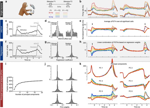
Existing approaches to population analysis, illustrated with recordings from monkey PFC during a somatosensory working memory task (Romo et al., 1999).
(a) Cartoon of the paradigm, adapted from Romo and Salinas (2003). Legend shows 12 experimental conditions. (b) Average per-condition firing rates (PSTHs) for four exemplary neurons out of . Colors refer to stimulus frequencies F1 and line styles (dashed/solid) refer to decision, see legend in (a). (c) Fraction of cells, significantly (, two-way ANOVA) tuned to stimulus and decision at each time point. (d) Left: Distribution of stimulus tuning effect sizes across neural population at F1 period (black arrow in c). Significantly tuned neurons are shown in dark gray. Right: Same for decision at F2 period (gray arrow in c). (e) The average of zero-centered PSTHs over all significantly tuned neurons (for neurons with negative effect size, the sign of PSTHs was flipped). Arrows mark time-points that were used to select the significant cells. (f) Fraction of cells, significantly (, linear regression) tuned to stimulus and decision at each time point. (g) Distribution of regression coefficients of neural firing rates to stimulus (during F1 period) and decision (during F2 period). (h) Stimulus and decision components produced by the method of Mante et al. (2013). Briefly, neural PSTHs are weighted by the regression coefficients. (i) Fraction of variance captured by the first 20 principal components. (j) Distributions of weights used to produce the first six principal components (weights are elements of the eigenvectors of the covariance matrix). (k) First six principal components (projections of the full data onto the eigenvector directions).
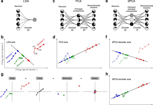
Linear dimensionality reduction.
(a) Linear discriminant analysis maps the firing rates of individual neurons onto a latent component that allows us to decode a task parameter of interest. Shades of grey inside each neuron show the proportion of variance due to the various task parameters (e.g. stimulus, decision, and time), illustrating mixed selectivity. In contrast, the LDA component is maximally demixed. (b) At any moment in time, the population firing rate of neurons is represented by a point in the -dimensional space; here . Each trial is represented by a trajectory in this space. Colors indicate different stimuli and dot sizes represent time. The LDA component for stimulus is given by the projection onto the LDA axis (black line); projections of all points are shown along this line. All three stimuli are clearly separated, but their geometrical relation to each other is lost. (c) Principal component analysis linearly maps the firing rates into a few principal components such that a second linear transformation can reconstruct the original firing rates. (d) The same set of points as in (b) is projected onto the first PCA axis. However, the stimuli are no longer separated. Rather, the points along the PCA axis have complex dependencies on stimulus and time (mixed selectivity). The PCA axis minimizes the distances between the original points and their projections. (e) Demixed principal component analysis also compresses and decompresses the firing rates through two linear transformations. However, here the transformations are found by both minimizing the reconstruction error and enforcing a demixing constraint on the latent variables. (f) The same set of points as in (b) projected onto the first dPCA decoder axis. The three stimuli are clearly separated (as in LDA), but some information about the relative distances between classes is preserved as well (as in PCA). (g) The same data as in (b) linearly decomposed into the time effect, the stimulus effect, and the noise. (h) The dPCA projection from (f) has to be mapped onto a different axis, given by the dPCA encoder, in order to reconstruct the stimulus class means (large colored circles). The decoder and encoder axes together minimize the reconstruction error between the original data and the stimulus class means.
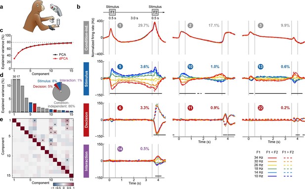
Demixed PCA applied to recordings from monkey PFC during a somatosensory working memory task (Romo et al., 1999).
(a) Cartoon of the paradigm, adapted from Romo and Salinas (2003). (b) Demixed principal components. Top row: first three condition-independent components; second row: first three stimulus components; third row: first three decision components; last row: first stimulus/decision interaction component. In each subplot, the full data are projected onto the respective dPCA decoder axis, so that there are 12 lines corresponding to 12 conditions (see legend). Thick black lines show time intervals during which the respective task parameters can be reliably extracted from single-trial activity (using pseudotrials with all recorded neurons), see Materials and methods. Note that the vertical scale differs across rows. Ordinal number of each component is shown in a circle; explained variances are shown as percentages. (c) Cumulative variance explained by PCA (black) and dPCA (red). Demixed PCA explains almost the same amount of variance as standard PCA. Dashed line shows an estimate of the fraction of 'signal variance' in the data, the remaining variance is due to noise in the PSTH estimates (see Materials and methods). (d) Variance of the individual demixed principal components. Each bar shows the proportion of total variance, and is composed out of four stacked bars of different color: gray for condition-independent variance, blue for stimulus variance, red for decision variance, and purple for variance due to stimulus-decision interactions. Each bar appears to be single-colored, which signifies nearly perfect demixing. Pie chart shows how the total signal variance is split among parameters. (e) Upper-right triangle shows dot products between all pairs of the first 15 demixed principal axes. Stars mark the pairs that are significantly and robustly non-orthogonal (see Materials and methods). Bottom-left triangle shows correlations between all pairs of the first 15 demixed principal components. Most of the correlations are close to zero.
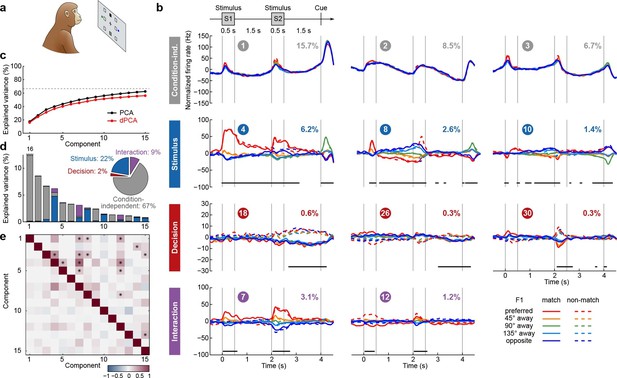
Demixed PCA applied to recordings from monkey PFC during a visuospatial working memory task (Qi et al., 2011).
Same format as Figure 3. (a) Cartoon of the paradigm, adapted from Romo and Salinas (2003). (b) Demixed principal components. In each subplot there are ten lines corresponding to ten conditions (see legend). Color corresponds to the position of the last shown stimulus (first stimulus for s, second stimulus for s). In non-match conditions (dashed lines) the colour changes at s. Solid lines correspond to match conditions and do not change colors. (c) Cumulative variance explained by PCA and dPCA components. Dashed line marks fraction of signal variance. (d) Explained variance of the individual demixed principal components. Pie chart shows how the total signal variance is split between parameters. (e) Upper-right triangle shows dot products between all pairs of the first 15 demixed principal axes, bottom-left triangle shows correlations between all pairs of the first 15 demixed principal components.
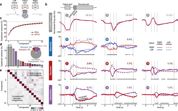
Demixed PCA applied to recordings from rat OFC during an olfactory discrimination task (Feierstein et al., 2006).
Same format as Figure 3. (a) Cartoon of the paradigm, adapted from Wang et al. (2013). (b) Each subplot shows one demixed principal component. In each subplot there are four lines corresponding to four conditions (see legend). Two out of these four conditions were rewarded and are shown by thick lines. (c) Cumulative variance explained by PCA and dPCA components. (d) Explained variance of the individual demixed principal components. Pie chart shows how the total signal variance is split between parameters. (e) Upper-right triangle shows dot products between all pairs of the first 15 demixed principal axes, bottom-left triangle shows correlations between all pairs of the first 15 demixed principal components.
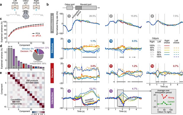
Demixed PCA applied to recordings from rat OFC during an olfactory categorization task (Kepecs et al., 2008).
Same format as Figure 3 (a) Cartoon of the paradigm, adapted from Wang et al. (2013). (b) Each subplot shows one demixed principal component. In each subplot there are ten lines corresponding to ten conditions (see legend). Six out of these ten conditions were rewarded and are shown with thick lines; note that the pure left (red) and the pure right (blue) odors did not have error trials. Inset shows mean rate of the second interaction component during the anticipation period. (c) Cumulative variance explained by PCA and dPCA components. (d) Explained variance of the individual demixed principal components. Pie chart shows how the total signal variance is split between parameters. (e) Upper-right triangle shows dot products between all pairs of the first 15 demixed principal axes, bottom-left triangle shows correlations between all pairs of the first 15 demixed principal components.
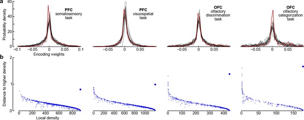
Encoder weights for the leading dPCA components across the neural population.
(a) Distributions of encoder weights for the 15 leading dPCA components across the neural population, in each of the four datasets. Each subplot shows 15 probability density curves, one curve per component (bin width 0.005). The distribution corresponding to the first component is highlighted in red. (b) Clustering of neurons by density peaks (Rodriguez and Laio, 2014). For each dataset we took the first 15 dPCA components, and then ran the clustering algorithm in the 15-dimensional space of encoding weights. The clustering algorithm works in two steps: first, it computes a local density for each point (i.e., for each neuron), using a Gaussian kernel with . Second, for each point it finds the minimal distance to a point with higher local density (if there is no such point, then the distance to the furthest point is taken). Each subplot shows local density on the horizontal axis plotted against distance to the next point with higher density on the vertical axis; each dot corresponds to one of the neurons. Cluster centres are characterized by high local density and large distance to the point of even higher density; they should appear as outliers in the upper-right corner of the plot (see Rodriguez and Laio, 2014, for details). In each case, there is only one such outlier (bigger dot), indicating a single cluster.

Marginalization procedure.
PSTHs of three exemplary neurons from the somatosensory working memory task decomposed into marginalizations.

Balanced and unbalanced data.
(a) In this toy example there are two task parameters (factors), with two possible values each. Parameter A (left) is represented by the size of the dot, parameter B (middle) is represented by the color of the dot, noise is Gaussian with zero mean and zero correlation (right). Interaction term is equal to zero. (b) Balanced case with data points in each of the four parameter combinations. Overall correlation is zero. (c) Unbalanced case with for two parameter combinations and for the other two. Overall correlation is 0.8.
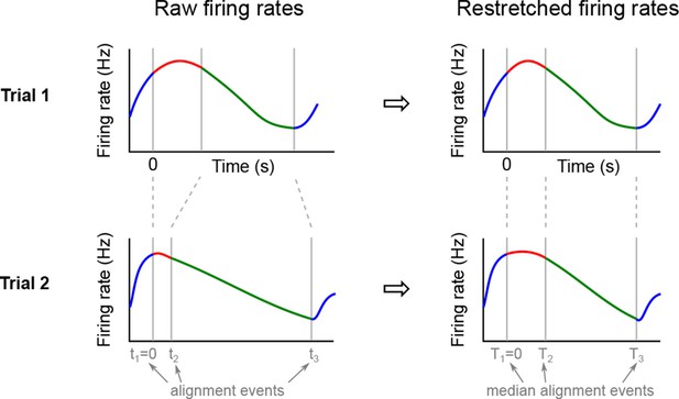
Re-stretching (time warping) procedure.
We defined several alignment events (such as odour poke in, odour poke out, etc.) and for each trial found the times of these events. After aligning all trials on (left) we computed median times for all other events. Then for each trial we re-stretched the firing rate on each interval to align it with (right). After such re-stretching, all events are aligned and the trials corresponding to one condition can be averaged.

Cross-validation errors depending on the regularization parameter .
Each subplot corresponds to one dataset and shows mean (solid lines) and min/max (boundaries of shaded regions) of the relative cross-validation errors for ten repetitions. Different colors refer to different marginalizations (see legend), the minima are marked by dots. Black color shows all marginalizations together, i.e. .
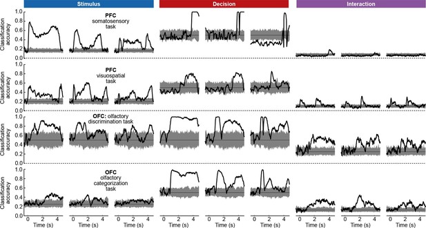
Cross-validated time-dependent classification accuracies of linear classifiers (black lines) given by the first three stimulus/decision/interaction dPCs (columns) in each dataset (rows).
Shaded gray regions show distribution of classification accuracies expected by chance as estimated by 100 iterations of shuffling procedure.

Toy example illustrating the pseudo-inverse intuition.
(a) Firing rate trajectories of two neurons for three different stimuli. (b) Same data with dPCA decoding and encoding axes. The encoding axes are approximately equivalent to the axes of the principal components in this case.

Some demixed components as given by three different demixing methods (rows) in various datasets and marginalizations (columns).
Empty subplots mean that the corresponding method did not find any components. All projections were -scored to make them of the same scale. Barplots on the right show fractions of variance in each marginalization for each component (stimulus in blue, decision in red, interaction in purple, condition-independent in gray): . Barplots consisting of a single colour correspond to perfect demixing.

Fourier-like artifacts in PCA.
(Left) In this toy example, single neuron responses are generated from the same underlying Gaussian but are randomly shifted in time. (Right) First three PCA components of the population data. While the leading component resembles the true signal, higher order components look like higher Fourier harmonics. They are artifacts of the jitter in time.
Videos
Stimulus representation in the somatosensory working memory task
Two leading stimulus dPCs in the somatosensory working memory task (components #5 and #10 as horizontal and vertical axis correspondingly). Each frame of this movie corresponds to one time point . Each dot is the average between two decision conditions with the same F1 stimulus. Fading 'tails' show last sections of the trajectories. See Figure 3 for the color code.
Illustration of the dPCA algorithm.
Illustration of the dPCA algorithm using the somatosensory working memory task.
Tables
Demixed PCA in comparison with existing methods. Columns: 'Signif.' refers to the method of counting significantly tuned cells, as shown in Figure 1c–e. TDR refers to the 'targeted dimensionality reduction' of Mante et al. (2013) shown in Figure 1f–h. LDA stands for linear discriminant analysis, but this column applies to any classification method (e.g. support vector machine, ordinal logistic regression, etc.). All classification methods can be used to summarize population tuning via a time-dependent classification accuracy (e.g. Meyers et al., 2012). PCA stands for principal component analysis, as shown in Figure 1i–k. FA stands for factor analysis, GPFA for Gaussian process factor analysis (Yu et al., 2009), LDS for hidden linear dynamical system (Buesing et al., 2012a; 2012b), jPCA is the method introduced in Churchland et al. (2012) . Some of the existing methods can be extended to become more general, but here we refer to how these methods are actually used in the original research. Rows: The first two rows are the two defining goals of dPCA. Following rows highlight notable features of other methods.
| Signif. | TDR | LDA | PCA | FA | GPFA | jPCA | LDS | dPCA | |
|---|---|---|---|---|---|---|---|---|---|
| Takes task parameters into account & provides summary statistics of population tuning | ✓ | ✓ | ✓ | ✓ | |||||
| Allows to reconstruct neural firing (captures variance) | ✓ | ✓ | ✓ | ✓ | ✓ | ||||
| Based on dynamical model | ✓ | ✓ | |||||||
| Based on probabilistic model | ✓ | ✓ | ✓ | ||||||
| Takes spike trains as input | ✓ | ✓ |


