Neural signatures of perceptual inference
- Newcastle University, United Kingdom
- University of Iowa, United States
- University College London, United Kingdom
Figures
Figure 1
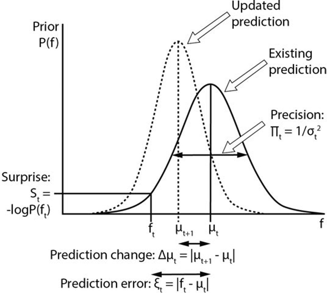
Computational variables involved in perceptual inference.
The graph displays a schematic probability distribution (solid curve) representing the prior prediction about the fundamental frequency (f) of an upcoming auditory stimulus (ft), where t simply refers to the number or position of the stimulus within a sequence. This prediction is characterised by its mean (μt) and precision (Πt), which is the inverse of its variance (σ2). The incongruence between the actual ft and the prediction can be expressed either as a (non-precision-weighted) prediction error (ξt), that is, the absolute difference from the prediction mean, or as surprise (St), that is, the negative log probability of the actual ft value according to the prediction distribution. As a result of a mismatch with bottom up sensory information, the prediction changes (dashed line). The change to the prediction (Δμt) is calculated simply as the absolute difference between the old (μt) and new (μt+1) prediction means. Note that the curves on the graph display changing predictions on account of a stimulus (i.e. Bayesian belief updating) as opposed to the more commonly encountered graph in this field of research where the curves indicate the prior prediction, the sensory information and the posterior inference about the individual stimulus (i.e. Bayesian inference).
Figure 2 with 3 supplements
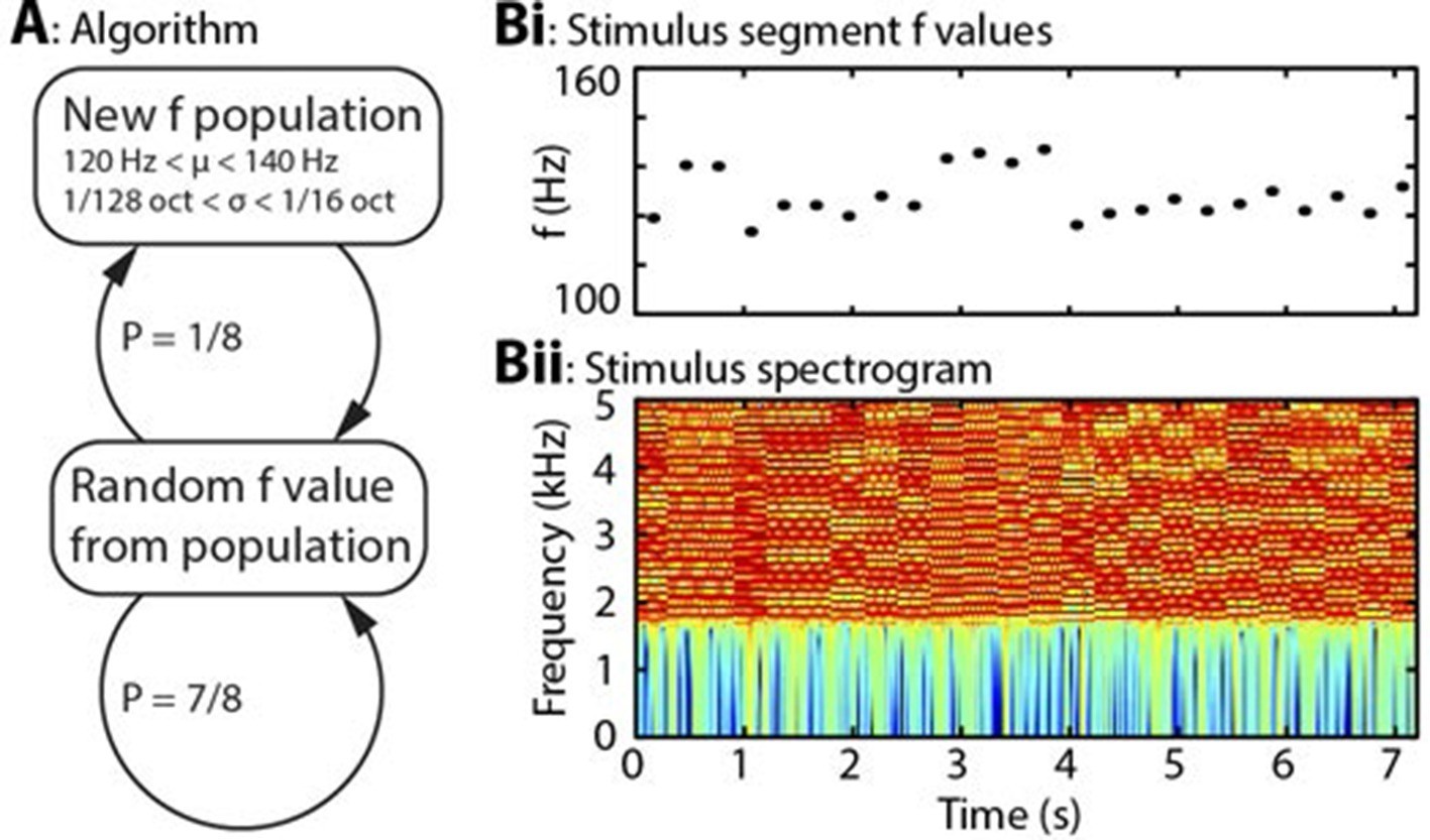
Algorithm and example stimulus.
(A) The stimulus is composed of a series of concatenated segments, differing only in fundamental frequency (f). At any time, a given f population is in effect, characterised by its mean (μ) and standard deviation (σ). For each successive segment, there is a 7/8 chance that that segment’s f value will be randomly drawn from the present population, and a 1/8 chance that the present population will be replaced, with new μ and σ values drawn from uniform distributions. (B) Example section of stimulus. (Bi) Dots indicate the f values of individual stimulus segments, of 300 ms duration each. Four population changes are apparent. (Bii) Spectrogram of the corresponding stimulus, up to 5 kHz, on a colour scale of -60 to 0 dB relative to the maximum power value. The stimulus power spectrum does not change between segments, and the only difference is the spacing of the harmonics.
Figure 2—figure supplement 1
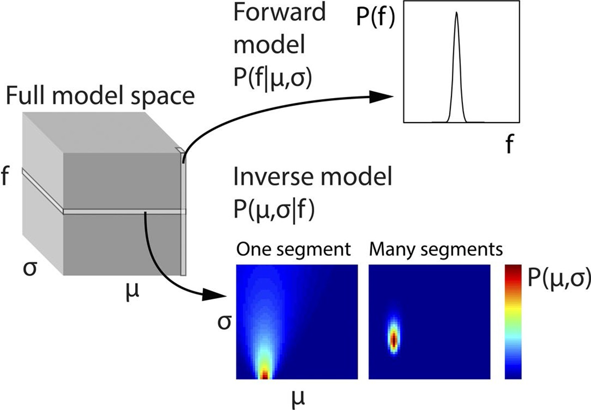
Generative model and inversion scheme.
Schematic of the full three-dimensional model space, with dimensions indicating population mean (σ), population standard deviation (σ) and stimulus fundamental frequency (f). To ease computational demands, the model space was discretised. Each point in model space corresponds to the probability of a particular f, given a specific μ and σ, that is, P(f|μ,σ). Therefore each column (along the f dimension) gives the probability distribution P(f|μ,σ), and corresponds to the forward model. The planes of the model space, conversely, indicate the probability of each given combination of μ and σ, given a particular f value, that is, P(μ,σ|f), or in other words the inverse model. To generate priors based on a series of observed f values, the scalar product of the planes for each of these f values is taken, and the resulting plane scaled to a sum of 1. This plane represents the estimates of the hidden states μ and σ and is then used to weight the columns of the model space. The weighted model space is averaged into a single column (forward model), and scaled to a sum of 1, thus providing optimal priors on the assumption that the f population does not change. The priors assuming a population change are derived from the same procedure, but with uniform weighting across the model space. The change and no change priors are then weighted according to the probability of a population change, and then summed. The only part of the process not illustrated here is the inference of population changes, determining how many preceding f values form part of the model inversion, which is explained in Equation 2.
Figure 2—figure supplement 2
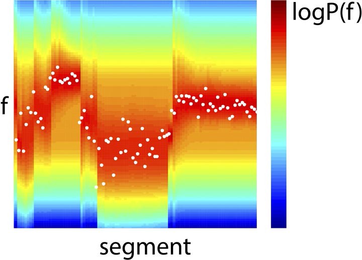
Example Bayes-optimal prior predictions generated by model inversion.
Observed f values from a section of the stimulus (white dots), overlaid on prior predictions (colour scale) based on previous observations of f, using the model inversion scheme.
Figure 2—figure supplement 3
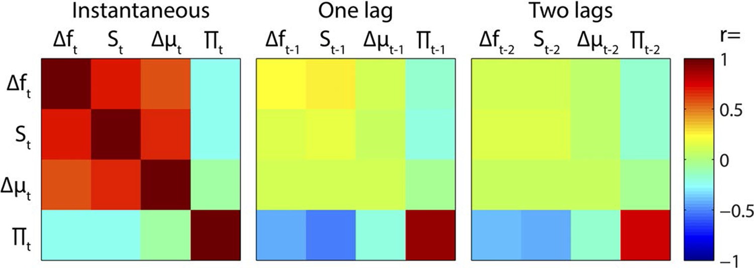
Regressor correlations.
Correlation matrices between instantaneous and time-lagged values of the main regressors. Note the strong instantaneous mutual positive correlations between Δf, S and Δμ, and the negative correlations between Π and preceding values of Δf, S and Δμ.
Figure 3
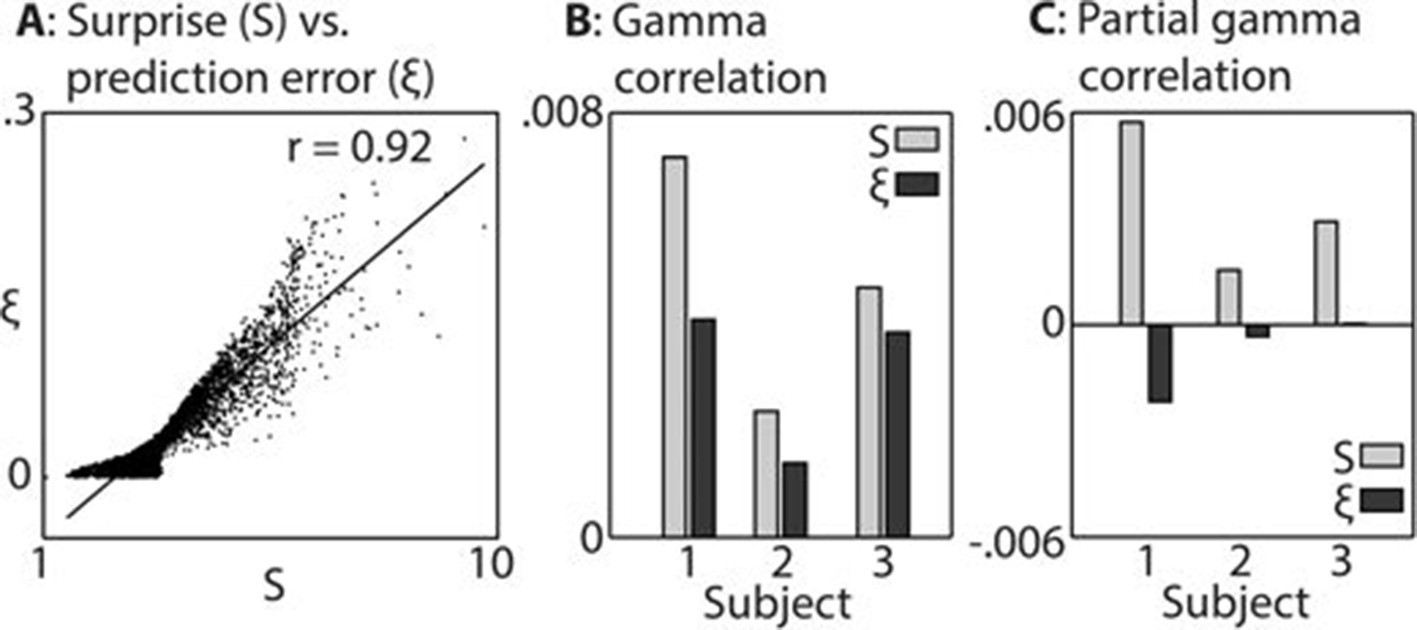
Comparison between surprise and prediction error.
(A) Correlation between surprise (S) and non-precision-weighted prediction error (ξ), with each dot indicating an individual stimulus segment and the line indicating a linear regression fit. (B/C) Mean Pearson product moment correlation coefficients (r) between St or ξt, and gamma oscillation magnitude (30–100 Hz) in the 90–500 ms period following the onset of stimulus segment t. Regression coefficients were calculated for each time-frequency point, after partialling out the influences of current and preceding/subsequent values of all other regressors, and then averaged across time and frequency; these processing steps diminished the absolute size of the correlation values. In C, the influence of S on ξ, and ξ on S, was also partialled out, thus exposing the unique contribution of each variable to explaining the observed neural response. Partial S showed a higher mean correlation, across subjects, with gamma magnitude than partial ξ (p<0.01).
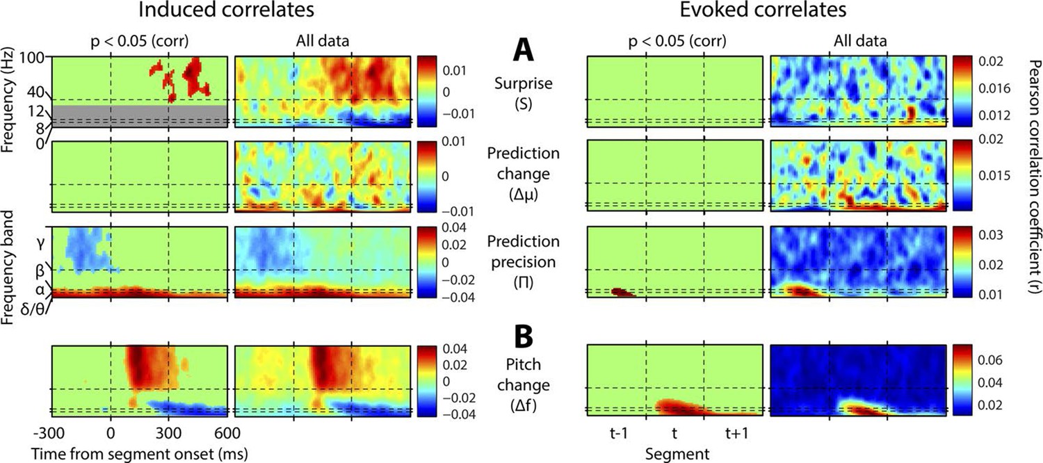
Figure 4 with 6 supplements
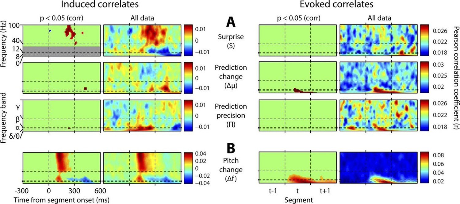
Spectrotemporal profiles associated with key perceptual inference variables.
Each plot illustrates the mean Pearson product moment correlation coefficient (r), across stimulus-responsive electrodes and across subjects, between induced oscillatory amplitude, at each time-frequency point, and the regressor of interest, that is, a time-frequency ‘image’ of the oscillatory correlates of a particular perceptual variable. Time is represented on horizontal axes, and frequency on vertical. Dashed lines indicate the division between the previous (t-1), current (t) and subsequent (t+1) stimulus segment (vertical lines), and between frequency bands (horizontal lines). Each row of plots represents one regressor. The left-hand group contains induced correlates, and the right-hand group evoked, with the left-hand column in each group showing data points significant at p<0.05 corrected. Regressors are partialised with respect to each other, such that only the unique contribution of each to explaining the overall oscillatory data is displayed. (A) Spectrotemporal correlates of the three fundamental variables for perceptual inference. Note that the grey area in the upper left plot reflects the spectrotemporal region of interest (ROI) analysis used for correlates of surprise (i.e. >30 Hz). Outside of the ROI analysis, no significant correlates were observed below 30 Hz. (B) The variable ‘pitch change’ indicates the overall response to a changing stimulus and is included to illustrate the magnitude and time-frequency distribution of a typical and robust auditory response. δ = delta (0–4 Hz), θ = theta (4–8 Hz), α = alpha (8–12 Hz), β = beta (12–30 Hz), γ = gamma (30–100 Hz).
Figure 4—figure supplement 1
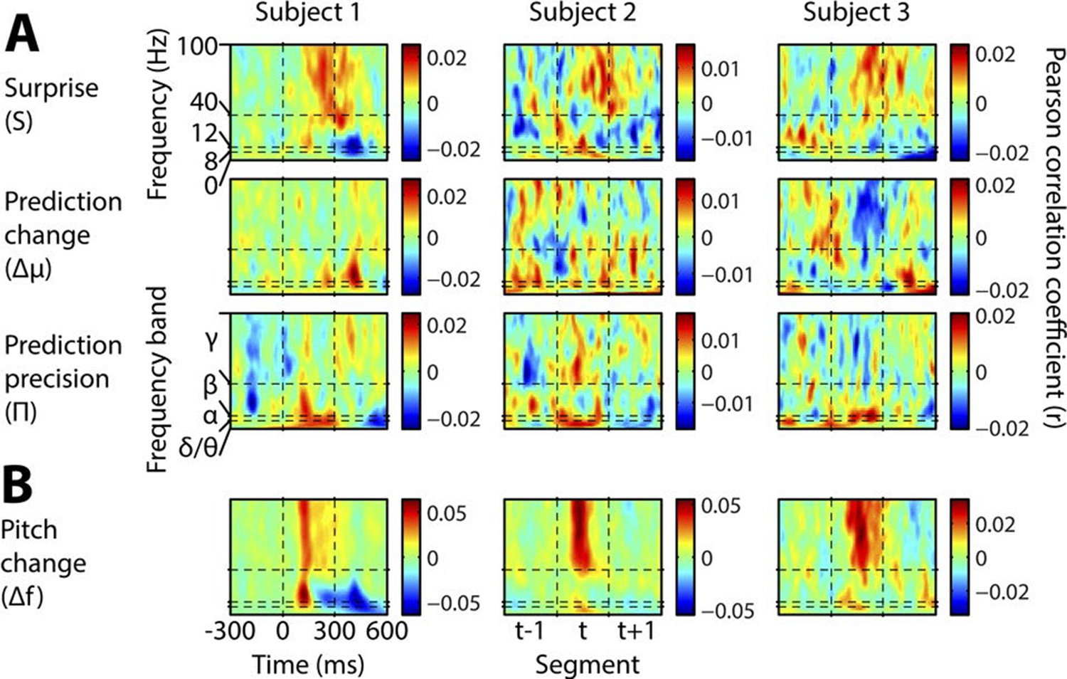
Individual subject induced correlates.
Notation and conventions are as for Figure 4, except that each column denotes a single subject. All data are displayed, as significance testing was not performed at the individual subject level.
Figure 4—figure supplement 2

Total variance explained by the model.
This figure shows the total variance explained by the four regressor of interest (applicable to the stimulus segment 0-300 ms), including both their overlaps and their unique explanatory contributions. The plot shows the mean across electrodes and subjects.
Figure 4—figure supplement 3
Results without mutual partialisation.
This figure is equivalent in all respects to Figure 4, except that the four regressors have not been partialised with respect to each other, hence results are not only limited to the unique explanatory power of each, but also include all overlaps between regressors. (A) The three perceptual inference regressors have been partialised only with respect to the contemporaneous pitch change value. (B) The pitch change regressor has been subjected to no partialisation at all.
Figure 4—figure supplement 4
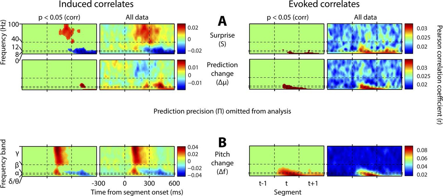
Results with prediction precision omitted.
This figure is equivalent in all respects to Figure 4, except that the analysis it displays does not include prediction precision. Hence, this quantity has not been partialised out of the other regressors. Also, a region-of-interest analysis is no longer applied to correlates of surprise. Note stronger but qualitatively similar gamma correlates of surprise, and beta correlates of precision, but the major difference that surprise is now correlated negatively with low-frequency induced oscillations coincident with the subsequent stimulus segment.
Figure 4—figure supplement 5
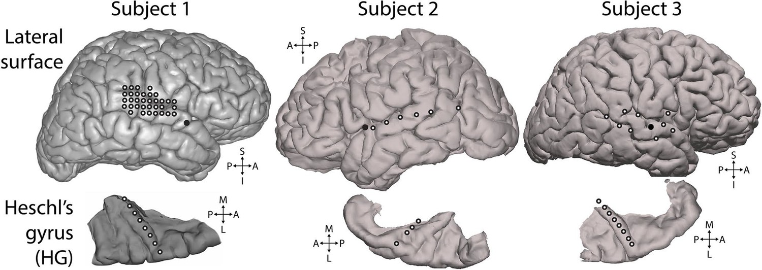
Electrode positions.
Electrodes used for analysis. White-filled circles each indicate one electrode. All electrodes shown were included in the presented analyses and were selected based on showing significant responses to the experimental stimulus, as described in the Methods section. Top row: lateral surface of the cerebral hemisphere recorded from. Solid black circles mark the insertion point for the Heschl’s gyrus depth electrode. Bottom row: depth electrode contacts used for analysis (white-filled circles), shown in the context of the surface of the superior temporal plane. Depth electrode contacts were positioned along the axis of Heschl’s gyrus. S = superior, I = inferior, A = anterior, P = posterior, M = medial, L = lateral.
Figure 4—figure supplement 6

Distribution of correlations across electrodes.
Distribution of regressor correlations. Each coloured plot represents one subject. Within each plot, the columns represent individual electrodes (positions displayed in A), with the vertical line separating Heschl’s gyrus (HG) from superior temporal gyrus (STG) electrodes. HG electrodes are arranged medial (left) to lateral (right). Rows indicate the four main partial regressors. Colour values indicate the relative similarity between the correlation pattern for that subject/electrode combination and the mean correlation pattern across electrodes and subjects (range -1 to 1). Δf = absolute change in f value (octaves) compared to previous, S = surprise, Δμ = absolute change in prediction mean (octaves), Π = precision of prediction.
Download links
A two-part list of links to download the article, or parts of the article, in various formats.
Downloads (link to download the article as PDF)
Open citations (links to open the citations from this article in various online reference manager services)
Cite this article (links to download the citations from this article in formats compatible with various reference manager tools)
Neural signatures of perceptual inference
eLife 5:e11476.
https://doi.org/10.7554/eLife.11476


