Admixture into and within sub-Saharan Africa
Figures
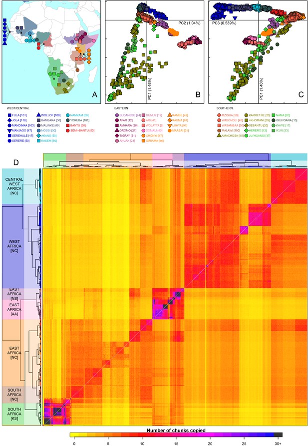
Sub-Saharan African genetic variation is shaped by ethno-linguistic and geographical similarity.
(A) the origin of the 46 African ethnic groups used in the analysis; ethnic groups from the same country are given the same colour, but different shapes; the legend describes the identity of each point. Figure 1—figure supplement 1 and Figure 1—source data 1 provide further detail on the provenance of these samples. (B) PCA shows that the first major axis of variation in Africa (PC1, y-axis) splits southern groups from the rest of Africa, each symbol represents an individual; PC2 (x-axis) reflects ethno-linguistic differences, with Niger-Congo speakers split from Afroasiatic and Nilo-Saharan speakers. Tick marks here and in (C) show the scale. (C) The third principle component (PC3, x-axis) represents geographical separation of Niger-Congo speakers, forming a cline from west to east Africans (D) results of the fineSTRUCTURE clustering analysis using copying vectors generated from chromosome painting; each row of the heatmap is a recipient copying vector showing the number of chunks shared between the recipient and every individual as a donor (columns);the tree clusters individuals with similar copying vectors together, such that block-like patterns are observed on the heat map; darker colours on the heatmap represent more haplotype sharing (see text for details); individual tips of the tree are coloured by country of origin, and the seven ancestry regions are identified and labelled to the left of the tree; labels in parentheses describe the major linguistic type of the ethnic groups within: AA = Afroasiatic, KS = Khoesan, NC = Niger-Congo, NS = Nilo-Saharan.
-
Figure 1—source data 1
Overview of sampled populations describing the continent, region, numbers of individuals used, and the source of any previously published datasets.
- https://doi.org/10.7554/eLife.15266.004
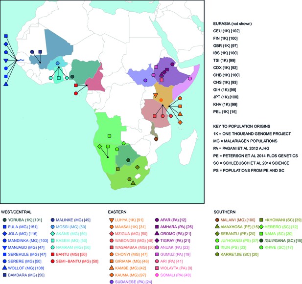
Map of populations used in the analysis.
Population names are coloured by the country of origin; positions of the countries are shown on the map. Individual point labels, which are used throughout this paper, are shown for each population in the legend. Sample provenance is shown immediately after the population name in circular parentheses and final number of individuals is shown in square parentheses.
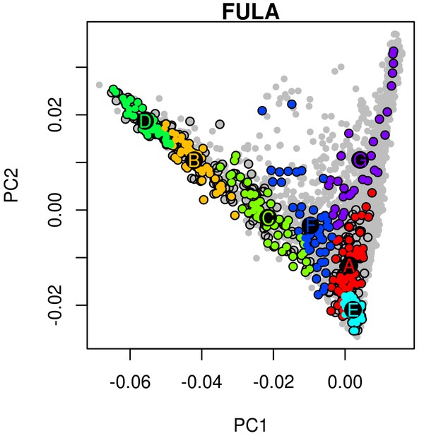
An example of hierarchical clustering to chose two groups of similar individuals from the Fula based on a PCA of The Gambia.
Projected onto a PCA of Gambian genetic variation where each point represents an individual, all Fula individuals are coloured, with the colour depicting their cluster assignment, based on the MClust clustering algorithm. We chose individuals from the green (D) and light blue (E) clusters to maximise the representation of Fula genetic variation. Note that the majority of the individuals from the other 6 Gambian ethnic groups occur in the right arm of the PCA. An analogous process was performed for all ethnic groups from the MalariaGEN dataset where more than 50 individuals were available.
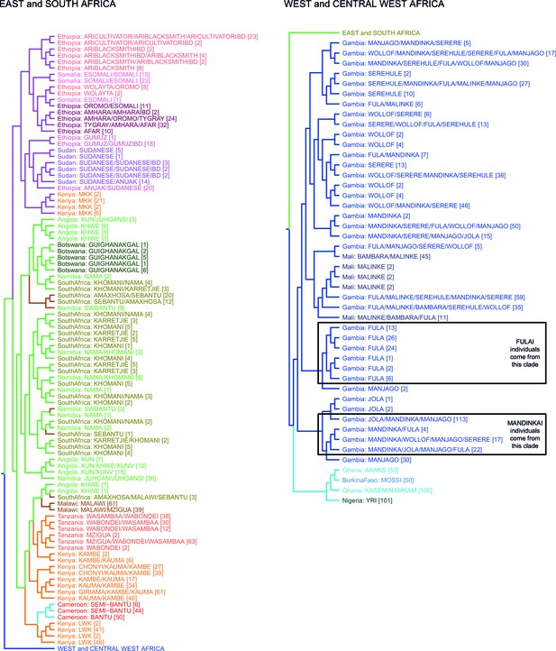
fineSTRUCTURE analysis of the full dataset.
We show the tree output from a single run of the fineSTRUCTURE algorithm. To aid reading, the tree has been split in two, East and Southern African groups are on the left, West and Central West African groups are on the right. Leaves are labelled by the identity of the individuals within them, with the total number of individuals in the clusters shown in parentheses. Leaves are coloured by the country of origin (as in Figure 1—figure supplement 1) and branches are coloured by the final ancestry region that the clusters were assigned to. Note that although Malawi and Cameroon individuals were located in a clade with mostly East African individuals, they were assigned to Southern and Central West African ancestry regions, respectively. Clades containing outlying individuals from the Fula and Mandinka are also shown.
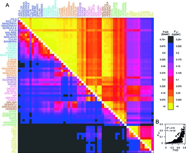
Haplotypes capture more population structure than independent loci.
(A) For each population pair, we estimated pairwise (upper right triangle) using 328,000 independent SNPs, and (lower left triangle) using population averaged copying vectors from CHROMOPAINTER. measures the difference between two copying vectors. (B) Comparison of pairwise and shows that they are not linearly related: some population pairs have low and high . (Source data is detailed in Figure 2—source data 2 to Figure 2—source data 1).
-
Figure 2—source data 1
Pairwise for Eurasian populations.
has been multiplied by 1000.
- https://doi.org/10.7554/eLife.15266.009
-
Figure 2—source data 2
Pairwise for Eurasian populations.
We used smartpca to compute for each pair of populations, upper right diagonal, together with standard errors computed using a block jacknife. has been multiplied by 1000.
- https://doi.org/10.7554/eLife.15266.010
-
Figure 2—source data 3
Pairwise for African populations.
We used smartpca to compute for each pair of populations, upper right diagonal, together with standard errors computed using a block jacknife. has been multiplied by 1000.
- https://doi.org/10.7554/eLife.15266.011
-
Figure 2—source data 4
Pairwise for African populations.
has been multiplied by 1000.
- https://doi.org/10.7554/eLife.15266.012
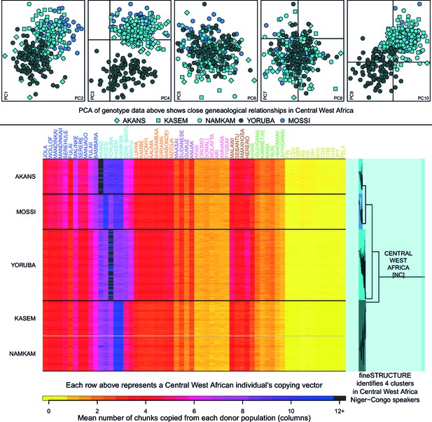
Haplotypic analysis of populations from the Central West Africa ancestry region accesses fine-scale population differentiation.
Here we show a comparison of principal components analysis (PCA), which uses genotype data, with fineSTRUCTURE, which uses haplotypic information in the form of painted chromosomes. The five plots in the top panel show the results of the main PCA based on genotype data. Symbols represent individuals and are detailed in the legend. PC3 differentiates the Yoruba from other groups in the region, but individuals from Central West Africa overlap at the remaining PCs, suggesting close genealogical relationships between individuals. The lower panel shows the results of the chromosome painting analysis, which we used with fineSTRUCTURE, where all individuals were allowed to copy from all other individuals. The rows of the heatmap represent un-normalised, individual copying vectors, with the mean number of chunks copied from each donor region as columns. Subtle differences in the copying of individuals from each of the five Central West African groups can be seen, which fineSTRUCTURE uses to cluster individuals into four clusters. We show a close-up of the fineSTRUCTURE tree from Figure 1 on the right of the bottom panel. Each group separates into its own cluster, with the exception of two of the groups from Ghana, the Kasem and Namkam, which are put in the same fineSTRUCTURE cluster.
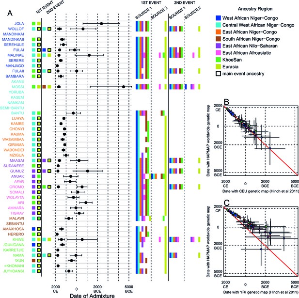
Inference of admixture in sub-Saharan Africa using MALDER.
We used MALDER to identify the evidence for multiple waves of admixture in each population. (A) For each population, we show the ancestry region identity of the two populations involved in generating the MALDER curves with the greatest amplitudes (coloured blocks) for at most two events. The major contributing sources are highlighted with a black box. Populations are ordered by ancestry of the admixture sources and dates estimates which are shown 1.96 s.e. For each event we compared the MALDER curves with the greatest amplitude to other curves involving populations from different ancestry regions. In the central panel, for each source, we highlight the ancestry regions providing curves that are not significantly different from the best curves. In the Jola, for example, this analysis shows that, although the curve with the greatest amplitude is given by Khoesan (green) and Eurasian (dark yellow) populations, curves containing populations from any other African group (apart from Afroasiatic) in place of a Khoesan population are not significantly smaller than this best curve (SOURCE 1). Conversely, when comparing curves where a Eurasian population is substituted with a population from another group, all curve amplitudes are significantly smaller (). (B) Comparison of dates of admixture 1.96 s.e. for MALDER dates inferred using the HAPMAP recombination map and a recombination map inferred from European (CEU) individuals from Hinch et al. (2011). We only show comparisons for dates where the same number of events were inferred using both methods. Point symbols refer to populations and are as in Figure 1. (C) as (B) but comparison uses an African (YRI) map. Source data can be found in Figure 3—source data 1.
-
Figure 3—source data 1
The evidence for multiple waves of admixture in African populations using MALDER and the HAPMAP recombination map.
For each event in each ethnic group we show the largest inferred amplitude and date of an admixture event involving two reference populations (Pop1 and Pop2). We additionally provide the ancestry region identity of the two main reference populations, together with scores for curve comparisons between this best curve and those containing populations from different ancestry regions. We use a cut-off of 2 to decide whether sources from multiple ancestries best describe the admixture source.
- https://doi.org/10.7554/eLife.15266.015
-
Figure 3—source data 2
The evidence for multiple waves of admixture in African populations using MALDER and the African recombination map.
Columns as in Figure 3—source data 1.
- https://doi.org/10.7554/eLife.15266.016
-
Figure 3—source data 3
The evidence for multiple waves of admixture in African populations using MALDER and the European recombination map.
Columns as in Figure 3—source data 1.
- https://doi.org/10.7554/eLife.15266.017
-
Figure 3—source data 4
The evidence for multiple waves of admixture in African populations using MALDER and the HAPMAP recombination map and a mindis of 0.5cM.
Columns are as in Figure 3—source data 1. Here we show the results for the MALDER analysis where we over-ride any short-range LD and define a minimum distance of 0.5cM from which to start computing admixture LD curves
- https://doi.org/10.7554/eLife.15266.018
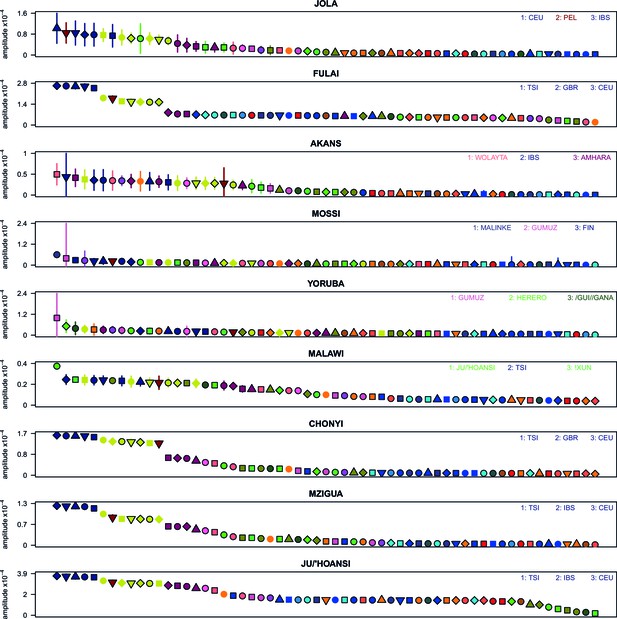
Weighted LD amplitudes for a selection of 9 ethnic groups.
For a given test population we show the amplitude ( 1 s.e.) computed using a test population and every other population as the second reference. Plotted are the fitted amplitudes for each set of curves with the population used labelled beneath, with populations ordered by amplitude. A large number of population showed a similar profile to (A), that is, with Eurasian populations showing the highest amplitudes. Other populations, e.g. Malawi, obtained the largest amplitudes from an African population.
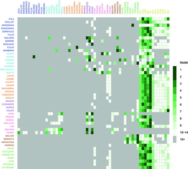
Comparison of weighted LD amplitude scores across all African ethnic groups.
For a given test population we computed the ALDER amplitude (y-axis intercept) using the test population and every other population as the second reference. We then ranked the amplitudes across a given test population: populations who gave the top-ranked (i.e. largest) amplitude are in green, with those beneath a rank 15 shown in grey. This analysis shows that for many populations the reference populations giving the largest amplitudes (i.e. have the highest rank) are often non-African groups.
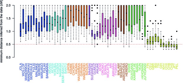
Comparison of the minimum distance to begin computing admixture LD.
For each of the 48 African populations as a target, we used ALDER to compute the minimum distance over which short-range LD is shared with each of the 47 other African and 12 Eurasian reference populations. Here we show boxplots showing the distribution of minimum inferred genetic distances (y-axis) over which LD is shared for each of the reference populations separately (x-axis). We performed two analyses using weighted LD, one using these values of the minimum distance inferred from the data, and another where this distance was forced to be 0.5cM (dotted red line). Across all African populations we observe LD correlations with other African populations at genetic distances 0.5cM, with median values ranging between 0.7cM when GUMUZ is used as a reference to 1.4cM when FULAII is used as a reference. In fact, when we further explore the range of these values across each region separately (Figure 3—figure supplement 3), we note that, as expected, these distances are greater between more closely related groups.
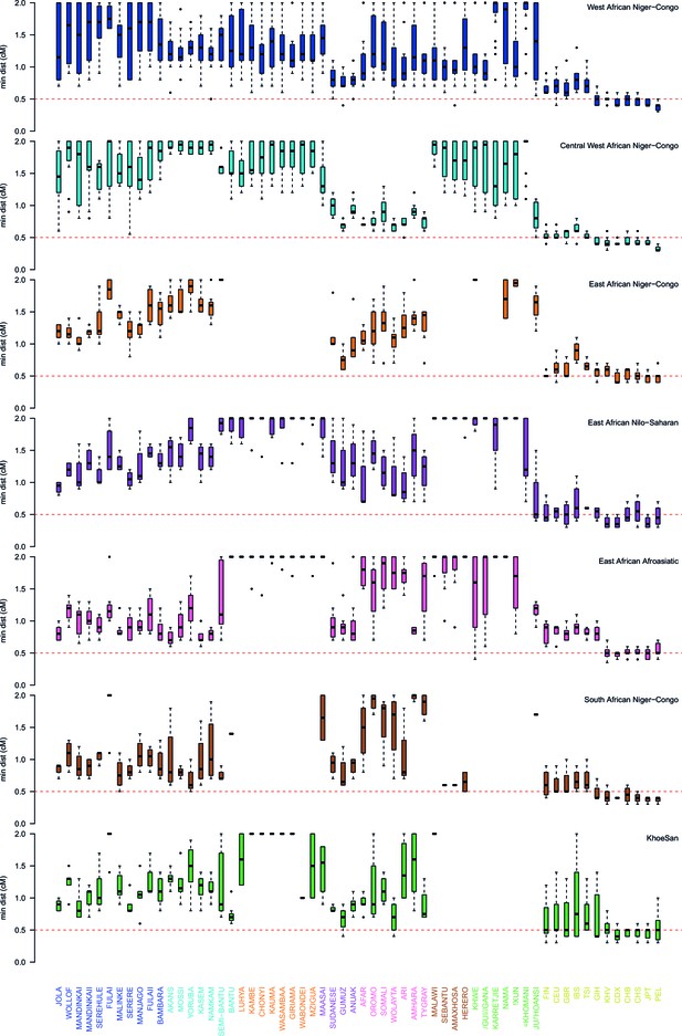
Comparison of the minimum distance to begin computing admixture LD split by region.
As in Figure 3—figure supplement 3 except distances are stratified by region. The median minimum distance that all sub-Saharan African populations have correlated LD is always greater than 0.5cM. Taken together with the results described in Figure 3—figure supplement 4, this suggests that all African populations share some LD over short genetic distances, that may be the result of shared demography or admixture. (Note that ALDER computes LD correlations at distances 2cM.)
Results of MALDER for all populations using a European specific recombination map.
We used MALDER to identify the evidence for multiple waves of admixture in each population. (A) For each population, we show the ancestry region identity of the two populations involved in generating the MALDER curves with the greatest amplitudes (which are the closest to the true admixing sources amongst the reference populations) for at most two events. The sources generating the greatest amplitude are highlighted with a black box. Populations are ordered by ancestry of the admixture sources and dates estimates which are shown 1 s.e. (B) Comparison of dates of admixture 1 s.e. for MALDER dates inferred using the HAPMAP recombination map and a recombination map inferred from European (CEU) individuals from Hinch et al. (2011). We only show comparisons for dates where the same number of events were inferred using both methods. Point symbols refer to populations and are as in Figure 1. (C) as (B) but comparing with an African (YRI) map.
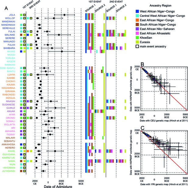
Results of the MALDER analysis computing weighted admixture decay curves from 0.5cM.
As in the main analyses, the algorithm was run independently three times with the HAPMAP, YRI, and CEU genetic maps. The main results shown here are from the HAPMAP analysis. For each population, we show the ancestry region identity of the two populations involved in generating the MALDER curves with the greatest amplitudes (which are the closest to the true admixing sources amongst the reference populations) for at most two events. The sources generating the greatest amplitude are highlighted with a black box. Populations are ordered by ancestry of the admixture sources and dates estimates which are shown 1 s.e. (B) Comparison of dates of admixture 1 s.e. for MALDER dates inferred using the HAPMAP recombination map and a recombination map inferred from European (CEU) individuals from (Hinch et al., 2011). We only show comparisons for dates where the same number of events were inferred using both methods. Point symbols refer to populations and are as in Figure 1. (C) as (B) but comparing with an African (YRI) map.
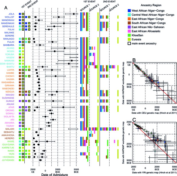
Results of MALDER for all populations using an African specific recombination map.
We used MALDER to identify the evidence for multiple waves of admixture in each population. (A) For each population, we show the ancestry region identity of the two populations involved in generating the MALDER curves with the greatest amplitudes (which are the closest to the true admixing sources amongst the reference populations) for at most two events. The sources generating the greatest amplitude are highlighted with a black box. Populations are ordered by ancestry of the admixture sources and dates estimates which are shown 1 s.e. (B) Comparison of dates of admixture 1 s.e. for MALDER dates inferred using the HAPMAP recombination map and a recombination map inferred from European (CEU) individuals from Hinch et al. (2011). We only show comparisons for dates where the same number of events were inferred using both methods. Point symbols refer to populations and are as in Figure 1. (C) as (B) but comparing with an African (YRI) map.
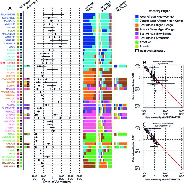
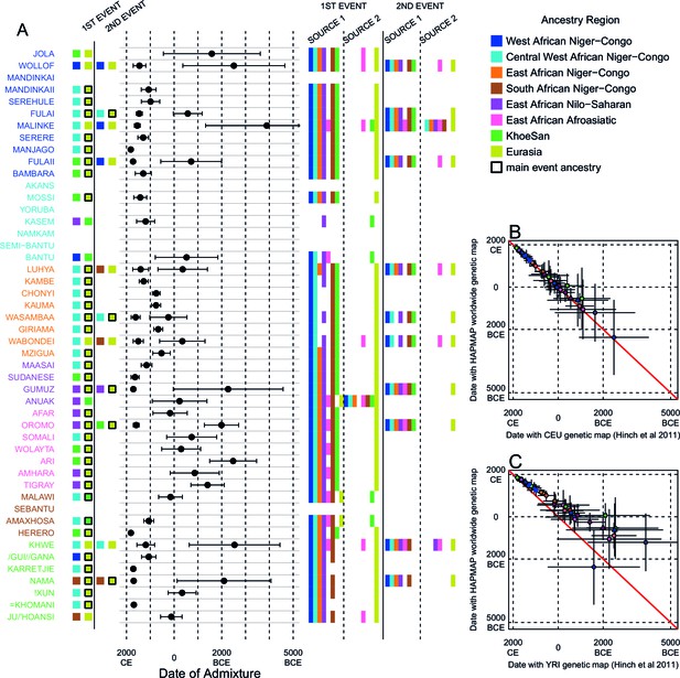
Inference of admixture in sub-Saharan African using GLOBETROTTER.
(A) For each group we show the ancestry region identity of the best matching source for the first and, if applicable, second events. Events involving sources that most closely match FULAI and SEMI-BANTU are highlighted by golden and red colours, respectively. Second events can be either multiway, in which case there is a single date estimate, or two-date in which case 2ND EVENT refers to the earlier event. The point estimate of the admixture date is shown as a black point, with 95% CI shown with lines. MIXTURE MODEL: We infer the ancestry composition of each African group by fitting its copying vector as a mixture of all other population copying vectors. The coefficients of this regression sum to 1 and are coloured by ancestry region. 1ST EVENT SOURCES and 2ND EVENT SOURCES show the ancestry breakdown of the admixture sources inferred by GLOBETROTTER, coloured by ancestry region as in the key top right. (B) and (C) Comparisons of dates inferred by MALDER and GLOBETROTTER. Because the two methods sometimes inferred different numbers of events, in (B) we show the comparison based on the inferred number of events in the MALDER analysis, and in (C) for the number of events inferred by GLOBETROTTER. Point symbols refer to populations and are as in Figure 1 and source data can be found in Figure 4—source data 1.
-
Figure 4—source data 1
Results of the main GLOBETROTTER analysis.
refers to whether the main or masked analysis was used to produce the final result. Admixture -values are based on 100 bootstrap replicates of the NULL procedure. Our resulting inference, can be: 1D (two admixing sources at a single date); 1MW (multiple admixing sources at a single date); 2D (admixture at multiple dates); NA (no-admixture); U (uncertain). max() refers to the goodness-of-fit for a single date of admixture, taking the maximum value across all inferred coancestry curves. is the fit of a single admixture event (i.e. the first principal component, reflecting admixture involving two sources) and is the fit of the first two principal components capturing the admixture event(s) (the second component might be thought of as capturing a second, less strongly-signalled event. is the additional explained by adding a second date versus assuming only a single date of admixture; we use values above 0.35 to infer multiple dates (although see Supplementary Text for details). As well as the final result, for each event we show the inferred dates, s and best matching sources for 1D, 1MW, and 2D inferences. Inferred dates are in years(+ 95% CI; B=BCE, otherwise CE); the proportion of admixture from the minority source (source 1) is represented by . Date confidence intervals are based on 100 bootstrap replicates of the date inference
- https://doi.org/10.7554/eLife.15266.027
-
Figure 4—source data 2
Results of the main GLOBETROTTER analysis.
refers to whether the main or masked analysis was used to produce the final result. Admixture -values are based on 100 bootstrap replicates of the NULL procedure. Our resulting inference, can be: 1D (two admixing sources at a single date); 1MW (multiple admixing sources at a single date); 2D (admixture at multiple dates); NA (no-admixture); U (uncertain). max() refers to the goodness-of-fit for a single date of admixture, taking the maximum value across all inferred coancestry curves. is the fit of a single admixture event (i.e. the first principal component, reflecting admixture involving two sources) and is the fit of the first two principal components capturing the admixture event(s) (the second component might be thought of as capturing a second, less strongly-signalled event. is the additional explained by adding a second date versus assuming only a single date of admixture; we use values above 0.35 to infer multiple dates (although see Supplementary Text for details). As well as the final result, for each event we show the inferred dates, s and best matching sources for 1D, 1MW, and 2D inferences. Inferred dates are in years(+ 95% CI; B=BCE, otherwise CE); the proportion of admixture from the minority source (source 1) is represented by . Date confidence intervals are based on 100 bootstrap replicates of the date inference
- https://doi.org/10.7554/eLife.15266.028
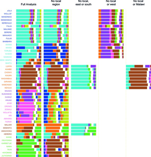
Admixture source inference by GLOBETROTTER after sequentially removing local surrogates from the analysis.
In addition to the Full analysis, we show the inferred composition of admixture sources for different, restricted surrogate analyses. Components and y-axis labels are coloured by ancestry region. In each case we show admixture sources inferred by GLOBETROTTER for a single date of admixture.
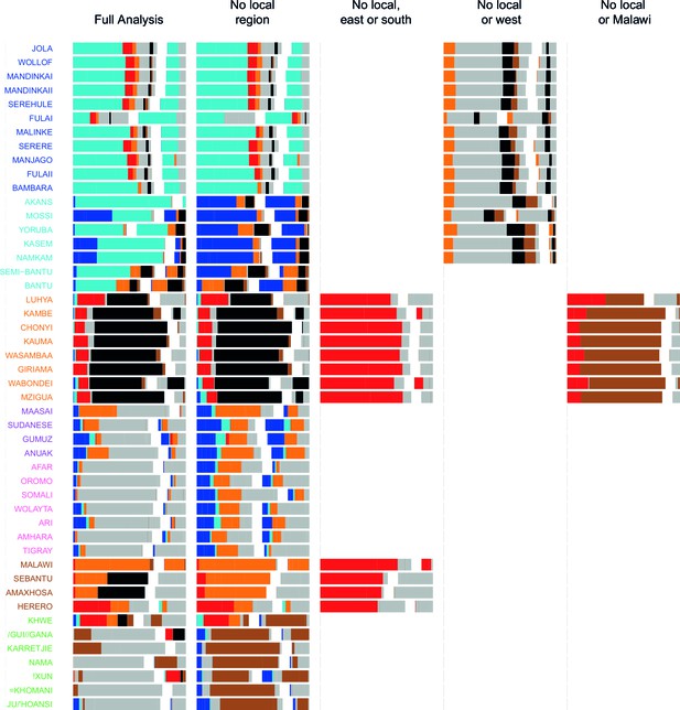
Admixture source inference by GLOBETROTTER after sequentially removing local surrogates from the analysis.
The results are the same as Figure 4—figure supplement 1, but only Niger-Congo speaking groups are coloured. We highlight Malawi components in black, and Cameroon (Bantu and Semi-Bantu) in red.
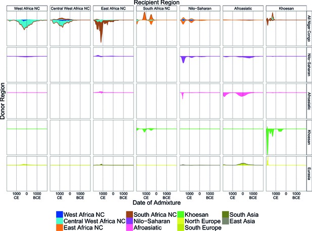
A timeline of recent admixture in sub-Saharan Africa.
For all events involving recipient groups from each ancestry region (columns) we combine all date bootstrap estimates generated by GLOBETROTTER and show the densities of these dates separately for the minor (above line) and major (below line) sources of admixture. Dates are additionally stratified by the ancestry region of the surrogate populations (rows), with all dates involving Niger Congo speaking regions combined together (All Niger Congo). Within each panel, the densities are coloured by the ancestry region origin of the surrogates, and in proportion to the components of admixture involved in the admixture event. The integrals of the densities are proportional to the admixture proportions of the events contributing to them.
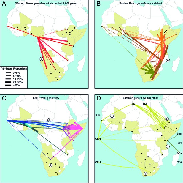
The geography of recent gene-flow in Africa.
We summarise gene-flow events in Africa using the results of the GLOBETROTTER analysis. For each ethnic group, we inferred the composition of the admixture sources, and link recipient population to surrogates using arrows, the width of which is proportional to the amount it contributes to the admixture event. We separately plot (A) all events involving admixture source components from the Bantu and Semi-Bantu ethnic groups in Cameroon; (B) all events involving admixture sources from East and Southern African Niger-Congo speaking groups; (C) events involving admixture sources from West African Niger-Congo and East African Nilo-Saharan / Afroasiatic groups; (D) all events involving components from Eurasia. in (D) arrows are linked to the labelled 1KGP Eurasian groups. Arrows are coloured by country of origin, as in Figure 1—figure supplement 1. Numbers 1–8 in circles represent the events highlighted in section A haplotype-based model of gene-flow in sub-Saharan Africa. An alternative version of this plot, stratified by date, is shown in Figure 6—figure supplement 1.
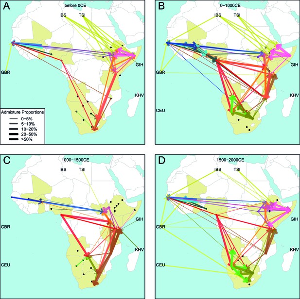
Gene-flow in Africa over the last 2000 years.
Using the results of the GLOBETROTTER analysis we show the connections between different groups in sub-Saharan Africa over time. For each population, we inferred the date of admixture and the composition of the admixing sources. We link each recipient population to its donor components using arrows, the size of which is proportional to the amount it contributes to the admixture event. Arrows are coloured by country of origin, as in Figure 4 in the main text.
Additional files
-
Supplementary file 1
A note on ethnolinguistic groupings.
- https://doi.org/10.7554/eLife.15266.034
-
Supplementary file 2
and ALDER analysis.
- https://doi.org/10.7554/eLife.15266.035
-
Supplementary file 3
Summary of inferred gene-flow from West to East and South Africa.
- https://doi.org/10.7554/eLife.15266.036


