Systematic morphological profiling of human gene and allele function via Cell Painting
- Broad Institute of MIT and Harvard, United States
- Boston University School of Medicine, United States
Figures
Figure 1

Morphological profiling by Cell Painting.
(A) Example Cell Painting images from each of the five channels for a negative control sample (no gene introduced). (B) From left to right: Cell and nucleus outlines found by segmentation in CellProfiler; raw profiles (2769 dimensional) containing median and median absolute deviation of each of 1384 measurements over all the cells in a sample, plus cell count; processed profiles which are made less redundant by feature selection and Principal Component Analysis; dendrogram constructed based on the processed profiles (see Figure 3). Replicates are merged to produce a profile for each gene which is then compared against others in the experiment to look for similarities and differences.
Figure 2 with 2 supplements

Morphological profiles are sensitive and reproducible, and show expected relationships.
(A) 50% of the gene overexpression constructs produced a detectable phenotype by image-based profiling.Constructs yielding a reproducible phenotype ought to have a median correlation among replicates that is higher than the 95th percentile of correlations seen for pairs of different constructs; this is true for 51% (112 out of 220) of the constructs (as shown). Additionally, we removed two constructs that passed that filter but whose profiles were highly similar to negative control profiles (not shown), leaving 110 constructs (50%) for further analysis. (B) Of wild-type ORF pairs that both yielded a distinguishable phenotype, 96% showed significant correlation to each other. Correlations between the 23 pairs of constructs that are clones of the same gene (although with potential sequence variation or possibly different isoforms) were almost always much higher than correlations between pairs of constructs related to different genes. The threshold, shown as the dashed line, is set to 95th percentile of profile correlation for pairs of different genes. Profile correlation of these 23 pairs lie above the threshold. (C) Genes in pathways thought to regulate morphology were more likely to yield detectable phenotypes vs. the remainder of genes in the experiment. The same cutoff as in (A) is used to identify percentage of genes with a detectable phenotype. This percentage is 87% for the genes hypothesized to change morphology, while it is 48% for the other genes.
Figure 2—figure supplement 1
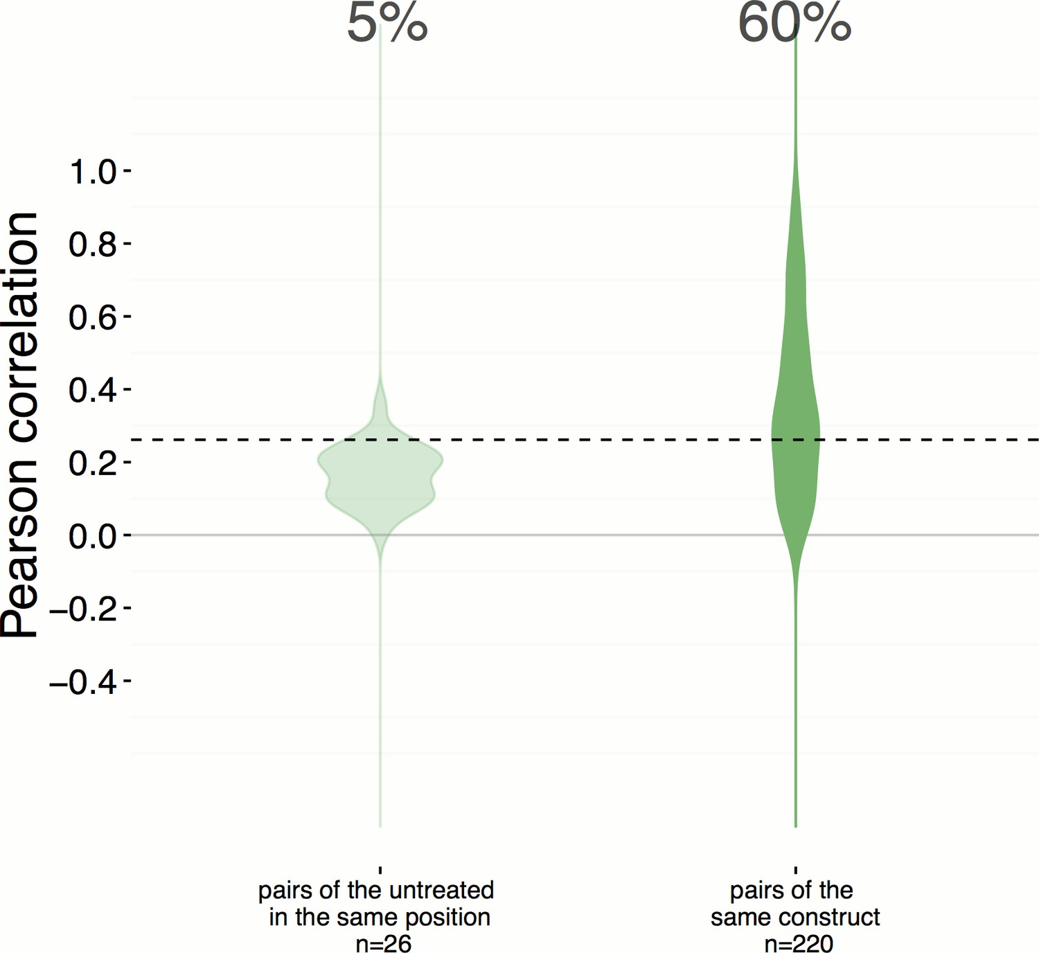
Position artifacts do not contribute to the hit rate seen in the experiment.
We were concerned that position artifacts may result in overestimating the replicate correlations because replicates of the same treatment are assigned to the same well location across different plates in the experiment (that is, it was infeasible to scramble well locations). We ruled out this possibility by taking an alternative pessimistic null distribution which takes well position into account. In contrast to Figure 2A, which shows a 51% hit rate, a more pessimistic alternative null distribution is shown here (left), calculated based on the replicate correlation of pairs of negative controls in the same position only. We consider this less reliable because the number of such pairs is small (26) and we excluded edge wells; nevertheless the hit rate increases slightly, to 60%.
Figure 2—figure supplement 2
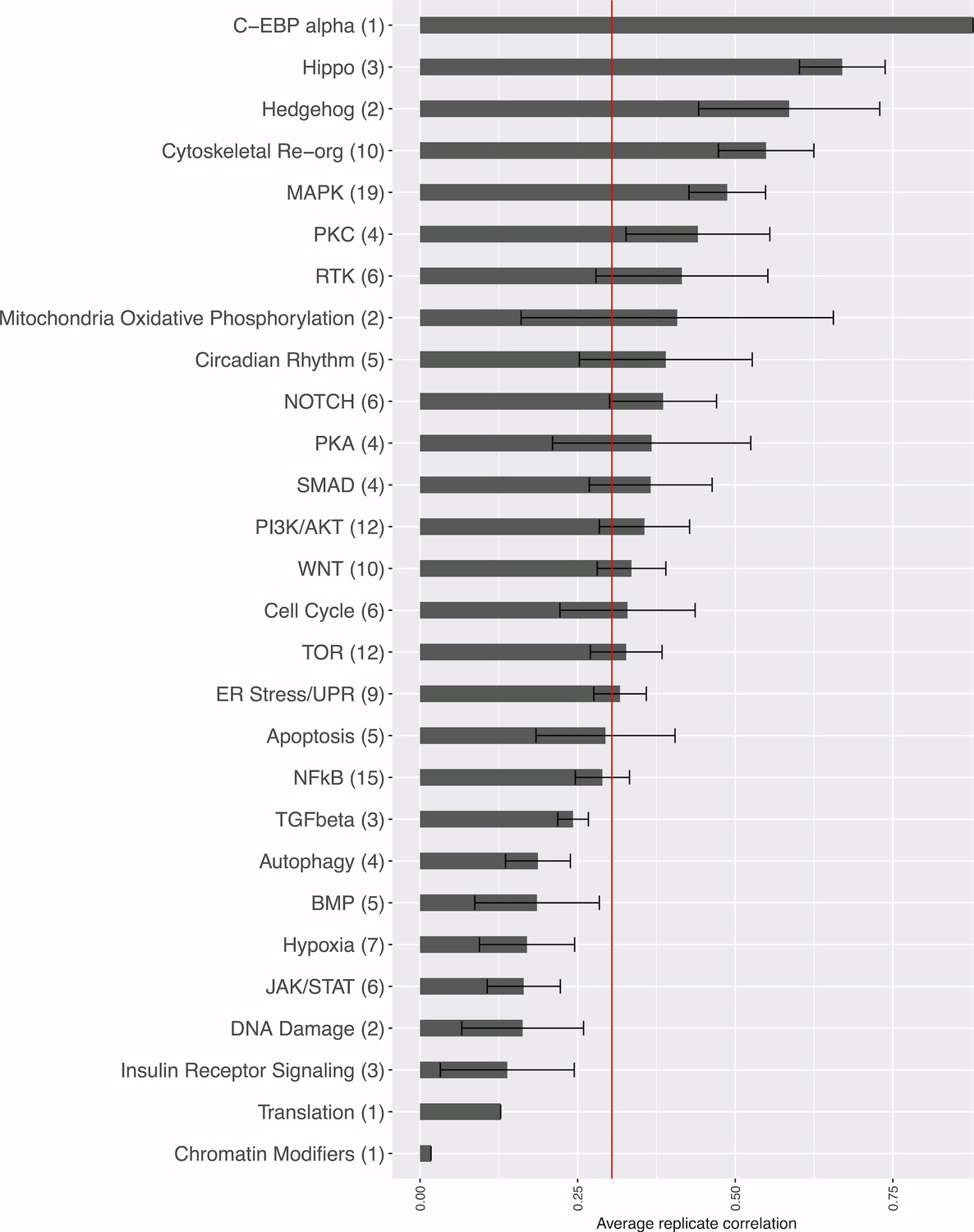
Strength of morphological phenotypes, according to annotated pathway.
Morphological phenotype strength is calculated as the average replicate correlation for genes that experts manually annotated genes as belonging to each pathway. The number of genes tested in each category is shown in parentheses after the pathway name (two wild-type clones of the same gene are only counted once, but a mutant allele is counted separately). The red line shows the threshold beyond which an individual gene’s profile would be considered to yield a distinguishable phenotype. Error bars indicate the deviation in the replicate correlation among the genes associated with the pathway.
Figure 3 with 3 supplements

Morphological relationships among overexpressed genes/alleles, determined by Cell Painting.
Correlations between pairs of genes/alleles were calculated and displayed in a correlation matrix (bottom left inset, full resolution is available as Figure 3—figure supplement 1). Only the 110 genes/alleles with a detectable morphological phenotype were included. The rows and columns are ordered based on a hierarchical clustering algorithm such that each blue submatrix on the diagonal shows a cluster of genes resulting in similar phenotypes. The correlations were then used to create a dendrogram (main panel) where the radius of the subtree containing a cluster shows the strength of correlation. The 25 clusters containing at least two constructs are printed on the dendrogram in arbitrary colored fonts, while gene names colored gray and marked by asterisks are those that do not correlate as strongly with their nearest neighbors (i.e., they are singletons or fall below the threshold used to cut the dendrogram for clustering). Each colored arc corresponds to a cell subpopulation as noted in the legend. Line thickness indicates the strength of enrichment of the subpopulation in the cluster samples compared to the negative control. Solid vs. dashed lines indicate the over- vs. under-representation of the corresponding subpopulation in a cluster, respectively. Note that the number next to each cluster in the dendrogram is referenced in the main text and corresponds to the numbered supplemental data file for each cluster.
Figure 3—figure supplement 1

Correlation among the 110 genes/alleles with a detectable morphological phenotype.
The rows and columns are ordered based on a hierarchical clustering algorithm such that each blue submatrix on the diagonal shows a cluster of genes resulting in similar phenotypes. The scale bar depicts Pearson correlation.
Figure 3—figure supplement 2
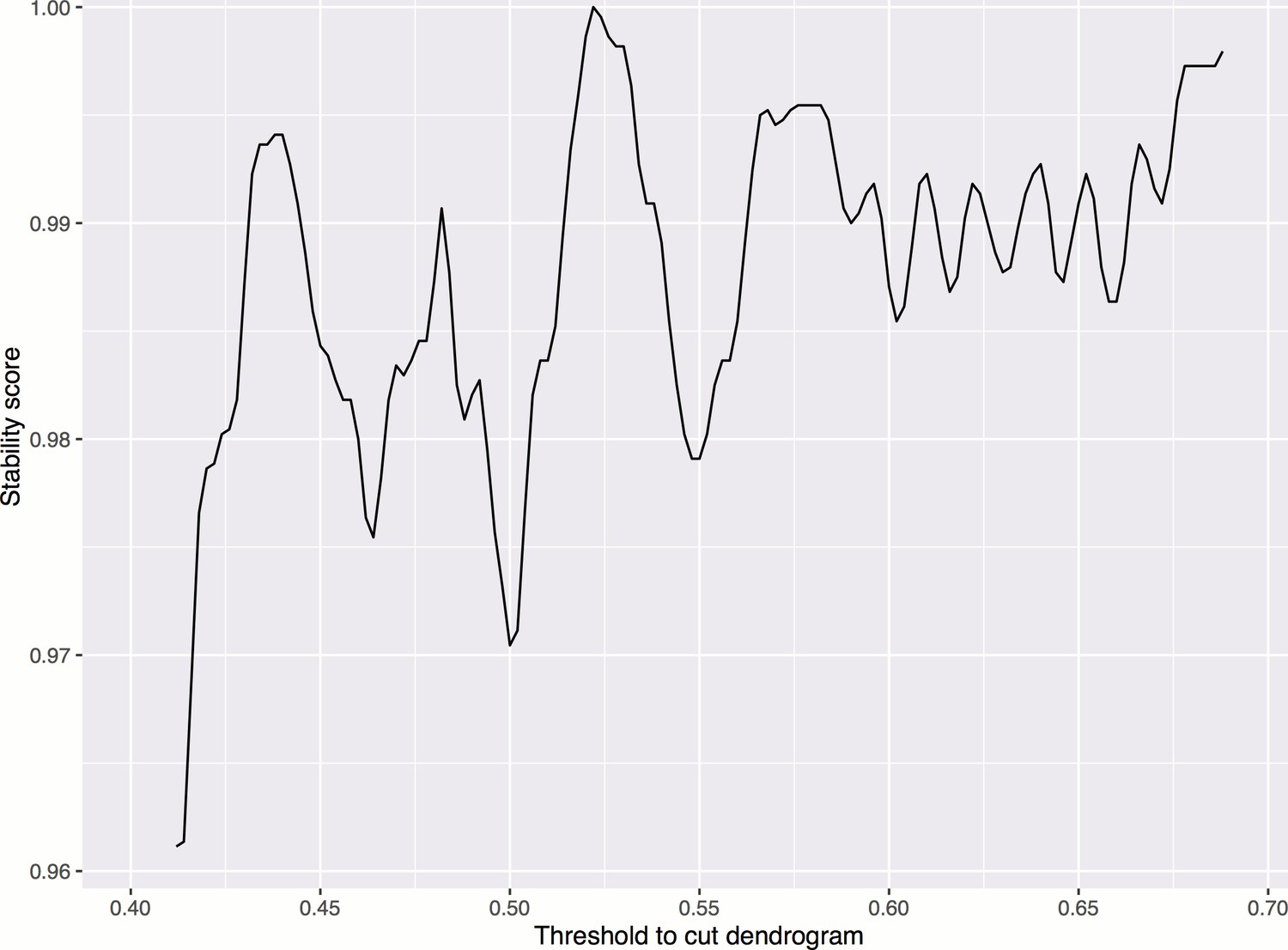
Smoothed stability score across different cutoffs, in order to choose a threshold for cutting the dendrogram to form clusters.
The maximum occurs at threshold = 0.522. Smoothing is done by taking the moving average of order 0.02. The stability score is defined as the proportion of treatments whose clusters are not affected if the cutoff is increased or decreased by a small amount ().
Figure 3—figure supplement 3
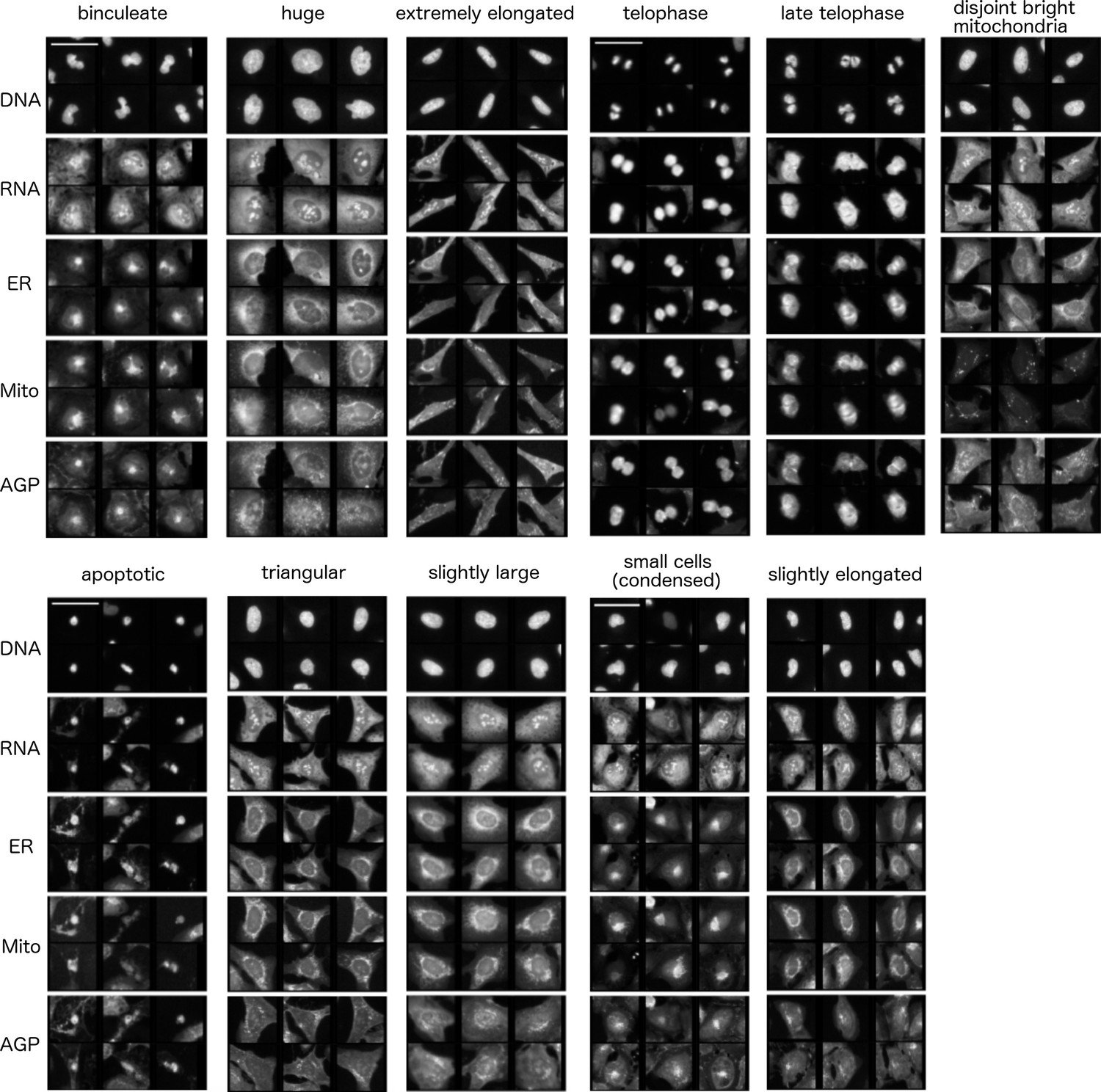
Common cell subpopulations seen across more than one cluster.
These names are used to annotate clusters of genes in Figure 3. Example images shown are taken from individual clusters. Scale bar is 63 and image intensities are log normalized. References to size and shape in the subpopulation legends refer to both the nucleus and cell borders, unless otherwise noted.
Figure 4
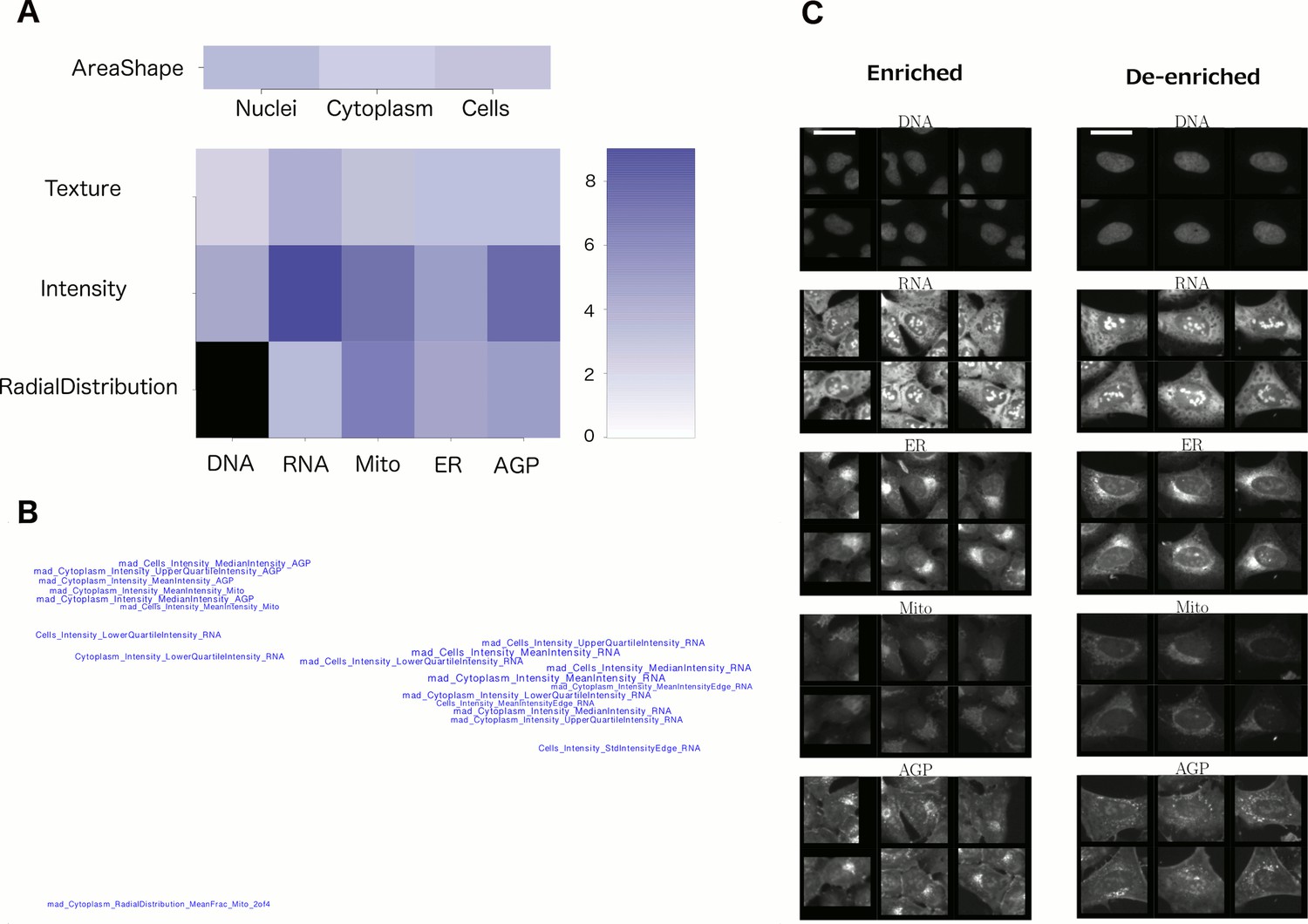
Visualizations used to interpret morphology of Cluster 19 (for other clusters, see Supplementary file 2 [PDFs 1A–25A]).
(A) Feature Grid. RNA and AGP (actin, Golgi, plasma membrane) intensity contribute most to distinguishing the genes in Cluster 19 (KRAS, RAF1, BRAF, and MOS). Dark blue colors indicate higher median z-score of the relevant measurements for genes in the cluster relative to negative controls. As ‘RadialDistribution’ features do not exist for the DNA channel, it is colored in black. (B) Feature Map. The feature names showing the greatest difference between the cluster and negative controls are shown, based on largest absolute value of z-scores (full resolution version is available in Cluster 19A PDF). They are mapped in 2D space such that features that are highly correlated with each other across all genes’ profiles are placed close together and thus can be interpreted together. Blue/red colored names indicate positive/negative sign of the z-score (i.e., blue indicates that the cluster shows higher values than controls). According to this map, the average intensity of AGP, RNA and Mito shows high variation for cells within samples in Cluster 19 (e.g., large mad_Cytoplasm_Intensity_MeanIntensity_AGP, where the prefix ‘mad’ refers to median absolute deviation, a robust form of standard deviation). (C) Sample images of a subpopulation of cells enriched and de-enriched for all genes in Cluster 19. Cells with asymmetric organelle distribution are highly over-represented for genes in the cluster, and cells with more even distribution of organelles are less abundant. Note that the exemplar cells are shown at the center of the patches. This explains the duplications observed in some patches. Scale bars are 39.36 long. Pixel intensities are multiplied by five for display.
Figure 5
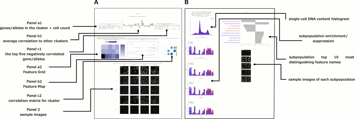
Data and visualizations supporting the morphological map for each cluster.
For all 25 clusters, there are two corresponding Supplemental PDF files. Left: Supplementary file 2 (type A PDFs, e.g., ‘1A.pdf’) provide an overview of data about the cluster. Panel a1 lists the genes/alleles in the cluster as well as expert annotations regarding related pathways and the cell count (as a z-score) for each gene/allele. Panel b1 contains the average correlation of the cluster to other clusters, indicating uniqueness of the cluster’s morphological phenotype. Panel c1 lists the top five negatively correlated gene/alleles to the cluster. Panel a2 shows the Feature Grid summarizing categories of morphological features distinguishing the cluster from the negative control. Panel b2 shows the Feature Map displaying the names of the top 20 morphological features distinguishing the cluster from the negative control, positioned based on similarity. Explanations for feature names can be found in the Methods section. Panel c2 shows a correlation matrix for just those genes/alleles in the cluster. Panel 3 contains sample images of fields of view of cells expressing each gene/allele in the cluster, along with images of the control for comparison. Right: Supplementary file 2 (type B PDFs) contain multiple plots aiming to illustrate the phenotype based on single-cell data, including cell subpopulation enrichment/suppression in the cluster. First, a histogram of single-cell DNA content is shown for all cells from all genes/allele treatments in the cluster, indicating the overall cell cycle distribution. Next, bar plots show (for the cluster overall and for each gene in the cluster) which of 20 subpopulations of cells are enriched and suppressed relative to negative controls. Finally, each subsequent page of the PDF is devoted to the subpopulations whose representation differs from negative controls in a statistically significant way, whether enriched or suppressed (subpopulations which are very small in both the cluster and negative control samples are omitted). For each subpopulation, a bar plot shows the top 10 most-distinguishing feature names (versus negative control cells). Then, sample images are shown of individual representative cells from each subpopulation.
Figure 6 with 2 supplements
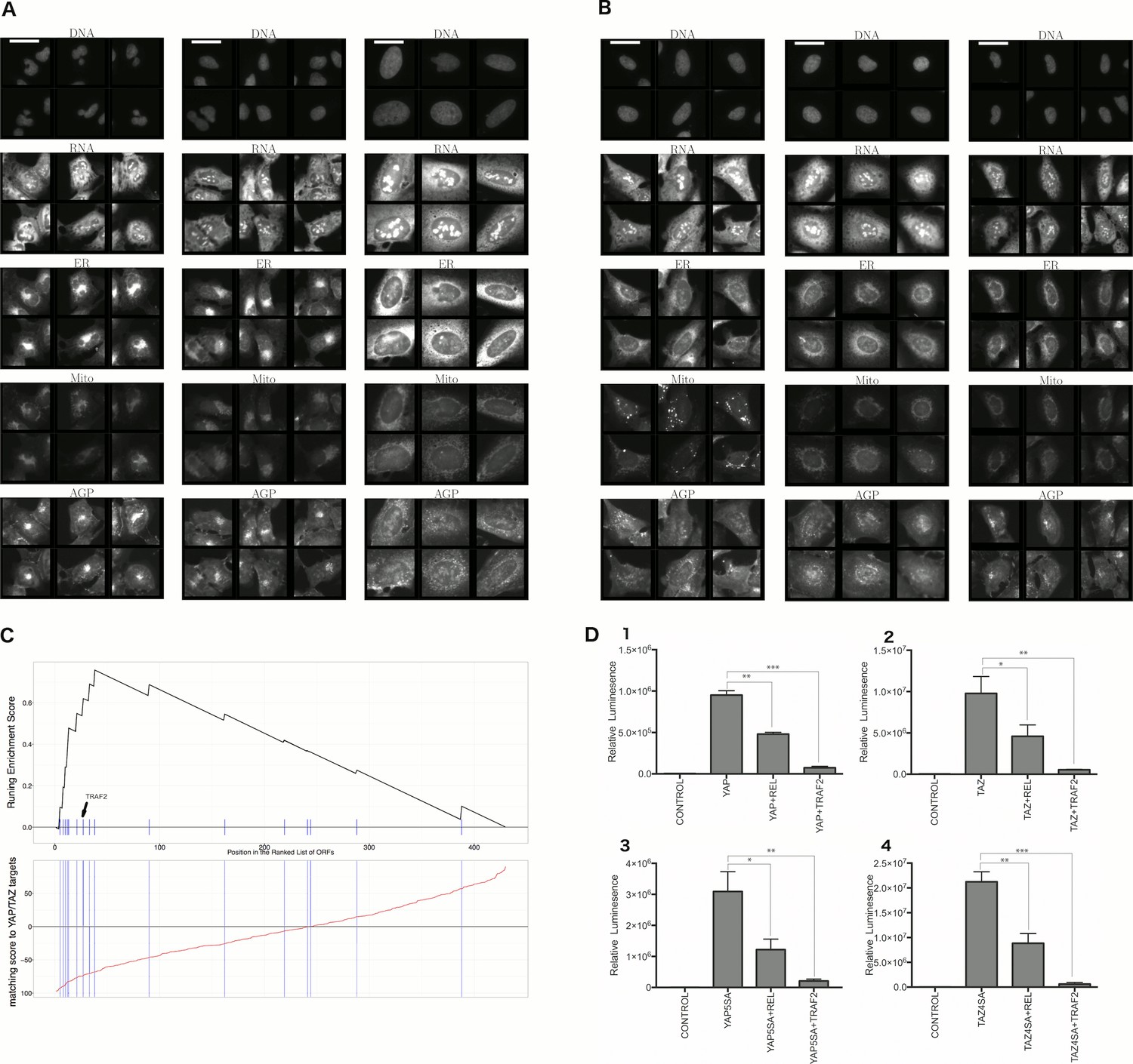
Morphological and transcriptional cross-talk between the Hippo pathway and regulators of NF-κB signaling.
(A). The TRAF2/CDC42 cluster (Cluster 11) is enriched for bi-nucleate cells, small cells with asymmetric organelles, and huge cells. Note that exemplar images shown are not labeled as to the actual gene they are associated with. Rather they are only supposed to provide a visual insight of the cell morphologies which are enriched in the gene cluster. (B) The YAP1/WWTR1 cluster (Cluster 20) is enriched for cells with bright disjoint mitochondria patterns, slightly large cells, and slightly elongated cells. Scale bars are 39.36 long. Pixel intensities are multiplied by five for display. (C) Gene Set Enrichment Analysis (GSEA) reveals that gene overexpression leading to down-regulation of YAP1 targets (CTGF, CYR61, and BIRC5) are enriched for regulators of the NF-κB pathway (Enrichment Score p-value = ). The horizontal axis gives the index of ORFs sorted based on the average amount of down-regulation of the YAP1 targets. Each blue hash mark on this axis indicates an NF-κB pathway member. The running enrichment score, which can range from −1 to 1, is plotted on the vertical axis and quantifies the accumulation of NF-κB pathways members on the sorted list of ORFs. (D) TRAF2 and REL suppress YAP and TAZ transcriptional activity. REL and TRAF2 suppress the ability of wild-type (D1) YAP and (D2) TAZ to drive the expression of a TEAD-regulated luciferase reporter. Activity of nuclear active mutants of (D3) YAP (5SA) and (D4) TAZ (4SA) are similarly suppressed. Luciferase reporter activity was measured in HEK293T cells co-transfected with expression constructs as indicated and a TEAD luciferase reporter was used to measure YAP-directed transcription. (* p-value<0.05, ** p-value=0.001, *** p-value<0.0001).
Figure 6—figure supplement 1
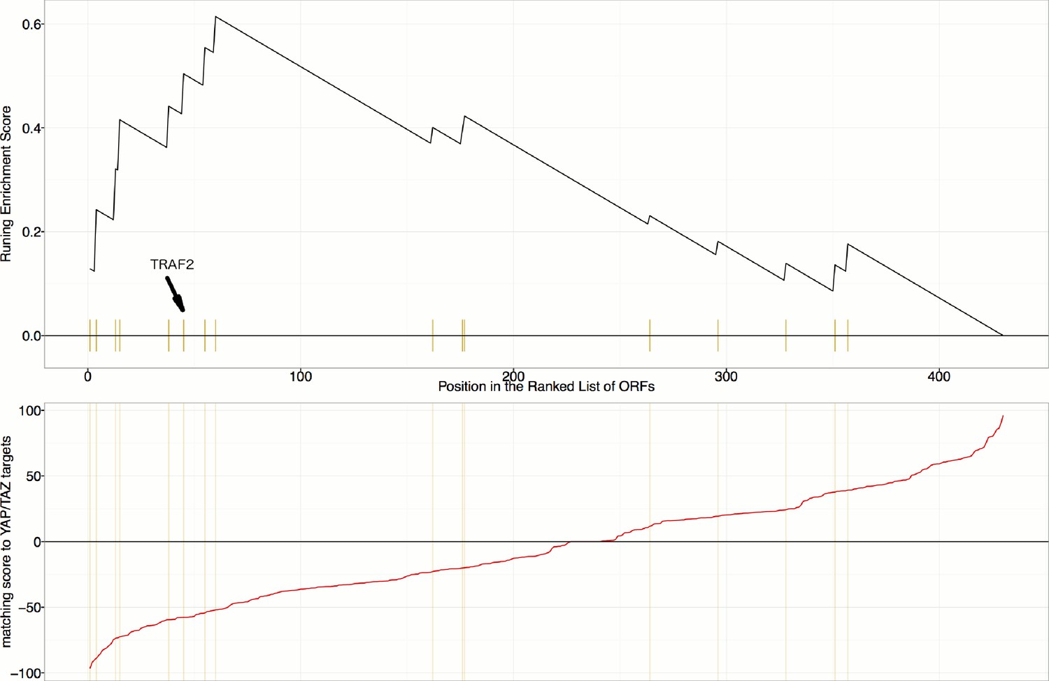
Gene Set Enrichment Analysis (GSEA) reveals that overexpression constructs sorted based on their similarity to YAP1/WWTR1 overexpression (in terms of impact on particular mRNA targets), are enriched for regulators of the NF-κB pathway (Enrichment Score p-value=0.0019).
mRNA targets common to both YAP1 and WWTR overexpression include INPP4B, MAP7, LAMA3, STMN1, and TRAM2, which are positively regulated, and SPP1, IER3, RAB31, and GPR56, which are negatively regulated.
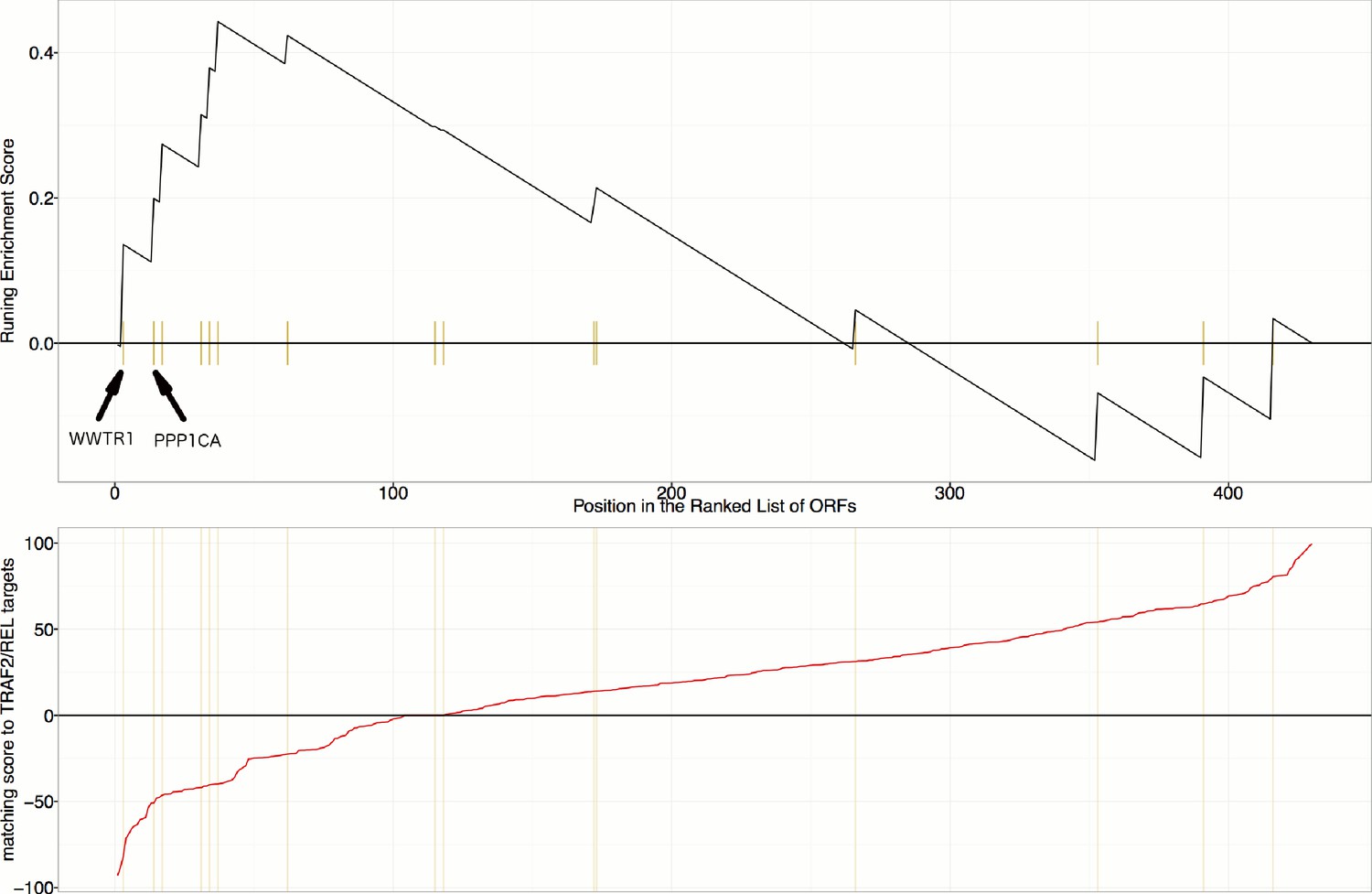
Figure 6—figure supplement 2
Gene Set Enrichment Analysis (GSEA) reveals that overexpression constructs sorted based on their similarity to TRAF2/REL overexpression (in terms of impact on particular mRNA targets), are weakly enriched for regulators of the Hippo pathway (Enrichment Score p-value=0.024).
mRNA targets common to both TRAF2 and REL overexpression include NFKBIA, IKBKE, AKAP8, and BIRC2, which are positively regulated and RPA3 which is negatively regulated. As compared to Figure 6C and Figure 6—figure supplement 1, this is a weaker/lower-confidence enrichment - note the lower maximum height (~0.44 compared to >0.6) and higher p-value (0.024 compared to <0.002). Still, we note that WWTR1 and PPP1CA are the top two matches among those annotated as related to the Hippo pathway in KEGG; PPP1CA (also known as PP-1A) activates TAZ (Liu et al., 2011).
Additional files
-
Supplementary file 1
Supporting and supplemental data for the figures and experiments.
(A) List of all the 323 constructs used in the experiment along with the target transcript and their public clone ID. (B) Replicate correlation is higher in the constitutively active mutant allele compared to the wild-type allele, except for AKT3_E17K. Constitutively active mutant annotations were obtained by literature search for all the mutants in the experiment showing a detectable phenotype. Genes shown here are only those where either the wild-type gene or its constitutively activating allele yielded a phenotype distinct from controls. (C) Pathways sorted based on proportion of their associated gene showing a detectable phenotype. (D) Highly correlated proteins (according to morphology in the Cell Painting assay) that have also been reported to interact physically. (E) Highly correlated genes (according to morphology in the Cell Painting assay) that have also been annotated to be related to the same pathway. (F) Gene Ontology terms associated with each gene cluster (Alexa and Rahnenführer, 2009). (G) Rank ordered list of distinctive features based on their z-scores for Cluster 19. (H): All genes/alleles in Cluster 8 and 10 induce cell rounding. (I) The NF-κB signaling pathway is the most enriched when searching for gene overexpressions that downregulate known YAP/TAZ targets (CYR61, CTGF, and BIRC5).
- https://doi.org/10.7554/eLife.24060.016
-
Supplementary file 2
Type A and B PDFs are collected in a ZIP file in Supplementary file 2.
The details of the contents have been described in Figure 5.
- https://doi.org/10.7554/eLife.24060.017
-
Supplementary file 3
The CellProfiler pipeline used to process the images is released as the Supplementary file 3.
- https://doi.org/10.7554/eLife.24060.018
Download links
A two-part list of links to download the article, or parts of the article, in various formats.
Downloads (link to download the article as PDF)
Open citations (links to open the citations from this article in various online reference manager services)
Cite this article (links to download the citations from this article in formats compatible with various reference manager tools)
Systematic morphological profiling of human gene and allele function via Cell Painting
eLife 6:e24060.
https://doi.org/10.7554/eLife.24060


