Rapid evolution of the human mutation spectrum
- Stanford University, United States
- Howard Hughes Medical Institute, Stanford University, United States
Figures
Figure 1 with 8 supplements
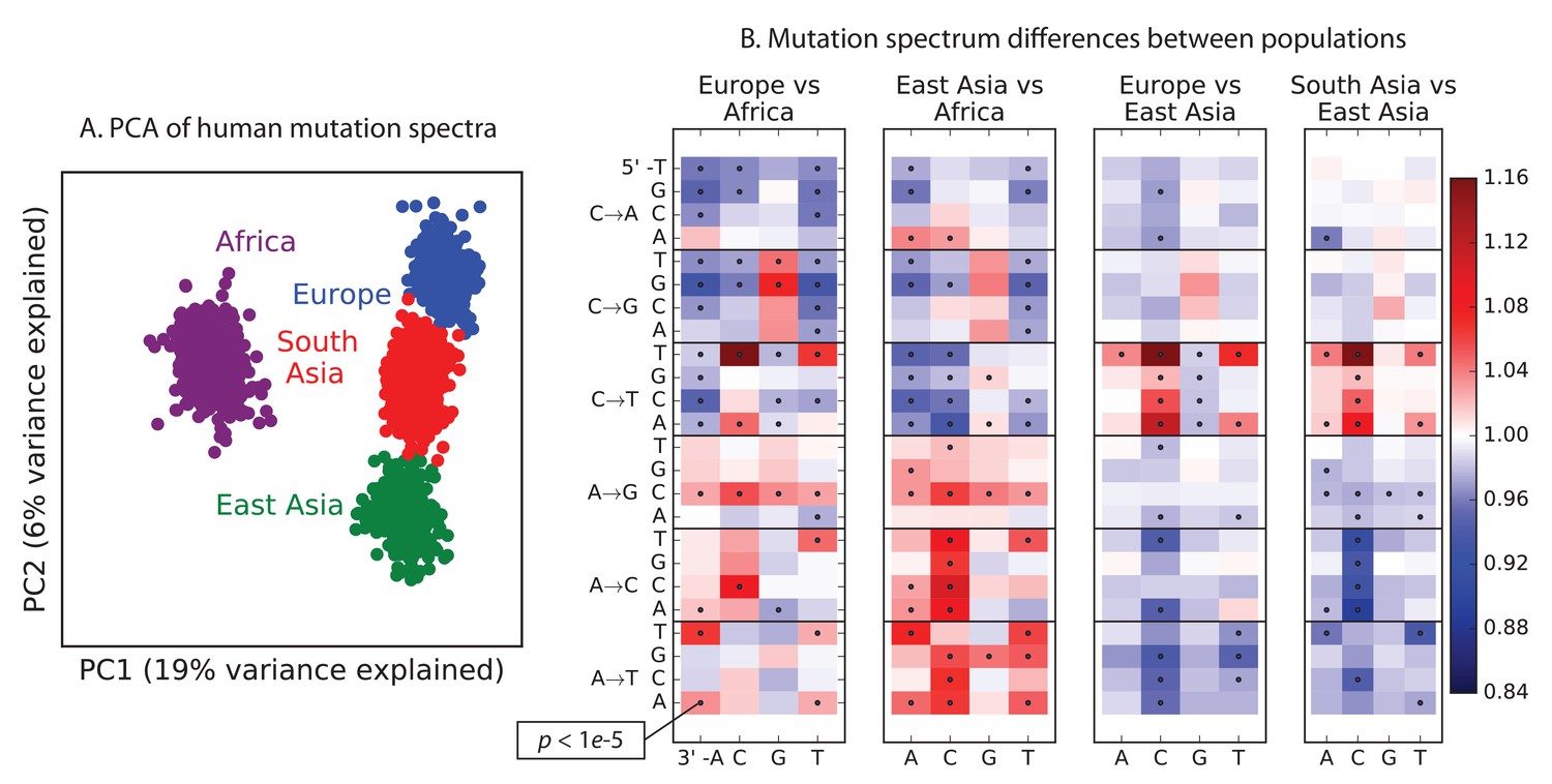
Global patterns of variation in SNV spectra.
(A) Principal component analysis of individuals according to the fraction of derived alleles that each individual carries in each of 96 mutational types. (B) Heatmaps showing, for pairs of continental groups, the ratio of the proportions of SNVs in each of the 96 mutational types. Each block corresponds to one mutation type; within blocks, rows indicate the 5’ nucleotide, and columns indicate the 3’ nucleotide. Red colors indicate a greater fraction of a given mutation type in the first-listed group relative to the second. Points indicate significant contrasts at p . See Figure 1—figure supplements 1, 2 and 3 for heatmap comparisons between additional population pairs as well as a description of PCA loadings and the p-valuesof all mutation class enrichments. Figure 1—figure supplement 4 demonstrates that these patterns are unlikely to be driven by biased gene conversion. In Figure 1—figure supplement 5, we see that this mutation spectrum structure replicates on both strands of the transcribed genome as well as the non-transcribed portion of the genome. Figure 1—figure supplements 6, 7 and 8 show that most of this structure replicates across multiple chromatin states and varies little with replication timing.
-
Figure 1—source data 1
This text file shows the number of SNPs in each of the 96 mutational categories that passed all filters in each 1000 Genomes continental group.
- https://doi.org/10.7554/eLife.24284.004
Figure 1—figure supplement 1
Pairwise mutation spectrum comparisons among continental groups.
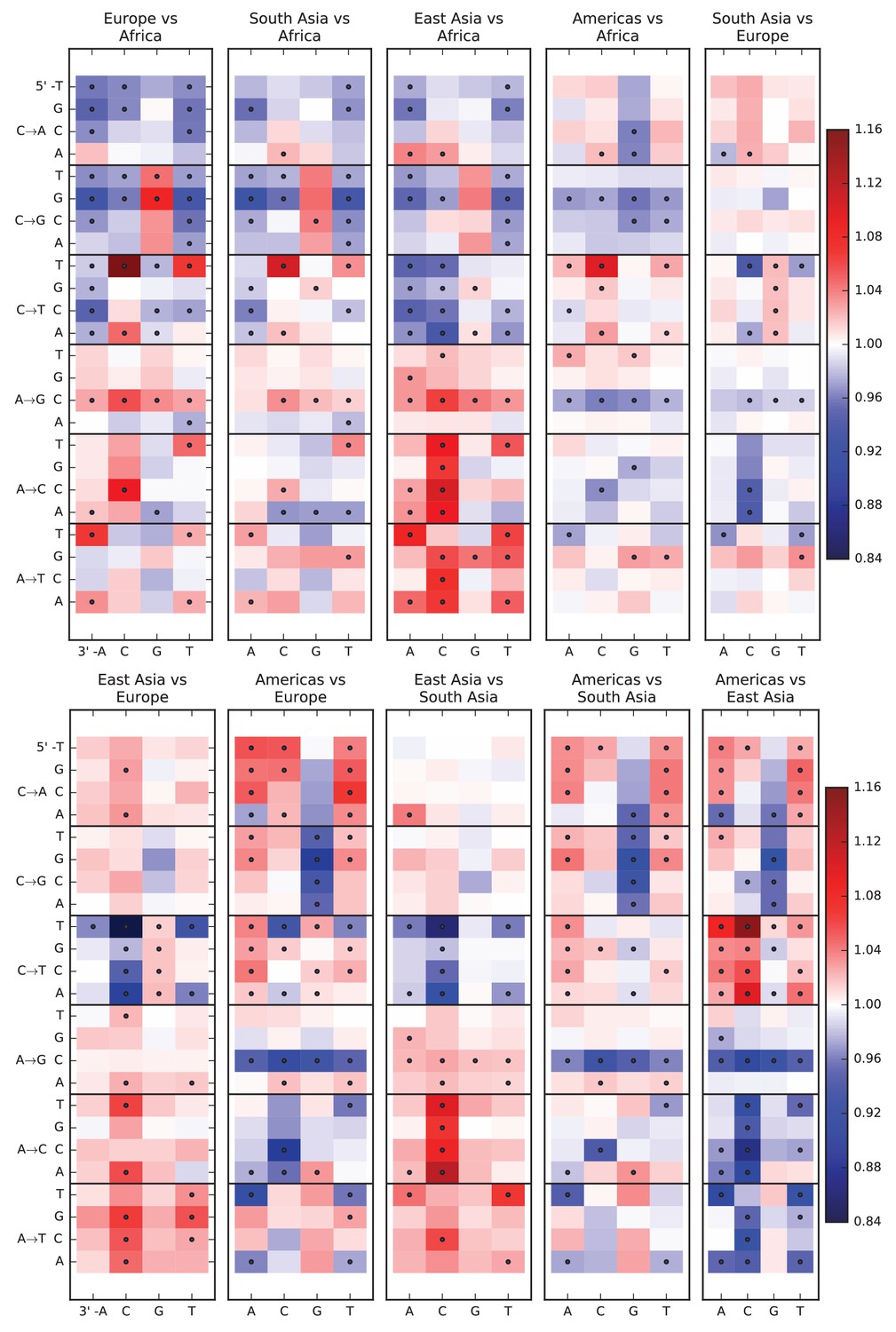
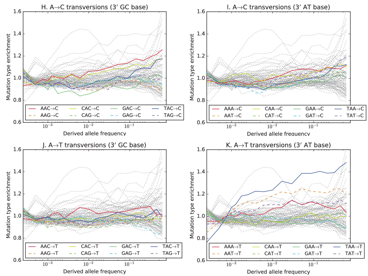
Each of these plots compares the mutation spectra of two populations and . Letting denote the fraction of SNVs in population that have a given triplet context, ancestral allele, and derived allele, the corresponding heat map square visualizes the enrichment ratio . Black dots mark mutation types for which the difference between populations has a p-value less than .
Figure 1—figure supplement 2
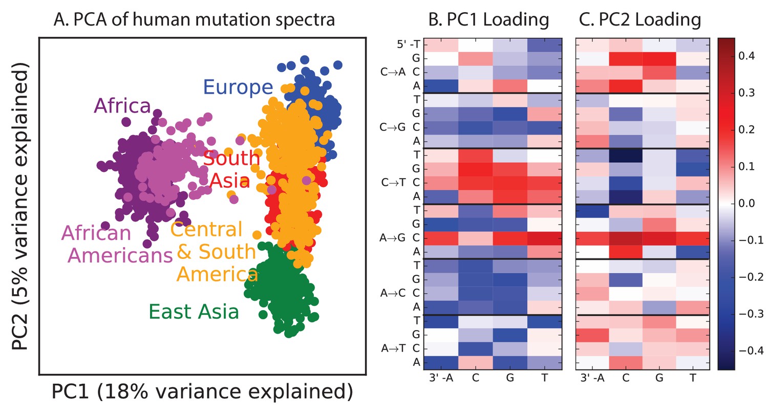
PCA of all 1000 Genomes continental groups.
All admixed North and South American individuals were omitted from Figure 1 in the main text to clarify the separation of other populations along an African vs non-African axis and an East vs West Eurasian axis. Here, admixed Americans are added in black. As expected, some African-Americans group with the Africans, while other admixed Americans fall within the variation of other East and West Eurasians. The accompanying heat maps show the mutation type loadings of the first two principal components, the second of which is heavily weighted toward the European TCCTTC signature.
Figure 1—figure supplement 3
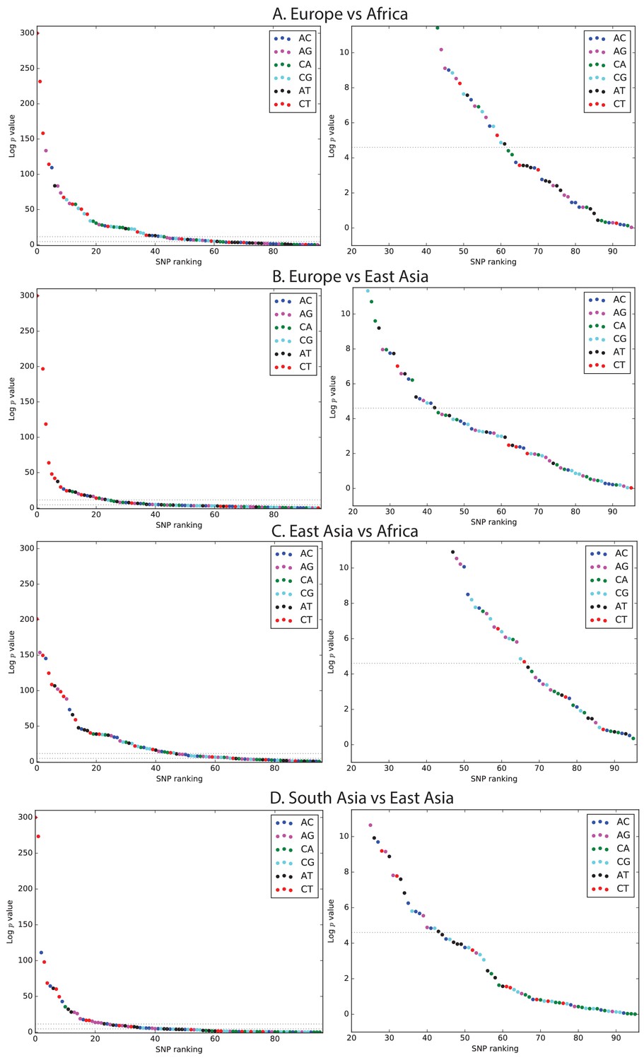
Mutation spectrum comparison p-values.
Each left-hand plot shows all chi-squared p-values corresponding to the ratios from Figure 1A. In the absence of recent mutation spectrum evolution, only one out of 96 SNP categories is expected to have a p-value below 0.01 (lower dotted line). In contrast, the majority of p values meet the more stringent threshold . The corresponding right hand panel shows a closeup of the distribution of p-values greater than .
Figure 1—figure supplement 4
The effects of biased gene conversion on mutation spectra.
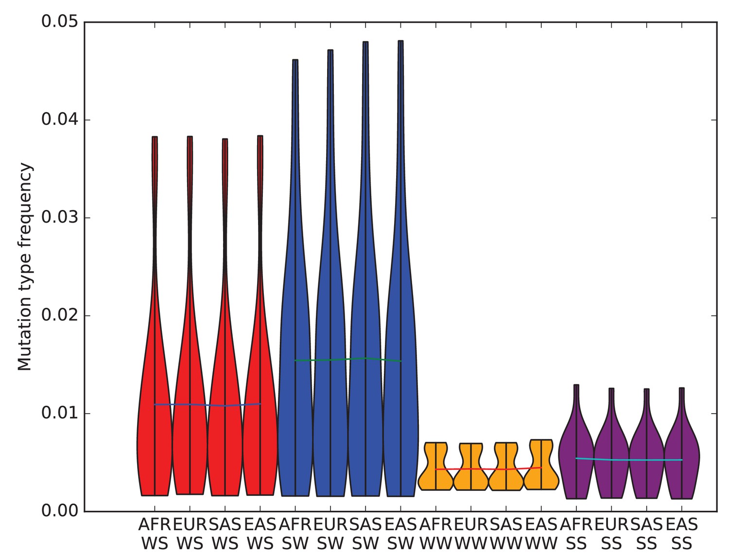
When using segregating variation to study the mutation spectrum, one potential source of bias is that strong-to-weak mutations, where the ancestral allele is G or C and the derived allele is A or T, have a lower fixation probability than weak-to-strong mutations due to biased gene conversion (BGC). If this effect were sufficiently strong, it would inflate the apparent mutation fractions of weak-to-strong mutations, especially in populations with large effective sizes where natural selection is particularly efficient. Within humans, Africans have the largest long-term effective population size, while East Asians and Native Americans have the lowest. Therefore, if BGC has created differences in mutation spectra between populations, the fraction of weak-to-strong SNVs should be highest in Africans, intermediate in Europeans and South Asians, and lowest in East Asians and Native Americans. This violin plot reveals no such pattern, suggesting that BGC is not a strong driver of mutation spectrum differences between human populations. We do not observe either a direct correlation between in strong-to-weak mutation fraction and distance from Africa or an inverse correlation between weak-to-strong mutation fraction and distance from Africa.
Figure 1—figure supplement 5
Mutation spectra of transcribed vs non-transcribed DNA.
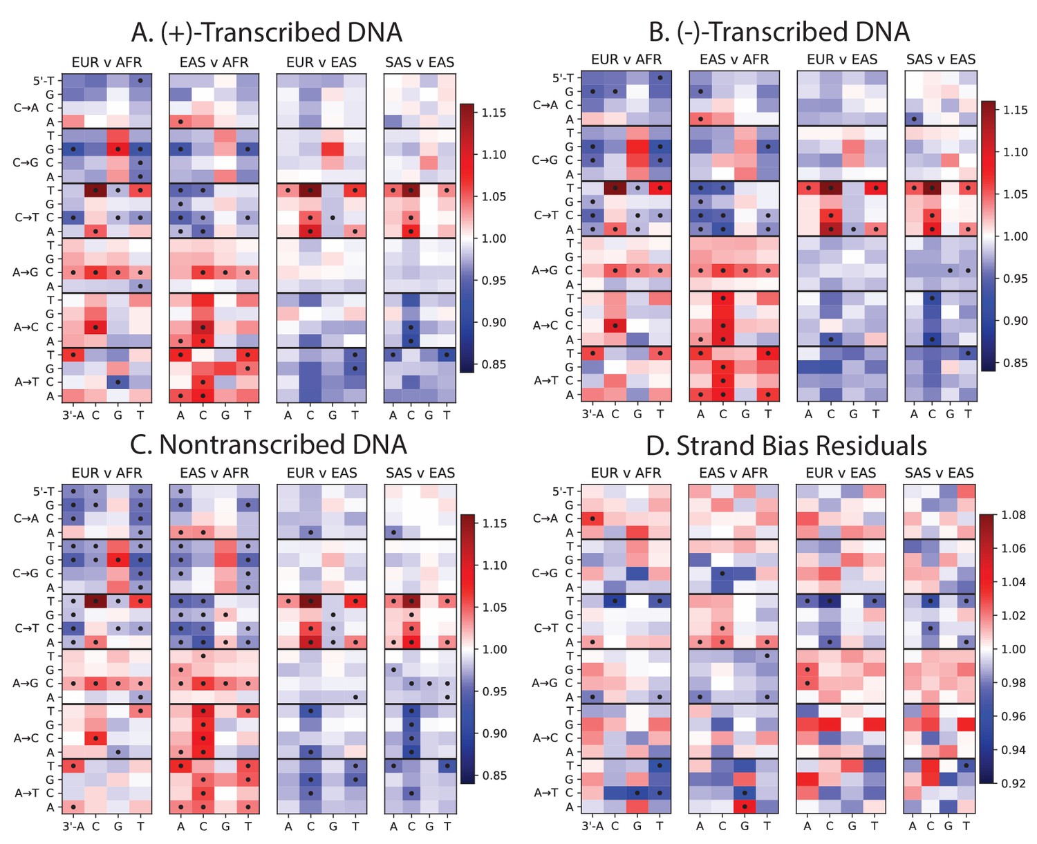
Using the UCSC Genome Browser annotations of the human reference hg19, we determined whether each SNP occurs in a transcribed or non transcribed region. We further divided SNPs occurring in transcribed regions according to whether the ancestral A or C allele occurs on the (+)-strand or the (-)-strand. Panels A, B, and C all show the same population-specific mutation type enrichments that are observed in Figure 1B. Panel D plots the residuals between panels A and B, highlighting mutation types that show a modest difference in strand bias between populations.
Figure 1—figure supplement 6
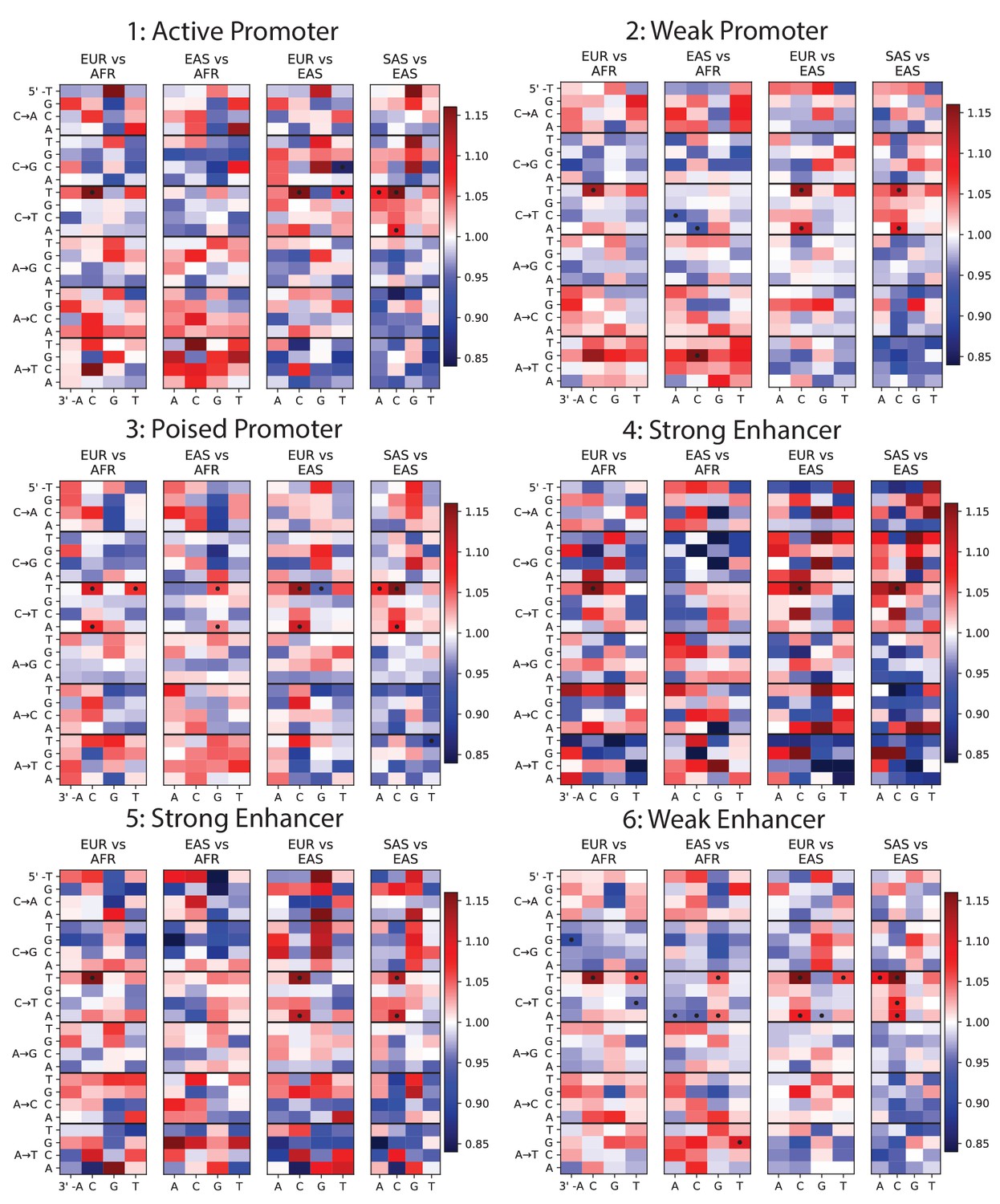
Mutation spectra of ChromHMM chromatin states (Part I of II).
To investigate whether any mutation spectrum shifts might be confined to particular chromatin states, we used chromHMM annotations of the human embryonic stem cell line HESC-H1 (Hoffman et al., 2013). Each heat map plots mutation spectrum comparisons for SNPs that are annotated as being part of the same chromatin state, and dots mark mutation types that show a significant enrichment in one population at the level p<0.01. Every chromatin state shows enrichment of the TCCTTC signature in Europe and South Asia. Some heat maps are noisy due to the small sample size of SNPs contained within these regions, but all showcase the same general patterns as Figure 1B.
Figure 1—figure supplement 7
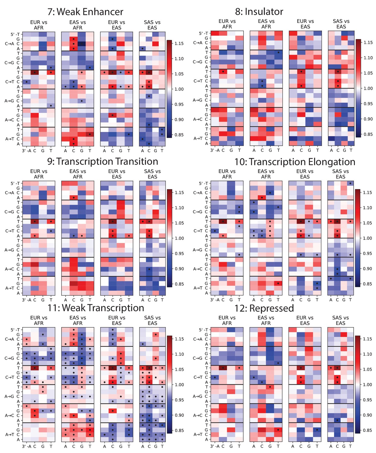
Mutation spectra of ChromHMM chromatin states (Part II of II).
https://doi.org/10.7554/eLife.24284.011
Figure 1—figure supplement 8
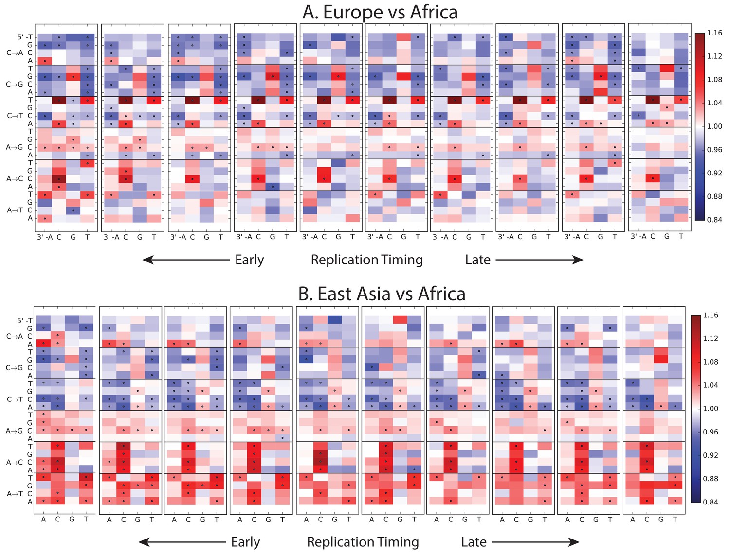
Variation of the mutation spectrum with DNA replication timing.
We partitioned the genome into 10 equal replication timing quantiles using data obtained from (Woodfine et al., 2004), then computed mutation spectrum differences within each quantile. Although most patterns from Figure 1B replicate within each replication timing bin, there are a few exceptions. CpG transitions, which occur most often in early-replicating regions, vary in population bias depending on replication timing. In addition, the deficit of ACAAAA and AAAATA mutations in Africa compared to Europe and Asia is observed mainly in early-replicating regions.
Figure 2 with 2 supplements
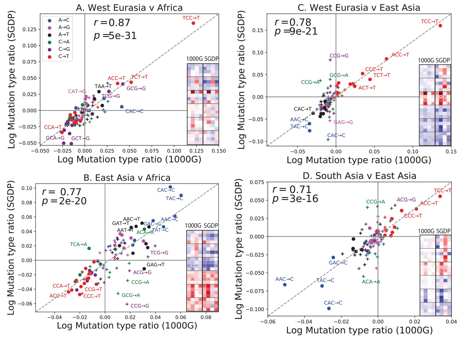
Concordance of mutational shifts in 1000 Genomes versus SGDP.
Each panel shows natural-log mutation spectrum ratios between a pair of continental groups, based on 1000 Genomes (x-axis) and SGDP (y-axis) data. Data points encoded by (+) symbols denote mutation types that are not significantly enriched in either population in the Figure 1 1000 Genomes analysis (). These heatmaps use the same labeling and color scale as in Figure 1. All 1000 Genomes ratios in this figure were estimated after projecting the 1000 Genomes site frequency spectrum down to the sample size of SGDP. See Figure 2—figure supplements 1 and 2 for a complete set of SGDP heatmaps and regressions versus 1000 Genomes.
Figure 2—figure supplement 1
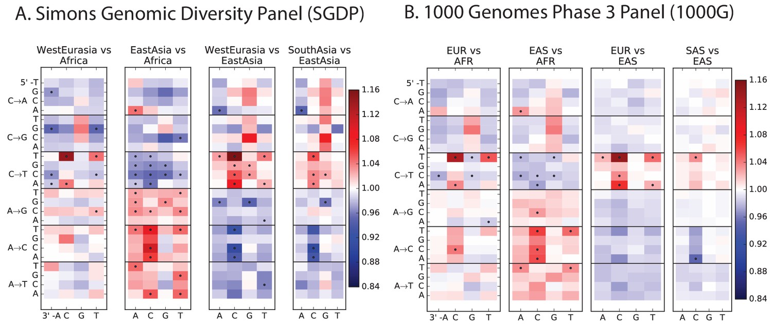
Heatmap comparisons between continental groups in 1000 Genomes and the SGDP.
Here, each 1000 Genomes population is projected down to the sample size of the corresponding SGDP population in order to sample alleles with a similar distribution of ages and frequencies.
Figure 2—figure supplement 2
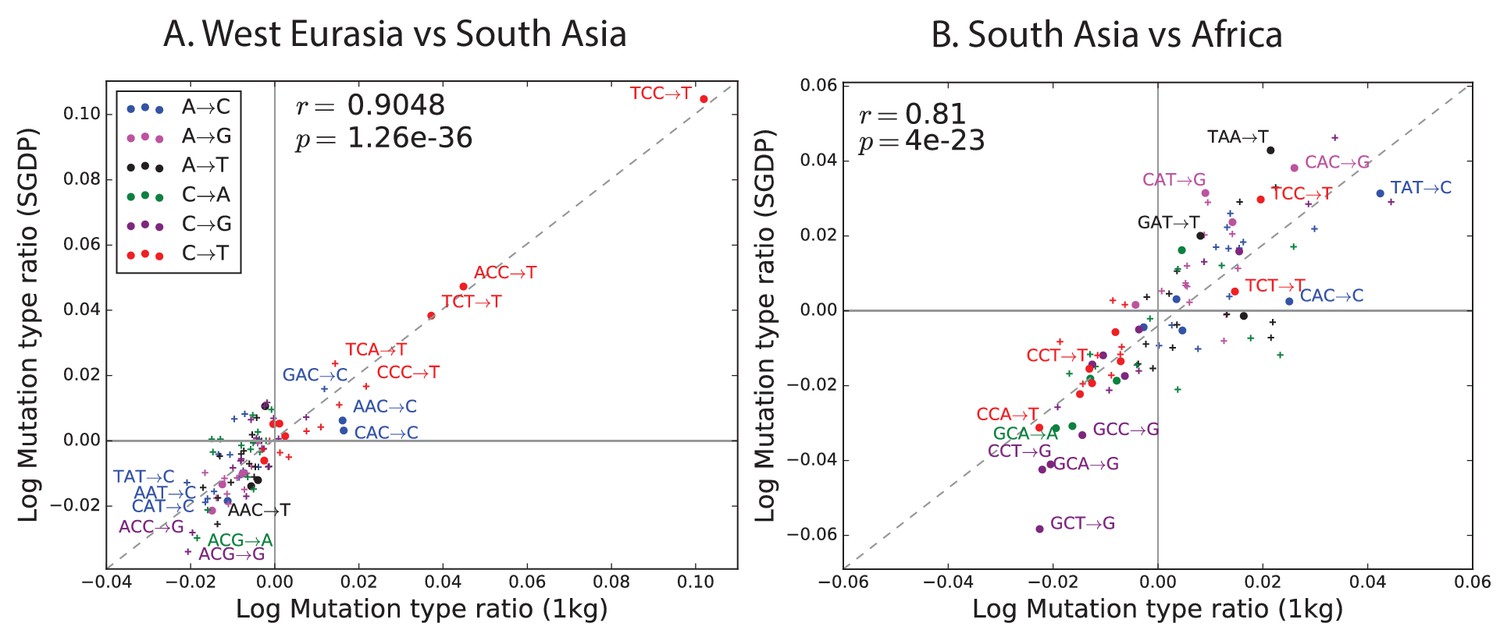
Regression of the SGDP heatmap coefficients versus the corresponding 1000 Genomes heatmap coefficients.
https://doi.org/10.7554/eLife.24284.015
Figure 3 with 6 supplements
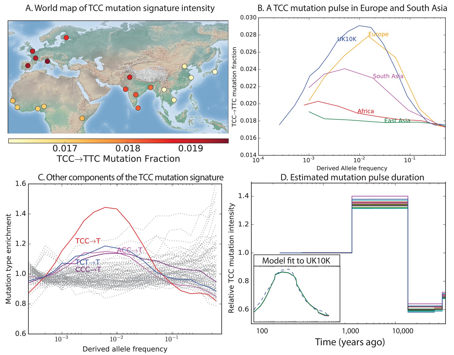
Geographic distribution and age of the TCC mutation pulse.
(A) Observed frequencies of TCCTTC variants in 1000 Genomes populations. (B) Fraction of TCCTTC variants as a function of allele frequency in different samples indicates that these peak around 1%. See Figure 3—figure supplement 1 for distributions of TCCTTC allele frequency within all 1000 Genomes populations, and see Figure 3—figure supplement 2 for the replication of this result in the Exome Aggregation Consortium Data. In the UK10K data, which has the largest sample size, the peak occurs at 0.6% allele frequency. (C) Other enriched CT mutations with similar context also peak at 0.6% frequency in UK10K. See Figure 3—figure supplements 3, 4 and 5 for labeled allele frequency distributions of all 96 mutation types (most represented here as unlabeled grey lines). See Figure 3—figure supplement 6 for heatmap comparisons of the 1000 Genomes populations partitioned by allele frequency, which provide a different view of these patterns. (D) A population genetic model supports a pulse of TCCTTC mutations from 15,000 to 2000 years ago. Inset shows the observed and predicted frequency distributions of this mutation under the inferred model.
Figure 3—figure supplement 1
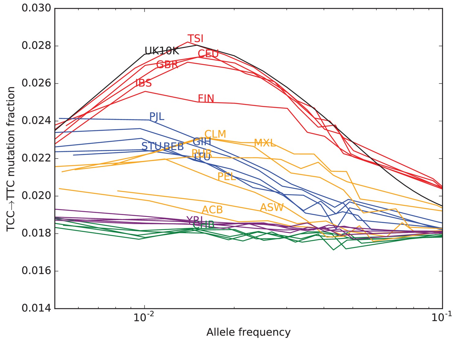
TCCTTC mutation fraction as a function of allele frequency in all 1000 Genomes populations.
To enable better comparison with the 1000 Genomes data, the UK10K SNPs have been downsampled to 200 individuals. The age distribution of alleles of a given frequency varies as a function of the number of lineages being sampled–this is why the UK10K pulse peaks around 0.6% frequency when measured in a dataset of thousands of lineages, but peaks around 2% in a subsample of only 400 lineages. Some African and East Asian population names have been omitted for clarity since the TCCTTC mutation fraction is so uniform within these continental groups. Red = European populations; Blue = South Asian; Orange = Americas; Purple = Africa; Green = East Asia.
Figure 3—figure supplement 2
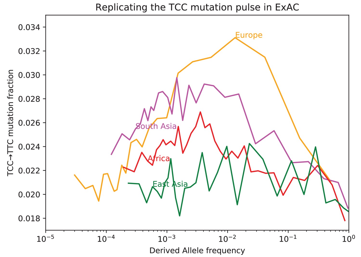
Fraction of TCCTTC mutations as a function of allele frequency in ExAC.
Lek et al. compiled data from 60,706 exomes to create the Exome Aggregation Consortium dataset, which enables the analysis of ultra-rare human variation (Lek et al., 2016). The overall fraction of TCCTTC mutations is slightly higher in exome data than in whole genome data because exons contain a skewed distribution of triplet contexts, but the pulse pattern from Figure 3B reproduces unmistakably.
Figure 3—figure supplement 3
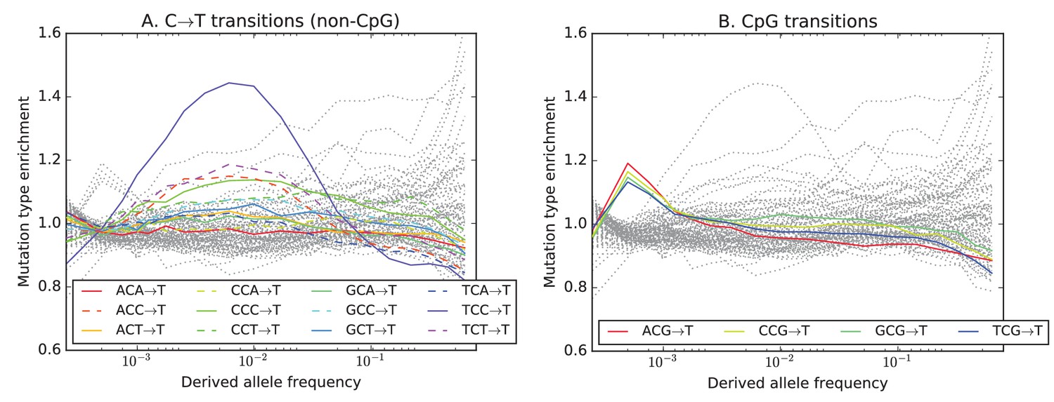
Mutation type enrichment as a function of allele frequency in UK10K (Part I of III).
The eleven panels in Figure 3—figure supplements 2, 3 and 4 show the full dependence of mutation spectrum on allele frequency in the UK10K data. If we let denote the fraction of SNVs of frequency that are of type and let denote the fraction of all mutations that are of type , the enrichment of mutation type as a function of frequency is . This function is expected to fluctuate around unless the rate of has recently increased or decreased. All 96 mutation types are visualized in every panel, but most corresponding lines are greyed out to enhance readability. Some lines deviate from due to the effects of biased gene conversion (BGC)–this occurs when one of the ancestral or derived alleles is a weak base (A or T, abbreviated W) and the other allele is a strong base (G or C, abbreviated S). WS mutations are more abundant at high allele frequencies, while SW mutations are more abundant at low frequencies. These effects are visible but modest in panels D, G, H, and I, but much more pronounced in panels B, C, and F, which focus on mutations in the CpG context. Transitions of the type CpACpG, which create CpG motifs, are extremely enriched at high frequencies, and this pattern may be an artifact of ancestral misidentification (Hernandez et al., 2007). CpG motifs have such high mutation rates that CpGCpT transitions often happen at the same site in humans and chimps, and these low-frequency double mutations are misclassified as high-frequency CpTCpG mutations. Although it is not surprising to see a peak of CpTCpG transitions at high frequencies in panel F, it is somewhat surprising to see CpGGpG transversions peak in abundance at high frequencies in panel C. This might be a signature of recent declines in the rates of these mutations, since neither ancestral misidentification nor biased gene conversion is thought to produce such a pattern. In addition, neither of these processes can explain the strong enrichment of certain AT mutations at high frequencies that is observed in panel K.
Figure 3—figure supplement 4
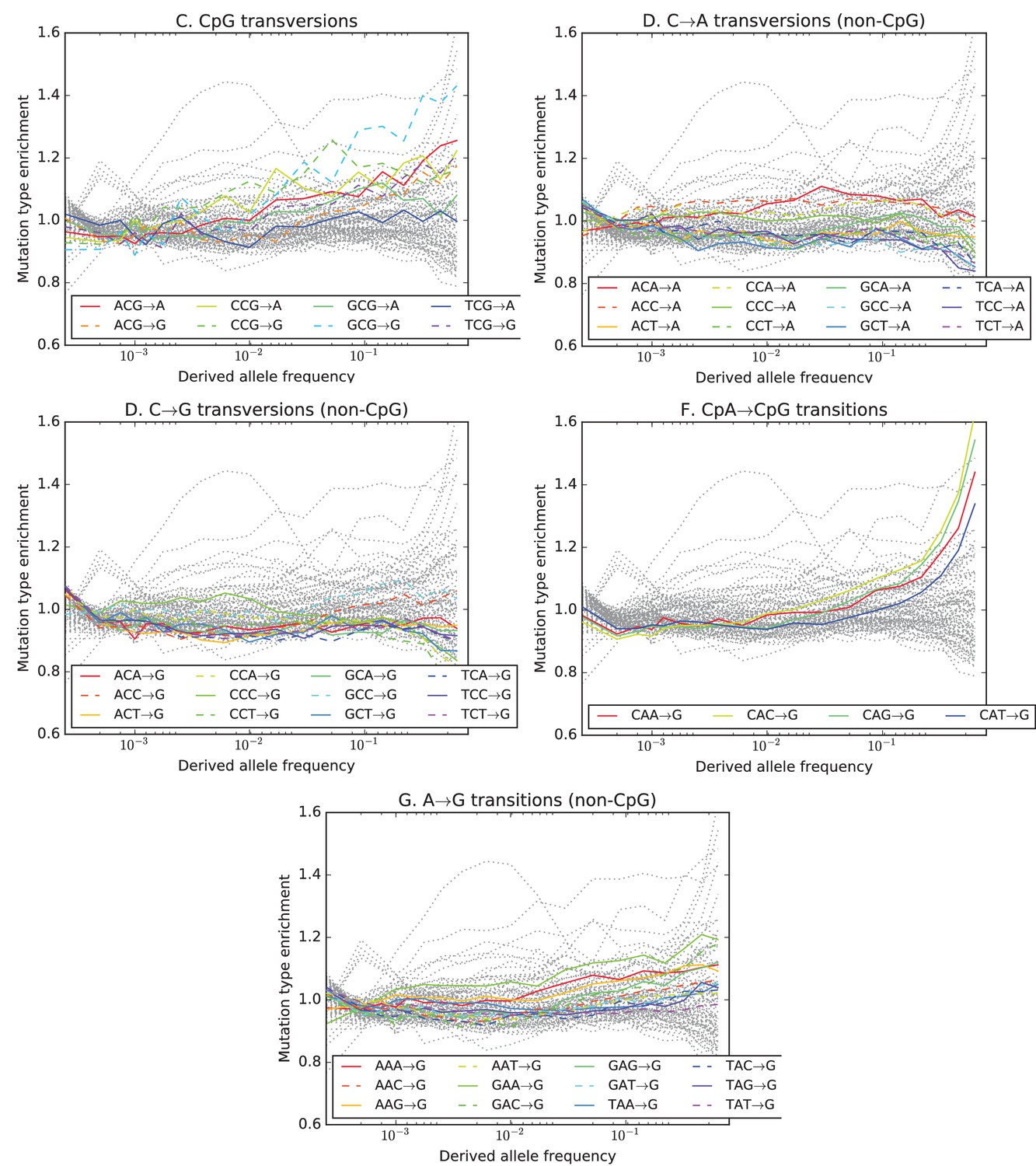
Mutation type enrichment as a function of allele frequency in UK10K (Part II of III).
The eleven panels in this three-part figure show the full dependence of mutation spectrum on allele frequency in the UK10K data.
Figure 3—figure supplement 5
Mutation type enrichment as a function of allele frequency in UK10K (Part III of III).
The 11 panels in this three-part figure show the full dependence of mutation spectrum on allele frequency in the UK10K data.
Figure 3—figure supplement 6
Mutation spectrum comparisons partitioned by allele frequency.
Each of these heatmaps shows a subset of the data used to construct Figure 1B, partitioned by allele frequency to show how rare variants are the most highly differentiated between populations. Black dots highlight mutation types that are significantly different in abundance between two populations in a particular frequency class at the level according to a chi-square test.
Figure 4 with 6 supplements
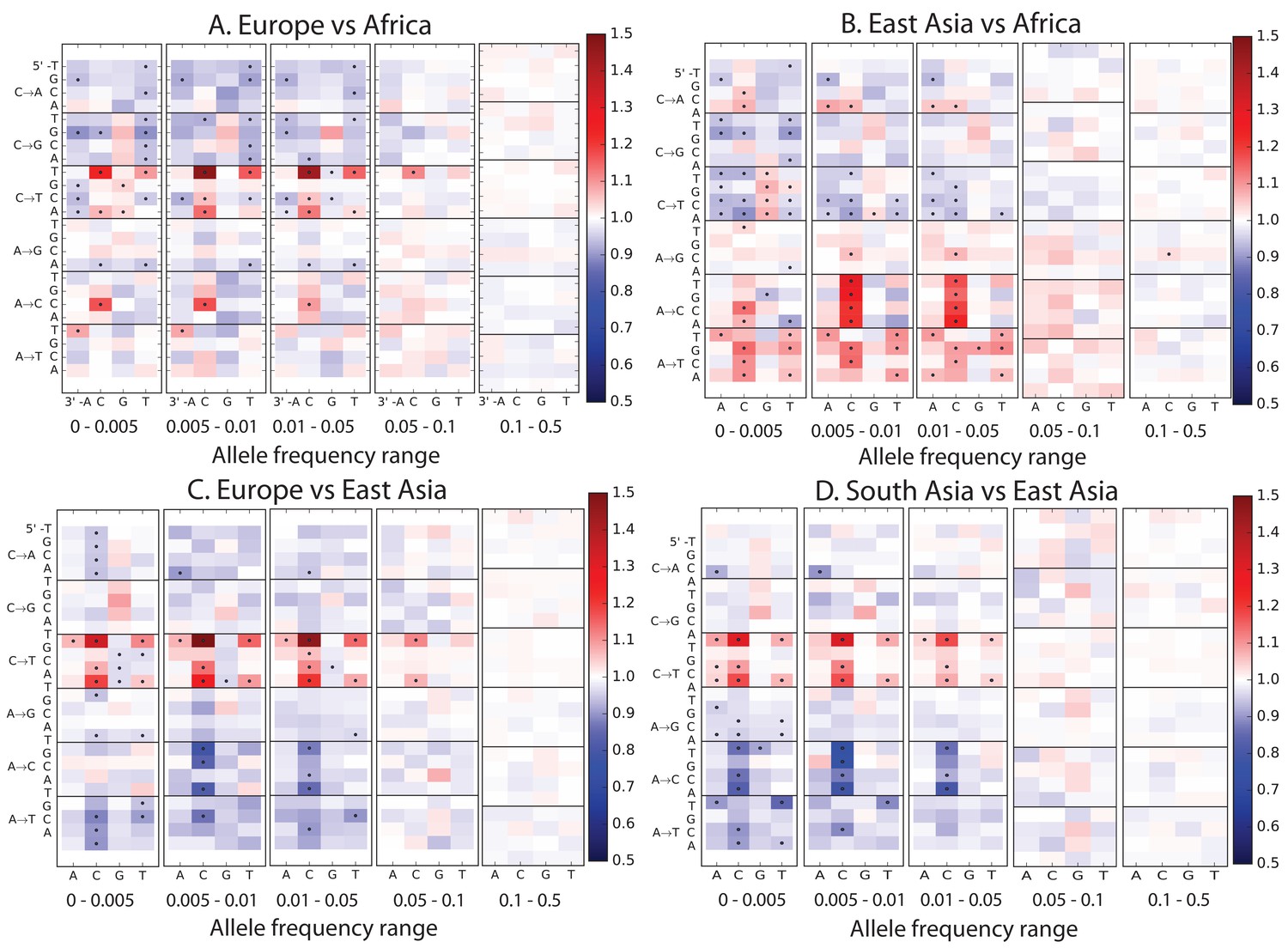
Mutational variation among east Asian populations.
(A) PCA of east Asian samples from 1000 Genomes, based on the relative proportions of each of the 96 mutational types. See Figure 4—figure supplement 2 through 6 for other finescale population PCAs. (B) Heatmaps showing, for pairs of east Asian samples, the ratio of the proportions of SNVs in each of the 96 mutational types. Points indicate significant contrasts at p . See Figure 4—figure supplement 1 for additional finescale heatmaps. (C) and (D) Relative enrichment of each mutational type in Japanese and Dai, respectively as a function of allele frequency. Six mutation types that are enriched in JPT are indicated. Populations: CDX=Dai, CHB=Han (Beijing); CHS=Han (south China); KHV=Kinh; JPT=Japanese.
-
Figure 4—source data 1
This text file shows the number of SNPs in each of the 96 mutational categories that passed all filters in each finescale 1000 Genomes population.
- https://doi.org/10.7554/eLife.24284.024
Figure 4—figure supplement 1
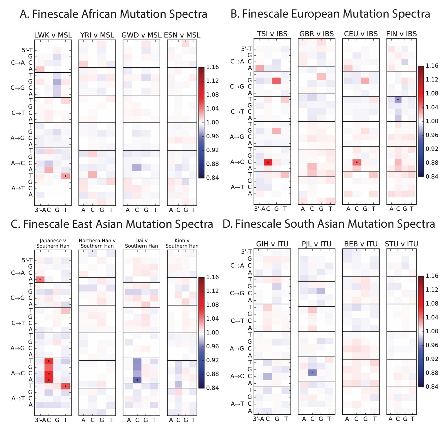
Mutation spectrum differences within Africa, Europe, East Asia, and South Asia.
Figure 4B of the main text shows heat map comparisons between East Asian populations, which display fine-scale differences that are exceptionally well defined. For completeness, this figure shows finescale heatmap comparisons within all 1 kG continental groups. We can see that CACCCC and TATTTT are heterogeneously distributed within multiple continents, but to the greatest extent in East Asia. In addition, the TCCTTC signature is somewhat heterogeneously distributed within Europe and South Asia, being depleted in Finns and enriched in the Punjabi and Gujarati. Each continental group in the 1000 Genomes data is divided into five sub-populations. These heat maps compare the mutation spectra of these fine-scale populations to each other. African populations are: MSL = Mende in Sierra Leone; LWK = Luhya in Webuye, Kenya; YRI = Yoruba in Ibadan, Nigeria; GWD = Gambian in Western Divisions; ESN = Esan in Nigeria. European populations are: IBS = Iberian Population in Spain; TSI = Toscani in Italia; GBR = British in England and Scotland; CEU = Utah Residents (CEPH) with Northern and Western Ancestry; FIN = Finnish in Finland. East Asian populations are: CDX = Chinese Dai in Xishuangbanna, China; JPT = Japanese in Tokyo, Japan; CHB = Han Chinese in Bejing, China; CHS = Southern Han Chinese; KHV = Kinh in Ho Chi Minh City, Vietnam. South Asian populations are: ITU = Indian Telugu from the UK; GIH = Gujarati Indian from Houston, Texas; PJL = Punjabi from Lahore, Pakistan; BEB = Bengali from Bangladesh; STU = Sri Lankan Tamil from the UK.
Figure 4—figure supplement 2
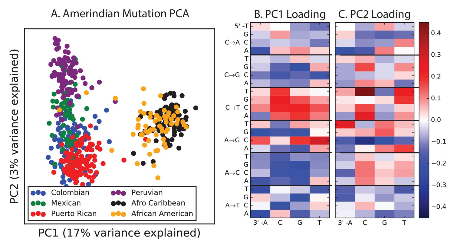
PCA of American populations.
Population abbreviations are: CLM = Colombians from Medellin, Colombia; MXL = Mexican Ancestry from Los Angeles, USA; PUR = Puerto Ricans from Puerto Rico; PEL = Peruvians from Lima, Peru; ACB = African Caribbeans in Barbados; ASW = Americans of African Ancestry in SW USA. Admixed populations from the Americans show structure that mirrors the continental groups, with PC1 essentially measuring the ratio between African and non-African ancestry and PC2 measuring the ratio between European and Native American ancestry. The accompanying heat maps show the loadings of the first two principal components.
Figure 4—figure supplement 3
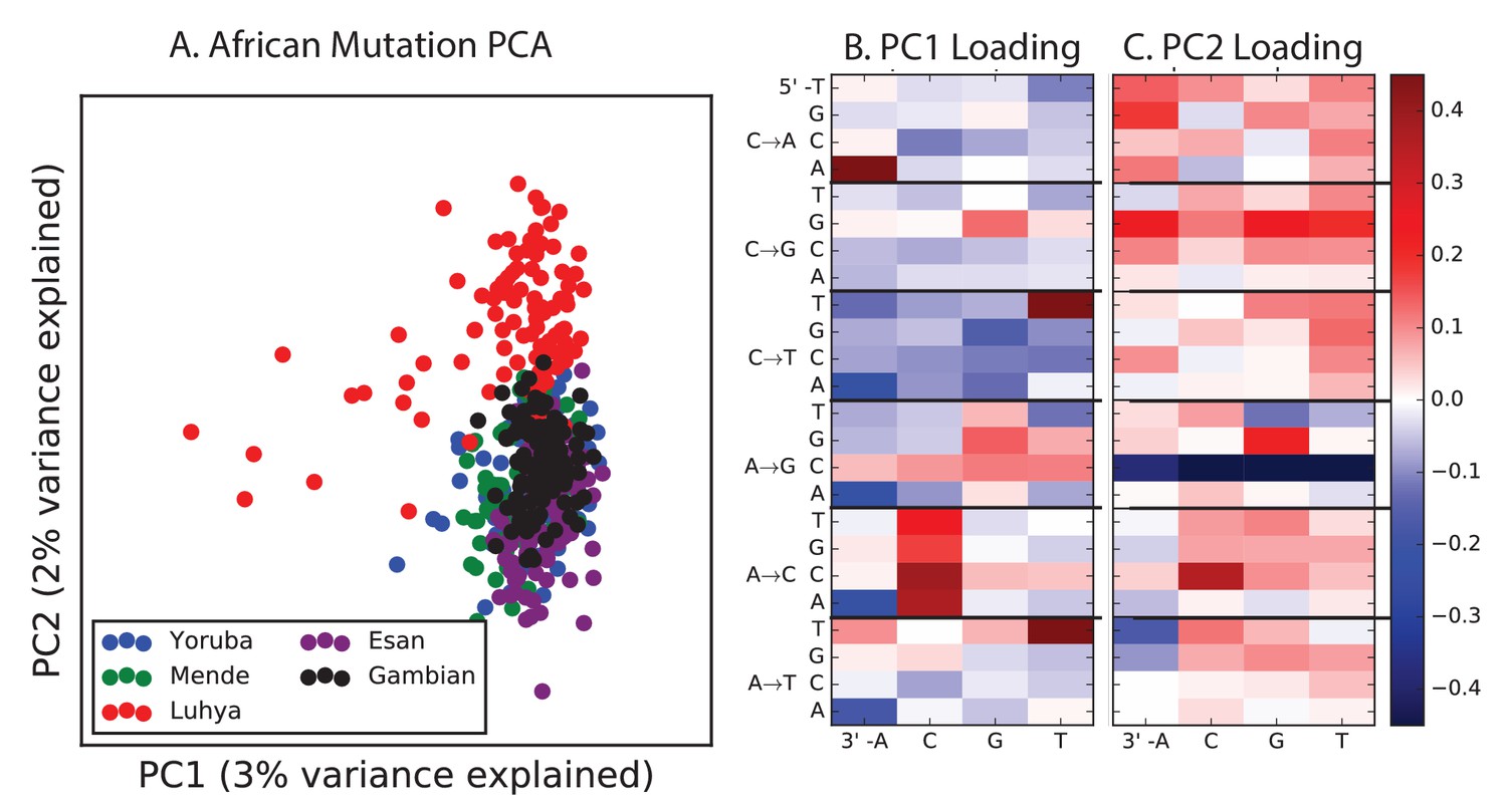
PCA of African populations.
Population abbreviations are: MSL = Mende in Sierra Leone; LWK = Luhya in Webuye, Kenya; YRI = Yoruba in Ibadan, Nigeria; GWD = Gambian in Western Divisions; ESN = Esan in Nigeria.
Figure 4—figure supplement 4
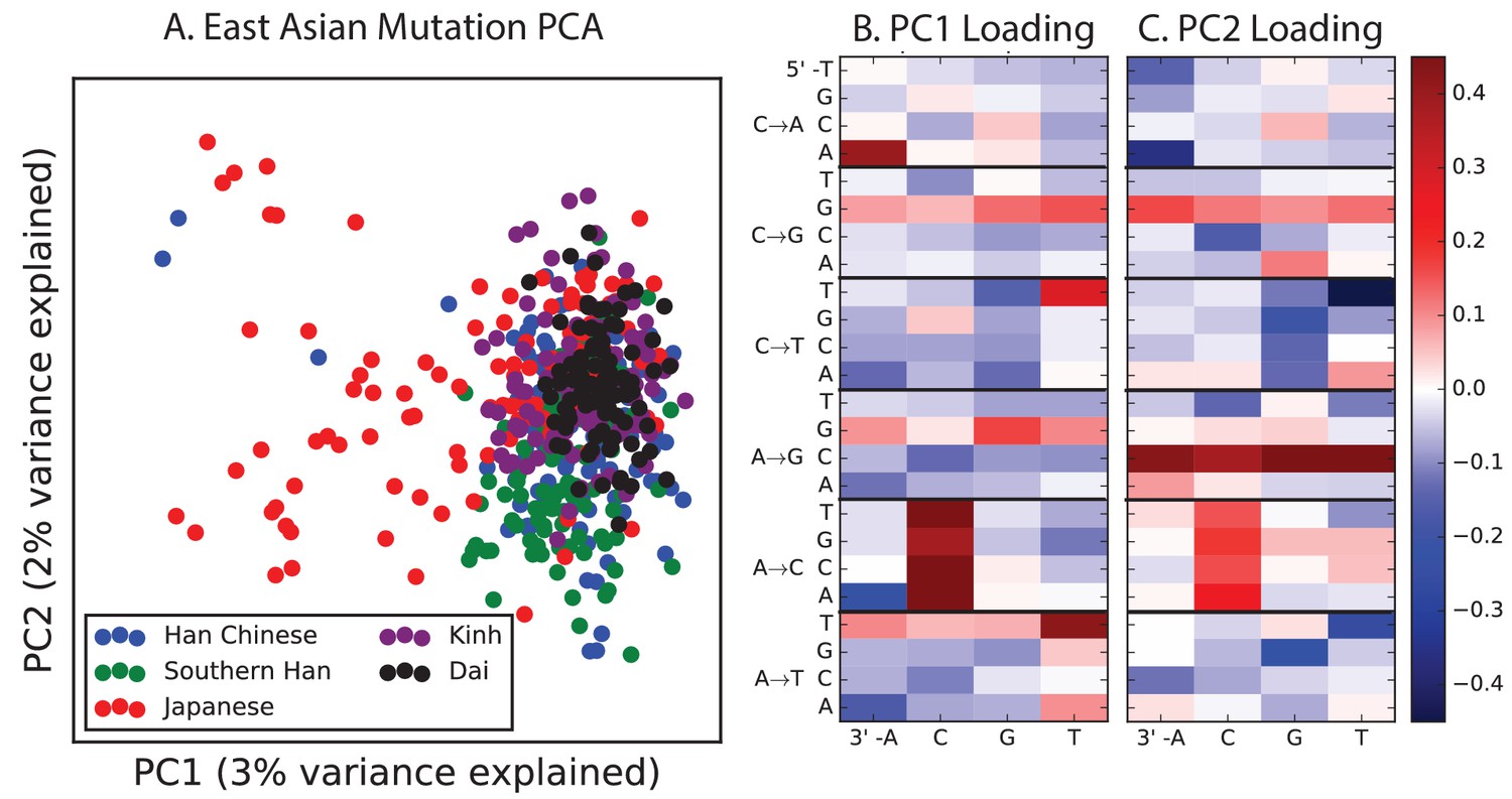
PCA of East Asian populations.
Population abbreviations are: CDX = Chinese Dai in Xishuangbanna, China; JPT = Japanese in Tokyo, Japan; CHB = Han Chinese in Bejing, China; CHS = Southern Han Chinese; KHV = Kinh in Ho Chi Minh City, Vietnam.
Figure 4—figure supplement 5
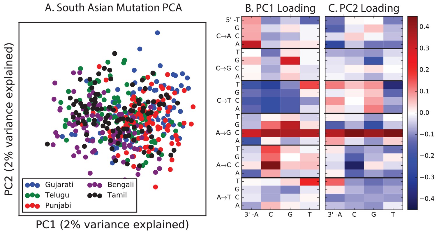
PCA of South Asian populations.
Population abbreviations are: ITU = Indian Telugu from the UK; GIH = Gujarati Indian from Houston, Texas; PJL = Punjabi from Lahore, Pakistan; BEB = Bengali from Bangladesh; STU = Sri Lankan Tamil from the UK.
Figure 4—figure supplement 6
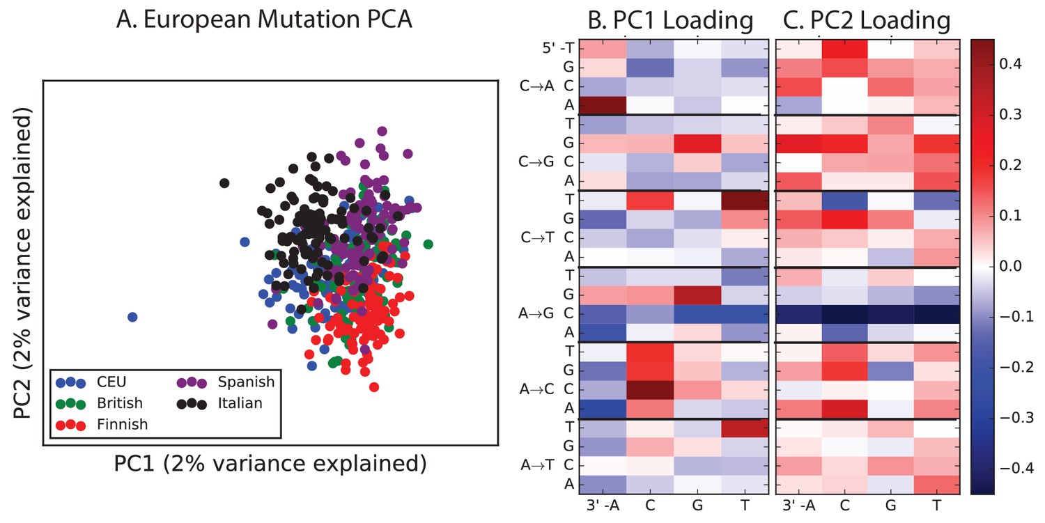
PCA of European populations.
Population abbreviations are: IBS = Iberian Population in Spain; TSI = Toscani in Italia; GBR = British in England and Scotland; CEU = Utah Residents (CEPH) with Northern and Western Ancestry; FIN = Finnish in Finland.
Figure 5 with 1 supplement
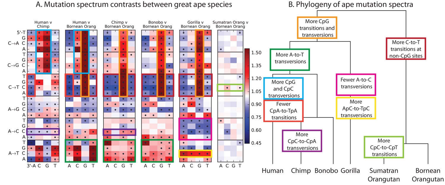
Mutational differences among the great apes.
(A) Relative abundance of SNV types in 5 ape species compared to Bornean Orangutan; data from (Prado-Martinez et al., 2013). Boxes indicate labels in (B). For additional comparisons see Figure 5—figure supplement 1. (B) Schematic phylogeny of the great apes highlighting notable changes in SNV abundance.
Figure 5—figure supplement 1
Mutation spectra of great apes.
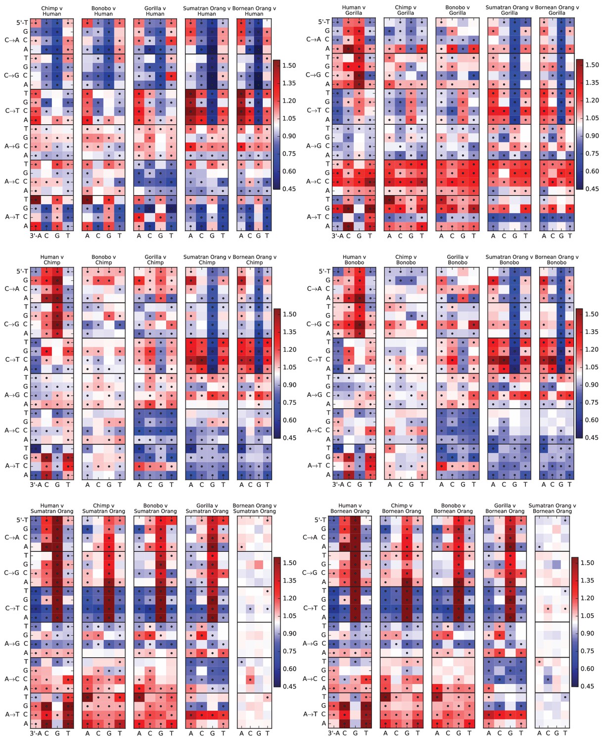
These heatmap comparisons demonstrate that closely related great apes such as Chimpanzees and Bonobos have more similar mutation spectra than more distantly related apes do.
Download links
A two-part list of links to download the article, or parts of the article, in various formats.
Downloads (link to download the article as PDF)
Open citations (links to open the citations from this article in various online reference manager services)
Cite this article (links to download the citations from this article in formats compatible with various reference manager tools)
Rapid evolution of the human mutation spectrum
eLife 6:e24284.
https://doi.org/10.7554/eLife.24284


