Proteomic analysis of cell cycle progression in asynchronous cultures, including mitotic subphases, using PRIMMUS
Figures
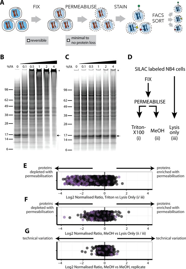
An optimised workflow for intracellular immunostaining, FACS, and MS-based proteomics.
(A) An abbreviated schematic of the workflow for the Proteomics of Intracellluar IMMunolabelledcell Subsets (PRIMMUS) approach, highlighting specific steps for optimisation (fixation, permeabilisation). Lysates prepared from cells crosslinked with the indicated concentrations of formaldehyde (%v/v) in PBS (B) and then de-crosslinked with heating (C) were electrophoresed by SDS-PAGE and stained for protein using Sypro Ruby. (D). SILAC-labelled cells were either processed by fixation and permeabilisation, comparing 0.5% Triton X-100 (i) versus 90% methanol (ii), or with lysis only (iii). Cells were then mixed pairwise 1:1 and analysed by ‘single shot’ proteome workflows. The resulting SILAC ratios (e.g. H/L) are plotted as scatter plots for the pairwise comparisons, namely Triton X-100 vs. lysis only, methanol vs lysis only, and methanol versus methanol (technical replicate).
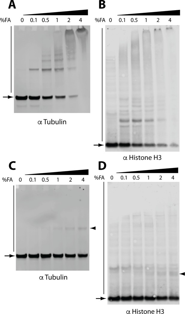
Immunoblot analysis of the effect of FA on the electrophoretic migration of individual proteins.
Immunoblot analysis of crosslinked lysates for alpha tubulin (A) and histone H3 (B). Immunoblot analysis of crosslinked and reverse crosslinked lysates for alpha tubulin (C) and histone H3 (D). Arrowheads indicate high MW bands remaining after reverse crosslinking step that migrate at a higher MW than the expected monomer mass (arrows).
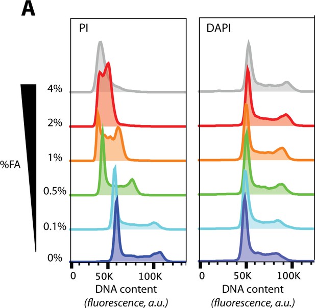
The effects of formaldehyde (FA) concentration on protein crosslinking and DNA staining.
(A) DNA content histograms from flow cytometry of cells fixed with the indicated concentrations of FA and using either propidium iodide (PI, left), or 4',6-diamidino-2-phenylindole (DAPI, right), as the DNA-binding dye.
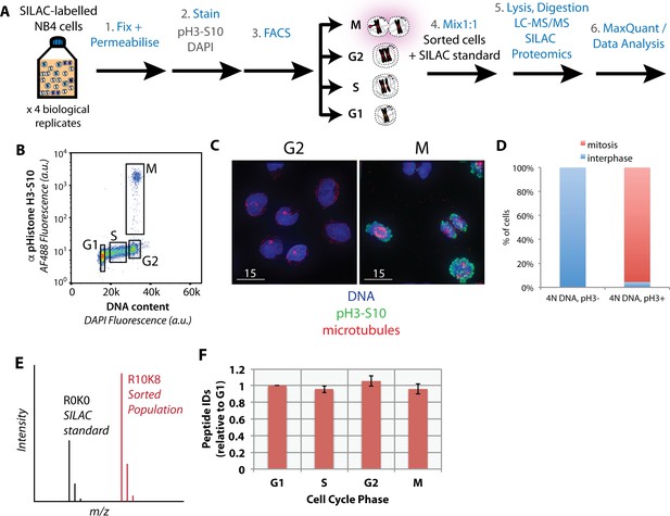
Purification of interphase and mitotic cells for PRIMMUS.
Workflow for PRIMMUS of human leukemia cells into four cell cycle phase fractions (G1, S, G2, and M). Stained cells were sorted by FACS into four populations (G1, S, G2, and M) based on the gates shown on the psuedocolour plot in (B). The mitotic index of the M phase fraction was independently visualised by immunofluorescence microscopy and co-staining for microtubules (C) and quantitated (D). Fractions were then mixed by cell number 1:1 with an asynchronous SILAC-labelled standard and processed for ‘single shot’ LC-MS/MS-based proteomics. The resulting measured SILAC ratios compare protein abundances in the sorted fraction versus the asynchronous standard (E). The analysis was performed with replicates (n = 4). Comparison of peptide ID rates across the sorted fractions (F).
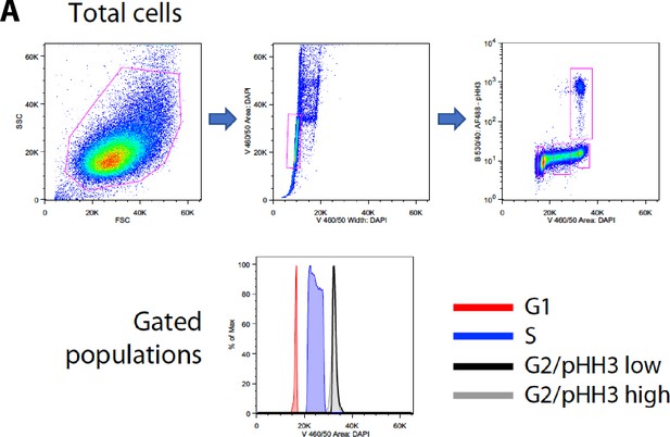
Sorting strategy.
Flow cytomety diagrams showing the gates used for FACS.
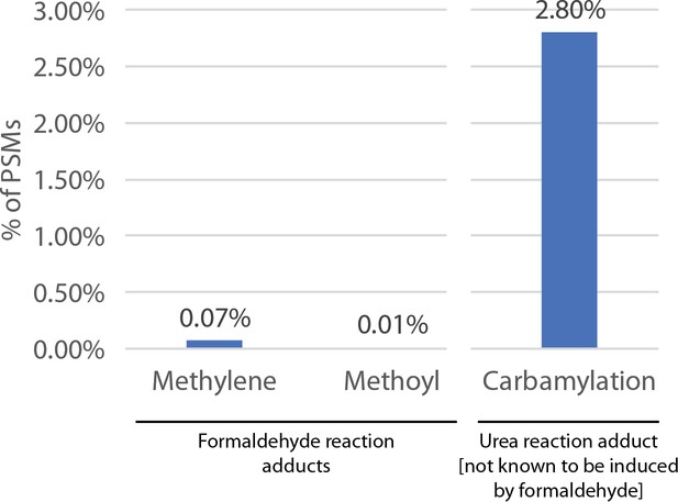
Formaldehyde-induced modifications are generally low.
A data-dependent search was performed and identified 0.07% and 0.01% for the major peptide adduct products of formaldehyde, that is methylene and methoyl, respectively.
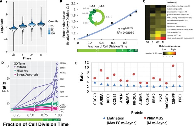
Proteomic measurement of protein accumulation across the cell division cycle.
(A) A ‘neeps’ plot showing the distribution of log2 SILAC ratios measured in each of the G1, S, G2, and M subpopulations in one representative replicate. The width of each ‘neep’ is proportional to the density, that is the number of proteins. Quartiles are marked by black lines, and interquartile ranges are indicated by shading. B, inset) A schematic showing the cell division cycle and the average position during the cell division cycle for each phase collected, where a newly divided cell is defined as t = 0, and cell division (cytokinesis) is defined as t = 1. B, graph) Regression analysis was performed to produce a best-fit line in the form of an exponential growth model (i.e., y = emx). (C) Ratios of proteins belonging to each of the indicated GO terms were averaged (mean) and visualised using a heatmap. (D) A plot of ratios of individual proteins associated with mitosis, chromatin, and the stress response versus cell cycle stage. (E) A comparison of the ratio of G2 and M vs. asynchronous measured in the elutriation vs. PRIMMUS datasets.
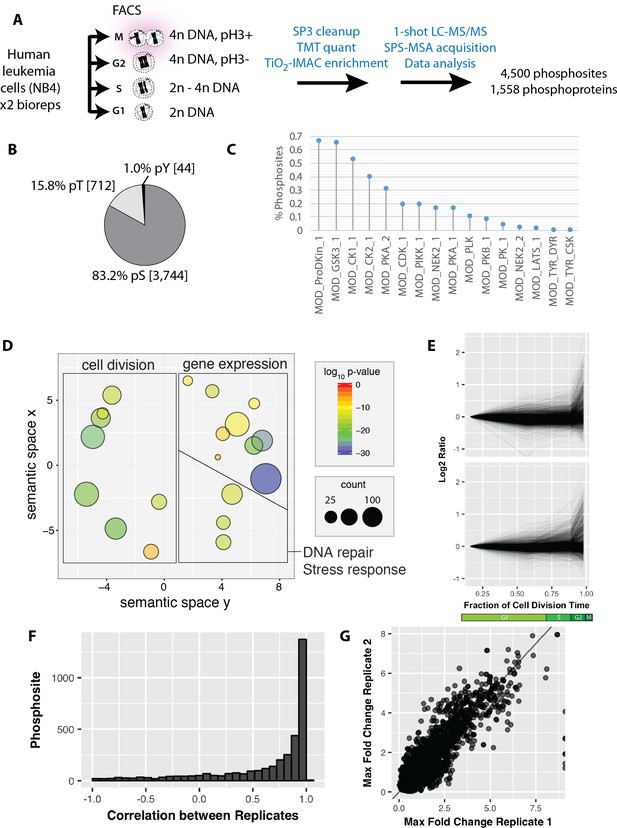
Reproducible analysis of phosphorylation changes across the cell division cycle.
https://doi.org/10.7554/eLife.27574.009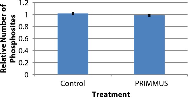
Comparison of phosphopeptide identifications between control and fixed, permeabilised samples shows no significant difference in identification rate.
Three biological replicates comparing control and PRIMMUS samples were analysed. The y-axis is the relative number of phosphopeptides normalised to control.
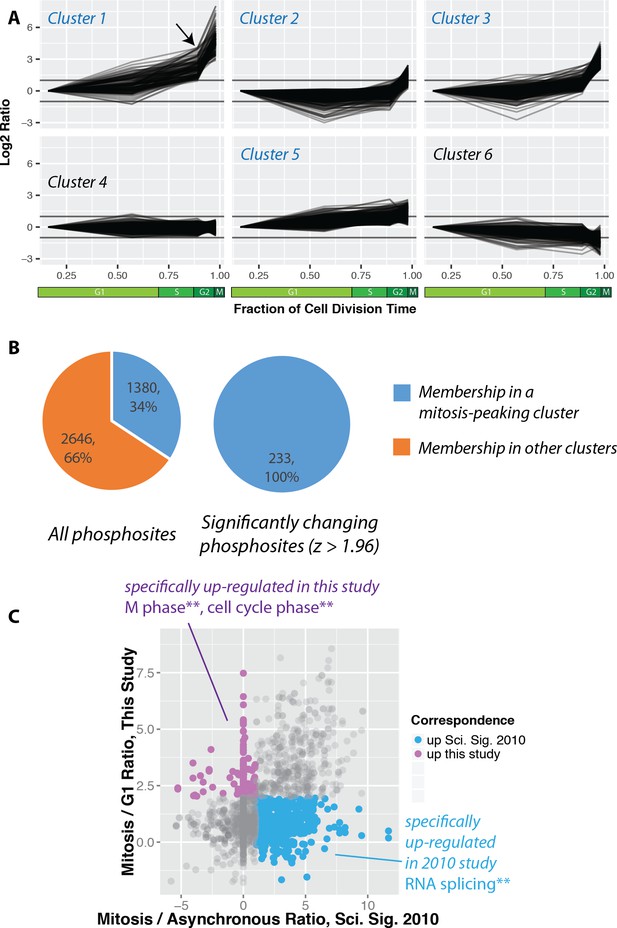
Increased global mitotic phosphorylation dominated by a subset of highly phosphorylated proteins.
(A) K-means clustering of the phosphorylation profiles. (B) Distribution of mitosis-peaking phosphorylation sites, either in the entire dataset (left), or significantly changing phosphorylation sites (right). (C) A comparison of phosphorylation site ratios measured in this dataset and a previous analysis of mitotic phosphorylation in human cells.
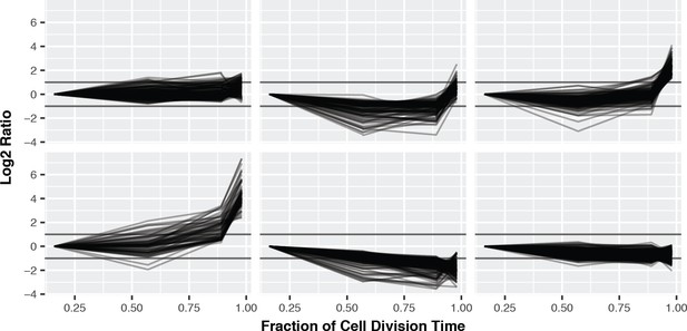
K-means clustering of the phosphorylation profiles normalised to total protein abundance.
https://doi.org/10.7554/eLife.27574.012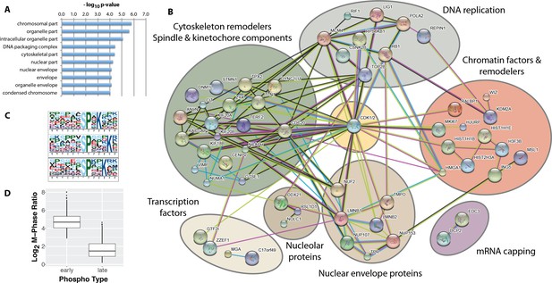
Identification of ‘early risers’, a subset of mitotic phosphorylations that begin increasing in G2 phase.
(A) Gene ontology enrichment analysis of early rising phosphorylation sites. (B) A STRING network analysis of early rising phosphoproteins. Nodes with one or more connections are shown. (C) Enriched sequence motifs among early rising phosphorylation sites (Motif-X). (D) Comparing the M-phase ratio between ‘early rising’ and ‘late rising’ phosphorylation sites. Error bars show s.e.m.
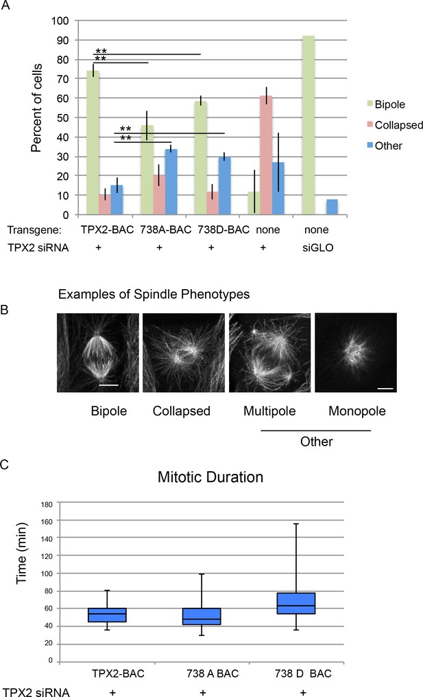
Mitotic defects in cells expressing phosphodefective and phosphomimetic mutants of TPX2-S738.
(A) Bar graph showing percentages of mitotic spindles with the indicated phenotypes. Collapsed spindles have large asters and short intervening spindle; spindles classified as other include monopolar, multipolar, bent and misshapen spindles. (B) Representative examples of spindle phenotypes. Bar = 5 microns. (C) Box and whisker plot of mitotic duration, defined as nuclear envelope breakdown to anaphase onset.
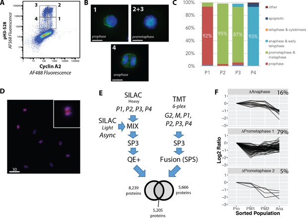
Proteome-wide analysis of protein abundance changes between mitotic subphases.
(A) Flow cytometry analysis of NB4 cells immunostained for H3S28ph and CycA. Gates show populations collected by FACS. (A, right) (B) Representative light microscopy images of cell fractions. Scale bars = 10 micron. (C) The frequency of each intra-mitotic stage was counted and quantified with 100 cells or more. (D) Wide field of view of population 4, the anaphase-enriched population. (E) Workflow for MS-based proteomic analysis involving SILAC and TMT based labelling and three biological replicates, resulting in 8,700 proteins identified in total. (F) K-means clustering of profiles were qualitatively agglomerated into three groups based on subpopulation where ‘trough’ in abundance occurs.

Sorting strategy.
Flow cytomety diagrams showing the gates used for FACS.
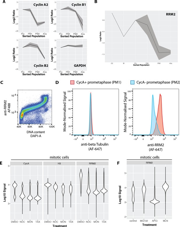
Ribonucleotide reductase M2 (RRM2) is degraded during prometaphase in a proteasome-dependent, MLN-4924-sensitive manner.
(A) Line graphs showing mean abundance profiles for Cyclin A2 (CycA), Cyclin B1, Cyclin B2, and GAPDH. Grey ribbons indicate 1 standard deviation from the mean. (B) Mean abundance profile for RRM2. (C) Flow cytometry analysis RRM2 levels vs. DNA content. (D) Flow cytometry-based comparison of beta-tubulin (negative control, left) and RRM2 (right) levels in CycA+ (red) vs. CycA- (blue) prometaphase cells. (E) Violin plots showing CycA, histone H3, and RRM2 levels in cells treated with either DMSO or microtubule drugs that activate the spindle assembly checkpoint (nocodazole, monastrol, taxol). (F) Violin plots showing levels of RRM2 in cells treated with either vehicle control (DMSO), MG132, apcin + proTAME, or MLN4924.
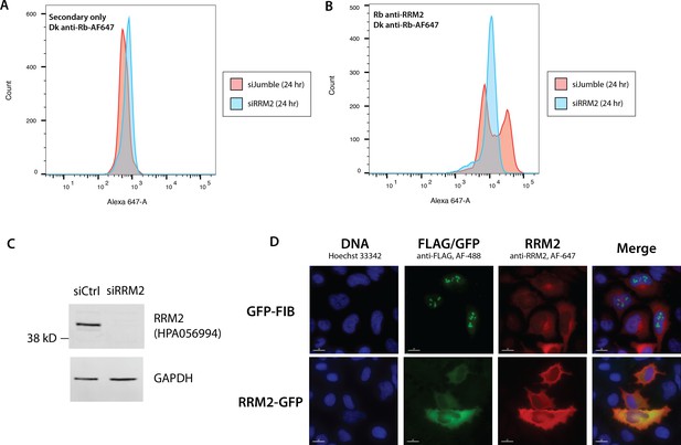
Validation of the anti-RRM2 antibody used in this study.
Flow cytometry analysis of cells treated either with non-targeting siRNA (siJumble), or siRNA against RRM2 and stained either with secondary antibody only (A), or anti-RRM2 antibody (B). (C) Immunoblot analysis of siJumble vs. siRRM2 cell lysates. (D) Overexpression of GFP-Fibrillarin (top) and RRM2-GFP (bottom). GFP and anti-RRM2 staining shows high correlation.

RRM2 is cell cycle regulated in U2OS cells, showing peak abundance in G2 phase.
(A) A representative image of FUCCI U2OS cells immunostained for RRM2. (B) A psuedocolour scatter plot with x- and y- axes representing the two proteins used in the FUCCI cell cycle reporter system (Red: Cdt1, Green: Geminin) with colour indicating anti-RRM2 signal. (C) Bar chart summarising (B).

RRM2 abundance decreases during early mitosis in U2OS cells.
Anti-Cyclin B1 and anti-RRM2 signals were measured in U2OS cells by immunofluorescence microscopy. Representative images of cyclin B (A, left) and RRM2 (A, right) staining. (B) Quantitation of immunofluorescence with cells ranked ordered based on Cyclin B1 signal. The arrow indicates nuclear concentration of Cyclin B1 signal, which marks mitotic entry.

The PRIMMUS cell cycle data is accessible through the Encyclopaedia of Proteome Dynamics (EPD).
A) Data from proteomic datasets from the Lamond laboratory can be easily visualised for the same proteins using the navigation bubble map. User interface features include: B) specifying type of search, including search for individual proteins, GO term, and CORUM complex membership, (C) an input box for protein and other identifiers (e.g. GO term), (D) a ribbon graph showing plots for input protein identifiers (here for illustration are shown RRM2 and CCNB1) with lines indicating mean profile and ribbons indicating s.e.m., (E) an interactive legend to show more information on individual proteins, and F) options to output visualisation as an SVG file or underlying data in CSV format. (G) An example plot correlating protein abundance and phosphorylation changes. Several proteins containing ‘early rising’ phosphorylation sites are highlighted: CENPF, TMPO, and RIF1.
Additional files
-
Supplementary file 1
The effect of fixation and permeabilisation protocols on MS-based protein quantitation.
A tab-delimited text file containing a list of all the protein groups identified and their associated SILAC ratios comparing the different fixation and permeabilisation protocols.
- https://doi.org/10.7554/eLife.27574.023
-
Supplementary file 2
Analysis of protein accumulation across interphase and mitosis.
The table consists of an excel file containing two worksheets. The first worksheet lists the protein groups identified and their associated SILAC ratios in four biological replicates. For each biological replicate, the ratios were normalised to the ratio measured in G1. An offset was then added to the G1 ratio to account for the difference in time between cell division and an average G1 cell (calculated from Figure 5B). The second worksheet also lists the same protein groups, but with the unnormalised ratios. These are the ratios that were used to produce the ‘neeps’ plot in Figure 5A.
- https://doi.org/10.7554/eLife.27574.024
-
Supplementary file 3
Analysis of protein phosphorylation across interphase and mitosis.
The table consists of a tab-delimited file containing the phosphorylation sites measured, quality measures (PEP, Score), and TMT ratios calculated relative to the G1 fraction from the two biological replicates. B – biological replicate, fc – fold change, repcor – Pearson’s correlation score between the ratio patterns of the two biological replicates
- https://doi.org/10.7554/eLife.27574.025
-
Supplementary file 4
Analysis of protein abundances during mitotic subphases.
The table consists of a tab-delimited file containing the proteins identified, quality measures (Q-value, Score, number of peptides), TMT ratios calculated relative to the prophase fraction, and SILAC ratios calculated relative to the prophase fraction in biological duplicate. cor – Pearson’s correlation score between the ratio patterns of the three biological replicates (only mitotic subphases are compared). numcor – number of times the Pearson’s correlation score is greater than 0.
- https://doi.org/10.7554/eLife.27574.026
-
Transparent reporting form
- https://doi.org/10.7554/eLife.27574.027


