Integrating images from multiple microscopy screens reveals diverse patterns of change in the subcellular localization of proteins
- University of Toronto, Canada
Figures
Figure 1 with 1 supplement
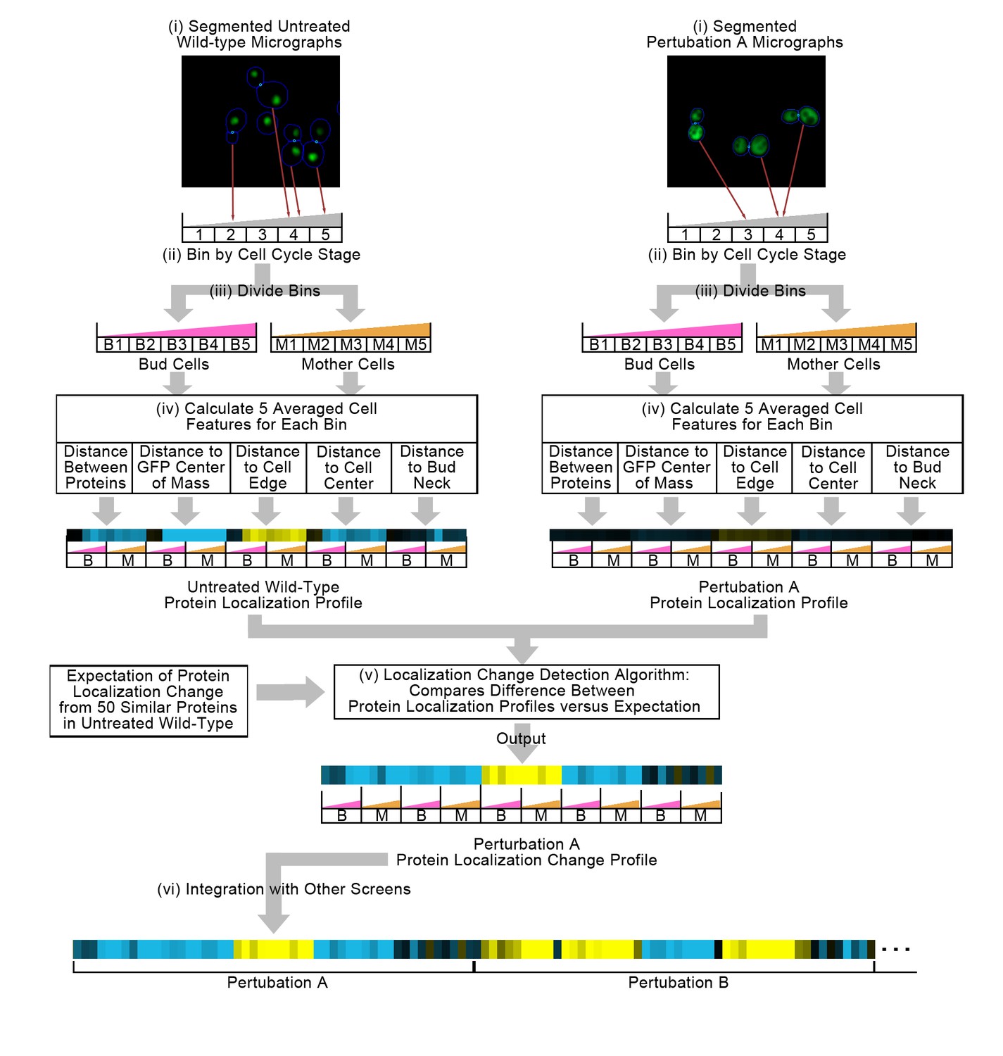
Summary of the methods used in this work.
In step (i), we segment micrographs into single cells. We divide single cells into 10 bins in step (ii), first into five bins by cell cycle stage, and then by mother or bud cell type. We calculate five features for all single cells in step (iii), and report the truncated average of each bin for each feature to form the protein localization profile (see Materials and methods). To compare the untreated wild-type protein localization profile to the perturbation protein localization profile, we apply an unsupervised localization change detection algorithm in step (iv), which outputs a protein localization change profile comprised of a z-score for each feature in the protein localization profile, reporting how significant the difference between the wild-type and perturbation is relative to expectation for each feature. Finally, we concatenate different protein localization change profiles with each other in step (v) to integrate profiles from different image screens. Steps (i) to (iv) are previously published methods, and are described in the Materials and methods section. We represent profiles as heat maps in this work (see the Figure 2 legend for details).
Figure 1—figure supplement 1
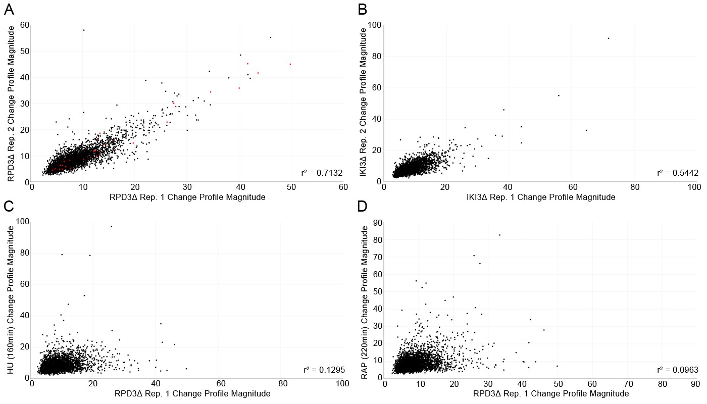
Quality control scatterplots comparing the protein localization change profile magnitudes for each protein (calculated using the sum of squares over the features of the profile) between replicates of the same perturbation, and between different perturbations.
(A) Comparison of the two replicates of the rpd3Δ perturbation. (B) Comparison of the two replicates of the iki3Δ perturbation. (C) Comparison of one replicate of the rpd3Δ perturbation with 160 min of hydroxyurea treatment, and (D) comparison of one replicate of the rpd3Δ perturbation with 220 min of rapamycin treatment. The squared correlation coefficient for each scatterplot is shown in the bottom right corner. Proteins that have localization changes previously detected by Chong et al. (2015) for the rpd3Δ perturbation are shown as red points in (A).
Figure 2 with 3 supplements
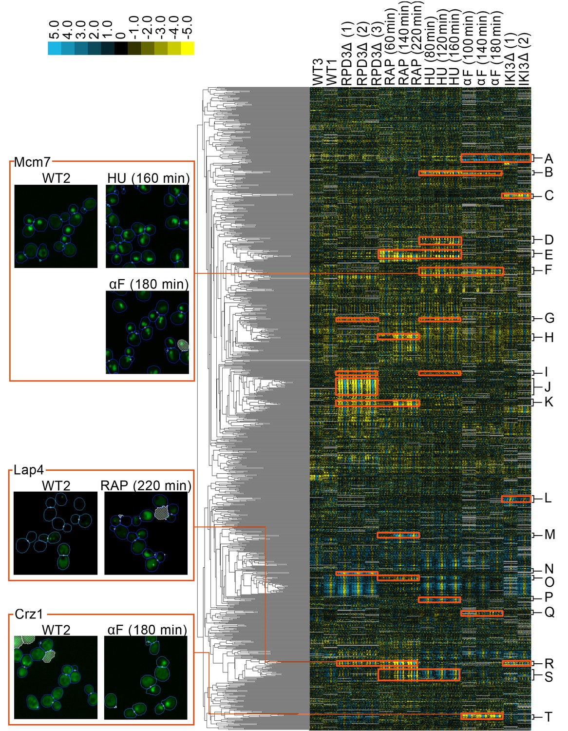
A clustered heat map of protein change profiles.
The right panel shows the 1159 protein change profiles with the strongest values, grouped by similarity. In this visualization, rows represent the protein change profiles for individual proteins, whereas columns represent feature measurements, with each set of 50 measurements corresponding to an image screen. Positive values are blue, whereas negative values are yellow, with the intensity of color corresponding to the magnitude of the value, as shown in the color bar. Grey values are missing data. The headers indicate the image screens that sets of features correspond to, abbreviated using WT to indicate the untreated wild-type screens, ΔRPD3 for the rpd3Δ replicates, RAP for time points of the rapamycin treatment, HU for time points of the hydroxyurea treatment, αF for time points of the α-factor treatment, and ΔIKI for the iki3Δ replicates. The dendrogram depth shows similarity between connected protein profiles or groups of profiles. We highlight examples of strong patterns of protein change profiles in yellow, with some clusters that we have annotations for labelled from A to T, with labels and enrichments for some clusters presented in Table 1. In the four boxes on the left, we show examples of localization changes found in our clusters of protein change profiles. The images are representative cropped micrographs of yeast cells, where the protein named in the top left corner of each box has been tagged with GFP (shown as the green channel). The blue lines in the images show the boundaries drawn between cells by our single-cell segmentation algorithm, the small white circles between cells indicate mother-bud relations, and the white meshed regions indicate areas that have been ignored by our image analysis because they are likely to be artifacts or mis-segmented cells.
-
Figure 2—source data 1
Protein localization change profiles for all of the perturbations presented in Figure 2.
Columns in this spreadsheet are features, whereas rows are proteins.
- https://doi.org/10.7554/eLife.31872.009
Figure 2—figure supplement 1
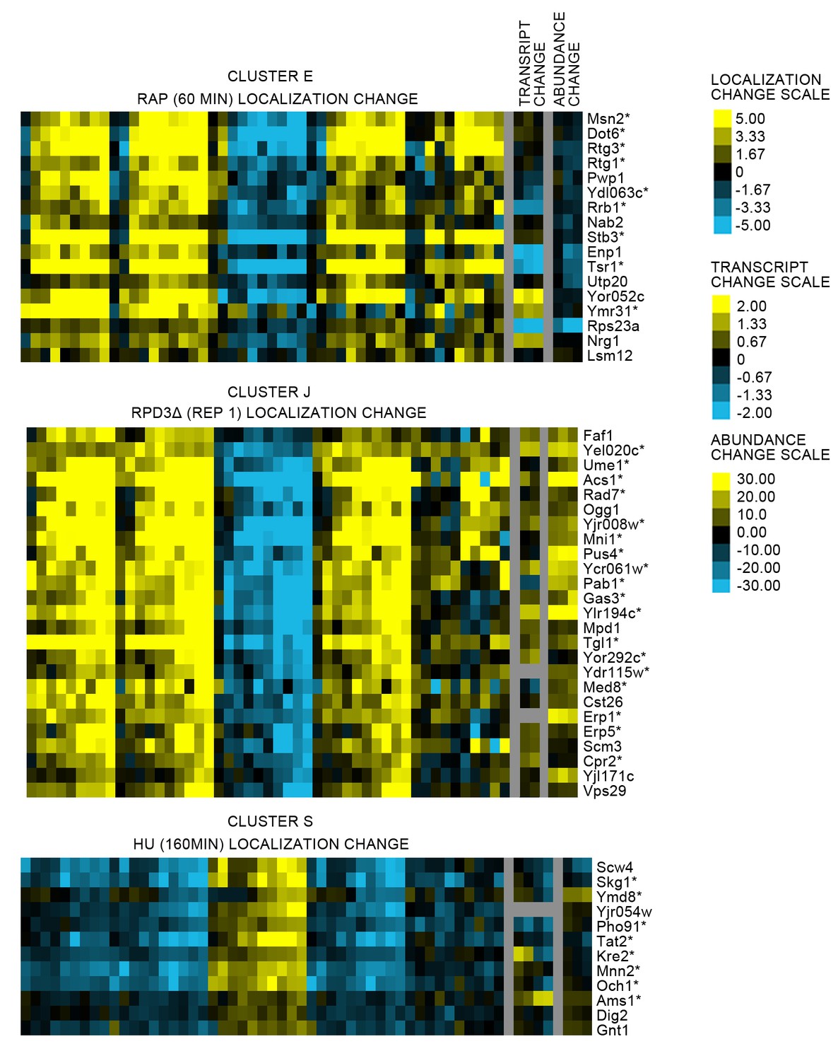
Heat maps comparing the protein localization change profile with the transcript change and protein abundance change for three clusters from Figure 2 (see legend of Figure 2 for details on the heat map visualization).
For each cluster, we show the protein localization change profile for a perturbation screen in which the proteins are predicted to change, and the associated transcript and abundance change profiles for that perturbation. We label the corresponding proteins on the right of the heat maps. Proteins for which we could manually confirm a localization change by evaluating the images are annotated with an asterisk (*). The color bar scales on the far right show the scaling of the pixels in the heat map; note that each profile is scaled differently.
Figure 2—figure supplement 2
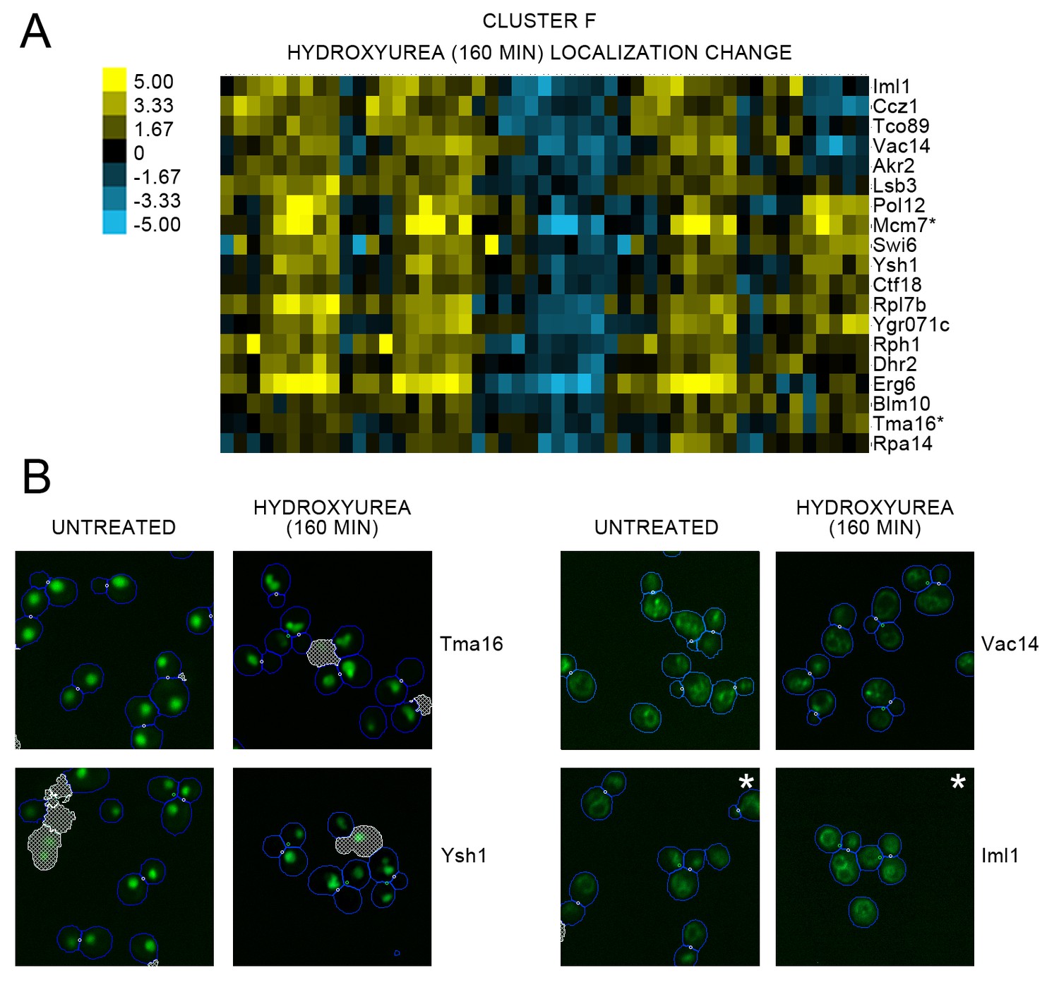
(A) Heat map of the protein localization change profiles for Cluster F and (B) cropped representative micrographs for some proteins in Cluster F from Figure 2 (see legend for Figure 2 for details on the heat map visualization.
For (A), we show the protein localization change profiles resulting from 160 min of hydroxyurea perturbation, and label the corresponding protein on the right of the heat map. The scale for the heat map is shown to the left of the map. Proteins for which we could confidently annotate a localization change after evaluating the images are annotated with an asterisk (*). For (B), we show cropped micrographs of yeast cells where the labeled protein has been fused with GFP (green) for untreated cells versus 160 min of hydroxyurea perturbation. Cropped micrographs labelled with an asterisk (*) have had their image intensities clipped at their lower range to remove noise.
Figure 2—figure supplement 3
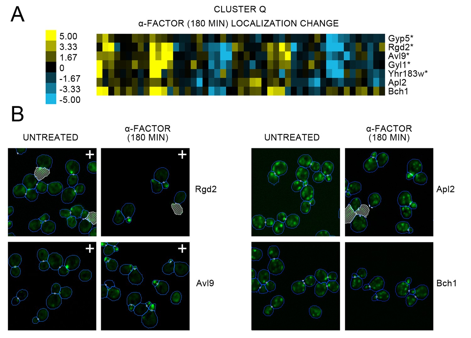
(A) Heat map of the protein localization change profiles for Cluster Q shown in Figure 2, and (B) cropped representative micrographs for some proteins in Cluster Q.
For (A), we show the protein localization change profiles resulting from 180 min of alpha factor perturbation, and label the corresponding protein on the right of the heat map. The scale for the heat map is shown to the left of the heat map. Proteins for which we could confidently annotate a localization change after evaluation of the images are annotated with an asterisk (*). For (B), we show cropped micrographs of yeast cells where the labeled protein has been fused with GFP (green) for untreated cells versus 180 min of alpha factor perturbation. Cropped micrographs labelled with a plus sign (+) have had their image intensities clipped at their higher range to allow better visualization of protein localization.
Figure 3

(A) Heat map of the protein change profiles and (B) cropped micrographs of the GFP collections strains for stress-responsive transcription factors Msn2, Dot6, and Rtg3.
Refer to Figure 2 for information on the heat map visualization of the protein change profiles and micrograph images. In (B), we show cropped micrographs of yeast cells in which Msn2, Dot6, and Rtg3 have been fused with GFP (green), under standard medium (WT2), rapamycin treatment for 60 min (RAP 60m) and 220 min (RAP 220m), and hydroxyurea treatment for 80 min (HU 80m) and 160 min (HU 160m). Cropped micrographs labelled with an asterisk (*) have had their image intensities clipped at their lower range to remove noise.
Figure 4
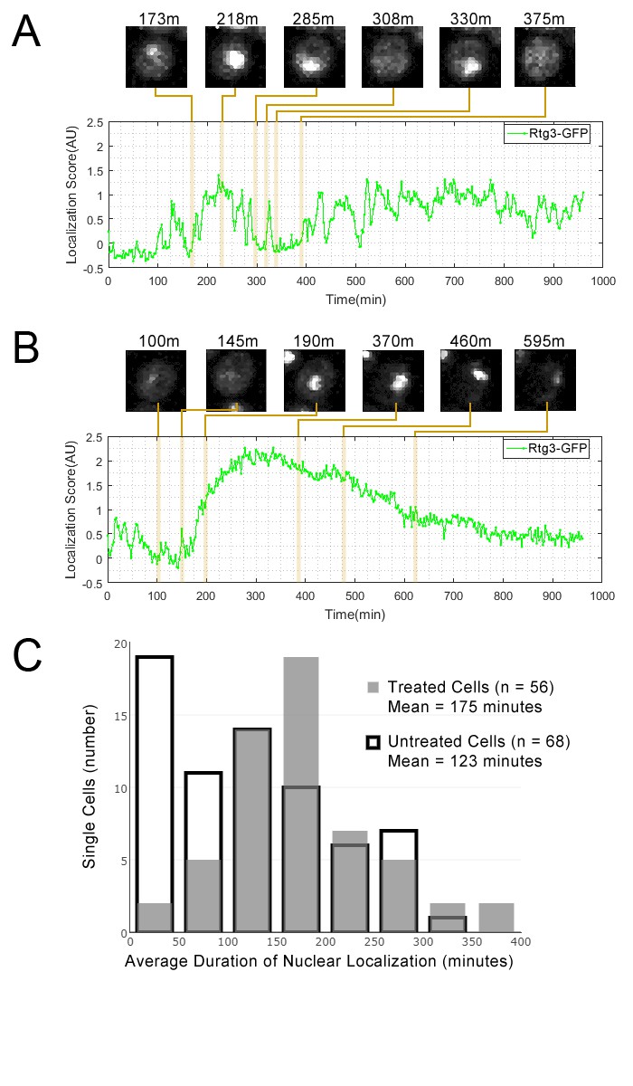
Single cell localization dynamics for Rtg3 for (A) a cell with frequent oscillations between the nucleus and cytoplasm, representative of typical untreated cells, and for (B) a cell with a single prolonged pulse, representative of typical rapamycin-treated cells.
(C) A histogram of the average duration of nuclear localization of Rtg3 for single cells treated with rapamycin versus untreated cells. For rapamycin-treated cells, rapamycin is added at 0 min. To quantify the localization of Rtg3-GFP in single cells, we compute a localization score (expected nuclear intensity, see Materials and methods), which is higher when there is more nuclear-localized protein and lower when there is more cytoplasmic protein. We track these scores for each single cell over each frame of our movie to track the cells over time. Plots show the localization score over time. We show cropped stills from the time-lapse movie showing the state of the cell at various timepoints (labels show the timepoint in minutes).
Figure 5
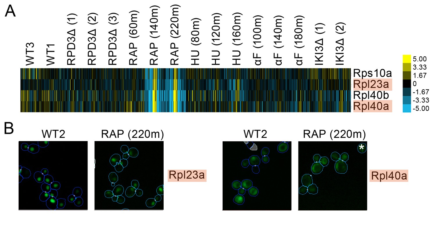
(A) Heat map showing protein change profiles, and (B) cropped micrographs for ribosomal subunits belonging to a cluster that responded specifically in rapamycin.
Refer to Figure 2 for information on the heat map representation of the protein change profiles and micrograph images. In (B), we show cropped micrographs where the labelled protein has been respectively fused with GFP (green), in standard media (WT2) and after 220 min of rapamycin treatment for the proteins highlighted in blue in (A). Cropped micrographs labelled with an asterisk (*) have had their image intensities clipped at their lower range to remove noise.
Figure 6
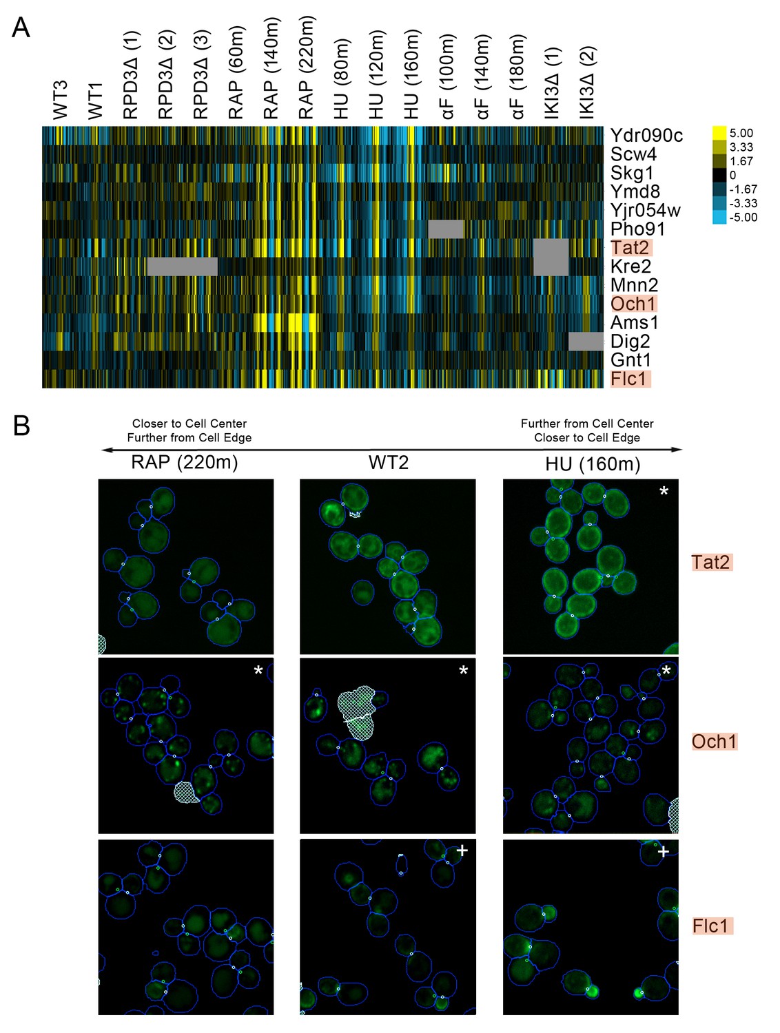
(A) Heat map of the protein change profiles and (B) cropped micrographs for a cluster of proteins with reciprocal protein change profiles between hydroxyurea and rapamycin treatment.
Refer to Figure 2 for information on the heat map representation of the protein change profiles and micrograph images. In (B), we show cropped micrographs of yeast cells in which Tat2, Och1, and Flc1 (highlighted in blue in [A]) have been tagged with GFP (green), after 220 min of rapamycin treatment (RAP 220m), growth in standard media (WT2), and after 160 min of hydroxyurea treatment (HU 160m). Cropped micrographs labelled with an asterisk (*) or a plus sign (+) have had their image intensities clipped at their lower range or higher range, respectively, to remove noise and to better visualize protein localization.
Figure 7 with 1 supplement
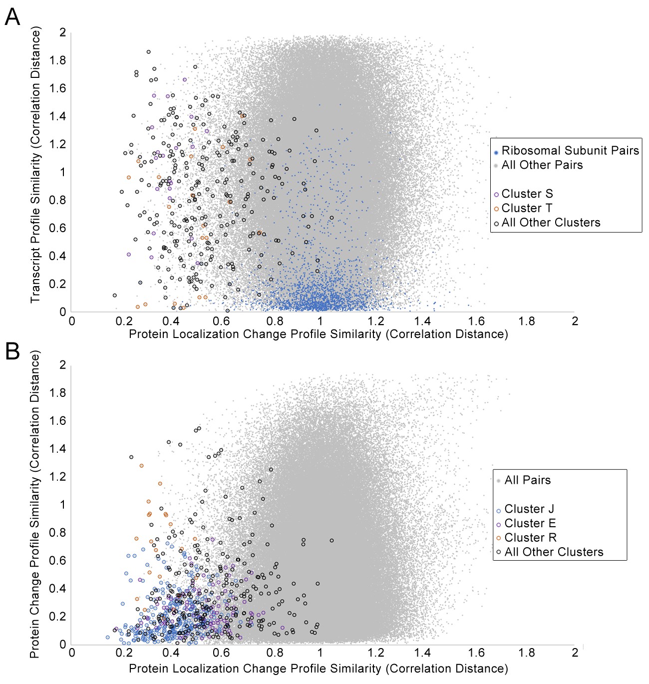
Scatterplots of the protein change profile similarity compared to (A) the transcript profile similarity and (B) the protein abundance profile similarity.
We show protein–protein pairs between all proteins that had strong signals in either profile (see Materials and methods for details). Protein–protein pairs are shown as grey dots, and we circle all protein–protein pairs that belonged to a cluster identified in Figure 2. Some circled protein–protein pairs are color-coded depending on the cluster they belonged to, for some clusters of interest (refer to legend in figures). For the transcript profile similarity scatterplot in (A), we also visualize all protein–protein pairs between ribosomal subunits as blue dots.
Figure 7—figure supplement 1
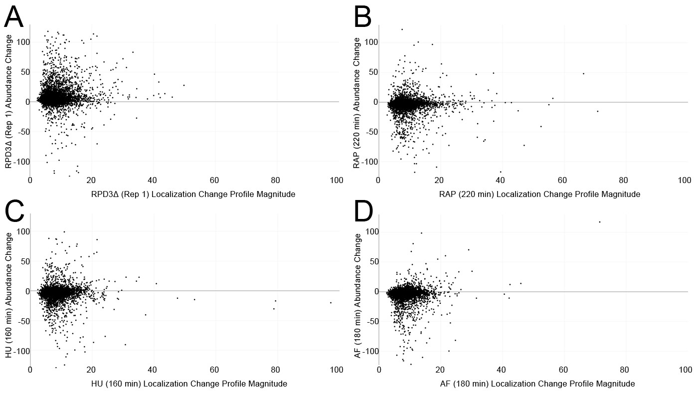
Scatterplots comparing the protein localization change profile magnitudes (calculated using the sum of squares over the features of the profile) with the average protein abundance change for each protein in four screens.
(A) The first replicate of rpd3Δ. (B) 220 min of rapamycin treatment. (C) 160 min of hydroxyurea treatment. (D) 180 min of alpha factor treatment. See Materials and methods for details on how protein abundance change is calculated.
Figure 8
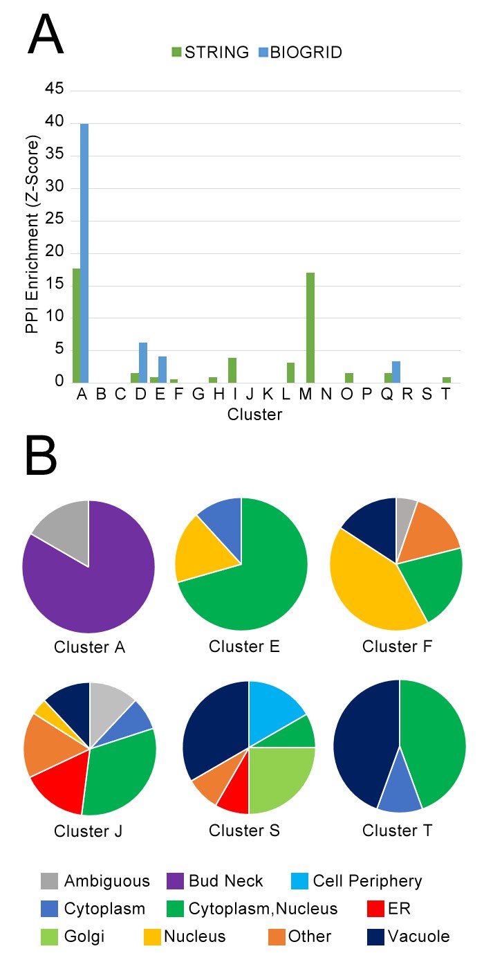
(A) Comparison of protein localization change profile clusters with physical protein–protein interactions and (B) localization in untreated wild-type cells.
(A) The enrichment of each protein localization change profile cluster that we identified in Table 1 for physical interactions in the BIOGRID and the STRING databases, measured as z-scores indicating degree of enrichment relative to null expectation. (B) The distribution of manually annotated subcellular localization for untreated wild-type proteins for proteins in Clusters A, E, F, J, S, and T.
Figure 9
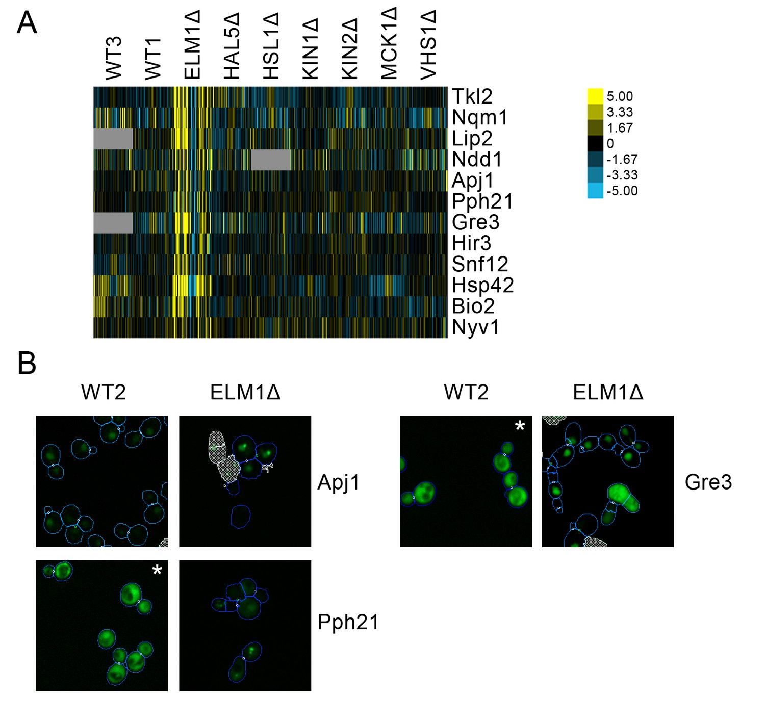
(A) Heat map showing protein change profiles, and (B) cropped micrographs for proteins in a cluster that responded specifically in elm1Δ.
Refer to Figure 2 for information on the heat map representation of the protein change profiles and micrograph images. In (B), we show cropped micrographs in which the labelled protein has been respectively fused with GFP (green), and the elm1Δ mutant for proteins Apj1, Gre3 and Pph21. Cropped micrographs labelled with an asterisk (*) have had their image intensities clipped at their lower range to remove noise.
Figure 10
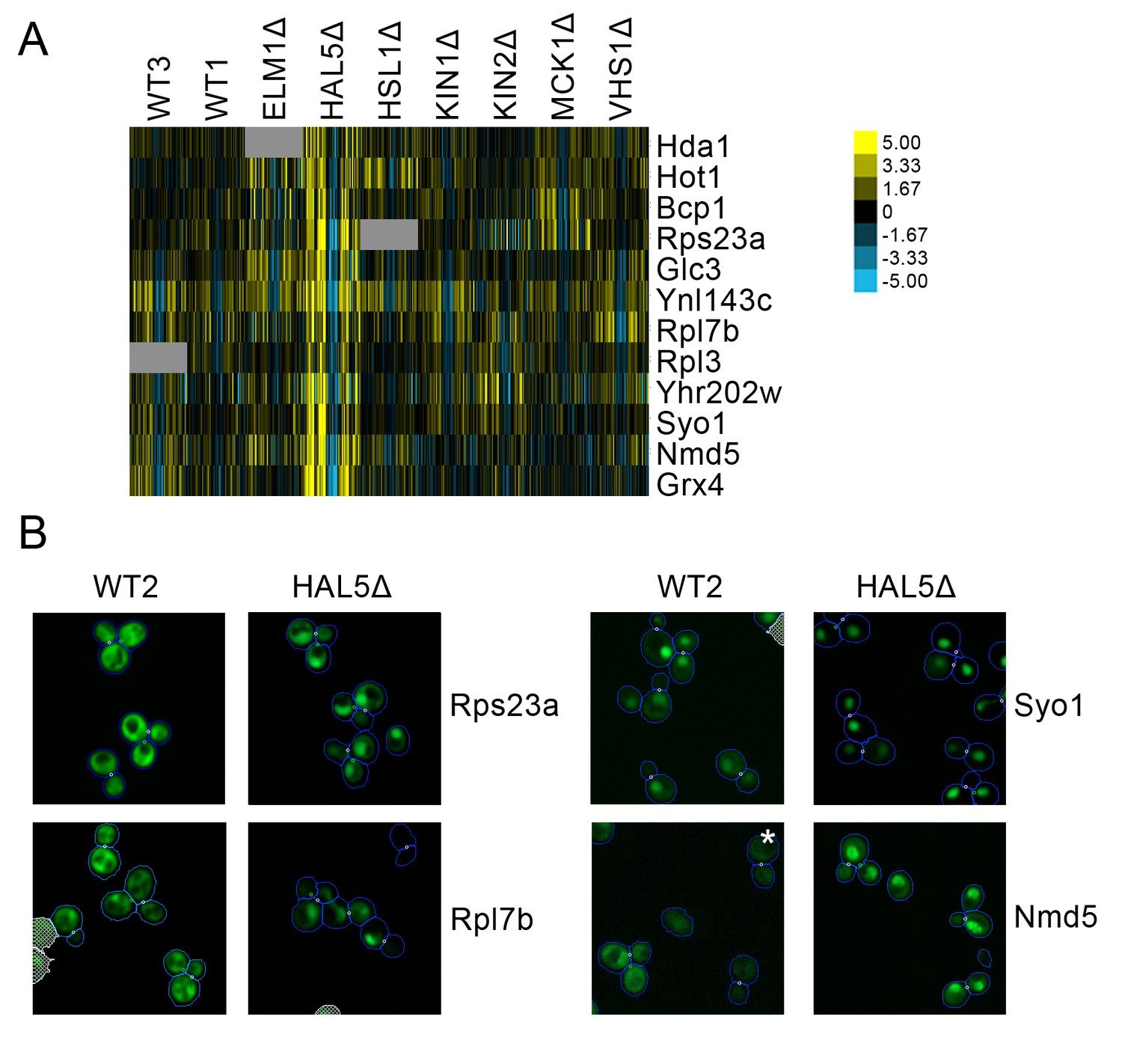
(A) Heat map showing protein change profiles, and (B) cropped micrographs for proteins in a cluster that responded specifically in hal51Δ.
Refer to Figure 2 for information on the heat map representation of the protein change profiles and micrograph images. In (B), we show cropped micrographs in which the labelled protein has been fused with GFP (green), and the hal5Δ mutant for proteins Rps23a, Rpl7b, Syo1, and Nmd5. Cropped micrographs labelled with an asterisk (*) have had their image intensities clipped at their lower range to remove noise.
Tables
Table 1
Annotations for some labelled clusters presented in Figure 1.
The letter in the cluster column corresponds to the letters assigned to clusters in Figure 2. Selected significant gene ontology enrichments are listed with their respective GO accession numbers and p-values, as well as some arbitrarily chosen examples of proteins. Clusters that are not associated with a GO accession number are manual annotations. Under the ‘Proteins with annotation’ column, we report the number of proteins with the GO annotation versus the total number of proteins in that cluster.
| Cluster | Perturbation(s) | Annotation | P-value | Proteins with annotation | Examples |
|---|---|---|---|---|---|
| A | α-factor, iki3Δ | Cytoskeleton-dependent cytokinesis [GO:0061640] | 3.77E–07 | 8/12 | Bud3, Bud4, Cdc10, Cdc11, Hof1, Myo1 |
| Cell cycle [GO:0007049] | 9.21E–05 | 11/12 | |||
| D | Hydroxyurea | Cell cycle | – | – | Cdc28, Cdc7, Clb2 |
| E | Rapamycin, hydroxyurea | RNA metabolic process [GO:0016070] | 6.70E–04 | 15/18 | Msn2, Dot6, Rtg1, Rtg3, Enp1, Tsr1, Stb3, Utp20 |
| Stress-responsive transcription factors | – | – | Msn2, Dot6, Rtg1, Rtg3 | ||
| F | Hydroxyurea, α-factor | Extrinsic component of vacuolar membrane [GO:0000306] | 0.028823 | 3/19 | Iml1, Vac14, Tco89 |
| DNA replication | – | – | Pol12, Mcm7, Ctf18 | ||
| G | rpd3Δ, hydroxyurea | Triglyceride lipase activity [GO:0004806] | 0.029239 | 2/6 | Tgl4, Tgl5 |
| Metabolic activity | – | – | Tgl4, Tgl5, Rnr3, Gdb1 | ||
| H | Rapamycin | Negative regulator of hydrolase activity [GO:0051346] | 2.70E-04 | 4/9 | Stf1, Inh1, Yhr138c, Pbi2 |
| Enzyme inhibitor activity [GO:0004857] | 0.001441 | 4/9 | |||
| J | rpd3Δ | Annotated by Chong et al. (2015) to localize away from cytoplasm in rpd3Δ | – | – | Acs1, Rad7, Mni1, Yjr008w, Ycr061w, Pab1, Pus4, Yor292c |
| L | iki3Δ | Ribosomal subunits | - | - | Rps9a, Rpl13b, Rps0b |
| M | Rapamycin | Cytosolic ribosome [GO:0022626] | 0.010879 | 4/5 | Rpl23a, Rpl40a, Rpl40b, Rps10a |
| Ribosomal subunits | – | – | |||
| Q | α-factor | Golgi vesicle transport | 0.005435 | 5/7 | Apl2, Avl9, Gyl1, Bch1, Gyp5 |
| Cellular bud tip | 9.28E–06 | 5/7 | Rgd2, Yhr182w, Avl9 Gyl1, Gyp5 | ||
| R | rpd3Δ, rapamycin, iki3Δ | Vacuole [GO:0005773] | 9.39E–05 | 7/7 | Bap2, Itr1, Hxt2, Aqr1, Dip5 |
| Ion transmembrane transporter activity [GO:0015075] | 0.020585 | 5/7 | |||
| S | Rapamycin, hydroxyurea | Bounding membrane of organelle [GO:0098588] | 0.027761 | 8/12 | Ams1, Kch1, Ymd8, Pho91, Mnn2, Och1, Kre2, Gnt1 |
| Protein glycosylation [GO:0006486] | 0.020786 | 4/12 | Mnn2, Och1, Kre2, Gnt1 | ||
| T | α-factor | Cellular response to pheromone [GO:0071444] | 5.37E–04 | 5/9 | Fus1, Kar4, Ste2, Aga2, Crz1 |
-
Table 1—source data 1
A spreadsheet containing lists of the proteins in each cluster highlighted in Figure 2, and the GO enrichments of these clusters.
For GO enrichments, we report the enriched term, the p-value, all proteins in the cluster annotated with the term, and the GO accession number.
- https://doi.org/10.7554/eLife.31872.011
Additional files
-
Supplementary file 1
A spreadsheet containing the manual evaluations of the five clusters shown in Figure 2.
For all proteins within each cluster, we gave to a human evaluator the images for the untreated wild-type and a perturbation predicted to change by the protein localization change profiles of the cluster. The evaluator recorded the localization in the untreated wild-type, in the perturbation, and whether a localization change was visible. If the localization change was ambiguous, the evaluator recorded why they were not able to confirm the localization change.
- https://doi.org/10.7554/eLife.31872.021
-
Supplementary file 2
A spreadsheet containing lists of proteins predicted to change localization under each perturbation, based upon the clusters presented in Figure 2.
- https://doi.org/10.7554/eLife.31872.022
-
Supplementary file 3
Protein localization change profiles for all kinase deletions.
Columns in this spreadsheet are features, while rows are proteins.
- https://doi.org/10.7554/eLife.31872.023
-
Transparent reporting form
- https://doi.org/10.7554/eLife.31872.024
Download links
A two-part list of links to download the article, or parts of the article, in various formats.
Downloads (link to download the article as PDF)
Open citations (links to open the citations from this article in various online reference manager services)
Cite this article (links to download the citations from this article in formats compatible with various reference manager tools)
Integrating images from multiple microscopy screens reveals diverse patterns of change in the subcellular localization of proteins
eLife 7:e31872.
https://doi.org/10.7554/eLife.31872


