Large-scale network integration in the human brain tracks temporal fluctuations in memory encoding performance
- Kochi University of Technology, Japan
- Keio University, Japan
Figures
Figure 1
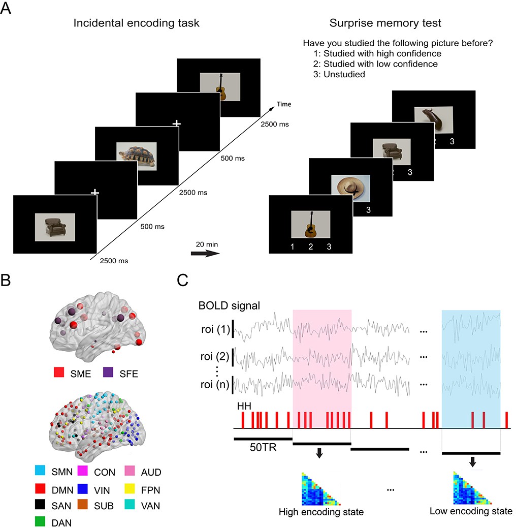
Experimental design and analysis overview.
(A) Participants performed an incidental memory encoding task inside the scanner (360 picture trials). They judged whether each picture contained a man-made or natural object. Twenty minutes later, participants performed a surprise memory test outside the scanner (360 studied and 360 unstudied pictures). They were asked to answer if they recognized each picture as (1) studied with high confidence, (2) studied with low confidence, or (3) unstudied. (B) Regions of interest (ROIs) used in connectivity analysis. We used two sets of ROIs: One consisting of 21 well-established memory-related brain regions derived from a recent meta-analysis (Kim, 2011) and the other consisting of 224 ROIs across the whole brain derived from a functional atlas (Power et al., 2011). (C) fMRI signal time series was extracted from each ROI and divided into 36 s time windows. Each window was classified as high or low encoding state based on window-wise encoding performance, that is, the proportion of high-confidence hit (HH) trials during that time window. Functional connectivity patterns and graph metrics were estimated within each window, then averaged within each state. SME, subsequent memory effect; SFE, subsequent forgotten effect; SMN, sensorimotor networks; CON, cingulo-opercular network; AUD, auditory network; DMN, default mode network; VIN, visual network; FPN, fronto-parietal network; SAN, salience network; SUB, subcortical network; VAN, ventral attention network; DAN, dorsal attention network.
Figure 2
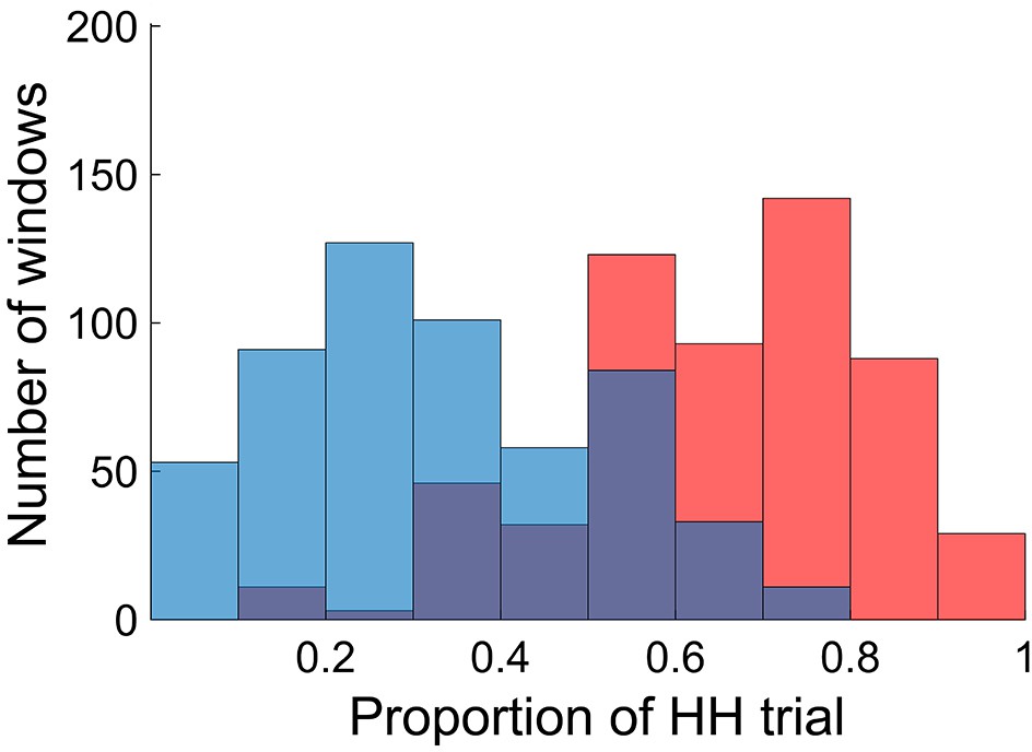
Distributions of time windows classified as high and low encoding states.
The histogram shows distributions of the time windows with regard to the window-wise encoding performance, pooled across participants (red, high encoding state; blue, low encoding state). Note that the two distributions are overlapping because we used participant-specific median split to classify the high and low encoding states. Source data for the analyses reported here are available in Figure 2—source data 1.
-
Figure 2—source data 1
Proportion of HH trials of all windows, high encoding windows, and low encoding windows pooled across 25 participants.
These data were used to generate the histograms shown in Figure 2.
- https://cdn.elifesciences.org/articles/32696/elife-32696-fig2-data1-v3.zip
Figure 3
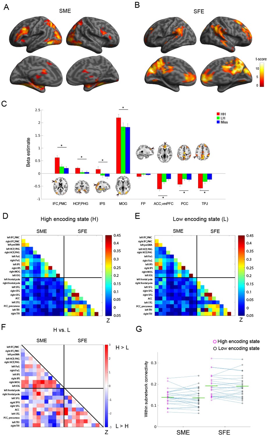
Functional connectivity patterns among memory-related brain regions.
Trial-related activation analysis confirmed (A) the subsequent memory effect (SME, that is, HH >Miss) and (B) subsequent forgetting effect (SFE, that is, Miss > HH). Statistical parametric maps are thresholded at p<0.05, FWE corrected across the whole brain. (C) Bar graph shows beta estimates (mean ± SEM across participants) for high-confidence hit (HH), low-confidence hit (LH), and Miss trials in representative ROIs from the SME/SFE regions. (D) Connectivity matrix of the high encoding state, averaged across participants. (E) Connectivity matrix of the low encoding state, averaged across participants. Color bars indicate Fisher-Z transform of Pearson’s correlation coefficients. (F) A matrix illustrating statistical differences in functional connectivity patterns between the high and low encoding states. Color bar indicates z values derived from Wilcoxon signed-rank test across participants. Connections showing significant differences (p<0.05, FDR corrected) are marked in red in the upper triangle of the matrix. (G) Within-subnetwork connectivity for the SME and SFE regions (mean Fisher’s Z value of connections within the SME and SFE regions, respectively). Magenta and black circles represent individual-participant data for the high and low encoding states, respectively. Green horizontal lines indicate across-participant means. Asterisk indicates a significant difference in within-subnetwork connectivity between the high and low encoding states (Wilcoxon signed-rank test, p<0.05). IFC, inferior frontal cortex; PMC, premotor cortex; HCP, hippocampus; PHG, parahippocampal gyrus; IPS, intraparietal sulcus; MOG, middle occipital gyrus; FP, frontal pole; ACC, anterior cingulate cortex; vmPFC, ventromedial prefrontal cortex; PCC, posterior cingulate cortex; TPJ, temporoparietal junction. Source data for the analyses reported here are available in Figure 3—source data 1–5.
-
Figure 3—source data 1
Beta estimates extracted from 8 representative ROIs from the SME/SFE regions.
These data were used to generate the bar graph shown in Figure 3C.
- https://cdn.elifesciences.org/articles/32696/elife-32696-fig3-data1-v3.zip
-
Figure 3—source data 2
Mean correlation coefficients across the 21 SME/SFE regions, averaged across high encoding windows.
These data were used to generate the connectivity matrix of the high encoding state shown in Figure 3D.
- https://cdn.elifesciences.org/articles/32696/elife-32696-fig3-data2-v3.zip
-
Figure 3—source data 3
Mean correlation coefficients across the 21 SME/SFE regions, averaged across low encoding windows.
These data were used to generate the connectivity matrix of the low encoding state shown in Figure 3E.
- https://cdn.elifesciences.org/articles/32696/elife-32696-fig3-data3-v3.zip
-
Figure 3—source data 4
z-values derived from Wilcoxon signed-rank test across participants.
These data were used to generate the matrix comparing correlation coefficients between the high and low encoding states shown in Figure 3F.
- https://cdn.elifesciences.org/articles/32696/elife-32696-fig3-data4-v3.zip
-
Figure 3—source data 5
Mean Fisher’s z-value of connections within the SME and SFE regions for each participant, separately for the high and low encoding states.
These data were used to generate the scatter plots shown in Figure 3G.
- https://cdn.elifesciences.org/articles/32696/elife-32696-fig3-data5-v3.zip
Figure 4 with 2 supplements
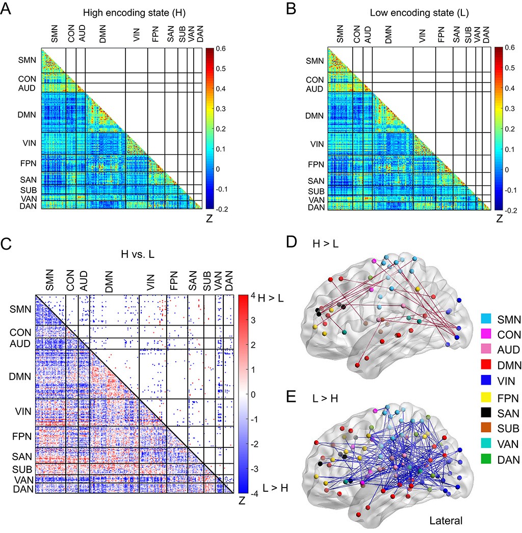
Functional connectivity patterns across large-scale brain network.
(A) Connectivity matrix of the high encoding state, averaged across participants. (B) Connectivity matrix of the low encoding state, averaged across participants. Color bars indicate Fisher’s Z-transform of Pearson’s correlation coefficients. (C) A matrix illustrating statistical differences in functional connectivity patterns between the high and low encoding states. ROIs belonging to the same subnetwork were grouped together resulting in 10 subnetworks. Color bar indicates z values derived from Wilcoxon signed-rank test across participants. Connections showing significant differences (p<0.05, FDR corrected) are marked in color (red, high >low; blue, low >high) in the upper triangle of the matrix. (D) Three-dimensional (3D) visualizations of significantly greater functional connectivity during the high encoding state. (E) 3D visualizations of significantly greater functional connectivity during the low encoding state. Source data for the analyses reported here are available in Figure 4—source data 1–5.
-
Figure 4—source data 1
Mean correlation coefficients across the 224 ROIs, averaged across high encoding windows.
These data were used to generate the connectivity matrix of the high encoding state shown in Figure 4A.
- https://cdn.elifesciences.org/articles/32696/elife-32696-fig4-data1-v3.zip
-
Figure 4—source data 2
Mean correlation coefficients across the 224 ROIs, averaged across low encoding windows.
These data were used to generate the connectivity matrix of the low encoding state shown in Figure 4B.
- https://cdn.elifesciences.org/articles/32696/elife-32696-fig4-data2-v3.zip
-
Figure 4—source data 3
z-values derived from Wilcoxon signed-rank test across participants.
These data were used to generate the matrix comparing correlation coefficients between the high and low encoding states shown in Figure 4C.
- https://cdn.elifesciences.org/articles/32696/elife-32696-fig4-data3-v3.zip
-
Figure 4—source data 4
.edge file used as an input of BrainNet Viewer toolbox to create the 3D visualizations of significantly greater functional connectivity during the high encoding state shown in Figure 4D.
- https://cdn.elifesciences.org/articles/32696/elife-32696-fig4-data4-v3.zip
-
Figure 4—source data 5
.edge file used as an input of BrainNet Viewer toolbox to create the 3D visualizations of significantly greater functional connectivity during the low encoding state shown in Figure 4E.
- https://cdn.elifesciences.org/articles/32696/elife-32696-fig4-data5-v3.zip
Figure 4—figure supplement 1
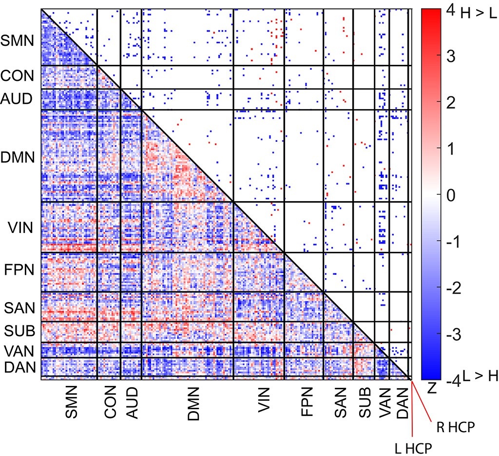
Difference in functional connectivity patterns between the high and low encoding states in a 226-node network combining the bilateral hippocampus and the Power atlas.
Color bar indicates z values derived from Wilcoxon signed-rank test across participants. L HCP, left hippocampus, R HCP, right hippocampus.
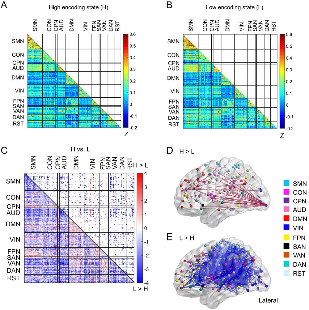
Figure 4—figure supplement 2
Functional connectivity patterns across a 285-node network derived from the Gordon atlas.
(A) Connectivity matrix of the high encoding state, averaged across participants. (B) Connectivity matrix of the low encoding state, averaged across participants. Color bars indicate Fisher’s Z-transform of Pearson’s correlation coefficients. (C) A matrix illustrating statistical differences in functional connectivity patterns between the high and low encoding states. ROIs belonging to the same subnetwork were grouped together, resulting in 11 subnetworks. Color bar indicates z values derived from Wilcoxon signed-rank test across participants. Connections showing significant differences (p<0.05, FDR corrected) are marked in color (red, high >low; blue, low >high) in the upper triangle of the matrix. (D) Three-dimensional (3D) visualizations of significantly greater functional connectivity during the high encoding state. (E) 3D visualizations of significantly greater functional connectivity during the low encoding state. SMN, sensorimotor networks; CON, cingulo-opercular network; CPN, cingulo-parietal network; AUD, auditory network; DMN, default mode network; VIN, visual network; FPN, fronto-parietal network; SAN, salience network; VAN, ventral attention network; DAN, dorsal attention network; RST, retrosplenial-temporal network.
Figure 5 with 3 supplements

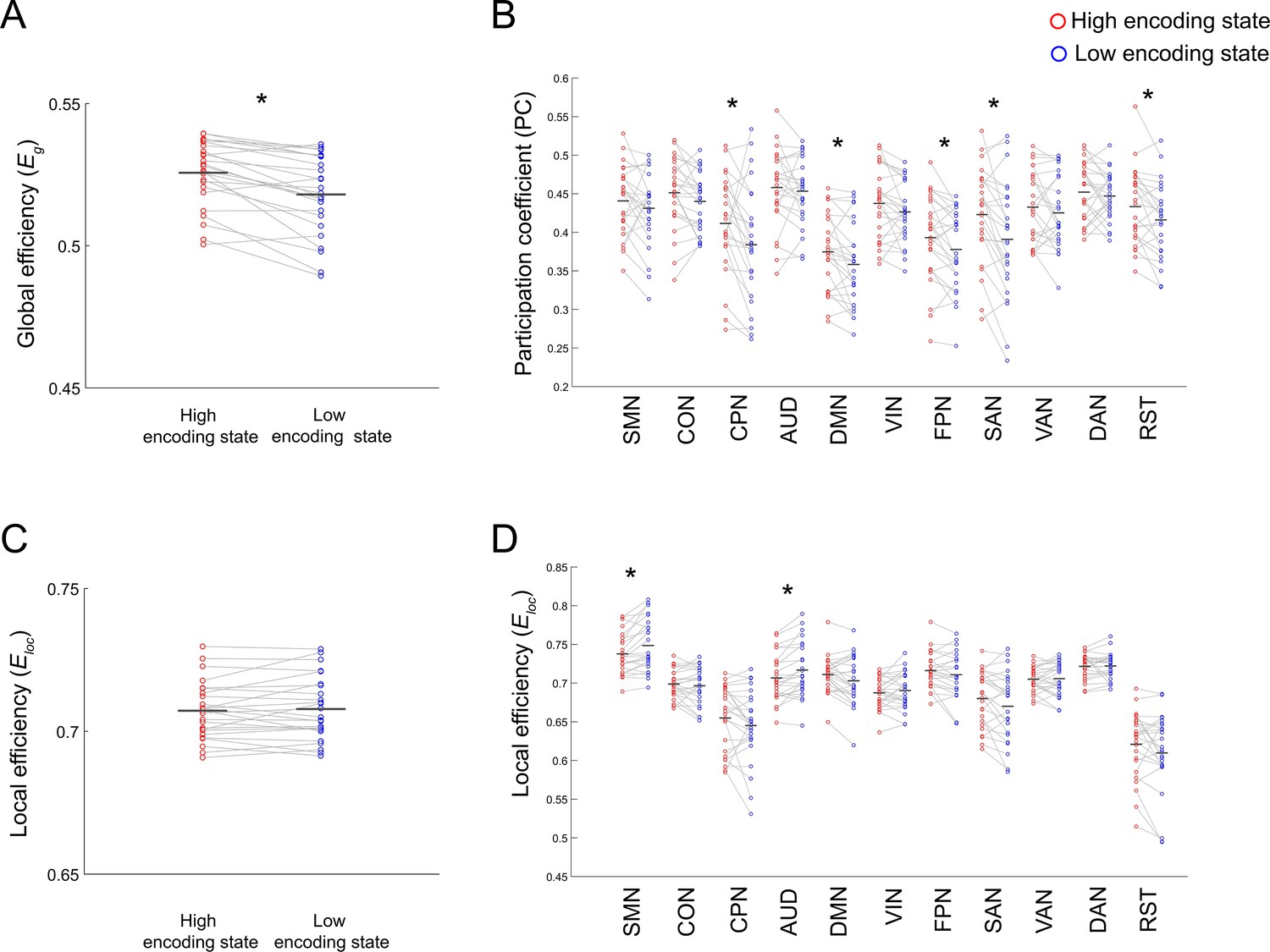
Differences in integration/segregation of large-scale network between high and low encoding states.
(A) Global efficiency, a measure of network integration. (B) Participation coefficient (averaged across nodes within each subnetwork), a measure of integration defined at subnetwork level. (C) Local efficiency (averaged across all nodes), a measure of segregation. (D) Local efficiency (averaged across nodes within each subnetwork), a measure of segregation defined at the subnetwork level. Graph metrics were computed for each time window, then averaged across windows separately for each state. Dots represent individual-participant data. Black horizontal lines indicate across-participant means. Asterisks indicate a significant difference between the states (p<0.05, FDR corrected for subnetwork-wise metrics). Source data for the analyses reported here are available in Figure 5—source data 1–4.
-
Figure 5—source data 1
Mat file containing global efficiency in the high and low encoding states for each participant.
These data were used to generate the scatter plot shown in Figure 5A.
- https://cdn.elifesciences.org/articles/32696/elife-32696-fig5-data1-v3.zip
-
Figure 5—source data 2
Participation coefficients (averaged across nodes within each subnetwork) in the high and low encoding states for each participant.
These data were used to generate the scatter plot shown in Figure 5B.
- https://cdn.elifesciences.org/articles/32696/elife-32696-fig5-data2-v3.zip
-
Figure 5—source data 3
Local efficiency (averaged across all nodes) in the high and low encoding states for each participant.
These data were used to generate the scatter plot shown in Figure 5C.
- https://cdn.elifesciences.org/articles/32696/elife-32696-fig5-data3-v3.zip
-
Figure 5—source data 4
Local efficiency (averaged across nodes within each subnetwork) in high and low encoding states for each participant.
These data were used to generate the scatter plot shown in Figure 5D.
- https://cdn.elifesciences.org/articles/32696/elife-32696-fig5-data4-v3.zip
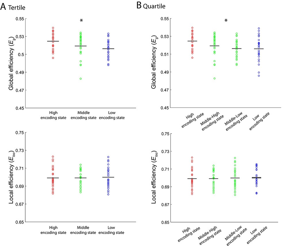
Figure 5—figure supplement 1
Levels of integration/segregation of a 224-node network associated with encoding performance.
(A) Global efficiency and local efficiency during high, middle, and low encoding states. States were defined based on participant-specific tertiles of window-wise encoding performance. (B) Global efficiency and local efficiency during high, middle-high, middle-low, and low encoding states. States were defined based on participant-specific quartiles of window-wise encoding performance. Graph metrics were computed for each time window, then averaged across windows separately for each state. In the analysis shown in this figure, unlike any other analyses, we included 24 participants because we could not define mid tertile or mid quartiles for the remaining one participant. Dots represent individual-participant data. Black horizontal lines indicate across-participant means. Asterisks indicate a significant linear effect of encoding states (p<0.05, one-way ANOVA with trend analysis).
Figure 5—figure supplement 2
Differences in integration/segregation between high and low encoding states for a 285-node network derived from the Gordon atlas.
(A) Global efficiency, a measure of network integration. (B) Participation coefficient (averaged across nodes within each subnetwork), a measure of integration defined at subnetwork level. (C) Local efficiency (averaged across all nodes), a measure of segregation. (D) Local efficiency (averaged across nodes within each subnetwork), a measure of segregation defined at the subnetwork level. Graph metrics were computed for each time window, then averaged across windows separately for each state. Dots represent individual-participant data. Black horizontal lines indicate across-participant means. Asterisks indicate a significant difference between the states (p<0.05, FDR corrected for subnetwork-wise metrics).
Figure 5—figure supplement 3
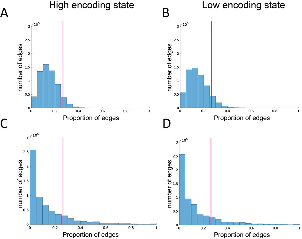
Edge reliability analysis.
(A, B) Histograms showing the distributions of the probability of edge appearance in randomized networks. (C, D) Histograms showing the distributions of the probability of edge appearance in real networks. Distributions were first computed for each participant and state, then pooled across participants for illustration. Here, the probability of edge appearance indicates how consistently an edge appears between a given node pair across time windows. An edge is defined as ‘reliable’ if the probability of appearance is higher than the 95th percentile threshold determined by the null distributions derived from randomized networks. The magenta vertical lines indicate the 95th percentile threshold (averaged across participants for illustration).
Figure 6 with 1 supplement
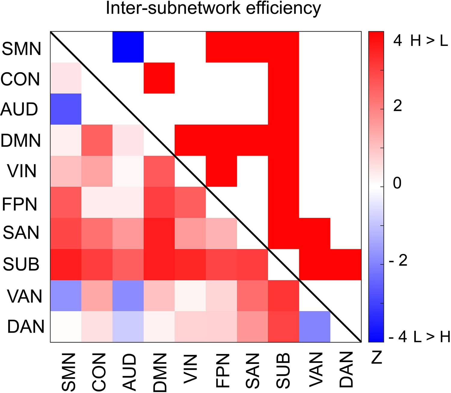
Differences in inter-subnetwork efficiency between high and low encoding states.
Inter-subnetwork efficiency (Eis) was computed for each pair of subnetworks. Color bar indicates z values derived from Wilcoxon signed-rank test across participants. Subnetwork pairs showing significant differences (p<0.05, FDR corrected) are marked in color (red, high >low; blue, low >high) in the upper triangle of the matrix. Source data for the analyses reported here are available in Figure 6—source data 1.
-
Figure 6—source data 1
z-values derived from Wilcoxon signed-rank test across participants.
These data were used to generate the matrix comparing inter subnetwork efficiency between the high and low encoding states shown in Figure 6.
- https://cdn.elifesciences.org/articles/32696/elife-32696-fig6-data1-v3.zip
Figure 6—figure supplement 1
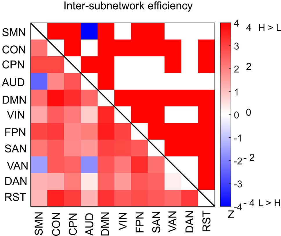
Differences in inter-subnetwork efficiency between high and low encoding states for a 285-node network derived from the Gordon atlas.
Inter-subnetwork efficiency (Eis) was computed for each pair of subnetworks. Color bar indicates z values derived from Wilcoxon signed-rank test across participants. Subnetwork pairs showing significant differences (p<0.05, FDR corrected) are marked in color (red, high > low; blue, low > high) in the upper triangle of the matrix.
Figure 7
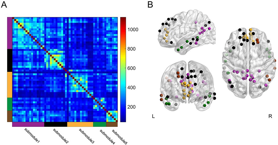
Group-level module decomposition of the DMN subnetwork.
(A) Group consistency coclassification matrix indicating an optimal modular structure across all time windows and participants. (B) 3D visualization of the 56 DMN nodes classified into five submodules. Source data for the analyses reported here are available in Figure 7—source data 1 and 2.
-
Figure 7—source data 1
The matrix showing how frequently each node was assigned to be the same submodule.
These data were used to generate the consistency matrix indicating the five DMN submodules shown in Figure 7A.
- https://cdn.elifesciences.org/articles/32696/elife-32696-fig7-data1-v3.zip
-
Figure 7—source data 2
.node file used as an input of BrainNet Viewer toolbox to create the 3D visualizations of the 56 DMN nodes classified into the five submodules as shown in Figure 7B.
- https://cdn.elifesciences.org/articles/32696/elife-32696-fig7-data2-v3.zip
Figure 8
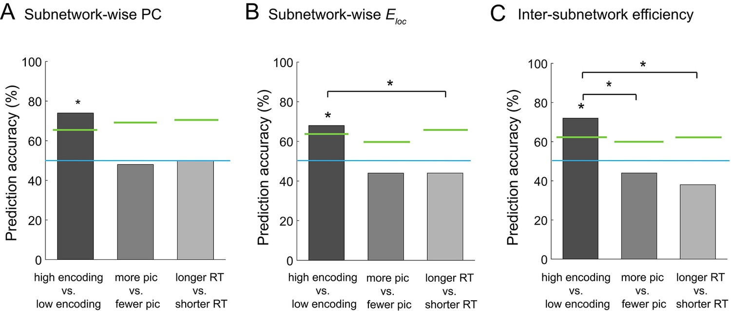
Multivariate classification analysis using graph metrics.
(A) Prediction accuracy of support vector machine (SVM) classifier using subnetwork-wise PCs as the input. (B) Prediction accuracy of SVM classifier using subnetwork-wise local efficiency as the input. (C) Prediction accuracy of SVM classifier using inter-subnetwork efficiency as the input. Bar graphs represent prediction accuracy obtained by different criteria for sorting time windows: encoding performance and two control criteria (proportion of picture trials and RT for semantic judgment). Asterisks indicate statistical significance (p<0.05, permutation test). Green lines indicate significance threshold determined by permutation null distributions. The blue lines indicate the theoretical chance level (i.e., 50%). Source data for the analyses reported here are available in Figure 8—source data 1.
-
Figure 8—source data 1
Prediction accuracy (P < 0.05, permutation test), i.e., the output from the SVM classifier using subnetwork-wise PCs, subnetwork-wise local efficiency, and inter-subnetwork efficiency as inputs.
These data were used to generate the bar plots shown in Figures 8A, B and C.
- https://cdn.elifesciences.org/articles/32696/elife-32696-fig8-data1-v3.xls
Additional files
-
Supplementary file 1
Supplementary tables for additional analyses.
- https://cdn.elifesciences.org/articles/32696/elife-32696-supp1-v3.docx
-
Transparent reporting form
- https://cdn.elifesciences.org/articles/32696/elife-32696-transrepform-v3.pdf
Download links
A two-part list of links to download the article, or parts of the article, in various formats.
Downloads (link to download the article as PDF)
Open citations (links to open the citations from this article in various online reference manager services)
Cite this article (links to download the citations from this article in formats compatible with various reference manager tools)
Large-scale network integration in the human brain tracks temporal fluctuations in memory encoding performance
eLife 7:e32696.
https://doi.org/10.7554/eLife.32696


