Using paired serology and surveillance data to quantify dengue transmission and control during a large outbreak in Fiji
- London School of Hygiene and Tropical Medicine, United Kingdom
- National Centre for Communicable Disease Control, Fiji
- University of the South Pacific, Fiji
- Institut Louis Malardé, French Polynesia
- Institut Pasteur, France
- Australian National University, Australia
- Queensland University of Technology, Australia
- World Health Organization Division of Pacific Technical Support, Fiji
Figures
Figure 1
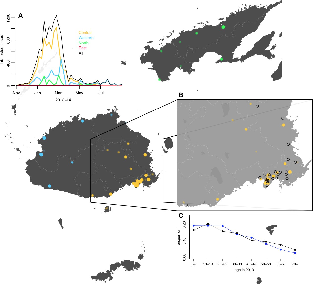
Geographical distribution of weekly lab tested suspected dengue cases in Northern (green), Western (blue) and Central (yellow) divisions between 27th October 2013 and 1 st July 2014.
Points on the maps show locations of cases arranged by health centre they reported to; these are plotted with jitter and transparency to show concentrations of cases. (A) Weekly reported case totals for Northern, Western, Central and Eastern divisions. (B) Serosurvey study locations. Black circles show the 23 study clusters included in the analysis. (C) Age distribution of Central Division in the 2007 census (blue line) and ages of serosurvey participants in 2013 (black line).
Figure 2
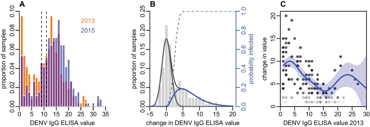
Distribution of ELISA values for anti-DENV IgG over time.
(A) Distribution of values in 2013 and 2015. Orange bars show observed proportion of samples with each value in 2013; blue bars show proportions in 2015. Dashed lines show threshold for seronegativity and seropositivity. (B) Change in ELISA values between 2013 and 2015. Bars show distribution of values. Grey line shows estimated uncertainty in assay measurements; blue line shows estimated increase in value following the 2013–14 epidemic; thin black line shows overall fitted distribution (model =0.93). Dashed line shows probability of infection for a given rise in value. (C) Relationship between value in 2013 and rise between 2013 and 2015, adjusting for probability of infection as shown in Figure 2B. Points show 1000 bootstrap samples of the data with replacement, with opacity of each point proportional to probability of infection. Blue line shows prediction from generalized additive model, with data points weighted by probability of infection; shaded region shows 95% CI (model =0.31).
Figure 3
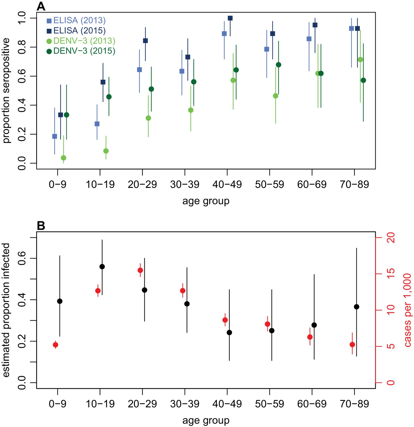
Age patterns of immunity and infection during 2013–15.
(A) Proportion of each age group seropositive against DENV as measured by ELISA (blue squares) and DENV-3 by MIA (green circles). Lighter points show 2013 results, darker points show 2015; lines show 95% binomial confidence intervals. (B) Comparison of estimated age-specific infection and reported cases. Black points, estimated proportion infected based on ELISA rise indicated in Figure 2B; red points, cases reported per 1000 people in each age group; lines show 95% binomial confidence intervals.
Figure 4
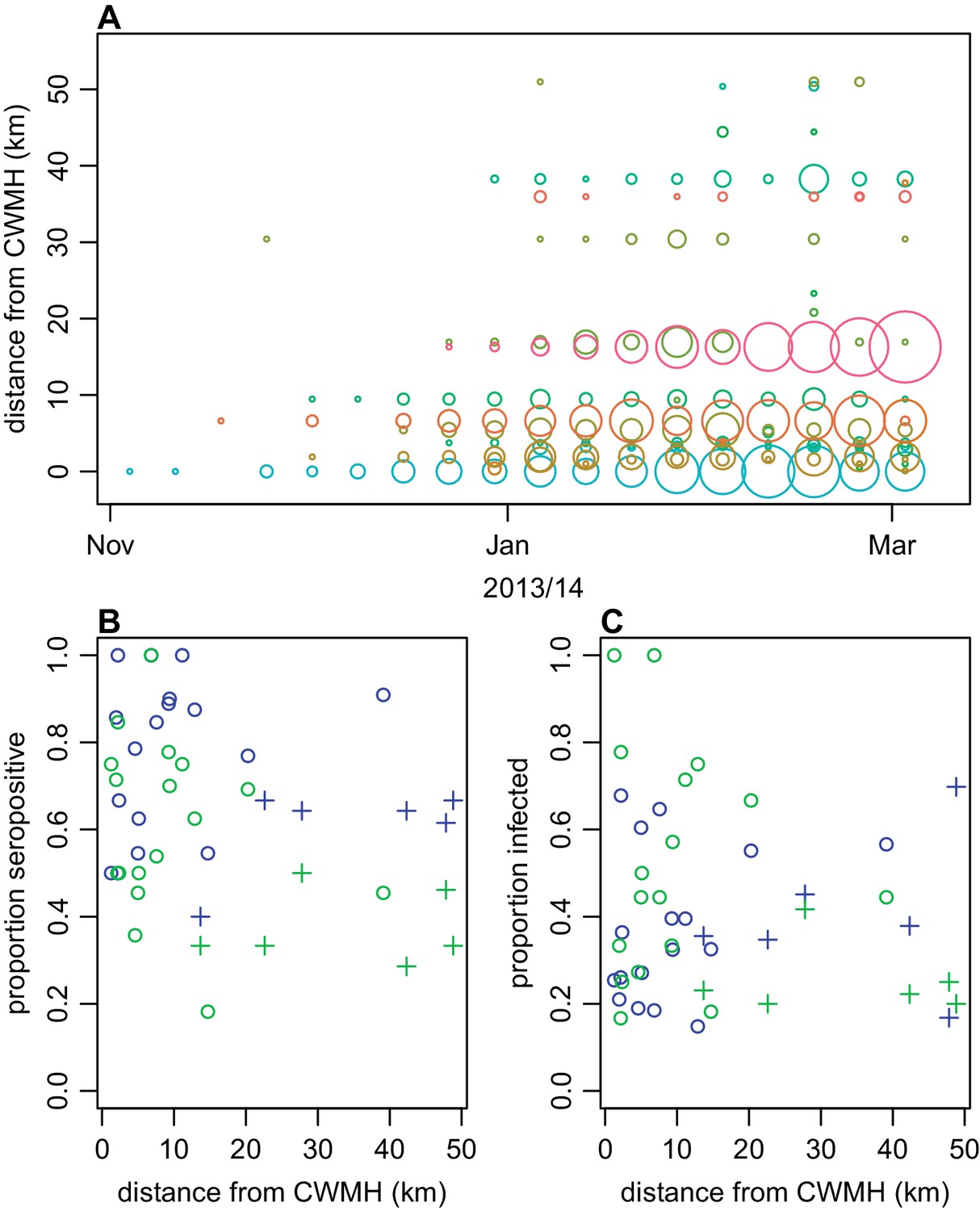
Spatial pattern of infection and immunity in Central Division.
(A) Relationship between dengue cases reported by each health centre at the start of the outbreak and Euclidean distance from Colonial War Memorial Hospital (CWM) in Suva. Area of circle is proportional to number of cases reported in that week; each health centre is represented by a different colour. (B) Proportion seropositive in each serosurvey study cluster in 2015 vs Euclidean distance from CWM. Blue, ELISA data; green, MIA data; circles, urban or peri-urban clusters; crosses, rural clusters. (C) Proportion infected in each serosurvey study cluster vs Euclidean distance from CWM. Blue, estimate based on ELISA data, using adjustment in Figure 2B; green, seroconversion based on MIA for individuals who were initially seronegative; circles, urban or peri-urban clusters; crosses, rural clusters.
Figure 5 with 7 supplements
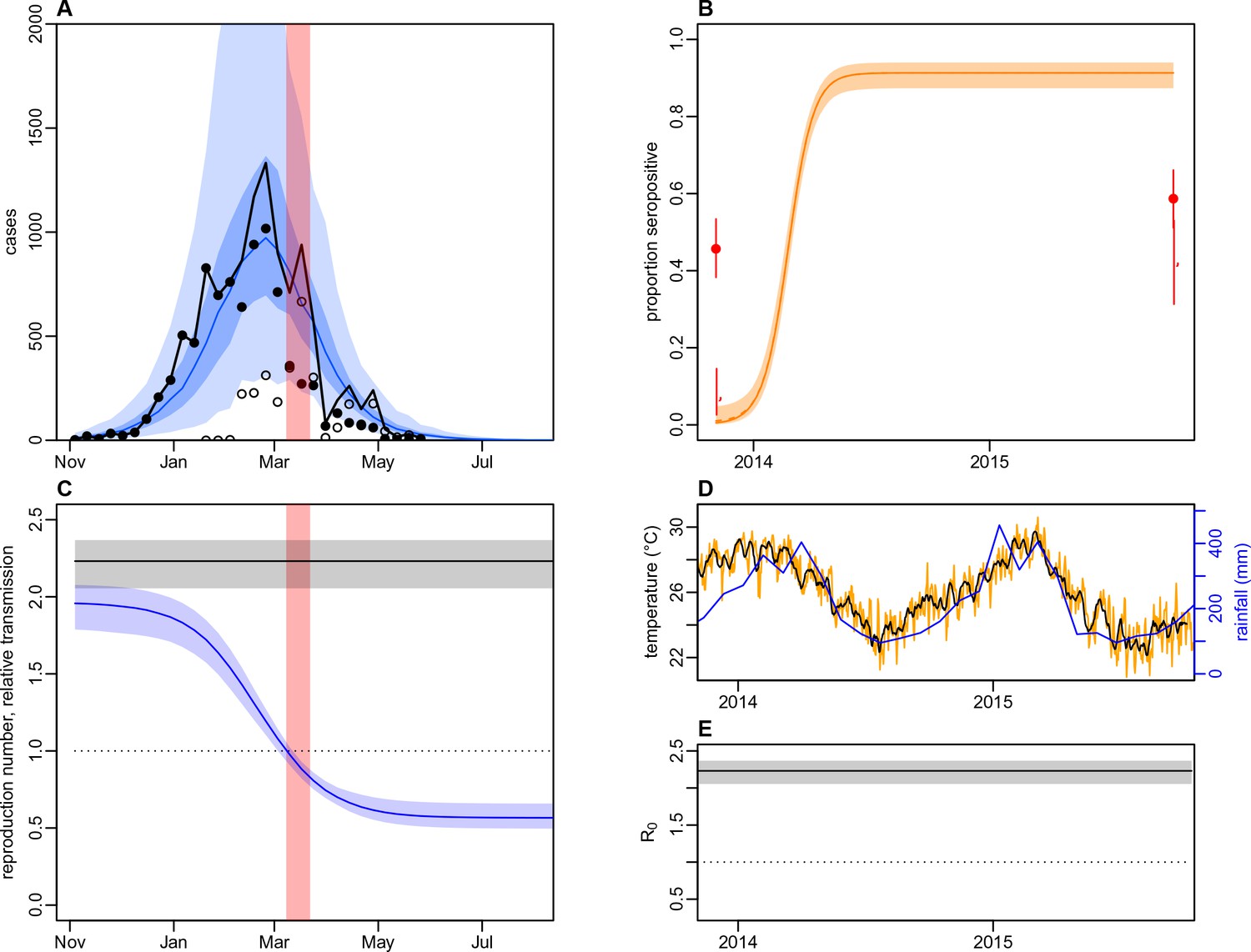
Impact of climate and control measures on DENV transmission during 2013/14, using a model jointly fitted to surveillance and serological data from Central Division.
(A) Model fit to surveillance data. Solid black dots, lab tested dengue cases; black circles, DLI cases; black line, total cases. Blue line shows median estimate from fitted model; dark blue region, 50% credible interval; light blue region, 95% CrI; red region shows timing of clean-up campaign. (B) Pre- and post-outbreak DENV immunity. Red dots show observed MIA seroprevalence against DENV-3 in autumn 2013 and autumn 2015; hollow dots, under 20 age group; solid dots, 20+ age group; lines show 95% binomial confidence interval. Dashed orange line shows model estimated rise in immunity during 2013/14 in under 20 group; solid line shows rise in 20+ group; shaded region shows 95% CrI. (C) Estimated variation in transmission over time. Red region, timing of clean-up campaign; green line, relative transmission as a result of control measures. Black line, basic reproduction number, ; blue line, effective reproduction number, , accounting for herd immunity and control measures. Shaded regions show 95% CrIs. Dashed line shows the herd immunity threshold. (D) Average monthly rainfall (blue lines) and daily temperature (orange line, with black line showing weekly moving average) in Fiji during 2013–15. (E) Change in over time. Shaded regions show 95% CrIs.
Figure 5—figure supplement 1

Illustration of model variation in transmission as a result of climate and control.
(A) Daily average temperature in Fiji during 2013/14; black line shows 7 day moving average (B) Average monthly rainfall in Fiji between 2003and 2014; thick lines show 2013/14 season. (C) Assumed relationship between temperature and mean vector lifespan (Mordecai et al., 2017). Blue lines show maximum and minimum temperature observed in Fiji during the 2013/14 season. (D) Relationship between temperature and extrinsic incubation period. (E) Relationship between temperature and probability of vector-to-human transmission. (F) Relationship between temperature and probability of human-to-vector transmission. (G) Relationship between temperature and daily biting rate. (H) Relationship between temperature and vector density (normalised to value at 25°C). (I) Relationship between rainfall and vector density (normalised to value at 400 mm). Solid line shows , dashed line, , dotted line, . (J) Illustrative example of a sigmoidal drop in transmission after clean-up campaign introduced on 8th March 2014. Here we assume a decline of 50%; in the model analysis this parameter is fitted, along with the gradient and timing of the decline. Red region shows timing of clean-up campaign.
Figure 5—figure supplement 2
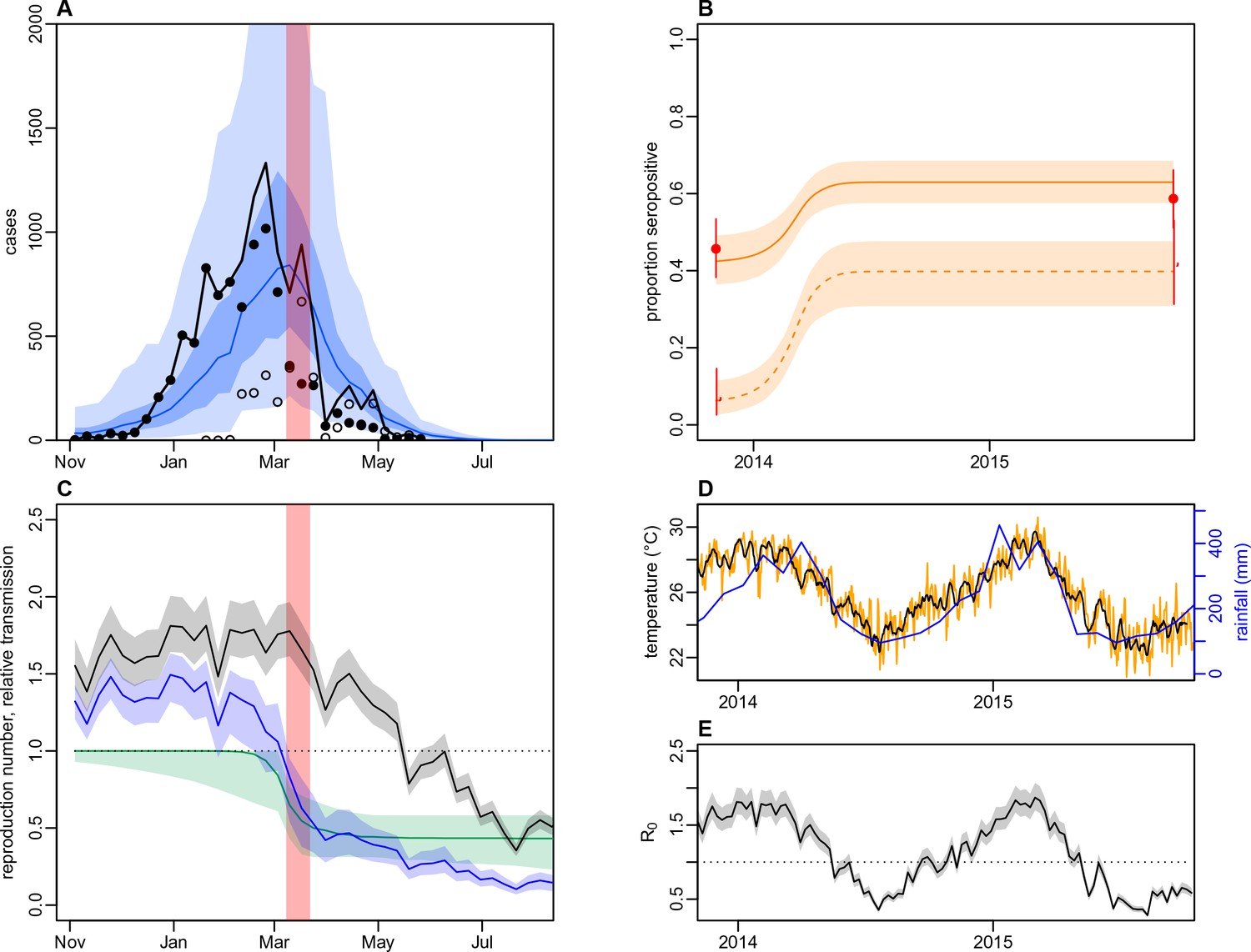
Dynamics of DENV transmission during 2013/14, using a model jointly fitted to surveillance and ELISA serological data from Central Division.
(A) Model fit to surveillance data. Solid black dots, lab tested dengue cases; black circles, DLI cases; black line, total cases. Blue line shows median estimate from fitted model; dark blue region, 50% credible interval; light blue region, 95% CrI; red region shows timing of clean-up campaign. (B) Pre- and post-outbreak DENV immunity. Red dots show observed MIA seroprevalence against DENV-3 in autumn 2013 and autumn 2015; hollow dots, under 20 age group; solid dots, 20+ age group; lines show 95% binomial confidence interval. Dashed orange line shows model estimated rise in immunity during 2013/14 in under 20 group; solid line shows rise in 20+ group; shaded region shows 95% CrI. (C) Estimated variation in transmission over time. Red region, timing of clean-up campaign; green line, relative transmission as a result of control measures. Black line, basic reproduction number, ; blue line, effective reproduction number, , accounting for herd immunity and control measures. Shaded regions show 95% CrIs. Dashed line shows the herd immunity threshold. (D) Average monthly rainfall (blue lines) and daily temperature (orange line, with black line showing weekly moving average) in Fiji during 2013–15. (E) Change in over time. Shaded regions show 95% CrIs.
Figure 5—figure supplement 3
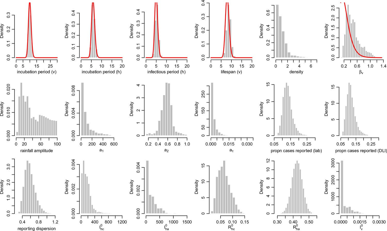
Posterior parameter estimates for the model with climate and control measures.
Histograms show the estimated posterior distributed from the MCMC chain, discarding burn in iterations, for each parameter in Table 7. Red lines show prior distributions if informative priors were used for that parameter.
Figure 5—figure supplement 4

Correlation between posterior distributions of transmission rate parameters.
Black dots show samples from the joint posterior distribution, with median given by orange circle. Histograms show the marginal posterior for each parameter.
Figure 5—figure supplement 5
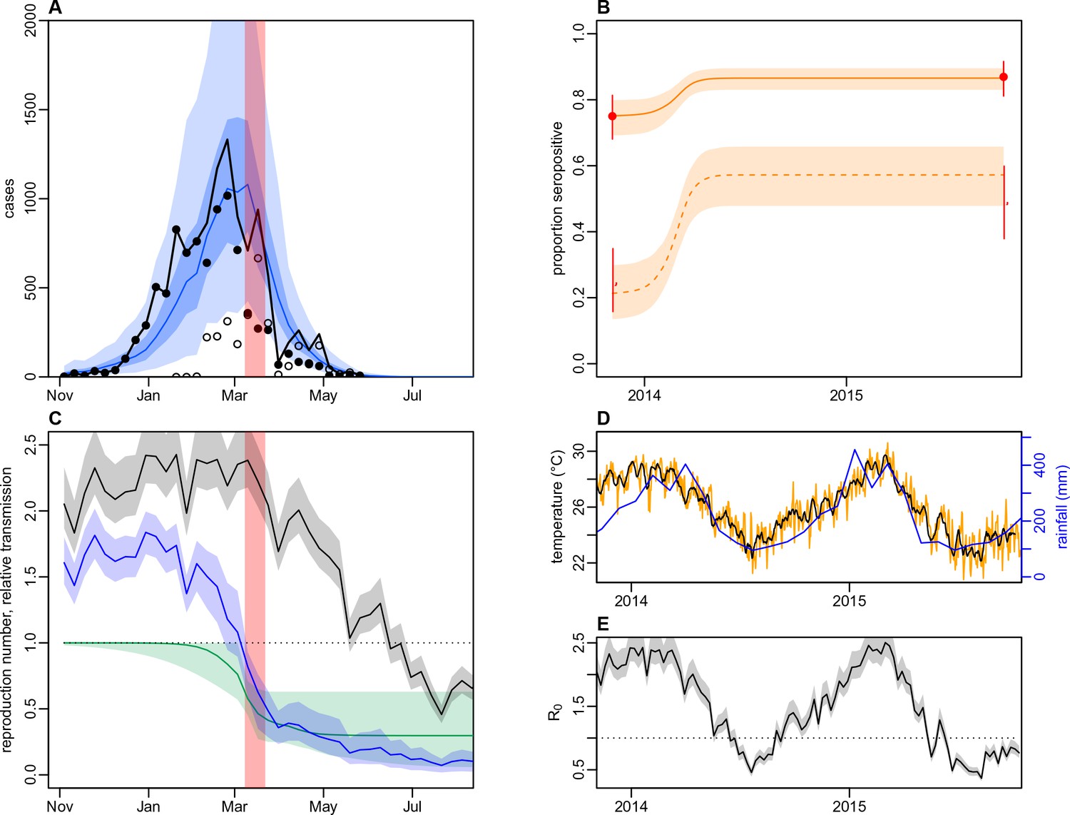
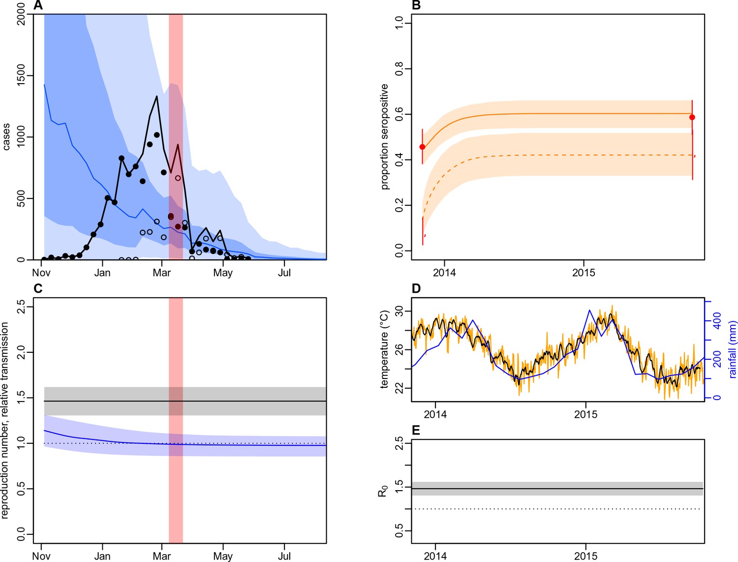
Dynamics of DENV transmission during 2013/14, using a model jointly fitted to surveillance and MIA serological data from Central Division, with only climate-based variation in transmission.
(A) Model fit to surveillance data. Solid black dots, lab tested dengue cases; black circles, DLI cases; black line, total cases. Blue line shows median estimate from fitted model; dark blue region, 50% credible interval; light blue region, 95% CrI; red region shows timing of clean-up campaign. (B) Pre- and post-outbreak DENV immunity. Red dots show observed MIA seroprevalence against DENV-3 in autumn 2013 and autumn 2015; hollow dots, under 20 age group; solid dots, 20+ age group; lines show 95% binomial confidence interval. Dashed orange line shows model estimated rise in immunity during 2013/14 in under 20 group; solid line shows rise in 20+ group; shaded region shows 95% CrI. (C) Estimated variation in transmission over time. Red region, timing of clean-up campaign; green line, relative transmission as a result of control measures. Black line, basic reproduction number, ; blue line, effective reproduction number, , accounting for herd immunity and control measures. Shaded regions show 95% CrIs. Dashed line shows the herd immunity threshold. (D) Average monthly rainfall (blue lines) and daily temperature (orange line, with black line showing weekly moving average) in Fiji during 2013–15. (E) Change in over time. Shaded regions show 95% CrIs.
Figure 5—figure supplement 6
Dynamics of DENV transmission during 2013/14, using a model jointly fitted to surveillance and MIA serological data from Central Division, without time-varying transmission.
(A) Model fit to surveillance data. Solid black dots, lab tested dengue cases; black circles, DLI cases; black line, total cases. Blue line shows median estimate from fitted model; dark blue region, 50% credible interval; light blue region, 95% CrI; red region shows timing of clean-up campaign. (B) Pre- and post-outbreak DENV immunity. Red dots show observed MIA seroprevalence against DENV-3 in autumn 2013 and autumn 2015; hollow dots, under 20 age group; solid dots, 20+ age group; lines show 95% binomial confidence interval. Dashed orange line shows model estimated rise in immunity during 2013/14 in under 20 group; solid line shows rise in 20+ group; shaded region shows 95% CrI. (C) Estimated variation in transmission over time. Red region, timing of clean-up campaign; green line, relative transmission as a result of control measures. Black line, basic reproduction number, ; blue line, effective reproduction number, , accounting for herd immunity and control measures. Shaded regions show 95% CrIs. Dashed line shows the herd immunity threshold. (D) Average monthly rainfall (blue lines) and daily temperature (orange line, with black line showing weekly moving average) in Fiji during 2013–15. (E) Change in over time. Shaded regions show 95% CrIs.
Figure 5—figure supplement 7
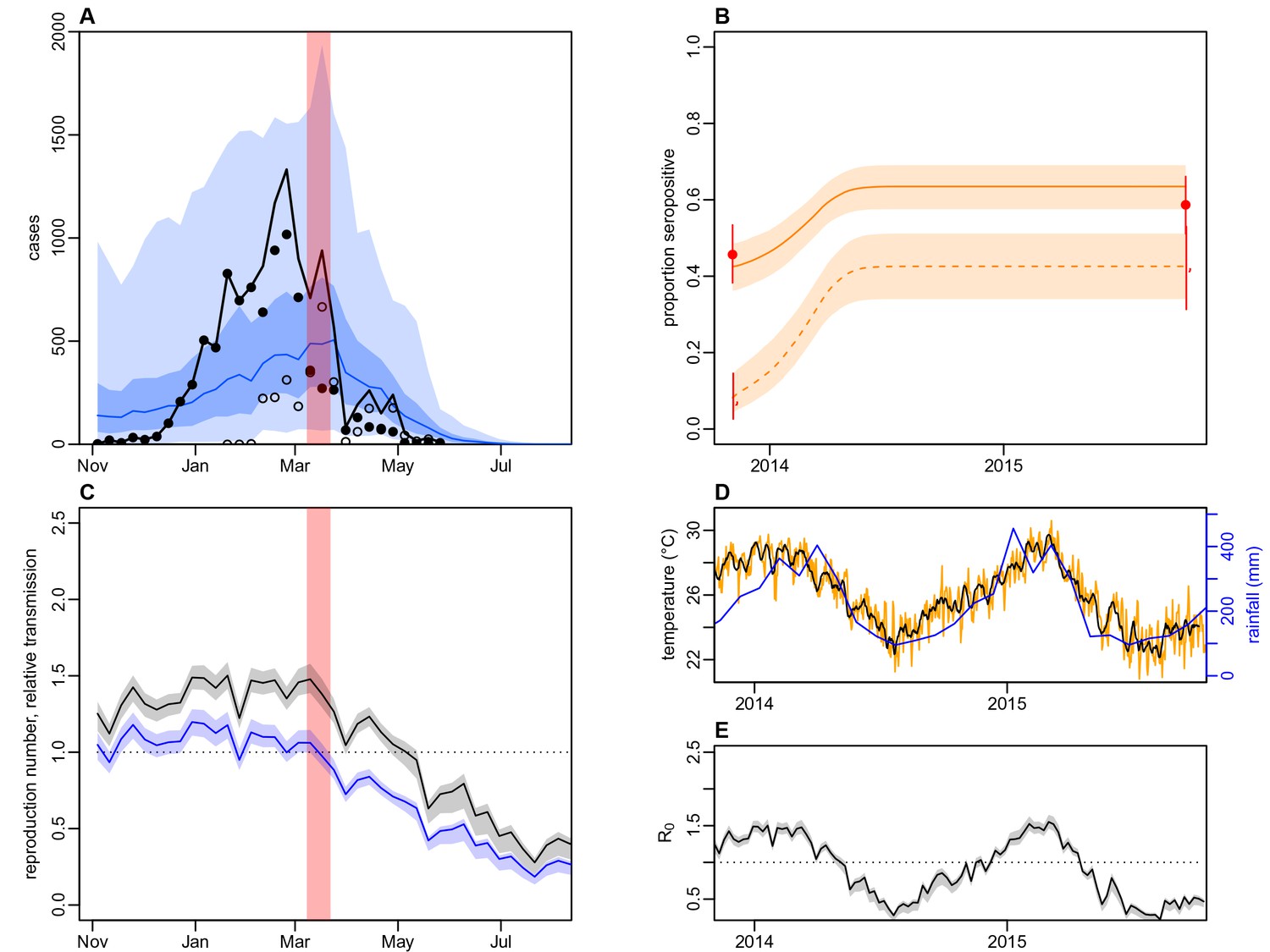
Dynamics of DENV transmission during 2013/14, using a model fitted only to surveillance data from Central Division, without time-varying transmission.
(A) Model fit to surveillance data. Solid black dots, lab tested dengue cases; black circles, DLI cases; black line, total cases. Blue line shows median estimate from fitted model; dark blue region, 50% credible interval; light blue region, 95% CrI; red region shows timing of clean-up campaign. (B) Pre- and post-outbreak DENV immunity. Red dots show observed MIA seroprevalence against DENV-3 in autumn 2013 and autumn 2015; hollow dots, under 20 age group; solid dots, 20+ age group; lines show 95% binomial confidence interval. Dashed orange line shows model estimated rise in immunity during 2013/14 in under 20 group; solid line shows rise in 20+ group; shaded region shows 95% CrI. (C) Estimated variation in transmission over time. Red region, timing of clean-up campaign; green line, relative transmission as a result of control measures. Black line, basic reproduction number, ; blue line, effective reproduction number, , accounting for herd immunity and control measures. Shaded regions show 95% CrIs. Dashed line shows the herd immunity threshold. (D) Average monthly rainfall (blue lines) and daily temperature (orange line, with black line showing weekly moving average) in Fiji during 2013–15. (E) Change in over time. Shaded regions show 95% CrIs.
Figure 6 with 2 supplements
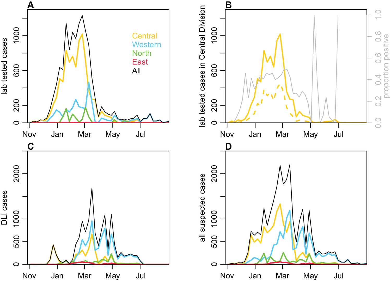
Geographical distribution of cases reported each week.
(A) Lab -tested dengue cases reported in Northern (green), Western (blue) and Central (yellow) divisions between 27th October 2013 and 31st August 2014. (B) Total tested and confirmed cases in Central division (solid and dashed lines respectively), as well as proportion of cases that tested positive (grey line). (C) Dengue-like illness (DLI) over time. (D) Total suspected cases (i.e. tested and DLI).
Figure 6—figure supplement 1
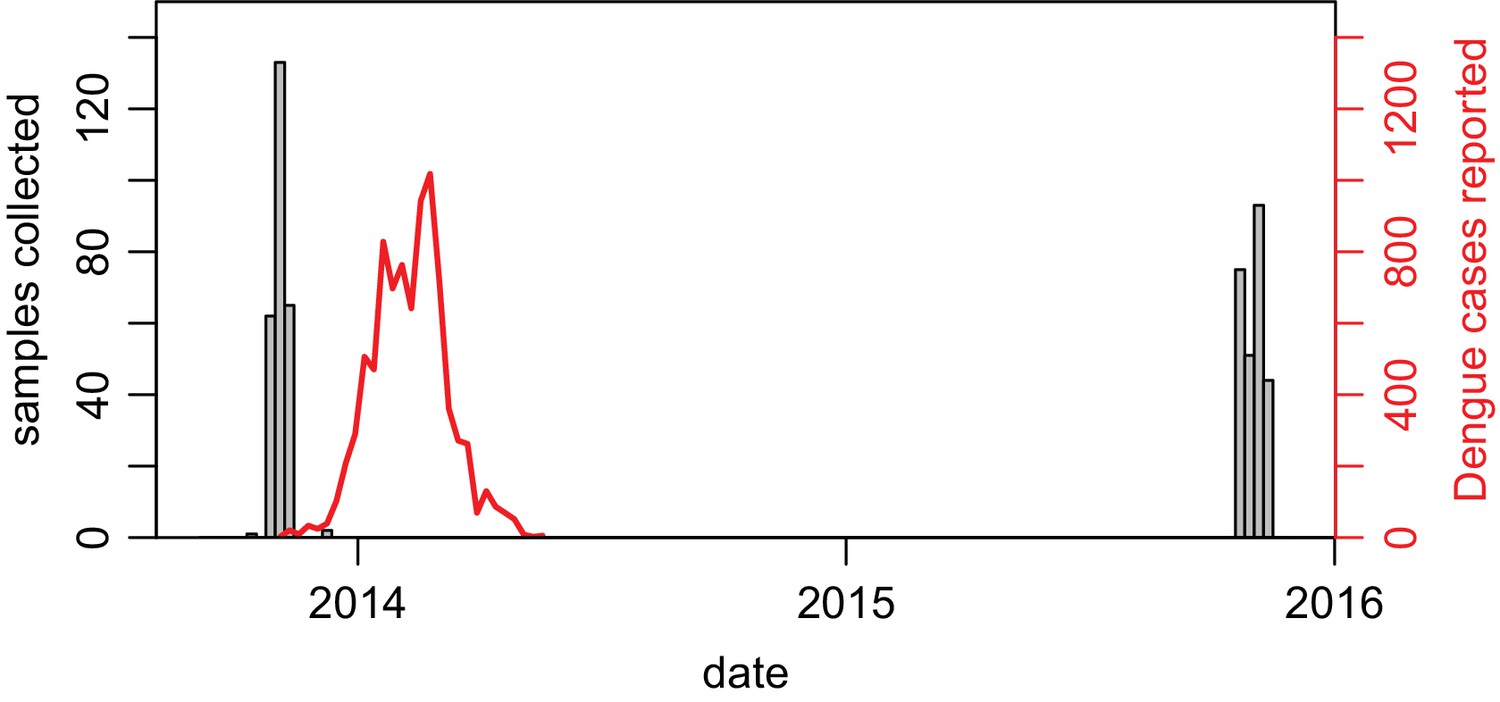
Dates of serological sample collection.
Grey bars show weekly number of samples collected in Central Division across the two studies (paired samples shown only). Red line shows lab-tested cases in Central Division.
Figure 6—figure supplement 2
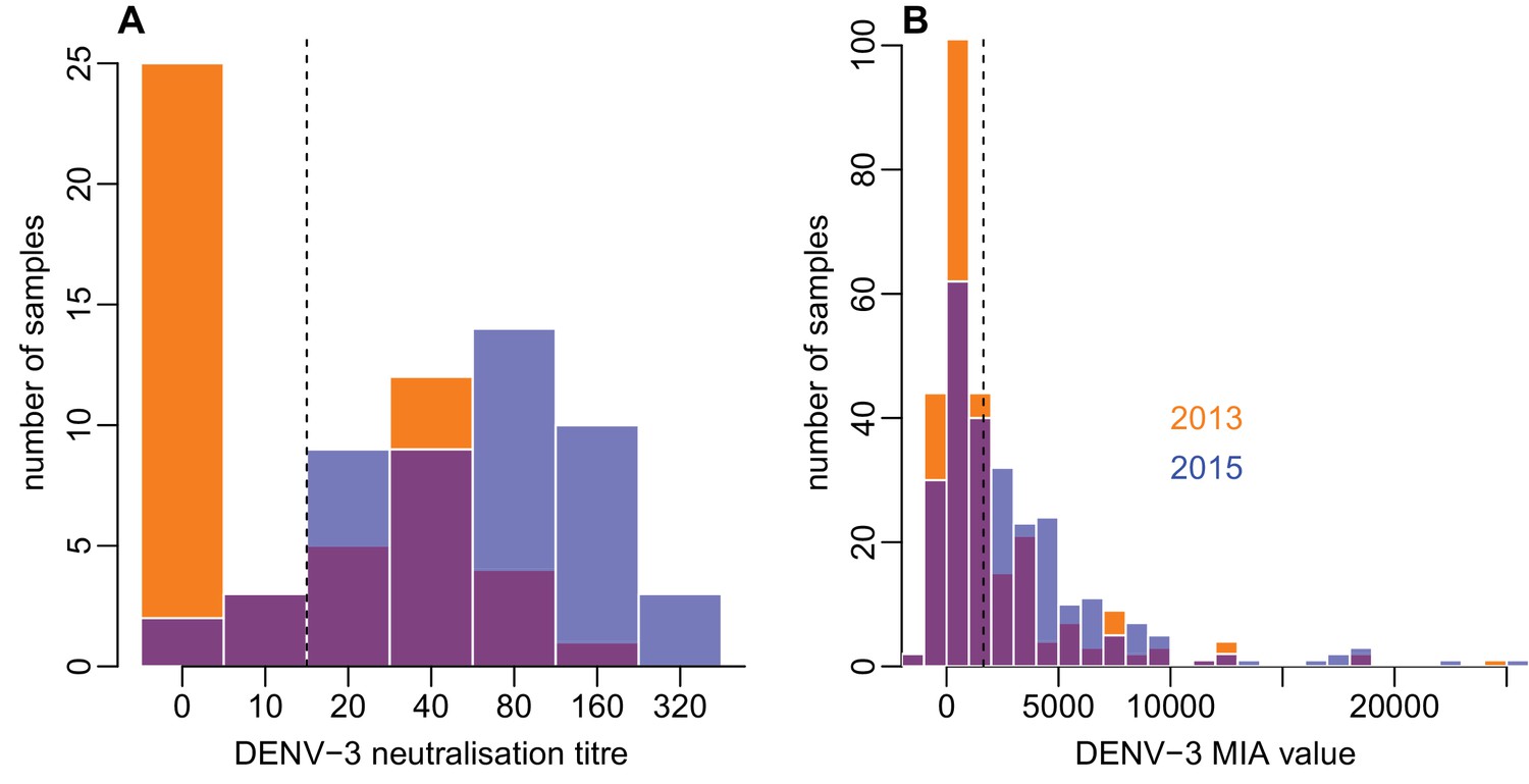
Distribution of individual-level measured responses in (A) neutralisation assay and (B) MIA.
Orange bars show observed proportion of samples with each value in 2013; blue bars show proportions in 2015. Dashed lines show threshold for seropositivity.
Tables
Table 1
Reported dengue outbreaks in Fiji between 1930–2014.
Two studies (Fagbami et al., 1995; Maguire et al., 1974) also included a post-outbreak serosurvey in Central Division. *There is also evidence of DENV-3 circulation during this period (Singh et al., 2005).
| Year | Main serotype | Reported cases | Seroprevalence | Source |
|---|---|---|---|---|
| 1930 | ? | Thousands | (Maguire et al., 1971) | |
| 1944-5 | 1 | Thousands | (Reed et al., 1977) | |
| 1971-3 | 2 | 3413 | 26% (Suva) | (Maguire et al., 1974) |
| 1974-5 | 1 | 16,203 | (Reed et al., 1977) | |
| 1980 | 4 | 127 | (Fagbami et al., 1995) | |
| 1981 | 1 | 18 | (Kiedrzynski et al., 1998) | |
| 1982 | 2 | 676 | (Kiedrzynski et al., 1998) | |
| 1984-6 | ? | 490 | (Fagbami et al., 1995) | |
| 1988 | ? | 22 | (Fagbami et al., 1995) | |
| 1989-90 | 1* | 3686 | 54% (Suva) | (Fagbami et al., 1995; Waterman et al., 1993) |
| 1997-8 | 2 | 24,780 | (World Health Organization, 2000) | |
| 2001-3 | 1 | ? | (Halstead, 2008) | |
| 2008 | 4 | 1306 | (PacNet Report, 2008; ProMED-mail, 2008) | |
| 2013-14 | 3 | 25,496 | Fiji MOH |
Table 2
Number of participants who were seropositive to DENV in 2013 and 2015 as measured by ELISA and MIA.
MIA any DENV denotes participants who were MIA seropositive to at least one DENV serotype. 95% CI shown in parentheses.
| Test | N | 2013 | 2013 (%) | 2015 | 2015 (%) | Difference |
|---|---|---|---|---|---|---|
| ELISA | 263 | 154 | 58.6% (52.3–64.6%) | 196 | 74.5% (68.8–79.7%) | 16% (11.8–21%) |
| MIA any DENV | 263 | 193 | 73.4% (67.6–78.6%) | 216 | 82.1% (77–86.6%) | 8.75% (5.62–12.8%) |
| MIA DENV-1 | 263 | 177 | 67.3% (61.3–72.9%) | 198 | 75.3% (69.6–80.4%) | 7.98% (5.01–11.9%) |
| MIA DENV-2 | 263 | 33 | 12.5% (8.8–17.2%) | 41 | 15.6% (11.4–20.5%) | 3.04% (1.32–5.91%) |
| MIA DENV-3 | 263 | 87 | 33.1% (27.4–39.1%) | 140 | 53.2% (47–59.4%) | 20.2% (15.5–25.5%) |
| MIA DENV-4 | 263 | 79 | 30.0% (24.6–36%) | 99 | 37.6% (31.8–43.8%) | 7.6% (4.71–11.5%) |
Table 3
Risk factors from a univariable logistic regression model.
Sample population was all individuals who were seronegative in 2013 (n = 97), and outcome was defined as seroconversion as measured by ELISA. Number indicates total individuals with a given characteristic.
| Variable | Number | Odds ratio | p value |
|---|---|---|---|
| Demographic characteristics | |||
| Age under 20 | 61 | 0.49 (0.21–1.13) | 0.10 |
| Male | 49 | 0.81 (0.36–1.84) | 0.62 |
| iTaukei ethnicity | 85 | 1.33 (0.39–5.32) | 0.66 |
| Environmental factors present | |||
| Mosquitoes | 90 | 4.19 (0.68–80.85) | 0.19 |
| Used car tires | 61 | 1.80 (0.77–4.42) | 0.18 |
| Open water container(s) | 61 | 1.49 (0.64–3.58) | 0.37 |
| Air conditioning | 23 | 0.46 (0.15–1.26) | 0.15 |
| Blocked drains | 53 | 1.04 (0.46–2.38) | 0.92 |
| Location | |||
| Urban or peri-urban | 50 | 2.18 (0.95–5.11) | 0.07 |
| Health seeking behaviour | |||
| Fever in preceding 2 years | 20 | 2.94 (1.08–8.38) | 0.04 |
| Visited doctor with fever in preceding 2 years | 16 | 3.15 (1.06–10.13) | 0.04 |
| Household member visited doctor with fever in preceding 2 years | 9 | 2.08 (0.52–8.94) | 0.30 |
Table 4
Estimated age-specific attack rates based on raw ELISA values, and seroconversion using ELISA cutoff.
Estimated proportions of infections were calculated from the total of the probabilities that each individual in that age group had been infected, based on change in ELISA values between 2013 and 2015 (Figure 2B). Binomial 95% confidence intervals are shown in parentheses.
| Age | N | Propn infected based on ELISA values | Seronegative | Seroconverted | Seroconverted (%) |
|---|---|---|---|---|---|
| 0–9 | 27 | 39.3% (22.2–59.3%) | 21 | 6 | 28.6% (11.3–52.2%) |
| 10–19 | 59 | 56% (44.1–67.8%) | 40 | 14 | 35% (20.6–51.7%) |
| 20–29 | 45 | 44.7% (31.1–60%) | 14 | 8 | 57.1% (28.9–82.3%) |
| 30–39 | 41 | 38% (24.4–53.7%) | 12 | 4 | 33.3% (9.92–65.1%) |
| 40–49 | 28 | 24.2% (10.7–39.3%) | 3 | 3 | 100% (29.2–100%) |
| 50–59 | 28 | 25.1% (10.7–42.9%) | 5 | 2 | 40% (5.27–85.3%) |
| 60–69 | 21 | 27.8% (9.52–47.6%) | 1 | 1 | 100% (2.5–100%) |
| 70+ | 14 | 36.6% (14.3–64.3%) | 1 | 0 | 0% (0–97.5%) |
| Total | 263 | 39.6% (33.8–45.6%) | 97 | 38 | 39.2% (29.4–49.6%) |
Table 5
Comparison of model performance using AIC and DIC.
https://doi.org/10.7554/eLife.34848.019| Model | Serological data | AIC | AIC | DIC | DIC |
|---|---|---|---|---|---|
| SEIR | MIA | 716.9 | 66.69 | 625.6 | 35.62 |
| SEIR + climate | MIA | 672.9 | 22.7 | 616.6 | 26.65 |
| SEIR + climate + control | MIA | 650.2 | 0 | 589.9 | 0 |
| SEIR | ELISA | 675.1 | 25.74 | 1219 | 643.2 |
| SEIR + climate | ELISA | 668.4 | 19.09 | 599.3 | 23.52 |
| SEIR + climate + control | ELISA | 649.3 | 0 | 575.8 | 0 |
Table 6
Parameter estimates for the 2013/14 dengue epidemic when the model was fitted to MIA or ELISA data.
Median estimates are shown, with 95% credible intervals shown in parentheses. Mean is the average basic reproduction number over a year. Proportion reported was calculated by sampling from the negative binomial distribution that defines the model observation process (i.e. the credible interval reflects both underreporting and dispersion in weekly case reporting). and denote the number of initially infectious individuals in the younger and older age group respectively.
| Parameter | MIA | ELISA |
|---|---|---|
| Mean | 1.12 (1.02–1.25) | 1.49 (1.35–1.69) |
| Peak | 1.87 (1.7–2.07) | 2.5 (2.29–2.81) |
| Control reduction | 0.57 (0.42–0.82) | 0.70 (0.37–0.95) |
| Proportion reported, lab (%) | 11 (1.1–39) | 13 (2.6–36) |
| Proportion reported, DLI (%) | 9.3 (0.99–37) | 12 (2.8–35) |
| 140 (18–550) | 0.98 (0.21–3.8) | |
| 130 (19–680) | 1.3 (0.0094–57) |
Table 7
Parameters fitted in the model.
Prior distributions are given for all parameters, along with source if the prior incorporates a specific mean value. All rates are given in units of days.
| Parameter | Definition | Prior | Source |
|---|---|---|---|
| intrinsic latent period | Gamma(=5.9, =0.1) | (Chan and Johansson, 2012) | |
| human infectious period | Gamma(=5, =0.1) | (Duong et al., 2015) | |
| extrinsic latent period at 25 | Gamma(=10, =0.1) | (Mordecai et al., 2017; Chan and Johansson, 2012) | |
| mosquito lifespan at 25 | Gamma(=8, =0.1) | (Sheppard et al., 1969) | |
| biting rate at 25 | Gamma(=0.25, =0.1) | (Mordecai et al., 2017) | |
| baseline vector density | (Andraud et al., 2012) | ||
| carrying capacity scaling parameter | |||
| gradient of sigmoidal change in transmission | |||
| magnitude of sigmoidal change in transmission | |||
| timing of sigmoidal change in transmission | 8th March 2014, 5th April 2014 | (Break Dengue, 2014) | |
| proportion of cases reported as lab tested | |||
| proportion of cases reported as DLI | |||
| reporting dispersion | |||
| initial number infectious aged < 20 | |||
| initial number immune aged < 20 | |||
| initial number infectious aged 20+ | |||
| initial number immune aged 20+ | |||
| initial proportion of infectious mosquitoes |
Additional files
-
Supplementary file 1
Supplementary data and results tables.
- https://doi.org/10.7554/eLife.34848.025
-
Supplementary file 2
Questionnaire that accompanied the 2015 serological survey in Central Division.
- https://doi.org/10.7554/eLife.34848.026
-
Supplementary file 3
Serological, surveillance and climate data for the 2013/14 DENV-3 outbreak in Central Division.
- https://doi.org/10.7554/eLife.34848.027
Download links
A two-part list of links to download the article, or parts of the article, in various formats.
Downloads (link to download the article as PDF)
Open citations (links to open the citations from this article in various online reference manager services)
Cite this article (links to download the citations from this article in formats compatible with various reference manager tools)
Using paired serology and surveillance data to quantify dengue transmission and control during a large outbreak in Fiji
eLife 7:e34848.
https://doi.org/10.7554/eLife.34848


