Motion sensing superpixels (MOSES) is a systematic computational framework to quantify and discover cellular motion phenotypes
- University of Oxford, United Kingdom
Figures
Figure 1 with 5 supplements
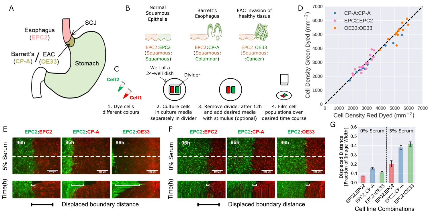
Temporary divider system to study interactions between cell populations.
(A) The squamous-columnar junction (SCJ) divides the stratified squamous epithelia of the esophagus and the columnar epithelia of the stomach. Barrett’s esophagus (BE) is characterised by squamous epithelia being replaced by columnar epithelial cells. The three cell lines derived from the indicated locations were used in the assays (EPC2, squamous esophagus epithelium, CP-A, Barrett’s esophagus and OE33, esophageal adenocarcinoma (EAC) cell line). (B) The three main epithelial interfaces that occur in BE to EAC progression. (C) Overview of the experimental procedure, described in steps 1–3. In our assay, cells were allowed to migrate and were filmed for 4–6 days after removal of the divider (step 4). (D) Cell density of red- vs green-dyed cells in the same culture, automatically counted from confocal images taken of fixed samples at 0, 1, 2, 3, and 4 days and co-plotted on the same axes. Each point is derived from a separate image. If a point lies on the identity line (black dashed), within the image, red- and green-dyed cells have the same cell density. (E,F) Top images: Snapshot at 96 h of three combinations of epithelial cell types, cultured in 0% or 5% serum as indicated. Bottom images: kymographs cut through the mid-height of the videos as marked by the dashed white line. All scale bars: 500 μm. (G) Displaced distance of the boundary following gap closure in (E,F) normalised by the image width. From left to right, n = 16, 16, 16, 17, 30, 17 videos.
Figure 1—figure supplement 1
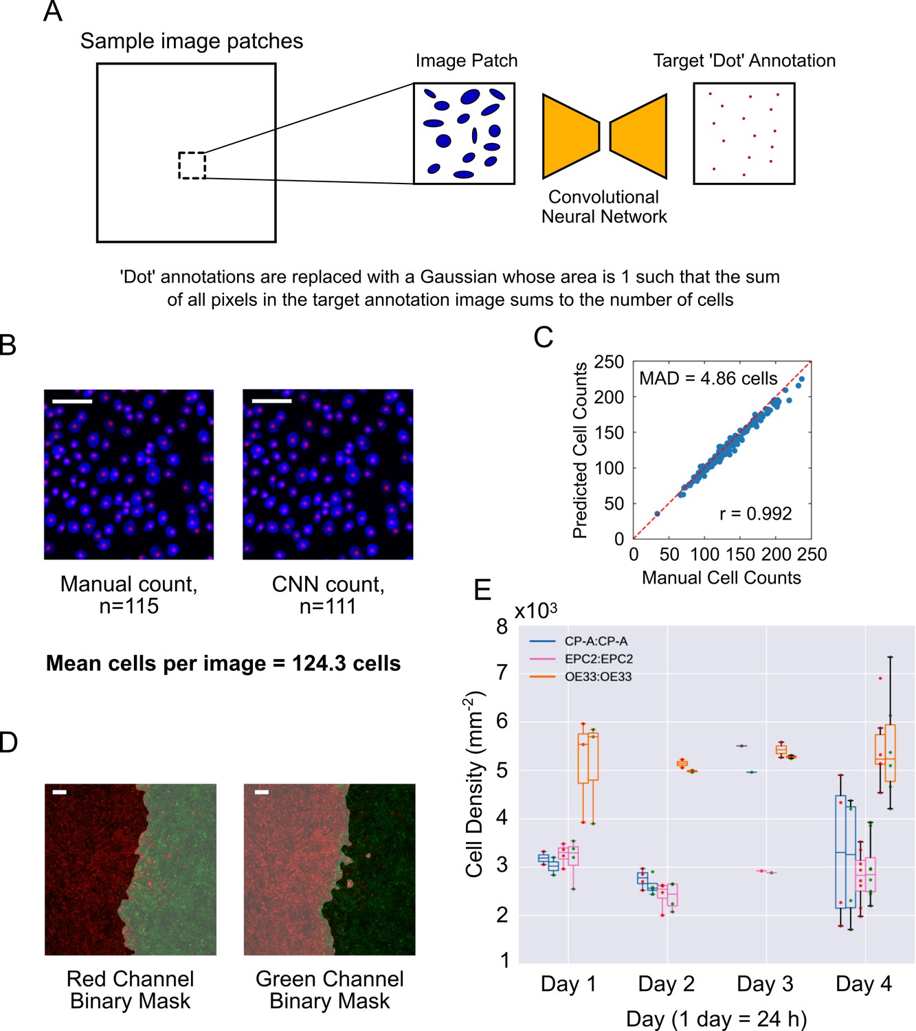
Automated cell counting with convolutional neural networks (CNN).
(A) CNN training procedure. Image patches (64 × 64 pixels) are randomly subsampled from the large DAPI-stained images. The convolutional network is trained to transform a given DAPI image patch to a dot-like image such that the sum of all pixel intensities in the output dot-like image equals the number of cells in the DAPI image. During training, the ideal dot-like image is provided by manual annotation. (B) An example of a 64 × 64 pixels image patch of cells stained with DAPI (blue), with individual cells counted manually (left) or by automatic CNN counting (right). Red spots mark individual counted cells. (C) Plot of manually annotated cell counts vs automated cell counts tested on 64 × 64 image patches (n = 200). Each point is a patch. The mean absolute deviation (MAD) was 4.86 cells, a percentage error of 3.91% for an average of 124.3 cells per image. Pearson correlation coefficient, r = 0.992. Red dashed line is the ideal identity line. (D) Image segmentation of epithelial sheets coloured with red and green dyes, used for sheet-specific cell counting. Grey shaded area is the excluded image area. (E) Paired boxplots of cell density (number of cells/sheet area, plotted as x103 on y-axis) for each monolayer from fixed samples collected at different times (up to 4 days (96 h) after divider removal). In each pair, the left boxplot is for the red labelled cells and right for the green labelled cells, indicated by red or green dots, respectively. Each dot represents the value from a confocal image. Outline box colour indicates the cell line (see legend). All scale bars: 200 μm.
Figure 1—figure supplement 2
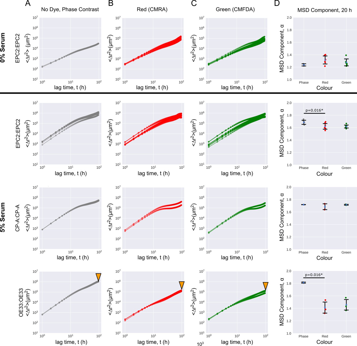
Cell migration is largely unaffected by dye colour.
Mean squared displacement (MSD) curves computed from optical flow plotted on a log10-log10 axis as a function of the time interval for named same cell line combinations in 0% and 5% serum. (A–C) MSD curves coloured grey for phase-constrast non-dyed (A), red for red-dyed (B) and green for green-dyed cells (C). (D) Errorbar plots showing mean extracted exponent from MSD = (Materials and methods) ± one standard deviation for time intervals h, for the phase-contrast, red and green sheets of individual phase-contrast plus RGB channel videos. Each point is a video. Two sided t-test was applied assuming identical variances. * denotes p = < 0.05. Red and green lipophilic dye reduced the mobility of non-dyed EPC2 and OE33 cells with statistical significance. The size effect was particularly large in OE33, (bottom row marked with orange triangles) with a large drop in the MSD exponent. We do not know the cause but it may be a result of the dyes affecting each cell line differently.
Figure 1—figure supplement 3
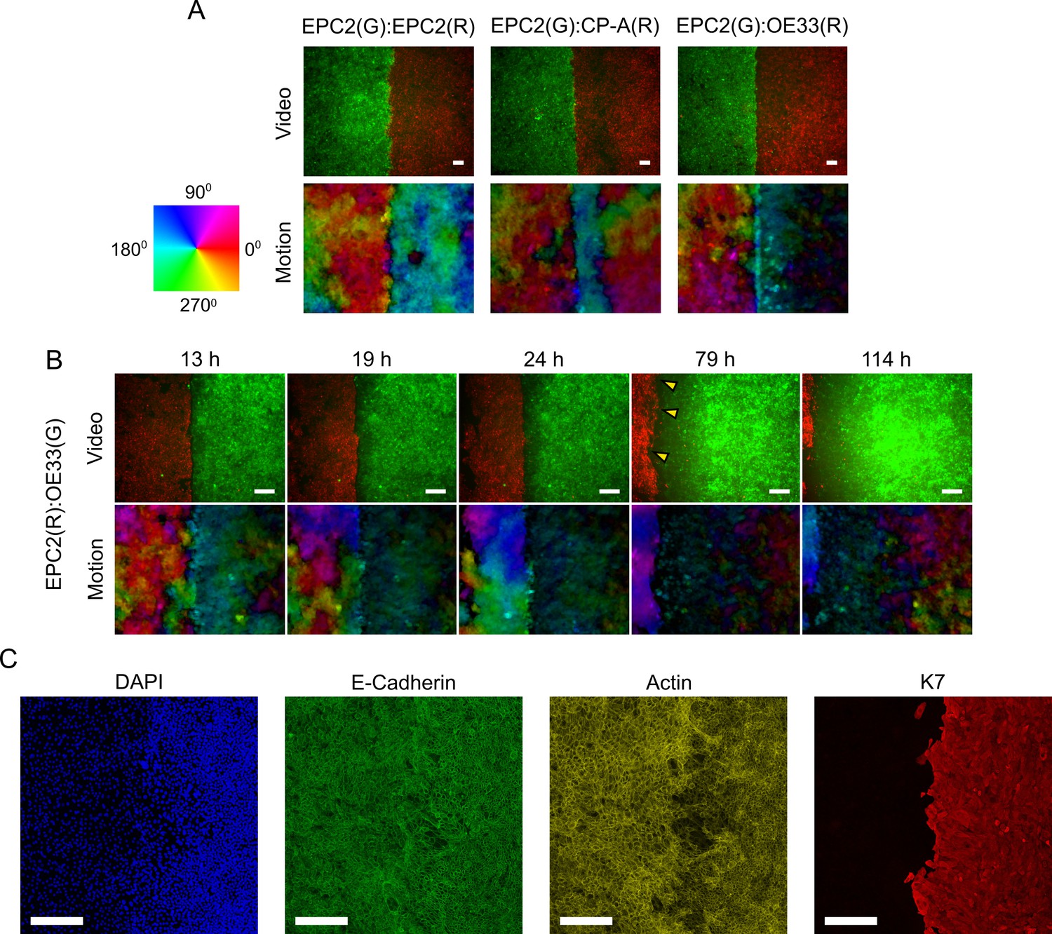
Motion fields at gap closure between EPC2:EPC2, EPC2:CP-A and EPC2:OE33 cell line combinations.
(A) Snapshot of the combined motion field of red (R) and green (G) dyed cells at the frame of gap closure (16 h, 14 h and 12 h for EPC2:EPC2, EPC2:CP-A, EPC2:OE33 respectively) coloured by direction of movement according to the colour wheel for representative videos. (B) Snapshots of the EPC2:OE33 motion field taken at different times following gap closure. Yellow triangles indicate identified motion in ‘green’ cells where the dye fluorescence is nearly lost. (C) Confocal staining of a fixed EPC2:OE33 sample at 72 h. DAPI stains the DNA; E-cadherin marks the adherens junctions; actin (-actin) marks the actin-cytoskeleton; and K7 (Keratin 7) marks the OE33 cells of columnar epithelium origin. All scale bars: 200 μm.
Figure 1—figure supplement 4
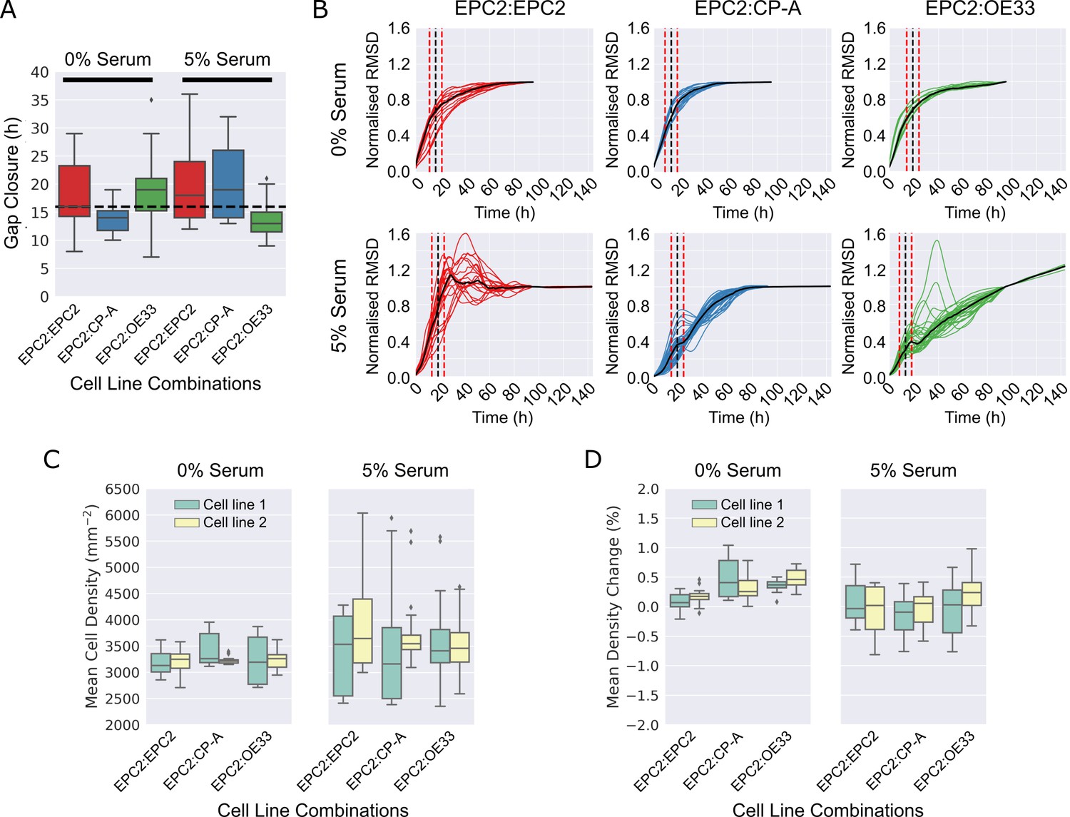
Gap closure times and cell proliferation of cell line combinations in 0% and 5% serum.
(A). Boxplots showing median and interquartile range (IQR) of gap closure in EPC2:EPC2, EPC2:CP-A and EPC2:OE33 combinations. Whiskers indicate data within 1.5 x IQR of lower and upper quartiles. Black dashed line = global mean gap closure time. (B) Root mean squared displacement (RMSD) curves of x-direction velocity components in 0% and 5% serum conditions with mean gap closure point marked (black dashed line) with ± 5 h either side (red dashed lines), the accuracy to which we could detect the gap closure frame (Figure 3—figure supplement 9). (C,D) Grouped boxplots of mean cell density (C) and cell density change (D) from automatic cell counting using convolutional neural networks. Cell line combinations are written cell line 1:cell line 2 thus EPC2:CP-A indicates cell line 1 = EPC2, cell line 2 = CP-A. Cell line 1 and cell line 2 are coloured green and yellow in the boxplots, respectively.
Figure 1—figure supplement 5

Collective sheet migration dynamics are lost in 0% serum.
(A) Samples grown in 0% or 5% serum were fixed for staining at 24 h when the gap between the two sheets have just closed, and at 144 h at the end of filming. DAPI (blue) marks the cell nucleus. E-cadherin (green) marks the adherens junctions. Actin (-actin, yellow) marks the actin-cytoskeleton. K7 (Keratin 7, red) is a specific marker of columnar cells. All scale bars: 20 μm. (B) Spatial correlation curves computed from superpixel tracks as a function of superpixel distance (Materials and methods). Black dots = computed values. Dashed black line = fitted line to black dots of the form, . Green solid line = median line computed from the black dots. Shaded region = ± 2 standard deviations of the green median line. (C) Plot of the extracted values vs , where is the correlation with superpixels 1 superpixel away and the characteristic number of superpixels away for which motion is correlated. Each video is a point, see legend for colour code. The higher points are on the plot, the greater the collective motion. Black solid line is the support vector of a linear support vector machine (SVM) trained to separate 0% and 5% serum according to the values of and . Dashed black lines mark the SVM margin. Serum separability, the ability to predict if a video contains 0% or 5% serum, is defined as the training SVM accuracy using the whole dataset, n = 112 videos (n = 16 each for EPC2:EPC2, EPC2:CP-A, EPC2:OE33 in 0% serum and n = 17 EPC2:EPC2, 30 EPC2:CP-A and 17 EPC2:EPC2 in 5% serum).
Figure 2 with 2 supplements
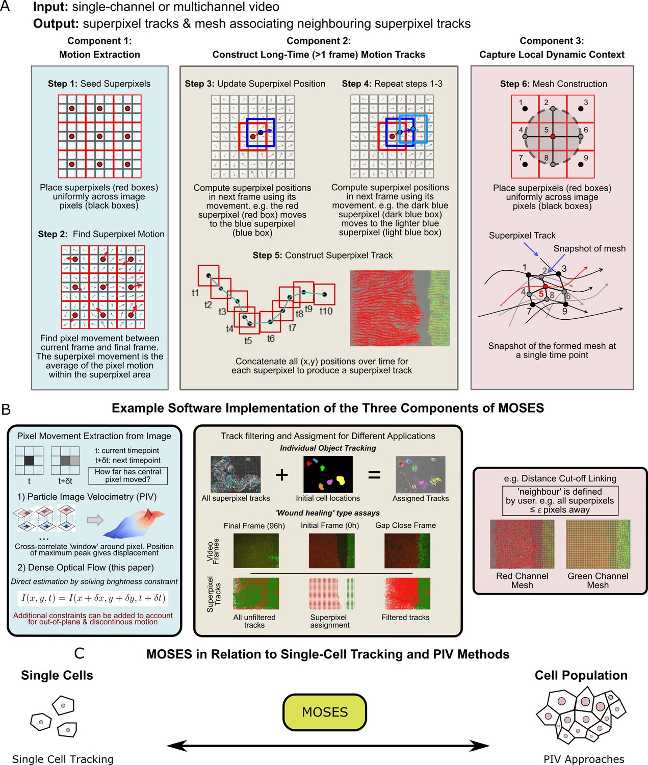
Schematic diagram of MOtion SEnsing Superpixels (MOSES).
(A) High level overview of the three configurable components that define MOSES: motion extraction, construction of long-time motion tracks, and capture of local dynamic context. Long-time here indicates tracking of superpixels for longer than one frame or timepoint. (B) Example ways to practically implement each of the three high-level MOSES component concepts described in (A) in software. (C) Using long-time tracking of superpixels MOSES bridges single-cell tracking for sparse cell culture and PIV for confluent monolayers to extract global motion patterns for both scenarios, single-cell and collective motion within one computational framework.
Figure 2—figure supplement 1
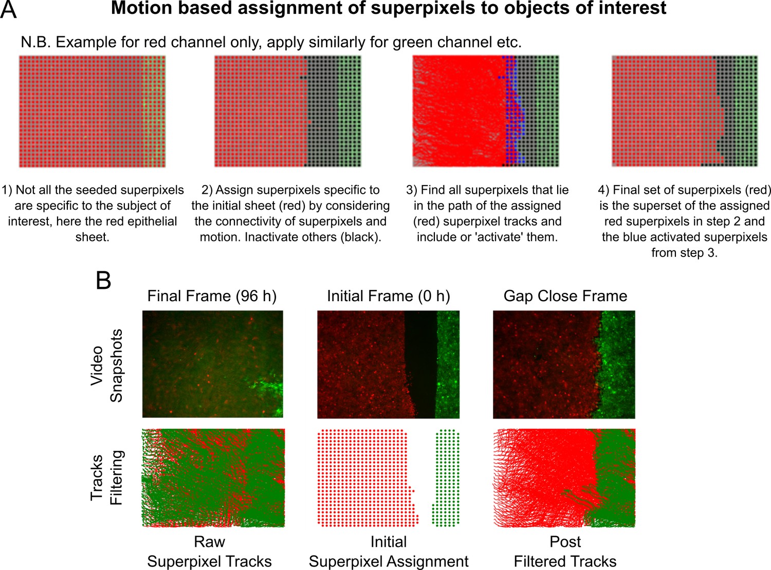
Intensity-independent filtering of superpixel tracks for migrating epithelial sheets.
(A) Graphic overview of the key steps in the algorithm, see Materials and methods for accompanying details. (B) Filtered tracks are robust to intensity artefacts. Top panels show snapshots from an example video at 96 h (left), 0 h (middle) and at the time of gap closure (right). Bottom left shows the ‘raw’ superpixel tracks from 0 to 96 h, which are spurious due to autofluorescence in the green channel after green cells leave the field-of-view. Bottom middle shows the assigned red and green superpixels depicted as coloured dots marking their centroid positions at 0 h for the image shown above. Bottom right shows all filtered superpixel tracks from 0 to 96 h using the algorithm in (A). The extent of the green tracks now correctly resembles the interface shape for the image above.
Figure 2—figure supplement 2
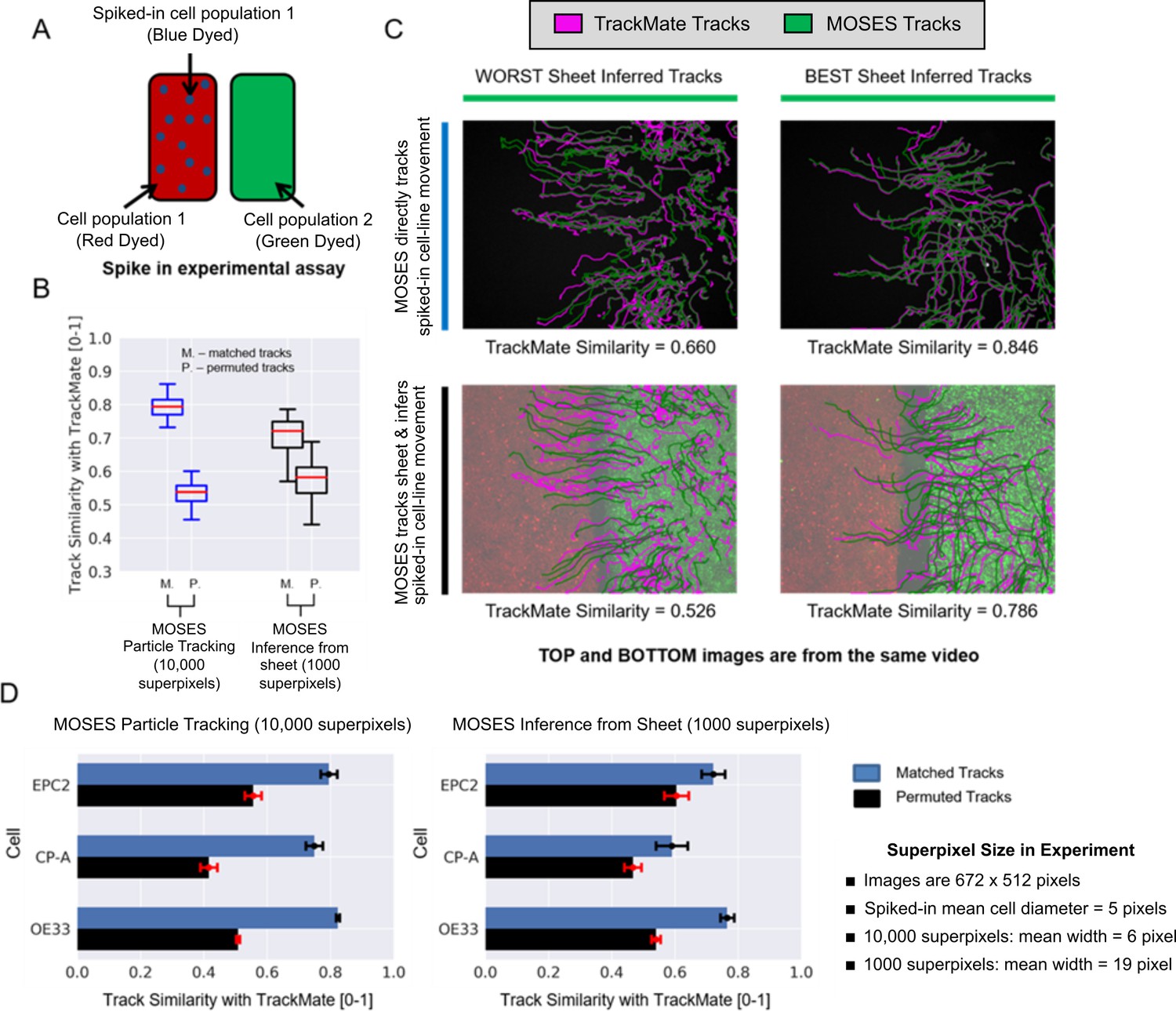
Experimental validation of MOSES optical flow superpixel tracking.
(A) Schematic illustration of the spike-in experimental setup. A separate sample of cell population 1 or 2 is dyed a third colour (blue; dots on figure) and added to the respective red or green sheet (solid colours on figure). (B) Comparison of MOSES tracks of spiked-in cells and the benchmark single-cell TrackMate tracks when the blue spiked-in cells were explicitly tracked (blue boxplots, 10,000 superpixels) or indirectly inferred from the respective coloured sheet (black boxplots, 1000 superpixels). Red boxplot centre line = median. Boxes of boxplots show interquartile range (IQR). Whiskers are located 1.5 x IQR above and below quartiles. Track similarity is reported using normalised velocity cross-correlation after matching the TrackMate and MOSES tracks (M) and if the correct matchings were randomly permuted (P). Permuted track similarity values for each video are the average of 10 random permutations. (C) Track results of the best and worst inferred tracks from sheet motion according to track similarity and the respective single-cell spiked-in MOSES tracks overlaid on a video snapshot at 0 h. Magenta: TrackMate tracks. Green: MOSES tracks of green cell population. (D) Breakdown of the mean MOSES track similarity with TrackMate tracks in (B) with respect to the three tested cell lines in combination; EPC2, CP-A, OE33. Blue bars = matched tracks, black bars = permuted tracks as in (B). Error bars show ± one standard deviation.
Figure 3 with 10 supplements
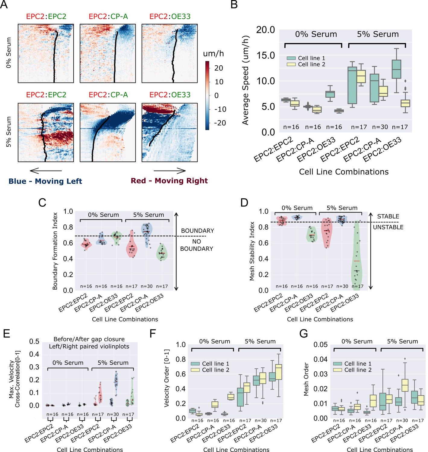
MOSES quantifies boundary formation and epithelial sheet interaction dynamics.
(A) Projected ‘x’-direction velocity kymograph of the dense optical flow for each cell line combination at the two serum concentrations used in the assay. The speed and direction of movement are indicated by the intensity and colour respectively (blue, moving left; red, moving right). (B) Average speed of each video for each cell combination, coloured green and yellow for the first and second cell line in the named combinations respectively. (C,D) Violin plots of boundary formation index (C) and mesh stability (D) for each video (black dot) for different cell combinations in 0% and 5% serum. Dashed line is the threshold, one standard deviation above the pooled mean value of all cell line combinations in 0% serum. Red solid line in violins = mean, black solid line in violins = median. (E) Maximum (Max.) velocity cross-correlation between the two sheets, before and after gap closure, left and right violins respectively for each cell line combination. Shaded region of all violins is the probability density of the data whose width is proportional to the number of videos at this value. (F) Boxplots showing median and interquartile range (IQR) of velocity order parameter and (G) mesh order for each cell line combination coloured green and yellow for the first and second cell line in the named combination, respectively. Whiskers show data within 1.5 x IQR of upper and lower quartiles.
Figure 3—figure supplement 1
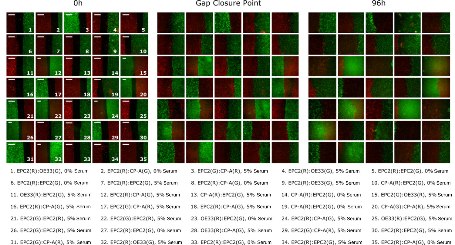
Heterogeneity in motion dynamics and quality of image acquisition.
A random selection of still images from videos are shown as examples of the variability in the acquired video frames. Cell combinations are labelled such that the first cell line name corresponds to the left sheet and the second cell line name the right sheet. The dye used is indicated as (R) for red and (G) for green. Left: Examples at 0 h at the start of the experiment. Middle: Examples when the red and green sheets first close the gap between them. The gap closure point varies among videos. An automatic method was used to detect this to ± 5 frames with 94% accuracy, (Figure 3—figure supplement 9). Right: at 96 h. All scale bars: 500 μm.
Figure 3—figure supplement 2
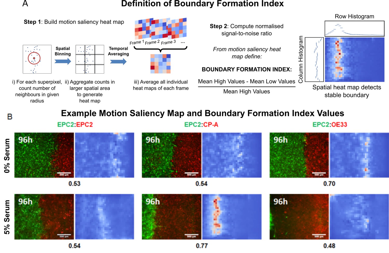
The motion saliency map and boundary formation index for analysing motion sources.
(A) Illustration of the key steps in computing the motion saliency map and the boundary formation index. The term ‘values’ in the signal-to-noise ratio equation refers to the pixel intensity value of the motion saliency heat map image, which represents the degree of motion localisation at a given pixel location. Higher values indicate increased motion concentration. The terms ‘high’ and ‘low’ in the equation refer to a two-class clustering of the motion saliency image pixel values where a binary threshold is given by Otsu thresholding. All pixel values above the threshold are ‘high’ and those below the threshold are ‘low’. (B) Example video snapshots at 96 h of the three cell line combinations (EPC2:EPC2, EPC2:CP-A, EPC2:OE33) in 0% (top panel) and 5% serum (bottom panel) with corresponding motion saliency map. The computed boundary formation index is given below each image pair. All scale bars: 500 μm.
Figure 3—figure supplement 3

MOSES mesh and boundary formation index captures multiple boundary formation.
The addition of high concentrations of an EGF inhibitor, Lapatnib, induces cell death in EPC2 cells, causing shrinkage at multiple sites and the effective formation of multiple boundaries. (A) Video snapshots of a representative EPC2(R):OE33(G) experiment in 5% serum with addition of 5 ng/ml Lapatnib (top row) with corresponding constructed MOSES mesh for each colour channel (middle and bottom rows). Time indicates hours after Lapatnib addition. (B) The corresponding mesh strain curve of EPC2 is irregular and the onset of cell death can be detected as early as 20 h even when the sheet appears relatively intact. (C) Snapshot of the MOSES mesh and induced strain ellipse distribution at 100 h. The formation of holes pushes local superpixels away whilst cell death sites bring neighbouring superpixels closer. Red ellipses highlight very high local concentration of superpixels. (D) Snapshot of final frame with corresponding motion saliency map and computed boundary formation index. All boundaries are detected but the boundary with the most movement, the leading edge of the OE33 (G, green) sheet is most highlighted. (E) Motion saliency map and boundary formation index for an EPC2 (R, red):CP-A (G, green) combination in 5% serum and addition of a more potent EGF inhibitor, Aeatinib (10 ng/ml). In this example, the CP-A sheet exhibits almost no movement and the multiple boundaries due to cell death are clearly highlighted. The MOSES motion saliency map thus captures the contribution from multiple motion sources.
Figure 3—figure supplement 4
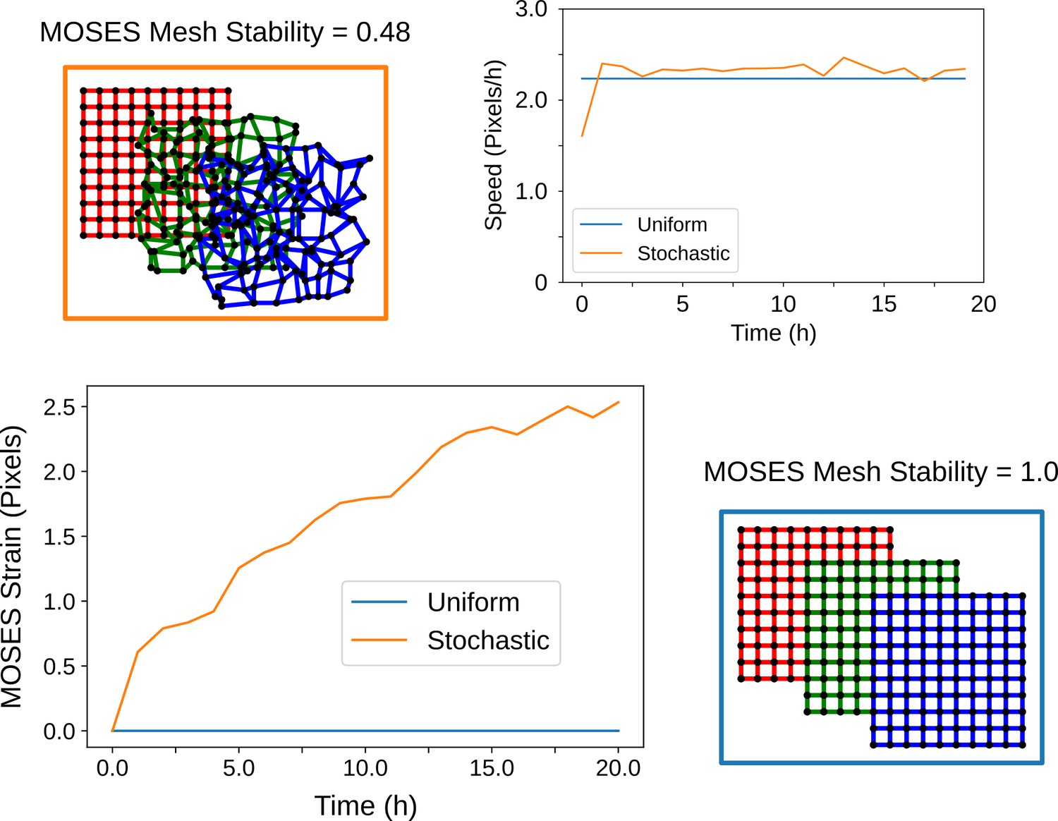
The MOSES mesh stability index captures the stability of the local topology.
When cells cease to move and exhibit zero velocity, the MOSES mesh stability is always stable (value of 1) but the converse is not always true. This can be shown starting from an initially regular arrangement of cells (red grid) and simulating the resultant arrangement of cells if they move with a constant average velocity towards the bottom right over time (green and blue grid snapshots). If all cells experience the same velocity (blue box, blue lines) the location relations or topology between all cells are preserved at all timepoints. Consequently, these cells have a constant 0 line as its MOSES strain curve. In contrast, stochastic movement (orange box) whereby individual cells move in random directions but collectively exhibit the same global mean direction and speed leads to an ever-changing topology. This is reflected in the increasing shape of the MOSES strain curve (orange line). The MOSES mesh stability index thus is suited for monitoring stability based on the local collectiveness even when there is no difference in the mean velocity of the collective.
Figure 3—figure supplement 5
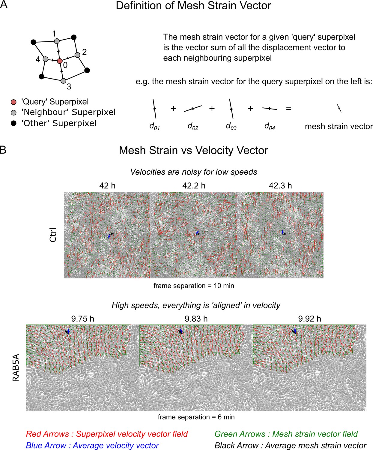
The mesh strain vector and collective motion.
(A) The mesh strain vector of a superpixel is the resultant displacement vector after summing together all individual displacement vectors of the superpixel to each connected ‘neighbour’ superpixel. (B) Comparison of the mesh strain vector with the velocity vector for two video examples in successive video frames. Top and bottom video is the MCF10-ctrl monolayer of Supp. Movie 3 and RAB5A monolayer of Supp. Movie 7 from Malinverno et al. (2017). See Video 5 of this paper for the accompanying videos to this figure.
Figure 3—figure supplement 6
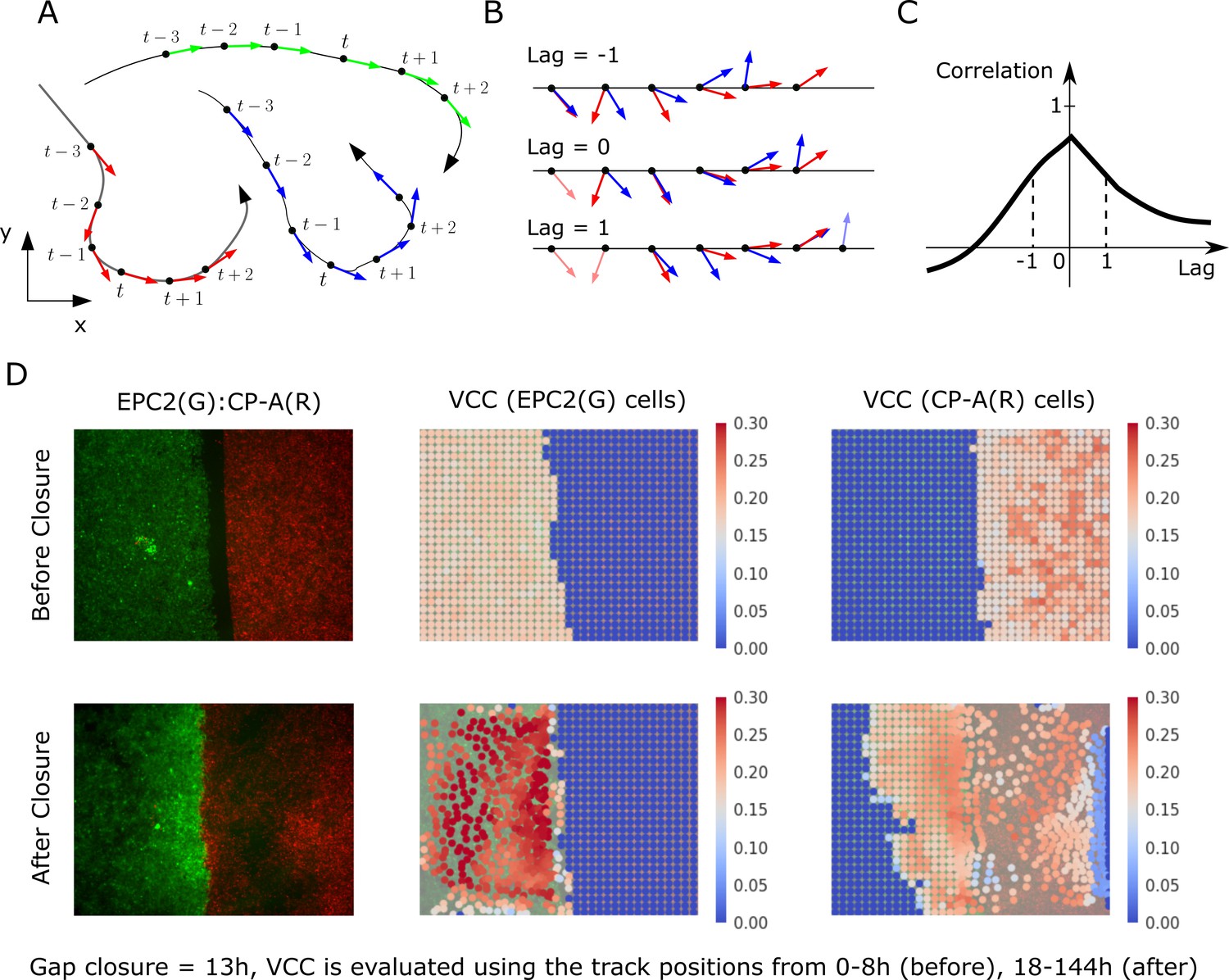
Velocity cross-correlation (VCC) for measuring the motion coordination of two epithelial sheets.
(A) A track is composed of sequential (x,y,t) points. (B) VCC evaluates the correlation between two given tracks at all possible time lags, yielding a curve of correlation vs time lag. (C) The maximum velocity cross-correlation corresponds to the highest value of this curve. (D) Example VCC evaluation between EPC2 (G, green cells) and CP-A (R, red cells). Each superpixel is coloured (see colour map) according to the mean maximum VCC between it and every superpixel of the other colour that is . For ‘before closure’, we use the (x,y) tracks from the initial frame up to and for ‘after closure’ from to the end frame where is the gap closure frame. Superpixel tracks are plotted at their initial position for ‘before closure’ and at for ‘after closure’.
Figure 3—figure supplement 7

Ranking of 5% serum videos according to boundary formation index.
Final frame snapshots (96 or 144 h) ordered according to the MOSES boundary formation index in decreasing order reading from left to right, top to bottom, (n = 77). Values to 2 s.f. are given for the first video in each row and column. * demarcates the first image where a boundary does not form, according to the threshold set by our negative 0% serum controls from Figure 3 (0.69), that is all videos to the left of and above the red dashed line are predicted by MOSES to form a boundary. Coloured dots indicate the cell line combinations cultured. AGS cells are derived from gastric adenocarcinoma. EPC2:AGS is included as another columnar cell and cancer control for comparison.
Figure 3—figure supplement 8

Quantitative assessment of boundary formation and sheet-sheet interaction dynamics of all 5% serum videos.
(A) Average speed of each cell line in each cell line combination in 5% serum. (B–D) Violin plots of (B) boundary formation index, (C) mesh stability index and (D) maximum (max.) velocity cross-correlation between the two sheets for all cell line combinations tested in 5% serum. Black dashed line in panels (B) and (C) is the threshold set using the 0% serum control as in Figure 3. In panel (D), for each paired violin, the left violin is before and the right violin is after gap closure. (E) Velocity cross-correlation difference before and after gap closure of (D). For all panels, each black point is a video, red solid line is the mean, black solid line is the median, shaded region is the probability density of the data whose width is proportional to the number of videos at this value, n = 77. Statistical two-tail test with Mann-Whitney U. (F,G) Boxplots of velocity order (F) and mesh order (G) for individual cell lines in each cell line combination with naming convention, cell line 1 (green):cell line 2 (yellow). AGS cells are derived from gastric adenocarcinoma. In all plots, EPC2:AGS is included as another columnar cell and cancer control for comparison.
Figure 3—figure supplement 9
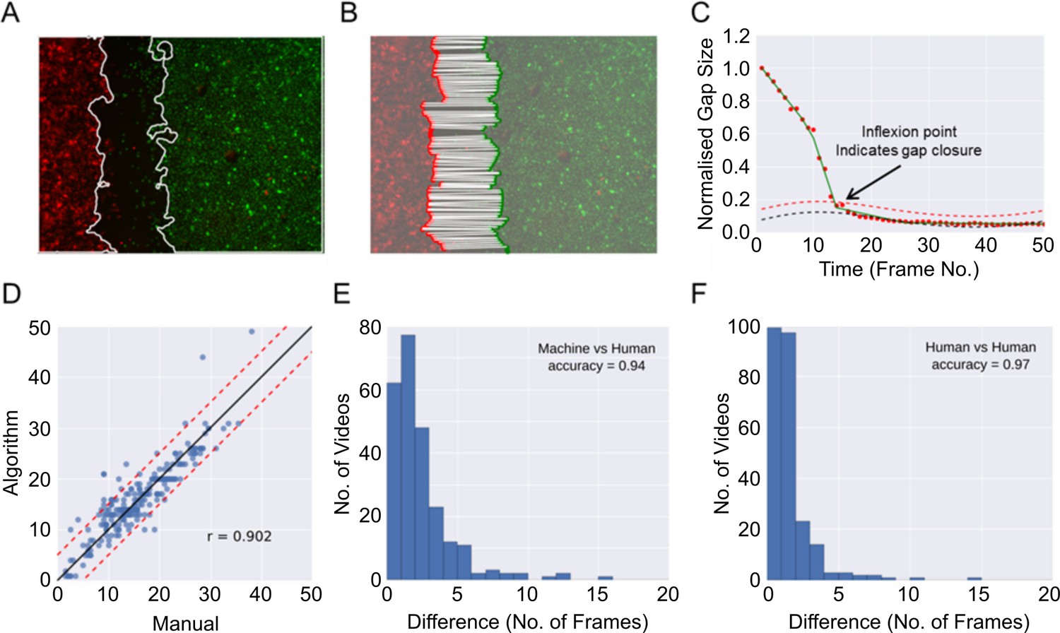
Automatic determination of gap closure.
(A) Epithelial sheet segmentation using the individual red and green image channels for each RGB video frame. Solid white lines mark the sheet boundaries. (B) Boundary points identified using a sweepline algorithm (Materials and methods) subsample the respective coloured sheet boundaries. Each red point is paired with the closest green point, shown with white solid lines. (C) The gap closure frame is the point of inflexion in the plot of the average pairwise distances between boundary points (normalised gap size) vs time (given as frame numbers (abbreviated as No.)). The inflexion point is automatically estimated by finding the point of intersection between the fitted linear spline approximation (green line) of the distance (red dots) and the fitted baseline + 2 times standard deviation (dashed red line). The baseline (dashed black line) is an estimation of the background noise measurement of the gap size due to image artefacts. (D) Comparison of frame number (no.) at the time of gap closure predicted by the algorithm vs the consensus of two independent human countings given by the average of their independently annotated frame number. Each blue point is a video, n = 246 videos. Note that this analysis included more videos than those reported in this paper for the purpose of increasing the rigour of the validation. These videos were derived from additional experiments, performed with the three cell lines described in combination with an additional cell line (OE21, an esophageal squamous cell carcinoma) under a range of different media conditions. Solid black line is the ideal identity line. Dashed red lines show ± 5 frames from the black ideal identity line. (E) Histogram of the error as measured by the absolute difference in frame number between automated and consensus manual annotations. (F) Histogram as in (E), showing difference between the two individual manual annotations. In (E) and (F) the accuracy score is reported treating a difference > 5 frames as a disagreement.
Figure 3—figure supplement 10
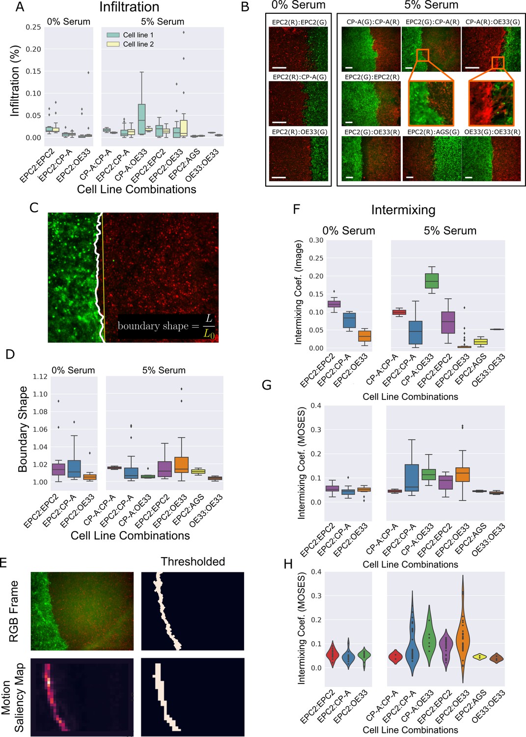
Cell infiltration, boundary shape and cell intermixing at the interface between two sheets.
(A) Boxplots showing the cell infiltration of individual cell lines into the other cell line in each cell combination with naming convention, cell line 1 (green):cell line 2 (yellow) as a fraction of the total cell count 3 h after gap closure. Image segmentation was used to find the boundary. (B) Snapshot of representative videos from each cell line combination grown in 0% or 5% serum 24 h after gap closure. Scale bar: 200 μm (C) Example snapshot with found ‘boundary’ line (solid white line), its straight line equivalent (solid yellow line) and definition of boundary shape. (D) Boxplots of the mean boundary shape over time in 0% and 5% serum. Boundaries were found in each video frame using the MOSES superpixel tracks. (E) Found boundary using image segmentation (top) and thresholding of the motion saliency map (bottom). When the cell motion is coordinated, the two are the same. (F,G) Boxplots of the intermixing coefficient (see Materials and methods) based on image segmentation at 72 h, (F) or based on thresholding of the motion saliency map, (G). (H) Violin plot of (G) with width proportional to the number of videos (black points). All boxplots depict median and interquartile range (IQR) of values with whiskers defined 1.5 x IQR above and below the quartiles. Coef. is used as the abbreviation for coefficient. AGS cells are derived from gastric adenocarcinoma. In all plots, EPC2:AGS is included as another columnar cell and cancer control for comparison.
Figure 4 with 2 supplements
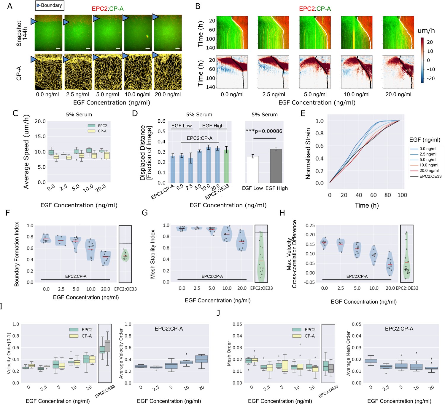
EGF titration at physiological levels disrupts boundary formation.
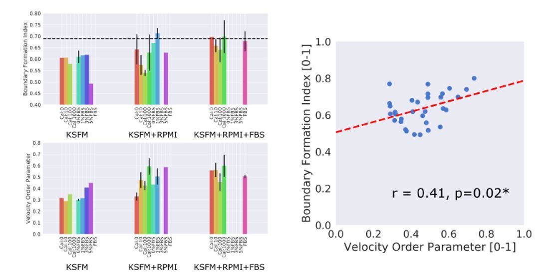
(A) Destabilisation of the junction with EGF addition. All in 5% serum with snapshots of endpoint (144 h). Shown also is the green channel CP-A MOSES mesh. The closeness of the lines indicates impeded motion leading to a local aggregation of superpixels in the vicinity and is suggestive of a boundary. The less lattice-like the mesh, the less ordered the motion. Blue triangles mark the boundary position in the image and its corresponding inferred position in the CP-A mesh. All scale bars: 500 μm. (B) Top: maximum projected video kymograph. Bottom: x-direction velocity kymograph computed from optical flow for the representative videos in (A). (C) Grouped boxplot of the average speed for the different cell lines in the combination in 5% serum with increasing EGF concentration. (D) Mean displaced distance of the boundary normalised by image width following gap closure with increasing EGF concentration in 5% serum. Mean displaced distance of EPC2:CP-A and EPC2:OE33 cultured in 5% serum from Figure 1G are also plotted for comparison. T-test was used with * indicating p = < 0.05, ** p = < 0.01, *** p = < 0.001. Error bars are plotted for ± one standard deviation of the mean. (E) Mean normalised strain curves for EPC2:CP-A in 5% serum for each concentration of EGF. The mean curve for EPC2:OE33 videos in 5% serum without EGF in Figure 3 is shown for comparison (black curve). (F–H) Violin plots of boundary formation index (F), mesh stability index (G) and maximum velocity cross-correlation (H) for each concentration of EGF and cells in 5% serum. Red solid line = mean, Black solid line = median. Dots are individual videos, total n = 40. Shaded region is the probability density of the data whose width is proportional to the number of videos at this value. Violins of respective measures for EPC2:OE33 in 5% serum without EGF with thresholds (horizontal black line) from Figure 3 is shown for comparison. (I,J) Boxplots of velocity order (I) and mesh order (J) for individual cell lines (left) and pooled across the two cell lines in the combination (right). Values for EPC2:OE33 in 5% serum without EGF and threshold from Figure 3 are shown for comparison.
Figure 4—figure supplement 1
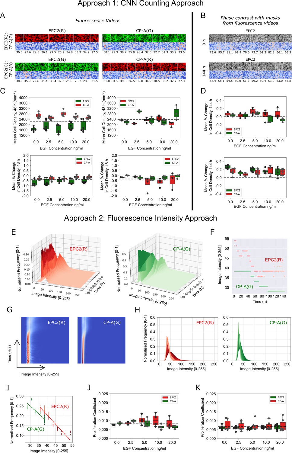
Migration-independent cell counting to assess cell proliferation upon EGF addition to EPC2:CP-A in 5% serum.
(A) Example results of CNN counting on fluorescence videos as described in Materials and methods with switching of dyes. For each panel, the top row shows video snapshots, the bottom row shows the CNN heatmap output and the numbers below it are the CNN predicted number of cells within the image patch. Exemplar patches shown are all sampled from the initial video frame. Consistent cell numbers across all sampled cell patches enables the use of the averaged cell density as an estimate of the cell density in the entire migrating epithelial sheet. Similar cell counts using either red or green dye shows cell counting is unaffected by the dye. (B) Similar examples presented as in (A) but using the matched phase contrast videos to illustrate the changing appearance of cells over time. Top panel: cell patches sampled from the initial frame (0 h). Bottom panel: cell patches sampled from the final frame (144 h). Individual cell types in co-cultures are distinguished using the matched fluorescence videos for image masking. (C) Boxplots of mean cell density (top) and corresponding mean % change in cell density (bottom) of each cell population, labelled with red and green dyes, where the average change in cell density is normalised by the average cell density across all frames up to 48 h. (D) Similar boxplots of mean % change as in (C) but with cell density computed from phase contrast videos. (E) Surface plot of the temporal evolution of the red and green channel normalised image intensity histograms for a representative video over 144 h. Given an image intensity value, the darker the colour the higher the proportion of image pixels share this image intensity (normalised frequency). (F) Plot of the change in the modal image intensity value of (E) over time with lighter colours representing later times. (G) Spatiotemporal evolution of the image intensity histogram of (E) as a heatmap with time on the y-axis, image intensity on the x-axis and the colour representing the normalised frequency. (H) Spatiotemporal evolution of the image intensity histogram of (E) shown as an overlay of histograms using the progression of dark to light colours to show time. (I) Plot of the (image intensity, normalised frequency) pair for the histogram peak estimated at each time point. Passage of time is indicated by the progression of dark to light colours. Points fit a linear regression. The proliferation gradient is the negative of the gradient of the best fit line. (J,K) Boxplots of the extracted proliferation coefficient for increasing EGF concentrations for individual cell populations where EPC2 is dyed ‘red’ (J) and ‘green’ (K). Compared to fitting the image intensity vs time in (F) which shows too discrete a transition between intensity values, fitting the normalised frequency vs image intensity was found to be more robust whilst yielding the same conclusions when all videos are of the same temporal length (144 h) as was the case here for EGF addition to EPC2:CP-A. All boxplots depict median and interquartile range (IQR) of values with whiskers defined 1.5 x IQR above and below the quartiles.
Figure 4—figure supplement 2
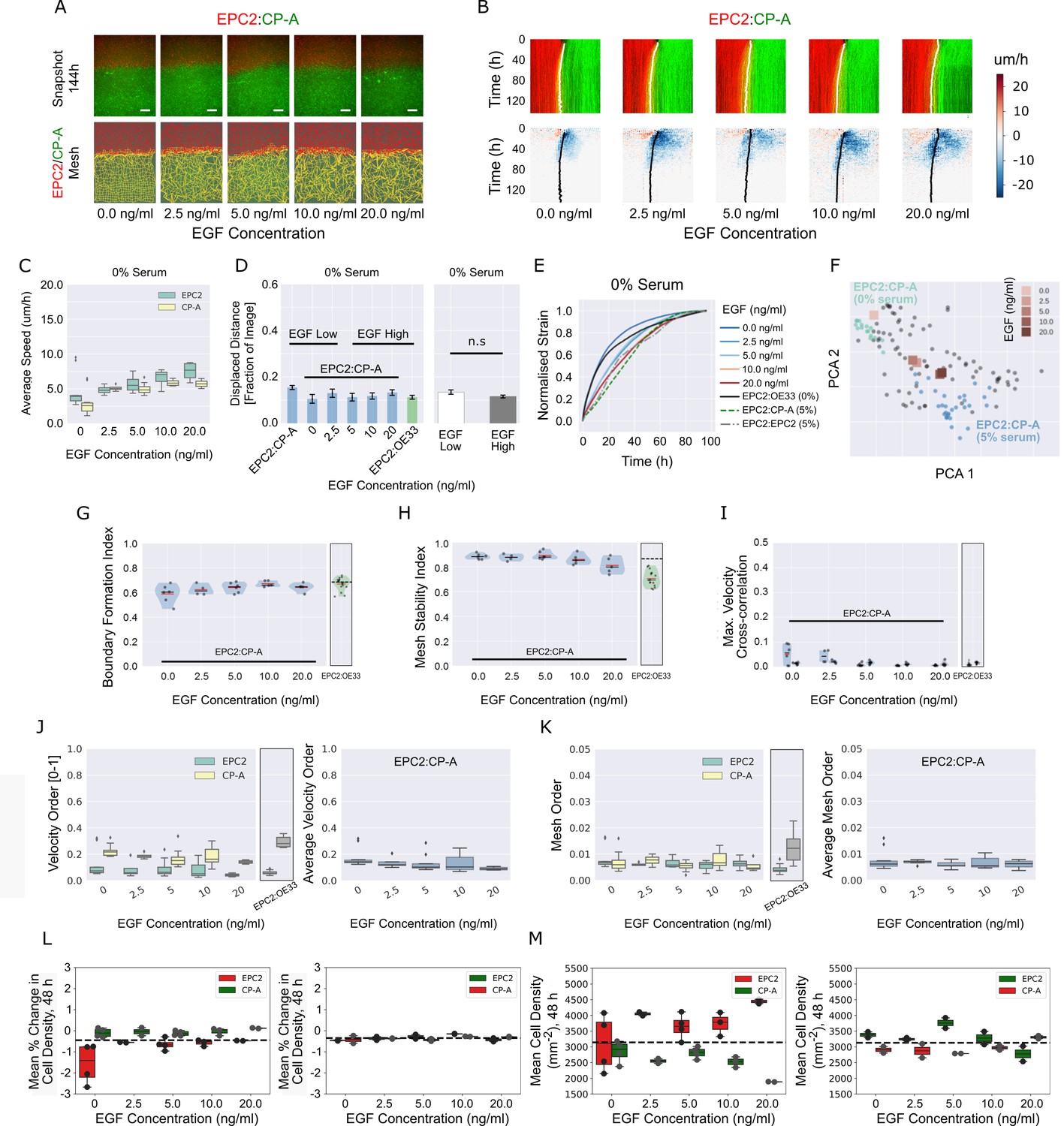
EGF addition to EPC2:CP-A in 0% serum does not induce boundary formation.
(A) Snapshots of the video (top) and fused red EPC2 and green CP-A MOSES mesh (bottom) at 144 h with increasing EGF concentration. (B) Top: maximum projected video kymograph. Bottom: x-direction velocity kymograph computed from optical flow for the representative videos in (A). The speed and direction of movement are indicated by the intensity and colour, respectively (blue, moving left; red, moving right). (C) Average speed of each cell line in each cell line combination for increasing concentrations of EGF. (D) Mean displaced distance of the boundary following gap closure with increasing EGF concentration. Mean displaced distance of EPC2:CP-A and EPC2:OE33 in 0% serum from Figure 1G are also plotted for comparison. T-test was used with * indicating p = < 0.05, ** p = < 0.01, *** p = < 0.001. Error bars are plotted for ± one standard deviation of the mean. (E) Mean normalised strain curves for EPC2:CP-A in 0% serum with each tested EGF concentration. The mean curves for EPC2:OE33, 0% serum and EPC2:CP-A, 5% serum, EPC2:EPC2, 5% serum without EGF are also shown for comparison. (F) Evolution of the mean curves in (E) plotted onto the motion map of Figure 5. (G–I) Violin plots of (G) boundary formation index, (H) mesh stability index and (I) maximum (max.) velocity cross-correlation before and after gap closure, left and right violins respectively of each paired violin in (I). Shaded region represents the probability density of the data. Width of shaded region is proportional to the number of videos with that value. Each point is a video, black line is the median, red line is the mean. EPC2:OE33, 0% serum without EGF and thresholds in Figure 3 are shown for comparison. (J,K) Box plots of the velocity order (J) and mesh order (K) for individual cell lines (left) and pooled over the combination (right). EPC2:OE33 in 0% serum without EGF from Figure 3 is shown for comparison. (L,M) Boxplots of mean % change in cell density normalised by the average cell density (L) and mean cell density (M) of each cell for all frames up to 48 h. Each point is a video. All boxplots depict median and interquartile range (IQR) of values with whiskers defined 1.5 x IQR above and below the quartiles.
Figure 5 with 2 supplements

MOSES generates motion signatures to produce a 2D motion map for unbiased characterisation of cellular motion phenotypes.
In all panels, each point represents a video (see legends for colour code). The position of each video on the 2D plot is based on the normalised mesh strain curves, analysed by PCA. (A) The mapping process for a single video. (B) The 5% serum videos (n = 77) were used to set the PCA that maps a strain curve to a point in the 2D motion map. (C) The 0% serum videos (n = 48) were plotted onto the same map defined by the 5% serum videos using the learnt PCA. In (B) and (C), the mean mesh strain curves for each cell combination are shown in the insets. Light blue region marks the two standard deviations with respect to the mean curve (solid black line). (D) Same map as in (C) with points coloured according to 0% or 5% serum. (E) The normalised mean strain curves for 0–20 ng/ml EGF addition to EPC2:CP-A from Figure 4E plotted onto the same map defined by the 5% serum videos.
Figure 5—figure supplement 1
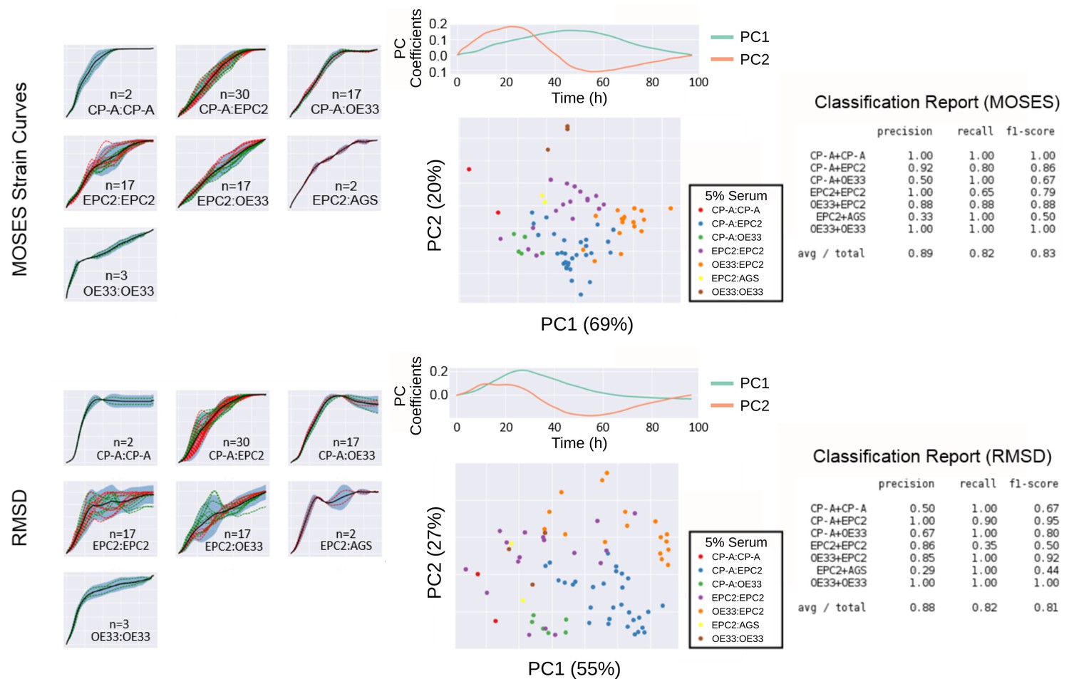
Comparison of MOSES-normalised strain curves vs RMSD curves as motion signatures for motion map generation from 5% serum videos.
Left: Normalised strain curves for each video organised by cell line combination with MOSES (top) and RMSD (bottom). Each video is represented by a single dashed curve coloured according to the dye colour used for the first cell line in the combination indicated on each plot. Thus for combinations such as CP-A:CP-A where the green dyed CP-A is always the left sheet, there is only one green dashed line. Solid black line is the mean curve, blue shaded region marks ± two standard deviations of the mean curve, total n = 77 videos. Middle: PCA analysis applied to MOSES (top) and RMSD (bottom) shown with the respective derived principal components plotted above the PCA motion map. Percentage of variance explained by each principal component or PC is displayed in brackets. Each point is a video (see legends for colour code). Right: Classification report with the precision, recall and f1 score after fitting a balanced linear SVM (support vector machine) machine learning classifier trained on the normalised MOSES strain or RMSD curves of all the videos, n = 77. AGS cells are derived from gastric adenocarcinoma. In all plots, EPC2:AGS is included as another columnar cell and cancer control for comparison.
Figure 5—figure supplement 2
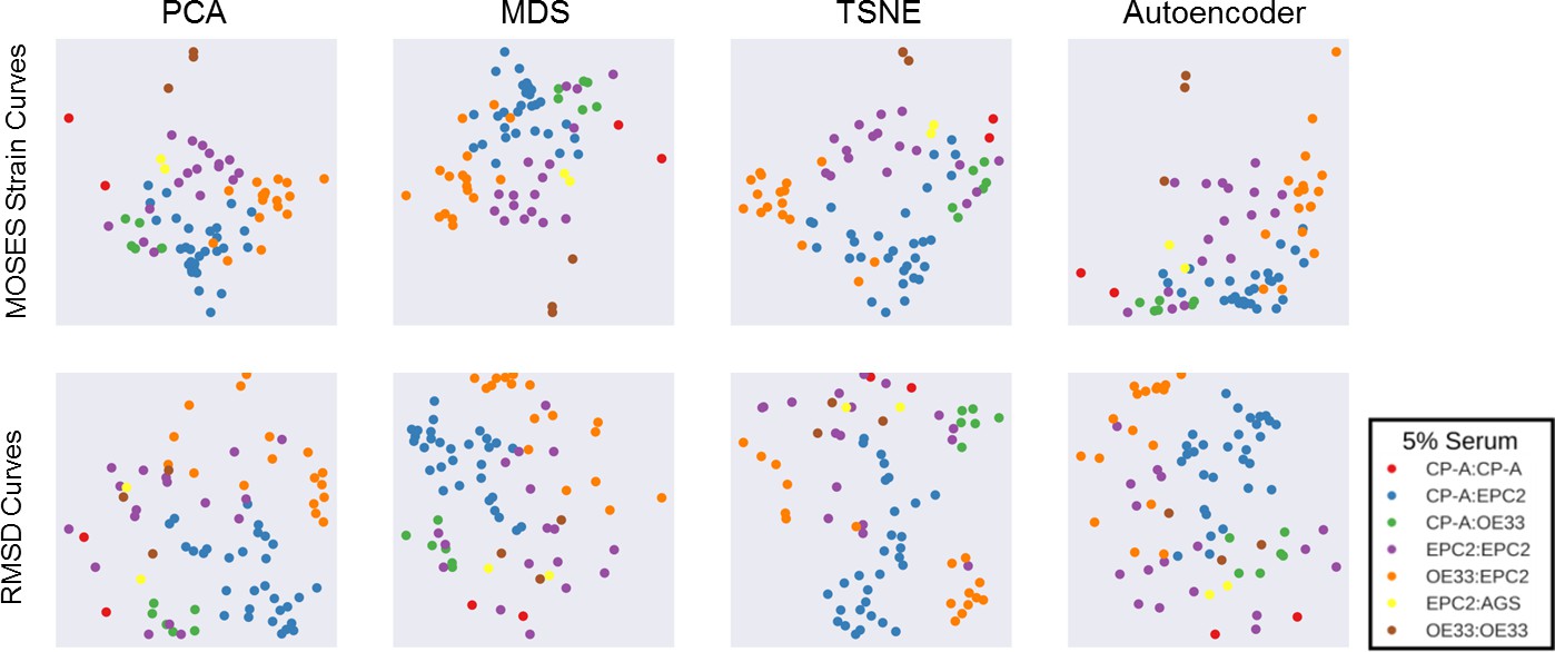
Comparison of motion map learning using different dimensional reduction techniques with MOSES strain curves and RMSD curves.
In each panel, the same 77 serum videos were used. From left to right, PCA - principal components analysis, MDS - multidimensional scaling, TSNE - t-distributed stochastic neighbour embedding and a neural network autoencoder. See Material and methods for details. Each point represents a video, as indicated in the legend. In all plots, EPC2:AGS is included as another columnar cell and cancer control for comparison.
Figure 6
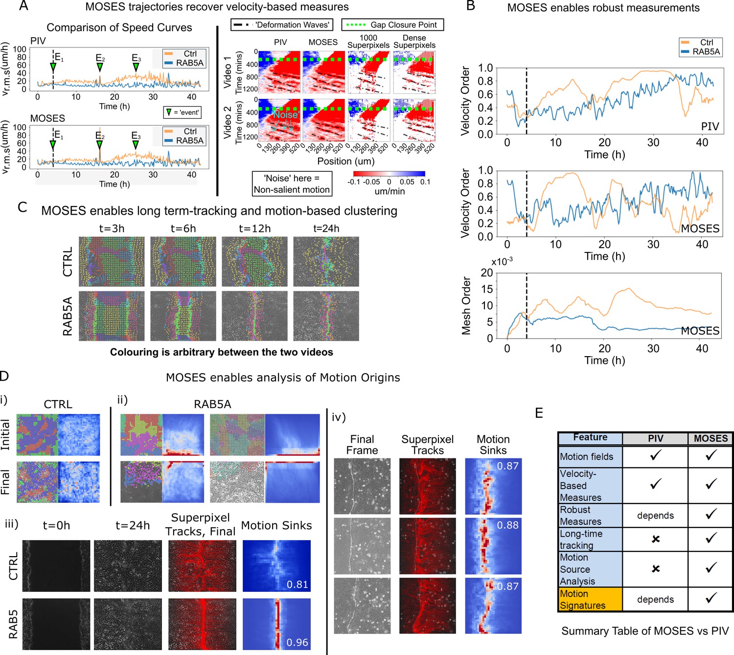
Comparison between MOSES and PIV.
(A) Left: average speed curves of MCF-10A control (CTRL) and doxycycline inducible RAB5A-expressing (RAB5A) monolayer cell migration after doxycycline addition (Supp. Movie 3 of Malinverno et al., 2017) computed using PIV and MOSES (optical flow). Green triangles indicate notable events in the movie; E1 (4 h): addition of doxycycline, E2 (16 h): first bright ‘flash’ in movie followed by accelerated movement of RAB5A expressing cells, E3 (25 h): timepoint at which RAB5A cells moved fastest. Right: velocity kymographs of Videos 1 and 2 (c.f. Figures 3 and 4 respectively in Rodríguez-Franco et al. (2017)) computed from PIV and MOSES motion fields showing the presence of deformation waves (black dash-dot line) due to cell jamming following initial gap closure (green dashed line). The corresponding velocity kymographs reconstructed from a fixed number of 1000 MOSES superpixel tracks and a ‘dense’ number of superpixel tracks (starting with 1000 superpixels) is shown for comparison. The speed and direction of movement are indicated by the intensity and colour, respectively (blue, moving right; red, moving left). (B) Top and middle: velocity order parameter curves as defined in Malinverno et al. (2017) for the MCF-10A control and RAB5A expressing cell lines was computed for the same movies as (A) using PIV and MOSES. Bottom: corresponding MOSES mesh order curve. Black vertical dashed line mark the addition of doxycycline. (C) MOSES superpixel tracks computed for wound-healing assay of MCF-10A and RAB5A cells (Supp. Video 19 of Malinverno et al., 2017) were automatically clustered into distinct groupings and coloured uniquely according to their mesh strain curve using GMM with BIC model selection (Materials and methods, Video 8 of this paper). (D) (i,ii) Automatic clustered superpixels and associated motion saliency maps (backward tracking to identify ‘initial’ motion, forward tracking to identify ‘final’ motion) for different videos of MCF10A-control (CTRL) and RAB5A monolayer migration in Malinverno et al. (2017), (see also Video 9). (iii) Left to right: snapshots of initial and final frames, MOSES superpixel tracks (1000 superpixels) overlaid on final frames, associated ‘final’ motion saliency map and boundary formation index for CTRL and RAB5A cells for same videos in (C). (iv) Snapshot of final frame, overlaid MOSES superpixel tracks (1000 superpixels) and associated ‘final’ motion saliency map and boundary formation index for the boundary formation between EphB2 and ephrinB1 expressing MDCK monolayers (Rodríguez-Franco et al., 2017). (E) Summary of the comparison between MOSES and PIV. Long-time refers to the tracking of movement beyond one timepoint.
Author response image 1
Author response image 2

Videos
Video 1
Dynamics of monolayer combinations of three oesophageal epithelial cell lines, EPC2:EPC2, CP-A:CP-A, OE33:OE33.
Bar: 500 μm.
Video 2
Sheet migration in EPC2:EPC2, EPC2:CP-A and EPC2:OE33 in 0% and 5% FBS.
No boundary forms in 0% fetal bovine serum (FBS) where all combinations move similarly. A stable boundary forms between EPC2 and CP-A in 5% FBS. Film duration: 96 h. Bar: 500 μm. Videos were contrast enhanced for better visualisation.
Video 3
Single-cell motion extraction using MOSES workflow compared to manual annotations used in the cell tracking challenge dataset (Maška et al., 2014).
Bar: 100 μm.
Video 4
Assessment of individual cell motion in confluent cell sheets using spiked-in fluorescent cell populations and MOSES.
Blue (B) represents the spiked-in population of EPC2 cells. (R) and (G) refer to the red and green EPC2 epithelial sheets, respectively. Bar: 500 μm.
Video 5
Comparison of the temporal stability of velocity and mesh strain vectors for measuring collective motion.
Individual velocity vectors are represented with red arrows, individual mesh strain vectors with green arrows. The large blue and black arrow are the global mean velocity and global mean mesh strain vector respectively. The corresponding derived MOSES mesh is shown on the right of the arrow plots in black. Bar: 100 μm.
Video 6
Representative videos of the sheet migration of all tested cell combinations in 5% FBS. (R) and (G) denote red and green dyed cells respectively.
Film duration 144 h. Bar: 500 μm.
Video 7
Motion dynamics of EPC2(R):CP-A(G) under increasing EGF addition (0–20 ng/ml).
MOSES can also measure decreased collective migration in the green CP-A sheet with increasing EGF, a phenomena difficult to assess by eye. MOSES meshes are shown, red for red-dyed (R) EPC2 cells and yellow for green-dyed (G) CP-A cells, respectively. Bar: 500 μm.
Video 8
Long-time superpixel track extraction and unbiased track clustering using the mesh strain curve of each superpixel as the feature vector for Supp.
Movie 19 of Malinverno et al. (2017). Each cluster is highlighted with a unique colour. The colours are arbitrary. There is no colour matching between individual videos. Bar: 100 μm.
Video 9
Long-time superpixel track extraction and unbiased track clustering using the mesh strain curve for Supp. Movie 3 and 7 of Malinverno et al. (2017).
Each cluster is highlighted with a unique colour. The colours are arbitrary. There is no colour matching between individual videos. Bar: 100 μm.
Tables
Table 1
Summary of MOSES-derived measurements for discriminating boundary formation phenotype in this paper and their biological interpretation and application.
https://doi.org/10.7554/eLife.40162.026| Proposed measures | Biological interpretation | Biological application |
|---|---|---|
| Motion Saliency Map | ‘Heatmap’-like image that highlights spatial regions that attract or repel local cellular motion over a defined time period. | Quantitative spatio-temporal readout of scratch or wound-healing assays. Highlights areas of salient motion activity spatially such as the migration of macrophages locally to inflicted wound sites. |
| Boundary formation index (value from 0 to 1) | Quantifies the concentration of movement within one region of space. Multiple ‘hotspots’ decrease this index. Uniform distributed movement (no attraction) scores 0. Concentration of movement in a single region for example a line or point scores 1. | Quantification of the spatial uniformity or ‘spread’ of motion activity. Highlights for example if all migrating cells move uniformly to close the wound in a wound-healing assay. |
| Mesh stability index (value from ∞ to 1) | Measures the motion stability of local cell groups by measuring the change in relative spatial arrangement (topology) with respect to neighbouring cell groups at a given endpoint. Static epithelial sheets and epithelial sheets that move uniformly in a single direction preserve local cellular arrangement and scores 1. Motion that results in the local spatial rearrangement of cells such as neighbour exchange in embryos is unstable and scores < 1. | Assessing the final global movement stability of a collective such as an embryo or epithelial sheet based on the movement of the cells that compose it. |
| Mesh order (value > 0) | Measures the collectiveness of local cellular migration by the change in distance and direction of cells with respect to neighbouring cells. Hypothesizes that cells that are part of the same motion group exhibit the same ‘mesh’ force and move retaining the same local spatial arrangement. | Quantitative assessment of the extent of global sheet-like movement. |
Key resources table
| Reagent type (species) or resource | Designation | Source or reference | Identifiers | Additional information |
|---|---|---|---|---|
| Cell line (H. sapiens) | EPC2 | https://www.med.upenn.edu/molecular/documents/EPCcellprotocol032008.pdf | Prof. Hiroshi Nakagawa (University of Pennsylvania) | |
| Cell line (H. sapiens) | CP-A | CP-A (KR-42421) (ATCC ) | ATCC:CRL-4027; RRID:CVCL_C451 | |
| Cell line (H. sapiens) | OE33 | ECACC | ECACC:96070808; RRID: CVCL_0471 | |
| Cell line (H. sapiens) | AGS | AGS (ATCC CRL-1739) | ATCC:CRL-1739; RRID:CVCL_0139 | |
| Chemical compound, drug | KSFM | Gibco/Thermo Fisher | Cat#:17005042 | |
| Chemical compound, drug | RPMI 1640 medium | Gibco/Thermo Fisher | Cat#:21875–034 | |
| Chemical compound, drug | Human recombinant EGF | Gibco/Thermo Fisher | Cat#:PHG0313 | |
| Chemical compound, drug | Celltracker Orange (CMRA) | Life Technologies/ Thermo Fisher | Cat#:C34551 | |
| Chemical compound, drug | Celltracker Green (CMFDA) | Life Technologies/ Thermo Fisher | Cat#:C7025 | |
| Chemical compound, drug | Celltracker DeepRed | Life Technologies/ Thermo Fisher | Cat#:C34565 | |
| Chemical compound, drug | Image-iTTM FX Signal Enhancer | Thermo Fisher | Cat#:I36933 | |
| Chemical compound, drug | Antibody diluent, background reducing | Agilent Dako | Cat#:S3022 | |
| Chemical compound, drug | Antibody dilutent | Agilent Dako | Cat#:S0809 | |
| Chemical compound, drug | Fluoromount-G | SouthernBiotech | Cat#:0100–01 | |
| Chemical compound, drug | DAPI (1 mg/ml) | Thermo Fisher | Cat#:62248 | 1:1000 dilution |
| Antibody | Goat polyclonal anti-mouse Alexa Fluor 488 | Thermo Fisher | Cat#:A-11001; RRID:AB_2534069 | 1:400 dilution |
| Antibody | Phalloidin Alexa Fluor 647 | Thermo Fisher | Cat#:A22287; RRID:AB_2620155 | 1:400 dilution |
| Antibody | Mouse monoclonal anti E-cadherin | Becton, Dickinson U.K Ltd. | Cat#:610181; RRID:AB_397580 | 1:400 dilution |
| Other | 25 culture-inserts 2-Well for self-insertion | Ibidi | Cat#:80209 | |
| Software | Fiji ImageJ | https://imagej.net/Fiji | RRID:SCR_002285 | TrackMate Plugin |
| Software /Algorithm | Motion Sensing Superpixels | This paper | RRID:SCR_016839 | https://github.com/fyz11/MOSES |
Additional files
-
Supplementary file 1
Table summary of video datasets and experiments analysed for 0% and 5% serum.
- https://doi.org/10.7554/eLife.40162.039
-
Supplementary file 2
Table summary of video datasets and experiments analysed for EGF addition.
- https://doi.org/10.7554/eLife.40162.040
-
Transparent reporting form
- https://doi.org/10.7554/eLife.40162.041
Download links
A two-part list of links to download the article, or parts of the article, in various formats.
Downloads (link to download the article as PDF)
Open citations (links to open the citations from this article in various online reference manager services)
Cite this article (links to download the citations from this article in formats compatible with various reference manager tools)
Motion sensing superpixels (MOSES) is a systematic computational framework to quantify and discover cellular motion phenotypes
eLife 8:e40162.
https://doi.org/10.7554/eLife.40162


