Inference and control of the nosocomial transmission of methicillin-resistant Staphylococcus aureus
- Columbia University, United States
- City College of New York, United States
- Stockholm University, Sweden
Figures
Figure 1 with 2 supplements

Observed incidence of UK EMRSA-15 and the agent-based MRSA transmission model.
(A) Incidence of UK EMRSA-15 every 4 weeks (red crosses) and cumulative cases (blue curve). (B) The raster plot for infections in 114 infected wards. Color indicates number of observed infections during 4-week periods. (C) Distributions of total patient numbers per ward (persons, upper panel), patient average length of stay (days, middle panel) and ward capacity (persons, lower panel) for infected and uninfected wards. (D) Overlaid degree distributions of 300 weekly aggregated contact networks. The solid blue line is the fitting to a Weibull distribution. Inset shows an illustration of the time-varying contact network. (E) A schematic of the model framework. The blue box defines the transmission process within hospitals, and imported infection and colonization from outside the study hospitals are quantified by two parameters and .
-
Figure 1—source data 1
Numerical data represented in Figure 1.
The data set includes: (1) incidence data in Figure 1A; (2) ward number, infection number, total visit, average stay and ward capacity visualized in Figure 1B–C.
- https://doi.org/10.7554/eLife.40977.006
Figure 1—figure supplement 1
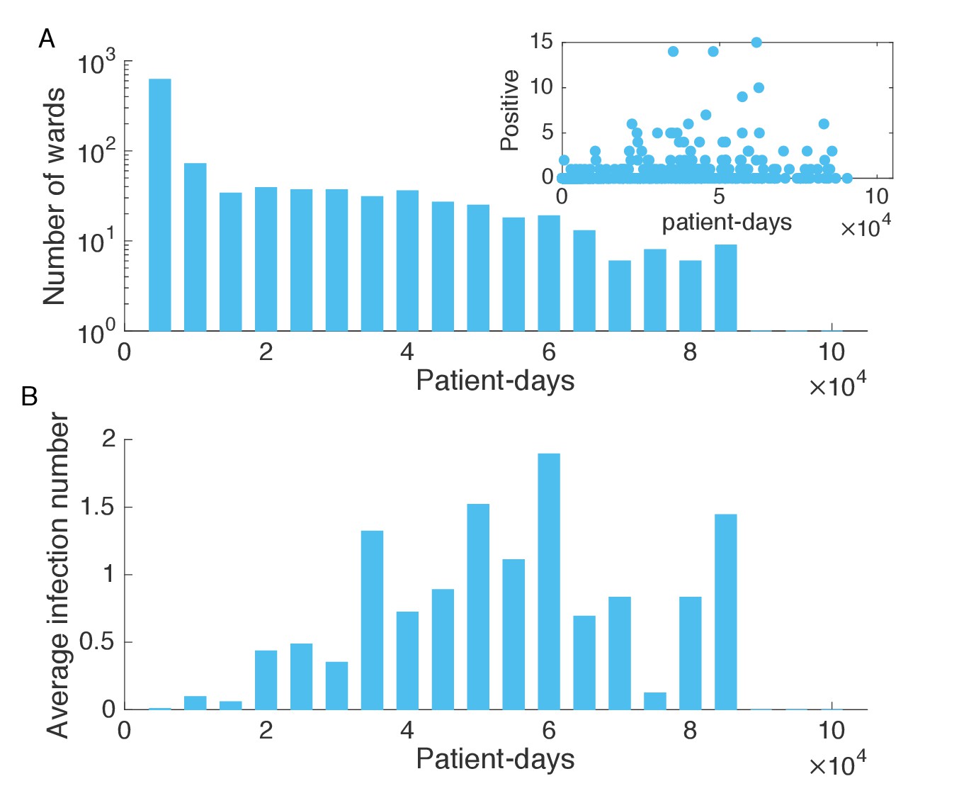
Association between infection numbers and patient-days per ward.
(A) Number of wards with a given number of total patient-days in the hospitalization records. Inset shows the scatter plot of the number of positive cases and patient-days per ward. (B) Average infection number as a function of patient-days per ward.
Figure 1—figure supplement 2
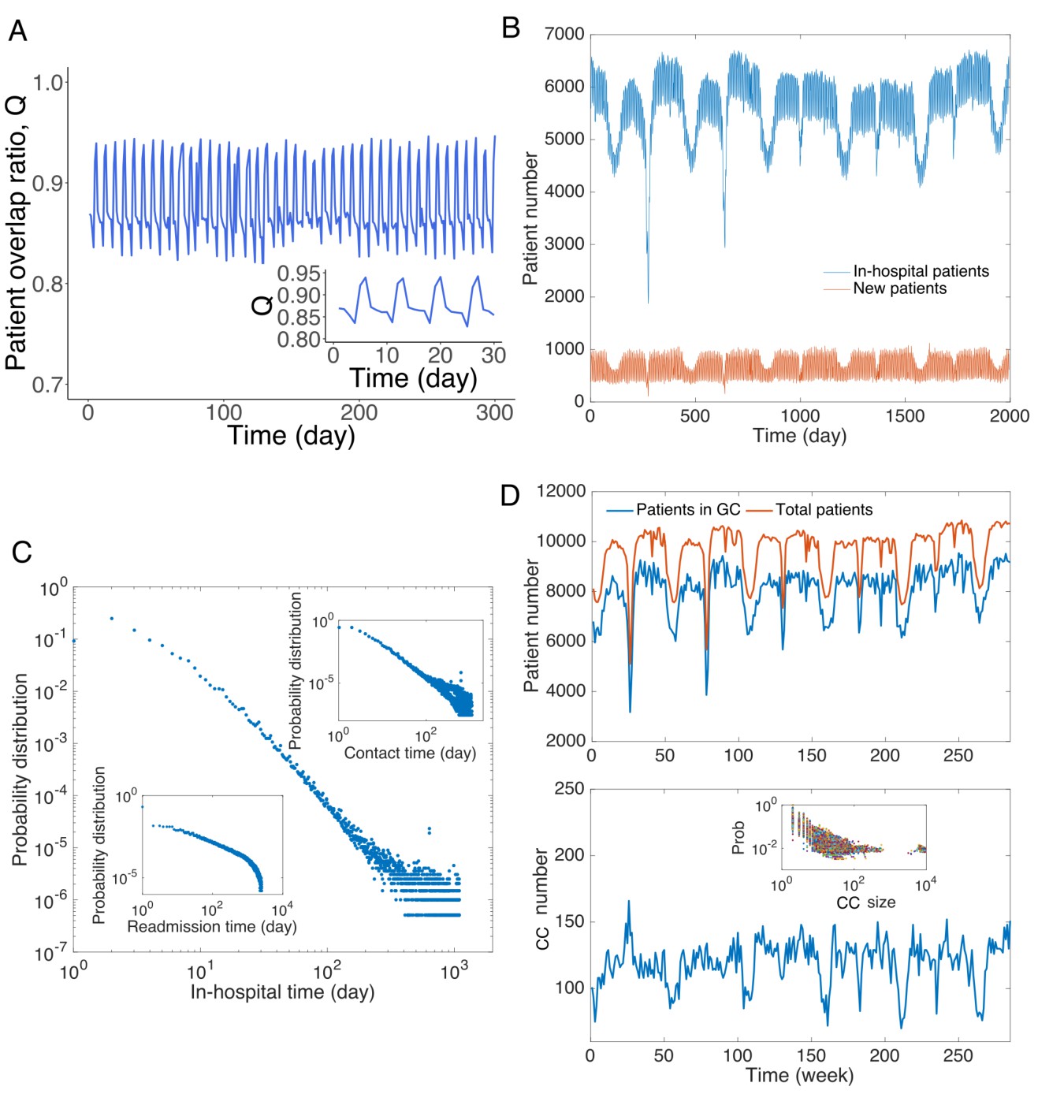
Patient traffic in the study Swedish hospitals.
(A) Daily patient overlap ratio Q during 300 days. Inset provides a zoom-in plot of the first 30 days. (B) The number of total patients and new patients (with respect to patients present the previous day) in hospitals each day. (C) Distribution of hospitalization time. The upper inset shows the distribution of contact time between all pairs of patients. The lower inset presents the distribution of readmission time (the time between previous discharge and current admission) for all patients. (D) Analysis of connected components in the contact network. The upper panel shows the total number of patients in the contact network and number of patients in the giant connected component. The lower panel displays the number of connected components in the contact network, and the inset shows the distribution of size of connected components.
Figure 2 with 5 supplements
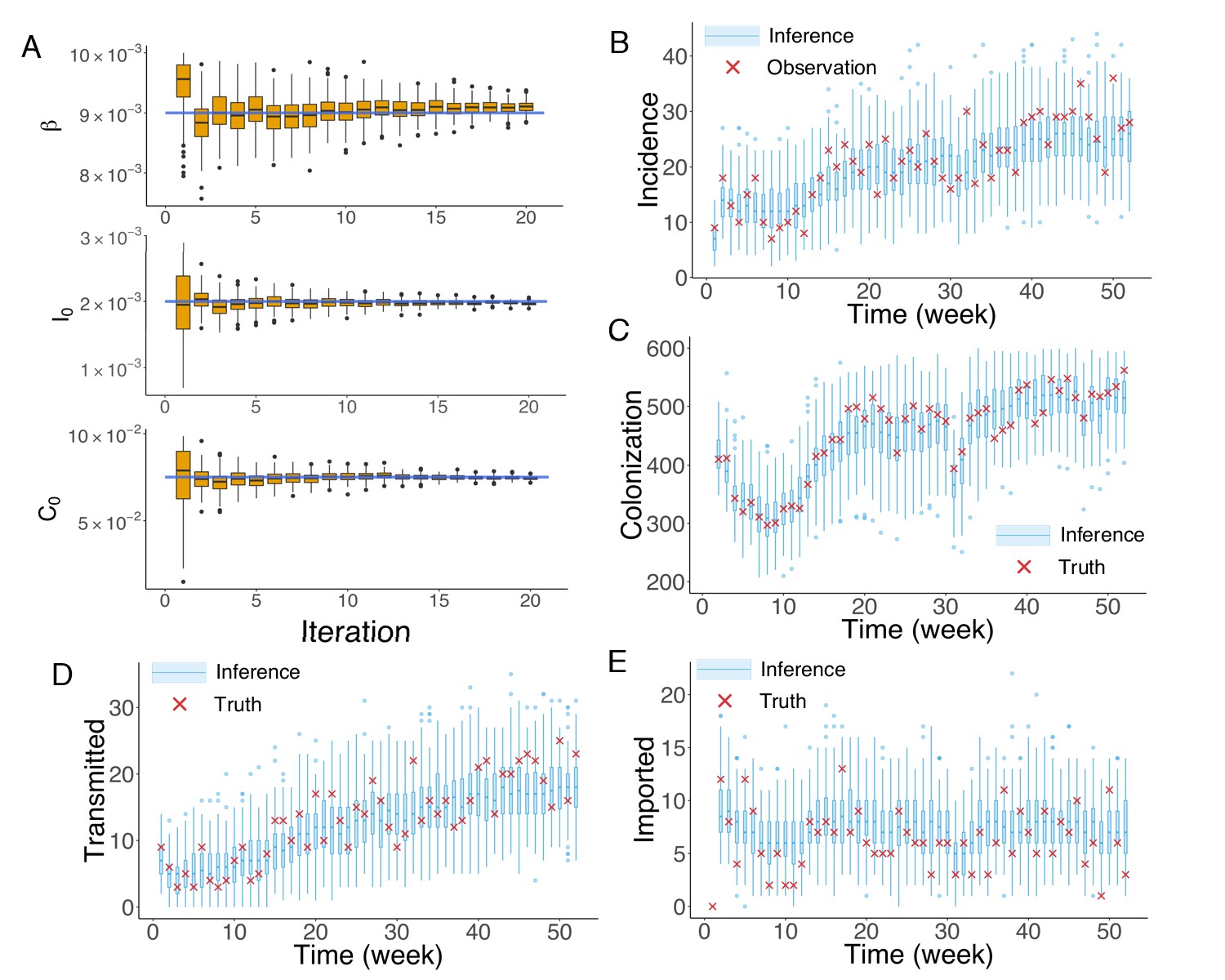
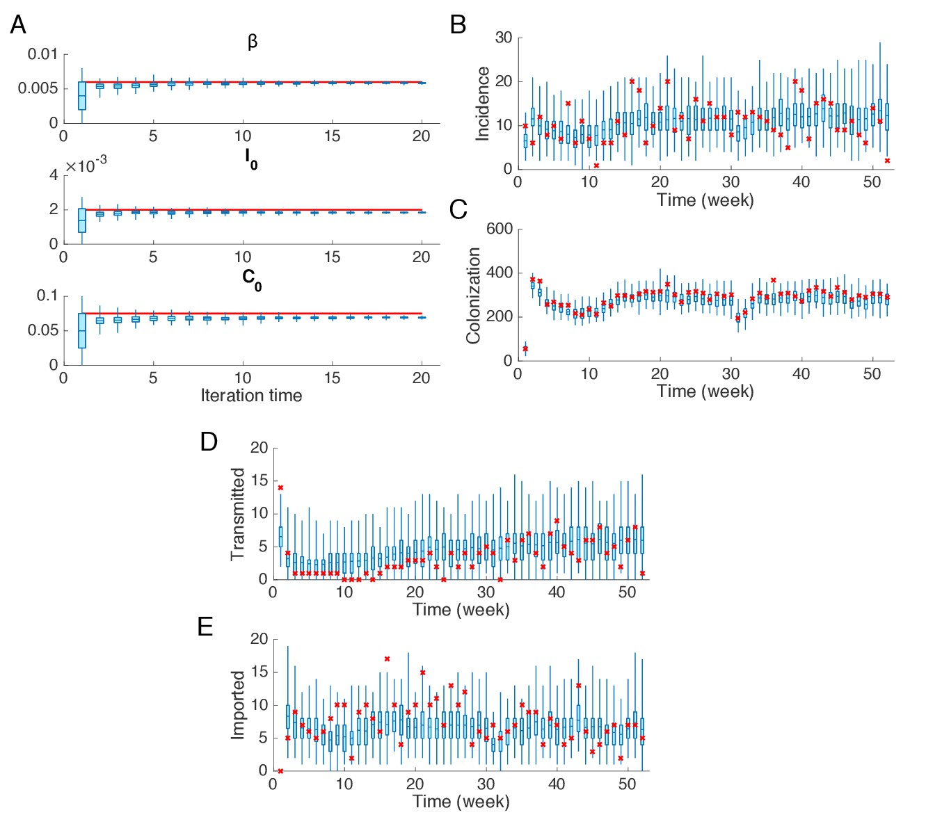
Inference of model parameters for a synthetic outbreak.
(A) Distributions of the posterior parameters (top), (middle) and (bottom) (300 ensemble members) for 20 iterations of inference in one realization of the IF algorithm. Orange Tukey boxes show the median and interquartile (IQR, Q1 to Q3). Whiskers mark the inferred values within the range [Q1-1.5 × IQR, Q3 + 1.5 × IQR]. Dots are outliers. Horizontal blue lines indicate the inference targets used in generating the synthetic outbreak. (B–C) Distributions of weekly incidence (B) and colonization (C) generated from 1000 realizations of simulations using the inferred parameters are shown by the blue boxes. The red crosses represent the synthetic observations used during the inference (B) and actual colonization in the outbreak (C). (D–E) Inference of the transmitted and imported infections. Blue boxes are distributions generated from simulations, and red crosses are the actual values in the synthetic outbreak.
-
Figure 2—source data 1
Numerical data represented in Figure 2.
The data set includes: (1) distributions of , and in Figure 2A; (2) distributions of inferred incidence and actual observation in the synthetic outbreak in Figure 2B; (3) distributions of inferred colonization and actual colonization in the synthetic outbreak in Figure 2C; (4) distributions of inferred transmitted incidence and actual transmitted incidence in the synthetic outbreak in Figure 2D; (5) distributions of inferred imported incidence and actual imported incidence in the synthetic outbreak in Figure 2E.
- https://doi.org/10.7554/eLife.40977.014
Figure 2—figure supplement 1
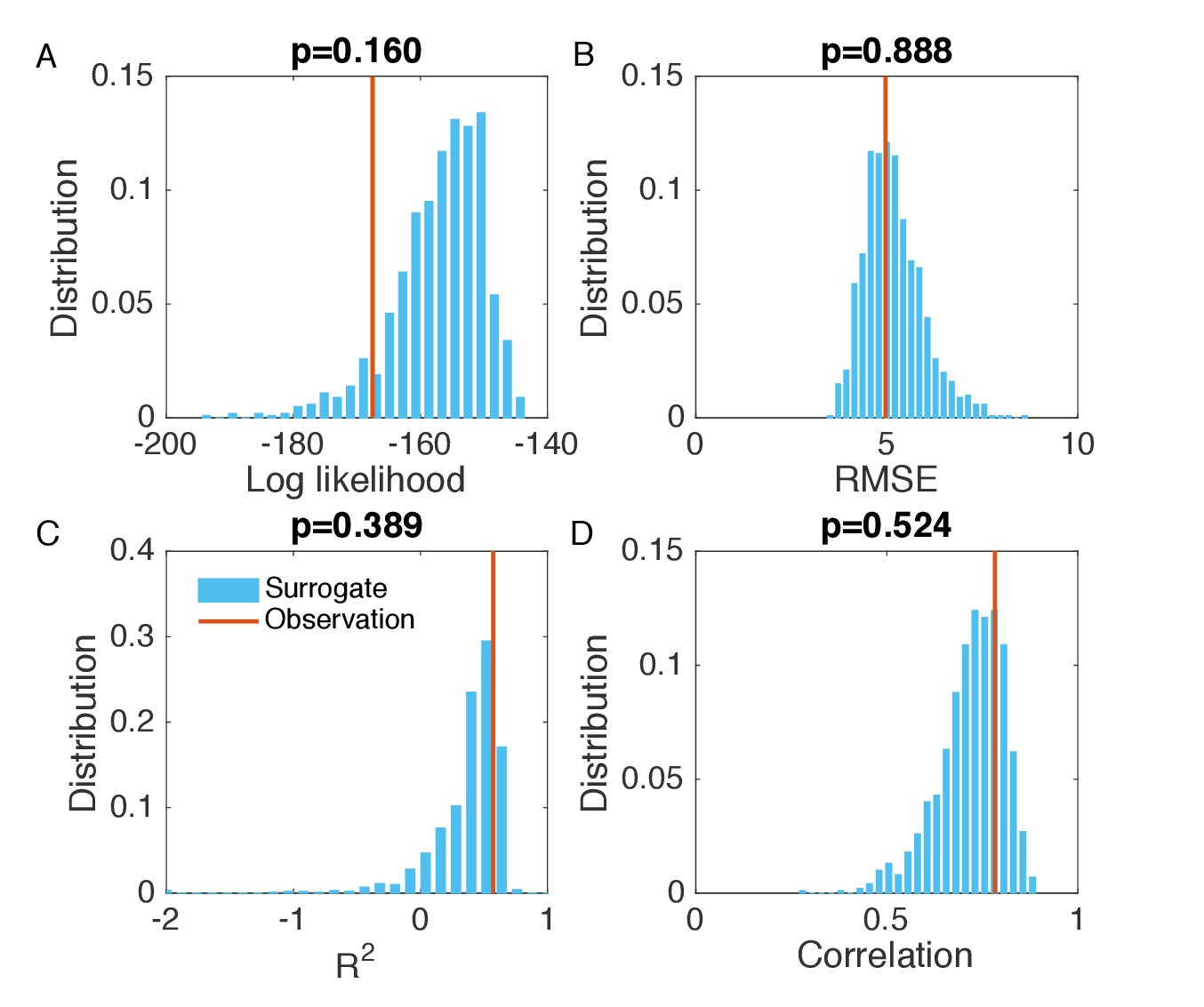
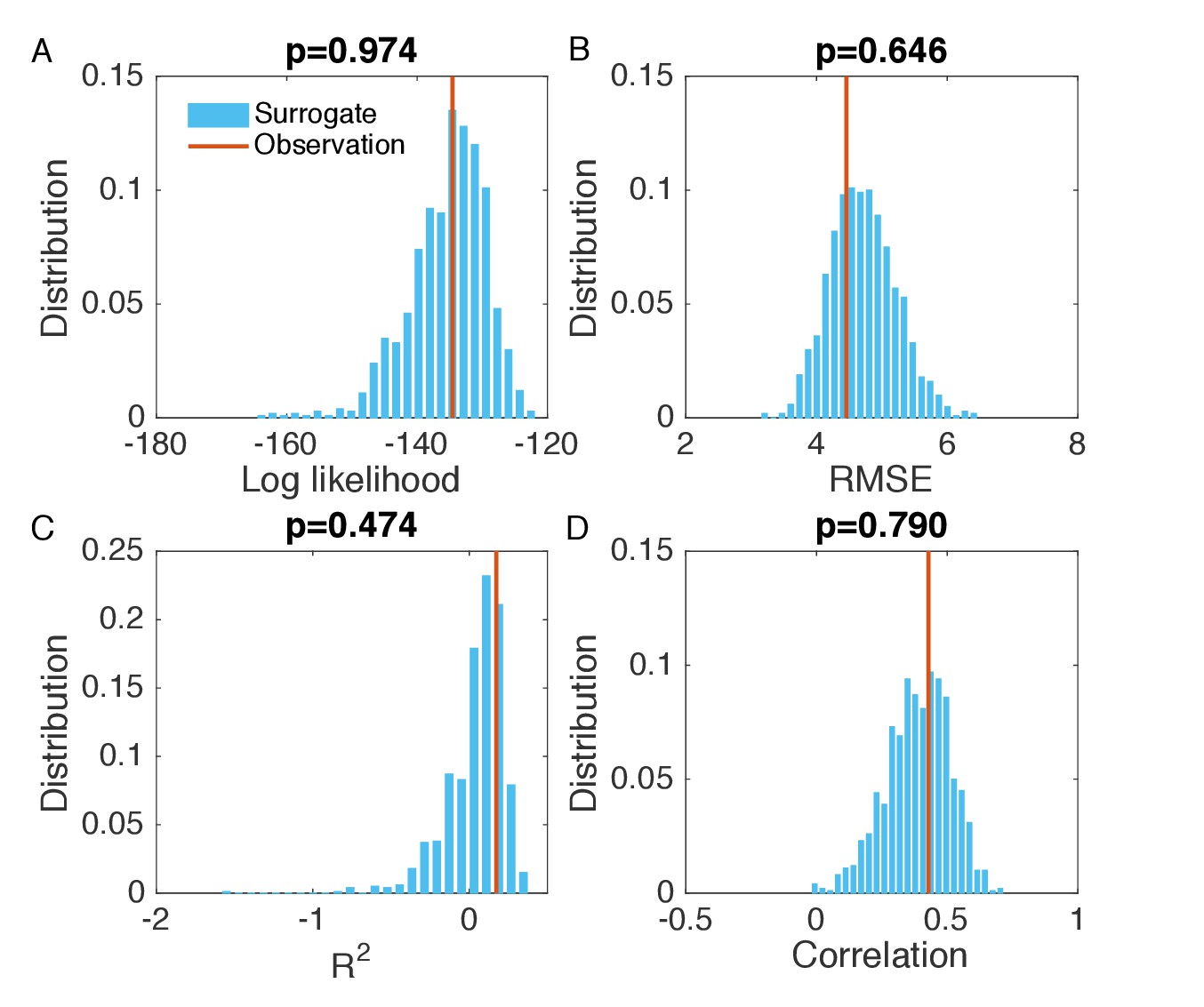
Evaluation of the goodness of fit in Figure 2B.
(A) Distribution of the log likelihood calculated from surrogate data (blue bars). We generated 1000 synthetic outbreaks using the inferred parameters, from which we approximated the distribution of incidence at each week. We then calculated the log likelihood for the observed incidence in each synthetic outbreak, and obtained its distribution using the 1000 log likelihood values computed from the surrogate data. Vertical red line indicates the log likelihood obtained in Figure 2B. Subplot title shows the two-sided p-value of the log likelihood for the inference relative to the surrogate distribution. The same analysis was also performed for RMSE (B), (C) and Pearson correlation coefficient (D). The RMSE, and Pearson correlation coefficient were calculated using the incidence time series in each synthetic outbreak and the mean incidence time series averaged over 1000 realizations.
Figure 2—figure supplement 2
Synthetic test of IF for an outbreak in which the majority of infections are imported.
(A) Parameters used in the synthetic outbreak (inference targets) are marked by red lines. The posterior parameter distributions (300 ensemble members) for different iterations in one realization of the IF algorithm are shown by the blue boxes and whiskers (box: interquartile; whisker: 95% CI). (B) Distributions of weekly incidence generated from 1000 realizations of simulations using the inferred parameters are shown by the blue boxes and whiskers. The red crosses represent the synthetic observations used in the inference. (C–E) Same analysis as in (B) for the colonized population, cases transmitted in hospital and cases imported from outside.
Figure 2—figure supplement 3
Evaluation of the goodness of fit in Figure 2—figure supplement 2B.
Same analysis as in Figure 2—figure supplement 1. Comparisons of the log likelihood (A), RMSE (B), (C), and Pearson correlation coefficient (D) obtained from the inference in Figure 2—figure supplement 2B with the distributions of these metrics calculated from 1000 simulations with inferred parameters.
Figure 2—figure supplement 4
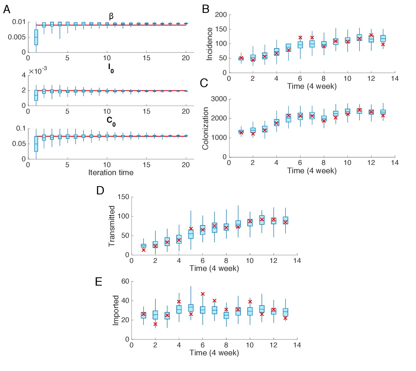
Synthetic test of IF for observations every 4 weeks.
Parameters are set as in Figure 2. (A) Parameters used in the synthetic outbreak (inference targets) are marked by red lines. The posterior parameter distributions (300 ensemble members) for different iterations in one realization of the IF algorithm are shown by the blue boxes and whiskers (box: interquartile; whisker: 95% CI). (B) Distributions of weekly incidence generated from 1000 realizations of simulations using the inferred parameters are shown by the blue boxes and whiskers. The red crosses represent the synthetic observations used in the inference. (C–E) Same analysis as in (B) for the colonized population, cases transmitted in hospital and cases imported from outside.
Figure 2—figure supplement 5
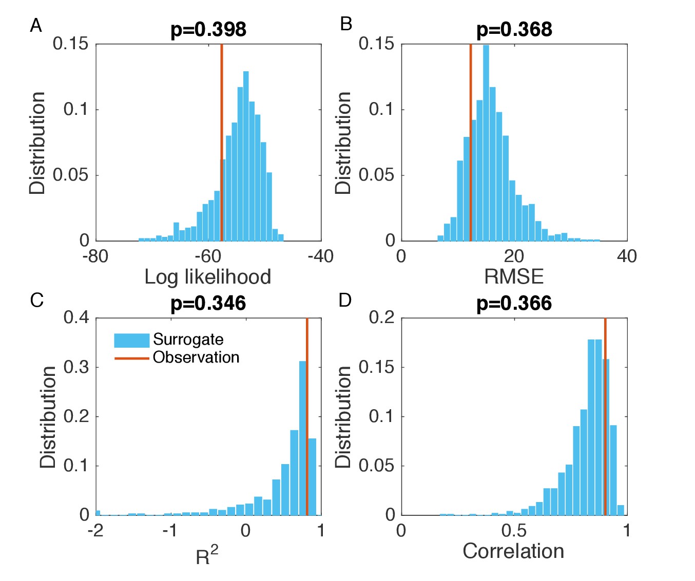
Evaluation of the goodness of fit in Figure 2—figure supplement 4B.
Same analysis as in Figure 2—figure supplement 1. Comparisons of the log likelihood (A), RMSE (B), (C), and Pearson correlation coefficient (D) obtained from the inference in Figure 2—figure supplement 4B with the distributions of these metrics calculated from 1000 simulations with inferred parameters.
Figure 3 with 3 supplements
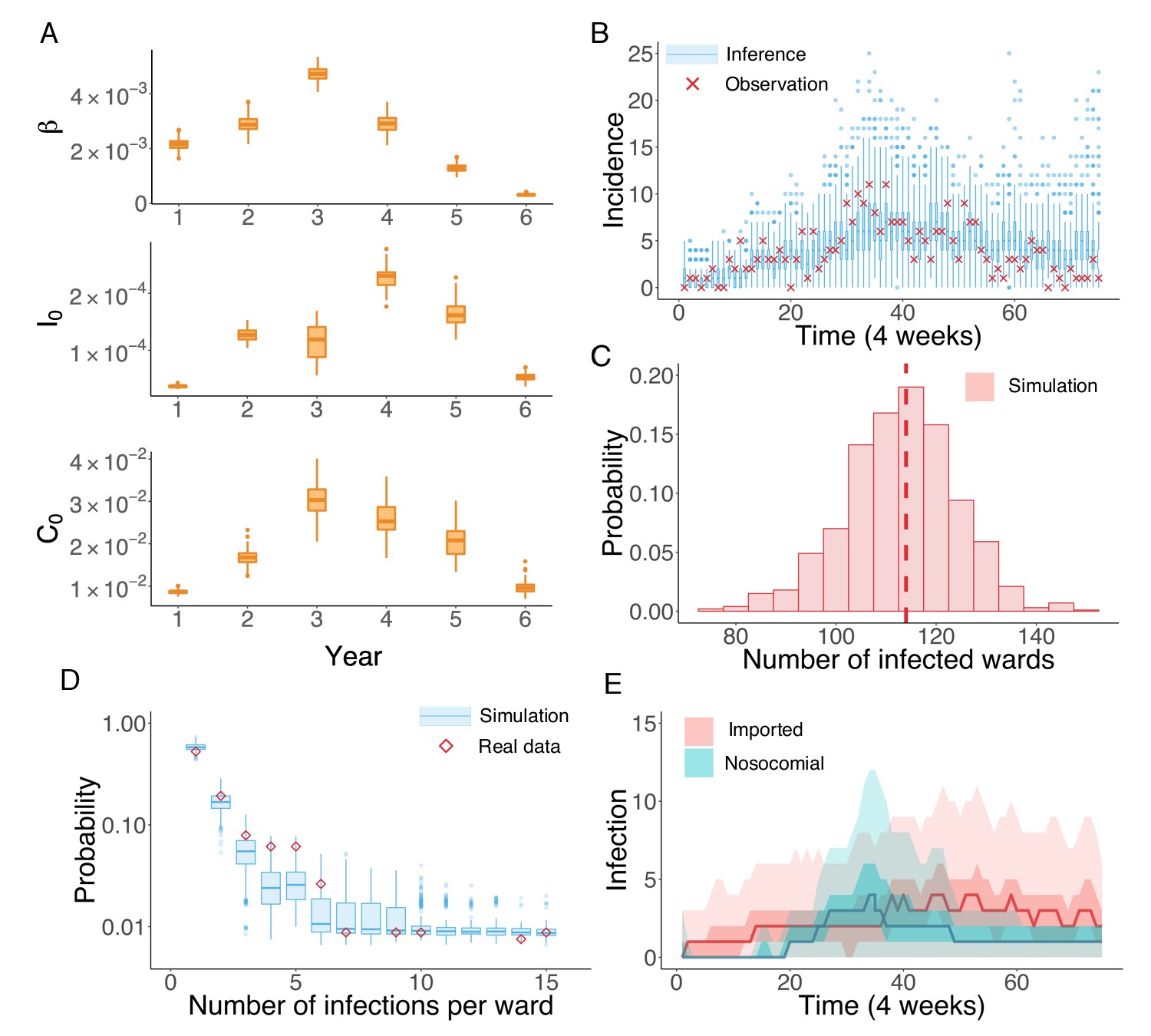
Inference of the nosocomial transmission of UK EMRSA-15.
(A) Inferred distributions of the MLEs for key parameters , and over 6 years, obtained from 100 independent realizations of the IF algorithm. (B) Observed incidence every 4 weeks (red crosses) and corresponding distributions generated from 1000 simulated outbreaks using the inferred mean parameters (blue boxes and whiskers). (C) Distribution of the number of infected wards obtained from 1000 simulations. The vertical red dash line indicates 114, the observed number of infected wards. (D) Distributions of the number of infections per ward from 1000 simulations (blue boxes and whiskers). Red diamonds are the observed probabilities. (E) Inferred distributions of infections transmitted in hospital (turquoise area) and imported from outside the study hospitals (pink area). The dark areas mark the IQR; light areas show values within the range [Q1-1.5 × IQR, Q3 + 1.5 × IQR].
-
Figure 3—source data 1
Numerical data represented in Figure 3.
The data set includes: (1) distributions of inferred parameters in Figure 3A; (2) distributions of inferred incidence and actual observation in the real-world outbreak in Figure 3B; (3) distribution of the number of infected wards obtained from inference in Figure 3C; (4) observed and inferred distributions of the number of infections per ward in Figure 3D; (5) distributions of inferred nosocomial transmitted and imported cases in Figure 3E.
- https://doi.org/10.7554/eLife.40977.019
Figure 3—figure supplement 1
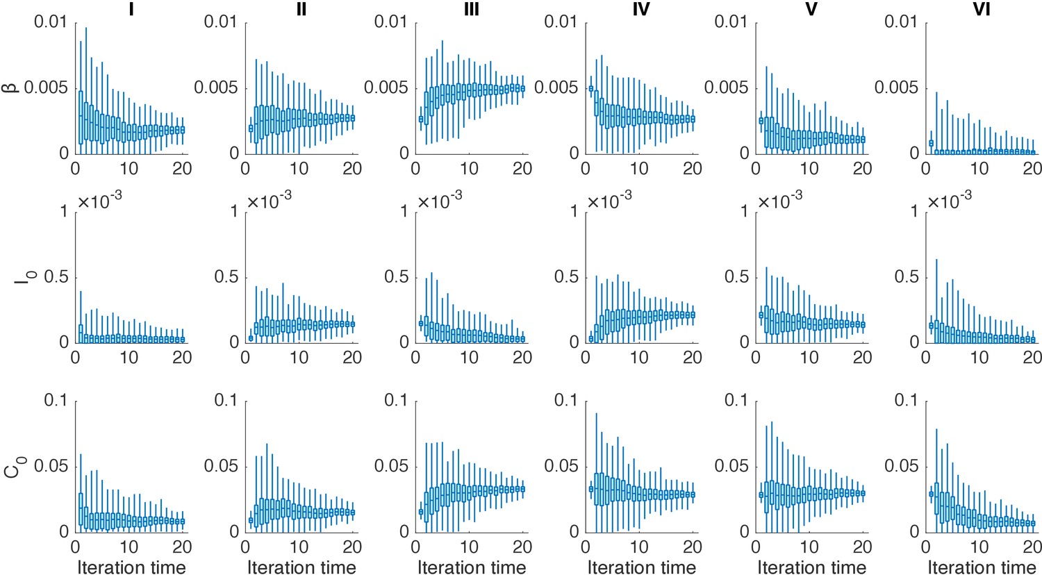
Distributions of posterior parameters (300 ensemble members) in 20 iterations for different years in one realization of the IF algorithm.
In each year, we performed 20 iterations using the IF. Boxes show the inferred distributions of 300 posterior parameters (box: interquartile; whisker: 95% CI).
Figure 3—figure supplement 2
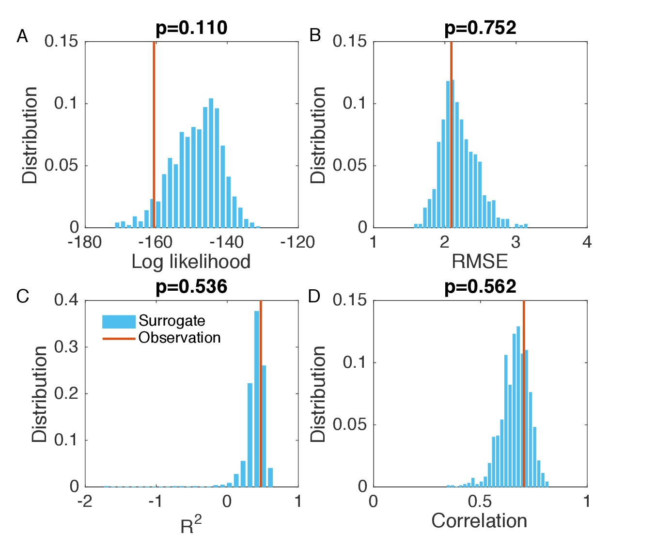
Evaluation of the goodness of fit in Figure 3B.
We generated the surrogate data (1000 synthetic outbreaks) using the inferred parameters, and compared the log likelihood (A), RMSE (B), (C), and Pearson correlation coefficient (D) obtained from the inference in Figure 3B with the distributions of these metrics calculated from 1000 simulations with inferred parameters.
Figure 3—figure supplement 3
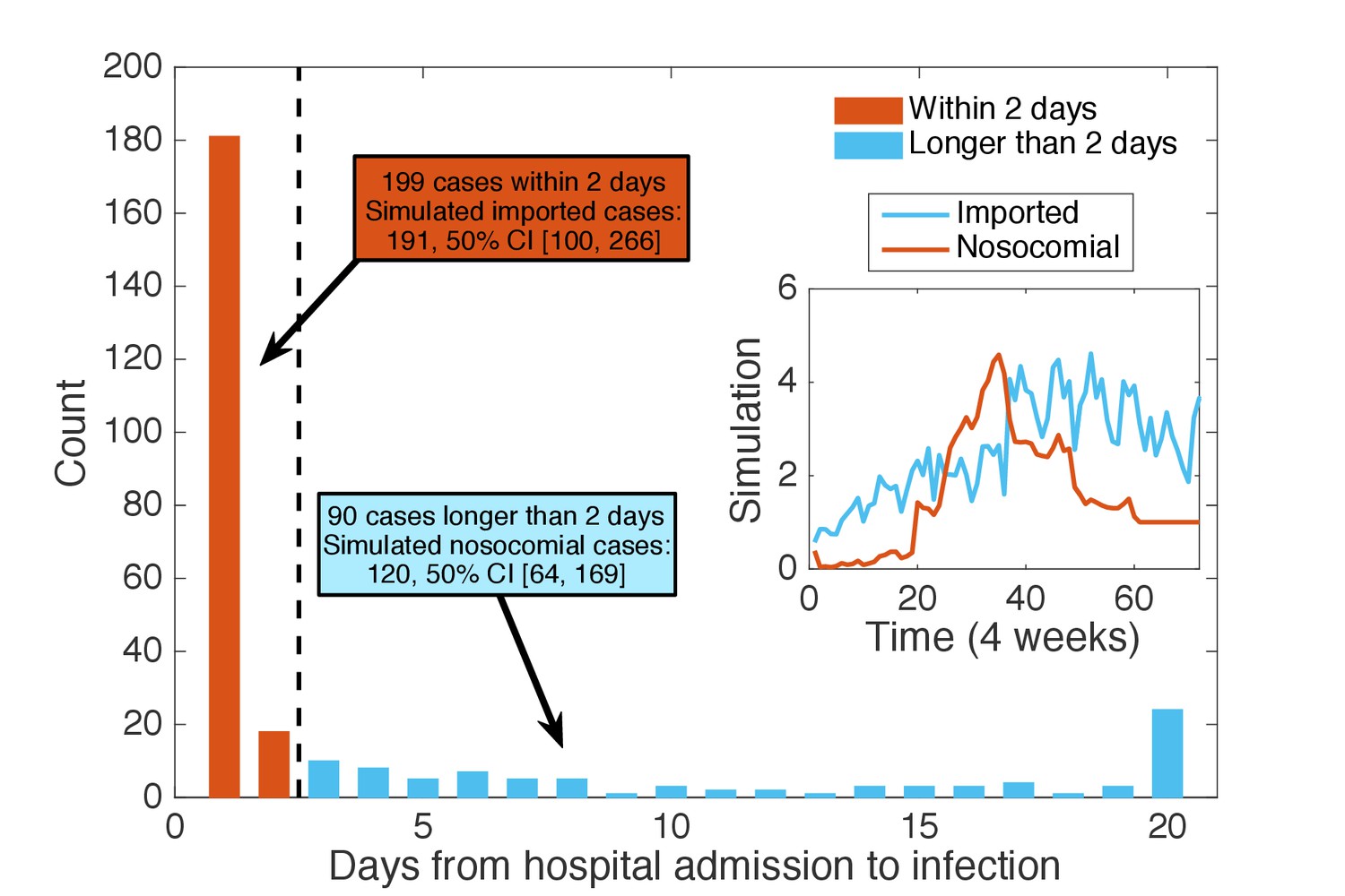
Classification of patients using days from admission to infection.
We classified the patients testing positive according to the time intervals between their hospital admission and confirmation date: those with days (48 hr) were regarded as imported cases (199 cases), whereas the others were classified as nosocomial cases (90 cases). Inset shows the mean time series for imported and nosocomial cases generated from 1000 simulations using the inferred parameters. The simulation results (imported cases: 191, 50% CI [100, 266]; nosocomial cases: 120, 50% CI [64, 169]) agree well with the classification using days from admission to infection.
Figure 4 with 1 supplement
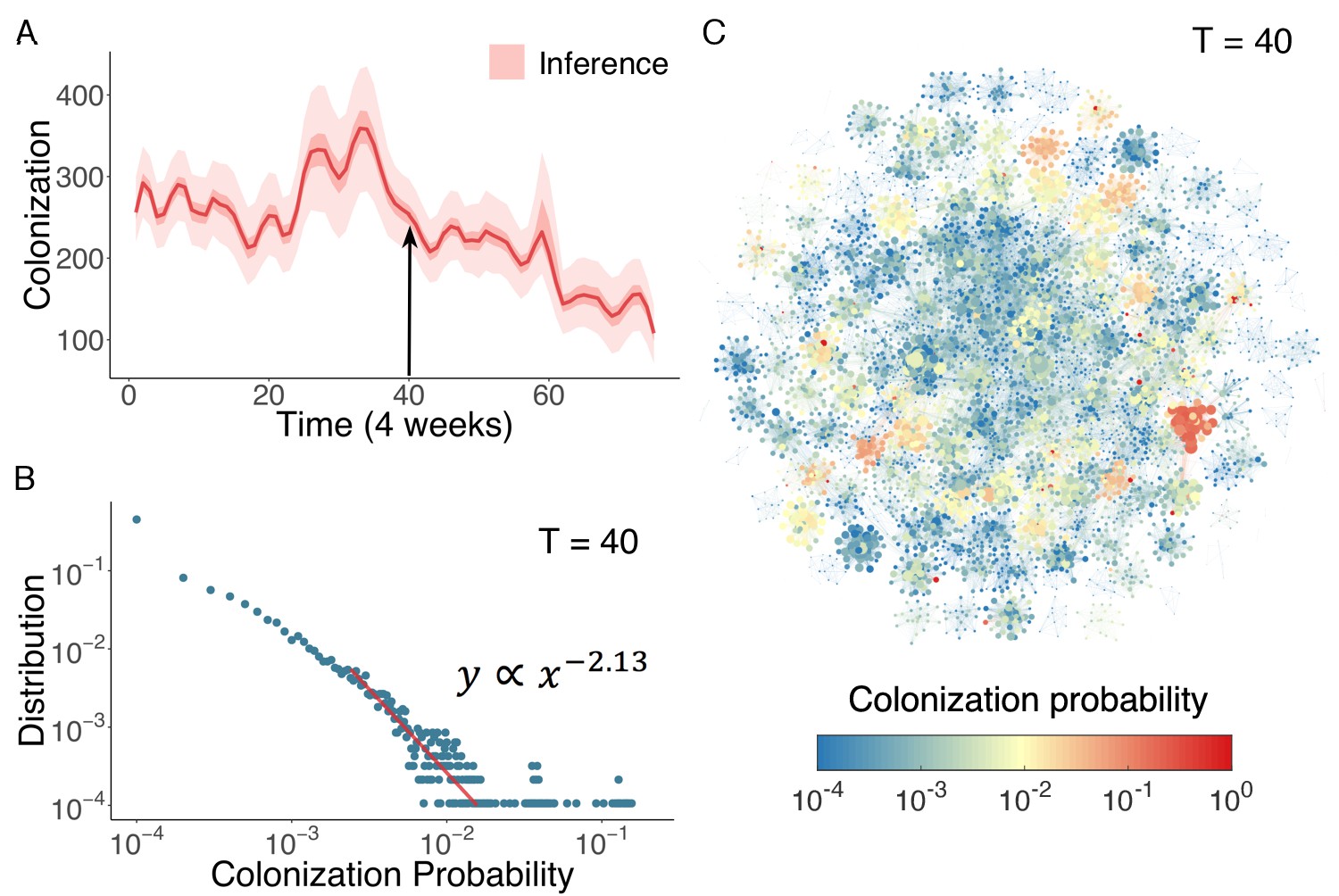
Inference of asymptomatic colonization in Swedish hospitals.
(A) Inferred distributions of colonized patients through time. (B) The distribution of colonization probability for each individual in hospital at T = 40 (week 160) calculated from 104 model simulations. The red line is the power-law fitting. (C) Visualization of individual-level colonization probability at T = 40. The probability is color-coded in a logarithmic scale. Node size reflects the number of connections.
-
Figure 4—source data 1
Numerical data represented in Figure 4.
- https://doi.org/10.7554/eLife.40977.025
Figure 4—figure supplement 1
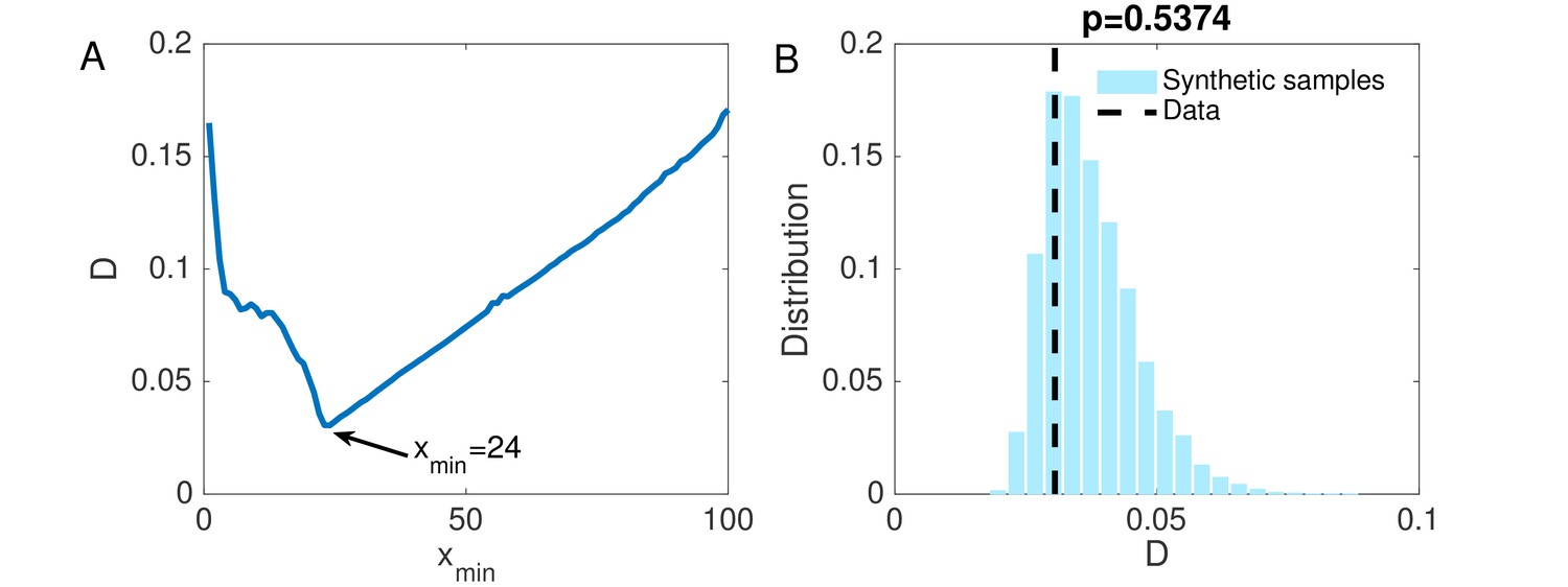
(A) The KS statistic for different lower bounds of power-law behavior.
(B) Comparison of the KS statistic between synthetic samples and observed data. The vertical line indicates the KS statistic for the observed data.
Figure 5
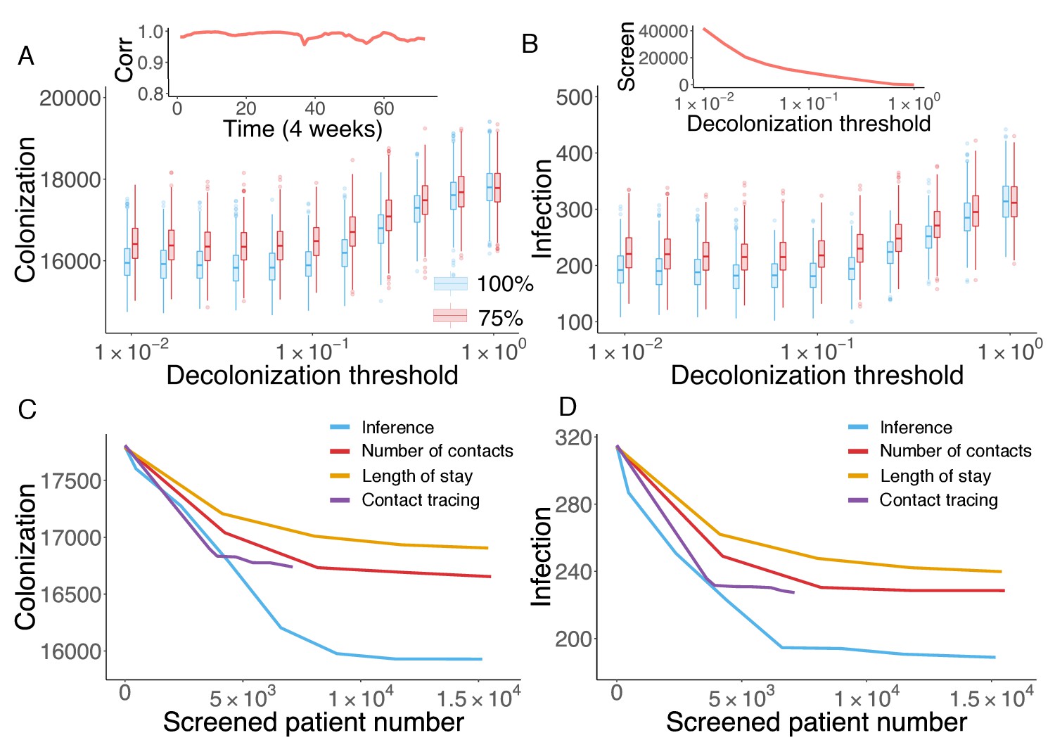
Retrospective control experiment in Swedish hospitals.
The cumulative cases of colonization (A) and infection (B) after decolonizing patients with a hazard of colonization higher than a specified decolonization threshold. Simulations were performed with decolonization success rates of 100% (blue boxes) and 75% (red boxes). Distributions were obtained from 1000 realizations of the retrospective control experiment. The inset in (A) reports the Pearson correlation coefficient between colonization probability estimated in real time and that obtained using information from the whole course of the epidemic. The inset in (B) shows the number of screened patients as a function of the decolonization threshold. (C–D) Comparison of the inference-based intervention with heuristic control measures informed by number of contacts, length of stay and contact tracing. Curves are average cumulative cases obtained from 1000 experiments with a 100% decolonization success rate.
-
Figure 5—source data 1
Numerical data represented in Figure 5.
The data set includes: (1) distributions of colonization for each decolonization threshold in Figure 5A; (2) distributions of infection for each decolonization threshold in Figure 5B; (3) colonization number for each control strategy in Figure 5C; (4) infection number for each control strategy in Figure 5D.
- https://doi.org/10.7554/eLife.40977.027
Videos
Video 1
One realization of the agent-based model simulation.
We visualize a single realization of the agent-based model during a one-year period. The grey nodes represent susceptible people, green nodes represent colonized individuals, and red nodes highlight infected patients. The contact network changes from day to day.
Tables
Table 1
Parameter ranges used in the agent-based transmission model.
https://doi.org/10.7554/eLife.40977.007| Parameter | Description | Range | Unit |
|---|---|---|---|
| Spontaneous decolonization rate | [1/525, 1/175] | per day | |
| Infection progress rate | [0.1, 0.3] | per day | |
| Recovery rate with treatment | [1/120, 1/20] | per day | |
| Transmission rate in hospitals | [0, 0.01] | per day | |
| Infection importation rate | [0, 0.001] | per admission | |
| Colonization importation rate | [0, 0.1] | per admission | |
-
Sources for parameter ranges – : (Cooper et al., 2004a; Bootsma et al., 2006; Eveillard et al., 2006; Wang et al., 2013; Macal et al., 2014; Jarynowski and Liljeros, 2015); : (Kajita et al., 2007; Jarynowski and Liljeros, 2015); : (D'Agata et al., 2009; Wang et al., 2013); : Prior; : Prior; : Prior, (Hidron et al., 2005; Eveillard et al., 2006; Jarvis et al., 2012). For each individual, the infection progress rate is drawn after is specified.
Table 2
Inferred parameters and 95% CIs across 6 years using the actual diagnostic data.
https://doi.org/10.7554/eLife.40977.020| Inferred parameters and 95% CIs | |||
|---|---|---|---|
| Year | |||
| I | |||
| II | |||
| III | |||
| IV | |||
| V | |||
| VI | |||
-
Table 2—source data 1
Numerical data represented in Table 2.
Results are obtained from 100 independent realizations of the IF algorithm.
- https://doi.org/10.7554/eLife.40977.021
Table 3
Inferred parameters and 95% CIs for three synthetic tests.
https://doi.org/10.7554/eLife.40977.029| Actual | |||
|---|---|---|---|
| Inference (weekly) | |||
| Actual | |||
| Inference (weekly) | |||
| Actual | |||
| Inference (monthly) |
Additional files
-
Source code 1
The Matlab code for parameter inference in a synthetic MRSA outbreak simulated in an example time-varying contact network.
- https://doi.org/10.7554/eLife.40977.030
-
Transparent reporting form
- https://doi.org/10.7554/eLife.40977.031
Download links
A two-part list of links to download the article, or parts of the article, in various formats.
Downloads (link to download the article as PDF)
Open citations (links to open the citations from this article in various online reference manager services)
Cite this article (links to download the citations from this article in formats compatible with various reference manager tools)
Inference and control of the nosocomial transmission of methicillin-resistant Staphylococcus aureus
eLife 7:e40977.
https://doi.org/10.7554/eLife.40977


