Nanoscale organization of rotavirus replication machineries
- Universidad Nacional Autónoma de México, Mexico
- Universidad Autónoma del Estado de Morelos, Mexico
Figures
Figure 1
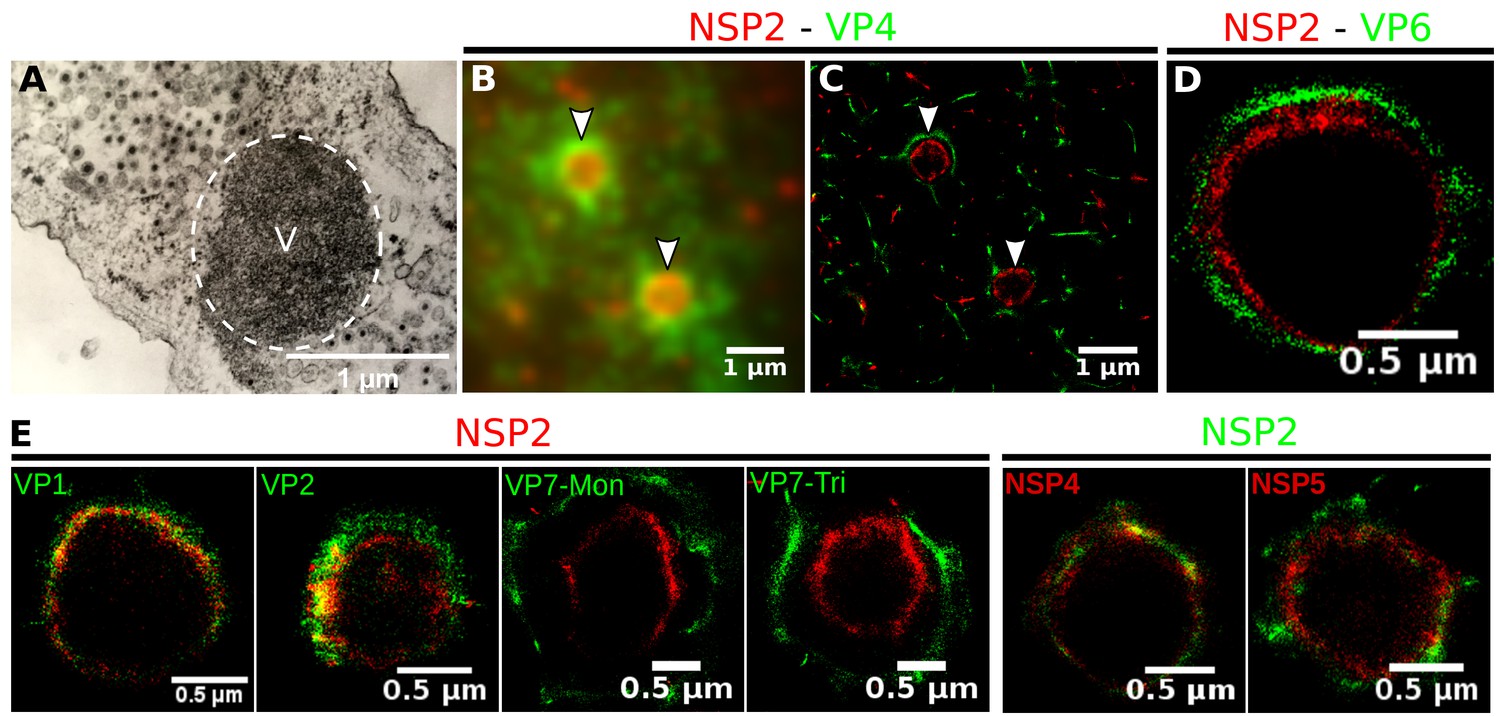
Relative distribution of viral components in rotavirus-VPs.
RRV-infected MA104 cells (6hpi) were fixed and processed for transmission electron microscopy or immunofluorescence microscopy. (A) Transmission electron microscopy of a VP (identified by the dotted white ellipse). (B) Diffraction-limited image of VPs (white arrows). (C) 3B-SRM image reconstructed from B. (D–E) 3B-SRM images of individual VPs labeled with different antibodies (see Methods).
Figure 2
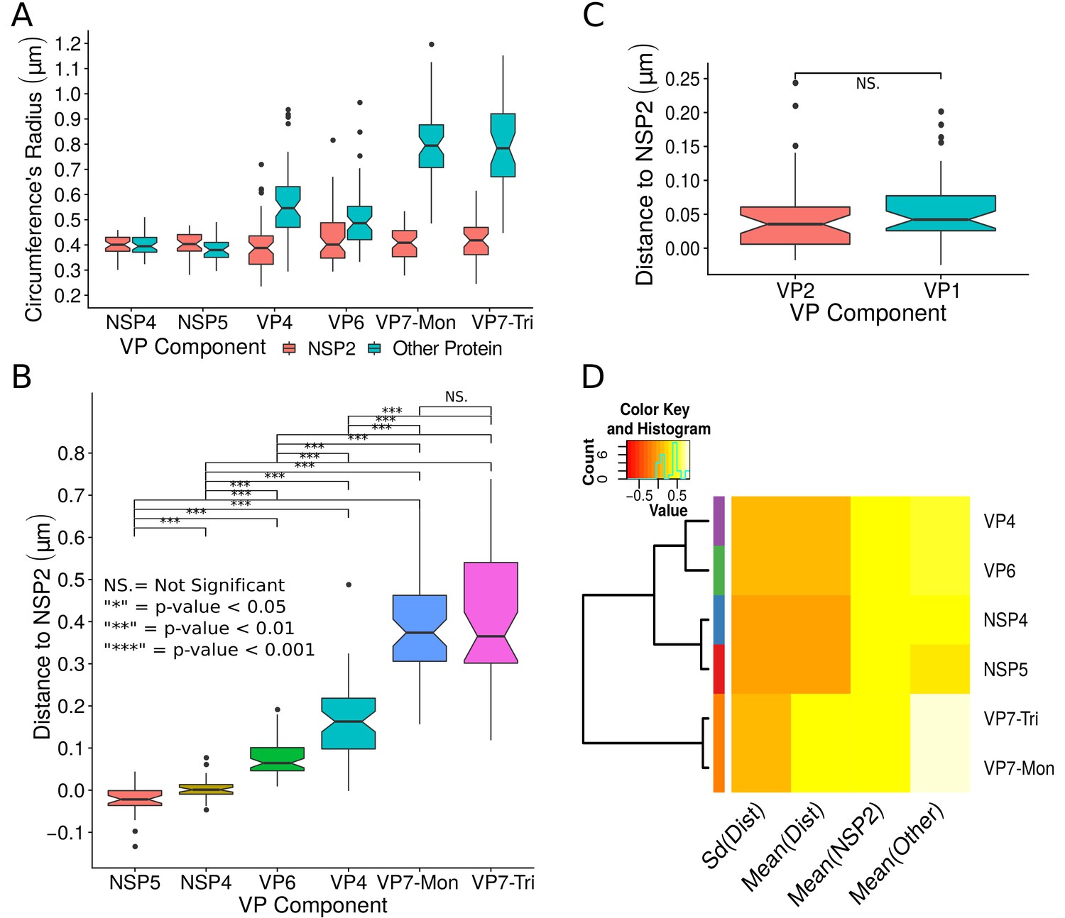
Exploratory analysis of the results obtained by the algorithm VPs-DLSFC.
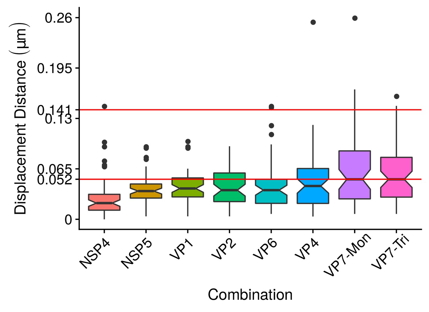
(A) Boxplot for the radius of the fitting circumferences. In each experimental condition we plot two boxes, the red box is for the radius of NSP2 (reference protein), and the blue box represents the radius of the accompanying VP components (names in x-axis). (B) Boxplot and results of the Mann-Whitney hypothesis test for the distance between each viral element and NSP2. Each combination of the Mann-Whitney test is linked by a line, and the result of the test it is above the line. Note that this test reports significant differences between the distribution of the distance to NSP2 of two different VP components. (C) Distance of VP1 and VP2 to NSP2 and result of the Mann-Whitney test. Because the distributions of NSP2 in combination with VP1 and VP2 are statistically different to the other NSP2 distributions (see Appendix 1—figure 7B), we show these two cases independently in this exploratory analysis. (D) Hierarchically clustered heatmap for the standard deviation of the distance to NSP2, the mean distance to NSP2, the mean radius of NSP2, and the mean radius of the accompanying protein layers, NSP5, NSP4, VP6, VP4, and VP7.
Figure 3
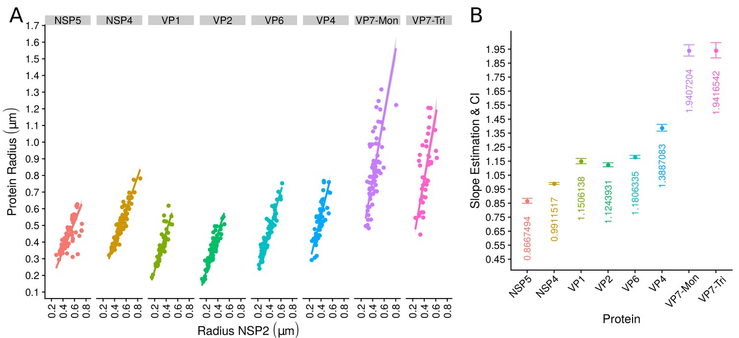
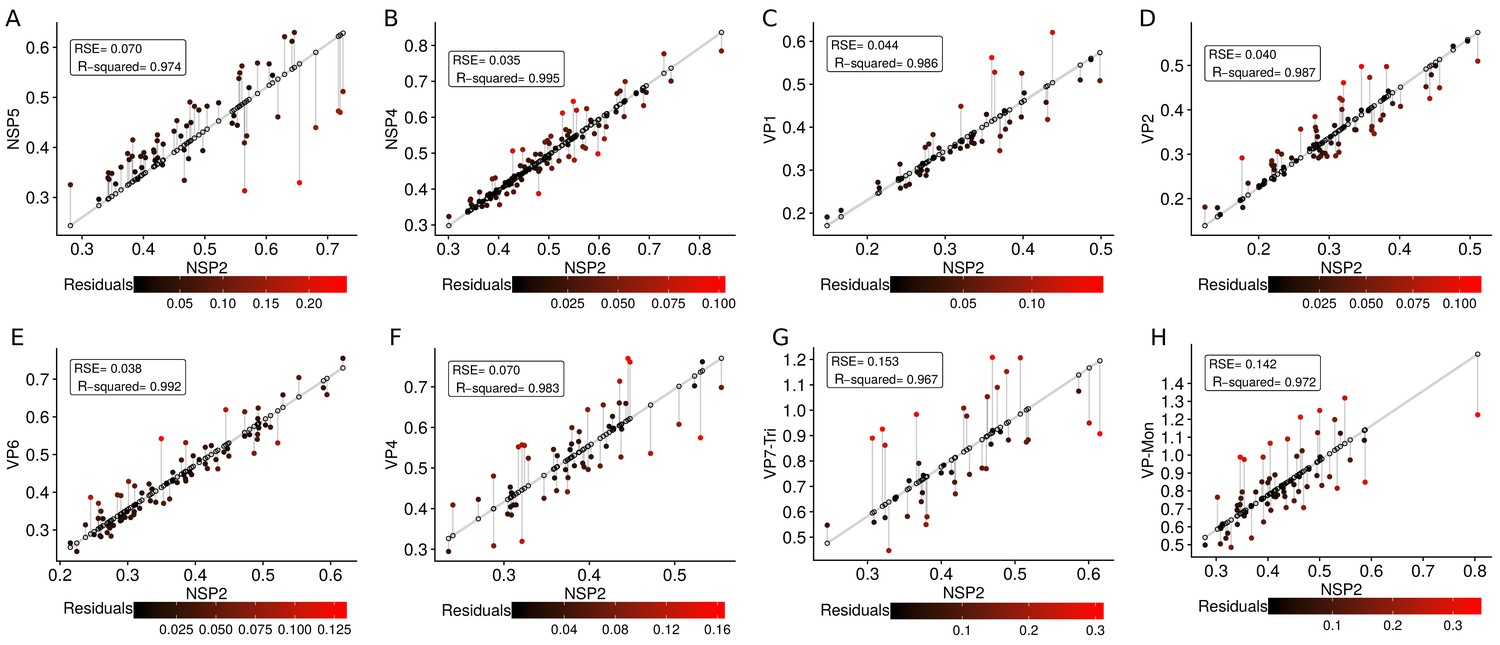
The organization of VPs scales with its size.
(A) Simple linear regression analyses for each component combination (eight subpanels). In all subpanels, the x-axis represents the radius of the distributions of NSP2, and the y-axis the radius of the distribution of the accompanying VP component. The 95% confidence interval, marked in grey, is imperceptible due to goodness of fit of the linear regression (solid line). (B) Slope and confidence interval for each linear regression model (dependent variables in x-axis). The slopes values were shown under each confidence interval.
Figure 4
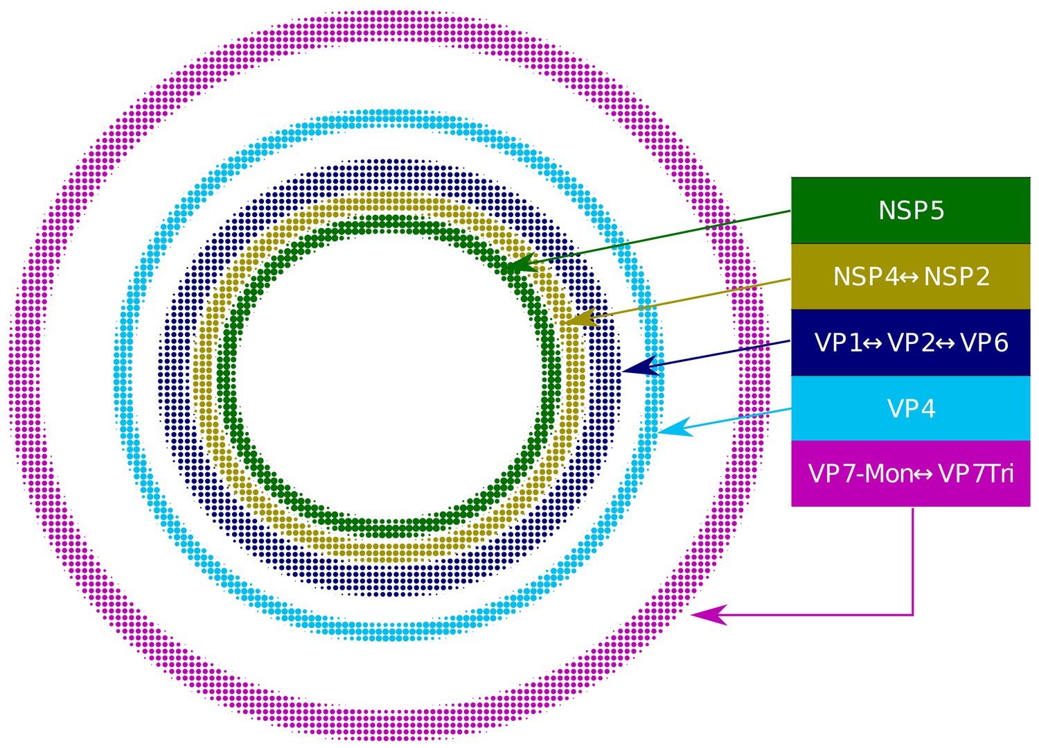
Relative structural distribution of VP components.
The radii of the circumferences maintain the relative values determined for the different VP layers.
Appendix 1—figure 1
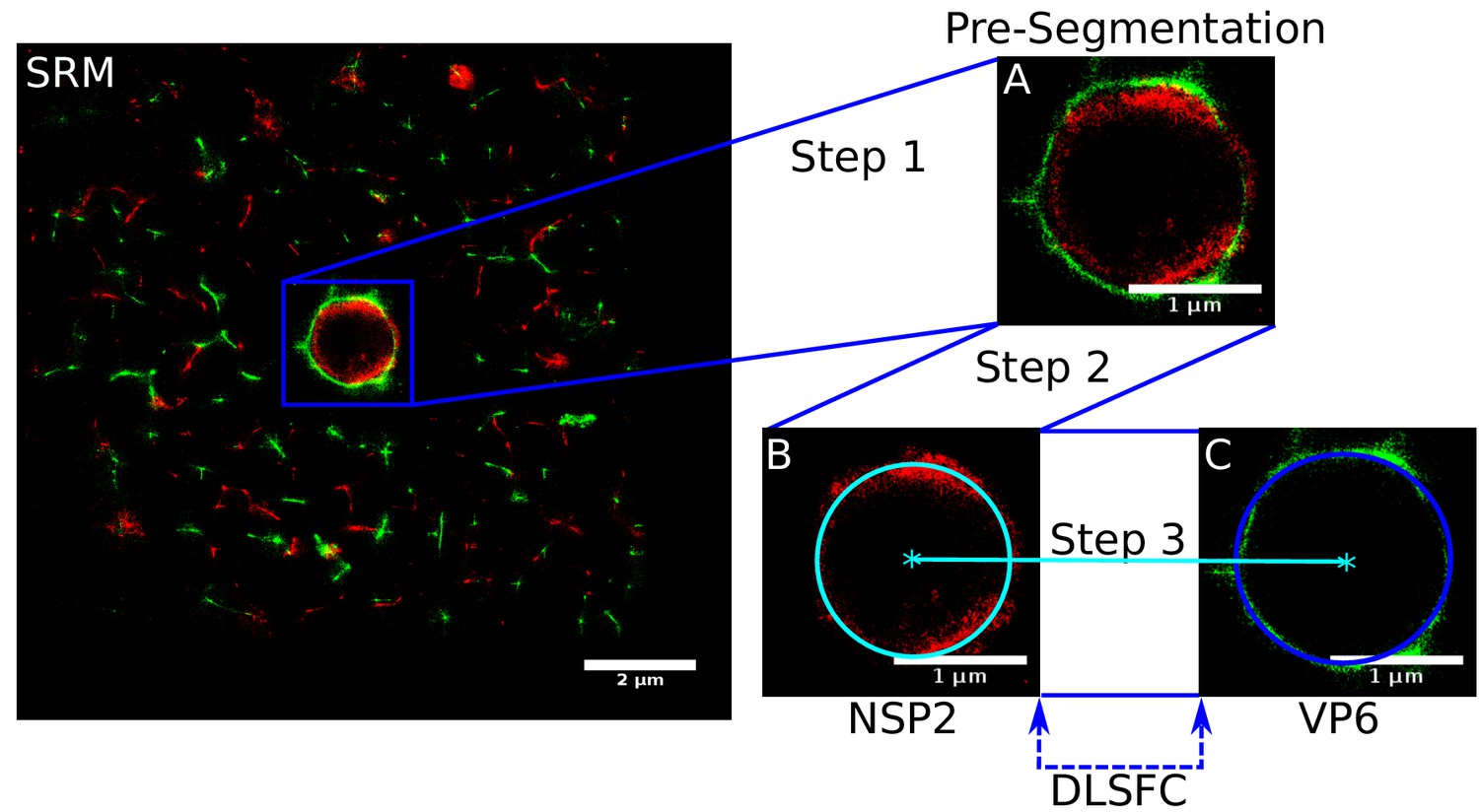
Scheme of the ‘Viroplasm Direct Least Square Fitting Circumference’ algorithm (VPs-DLSFC).
SRM) Complete SRM image; A) Manual pre-segmentation step, an expert selects and isolates each viroplasm as a single image; B) Fit a circumference to the reference protein through the algorithm DLSFC; C) The center of the reference protein is taken as the center of the accompanying protein, and then the radius of the adjust circumference for this second protein is computed.
Appendix 1—figure 2
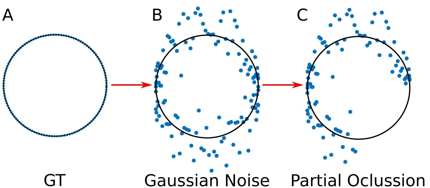
Simulation of the viral proteins.
(A) ‘Ground truth’ (GT) circumference; (B) Addition of gaussian noise to the GT circumference (see Appendix 1 subsection –noise generation–); (C) Generation of partial occlusion (see Appendix 1 subsection –Partial Occlusion Generation).
Appendix 1—figure 3
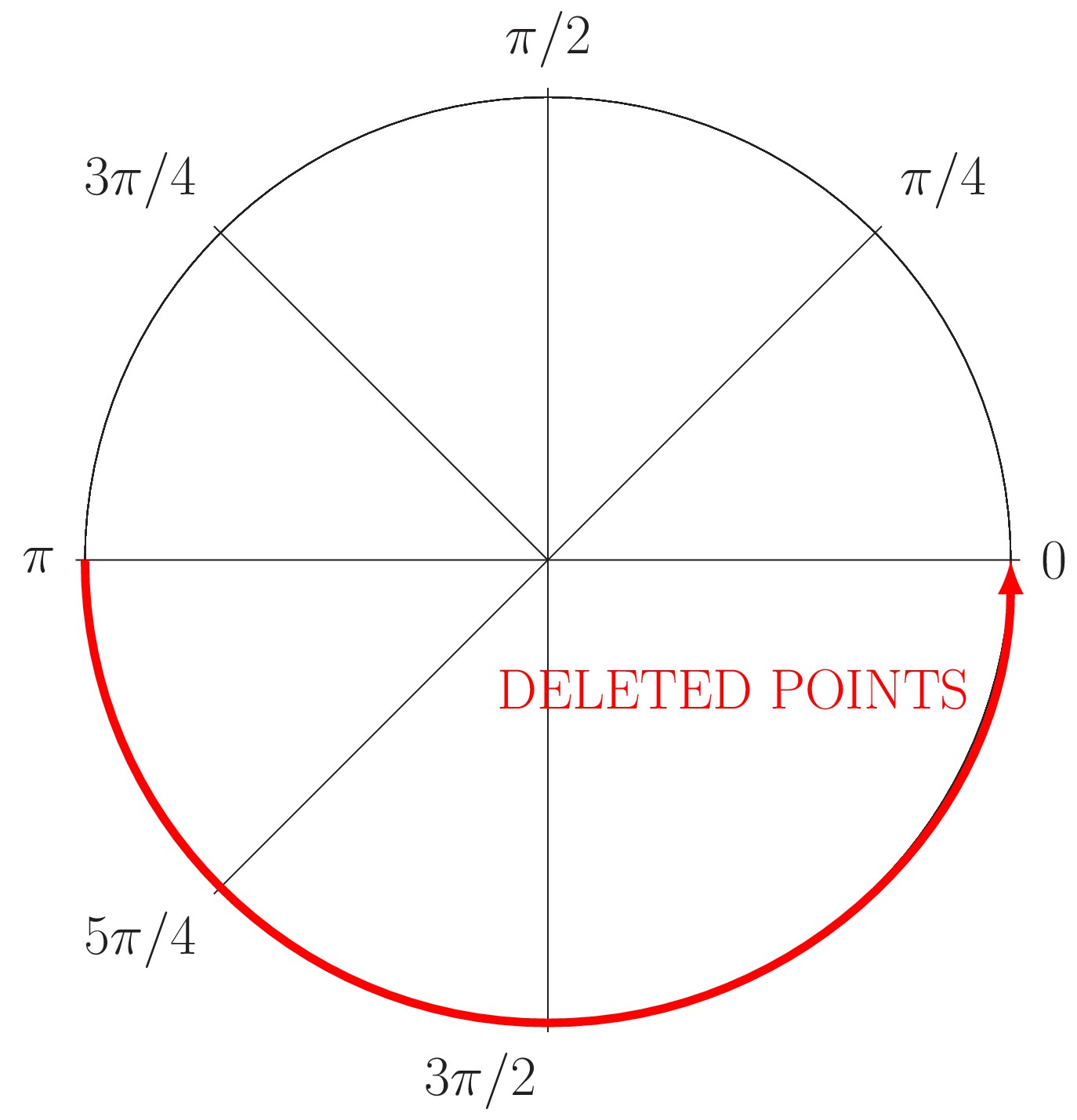
Generation of partial occlusion in the angle (red line).
The circle just conserves the information relative to the angle .
Appendix 1—figure 4
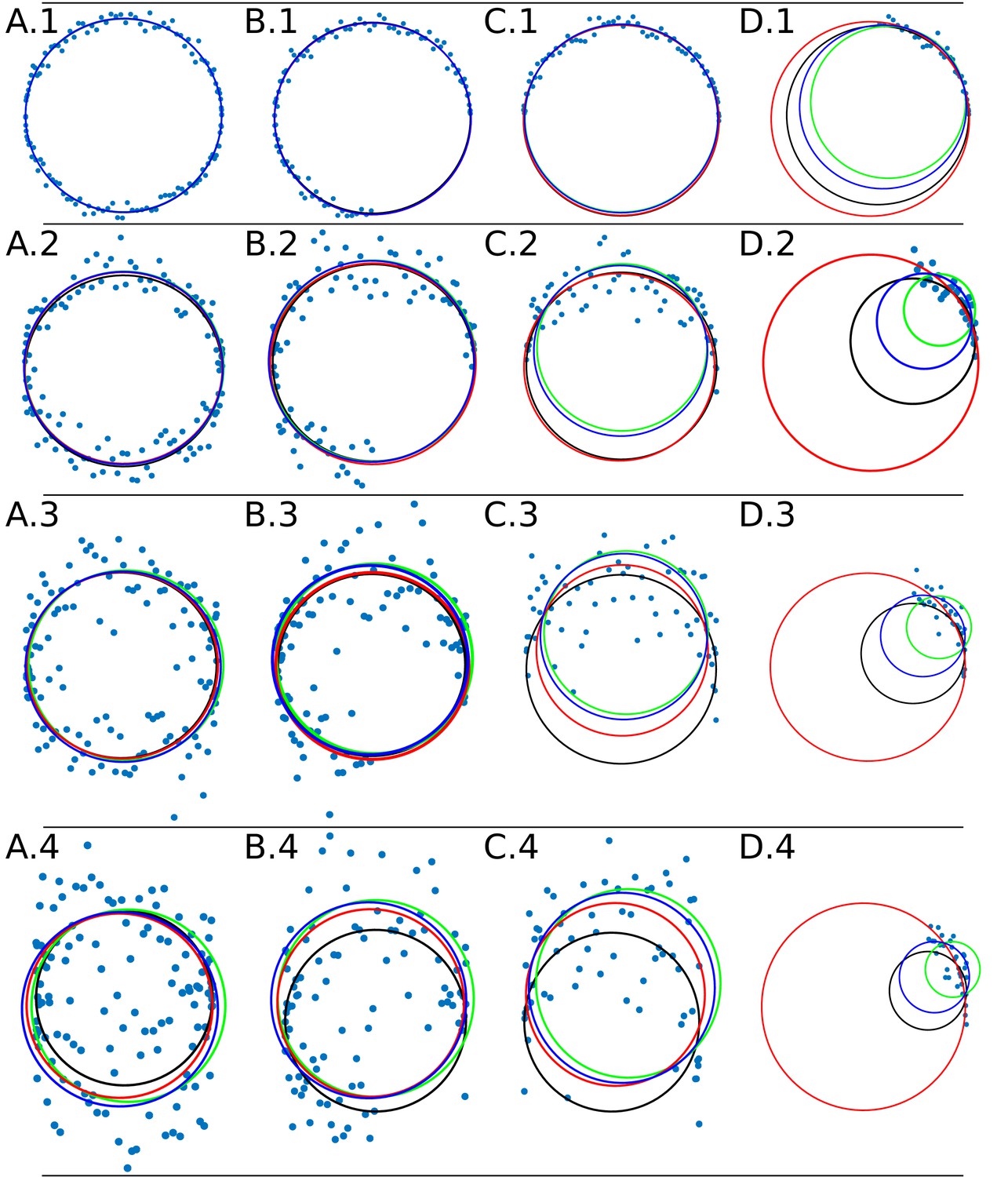
Data adjustment through the algorithms DLSFC (solid blue line), ALSFC (solid green line) and GLSFC (solid red line).
The data was generated corrupting the points of a ‘ground truth’ circumference (solid black line) with different noise levels (rows) and four differents occlusion angles conditions (columns). Column 1 (A.1-A.4) Not Occlusion angle, Column 2 (B.1-B.4) , Column 3 (C.1-C.4) , Column 4 (D.1-D.4) . The noise increase by rows: Row 1: , , ; Row 2: , , ; Row 3: , , ; Row 4: , , .
Appendix 1—figure 5
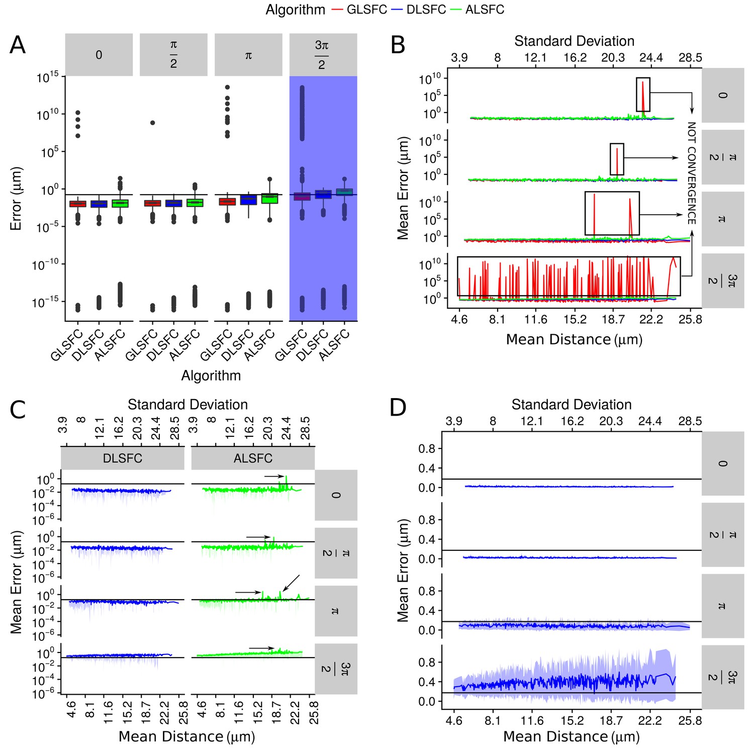
Error in the adjustment of the algorithms DLSFC, GLSFC and ALSFC.
The error was quantified through Equation (21). In all panels, the horizontal black line represents the value (see Equation (21)). (A) Boxplot of the error distribution for each algorithm taking into account the partial occlusion angles (four sub-panels). The x-axis specifies the name of the algorithm and the y-axis the error in microns. The blue shadow in the sub-panel represents the occlusion angle in which the mean value of the errors are greater than . (B) Mean error of the adjustment by the algorithms DLSFC, GLSFC and ALSFC. The bottom x-axis is the Mean distance of the corrupted points to the ‘ground truth’ circumference (see Equation (20)), and the up x-axis is the Standard Deviation. The figure is split out in four sub-panels in accordance with the occlusion angle. The black boxes show examples in which the algorithm GLSFC does not reach the convergence (extremely high error). The arrows mark out some examples where the algorithm ALSFC does not have have a good adjustment. (C) Zoom of the performance of the algorithms DLSFC and ALSFC. (D) Results of the algorithm DLSFC. The graphics in the panel (C)) and (D)) also shows the confidence interval around the mean (see green and blue shadows), it was computed as .
Appendix 1—figure 6
Boxplot of the differences in location between the center of the circumference that adjust NSP2 and the centers of the others nine viral elements.
The red line represents approximately the maximun median value of distance between NSP2 and each of the others viral elements, while the second red line () is the maximun error that we considered in the algorithm validation section (see Appendix 1 Section –Algorithm validation–). Each box contains the 50% of the observations, the bottom and the top of the box are the first and third quartiles (25% and 75% of the observations respectively). The line inside the box is the median (second quartiles (50% of the observations)). The upper whisker extends from the hinge to the largest value no further than from the hinge (where IQR is the interquartile range, or distance between the first and third quartiles). The lower whisker extends from the hinge to the smallest value at most of the hinge. The notches around the median extend to . This gives a roughly 95% confidence interval for comparing medians (McGill et al., 1978).
Appendix 1—figure 7

Supplementary exploratory analysis of the results obtained by the algorithm VPs-DLSFC.
(A) Histogram with the numbers of VPs that were obtained as part of the pre-segmentation step of the algorithm described in Appendix 1—figure 1A. Note that because each image contains one and only one VP, this histogram represents also the numbers of pre-segmented images that we had in our study. (B) Graphical representation of the Mann-Whitney hypothesis test in two-by-two comparison between the radii distributions of NSP2 in each experiment (Mann and Whitney, 1947). To avoid confusions, for each box, under the NSP2 name in x-axis, we included the name of the accompanying protein that specifies in which experiment we obtain that distribution of NSP2. Each combination is linked by a line, and the result of the test is up of the line. The red dashed square highlights the only two combinations (VP1 and VP2) in which the distribution of NSP2 had a significant statistical difference with the other NSP2 distributions. (C) Two-sample Mann-Whitney hypothesis test, considering as variables the radius of NSP2 in contrast to the radius of the others seven proteins. In each combination, we show the difference in location between NSP2 and the other protein (x-axis) and the confidence interval at a level of 95%. The numbers over the intervals confidence are the p-value of the statistical test.
Appendix 1—figure 8

Examples of small zones of colocalization between differents viral proteins.
The interations between the viral elements could be explained throught the spikes that come from the central distribution of the viral elements which colocalize with other proteins. A more specific study it is necessary in order to explain these interactions.
Appendix 1—figure 9
Residuals errors for each linear regression model.
Gray line represent the regression model, the points over the line are the predicted values (see Equation (31)) by the models, and the dots filled with a color gradient are the real values . The errors between the predicted and real values, , are represented as a gradient of colors as follows (from lowest/coldest to highest/warmest). For each model, the RSE and (R-squared) were included, note that this statistics are the same that were presented in Appendix 1—table 6. (A) , (B) , (C) , (D) , (E) , (F) , (G) , (H) .
Appendix 1—figure 10

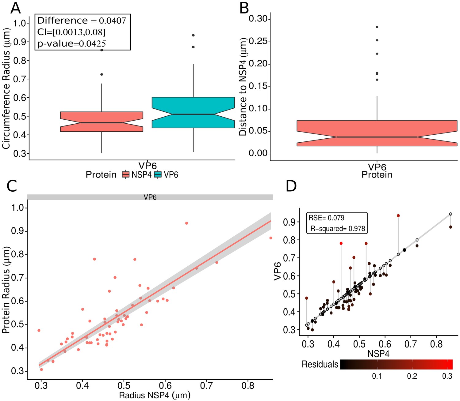
VP6 and VP4 spatial distribution taking NSP5 as reference protein.
(A) Boxplot for the radii of the fitting circumferences for NSP5 and {VP6,VP4}. Mann-Whitney hypothesis test for the radius distribution of NSP5 shows that does not exist a significative statistically differences between the reference protein (NSP5) in the two experiments. A.1) Histogram of the numbers of viroplasm by combination. (B) Boxplot for the distance of the viral proteins VP6 and VP4 to NSP5, and result of the Mann-Whitney test between these two distributions. (C) Linear regression model taking the radius of NSP5 as independent variable and the radius of {VP6, VP4} as dependent variable. The gray shadow represent the 95% confidence interval for the regression adjustment. (D and E) Residual error for the VP6 and VP4 linear models, respectively. The details about this kind of representation can be consulted in Appendix 1—figure 9.
Appendix 1—figure 11
VP6 spatial distribution taking NSP4 as reference protein.
(A) Boxplot for the radii of the fitting circumference of NSP4 and VP6. The inside panel shows the results of the Mann-Whitney hypothesis test (see the Appendix 1—table 5 for details). (B) Boxplot for the distance between NSP4 and VP6. (C) Linear regression fitting taking the radius of NSP4 as independent variable and the radius of VP6 as dependent variable. The gray shadow represents the confidence interval at a level of 95%. (D) Residual error analysis of the model. This graph is analogous to Appendix 1—figure 9; the details about this kind of representation can be consulted in that figure.
Appendix 1—figure 12

Diagram of probabilities for the transitions between the states of a fluorophore for the 3B-algorithm.
From left to right are represented the emitting state, non-emitting state and bleached state for a fluorophore, with their respective transition probabilities among the states. As an example, a fluorophore can transit from the emission state to the non-emission state or remain in this state with a probability and , respectively.
Appendix 1—figure 13
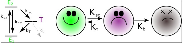
Left panel: The reduced Jablonski diagram for the fluorophore model (Appendix 1—figure 12).
Right panel: Diagram of probabilities for the transitions between the states of a fluorophore for our fluorophore’s model. In our model, the basal () and the excited () states, from the reduced Jablonski diagram, are collapsed in a new excited state (green). The justification for this lies in the fact that the fluorescence phenomenon () occurs on the scale of nanoseconds or less; however, an image collected with an EM-CCD camera regularly has millisecond exposure times, therefore, it involves the integration of cycles of photon emission; as a consequence, the state is never detected. The entrance into the triplet excited state () happens on the scale of seconds; if the emission process occurs, it releases photons of lower energy that are not detected and, therefore, the triplet state is considered as a dark state (violet). Finally, the photobleaching state (gray) is a irreversible process ( culminating with the destruction of the coordinating center of resonant electrons (orbitals ) which is responsible for absorbing photons.
Appendix 1—figure 14
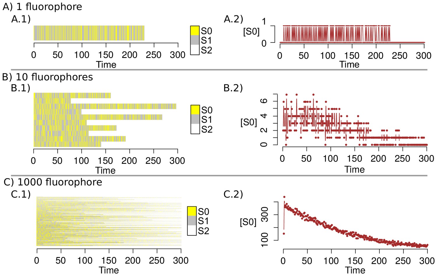
Markov Chain simulations with the new transition matrix.
(A–C) shows the simulation of the dynamics for 1, 10 and 1000 fluorophores respectively. A.1, B.1 and C.1 indicates the state of each fluorophore in the time; A.2, B.2 and C.2 point out the amount of fluorophores that are in the state in the time.
Appendix 1—figure 15
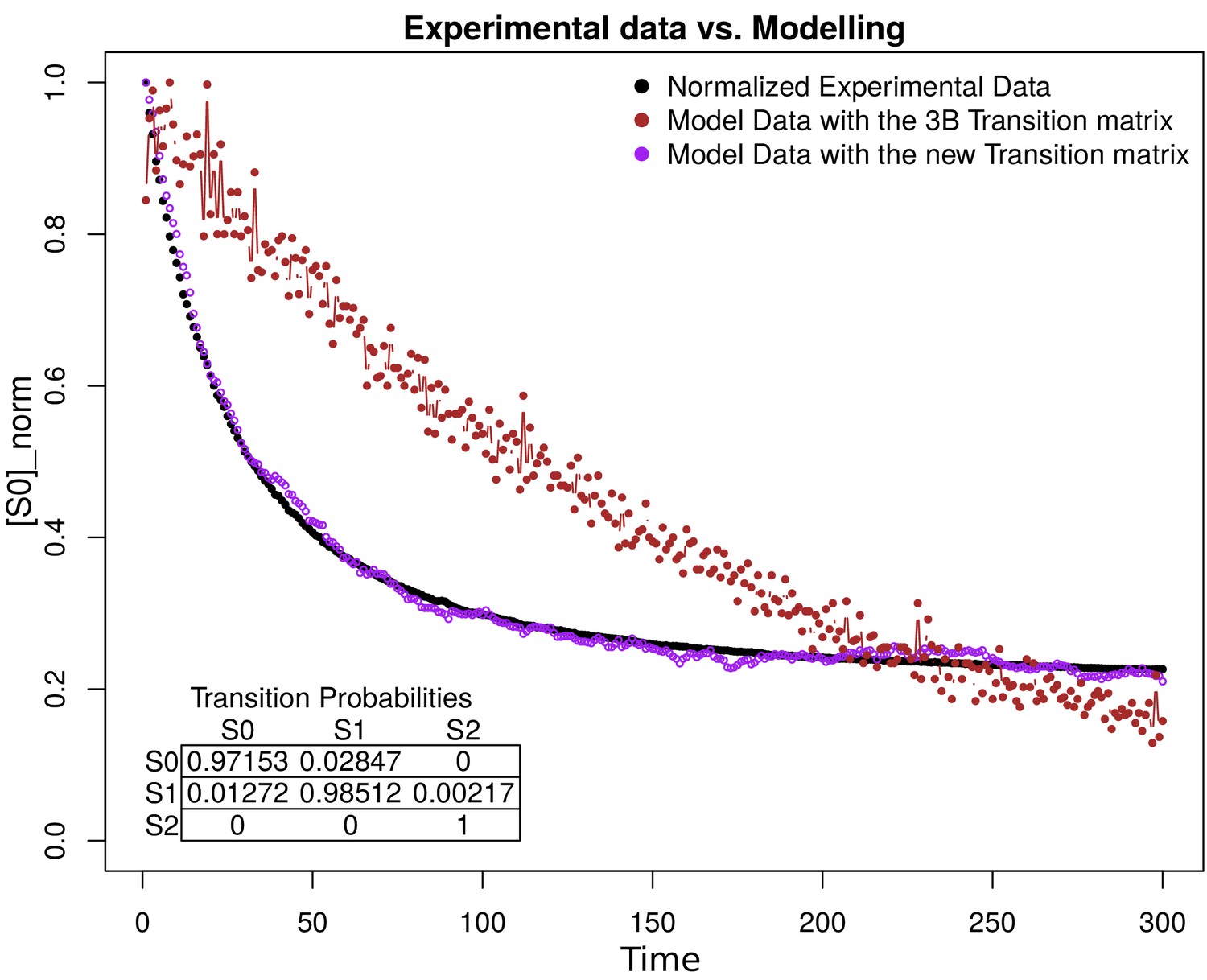
Simulation estimation chart of 1000 fluorophores.
The -axis is the normalization of fluorophores in the state (emission) in the time (-axis). The normalized data extracted from the images are shown in black. The purple and the brown dots represent the simulation of 1000 fluorophores as a Markov chain with the transition matrix that we propose and with the original 3B matrix, respectively. The transition matrix that we propose is shown in the bottom of the figure.
Appendix 1—figure 16
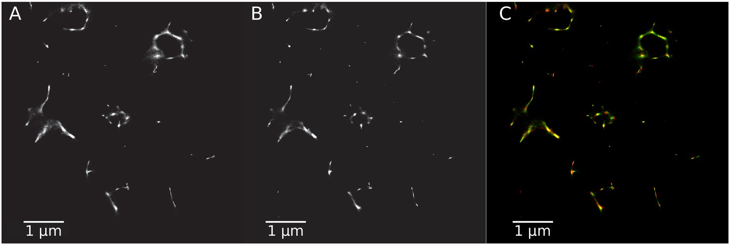
Super-resolution images generated with different transition matrices.
(A) SR image using the transition matrix constructed by our model. (B) SR image with the original transition matrix. (C) Composite image comparing the two SR images in green (A) and in red (B).
Appendix 1—figure 17
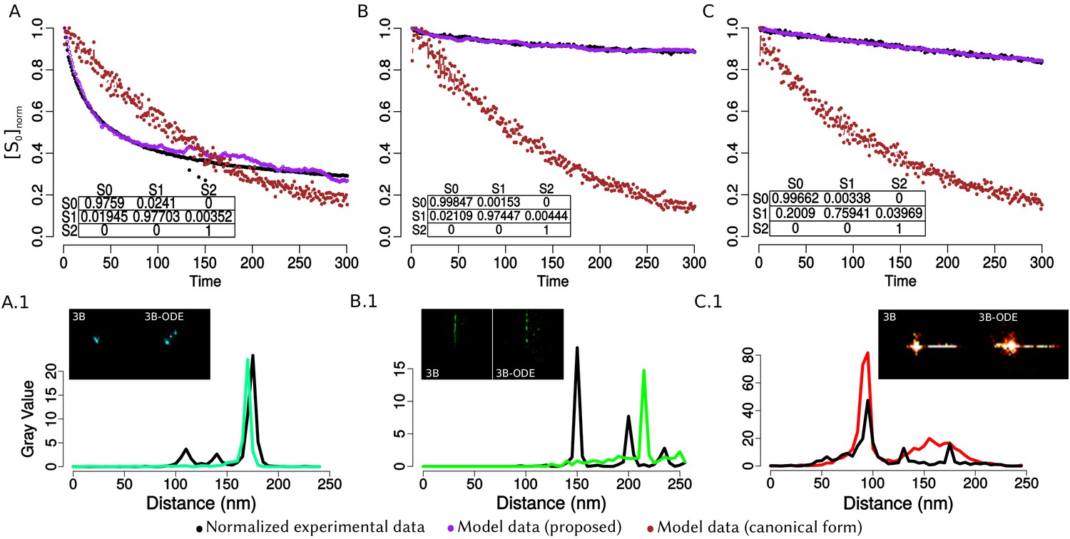
Comparison between the original model of 3B against the obtained with the transition matrix that we propose.
Columns A-C represent the nanorulers GATTA-PAINT labelled with ATTO 488, 550 and 655 respectively. Panels A-C show the normalized experimental data (black dots) and the simulation for 1000 fluorophores with the matrix that we propose (purple dots) and with the original 3B matrix (burgundy dots); each point represents the mean value of the fluorescence. The time is indicated in frames, acquisition time between images is 100 ms. A complete experiment consists of 300 images collected in a CellTIRF microscope with a 160× magnification. Panels A.1- C.1 show two ROI’s from the complete SR images: 3B) canonical reconstruction and 3B-ODE) reconstruction with the ODE’s model. The graph shows a line profile from the two reconstructions, in green the results from original 3B and in black with the transition matrix that we propose, the x-label is the distance in nm and the y-label is the intensity pixel value. The peaks from the graph denote the localization of a fluorophore.
Author response image 1
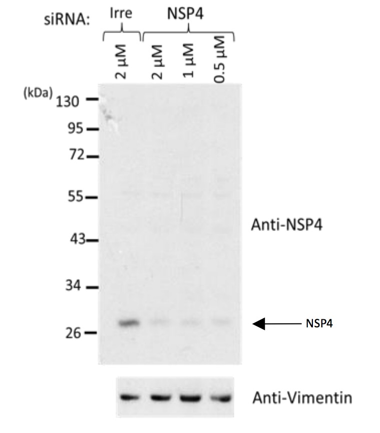
Western blot analysis of rotavirus RRV-infected cells previously transfected with an siRNA directed to NSP4 or with a control, irrelevant (Irre) siRNA, using the rabbit polyclonal serum (C-239) to NSP4.
https://doi.org/10.7554/eLife.42906.036
Author response image 2
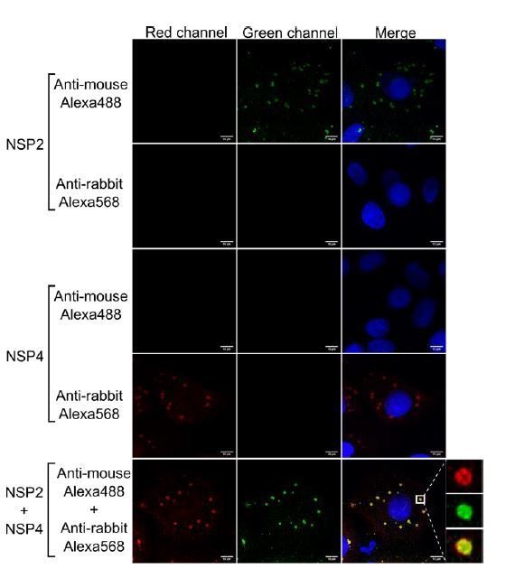
Anti-rabbit and anti-mouse secondary antibodies are specific for their target species.
MA104 cells monolayers grown in coverslips were infected with RRV at an MOI of 1. At 6 hpi the cells were fixed and processed for immunofluorescence with either the primary antibody against NSP2 (green), NSP4 (red), or a combination of both antibodies, as described under Materials and methods. Afterwards, the cells were stained with either anti-rabbit Alexa568, anti-mouse Alexa488, or a combination of both antibodies. The cells nuclei (blue) were stained with DAPI.
Author response image 3

Author response image 4
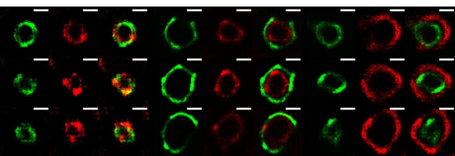
The VPs of rotavirus present a ring-like structure at early times of infection.
MA104 cells grown in coverslips were infected with RRV (MOI of 3). At 3 hours post-infection, the cells were fixed and co-inmunostained with the indicate antibodies. The nanoscale distribution of viral proteins within the VP was then analyzed through SRRF-SRM. Scale bar is 0.5 um.
Tables
Key resources table
| Reagent type (species) or resource | Designation | Source or reference | Identifiers | Additional information |
|---|---|---|---|---|
| Virus strain (Rhesus rotavirus) | RRV | Harry B. Greenberg, Stanford University. | ||
| Cell line (Cercopithecus aethiops) | MA014 cells | American Type Culture Collection | ATCC:CRL-2378.1; RRID:CVCL_3846 | |
| Antibody | Mouse monoclonal antibody 3A8 | Harry B. Greenberg, Stanford University. | IF (1:1000) | |
| Antibody | Mouse monoclonal antibody 2G4 | Harry B. Greenberg, Stanford University. PMID: 2431540 | IF (1:1000) | |
| Antibody | Mouse monoclonal antibody 255/60 | Harry B. Greenberg, Stanford University. PMID: 6185436 | IF (1:1000) | |
| Antibody | Mouse monoclonal antibody M60 | Harry B. Greenberg, Stanford University. PMID: 2431540 | IF (1:2000) | |
| Antibody | Mouse monoclonal antibody 159 | Harry B. Greenberg, Stanford University. PMID: 2431540 | IF (1:2000) | |
| Antibody | Mouse polyclonal antibody VP1 | Our Laboratory. | RRID:AB_2802095 | IF (1:500) |
| Antibody | Mouse polyclonal antibody NSP2 | Our Laboratory. PMID: 9645203 | RRID:AB_2802096 | IF (1:100) |
| Antibody | Rabbit polyclonal antibody NSP2 | Our Laboratory. PMID: 9645203 | RRID:AB_2802097 | IF (1:2000) |
| Antibody | Rabbit polyclonal antibody NSP4 | Our Laboratory. PMID: 18385250 | RRID:AB_2802094 | IF (1:1000) |
| Antibody | Rabbit polyclonal antibody NSP5 | Our Laboratory. PMID: 9645203 | RRID:AB_2802098 | IF (1:2000) |
| Software, algorithm | R | R Development Core Team, 2017. R: A language and environment for statistical computing. R Foundation for Statistical Computing, Vienna, Austria. URL https://www.r-project.org/ | RRID:SCR_001905 | Version 3.4.4 (2018-03-15) |
| Software, algorithm | Matlab | MATLAB and Statistics Toolbox Release 2018b, The MathWorks, Inc, Natick, Massachusetts, United States. | RRID:SCR_001622 | |
| Software, algorithm | Fiji | PMID:22743772 | RRID:SCR_002285 | |
| Software, algorithm | VP-DLSFC | This paper | See ‘Segmentation Algorithm’ in Appendix 1. |
Appendix 1—table 1
Results of the Binomial Test.
Column 1: Names of the algorithms. Column 2: ‘P. Success’ is the Probability of Success; ‘P. Value’ denote the probability of the error type 1, that is, reject the null hypothesis when it is true; ‘C. Interval’ is the 95% confidence interval. Column 3–6: Partial Occlusion Angles. The blue shadowed area in the table cell indicates the conditions in which it is not possible to reject the null hypothesis.
| Algorithm | Statistics | Partial occlusion angles | |||
|---|---|---|---|---|---|
| 0 | |||||
| P. Success | 1 | 1 | 0.804 | 0.384 | |
| DLSFC | P. Value | 2.2 × 10⁻¹⁶ | 2.2 × 10⁻¹⁶ | 2.2 × 10⁻¹⁶ | 1 |
| C. Interval | [0.999, 1] | [0.999, 1] | [0.797, 1] | [0.376, 1] | |
| P. Success | 0.993 | 0.99 | 0.643 | 0.273 | |
| ALSFC | P-value | 2.2 × 10⁻¹⁶ | 2.2 × 10⁻¹⁶ | 1 | 1 |
| C. Interval | [0.99, 1] | [0.99, 1] | [0.635, 1] | [0.265, 1] | |
Appendix 1—table 2
Two-sample Mann-Whitney hypothesis test between (major semi-axis of the ellipse ) and (circumference radius).
H0(H1): The radii of the circumferences and the values of the major semi-axis of the ellipses came from the same distribution function (different). Column 1: W represent the distribution value of the statistical test; Difference is the estimation of the location parameter (median difference between and ); P. Value is the p-value of the test; C. Interval is the 95% confidence interval. For each one of the nine viral elements combinations, we carry up the hyphotesis test taking into account NSP2 independenly in each combination, just for the semi-major axis this table shows the results of 18 Mann-Whitney hypothesis tests. More information about this test is available in Mann and Whitney (1947) and Hollander et al. (2013).
| Proteins Combinations | ||||||||
|---|---|---|---|---|---|---|---|---|
| NSP2/NSP4 | NSP2/NSP5 | NSP2/VP1 | NSP2/VP2 | |||||
| Statistics | NSP2 | NSP4 | NSP2 | NSP5 | NSP2 | VP1 | NSP2 | VP2 |
| W | 900 | 902 | 1426 | 1415 | 559 | 539 | 174 | 184 |
| Difference | 0.0352 | 0.03369 | 0.0358 | 0.0357 | 0.0213 | 0.026 | 0.0529 | 0.0512 |
| P. Value | 0.1233 | 0.127 | 0.091 | 0.08025 | 0.1776 | 0.117 | 0.1137 | 0.1789 |
| 95% CI | [−0.082, 0.011] | [−0.08,0.013] | [−0.086, 0.007] | [−0.08,0.006] | [−0.054,0.012] | [−0.057, 0.006] | [−0.1168,0.0204] | [-0.15, 0.028] |
| NSP2/VP4 | NSP2/VP6 | NSP2/VP7-Tri | NSP2/VP7-Mon | |||||
| Statistics | NSP2 | VP4 | NSP2 | VP6 | NSP2 | VP7-Tri | NSP2 | VP7-Mon |
| W | 771 | 760 | 119 | 134 | 1425 | 1421 | 551 | 528 |
| Difference | 0.0264 | 0.0221 | 0.0393 | 0.031 | 0.0301 | 0.032 | 0.0487 | 0.055 |
| P. Value | 0.1012 | 0.0833 | 0.0747 | 0.1814 | 0.1567 | 0.1503 | 0.1513 | 0.092 |
| 95% CI | [−0.0549, 0.0044] | [−0.051,0.003] | [−0.0909,0.0067] | [−0.103,0.034] | [−0.0675,0.0105] | [−0.073, 0.014] | [−0.1165,0.0221] | [−0.119,0.01] |
Appendix 1—table 3
Two-sample Mann-Whitney hypothesis test between (minor semi-axis of the ellipse ) and (circumference radius).
H0(H1): The radii of the circumferences and the values of the minor semi-axis of the ellipses came from the same distribution function (different). This table is equivalent to Appendix 1—table 2. We considered to split the results for each semi-axis of the ellipse for better analysis and visualization.
| Proteins Combinations | ||||||||
|---|---|---|---|---|---|---|---|---|
| NSP2/NSP4 | NSP2/NSP5 | NSP2/VP1 | NSP2/VP2 | |||||
| Statistics | NSP2 | NSP4 | NSP2 | NSP5 | NSP2 | VP1 | NSP2 | VP2 |
| W | 1263 | 1261 | 1966 | 1960 | 804 | 824 | 1135 | 1134 |
| Difference | 0.0325 | 0.041 | 0.0282 | 0.03 | 0.0308 | 0.0278 | 0.0185 | 0.0216 |
| P. Value | 0.1499 | 0.1936 | 0.2334 | 0.2394 | 0.2259 | 0.2385 | 0.1995 | 0.1335 |
| 95% CI | [−0.027,0.092] | [−0.026,0.108] | [−0.019,0.077] | [−0.0213,0.08] | [−0.018,0.085] | [−0.021,0.082] | [−0.015,0.05] | [−0.012,0.057] |
| NSP2/VP4 | NSP2/VP6 | NSP2/VP7-Tri | NSP2/VP7-Mon | |||||
| Statistics | NSP2 | VP4 | NSP2 | VP6 | NSP2 | VP7-Tri | NSP2 | VP7-Mon |
| W | 227 | 213 | 1931 | 1895 | 798 | 814 | 291 | 279 |
| Difference | 0.038 | 0.029 | 0.0259 | 0.0288 | 0.0427 | 0.046 | 0.0435 | 0.038 |
| P. Value | 0.1814 | 0.3543 | 0.17 | 0.2407 | 0.2233 | 0.1641 | 0.2578 | 0.3953 |
| 95% CI | [−0.023,0.097] | [−0.031,0.106] | [−0.013,0.066] | [-0.02, 0.074] | [−0.022,0.107] | [−0.019,0.113] | [−0.0317,0.107] | [−0.058,0.135] |
Appendix 1—table 4
Difference in location between the centers of NSP2 and {NSP5, NSP4, VP1, VP2, VP6, VP4, VP7-Tri, VP7-Mon}.
The 95% Confidence Interval (Column 3) was computed in accordance with Chambers et al. (1983) as: , where, is the median of , IQR is the interquartile range, and is the length of .
| Combination | Difference in location | 95% CI |
|---|---|---|
| NSP2/NSP5 | 0.0367391 | [0.03302618, 0.04045203] |
| NSP2/NSP4 | 0.02126683 | [0.01708335, 0.02545032] |
| NSP2/VP2 | 0.03795674 | [0.03043561, 0.04547787] |
| NSP2/VP1 | 0.04006871 | [0.03508308, 0.04505433] |
| NSP2/VP6 | 0.03787043 | [0.03153263, 0.04420824] |
| NSP2/VP4 | 0.0432802 | [0.03410000, 0.05246041] |
| NSP2/VP7-Tri | 0.05184999 | [0.04138659, 0.06231340] |
| NSP2/VP7-Mon | 0.05184999 | [0.03922319, 0.06447680] |
Appendix 1—table 5
Two-sample Mann-Whitney hypothesis test, considering as variables the radii of NSP2 in contrast with the radii of the others seven viral proteins.
Under the null hypothesis, both samples come from the same distribution (H0: true location is equal to zero), while the alternative hypothesis (H1: true location is not equal to zero) establishes that exist a difference between the median of the distributions. Protein: Name of the viral element compared with NSP2; W: value of the Mann-Whitney statistical hypothesis test; Difference: Estimation of the location parameter (median difference between the radii of NSP2 and the radii of the other viral element); C. Interval: 95% confidence interval; P. Value: p-value of the test.
| Protein | W | Difference in location | 95% CI | p-value |
|---|---|---|---|---|
| NSP5 | 1327 | −0.048972049 | [−0.086040620,–0.01563190] | |
| NSP4 | 4711 | −0.003348142 | [−0.032696239, 0.02632726] | |
| VP1 | 1699 | 0.044239569 | [0.012214263, 0.07804365] | |
| VP2 | 3557 | 0.040956503 | [0.010802771, 0.06990018] | |
| VP6 | 4316 | 0.063282322 | [0.032020596, 0.09793399] | |
| VP4 | 2637 | 0.150597251 | [0.115162890, 0.18499337] | |
| VP7-Mon | 4280 | 0.392334895 | [0.350192949, 0.43852366] | |
| VP7-Tri | 1814 | 0.400145108 | [0.324450625, 0.46457274] |
Appendix 1—table 6
Results and validation of the linear regression models.
NSP2 was considered as the independent variable and the other viral elements as the dependent variable (see Equation (25)). The slope and standard error for each regression model (Column 2 and 3) were computed in accordance with the Equation (26) and (28) respectively. The t-value of the t-Student distribution function with N-1 degrees of freedom are in Column 4 (see Appendix 1 Section – Linear Regression Model– for details). The p-value for each linear regression model are shows in Column five and were measure as was described in (Equation (29)) and (Equation (30)). Finally, the RSE and the summarize the adjustment of the data through the proposed lineal models. As was advised, the RSE (Column 6) is a fit measure of the linear model to the data (see Equation (27)). The ‘% Error’ is the average error in the prediction and it is computed as: , while the is the percent of the data variance that it is explained by the model (see Equation (32)).
| Model | Slope (β) | Std.error | t-value | p-value | RSE | % Error | R2 |
|---|---|---|---|---|---|---|---|
| 0.8667494 | 0.017947738 | 48.29296 | 2.550154 × 10−50 | 0.07 | 8% | 0.974 | |
| 0.9911517 | 0.006973701 | 142.12708 | 2.271571 × 10−114 | 0.035 | 3.5% | 0.995 | |
| 1.1243931 | 0.014817985 | 75.88030 | 6.242800 × 10−72 | 0.04 | 3.5% | 0.987 | |
| 1.1506138 | 0.019069730 | 60.33718 | 2.238867 × 10−48 | 0.044 | 3.8% | 0.986 | |
| 1.1806335 | 0.011218918 | 105.23595 | 1.087989 × 10−86 | 0.038 | 3.2% | 0.992 | |
| 1.3887083 | 0.024319983 | 57.10153 | 5.757257 × 10−50 | 0.07 | 5% | 0.983 | |
| 1.9407204 | 0.040354225 | 48.09212 | 1.560719 × 10−52 | 0.142 | 7.3% | 0.972 | |
| 1.9416542 | 0.054656327 | 35.52478 | 5.778910 × 10⁻³³ | 0.153 | 7.8% | 0.967 |
Appendix 1—table 7
Linear regression results with NSP5 used as independent variable.
For more information about the variables involved (columns) consult Appendix 1—table 6 or Appendix 1 Section – Linear Regression Model.
| Model | Slope (β ) | Std.error | t-value | p-value | RSE | R-squared |
|---|---|---|---|---|---|---|
| 1.273246 | 0.03278467 | 38.83663 | 1.364503 × 10⁻³¹ | 0.071 | 0.976 | |
| 1.623226 | 0.05248750 | 30.92596 | 1.262448 × 10⁻¹⁹ | 0.093 | 0.977 |
Appendix 1—table 8
Two-sample Mann-Whitney hypotheses test, considering the radius of NSP5 in contrast with the radius of VP6 and VP4.
For more information about the parameters (columns) see the Appendix 1—table 5.
| Protein | W | Difference in location | 95% | p-value |
|---|---|---|---|---|
| VP6 | 1174 | 0.096555 | [0.05986,0.13473] | 9.359731 × 10−07 |
| VP4 | 502 | 0.227230 | [0.17693,0.28280] | 3.574209 × 10−09 |
Appendix 1—table 9
Linear regression results with NSP4 as independent variable.
For more information about the variables involved (columns) consult Appendix 1—table 6 or Appendix 1 Section – Linear Regression Model.
| Model | Slope (β) | Std.error | t-value | p-value | RSE | R-squared |
|---|---|---|---|---|---|---|
| 1.103683 | 0.0212345 | 51.97592 | 5.626321×10−51 | 0.079 | 0.978 |
Additional files
-
Transparent reporting form
- https://doi.org/10.7554/eLife.42906.007
Download links
A two-part list of links to download the article, or parts of the article, in various formats.
Downloads (link to download the article as PDF)
Open citations (links to open the citations from this article in various online reference manager services)
Cite this article (links to download the citations from this article in formats compatible with various reference manager tools)
Nanoscale organization of rotavirus replication machineries
eLife 8:e42906.
https://doi.org/10.7554/eLife.42906


