Mapping imported malaria in Bangladesh using parasite genetic and human mobility data
- Harvard T.H. Chan School of Public Health, United States
- Johns Hopkins Bloomberg School of Public Health, United States
- Mahidol University, Thailand
- University of Oxford, United Kingdom
- Wellcome Sanger Institute, United Kingdom
- Chittagong Medical College, Bangladesh
- Dev Care Foundation, Bangladesh
- Chittagong Medical College Hospital, Bangladesh
- Shaheed Suhrawardy Medical College, Bangladesh
- BRAC Centre, Bangladesh
- National Malaria Elimination Programme, Bangladesh
- World Health Organization, Bangladesh
- Directorate General of Health Services, Bangladesh
- Worldwide Antimalarial Resistance Network, Asia Regional Centre, Thailand
- Oxford University, United Kingdom
- Telenor Group, Norway
Figures
Figure 1 with 3 supplements
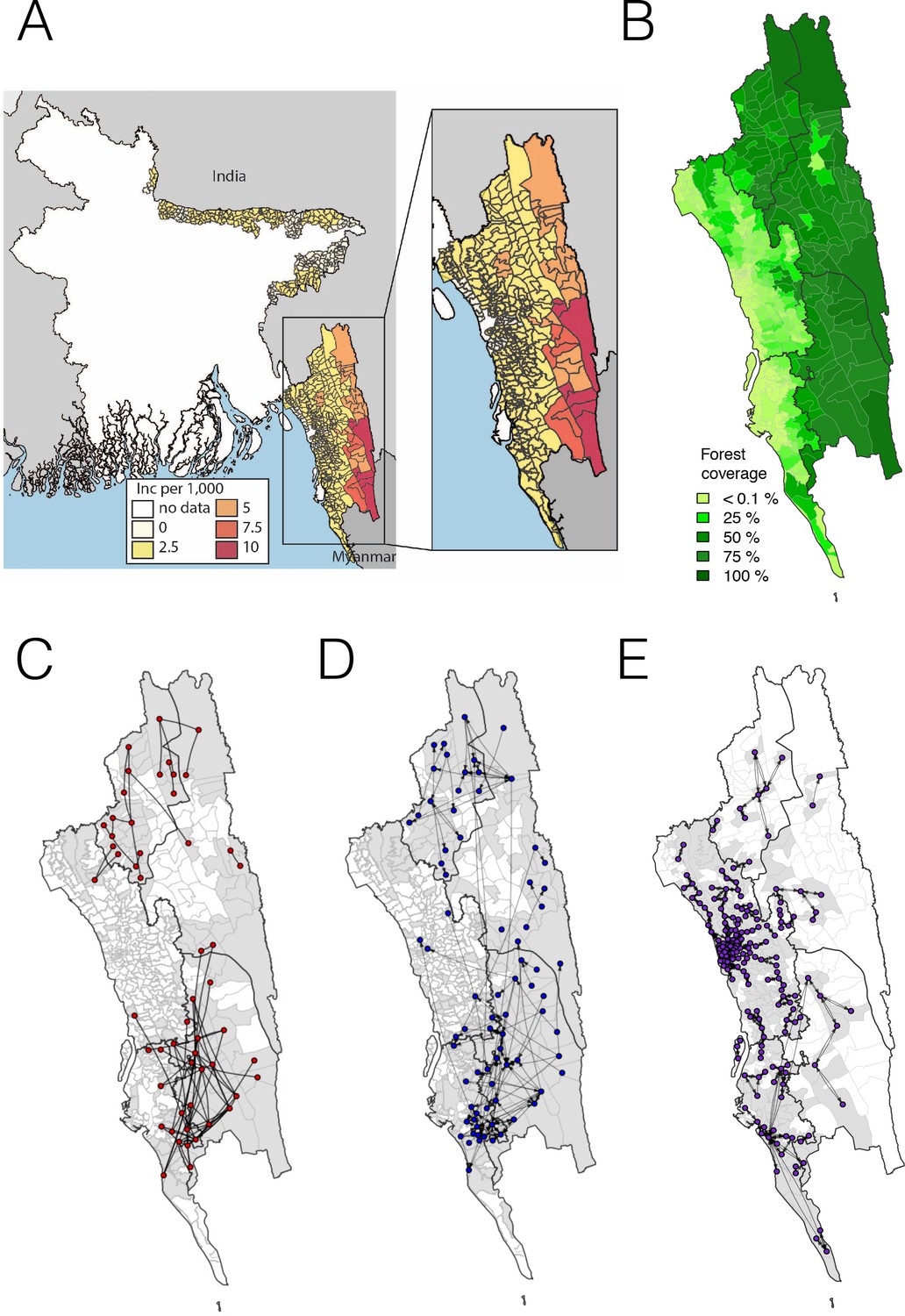
The incidence of malaria and spatial connectivity in the Chittagong Hill Tracts (CHT) Region.
(A) The average monthly incidence per 1000 population of P. falciparium malaria from 2015 to 2016 as reported by the NMEP. Incidence was highest in the eastern portion of the CHT (shown in relation to the country borders) and decreased westward. (B) The forest coverage (%). (C) Unions sharing at least one parasite with identical genetic barcodes. (D) Top 50% of most traveled routes reported between pairs of locations from the travel survey data. (E) Top 1% of routes traveled between pairs of locations from the mobile phone data. Unions were colored grey where data was collected on genetic (C), travel survey (D) or mobile phone data (E).
Figure 1—figure supplement 1
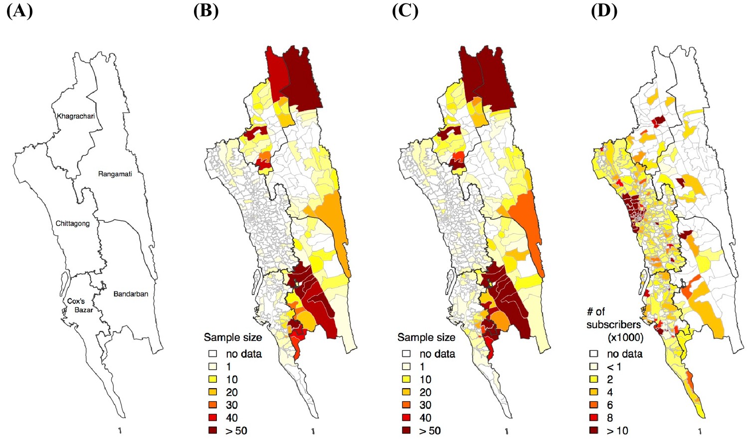
Sample distribution.
(A) District map in the CHT. Sample distribution of genetic (B), travel survey (C) and mobile phone (D) data.
Figure 1—figure supplement 2
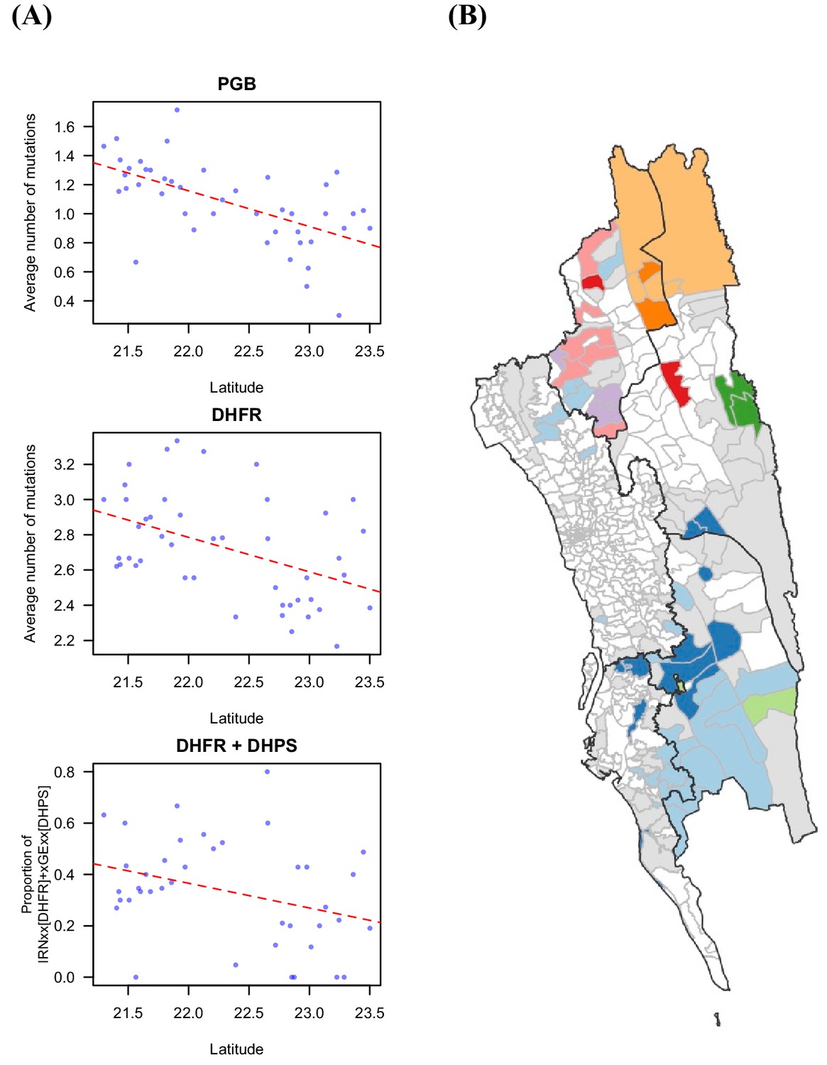
Drug resistant markers and the proportion of identical parasites showing spatial signal.
(A) The drug resistance-related markers were significantly associated with latitude, including PGB mutations that were found in genetic background of K13 mutations that lead to artemisinin resistance (Pearson’s correlation test, p-value=1.58 × 10⁻⁵, r=–0.601), DHFR mutations that mediated pyrimethamine resistance (Pearson’s correlation test, p-value=0.0018, r=–0.453), and the proportion of the haplotype of IRNxx [DHFR] and xGExx [DHPS], which was shown to be associated with treatment failure for the combination of pyrimethamine and sulfadoxine (Pearson’s correlation test, p-value=0.035, r=–0.335). Red dotted line is the fitted linear regression line. (B) The unions were clustered based on genetic information, the proportion of identical parasites between locations, using Infomap (Rosvall and Bergstrom, 2011). Unions without genetic data are shown in white; unions that had genetic data but did not cluster with any other union are shown in grey; the remaining colors represent the identified cluster (i.e. unions in the same cluster were colored using the same color).
Figure 1—figure supplement 3

Commonly used genetic measures show little spatial signal.
(A) Pattern of genetic variation was presented by the first two principal components from principal component analysis (PCA) analysis. The color shows the average PC1 or PC2 values for each union (white means no data). There was no clear spatial trend in PC1 or PC2 values. (B) Unions with lowest 1% average pairwise difference were connected. (C) The average complexity of infection for each union. (D) Genetic barcodes of parasites in international travelers were not distinguishable from people who did not travel or only traveled within Bangladesh, from PCA analysis. The case from Mozambique was an immigrant and was an outlier in the plot. (E)-(F) Average pairwise SNP difference (%) (E) and FST (F) were not associated with geographic distance. FST was calculated for both barcodes and drug markers using Weir and Cockerham's method (Weir and Cockerham, 1984) between all union pairs with sample sizes > 20.
Figure 2 with 3 supplements
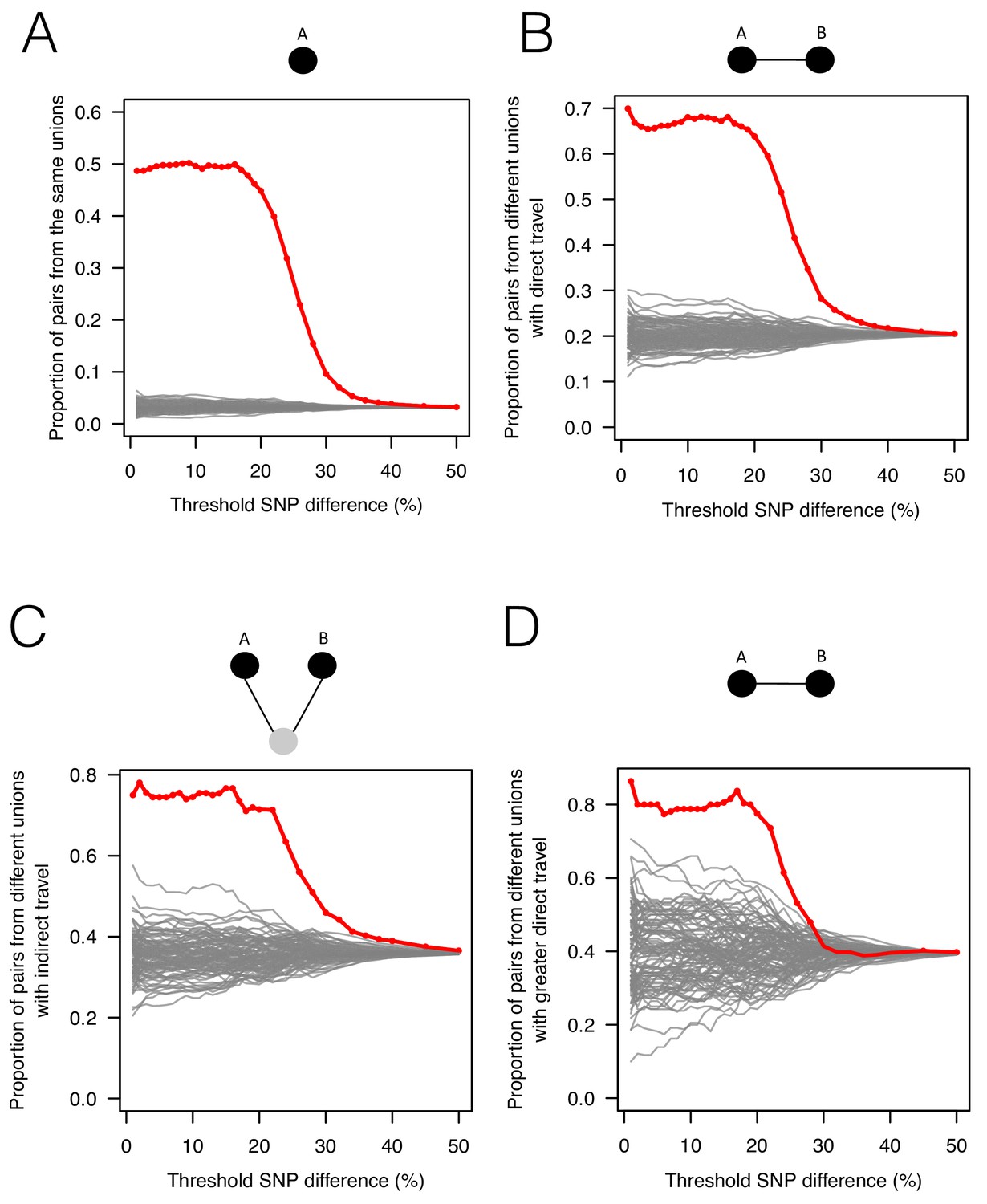
The association between genetic data, travel survey, and mobile phone data.
We compared genetic data with population-level travel survey data and mobile phone data under four scenarios: being in the same union (A), coming from unions with direct travel reported in travel survey (B) or indirect travel (C), and coming from unions with high direct travel inferred from mobile phone data (D) (See Materials and methods for details). We calculated the proportion of pairs under these four scenarios when SNP differences were lower than given thresholds (red) and compared them with 100 permutation results (grey). (A) Sample pairs with smaller SNP differences were more likely to be from the same union than random permutations; (B) if they did not live in the same union, they were more likely to be from unions with direct travel; (C) if neither of these conditions held, then they were more likely to be from unions with indirect travel. (D) If sample pairs were not from the same union, those with a smaller SNP difference were more likely to be from unions with higher direct travel (>0.1%) estimated from mobile phone data.
Figure 2—figure supplement 1
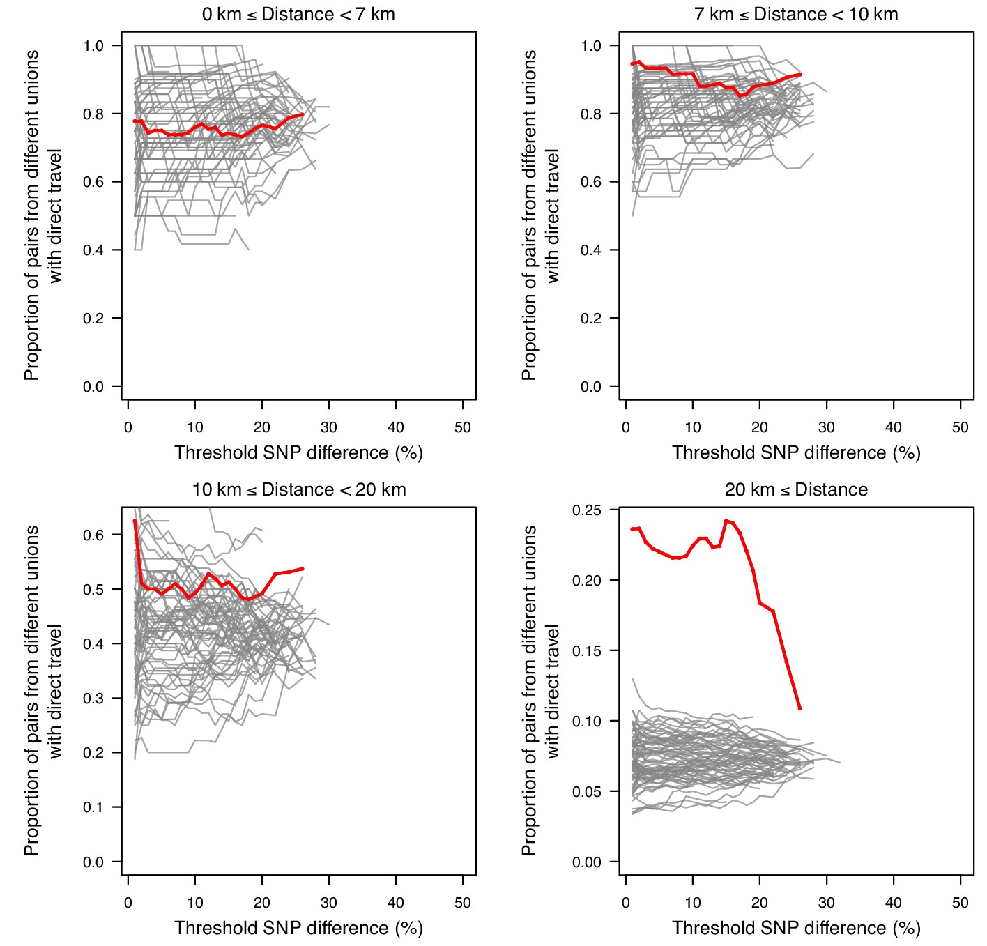
The association between SNP difference and travel at varying distances.
Sample pairs with smaller SNP differences were more likely to come from unions with direct travel; this is mainly driven by samples from unions that were ≥20 km apart.
Figure 2—figure supplement 2

Odds ratio of observing nearly identical barcodes with respect to resident locations and travel patterns.
The odds ratio of observing nearly identical barcodes with respect to living in the same location was 30.97 (p-value<0.001). Limiting to individuals living in the same locations, the odds ratio with respect to living in the same forest was 2.50 (p-value=0.057). Given that individuals did not live in the same location, the odds ratio with respect to working in the same forest was 12.14 (p-value<0.001); Given that individuals did not live or work in the same locations, the odds ratio with respect to traveling to the same location was 8.2 (p-value<0.001).
Figure 2—figure supplement 3

The differences in mobile phone versus travel survey data.
(A) From both data sets, we estimated the proportion of subscribers or individuals who did not travel (stays) by either remaining in their residence location or their previous day’s tower location. The travel survey data estimated a higher proportion of time staying. The (B) mobile phone data and (C) travel survey data also varied in the number of destinations from each union. The mobile phone data estimated a much higher number of destinations than the travel survey data.
Figure 3 with 3 supplements
The relationship between genetic and geographic distance.
(A) The association between genetic data and geographic distance was only obvious for small SNP differences. Pairs of parasites sampled from unions that are geographically closer were more likely to be genetically similar. The proportion of intermediate or high SNP differences did not vary much with geographic distance. (B) The genetic mixing index for each location. Unions were colored white if they did not include genetic data and grey if they included genetic data but their genetic mixing index was not identifiable due to lack of samples that were both nearby and genetically similar. High genetic mixing index suggests high parasite flow or importation.
Figure 3—figure supplement 1

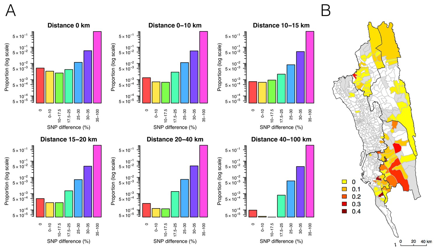
The probability that parasites were sampled from locations within a specified geographic distance (red – purple) given different levels of SNP differences.
The probability of coming from nearby locations decreased with the SNP difference. For example, if the SNP difference is smaller than 17.5%, the probability of residing at unions that were within 20 km was higher than 0.95.
Figure 3—figure supplement 2
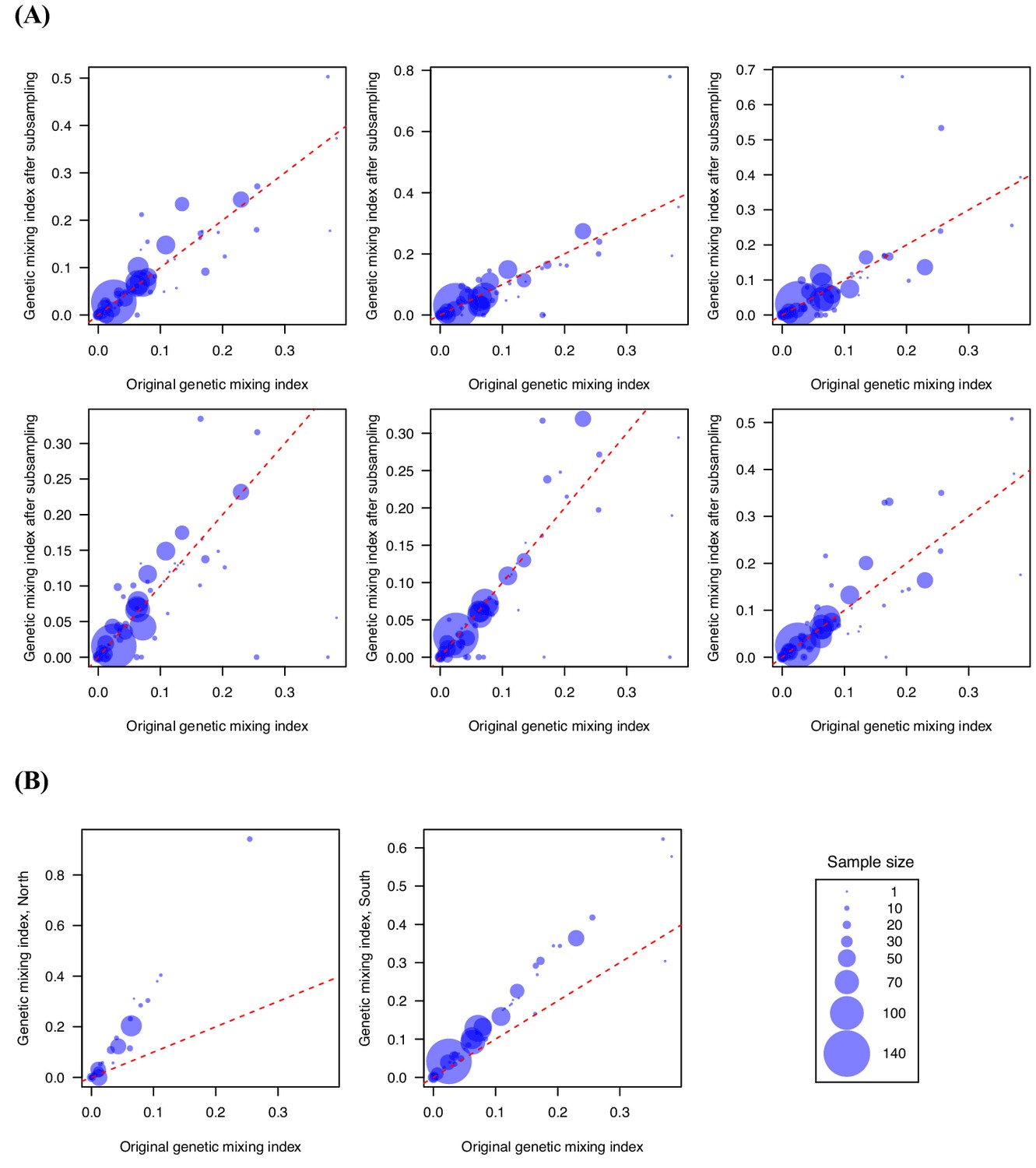
Genetic mixing index was robust to subsampling randomly and geographically.
We performed subsampling (80%) (A) and separated the northern and southern samples (B) to test the sensitivity of genetic mixing index to sampling, and the results remained qualitatively similar. (A) shows six independent replicates of subsampling. The latitude of 22.6 was used as the cutoff for separating the northern and southern samples. These results suggest that the importation index is a robust measure.
Figure 3—figure supplement 3

Examples of genetic mixing index.
We constructed simplified genetic models in order to provide intuitive interpretation for the genetic mixing index. In the simplified genetic model, we assumed that each location had its own genetic lineage (a, b, c, or d) and migration introduced genetic lineage from one location to the other (x). The model results indicate that the genetic mixing index of population B increased with the proportion of imported cases and the number of source populations.
Figure 4 with 2 supplements
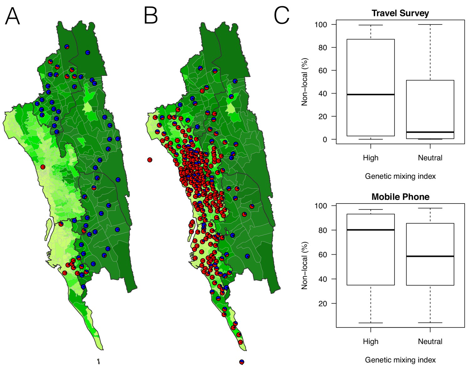
The estimated non-locally acquired cases from the epidemiological modeling using travel survey and mobile phone data.
(A–B) The estimated proportions of non-locally acquired parasites. We estimated the percentage of infections in each union that were acquired in other destination unions (red) versus locally acquired (blue). For each union where travel data was available from the travel survey (A) or mobile phone data (B), the percentage was shown. Unions were colored according to their forest coverage (light green for low, dark green for high). (C) We classified genetic mixing index >0.1 as high and ≤0.1 as neutral. The estimated proportion of imported infections from the travel survey data (top panel) or mobile phone data (bottom panel) was higher for unions classified as a high genetic mixing index, while not statistically significant (p-value>0.05).
Figure 4—figure supplement 1
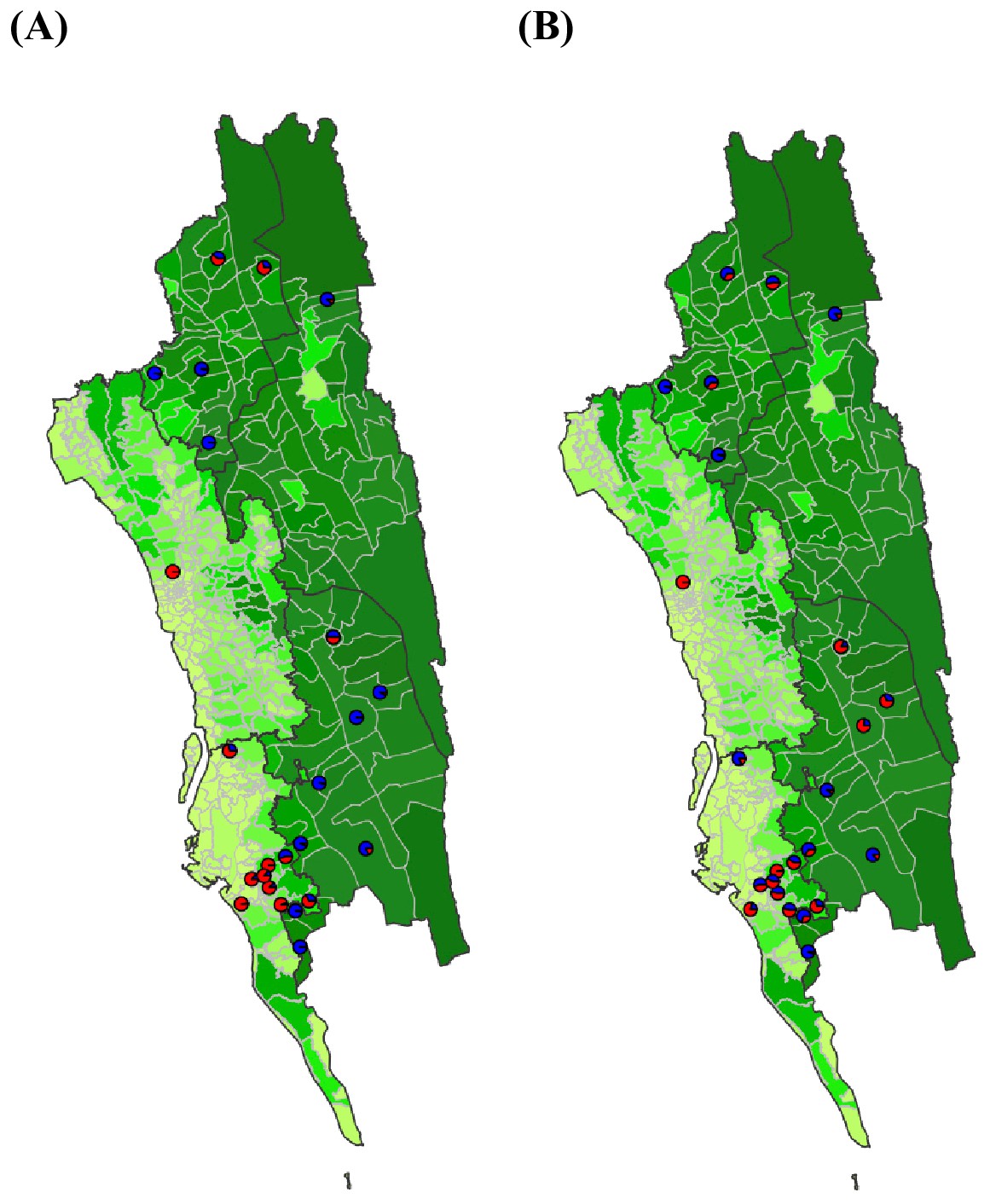
The estimated non-locally acquired cases from the epidemiological modeling using travel survey and mobile phone data.
We estimated the percentage of infections in each union that were acquired in other destination unions (red) versus locally acquired (blue) using the epidemiological model parameterized by travel survey (A) or mobile phone data (B). For each union where both the travel survey and mobile phone data were available, the percentage of non-locally acquired cases was shown. Unions were colored according to their forest coverage (light green for low, dark green for high).
Figure 4—figure supplement 2
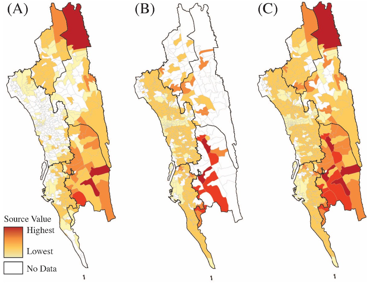
Sources of parasite importations based on the epidemiological models parameterized by the mobility data.
Travel survey data (A), mobile phone data (B) or a combination of both data sets (C) were used to calculate the source value for each union. Source ranks were calculated using the total contribution of each location to all other locations in each data set. Source ranks (the highest source values are colored red and the lowest values are colored light yellow) are shown using each data set individually (A, B). To combine source ranks from both data sets, we used either the higher source value based on each data set or the source value if they were equal from each type of data (C). White color means no data.
Figure 5 with 2 supplements
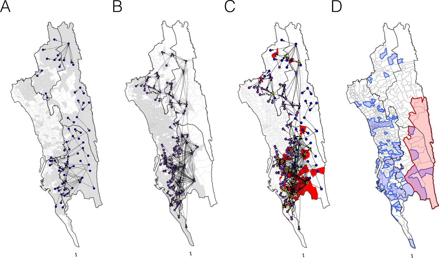
The estimated routes of parasite importations.
(A–B) We estimated parasite flows between unions using epidemiological models parameterized by the travel survey (A) or mobile phone data (B). The top routes of parasite flows (the top 25% for travel survey and the top 1% for mobile phone) and their origins and destinations were shown by lines and dots, respectively. Unions were colored grey if they included travel survey (A) or mobile phone data (B). The top routes of parasite flows accounted for 86.4% (travel survey) and 87.8% (mobile phone) of the total importation. (C) The combined map showing top parasite importation routes from the travel survey (nodes colored blue), mobile phone data (nodes colored purple), or both (nodes colored black with a yellow outline). Unions were shown in red if they had a high genetic mixing index. (D) An updated risk map for malaria transmission in the CHT: unions with high genetic mixing index (>0.1) or a high proportion of imported cases estimated from the epidemiological models (blue: top 25% from the travel survey, top 1% from the mobile phone data), high incidence areas (red: the average monthly incidence per 1000 population >4), and unions that have both high incidence and a high importation level (purple).
Figure 5—figure supplement 1
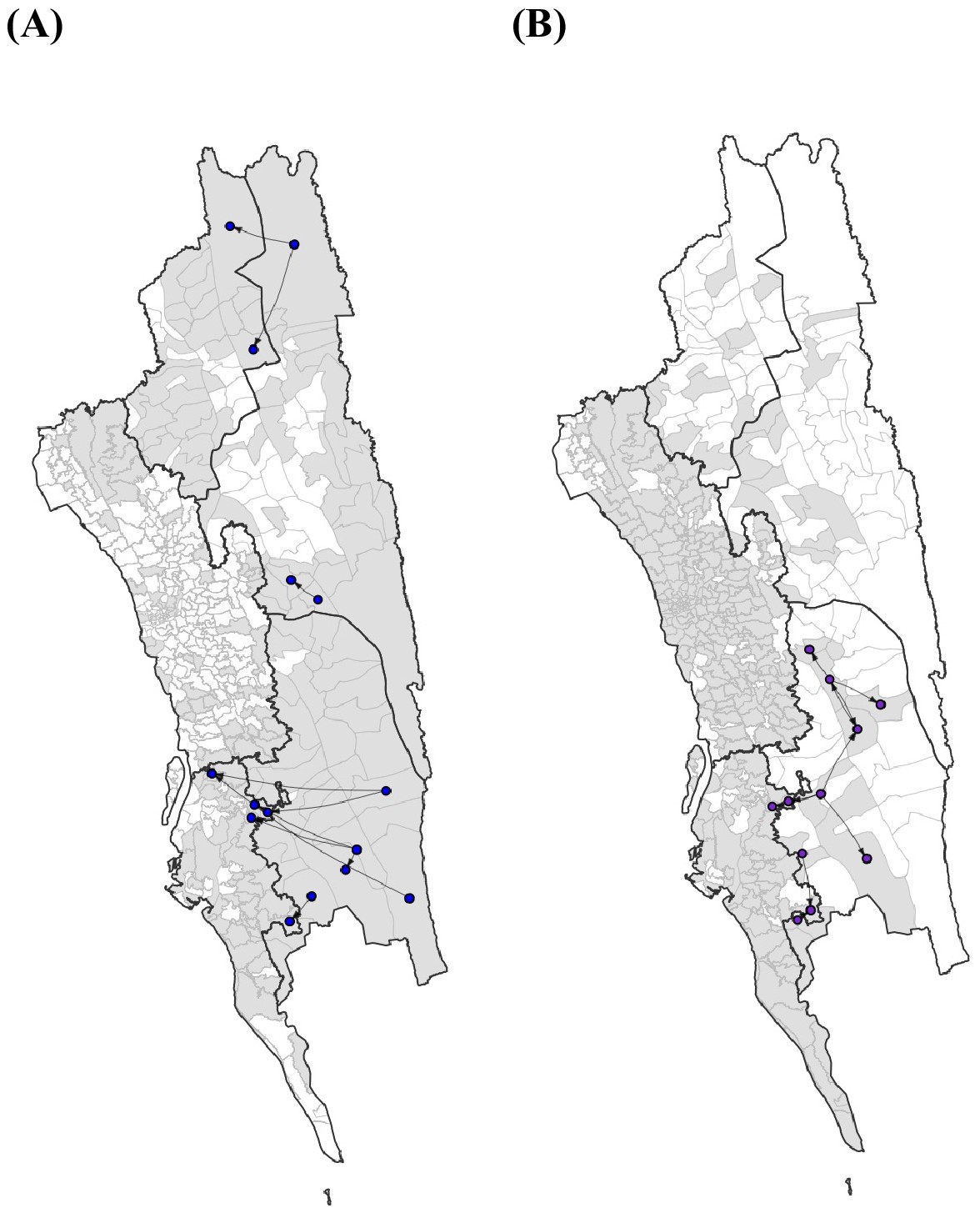
The top 10 routes of parasite flows.
The top 10 routes of parasite flows using epidemiological models parameterized by the (A) travel survey (blue) or (B) mobile phone data (purple). These routes accounted for 39.1% (travel survey) and 40.2% (mobile phone) of the total importation.
Figure 5—figure supplement 2

The top routes of importation based on different types of travel.
We further analyzed the travel survey to (A) include only work travel, or (B) exclude work travel since this type of travel was quantified per week, as opposed to every 2 months. Similar to all travel, we calculated importations using the incidence values per union. In both instances, the top 25% of routes are shown.
Additional files
-
Supplementary file 1
Genetic mixing index.
- https://doi.org/10.7554/eLife.43481.020
-
Supplementary file 2
Questions in the travel survey.
- https://doi.org/10.7554/eLife.43481.021
-
Supplementary file 3
Drug resistance markers.
- https://doi.org/10.7554/eLife.43481.022
-
Supplementary file 4
Genetic barcode data.
- https://doi.org/10.7554/eLife.43481.023
-
Supplementary file 5
Travel matrices inferred from travel survey and mobile phone data.
- https://doi.org/10.7554/eLife.43481.024
-
Supplementary file 6
Genetic barcode locations.
- https://doi.org/10.7554/eLife.43481.025
-
Transparent reporting form
- https://doi.org/10.7554/eLife.43481.026
Download links
A two-part list of links to download the article, or parts of the article, in various formats.
Downloads (link to download the article as PDF)
Open citations (links to open the citations from this article in various online reference manager services)
Cite this article (links to download the citations from this article in formats compatible with various reference manager tools)
Mapping imported malaria in Bangladesh using parasite genetic and human mobility data
eLife 8:e43481.
https://doi.org/10.7554/eLife.43481


