Using subthreshold events to characterize the functional architecture of the electrically coupled inferior olive network
Figures
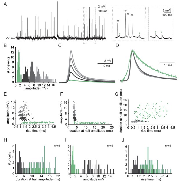
Two types of subthreshold spontaneous events recorded in olivary neurons.
(A) Spontaneous subthreshold events recorded from an olivary neuron. Right panels - higher magnification of the marked rectangles; gray stars - fast and high amplitude events; green circles - slow and small events. (B) The distribution of the events’ amplitudes in this neuron; colors were assigned according to the K-means analysis of the amplitudes. (C) Averages of the subthreshold events in each cluster, color coded as in B. (D) The normalized events shown in C. (E–G) Scatter plots for the relationships between the shape indices of the subthreshold events (color coded as in B). (E) Amplitude and rise time; (F) Amplitude and half width; (G) half width and rise time. (H–J) Histograms of the shape indices (half width (H); amplitude (I); and rise time (J)) of the subthreshold events in a population of 63 olivary neurons; green and gray bars correspond to slow and fast events respectively.
-
Figure 1—source data 1
Source data for Figure 1.
- https://cdn.elifesciences.org/articles/43560/elife-43560-fig1-data1-v1.xlsx
-
Figure 1—source data 2
Trace for Figure 1A.
- https://cdn.elifesciences.org/articles/43560/elife-43560-fig1-data2-v1.mat
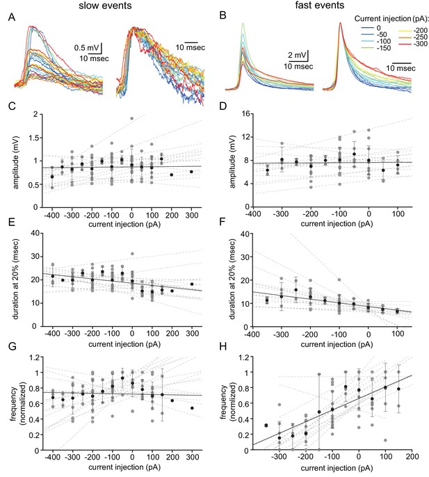
Voltage dependency of the subthreshold events.
(A) Superimposed slow events recorded during seven different DC current injections (−300 to 0 pA, color coded, left panel), and normalized by amplitude (right panel). (B) Same as A, for the fast events. (C–H) The effect of DC current injection on the amplitude (C–D), the duration measured at 20% of the amplitude (E–F) and the frequency of occurrence (G–H) measured in 16 neurons. Gray circles represent the average data from individual neurons, each fitted with a linear regression (dashed gray lines). Black circles and error bars (std) represent the average value for all the neurons in each current injection. Note that the decrease in duration (F) and the increase in frequency (H) with depolarization only occurs for fast events.
-
Figure 2—source data 1
Source data for Figure 2.
- https://cdn.elifesciences.org/articles/43560/elife-43560-fig2-data1-v1.xlsx
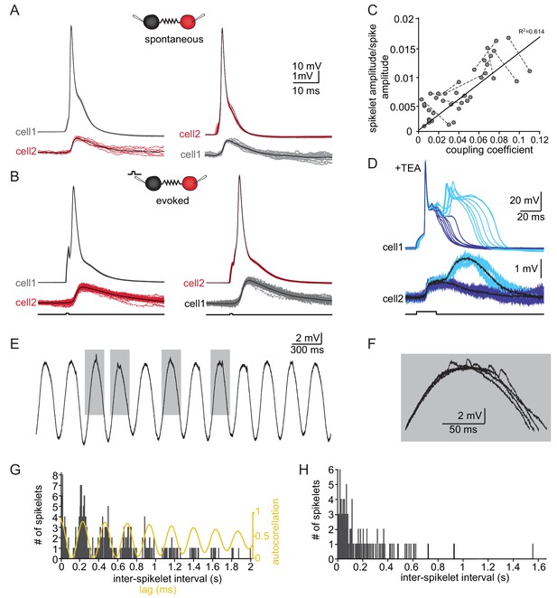
The slow events represent the electrical coupling between neurons.
(A) Superimposed traces of spontaneously occurring action potentials recorded simultaneously from a pair of coupled neurons (red and gray traces; black traces represent the average events). (B) The same as in A for action potentials evoked by 100 pA, 1 ms current pulses. (C) The linear relationship between the DC coupling coefficient and the spike coupling coefficient. Pairs of cells are connected by dashed lines. Blue line is the linear regression fit (R2 = 0.6). (D) Paired recording in the presence of 10 mM TEA. Action potentials with relatively long durations (upper panel, blue traces) were elicited in cell 1 by 50 pA, 20 ms current pulse. Occasionally they were followed by a second response (cyan traces). These action potentials elicited post junctional responses in cell 2 with corresponding waveforms (lower traces). (E) Subthreshold events recorded in oscillating olivary neuron. (F) Superposition of the gray rectangles in E, at higher magnification. Note that spikelets were only present for 50 ms along the peak of the oscillations. (G) Inter-spikelet interval (ISLI) from the same neuron (using 4 ms bins), and an autocorrelation (yellow line) of the membrane potential. (H) The ISLI distribution in a non-oscillating neuron.
-
Figure 3—source data 1
Source data for Figure 3.
- https://cdn.elifesciences.org/articles/43560/elife-43560-fig3-data1-v1.xlsx
-
Figure 3—source data 2
Trace for Figure 3A.
- https://cdn.elifesciences.org/articles/43560/elife-43560-fig3-data2-v1.mat
-
Figure 3—source data 3
Trace for Figure 3B.
- https://cdn.elifesciences.org/articles/43560/elife-43560-fig3-data3-v1.mat
-
Figure 3—source data 4
Trace for Figure 3E.
- https://cdn.elifesciences.org/articles/43560/elife-43560-fig3-data4-v1.mat
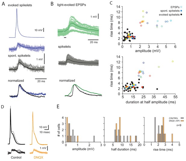
The slow events represent electrical coupling between olivary neurons.
(A) Comparison between evoked slow events and spontaneous occurring slow events. Top two traces are pre- and post-junctional events in pair recording aligned by the time of peak response. Middle, spontaneous slow events recorded from the same cell. Dark lines represent the average responses. Lower traces, the two average responses normalized and superimposed. (B) Top, superimposed traces of light evoked chemical synaptic potentials recorded in an olivary neuron from Thy1 mouse. Middle, superimposed traces of spontaneous spikelets from the same neuron. Dark lines represent the average responses, black bar is the duration of light stimulation. Lower traces, the two average responses normalized and superimposed. (C) Scatter plot of rise time and amplitude (top) and rise time and duration at half amplitude (bottom) of slow events (colored close circles) and chemical synaptic events (open circles). Each point represents an average response in one cell (n = 17 cells). Matching color denotes the same cell. Evoked slow events from different neurons are plotted as black circles (n = 30 cells). (D) Example of evoked slow events in paired recording before (gray) and after (orange) addition of DNQX. (E) The distribution of the average amplitude, duration and rise time of spontaneous slow events before (gray) and after (orange) addition of DNQX and APV (n = 9 cells).

The fast evens are the major source of spontaneous action potentials in olivary neurons.
(A) Superimposed traces of spontaneous occurring action potentials (green and black traces) and fast events (gray traces) recorded from an olivary neurons. Green traces action potentials are clearly preceded by pre-potential that resemble the fast event. Black traces show action potentials that seem to emerge from baseline. Inset depicts the initial deviation from baseline of the three types of responses (corresponding colors). Note that even the black labeled action potentials follow the initial deviation from baseline and therefore might also be activated by the fast events. (B) Phase plots of the traces shown in A, further support the possibility that spiking in olivary neurons are activated by the fast events. (C) The frequency of spontaneous action potentials recorded in 29 neurons. In each neuron the frequency of action potentials that show clear pre potential are marked in green. Note that in some neurons the majority of action potentials are preceded by pre potential. It should be emphasized that this is an underestimation, because some of the black labeled action potential might also be triggered by fast events of high amplitude.
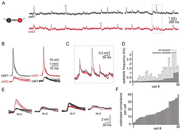
Common groups of spikelets during paired recording reveals the estimated number of neurons that are electrically coupled.
(A) Simultaneous recording from two electrically coupled neurons. Action potentials were truncated (doubled diagonal lines) and an example of the occurrence of common spikelets is marked (dashed rectangle). (B) Superimposed traces of spontaneous action potentials in either cell 1 (black neuron) or cell 2 (red neuron) and the corresponding spikelets in the other neuron. (C) Higher magnification of the rectangle marked in A, showing spikelets that occur simultaneously in both neurons. (D) Histogram of the frequency of spikelets in neurons recorded in pairs, showing all the spikelets (white bars) and all the common spikelets (gray bars; n = 18 pairs), sorted by increasing frequency of common spikelets. (E) Example of common spikelets from the pair presented in A-C. The spikelets could be divided into four groups, with N = 2–7 spikelets in each group. (F) Histogram of the estimated number of neurons that are electrically coupled to each of the pair-recorded neurons (n = 18 pairs).
-
Figure 4—source data 1
Trace for Figure 4.
- https://cdn.elifesciences.org/articles/43560/elife-43560-fig4-data1-v1.mat
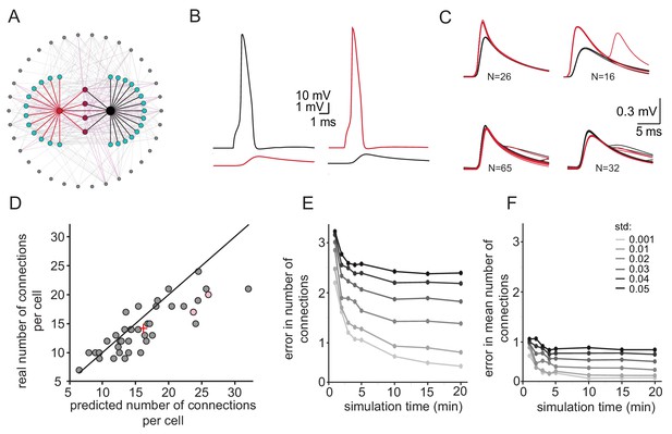
Simulations examining the method used for estimating the number of connections per cell.
(A) Schematics of the modeled network where the recorded pairs of neurons (black and red circles) are connected to four common neurons (purple) and to 12 and 15 additional neurons (cyan); 34 other neurons (gray) that are connected to either the cyan or the purple neurons are also shown. (B) Example action potential and their post junctional responses from the red and black neurons in A. (C) The four common groups of spikelets recorded in the black and red cells with N = 16–65 spikelets in each group. (D) Plot of the predicted number of connections per cell, estimated from the common groups of spikelets, against the real number of connections per cell. The line marks the diagonal, the + sign marks the mean and the pink circles represent the two cells in A. (E) Difference between the estimated and real number of connections per neurons as a function of simulation duration for six different firing rate variabilities (std; color-coded as in the legend). (F) The difference in estimating the mean number of connections in the network (+ sign in D) as a function of simulation duration for six different firing rate variabilities (std). The calculation was done only on neurons that had common neighbors (n = 278 pairs). Mean firing rate was 0.058 Hz.

Simulations examining the network connectivity that accounts for the experimental distribution of common groups of spikelets.
(A) Experimental example of common spikelets from three different pairs, that were divided to 1, 4 or 6 common groups (pair 1,2 and 3, respectively). (B) The distribution of the number of common groups in all experimentally recorded pairs. (C–E) The expected distribution of the common groups in a model where the probability of connection is distance- dependent. (C) Schematic illustration of a distance-dependent connectivity. The connection probability is color coded. (D) The probability of connection in the model (gray bars) and in the experiments (blue line) as a function of the inter-somatic distance. The blue curve represents a Gaussian fit to the data. The green curve represents the experimental results (Devor and Yarom, 2002a; see actual data in Figure 6—figure supplement 1). (E) Distribution of the common groups in the model (gray bars) and experiment (as in B; green line) for cells of up to 40 µm apart. (F–H) Same as C-E for a network that is organized in clusters of neurons with a high probability of connection within a cluster and a low probability between clusters (See Materials and methods). Each cluster consisted of about 40 neurons.
-
Figure 6—source data 1
Traces for Figure 6.
- https://cdn.elifesciences.org/articles/43560/elife-43560-fig6-data1-v1.mat
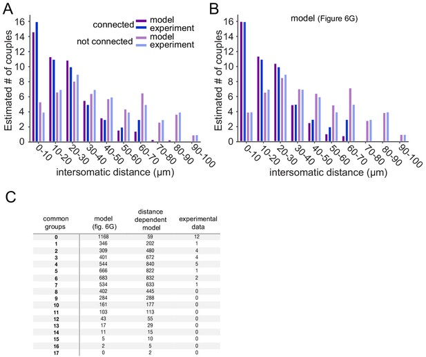
Extended data for the statistical analysis in Figure 6.
(A–B) Blue and light blue bars represent the experimental sample of connected (blue) and not connected (light blue) pairs for different intersomatic distances (Devor and Yarom, 2002a). Purple and light purple bars represent the expected connected (purple) and not connected (light purple) pairs for the different intersomtaic distances for the two network configurations shown in Figure 6: (A) Distance dependent; (B) Cluster model. These values were used for the Chi-Square test (See Materials and methods). (C) Experimental and model sample of the number of common neighbors per pair. These data were used for the Fisher’s Exact test (See Materials and methods) and to create the expected number of common neighbors in Figure 6E,H.
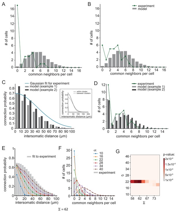
Further examination of possible network connectivity reveals the robustness of cluster organization as the best explanation for the experimental data.
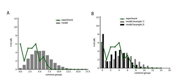
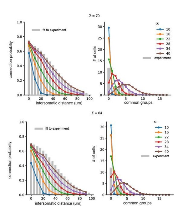
(A) and (B) Examining the possibility that inaccurate detection of common groups led to the clustered organization. (A) Compensating for possible over estimation of common groups, by increasing the number of pairs that had zero common groups. (B) Compensating for possible underestimation of common groups, by reducing the number of pairs that has zero common group. Green lines are the corrected distribution of common group; bars are the expected distribution assuming distance-dependent connectivity (As in Figure 6C–E). (C–D) Two additional cluster models that can account for the connectivity probability and common neighbor distribution that were found experimentally (as in Figure 6F–H). The different connectivity profiles of the models are shown in the inset. (E–G) Color lines show the distance- dependent connection probability (E) and common neighbor distribution (F) for seven different distance- dependent models with Σ = 62 and different σ (see legend). All models did not fit the experimental common neighbor distribution (p<0.05). (G) Summary of the fit between the experimental common neighbor distribution and modeled common neighbor distribution, for different distance dependent models. The x axis represents the Σ that was used for each network and the y axis represent the σ that was used. All p values were below 0.05 (see color bar). The networks in E and F correspond to the column marked by Σ = 62.


