Neural activity in a hippocampus-like region of the teleost pallium is associated with active sensing and navigation
- Harvard University, United States
- University of Ottawa, Canada
- Flatiron Institute, United States
Figures
Figure 1
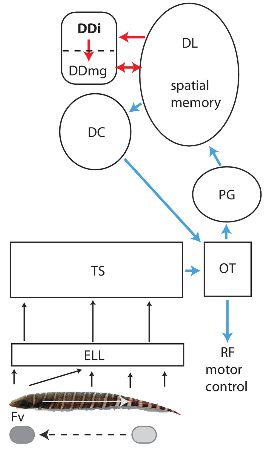
Schematic diagram of the connectivity of DDi and its relation to the neural circuitry for electrolocation.
Electroreceptors are distributed over the body of a Gymnotus sp. with the highest density and highest number on the head; in addition, the electric currents generated by the electric organ are ‘funnelled’ toward the head. The ‘nose’ and head have therefore been considered to be the electrosensory equivalent of a fovea (Castelló et al., 2000; Aguilera and Caputi, 2003). Backward scans by the fish (white arrow) lead to relative forward motion of stationary objects (dashed black arrow) that brings them to the foveal region. Electroreceptors project topographically to the electrosensory lobe (ELL) where the foveal region is mapped to over half the ELL (Carr et al., 1982). The ELL projects topographically to the torus semicircularis (TS). Neurons in the ELL respond to both electrolocation and electrocommunication signals while neurons in TS are selective for one or the other of these signal categories (Vonderschen and Chacron, 2011). The diagram here illustrates the electrolocation pathways and ignores the electrocommunication pathways emanating from the TS (Giassi et al., 2012b). Blue: Neural circuitry similar to the cortical/superior colliculus circuitry of amniotes (see Giassi et al., 2012b; Giassi et al., 2012c; Harvey-Girard et al., 2012; Wallach et al., 2018; Trinh et al., 2016; Elliott et al., 2017). TS projects topographically to the tectum where cells are highly responsive to object motion (electrosensory and visual). Tectum then projects non-topographically to the preglomerular nucleus (PG, putative thalamus homolog) where a variety of motion-sensitive neurons (electrosensory and visual) have been identified (Wallach et al., 2018). PG projects in turn to the dorsolateral pallium (DL). DL projects to central pallium (DC) whose cells are comparable to the layer 5/6 pyramidal cells of cortex. DC then projects to tectum. Numerous tectal neurons of goldfish and zebrafish project to the reticular formation and can drive directed movements via this projection (Herrero et al., 1998; Luque et al., 2008; Gahtan et al., 2005).Red: Neural circuitry similar to the mammalian circuitry required for the formation of spatial maps (see Elliott et al., 2017 for a detailed discussion). DL is essential for spatial learning and memory in goldfish and, in this view, is similar to the mammalian dentate gyrus. DL projects to DDi (similar to CA3). Both DL and DDi project to the large cells of DDmg (similar to dentate hilus mossy cells). DDmg then projects back to DL much like mossy cells project back onto the dentate gyrus granule cells. We have omitted, for simplicity, the GABAergic interneurons that appear to correspond to the somatostatin positive hilar interneurons of the mammalian hippocampus. We would like to thank Will Crampton for providing the image of a Gymnotus fish used in this figure.
Figure 2 with 1 supplement
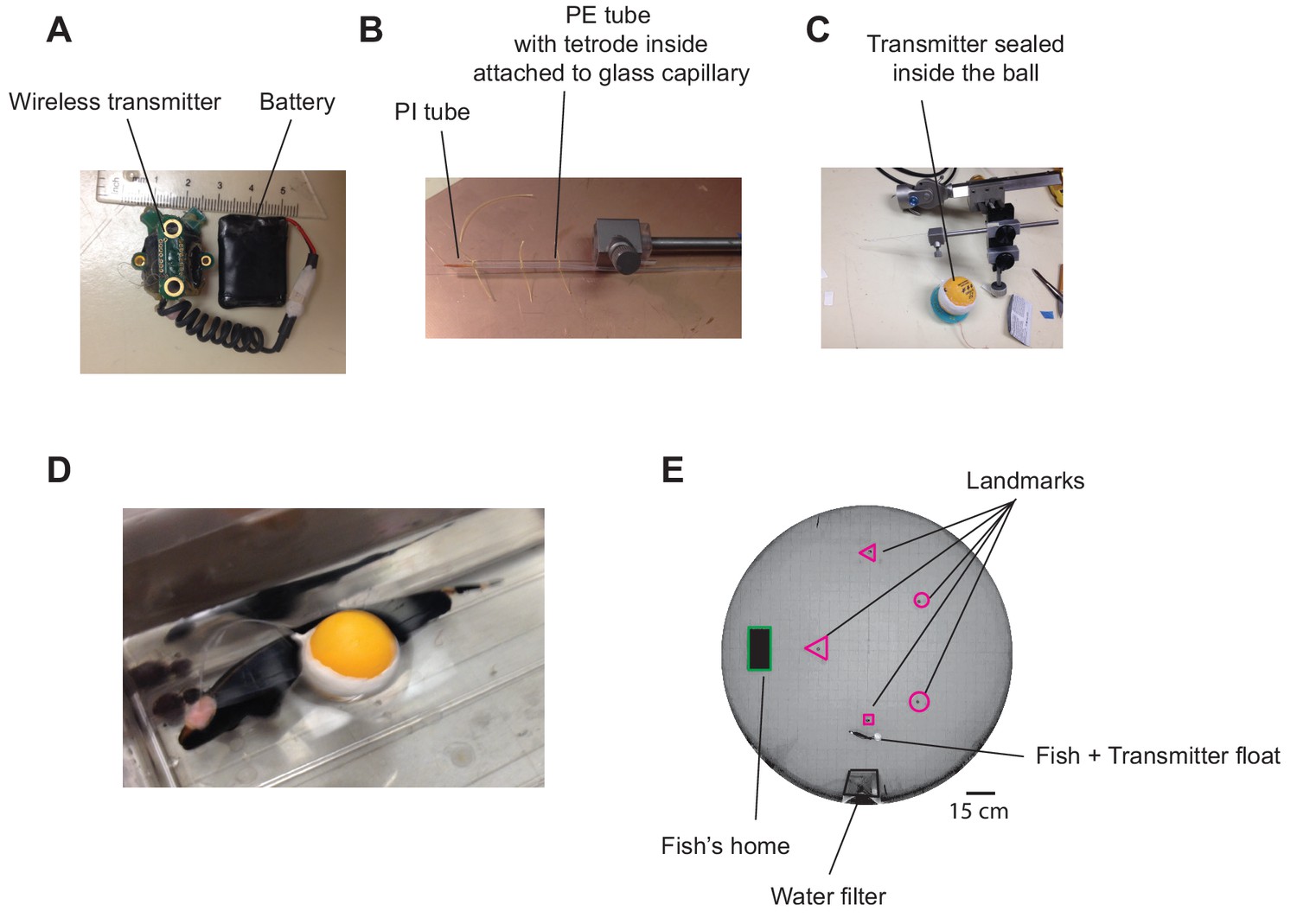
Experimental setup and example wireless recording.
(A) Wireless transmitter system used for recordings. (B) A long tetrode was constructed and mounted on an electrode holder to be attached to a micromanipulator. (C) The other end of the tetrode was connected to the transmitter, and the ensemble was placed in a ping-pong ball and sealed. (D) Pictures of a fish after tetrode implantation together with the transmitter float (picture from a related species with the same size). (E) Recordings were performed in a large experimental tank containing various landmarks made with clear and opaque plexiglass, as well as a water filtering system.
Figure 2—figure supplement 1
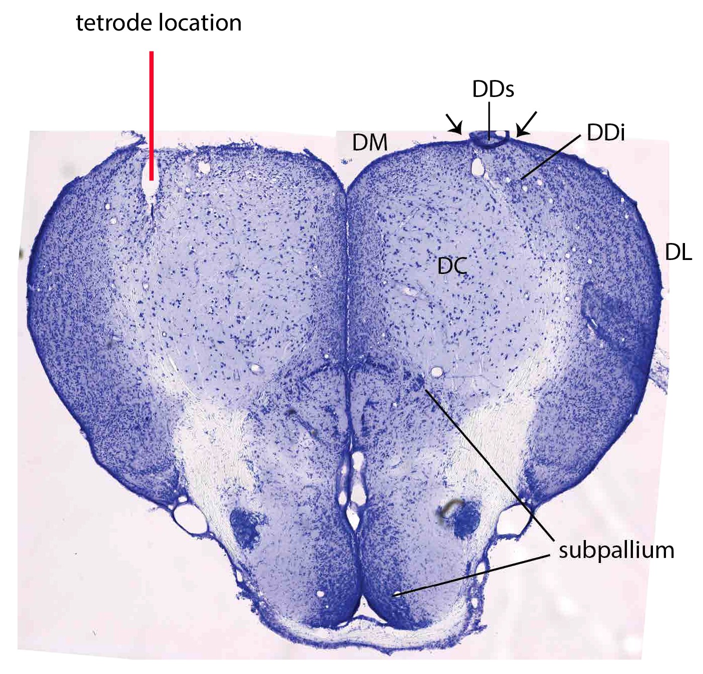
Cresyl violet stained section through the pallium of an implanted fish illustrating the location of the tetrode.
Small arrows (right side) indicate the sulci used as an aid in placing the tetrode. Note that the tetrode track passed through the superficial DD (DDs) and ended within DDi. The much lower cell density in DDi compared to DL is evident in this section. DC: central division of dorsal telencephalon DDi: intermediate division of the dorsal portion of dorsal telencephalon (DD, pallium) DDs: superficial division of the dorsal portion of DD DL: dorsolateral pallium DM: dorsomedial pallium.
Figure 3
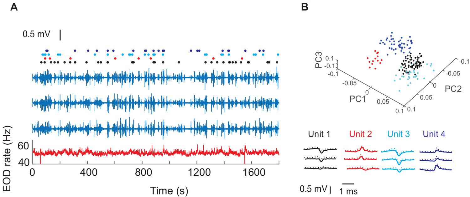
Example recordings in one fish and four isolated units.
(A) The blue traces show extracellular recordings on the three of the four tetrode channels after EOD spike removal (see Materials and ethods). The fourth channel was used as reference. The red trace shows instantaneous EOD rate calculated based on EOD recordings obtained by electrodes inside the experimental tank. Raster plots show spike timing corresponding to the four units. (B) Average (SD) of waveforms of the isolated units from this recording and their first three principle components (PCs).
Figure 4
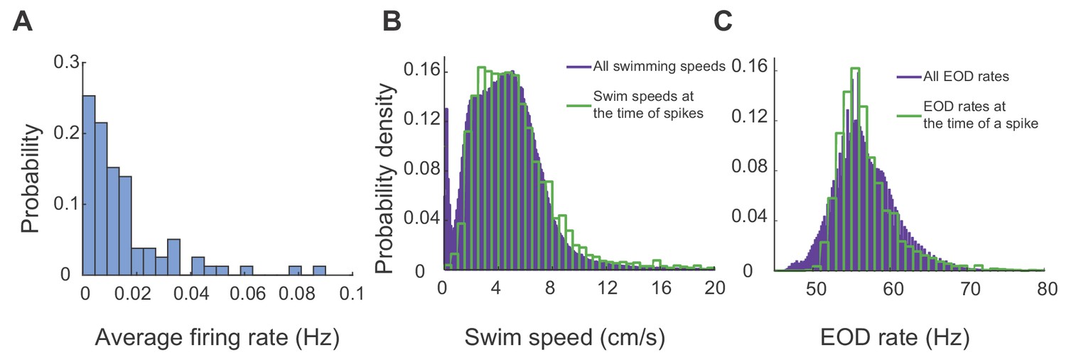
DDi units spiked sparsely during periods swimming and active sensing.
(A) Probability histogram of average firing rates observed in all units and all trials (25 units, 23 trials, five fish). (B) Probability density function of all observed swim speeds (purple bars), and swim speeds at the time of a spikes (green bars). Spikes were unlikely at very low swimming speeds. (C) Probability density function of all observed EOD rates (purple bars) and those observed at the time of spikes. (green bars). Spikes were unlikely at low EOD rates (<50 Hz) corresponding to down states.
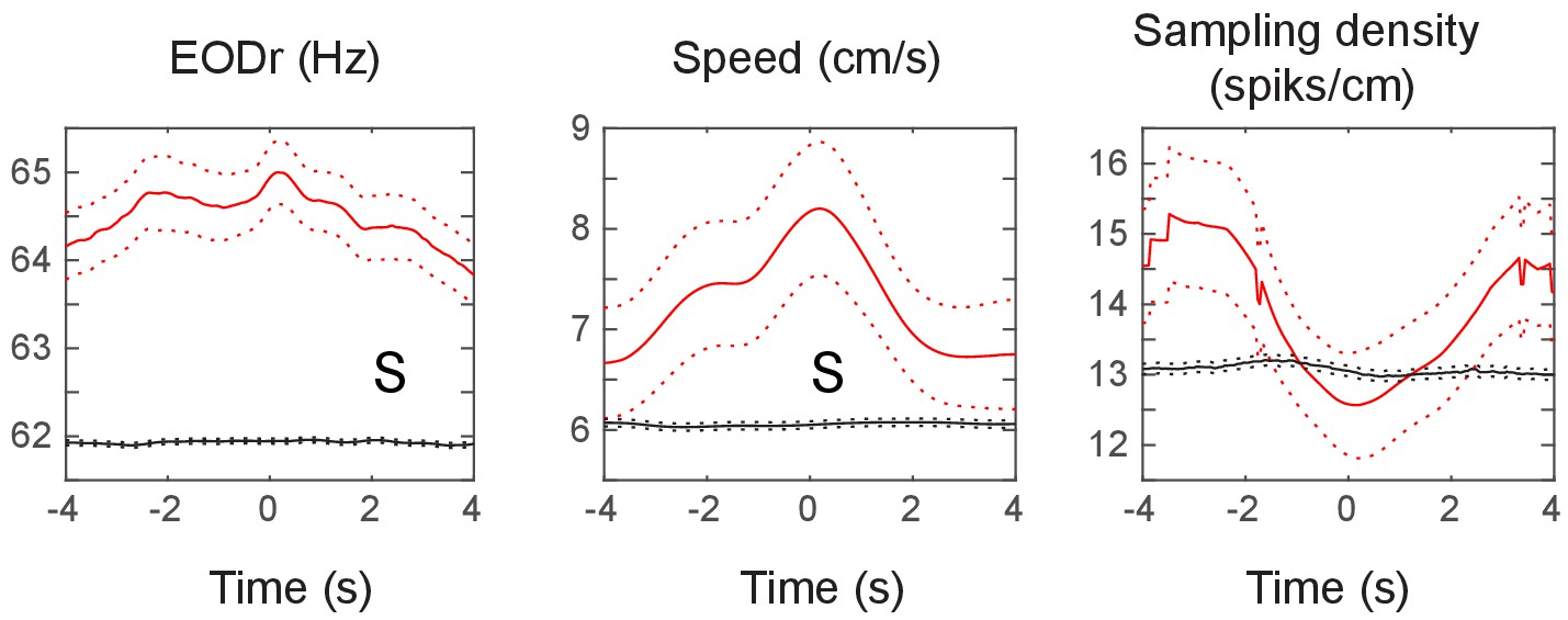
Figure 5 with 11 supplements
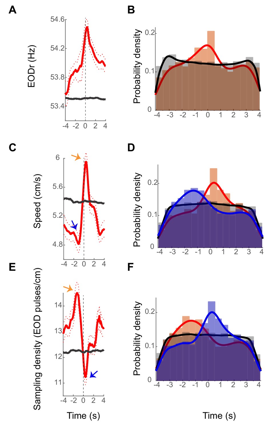
Examples stEODr, stSpeed and stSmpD averages.
(A) StEODr average for an exemplar unit (solid red curve, dotted curve: standard error). The black curve shows the stEODr average for 100 random time shifts of the same spike train. The dashed vertical line corresponds to the spike time (zero). (B) Probability density of timing of stEODr peaks around individual spikes for units with significant peak in stEODr average (orange bars, 13 units in five fish) and for 100 random time shifts of the same spike trains (gray bars). There was a clear peak of stEODr around zero that did not exist in the random data. (C) StSpeed average (red curve) for the same unit shown in A, and the corresponding average for randomly shifted spike times (black curve). Arrows point to the dip and peak in the stSpeed pre- and post- spike respectively. (D) Probability density of speed dips (blue) preceding the spike and peaks (orange) after spikes for units with a significant peak in stSpeed average (14 units in five fish, gray: randomly time-shifted spike trains). (E) stSmpD average for the same unit. stSmpD showed a clear peak before the spike and sharply decreased immediately post-spike, with the minimum occurring after spike time. (F) Probability distribution of timing of the peak (orange) and dip (blue) in sampling density for individual spikes of units with significant peaks in both stEODr and stSpeed shows the same pattern of a pre-spike increase followed by a post-spike decrease (10 units in five fish). Fits in all histograms are non-parametric fits with Gaussian kernels.
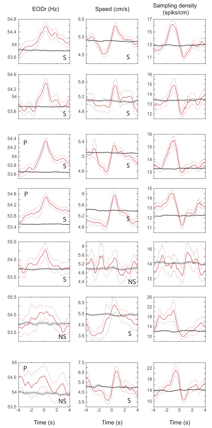
Figure 5—figure supplement 1
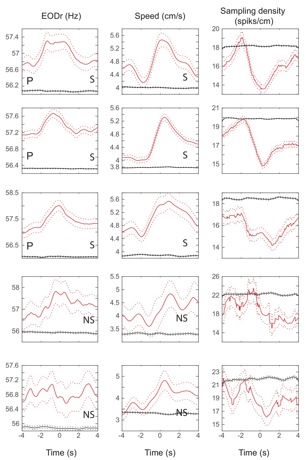
stEOD, stSpeed and stSmpD averages for all units and all fish 1 (red curves).
Black curves show the average for 100 random time- shifts of the same spike train. Dashed curves are standard errors. Units with significant (non-significant) peak in their stEOD average are labeled with S (NS). Units that further showed significant place specificity are denoted with a ‘P’.
Figure 5—figure supplement 2
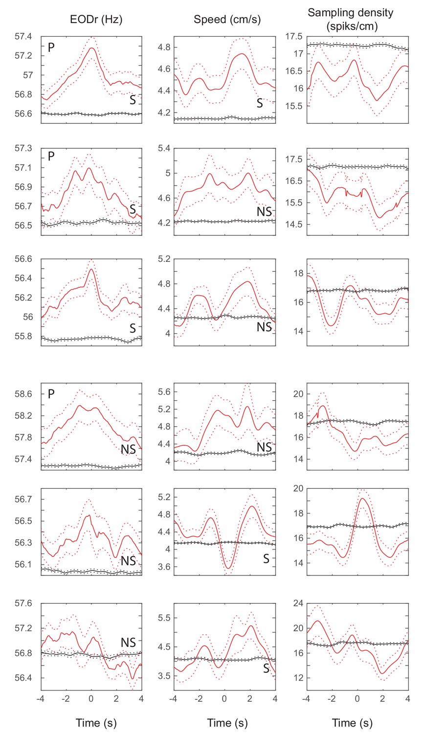
stEOD, stSpeed and stSmpD averages for all units and all fish 2 (red curves).
Black curves show the average for 100 random time- shifts of the same spike train. Dashed curves are standard errors. Units with significant (non-significant) peak in their stEOD average are labeled with S (NS). Units that further showed significant place specificity are denoted with a ‘P’.
Figure 5—figure supplement 3
stEOD, stSpeed and stSmpD averages for all units and all fish 3 (red curves).
Black curves show the average for 100 random time- shifts of the same spike train. Dashed curves are standard errors. Units with significant (non-significant) peak in their stEOD average are labeled with S (NS).
Figure 5—figure supplement 4
stEOD, stSpeed and stSmpD averages for all units and all fish 4 (red curves).
Black curves show the average for 100 random time- shifts of the same spike train. Dashed curves are standard errors. Units with significant (non-significant) peak in their stEOD average are labeled with S (NS). Units that further showed significant place specificity are denoted with a ‘P’.
Figure 5—figure supplement 5
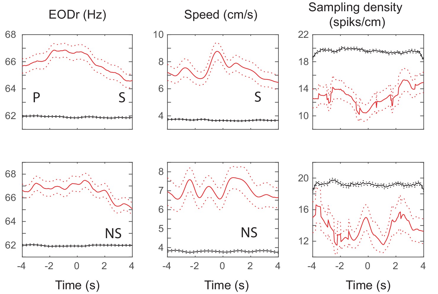
stEOD, stSpeed and stSmpD averages for all units and all fish 5 (red curves).
Black curves show the average for 100 random time- shifts of the same spike train. Dashed curves are standard errors. Units with significant (non-significant) peak in their stEOD average are labeled with S (NS). Units that further showed significant place specificity are denoted with a ‘P’.
Figure 5—figure supplement 6
Comparison of average spike-triggered EODr for spikes of a unit when they occurred in close vicinity of landmarks or tank boundary (<3 cm, red curves) and when they occurred far from them (>10 cm away, black curves).
Different red traces correspond to different units (and have a corresponding black trace). For all but three units (1 unit in fish 3 and two units in fish 5) spike-triggered EOD rates were higher when the fish was very close to landmarks or tank boundary. Both fish 3 and 5 spent most of their time near the tank boundary and therefore only a few spikes were fired far from landmarks/boundary. Interestingly, for most units the peak in the average stEODr was not absent when the fish was far from all landmarks. The coupling between DDi spikes and EODr transients could therefore occur at locations away from landmarks, albeit less strongly.
Figure 5—figure supplement 7

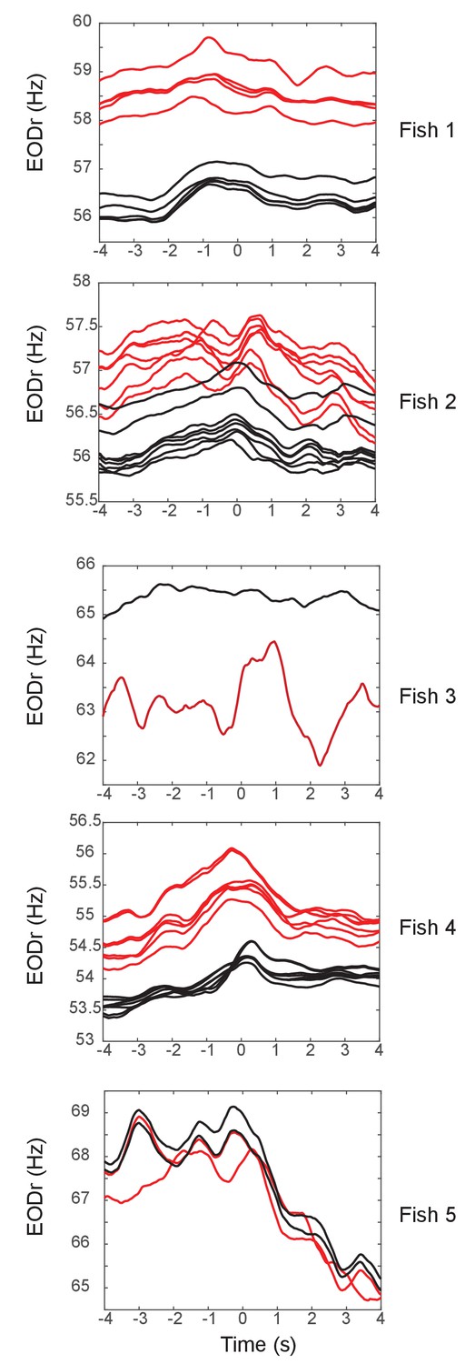
Relation between EOD rate and swimming speed.
There was a significant correlation between EODr and swimming speed, although the relationship could not be fully explained with a linear fit. Pearson correlation coefficient (ρ) and R2 values for the linear fit are displayed on the figure. Note that the variance in speed could not fully explain the variance in EODr as the R2 values were rather small in most fish. It is important to note that the fish that showed the highest level of correlation and R2 possessed the least sharp peaks in stEODr and stSpeed (Figure 5—figure supplement 5 ). Conversely, fish with lower correlation levels (e.g. Fish 2 and 4) possessed sharper peaks in the pike triggered averages (Figure 5—figure supplement 2; Figure 5—figure supplement 4 ). We therefore conclude that although EODr and Speed could be correlated in some instances, they can also be under independent control.
Figure 5—figure supplement 8
Comparison of the shape of spike-triggered averages across trials with the overall average for fish 1.
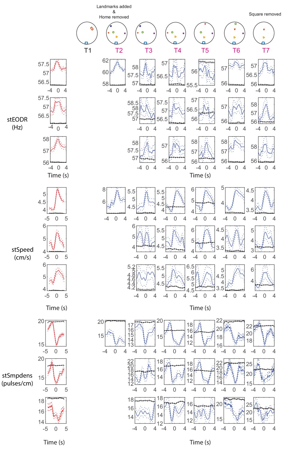
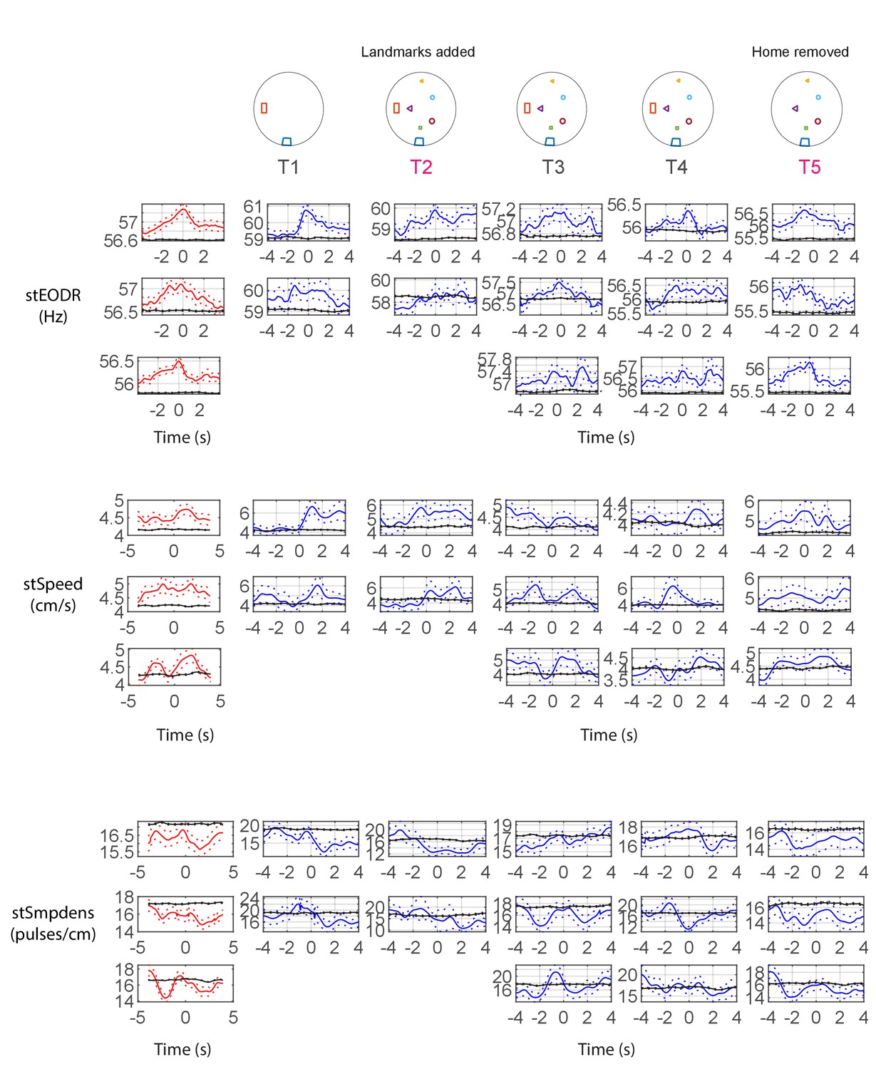
Left columns show the average calculated across all trials (red curves) and the right columns show these averages within a trial (blue curves). Black curves correspond to the same variables calculated using randomly time-shifted spike trains. Dotted lines show standard error. The corresponding landmark configuration is depicted above. Trials where a change was made to the configuration are marked with pink (T) letters. Only units that were present over 2 or more trials and showed significant across-trial stEODr average are shown. Each row for each category corresponds to the spike-triggered averages for one unit. Trial 1, was not included as the fish did not move from the home region. Swimming initiated as the home was removed and landmarks were added starting at trial 2.
Figure 5—figure supplement 9
Comparison of the shape of spike-triggered averages across trials with the overall average for fish 2.
Left columns show the average calculated across all trials (red curves) and the right columns show these averages within a trial (blue curves). Black curves correspond to the same variables calculated using randomly timeshifted spike trains. Dotted lines show standard error. The corresponding landmark configuration is depicted above. Trials where a change was made to the configuration are marked with pink (T) letters. Only units that were present over 2 or more trials and showed significant across-trial stEODr average are shown. Each row for each category corresponds to the spike-triggered averages for one unit.
Figure 5—figure supplement 10

Comparison of the shape of spike-triggered averages across trials with the overall average for fish 3.
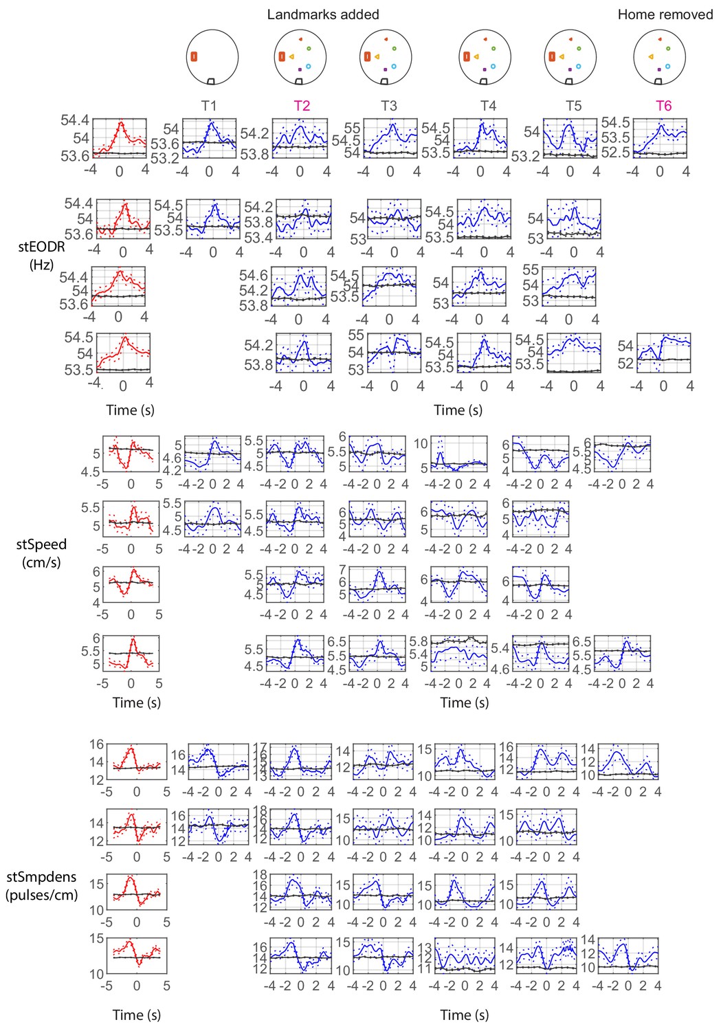
Left columns show the average calculated across all trials (red curves) and the right columns show these averages within a trial (blue curves). Black curves correspond to the same variables calculated using randomly timeshifted spike trains. Dotted lines show standard error. The corresponding landmark configuration is depicted above. Trials where a change was made to the configuration are marked with pink (T) letters. Only units that were present over 2 or more trials and showed significant across-trial stEODr average are shown. Each row for each category corresponds to the spike-triggered averages for one unit.
Figure 5—figure supplement 11
Comparison of the shape of spike-triggered averages across trials with the overall average for fish 4.
Left columns show the average calculated across all trials (red curves) and the right columns show these averages within a trial (blue curves). Black curves correspond to the same variables calculated using randomly timeshifted spike trains. Dotted lines show standard error. The corresponding landmark configuration is depicted above. Trials where a change was made to the configuration are marked with pink (T) letters. Only units that were present over 2 or more trials and showed significant across-trial stEODr average are shown (Only one trial was recorded from Fish 5 so this figure could not be generated for fish 5). Each row for each category corresponds to the spiketriggered averages for one unit.
Figure 6 with 7 supplements
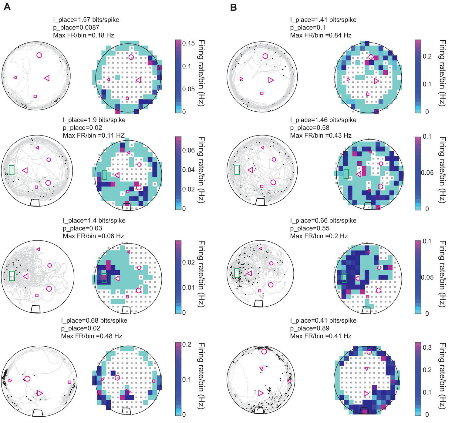
Spatial properties of DDi units.
(A) Left columns: Examples of spiking patterns of four units in four fish that conveyed significant place information. gray curves show fish’s swimming trajectory, and black dots represent spikes. Right column: Firing rate maps of the same units shown to the left. Firing rate per bin is calculated by dividing the total number of spikes by the time spent in that bin. Only bins where the fish visited more than five times are used for the plot. The range of the color plot was clipped to the 97th percentile of the data for visual representation purposes (see Materials and methods). The value of the maximum firing rate/bin (Max FR/bin) is indicated above the plot. The place information for the unit and its level of significance compared to randomly time shifted spike trains are indicated as I_place and p_place, respectively. (B) Same as A but for units that did not show statistically significant place specificity. The green rectangle corresponds to fish’s home, the black trapezoid in the bottom three plots show the location of a water filter. Other shapes represent various landmarks placed in the tank. Note that the fish could go inside the home area, but not other landmarks. Small gray squares denote bins excluded from analysis due to visit counts less than 5 (see Materials and methods).
Figure 6—figure supplement 1

Comparison of the total number of spikes fired by each unit within a trial around landmarks or tank boundary and away from them.
Each circle corresponds to the total number of spikes for a given unit in a given trial. All units and trials from all fish are shown here. More spikes occurred around landmarks and tank boundary (<10 cm away) than away from them. Unity line is shown on the plot.
Figure 6—figure supplement 2
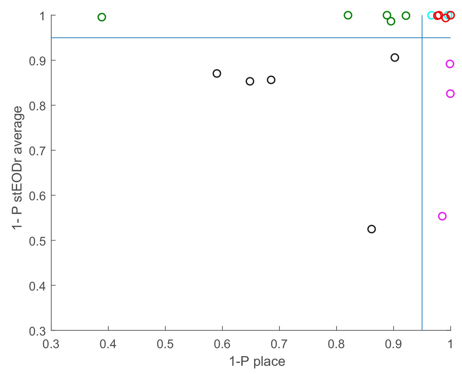
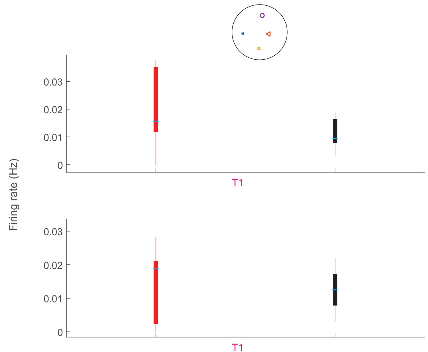
Significance levels for place information and the peak amplitude for the stEODr average for each of the 21 units recorded in five fish (1- p values).
Eight out of 21 units conveyed significant place information (1-p > 0.95, red and purple circles), 5 of which also had a significant peak in their stEODr average (red circles). Cyan circles correspond to units that had a small p value for place information, but in fact were not place specific as they conveyed significantly less place information than that conveyed by randomly time-shifted spike trains. Out of the 13 units which did not show place specificity, eight had significant peaks in their stEODr average (green and cyan circles).
Figure 6—figure supplement 3
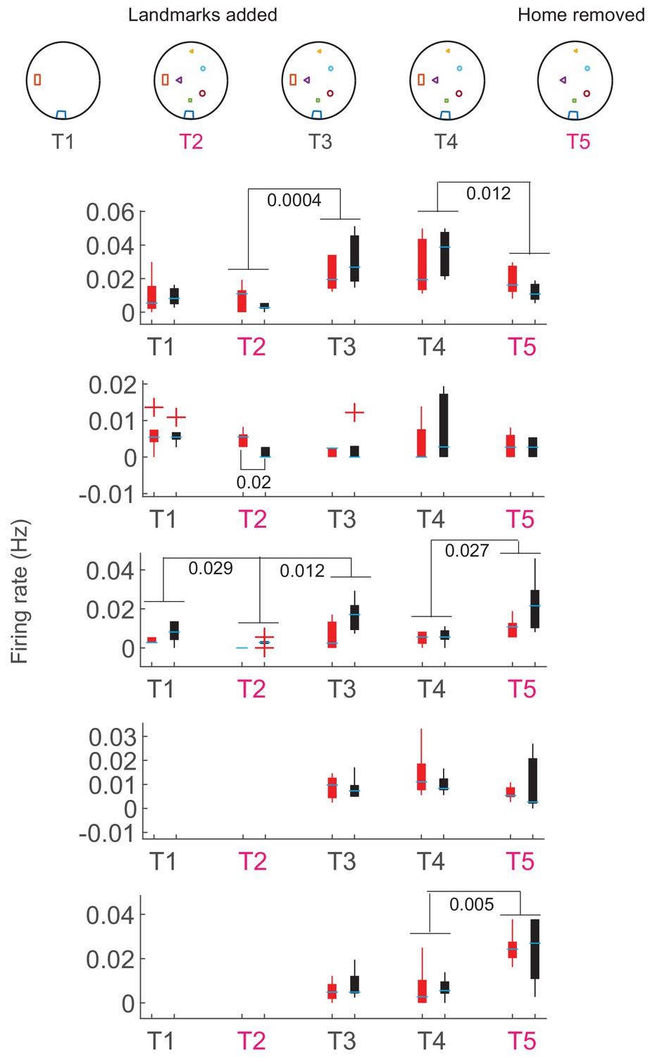
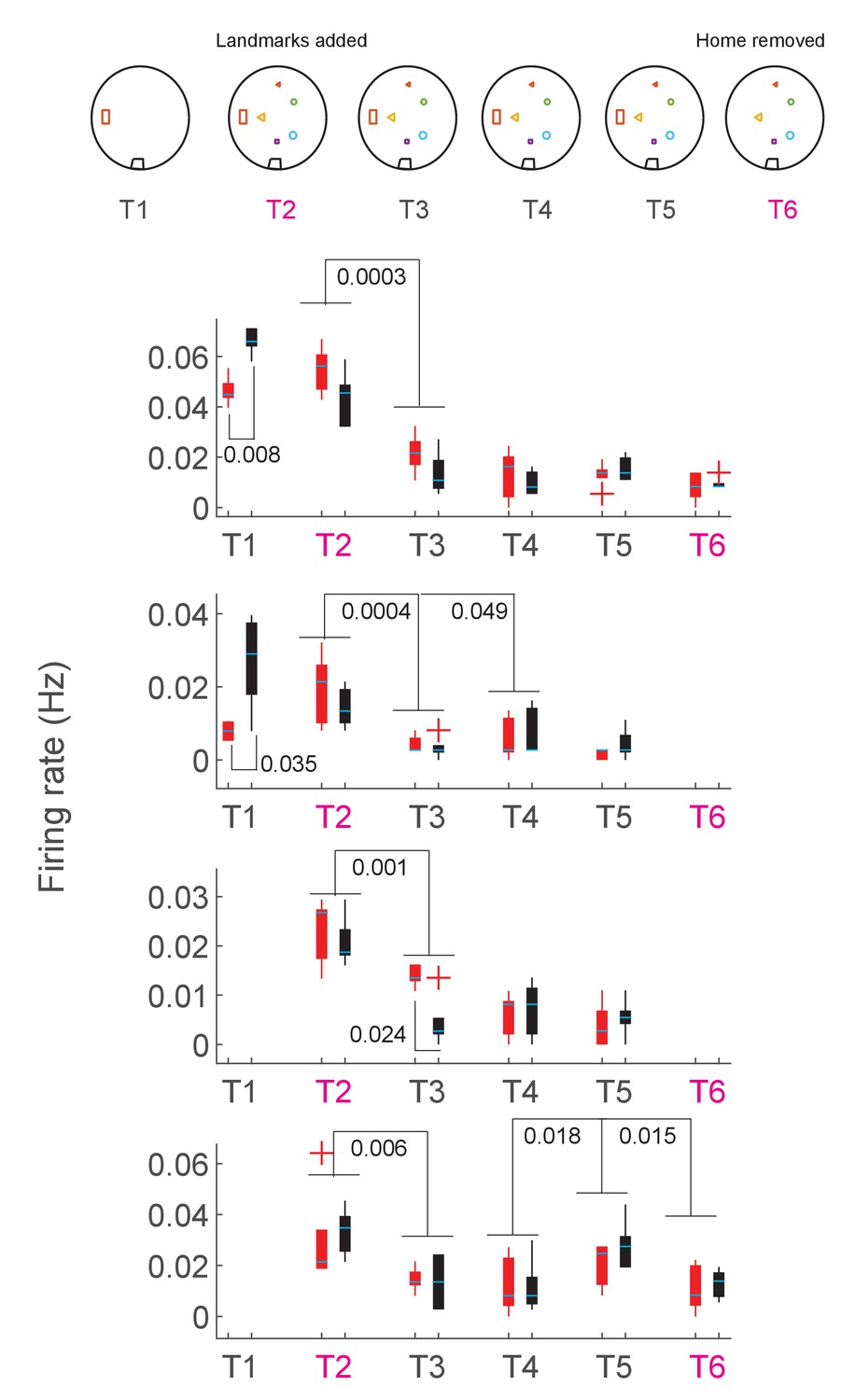
Comparison of the overall firing rate within and across trials for fish 1.
Trials with induced change are marked with a pink T. Comparisons were made between the first and second half of each trial and then across consecutive trials, pooling the two halves of each trial together (see Materials and methods). Each half of a trial was composed of 5 bins over which the firing rate was estimated and then used to perform statistical tests within and across trials. P values are shown when a significant difference was present.
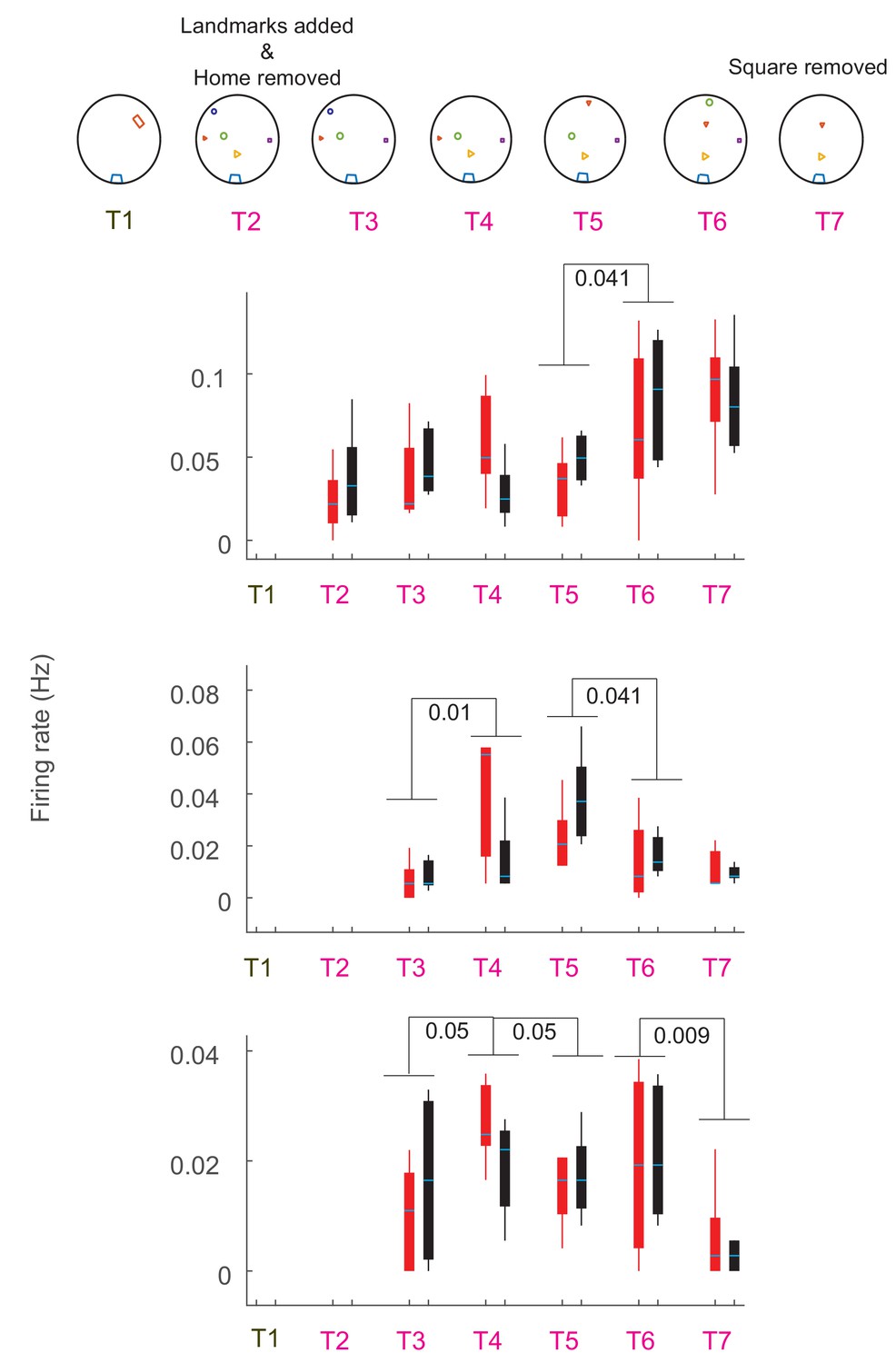
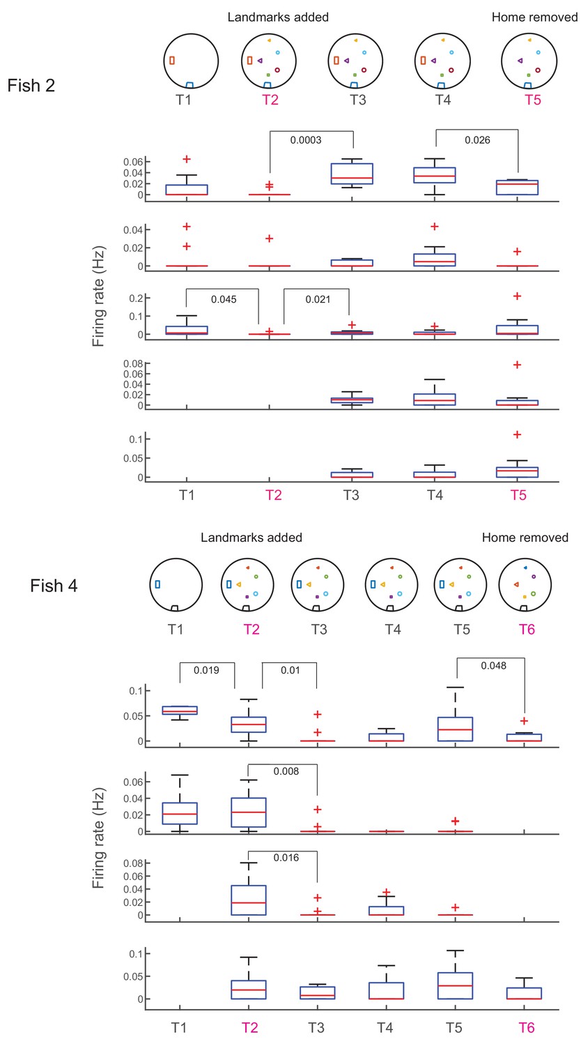
Figure 6—figure supplement 4
Comparison of the overall firing rate within and across trials for fish 2.
Trials with induced change are marked with a pink T. Comparisons were made between the first and second half of each trial and then across consecutive trials, pooling the two halves of each trial together (see Materials and methods). Each half of a trial was composed of 5 bins over which the firing rate was estimated and then used to perform statistical tests within and across trials. P values are shown when a significant difference was present.
Figure 6—figure supplement 5
Comparison of the overall firing rate within and across trials for fish 3.
Trials with induced change are marked with a pink T. Comparisons were made between the first and second half of each trial and then across consecutive trials, pooling the two halves of each trial together (see Materials and methods). Each half of a trial was composed of 5 bins over which the firing rate was estimated and then used to perform statistical tests within and across trials. P values are shown when a significant difference was present.
Figure 6—figure supplement 6
Comparison of the overall firing rate within and across trials for fish 4.
Trials with induced change are marked with a pink T. Comparisons were made between the first and second half of each trial and then across consecutive trials, pooling the two halves of each trial together (see Materials and methods). Each half of a trial was composed of 5 bins over which the firing rate was estimated and then used to perform statistical tests within and across trials. P values are shown when a significant difference was present.
Figure 6—figure supplement 7
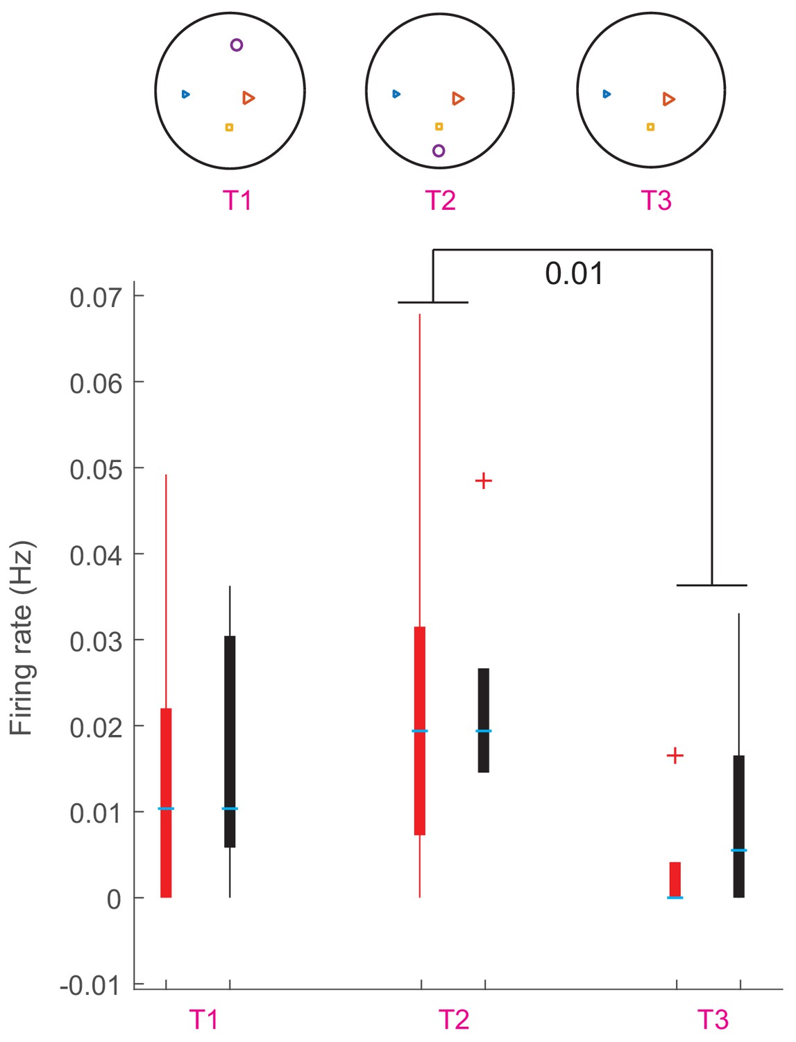
Comparison of the overall firing rate within and across trials for fish 5.
Trial with induced change is marked with a pink T. Comparisons were made between the first and second half of the trial. Each half of a trial was composed of 5 bins over which the firing rate was estimated and then used to perform statistical tests within trial. P values are shown when a significant difference was present.
Figure 7 with 1 supplement
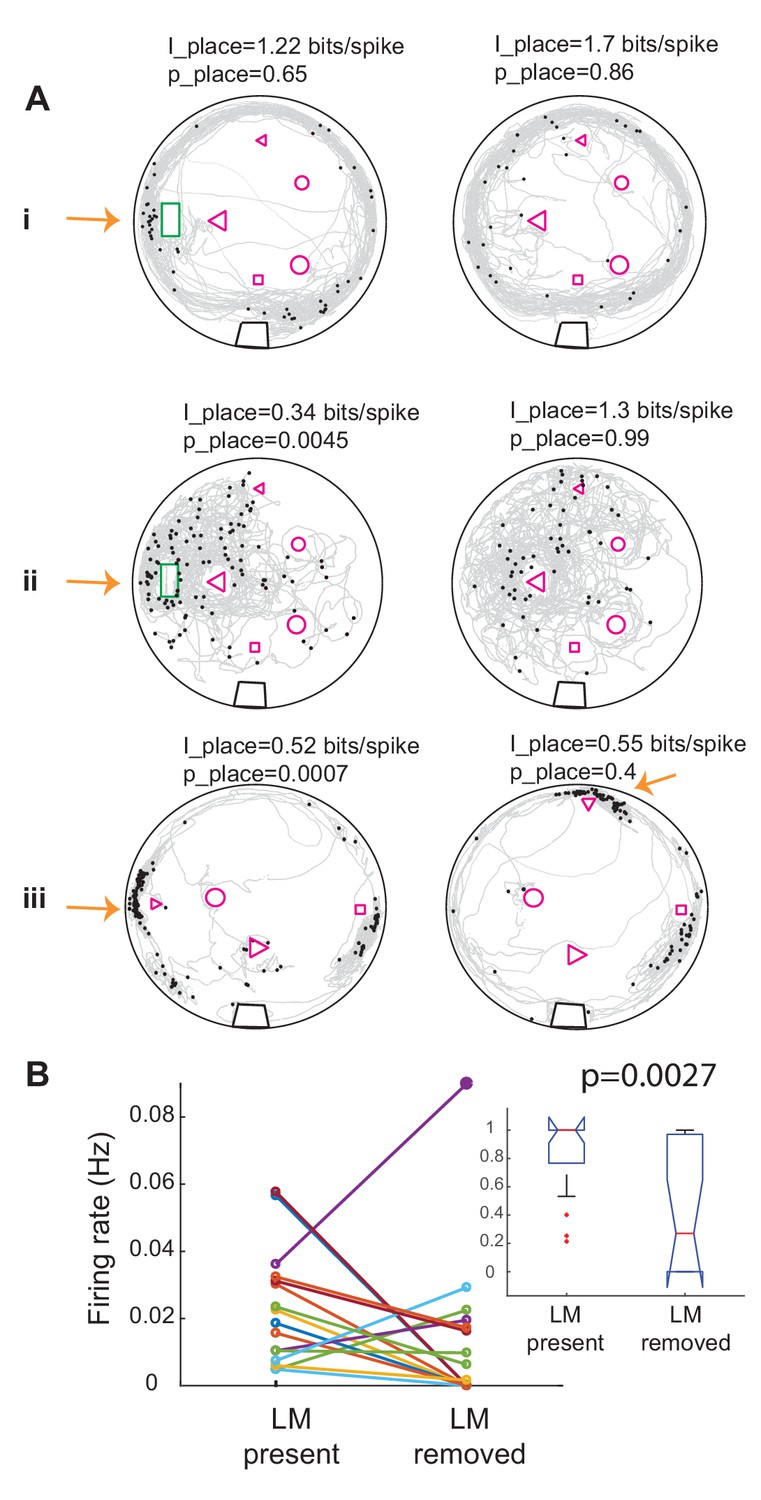
Removing landmarks often resulted in reduction of firing rate near the missing landmark.
(A) Examples of the effect of removing or displacing a landmark in three units in three fish. In i and ii the home was removed and in iii the small triangle was moved to a new location. Note that spikes now occur near the triangle in its new location. Place information and its significance level compared to randomly time-shifted spikes are shown above each panel. Arrows point to the location of the moved landmark. Note that the unit shown on the left panel ii was significantly less place specific than chance. (B) Summary plot of the effect of landmark removal on the firing rate of 10 units in three fish, 16 trials. In 12 out of 16 trials, the firing rate decreased near the removed landmark. Inset: comparison of the normalized firing rates between the two conditions for the same data set. Firing rate was significantly lower in after landmarks were removed. Kruskal-Wallis p value is indicated on the plot.
Figure 7—figure supplement 1
Effect of change in landmark configuration on the firing rate of units from two fish around the location of home (within 10 cm).
Each trial was first divided into 10 bins. Firing rate in this location for each time bin was calculated by dividing the total number of spikes in that region fired during that time bin to the time spent in that region during that time bin. Landmark configuration for each trial is shown on the first row. Trials in which changes were induced are marked with a pink T. Kruskal-Wallis test was used to compare the 10 firing rate values computed for each trial to those computed for the consecutive trial. p-Values are depicted when a significant change was observed. The horizontal line on each bar shows the median and edges of the bar correspond to 25th and 75th percentile of the data. The vertical lines on the bars show the extent of the data and the +signs are the outliers. The same convention holds for bar plots in all supplementary figures.
Figure 8

Relationship between swimming direction and preferred landmark location.
(A) Probability distribution of direction preference index (21 units, five fish). Negative values correspond to preference for spiking during backward swims, with the maxima ± 1 corresponding to spiking only during forward or backward swims, respectively. The red curve shows a non-parametric fit with Gaussian kernels. There was a significant bias for spiking for negative swim direction preference indices (p=0.0072, non-parametric sign test). (B) Schematics of the procedure for calculating Spike and Location Triggered Landmark matrices (STLM and PTLM, respectively). To calculate the spike-triggered landmark (STLM) matrix, first a 160 × 120 element matrix corresponding to the absolute location of landmarks and tank boundary as viewed from the video recording was constructed. Matrix elements that contained landmarks or tank boundaries were set to 1 (depicted as orange on the diagram), whereas other elements were set to zero. Next, at the time of each spike of a given unit, this matrix was rotated and then translated such that fish’s position at that time was centered in the matrix and its head was facing north. The matrix sum was then calculated for all spikes from a given unit. Similarly, a PTLM matrix was calculated as the sum of such rotated and translated landmark matrices calculated for all time points during the trial (down-sampled fish location, see Materials and methods). STLM was then divided by PTLM to calculate the probability of presence of landmarks around the fish (within 10 cm, blue rectangle). The pixel values within this 10 cm wide window were normalized to the maximum pixel value to generate the probability plots. (C) Examples of landmark presence probability plot at the time of spikes of various units. Units b and c are from the same fish and other units are from three other fish. Dark blue regions around the fish correspond to locations that were either never occupied by any landmark or occurred very rarely (lower 10 percentile of all PTLM values) and were excluded from the analysis (see Materials and methods). The anterior part of the fish was defined as the anterior 1/3 of the animal, which corresponded to the zero value on the A/P axis. The L-R axis was defined as the left or right side of the fish, with the fish’s mid-line serving as zero. The left - right preference index was calculated as the difference between the maximum probability on the left side and the right side divided by the sum of the two. We similarly calculated an anterior-posterior preference index. (D) Vector plot of the direction preference indices for anterior-posterior (AP) and left- right (LR) preference indices. Small letters next to the arrows correspond to exemplar units shown in panel C. (E) Most units showed preference for landmarks that were located on the posterior 2/3 of the body (blue shaded area). (F) Left- right preference indices were equally likely to be positive or negative.
Additional files
-
Transparent reporting form
- https://doi.org/10.7554/eLife.44119.030
Download links
A two-part list of links to download the article, or parts of the article, in various formats.
Downloads (link to download the article as PDF)
Open citations (links to open the citations from this article in various online reference manager services)
Cite this article (links to download the citations from this article in formats compatible with various reference manager tools)
Neural activity in a hippocampus-like region of the teleost pallium is associated with active sensing and navigation
eLife 8:e44119.
https://doi.org/10.7554/eLife.44119


