Rapid regulation of vesicle priming explains synaptic facilitation despite heterogeneous vesicle:Ca2+ channel distances
Figures
Deriving the spatial docked SV distribution.
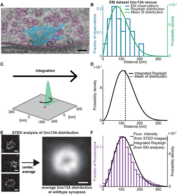
(A) Example EM image of an NMJ active zone (AZ) obtained from a 3rd instar Drosophila larva expressing the dominant Unc13A isoform after high pressure freeze fixation (Unc13A rescue: elav-GAL4/+;;UAS-Unc13A-GFP/+;P84200/P84200). The image captures a T-bar cross section. For clarity, the T-bar is colored in light blue, SVs are indicated with circles, the outline of the presynaptic plasma membrane is shown (magenta). Docked SVs are marked with black circles (non-docked in magenta). Black scale bar: 50 nm. (B) Histogram of the distances of docked SVs to the T-bar center obtained from EM micrographs 19 SVs observed in n = 10 EM cross-sections/cells from at least two animals, the same distance measurements had previously been used for the analysis depicted in Figure 5 of Reddy-Alla et al. (2017). The solid green line is the fitted Rayleigh distribution (σ = 76.5154 nm, mean is 95.9 nm, standard deviation, SD is 50.1 nm). (C) The one-dimensional Rayleigh distribution (green line) is integrated in order to estimate the docked SV distance distribution in the whole presynapse. (D) The integrated Rayleigh distribution is more symmetric, and the mean increases to 122.1 nm. SD is 51.5 nm. (E) The three left example images show wildtype (w[1118]) AZs stained against Unc13A and imaged on a STED microscope. The right hand image shows the average fluorescence signal for 524 individual centered AZ images from 16 different NMJs and more than three different animals (see Materials and methods for details). White scale bars: 100 nm. (F) Histogram of fluorescence intensities against distance from the AZ center, as derived from the average STED image plotted together with the integrated Rayleigh distribution derived from the EM analysis (replotted from panel D), showing a close agreement between the two approaches. Additional EM analysis of wildtype flies and the analysis of an independent STED experiment are compared to the data depicted here in Figure 1—figure supplement 1. Used genotype: Unc13A rescue (panel A, B), w[1118] (panel E, F). Materials and methods section ‘Fly husbandry, genotypes and handling’ lists all genotypes. Raw data corresponding to the depicted histograms can be found in the accompanying source data file (Figure 1—source data 1). Scripts used for analysis of average STED image and plotting of histograms in 1B and 1F can be found in accompanying source data zip file (Figure 1—source data 2).
-
Figure 1—source data 1
Source data for graphs in Figure 1 and Figure 1—figure supplement 1.
- https://cdn.elifesciences.org/articles/51032/elife-51032-fig1-data1-v2.xlsx
-
Figure 1—source data 2
Matlab codes used for data analysis, original images, and instructions for analysis depicted in Figure 1 and Figure 1—figure supplement 1.
- https://cdn.elifesciences.org/articles/51032/elife-51032-fig1-data2-v2.zip
EM + STED vesicle positions are consistent between independent datasets and overlapping with each other.
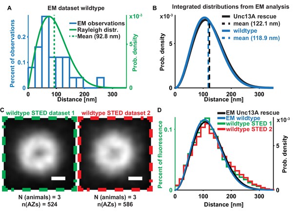
(A) Histogram (blue) of the distances of docked SVs to the T-bar center obtained from EM micrographs of Wild-type (w[1118]) animals (‘EM dataset 1’) plotted with a fitted Rayleigh distribution green, N = 5 animals, n = 11 AZs, mean of Rayleigh distibution = 92.83 nm, SD is 48.5 nm; the same distance measurements had been used for the analysis depicted in Figure 6 of Böhme et al. (2016). (B) Integrated distributions of ‘EM dataset 2’ (Figure 1B, Unc13A rescue, black) with a mean of 122.1 nm and SD of 51.5 nm and of ‘EM dataset 1’ with a mean of 118.9 nm (blue) and SD of 49.9 nm. (C) Average images of ‘STED dataset 1’ (replotted from Figure 1E, green box) (N = 3 animals, n = 524 AZs) and ‘STED dataset 2’ (red box) (N = 3 animals, n = 586 AZs). (D) Overlay of the distance distributions derived from all four (two EM and two STED) datasets. Used genotypes: w[1118] (‘EM dataset 2’, panel A-D), Unc13A rescue: elav-GAL4/+;;UAS-Unc13A-GFP/+;P84200/P84200 (‘EM dataset 1’, panel B, D). Materials and methods section ‘Fly husbandry, genotypes and handling’ lists all exact genotypes.
Characterization of short-term plasticity at the Drosophila melanogaster NMJ.
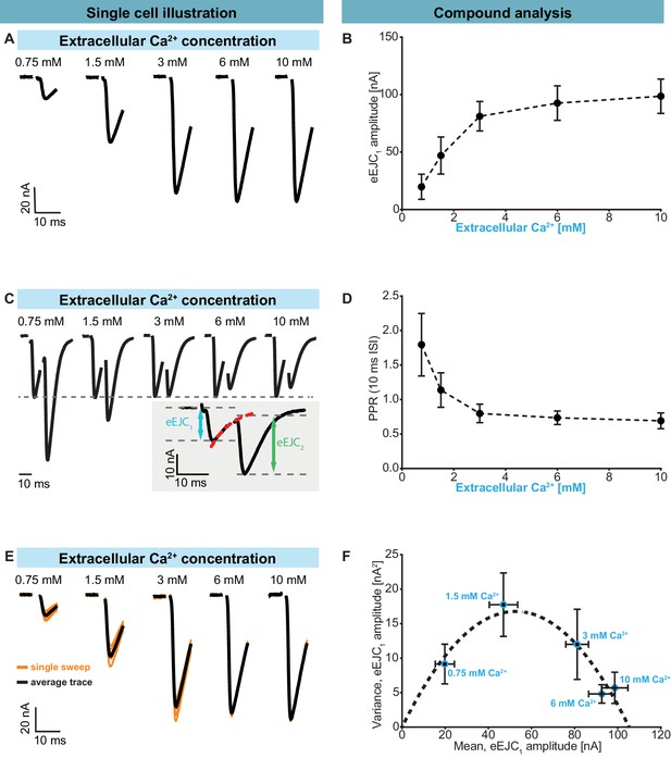
Two-electrode voltage clamp recordings of AP-evoked synaptic transmission in muscle 6 NMJs (genotype: Ok6-GAL4/+ (Ok6-Gal4/II crossed to w[1118])). Left panel (A, C, E) shows example traces from one cell. Right panel (B, D, F) shows quantification across cells. (A) Representative eEJC traces from a single cell measured at different Ca2+ concentrations (0.75–10 mM). (B) Average eEJC1 amplitudes and SD from six animals as a function of extracellular Ca2+ concentration. (C) Representative eEJC traces of paired pulse paradigm (10 ms inter-stimulus interval, normalized to eEJC1) from single cell measured at different Ca2+ concentrations (0.75–10 mM). While STF can be seen at the two lowest extracellular Ca2+ concentrations (0.75 and 1.5 mM), the cell exhibits STD for extracellular Ca2+ concentrations of 3 mM or more. Insert (gray background) shows calculation of eEJC2. An exponential function was fitted to the decay to estimate the baseline for the second response (see Figure 1—figure supplement 1 and Materials and methods for details). (D) Mean and SD of PPR values (6 cells from six animals) at different Ca2+ concentrations. (E) Experiment to assess variance of repeated synaptic responses in a single cell. eEJC1 traces in response to nine consecutive AP stimulations (10 s interval) are shown (orange lines) together with the mean eEJC1 response (black line) at different extracellular Ca2+ concentrations (0.75–10 mM, see Materials and methods). (F) Plot of mean eEJC1 variance as a function of the mean eEJC1 amplitude across 6 cells from six animals for each indicated Ca2+ concentration. The curve shows best fitted parabola with intercept forced at (0,0) (Var = −0.0061*<eEJC1>2+0.6375 nA*<eEJC1>, corresponding to nsites = 164 and q = 0.64 nA when assuming a classical binomial model (Clements and Silver, 2000), see Materials and methods). For the variance-mean relationship of the single cell depicted in Figure 2E , please refer to Figure 2—figure supplement 2. Experiments were performed in Ok6-Gal4/+ 3rd instar larvae, often used as a control genotype for experiments using cell-specific driver lines. Separate experiments were performed to ensure that this genotype showed similar synaptic responses and STP behavior as wildtype animals (Figure 2—figure supplement 3). Used genotype: Ok6-Gal4/II crossed to w[1118]. Materials and methods section ‘Fly husbandry, genotypes and handling’ lists all exact genotypes. Data points depict means, error bars are SDs across cells except in (F), where error bars show SEM. Raw data corresponding to the depicted graphs can be found in the accompanying source data file (Figure 2—source data 1). Scripts for analysis of recorded traces are found in accompanying source data zip file (Figure 2—source data 2). Raw traces from paired-pulse experiments summarized in Figure 2 and Figure 2—figure supplements 2 and 3 can be found in Figure 2—source data 2; Figure 2—figure supplement 1—source data 1; Figure 2—figure supplement 3—source data 1. Estimation of eEJC2 amplitudes and fitting of a smooth mEJC function (used in simulations, see Materials and methods) are illustrated in Figure 2—figure supplement 1.
-
Figure 2—source data 1
Raw data for experiments displayed in Figure 2 and Figure 2—figure supplement 2.
- https://cdn.elifesciences.org/articles/51032/elife-51032-fig2-data1-v2.zip
-
Figure 2—source data 2
Matlab code used for data analysis of electrophysiological traces.
- https://cdn.elifesciences.org/articles/51032/elife-51032-fig2-data2-v2.zip
-
Figure 2—source data 3
Raw data which was used for depicted anaylsis in Figure 2 and Figure 2—figure supplement 3.
- https://cdn.elifesciences.org/articles/51032/elife-51032-fig2-data3-v2.xlsx
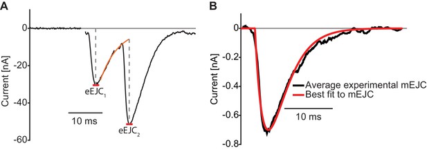
Illustration of analysis of experimental electophysiological data.
(A) Analysis of eEJCs. The eEJC1 amplitude is determined as the first minimum within 10 ms of the stimulus. The eEJC2 amplitude is determined from the baseline found by exponential extrapolation of the eEJC1 decay. (B) The mean mEJC from experimental recordings and the best fit used for convolution (see Materials and methods). Used genotype: Ok6-Gal4/II crossed to w[1118]. Materials and methods section ‘Fly husbandry, genotypes and handling’ lists all exact genotypes.
-
Figure 2—figure supplement 1—source data 1
Raw data for mEJC recordings used for simulations in Figure 2—figure supplement 1.
- https://cdn.elifesciences.org/articles/51032/elife-51032-fig2-figsupp1-data1-v2.zip
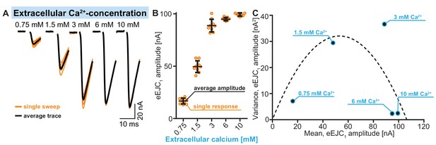
Illustration of fluctuation analysis (quantification across cells shown in Figure 2F) in a single representative cell.
(A) Example traces showing nine individual stimulation sweeps (orange) per Ca2+ concentration (0.75–10 mM). Averages of single sweeps are shown in black. (B) Quantification of eEJC amplitudes of single sweeps (orange) at different Ca2+ concentrations. Scattering of these values illustrates the variance of eEJC amplitudes between individual sweeps. Average eEJC amplitudes per Ca2+ concentration are indicated in black, error bars show SDs. Average amplitudes (and their variance) shown here were used in C. (C) Variances of eEJC amplitudes in this cell (from nine repetitions per Ca2+ concentration, indicated in blue) plotted as a function of the mean eEJC amplitude. A parabola can be fitted to the data points (forced through (0,0) intercept, see Materials and methods for futher information and exact genoytpes). Used genotype: Ok6-Gal4/II crossed to w[1118]. Materials and methods section ‘Fly husbandry, genotypes and handling’ lists all exact genotypes.
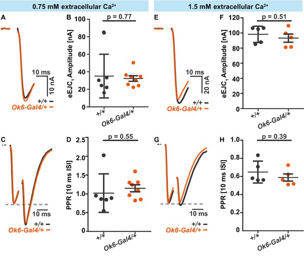
Electrophysiological comparison of synaptic transmission in wildtype (w[1118], +/+) (black) and Ok6-Gal4/+ (orange) flies.
Electrophysiological recordings of muscle 6 NMJs upon a paired-pulse stimulation (10 ms inter-stimulus interval) at 0.75 mM (A-D) and 1.5 mM Ca2+(E-H). (A) Representative example traces for eEJC1 from single cells in +/+ or Ok6-Gal4/+. (B) Quantification of eEJC1 amplitudes in +/+ (n = 6 cells from three animals) and Ok6-Gal4/+ (n = 8 cells from four animals), averages and SDs across cells are indicated. (C) Representative normalized eEJC example traces of paired pulse (10 ms inter-stimulus interval) responses in representative cells of +/+ and Ok6-Gal4/+ animals. (D) Quantification of paired pulse ratios (PPRs) in +/+ (n = 6 cells from three animals) and Ok6-Gal4/+ (n = 8 cells from four animals), averages across cells and SDs are indicated. (E) Representative example traces for eEJC1 from single cells of +/+ or Ok6-Gal4/+ animals. (F) Quantification of eEJC1 amplitudes in +/+ (n = 5 cells from three animals) and Ok6-Gal4/+ (n = 5 cells from three animals), averages and SDs across cells are indicated. (G) Normalized eEJC example traces of paired pulse (10 ms inter-stimulus interval) from single cells in +/+ and Ok6-Gal4/+ animals. (G) Quantification of PPRs in +/+ (n = 5 cells from three animals) and Ok6-Gal4/+ (n = 5 cells from three animals), averages across cells and STDs are indicated. Used genotypes: Ok6-GAL4/+ (Ok6-Gal4/II crossed to w[1118]) and +/+: w[1118]. Materials and methods section ‘Fly husbandry, genotypes and handling’ lists all exact genotypes.
-
Figure 2—figure supplement 3—source data 1
Raw data for experiments displayed in Figure 2—figure supplement 3.
- https://cdn.elifesciences.org/articles/51032/elife-51032-fig2-figsupp3-data1-v2.zip
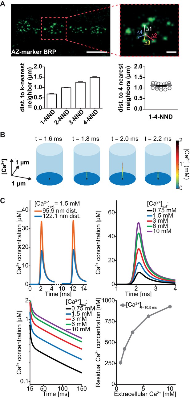
Simulation of AP-induced synaptic Ca2+ profiles.
(A) Estimation of the simulation volume and Ca2+ simulations. The left hand image shows a confocal scan of a 3rd instar larval NMJ stained against the AZ marker Bruchpilot (BRP) (genotype: w[1118]; P{w[+mC]=Mhc-SynapGCaMP6f}3–5 (Bloomington Stock No. 67739). The right hand image shows a higher magnification of the indicated region. To determine the dimensions of the simulation volume, the average distance of each AZ to its closest four neighboring AZs (k-NND = kth nearest neighbor distance) was determined. The average inter-AZ distance to each of the closest four neighboring AZs (1- through 4-NND) is depicted on the left. Average and SEM of inter-AZ distances (1-4-NND) are depicted on the right. White scale bars: Left: 5 µm; right: 1 µm. (B) Example illustration of the Ca2+ simulation. The simulation volume is a cylinder whose base area (radius 624 nm) is the same as a square with side length of the mean 1–4-NND. The local Ca2+ concentration is shown at different time points following an AP-induced Gaussian Ca2+ current (the area/height is a free parameter, see Table 2, the FWHM is 0.36 ms). The simulation started at t=0 ms, Ca2+ influx was initiated at t=0.5 ms and peaked at t=2 ms. The Ca2+ (point) source is located in the AZ center (black dot) and the Ca2+ concentration is determined at 10 nm height from the plasma membrane. (C) Example simulation of the local Ca2+ concentration profile in response to stimulation with a pair of APs (current was initiated at 0.5 and 10.5 ms and peaked at 2 and 12 ms). Simulations were performed using the best fit parameters of the single sensor model described below (see Figure 4, Table 2). Top left: Ca2+ transients in response to the first AP at two distances: 95.9 nm and 122.1 nm (the mean of Rayleigh/integrated Rayleigh). Top right: AP-induced Ca2+ transient at 122.1 nm for all experimental extracellular Ca2+ concentrations. Bottom left: Semi-logarithmic plot of Ca2+ decays toward baseline after the 2nd transient (residual Ca2+) at different extracellular Ca2+ concentrations ([Ca2+]ext). Time constant of decay is τ = 111 ms. Bottom right: Residual Ca2+ levels at 122.1 nm after 10.5 ms of simulation as a function of extracellular Ca2+ concentrations. Data depicted in panel A were collected from 17 different animals. Used genotype: w[1118]; P{w[+mC]=Mhc-SynapGCaMP6f}3–5 (Bloomington Stock No. 67739, panel A). Materials and methods section ‘Fly husbandry, genotypes and handling’ lists all exact genotypes. Values used for graphs can be found in the accompanying source data file (Figure 3—source data 1). GCaMP6m experiment is summarized in Figure 3—figure supplement 1. Ca2+ signals for all optimised models (below) are summarised in Figure 3—figure supplement 2.
-
Figure 3—source data 1
Average cell-wise mean fluorescence values and fit parameters of hill-curve fit on presynaptic GCaMP data, and NND values.
- https://cdn.elifesciences.org/articles/51032/elife-51032-fig3-data1-v2.xlsx
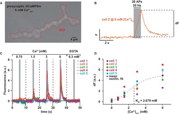
Experiment to determine the dependence of AP-induced Ca2+ influx on the extracellular Ca2+ concentration.
(A) Example frame of maximum fluorescence during recording of presynaptic GCaMP6m at 6 mM extracellular Ca2+. Red dotted line indicates the ROI used for read-out of the fluorescence signal. (B) 10 s fluorescence trace of experiment shown in A. At the 5 s mark, 20 APs are given over 1 s. Subtracting the fluorescence at 4.75 s from the maximum fluorescence gives the value dF plotted in panel D. (C) Baseline-subtracted fluorescence (see Materials and methods for details) traces of 5 different animals over the whole range of extracellular Ca2+ concentrations. 8.3 mM EGTA was added at the end to quench Ca2+ influx. (D) Quantification of dF (see panel B) per cell and Ca2+ concentration. The nonlinear fit with hill coefficient, m, of 2.43 (as previously determined for GCaMP6m Barnett et al., 2017) is indicated as a dashed black line, see Materials and methods for details. Mean is shown as black bars ± SEM. Used genotype: w[1118]; P{y[+t7.7] w[+mC]=20XUAS-IVS-GCaMP6m}attP40 crossed to Ok6-GAL4. Materials and methods section ‘Fly husbandry, genotypes and handling’ lists all exact genotypes. Data summary as well as best fit Hill curve corresponding to the depicted graph can be found in the accompanying source data file (Figure 3—source data 1).
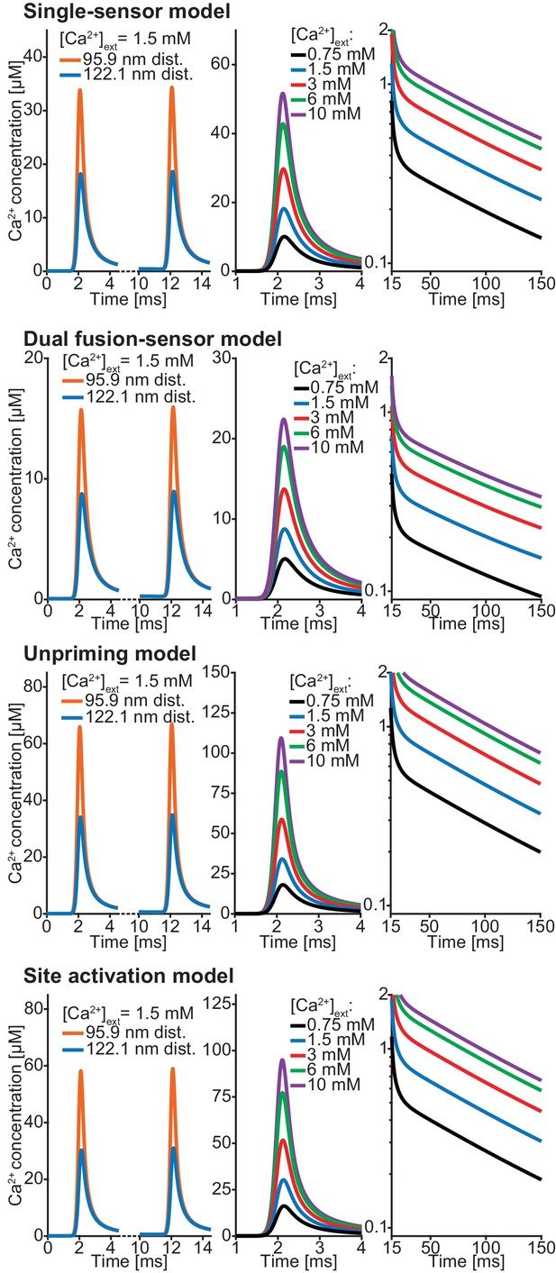
Ca2+ profiles of all models using best fit parameters (reported in Table 1; Table 2).
Left: Both transients at 1.5 mM extracellular Ca2+ concentration at 95.9 nm and 122.1 nm. Middle: For all experimental extracellular Ca2+ concentrations an AP induced Ca2+ transient at a distance of 122.1 nm distance from the Ca2+ source is shown. Right: Semilogarithmic plot of Ca2+ decays at the different extracellular Ca2+ concentration. Time constant of decay is τ = 111 ms in all models. Plots of Ca2+ in the single-sensor model are the same as Figure 3C. Parameters can be found in Tables 1,2.
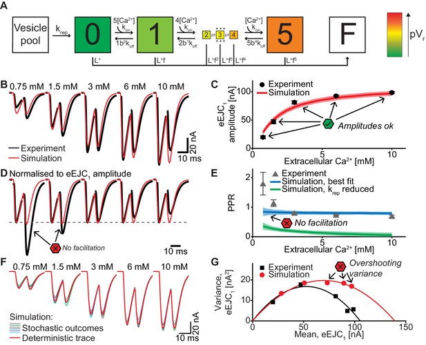
A single-sensor model reproduces the magnitude of transmission to single APs, but cannot account for STF and variances.
(A) Diagram of the single-sensor model. Consecutive binding of up to 5 Ca2+ ions to a vesicular Ca2+ sensor increases the probability of SV fusion (transition to state F) indicated by the color of the state. Primed SVs can be replenished from an infinite Vesicle pool. (B) Experimental eEJC traces averaged over all cells (black) together with average simulated traces (red). (C) eEJC1 amplitudes of experiment (black) and simulation (red). Error bars and colored bands show the standard deviations of data (see text) and simulations, respectively. Simulations reproduce eEJC1 amplitudes well. (D) Average (over all cells), normalized eEJC traces of experiment (black) and simulation (red). Simulations obtained with this model lack facilitation, as indicated by the red symbols. (E) PPR values of experiment (gray) and best fit simulation (blue). Green curve show simulations with replenishment 100x slower than the fitted value illustrating the effect of replenishment on the PPR. Error bars and colored bands show standard deviation. Best fit simulations do not reproduce the facilitation observed in the experiment at low extracellular Ca2+ concentrations. (F) Average simulated traces (red) and examples of different outcomes of the stochastic simulation (colors). (G) Plot of the mean synaptic variance vs. the mean eEJC1 amplitudes, both from the experiment (black) and the simulations (red). The curves show the best fitted parabolas with forced intercept at (0,0) (simulation: Var = −0.0041*<eEJC1>2+0.5669 nA*<eEJC1>, corresponding to nsites = 244 and q = 0.57 nA when assuming a classical binomial model (Clements and Silver, 2000), see Materials and methods). Simulations reveal too much variance in this model. Experimental data (example traces and means) depicted in panels B-E,G are replotted from Figure 2A–D,F. All parameters used for simulation can be found in Tables 1–3. Simulation scripts can be found in Source code 1. Results from simulations (means and SDs) can be found in the accompanying source data file (Figure 4—source data 1). Exploration of the difference between PPR estimations in deterministic and stochastic simulations are illustrated in Figure 4—figure supplement 1.
-
Figure 4—source data 1
Simulation data for graphs in Figure 4C, G, E and Figure 4—figure supplement 1.
- https://cdn.elifesciences.org/articles/51032/elife-51032-fig4-data1-v2.xlsx
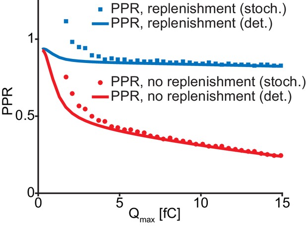
Stochastic and deterministic simulations yield different PPR values.
PPR values from stochastic (bullets) and deterministic (curves) simulations of the single-sensor model (Figure 4) at varying amounts of Ca2+ influx. Simulations are performed with (blue) and without (red) replenishment. Decreasing Ca2+ influx increases the PPR values due to less SV depletion. Stochastic simulations generally yield higher PPR estimations than the deterministic simulations. The effect is most significant at the lower Ca2+ influx. Parameters used for simulation can be found in Tables 1–3. Simulation scripts can be found in Source code 1. Results from simulations (means) can be found in the accompanying source data file (Figure 4—source data 1).
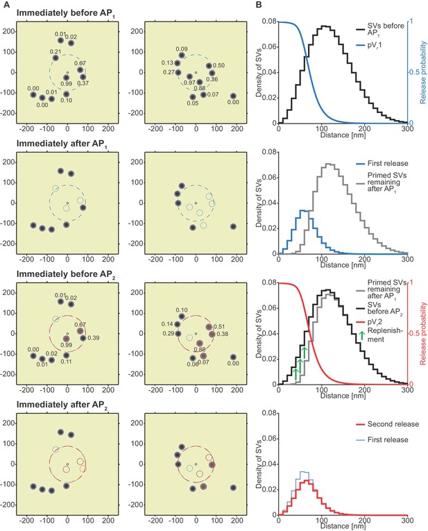
Analysis of the spatial dependence of SV fusion in the single-sensor model reveals a near-identical use of release sites during the two APs, thereby favoring STD.
(A) Two examples of docked SVs stochastically placed according to the distribution described in Figure 1D and their behavior in the PPR simulation at 0.75 mM extracellular Ca2+. For clarity, 10 SVs are shown per AZ (the actual number is likely lower) and only a central part of the AZ is shown. Top row: Prior to AP1 SVs are primed (dark gray circles) and pVr1 is indicated as numbers. The larger dashed, blue circle in the AZ center indicates pVr1 = 0.25. Second row: After AP1 some of the SVs have fused (dashed blue circles). Third row: Right before AP2 some of the SVs that had fused in response to AP1 have been replenished (orange shading), and pVr2 is indicated as a number. The larger dashed, red circle indicates pVr2 = 0.25. Bottom row: After AP2 the second release has taken place. Small dashed circles indicate release from AP1 and AP2 (blue and red, respectively). The small increase in pVr caused by Ca2+ accumulation cannot produce facilitation because of depletion of SVs. (B) The average simulation at the same time points as in (A). Histograms represent primed SVs (black and gray) as well as first and second release (blue and red) illustrating how release from AP1 and AP2 draw on the same subpopulation of SVs. The blue and red curves indicate the vesicular release probability as a function of distance during AP1 (blue) and AP2 (red). The green arrows show the repopulation of previously used sites via replenishment. AP2 draws on the same portion of the SV distribution as AP1 causing depression despite the fast replenishment mechanism. Parameters used for simulations can be found in Tables 1–3.
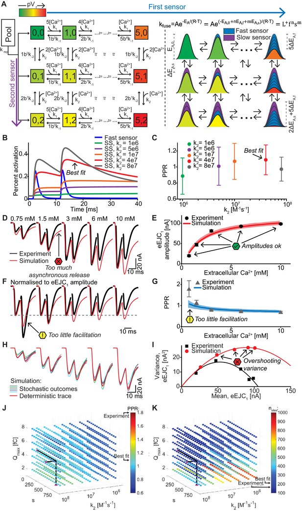
A dual fusion-sensor model of Ca2+ sensors cooperating for SV fusion improves STP behavior, but suffers from too little STF, asynchronous release and too much variance.
(A) Diagram of the dual fusion-sensor model (left). A second Ca2+ sensor for fusion with slower kinetics can increase pVr (indicated by color of each Ca2+ binding state). The second fusion sensor is assumed to act on the energy barrier in a similar way as the first sensor (right). The top right equation shows the relation between the fusion constant, kfuse, and energy barrier modulation with n and m being the number of Ca2+ bound to the first and second Ca2+ sensor, respectively. Ca2+ binding to the second sensor is described by similar equations as for the first sensor, but with different rate constants and impact on the energy barrier. (B) Simulation of Ca2+ binding to the fast (blue) and slow (other colors) Ca2+ sensor in simulations at 0.75 mM extracellular Ca2+ with different k2 values but with constant affinity (i.e. fixed ratio of k-2/k2). The binding is normalized to the maximal number of bound Ca2+ to each sensor (5 and 2, respectively). For illustration purposes in this graph the fusion rate was set to 0 (because otherwise the fast sensor (blue line) would be consumed by SV fusion). k2 = 4e7 M-1s-1 (red trace) illustrates the situation for the optimal performance of the model (approximately best fit value). (C) PPR values in stochastic simulations with the same parameter choices as in (B) but allowing fusion. (D) Experimental eEJC traces (black) together with average simulated traces (red). Simulations show too much asynchronous release compared to experiments. (E) eEJC1 amplitudes of experiment (black) and simulation (red). Error bars and colored bands show standard deviations of data and simulations, respectively. Simulations reproduce eEJC1 amplitudes well. (F) Average, normalized eEJC traces of experiment (black) and simulation (red). Simulations show too little facilitation compared to experiment. (G) PPR values of experiment (gray) and simulation (blue). Error bars and colored bands show standard deviation. Simulations show too little facilitation compared to experiment. (H) Average simulated traces (red) and examples of different outcomes of the stochastic simulation (colors). (I) Plot of the mean synaptic variance vs. the mean eEJC1 values, both from the experiment (black) and the simulations (red). Curves are the best fitted parabolas with forced intercept at (0,0) (simulation: Var = −0.0034*<eEJC1>2+0.5992 nA*<eEJC1>, corresponding to nsites = 294 and q = 0.60 nA when assuming a classical binomial model (Clements and Silver, 2000), see Materials and methods). Simulations lead to too much variance at the highest Ca2+ concentrations. (J) Parameter exploration of the second sensor varying the parameters Qmax, k2, and s. Each ball represents a choice of parameters and the color indicates the average PPR value in stochastic simulations with 0.75 mM extracellular Ca2+. None of the PPR values match the experiment (indicated by the black arrow). Black lines show the best fit parameters. (K) Same parameter choices as in (I). The colors indicate the number of RRP SVs in order to fit the eEJC1 amplitudes at the five different experimental Ca2+ concentrations. Black lines show the best fit parameters, and arrows show the experimental and best fit simulation values. Note that the best fit predicted more release sites than fluctuation analysis revealed in the experiment. Experimental data (example traces and means) depicted in panels D-G,I are replotted from Figure 2A–D,F. Parameters used for simulations can be found in Tables 1–3. Simulation scripts can be found in Source code 1. Results from simulations (means and SDs) can be found in the accompanying source data file (Figure 6—source data 1). Simulations of the dual fusion-sensor model with cooperativity 5 are summarized in Figure 6—figure supplement 1.
-
Figure 6—source data 1
Simulation data for graphs in Figure 6B, E, G, I and Figure 6—figure supplement 1B, D, E.
- https://cdn.elifesciences.org/articles/51032/elife-51032-fig6-data1-v2.xlsx
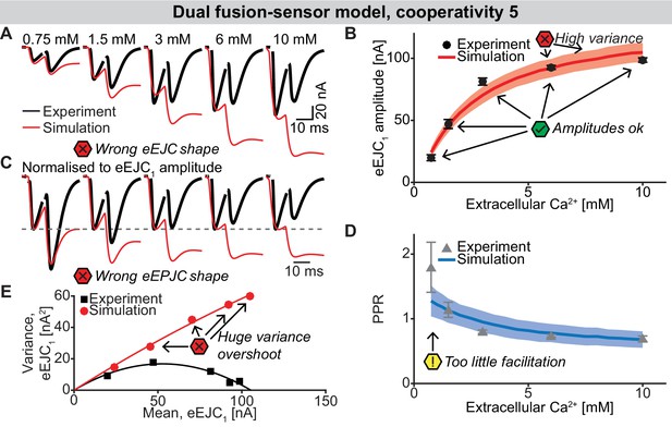
The dual fusion-sensor sensor model with cooperativity 5 (allowing the binding of 5 Ca2+ to the second fusion sensor).
(A) Average, experimental eEJC1 traces (black) together with average simulated traces (red). The higher cooperativity increases the PPR compared to cooperativity 2 (Figure 6), but introduces massive asynchronous release resulting in distorted eEJC shapes. (B) eEJC1 amplitudes of experiment (black) and simulation (red). Error bars and colored bands show standard deviation. Like with the three models described in the main text, simulations of this model reproduces eEJC1 amplitudes well, but the variance at the higher extracellular Ca2+ concentrations is too large. (C) Average, normalized eEJC traces of experiment (black) and simulation (red). Like in (A) the wrong shape of the eEJC is evident. (D) PPR values of experiment (gray) and simulation (blue). Error bars and colored bands show standard deviation. Despite the increase in PPR compared to the dual fusion-sensor model with cooperativity 2, the PPR is still too low. (E) Plot of the mean synaptic variance vs. the mean eEJC1 values, both from the experiment (black) and the simulation (red). The curves show the best fitted parabolas with forced intercept at (0,0) (simulation: Var = −0.00089*< eEJC1>2+0.6728 nA*< eEJC1>, corresponding to nsites = 1124 and q = 0.67 nA when assuming a classical binomial model (Clements and Silver, 2000), see Materials and methods). This model leads to an even larger overshoot of the variance than the dual fusion-sensor model with cooperativity 2 (Figure 6). Experimental data (example traces and means) depicted in panels A-E are replotted from Figure 2A–D,F. Parameter values used for simulations can be found in Tables 1–3. Simulation scripts can be found in Source code 1. Results from simulations (means and SDs) can be found in the accompanying source data file (Figure 6—source data 1).
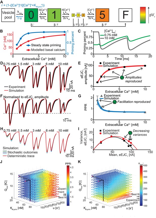
An unpriming model with Ca2+ dependent regulation of the RRP accounts for experimentally observed Ca2+ dependent eEJCs, STP and variances.
(A) Diagram of the unpriming model. The rate of unpriming decreases with the Ca2+ concentration. All other reactions are identical to the single-sensor model (Figure 4A). (B) Assumed basal Ca2+ concentration at different extracellular Ca2+ concentrations (red curve) together with the steady-state amount of priming (blue). Increasing basal Ca2+ concentration increases priming. (C) The average fraction of occupied release sites as a function of time in simulations with 0.75 mM (green) and 10 mM (gray) extracellular Ca2+ concentration. Release reduced the number of primed SVs. At 0.75 mM Ca2+, the Ca2+-dependent reduction of unpriming leads to ‘overfilling’ of the RRP between AP1 and AP2, thereby inducing facilitation. (D) Average experimental eEJC traces (black) together with average simulated traces (red). (E) eEJC1 amplitudes of experiment (black) and simulation (red). Error bars and colored bands show standard deviation. (F) Average, normalized eEJC traces of experiment (black) and simulation (red). (G) PPR values of experiment (gray) and simulation (blue). Error bars and colored bands show standard deviation. Simulations reproduce the experimentally observed facilitation. (H) Average simulated traces (red) and examples of different outcomes of the stochastic simulation (colors). (I) Plot of the mean synaptic variance vs. the mean eEJC1 values, both from the experiment (black) and the simulations (red). The curves show the best fitted parabolas with forced intercept at (0,0) (simulation: Var = −0.0053*<eEJC1>2+0.6090 nA*<eEJC1>, corresponding to nsites = 189 and q = 0.61 nA when assuming a classical binomial model (Clements and Silver, 2000), see Materials and methods). (J) Similar to Figure 6J. Parameter exploration of the unpriming model varying Qmax, kM,prim, and u (unpriming rate constant). Each ball represents a choice of parameters and the color indicates the PPR value. Black lines show the best fit parameters, and arrows show the experimental and best fit simulation values. (K) Same parameter choices as in (J). The colors indicate the optimal maximal number of SVs (i.e. number of release sites, nsites) in order to fit the eEJC1 amplitude at the five different Ca2+ concentrations. A large span of PPR values (shown in (J)) can be fitted with a reasonable number of release sites (shown in (K)). Experimental data (example traces and means) depicted in panels D-G,I are replotted from Figure 2A–D,F. Parameters used for simulation can be found in Tables 1–3. Simulation scripts can be found in Source code 1. Results from simulations (means and SDs) can be found in the accompanying source data file (Figure 7—source data 1). Simulations of the unpriming model with cooperativity two are summarized in Figure 7—figure supplement 1. The site activation model (described later) is introduced and results are summarized in Figure 7—figure supplement 3. Simulations of the unpriming model with various inter-stimulus intervals are summarized in Figure 7—figure supplement 2.
-
Figure 7—source data 1
Simulation data for graphs in Figure 7E, G, I; Figure 7—figure supplement 1B, D, E; Figure 7—figure supplement 2D, F, H and Figure 7—figure supplement 3.
- https://cdn.elifesciences.org/articles/51032/elife-51032-fig7-data1-v2.xlsx
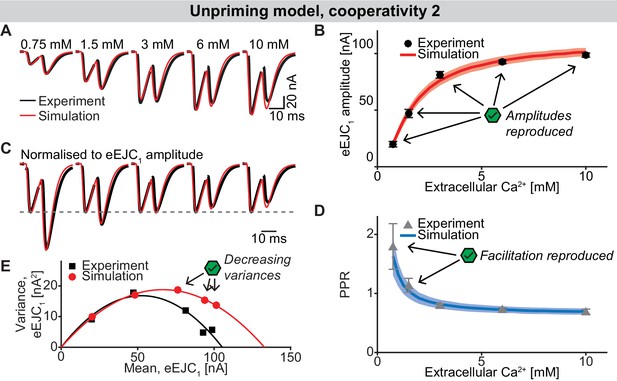
The unpriming model with cooperativity 2.
(A) Average, experimental eEJC traces (black) together with average simulated traces (red). (B) eEJC1 amplitudes of experiment (black) and simulation (red). Error bars and colored bands show standard deviation. Like with the three models described in the main text, simulations of this model reproduce eEJC1 amplitudes well. (C) Average, normalized eEJC traces of experiment (black) and simulation (red). (D) PPR values of experiment (gray) and simulation (blue). Error bars and colored bands show standard deviation. Like the unpriming model with cooperativity 5 (Figure 7), this model reproduces the short-term facilitation observed in experiments. (E) Plot of the mean synaptic variance vs. the mean eEJC1 values, both from the experiment (black) and the simulation (red). The curves show the best fitted parabolas with forced intercept at (0,0)) (simulation: Var = −0.0042*< eEJC1>2+0.5648 nA*< eEJC1>, corresponding to nsites = 238 and q = 0.56 nA when assuming a classical binomial model (Clements and Silver, 2000), see Materials and methods). Like the unpriming model with cooperativity 5, variances decrease with increasing extracellular Ca2+ concentration, although the variances are slightly higher. Experimental data (example traces and means) depicted in panels A-E are replotted from Figure 2A–D,F. Parameter values used for simulations can be found in Tables 1–3. Simulation scripts can be found in Source code 1. Results from simulations (means and SDs) can be found in the accompanying source data file (Figure 7—source data 1).
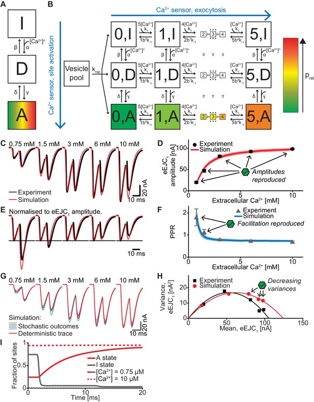
A model with Ca2+-dependent release site activation accounts for experimentally observed eEJCs, STP and variances.
(A) Diagram of the site activation mechanism. Three states are introduced: [I], inactive, [D], delay, and [A], activated. SV fusion is only allowed from sites in state [A]. The rate from [I] to [D] is increased by Ca2+, whereas the rate from [D] to [A] is slower and independent of Ca2+, thereby introducing a delay. All (in)activation reactions are assumed to be reversible. (B) Full site activation model. The Ca2+ (un)binding of the SVs follow the same equations as in the single-sensor model and occurs independently of the site (in)activation. Replenishment is allowed into empty release sites regardless of activation status. (C) Average, experimental eEJC traces (black) together with average simulated traces (red). (D) eEJC1 amplitudes of experiment (black) and simulation (red). Error bars and colored bands show standard deviation. Like with the three models described in the main text, simulations reproduce eEJC1 amplitudes well. (E) Average, normalized eEJC traces of experiment (black) and simulation (red). (F) PPR values of experiment (gray) and simulation (blue). Error bars and colored bands show standard deviation. Like the unpriming model, simulations reproduce the experimentally observed facilitation. (G) Average simulated traces (red) and examples of different outcomes of the stochastic simulation (colors). (H) Plot of the mean synaptic variance vs. the mean eEJC1 values, both from the experiment (black) and the simulation (red). The curves show the best fitted parabolas with forced intercept at (0,0) (simulation: Var = −0.0043*< eEJC1>2+0.5398 nA*< eEJC1>, corresponding to nsites = 233 and q = 0.54 nA when assuming a classical binomial model (Clements and Silver, 2000), see Materials and methods). Like in experiments, simulations lead to decreasing variance at the highest Ca2+ concentrations. (I) The number of sites in state [I] and [A] (gray and red resp.) in simulations with extracellular Ca2+ concentrations of 0.75 mM and 10 mM (solid and dashed resp.). The varying basal Ca2+ concentration yield different initial amounts of site activation. The activation of sites mainly occurs between APs because of the delay state. Experimental data (example traces and means) depicted in panels C-F,H are replotted from Figure 2A–D, F. Parameter values used for simulations can be found in Tables 1–3. Simulation scripts can be found in Source code 1. Results from simulations (means and SDs) can be found in the accompanying source data file (Figure 7—source data 1).
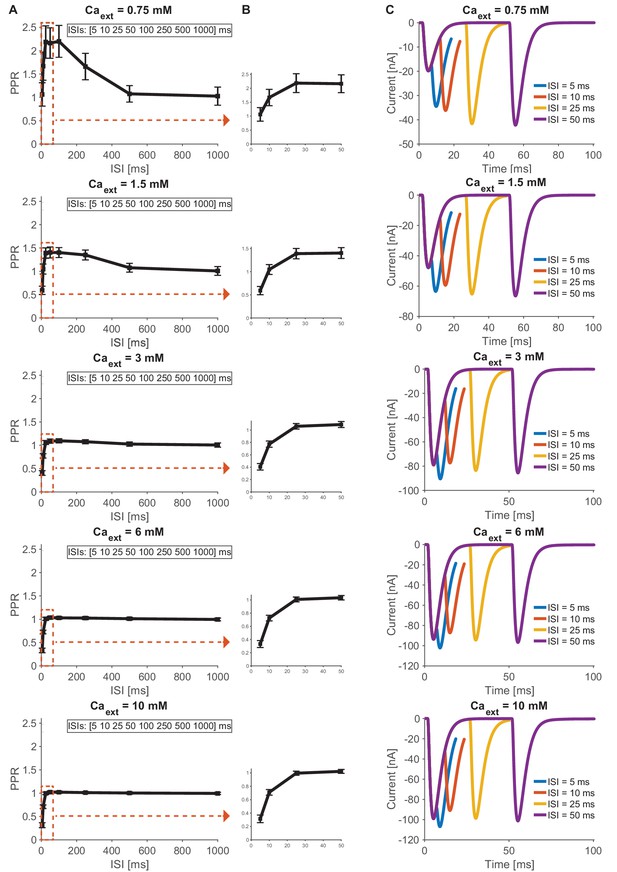
Simulation based time course predictions of paired-pulse STF recovery for different interstimulus intervals across different Ca2+ concentrations (0.75–10 mM).
(A) Estimated PPRs for 0.75, 1.5, 3, 6 and 10 mM extracellular Ca2+ (from top to bottom) as a function of interstimulus interval (5, 10, 25, 50, 100, 250, 500 and 1000 ms). STF can be detected at low (0.75 mM) and physiological (1.5 mM) Ca2+ concentrations and decays after approximately 100 ms, no STF can be detected at high (3–10 mM) Ca2+ concentrations (starting with PPR values below 0.5 at 5 ms and increasing to PPR values around one for intervals above 25 ms). Regions of interest indicated by dashed red square are shown as a close-up in next panel. (B) Estimated paired-pulse ratio values (PPR) for Ca2+ concentrations (0.75–10 mM) 0.75, 1.5, 3, 6 and 10 mM extracellular Ca2+ (from top to bottom) as a function of their interstimulus interval (5, 10, 25, 50 ms). (C) Examples of average traces from paired-pulse simulations at different (0.75–10 mM) extracellular Ca2+ (from top to bottom) for 5 ms (blue), 10 ms (red), 25 ms (yellow) and 50 ms (purple) interstimulus intervals. Results from simulations (means and SDs) can be found in the accompanying source data file (Figure 7—source data 1).
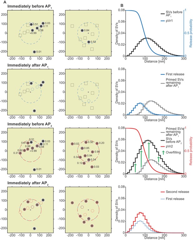
The unpriming model counteracts short-term depression by increasing the number of responsive SVs between stimuli and predicts a more efficient use of SVs throughout the synapse.
(A) Two examples of docked SVs stochastically placed according to the distribution described in Figure 1D and their behavior in the PPR simulation at 0.75 mM extracellular Ca2+ concentration. For clarity, 10 SVs are shown per AZ and only a central part of the AZ is shown. Top row: Prior to AP1, only some release sites contain a primed SV (dark gray circles) and pVr1 is indicated as a number. Initially empty release sites are indicated by dashed black squares. The larger dashed, blue circle in the AZ center indicates pVr1 = 0.25. Second row: After AP1 some of the SVs have fused (dashed blue circles). Third row: Right before AP2 the initially empty sites as well as the sites with SV fusion in response to AP1 have been (re)populated (orange shading). pVr2 is indicated as a number. The larger dashed, red circle indicates pVr2 = 0.25. Bottom row: After AP2 the second release has taken place. Small, dashed circles indicate release from AP1 and AP2 (blue and red resp.). (B) The average simulation at the same time points as in (A). Histograms represent primed SVs (black and gray) as well as first and second release (blue and red) illustrating how release from AP1 and AP2 draw on a larger part of the SV distribution (compare to Figure 5) and how the increase in RRP size can induce facilitation. The blue and red curves indicate the vesicular release probability as a function of distance during AP1 (blue) and AP2 (red). Parameters used for simulations can be found in Tables 1–3.
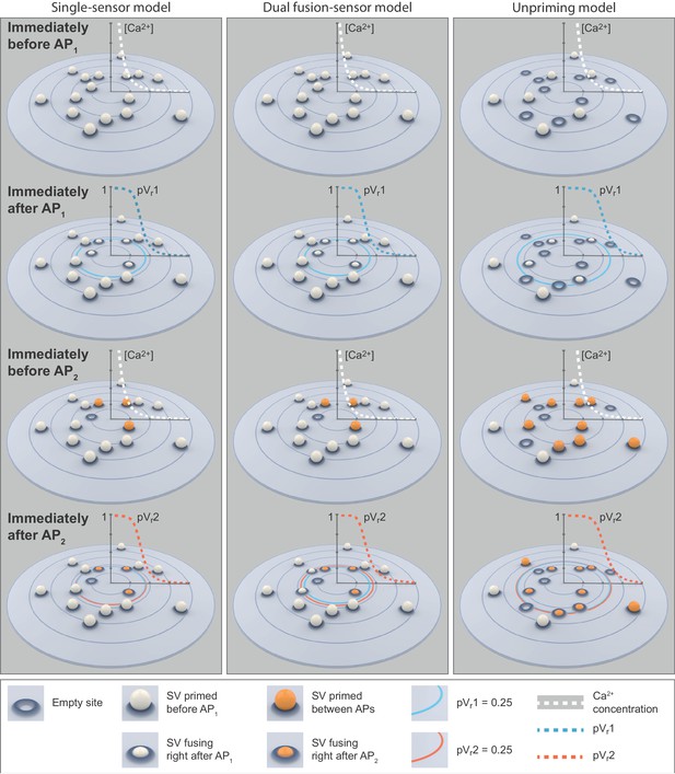
Cartoon illustrations of the single-sensor, the dual fusion-sensor, and the unpriming models during a paired-pulse simulation at 0.75 mM extracellular Ca2+.
Top row: SVs primed (white ball) prior to AP1. In the single- and dual fusion-sensor models all release sites are occupied. In the unpriming model priming is in an equilibrium with unpriming and some release sites are empty. The dashed white graphs show the peak Ca2+ concentration (simulation of optimal fits for each model) during the first transient as a function of distance to the Ca2+ source. Second row: Some of the SVs fuse in response to AP1. The dashed blue graphs show the pVr1 as a function of distance. The large blue circles indicate pVr1 = 0.25. In the unpriming model the larger Ca2+ influx (according to the optimal fit) increases the area from which SVs fuse. Third row: Right before AP2 some of the empty release sites have been repopulated or newly filled by priming (orange balls). The shift in the (un)priming equilibrium in the unpriming model makes the increase in the number of primed SVs substantially larger than in the other models. The dashed white graphs show the peak Ca2+ concentration during the second transient as a function of distance to the Ca2+ source. Bottom row: SV fusion in response to AP2. The large dashed red graphs show pVr2 as a function of distance to the Ca2+ source. The blue and red circles indicate pVr1 and pVr2 of 0.25. In the dual fusion-sensor model, the second sensor increases pVr between stimuli, but the effect is small, even in the best fit of the model. These cartoons illustrate the mechanisms underlying our fitting results of the different models: The dual fusion-sensor model shows a small increase in second release compared to the single-sensor model, but only the unpriming model reproduces the experimentally observed facilitation. Parameters used for simulations can be found in Tables 1–3.
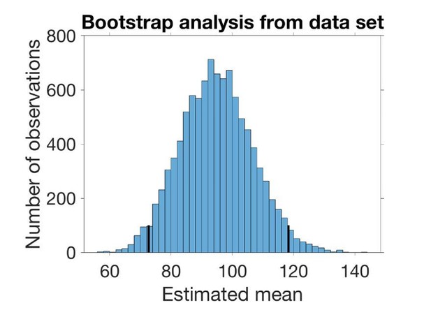
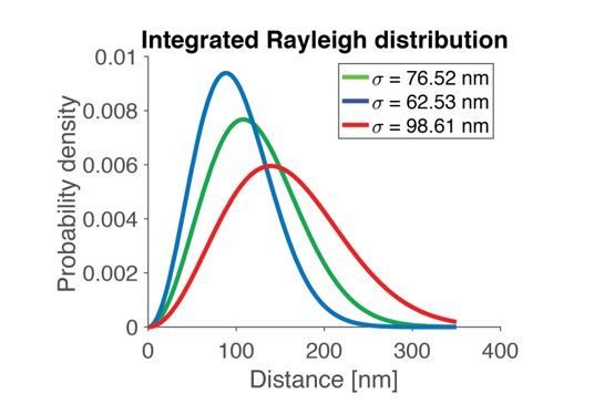
The histogram in Author response image 2 shows the sampled mean with 95 % confidence interval marked.
Tables
Parameters of Ca2+ and buffer dynamics.
| Simulation volume | ||
|---|---|---|
| r | Radius of cylindric simulation volume | 623.99 nm |
| h | Height of cylindric simulation volume | 1 µm |
| ngrid | Spatial grid points in CalC simulation | 71 × 101 (radius x height) |
| Ca2+ | ||
| Qmax | Scaling of the total amount of Ca2+ charge influx | Fitted (all models), see Table 2 |
| DCa | Diffusion coefficient of Ca2+ (Allbritton et al., 1992) | 0.223 µm2/ms |
| [Ca]bgr | Background Ca2+ | |
| KM,current | Set to the same value as KM,fluo determined in GCaMP6 experiments | 2.679 mM |
| Ca2+ uptake | Volume-distributed uptake (Helmchen et al., 1997) | 0.4 ms−1 |
| Buffer Bm (‘fixed’ buffer) | ||
| DBm | Diffusion coefficient | 0.001 µm2/ms |
| KD,Bm | Equilibrium dissociation constant (Xu et al., 1997) | 100 µM |
| K+,Bm | Ca2+ binding rate (Xu et al., 1997) | 0.1 (µM⋅ms)−1 |
| K-,Bm | Ca2+ unbinding rate: KD,Bm⋅K+,Bm | 1 ms−1 |
| Total Bm | Total concentration (bound+unbound) (Xu et al., 1997) | 4000 µM |
| Buffer ATP | ||
| DATP | Diffusion coefficient (Chen et al., 2015) | 0.22 µm2/ms |
| KD,ATP | Equilibrium dissociation constant (Chen et al., 2015) | 200 µM |
| K+,ATP | Ca2+ binding rate (Chen et al., 2015) | 0.5 (µM⋅ms)−1 |
| K-,ATP | Ca2+ unbinding rate: KD,ATP⋅K+,ATP | 100 ms−1 |
| Total ATP | Total concentration (bound+unbound) (Chen et al., 2015) | 650 µM |
| Resting Ca2+ | ||
| KM,current | Michaelis Menten-constant of resting Ca2+ (same as KM,current of Ca2+ influx) | 2.679 mM |
| [Ca2+]max | Asymptotic max value of resting Ca2+ | 190 nM |
Best fit parameters of all models.
| Models presented in main figures | |||
|---|---|---|---|
| Single-sensor model (Figure 4) | Dual fusion-sensor model, cooperativity 2 (Figure 6) | Unpriming model, cooperativity 5 (Figure 7) | |
| Qmax | 8.42 fC | 4.51 fC | 13.77 fC |
| krep | 165.53 s−1 | 159.30 s−1 | 134.85 s−1 |
| nsites | 216 | 211 | 180 |
| k2 | 4.10e7 M−1s−1 | ||
| s | 510.26 | ||
| u | 236.82 s−1 | ||
| kM,prim | 55.21 nM−1 | ||
| Cost value (see Materials and methods) | 9.689 | 4.129 | 0.340 |
| Models presented in figure supplements | |||
| Dual fusion-sensor model, cooperativity 5 (Figure 6—figure supplement 1) | Unpriming model, cooperativity 2 (Figure 7—figure supplement 1) | Site activation model (Figure 7—figure supplement 3) | |
| Qmax | 8.10 fC | 13.49 fC | 12.59 fC |
| krep | 492.56 s−1 | 106.59 s−1 | 141.20 s−1 |
| nsites | 112 | 203 | 189 |
| k2 | 5.41e6 M−1s−1 | ||
| s | 261.07 | ||
| u | 5207.70 s−1 | ||
| kM,prim | 7.61 nM−1 | ||
| β | 0.09 s−1 | ||
| γ | 194.77 s−1 | ||
| δ | 10.70 s−1 | ||
| Cost value (see Materials and methods) | 2.941 | 0.642 | 1.57 |
Parameters of exocytosis simulation.
| Parameter | Explanation and reference | Value |
|---|---|---|
| Common parameters | ||
| nsites | Number of release sites (=maximal number of SVs) | Fitted (all models), see Table 2 |
| L+ | Basal fusion rate constant (Kochubey and Schneggenburger, 2011) | 3.5⋅10−4 s−1 |
| q | Amplitude of the mEJC. Estimated from variance-mean of data (see Figure 2F) | 0.6 nA |
| Fast sensor (all models) | ||
| nmax | Cooperativity, fast sensor (Lou et al., 2005; Schneggenburger and Neher, 2000; Wölfel et al., 2007) | 5 |
| k1 | Ca2+ binding rate, first sensor (Wölfel et al., 2007) | 1.4⋅108 M−1s−1 |
| k-1 | Ca2+ unbinding rate, first sensor (Wölfel et al., 2007) | 4000 s−1 |
| bf | Cooperativity factor, first sensor (Lou et al., 2005; Wölfel et al., 2007) | 0.5 |
| kf | Fusion rate constant of R(5,0) (fast sensor fully activated). (Lou et al., 2005; Schneggenburger and Neher, 2000; Wölfel et al., 2007) | 6000 s−1 |
| f | 27.978 | |
| Replenishment (all models) | ||
| krep | Replenishment rate constant | Fitted (all models), see Table 2 |
| Slow sensor (dual fusion-sensor model) | ||
| mmax | Cooperativity, second fusion sensor | 2 (5 in figure supplement) |
| KD | Dissociation constant, second fusion sensor (Brandt et al., 2012) | 1.5 µM |
| k2 | Ca2+ binding rate, second fusion sensor | Fitted (dual fusion-sensor model), see Table 2 |
| k-2 | Ca2+ unbinding rate, second fusion sensor | kD⋅k2 |
| bs | Cooperativity factor, second fusion sensor (=bf) | 0.5 |
| s | Second fusion sensor analogue of f: factor on the fusion rate | Fitted (dual fusion-sensor model), see Table 2 |
| Unpriming (unpriming model) | ||
| n | Cooperativity (exponent in unpriming rate equation) | 5 (2 in figure supplement) |
| u | Rate constant of unpriming | Fitted (unpriming model), see Table 2 |
| KM,prim | Michaelis-Menten constant in expression of r | Fitted (unpriming model), see Table 2 |
| Site activation (site activation model) | ||
| n | Cooperativity (exponent on [Ca2+] | 5 |
| α | Rate constant [I] to [D] | 1e6 s-1 |
| β | Rate constant [D] to [I] | Fitted (site activation model), see Table 2 |
| γ | Rate constant [D] to [A] | Fitted (site activation model), see Table 2 |
| δ | Rate constant [A] to [D] | Fitted (site activation model), see Table 2 |
| Reagent type (species) or resource | Designation | Source or reference | Identifiers | Additional information |
|---|---|---|---|---|
| Strain (Drosophila melanogaster) | w[1118] | BloomingtonDrosophilaStock Center | ||
| Genetic reagent (D. melanogaster) | Ok6-GAL4/II | (Aberle et al., 2002) | PMID:11856529 | Ok6-Gal4/II crossed to w[1118] |
| Genetic reagent (D. melanogaster) | elav-Gal4/I | (Lin and Goodman, 1994) | PMID:7917288 | Used for elav-GAL4/+;;UAS-Unc13A-GFP/+;P84200/P84200 |
| Genetic reagent (D. melanogaster) | UAS-Unc13A-GFP/III | (Böhme et al., 2016) | PMID:27526206 | Used for elav-GAL4/+;;UAS-Unc13A-GFP/+;P84200/P84200 |
| Genetic reagent (D. melanogaster) | ry506; P{ry11}unc-13P84200 / ciD | Kyoto Stock Center | FlyBase: FBst0300878 | Used for elav-GAL4/+;;UAS-Unc13A-GFP/+;P84200/P84200 |
| Genetic reagent (D. melanogaster) | w[1118]; P{w[+mC]=Mhc-SynapGCaMP6f}3–5 | (Newman et al., 2017) BloomingtonDrosophilaStock Center | PMID:28285823 Bloomington Stock # 67739 | |
| Genetic reagent (D. melanogaster) | w[1118]; P{y[+t7.7] w[+mC]=20XUAS-IVS-665GCaMP6m}attP40/Ok6-GAL4 | BloomingtonDrosophilaStock Center | Bloomington Stock # 42748 | |
| Antibody | Anti-Unc13A (guinea pig polyclonal) | (Böhme et al., 2016) | PMID:27526206 | Dilution: 1:500 |
| Antibody | Anti guinea pig STAR635 (goat polyclonal) | (Böhme et al., 2016) | PMID:27526206 | Dilution: 1:100 |
| Antibody | Anti Nc82 (mouse monoclonal) | Developmental Studies Hybridoma Bank | Antibody Registry ID: AB_2314866 | Dilution: 1:1000 |
| Antibody | Anti-mouse Cy5 (goat polyclonal) | Jackson ImmunoResearch | SKU: 115-175-072 | Dilution: 1:500 |
| Software, algorithm | LAS X software | Leica Microsystems | https://www.leica-microsystems.com | |
| Software, algorithm | LCS AF | Leica Microsystems | Leica Microsystems | |
| Software, algorithm | Image J | NIH | Version 1.48q/1.50 g; https://imagej.nih.gov/ij/ | |
| Software, algorithm | Imspector Software | Max Planck Innovation | Version 0.10 | |
| Software, algorithm | MATLAB | MathWorks | R2010b/R2016b | |
| Software, algorithm | Clampfit | Molecular Devices | Version 10.3 | |
| Software, algorithm | GraphPad Prism | GraphPad Software | Version 5.01/6.01 | |
| Software, algorithm | pClamp 10 | Molecular Devices | ||
| Software, algorithm | CalC | (Matveev et al., 2002) | PMID:12202362 Version 6.8.6 | |
| Other | Computer grid | Bioinformatics Center, University of Copenhagen | https://www1.bio.ku.dk/scarb/bioinformatics-centre/ | Used for simulations |
| Other | custom-built STED-microscope | (Göttfert et al., 2017) | PMID:23823248 | |
| Other | HPF machine (HPM100) | Leica Microsystems | https://www.leica-microsystems.com | |
| Other | AFS | Leica Microsystems | https://www.leica-microsystems.com | |
| Other | Ultramicrotome (RMC PowerTome XL; Reichert Ultracut S) | Leica Microsystems | https://www.leica-microsystems.com | |
| Other | Electrone microscope (TecnaiSpirit; FEI or Zeiss 900) | FEI; Zeiss | https://www.fei.com,https://www.zeiss.com |
| 95% CI, lower bound | Best fit | 95% CI, higher bound | |
| Parameter value (σ) | 62.53 nm | 76.52 nm | 98.61 nm |
| Mean of Rayleigh | 78.37 nm | 95.90 nm | 123.59 nm |
| SD of Rayleigh | 40.97 nm | 50.13 nm | 64.60 nm |
| Mean of integrated Rayl | 99.76 nm | 122.08 nm | 157.36 nm |
| SD of integrated Rayl | 42.12 nm | 51.52 nm | 66.40 nm |
| 95% CI, lower bound | Estimated mean/SD of distribution | 95% CI, higher bound | |
| Mean of Rayleigh | 78.37 nm (CI from likelihood) | 95.90 nm | 123.59 nm (CI from likelihood) |
| SD of Rayleigh | 40.97 nm (CI from likelihood) | 50.13 nm | 64.60 nm (CI from likelihood) |
| Mean from bootstrap | 72.74 nm (CI from quantiles) | 94.85 nm | 118.32 nm (CI from quantiles) |
| SD from bootstrap | 37.37 nm (CI from quantiles) | 51.52 nm | 65.21 nm (CI from quantiles) |
Additional files
-
Source code 1
MATLAB scripts used for simulations.
- https://cdn.elifesciences.org/articles/51032/elife-51032-code1-v2.zip
-
Transparent reporting form
- https://cdn.elifesciences.org/articles/51032/elife-51032-transrepform-v2.docx


