A single-cell transcriptomic atlas of the adult Drosophila ventral nerve cord
- Centre for Neural Circuits and Behaviour, University of Oxford, United Kingdom
Figures
Figure 1 with 7 supplements
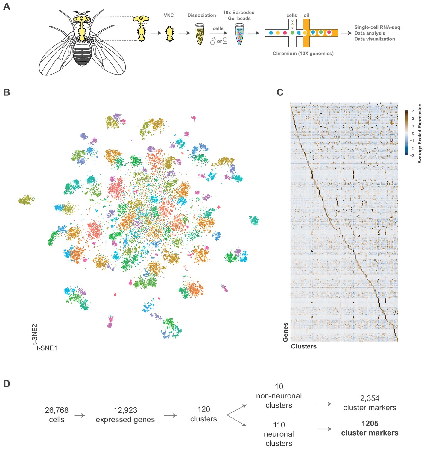
Single cell sequencing of 5 day old adult Drosophila VNC.
(A) Schematic workflow showing single cell sequencing data generation. Male and female Drosophila VNCs were dissected and dissociated prior to droplet encapsulation of individual cells with barcoded beads, forming gel beads in emulsion (GEMs). Following barcode incorporation, molecular amplification and sequencing the transcriptional profiles of individual cells were determined. (B) Two-dimensional representation (t-SNE) of 26,768 Drosophila VNC cells grouped into 120 clusters. Clusters were assigned using the Louvain algorithm, using 45 CCA dimensions with a cluster resolution of 12. Each dot is a cell colored by cluster identity. (C) Heatmap showing scaled, log-normalized expression of top 5 cluster discriminative genes per cluster. (D) Flow diagram representing neuronal and non-neuronal cluster identification, including total number of genes identified as cluster markers.
-
Figure 1—source data 1
List of marker genes for the 120 clusters shown in Figure 1B and Figure 1—figure supplement 4.
Table showing the average log-fold change (>0.5) values of cluster-discriminative marker genes, including adjusted p-values (<0.05). pct.1 is the proportion of cells that express the gene in the cluster, pct.2 is the proportion of cells that express the gene in all other clusters. Cell types represented in each cluster are specified where appropriate. To better visualize the data, the intensity of blue in column C reflects average log-fold change values, while the intensity of red in columns D and E reflect the percent cells expressing a given gene inside (pct.1) and outside (pct.2) each cluster.
- https://cdn.elifesciences.org/articles/54074/elife-54074-fig1-data1-v1.xlsx
-
Figure 1—source data 2
Cluster summary table.
Neuronal cluster summary includes number of cells, number of significantly enriched cluster markers (average log-fold change >0.5, adjusted p-value<0.05), number of unique cluster markers, neurotransmitter identity, predicated hemilineage designation, enriched peptide encoding genes, and enriched Hox gene expression. Non-neuronal cluster summary includes number of cells, number of significantly enriched cluster markers, number of unique cluster markers and predicated cell type.
- https://cdn.elifesciences.org/articles/54074/elife-54074-fig1-data2-v1.xlsx
Figure 1—figure supplement 1
Cut-offs and correlation to bulk sequencing.
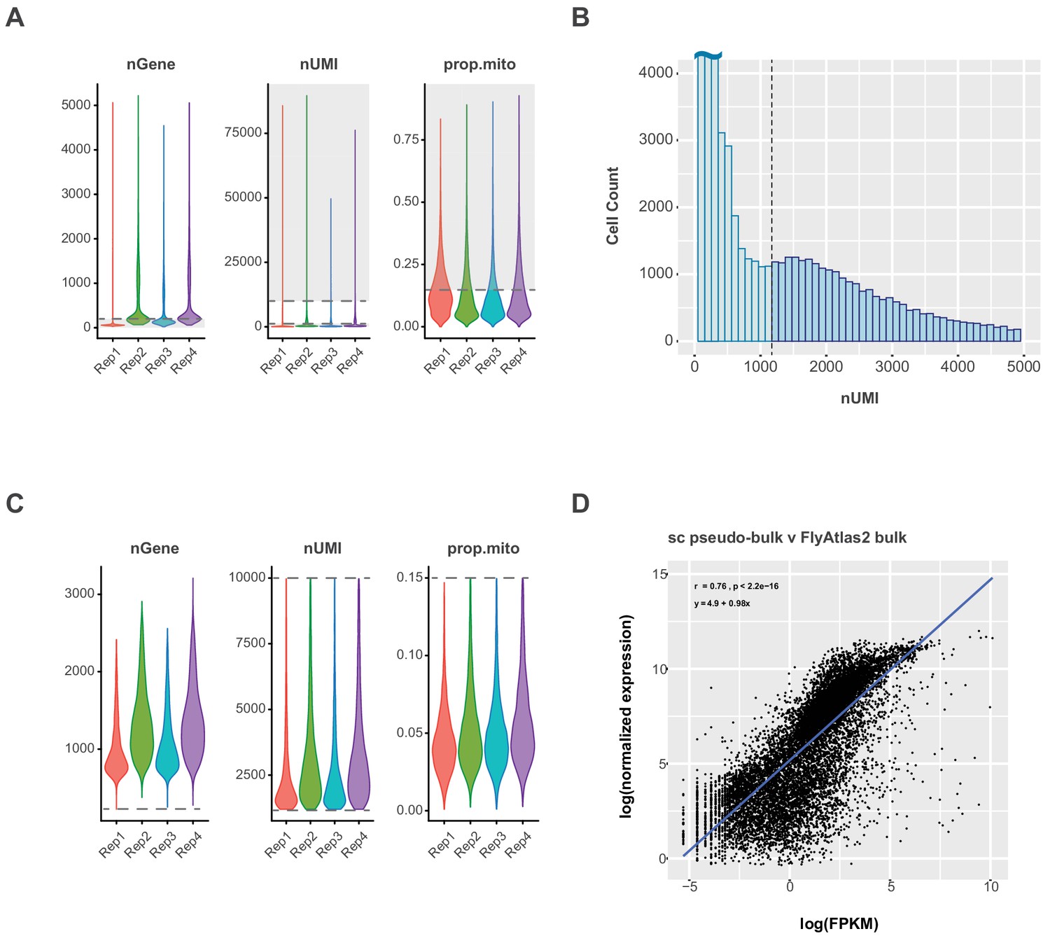
(A) Violin plot showing the number of expressed genes (nGene), number of transcripts (nUMI) and proportion of transcripts that are mitochondrial (prop.mito) in each replicate (Rep1-4) of the VNC data. Dashed lines represent the following cutoffs:>200 nGenes,>1200 and≤10,000 nUMI and ≤15% prop.mito; the grey areas highlight the data excluded from final analysis. (B) Histogram showing the distribution of cells expressing 0–5000 UMI. Dashed line represents nUMI cutoff, with cells below 1,200 UMI excluded from final analysis. (C) Violin plot showing the number of expressed genes (nGene), number of transcripts (nUMI) and proportion of transcripts that are mitochondrial (prop.mito) in each replicate of filtered VNC data. Dashed lines represent the following cutoffs:>200 nGenes,>1200 and≤10,000 nUMI and ≤15% prop.mito. (D) Single-cell pseudo-bulk vs. bulk RNA-seq expression in the VNC. Scatter plot showing the relationship between the expression level of each gene in this filtered single-cell data set (log(normalized expression)) and the FlyAtlas 2 VNS data set (log(FPKM)). The regression line is in blue and the Pearson’s correlation coefficient (r), p-value (p) and equation of the regression line appear in the upper left corner.
Figure 1—figure supplement 2
Pseudo-bulk comparisons between replicates of filtered VNC data.
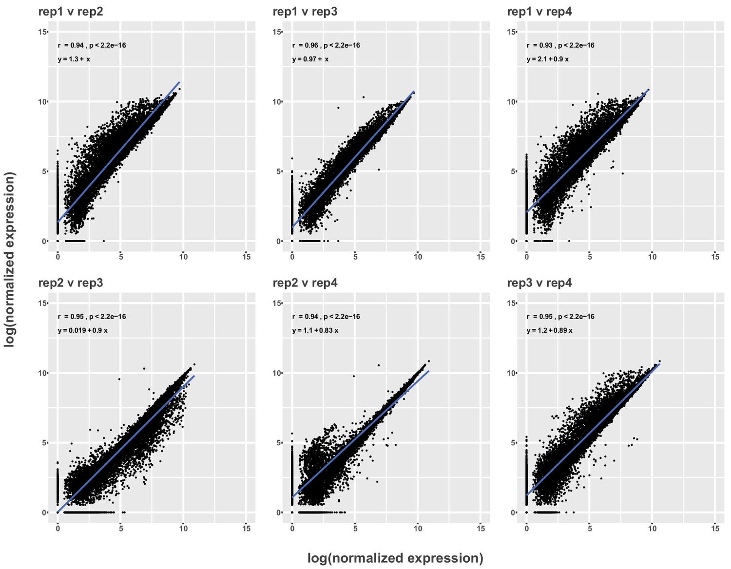
Scatter plots showing relationship between log-normalized expression levels of each gene in filtered single-cell data sets between all replicates (Rep1-4). The regression line is in blue and the Pearson’s correlation coefficient (r), p-value (p) and equation of the regression line appear in the upper left corner.
Figure 1—figure supplement 3

Cluster resolution analysis of adult VNC dataset.
(A–C) t-SNE plots with a cluster resolution of 1.0 (A), 3.0 (B), or 12.0 (C); Individual clusters are defined by unique numbers and colors. (D) Dendrogram of the relationship between cluster (shown as numbers) at different cluster resolutions (color circles). The shade of the arrows connecting clusters between resolutions represent the proportion of the cluster at the higher resolution.
Figure 1—figure supplement 4
t-SNE plot of 5 day old adult VNC with cluster numbers labeled.
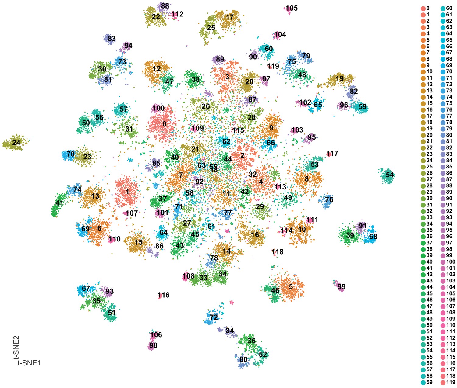
t-SNE of VNC cells; each cluster is defined by a unique number and color. Clusters are numbered based on cluster size (see cell numbers in Figure 1—source data 2).
Figure 1—figure supplement 5
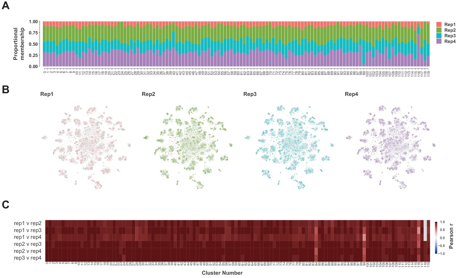
Replicate contributions.
(A) Proportional contribution of each replicate (Rep1-4) to each cluster in the t-SNE plot at a cluster resolution of 12. (B) t-SNE plots showing the spatial distribution of each replicate. (C) Heatmap showing Pearson correlations coefficients (−1 to +1) of the average expression of each gene between each replicate per cluster. Note cluster 180 does not contain any cells from replicate 1 (grey boxes).
Figure 1—figure supplement 6
t-SNE spatial distributions.
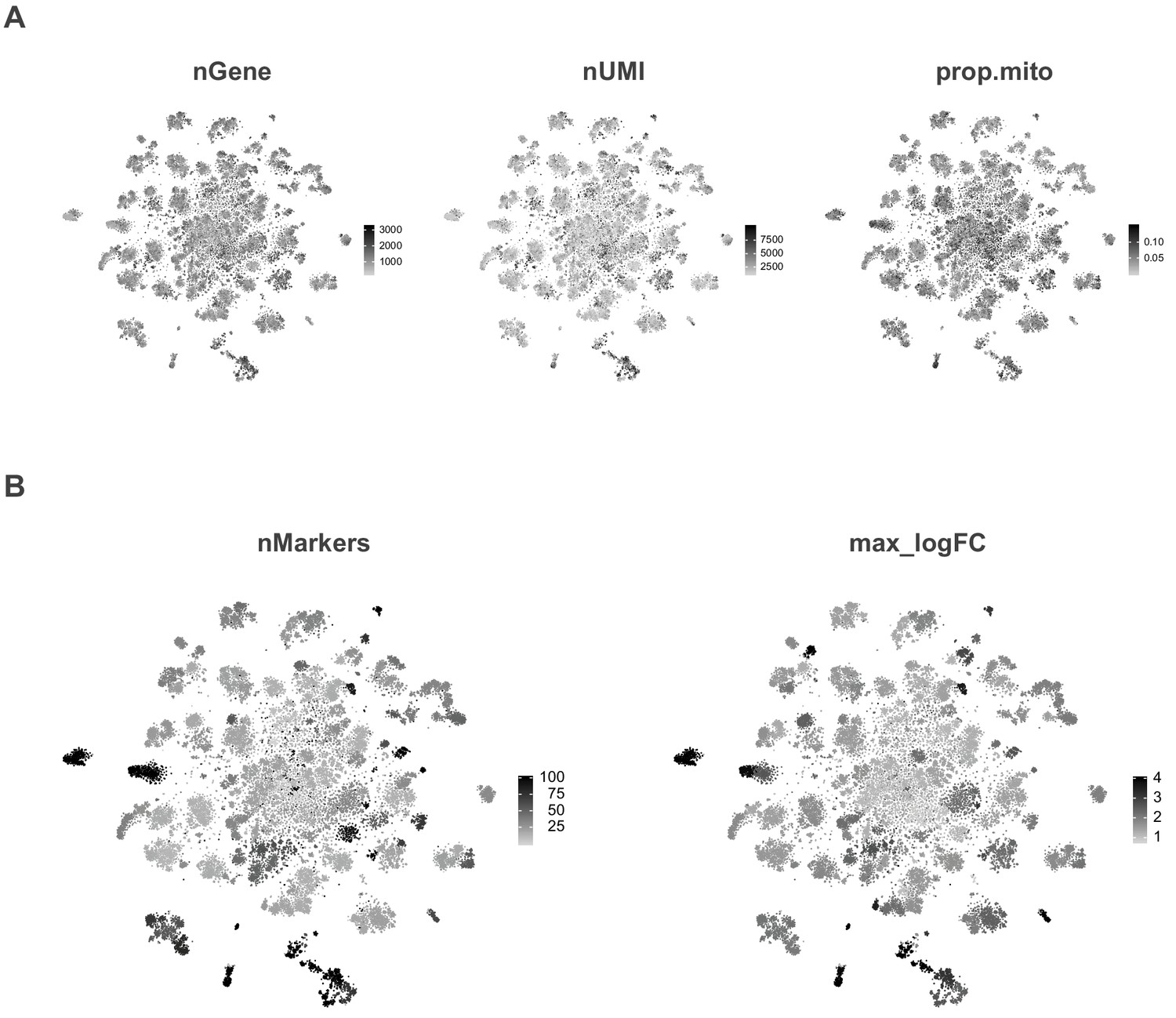
(A) t-SNE plots showing the spatial distribution of the number of expressed genes (nGene), number of transcripts (nUMI) and proportion of transcripts that are mitochondrial (prop.mito). (B) t-SNE plots showing the spatial distribution of the number of markers genes (nMarker) and maximum observed fold-enrichment (max_logFC) for the most enriched gene per cluster.
Figure 1—figure supplement 7
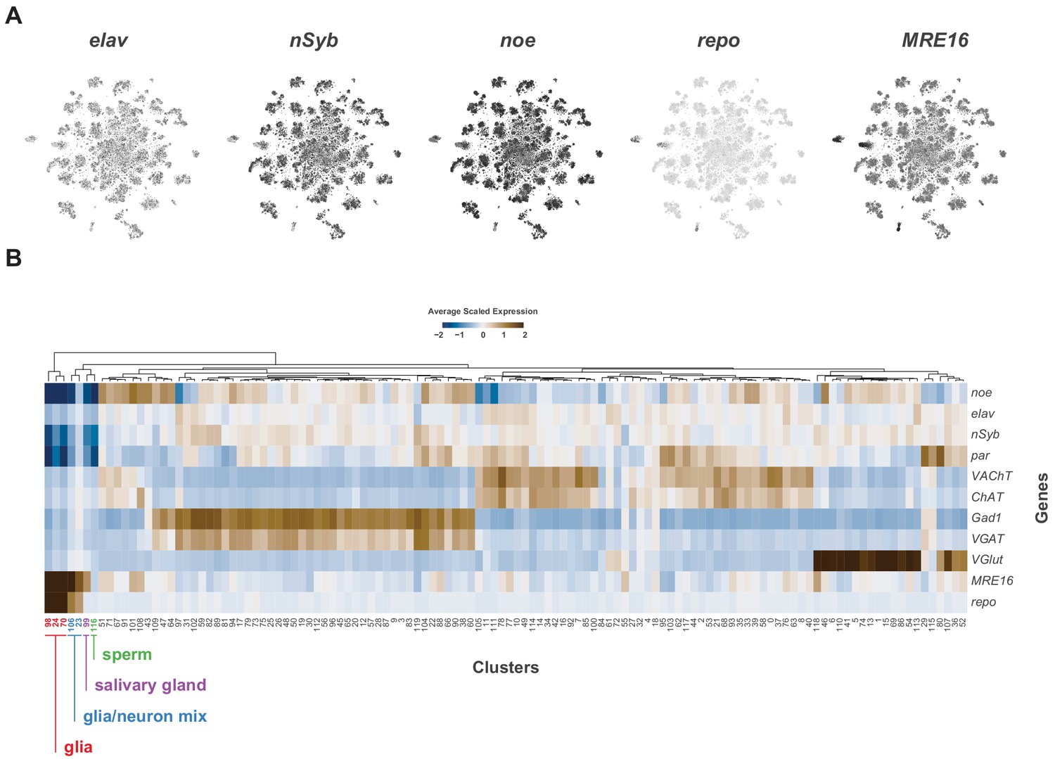
Identification of neuronal and glia clusters.
(A) t-SNE plots showing distribution of cells expressing known neuronal (elav, nSyb, noe) and glial (repo, MRE16) marker genes. (B) Heatmap of the mean scaled log-normalized expression, by cluster, of glial and neuronal marker genes. Glial cluster numbers are shown in red, neuron/glia mixed cluster numbers in blue, salivary gland in purple and sperm in green.
Figure 2 with 6 supplements
Characterization of neuronal cluster markers.
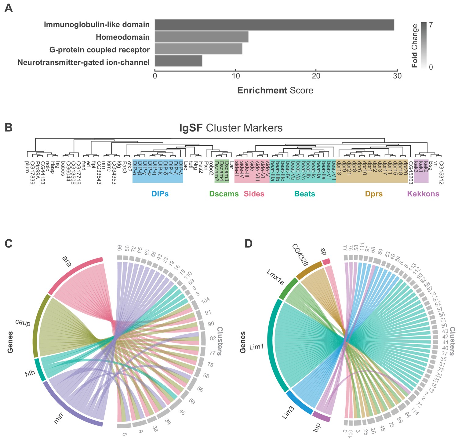
(A) Functional analysis of neuronal cluster markers (DAVID) showing representative functional terms (>5 fold-change) and their corresponding enrichment scores (representing mean p-values). (B) Phylogenetic tree of IgSF neuronal cluster markers. IgSF subfamily members are highlighted in color. (C) Chord diagram comparing the relationship between Tale Homeobox TF cluster markers (left) and the clusters in which they are significantly enriched (right). (D) Chord diagram comparing the relationship between LIM Homeobox TF cluster markers (left) and the clusters in which they are significantly enriched (right). (B–D) Gene were classified based on Flybase Gene Group annotations (www.flybase.org). (C,D) Chord diagrams are visual aids based on data available in Figure 1—source data 1.
Figure 2—figure supplement 1
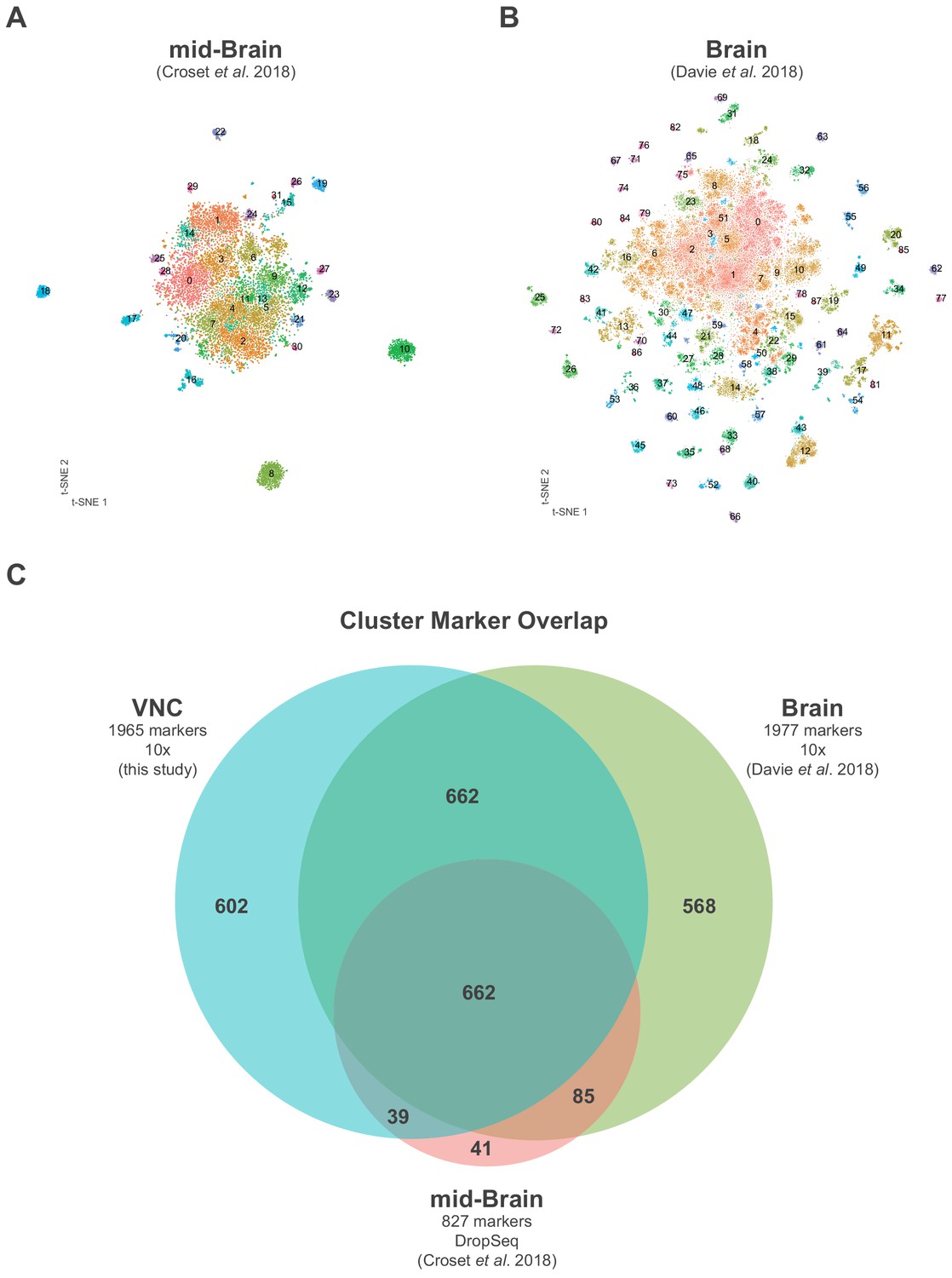
Comparison of central nervous system single-cell data sets.
(A) t-SNE of mid-brain DropSeq single-cell data generated in Croset et al. (2018); each cluster is defined by a unique number and color. (B) t-SNE of brain 10x single-cell data generated in Davie et al. (2018); each cluster is defined by a unique number and color. (C) Euler diagram showing the overlap of cluster markers (average log-fold change >0.5, adjusted p-value<0.05) between the VNC (blue) mid-brain (pink) and brain (green) datasets. (A–C) For comparison purposes, datasets were reanalyzed as described in the Methods.
-
Figure 2—figure supplement 1—source data 1
List of marker genes for the 32 clusters shown in Figure 2—figure supplement 1A of re-analyzed data from Croset et al. (2018).
Table showing the average log-fold change (>0.5) values of cluster-discriminative marker genes, including adjusted p-values (<0.05). pct.1 is the proportion of cells that express the gene in the cluster, pct.2 is the proportion of cells that express the gene in all other clusters.
- https://cdn.elifesciences.org/articles/54074/elife-54074-fig2-figsupp1-data1-v1.xlsx
-
Figure 2—figure supplement 1—source data 2
List of marker genes for the 88 clusters shown in Figure 2—figure supplement 1B of re-analyzed data from Davie et al. (2018).
Table showing the average log-fold change (>0.5) values of cluster-discriminative marker genes, including adjusted p-values (<0.05). pct.1 is the proportion of cells that express the gene in the cluster, pct.2 is the proportion of cells that express the gene in all other clusters.
- https://cdn.elifesciences.org/articles/54074/elife-54074-fig2-figsupp1-data2-v1.xlsx
Figure 2—figure supplement 2
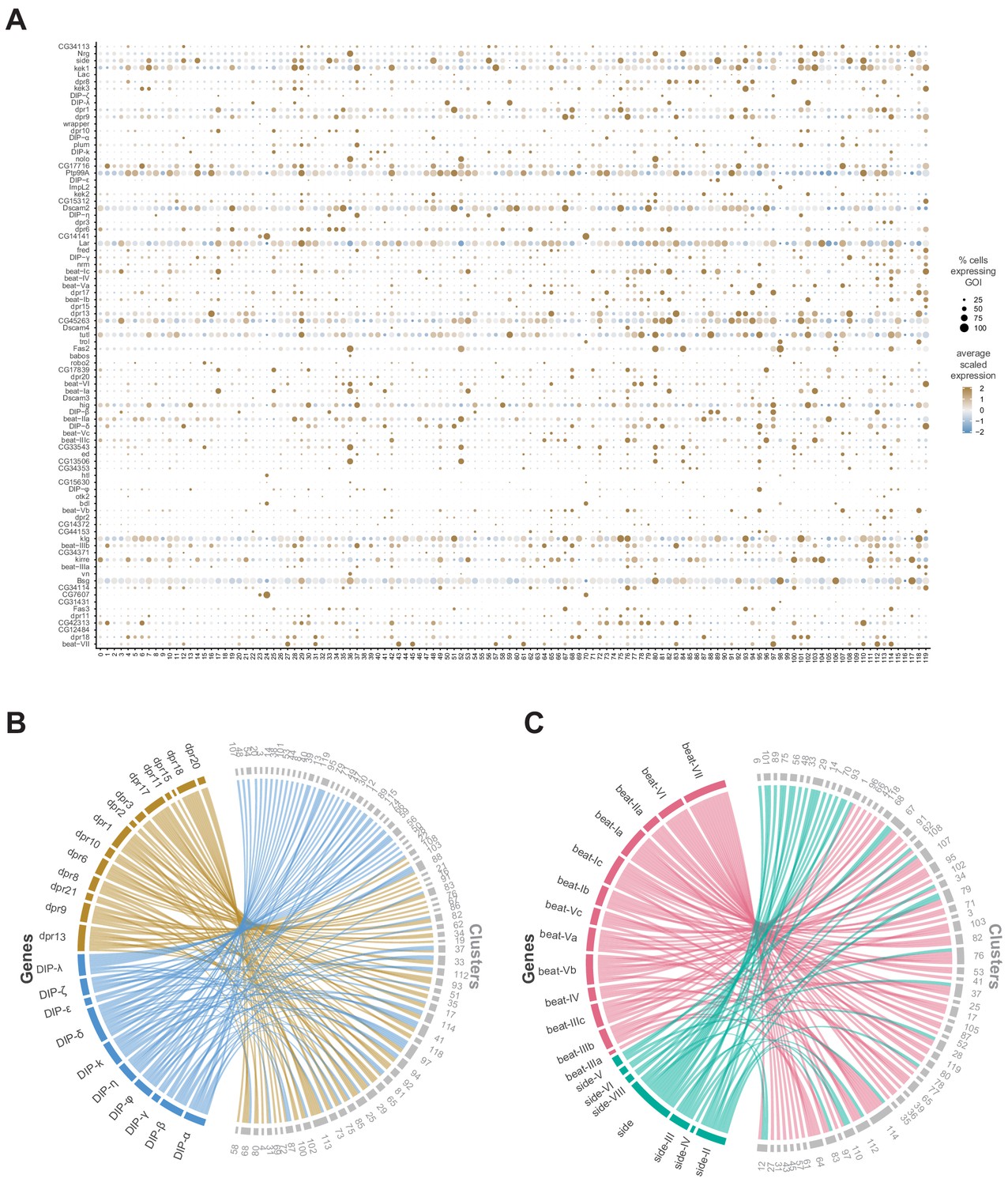
Relationships between IgSF subfamilies in defining cluster identity.
(A) Dot plot of the expression of IgSF cluster markers (left) across clusters (below). The fill color intensity represents the scaled, normalized expression level of each gene, and the radius of the dot represents the percent of cells in that cluster expressing the gene of interest (GOI). (B) Chord diagram comparing the relationship between dpr (left, brown) and DIP (left, blue) cluster markers genes and the clusters in which they are significantly enriched (right, clusters in grey). (C) Chord diagram comparing the relationship between Beat (left, green) and Side (left, pink) cluster marker genes and the clusters in which they are significantly enriched (right, clusters in grey) (B,C) Chord diagrams are visual aids based on data available in Figure 1—source data 1.
Figure 2—figure supplement 3
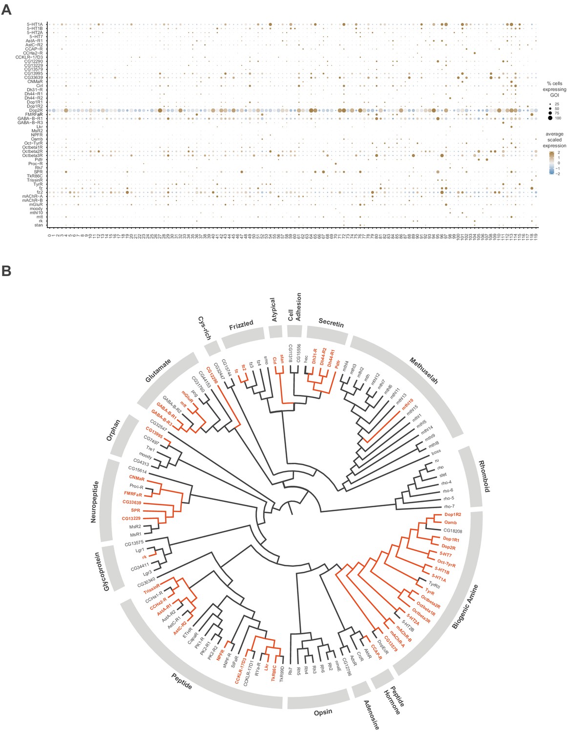
GPCR neuronal cluster markers.
(A) Dot plot of the expression of GPCR cluster markers(left) across clusters (below). The fill color intensity represents the scaled, normalized expression level of each gene, and the radius of the dot represents the percent of cells in that cluster expressing the gene of interest (GOI). (B) Phylogenetic tree of Drosophila GPCR gene family. GPCRs found as neuronal cluster markers are highlighted in orange. The multiple sequence alignment (not shown) and the phylogenetic tree were created with Clustal Omega and FigTreeV1.4.4, respectively (adapted from Hanlon and Andrew, 2015).
Figure 2—figure supplement 4
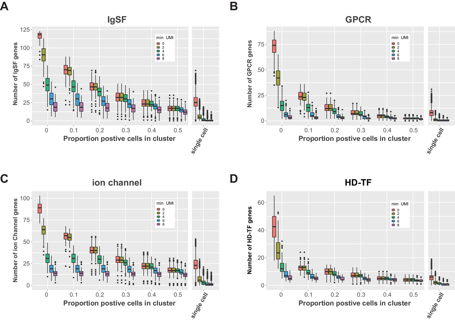
Co-expression of gene family members in the VNC.
Box plots of the number of co-expressed IgSF (A), GPCR (B), ion channel (C), and HD-TF (D) genes (number of genes) per cluster (varying thresholds for the proportion positive cells in cluster). For each threshold a series is shown with filtered data for increasing minimum UMI thresholds (min UMI 0–8). Co-expression in all single cells in shown on the right.
Figure 2—figure supplement 5
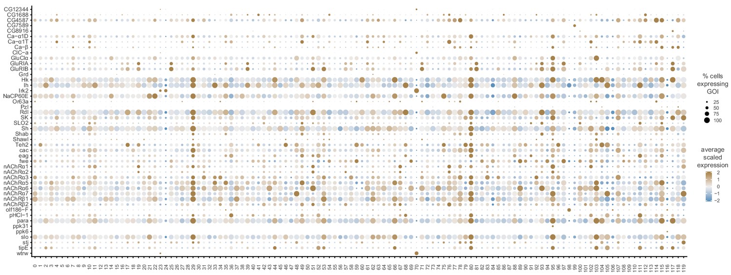
Ion channel neuronal cluster markers.
Dot plot of the expression of ion channel cluster markers (left) across clusters (below). The fill color intensity represents the scaled, normalized expression level of each gene, and the radius of the dot represents the percent of cells in that cluster expressing the gene of interest (GOI).
Figure 2—figure supplement 6

TF neuronal cluster markers.
(A) Dot plot of the expression of homeodomain TF cluster markers (left) across clusters (below). The fill color intensity represents the scaled, normalized expression level of each gene, and the radius of the dot represents the percent of cells in that cluster expressing the gene of interest (GOI). (B) Doughnut graphs representing proportion of TF types found in the entire Drosophila genome (left) versus those found as neuronal cluster markers (right), based on Flybase Gene Group annotations.
Figure 3
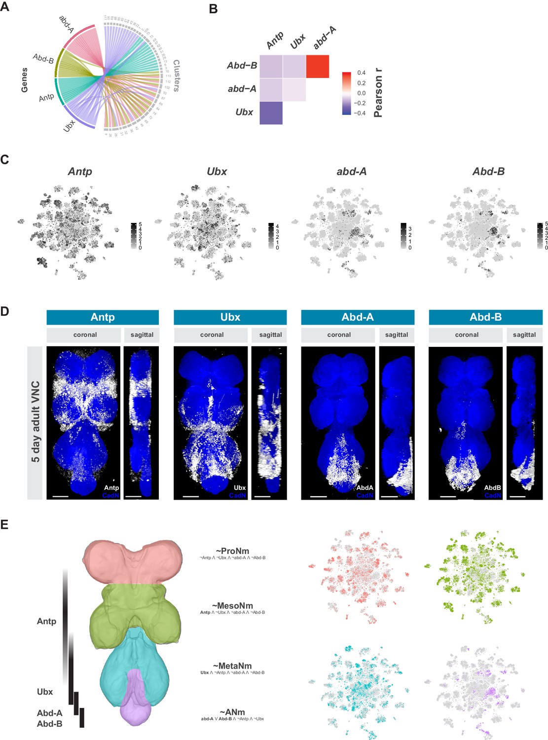
Neuromeres are defined by Hox gene expression in the adult VNC.
(A) Chord diagram comparing the relationship between Hox genes found as cluster markers (left) and the clusters in which they are significantly enriched (right), based on data available in Figure 1—source data 1. (B) Heatmap of Pearson correlation coefficient for Hox gene expression in all single cells. We saw consistent patterns of correlation at the cluster-level expression, and between replicates. (C) t-SNE plot of Hox gene expression distribution. Expression shown in black, intensity is proportional to the log-normalized expression levels. (D) Visualization of Hox protein expression in the 5 day old adult VNC. Coronal and sagittal views of anti-Antp, -Ubx, -Abd-A, and -Abd-B (white). Neuropil counterstained with anti-Cad-N (blue). Scale bars = 50 μm. (E) Schematic representing bands of Hox expression along the anterior-posterior axis of the VNC (left). Cells assigned to approximate neuromeres in VNC t-SNE plots (right) based on differential Hox gene expression: ProNm (pink), MesoNm (green), MetaNm (blue) and ANm (purple). Expressed genes used in defining each neuromere are in bold. (symbols represent the following: ‘¬’ not, ‘∧’ and, ‘∨’ or, ‘~’ approximate).
Figure 4 with 2 supplements
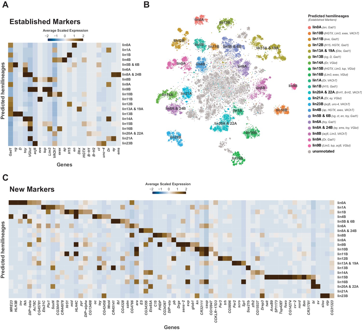
Cellular identities defined by developmental lineages.
(A) Heatmap of the mean scaled log-normalized expression of established lineage markers genes (bottom) within predicated neuroblast hemilineage (right). (B) t-SNE plot of neuronal cells highlighting predicted hemilineages based on the expression of established hemilineage marker genes (shown beside list of predicted hemilineages on the right). (C) Heatmap of the mean scaled log-normalized expression of potential new hemilineage markers genes (bottom) within predicated neuroblast hemilineage (right). Full list of predicted hemilineage markers can be found in Figure 4—source data 1.
-
Figure 4—source data 1
List of marker genes for predicated hemilineages shown in Figure 4B.
Table showing the average log-fold change (>0.5) values of hemilineage-discriminative marker genes, including adjusted p-values (<0.05). pct.1 is the proportion of cells that express the gene within the predicated hemilineage, pct.2 is the proportion of cells that express the gene outside of the predicted hemilineage.
- https://cdn.elifesciences.org/articles/54074/elife-54074-fig4-data1-v1.xlsx
Figure 4—figure supplement 1

Neuroblast lineage marker gene expression in the VNC.
(A) Heatmap of the mean scaled log-normalized expression, by cluster (bottom), of the neuroblast hemilineage and FA-neurotransmitter markers (right). Dendrograms represent hierarchical clustering. (B) t-SNE plots of the neuroblast lineage marker gene expression, shown in black, intensity is proportional to the log-normalized expression levels.
Figure 4—figure supplement 2
Neurodevelopment gene expression.
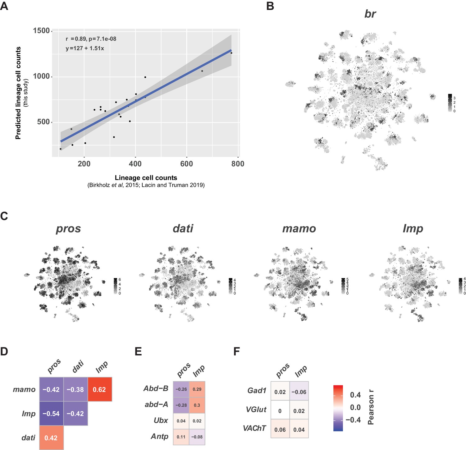
(A) Scatter plot of hemilineage cell counts from thoracic neuromeres (calculated from Birkholz et al., 2015 and Lacin et al., 2019) compared to cell counts from predicted hemilineage identity in this single-cell data set (used pros+, abd-A-, Abd-B- cells to approximate postembryonic, thoracic hemilineages). Each dot represents a hemilineage (or group of hemilineages). The regression line (blue line) and 95% confidence interval (grey bar) are shown. Pearson’s correlation coefficient (r), p-value (p) and equation of the regression line appear in the upper left corner. (B) t-SNE plot of br expression showing regional expression in clusters throughout the VNC. Expression shown in black, intensity is proportional to the log-normalized expression levels. (C) t-SNE plots of pros, dati, mamo, and Imp in the VNC. Expression shown in black, intensity is proportional to the log-normalized expression levels. (D) Heatmaps showing Pearson correlations coefficients (in text) of expression for pros, dati, mamo, and Imp in single cells. (E) Heatmaps showing Pearson correlations coefficients (in text) of expression for pros and Imp with the Hox genes Abd-B, abd-A, Ubx, and Antp in single cells. (F) Heatmaps showing Pearson correlations coefficients (in text) of expression for pros and Imp with fast-acting neurotransmitter markers Gad1, VGlut, and VAChT in single cells. (D–F) All heatmaps share the same scale and consistent patterns of correlation were seen at the cluster-level and between replicates (data not shown).
Figure 5 with 3 supplements
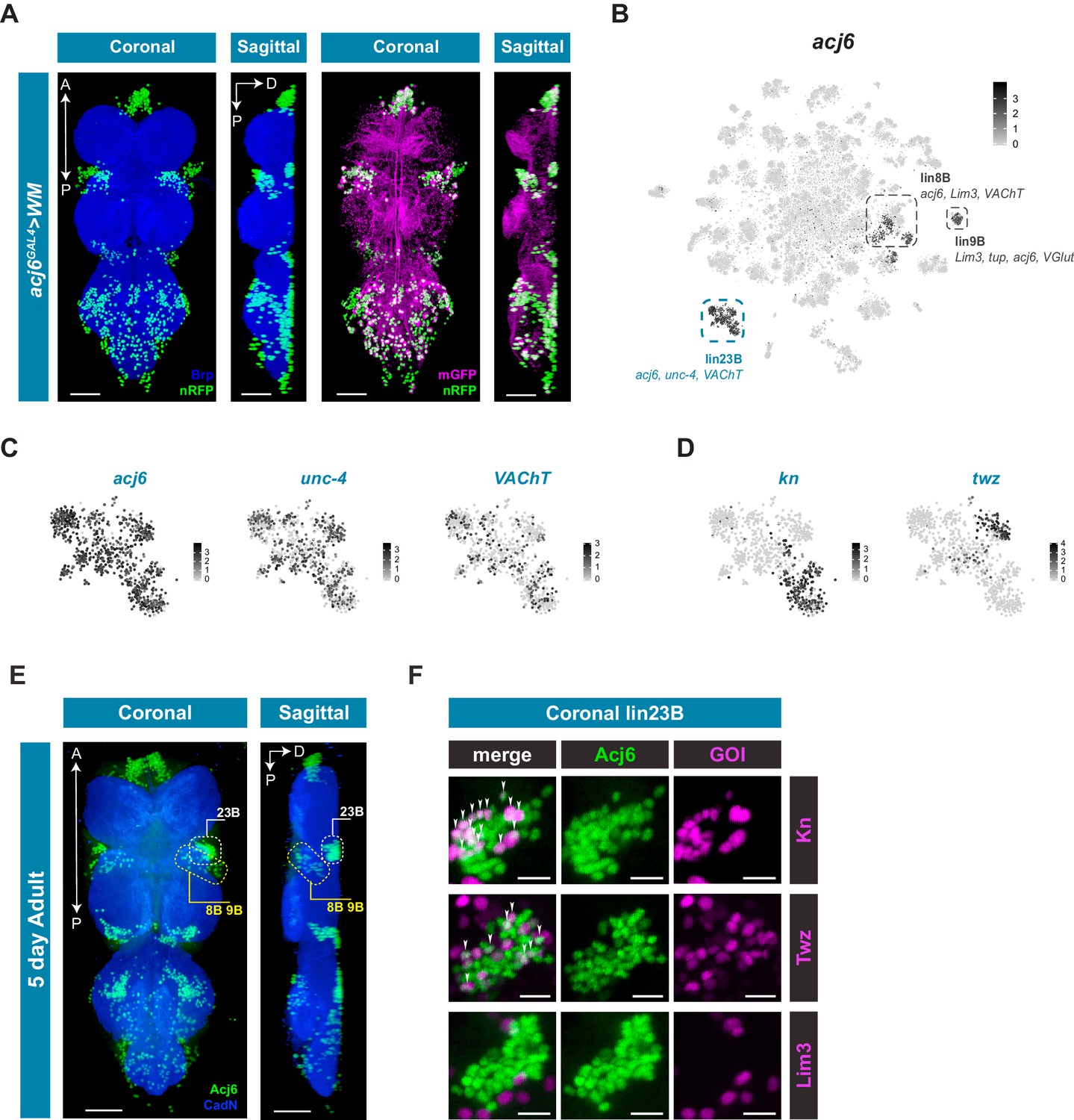
acj6 expression, hemilineage identity, and novel sub-lineage marker co-expression in the VNC.
(A) Visualization of acj6 expressing cells in the 5 day old adult VNC. Maximal coronal projection, and hemi-maximal sagittal projectionof acj6GAL4 driving expression of UAS-WM, enabling the visualization of cell nuclei (nRFP; green) and neuronal morphology (mGFP; magenta). Neuropil is counterstained (Brp; blue). A, Anterior, P, posterior, D, dorsal; scale bars = 50 μm. (B) t-SNE plot of acj6 expression in the VNC. Predicted hemilineage 8B, 9B, and 23B, based on known markers (shown below) are highlighted. (C) t-SNE plots of predicted hemilineage 23B, showing expression of markers acj6, unc-4, and VAChT. (D) t-SNE plots of predicted hemilineage 23B, showing expression of novel sub-type markers kn and twz. (B–D) Expression shown in black, intensity is proportional to the log-normalized expression levels. (E) Maximal coronal view (left) and hemi-maximal sagittal view (right) of Acj6 expression (green) in the 5 day old adult VNC. The posterior prothoracic hemilineages 23B (dashed white box) and the anterior mesothoracic 8B and 9B (dashed yellow box) are marked. A, Anterior, P, posterior, D, dorsal; Neuropil is counterstained (Cad-N; blue) scale bars = 50 μm. (F) Close-up maximal coronal views of dorsolateral hemilineage 23B showing the co-expression of knGAL4 and twzGAL4 driven UAS-Stinger expression (nGFP; magenta) with Acj6 (green). Co-positive cells (white) are indicated with arrow heads. Lim3GAL4 driven expression did not colocalize with Acj6 in hemilineage 23B. GOI = gene of interest, scale bars = 10 μm.
-
Figure 5—source data 1
Cell counts of novel sub-lineage marker co-expression in the VNC.
Cell counts of Acj6-positive and Acj6/GOI co-positive cells in prothoracic hemilineage 23B and mesothoracic hemilineages 8B and 9B. Values are for a single side of a single individual (along with means, standard deviations, and standard errors).
- https://cdn.elifesciences.org/articles/54074/elife-54074-fig5-data1-v1.xlsx
Figure 5—figure supplement 1
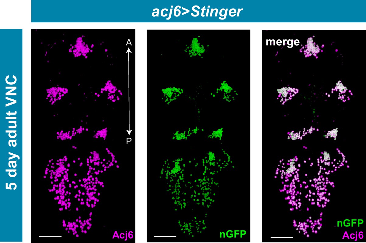
acj6GAL4 recapitulates Acj6 protein expression in the adult VNC.
Maximal projections showing co-expression of acj6GAL4 driven expression of UAS-Stinger (nGFP; green) and endogenous Acj6 protein expression (anti-Acj6, magenta) in the 5 day old adult VNC. Merged expression shown on right in white. A, Anterior, P, posterior; scale bars = 50 μm.
Figure 5—figure supplement 2
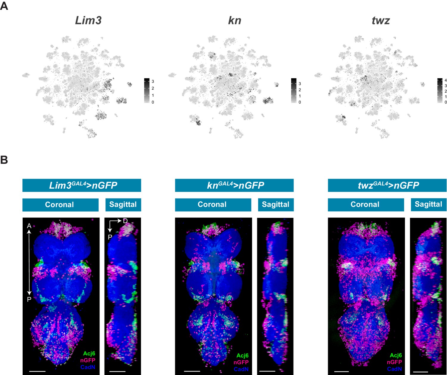
Novel sub-lineage marker expression in the VNC.
(A) t-SNE plots of Lim3 (A), kn (B) and twz (C) expression in the VNC. Expression shown in black, intensity is proportional to the log-normalized expression levels. (B) Maximal projections showing co-expression of Acj6 (anti-Acj6; green) with Lim3GAL4, knGAL4, and twzGAL4 driven expression of UAS-Stinger (nGFP; magenta) in the 5 day adult VNC; coronal (left) and sagittal (right) views. A, Anterior, P, posterior, D, dorsal; Neuropil is counterstained (CadN; blue); scale bars = 50 μm.
Figure 5—figure supplement 3
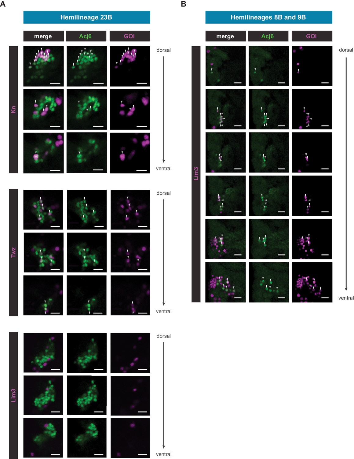
Single slices of novel sub-lineage marker co-expression in the VNC.
(A) Single coronal slices of hemilineage 23B moving from dorsal to ventral side showing co-expression of Acj6 (anti-Acj6; green) with knGAL4, and twzGAL4 driven expression of UAS-Stinger (nGFP; magenta), and lack of co-expression of Lim3GAL4, in the 5 day adult VNC (GOI = gene of interest; arrow heads indicate co-positive cells; scale bars = 10 μm). (B) Single coronal slices of hemilineages 8B and 9B moving from dorsal to ventral side showing co-expression of Acj6 (anti-Acj6; green) with Lim3GAL4 driven expression of UAS-Stinger (nGFP; magenta), in the 5 day adult VNC (GOI = gene of interest; arrow heads indicate co-positive cells; scale bars = 10 μm).
Figure 6 with 1 supplement
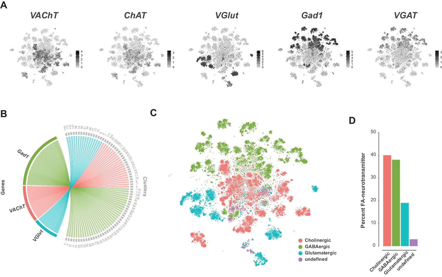
Fast-acting neurotransmitter usage in the VNC.
(A) t-SNE plots showing distribution of cells expressing biomarkers for the fact-acting neurotransmitters acetylcholine (VAChT, ChAT), glutamate (VGlut) and GABA (VGAT, Gad1). Expression shown in black, intensity is proportional to the log-normalized expression levels. (B) Chord diagram comparing the relationship between fast-acting neurotransmitter cluster markers (left, genes) and the clusters in which they are significantly enriched (right, clusters). (C) t-SNE plot colored according to fast-acting neurotransmitter usage based on assigned cluster identity. (D) Percentage of cells in the VNC assigned as releasing distinct fast-acting neurotransmitters.
Figure 6—figure supplement 1
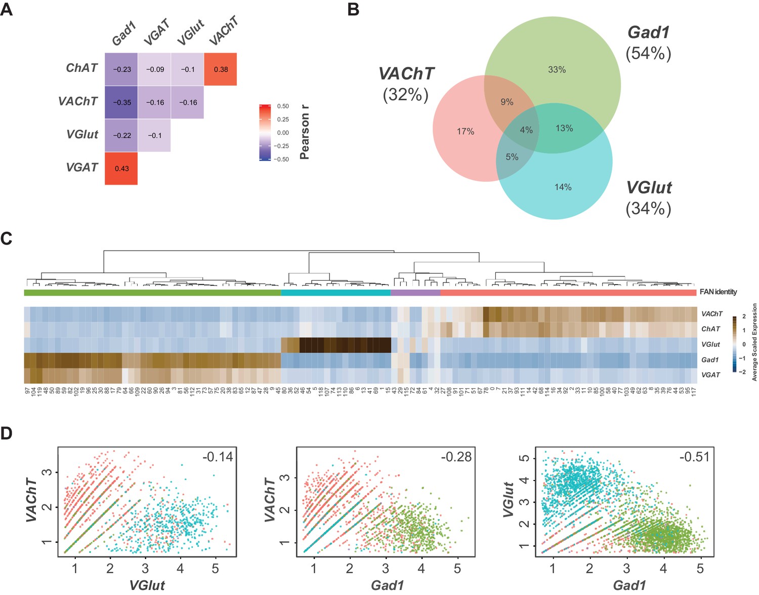
Expression of fast-acting neurotransmitter biomarkers in the VNC.
(A) Heatmap of Pearson correlation values for the expression fast-acting neurotransmitter biomarkers in single cells. We saw consistent patterns of correlation at the cluster-level and between replicates (data not shown). (B) Euler diagram showing the percent of cells (relative to all neurons) with overlapping expression of VAChT, VGlut and Gad1. (C) Heatmap of the mean scaled log-normalized expression, by cluster, of the fast-acting neurotransmitter biomarkers VAChT/ChAT (acetylcholine), VGlut (glutamate) and VGAT/Gad1 (GABA). Cell clusters have been hierarchically grouped. Assigned FAN identity is color coded by bars below the dendrogram. (D) Scatter plots showing the expression levels of fast-acting neurotransmitter biomarkers in pairwise co-expressing cells. This plot highlights ambient RNA contamination issues when assigning FAN identity at the cellular level. Each dot represents a cell. Cells have been color coded by their assigned FAN identity. Pearson correlation coefficients are inset.
Figure 7 with 1 supplement
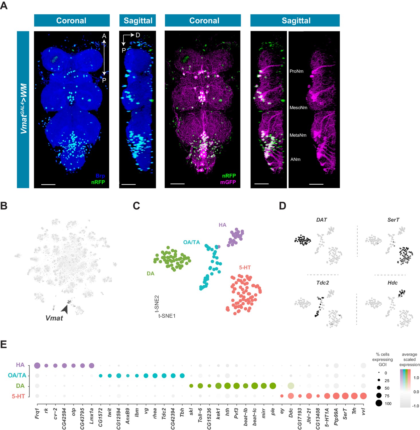
Identification and characterization of monoaminergic cell sub-types.
(A) Visualization of Vmat expressing cells in the 5 day old adult VNC. Coronal and sagittal views of VmatGAL4 driving expression of UAS-WM, enabling the visualization of cell nuclei (nRFP; magenta) and neuronal morphology (mGFP; green). Neuropil is counterstained (Brp; blue). A, Anterior, P, posterior, D, dorsal; scale bars = 50 μm. (B) t-SNE plot of Vmat expression in black, intensity is proportional to the scaled log-normalized expression level. Vmat enriched Cluster 72 is highlighted with arrowhead. (C) t-SNE plot showing sub-clustering analysis of Vmat+ cells from clusters 72 and 84. Four sub-clusters are identified representing dopaminergic (DA), octopaminergic/tyraminergic (OA/TA), histaminergic (HA), and serotonergic neurons (5-HT). (D) Expression of established monoaminergic subtype-specific biomarkers used to determine cluster identity. Histidine decarboxylase (Hdc) labels Histamine (HA) neurons, Tyrosine decarboxylase 2 (Tdc-2) labels Tyramine (TA) and Octopamine (OA) neurons, Dopamine transporter (DAT) labels Dopamine (DA) neurons and Serotonin transporter (SerT) labels Serotonin (5-HT) neurons. (E) Dot plot of the top genes in each monoaminergic sub-type based on fold-enrichment (Figure 8—source data 1). Size of dots represent percent of cells in cluster expressing gene of interest (GOI); intensity of color reflects average scaled expression. Figure 7—source data 1 contain the full list of significantly enriched genes.
-
Figure 7—source data 1
List of marker genes for the Vmat+ sub-clusters shown in Figure 7C.
Table showing the average log-fold change values (>0.5) of monoaminergic cluster-discriminative marker genes, including adjusted p-values (<0.05). pct.1 is the proportion of cells that express the gene in the cluster, pct.2 is the proportion of cells that express the gene in the other clusters.
- https://cdn.elifesciences.org/articles/54074/elife-54074-fig7-data1-v1.xlsx
Figure 7—figure supplement 1
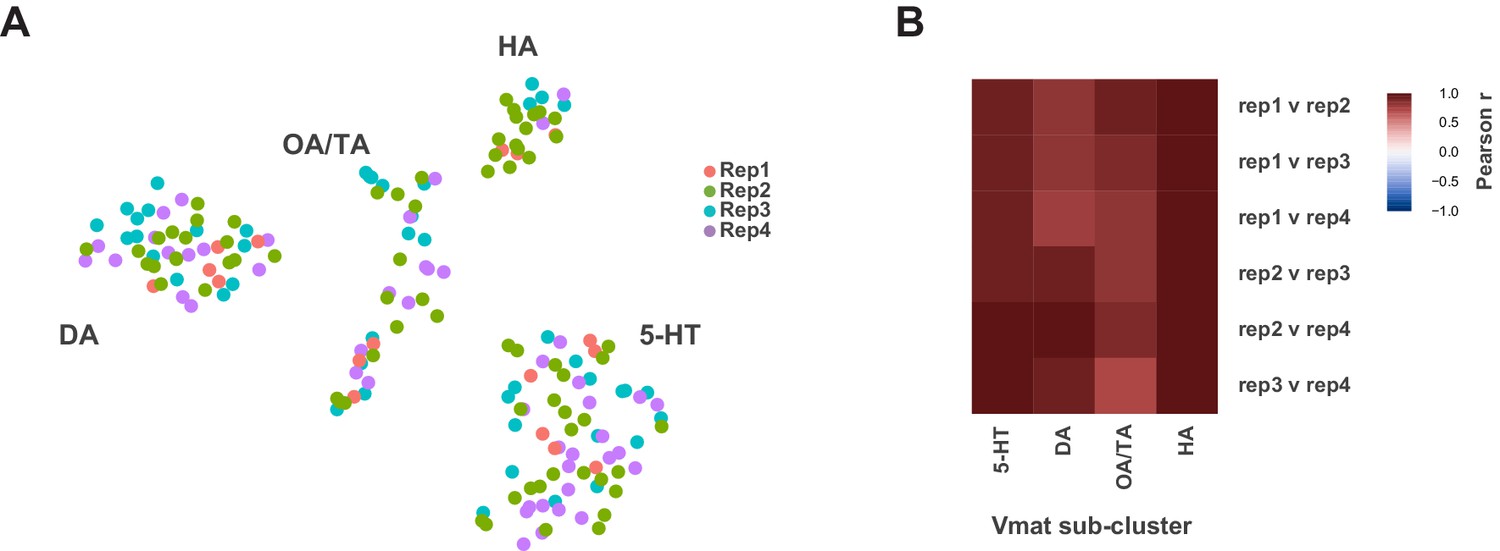
Individual replicate contribution to Vmat+ sub-clusters.
(A) t-SNE plot showing distribution of each replicate (Rep1-4) within the Vmat+ sub-clustering. (B) Heatmap showing Pearson correlations coefficients (−1 to +1) between each replicate per sub-cluster.
Figure 8 with 3 supplements
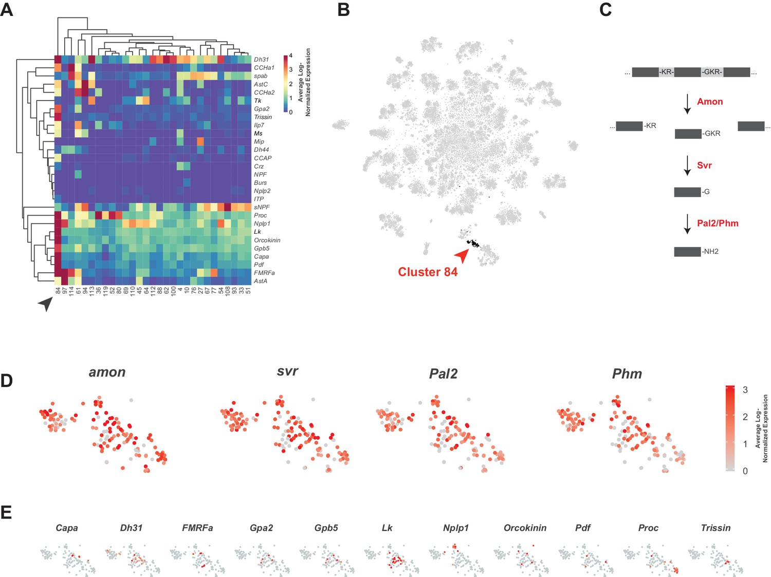
Identification of neuropeptide expressing cells.
(A) Heatmap of the mean log-normalized expression (0–4), by cluster (bottom), of neuropeptide genes (right). Only clusters with at least one neuropeptide gene expressing in excess of mean log-normalized value of 10 are shown. Only neuropeptide genes that were expressed in at least one cell at a level >10 transcripts per cell are shown. Arrowhead highlights cluster 84. Dendrograms represent hierarchical clustering. (B) t-SNE plot highlighting neuropeptide expressing cluster 84. (C) Schematic of neuropeptide processing steps highlighting enzymes (in red) identified as enriched markers for cluster 84. Propeptides are cleaved by the pro-hormone convertase Amontillado (Amon); the carboxypeptidase Silver (Svr) then removes the C-terminal cleavage sequence. C-terminal amidation occurs through the combined actions of Peptidyl-α-hydroxyglycine-α-amidating lyase 2 (Pal2) and Peptidylglycin-α-hydroxylating monooxygenase (Phm) (reviewed in Pauls et al., 2014). (D, E). Expression of neuropeptide processing enzymes (D) and multiple neuropeptide genes (E) in t-SNE cluster 84. Intensity of red is proportional to the log-normalized expression level.
-
Figure 8—source data 1
Neuropeptide expression levels.
Table of neuropeptide expressed genes, their maximum observed log-normalized expression, the rank position of this expression, the percentile of this expression, and their associated receptors. n.d. = no data available regarding associated receptors.
- https://cdn.elifesciences.org/articles/54074/elife-54074-fig8-data1-v1.xlsx
Figure 8—figure supplement 1
Neuropeptide gene expression levels.
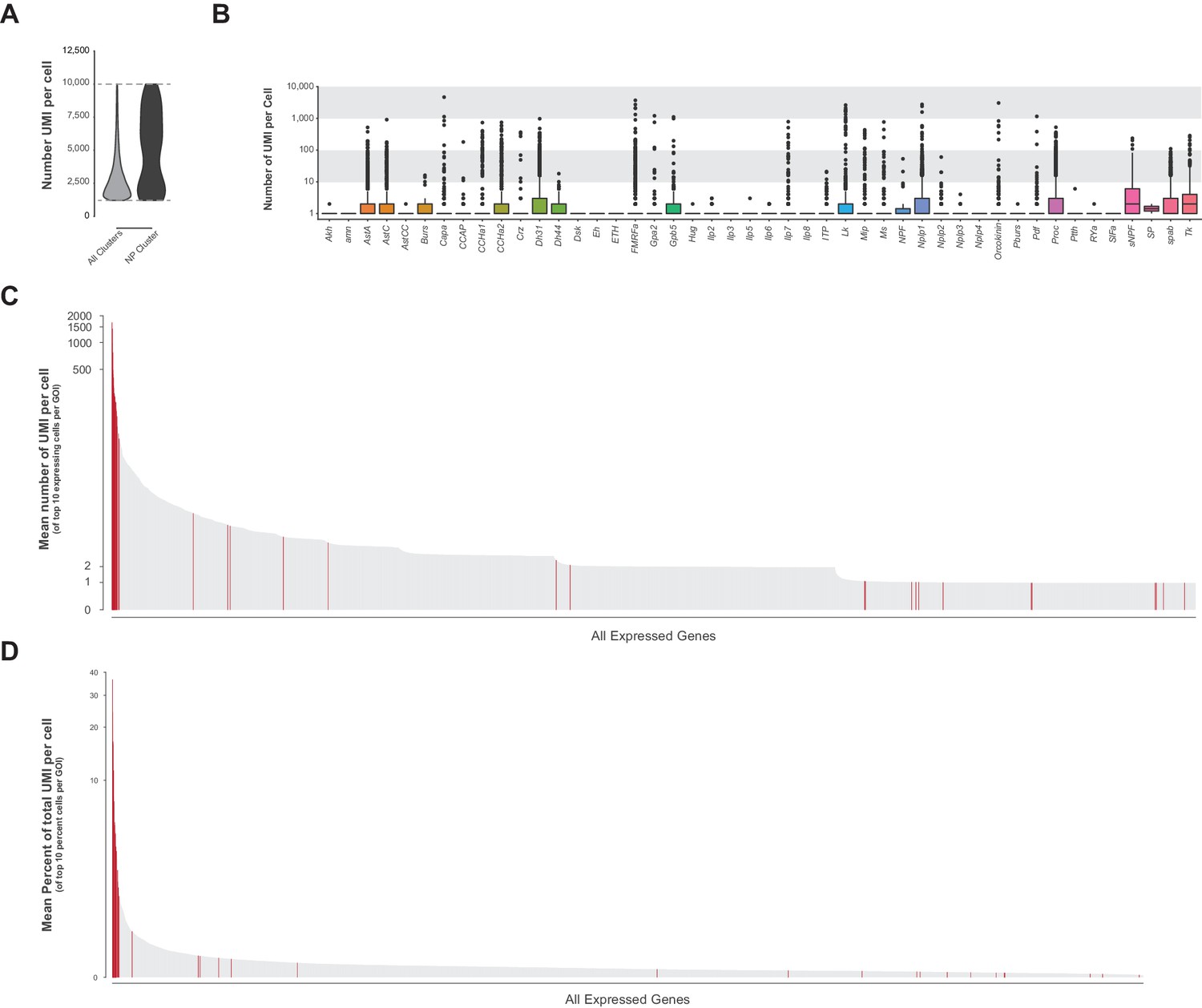
(A) Violin plot showing the number of transcripts (UMI) per cell in the whole VNC data set (all clusters) compared to neuropeptide-expressing cluster 84. Data represents expression between 1,200–10,000 UMI (dashed lines). (B) Box plots representing number of UMI per cell of all detected neuropeptide genes across the whole VNC data set. (C) Ranked mean number of UMI per cell of the top 10 expressing cells for each GOI. Neuropeptide genes are highlighted in red, many of which have the highest number of UMI/cell in the genome. (D) Ranked mean percent of UMI per cell (GOI UMI/total UMI) of the top 10 proportion of UMI cells for each GOI. Neuropeptide genes are highlighted in red, many of which have the highest proportion of transcripts per cell in the genome.
Figure 8—figure supplement 2
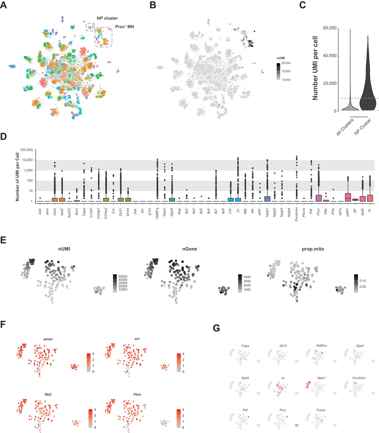
Analysis of VNC data removing upper limit on transcript number (UMI) per cell.
(A) Re-analyzed t-SNE plot of VNC data without the 10,000 UMI high cut-off. Neuropeptide (NP) enriched cluster and Proctolin expressing motor neuron (Proc+ MN) cluster are highlighted. (B) t-SNE of the number of UMI. Color is scaled from 10,000 to 20,000 UMI. Most cells with greater than 10,000 UMI are in the NP cluster or the Proc+ MN cluster. (C) Violin plot showing the number of UMI per cell without 10,000 UMI filtering cut-off in the whole VNC data set (all clusters) compared to the NP cluster. Dashed lines represent the low cut-off of 1,200 UMI and the now removed cut-off of 10,000 UMI. (D) Box plots representing number of UMI per cell of all expressed neuropeptide genes across the whole VNC data set without the 10,000 UMI filtering cut-off. Multiple NP genes exceed the expression level of 10,000 UMI. (E) t-SNE plots of the NP cluster showing the spatial distribution of the number of expressed genes (nGene), number of transcripts (nUMI) and proportion of transcripts that are mitochondrial (prop.mito). (F, G) Expression of neuropeptide processing enzymes (F) and multiple neuropeptide genes (G) in t-SNE of NP cluster. Intensity of red is proportional to the log-normalized expression level.
Figure 8—figure supplement 3
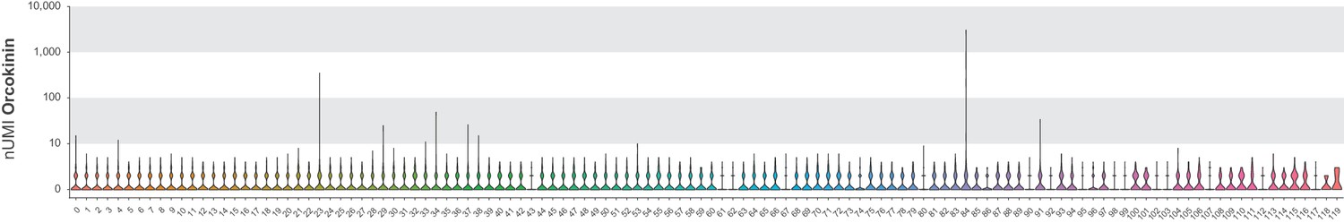
Orcokinin expression analysis.
Violin plot of raw UMI Orcokinin expression by cluster.
Figure 9 with 1 supplement
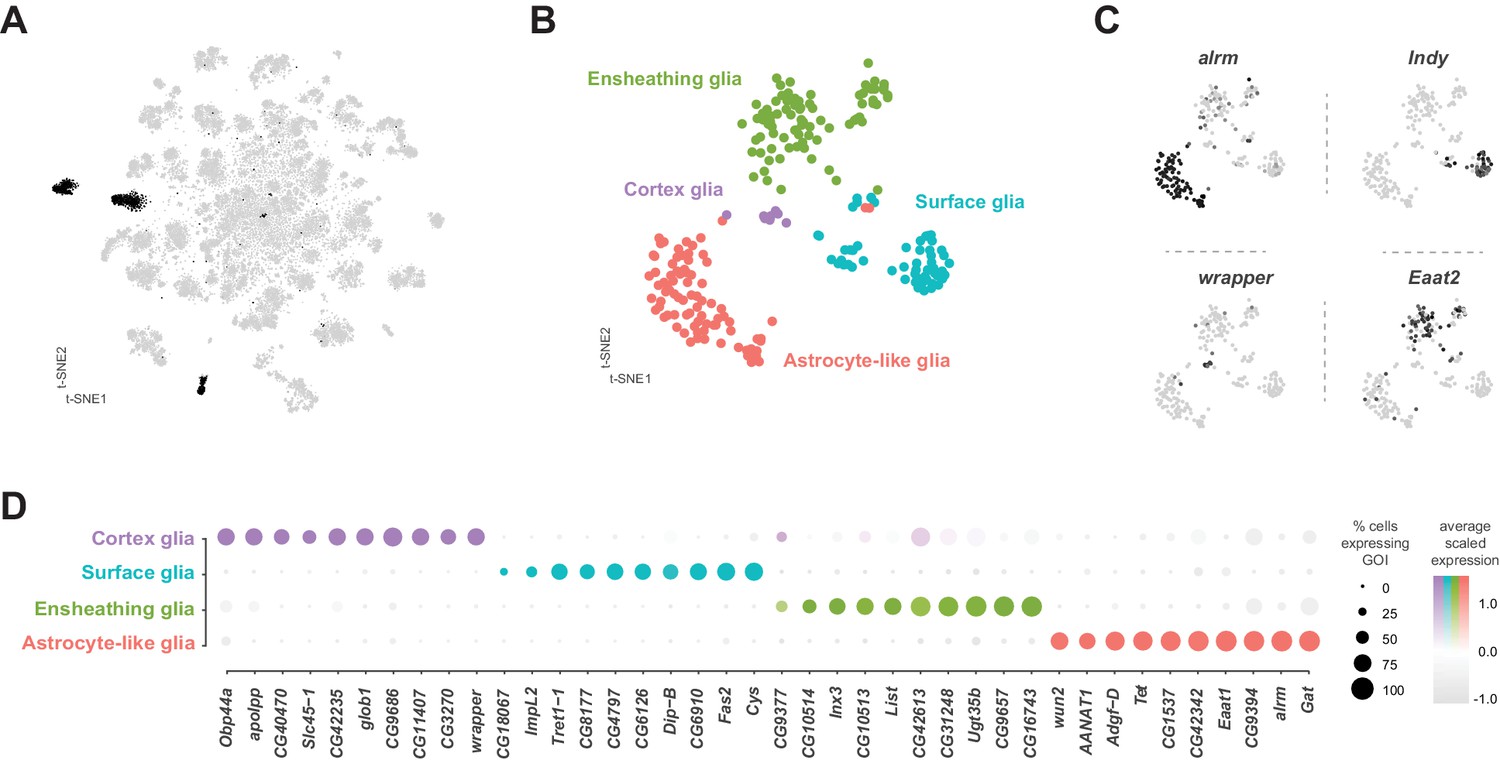
Identification and characterization of glial cell sub-types.
(A) t-SNE plot highlighting glial cell clusters. Clusters 23, 24, 70, 98, and 106 are shown in black, as they were determined to be glia based on differential expression of established glial and neuronal biomarkers (Figure 1—figure supplement 7). (B) t-SNE plot showing sub-clustering analysis of glial cells. Distinct clusters are color-coded and named. (C) Expression of established glial subtype-specific biomarkers used to determine cluster identity. astrocytic leucine-rich repeat molecule (alrm), for astrocytes; I’m not dead yet (Indy) for surface glia; wrapper for cortex glia; Excitatory amino acid transporter 2 (Eaat2) for ensheathing glia. Expression shown in black, intensity is proportional to the log-normalized expression levels. (D) Dot plot of the top 10 genes in each glial sub-type based on fold-enrichment (Figure 9—source data 1). Size of dots represent percent of cells in cluster expressing gene of interest (GOI); intensity of color reflects average scaled expression. Figure 9—source data 1 contain the full list of significantly enriched genes.
-
Figure 9—source data 1
List of marker genes for the glial sub-clusters shown in Figure 9D.
Table showing the average log-fold change values (>0.5) of glial cluster-discriminative marker genes, including adjusted p-values (<0.05). pct.1 is the proportion of cells that express the gene in the cluster, pct.2 is the proportion of cells that express the gene in the other clusters.
- https://cdn.elifesciences.org/articles/54074/elife-54074-fig9-data1-v1.xlsx
Figure 9—figure supplement 1
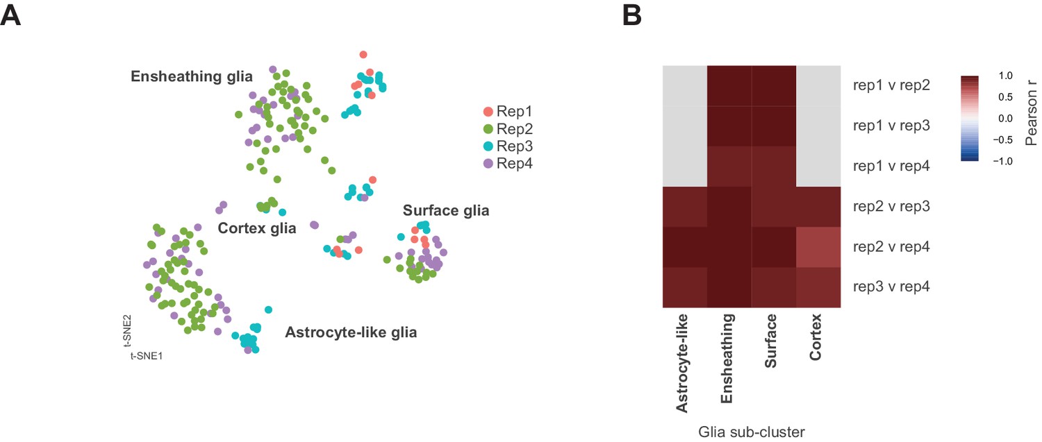
Identification of neuronal and glia clusters.
(A) t-SNE plot showing distribution of each replicate (Rep1-4) within the glial sub-clustering. (B) Heatmap showing Pearson correlations coefficients (−1 to +1) between each replicate per glial sub-cluster. Note replicate 1 does not contribute to the astrocyte-like or cortex glial clusters (grey). Replicates 2, 3, and 4 contributed to all clusters. Replicate 1 did not have any constituents in astrocyte-like or cortex glia. Replicate 1 was the smallest replicate in the whole data set and only contributed 13 of the 232 cells depicted in the glial sub-clustering.
Videos
Video 1
Video of 3D volume showing the co-expression of Acj6 (anti-Acj6; green) with knGAL4 driven expression of UAS-Stinger (nGFP; magenta) in the 5 day adult VNC, with neuropil counterstained (CadN; blue).
Video 2
Video of 3D volume showing the co-expression of Acj6 (anti-Acj6; green) with twzGAL4 driven expression of UAS-Stinger (nGFP; magenta) in the 5 day adult VNC, with neuropil counterstained (CadN; blue).
Video 3
Video of 3D volume showing the co-expression of Acj6 (anti-Acj6; green) with Lim3GAL4 driven expression of UAS-Stinger (nGFP; magenta) in the 5 day adult VNC, with neuropil counterstained (CadN; blue).
Additional files
Download links
A two-part list of links to download the article, or parts of the article, in various formats.
Downloads (link to download the article as PDF)
Open citations (links to open the citations from this article in various online reference manager services)
Cite this article (links to download the citations from this article in formats compatible with various reference manager tools)
A single-cell transcriptomic atlas of the adult Drosophila ventral nerve cord
eLife 9:e54074.
https://doi.org/10.7554/eLife.54074


