Pyphe, a python toolbox for assessing microbial growth and cell viability in high-throughput colony screens
- University College London, Institute of Healthy Ageing, Department of Genetics, Evolution and Environment, United Kingdom
- The Francis Crick Institute, Molecular Biology of Metabolism Laboratory, United Kingdom
- Charité Universitaetsmedizin Berlin, Department of Biochemistry, Germany
Figures
Figure 1 with 2 supplements
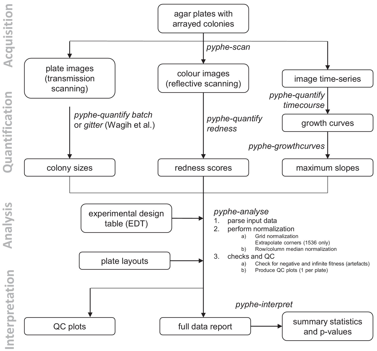
Data processing workflows using pyphe.
Pyphe is flexible and can use several fitness proxies as input. In a typical endpoint experiment, plate images are acquired using transmission scanning and colony sizes are extracted using pyphe-quantify or the R package gitter (Wagih and Parts, 2014). Alternatively or additionally, plates containing phloxine B are scanned using reflective scanning and analysed with pyphe-quantify in redness mode to obtain redness scores reflecting colony viability. Alternatively, image time series can be analysed with pyphe-quantify in timecourse mode and growth curve characteristics extracted with pyphe-growthcurves. Pyphe-analyse analyses and organises data for collections of plates. It requires an Experimental Design Table (EDT) containing a single line per plate and the path to the data file, optionally the path to the layout file, and any additional metadata the user wishes to include. Data is then loaded and the chosen normalisation procedures are performed. QC plots are produced and the entire experiment data is summarised in a single long table. This table is used by pyphe-interpret which produces a table of summary statistics and p-values for differential fitness analysis.
Figure 1—figure supplement 1
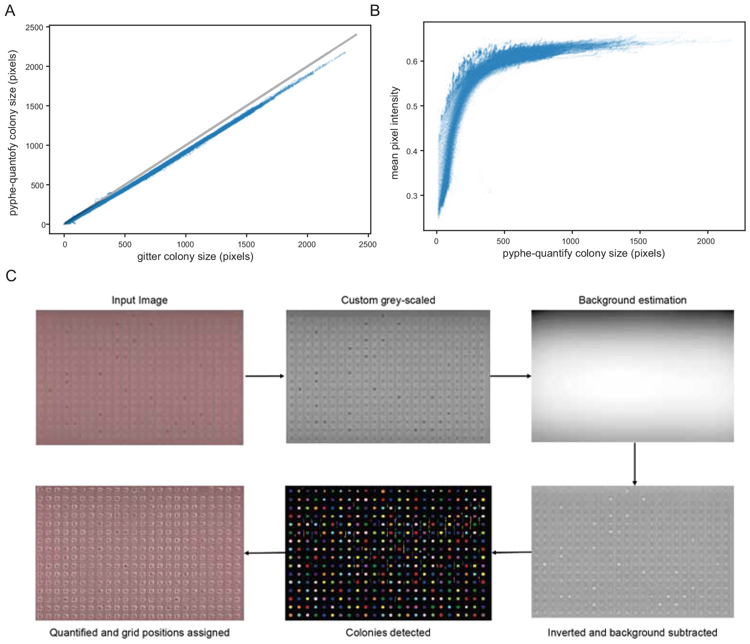
Image analysis with pyphe-quantify, described in Appendix 1.
All 144 images from the image time course of 57 wild strains in replicates in 1536 format were analysed with pyphe-quantify batch and with gitter using remove.noise=TRUE and inverse=TRUE settings. (A) Colony area measurements obtained with pyphe-quantify are very tightly correlated with those obtained with gitter (r=0.9991). In terms of absolute values, colony size estimates are consistently lower which is due to the default thresholding settings. (B) Mean pixel intensities (averaged over all pixels identified as belonging to the same colony) depend strongly on colony size (thickness). This signal quickly saturates as colonies become larger, as previously described by Zackrisson et al., 2016. (C) Illustration of image analysis algorithm used by pyphe-quantify in redness mode.
Figure 1—figure supplement 2
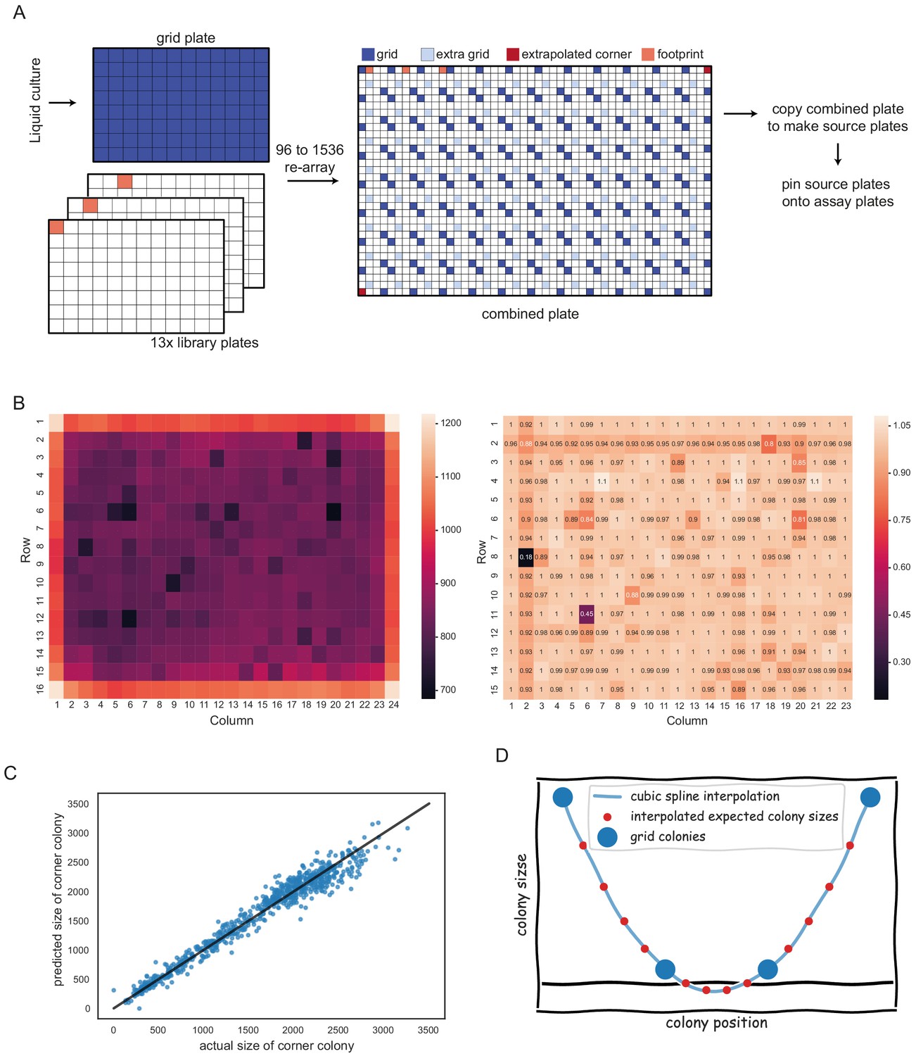
Spatial normalisation with pyphe-analyse, described in Appendix 2.
(A) Placement of two 96 grids in opposite corners of 1536 plate maximises grid coverage and only uses 1 in 8 positions for normalisation purposes. (B) Left: Mean uncorrected colony sizes across hundreds of plates. A strong edge effect is clearly visible. This is removed by grid correction which introduces a much weaker secondary edge (right). (C) Prediction of missing corners based on neighbours. Shown are predicted versus actual colony sizes for top left and bottom right corners (the training data) for an experiment comprising 375 plates. The linear regression model in this case was y = 1.24 * horizontal neighbour + 0.16 * vertical neighbour - 34. The R² was 0.96. (D) Extremely small grid colonies can result in negative values for expected colony sizes.
Figure 2 with 3 supplements
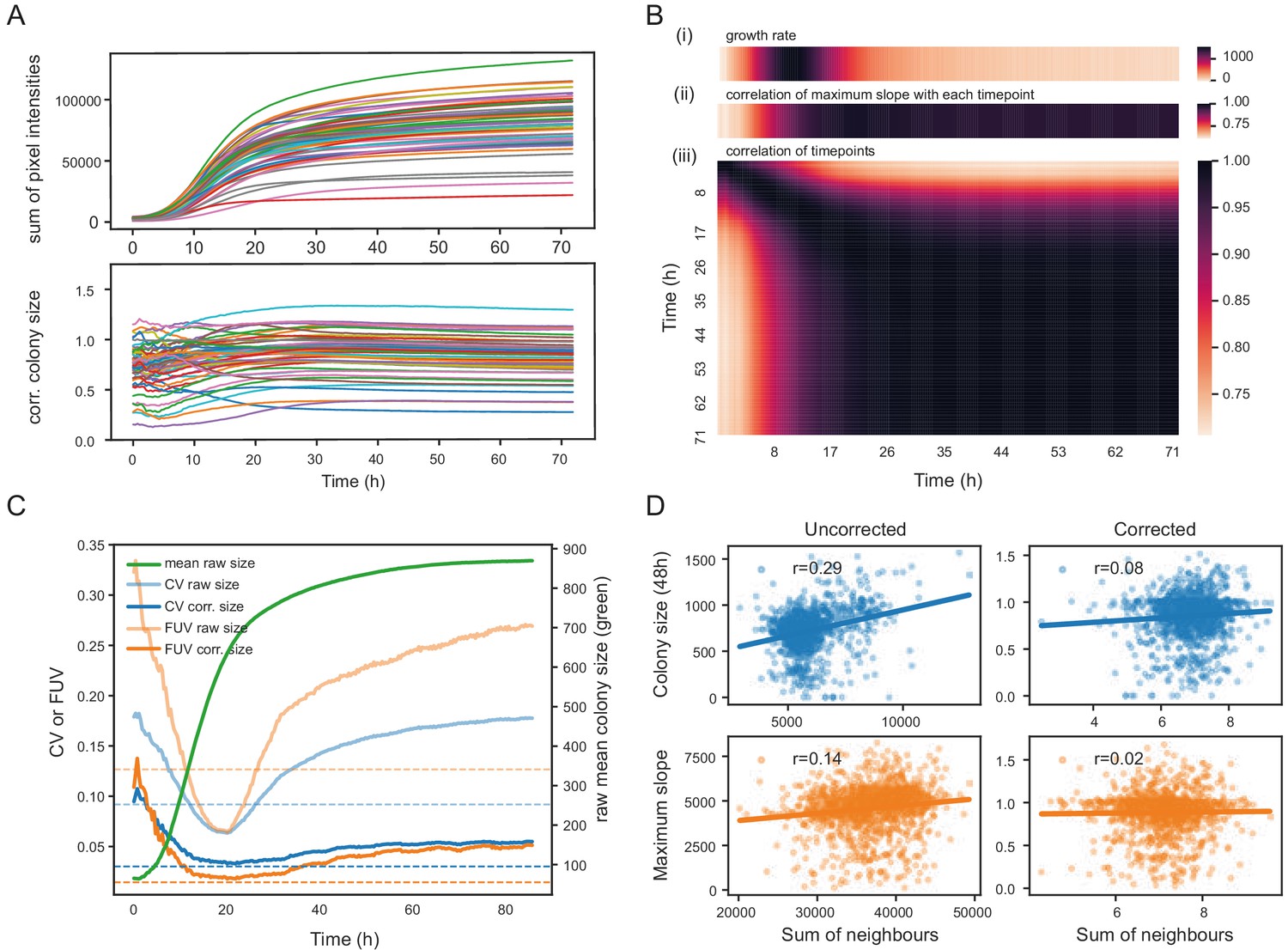
Normalisation strategies for growth curves and endpoints.
(A) Growth curves of 57 wild S. pombe strains (average of approximately 20 replicates each) before (top) and after (bottom) correction. Corrected colony sizes describe the fitness relative to the standard laboratory strain (972) after grid correction. (B) Late endpoint measurements are tightly correlated with maximum slopes. (i) Average growth rates (mean difference in sum of pixel intensities between consecutive timepoints) across all strains. (ii) Pearson correlation of each individually corrected timepoint with corrected maximum slope of growth curves. The correlation increases throughout the rapid growth curve and then maintains high levels as the phase of fast growth comes to an end. (iii) Pearson correlation matrix of all corrected timepoints (averaged by strain prior to correlation analysis). (C) Coefficient of variation (CV, blue) and fraction of unexplained variance (FUV, orange) for corrected and uncorrected colony sizes throughout the growth curve. Dashed lines are the same values computed based on maximum slopes. The average growth curve of the control strain is shown in green (based on colony sizes extracted with gitter). The normalisation procedure maintains noise at low levels even in later growth. Endpoint measurements contain slightly more noise than slope measurements. (D) Scatter plots of colony fitness estimates dependent on the sum of colony fitness of its 8 neighbours. A positive correlation, such as seen for the uncorrected readouts, points to spatial biases within plates (specific regions of a plate growing slower/faster, for example due to temperature, moisture or nutrient gradients). A negative correlation would be expected for competition effects. Without correction, regional plate effects dominate over competition effects and these are efficiently removed during grid correction. Importantly, the correction does not result in a negative correlation, a potential side-effect of correcting colony sizes by comparing it to the size of neighbouring controls, which would lead to phenotypes becoming artificially more extreme.
Figure 2—figure supplement 1
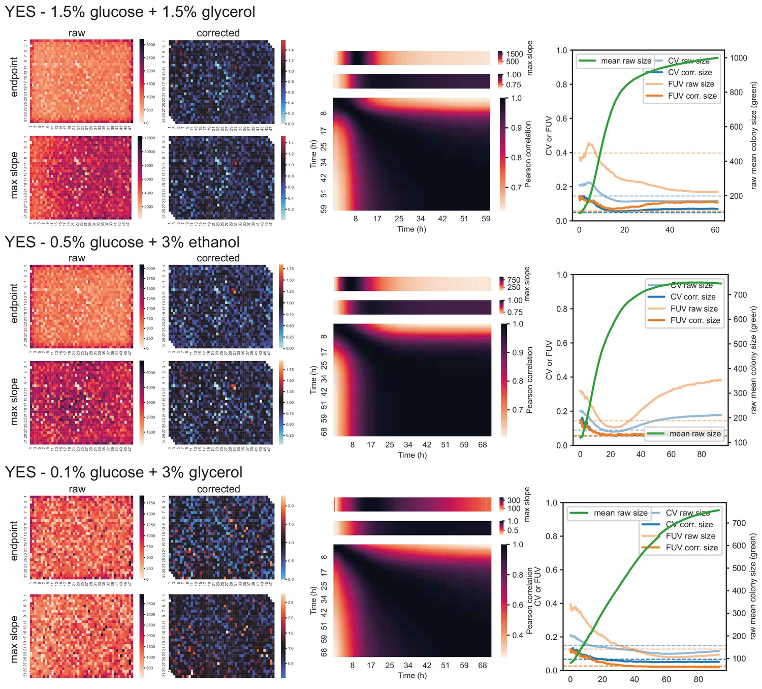
57 wild strains on different carbon and nitrogen sources.
Left: Heatmaps showing raw and corrected colony sizes of maximum slopes and endpoints. Centre: Correlation of timepoints with each other (large heatmaps), correlation of each timepoint with maximum slope (heatmaps above), and average growth rate across plate for each timepoint (heatmaps on top). Right: Coefficient of variation (CV, blue) and fraction of unexplained variance (FUV, orange) for corrected and uncorrected colony sizes throughout the growth curve. Dashed lines are the same values computed based on maximum slopes. The average growth curve of the control strain (based on colony sizes extracted with gitter) is shown in green.
Figure 2—figure supplement 2
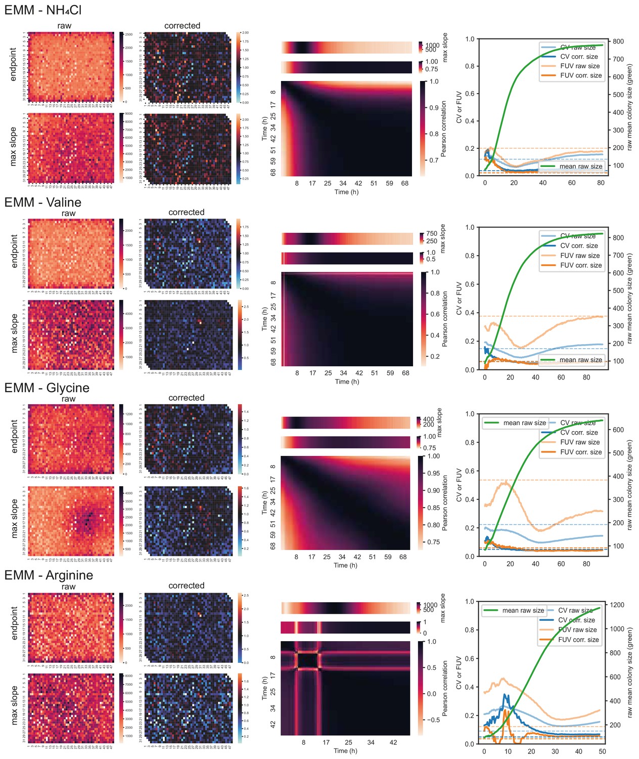
57 wild strains on different carbon and nitrogen sources (cont’d).
Left: Heatmaps showing raw and corrected colony sizes of maximum slopes and endpoints. Centre: Correlation of timepoints with each other (large heatmaps), correlation of each timepoint with maximum slope (heatmaps above), and average growth rate across plate for each timepoint (heatmaps on top). Right: Coefficient of variation (CV, blue) and fraction of unexplained variance (FUV, orange) for corrected and uncorrected colony sizes throughout the growth curve. Dashed lines are the same values computed based on maximum slopes. The average growth curve of the control strain (based on colony sizes extracted with gitter) is shown in green.
Figure 2—figure supplement 3

57 wild strains analysis summary.
(A) Distribution of CVs and FUVs (based on 96 replicates of the control strain 972 evenly dispersed through the plate, normalised for spatial effects with grid correction) across 8 conditions. Using maximum slopes instead of endpoints usually results in lower noise levels. (B) Table listing the correlation between corrected maximum slopes and corrected enpoints.
Figure 3 with 1 supplement
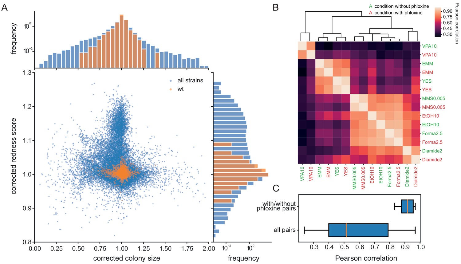
Phloxine B provides an orthogonal and independent fitness proxy.
(A) Relative colony sizes and redness scores after correction for 238 single gene knock-outs in 70 conditions (after quality filtering as described in Methods, three biological replicate colonies for each condition-gene pair are shown individually). The two read-outs are only weakly anti-correlated (r = −0.088) and many mutant-condition pairs show a strong phenotype in only one of the two fitness proxies. Axes were cut to exclude extreme outliers for visualisation. The redness score was robust with a CV of 1.04% and a FUV of 7.83% (histogram on right). For comparison, the CV and FUV of the colony size read-out were 6.1% and 31.5%, respectively (top histogram). (B) Clustered Pearson correlation matrix of averaged corrected colony sizes (n = 3) for 7 conditions with and without phloxine B. Repeats with and without dye consistently cluster together indicating general robustness of our measurements across batches and no substantial mutant-condition-dye interactions. (C) Boxplot comparing the pairwise correlation between conditions with and without phloxine B (median = 0.92) and all possible pairs from (B) (median = 0.51).
Figure 3—figure supplement 1
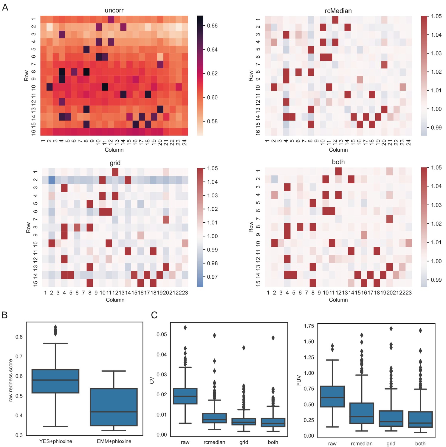
Normalisation of redness data for 238 knock-out mutants.
(A) Median redness scores across 308 plates (covering 78 different conditions). Top left: Uncorrected redness scores as obtained with pyphe-quanitfy in redness mode. There is a strong row-dependent effect with colonies in the top and bottom rows showing increased redness. This bias can be removed with a row/column median normalisation as implemented in pyphe-analyse, resulting in median corrected redness scores in the top right. Alternatively (e.g. if row/column median normalisation is no option), grid normalisation can be used (bottom left). This introduces the secondary edge effect observed before (Figure 1—figure supplement 2B), which can be removed by an additional subsequent row/column median normalisation. Colormaps were clipped at 1.05 for heatmaps showing corrected phenotypes. (B) Raw redness scores vary between plates. A major factor is whether the media is minimal or rich. Boxes show distributions of raw redness scores for 451 replicates o the standard lab strain 972 (across 41 plates) for rich media and 77 replicates acr across 7 plates for minimal media. (C) CVs and FUVs across all 308 plates with the three different correction strategies explained above. The optimal choice of normalisation will vary acorss experiments, but unlike for colony sizes, row/column median normalisation achieves comparable reductions in noise.
Figure 4 with 2 supplements
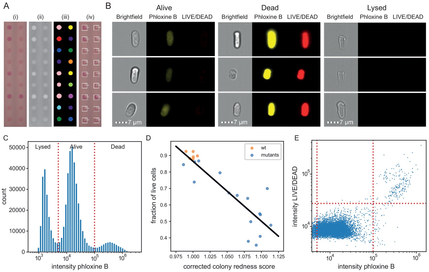
Phloxine B staining reflects percentage of dead cells.
(A) Example of colony redness score extraction by pyphe-quantify in redness mode. From the acquired input image (i), colors are enhanced and the background subtracted (ii), colonies are identified by local thresholding (iii), and redness is quantified and annotated in the original image (iv). (B) Representative cells for alive, dead and lysed cells using imaging flow cytometry (ImageStream). Lysed cells show no signal in either the phloxine B or LIVE/DEAD channels. Live cells show an intermediate signal intensity in the phloxine B channel but no LIVE/DEAD signal. Dead cells are brightly stained in both channels. (C) Histogram of intensities in phloxine B channel across 23 samples with three populations (lysed, alive and dead) clearly resolved. (D) Fraction of live cells (live/(lysed+dead)) by ImageStream correlate with colony redness scores (corrected by row/median column normalisation) obtained with pyphe. (E) Co-localisation of phloxine B stain with LIVE/DEAD stain for the standard lab strain 972. Both readouts agree with 99.3% accuracy using the illustrated thresholds.
Figure 4—figure supplement 1
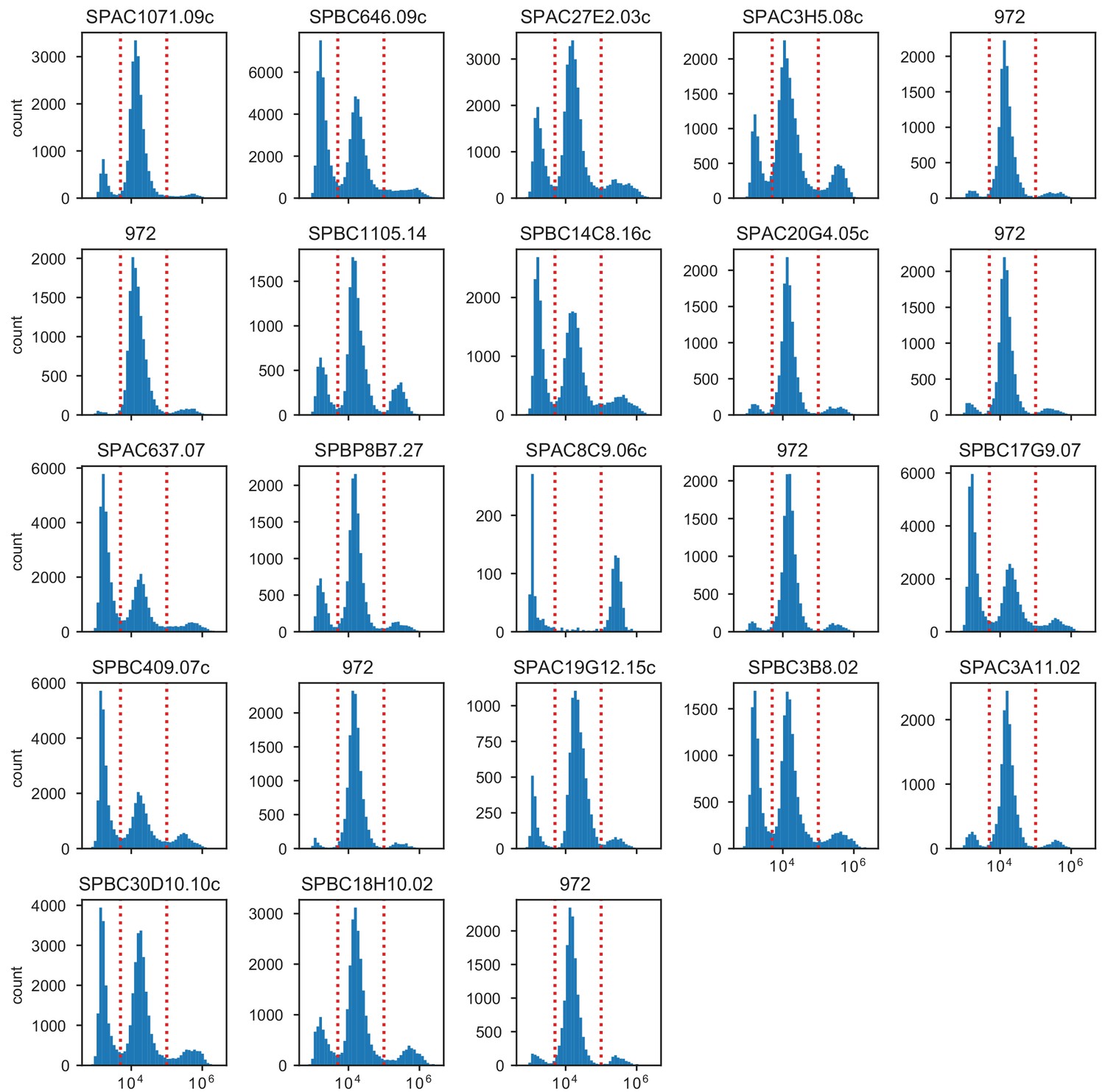
Distribution of phloxine B intensities in ImageStream.
Plot titles indicate the gene which was knocked out. The standard laboratory strain 972 was measured in 6 biological replicates from samples obtained from different colonies.
Figure 4—figure supplement 2
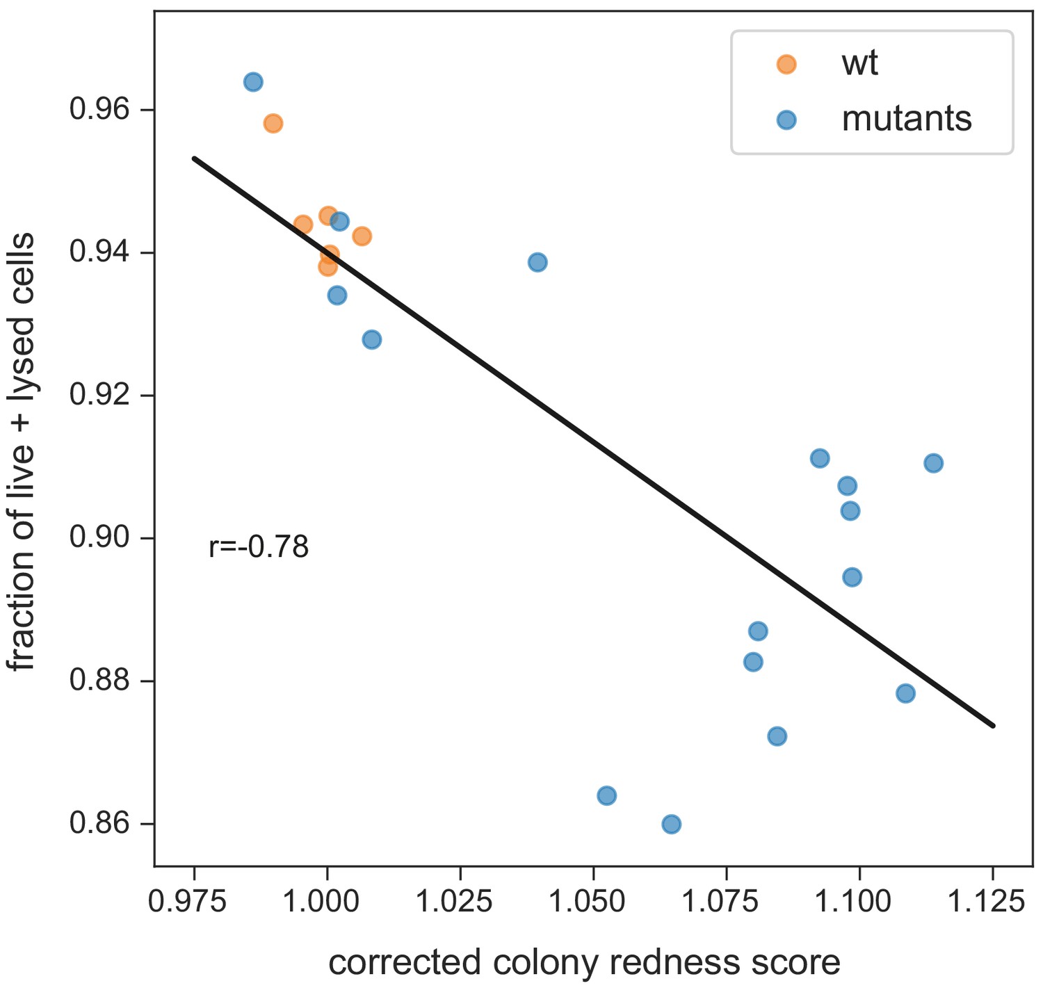
Fraction of strongly stained cells depending on colony redness score.
The correlation is weaker than for the fraction of live cells only (neither burst nor strongly stained in the flow cytometer, shown in Figure 4D). This suggests that burst cells do contribute to staining in the colony (while being unstained in the flow cytometer). Note that the correlation especially breaks down for colonies with higher redness scores (which have more burst cells).
Figure 5
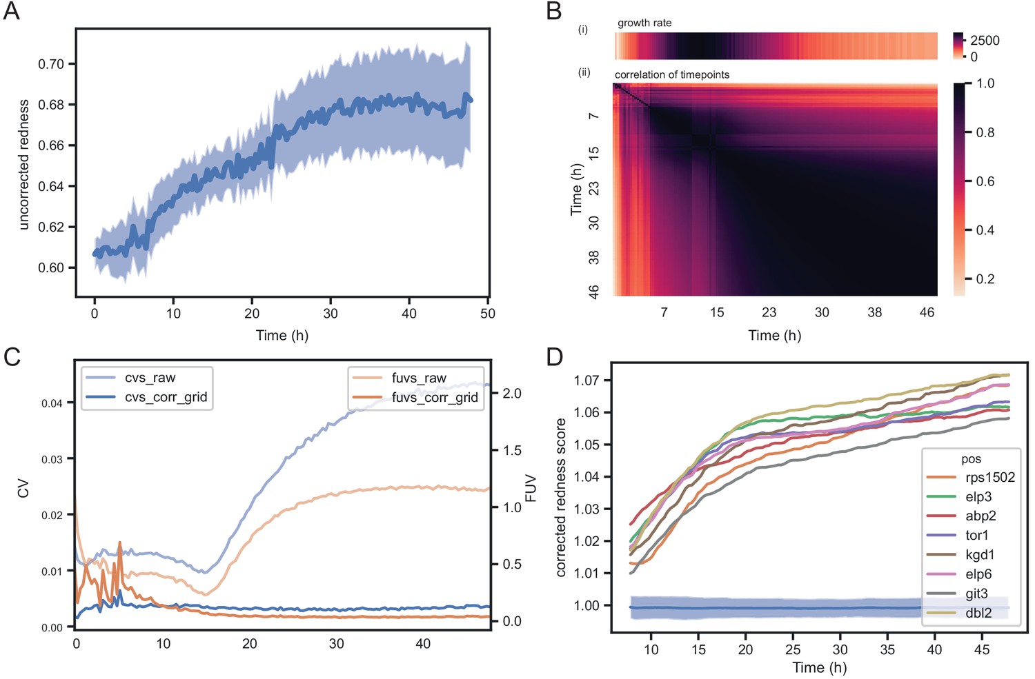
Temporal dynamics of phloxine B colony redness scores.
(A) Raw redness scores over time for 96 wild-type grid colonies (dark line shows mean, shaded area shows standard deviation). The uncorrected redness increases as colonies grow as there is a background signal unrelated to cell death. (B) Correlation matrix corrected redness scores for all 238 strains over 48 hr (3 timepoints per hour). The readout is stable from the point at which fast growth ends and remains tightly correlated for at least 24 hr. (C) CVs and FUVs during 48 hr. Grid normalisation effectively neutralises non-biological effects. (D) Redness curves for selected mutants showing the strongest red phenotype. Increased redness is visible from the start, and this further increases as colonies grow. Therefore, in this case, growth and death are not temporally decoupled.
Author response image 1

Pixel calibration is not required for accurate determination of colony sizes.
Top row: calibration functions applied to the original scanned image. The first function is a linear transformation that scales the image to fill the entire 8bit range. We apply this to images in batch (but not timecourse) analysis by default. The other functions are 3rd-degree polynomials (as used by scan-o-matics). Middle row: Transformed images with upper right corner magnified. The third function has strong non-linear components which result in visible distortion of the image. Bottom row: colony sizes obtained with pyphe-quantify batch of the transformed images versus the original image. The median of the relative error abs(size(transformed)-size(original))/size(original) across the plate is noted. This is negligibly small when compared to the variation of colony sizes.
Author response image 2

Examples of raw growth curves obtained with pyphe setup.
Shown are 12 growth curves from the first row of a 1536 plate of 57 S. pombe wild strains (same data as Figure 2 in manuscript) analysed with pyphe-quantify in timecourse mode.
Author response image 3

Image conversion to jpg has negligible impact on results.
Each image of a growth curve consisting of 145 images (shown on x-axis) was analysed in the original tiff format and in the converted jpg, using gitter (right) and pyphe-quantify in batch mode (left). The correlation (blue line) is extremely high for all images (>0.996) and increases as colonies get larger and darker. The median relative error abs(size(jpg)-size(tiff_image))/size(tiff) is shown (orange) and is practically 0 compared to the biological signal (median absolute deviation of all colony sizes per plate).
Author response image 4

The analysis shows the number of replicates required with scan-o-matics and with pyphe in order to achieve the same statistical power.
Author response image 5

Subgroup analysis of colony staining.
We divided the data into two groups and computed the correlation separately. Both groups still show clear correlation (0.41 and -0.33) which is incompatible with the claim that the method allows a binary classification only. However, the within-group correlation is substantially lower than the overall correlation. Regardless, redness scores in themselves are highly reproducible and precise and therefore present an attractive fitness readout, the use of which does not require a detailed mechanistic understanding.
Author response image 6

The fraction of live cells (neither burst nor strongly stained in flow cytometer, left panel) better explains the colony redness score than the fraction of strongly stained cells only (right panel).
This suggests that burst cells do contribute to staining in the colony (while being unstained in the flow cytometer). Note that the correlation breaks down for colonies with higher redness scores (which have more burst cells).
Tables
Key resources table
| Reagent type (species) or resource | Designation | Source or reference | Identifiers | Additional information |
|---|---|---|---|---|
| Strain, strain background (Schizosaccharomyces pombe) | 57 S. pombe wild strains | Jeffares et al., 2015 | JBxxx | These strains were identified as a set of most diverse strains from the overall collection |
| Strain, strain background (Schizosaccharomyces pombe) | 238 S. pombe knock-out strains | Bioneer and (Sideri et al., 2015) | Pombase gene IDs and names | The original library obtained from Bioneer was made prototrophic by crossing with suitable strain. Genes were selected to cover GO functional categories and include unknowns. |
| Chemical compound, drug | Phloxine B | Sigma | Cat# P2759 | Prepared as a 5 g/L (1000x) stock in water and stored at 4°C in the dark. |
| Software, algorithm | Pyphe | This publication | Pyphe provides the following tools: pyphe-scan, pyphe-scan-timecourse, pyphe-quantify, pyphe-analyse, pyphe-interpret, pyphe-growthcurves | Version 0.95 was used for preparation of this manuscript. |
| Other | Scanner | Epson | V800 Photo |
Additional files
-
Supplementary file 1
Corrected maximum slopes and endpoints for 57 wild strains in 8 conditions.
- https://cdn.elifesciences.org/articles/55160/elife-55160-supp1-v1.csv
-
Supplementary file 2
Relative redness scores and colony sizes for 238 knock-out mutants.
- https://cdn.elifesciences.org/articles/55160/elife-55160-supp2-v1.csv
-
Supplementary file 3
Differential fitness of 238 knock-out mutants in conditions with and without phloxine B.
- https://cdn.elifesciences.org/articles/55160/elife-55160-supp3-v1.csv
-
Supplementary file 4
ImageStream classification counts for mutants.
- https://cdn.elifesciences.org/articles/55160/elife-55160-supp4-v1.csv
-
Transparent reporting form
- https://cdn.elifesciences.org/articles/55160/elife-55160-transrepform-v1.docx
Download links
A two-part list of links to download the article, or parts of the article, in various formats.
Downloads (link to download the article as PDF)
Open citations (links to open the citations from this article in various online reference manager services)
Cite this article (links to download the citations from this article in formats compatible with various reference manager tools)
Pyphe, a python toolbox for assessing microbial growth and cell viability in high-throughput colony screens
eLife 9:e55160.
https://doi.org/10.7554/eLife.55160


