A whole-brain connectivity map of mouse insular cortex
- Max Planck Institute of Neurobiology, Circuits for Emotion Research Group, Germany
- International Max-Planck Research School for Molecular Life Sciences, Germany
- International Max-Planck Research School for Translational Psychiatry, Germany
- Max von Pettenkofer-Institute and Gene Center, Medical Faculty, Ludwig-Maximilians-University Munich, Germany
Figures
Figure 1 with 4 supplements
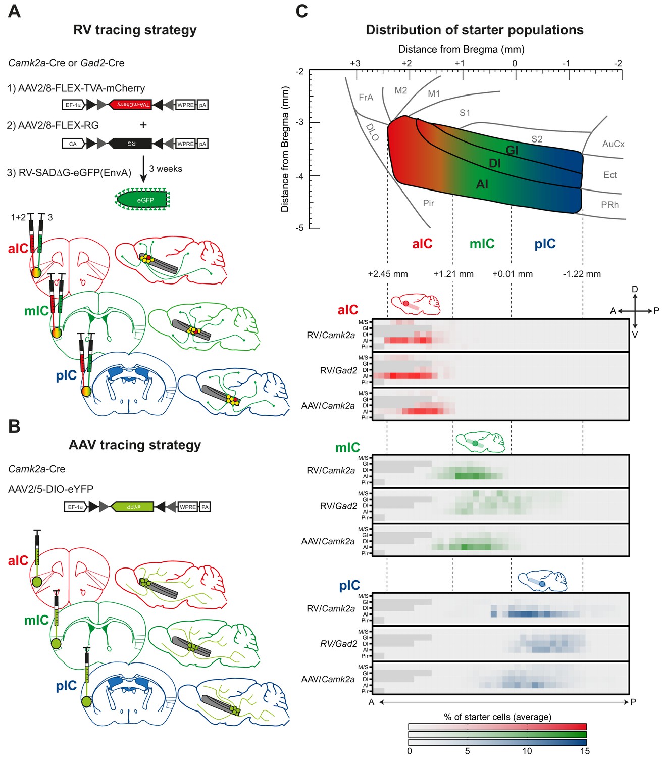
Tracing strategy and localizations for input and output viral tracings from distinct IC subregions.
Schematic representation of Cre-dependent (A) monosynaptic retrograde Rabies virus tracing (RV) and (B) anterograde axonal AAV tracings (AAV) used to determine respective input and output connectivity to the IC. Tracings were performed in both excitatory (Camk2a-Cre) and inhibitory (Gad2-Cre) mouse lines for RV, and only in the Camk2a-Cre mouse line for AAV. For RV tracings, AAV-FLEX helper viruses expressing mCherry-tagged TVA (1) and rabies-virus-specific G protein (2) were co-injected into the IC region of interest. Three weeks later EnvA-coated, eGFP-expressing modified RV lacking G protein was injected at the same location (3). For anterograde tracings, a one-off injection of eYFP-expressing AAV-FLEX virus was administered into the chosen location. Three distinct IC subregions were chosen for each tracing technique: anterior (aIC, red), medial (mIC, green) or posterior (pIC, blue). (C) Schematic illustration of the lateral view of the IC including distances from Bregma (top panel) and heatmap showing average starter cell distribution for each tracing strategy at each specific IC target (bottom panels). The three IC target subregions were mostly non-overlapping, and only a minimal percentage of cells were detected in the Motor and Sensory Cortex (M/S), or Piriform Cortex (Pir) neighboring the IC. n = 3 mice per injection site/tracing strategy. Heatmap intensity scale is the same for all three IC target subregions. Regions absent at specific Bregma levels indicated by dark gray squares.
Figure 1—figure supplement 1
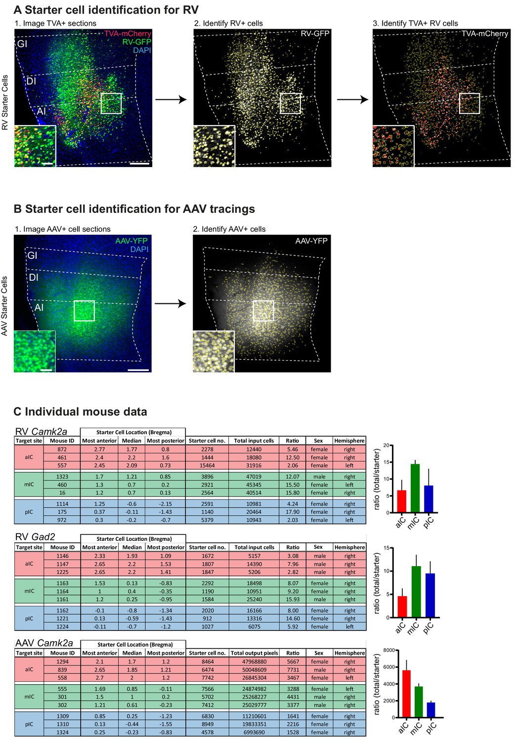
Starter cell identification.
(A) Starter cell identification pipeline for RV helper system. (1) High-resolution image of a representative section at the injection site in the IC. Starter cells are double-labeled with TVA-mCherry and RV-GFP, and appear yellow. Scale bars 200 µm (main image), 50 µm (inset). Number of starter cells were identified in an automated fashion using Cell Profiler. First RV+ cells were identified ([2], yellow cell outlines) from the GFP image, then RV+ cells that also contain mCherry-TVA were identified from the mCherry signal ([3], red rings within yellow RV+ cell outlines). Double-labeled cells were counted as starter cells. (B) Starter cell identification pipeline for AAV tracing system. (1) Representative epifluorescent image of YFP-labeled AAV starter cells. Scale bars 200 µm (main image), 50 µm (inset). (2) YFP-positive cells were identified in an automated manner using Cell Profiler. Data given as cells per brain subregion, which was manually defined before cell identification. (C) Raw data for each individual animal used. Starter cell range values given as distance from Bregma in mm. Ratio shown as total cells/starter cells. Hemisphere indicates injection site.
Figure 1—figure supplement 2
Starter cells.
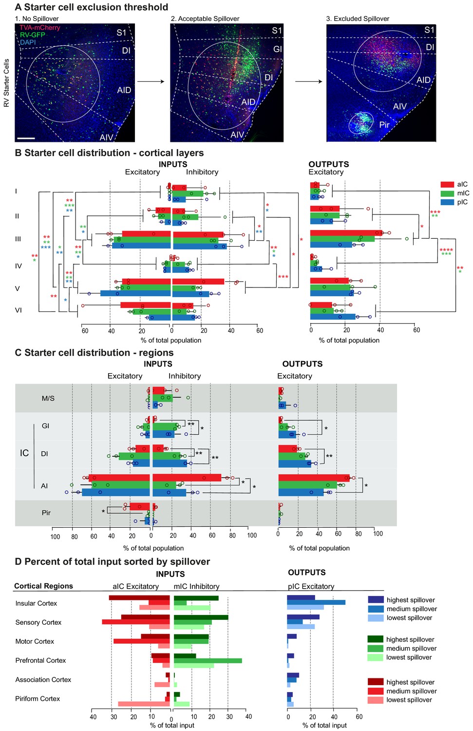
(A) Starter cell exclusion threshold. High-resolution image of a representative section at the injection site in the IC. Starter cells are double-labeled with TVA-mCherry and RV-GFP, and appear yellow. The center of the population is marked with a circle. Scale bars 200 µm. (1) Example of a brain without spillover into adjacent regions (2) Example of a brain with an acceptable amount of spillover into Primary Sensory Cortex (S1) (3) Image of an excluded brain with high spillover into S1 and Piriform Area (Pir). (B) Percent of total starter cell population sorted by layer occupation. A two-way ANOVA followed by Tuckey’s multiple comparison test was performed to compare starter cell distribution between and within layers. Significant differences were labeled as ****p<0.0001, ***p<0.001, **p<0.01, *p<0.05. (C) Percent of total starter cell population sorted by region occupation; showing spillover. Group comparisons per region were made using one-way ANOVAs followed by Tuckey’s multiple comparison tests. Significant differences were labeled as **p<0.01, *p<0.05. (D) Comparison of percent of total input between individual brains with varying amount of spillover to either the Motor- and Somatosensory cortices (M/S) or Piriform cortex (Pir). The darkest color indicates the sample with the highest spillover and lightest color the lowest/no spillover. For detailed statistics see Supplementary file 3. n = 3 mice per condition, data shown as average ± SEM.
Figure 1—figure supplement 3

Cell counting.
(A–C) Example pictures depicting (1) The raw GFP channel signal of labeled input cells, (2) Human counts laid over the raw GFP signal and (3) The automated counts laid over the segmented image of the GFP channel. Exemplary counts are shown for (A) VP, (B) Po and (C) parts of the Amygdala (CeA, LA and BLA). (D–E) Cell count comparisons, including number of sections on which the brain region was present and cells were counted as well as the average difference in cell counts per section (human vs. automated) and Relative Percent Difference (RPD). (D) Comparison within a single brain showing differences between several human counters (left part of the table) and the difference between averaged human counts and the automated counts (right part of the table). (E) Comparisons between human and automated counts for three different brains.
Figure 1—figure supplement 4
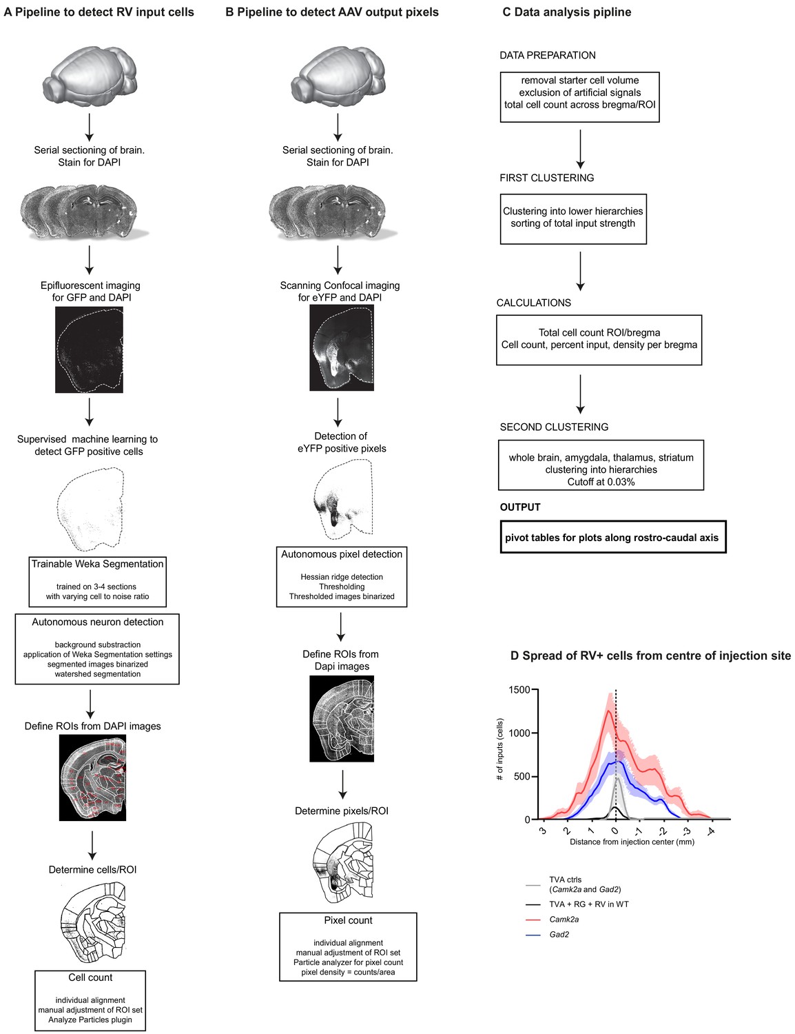
Workflow of tracing quantification and data analysis.
All data available at https://github.com/GogollaLab/tracing_quantification_and_analysis (Gehrlach, 2020; copy archived at https://github.com/elifesciences-publications/tracing_quantification_and_analysis). Pipeline to detect (A) RV+ input neurons to the IC and (B) AAV+ output neurons from the IC. Brains were fixed and coronally sectioned (thickness: 70 µm). Every second section was stained for DAPI and imaged either using slide scanner epifluorescent microscopy (RV) or scanning confocal microscopy (AAV). For RV, positive cells were identified using supervised machine learning (https://github.com/GogollaLab/tracing_quantification_and_analysis/blob/master/autonomous_neuron_detection.ijm) and allocated to manually adjusted ROIs corresponding to the Paxinos and Franklin mouse brain atlas (https://github.com/GogollaLab/tracing_quantification_and_analysis/blob/master/counting_RV.ijm). For AAV tracings, YFP-positive pixels were segmented with hessian ridge detection (https://github.com/GogollaLab/tracing_quantification_and_analysis/blob/master/autonomous_pixel_detection.ijm) and allocated to manually adjusted ROIs from the mouse brain atlas (https://github.com/GogollaLab/tracing_quantification_and_analysis/blob/master/counting_AAV.ijm). (C) Pipeline of data analysis in python. After cleaning of the raw data, it was clustered and calcualtions done before a final clustering. The output was pivot tables. https://github.com/GogollaLab/tracing_quantification_and_analysis/blob/master/analysis_AAV.py and https://github.com/GogollaLab/tracing_quantification_and_analysis/blob/master/analysis_RV.py. (D) Assessment of the specificity and spread of experimental and control conditions. In contrast to experimental conditions (red: Camk2a-Cre, N = 9 mice; blue: Gad2-Cre, N = 9 mice), we could not detect long-range RV+ neurons in the wildtype- (black, N = 2 mice) and TVA control conditions (grey, N = 2 mice). This confirms, that in the experimental conditions, the brain-wide signals are indeed from a transsynaptic retrograde transfer. Further, combining the results from the WT controls (black) and TVA controls (grey) revealed that there is some leakage of the AAV-FLEX system and that SADdG-eGFP(EnvA) can still infect a minor fraction of TVA-negative neurons. Guided by these control experiments, we omitted quantification of RV+ neurons for ±1 mm from the injection center within the IC and claustrum.
Figure 2 with 4 supplements
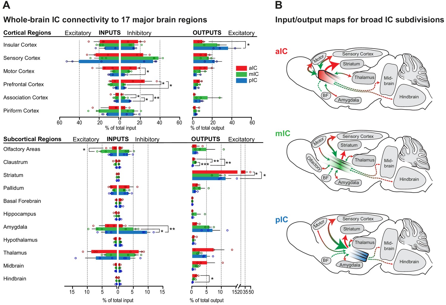
Whole-brain IC connectivity map.
(A) Comparison of inputs to excitatory and inhibitory IC neurons (left) and outputs of excitatory neurons of the IC (right) of all three IC subregions (aIC, red; mIC, green; pIC, blue) across the 17 major brain regions that displayed connectivity. Region values are given as percentage of total cells (RV) or of total pixels (AAV). Data is shown as average ± SEM. n = 3 mice per condition. Top panel shows cortical connectivity, bottom panel shows subcortical connectivity. One-way ANOVAs per subregion followed by Tuckey’s multiple comparison test were performed to generate p-values. Significant differences between inputs to excitatory or inhibitory neurons to IC subregions or between outputs from the IC subregions were labeled as ***p<0.001, **p<0.01, *p<0.05. For detailed statistics see Supplementary file 3. (B) Individual input-output maps for the three IC subdivisons highlighting selected brain regions. Weight of arrowhead and thickness of arrow shaft indicate strength of connection. Green arrowheads indicate inputs, red arrowheads indicate outputs.
Figure 2—figure supplement 1

Brain-wide dataset for aIC.
Brain-wide global datasets were divided into 75 subregions for comparison. Data shows excitatory (Camk2a) and inhibitory (Gad2) input strengths, and excitatory output strength (Camk2a) from each IC- subregion (aIC, mIC, and pIC, Figure 2—figure supplements 1, 2, and 3, respectively). Values are presented as normalized percentage of total cells (RV) or total pixels (AAV). Data shown as average ± SEM. N = 3 mice per condition. Top panel shows cortical connectivity, bottom panel shows subcortical connectivity.
Figure 2—figure supplement 2
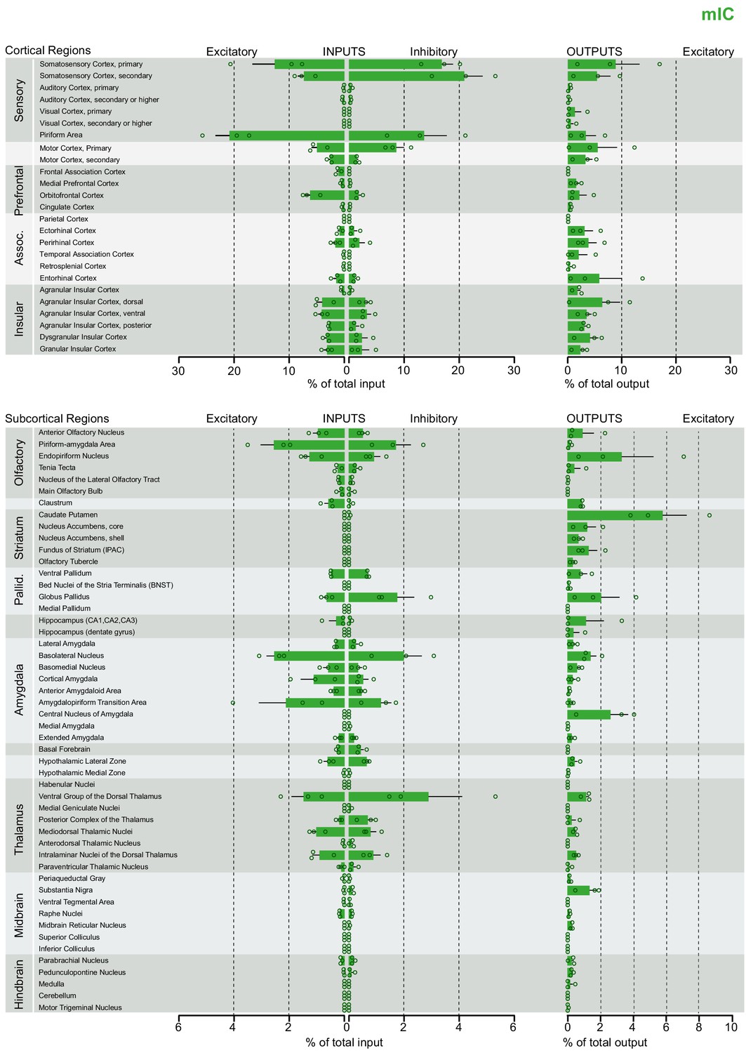
Brain-wide dataset for mIC.
Brain-wide global datasets were divided into 75 subregions for comparison. Data shows excitatory (Camk2a) and inhibitory (Gad2) input strengths, and excitatory output strength (Camk2a) from each IC- subregion (aIC, mIC, and pIC, Figure 2—figure supplements 1, 2, and 3, respectively). Values are presented as normalized percentage of total cells (RV) or total pixels (AAV). Data shown as average ± SEM. N = 3 mice per condition. Top panel shows cortical connectivity, bottom panel shows subcortical connectivity.
Figure 2—figure supplement 3
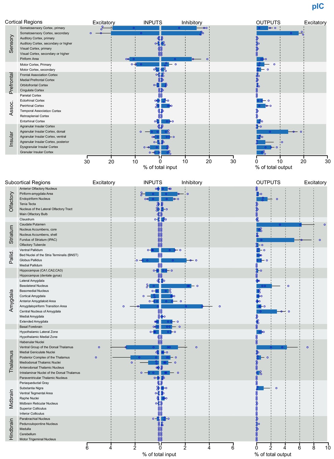
Brain-wide dataset for pIC.
Brain-wide global datasets were divided into 75 subregions for comparison. Data shows excitatory (Camk2a) and inhibitory (Gad2) input strengths, and excitatory output strength (Camk2a) from each IC- subregion (aIC, mIC, and pIC, Figure 2—figure supplements 1, 2, and 3, respectively). Values are presented as normalized percentage of total cells (RV) or total pixels (AAV). Data shown as average ± SEM. N = 3 mice per condition. Top panel shows cortical connectivity, bottom panel shows subcortical connectivity.
Figure 2—figure supplement 4
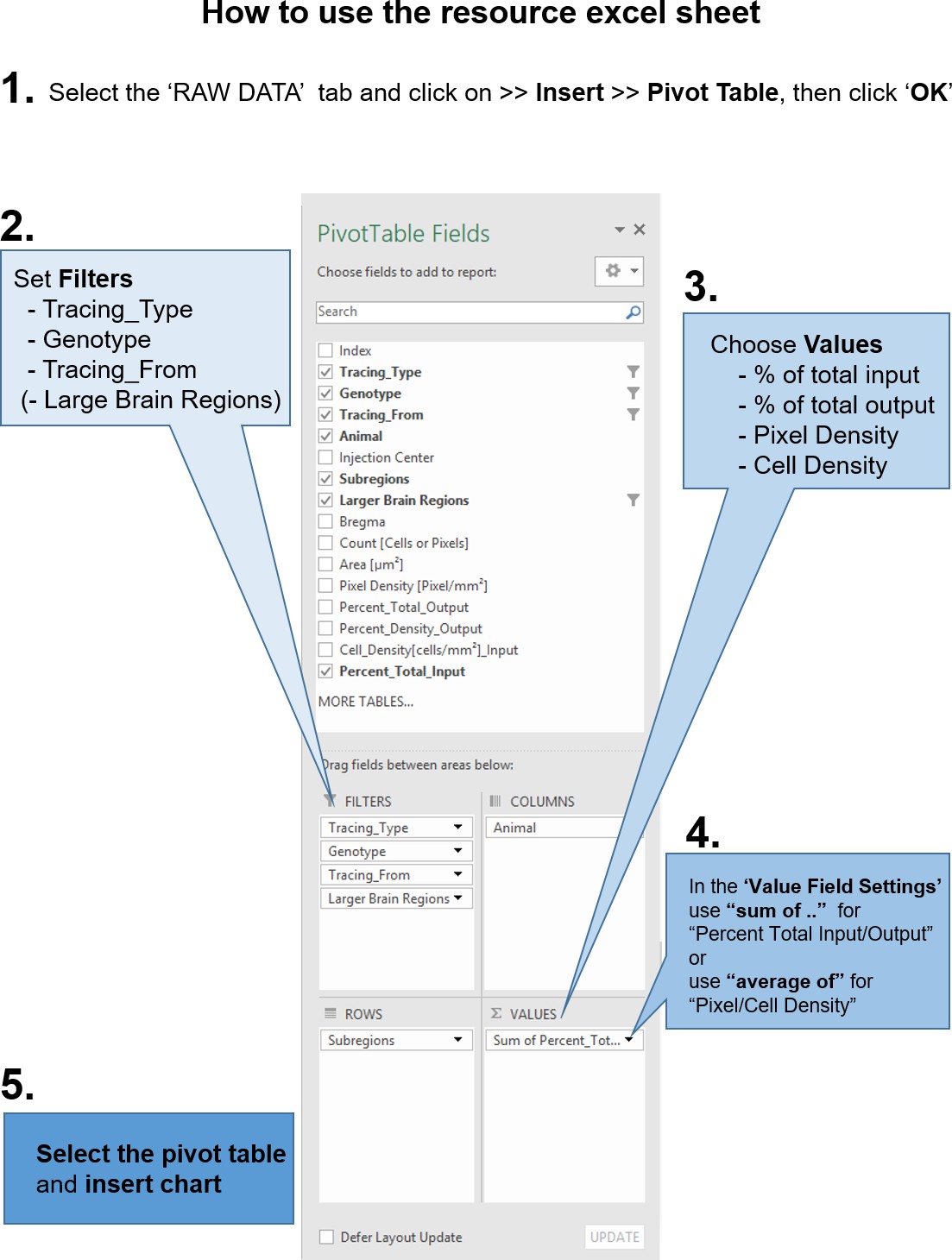
Instructions to query the datasets with custom questions.
From the accompanying excel resource sheet, all plots presented in this study can be recreated. In addition, the reader can query the dataset with his own questions, by creating pivot tables. The workflow, how to create such a pivot table in excel is described here. (1) After opening the excel sheet, navigate to the ‘RAW DATA’ tab. Then go to the ‘Insert’ tab and insert a pivot table. In the subsequent pop-up dialogue, make sure the entire range of the dataset is selected and click ‘OK’. Next, (2) set Filters for at least the tracing type (AAV or RV), as RV and AAV results do not share the same values. Optionally, you can set filters for the Genotype (Camk2a-Cre and Gad2-Cre) and from which part of the insula the tracings should be selected (aIC, mIC, pIC). Depending on your question and how you want the data to be plotted, you have to choose which values to use (3). In the manuscript we present the data as percent of total output or input, respectively. Additionally, we provide cell density and pixel density measurements for RV and AAV tracings, respectively. Important: (4) Because of the raw data structure, it is necessary to use ‘sum of percent_total_input or output’. Double-check that the percentages add up to 100% in the grand total fields. For density measurements, please use ‘average of’. (5) Depending on how you want the data to be arranged, drag and drop the fields into either columns or rows window. For example if you are interested in inputs from a region along the anterior-posterior axis, put ‘Bregma’ into either Columns or Rows. Then select the entire pivot table and insert a chart.
Figure 3
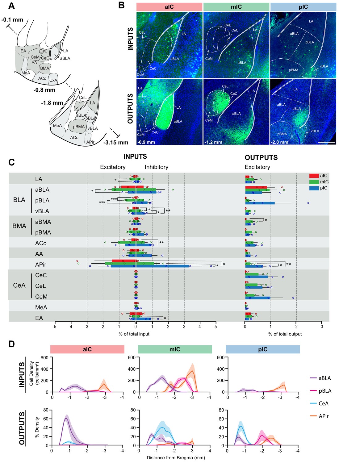
IC-amygdala connectivity.
(A) Coronal sections depicting the amygdala with its subregions. Distances are provided as anterior-posterior positions relative to Bregma. (B) Representative images from excitatory inputs (top row, eGFP-expressing neurons) and outputs (bottom row, eYFP-positive neurons). Different Bregma levels are shown for each IC target site, as indicated on the images (−0.9 mm, −1.2 mm, −2.0 mm). Scale bar = 200 µm. (C) Comparison of excitatory and inhibitory inputs detected in the amygdala (left) and excitatory outputs from the IC to the amygdala (right) in percent of total in- or output, respectively (aIC, red; mIC, green; pIC, blue). Data is shown as average ± SEM. n = 3 mice per condition. One-way ANOVAs per subregion followed by Tuckey’s multiple comparison test were performed to generate p-values. Significant differences between inputs to excitatory or inhibitory neurons to IC subregions or between outputs from the IC subregions were labeled as ***p<0.001, **p<0.01, *p<0.05. For detailed statistics see Supplementary file 3. (D) Input cell density (top row) and percent output density (bottom row) plots along the anterior-posterior axis covering the entire amygdala. We selected aBLA, pBLA, CeA and APir to provide the areas with most differences between the IC subregions. n = 3 mice per condition. Data shown as average ± SEM.
Figure 4

IC-striatum connectivity.
(A) Coronal sections depicting the striatum with its subregions. (B) Representative images from excitatory outputs (eYFP-positive neurons). Note the dense innervation of CPu, NAcC and NAcSh by the aIC. Different Bregma levels are shown for each aIC, mIC and pIC, as indicated on the images. Scale bar = 500 µm. (C) Comparison of excitatory outputs from the three IC subregions to the striatum in percent of total output (aIC, red; mIC, green; pIC, blue). Values are given as percentage of total pixels. Data shown as average ± SEM, n = 3 mice per condition. One-way ANOVAs per subregion followed by Tuckey’s multiple comparison test were performed to generate p-values. For detailed statistics see Supplementary file 3. (D) Plots depict the density of IC innervation along the anterior-posterior axis of the striatum. n = 3 mice per condition, data shown as average ± SEM.
Figure 5

IC-thalamus connectivity.
(A) Coronal sections depicting the thalamus with subregions that connect to the IC. (B) Representative images from excitatory inputs (top row, eGFP-expressing cell bodies) and outputs (bottom row, eYFP-positive neurons). Different Bregma levels are shown for each IC subregion as indicated on the images. Scale bar = 500 µm. (C) Comparison of inputs to excitatory or inhibitory neurons of all three IC subregions (left) and of outputs from excitatory IC neurons to the thalamus (aIC, red; mIC, green; pIC, blue). Values are calculated as percentage of total cells (RV) or of total pixels (AAV). Data shown as average ± SEM, n = 3 mice per condition. One-way ANOVAs per subregion followed by Tuckey’s multiple comparison test were performed to generate p-values. Significant differences between inputs to excitatory or inhibitory neurons to IC subregions or between outputs from the IC subregions were labeled as **p<0.01, *p<0.05. For detailed statistics see Supplementary file 3. (D) Input cell density (top row) and output density (bottom row) plots along the anterior-posterior axis. Thalamus regions of interest are shown, n = 3 mice per condition, data shown as average ± SEM.
Figure 6 with 1 supplement
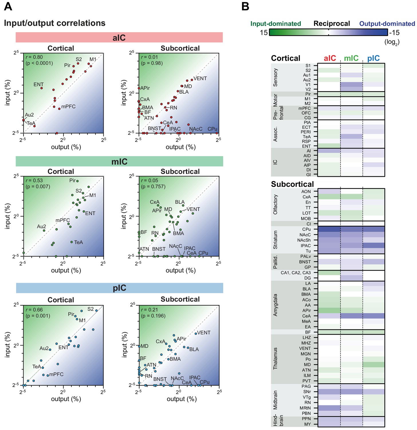
IC input-output relationships for excitatory cells.
The global dataset was further subdivided into subregions of higher specificity (see Figure 2—figure supplements 1–3). (A) The average value for each excitatory input and output was correlated for the three IC subregions. Data is divided into cortical (left panels) and subcortical (right panels) regions. Subregions that lacked both input and output neurons are not included in the graphs. Note the high correlation in the cortical connectivity as compared to the connectivity in the subcortex for all datasets (r = Pearson’s correlation coefficients). (B) Heatmaps showing fold-difference between inputs to outputs per brain subregion for each IC target. Green gradient represents connectivity characterized by stronger inputs to the IC from target regions, blue gradient represents connectivity characterized by stronger projections from the IC to target regions. Subregions where no signal was detected for both input and output conditions were omitted. Data shown as ratio from the average of three mice per condition per IC subregion. The meaning of the abbreviations can be found in Supplementary file 1.
Figure 6—figure supplement 1

Input-output relationships for excitatory output and inhibitory input.
Correlation data is divided into cortical (left panels) and subcortical (right panels) regions. The average value for each inhibitory input and output was correlated for the three IC subregions.
Figure 7
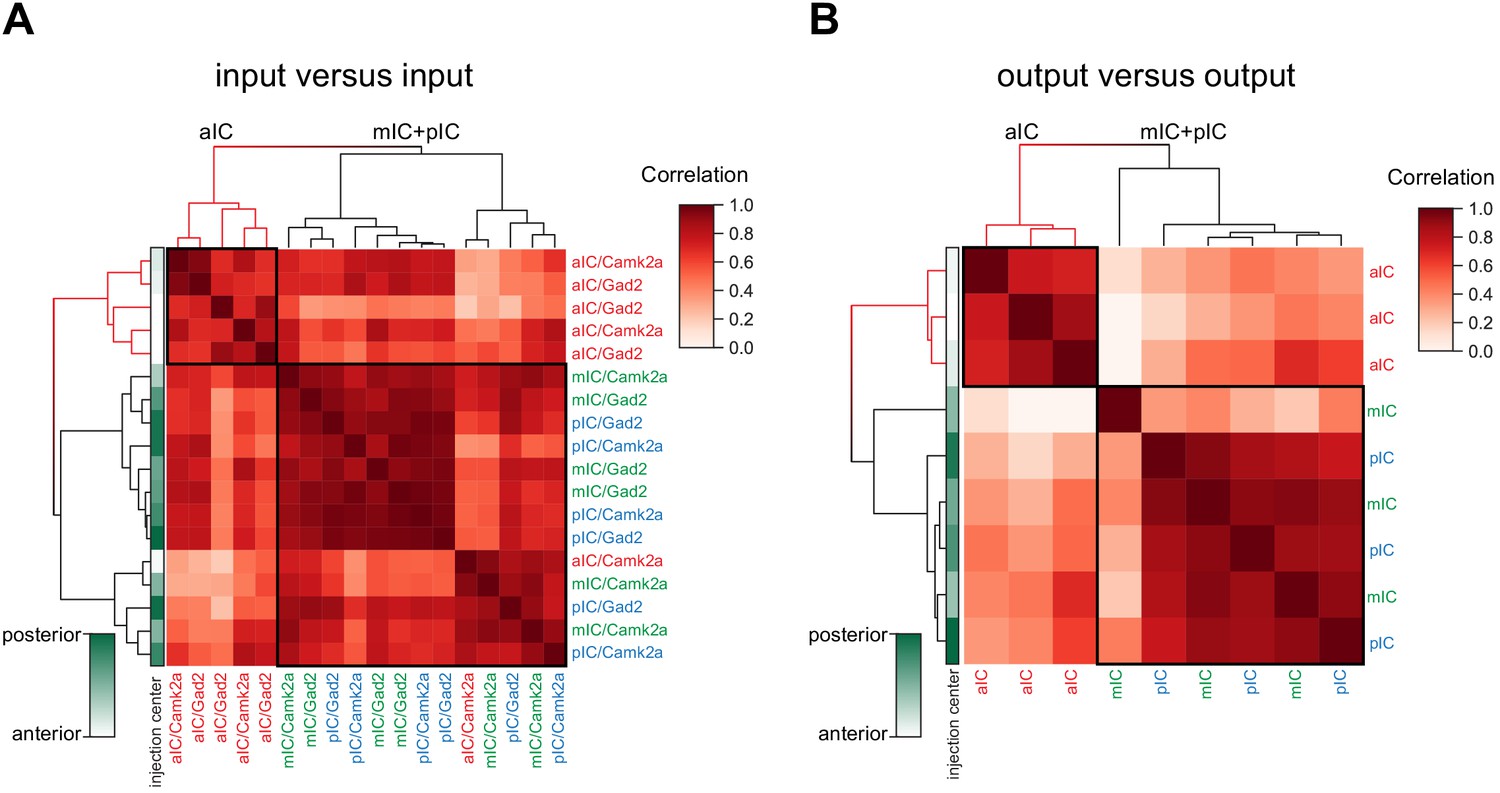
Connectivity-based subregions of the IC.
Matrices of hierarchically clustered pair-wise correlation coefficients (Pearson’s) of animals (A) inputs vs. inputs (N = 18 mice) or (B) outputs vs outputs (N = 9 mice). The pair-wise correlations were performed on the data organized into 17 major brain regions (see Figure 2). Far left gradient bar (green hues) indicates the center of the starter cells, ranked relative to every mouse in the dataset. Note for both input and output correlations, a clear cluster forms from the aIC-targeted animals (top left boxed sections and red-colored dendrograms), whereas the mIC- and pIC-targeted animals intermingle in a second cluster (larger boxed areas). Interestingly, the clustering algorithm did not separate excitatory (Camk2a-Cre) from inhibitory (Gad2-Cre) rabies virus tracings.
Tables
Key resources table
| Reagent type (species) or resource | Designation | Source or reference | Identifiers | Additional information |
|---|---|---|---|---|
| Genetic reagent (M. musculus) | Camk2a-Cre | https://www.jax.org/strain/005359 | IMSR Cat# JAX:005359, RRID:IMSR_JAX:005359 | B6.Cg-Tg(Camk2a-cre) T29-1Stl/J |
| Genetic reagent (M. musculus) | GAD2-Cre | https://www.jax.org/strain/010802 | IMSR Cat# JAX:010802, RRID:IMSR_JAX:01002 | Gad2tm2(cre)Zjh/J |
| Software, algorithm | CellProfiler 3.0.0 | https://cellprofiler.org/ | CellProfiler Image Analysis Software, RRID:SCR_007358 | |
| Software, algorithm | FIJI | Fiji is just ImageJ, NIH (https://imagej.net/Fiji) | Fiji, RRID:SCR_002285 | |
| Software, algorithm | Autonomous_neuron_ detection.ijm | This paper, GitHub (https://github.com/GogollaLab/ tracing_quantification_and_analysis/ blob/master/autonomous_ neuron_detection.ijm) | ||
| Software, algorithm | Counting_RV.ijm | This paper, GitHub (https://github.com/GogollaLab/ tracing_quantification_and_analysis/ blob/master/counting_RV.ijm) | ||
| Software, algorithm | Roi_set_atlas | This paper, GitHub (https://github.com/GogollaLab/ tracing_quantification_and_analysis/ tree/master/ROI_set_atlas) | ||
| Software, algorithm | Leica Application Suite X 3.3.0.16799 | https://www.leica-microsystems.com/ products/microscope-software/ details/product/leica-las-x-ls/ | Leica Application Suite X, RRID:SCR_013673 | |
| Software, algorithm | Autonomous_pixel_ detection.ijm | This paper, GitHub (https://github.com/GogollaLab/ tracing_quantification_and_analysis/ blob/master/autonomous_ pixel_detection.ijm) | ||
| Software, algorithm | Counting_AAV.ijm | This paper, GitHub (https://github.com/GogollaLab/ tracing_quantification_and_analysis/ blob/master/counting_AAV.ijm) | ||
| Software, algorithm | Python 3.6 | http://www.python.org/ | Python Programming Language, RRID:SCR_008394 | |
| Software, algorithm | Analysis_RV.py | This paper, GitHub (https://github.com/GogollaLab/ tracing_quantification_and_analysis/ blob/master/analysis_RV.py) | ||
| Software, algorithm | Analysis_AAV.py | This paper, GitHub (https://github.com/GogollaLab/ tracing_quantification_and_analysis/ blob/master/analysis_AAV.py) | ||
| Software, algorithm | GraphPad Prism | GraphPad Software, CA (https://graphpad.com) | GraphPad Prism, RRID:SCR_002798 | |
| Other | AAV2/5-EF1a-DIO-eYFP | UNC Vector Core https://www.med.unc.edu/ genetherapy/vectorcore/ | In-Stock AAV Vectors – Dr. Karl Deisseroth, 100 ul Aliquots | 5.6 × 10¹² vg/ml |
| Other | AAV2/8-EF1a-FLEX- TVA-mCherry | UNC Vector Core https://www.med.unc.edu/ genetherapy/vectorcore/ | In-Stock AAV Vectors – Dr. Karl Deisseroth, 100 ul Aliquots | 4.2 × 10¹² vg/ml |
| Other | AAV2/8-CA-FLEX-RG | UNC Vector Core https://www.med.unc.edu/ genetherapy/vectorcore/ | In-Stock AAV Vectors – Dr. Karl Deisseroth, 100 ul Aliquots | 2.5 × 10¹² vg/ml |
| Other | SAD∆G-eGFP(EnvA) | UNC Vector Core https://www.med.unc.edu/ genetherapy/vectorcore/ | In-Stock AAV Vectors – Dr. Karl Deisseroth, 100 ul Aliquots | 3 × 10⁸ ffu/ml |
Additional files
-
Supplementary file 1
List of abbreviations.
- https://cdn.elifesciences.org/articles/55585/elife-55585-supp1-v2.xlsx
-
Supplementary file 2
Entire dataset for pivot tables.
- https://cdn.elifesciences.org/articles/55585/elife-55585-supp2-v2.xlsx
-
Supplementary file 3
Detailed statistics.
- https://cdn.elifesciences.org/articles/55585/elife-55585-supp3-v2.xlsx
-
Transparent reporting form
- https://cdn.elifesciences.org/articles/55585/elife-55585-transrepform-v2.docx
Download links
A two-part list of links to download the article, or parts of the article, in various formats.
Downloads (link to download the article as PDF)
Open citations (links to open the citations from this article in various online reference manager services)
Cite this article (links to download the citations from this article in formats compatible with various reference manager tools)
A whole-brain connectivity map of mouse insular cortex
eLife 9:e55585.
https://doi.org/10.7554/eLife.55585


