Thresholds for post-rebound SHIV control after CCR5 gene-edited autologous hematopoietic cell transplantation
- Vaccine and Infectious Disease Division, University of Washington, United States
- Department of Medicine, University of Washington, United States
- Clinical Research Division, Fred Hutchinson Cancer Research Center, United States
- Stem Cell and Gene Therapy Program, Fred Hutchinson Cancer Research Center, United States
- Department of Pathology, University of Washington, United States
Figures
Figure 1
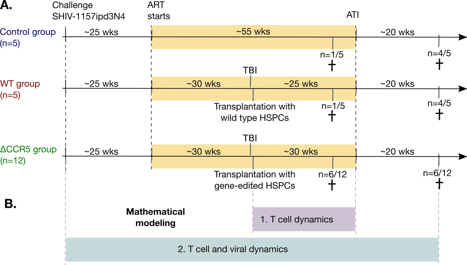
Study design and mathematical modeling.
(A) Twenty-two pig-tailed macaques were infected with SHIV and suppressed with ART. Next, 17/22 underwent hematopoietic stem and progenitor cell (HSPC) transplantation following myeloablative conditioning (TBI), including 12 animals that received CCR5-edited products and five that received non-edited products (ΔCCR5 and WT groups, respectively). A control group (n = 5) did not receive TBI or HSPC transplantation. Fourteen animals underwent ATI approximately 1 year after ART initiation, while the remaining eight animals were necropsied prior to ATI (see Materials and methods for details). (B) We first developed mathematical models for T cell dynamics and reconstitution following transplant and before ATI (purple), assuming that low viral loads on ART do not affect cell dynamics. After validation of that model, we introduced viral dynamics and fit those to the T cell, primary infection, and viral rebound dynamics from the animals pre- and post-ATI (blue).
Figure 2 with 1 supplement
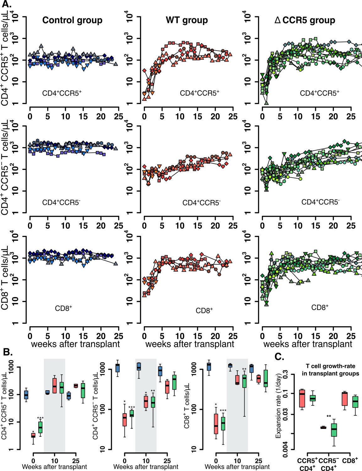
Post-transplantation, pre-ATI CD4+ and CD8+ T cell dynamics.
(A) Empirical data for peripheral CD4+ CCR5+ (top row), CD4+CCR5- (middle row), and CD8+ T cell counts (bottom row) for control (blue), wild-type (red), and ΔCCR5 (green) transplantation groups. Each data point shape and color is a different animal sampled over time. (B) Distributions of blood CD4+ and CD8+ T cell counts for weeks 0, 10, and 25 after transplantation (p-values calculated with pairwise Mann-Whitney test with Bonferroni correction comparing control group with transplant groups. *p<0.05, **p<0.01 and ***p<0.001). (C) Expansion-rate estimates of CD4+CCR5+, CD4+CCR5-, and CD8+ T cells (p-values calculated with paired Mann-Whitney test with Bonferroni correction comparing expansion rates of CD4+CCR5- with CD4+CCR5+ and CD8+ in transplant groups. **p<0.01 for both). Colors for boxplots in B and C are matched to A (blue: control, red: wild-type-transplantation, and green: ΔCCR5-transplantation groups).
-
Figure 2—source code 1
R code for plots and tests in Figure 2.
- https://cdn.elifesciences.org/articles/57646/elife-57646-fig2-code1-v1.zip
-
Figure 2—source data 1
Complete data set of blood T cell counts for Figures 2 and 3.
- https://cdn.elifesciences.org/articles/57646/elife-57646-fig2-data1-v1.zip
Figure 2—figure supplement 1
CD4+ and CD8+ T cell levels pre-ATI in control group (n = 5) at times relative to post-transplantation in WT and ΔCCR5 transplant groups.
Range of blood (A) CD4+ and (B) CD8+ T cell counts using all data points for the period before ATI in control animals (p-value calculated with a paired t-test for averaged measurements from a time relative to infusion in transplanted animals and before ATI).
Figure 3 with 4 supplements
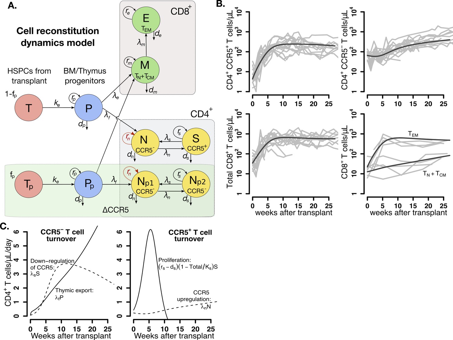
Mathematical model of T cell reconstitution after hematopoietic stem and progenitor cell (HSPC) transplantation.
(A) Schematics of the model. Each circle represents a cell compartment: T represents the HSPCs from the transplant; P, the progenitor cells in bone marrow (BM) and thymus; S and N, CD4+CCR5+ and CD4+CCR5- T cells, respectively; Tp, the protected (ΔCCR5), gene-modified cells from transplant; Pp, protected (ΔCCR5) progenitor cells in BM/thymus; Np1 and Np2 the protected (ΔCCR5) CD4+ T cells; M the CD8+ T cells with naive and central memory phenotype and E CD8+ T cells with effector memory phenotype. The initial fraction of protected cells in the product is represented by the parameter fp. Gray panels represent mature blood CD4+ and CD8+ T cells, and the green panel all ΔCCR5 cells in the model. Red, dashed arrows represent discarded terms after model selection and validation (see text for details). (B) Model predictions using the maximum likelihood estimation of the population parameters (solid black lines) for all blood T cell subsets before ATI for all animals in the transplant groups using model with ΔAIC = 0 (Figure 3—source datas 2–3). Each gray line is one animal. (C) Model predictions of the total concentration of CD4+CCR5- T cells generated by CCR5 downregulation (dashed line) or thymic export (solid line), and of the total concentration of CD4+CCR5+ T cells generated by proliferation (solid line) or by upregulation of CCR5 (dashed line) over time using the maximum likelihood estimation of the population parameters.
-
Figure 3—source code 1
Best model file for T cell reconstitution in Monolix format.
- https://cdn.elifesciences.org/articles/57646/elife-57646-fig3-code1-v1.zip
-
Figure 3—source code 2
R code for plots in Figure 3.
- https://cdn.elifesciences.org/articles/57646/elife-57646-fig3-code2-v1.zip
-
Figure 3—source data 1
Values of the fraction of protected cells in transplant product , dose or number of hematopoietic stem and progenitor cell (HSPCs) in transplant product and time of transplantation of each animal for model fitting and projections.
We assumed animal weight of 5 Kg.
- https://cdn.elifesciences.org/articles/57646/elife-57646-fig3-data1-v1.docx
-
Figure 3—source data 2
Competing models for fitting T cell reconstitution with respective AIC values.
Best fit in bold-red (lowest AIC). The AIC values presented for each statistical assumption is the lowest of 10 runs of the SAEM algorithm with different randomly selected initial guesses.
- https://cdn.elifesciences.org/articles/57646/elife-57646-fig3-data2-v1.docx
-
Figure 3—source data 3
Population parameter estimates for the best fits of the model in Equation 2 in the main text (lowest AIC in Figure 3—source data 2) to the T cell reconstitution dynamics.
RSE: relative standard error. Empty fields represent a standard deviation of random effects, , fixed to zero. Values of for and shown here are in log10 cell counts/μL assuming a blood volume of of 3 × 10⁵ μL (calculated assuming blood:weight ratio of 60 mL/kg and body weight of 5 kg). Red values represent an RSE greater than 100% implying that the number of data points may not be enough to estimate the respective parameter.
- https://cdn.elifesciences.org/articles/57646/elife-57646-fig3-data3-v1.docx
-
Figure 3—source data 4
Individual parameter estimates for the best fits of the model in Equation 2 in the main text (lowest AIC in Figure 3—source data 2) to the T cell reconstitution dynamics.
Values obtained for and shown here are in log10 cell counts/μL assuming a blood volume of of 3 × 10⁵ μL (calculated assuming blood:weight ratio of 60 mL/kg and body weight of 5 kg). Initial values for the control group where obtained assuming steady state.
- https://cdn.elifesciences.org/articles/57646/elife-57646-fig3-data4-v1.docx
-
Figure 3—source data 5
Population parameter estimates for the best fits used in the R code for Figure 3.
- https://cdn.elifesciences.org/articles/57646/elife-57646-fig3-data5-v1.zip
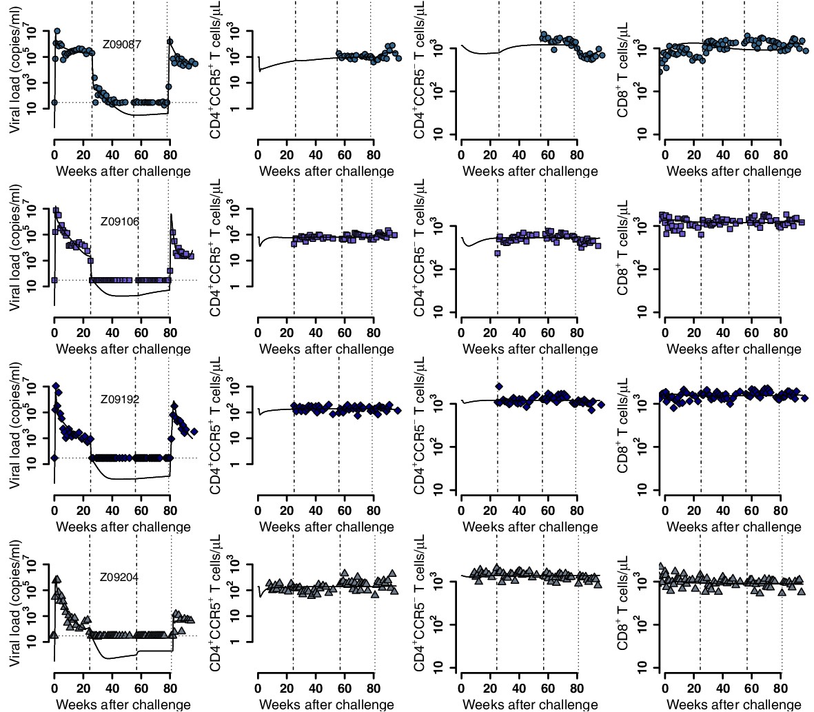
Figure 3—figure supplement 1
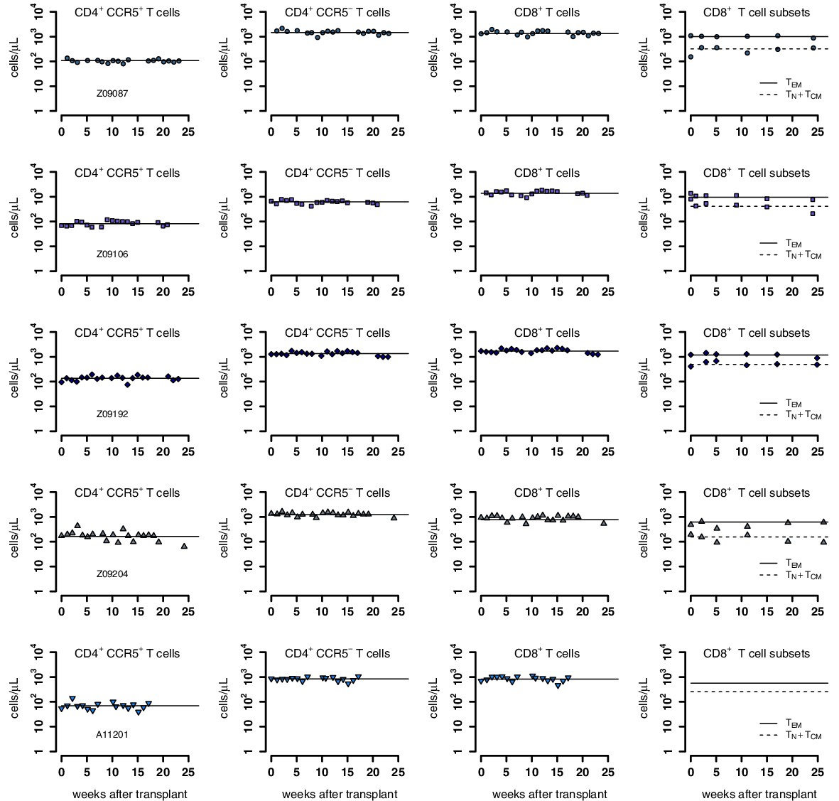
Individual fits of the best model to the blood T cell observations pre-ATI in control group from a time relative to post-transplantation in transplant groups.
Empirical data for peripheral T cell subset counts (blue data points) and best fits of the model (black lines) in Equation 2 in the main text to all blood T cell subsets before/after ATI for the control group. Each row is one animal (ID in the leftmost graph per row). Each datapoint shape and color is a different animal sampled over time and is maintained throughout.
Figure 3—figure supplement 2
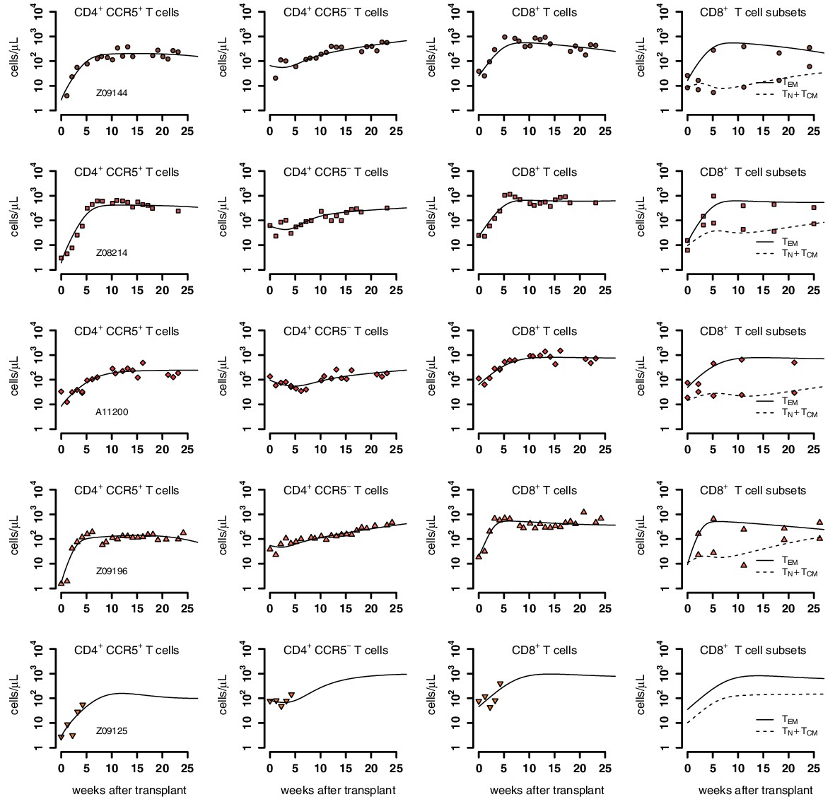
Individual fits of the best model to the blood T cell observations post-transplantation, pre-ATI for the wild-type-transplant group.
Empirical data for peripheral T cell subset counts and plasma viral load (red data points) and best fits of the model (black lines) in Equation 2 in the main text to all blood T cell subsets before ATI for the wild-type-transplant group. Each row is one animal (ID in the leftmost graph per row).
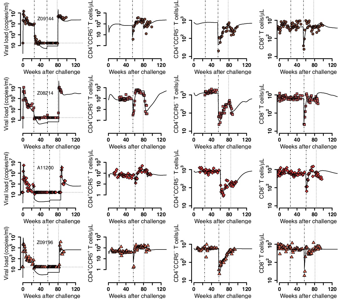
Figure 3—figure supplement 3
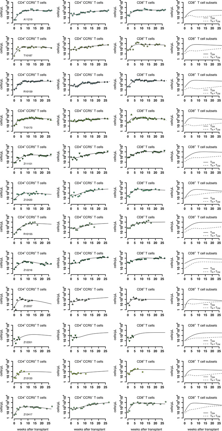
Individual fits of the best model to the blood T cell observations post-transplantation, pre-ATI for the ΔCCR5-transplant group.
Empirical data for peripheral T cell subset counts and plasma viral load (green data points) and best fits of the model (black lines) in Equation 2 in the main text to all blood T cell subsets before ATI for the ΔCCR5-transplant group. Each row is one animal (ID in the leftmost graph per row).
Figure 3—figure supplement 4
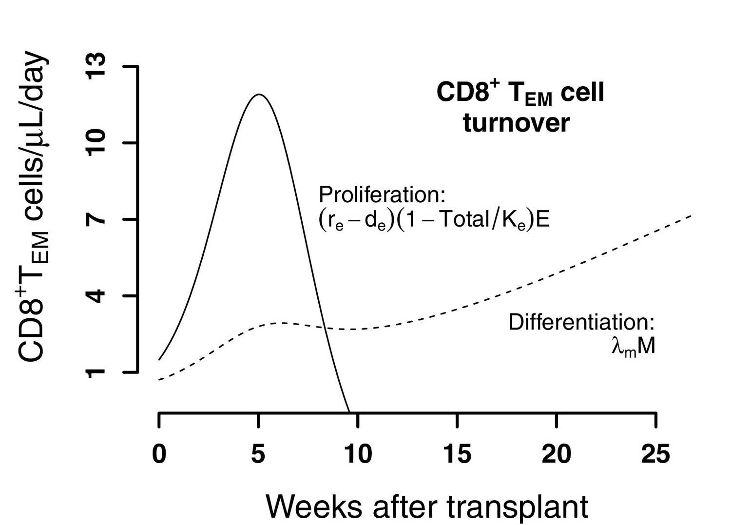
Predictions of the best model for the contributors to cell expansion in CD8+ TEM cells in animals from the transplant groups.
Solid line represents the total number of cells that proliferate over time . Dashed lines indicate the number of exogenous cells differentiated from Tnaive and TCM () over time using the maximum likelihood estimation of the population parameters.
Figure 4 with 1 supplement

Plasma viral load and CD4+ T cell kinetics after ATI.
(A) Empirical data for viral load (top row) and peripheral T cell counts (middle and bottom rows) for control (blue), wild-type (red) and ΔCCR5 (green) transplantation groups. Each data point shape and color represent a different animal sampled over time. (B) Distributions of the ratio at ATI vs pre-ART of final, nadir, and median viral load. Dotted horizontal lines represent a ratio equal to one (or no difference between ATI vs nadir).
-
Figure 4—source code 1
R code for plots and test in Figure 4.
- https://cdn.elifesciences.org/articles/57646/elife-57646-fig4-code1-v1.zip
-
Figure 4—source data 1
Complete data set of blood T cell counts and viral load for Figures 4 and 5.
- https://cdn.elifesciences.org/articles/57646/elife-57646-fig4-data1-v1.zip
Figure 4—figure supplement 1
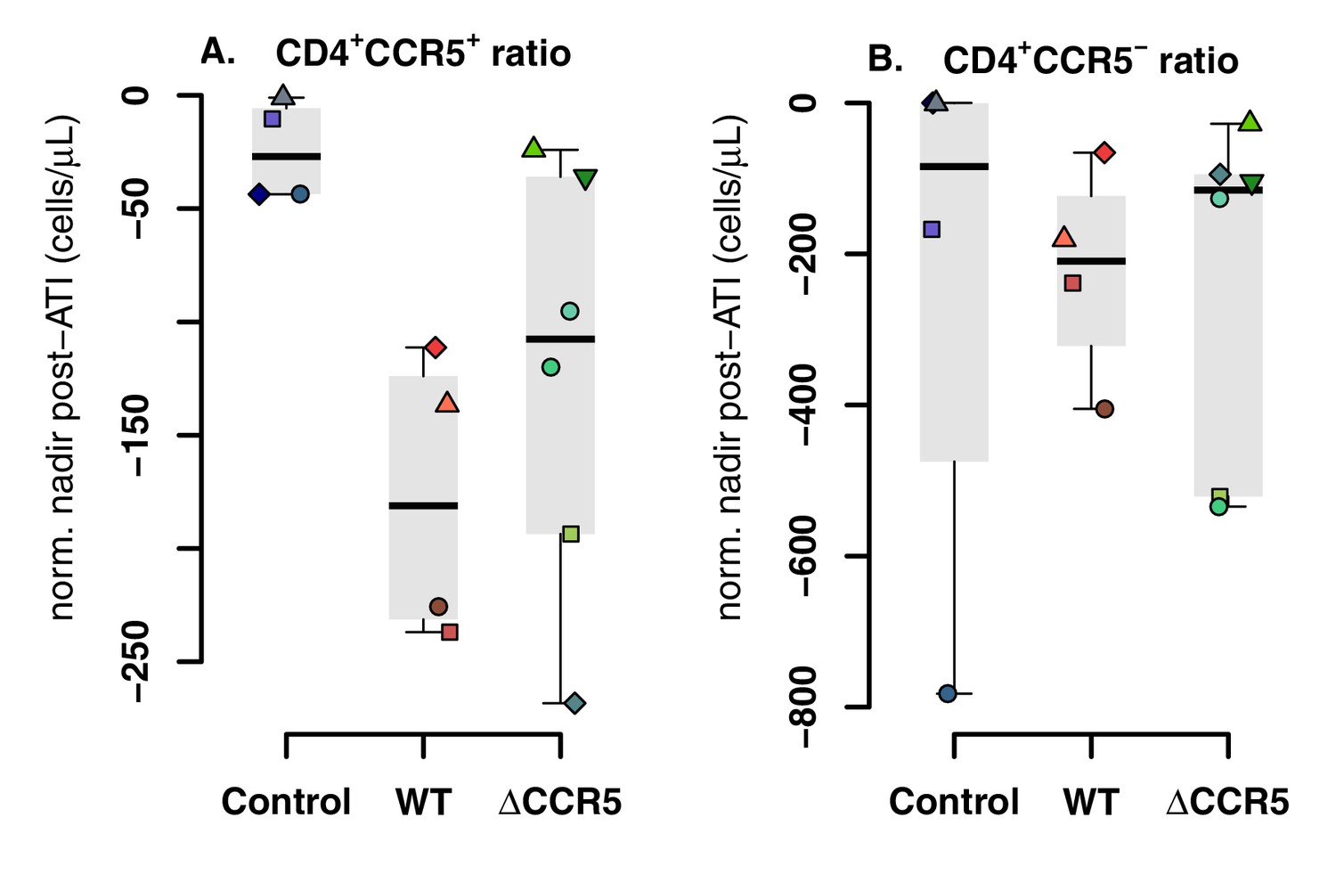
Blood CD4+CCR5+ and CD4+CCR5- T cell kinetics post-ATI.
(A) Distribution of the CD4+CCR5+ T-cell nadir post-ATI normalized relative to the CD4+CCR5+ concentration at ATI. (B) Distribution of the CD4+CCR5- T-cell nadir post-ATI normalized relative to the CD4+CCR5- concentration at ATI.
Figure 5 with 3 supplements
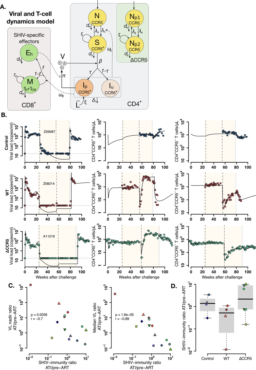
Mathematical model of virus and T cell dynamics following ATI.
(A) Model: Susceptible cells, S, are infected by the virus, V, at rate β. Ip represents the fraction τ of the infected cells that produce virus, and, Iu, the other fraction that becomes unproductively infected. Total CD4+CCR5+ T cell count is given by the sum of S, Ip and Iu. All infected cells die at rate δI. IP cells arise from activation of latently infected cells at rate and produce virus at a rate π. Virus is cleared at rate γ. CD8+ M cells proliferate in the presence of infection with rate ω8 from which a fraction f become SHIV-specific CD8+ effector T cells, Eh, that are removed at a rate dh. These effector cells reduce virus production (π) by 1/ (1+θEh). Non-susceptible CD4+ T cells that were not CCR5-edited upregulate CCR5 in the presence of infection and replenish the susceptible pool at rate ω4. Gray panels represent mature blood CD4+ and CD8+ T cells, and the green panel represents ΔCCR5 cells. (B) Individual fits of the model (black lines) to SHIV RNA (left column), blood CD4+CCR5+ T cells (middle column), and CD4+CCR5- T cells (right column) for one animal in the control (top row), wild type (middle row), and ΔCCR5 groups (bottom row). Shaded areas represent time during ART and dashed-point line, the time of transplantation. (C–D) Scatterplots of observed ATI/pre-ART ratio of the (C) nadir viral load, and the median viral load ratio versus the SHIV-specific CD8+ T immunity ATI/pre-ART ratio: (p-values calculated by Pearson’s correlation test); a higher ratio means a better immune response post-ATI. (D) Individual estimates of the SHIV-specific CD8+ T immunity ATI/preART ratio. Blue: control, red: wild type, and green: ΔCCR5 transplant group.
-
Figure 5—source code 1
Best model file for T cell and virus dynamics from acute infection after ATI in Monolix format.
- https://cdn.elifesciences.org/articles/57646/elife-57646-fig5-code1-v1.zip
-
Figure 5—source code 2
R code for plots in Figure 5B.
- https://cdn.elifesciences.org/articles/57646/elife-57646-fig5-code2-v1.zip
-
Figure 5—source code 3
R code for plots and tests in Figure 5C–D.
- https://cdn.elifesciences.org/articles/57646/elife-57646-fig5-code3-v1.zip
-
Figure 5—source data 1
Competing models for fitting T cell and viral dynamics (Equations 2-3 in main text) using the best model in Figure 3—source data 2 and fixing parameter values as in Figure 3—source data 3, with AIC values.
Best fit in bold-red (lowest AIC).
- https://cdn.elifesciences.org/articles/57646/elife-57646-fig5-data1-v1.docx
-
Figure 5—source data 2
Population parameter estimates for the fits of the model with lowest AIC in Figure 5—source data 1 to the T cell and virus dynamics.
RSE: relative standard error. Empty fields represent cases when the standard deviation of random effects, , was fixed to zero. Values of for , and shown here are transformed assuming a blood volume of 3 × 10⁵ μL (calculated assuming blood:weight ratio of 60 mL/kg and body weight of 5 kg). Red values represent an RSE greater than 100% implying that the number of data points may not be enough to estimate the respective parameter.
- https://cdn.elifesciences.org/articles/57646/elife-57646-fig5-data2-v1.docx
-
Figure 5—source data 3
Individual parameter estimates for the fits of the model in Equations 2-3 in main text (lowest AIC in Figure 5—source data 1) to the T cell and virus dynamics.
Values of for , and shown here are transformed assuming a blood volume of 3 × 10⁵ μL (calculated assuming blood:weight ratio of 60 mL/kg and body weight of 5 kg). Shown are individual estimates for animals that continued study after ATI.
- https://cdn.elifesciences.org/articles/57646/elife-57646-fig5-data3-v1.docx
-
Figure 5—source data 4
Individual parameter estimates obtained from Monolix for the best fits used in the R code for Figure 5.
- https://cdn.elifesciences.org/articles/57646/elife-57646-fig5-data4-v1.zip
Figure 5—figure supplement 1
Individual fits of the best model to the blood T cell and viral load observations before/after ATI for control group.
Empirical data for peripheral T cell subset counts and plasma viral load (blue data points) and best fits of the model in Equations 2 and 3 to all blood T cell subsets before/after ATI for the control group. Dashed-dot lines: ART initiation and time relative to transplantation with respect to the other groups; dotted line: ATI. Each row is one animal (ID in the leftmost graph per row).
Figure 5—figure supplement 2
Individual fits of the best model to the blood T cell and viral load observations before/after ATI for the wild-type-transplant group.
Empirical data for peripheral T cell subset counts and plasma viral load (red data points) and best fits of the model in Equations 2 and 3 to all viral load observations and blood T cell subsets before/after ATI for the wild-type-transplant group (solid lines). Dashed-dot lines: ART initiation and transplantation; dotted line: ATI. Each row is one animal (ID in the leftmost graph per row).
Figure 5—figure supplement 3
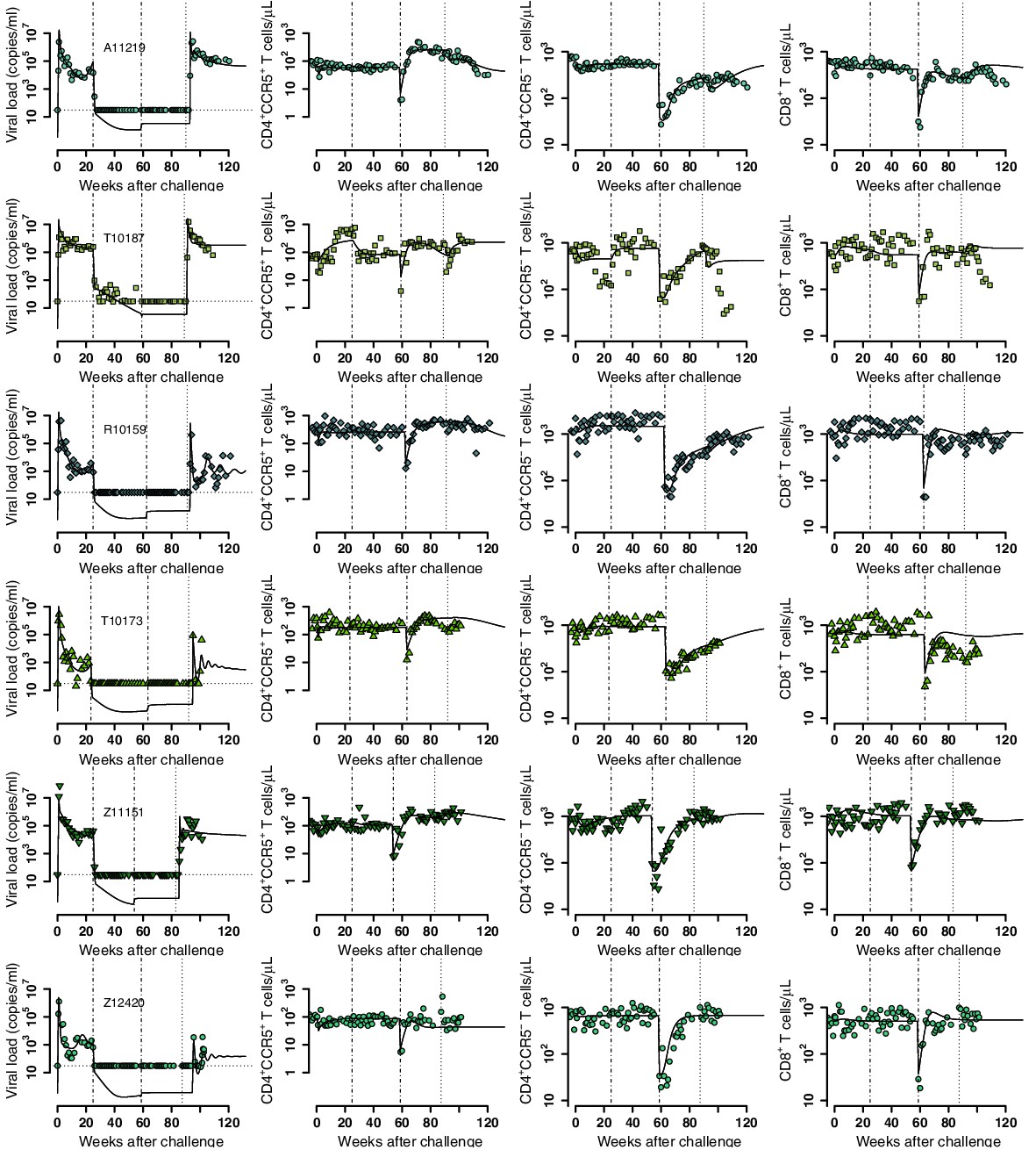
Individual fits of the best model to the blood T cell and viral load observations before/after ATI for the ΔCCR5-transplant group.
Empirical data for peripheral T cell subset counts and plasma viral load (green data points) and best fits of the model in Equations 2 and 3 to all viral load observations and blood T cell subsets before/after ATI for the ΔCCR5-transplant group (solid lines). Dashed-dot lines: ART initiation and transplantation; dotted line: ATI. Each row is one animal (ID in the leftmost graph per row).
Figure 6 with 2 supplements
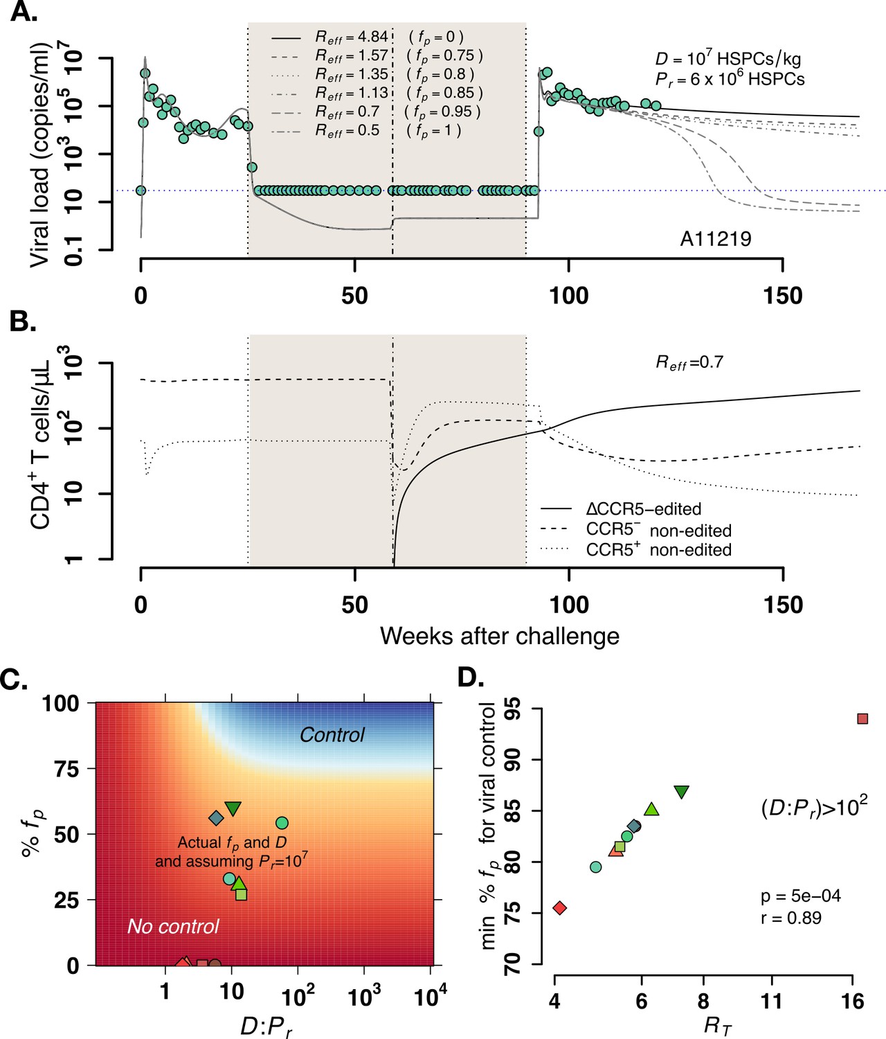
Model predictions of factors governing post-rebound viral control after CCR5 gene-edited hematopoietic stem and progenitor cell (HSPC) transplant.
(A) Predictions for plasma viral loads post-ATI using the optimized mathematical model. Here, and is the composite determinant of viral control. Parameter estimates for animal A11219 (Figure 5—source data 3) were used to compute the effective reproductive ratio . Higher values of imply poorer anti-SHIV immunity and high virulence (see Equation 4 in Materials and methods). We varied values of the fraction of HSPCs in transplant , the stem cell dose as shown, and fixed the remaining number of HSPCs after TBI before transplant . predicted spontaneous viral control 40–60 weeks after ATI. (B) A simulation with demonstrates CCR5-edited CD4+ T cell recovery is concurrent with viral control. (C) Model predictions of the fraction of protected HSPCs in the transplant (y-axis) and the ratio of transplanted HSPCs to total infused plus remaining post-TBI HSPCs (x-axis) required for spontaneous viral control. The heatmap shown corresponds to animal A11200 which has , the lowest predicted (76%) and (~5) required for post-ATI viral control (heatmaps for other animals in Figure 6—figure supplement 2). Blue shaded region represents the parameter space with post-ATI viral control or . Yellow-to-red region represent the parameter space with no control or . Data points represent the individual values of and from each transplanted animal in the study. (D) Model predictions of the minimum fraction of protected HSPCs in the body for viral control (y-axis) for each animal given their calculated values for (x-axis). In all cases, the minimum corresponded to (Figure 6—figure supplement 2). Each color is an animal, and A11200 is the red diamond with the lowest value of min . p-Value calculated using Pearson’s correlation test.
-
Figure 6—source code 1
R code for plots in Figure 6A–B.
- https://cdn.elifesciences.org/articles/57646/elife-57646-fig6-code1-v1.zip
-
Figure 6—source code 2
R code for plots in Figure 6C–D.
- https://cdn.elifesciences.org/articles/57646/elife-57646-fig6-code2-v1.zip
-
Figure 6—source data 1
Results from all simulations varying fp, D, and Pr.
- https://cdn.elifesciences.org/articles/57646/elife-57646-fig6-data1-v1.zip
Figure 6—figure supplement 1
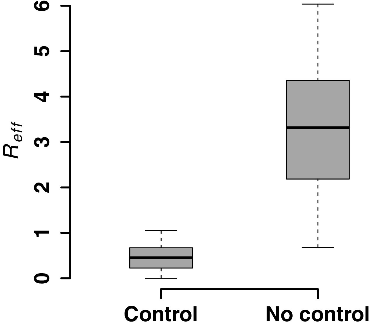
Model predictions for post-rebound viral control after CCR5 gene-edited hematopoietic stem and progenitor cell (HSPC) transplantation based on .
Model predictions of the effective reproductive ratio that lead to post-ATI viral control or not. was computed using varying values of : fraction of HSPCs in transplant, : total amount of infused HSPCs and : remaining number of HSPCs after TBI before transplant and using parameter estimates from all animals (Figure 5—source data 3) to estimate from Equation 4 in the main text.
Figure 6—figure supplement 2
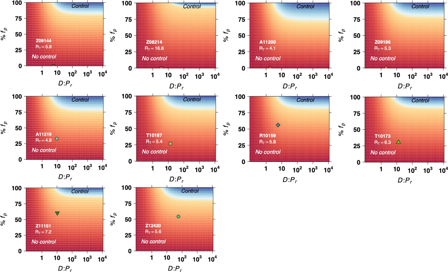
Model predictions of the fraction of protected hematopoietic stem and progenitor cell (HSPCs) in the transplant (y-axis) and the fraction of transplanted HSPCs with respect to the total infused plus remaining post-TBI HSPCs (x-axis) required for spontaneous viral control.
Blue color represents the parameter space with post-ATI viral control or . Yellow-to-red colors represent the parameter space with no control or . Data points (green and red shapes) represent the individual values of and from each transplanted animal in the study, assuming HSPCs.
Figure 7
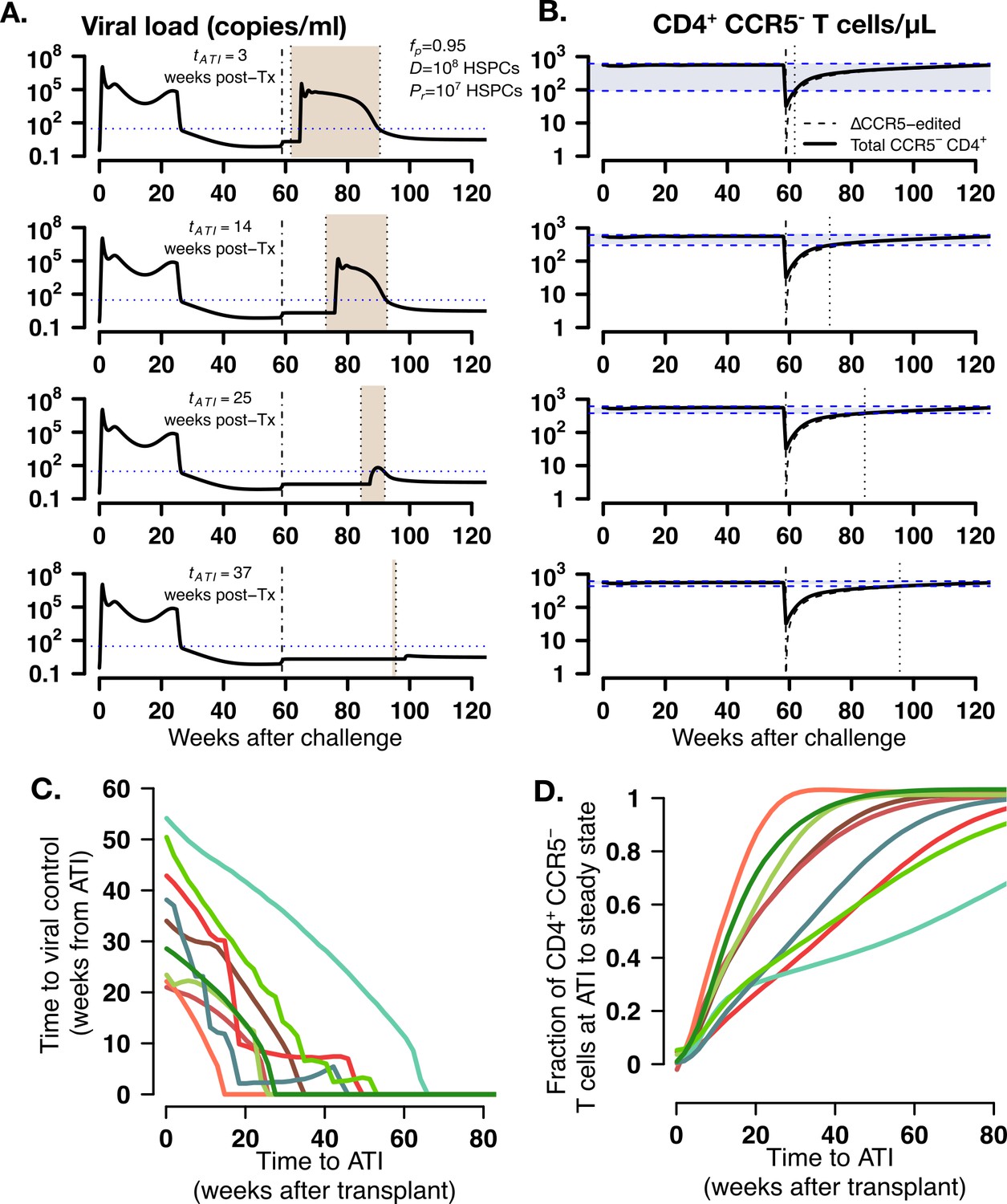
Model predictions of time to post-ATI viral control given varying times for the start of ATI.
(A-B) Examples of projected (A) viral load and (B) total, modified and unmodified CD4+ CCR5- (solid) and ΔCCR5 CD4+ T cells (dashed) from the model for animal A11219 when , HSPCs and HSPCs, for different times of ATI (=3, 14, 25, and 37 weeks after transplantation). Dashed-dotted vertical lines represent time of transplant. Shaded areas between the dotted lines in (A) describe the time from ATI until spontaneous viral control. Shaded areas between the blue dashed lines in (B) represent the difference between the CD4+ CCR5- T cell concentration at ATI and the projected steady state. Dotted lines in (B) represent time of ATI. (C–D) Model predictions of the (C) time until viral control after ATI and (D) the fraction of total CD4+ CCR5- T cell concentration at ATI with respect to its steady state conditions given actual estimated parameter values for each transplanted macaque when , HSPCs and HSPCs.
-
Figure 7—source data 1
Results from all simulations varying time to ATI.
- https://cdn.elifesciences.org/articles/57646/elife-57646-fig7-data1-v1.zip
Additional files
Download links
A two-part list of links to download the article, or parts of the article, in various formats.
Downloads (link to download the article as PDF)
Open citations (links to open the citations from this article in various online reference manager services)
Cite this article (links to download the citations from this article in formats compatible with various reference manager tools)
Thresholds for post-rebound SHIV control after CCR5 gene-edited autologous hematopoietic cell transplantation
eLife 10:e57646.
https://doi.org/10.7554/eLife.57646


