Specialized contributions of mid-tier stages of dorsal and ventral pathways to stereoscopic processing in macaque
- Laboratory for Cognitive Neuroscience, Graduate School of Frontier Biosciences, Osaka University, Japan
- Center for Information and Neural Networks, Osaka University and National Institute of Information and Communications Technology, Japan
- Department of Psychology, University of Pennsylvania, United States
- Laboratory for Neural Circuits and Behavior, RIKEN Center for Brain Science (CBS), Japan
Figures
Figure 1
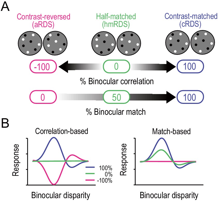
Correlation-based and match-based representations predict distinct responses to graded anticorrelation.
(A) Three RDSs with graded anticorrelation. From right to left, the fraction of binocularly contrast-matched dots decreases from 100% (correlated RDS or cRDS) through 50% (half-matched RDS or hmRDS) to 0% (anticorrelated RDS or aRDS). This same stimulus manipulation decreases binocular correlation gradually from 100% (cRDS) through 0% (hmRDS) to −100% (aRDS). (B) Hypothetical disparity-tuning curves to graded-anticorrelation stimuli as predicted by correlation-based or match-based disparity representations. In the correlation-based responses (left), the absolute value and the sign of the percent binocular correlation determine the amplitude and shape of the tuning function, respectively. In the match-based responses (right), the amplitude reflects the fraction of matched dots, and the shape is invariant.
Figure 2 with 1 supplement

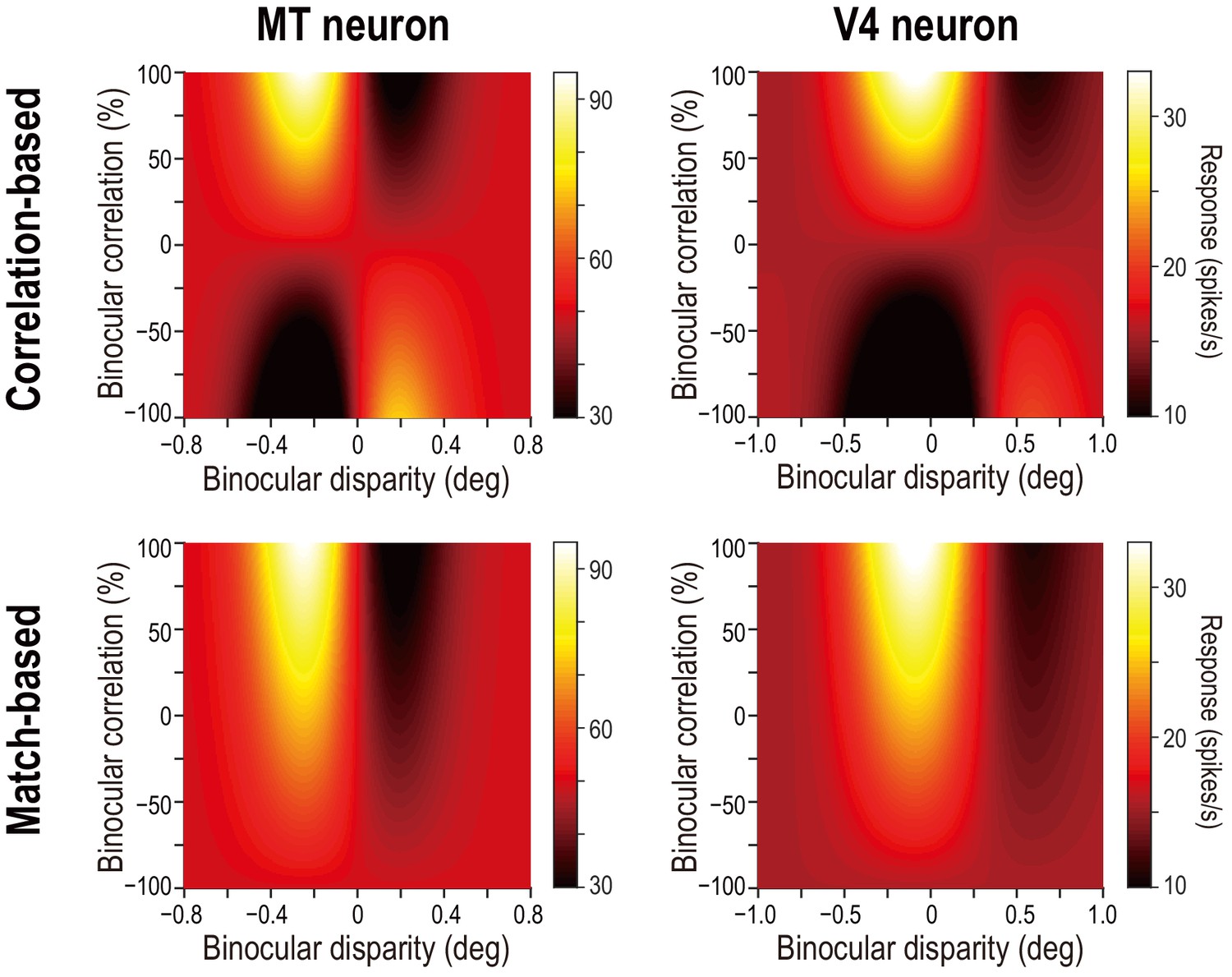
Disparity-tuning curves of example neurons in MT and V4.
The average firing rates of example neurons at different binocular-disparity values and binocular-correlation levels in MT (A) and V4 (B). Different colors indicate different correlation levels. Error bars indicate the ± SEMs. Letters S, U, R, and L indicate the level of spontaneous (pre-stimulus) activity, the response to uncorrelated RDSs, and the responses to right and left monocular images, respectively. (C and D) Color plots of responses of the neurons shown in A and B in a 2D plane defined by binocular disparity and correlation level. Brighter colors indicate stronger responses, as shown in the scale bars. The raw responses are linearly interpolated in both dimensions. The V4 example was previously shown in Abdolrahmani et al., 2016.
-
Figure 2—source data 1
Tuning-curve data of example neurons.
- https://cdn.elifesciences.org/articles/58749/elife-58749-fig2-data1-v2.csv
Figure 2—figure supplement 1
Predicted response maps for example MT and V4 neurons.
Compare the observed response maps for the same neurons (shown in Figure 2C,D) and the predicted maps shown here. The observed map for the example MT neuron is closer to the correlation-based prediction (top left), whereas the observed map for the V4 neuron is closer to the match-based prediction (bottom right). We constructed the predictions for each example neuron as follows: we started with the Gabor functions fitted to the disparity-tuning data for correlated RDSs (i.e., at 100% binocular correlation). Next, we computed the predicted responses at lower correlation levels using the linear functions shown in Figure 4A; these functions dictate how the tuning amplitude and shape should change with decreasing binocular correlation for pure correlation-based and match-based models. Specifically, we multiplied the signed amplitude ratio of the correlation-based representation or of the match-based representation by the Gabor amplitude at 100% correlation. The predictions were plotted using the same color ranges as the corresponding observed data.
Figure 3 with 1 supplement
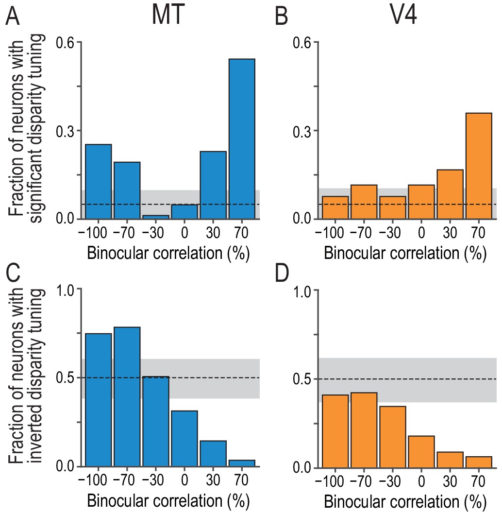
Fractions of neurons with significant and inverted disparity tuning show different dependencies on graded anticorrelation between MT and V4.
(A and B) The fraction of neurons with significant disparity tuning as a function of binocular correlation (Kruskal–Wallis test; p<0.05). The population comprises all recoded neurons with significant tuning at 100% correlation (83 and 78 neurons for MT and V4, respectively). The dashed line indicates the chance level and the gray area indicates its 95% interval based on the binomial distribution. The fraction at 100% correlation is one by definition. (C and D) The fraction of neurons with inverted disparity tuning (relative to the tuning to cRDSs) as a function of binocular correlation. Negative tuning correlation was considered to indicate tuning inversion. The same populations as in (A and B) were analyzed. (See Figure 3—figure supplement 1 for the same analysis applied to the subpopulations of tuning curves without significant selectivity; we suggest that the supplementary results warrant the inclusion of non-selective tuning in this main analysis.) The chance level is 0.5. The fraction at 100% correlation is zero by definition.
-
Figure 3—source data 1
The p-values for Kruskal–Wallis test to assess disparity selectivity and tuning-curve correlation to assess tuning inversion at each binocular-correlation level.
- https://cdn.elifesciences.org/articles/58749/elife-58749-fig3-data1-v2.csv
Figure 3—figure supplement 1
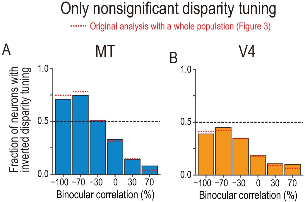
Fractions of neurons with tuning inversion in a subpopulation of neurons with nonsignificant disparity tuning.
(A and B) The fraction of neurons with inverted disparity tuning as a function of binocular correlation. The population comprises all neurons with nonsignificant disparity tuning judged at each correlation level (Kruskal–Wallis test; p>0.05). The results were similar to those reported in Figure 3C,D, which are shown by red dotted lines. We suggest that the similarity between the main and supplementary results warrants the inclusion of nonsignificant tuning in the main analysis.
Figure 4
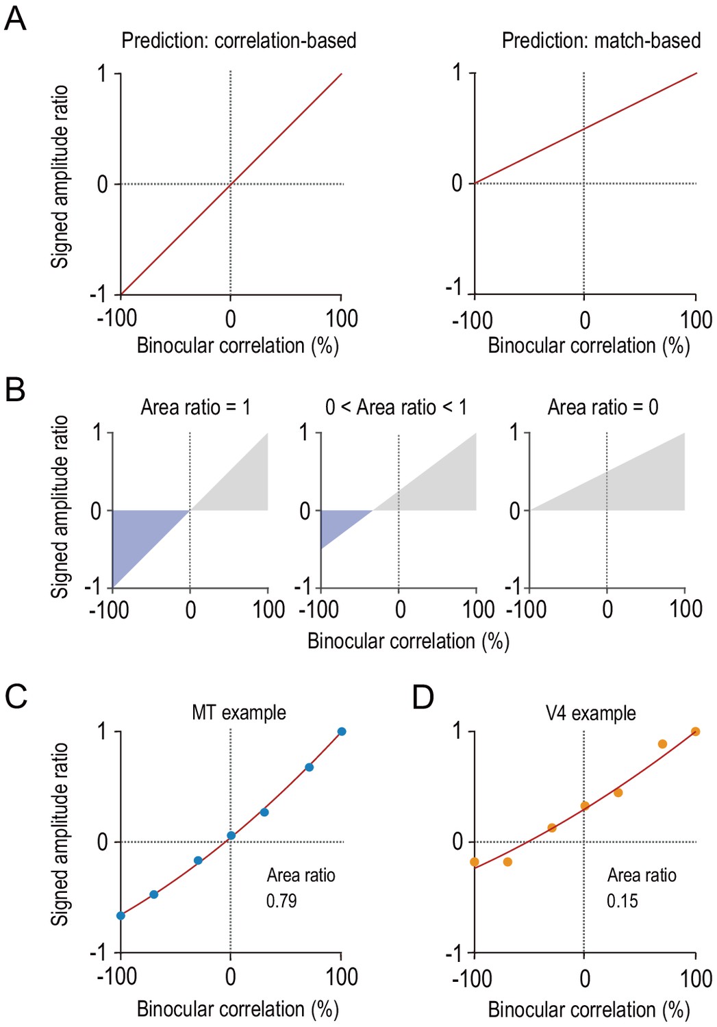
Characterizing disparity representation for each individual neuron.
(A) Correlation-based and match-based disparity representations predict different profiles for the signed amplitude ratio as a function of binocular correlation. The signed amplitude ratio at each correlation level reflects both how much the tuning amplitude is reduced and if the tuning shape is inverted by partial anticorrelation. (B) Area ratio as a novel metric to quantify how well the observed responses conform to correlation-based or match-based prediction. The area ratio was defined as the ratio of two areas: the numerator was the area with the negatively signed amplitude ratios (blue); the denominator was the area with the positively signed amplitude ratios (gray). An area ratio of 1 indicates perfectly correlation-based responses (leftmost), and an area ratio of 0 indicates perfectly match-based responses (rightmost). An intermediate area ratio indicates an intermediate representation type (middle). (C and D) Area ratios calculated for the example MT and V4 neurons shown in Figure 2. The signed amplitude ratios were calculated based on the best fitted Gabor tuning functions (see Materials and methods). Then, quadratic functions were fitted to interpolate the data points.
-
Figure 4—source data 1
Signed amplitude ratio of example neurons.
- https://cdn.elifesciences.org/articles/58749/elife-58749-fig4-data1-v2.csv
Figure 5 with 5 supplements

Distinct distributions of single-neuron disparity representation between MT and V4 revealed only by area ratio.
Distributions of the area ratio, our new metric (A–C), and the amplitude ratio, the conventional metric (D–F), are shown. A–C consist of the neurons with good Gabor-function fitting to disparity-tuning curves and good quadratic-function fitting to signed amplitude ratios (R2 >0.6; MT, N = 59; V4, N = 43). D–F consist of the neurons with good Gabor-function fitting (R2 >0.6; MT, N = 76; V4, N = 71). Triangles indicate the medians. C and F show cumulative distributions of the area ratio and amplitude ratio, respectively. The amplitude ratio histogram for V4 (E) is a replot of the result reported in Abdolrahmani et al., 2016.
-
Figure 5—source data 1
Data for Figure 5 and its figure supplements.
The source file contains area ratio, amplitude ratio, area ratio calculated without fitting, flag to select Monkey O’s data, disparity discrimination index for correlated RDSs, and mean firing rate for uncorrelated RDSs.
- https://cdn.elifesciences.org/articles/58749/elife-58749-fig5-data1-v2.csv
Figure 5—figure supplement 1
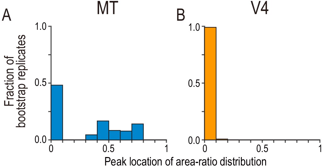
Bootstrap distribution for peak location of area-ratio distribution.
(A and B) The fraction of bootstrap replicates is plotted against the binned area ratio. For each bootstrap replicate, we resampled the observed area-ratio values with replacement, constructed a histogram with the same bins used in Figure 5A,B, and registered the location of the peak bin. We repeated the process 50,000 times. The peak distribution for MT consisted of two clusters with an approximately equal size, whereas the peak distribution for V4 was almost entirely concentrated at around zero.
-
Figure 5—figure supplement 1—source data 1
Bootstrap distribution of the area ratio’s peak-bin locations.
- https://cdn.elifesciences.org/articles/58749/elife-58749-fig5-figsupp1-data1-v2.csv
Figure 5—figure supplement 2
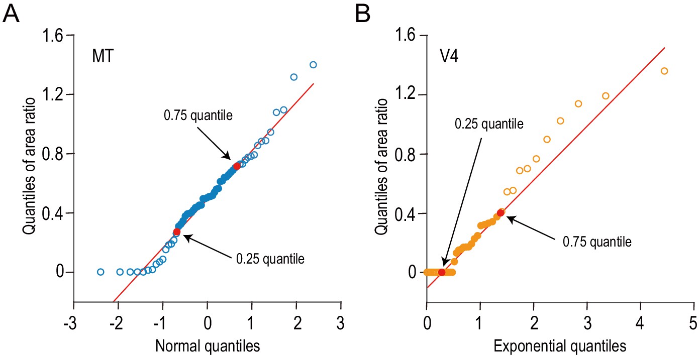
The distributions of the area ratios for MT and V4 are compared against normal and exponential distributions, respectively.
We examined the shapes of area-ratio distributions using quantile–quantile plots. (A) The quantiles of area ratios for MT are plotted against the theoretical quantiles expected from the standard normal distribution. (B) Likewise, the quantiles of V4 data are plotted against the theoretical quantiles expected from an exponential distribution (mean = 1). Red lines are drawn through the 0.25 and 0.75 quantiles. The data between these two points are well aligned on the red lines, meaning that the area-ratio distributions from MT and V4 follow the normal and exponential distributions, respectively, within the middle 50% of the data range.
Figure 5—figure supplement 3
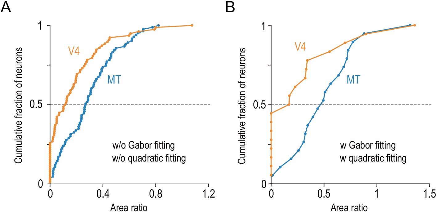
The differential distributions of the area ratios between V4 and MT hold in two control analyses.
(A) We quantified the area ratio without model fitting (see Materials and methods) and confirmed that the area ratio significantly differed between MT and V4 (two-sided Mann–Whitney U-test, p=2.3 × 10⁻⁵ for the median difference). This analysis included our whole data set (MT, n = 83; V4, n = 78). (B) We analyzed only the data obtained from MT and V4 of the same individual monkey and confirmed the same result (Monkey O; MT, n = 28; V4, n = 30; two-sided Mann–Whitney U-test, p=9.9 × 10⁻³).
Figure 5—figure supplement 4
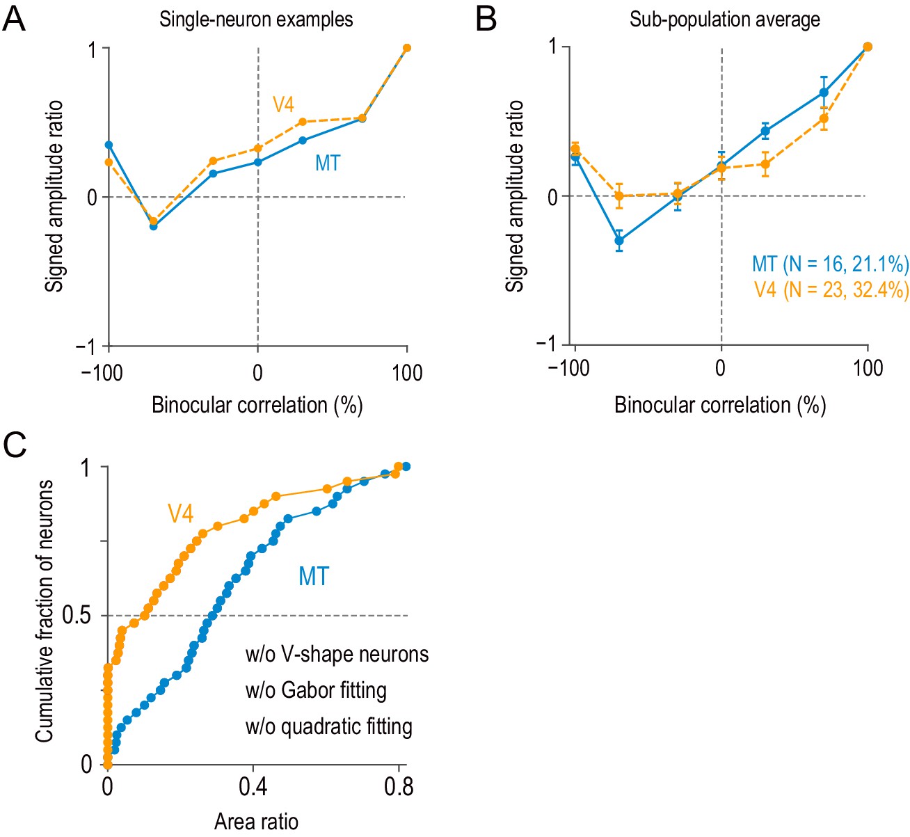
Neurons with V-shape signed amplitude-ratio functions.
(A) Example single neurons with V-shape signed amplitude-ratio functions. The signed amplitude ratios were calculated based on the Gabor functions fitted to disparity-tuning data (we did not use the peak-to-trough difference of raw disparity-tuning data because it was more susceptible to neuronal noise). (B) The average signed amplitude-ratio functions for the subpopulation of neurons similar to the examples in (A) (i.e., neurons with positive values at −100% correlation and negative minima at correlation levels above −100%). The average curve for the V4 subpopulation did not have a large negative minimum, because the location of the minimum varied between −70% and −30% correlations. Error bars indicate ± SEMs. (C) Model-free area-ratio distribution similar to Figure 5—figure supplement 3A but without the subpopulation of neurons summarized in (B). The area ratio significantly differed between MT and V4 (two-sided Mann–Whitney U-test, p=3.3 × 10⁻⁵ for the median difference; N = 67 for MT, 55 for V4).
-
Figure 5—figure supplement 4—source data 1
Signed amplitude ratios from Gabor-function disparity tuning.
Neurons with strong violation (see Appendix 1—Figure 5—text supplement 1) are flagged.
- https://cdn.elifesciences.org/articles/58749/elife-58749-fig5-figsupp4-data1-v2.csv
Figure 5—figure supplement 5
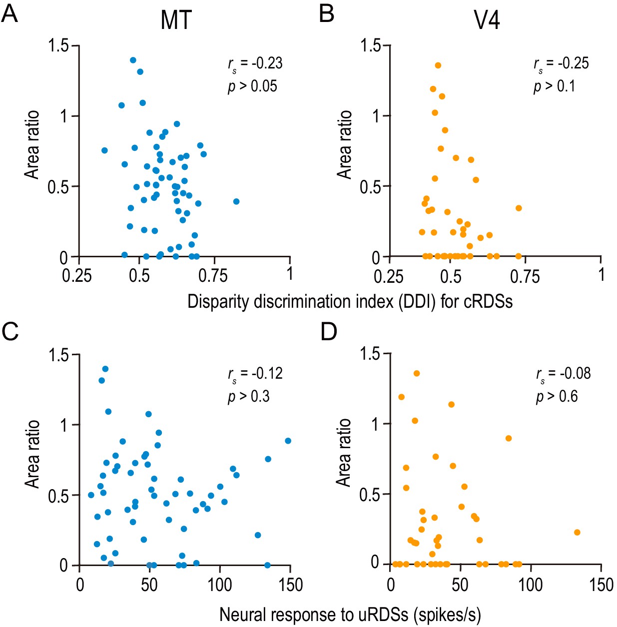
The area ratio is correlated neither with the strength of disparity selectivity nor with the responsiveness in MT and V4.
(A and B) The area ratio is plotted against the disparity discrimination index (DDI) calculated from the responses to correlated random dot stereograms (cRDSs). The DDI quantifies the strength of disparity selectivity. (C and D) The area ratio is plotted against the average firing rate for uncorrelated RDSs, which is often taken as the baseline response level (Uka and DeAngelis, 2003). rs, Spearman’s correlation coefficient. The analyses were performed in the same population of neurons as in Figure 6.
Figure 6 with 2 supplements
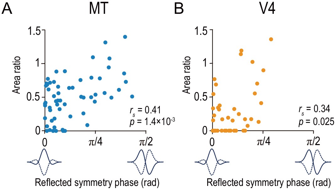
Area ratio is correlated with tuning-curve symmetry in both MT and V4.
Area ratios of neurons in MT (A) and V4 (B) were plotted against the reflected symmetry phase, which takes the value of 0 and π/2 for even-symmetric and odd-symmetric tuning curves, respectively. The symmetry was computed for the responses to correlated RDSs. The plots consist of the neurons with good fitting quality (R2 >0.6 both for Gabor functions for disparity-tuning curves and quadratic functions for the signed amplitude ratio; N = 59 and 43 for MT and V4, respectively). rs indicates Spearman’s rank correlation coefficient.
-
Figure 6—source data 1
Data for Figure 6 and its figure supplement.
The source file contains area ratio, reflected symmetry phase, and reflected Gabor phase.
- https://cdn.elifesciences.org/articles/58749/elife-58749-fig6-data1-v2.csv
Figure 6—figure supplement 1
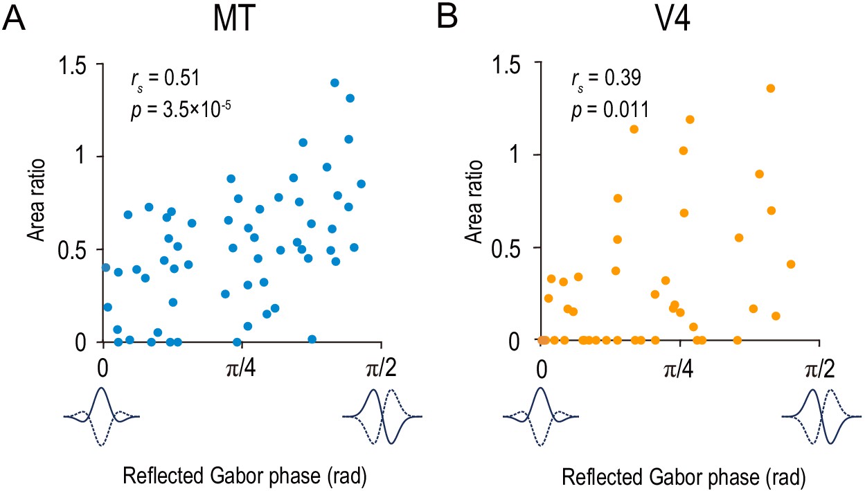
The area ratio is correlated with the symmetry of the disparity-tuning curve as quantified by the Gabor function’s phase parameter in MT and V4.
The area ratio is plotted against the best-fitted values of the phase parameter of the Gabor function for 59 MT neurons (A) and 43 V4 neurons (B). The analyses were performed in the same population of neurons as in Figure 6.
Figure 6—figure supplement 2
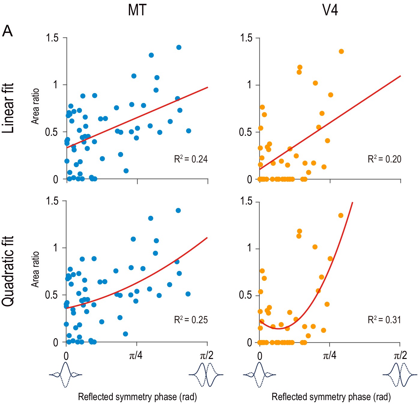
Linear and quadratic regressions for area ratio as dependent variable and reflected symmetry phase as independent variable.
Red curves indicate the best fitted linear functions (top row) and quadratic functions (bottom row). Data points are the same as in Figure 6.
-
Figure 6—figure supplement 2—source data 1
Best-fitted regression coefficients.
- https://cdn.elifesciences.org/articles/58749/elife-58749-fig6-figsupp2-data1-v2.csv
Figure 7

Tuning-curve symmetry is more strongly biased toward the even shape in V4 than in MT.
(A and B) The distributions of the reflected symmetry phase. We included the neurons for which Gabor functions were well fitted to the disparity tuning (R2 >0.6; N = 76 and 71 for MT and V4, respectively). The parts of the histograms with solid color correspond to the neurons for which quadratic functions were well fitted to the signed amplitude ratio (i.e., the same subpopulations as plotted in Figure 6 and Figure 5A–C). Triangles indicate the medians. (C) Cumulative distributions of the reflected symmetry phase for the full populations shown in A and B. (D) Quantile–quantile plot comparing the shape of the distribution between V4 and MT. N = 71 (the number of V4 neurons, which was smaller than that of MT neurons). The horizontal axis plots the sorted values of the reflected symmetry phase for V4. The vertical axis plots the interpolated values of the reflected symmetry phase for MT at the corresponding quantiles. The black line indicates the linear regression. The flanking gray lines indicate the 95% confidence interval of the linear regression.
-
Figure 7—source data 1
The source file contains reflected symmetry phase for a larger population of neurons than analyzed in Figure 6.
The flag to select the neurons analyzed in Figure 6 is also included.
- https://cdn.elifesciences.org/articles/58749/elife-58749-fig7-data1-v2.csv
Figure 8
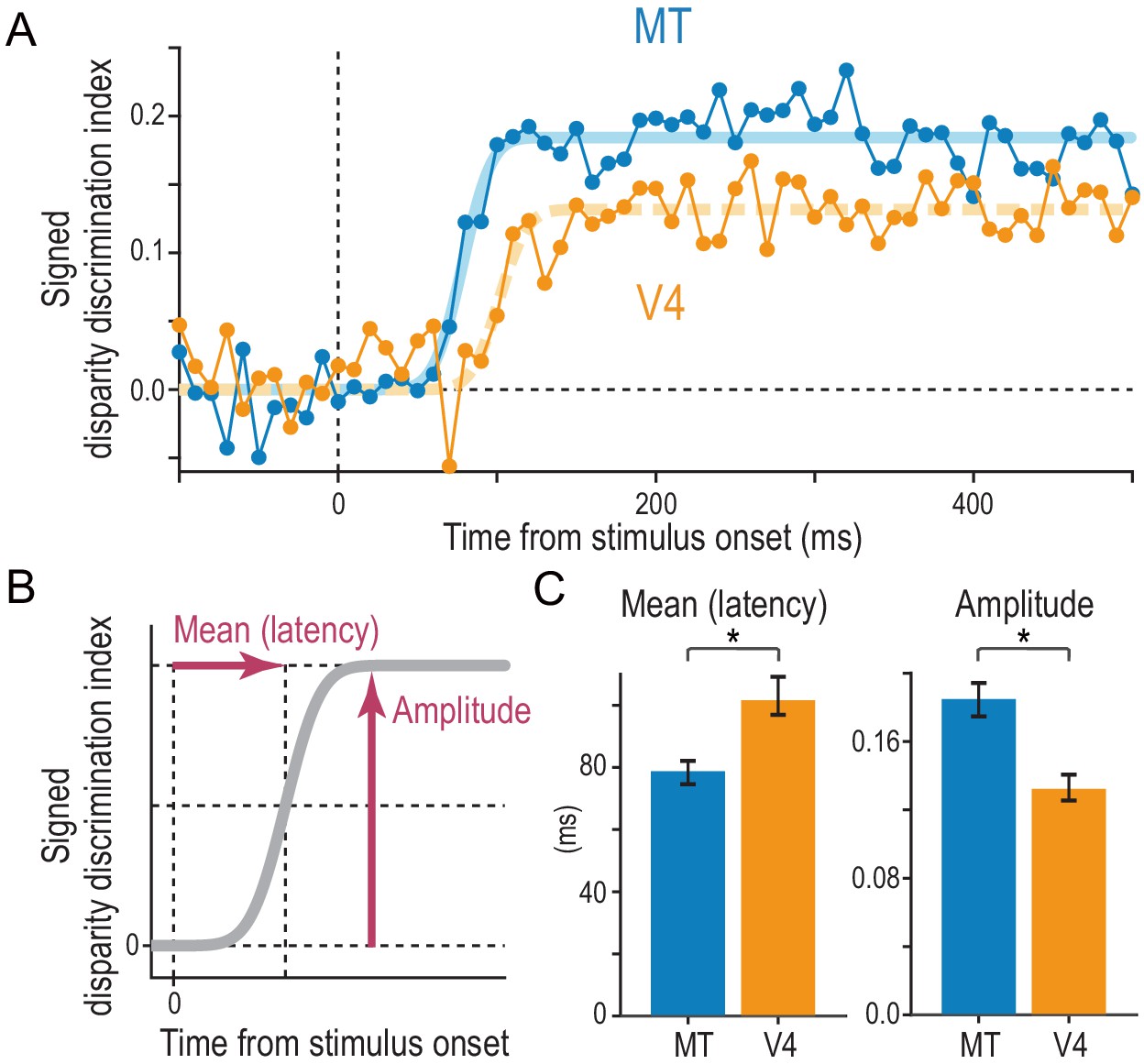
Comparison of the strength and speed of disparity selectivity between MT and V4 in response to cRDSs.
(A) The average time course of the signed disparity discrimination index (sDDI). The sDDI was calculated within 10 ms (non-overlapping) time windows for each cell and then averaged across cells separately for MT and V4 (N = 83 and 78, respectively). The smooth curves are fitted cumulative Gaussian functions. The vertical dashed line indicates the stimulus onset. (B) Parameters of the fitted cumulative Gaussian function. The amplitude parameter quantifies the saturation level of the sDDI. The mean parameter, our estimate of the selectivity latency, corresponds to the time required for the sDDI to rise to half the final amplitude. (C) Best-fitted values and 68% bootstrap confidence intervals. The latency and amplitude were significantly different between MT and V4.
-
Figure 8—source data 1
Time course of population-averaged signed disparity discrimination index.
- https://cdn.elifesciences.org/articles/58749/elife-58749-fig8-data1-v2.csv
Figure 9 with 1 supplement

Threshold energy model with effectively smaller receptive fields (RFs) produces response patterns closer to match-based depth representation.
(A) Gaussian envelope of a model RF (s.d., 2.86 pixels). We fixed the RF size in the simulations. (B) Random-dot stimuli with different spatial scales to simulate different relative RF sizes. The dot size ranged from 16 pixels to 1 pixel. (C) Disparity tuning curves from the standard energy model (top row) and those from the threshold energy model (bottom row). For the standard energy model, the response was defined as the binocular term of an energy-model complex unit. For the threshold energy model, these responses were half-wave rectified at each temporal frame. The tuning curves in each panel were normalized by the peak response (to 100% binocular correlation at zero disparity). Compare the simulated tuning curves to the pure correlation-based and match-based tuning shown in Figure 1B. (D) Signed-amplitude-ratio curves as a function of binocular correlation for different relative RFs. Compare the simulated results to the predictions shown in Figure 4A. The tuning amplitude was calculated as the tuning peak (or trough) minus tuning baseline. The negative sign indicates inverted tuning. (E) Area ratios computed for the curves in the threshold energy model in (D). The area ratio monotonically increased with the relative RF size.
-
Figure 9—source data 1
Data for Figure 9C (disparity tuning).
- https://cdn.elifesciences.org/articles/58749/elife-58749-fig9-data1-v2.csv
-
Figure 9—source data 2
Data for Figure 9D (signed-amplitude ratios).
- https://cdn.elifesciences.org/articles/58749/elife-58749-fig9-data2-v2.csv
-
Figure 9—source data 3
Data for Figure 9E (area ratios).
- https://cdn.elifesciences.org/articles/58749/elife-58749-fig9-data3-v2.csv
Figure 9—figure supplement 1
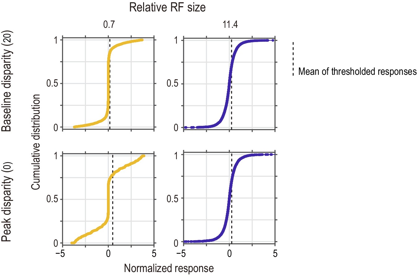
Distributions of instantaneous (frame-wise) responses of the standard energy model to half-matched RDSs.
The response distribution is shown for two relative RF sizes (small and large for the left and right columns, respectively) and for two disparity values (tuning baseline and peak for the top and bottom rows, respectively). Vertical dashed lines indicate the mean computed for the half-wave rectified responses (i.e., responses of the threshold energy model). Their horizontal positions in the top-row panels correspond to the vertical levels of the arrows in the bottom-row panels of Figure 9C. The response distribution was sensitive to disparity when the relative RF size was small (left column), but not when the relative RF size was large (right column). At the baseline disparity (top row), the response was closer to zero when the RF was smaller.
-
Figure 9—figure supplement 1—source data 1
Single-frame responses of the standard disparity energy model to half-matched random-dot stereograms.
- https://cdn.elifesciences.org/articles/58749/elife-58749-fig9-figsupp1-data1-v2.csv
Author response image 1
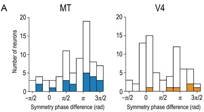
Distributions of symmetry-phase differences for aRDSs (i.e., at −100% binocular correlation).
Solid bars indicate neurons with significant disparity selectivity for aRDSs (Kruskal-Wallis test, p < 0.05). The histogram for V4 is a modified plot of Figure 7A (bottom left) in Abdolrahmani et al., 2016. N = 76 and 71 for MT and V4, respectively (neurons with well-fitted Gabor tuning curves, R2 > 0.6).
Additional files
Download links
A two-part list of links to download the article, or parts of the article, in various formats.
Downloads (link to download the article as PDF)
Open citations (links to open the citations from this article in various online reference manager services)
Cite this article (links to download the citations from this article in formats compatible with various reference manager tools)
Specialized contributions of mid-tier stages of dorsal and ventral pathways to stereoscopic processing in macaque
eLife 10:e58749.
https://doi.org/10.7554/eLife.58749


