Graphical-model framework for automated annotation of cell identities in dense cellular images
- School of Chemical & Biomolecular Engineering, Georgia Institute of Technology, United States
- Petit Institute for Bioengineering and Bioscience, Georgia Institute of Technology, United States
Figures
Figure 1 with 3 supplements

CRF_ID annotation framework automatically predicts cell identities in image stacks.
(A) Steps in CRF_ID framework applied to neuron imaging in C. elegans. (i) Max-projection of a 3D image stack showing head ganglion neurons whose biological names (identities) are to be determined. (ii) Automatically detected cells (Materials and methods) shown as overlaid colored regions on the raw image. (iii) Coordinate axes are generated automatically (Note S1). (iv) Identities of landmark cells if available are specified. (v) Unary and pairwise positional relationship features are calculated in data. These features are compared against same features in atlas. (vi) Atlas can be easily built from fully or partially annotated dataset from various sources using the tools provided with framework. (vii) An example of unary potentials showing the affinity of each cell taking the label RMGL. (viii) An example of dependencies encoded by pairwise potentials, showing the affinity of each cell taking the label ALA given the arrow-pointed cell is assigned the label RMEL. (ix) Identities are predicted by simultaneous optimization of all potentials such that assigned labels maximally preserve the empirical knowledge available from atlases. (x) Predicted identities. (xi) Duplicate assignment of labels is handled using a label consistency score calculated for each cell (Appendix 1–Extended methods S1). (xii) The process is repeated with different combinations of missing cells to marginalize over missing cells (Note S1). Finally, top candidate label list is generated for each cell. (B) An example of automatically predicted identities (top picks) for each cell.
Figure 1—figure supplement 1

Schematic description of various features in the CRF model that relate to intrinsic similarity and extrinsic similarity.
(A) An example of binary positional relationship feature (Appendix 1–Extended methods S1.2.2) illustrated for positional relationships along AP axis. The table lists feature value for some exemplary assignment of labels ‘A’, ‘B’, and ‘C’ from the atlas to cells ‘1’ and ‘2’ in the image data. For example since cell ‘1’ is anterior to cell ‘2’ in image, if labels assigned to these cells are consistent with the anterior-posterior positional relationship (e.g. ‘A-B’, ‘A-C’, ‘B-C’), then the feature value is high (1); else low (0). CRF_ID model assigns identities to cells in image by maximizing the feature values for each pair of cells in image over all possible label assignments. The table also illustrates the difference between using a static atlas (or single data source) and a data-driven atlas built using available annotated data. In case of static atlas, the CRF model assumes that the cell ‘A’ is anterior to cell ‘B’ with 100% probability. In contrast, in experimental data cell ‘A’ may be anterior to cell ‘B’ with 80% probability (8 out of 10 datasets) and cell ‘B’ may be anterior to cell ‘C’ with 50% probability (5 out of 10 datasets). Thus, data-driven atlases relaxes the hard constraint and uses statistics from experimental data. The feature values are changed accordingly. Note, unlike registration based methods for building data-driven atlas, in CRF model data-driven atlases record only probabilistic positional relationship among cells and not probabilistic positions of cells. Thus CRF_ID does not build spatial atlas of cells. (B) An example of angular relationship feature (Appendix 1–Extended methods S1.2.4). The table lists feature value for some exemplary assignment of labels. For example, the feature value is highest for assigning labels ‘A’ and ‘C’ to cells ‘1’ and ‘2’’ because the vector joining cells ‘A’ and ‘C’ in atlas () is most directionally similar to vector joining cells ‘1’ and ‘2’ in image () as measured by dot product of vectors. For data-driven atlas, average vectors in atlas are used. (C) An example of proximity relationship feature (Appendix 1–Extended methods S1.2.3). The table lists feature value for some exemplary assignment of labels. For example, the feature value is low for assigning labels ‘B’ and ‘C’ to cells ‘1’ and ‘2’’ because the distance between cells ‘B’ and ‘C’ in atlas () is least similar to distance between cells ‘1’ and ‘2’ in image (). The distance metric can be Euclidean distance or geodesic distance. For data-driven atlas, average distances in atlas are used. (D) An example illustrating the cell annotation performed by maximizing extrinsic similarity in contrast to intrinsic similarity. Registration based methods maximize extrinsic similarity by minimizing registration cost function . Here, a transformation is applied to the atlas and labels are annotated to cells in image by minimizing the assignment cost that is sum of distances between cell coordinates in image and transformed coordinates of cells in atlas. For data-driven atlas, a spatial atlas is built using annotated data that is used for registration. Note, in contrast, CRF_ID method does not build any spatial atlas of cells because it uses intrinsic similarity features. CRF_ID only builds atlases of intrinsic similarity features shown in panels (A-C).
Figure 1—figure supplement 2
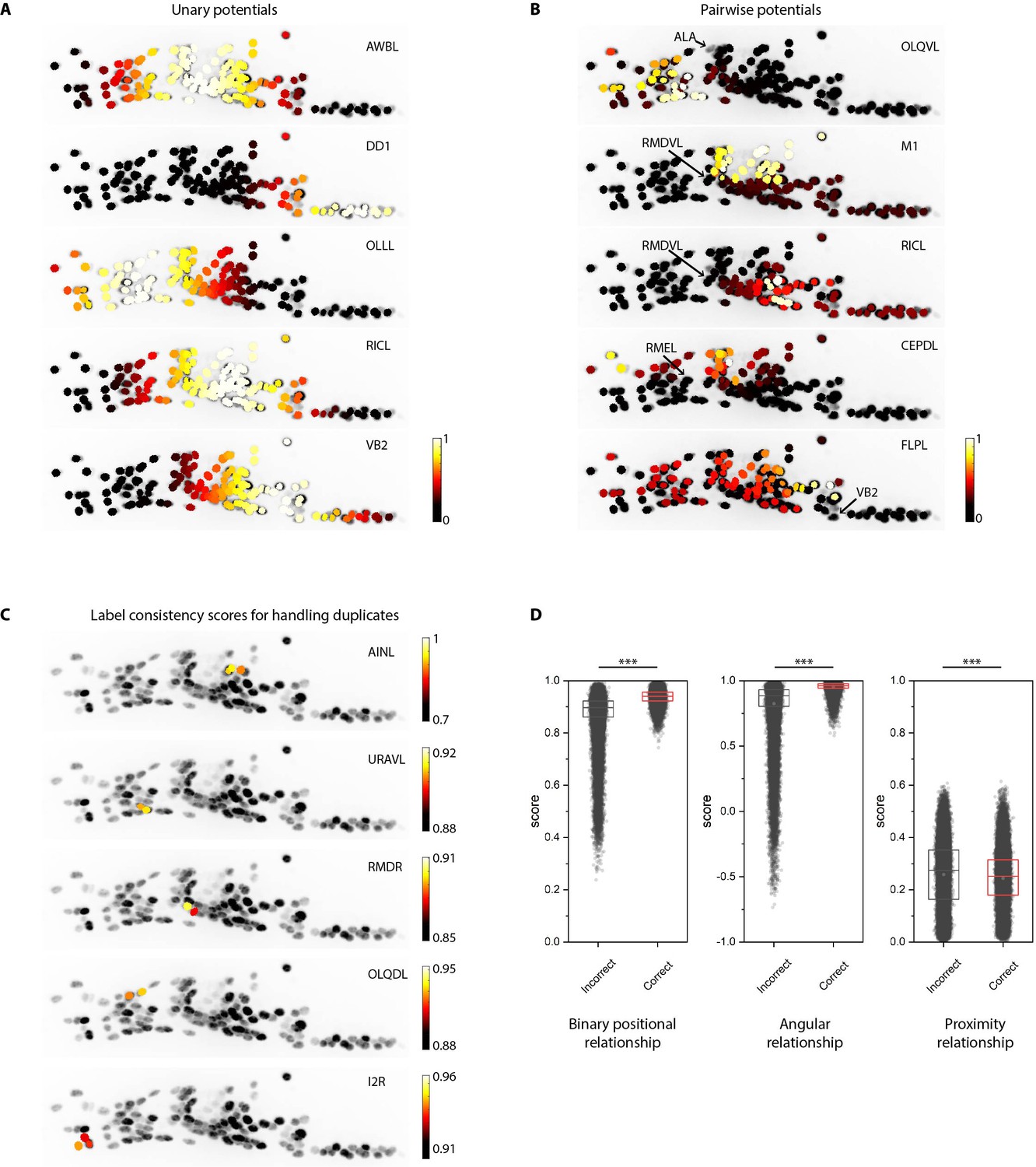
Additional examples of unary and pairwise potentials and label consistency scores calculated for each cell.
(A) Unary potentials encode affinities of each cell to take specific labels in atlas. Here, affinities of all cells to take the label specified on the top right corner of images are shown. Randomly selected examples are shown here. In practice, unary potentials are calculated for all cells for every label. (B) Pairwise potentials encode affinities of pair of cells in head ganglion to get two labels from atlas. Here, we show the affinity of all cells taking the label specified on the top right corner of images given the cell marked by the arrow is assigned the given label. Randomly selected examples are shown here. In practice, pairwise potentials are calculated for all pairs of cells for all pairs of labels. (C) Examples of label-consistency score of cells that were assigned duplicate labels (specified on the top right corner of the image) in an intermediate step in framework. To remove duplicate assignments, only the cell with the highest consistency score is assigned the label. Optimization is run again to assign labels to all unlabeled cells while keeping the identities of labeled cells fixed. (D) Comparison of label-consistency scores for accurately predicted cells and incorrectly predicted cells. Correctly predicted cells have a higher binary positional relationship consistency score, close to one angular relationship consistency score (smaller angular deviation between labels in image and atlas) and close to 0 proximity consistency score (smaller Gromov-Wasserstein discrepancy). Scores shown for all 130 predicted cells in synthetic data across ~1100 runs. Thus, n ≈ 150,000. *** denotes p<0.001, Bonferroni paired comparison test. Each run differed from the other in terms of random position noise and count noise applied to synthetic data to mimic real images. Top, middle, and bottom lines in box plot indicate 75th percentile, median, and 25th percentile of data, respectively.
Figure 1—video 1
Identities predicted automatically by the CRF_ID framework in head ganglion stack.
Top five identities predicted are shown sorted by consistency score. Scale bar 5 µm.
Figure 2 with 7 supplements
CRF_ID annotation framework outperforms other approaches.
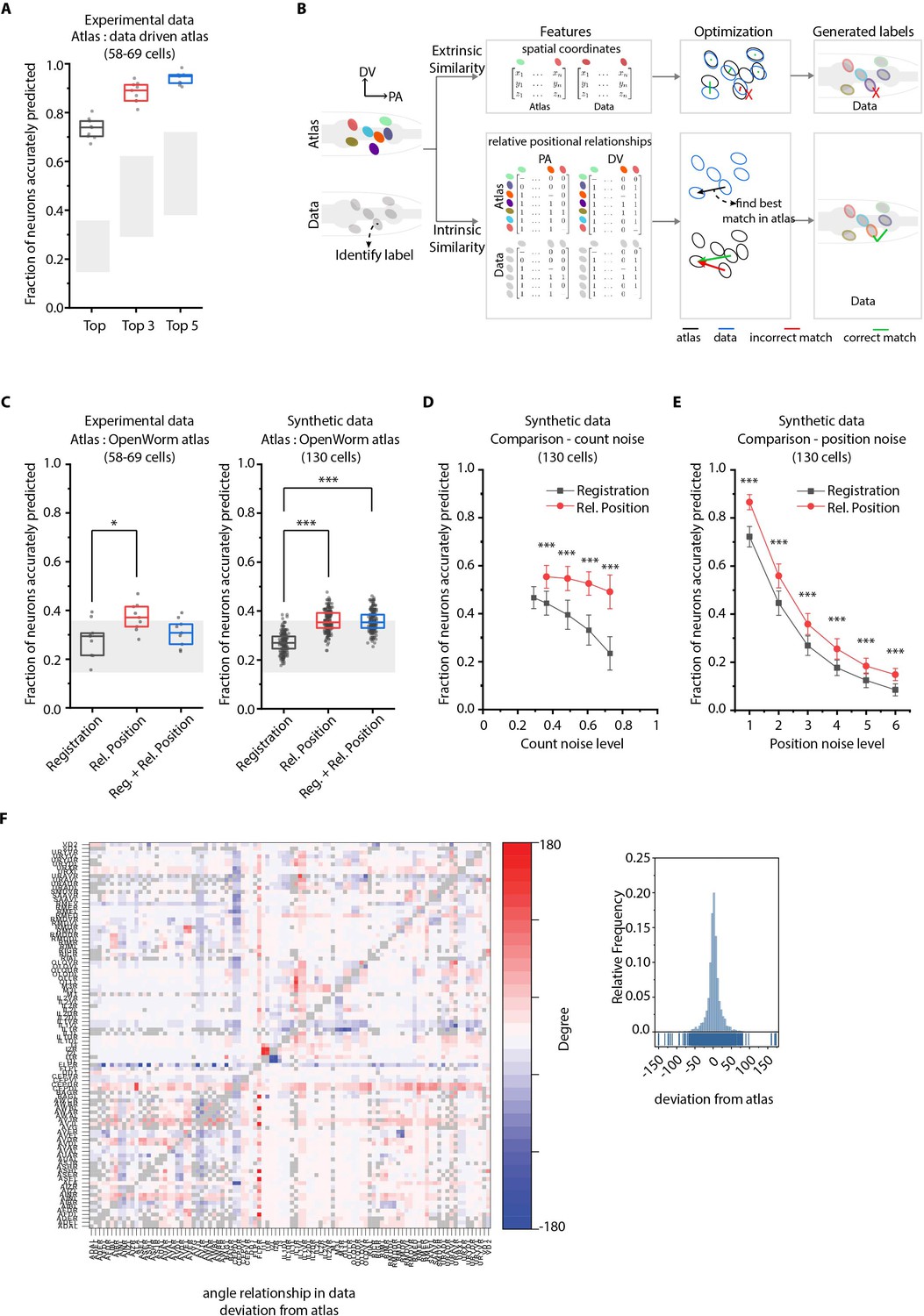
(A) CRF_ID framework achieves high prediction accuracy (average 73.5% for top labels) using data-driven atlases without using color information. Results shown for whole-brain experimental ground truth data (n = 9 animals). Prediction was performed using separate leave-one-out data-driven atlases built for each animal dataset with test dataset held out. Gray regions indicate bounds on prediction accuracy obtained using simulations on synthetic data (see Figure 2—figure supplement 1F). Experimental data comes from strain OH15495. Top, middle, and bottom lines in box plot indicate 75th percentile, median, and 25th percentile of data, respectively. (B) Schematic highlighting key difference between registration-based methods and our CRF_ID framework. (C) Prediction accuracy comparison across methods for ground truth experimental data (n = 9, *p<0.05, Bonferroni paired comparison test) and synthetic data (n = 190–200 runs for each method, ***p<0.001, Bonferroni paired comparison test). OpenWorm atlas was used for predictions. Accuracy results shown for top predicted labels. Experimental data comes from strain OH15495. For synthetic data, random but realistic levels of position and count noise applied in each run. Gray regions indicate bounds on prediction accuracy obtained using simulations on synthetic data (see Figure 2—figure supplement 1F). Top, middle, and bottom lines in box plot indicate 75th percentile, median, and 25th percentile of data, respectively. (D) Comparison of methods across count noise levels (defined as percentage of cells in atlas that are missing from data) using synthetic data. (n = 150–200 runs for Rel. Position for each noise level, n = ~1000 runs for Registration for each noise level, ***p<0.001, Bonferroni paired comparison test). OpenWorm atlas was used for prediction. Accuracy results shown for top predicted labels. For a fixed count noise level, random cells were set as missing in each run. Markers and error bars indicate mean ± standard deviation. (E) Comparison of methods across position noise levels using synthetic data. (n = 190–200 runs for each method for each noise level, ***p<0.001, Bonferroni paired comparison test). OpenWorm atlas was used for prediction. Accuracy results shown for top predicted labels. For a fixed position noise level, random position noise was applied to cells in each run. Different noise levels correspond to different variances of zero-mean gaussian noise added to positions of cells (see section Materials and methods – Generating synthetic data for framework tuning and comparison against other methods). Noise levels 3 and 6 correspond to the lower bound and upper bound noise levels shown in Figure 2—figure supplement 1F. Markers and error bars indicate mean ± standard deviation. (F) Pairwise positional relationships among cells are more consistent with OpenWorm atlas even though the absolute positions of cells vary across worms. (Left) average deviation of angular relationship measured in ground truth data (n = 9) from the angular relationship in static atlas. (Right) distribution of all deviations in left panel (total of 8516 relationships) is sparse and centered around 0 deviation, thus indicating angular relationships are consistent with atlas.
Figure 2—figure supplement 1
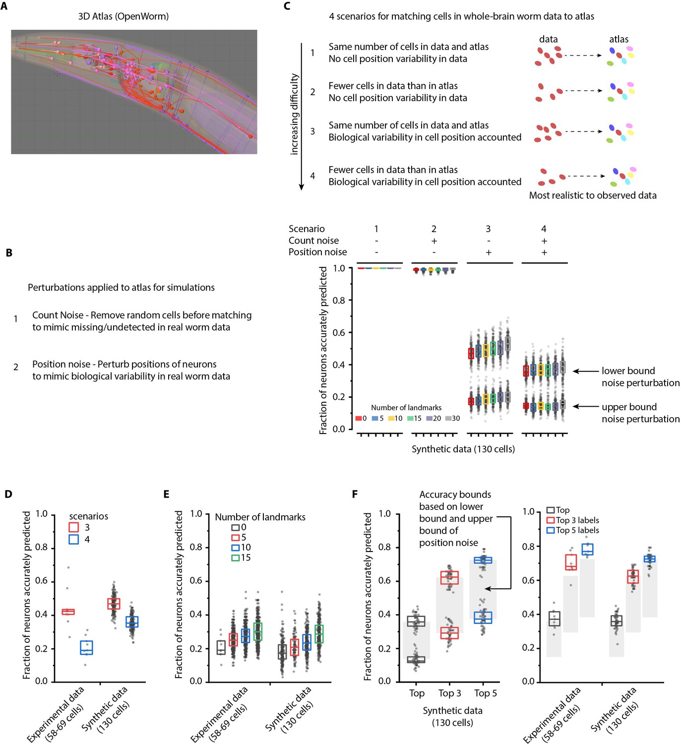
Performance characterization using synthetic data.
(A) Freely available open-source 3D atlas (OpenWorm atlas) was used to generate synthetic data. (B) Four scenarios were simulated using atlas and prediction accuracies were quantified. These scenarios include different perturbations observed in experimental data such as count noise (discrepancy between cells in images and atlas), and position noise (variability in cell positions compared to atlas). (C) Prediction accuracy of framework for four simulated scenarios. For the scenario 1, in which no position noise or count noise perturbation was applied to generate simulated data, CRF_ID framework predicted identities with 99.9% accuracy thus highlighting that identities can be predicted by using relative positional relationships only (without any information about absolute positions of cells) in CRF_ID framework. With application of position and count noise, prediction accuracy decreased (scenarios 2–4). Two levels of box plots for scenario 3 and scenario 4 show prediction results for lower bound and upper bound levels of position noise applied to cells (see Figure 2—figure supplement 2). n = 200–203 runs for each scenario and for each number of landmarks condition. Each run differed from another with respect to (1) random perturbations applied to positions of cells (2) random combination of landmarks selected in each run (3) random combination of cells set as missing. Top, middle, and bottom lines in box plot indicate 75th percentile, median, and 25th percentile of data, respectively. (D)Scenarios 3 and 4 were simulated for experimental data by applying count noise to data and results were compared to results on synthetic data shown in panel C. Results show good match between synthetic data and experimental ground truth data. For synthetic data simulations, results are same as panel C for 0 landmarks condition and lower bound level of perturbation. Experimental data comes from OH15495 strain. Top, middle, and bottom lines in box plot indicate 75th percentile, median, and 25th percentile of data, respectively. (E) Effect of number of landmarks on prediction accuracy using both experimental data and synthetic data show similar accuracy trends. Images of nine animals were used as experimental ground truth datasets (strain OH15495). For no landmarks condition, n = 9. For non-zero landmarks conditions, n = 450 runs across nine datasets were performed for each condition with randomly selected landmarks in each run. For synthetic data, n = 200 runs were performed for each condition with randomly selected landmarks in each run. For no landmarks condition in synthetic data – each run is different from another only with respect to random perturbations applied in each run. Top, middle, and bottom lines in box plot indicate 75th percentile, median, and 25th percentile of data, respectively. (F) Accuracy bounds for Top, Top 3, and Top 5 labels were defined as average prediction accuracies achieved by applying lower bound and upper bound levels of position noise in synthetic data. These accuracy bounds are shown as gray regions in Figure 2. n = 50 runs for both lower and upper bounds levels of noise. Accuracies obtained for top, top 3, and top 5 labels in synthetic data are similar to accuracies in experimental data (n = 9). Experimental data comes from OH15495 strain. Top, middle, and bottom lines in box plot indicate 75th percentile, median, and 25th percentile of data, respectively.
Figure 2—figure supplement 2
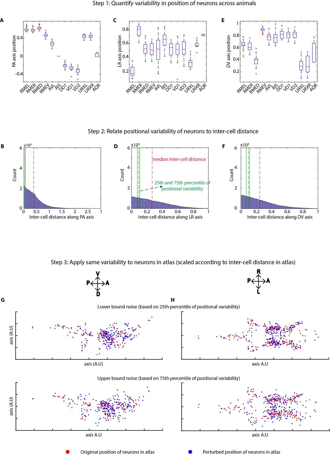
Method of applying position noise to the atlas to generate synthetic data.
(A, C, E) Variability in positions of cells were quantified in experimental data using landmark strains GT290 and GT298. Panels here show the variability of landmark cells along AP, LR, DV axes (n = 31 animals). Top and bottom lines in box plot indicate 75th percentile and 25th percentile of data, middle (red) line indicates data median, and whiskers indicate range. (B, D, F) Position variability of cells was compared to the inter-cell distances among all cells in the head ganglion. Panels show distributions of inter-cell distances between all pairs of cells in the head along AP, LR, and DV axes. 25th and 75th percentiles of cell position variability were compared to inter-cell distances to define lower bound and upper bound levels of variability in cell positions. (G, H) To calculate perturbations to be applied to cells in atlas, inter-cell distances in the atlas were calculated as well. Subsequently, the relation between position variability and inter-cell distance calculated in experimental data was used to calculate appropriately scaled perturbations based on inter-cell distance in atlas. This was done to remove the effect of different spatial scales of cell positions in experimental data vs atlas. Scaled noise perturbations were applied to each cell position. Panels show original positions of cells (red) and positions after applying perturbation (blue) in atlas for the lower bound and upper bound level of perturbations. Two views of the atlas are shown.
Figure 2—figure supplement 3
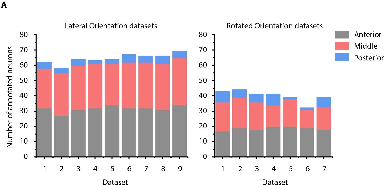
Details of manually annotated experimental ground-truth datasets.
(A) Number of cells manually annotated in each of anterior (anterior ganglion), middle (lateral, dorsal, and ventral ganglion) and posterior (retrovesicular ganglion) regions of head ganglion in two kinds of experimental ground-truth datasets: where animal is imaged in lateral orientation, that is LR axis is perpendicular to the image plane (left panel) and where animal is non-rigidly rotated about AP axis (right panel). See Figure 4—figure supplement 2 for details on grouping of head ganglion in anterior, middle, and posterior regions. Data was collected using NeuroPAL strains (OH15495 and OH15500).
Figure 2—figure supplement 4
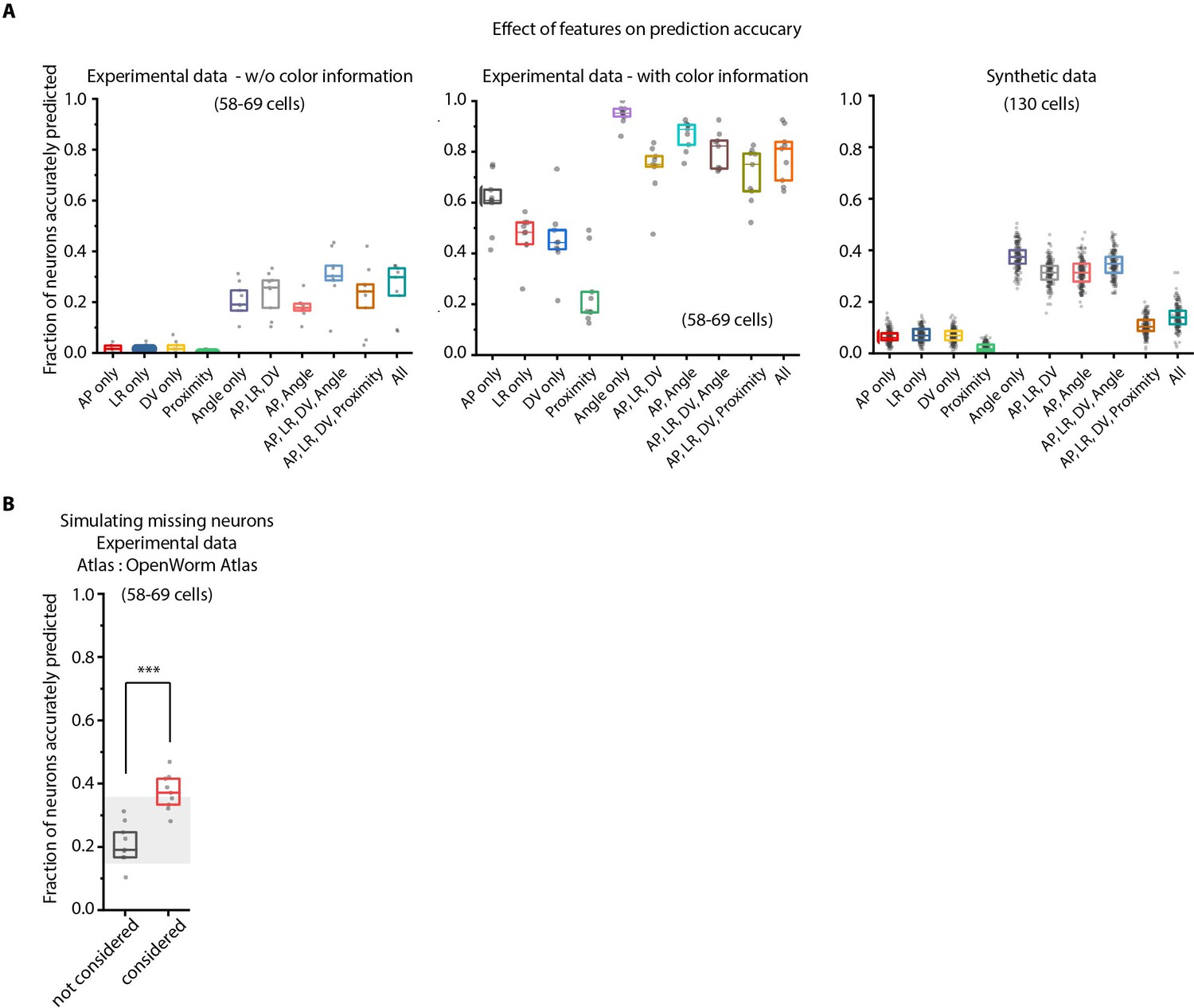
Model tuning/characterization – features selection and simulating missing cells.
(A) Feature selection in the model was performed by keeping various feature combinations in the model and assessing prediction accuracy. Left panel – experimental data without using color information (n = 9 animals for each condition), Middle panel – experimental data using color information (n = 9 worms for each condition), Right panel – Synthetic data generated from atlas (n = 189–200 runs for each condition with random position and count noise perturbations applied in each run, see Materials and methods). Prediction accuracy across these datasets follow a similar trend for different feature combination. Overall, the angular relationship feature by itself or combined with binary positional relationship features performs best. Experimental data comes from OH15495 strain. Top, middle, and bottom lines in box plot indicate 75th percentile, median, and 25th percentile of data, respectively. (B) Accounting for missing neurons improves prediction accuracy (n = 9 animals, ***p<0.001, Bonferroni paired comparison test). Top, middle, and bottom lines in box plot indicate 75th percentile, median, and 25th percentile of data, respectively.
Figure 2—figure supplement 5
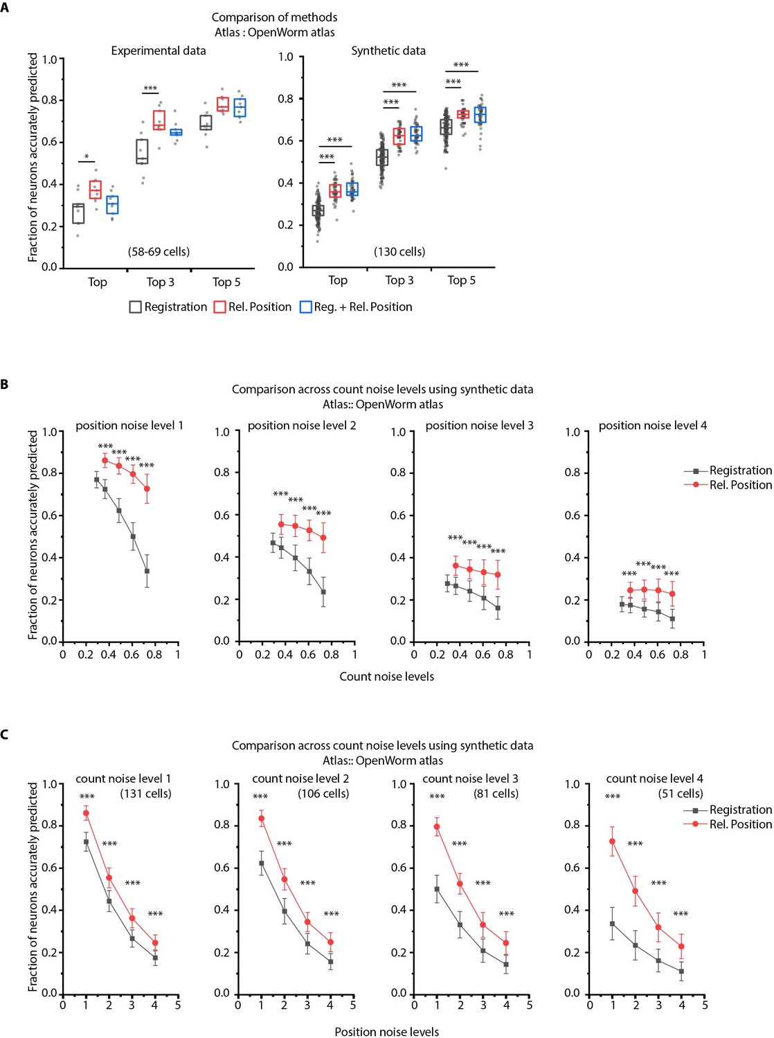
CRF_ID framework with relative positional features outperforms registration method.
(A) Prediction accuracies achieved by Top, Top 3, and Top 5 labels predicted by three methods – Registration, CRF_ID framework with Relative Position features and CRF_ID framework with combined features (see Appendix 1–Extended methods S2.1-2.3). Relative position features outperform the registration method in both experimental data (left panel) and synthetic data (right panel). For experimental data, n = 9 worm datasets, strain OH15495. For synthetic data, n = 200 runs for registration method, n = 48–50 runs for Rel. Position method and combined method. Each run differed from the other in terms of position noise and count noise applied. *** denotes p<0.001, Bonferroni paired comparison test. Part of data is re-plotted in Figure 2C. Top, middle, and bottom lines in box plot indicate 75th percentile, median, and 25th percentile of data, respectively. (B) Accuracy comparison across count noise levels (defined as percentage of cells in atlas that are missing from data) for various fixed position noise levels. (n = 180–200 runs for Rel. Position for each count noise level for each condition, n = ~500 runs for Registration for each count noise level for each condition, ***p<0.001, Bonferroni paired comparison test). Results for position noise level two are shown in Figure 2D. For a fixed count noise level, random cells were removed in each run. Markers and error bars indicate mean ± standard deviation. (C) Accuracy comparison across position noise levels for various fixed count noise levels. (n = 180–200 runs for Rel. Position for each position noise level for each condition, n = ~500 runs for Registration for each position noise level for each condition, ***p<0.001, Bonferroni paired comparison test). Different noise levels correspond to different variances of zero-mean gaussian noise added to positions of cells (see section Materials and methods – Generating synthetic data for framework tuning and comparison against other methods). For a fixed position noise level, random noise was applied to cell positions in each run. Noise levels three corresponds to the lower bound noise level calculated in Figure 2—figure supplement 2. Markers and error bars indicate mean ± standard deviation.
Figure 2—figure supplement 6
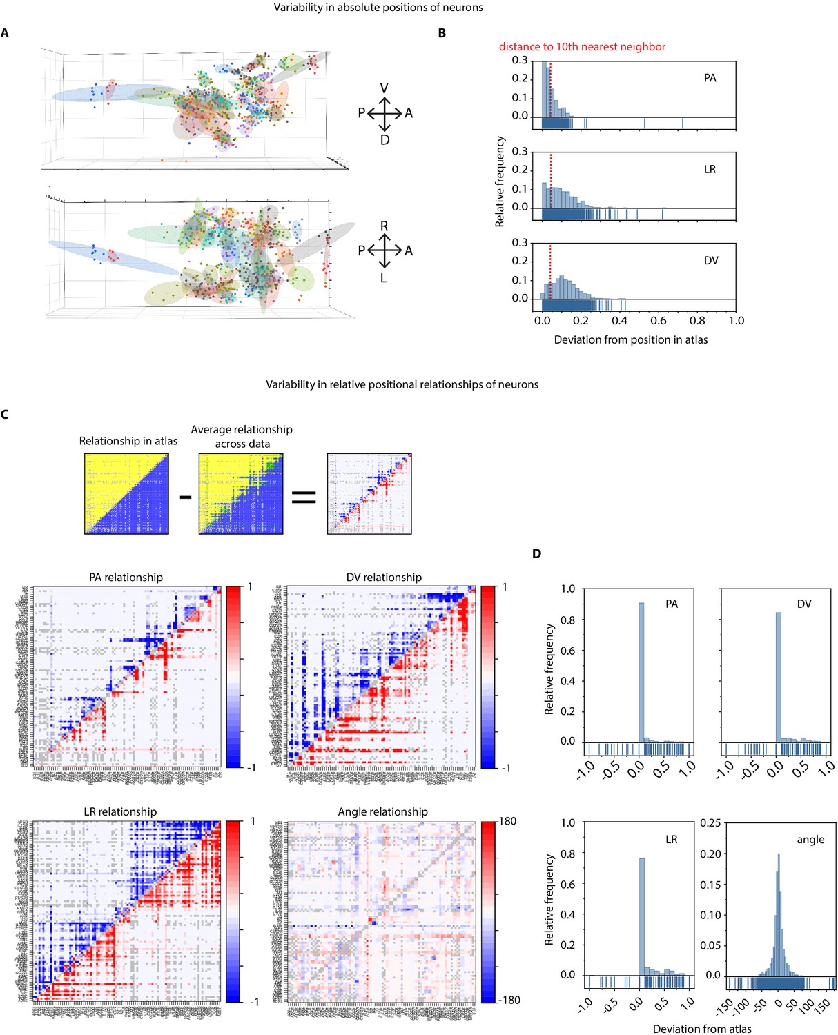
Variability in absolute positions of cells and relative positional features in experimental data compared to the static atlas.
(A) DV view (top) and LR view showing positions of cells across ground truth data (n = 9 worms, strain OH15495). Each point cloud of one color represents positions of a specific cell across datasets. Ellipsoid around the point clouds shows 50% confidence interval. Total 98 point-clouds for 98 uniquely identified cells across nine datasets shown here. (B) Distributions of deviations of absolute positions of cells in experimental data (n – nine animals, strain OH15495) compared to corresponding positions in static OpenWorm atlas. Top, middle, and bottom panels show deviation along anterior-posterior, (AP), left-right (LR), and dorsal-ventral (DV) axes. To put the deviations into perspective, dotted red lines show the median distance of each cell to its 10th nearest neighbor. Thus, in experimental data, cell positions can be deviated from their atlas position by much more than their distances to their 10th nearest neighbor. As a result, registration method often creates mismatches. (C) Deviation of relative positional relationships among cells compared to the relationship in static atlas. Top panel shows a schematic of how these deviations were calculated. for example each positional relationship is represented as a matrix. Each element in the matrix records the positional relationship between pair of cells. for example in case of static atlas, if a column cell such as RMEL is anterior to a row cell such as AIZR, then the corresponding elements will denote 1 otherwise 0. Similarly, for experimental data (n = 9 worms, same as panel A, strain OH15495), each element denotes the average number of times RMEL is observed anterior to AIZR in data. Hence the value can be between 0 and 1. Matrices are calculated in the same manner for other features. A simple subtraction of the two matrices records the deviation of the positional relationship feature. Below panels show deviations of AP, LR, DV, and angular relationships between static atlas and data. Closer to 0 values in PA and angular relationship indicates these relationships are most similar to static atlas. Gray cells in matrix denote relationships that could not be measured across nine datasets (when both cells were never annotated in same data). (D) Distributions of deviation of relative positional relationship features between static atlas and data. Total 8546 positional relationship features compared for 98 uniquely identified cell across data. Sparseness of the distributions indicate that the relative positional relationships are consistent with the atlas, although absolute positions of cells vary a lot (panel a, b).
Figure 2—figure supplement 7
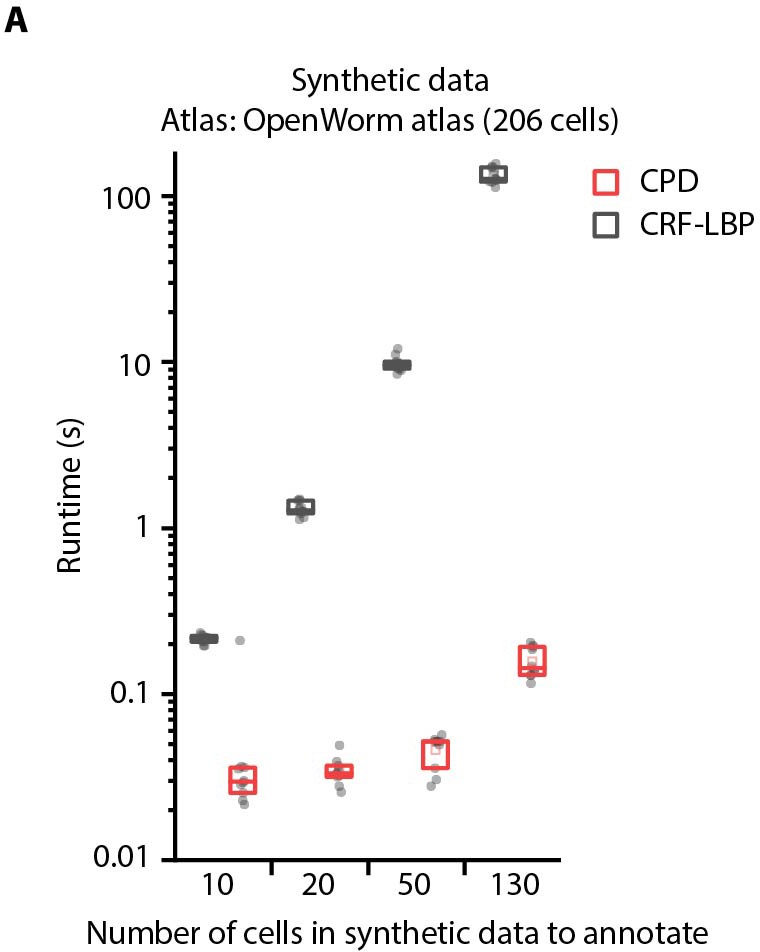
Comparison of optimization runtimes of CRF_ID framework with a registration method CPD (Myronenko and Song, 2010).
(A) Optimization runtimes of CRF method using Loopy Belief Propagation (LBP) as optimization method, and registration method CPD across different number of cells in data to be annotated. Synthetic data was used for simulations and annotation was performed using OpenWorm atlas with 206 head ganglion cells (n = 10 runs). Top, middle, and bottom lines in box plot indicate 75th percentile, median, and 25th percentile of data, respectively.
Figure 3
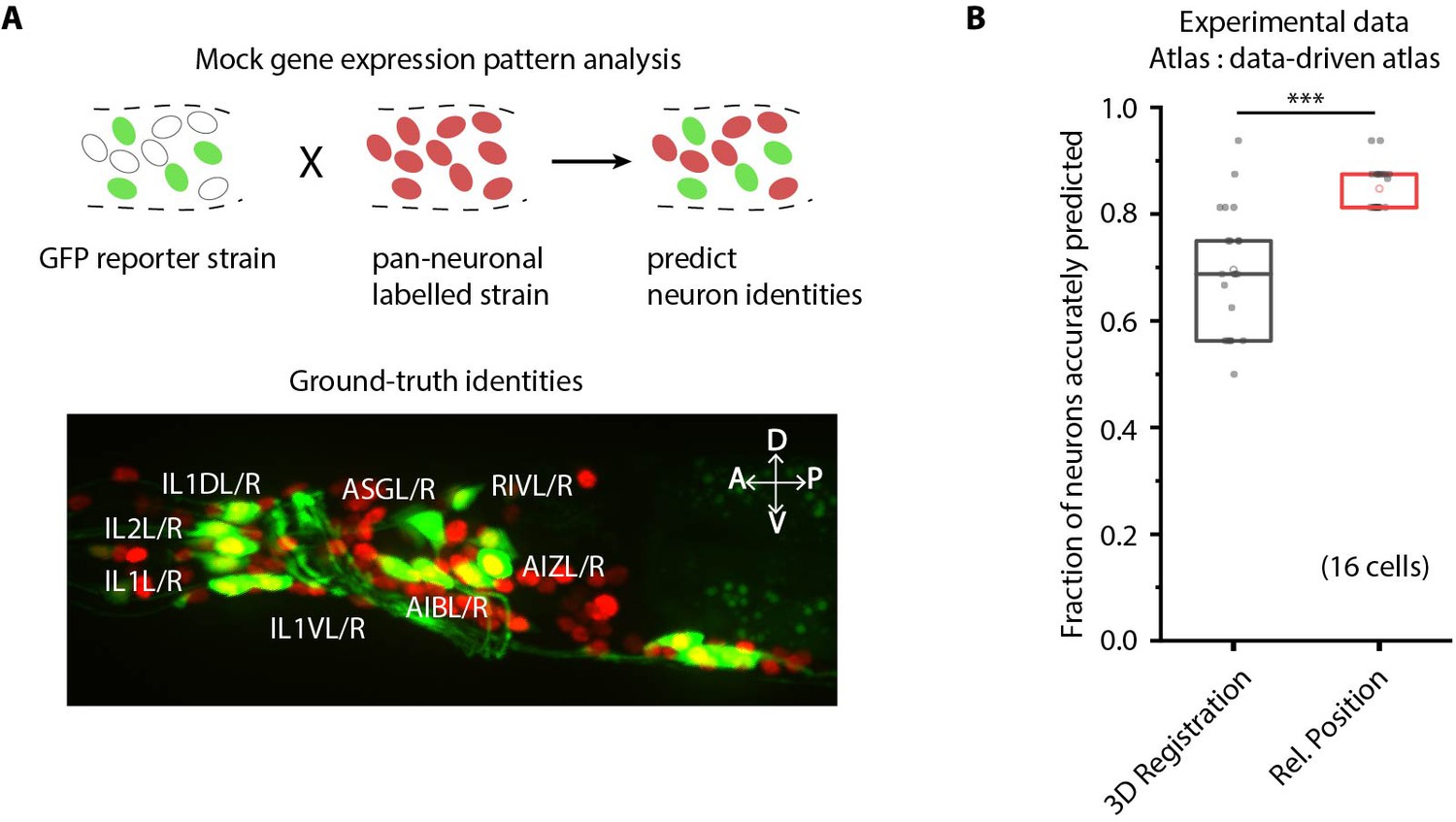
CRF_ID framework predicts identities for gene expression pattern analyses.
(A) (Top) Schematic showing a fluorescent reporter strain with GFP expressed in cells for which names need to be determined. Since no candidate labels are known a priori neurons labels are predicted for all cells marked with pan-neuronally expressed RFP using full whole-brain atlas. (Bottom) A proxy strain AML5 [rab-3p(prom1)::2xNLS::TagRFP; odr-2b::GFP] with pan-neuronal RFP and 19 cells labeled with GFP was used to assess prediction accuracy. (B) CRF_ID framework with relative position features outperforms registration method (n = 21 animals) (***p<0.001, Bonferroni paired comparison test). Accuracy shown for top five labels predicted by both methods. Experimental data comes from strain AML5. Top, middle, and bottom lines in box plot indicate 75th percentile, median, and 25th percentile of data, respectively.
Figure 4 with 4 supplements
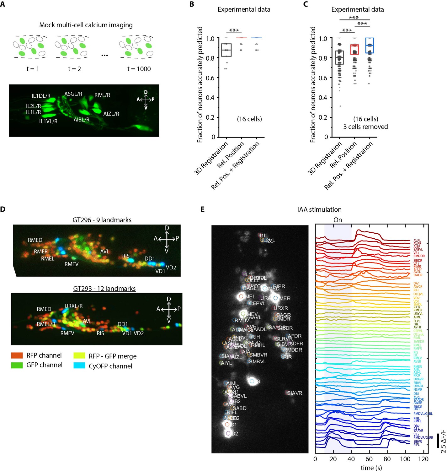
Cell identity prediction in mock multi-cell calcium imaging experiments and landmark strain.
(A) (Top) schematic showing automatic identification of cells in multi-cell calcium imaging videos for high-throughput analysis. (Bottom) A mock strain with GFP-labeled cells was used as an illustration of GCaMP imaging. Only green channel of AML5 strain was used for this purpose. (B) CRF_ID framework outperforms registration method (n = 35 animals, ***p<0.001, Bonferroni paired comparison test). OpenWorm atlas was used for prediction. Accuracy results shown for top predicted labels. Experimental data comes from strain AML5 (only green channel used). Top, middle, and bottom lines in box plot indicate 75th percentile, median, and 25th percentile of data, respectively. (C) Prediction accuracy comparison for the case of missing cells in images (count noise). ***p<0.001, Bonferroni paired comparison test. Total n = 700 runs were performed across 35 animals for each method with 3 out 16 randomly selected cells removed in each run. For fair comparison, cells removed across methods were the same. OpenWorm atlas was used for prediction. Accuracy results shown for top predicted labels. Experimental data comes from strain AML5 (only green channel used). Top, middle, and bottom lines in box plot indicate 75th percentile, median, and 25th percentile of data, respectively. (D) Max-projection of 3D image stacks showing CyOFP labeled landmark cells in head ganglion (pseudo-colored as cyan): animals carrying [unc47p::NLS::CyOFP1::egl-13NLS] (GT296 strain) with nine landmarks (top), and animals carrying [unc-47p::NLS::CyOFP1::egl-13NLS; gcy-32p::NLS::CyOFP1::egl-13NLS] with 12 landmarks (bottom). (E) (Left) max-projection of a 3D image stack from whole-brain activity recording showing head ganglion cells and identities predicted by CRF_ID framework (Top labels). Animal is immobilized in a microfluidic device channel and IAA stimulus is applied to the nose tip. (Right) GCaMP6s activity traces extracted by tracking cells over time in the same 108 s recording and their corresponding identities. Blue shaded region shows IAA stimulation period. Experimental data comes from strain GT296.
Figure 4—figure supplement 1
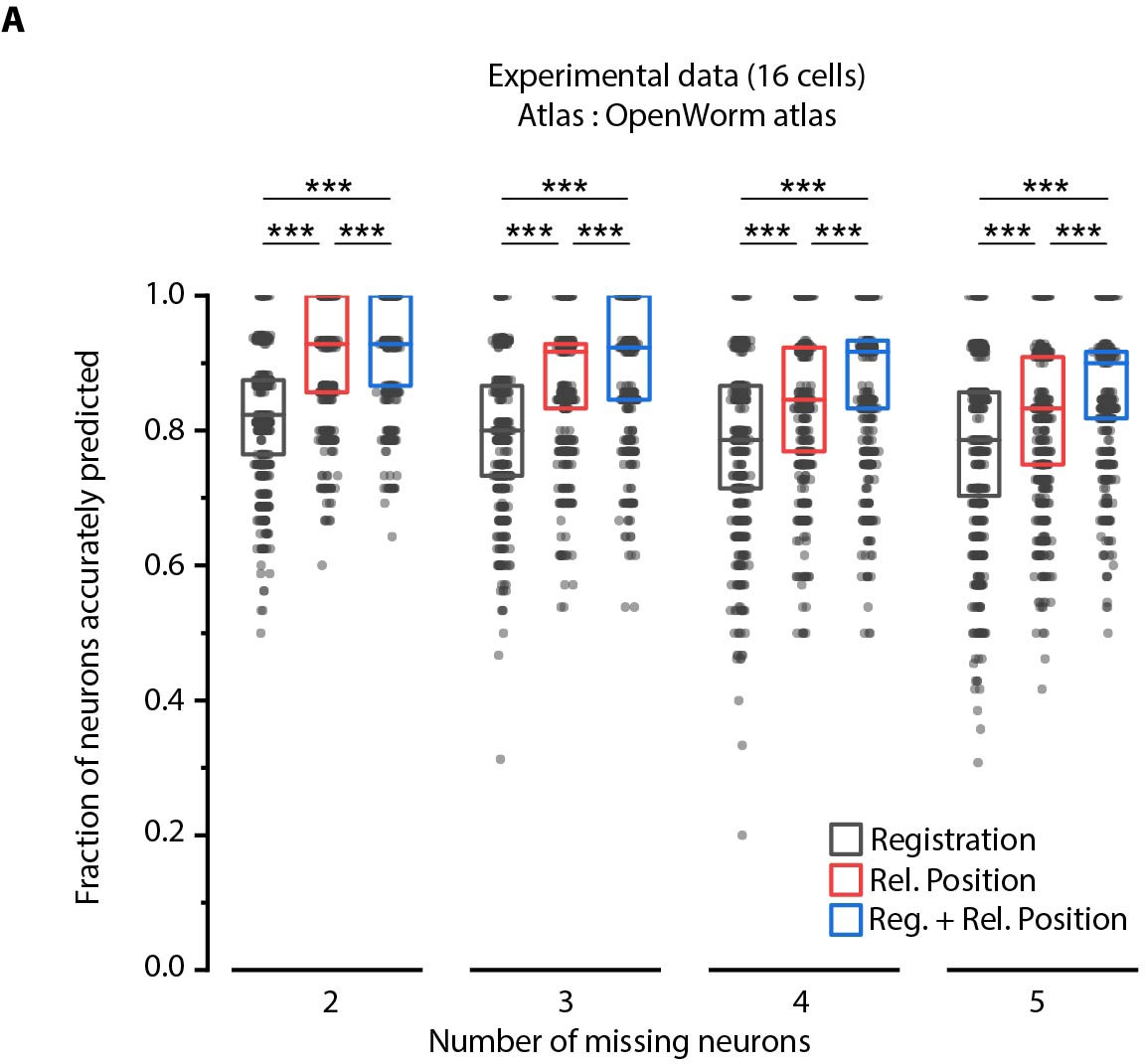
Relative position features perform better than registration in handling missing cells in images.
(A) Comparison of prediction accuracies across three methods for different number of missing cells (out of total 16 cells) simulated in experimental data. Experimental data comes from AML5 strain (only GFP channel used). Results for 3 cells missing are shown in Figure 4C. ***p<0.001, **p<0.01, all comparisons done with Bonferroni paired comparison test. n = 700 runs were performed across data from 35 animals for each number of missing cells and each method. For fair comparison across methods, the same cells were considered missing for all methods for a fixed missing cell number. Each run differed from the other with respect to random subset of cells considered missing. Part of data is re-plotted in Figure 4C. Top, middle, and bottom lines in box plot indicate 75th percentile, median, and 25th percentile of data, respectively.
Figure 4—figure supplement 2
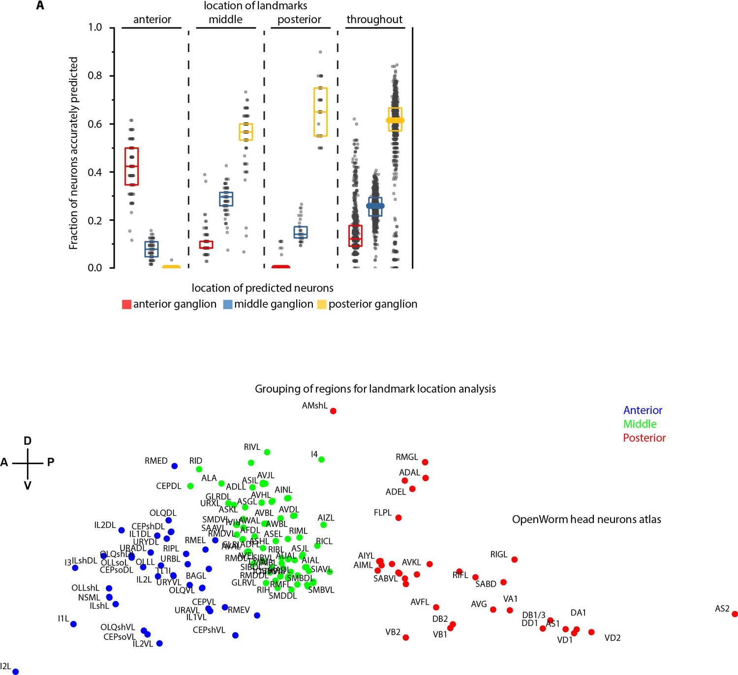
Spatially distributed landmarks or landmarks in lateral ganglion perform best in supporting CRF_ID framework for predicting identities.
(A) Top panel – Region-wise prediction accuracy achieved by our CRF_ID framework when landmarks were constrained to lie in specific regions of the head. n = 200 runs when landmarks were constrained in anterior, middle and posterior regions, n = 1000 runs when landmarks were spatially distributed throughout the head. All data is synthetic data. A random combination of 15 landmarks was selected in each run. Landmarks constrained in the anterior region perform badly in predicting identities of the posterior region, similarly landmarks constrained in the posterior region perform badly in predicting identities of the anterior region. Landmarks in the middle region or spatially distributed throughout the head show balanced accuracy for all regions. Bottom panel – shows the grouping of head regions as anterior, middle, and posterior regions. Top, middle, and bottom lines in box plot indicate 75th percentile, median, and 25th percentile of data, respectively.
Figure 4—figure supplement 3
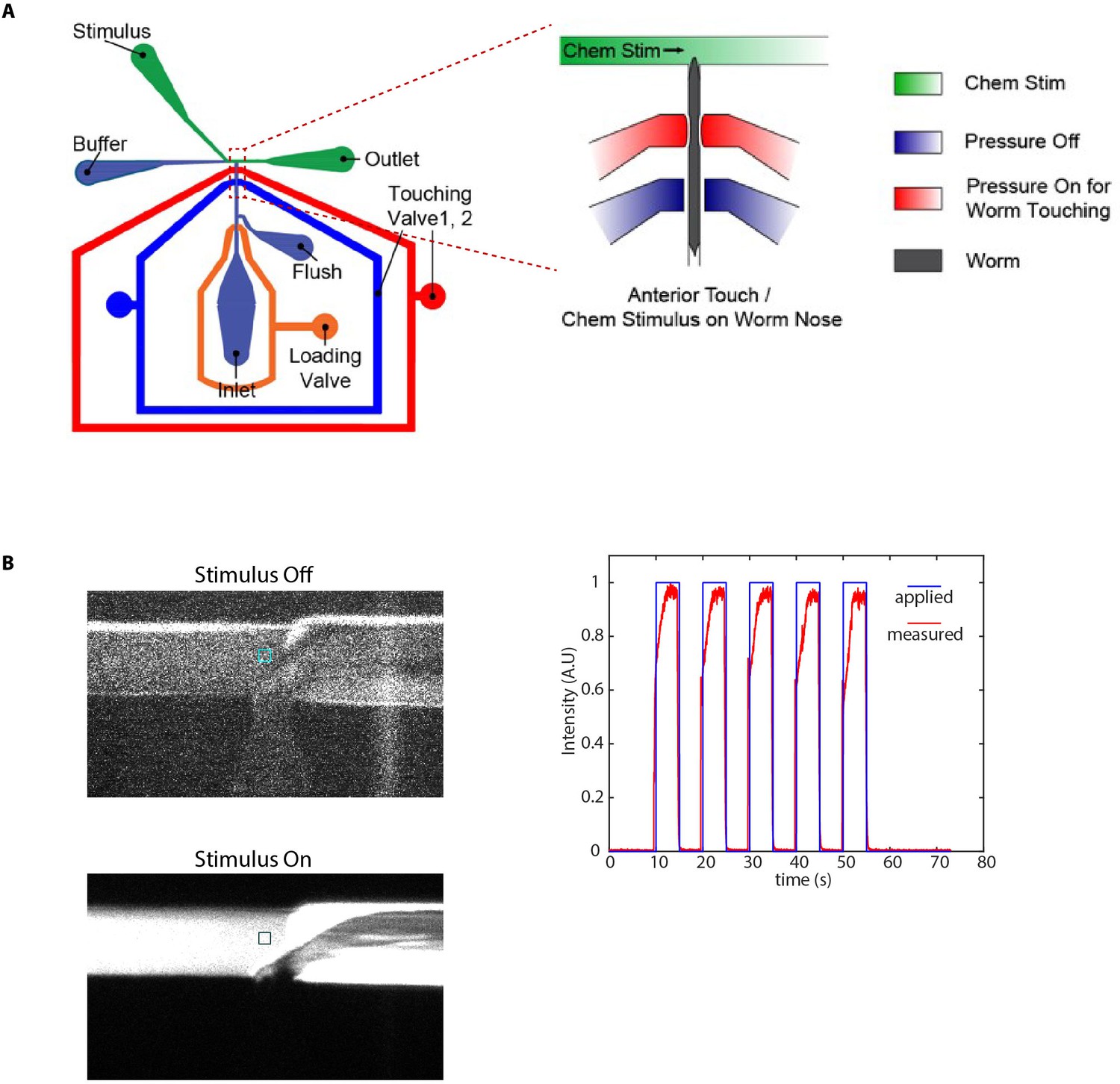
Microfluidic device used in chemical stimulation experiments and characterization.
(A) Schematic of the microfluidic device Cho et al., 2020 used in chemical stimulation experiments. The position of nematode in the imaging channel is shown. Temporally varying stimulus is applied to the nose tip of the nematode by switching between food/IAA and buffer streams. (B) Stimulus characterization was performed using FITC as stimulus and S-basal as buffer. Figures show a zoom-in of the T-junction in the device (where the nose tip of the nematode would be). Colored boxes show the regions used to characterize the stimulus profile. (C) Applied stimulus profile and measured stimulus profile for 5 s on and 5 s off stimulus.
Figure 4—video 1
Comparison between the CRF_ID framework and the registration method for predicting identities in case of missing cells.
Identities shown in red are incorrect predictions. Scale bar 5 μm.
Figure 5 with 3 supplements
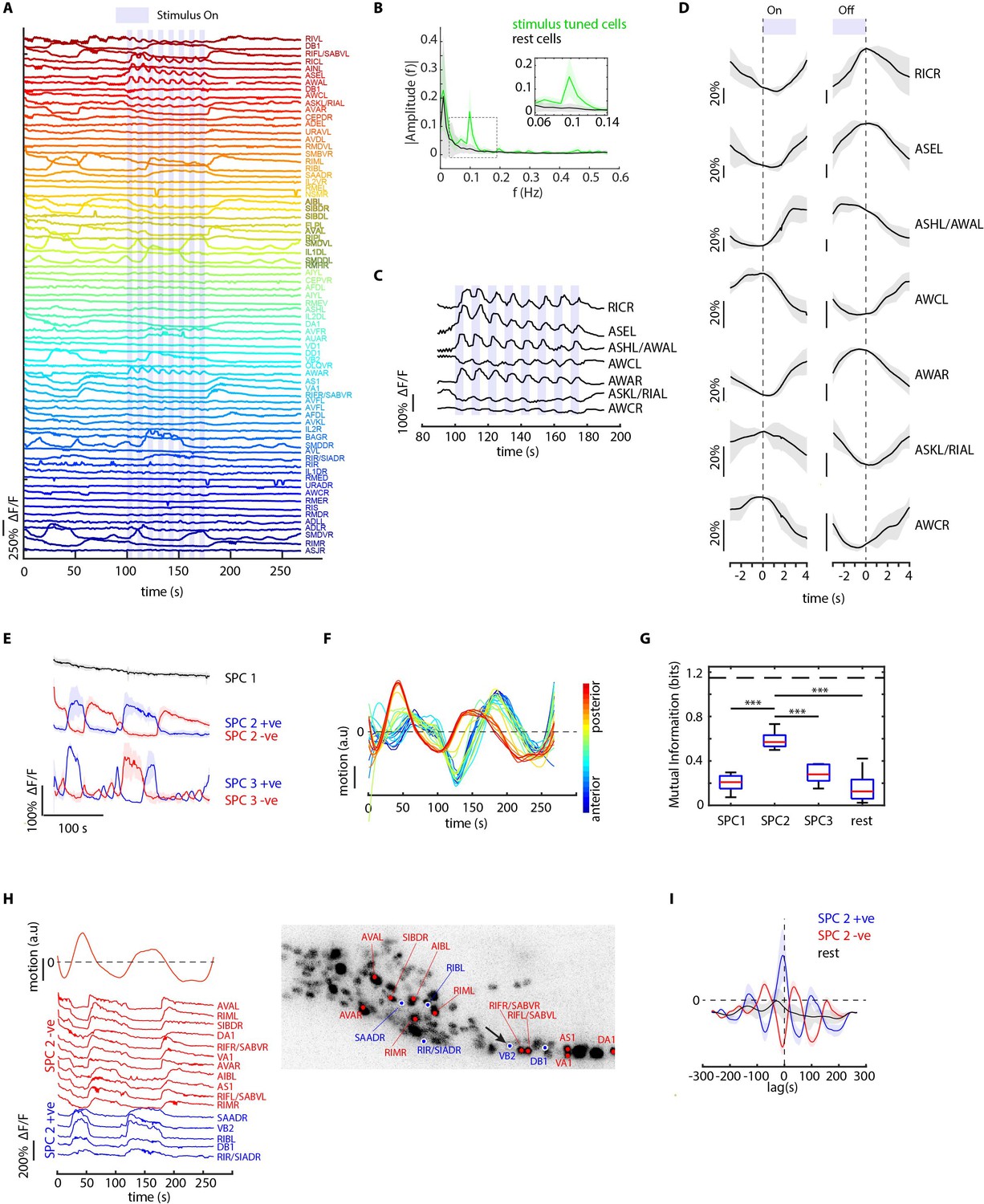
CRF_ID framework identifies neurons representing sensory and motor activities in whole-brain recording.
(A) GCaMP6s activity traces of 73 cells automatically tracked throughout a 278 s long whole-brain recording and the corresponding predicted identities (top labels). Periodic stimulus (5 sec-on – 5 sec-off) of bacteria (E. coli OP50) supernatant was applied starting at 100 s (shaded blue regions). Experimental data comes from strain GT296. (B) Power spectrum of neuron activity traces during the stimulation period for all cells. Cells entrained by 0.1 Hz periodic stimulus show significant amplitude for 0.1 Hz frequency component (green). (C) Activity traces of cells entrained by periodic stimulus shown for the stimulation period. Blue shaded regions indicate stimulus ON, unshaded region indicate stimulus OFF. Identities predicted by the framework are labeled. (D) Average ON and OFF responses of cells entrained by periodic stimulus across trials. The black line indicates mean and gray shading indicates ± s.e.m. (E) Average activities of neurons with significant non-zeros weights in the first three sparse principal components (SPCs). Activities within each component are stereotypical and different components show distinct temporal dynamics. Cells with positive weights (blue) and negative weights (red) in SPC2 and SPC3 showed anti-correlated activity. Out of the 67 non-stimulus-tuned cells, 19 had non-zero weights in SPC1, 16 cells had non-zero weights in SPC2, and 5 cells had non-zero weights in SPC3. SPC1, SPC2, and SPC3 weights of cells are shown in Figure 5—figure supplement 1. Shading indicates mean ± s.e.m of activity. (F) Velocity (motion/second) traces of cells along anterior-posterior (AP) axis (blue to red) show phase shift in velocity indicating motion in device shows signatures of wave propagation. (G) Cells with non-zero weights in SPC2 show high mutual information with worm velocity compared to cells grouped in other SPCs (*** denotes p<0.001, Bonferroni paired comparison test). Median (red line), 25th and 75th percentiles (box) and range (whiskers). Dashed line indicates entropy of velocity (maximum limit of mutual information between velocity and any random variable). Velocity of cell indicated by the black arrow in panel H right was used for mutual information analysis. (H) Activity traces of 16 cells (with significant non-zero weights) in SPC2 and corresponding identities predicted by the framework. Red traces for cells with negative weights in SPC2, blue traces for cells with positive weights in SPC2. Worm motion/second shown on top. (Right) max projection of 3D image stack showing head ganglion neurons and cells with positive weights (blue) and negative weights (red) in SPC2. Motion/second of cell indicated with arrow is shown in left panel. (I) Cross-correlation analysis between velocity and cells with non-zero weights in SPC2 shows a strong correlation between neuron activities and velocity. In comparison, other cells show low correlation. Velocity of cell indicated by arrow in panel H right was used for cross-correlation analysis.
Figure 5—figure supplement 1
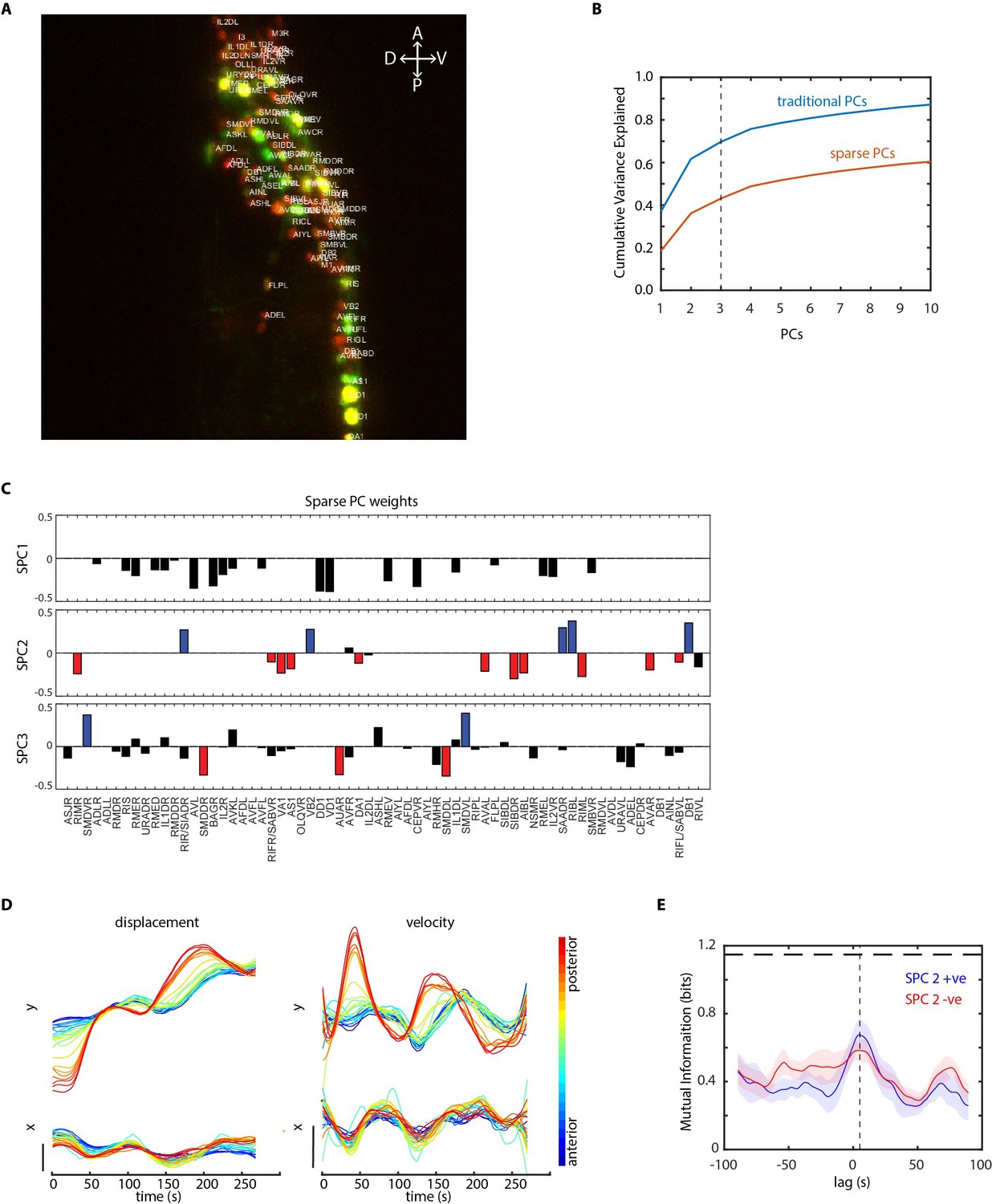
Further analysis of data in periodic food stimulation and whole-brain imaging experiment.
(A) Identities (top labels) predicted by our CRF_ID framework overlaid on the image (max-projection of image stack shown). Data comes from strain GT296. (B) Cumulative variance captured by traditional principal components (PCs) and sparse PCs. Sparse PCs capture lower variance as a tradeoff for minimizing mixing of different temporal dynamics across components to improve the interpretability of each PC. (C) The weights of cells across first three sparse principal components (SPCs). Blue and red bars in SPC2 and SPC3 denote cells with significant non-zero weights in SPC2 and SPC3. Activities of these cells are shown in Figure 5E. (D) Left panels top and bottom – Y and X displacement of randomly selected cells in the head ganglion, blue to red ordered from anterior to posterior. Right panels top and bottom show corresponding velocities along Y and X directions. Smooth displacement of cells and phase shift in peak velocities of cells along the AP axis show signatures of wave-propagation in partially immobilized worm in microfluidic device. (E) Mutual information between worm velocity and lagged activities of cells grouped as SPC2 positive (blue) and SPC2 negative (red). Positive lag of neuron activities at which mutual information is maximum indicates neuron activities precede velocity. Shading indicates mean ± sem. The horizontal dotted line indicates entropy of velocity that is maximum mutual information any random variable can have with velocity.
Figure 5—video 1
Whole-brain functional imaging with bacteria supernatant stimulation.
Circles indicate the tracking of two cells that show ON and OFF response to food stimulus. Scale bar 5 µm.
Figure 5—video 2
Wave propagation in animal and correlation of neuron activities to worm motion.
Top-left panel shows tracking of cell along the anterior-posterior axis used to calculate the motion of worm. Scale bar 5 μm. Bottom-left panel shows the velocity (px/s) of the cells. Top-right panel shows the velocity of one of the cells. Bottom-right panels show activity of two cells in SPC2 with negative (red) and positive (blue) weights in SPC2.
Figure 6 with 3 supplements
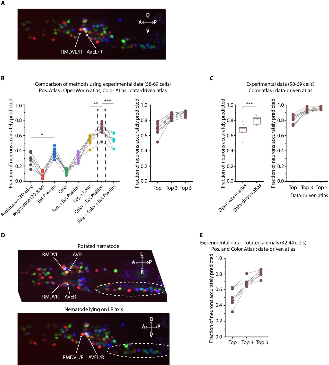
Annotation framework is generalizable and compatible with different strains and imaging scenarios.
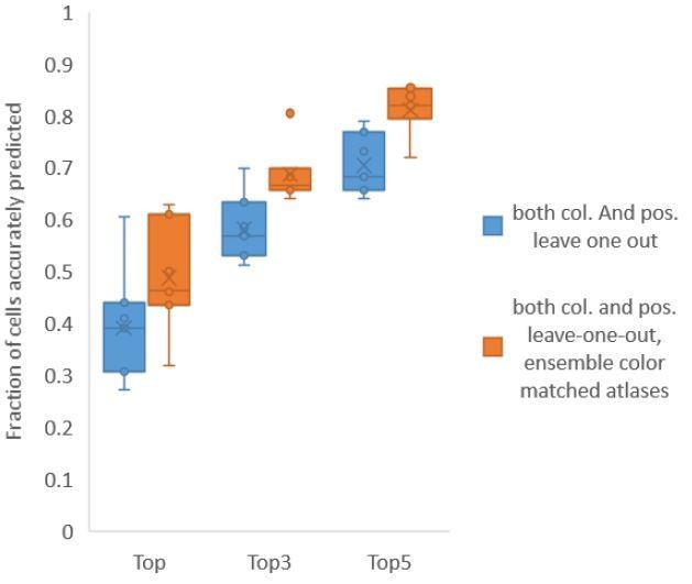
(A) A representative image (max-projection of 3D stack) of head ganglion neurons in NeuroPAL strain OH15495. (B) (Left) comparison of prediction accuracy for various methods that use different information. CRF_ID framework that combines relative position features along with color information performs best (n = 9 animals, *p<0.05, **p<0.01, ***p<0.001, Bonferroni paired comparison test). (Right) the best performing method predicts cell identities with high accuracy. OpenWorm static atlas was used for all methods. Color atlas was built using experimental data with test data held out. Ensemble of color atlases that combine two different color matching methods were used for prediction. Accuracy results shown for top predicted labels. Experimental data comes from strain OH15495. (C) (Left) annotation framework can easily incorporate information from annotated data in the form of data-driven atlas, which improves prediction accuracy (***p<0.001, Bonferroni paired comparison test). Prediction was performed using leave-one-out data-driven atlases for both positional relationship features and color. Accuracy shown for top predicted labels. Ensemble of color atlases that combine two different color matching methods were used for prediction. (Right) accuracy achieved by top, top 3, and top 5 labels. Experimental data comes from strain OH15495. Top, middle, and bottom lines in box plot indicate 75th percentile, median and 25th percentile of data, respectively. (D) An example image of head ganglion neurons in NeuroPAL strain for rotated animal (nematode lying on DV axis). In contrast, animal lying on the LR axis is shown below. The locations of RMDVL/R, AVEL/R cells in the two images are highlighted for contrasts. Dashed ellipses indicate positions of cells in retrovesicular ganglion, showing that the rotated animal is not rigidly rotated. Experimental data comes from strain OH15495. (E) Top-label prediction accuracies for non-rigidly rotated animal. n = 7 animals. Experimental data comes from strain OH15495 and OH15500. Prediction was performed using leave-one-out data-driven atlases for both positional relationship features and color. Accuracy shown for top predicted labels. Ensemble of color atlases that combine two different color matching methods were used for prediction.
Figure 6—figure supplement 1
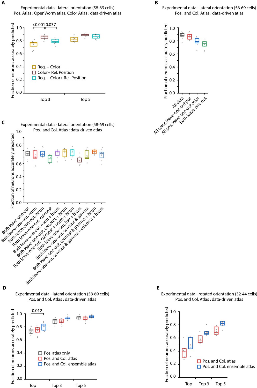
Additional results on prediction performance of CRF_ID method on NeuroPAL data: comparison against registration method and utility of ensemble of color atlases.
(A) Comparing accuracy of top 3 and top 5 identities predicted by different methods show CRF_ID framework with pairwise positional relationship features performs better than registration method (top three identities case). All methods used the same leave-one-out color atlas (see Appendix 1–Extended methods S2.3). Experimental data comes from OH15495 strain. n = 9 animals. All comparisons performed with Bonferroni paired comparison test. Top, middle, and bottom lines in box plot indicate 75th percentile, median, and 25th percentile of data respectively. (B) Prediction accuracy of CRF_ID framework on experimental datasets across different kinds of data-driven atlases. ‘All’ atlas includes positional relationships and color information from all datasets including test dataset. For ‘All color, leave-one-out pos.’ atlas, test dataset is held out from positional relationships atlas only. For ‘All pos., leave-one-out-color’ atlas, test dataset is held out from color atlas only. For ‘Both leave-one-out’ atlas, test dataset is held out from both positional relationship and color atlases. Experimental data comes from OH15495 strain. n = 9 animals. Top, middle, and bottom lines in box plot indicate 75th percentile, median, and 25th percentile of data, respectively. (C) Effect of different color distribution alignment methods on prediction accuracy. ‘Both leave-one-out’ case is the baseline case that uses leave-one-out atlases for both positional relationships and color, and color atlases are built by simple aggregation of RGB values across datasets. ‘norm’ indicates normalization of color channels, ‘histm’ indicates histogram matching of training datasets (images used to build atlas) to test dataset. ‘colconst’ indicates color invariant transformation applied to images. ‘norm + histm’ indicates normalization of color channels and then histogram matching of training images to test image. ‘colconst + histm’ indicates color invariant transformation and then histogram matching of training images to test image. ‘colconst + norm + histm’ indicates color normalization, subsequent color invariant transformation and finally histogram matching of training images to test image. ‘hsv + histm’ indicates using hsv color space instead of RGB color space and histogram matching. ‘contrast and gamma’ indicates contrast and gamma adjustment of image channels. ‘contrast and gamma + histm’ indicates contrast and gamma adjustment of image channels and subsequent histogram matching. ‘contrast and gamma + colconst + histm’ indicates contrast and gamma adjust of image channels, subsequent color invariant transformation and finally histogram matching. See Appendix 1–Extended methods S2.4 for more details on methods. Experimental data comes from OH15495 strain. n = 9 animals. Top, middle, and bottom lines in box plot indicate 75th percentile, median, and 25th percentile of data, respectively. (D) Comparison of prediction accuracy of CRF_ID framework across different kinds of data-driven atlases used for prediction. Test dataset was held out from data-driven atlases. ‘Pos. atlas only’ uses only positional relationship features atlas for prediction (these results are same as Figure 2A). ‘Pos. and Col. atlas’ uses positional relationship features and baseline color atlas (Appendix 1–Extended methods S2.4) built by simple aggregation of RGB values of cells in training data used to build atlas. ‘Pos. and Col. ensemble atlas’ uses ensemble of two color atlases for prediction along with positional relationship features atlas. In this case, color distributions in training images were aligned to test data using color invariants and histogram matching prior to building atlas (Appendix 1–Extended methods S2.4). (n = 9 animals, Bonferroni paired comparison test). Experimental data comes from OH15495 and OH15000 strains. Top, middle, and bottom lines in box plot indicate 75th percentile, median, and 25th percentile of data, respectively. (E) Similar to panel B for animals non-rigidly rotated about AP axis (n = 7 animals). Test dataset was held out from data-driven atlases. In this case, Positional relationship and color data-driven atlases were built using data from animals imaged in lateral orientation as well as rotated animals. Comparisons performed with Bonferroni paired comparison test. Experimental data comes from OH15495 and OH15000 strains. Top, middle, and bottom lines in box plot indicate 75th percentile, median, and 25th percentile of data, respectively.
Figure 6—figure supplement 2
Example annotations predicted by the CRF_ID framework for animals imaged lying on the LR axis.
Data comes from OH15495 strain.
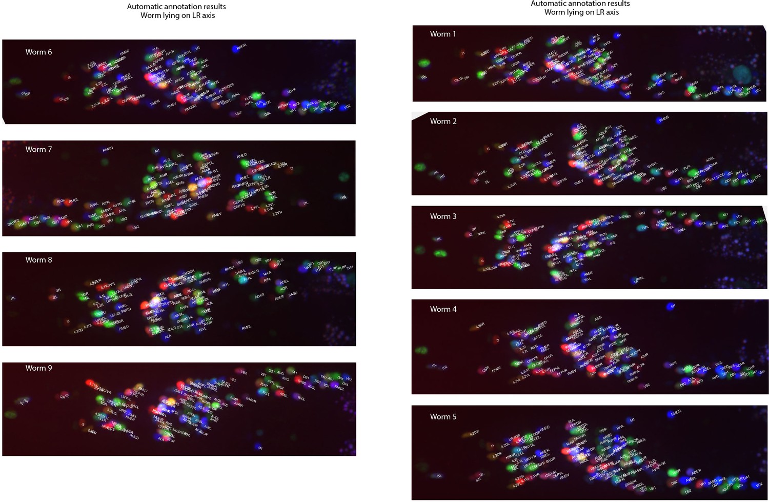
Figure 6—figure supplement 3
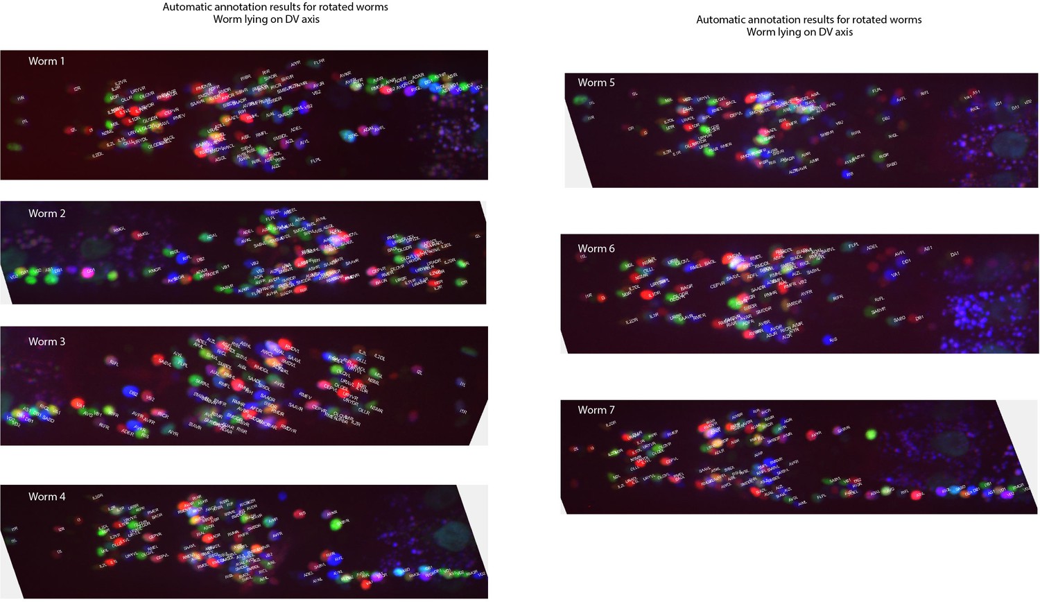
Example annotations predicted by the CRF_ID framework for animals twisted about the anterior-posterior axis (note the anterior and lateral ganglions show clear left-right separation whereas retrovesicular ganglion instead of being in the middle is more toward one of the left or right sides).
Data comes from OH15495 and OH15500 strains.
Appendix 1—figure 1
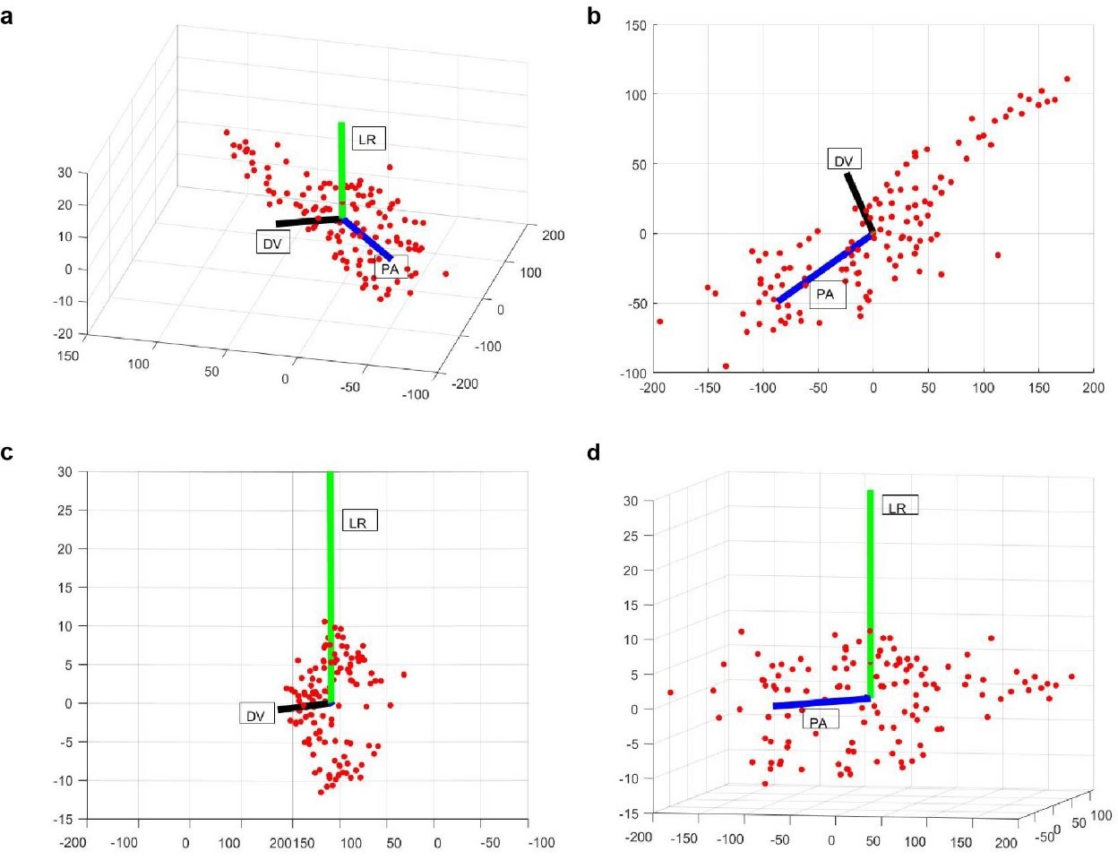
Examples of PA (blue), LR (green), and DV (black) axes generated automatically in a whole-brain image stack.
Here red dots correspond to the segmented nuclei in image stack. Shown are 3D view (a), XY (b), YZ (c), and XZ (d) views of the image stack.
Author response image 1
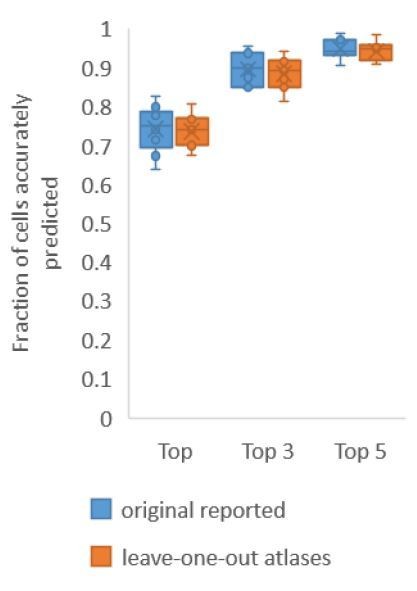
Accuracy comparison on experimental datasets when prediction was done using atlas built with all data vs leaveone-out atlases.
Prediction was done using positional relationship information only. This figure is update for Figure 2A. Experimental datasets come from NeuroPAL strains.
Author response image 2
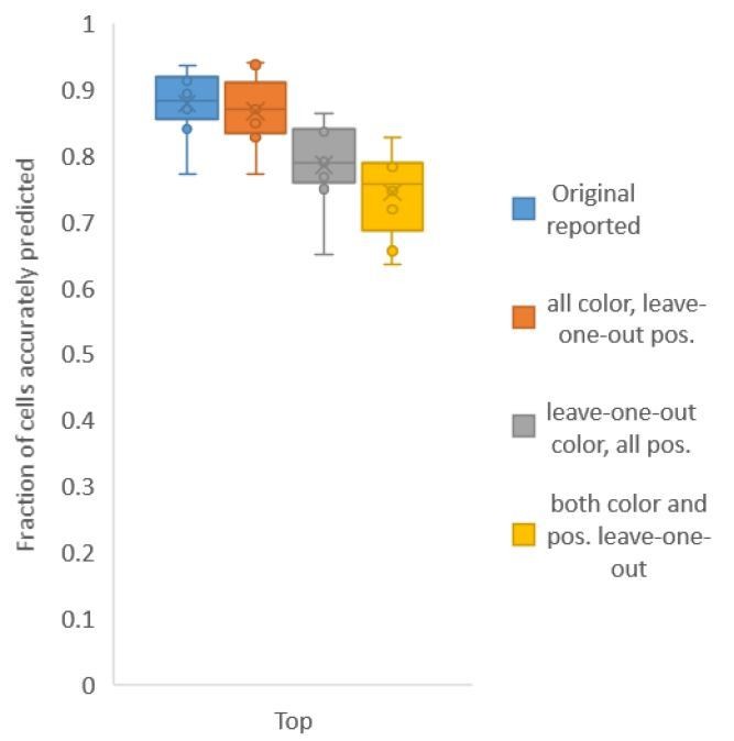
Accuracy achieved on experimental datasets when prediction was done using different combinations of atlases for positional relationships and color.
In these cases, leave-one-out atlas was used for either positional relationship, color or both. Experimental datasets come from NeuroPAL strains.
Author response image 3

Accuracy on experimental datasets when prediction was done using different leave-one-out atlases for color.
In each method, a different technique was used to match colors of images used to build atlas to colors of test image. Leave-one-out atlas for both positional relationships and color was used for prediction. Experimental datasets come from NeuroPAL strains.
Author response image 4
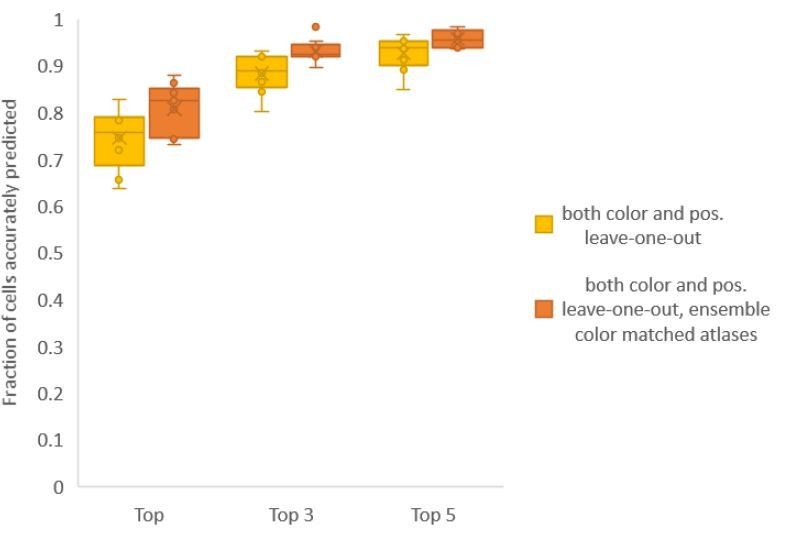
Accuracy comparison between base case (when prediction was done using leave-one-out color atlas without any color matching) and ensemble of two leave-one-out color atlases (with different color matching techniques).
In both cases, same leave-one-out atlases for positional relationships were used. Experimental datasets come from NeuroPAL strain (n = 9). Results in this figure are updated in Fig. 6C.
Author response image 5
Accuracy comparison between base case (when prediction was done using leave-one-out color atlas without any color matching) and ensemble of two leave-one-out color atlases (with different color matching techniques).
In both cases, same leave-one-out atlases for positional relationships were used. Experimental data comes from NeuroPAL strains with non-rigidly rotated animals (n = 7). Results in this figure are updated in Fig. 6E.
Additional files
Download links
A two-part list of links to download the article, or parts of the article, in various formats.
Downloads (link to download the article as PDF)
Open citations (links to open the citations from this article in various online reference manager services)
Cite this article (links to download the citations from this article in formats compatible with various reference manager tools)
Graphical-model framework for automated annotation of cell identities in dense cellular images
eLife 10:e60321.
https://doi.org/10.7554/eLife.60321


