The temporal and spectral characteristics of expectations and prediction errors in pain and thermoception
- Department of Systems Neuroscience, University Medical Center Hamburg-Eppendorf, Germany
Figures
Figure 1 with 1 supplement
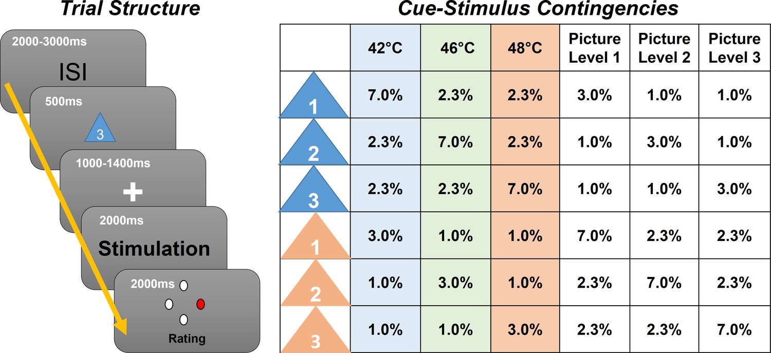
Left: Graphical representation of the trial structure.
Each trial started with the presentation of a cue, indicating the stimulus intensity and modality of the following stimulus. After a jittered phase where only the fixation cross was shown, the stimulus (visual or thermal) was presented. A rating phase (1–4) of the stimulus aversiveness followed. Right: Contingency table for all conditions for each cue–stimulus combination. Note that percentages are for all trials; therefore, each row adds up to 1/6 (six different cues).
Figure 1—figure supplement 1
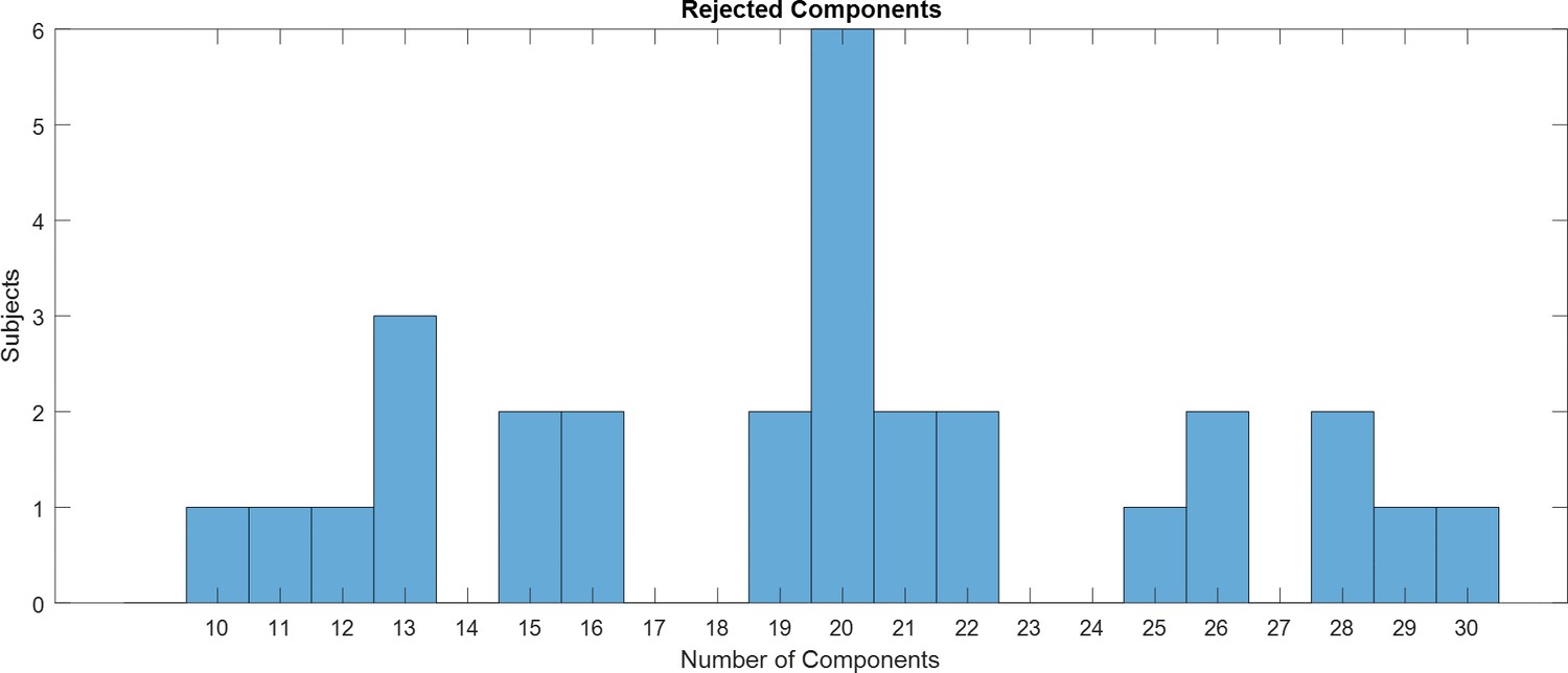
Histogram showing the distribution of the total number of rejected components based on detected muscle artifacts.
Figure 2

Hypothetical response patterns based on stimulus intensity (left), expectation (middle), and absolute prediction error (right).
The y-axis represents a hypothetical response variable (e.g. electroencephalogram [EEG] power). Each dot represents a different condition for each stimulus–cue combination. Blue colors represent low heat conditions, green colors represent medium heat conditions, and red colors represent high heat conditions. Color intensities depict expectation level.
Figure 3
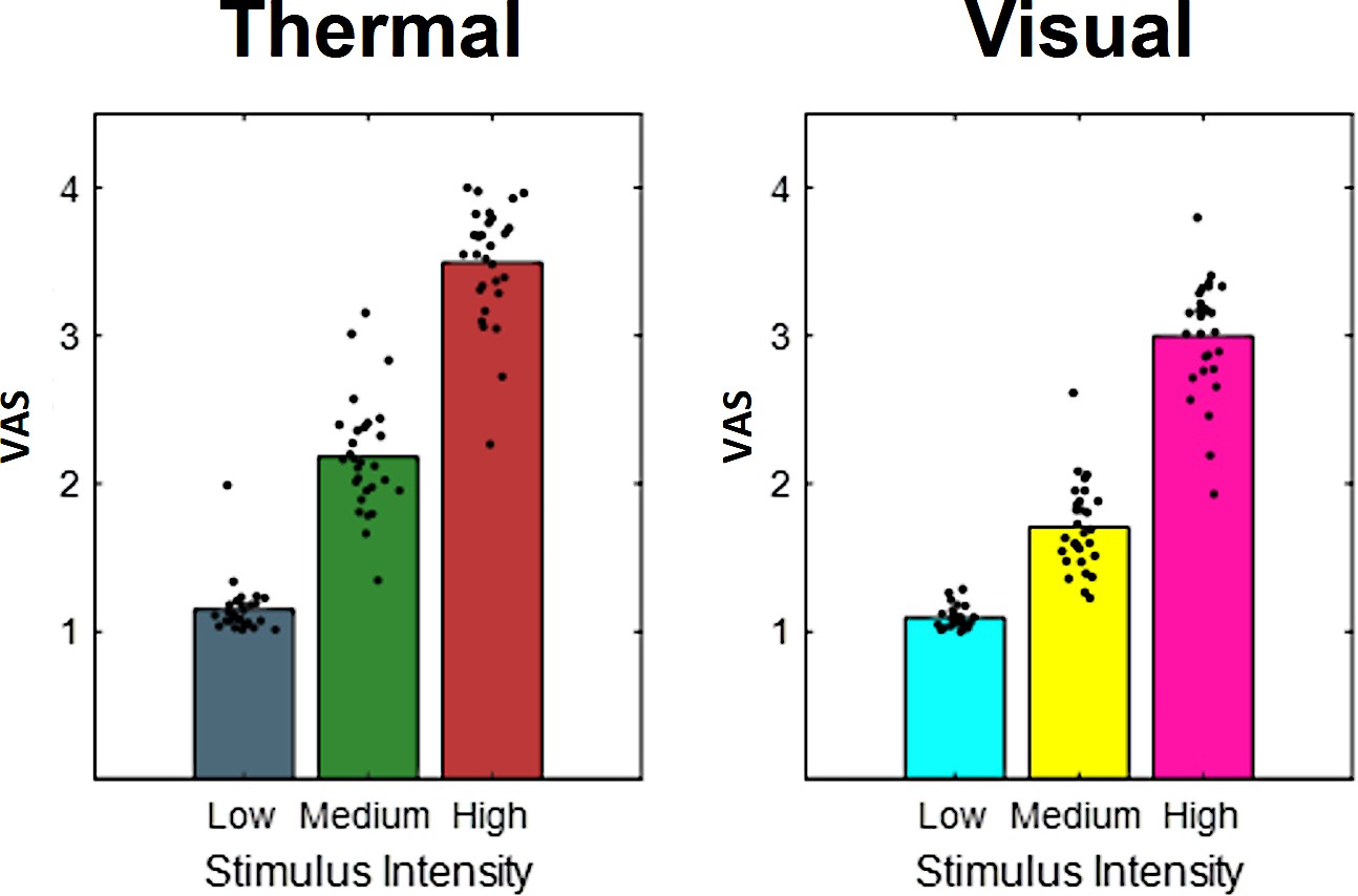
Bars indicate pooled aversiveness ratings for (a) heat and (b) aversive pictures for low-, medium-, and high-intensity conditions.
Dots indicate average single-subject ratings.
Figure 4

Ratings for heat stimuli (left) and ‘expectation factor’ weights (right).
Bars indicate average aversiveness ratings. Ratings were given on a scale from 1 to 4. Error bars depict SEM. The data shows not only an effect of stimulus intensity (increase from blue to green to red) but also an effect of expectation (low to medium to high expectation). The right figure represents hypothetical response patterns based on the expectation factor. The y-axis represents the hypothetical response variable (e.g. visual analog scale [VAS] rating). Each dot represents a different condition for each stimulus–cue combination. Blue colors represent low heat conditions, green colors represent medium heat conditions, and red colors represent high heat conditions. Color intensities depict expectation level.
Figure 5 with 1 supplement
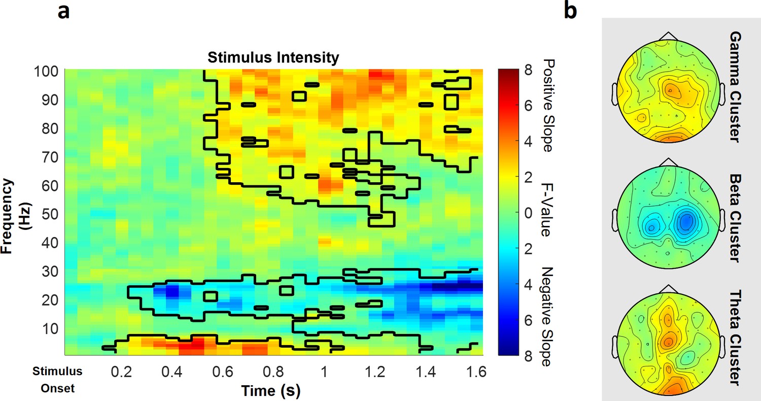
Parametric effects of stimulus intensity.
Time–frequency representation averaged over all channels including a significant time–frequency sample of any cluster (a) and topographies over the whole cluster extents (i.e. full time and frequency range), respectively (b), of the stimulus intensity main effect of the repeated-measures ANOVA depicting increases (warm) and decreases (cold) in power in relation to heat stimulus intensity. Significant clusters are highlighted. Colors represent F-values from the repeated-measures ANOVA statistics for the main effect of stimulus intensity.
Figure 5—figure supplement 1
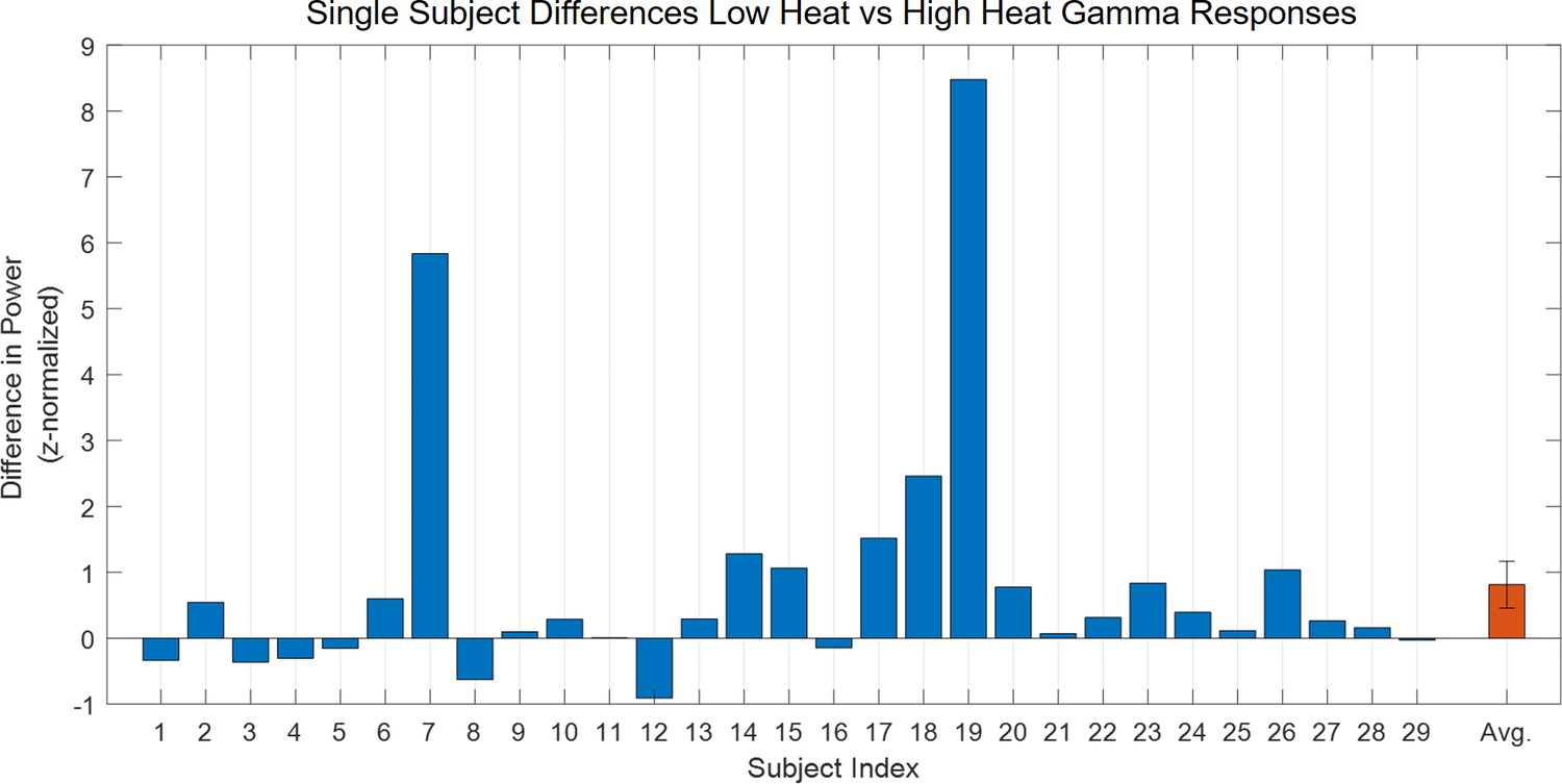
Difference for the main effect of stimulus intensity in the gamma band (averaged over 60–100 Hz, 1250–1600 ms) in power values for all high heat vs. low heat conditions with a valid modality cue (expect heat receive heat) for each subject, respectively.
Figure 6 with 1 supplement
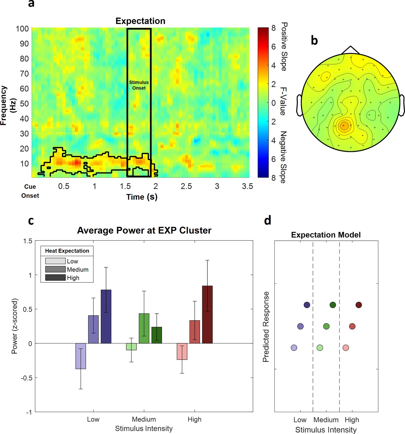
The main effect of expectation.
(a) Time–frequency representation of the statistical F-values averaged over all channels. The significant cluster is highlighted. The black box between 1500 and 1900 ms marks the jittered onset of the trigger signal to start the ramp-up of the heat stimulus. (b) Topography of the averaged power over time and frequency of the whole cluster extent (i.e. over the whole time and frequency range) at each channel. Brighter colors indicate higher F-values. (c) Power values for all conditions with a valid modality cue (expect heat receive heat) averaged over all significant time–frequency–electrode samples of the EXP cluster show alpha-to-beta enhancement (i.e. positive representation) associated with expectation. Error bars represent SEM. (d) Predicted responses based on the positive expectation factor are shown. The y-axis represents an imaginary response variable (e.g. EEG power). Each dot represents a different condition (in the order of the bar plot representation of average EEG power) for each stimulus–cue combination. Blue colors represent low heat conditions, green colors represent medium heat conditions, and red colors represent high heat conditions. Color intensities depict expectation level.
Figure 6—figure supplement 1
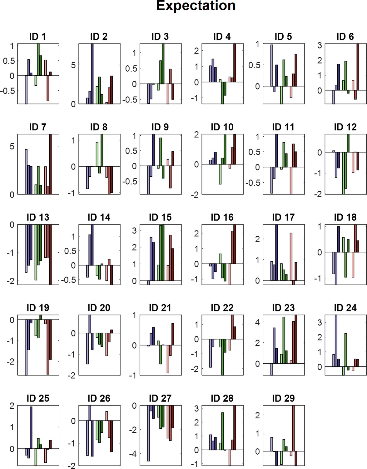
Power values for all conditions with a valid modality cue (expect heat receive heat) averaged over all significant time–frequency–electrode samples period for each subject (ID) of the EXP cluster.
Blue colors represent low heat conditions, green colors represent medium heat conditions, and red colors represent high heat conditions. Color intensities depict expectation level.
Figure 7 with 1 supplement

The main effect of absolute prediction errors.
(a) Time–frequency representation of the statistical F-values averaged over all channels. The significant cluster is highlighted. (b) Topography of the averaged power over time and frequency of the whole cluster extent (i.e. over the whole time and frequency range) at each channel. Brighter colors indicate higher F-values. (c) Power values for all conditions with a valid modality cue (expect heat receive heat) averaged over all significant time–frequency–electrode samples of the prediction error factor (PE) cluster show gamma decreases (i.e. negative representation) associated with prediction errors. Error bars represent SEM. (d) Predicted responses based on the negative PE are shown: The y-axis represents an imaginary response variable (e.g. electroencephalogram [EEG] power). Each dot represents a different condition (in the order of the bar plot representation of average EEG power) for each stimulus–cue combination. Blue colors represent low heat conditions, green colors represent medium heat conditions, and red colors represent high heat conditions. Color intensities depict expectation level.
Figure 7—figure supplement 1
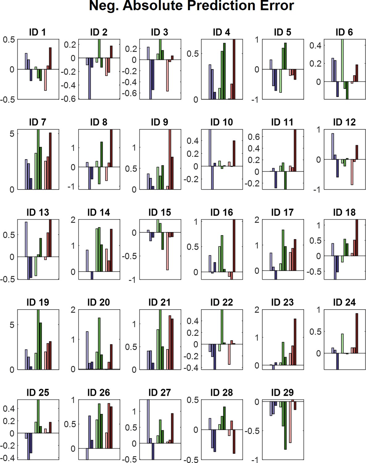
Power values for all conditions with a valid modality cue (expect heat receive heat) averaged over all significant time–frequency–electrode samples period for each subject (ID) of the negative absolute prediction error cluster.
Blue colors represent low heat conditions, green colors represent medium heat conditions, and red colors represent high heat conditions. Color intensities depict expectation level.
Figure 8 with 3 supplements
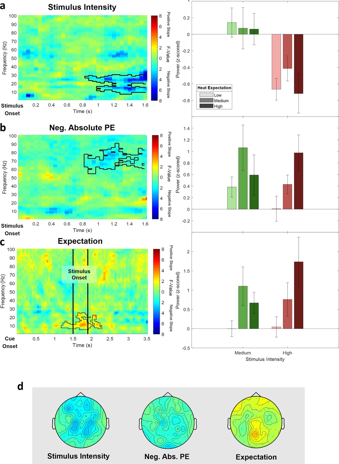
Electroencephalogram (EEG) data analysis of the reduced pain model.
The top three rows show (a) the main effect of stimulus intensity, (b) the main effect of negative absolute prediction errors, and (c) the main effect of expectation. Left column: time–frequency representation of the statistical F-values averaged over all channels. Significant clusters are highlighted by a solid line. The non-significant expectation cluster is highlighted by a thin dotted line. Right column: power values for all conditions included in the reduced model with a valid modality cue (expect heat receive heat) averaged over all significant time–frequency–electrode samples of the respective cluster. (d) Topographies of the averaged power over time and frequency of the whole cluster extent (i.e. over the whole time and frequency range) at each channel for stimulus intensity (left), negative absolute prediction errors (center), and expectation (right). Brighter colors indicate higher F-values.
Figure 8—figure supplement 1
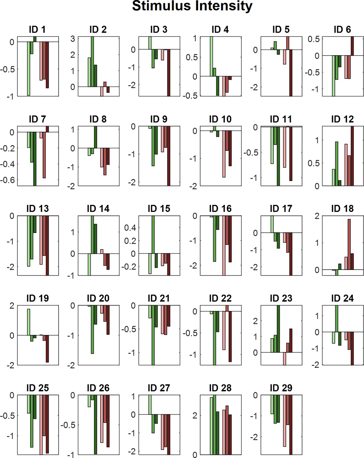
Power values for all medium and high intensity conditions with a valid modality cue.
(Expect heat receive heat) averaged over all significant time–frequency–electrode samples period for each subject (ID) of the negative stimulus intensity cluster of the analysis of the reduced model. Green colors represent medium heat conditions and red colors represent high heat conditions. Color intensities depict expectation level.
Figure 8—figure supplement 2

Power values for all medium and high intensity conditions with a valid modality cue.
(Expect heat receive heat) averaged over all significant time–frequency–electrode samples period for each subject (ID) of the negative absolute prediction error cluster of the analysis of the reduced model. Green colors represent medium heat conditions and red colors represent high heat conditions. Color intensities depict expectation level.
Figure 8—figure supplement 3
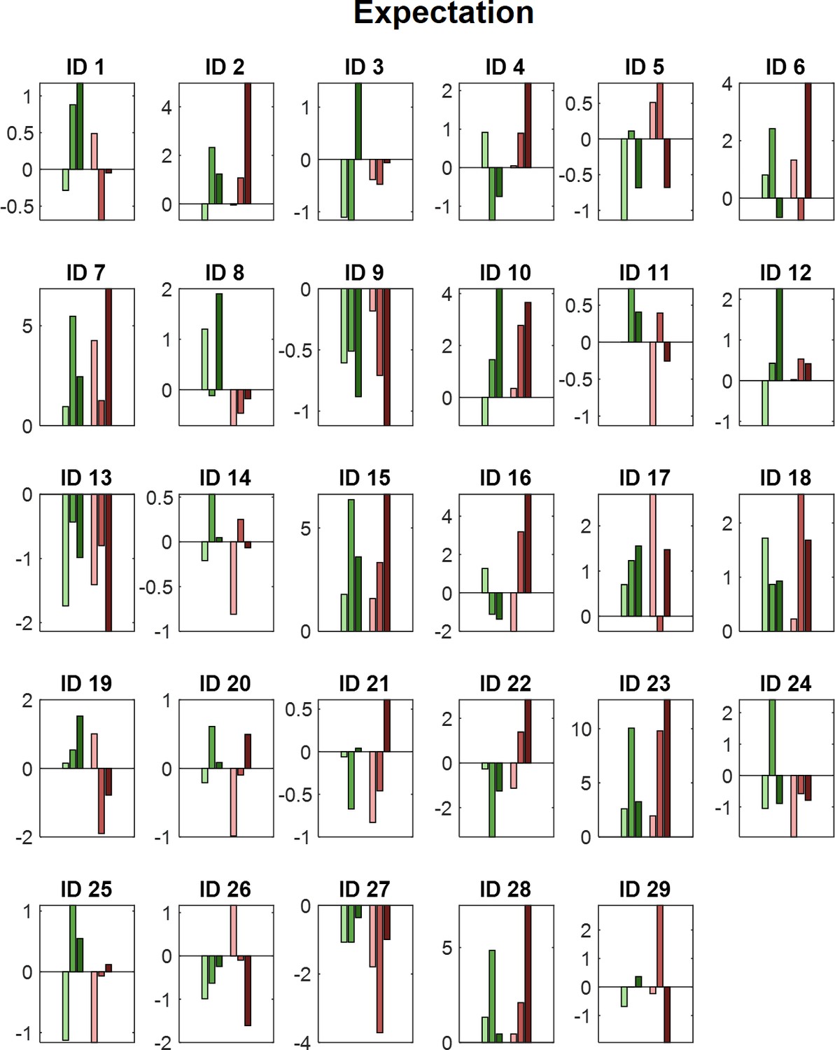
Power values for all medium and high intensity conditions with a valid modality cue.
(Expect heat receive heat) averaged over all (non-significant) time–frequency–electrode samples of the respective cluster period for each subject (ID) of the non-significant expectation cluster of the analysis of the reduced model. Green colors represent medium heat conditions and red colors represent high heat conditions. Color intensities depict expectation level.
Tables
Table 1
Main effects of stimulus intensity, expectation, and absolute prediction errors on subjective ratings in both heat and picture conditions.
| Factor | Stimulus intensity (INT) | Cued intensity (EXP) | Absolute prediction error (PE) | |||
|---|---|---|---|---|---|---|
| F(1,28) | p | F(1,28) | p | F(1,28) | p | |
| Modality | ||||||
| Thermal | 743.97 | <0.001 | 39.53 | <0.001 | 2.87 | 0.10 |
| Visual | 762.10 | <0.001 | 1.46 | 0.24 | 7.7 | 0.01 |
Additional files
Download links
A two-part list of links to download the article, or parts of the article, in various formats.
Downloads (link to download the article as PDF)
Open citations (links to open the citations from this article in various online reference manager services)
Cite this article (links to download the citations from this article in formats compatible with various reference manager tools)
The temporal and spectral characteristics of expectations and prediction errors in pain and thermoception
eLife 10:e62809.
https://doi.org/10.7554/eLife.62809


