An evolutionary model identifies the main evolutionary biases for the evolution of genome-replication profiles
Figures
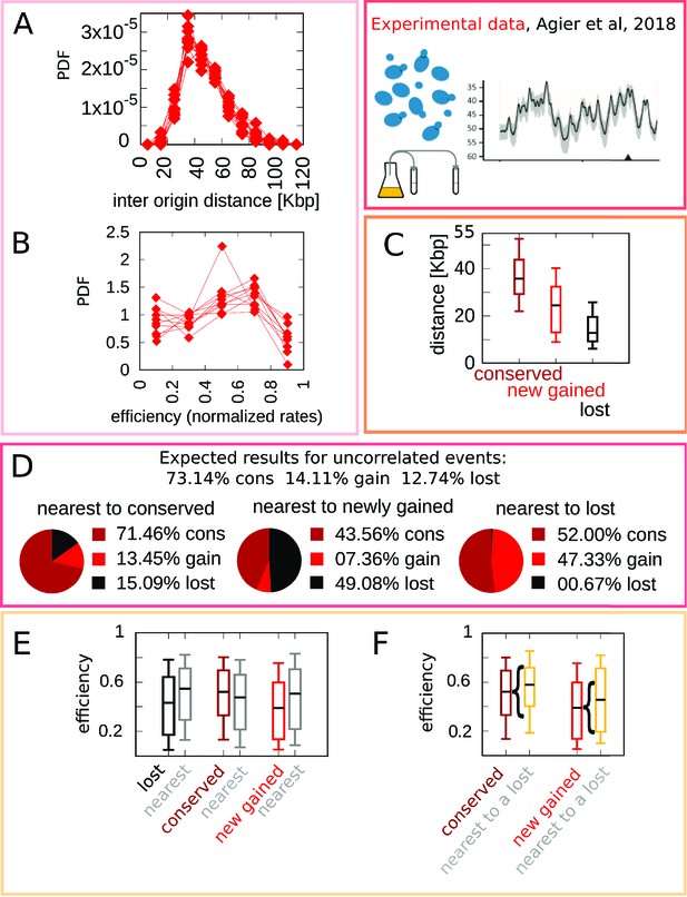
Experimental data motivate an evolutionary model for replication origins turnover.
(A) Distribution of the distance between neighbor origins in 10 Lachancea species, each histogram refers to a different species (data from Agier et al., 2018), and all the plots show a marked peak around 35 kbp. (B) Distribution of the efficiency (calculated from a fit, using Equation 4) for all origins in 10 Lachancea yeast species Agier et al., 2018. (C) From Agier et al., 2018, box plot of the distribution of the distance from the nearest origin split by evolutionary events, for conserved (dark red), newly gained (red), and lost origins (black), estimated comparing six sister species of the Lachancea clade Agier et al., 2018. (D) Analysis of the origins that are nearest to conserved, newly gained, and lost, compared to the expected result if events were uncorrelated Agier et al., 2018. (E) Distribution of the efficiency of lost, conserved, and newly gained origins (respectively in black, dark red, and red) and their neighbors (gray). Note that the efficiency of lost origins is lower than average, while the efficiency of origins flanking a lost origin is higher. (F) Box plot of efficiency of all conserved and newly gained origins compared to those flanking a lost origin, which tend to be more efficient. Braces indicate subsampling (the box plots on the right side are defined by a subset of points of the box plots on the left). Box plots show the median (bar), 25–75 (box), and 10–90 (whiskers) percentiles. The data in panel (C–F) refers to the six sister species of the Lachancea tree.
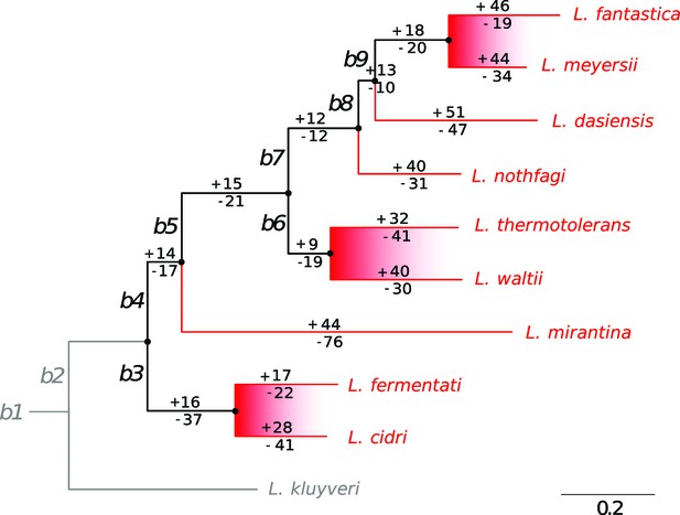
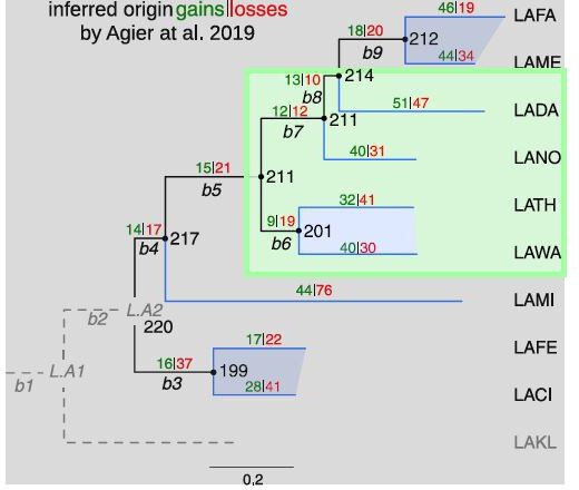
The phylogenetic tree of the 10 Lachancea yeasts clade.
Taken from [Agier et al., 2018], Figure 3A. L. kluyveri was used as the outgroup species. Hence, evolutionary events that occurred on both the L. kluyveri and the b2 branches (gray lines) could not be retraced. As a consequence, our simulations of the model were not possible for the b2 and L. kluyveri branches, and it was possible to simulate 9 species instead of 10. Internal branches, labeled b3 to b9, and terminal branches are drawn in black and red, respectively. The number of origin gains (with plus sign) and losses (with minus sign) was estimated for each branch of the tree in Agier et al., 2018. The six sister species, which belong to the three closest pairs of species, are highlighted with the red shaded areas.
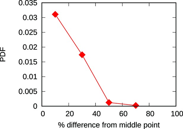
The majority of new origins are born within a 20% distance from the midpoint of the associated interval.
The plot shows the empirical distribution of the fractional distance from the midpoints of nearby origins for newborn origins of the Lachancea clade. More than half of all the newborn origins are less than 20% far away from the midpoint of the inter-origin interval where they are born. This means that for an ideal 50 kbp interval, more than half of the birth events would occur in positions between 20 and 30 kbp, which is remarkably close to the midpoint position of 25 kbp. This result justifies the simplified choice of placing newborn origins at midpoints in our models.
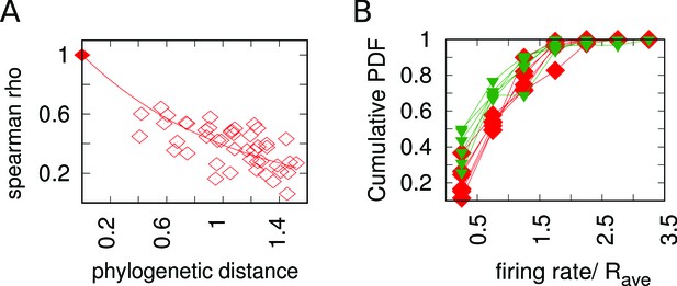
Experimental data on the evolutionary change of firing rates process.
(A) The firing rates Spearman correlation coefficient ρ between sets of corresponding origins decreases with increasing phylogenetic distance between species. Each point in the plot represents a pair of species. The axis reports the phylogenetic distance between the two species, while the axis reports the Spearman correlation between the sets of normalized firing rates for corresponding origins between the two species. Empty squares represent the analysis carried out with Lachancea clade yeasts, while the symbol with coordinates (0,1) represents the fact that that non-distant species must have . (B) Cumulative probability distribution of the normalized firing rates of newly gained origins (green triangles, for the six sister species) compared to all the extant origins (red squares, for the six sister species). This plot shows that all the functions are very similar. This result is compatible with the assumption of resampling of firing rates over evolution taken for the model (see Appendix 1).
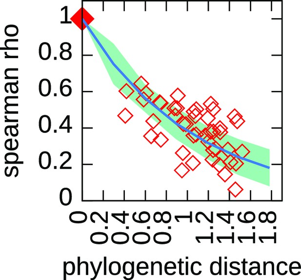
The decaying trend of the Spearman correlation coefficient defines a characteristic time for the firing rate resample.
For each pair of species, we compute the Spearman correlation coefficient between the set of normalized firing rates belonging to corresponding origins. The figure shows the results of this analysis. The red empty points refer to experimental data, each dot is a pair of species, the x coordinate is the phylogenetic distance between them while the y coordinate is the value of the Spearman correlation coefficient. The squared dot in (0,1) is a fictitious point placed to remark that the Spearman coefficient between non-distant species must be 1. The blue line represent the results of a simulation (1000 runs, where we only implemented an unbiased death process) with and the light blue area the standard deviation. We fixed the value of by fitting this specific trend, and indeed the simulations that use this value of show a remarkable agreement with the experimental trend. For the algorithm details, see Materials and methods and Appendix 1.
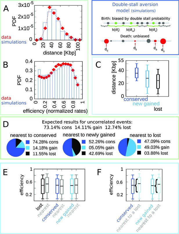
The double-stall-aversion model reproduces origin turnover and distributions but fails to capture correlations between origin turnover and origin strength.
The plots show the simulations of the best-fitting double-stall-aversion model compared with empirical data. (A) Inter-origin distance distribution in simulated species (blue bars) compared to the empirical distribution for the 10 Lachancea species (red diamonds). (B) Origin efficiency distribution in simulated (blue bars) vs. empirical species (red diamonds). (C) Box plot of the distance from the nearest origin split by evolutionary events, that is, for conserved (dark blue), newly gained (blue), and lost origins (black) for simulated species. (D) Fraction of origins that are nearest to conserved, newly gained, and lost for simulated species compared to the expected result for uncorrelated events. (E) Box plot of efficiency of lost, conserved, and newly gained origins (respectively in black, dark blue, and blue) and their neighbors (gray) in simulated species. The six distributions show very little variation. (F) The efficiency of all conserved and newly gained origins compared to the ones flanking a lost origin. Braces indicate subsampling. Box plots show the median (bar), 25–75 (box), and 10–90 (whiskers) percentiles. Simulation parameters (see Materials and methods): overall birth and death rate , and firing rate resampling rate , where is measured by protein-sequence divergence. Panels (A) and (B) were generated using data from approximately 320,000 simulated origins, while panels (C–F) were built using data from about 60,000 birth and death events and 240,000 conservation events.
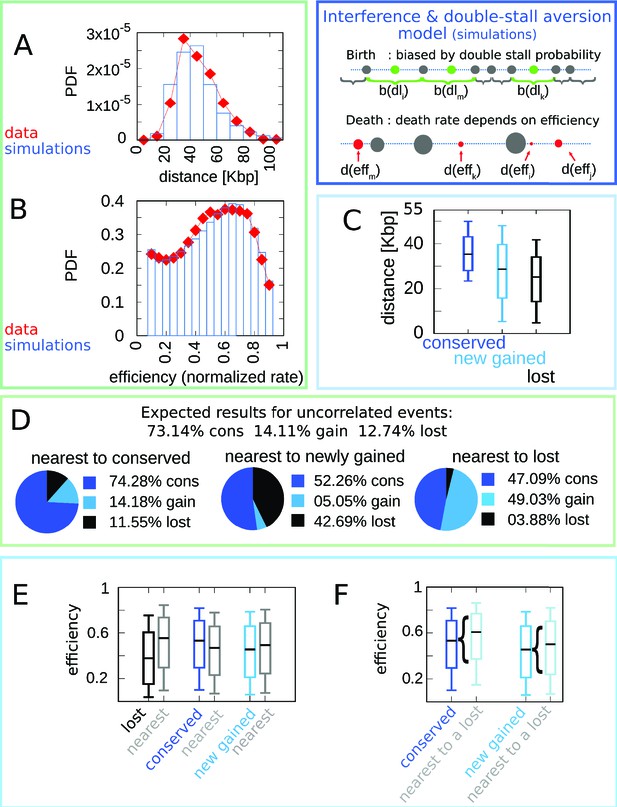
A model where both fork stalling and interference affect fitness explain the correlations between origins of evolutionary events.
Result of the joint model best-fitting simulation compared with empirical data. (A) Inter-origin distance distribution in simulated species (blue bars) vs. empirical distribution for the 10 Lachancea species (red diamonds). (B) Origin efficiency distribution in simulated (blue bars) vs. empirical species (red diamonds). The agreement between simulation and experimental data shows that this joint evolutionary model reproduces the typical structural features of a yeast genome. (C) Box plot of the distance from the nearest origin split by evolutionary events, that is, for conserved (dark blue), newly gained (blue), and lost origins (black) for simulated species. (D) Fraction of origins that are nearest to conserved, newly gained, and lost for simulated species compared to the expected result for uncorrelated events. (E) Box plot of efficiency of lost, conserved, and newly gained origins (respectively in black, dark blue, and blue) and their neighbors (gray) in simulated species. (F) The efficiency of all conserved and newly gained origins compared to the ones flanking a lost origin. Braces indicate subsampling. Box plots show the median (bar), 25–75 (box), and 10–90 (whiskers) percentiles. Panels (D–F) show that the model correctly reproduces the correlation between origin birth-death events over evolution and efficiency of the nearest origin. Simulation parameters (see Materials and methods): , , overall birth and death rate , , and rate of origin firing rate reshuffling , where is measured by protein-sequence divergence. Panels (A) and (B) show data from approximately 600,000 simulated origins, while panels (C–F) data from about 100,000 birth and death events and 500,000 conservation events.
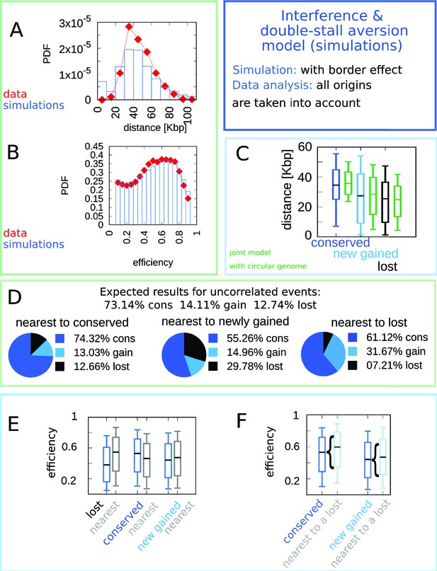
Linear chromosomes do not alter significantly the model outcomes.
We simulated eight linear chromosomes (the number of chromosomes of the majority of Lachancea species), with length equal to one eighth of the average genome size. We have modified the model so that the birth probability at the chromosomes ends is biased by the single-stall probability (as double stalls are not possible). The plot shows the results of the simulations (100 runs) of the model. The main difference is visible in the distance distribution shown in panel (A). The correlations shown in panels (C–F) only display minor quantitative changes. The predicted efficiency distribution is in agreement with the empirical one (B). In the model, the accumulation of origins towards the chromosome ends is due to the fact that single-stall events are more prone to happen than double stalls. Biologically, the region involving the last origin before telomeres is specific, and additional mechanisms such as telomerase or homologous recombination could repair stalled forks Matmati et al., 2020.
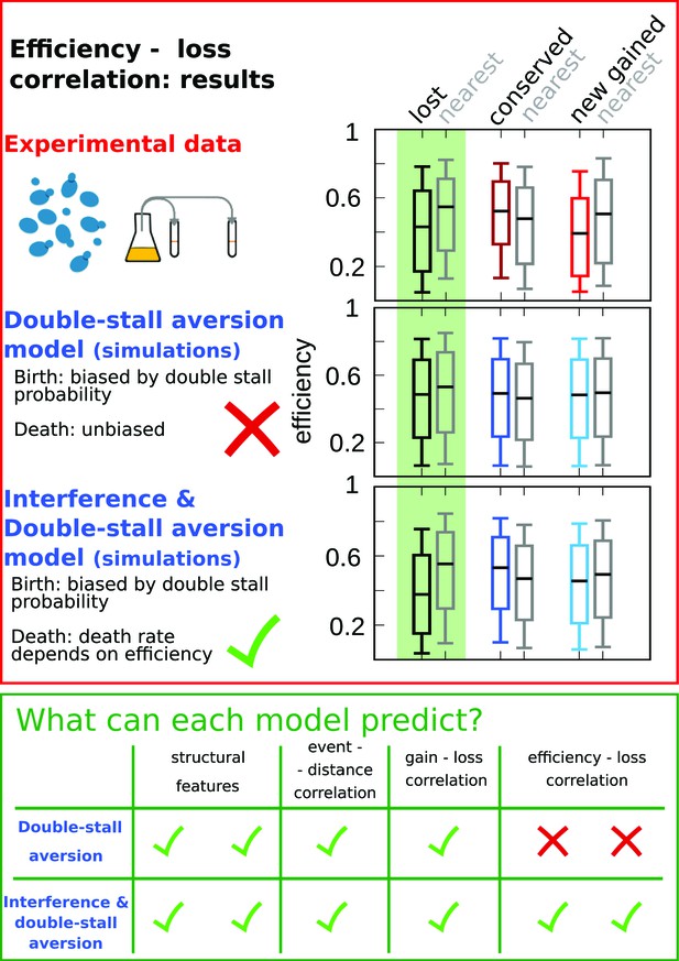
Comparison of model predictions for the correlations of origin birth-death events.
The plots in the red upper box compare efficiency distributions of the best-fitting simulation of the two different models (bottom and central panels) with experimental data (top panel). Comparison of the box plot of efficiency of lost, conserved, and newly gained origins (red for the data, blue for the models) shows better agreement of the joint efficiency/double-stall-aversion model (bottom panel) with the experimental data. Hence, the joint model reproduces well the correlation between evolutionary birth-death events of origins and efficiency of the nearest origin, while the double-stall-aversion model fails. Box plots show the median (bar), 25–75 (box), and 10–90 (whiskers) percentiles. Simulation parameters for the joint model (see Materials and methods): , , and for the double-stall-aversion one: . General parameters: overall birth and death rate , and rate of origin firing rate reshuffling , where is measured by protein-sequence divergence. In the green lower box, we compare the predictive power of the two models for each of the tested feature of the experimental data. The box highlights that both the double-stall aversion model and the joint efficiency–double-stall model are able to reproduce the structural features of the genome. Also, the correlation between events–distance from the nearest and event–event of the nearest are correctly predicted by both models. The important difference between the two proposed models is found for the correlation between evolutionary events and origin efficiency, which is predicted and can be explained solely by the joint model.
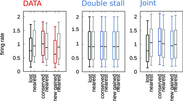
The efficiency mechanism is necessary to reproduce the correlation between firing rates and evolutionary events.
Comparison between the firing rates events correlation for experimental data, double-stall-aversion model, and joint model. Only the joint model can reproduce this correlation, which is observed in experimental data. The reason is that in the double-stall-aversion model the evolution of firing rates is uncoupled from the origin birth-death dynamics.
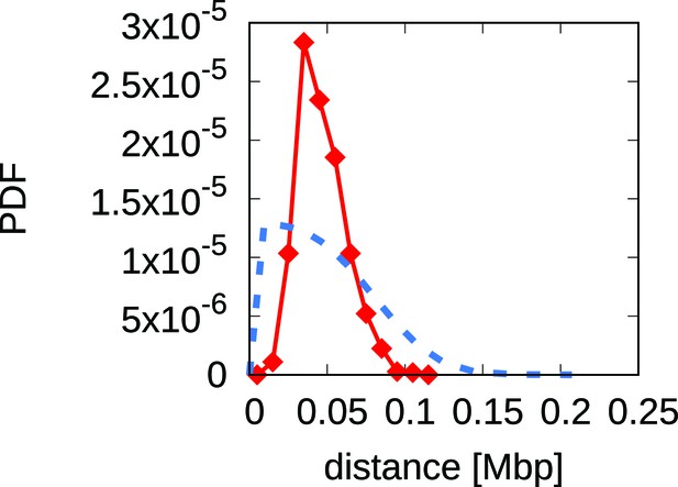
Analytical predictions for the inter-origins distance distribution falsify the scenario whereby interference alone drives replication program evolution.
The plot shows a comparison between the empirical inter-origin distance distribution (red line, diamonds) and the analytical prediction from the scenario of origin birth-death driven by interference alone (blue dotted line, see Appendix 1 for the calculation). The predicted distribution does not match the empirical one, thus the scenario can be rejected because it fails to reproduce a crucial feature of the data.
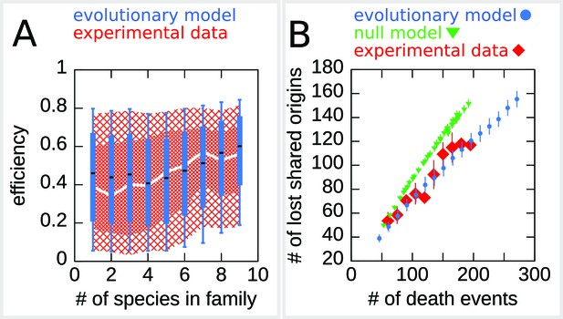
The efficiency/double-stall-aversion model predicts origin divergence.
The plots compare predictions of the evolutionary model on the extent of origin divergence (simulations of the Lachancea phylogenetic tree) with empirical data. (A) Box plot of origins efficiency distributions split by family size. The plot compares origin families (sets of orthologous origins) in the nine Lachancea species (white line and red shaded areas) and simulated species (blue boxes, for 100 simulation runs). Medians are shown as white line for data, black bar for simulation, 25–75 percentiles as shaded area for data, box for simulation, and 10–90 percentiles as coarse shaded area for data, whiskers for simulation. (B) Origin divergence measured by the number of origins in the common ancestor that were lost in a pair of species, plotted as a function of total origin loss events. The plot compares model simulations (blue circles, 100 simulation runs), the experimental data (red squares), and a null model that shuffles the empirical birth-death events in each branch (green triangles, 1000 simulation runs). Error bars are standard deviations on y-axis values. Simulation parameters (for the evolutionary model, see Materials and methods): , , overall birth and death rate , , and rate of origin firing rate reshuffling , where is measured by protein-sequence divergence.
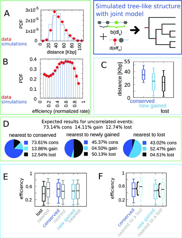
The joint efficiency/double-stall-aversion model simulated on a cladogenetic structure reproduces all the results found for a single lineage.
The results refer to 100 different runs of the simulation of the joint model on the empirical tree structure compared with empirical data. (A) Inter-origin distance distribution in simulated species (blue bars) compared to the empirical distribution for the 10 Lachancea species (red diamonds). (B) Origin efficiency distribution in simulated (blue bars) vs. empirical species (red diamonds). (C) Box plot of the distance from the nearest origin split by evolutionary events, that is, for conserved (dark blue), newly gained (blue), and lost origins (black) for simulated species. (D) Fraction of origins that are nearest to conserved, newly gained, and lost for simulated species compared to the expected result for uncorrelated events. (E) Box plot of efficiency of lost, conserved, and newly gained origins (respectively black, dark blue, and blue) and their neighbors (gray) in simulated species. (F) The efficiency of all conserved and newly gained origins compared to the ones flanking a lost origin. Box plots show the median (bar), 25–75 (box), and 10–90 (whiskers) percentiles. Panels (D) and (F) show that the model correctly reproduces the correlation between origin birth-death events over evolution and efficiency of the nearest origin. Simulation parameters (see Materials and methods): , , overall birth and death rate , , and rate of origin firing rate reshuffling , where is measured by protein-sequence divergence.
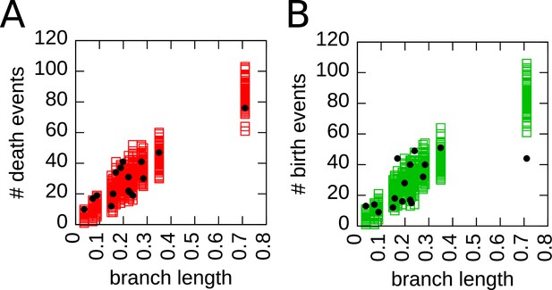
Simulations and empirical data show a similar variability in number of death and birth events across branches of the tree.
In each plot, a symbol corresponds to one branch of the phylogenetic tree, empty squares represent the simulations of the cladogenetic structure (100 different runs), and round black circles the experimental data. The axis represents the branch length, while the axis is the number of death events (A) or birth events (B) that occur in that branch. Both plots show a similar spread, supporting the idea that a fixed birth (death) rate in the simulations represents sufficiently well the fluctuations of the number of birth (death) events observed in the data.
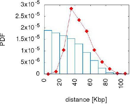
The "uniform draw" model does not reproduce the inter origin distance distribution.
The figure compares the empirical distance distribution (red point line) with the one resulting from the simulation of the uniform draw model (blue bars) with γ=10. We choose this value because for γ=10 the error made on this distribution has already saturated to the lower reached level. The model tested here cannot reproduce the inter origin distance distribution.
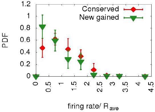
Newborn origins and conserved ones have similar distributions of firing rates.
The plot shows the probability distribution functions for the normalized firing rates for all the origins in the ten Lachancea species (red diamonds) and for those origins which have been gained in the terminal branches belonging to the six sister species (green triangles). The two distributions are similar, supporting the idea that the firing rates of the new gained origins are at steady state.
Additional files
-
Supplementary file 1
Results of the simplified log-likelihood tests of the joint and the double-stall-aversion model with the associated p-values.
Positive log-likelihood differences favor the joint model (see Materials and methods).
- https://cdn.elifesciences.org/articles/63542/elife-63542-supp1-v2.txt
-
Transparent reporting form
- https://cdn.elifesciences.org/articles/63542/elife-63542-transrepform1-v2.pdf


