Longitudinal proteomic profiling of dialysis patients with COVID-19 reveals markers of severity and predictors of death
- Centre for Inflammatory Disease, Department of Immunology and Inflammation, Imperial College London, United Kingdom
- Renal and Transplant Centre, Hammersmith Hospital, Imperial College Healthcare NHS Trust, United Kingdom
- Cambridge Institute for Medical Research, University of Cambridge, United Kingdom
- CRUK Cambridge Institute, University of Cambridge, United Kingdom
- MRC Biostatistics Unit, Forvie Way, University of Cambridge, United Kingdom
- Cambridge Institute of Therapeutic Immunology & Infectious Disease, University of Cambridge, United Kingdom
- Health Data Research UK, United Kingdom
Figures
Figure 1 with 1 supplement
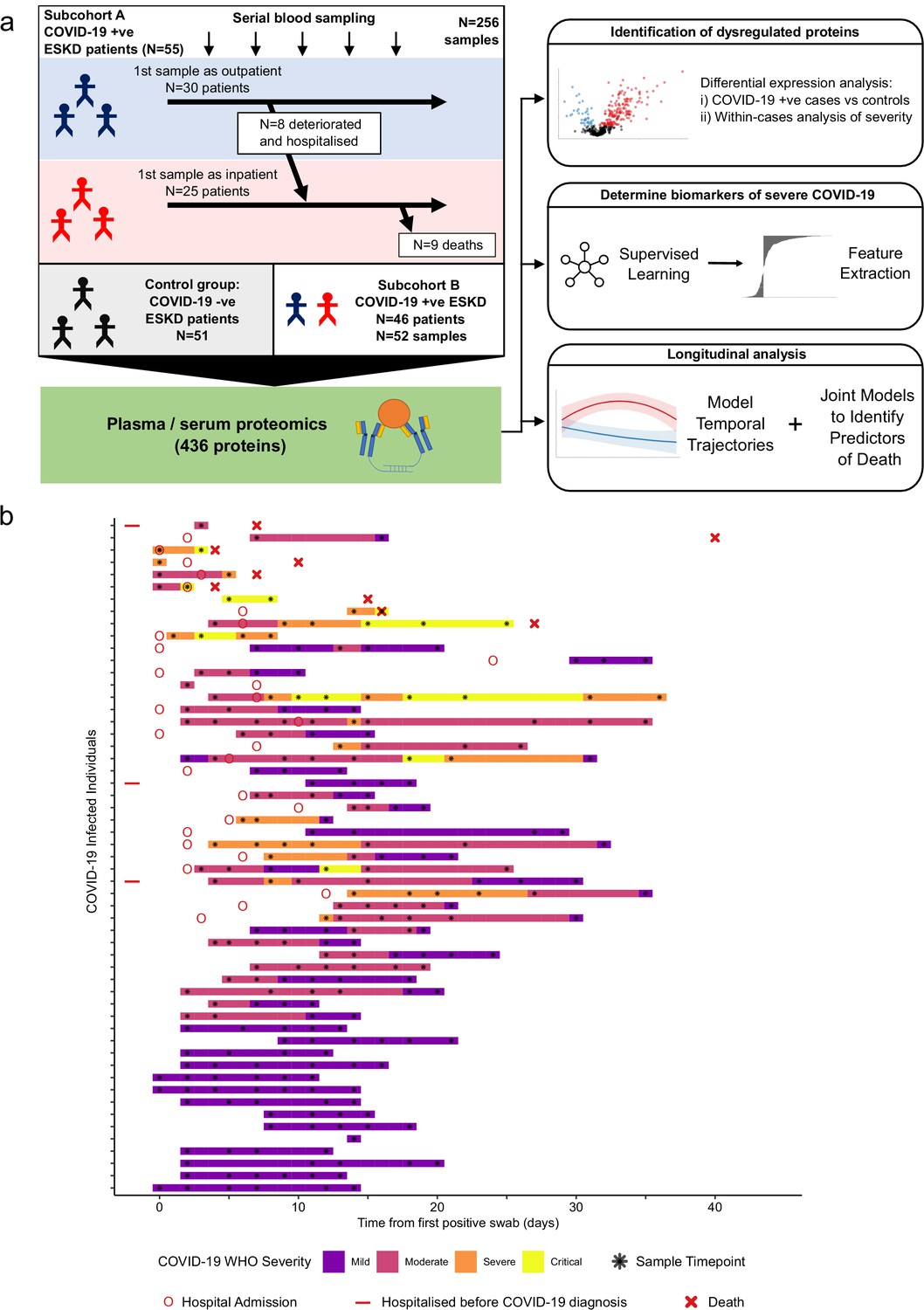
Study design.
(a) Schematic representing a summary of the patient cohorts, sampling, and the major analyses. Blue and red stick figures represent outpatients and hospitalised patients, respectively. (b) Timing of serial blood sampling in relation to clinical course of COVID-19 (subcohort A). Black asterisks indicate when samples were obtained. Three patients were already in hospital prior to COVID-19 diagnosis (indicated by red bars).
Figure 1—figure supplement 1
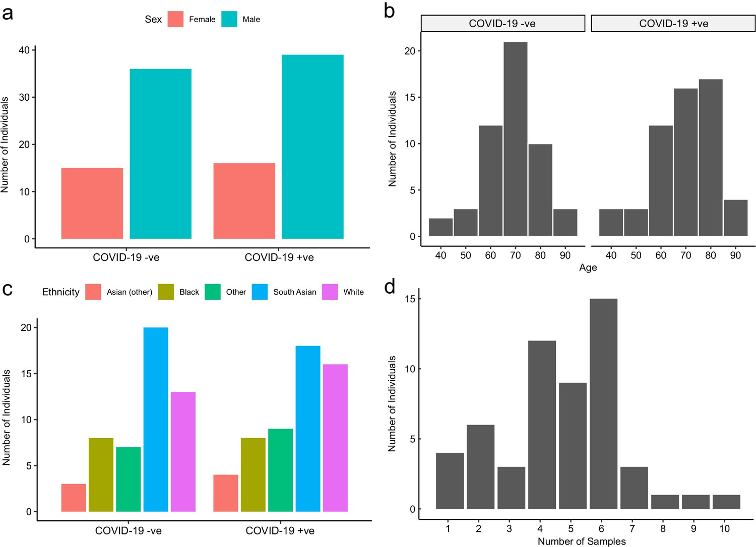
Baseline characteristics of subcohort A.
The number of COVID-19-positive and -negative patients in subcohort A (plasma), stratified by (a) sex, (b) age, and (c) ethnicity. (d) Serial samples obtained for COVID-19 patients.
Figure 2 with 2 supplements
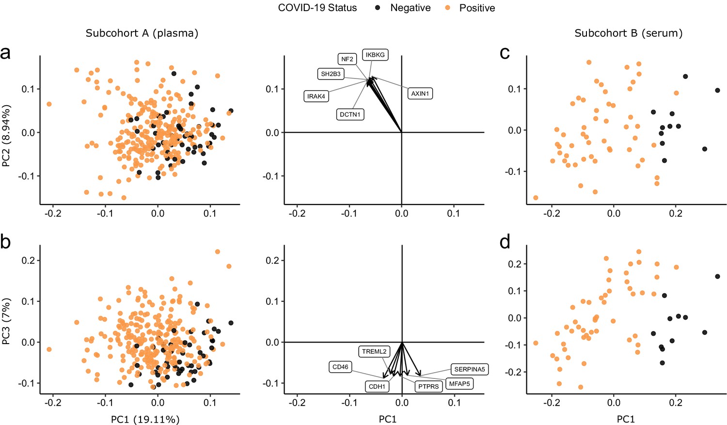
Principal component analysis.
PC = principal component. Each point represents a sample. Colouring indicates COVID-19 status. The directions and relative sizes of the six largest PC loadings are plotted as arrows (middle column). (a, b) Subcohort A. Due to serial sampling, there are multiple samples for most patients. The proportion of variance explained in subcohort A by each PC is shown in parentheses on the axis labels. (c, d) Subcohort B. Samples are projected into the PCA coordinates from subcohort A.
Figure 2—figure supplement 1
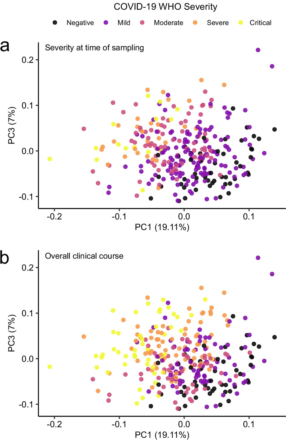
Principal component analysis in relation to clinical severity.
(a) Colouring indicates WHO severity at time of sampling. (b) Colouring indicates overall clinical course (indicated by peak WHO severity) for the patient from which that sample was taken.
Figure 2—figure supplement 2
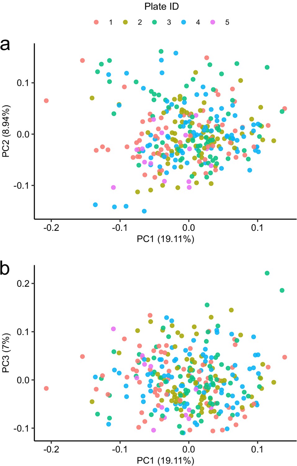
Principal component analysis in relation to assay plate.
Principal component analysis of the subcohort A coloured by plate.
Figure 3 with 4 supplements
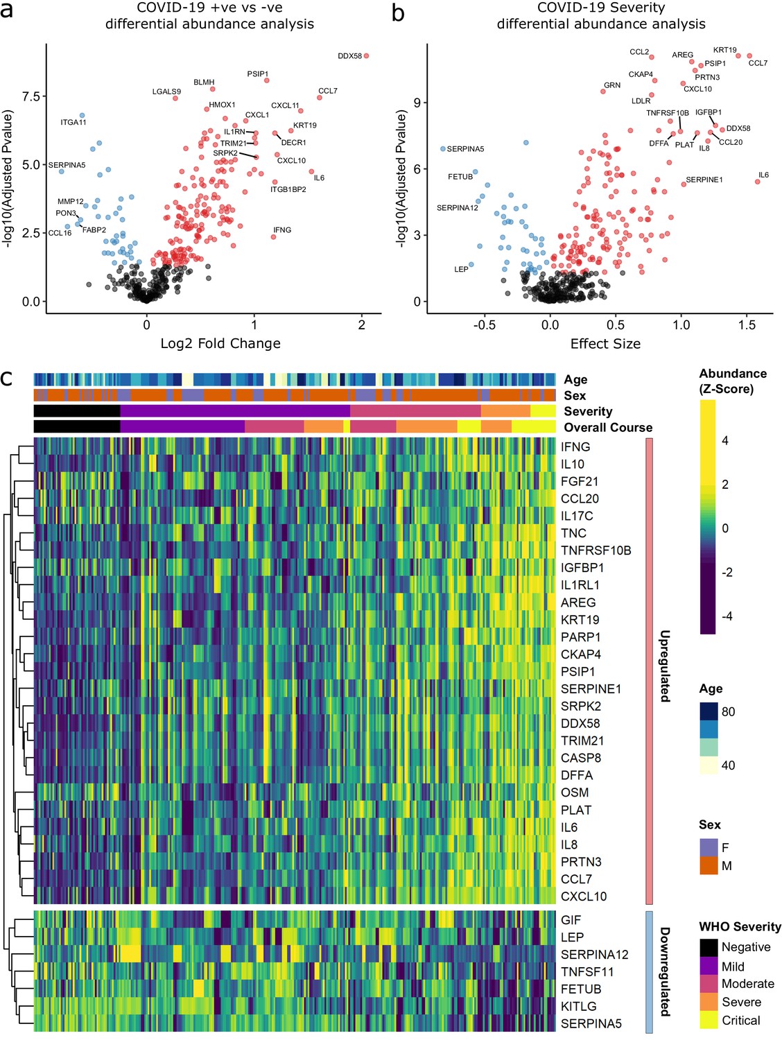
Identification of dysregulated proteins.
(a) Proteins upregulated (red) or downregulated (blue) in COVID-19-positive patients versus COVID-19-negative ESKD patients n = 256 plasma samples from 55 COVID-19-positive patients, versus n = 51 ESKD controls (one sample per control patient). (b) Proteins associated with disease severity associations of protein levels against WHO severity score at the time of sampling. Linear gradient indicates the effect size. A positive effect size (red) indicates that an increase in protein level is associated with increasing disease severity and a negative gradient (blue) the opposite. n = 256 plasma samples from 55 COVID-19-positive patients. For (a, b), p-values from linear mixed models after Benjamini–Hochberg adjustment; significance threshold = 5% FDR; dark-grey = non-significant. (c) Heatmap showing protein levels for selected proteins with strong associations with severity. Each column represents a sample (n = 256 COVID-19 samples and 51 non-infected samples). Each row represents a protein. Proteins are annotated using the symbol of their encoding gene. For the purposes of legibility, not all significantly associated proteins are shown; the heatmap is limited to the 17% most up- or downregulated proteins (by effect size) of those with a significant association. Proteins are ordered by hierarchical clustering. Samples are ordered by WHO severity at the time of blood sample (‘Severity’). ‘Overall course’ indicates the peak WHO severity over the course of the illness.
Figure 3—figure supplement 1
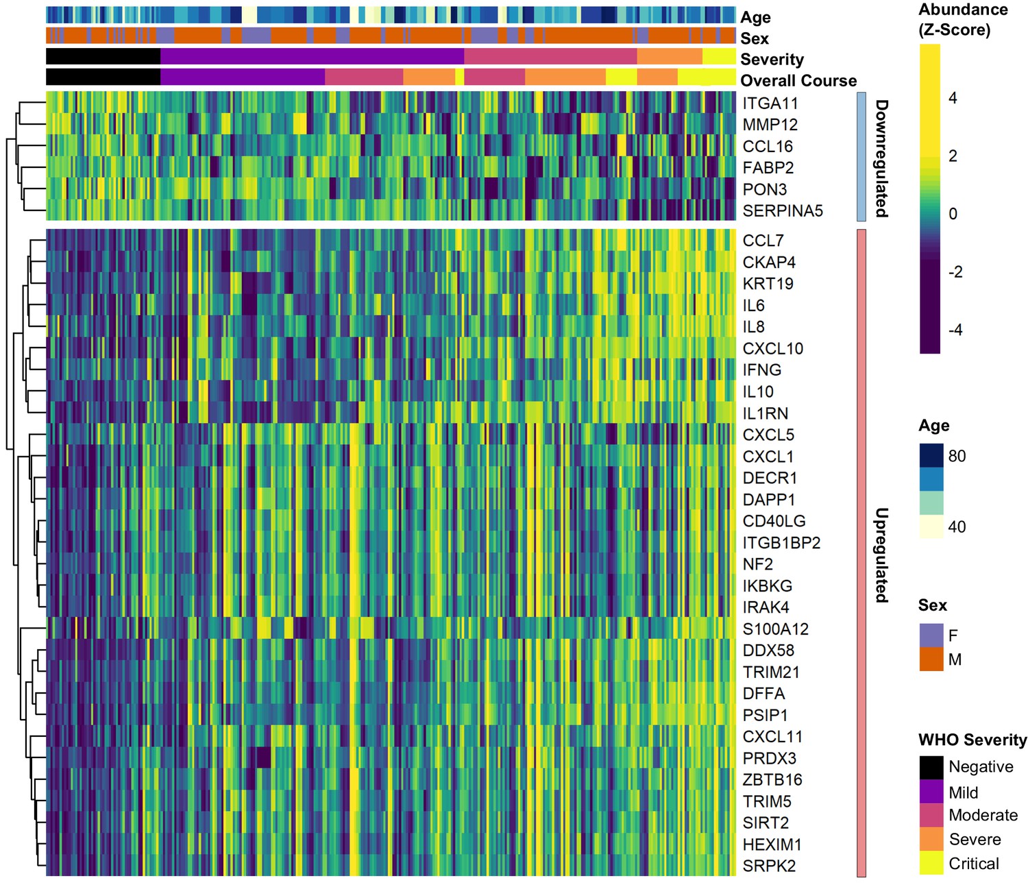
Differential abundance analysis between ESKD patients with and without COVID-19.
Heatmap showing selected proteins with the largest fold changes in differential abundance analysis (subcohort A). As for Figure 3, the heatmap is limited to the 17% most up- or downregulated proteins (by fold change) of those with a significant association.
Figure 3—figure supplement 2
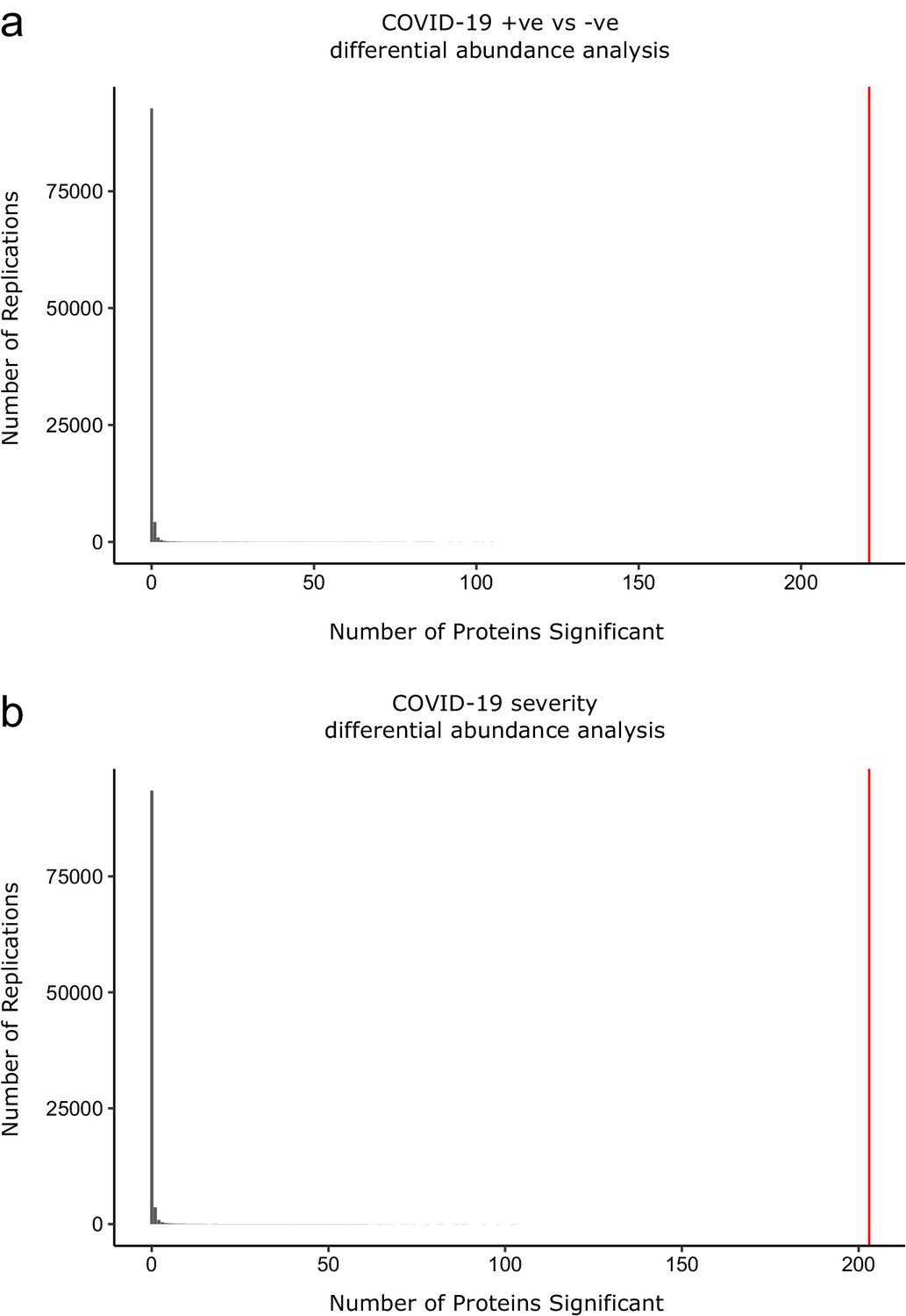
Permutation analysis to estimate the null distribution.
Histogram showing the distribution of the number of associations declared significant (FDR 5%) after random permutation of class labels (100,000 replications). (a) The COVID-19 +ve versus −ve differential abundance analysis. (b) The COVID-19 severity differential abundance analysis. The vertical red line denotes the number of proteins we found significant in the analysis with the true sample labels.
Figure 3—figure supplement 3
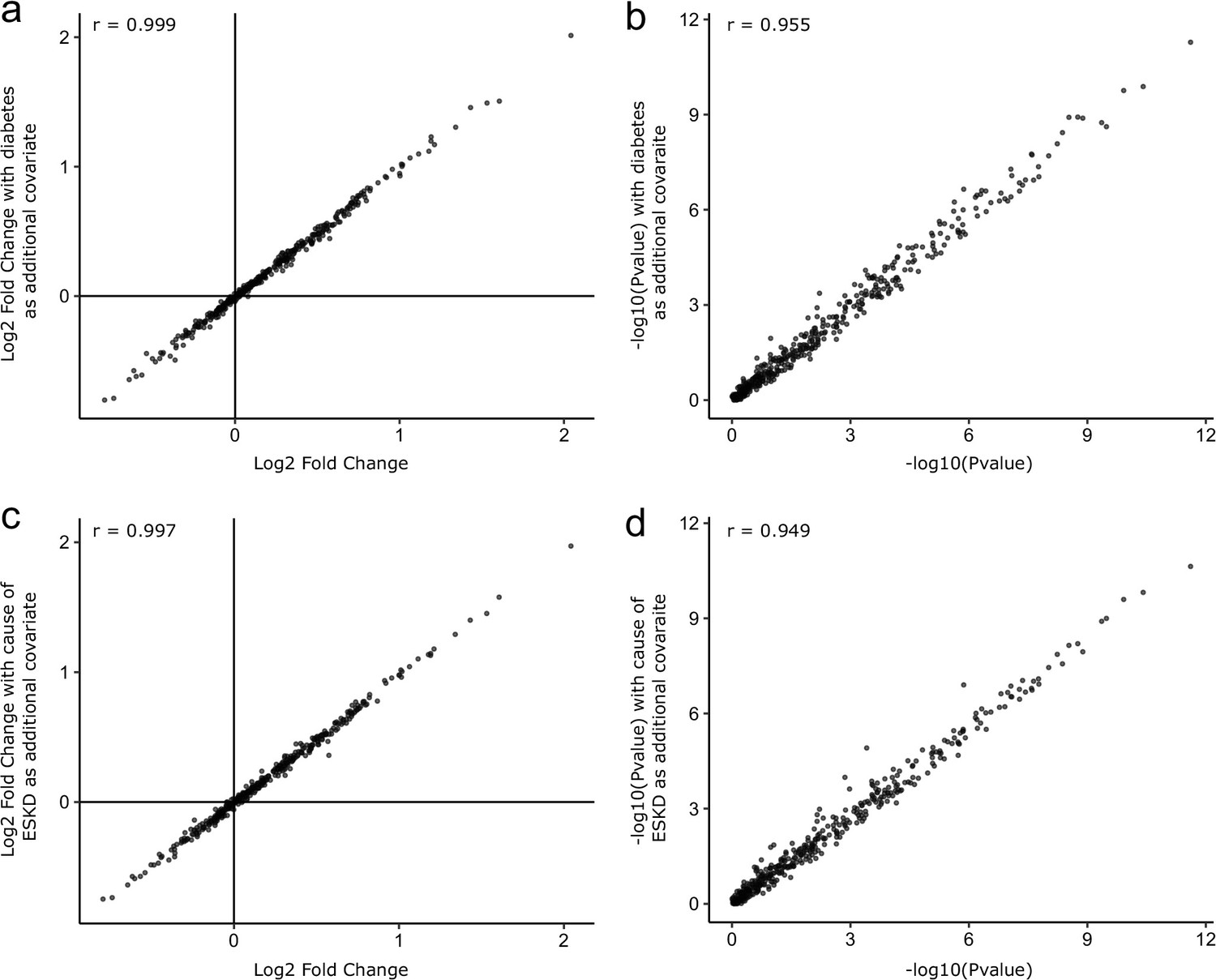
Sensitivity analyses adjusting for diabetes status and cause of ESKD.
As sensitivity analyses, the COVID-19-positive versus -negative differential abundance regressions were repeated adding diabetes status (a, b) and cause of ESKD (c, d) as additional covariates. The basic model included age, sex, and ethnicity as covariates. Each point represents a protein. A comparison of −log10 p-values and effect sizes is shown for all 436 proteins. r indicates Pearson’s correlation coefficient.
Figure 3—figure supplement 4
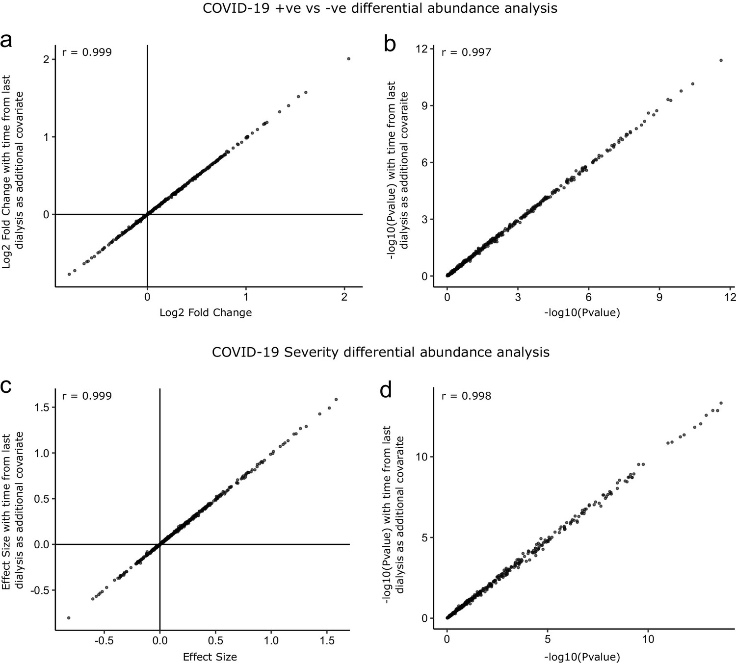
Sensitivity analysis adjusting for time since last haemodialysis.
Comparison of results obtained with and without adding time since last haemodialysis as an additional covariate to the regression models. (a, b) COVID-19 positive versus negative differential expression analysis. (c, d) Severity analysis. Each point represents a protein. r indicates Pearson’s correlation coefficient.
Figure 4 with 1 supplement
Validation.
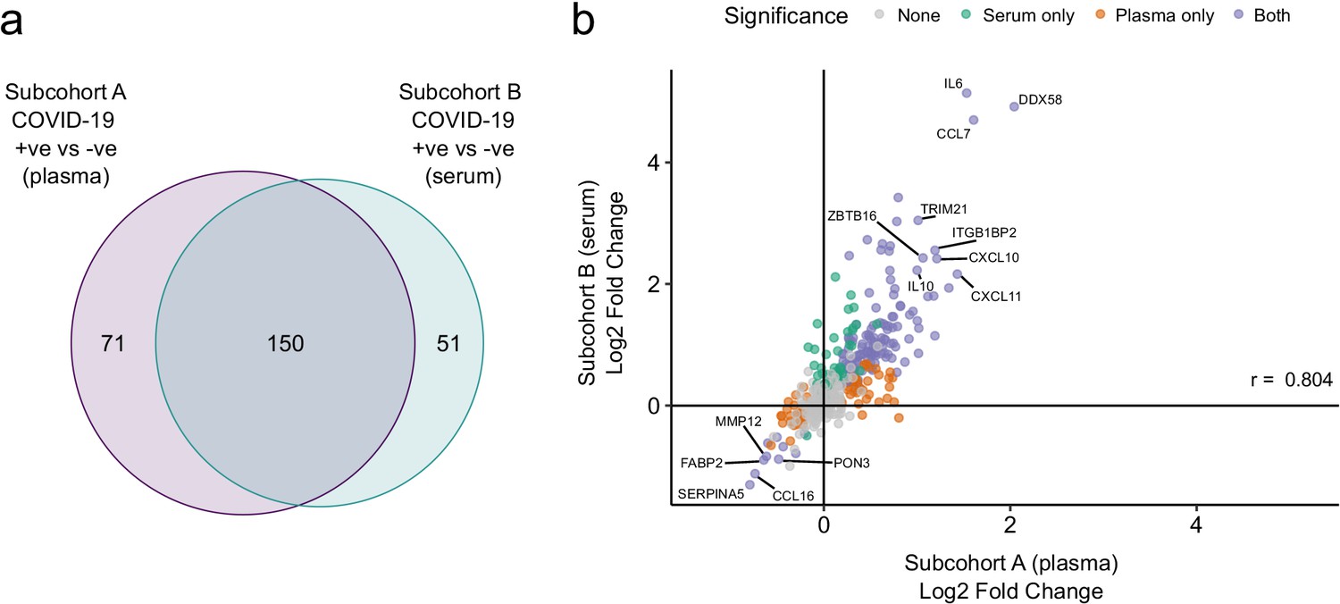
(a) Overlap between the significant associations in the differential abundance analysis between ESKD patients with and without COVID-19 in subcohorts A and B. 5% FDR was used as the significance threshold in both analyses. (b) Comparison of estimated effect sizes for all 436 proteins in the differential abundance analyses (COVID-19 positive versus negative) in subcohort A and B. Each point represents a protein. Pearson’s r is shown. Differential abundance analyses were performed using linear mixed models. Subcohort A analysis (plasma samples): 256 samples from 55 COVID-19 patients versus 51 non-infected patient samples (single time-point). Subcohort B (serum samples): 52 samples from 55 COVID-19 patients and 11 non-infected patient samples (single timepoint).
Figure 4—figure supplement 1
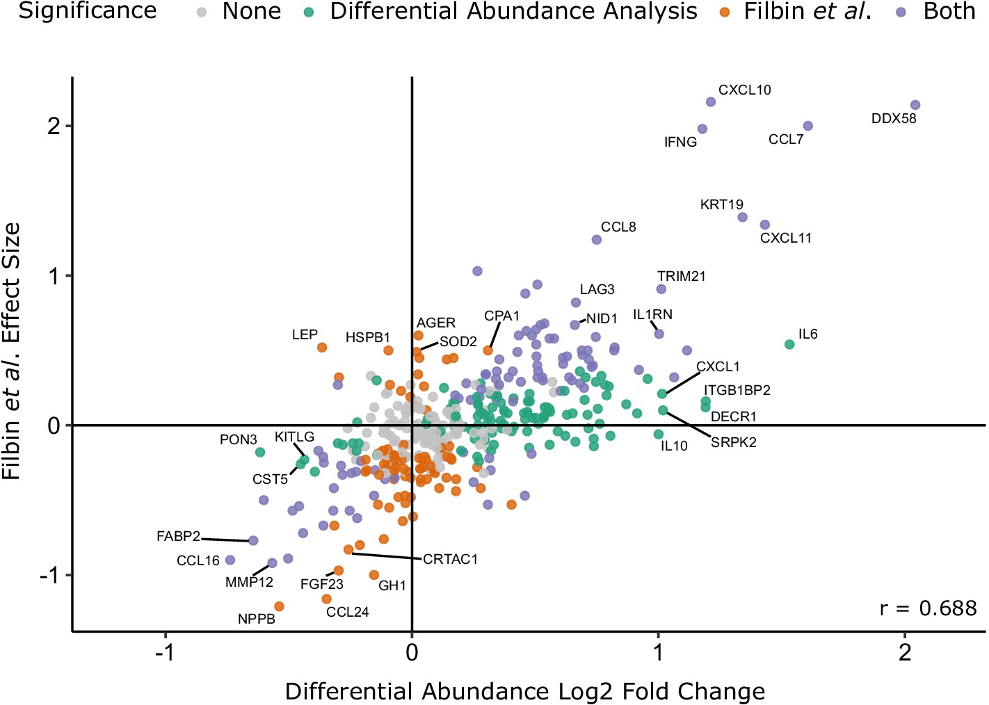
Comparison with the report of Filbin et al., 2020.
Comparison of log2 fold change for COVID-19-positive versus -negative ESKD patients in our study versus COVID-19-positive versus -negative respiratory distress patients in the report by Filbin et al., 2020. Colours indicate whether a protein was significantly differentially abundant in each study. Pearson’s r is shown.
Figure 5
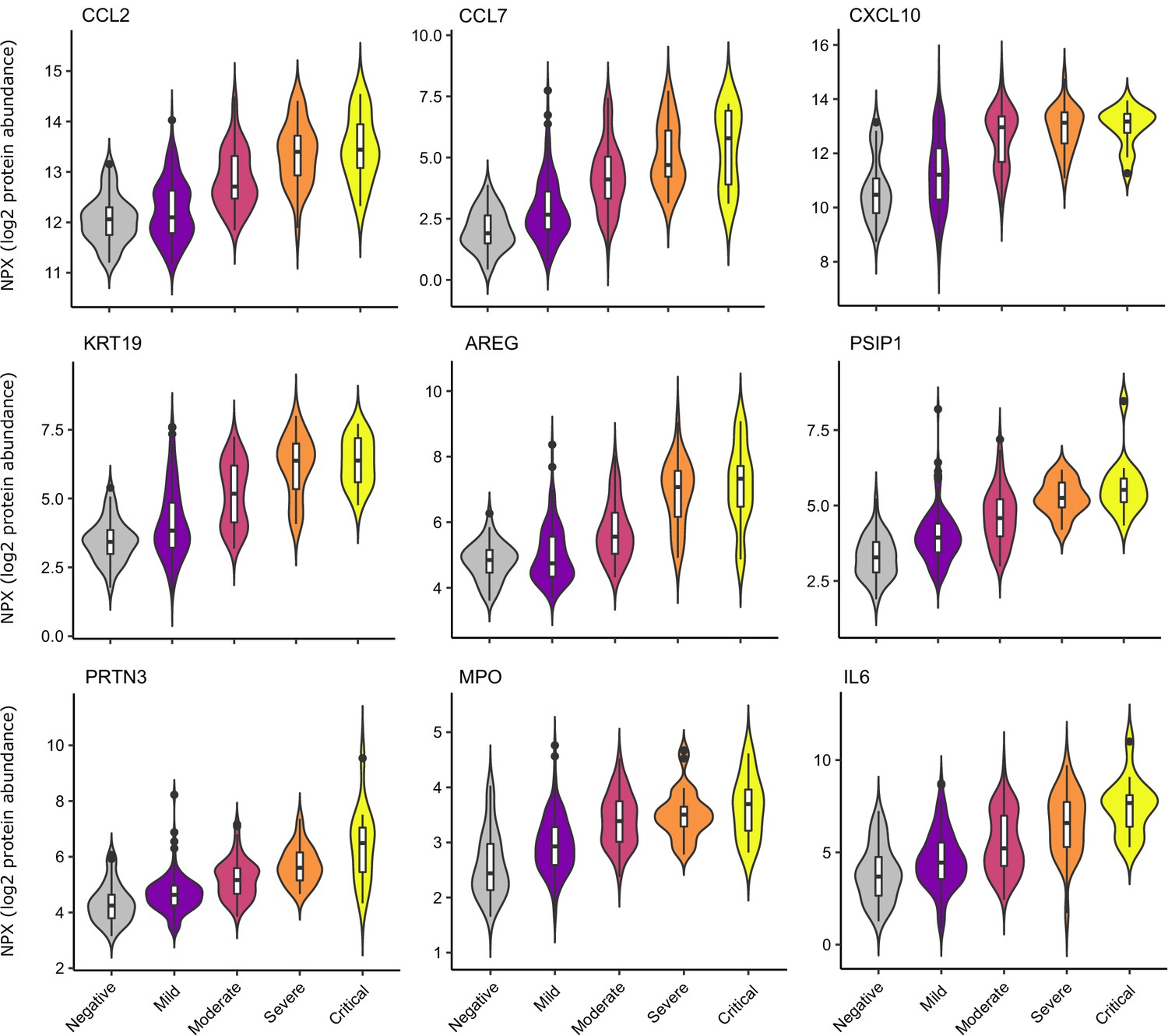
Selected proteins strongly associated with COVID-19 severity.
Violin plots showing distribution of plasma protein levels according to COVID-19 status at the time of blood draw. Boxplots indicate median and inter-quartile range. n = 256 samples from 55 COVID-19 patients and 51 samples from non-infected patients. WHO severity indicates the clinical severity score of the patient at the time the sample was taken. Mild n = 135 samples; moderate n = 77 samples; severe n = 29 samples; critical n = 15 samples. Upper: monocyte chemokines. Middle: markers of epithelial injury. Lower: two neutrophil proteases and IL6.
Figure 6
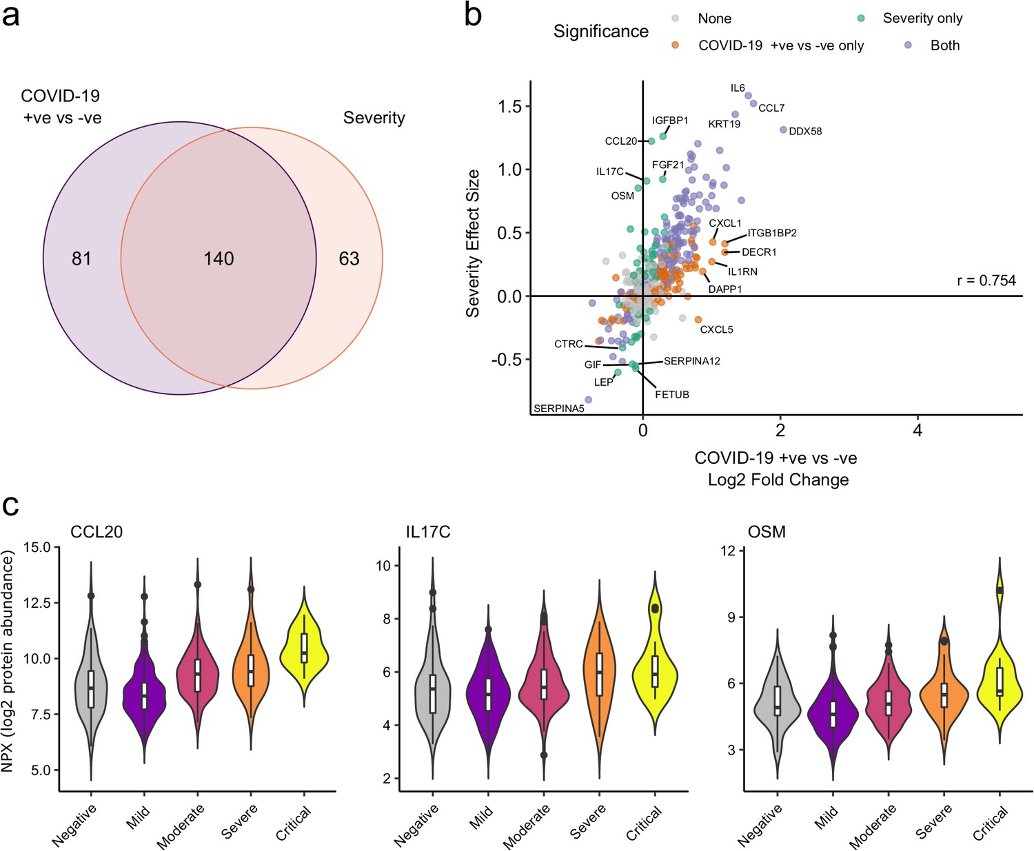
Comparison of proteins differentially expressed in COVID-19 with those associated with clinical severity.
(a) Overlap between the proteins significantly differentially expressed in COVID-19 (n = 256 COVID-19 samples and 51 non-infected samples) versus those associated with severity (within-case analysis, n = 256 samples) (subcohort A). 5% FDR was used as the significant cut-off in both analyses. (b) Comparison of effect sizes for each protein in the COVID-19-positive versus -negative analysis (x-axis) and severity analysis (y-axis). Each point represents a protein. Pearson’s r is shown. (c) Examples of proteins specifically associated with severity, but not significantly differentially abundant in the comparison of all cases versus controls. Violin plots showing distribution of plasma protein levels according to COVID-19 status at the time of blood draw. Boxplots indicate median and inter-quartile range. n = 256 samples from 55 COVID-19 patients and 51 samples from non-infected patients. WHO severity indicates the clinical severity score of the patient at the time the sample was taken. Mild n = 135 samples; moderate n = 77 samples; severe n = 29 samples; critical n = 15 samples.
Figure 7 with 1 supplement
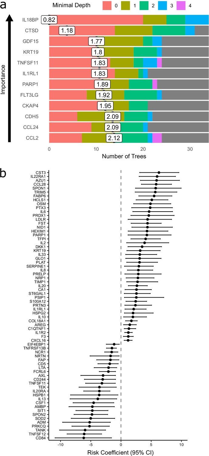
Prediction of severe COVID-19 and death.
(a) The 12 most important proteins for predicting overall clinical course (defined by peak COVID-19 WHO severity) using Random Forests supervised learning. If a variable is important for prediction, it is likely to appear in many decision trees (number of trees) and be close to the root node (i.e. have a low minimal depth). The mean minimal depth across all trees (white box) was used as the primary feature selection metric. (b) Proteins that are significant predictors of death (Benjamini–Hochberg adjusted p<0.05). n = 256 samples from 55 COVID-19-positive patients, of whom nine died. Risk coefficient estimates are from a joint model. Bars indicate 95% confidence intervals. For proteins with a positive risk coefficient, a higher concentration corresponds to a high risk of death, and vice versa for proteins with negative coefficients.
Figure 7—figure supplement 1
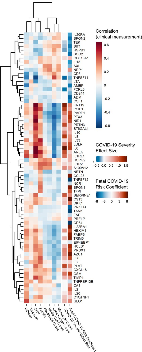
Proteins associated with risk of death: correlation to clinical severity and clinical laboratory measurements.
Proteins significantly associated with risk of death (5% FDR) are shown. The estimated effect size from the linear mixed model testing association with severity is also shown. Correlations between protein levels and contemporaneous clinical laboratory marker values were calculated using rmcorr (Bakdash and Marusich, 2017) for each of the proteins significant (5% FDR) in the joint model. The rows and columns of the clinical marker correlation matrix are ordered by hierarchical clustering.
Figure 8
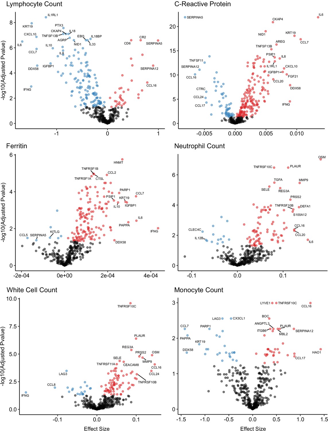
Associations of clinical laboratory markers with plasma proteins.
Proteins that are positively (red) or negatively (blue) associated with clinical laboratory parameters (5% FDR). p-values from differential abundance analysis using linear mixed models after Benjamini–Hochberg adjustment. Dark-grey = non-significant. Two associations were found for d-dimer (not shown – see Supplementary file 1g).
Figure 9 with 2 supplements

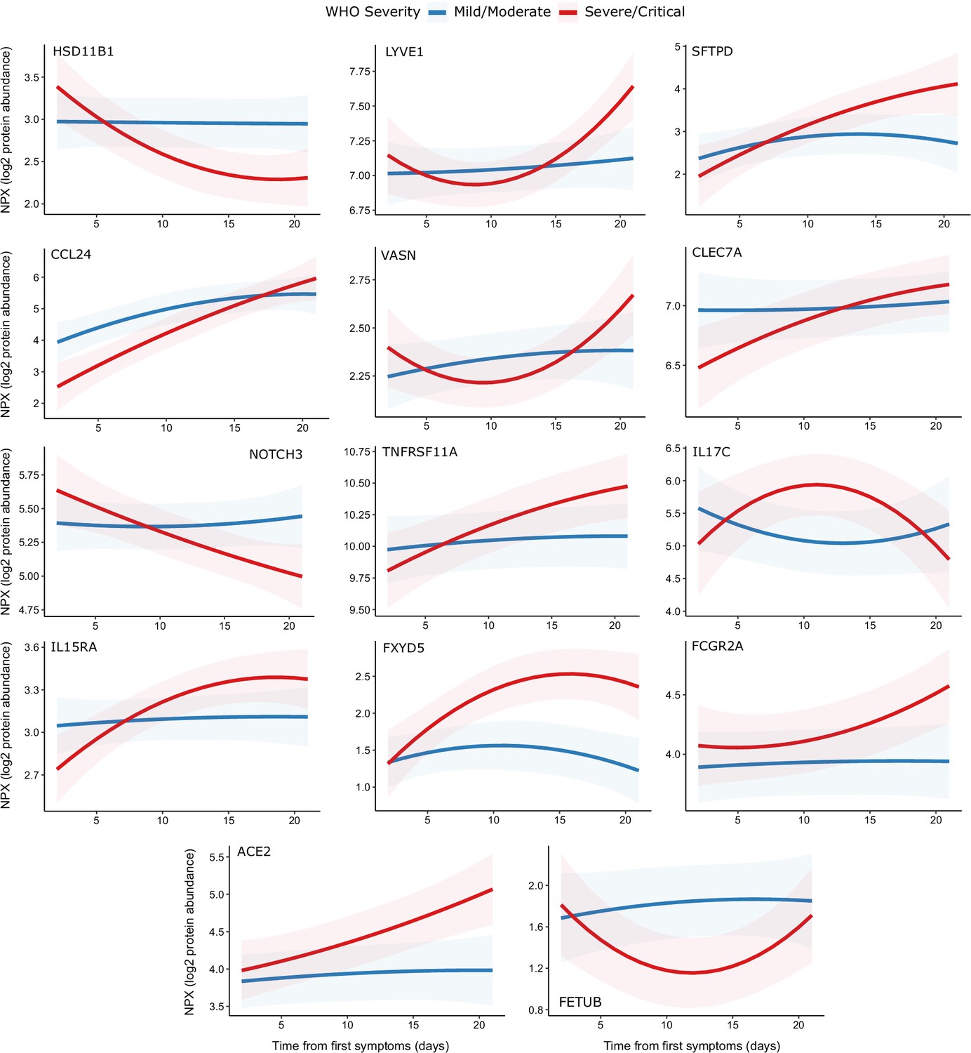
Modelling of temporal protein trajectories.
The top 18 proteins displaying the most significantly (5% FDR) different longitudinal trajectories between patients with a mild or moderate (n = 28) versus severe or critical (n = 27) overall clinical course (defined by peak WHO severity). Means and 95% confidence intervals for each group, predicted using linear mixed models (see Materials and methods), are plotted. The remainder of significant proteins are shown in Figure 9—figure supplement 1. Individual data points are shown in Figure 9—figure supplement 2.
Figure 9—figure supplement 1
Display of modelled temporal trajectories for other proteins with a significant time × severity interaction.
Proteins significant at 5% FDR but not shown in Figure 9 is displayed here.
Figure 9—figure supplement 2
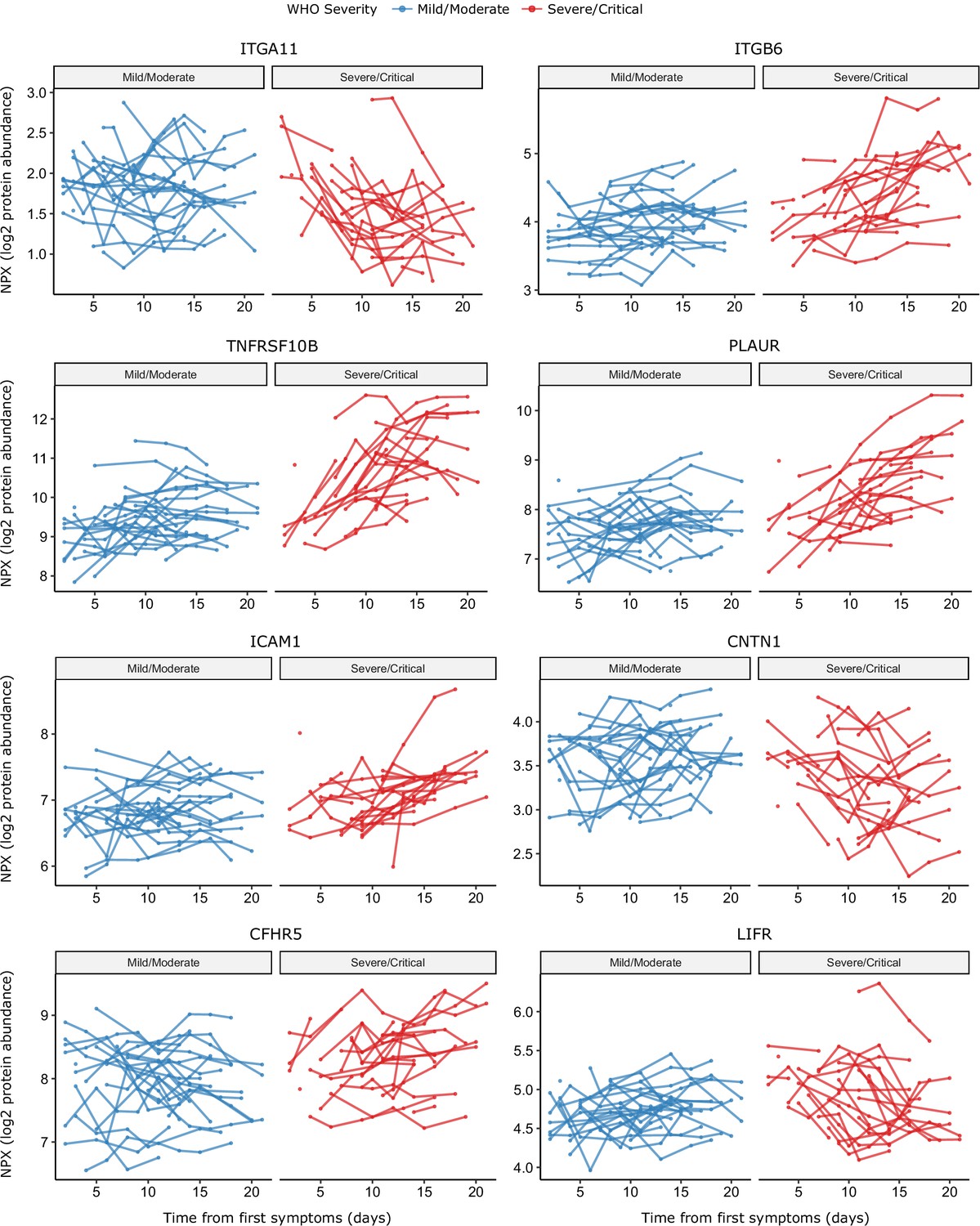
Raw data points for modelling of temporal protein trajectories.
The eight most significant proteins from Figure 9 are displayed.
Tables
Table 1
Characteristics of subcohort A.
| COVID-19-positive ESKD patients (n = 55) | ESKD controls (n = 51) | |||
|---|---|---|---|---|
| Overall | Peak severity mild or moderate (n = 28) | Peak severity severe or critical (n = 27) | ||
| Age Median (IQR) | 72.2 62.5–77.3 | 73.4 65.5–76.4 | 68.5 61.8–78.8 | 70.1 62.2–75.1 |
| Sex M F | 39 (70.9%) 16 (29.1%) | 18 (64.3%) 10 (35.7%) | 21 (77.8%) 6 (22.2%) | 36 (70.6%) 15 (29.4%) |
| Ethnicity White Black South Asian Asian (other) Other | 16 (29.1%) 8 (14.5%) 18 (32.7%) 4 (7.3%) 9 (16.4%) | 5 (17.9%) 5 (17.9%) 10 (35.7%) 1 (3.6%) 7 (25.0%) | 11 (40.7%) 3 (11.1%) 8 (29.6%) 3 (11.1%) 2 (7.4%) | 13 (25.5%) 8 (15.7%) 20 (39.2%) 3 (5.9%) 7 (13.7%) |
| Diabetes | 34 (61.8%)* | 16 (57.1%) | 18 (66.7%) | 24 (47.1%)* |
| Current smoker | 1 (1.8%) | 1 (3.6%) | 0 | 0 |
| ESKD cause DN Genetic GN HTN/vascular Other Unknown | 29 (52.7%) 1 (1.8%) 3 (5.5%) 5 (9.1%) 8 (14.5%) 9 (16.4%) | 14 (50.0%) 1 (3.6%) 1 (3.6%) 3 (10.7%) 5 (17.9%) 4 (14.3%) | 15 (55.6%) 0 2 (7.4%) 2 (7.4%) 3 (11.1%) 5 (18.5%) | 20 (39.2%) 1 (2.0%) 9 (17.6%) 7 (13.7%) 4 (7.8%) 10 (19.6%) |
| Hospitalisation due to COVID-19† | 33 (60%) | 6 (21.4%) | 27 (100%) | N/A |
| Fatal COVID-19 | 9 (16.3%) | 0 (0%) | 9 (33.3%) | N/A |
-
DN = diabetic nephropathy. GN = glomerulonephritis. HTN = hypertension. IQR = inter-quartile range. ‘South Asian’ represents individuals with Indian, Pakistani, or Bangladeshi ancestry. Subsets defined according to peak WHO severity over the course of the illness. N/A = not applicable.
*One patient had type 1 diabetes, the remainder type 2. †3 patients were hospitalised prior to COVID-19 diagnosis. 8 patients diagnosed with COVID-19 as outpatients subsequently deteriorated were hospitalised.
Table 2
Characteristics of subcohort B.
| COVID-19-positive ESKD patients (n = 46) | COVID-19-negative ESKD controls (n = 11)* | |
|---|---|---|
| Age Median (IQR) | 64.3 60.3–73.0 | 71.6 (61.7–73.9) |
| Sex M F | 32 (69.6%) 14 (30.4%) | 8 (72.3%) 3 (27.3%) |
| Ethnicity White Black South Asian Asian (other) Other | 11 (23.9%) 8 (17.4%) 12 (26.1%) 7 (15.2%) 8 (17.4%) | 3 (27.3%) 3 (27.3%) 3 (27.3%) 0 2 (18.2%) |
| Diabetes | 29 (63.0%) | 6 (54.5%) |
| Current smoker | 2 (4.3%) | 0 (%) |
| ESKD cause DN Genetic GN HTN/vascular Other Unknown | 19 (41.3%) 1 (2.2%) 7 (15.2%) 3 (6.5%) 3 (6.5%) 13 (28.3%) | 5 (45.5%) 0 1 (9.1%) 1 (9.1%) 2 (18.2%) 2 (18.2%) |
| Hospitalisation due to COVID-19 | 41 (89.1%) | N/A |
| Severe or critical COVID-19 | 33 (71.7%) | N/A |
| Fatal COVID-19 | 9 (19.6%) | N/A |
-
DN = diabetic nephropathy. GN = glomerulonephritis. HTN = hypertension. IQR = inter-quartile range. ‘South Asian’ represents individuals with Indian, Pakistani, or Bangladeshi ancestry. Subsets defined according to peak WHO severity over the course of the illness. N/A = not applicable. *These 11 controls are a subset of the control patients used in subcohort A.
Additional files
-
Source data 1
Individual-level plasma proteomic data for subcohort A.
- https://cdn.elifesciences.org/articles/64827/elife-64827-data1-v2.csv
-
Source data 2
Individual-level clinical and demographic covariate data for subcohort A.
- https://cdn.elifesciences.org/articles/64827/elife-64827-data2-v2.csv
-
Source data 3
Individual-level serum proteomic data for subcohort B.
- https://cdn.elifesciences.org/articles/64827/elife-64827-data3-v2.csv
-
Source data 4
Individual-level clinical and demographic covariate data for subcohort B.
- https://cdn.elifesciences.org/articles/64827/elife-64827-data4-v2.csv
-
Supplementary file 1
Table legends.
(a) Protein annotation. List of the 436 proteins measured. GeneID = gene symbol of the gene encoding the protein (used as the main identifier in the manuscript); UniProt = UniProt ID; Olink Assay Name = protein id used by Olink; Protein Name = full protein name; Panel name = the name of the 92 protein multiplex Olink panel on which the protein was measured. (b) Enrichment of Reactome terms for the entire set of proteins measured. The results of enrichment testing for genes corresponding to all 436 measured proteins against the background of the genome. The analysis was performed against the Reactome pathways using string-db. The list of Reactome terms is ordered by the number of proteins associated with the term. (c) Differential abundance analysis for COVID-19-positive vs -negative ESKD patients in subcohort A and B. Summary statistics for all 436 proteins are shown. Pvalue = nominal p-value from linear mixed model. Adjusted Pvalue = p-values after Benjamini–Hochberg correction. Fold change = estimated fold change from regression coefficient. Proteins are ordered based on results in subcohort A: first by whether they are significant or not (at 5% FDR), then by fold change (from positive to negative). Note the associations are not ordered by p-value so strong associations do not necessarily appear at the top of the table. Significant adjusted p-values are coloured in green and non-significant in grey. Estimated fold changes are coloured in a gradient from red to blue for up or downregulated in COVID-19 +ve versus –ve, respectively. Sample size for subcohort A: n = 256 plasma samples from 55 COVID-19 positive ESKD patients, versus n = 51 ESKD controls (one sample per control patient). Sample size for subcohort B: 52 samples from 55 COVID-19 patients and 11 non-infected patient samples (single time-point). (d) Associations of proteins and COVID-19 severity (subcohort A). Summary statistics for all 436 proteins are shown. Pvalue = nominal p-value from linear mixed model. Adjusted Pvalue = p-values after Benjamini–Hochberg correction. Fold change = estimated fold change from regression coefficient. Proteins are ordered first by whether they are significant or not (at 5% FDR), then by linear gradient (effect size) from positive to negative. Note the associations are not ordered by p-value so strong associations do not necessarily appear at the top of the table. (e) Predictors of clinical course from Random Forests. Importance metrics for each protein for prediction according to a random forest model trained to predict current or future severe/critical disease using the first sample of each patient. Proteins are ordered by mean minimal depth across all trees – this was used as the primary importance metric. (f) Proteomic predictors of fatal COVID-19. Summary statistics from joint models for fatal disease. Results for all 436 proteins are shown. ‘Is significant’ indicates significance (green) or not (grey) at 5% FDR. The association coefficient for each protein indicates the direction and magnitude of the estimated log relative risk for death (red indicates higher protein levels increase risk of death, blue the opposite). 95% confidence intervals are plotted. (g) Associations of proteins and clinical laboratory measurements. Clinical variable = clinical lab tests: white cell count, lymphocyte count, neutrophil count, monocyte count, C-reactive protein, ferritin, d-dimer, troponin. (h) Longitudinal proteomic profiling with linear mixed models. Summary statistics from the linear mixed models used to identify proteins with differential temporal trajectories between mild/moderate (n = 28) and severe/critical COVID-19 patients (n = 27). Summary statistics for all 436 proteins are shown. Pvalue = nominal p-value from linear mixed model for the interaction term between time from symptom onset (days) and overall WHO severity (as a binary variable: mild–moderate or severe–critical). Adjusted Pvalue = p-values after Benjamini–Hochberg correction. ‘Is significant’ indicates significance (green) or not (grey) at 5% FDR. (i) Comparison to other proteomic studies of COVID-19 positive vs negative patients. Proteins that were differentially abundant in COVID-19 +ve vs -ve patients in our data are listed (5% FDR). TRUE indicates that the protein was reported as differentially abundant in the relevant previous proteomic study. The final column summarises whether the association was previously reported in any of the four studies. We have not harmonised significance thresholds between studies: we simply report whether the authors declared the protein significant by the threshold of their study. (j) Comparison to other proteomic studies of COVID-19 severity. Proteins that were associated with severity in our data are listed (5% FDR). TRUE indicates that the protein was reported as associated with severity in the relevant previous proteomic study. The final column summarises whether the association was previously reported in any one or more of the four studies. We have not harmonised significance thresholds between studies: we simply report whether the authors declared the protein significant by the threshold of their study. Results are shown for all 436 proteins against all eight lab measurements. Adjusted p-value = p-value from linear mixed model after Benjamini–Hochberg correction. Gradient indicates effect size and direction. A positive gradient (red) indicates higher concentrations of proteins are associated with higher clinical laboratory measurements. ‘Is significant’ indicates significance (green) or not (grey) at 5% FDR. Contemporaneous clinical laboratory tests were not available for all plasma samples. The proportion of samples for which contemporaneous lab tests were available were: white cell count 66%, neutrophils 66%, monocytes 66%, lymphocytes 66%, CRP 64%, ferritin 36%, troponin 35%, d-dimer 30%. (k) Per protein correlations between plasma and serum levels derived from the same blood sample in 11 COVID-19 negative ESKD patients. Plasma and serum were taken from 11 non-infected ESKD patients that were measured in both subcohort A (plasma) and B (serum). Pearson’s r was calculated for the 11 paired measurements for each protein. Proteins are ordered by r value; this column is coloured from red to blue for positive and negative r values, respectively. 95% confidence intervals are reported. We also report the variance of the NPX levels for each protein in plasma and in serum.
- https://cdn.elifesciences.org/articles/64827/elife-64827-supp1-v2.xlsx
-
Transparent reporting form
- https://cdn.elifesciences.org/articles/64827/elife-64827-transrepform-v2.docx
Download links
A two-part list of links to download the article, or parts of the article, in various formats.
Downloads (link to download the article as PDF)
Open citations (links to open the citations from this article in various online reference manager services)
Cite this article (links to download the citations from this article in formats compatible with various reference manager tools)
Longitudinal proteomic profiling of dialysis patients with COVID-19 reveals markers of severity and predictors of death
eLife 10:e64827.
https://doi.org/10.7554/eLife.64827


