Stochastic social behavior coupled to COVID-19 dynamics leads to waves, plateaus, and an endemic state
- Center for Functional Nanomaterials, Brookhaven National Laboratory, United States
- Department of Bioengineering, University of Illinois Urbana-Champaign, United States
- Department of Physics, University of Illinois at Urbana-Champaign, United States
- Department of Civil Engineering, University of Illinois at Urbana-Champaign, United States
- Carl R. Woese Institute for Genomic Biology, University of Illinois at Urbana-Champaign, United States
- University of Illinois at Urbana-Champaign, United States
Figures
Figure 1
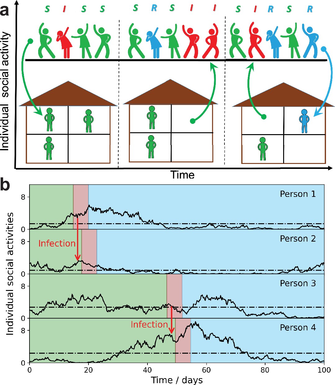
Schematic illustration of the stochastic social activity model in which each individual is characterized by a time-dependent social activity.
(a) People with low social activity (depicted as socially isolated figures at home) occasionally increase their level of activity (depicted as a party). The average activity in the population remains the same, but individuals constantly change their activity levels from low to high (arrows pointing up) and back (arrows pointing down). Individuals are colored according to their state in the susceptible-infected-removed (SIR) epidemiological model: susceptible, green; infected, red; and removed, - blue. The epidemic is fueled by constant replenishment of susceptible population with high activity due to transitions from the low-activity state. (b) Examples of individual time-dependent activity (solid lines), with different persistent levels (dot-dashed lines). S,I,R states of an individual have the same color code as in (a). Note that pathogen transmission occurs predominantly between individuals with high current activity levels.
Figure 2
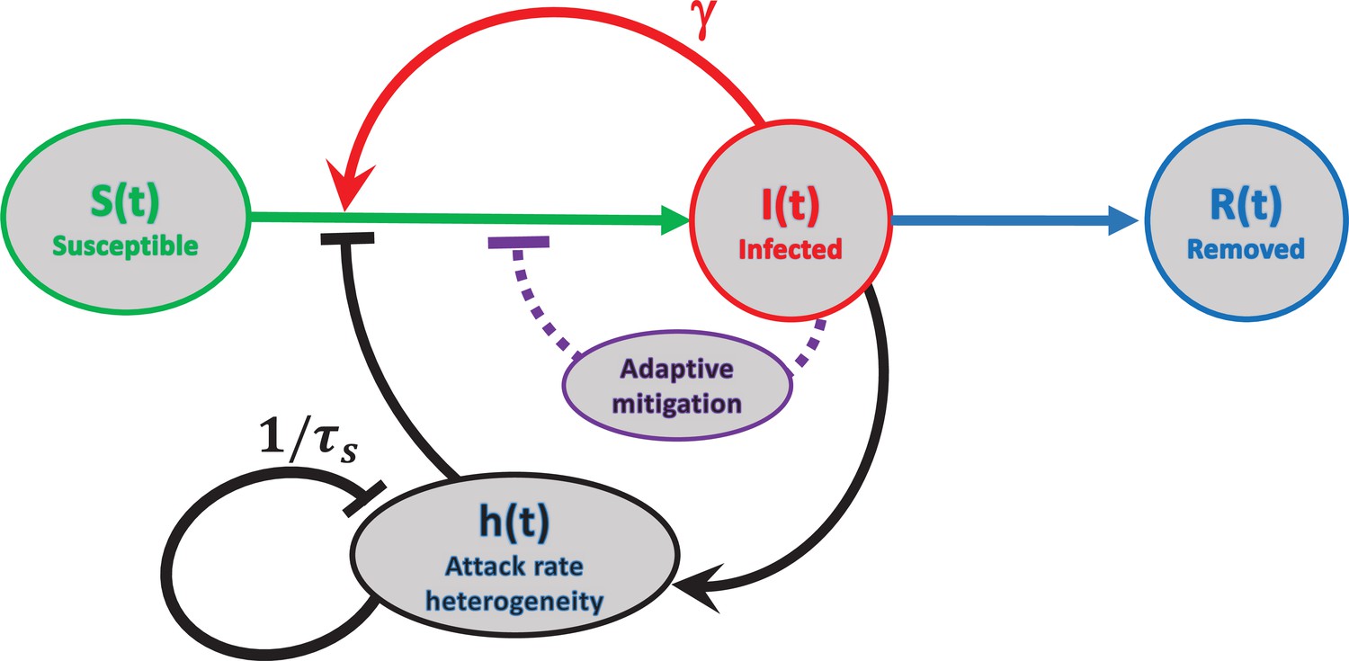
Schematic representation of feedback mechanisms that lead to self-limited epidemic dynamics.
In traditional epidemic models, the major factor is the depletion of the susceptible population (red). Government-imposed mitigation and/or behavioral knowledge-based adaptation to the perceived risk creates a second feedback loop (purple). Yet another feedback mechanism is due to dynamic heterogeneity of the attack rate parameterized by (black). Note that this mechanism is due to the selective removal of susceptibles with high current levels of social activity in the course of the epidemic. Therefore, it does not involve any knowledge-based adaptation, defined as modulation of average social activity in response to the perceived danger of the current level of infection. The attack rate heterogeneity is generated by the current infection and suppresses itself on the timescale of due to reversion of individual social activity towards the mean.
Figure 3
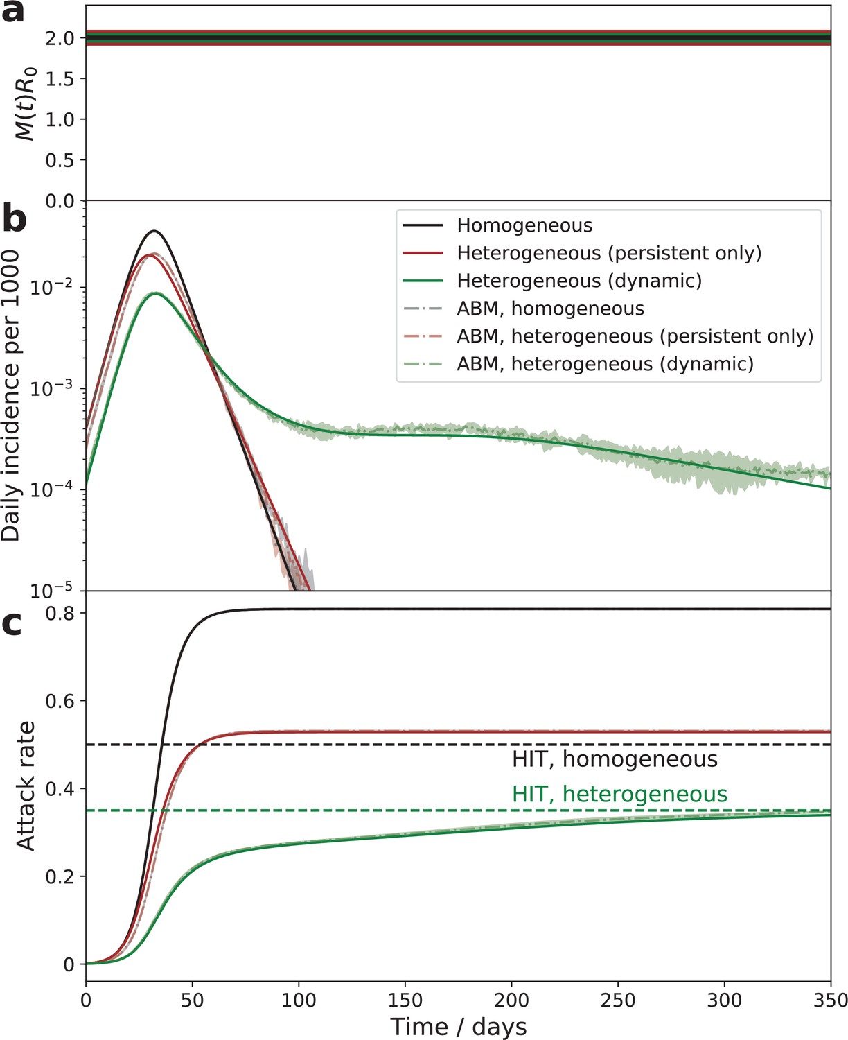
Comparison of the epidemic dynamics in three models.
The mitigation profile (a), the daily incidence (b), and the cumulative attack rate (c). The mitigation profile (a), the daily incidence (b), and the cumulative attack rate (c) in the SIR model with homogeneous population (black curves), the model with persistent population heterogeneity (brown curves), and our SSA model with dynamic heterogeneity (green curves). While parameters in all three models correspond to the same herd immunity threshold (HIT), the behavior is drastically different. In the persistent model, the epidemic quickly overshoots above HIT level. In the case of dynamic heterogeneity, the initial wave is followed by a plateau-like behavior with slow relaxation towards the HIT. Note an excellent agreement between the quasi-homogeneous theory described by Equation 4; Equation 5; Equation 6 (solid lines) and an agent-based model with 1 million agents whose stochastic activity is given by Equation 1 (shaded area = the range of three independent simulations).
Figure 4

The time course of an epidemic with enhanced mitigation during the first wave.
(a) shows the progression for two different strategies. In both cases, the enhanced mitigation leads to a 50% reduction of from 2 to 1. In the first scenario (early mitigation, blue curves), the reduction lasted for only 15 days starting from day 27. In the second scenario (delayed mitigation, red curves), the mitigation was applied on day 37 and lasted for 45 days. (b and c) show daily incidence and cumulative attack rates for both strategies. As predicted, differences in the initial mitigation had no significant effect on the epidemic in the long run: the two trajectories eventually converge towards the universal attractor. However, early mitigation allows the peak of the infection to be suppressed, potentially reducing stress on the healthcare system. A delayed mitigation gives rise to a sizable second wave.
Figure 5
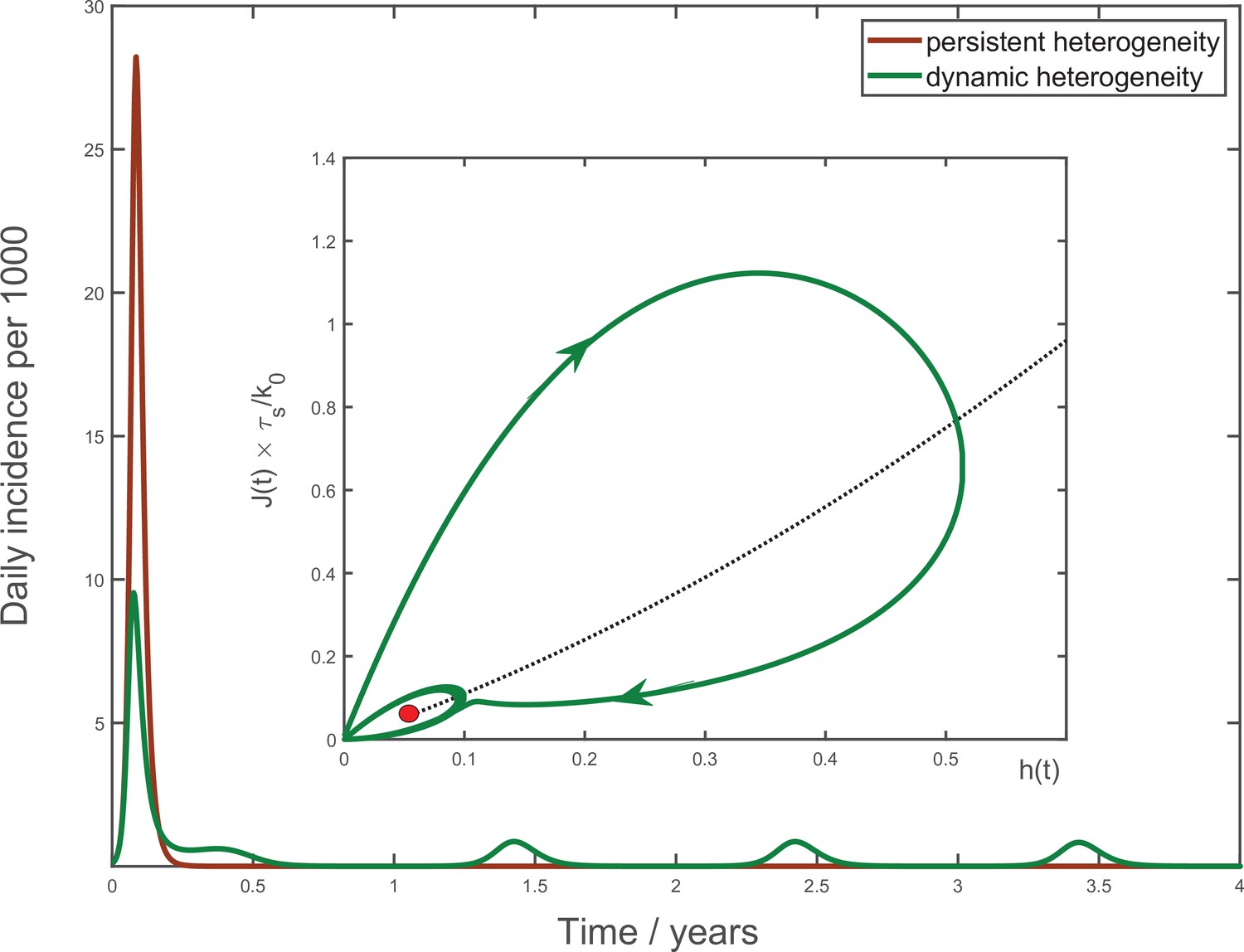
Multiyear dynamics of a hypothetical new pathogen.
Effects of waning biological immunity with characteristic time years, and seasonal forcing are included (see Appendix 4 for details). In the case of persistent heterogeneity without temporal variations of social activity (brown solid line), the infection becomes extinct following the initial wave of the epidemic. In contrast, dynamic heterogeneity leads to an endemic state with strong seasonal oscillations (green line). Inset: the epidemic dynamics in the phase space. The black dotted line corresponds to the universal attractor trajectory, manifested, for example, as a plateau in green line in Figure 3b. The attractor leads to the endemic state (red point).
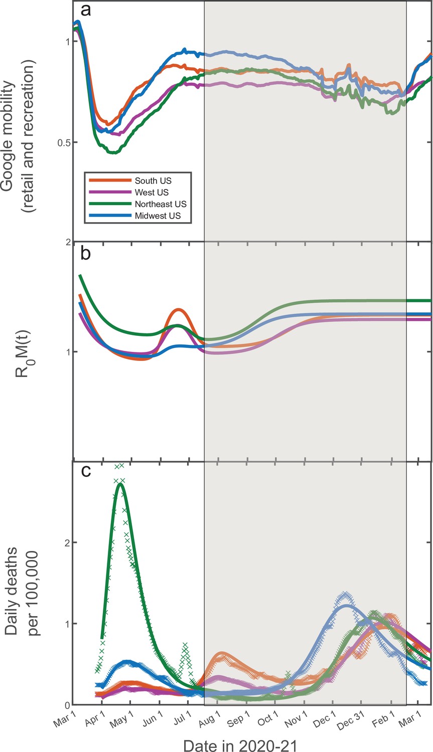
Figure 6

14-day moving average of Google Mobility Data (retail and recreation) in four US regions (China Data Lab Dataverse, 2021).
Note that the early epidemic was associated with wide and fast swings in mobility due to government-imposed mitigation and adaptive response of the population. In contrast, there is only modest and slow variation in the mobility from mid-July 2020 through mid-February 2021. This range of dates (shaded) is of interest since it allows one to directly test our theory without accounting for knowledge-based adaptation of the population.
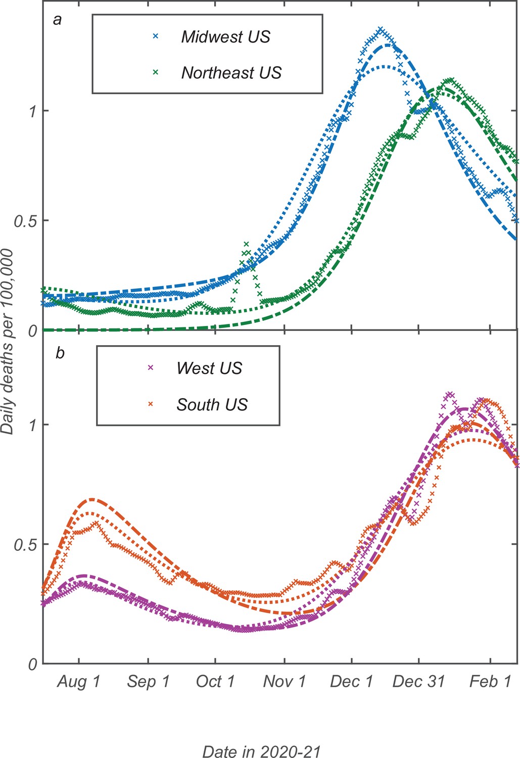
Figure 7

Fitting of the empirical data on COVID-19 epidemic in Northeast (green), Midwest (blue), West (purple), and South (orange) of the USA.
The time range corresponds to the shaded region in Figure 6. The best-fit profiles of within this range (panel a) are shaped only by seasonal changes. The time dependence of daily deaths per capita for the Northeast and Midwestern regions of the USA (panel b) as well as for Southern and Western regions (panel c). Data points represent reported daily deaths per 100,000 of population for each of the regions. Solid lines are the best theoretical fits with our model (see Appendix 5 for details of the fitting procedure).
Figure 8
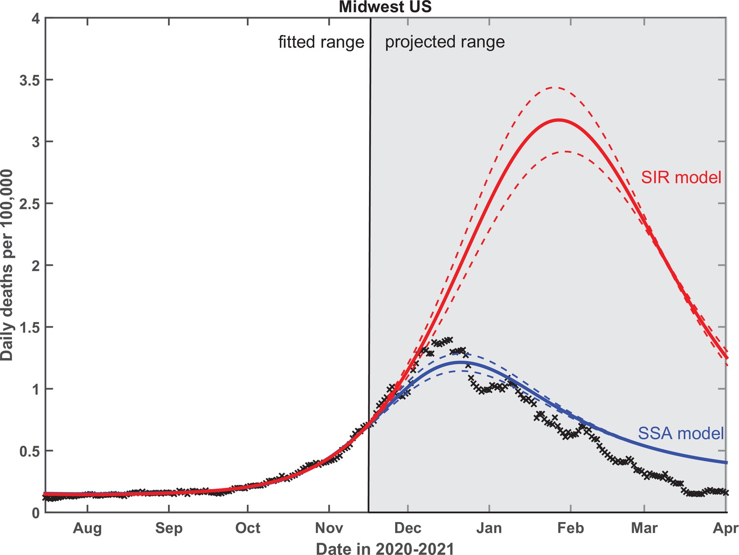
Test of the predictive power of the stochastic social activity (SSA) model developed in this work.
Daily deaths data in the Midwest region of the USA have been fitted up to November 17, 2020. The epidemic dynamic beyond that date has been projected by our model (blue). One observes a good agreement between this prediction and the reported data (crosses). In contrast, the classical susceptible-infected-removed (SIR) model (red) substantially overestimates the height of the peak and projects it at a much later date than had been observed. Solid lines represent the best-fit behavior for each of the models, while dotted lines indicate the corresponding 95% confidence intervals.
Appendix 1—figure 1
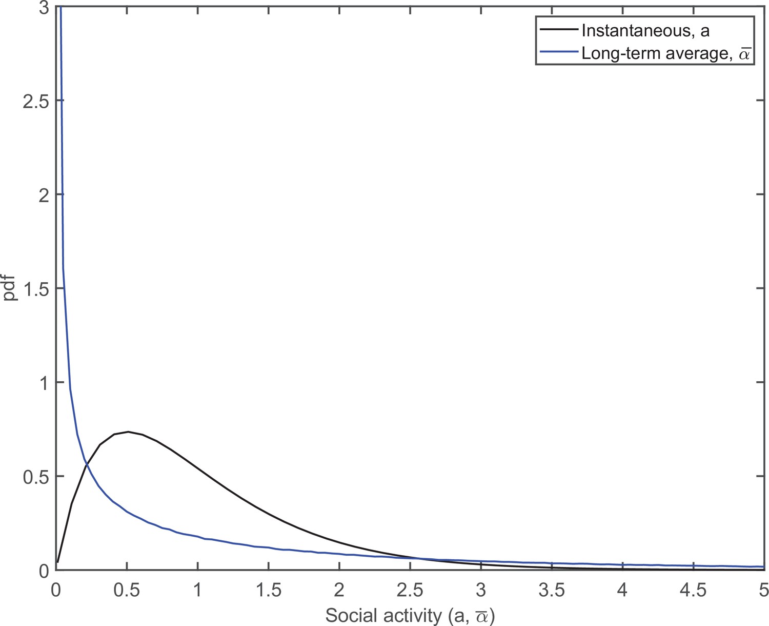
The pdfs of distributions of the instantaneous (black) and persistent (blue) social activities.
Appendix 5—figure 1
Fitting of the empirical data on COVID-19 epidemic in Northeast (green), Midwest (blue), West (purple), and South (orange) of the USA, alongside Google Mobility Data (a).
Panel (b) shows the mitigation profile used in the model. Panel (c) shows the 7-day moving average of daily COVID-19 deaths fitted with the model. The time range of interest, presented in Figure 3 of the main text, is shaded.
Appendix 5—figure 2
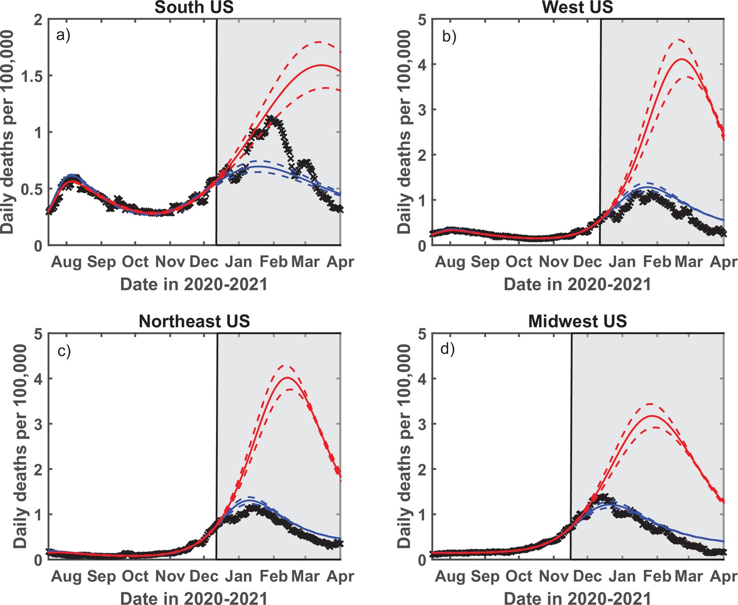
Test of the predictive power of the stochastic social activity (SSA) model developed in this work.
Daily deaths data in each of four regions of the USA have been fitted up to December 13, 2020 (November 17, 2020, for the Midwest region). The epidemic dynamic beyond that date has been projected by our model (blue). One observes a good agreement between this prediction and the reported data (crosses). In contrast, the classical susceptible-infected-removed (SIR) model (red) substantially overestimates the height of the peak and projects it at a much later date than had been observed. Solid lines represent the best-fit behavior for each of the models, while dotted lines indicate the corresponding 95% confidence intervals.
Appendix 5—figure 3
Analysis of the sensitivity of model predictions to parameter .
Dotted lines correspond to days, while dot-dashed lines to days. These values in turn correspond to the range of the best-fit values of in individual US regions (see Appendix 5—table 3).
Tables
Appendix 5—table 1
The set of fixed model parameters used throughout this study.
| k0 | IFR | |||||
|---|---|---|---|---|---|---|
| 0.4 | 2 | 5 days | 30 days | 1 year | 0.5% | 30 days |
Appendix 5—table 2
The best-fit values for seven parameters in each of the four US regions.
The fits were made using MATLAB R2021a nonlinear least-squares regression function (nlinfit)
| US region | j0 | R1 | tspring | R2 | tfall | ||
|---|---|---|---|---|---|---|---|
| Northeast | 0.0014 | 1.14 | 26 Mar 2020 | 1.25 | 1.10 | 1.46 | 06 Oct 2020 |
| Midwest | 0.00036 | 0.95 | 20 Mar 2020 | 1.07 | 1.04 | 1.34 | 29 Sep 2020 |
| South | 0.00014 | 0.91 | 24 Mar 2020 | 1.43 | 1.04 | 1.33 | 07 Nov 2020 |
| West | 0.00015 | 0.97 | 15 Mar 2020 | 1.27 | 0.98 | 1.29 | 25 Oct 2020 |
Appendix 5—table 3
The best-fit values of in each of the four US regions.
The fits were made using MATLAB R2021a nonlinear least-squares regression function (nlinfit).
| Northeast | Midwest | South | West | |
|---|---|---|---|---|
| Best fit (days) | 19 | 39 | 33 | 55 |
| Lower 95% CI (days) | 17 | 36 | 27 | 49 |
| Upper 95% CI (days) | 20 | 42 | 38 | 61 |
Additional files
Download links
A two-part list of links to download the article, or parts of the article, in various formats.
Downloads (link to download the article as PDF)
Open citations (links to open the citations from this article in various online reference manager services)
Cite this article (links to download the citations from this article in formats compatible with various reference manager tools)
Stochastic social behavior coupled to COVID-19 dynamics leads to waves, plateaus, and an endemic state
eLife 10:e68341.
https://doi.org/10.7554/eLife.68341


