Integrated single-cell analysis unveils diverging immune features of COVID-19, influenza, and other community-acquired pneumonia
- Center for Experimental and Molecular Medicine, Amsterdam UMC, Academic Medical Center, University of Amsterdam, Netherlands
- Amsterdam Institute for Infection and Immunity, Amsterdam UMC, Netherlands
- Laboratory for Experimental Oncology and Radiobiology, Center for Experimental and Molecular Medicine, Cancer Center Amsterdam and Amsterdam Gastroenterology and Metabolism, Amsterdam UMC, Academic Medical Center, University of Amsterdam, Netherlands
- Division of Infectious Diseases, Amsterdam UMC, Academic Medical Center, University of Amsterdam, Netherlands
- Department of Clinical Epidemiology, Biostatistics and Bioinformatics, Amsterdam UMC, Academic Medical Center, University of Amsterdam, Netherlands
Figures
Figure 1 with 2 supplements
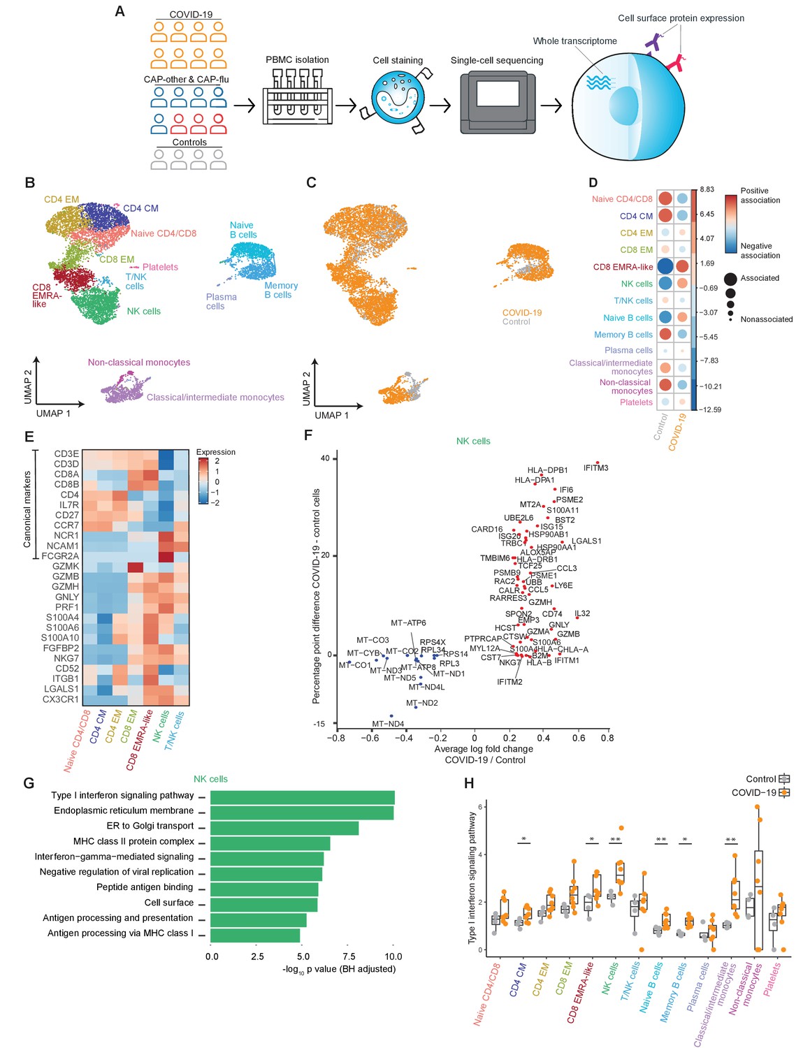
The immune response in COVID-19 is characterized by an expansion of CD8 EMRA-like T cells and type I interferon-stimulated NK cells, both demonstrating high cytotoxic potential.
(a) Experimental overview: PBMCs from a matched cohort of hospitalized patients with CAP caused by SARS-CoV-2 (COVID-19), CAP caused by Influenza A or other pathogens, and non-infectious controls, were isolated and stained with a panel of oligonucleotide-tagged antibodies. Single-cell mRNA and surface protein expression were subsequently measured on a 10x Genomics platform. (b, c) UMAPs depicting the clusters identified by the single-cell transcriptomic analysis of PBMCs from control subjects and patients with COVID-19, each dot representing a single cell. In the first UMAP (b), cells are colored by cell type cluster, whereas in the second UMAP (c), cells are colored by donor group. See also Figure 1—figure supplement 1. (d) Correlation plot depicting cluster enrichment in controls and COVID-19 patients. Dot size proportional to Pearson’s residual of the chi-squared test (i.e., reflecting the difference between the observed and expected proportion), while the color represents the degree of association from Pearson’s chi-squared residuals (red means a positive association, blue means a negative association). (e) Heatmap showing the expression of canonical genes and the top differentially expressed genes (DEGs) derived from comparing the CD8 EM and CD8 EMRA-like cell clusters (adjusted p<0.05). The heatmap also shows the expression of these genes in the other identified T and NK cell clusters. See also Figure 1—figure supplement 2. (f) Graph depicting the DEGs identified when comparing cells from COVID-19 patients and controls within the NK cell cluster. The X-axis depicts the average log fold change and the Y-axis depicts the percentage point difference between the proportion of cells expressing the gene in the COVID-19 group minus the proportion of cells expressing the gene in the control group. All depicted DEGs are statistically significant after adjusting for multiple testing (Benjamini-Hochberg). (g) Bar plot showing Gene Ontology pathway analysis of genes upregulated in NK cells from patients with COVID-19 (relative to controls) identified in the analysis in panel (g). The X-axis shows the Benjamini-Hochberg adjusted −log10 p-value from the enrichment score analysis. (h) Box and whisker plots showing the enrichment of the type I interferon pathway in all cell subsets, split between COVID-19 patients and controls. The Y-axis depicts the enrichment score. Statistical significance was determined using the two-sided Wilcoxon rank-sum test: *p<0.05, **p<0.01. CAP, community-acquired pneumonia; NK, natural killer; PBMC, peripheral blood mononuclear cell; UMAP, Uniform Manifold Approximation and Projection.
Figure 1—figure supplement 1
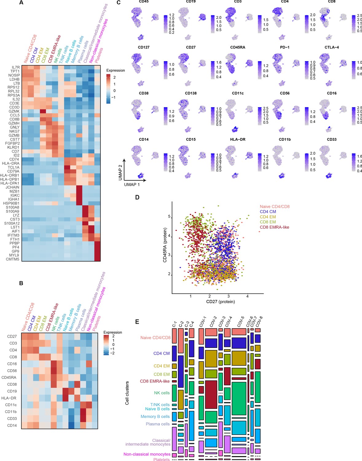
mRNA, surface protein expression, and cell cluster distribution of patients with COVID-19 and non-infectious controls.
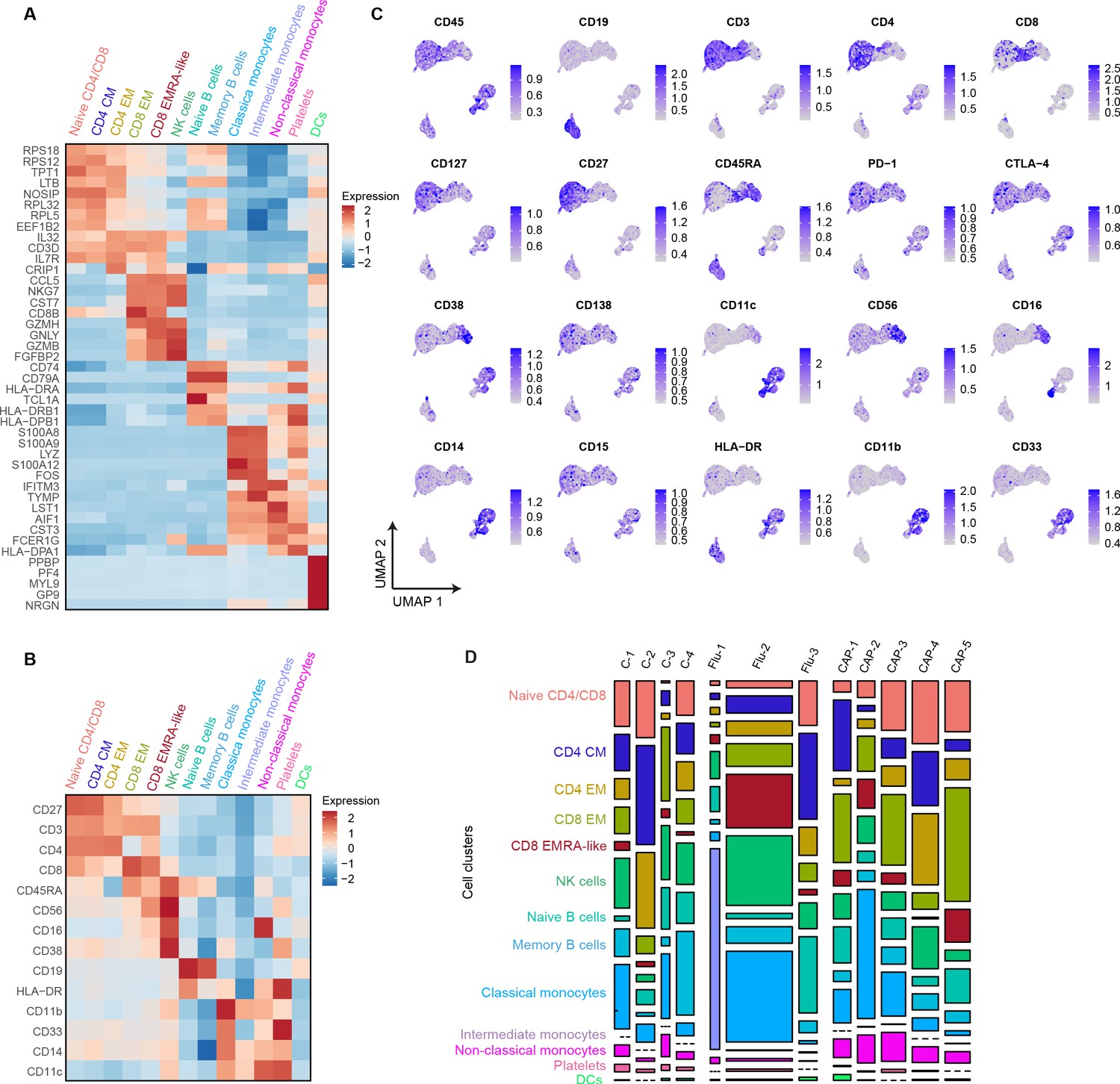
(a) Heatmap depicting mRNA expression of genes identified via differential expression analysis comparing the clusters identified by the single-cell transcriptomic analysis of PBMCs from control subjects and COVID-19 patients. (b) Heatmap depicting surface protein expression of genes identified via differential expression analysis of protein markers comparing all cell clusters identified in panel (a). (c) UMAPs depicting the clusters identified by the single-cell transcriptomic analysis of PBMCs from control subjects and COVID-19 patients, where each dot represents a single cell with the color corresponding to the normalized expression of each respective surface protein marker. (d) Scatterplot depicting CD27 and CD45RA surface protein expression for each T cell cluster. (e) Stacked bar plots depicting the distribution of cell clusters per individual donor. The height of each rectangle represents the proportion of that cluster within each individual, whereas the surface area of each rectangle represents the proportion of the total number of cells from all donors combined. PBMC, peripheral blood mononuclear cell.
Figure 1—figure supplement 2
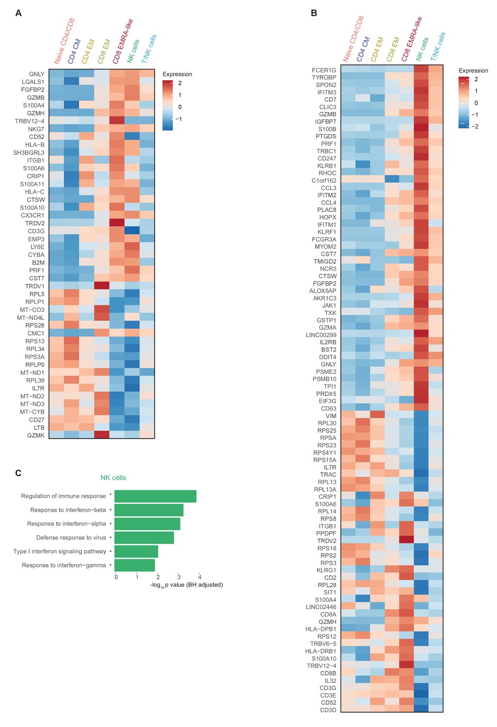
Comprehensive gene expression profile of T and NK cells in patients with COVID-19 compared with non-infectious controls.
(a) Heatmap depicting normalized mRNA expression of genes identified via differential expression analysis comparing CD8 EM and EMRA-like T cells (adjusted p<0.05) as depicted in Figure 1E. The heatmap also shows the expression of these genes in the other identified T and NK cell clusters. (b) Heatmap depicting normalized mRNA expression of genes identified via differential expression analysis comparing NK cells to EMRA-like T cells (adjusted p<0.05). The heatmap also shows the expression of these genes in the other identified T and NK cell clusters. (c) Barplot depicting Gene Ontology pathway analysis of the upregulated genes identified in the analysis of panel (b). The X-axis shows the Benjamini-Hochberg adjusted −log10 p-value from the enrichment score analysis.
Figure 2 with 2 supplements
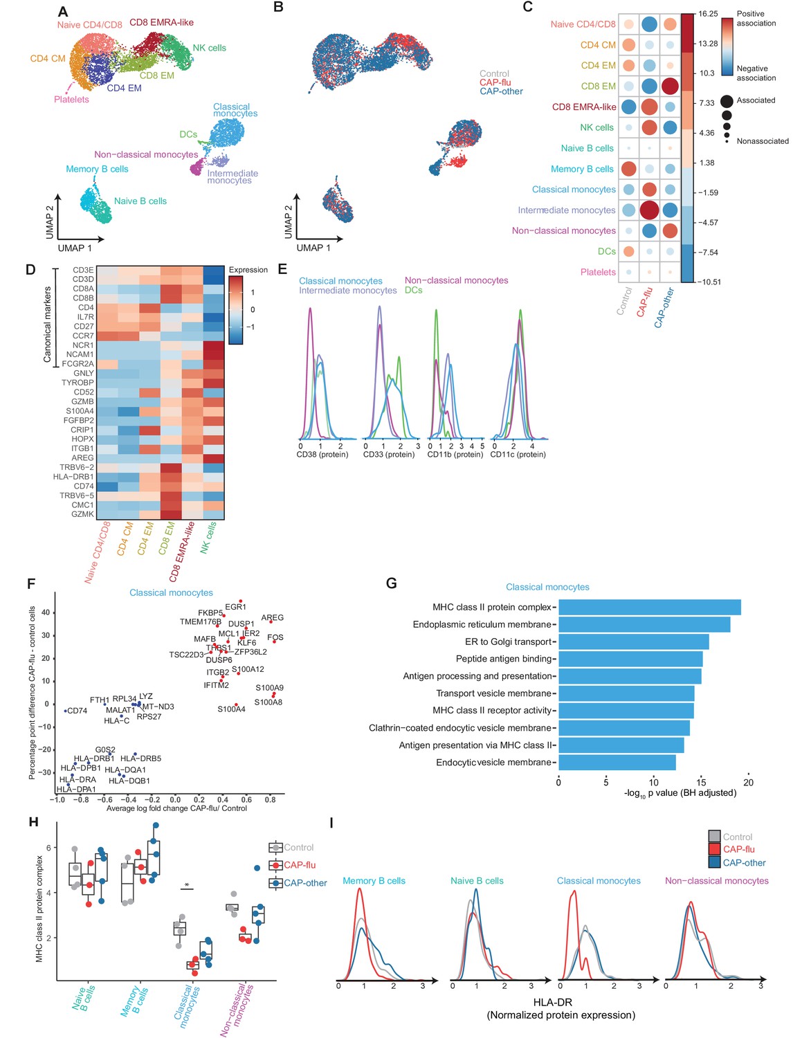
The peripheral immune features of T cells, NK cells, and monocytes vary between CAP-flu and CAP-other.
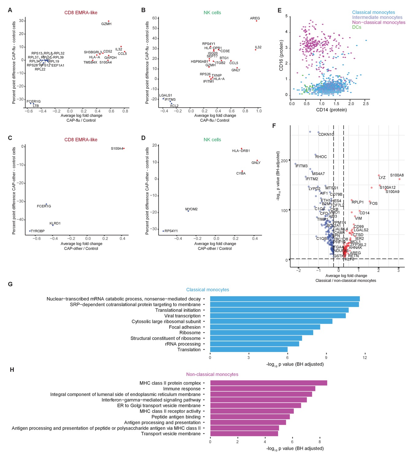
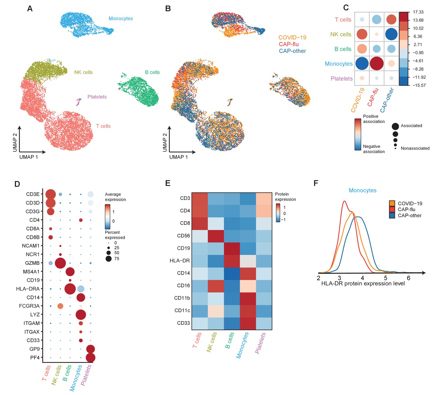
(a, b) UMAPs depicting the clusters identified by the single-cell transcriptomic analysis of PBMCs from controls, CAP-flu, and CAP-other patients, where each dot represents a single cell. In the first UMAP (a), cells are colored by cell type cluster, whereas in the second UMAP (b), cells are colored by donor group. See also Figure 2—figure supplement 1. (c) Correlation plot depicting cluster enrichment in controls, CAP-flu, and CAP-other patients. Dot size proportional to Pearson’s residual of the chi-squared test (i.e., reflecting the difference between the observed and expected proportion), while the color represents the degree of association from Pearson’s chi-squared residuals (red means a positive association, blue means a negative association). (c) Heatmap showing the expression of canonical genes and the top differentially expressed genes (DEGs) derived from comparing the CD8 EM and CD8 EMRA-like cell clusters (adjusted p<0.05). The heatmap also shows the expression of these genes in the other identified T and NK cell clusters. See also Figure 2—figure supplement 2. (e) Density plots showing the surface protein expression of CD38, CD33, CD11b, and CD11c per myeloid cell cluster. (f) Graph depicting the DEGs in the classical monocyte cluster when comparing CAP-flu patients versus controls. The X-axis depicts the average log fold change and the Y-axis depicts the percentage point difference between the proportion of cells expressing the gene in the CAP-flu group minus the proportion of cells expressing the gene in the control group. All depicted DEGs are statistically significant after adjusting for multiple testing (Benjamini-Hochberg [BH]). (g) Bar plot showing Gene Ontology pathway analysis of downregulated genes identified in the analysis in panel (g). The X-axis shows the BH adjusted −log10 p-value from the enrichment score analysis. (h) Boxplots depicting the downregulation of the MHC class II protein complex transcriptional pathway in naive B cells, memory B cells, classical monocytes, and non-classical monocytes clusters, split between controls, CAP-flu, and CAP-other patients. Statistical significance was determined using the two-sided Kruskal-Wallis test with post hoc pairwise Dunn’s test: *BH-adjusted p<0.05. (i) Density plot showing the normalized surface protein expression of HLA-DR on cells in naive B cells, memory B cells, classical monocytes, and non-classical monocytes clusters, split between controls, CAP-flu, and CAP-other patients. CAP, community-acquired pneumonia; NK, natural killer; PBMC, peripheral blood mononuclear cell; UMAP, Uniform Manifold Approximation and Projection.
Figure 2—figure supplement 1
mRNA, surface protein expression, and cell cluster distribution of controls, patients with CAP-flu, and patients with CAP-other.
(a) Heatmap depicting mRNA expression of genes identified via differential expression analysis comparing the clusters identified by the single-cell transcriptomic analysis of PBMCs from control subjects, CAP-flu, and CAP-other patients. (b) Heatmap depicting surface protein expression of genes identified via differential expression analysis of protein markers comparing all cell clusters identified in panel (a). (C) UMAPs depicting the clusters identified by the single-cell transcriptomic analysis of PBMCs from control subjects, CAP-flu, and CAP-other patients, where each dot represents a single cell with the color corresponding to the normalized expression of each respective surface protein marker. (d) Stacked bar plots depicting the distribution of cell clusters per individual donor. The height of each rectangle represents the proportion of that cluster within each individual, whereas the surface area of each rectangle represents the proportion of the total number of cells from all donors combined. CAP, community-acquired pneumonia; PBMC, peripheral blood mononuclear cell; UMAP, Uniform Manifold Approximation and Projection.
Figure 2—figure supplement 2
Differentially expressed genes of T cell, NK cell, and monocyte clusters between patients with CAP-flu, CAP-other, and control subjects.
(a, b) Dot plot depicting the differentially expressed genes (adjusted p<0.05) between PBMCs from CAP-flu patients and control subjects present in the CD8 EMRA-like cell cluster (a) or NK cell cluster (b). (c, d) Dot plot depicting the differentially expressed genes (adjusted p<0.05) between PBMCs from CAP-other patients versus control subjects present in the activated T cell cluster (c) or NK cell cluster (d). In panels (a–d), the X-axis depicts the average log fold change and Y-axis depicts the percentage point difference between the proportion of cells expressing the gene in the CAP-other or CAP-flu group minus the proportion of cells expressing the gene in the control group. (e) Scatterplot depicting CD14 and CD16 normalized surface protein expression for each monocyte cluster and dendritic cells. (f) Volcano plot depicting the average log fold change gene expression between classical and non-classical monocytes on the X-axis and the −log10 of the Benjamini-Hochberg adjusted p-value on the Y-axis. Only genes with an adjusted p-value<0.05 and log fold change>0.25 are depicted. Red dots represent genes upregulated in classical monocytes, blue dots represent genes upregulated in non-classical monocytes. (g, h) Bar plots depicting Gene Ontology pathways enriched from the differentially expressed classical monocyte genes (g) and non-classical monocyte genes (h) identified in the analysis in panel (f). The X-axis shows the Benjamini-Hochberg adjusted −log10 p-value from the enrichment score analysis. CAP, community-acquired pneumonia; NK, natural killer; PBMC, peripheral blood mononuclear cell.
Figure 3 with 2 supplements
Divergent composition of major immune cell types in patients with COVID-19, CAP-flu, and CAP-other.
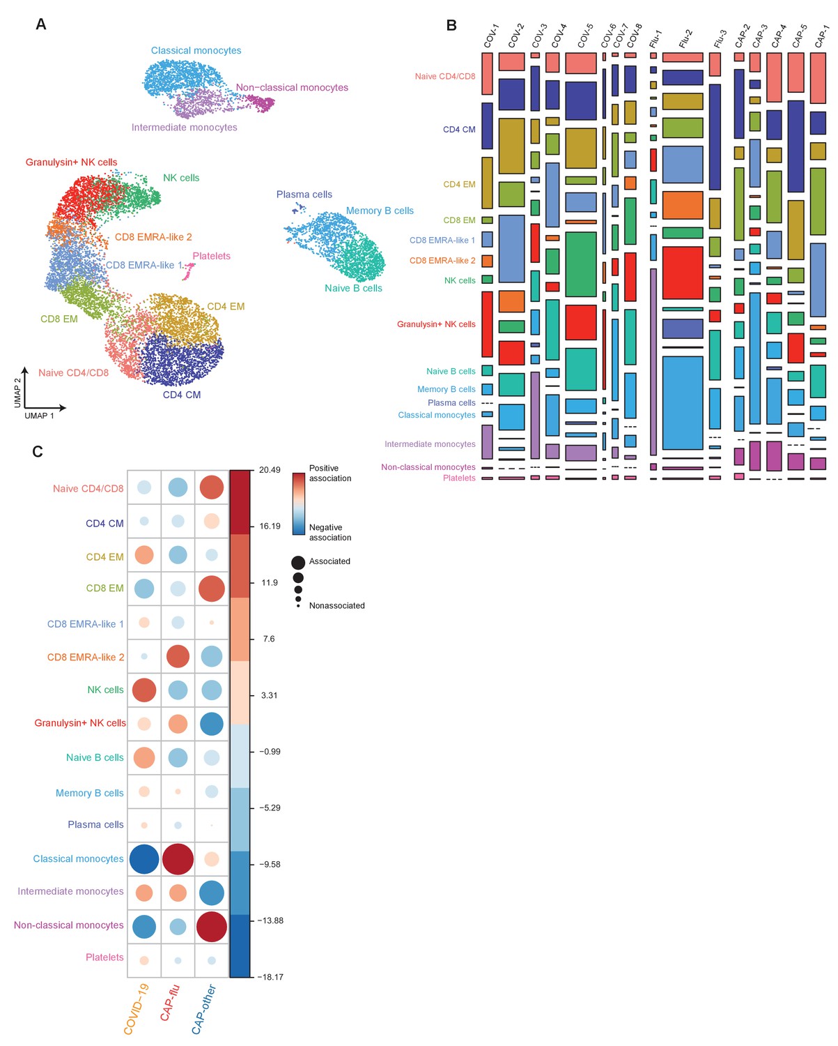
(a, b) UMAPs depicting the metaclusters identified by the single-cell transcriptomic analysis of PBMCs from controls, COVID-19, CAP-flu, and CAP-other patients, where each dot represents a single cell. In the first UMAP (a), cells are colored by cell type cluster, whereas in the second UMAP (b), cells are colored by donor group. (c) Correlation plot depicting metacluster enrichment in COVID-19, CAP-flu, or CAP-other patients. Dot size proportional to Pearson’s residual of the chi-squared test (i.e., reflecting the difference between the observed and expected proportion), while the color represents the degree of association from Pearson’s chi-squared residuals (red means a positive association, blue means a negative association). (d) Dot plot showing canonical genes per identified metacluster. Color indicates the normalized level of expression, while the dot size is proportional to the percentage of cells per cluster expressing the canonical gene. (e) Heatmap showing the expression of lineage-defining protein surface markers per metacluster. (f) Density plot showing the normalized surface protein expression of HLA-DR on the monocyte lineage, split between COVID-19, CAP-flu, and CAP-other patients. CAP, community-acquired pneumonia; UMAP, Uniform Manifold Approximation and Projection.
Figure 3—figure supplement 1
Cell clusters in individual samples from COVID-19, CAP-flu, and CAP-other.
(a) UMAP depicting all 15 clusters identified by the single-cell transcriptomic analysis of PBMCs from COVID-19, CAP-flu, and CAP-other patients, where each dot represents a single cell with each color corresponding to a specific cell type cluster. (b) Stacked bar plots depicting the distribution of cell clusters per individual donor. The height of each rectangle represents the proportion of that cluster within each individual, whereas the surface area of each rectangle represents the proportion of the total number of cells from all donors combined. (c) Correlation plot depicting cluster enrichment in COVID-19, CAP-flu, or CAP-other patients. Dot size proportional to Pearson’s residual of the chi-squared test (i.e., reflecting the difference between the observed and expected proportion), while the color represents the degree of association from Pearson’s chi-squared residuals (red means a positive association, blue means a negative association).
Figure 3—figure supplement 2
Differential mRNA and surface protein expression between COVID-19, CAP-flu, and CAP-other patients.
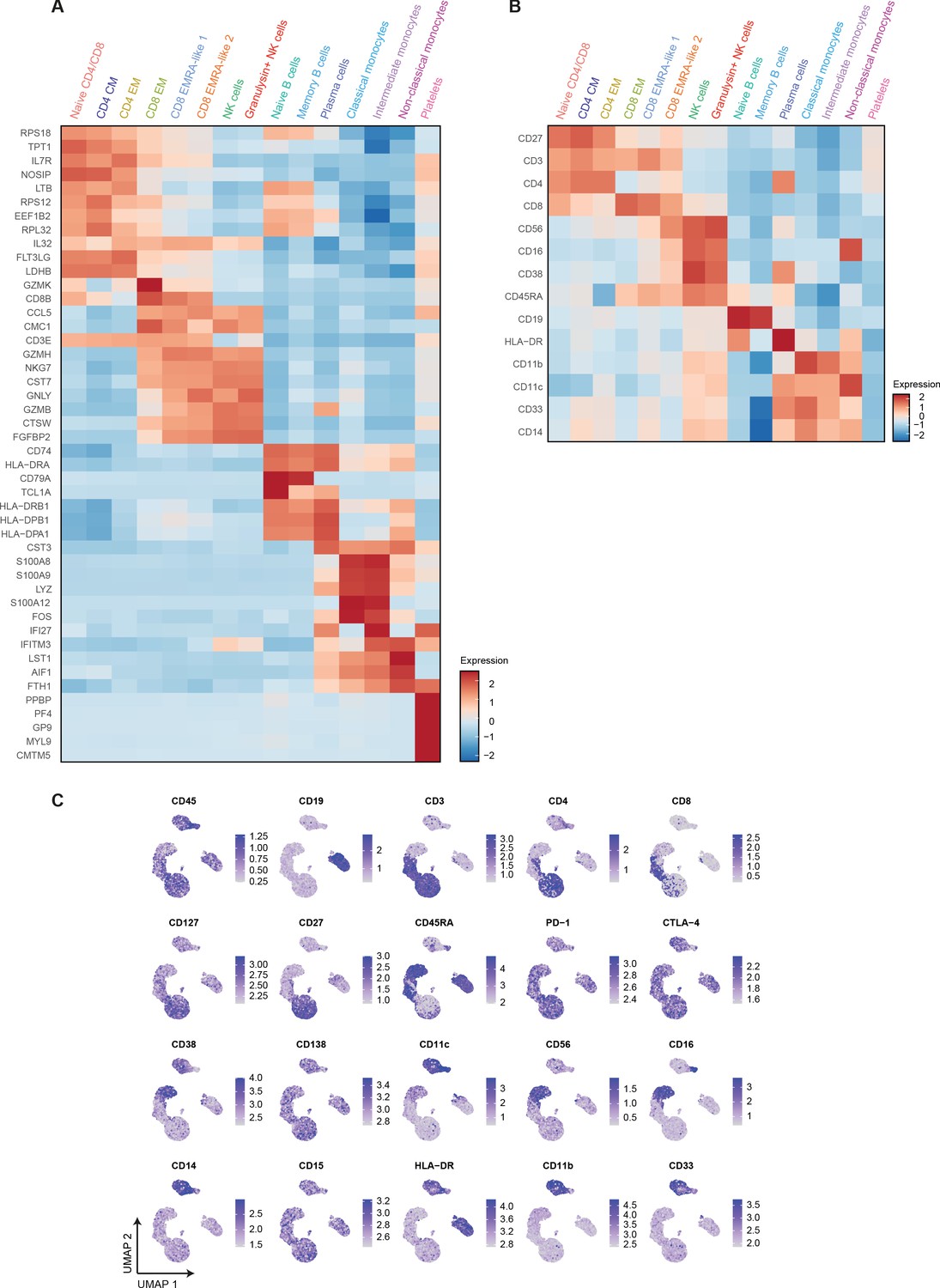
(a) Heatmap depicting normalized mRNA expression of genes identified via differential expression analysis comparing all 15 cell clusters identified by the single-cell transcriptomic analysis of PBMCs from COVID-19, CAP-flu, and CAP-other patients. (b) Heatmap depicting surface protein expression identified via differential expression analysis of protein markers comparing all 15 cell clusters identified by the single-cell transcriptomic analysis of PBMCs from COVID-19, CAP-flu, and CAP-other patients. (c) UMAPs depicting the clusters identified by the single-cell transcriptomic analysis of PBMCs from COVID-19, CAP-flu, and CAP-other patients, where each dot represents a single cell with the color corresponding to the normalized expression of each respective surface protein marker. CAP, community-acquired pneumonia; PBMC, peripheral blood mononuclear cell; UMAP, Uniform Manifold Approximation and Projection.
Figure 4
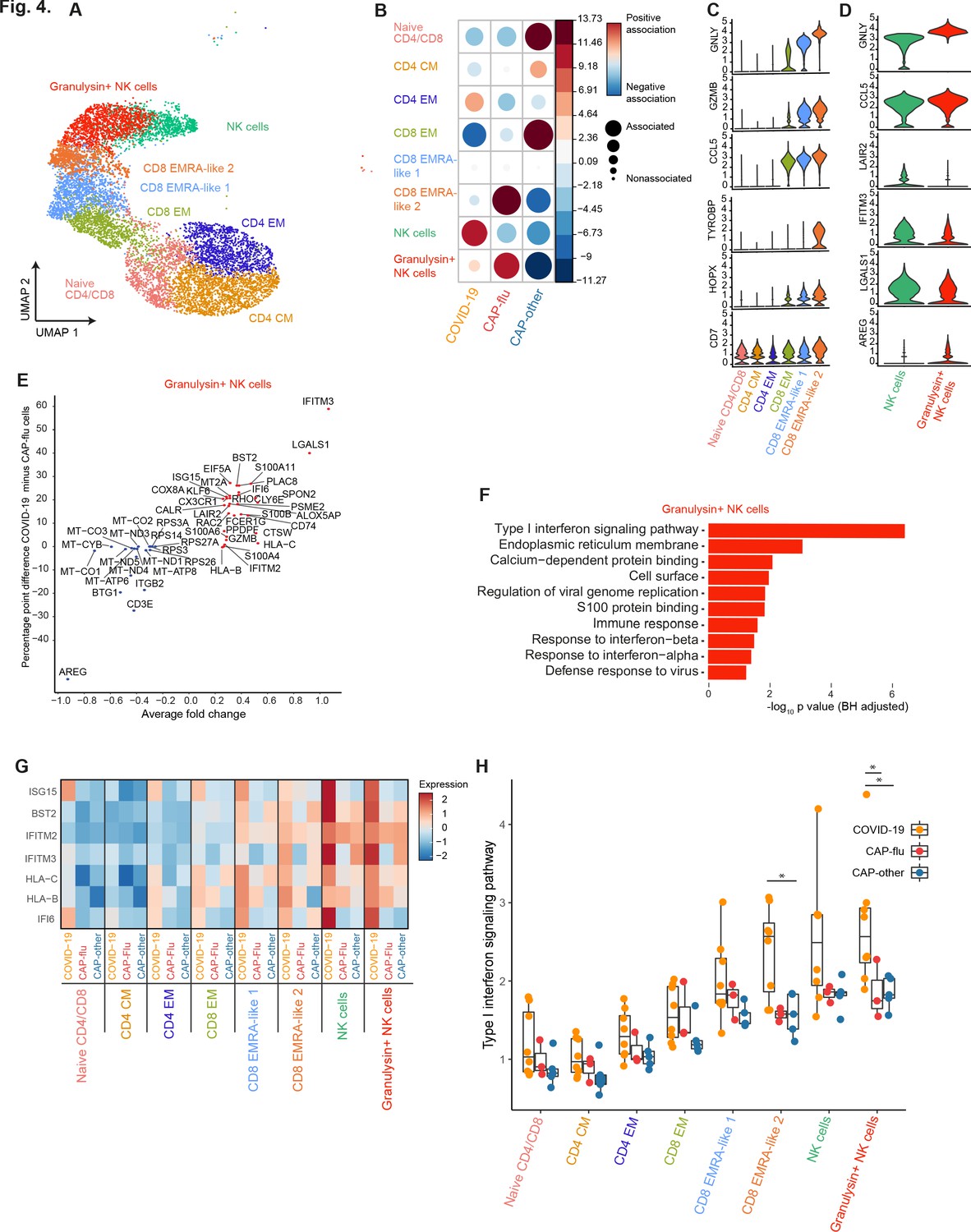
CAP-flu is characterized by expansion of T cells and NK cells expressing granulysin, while COVID-19 T and NK cells exhibit a clear type I interferon signature.
(a) UMAP depicting the T and NK cell clusters identified by the single-cell transcriptomic analysis of PBMCs from COVID-19, CAP-flu, and CAP-other patients, where each dot represents a single cell with each color corresponding to a specific cell type cluster. The full UMAP of all identified clusters, the distribution per individual patient, and the differentially expressed genes and proteins between all clusters are depicted in Figure 3—figure supplements 1 and 2. (b) Correlation plot depicting T and NK cell cluster enrichment in COVID-19, CAP-flu, and CAP-other. Dot size proportional to Pearson’s residual of the chi-squared test (i.e., reflecting the difference between the observed and expected proportion), while the color represents the degree of association from Pearson’s chi-squared residuals (red means a positive association, blue means a negative association). See also Figure 3—figure supplement 1c for the correlation plot of all identified clusters. (c) Violin plots showing the expression of the top DEGs derived from comparing the two identified EMRA-like T cell clusters (adjusted p<0.05). The expression of these genes in other T cell clusters is also depicted. See also Figure 3—figure supplement 2 for the top DEGs and surface protein expression differences between all identified cell clusters. (d) Violin plots showing the expression of the top DEGs between the two identified NK cell clusters (adjusted p<0.05). (e) Graph depicting the DEGs identified when comparing COVID-19 cells and CAP-flu cells in the granulysin+ NK cell cluster. The X-axis depicts the average log fold change and the Y-axis depicts the percentage point difference between the proportion of cells expressing the gene in the COVID-19 group minus the proportion of cells expressing the gene in the CAP-flu group. All depicted DEGs are statistically significant after adjusting for multiple testing (Benjamini-Hochberg [BH]). (f) Bar plot showing Gene Ontology pathway analysis of the genes upregulated in granulysin+ NK cells from patients with COVID-19. The X-axis shows the BH adjusted −log10 p-value from the enrichment score analysis. (g) Heatmap showing the expression of genes in the type I interferon signaling pathway in all T and NK cell subsets, split between COVID-19, CAP-flu, and CAP-other patients. (h) Box and whisker plots depicting the upregulation of the type I interferon signaling pathway in all T and NK cell subsets, split between COVID-19, CAP-flu, and CAP-other patients. Statistical significance was determined using the two-sided Kruskal-Wallis test with post hoc pairwise Dunn’s test: *BH-adjusted p<0.05. CAP, community-acquired pneumonia; DEG, differentially expressed gene; NK, natural killer; UMAP, Uniform Manifold Approximation and Projection.
Figure 5
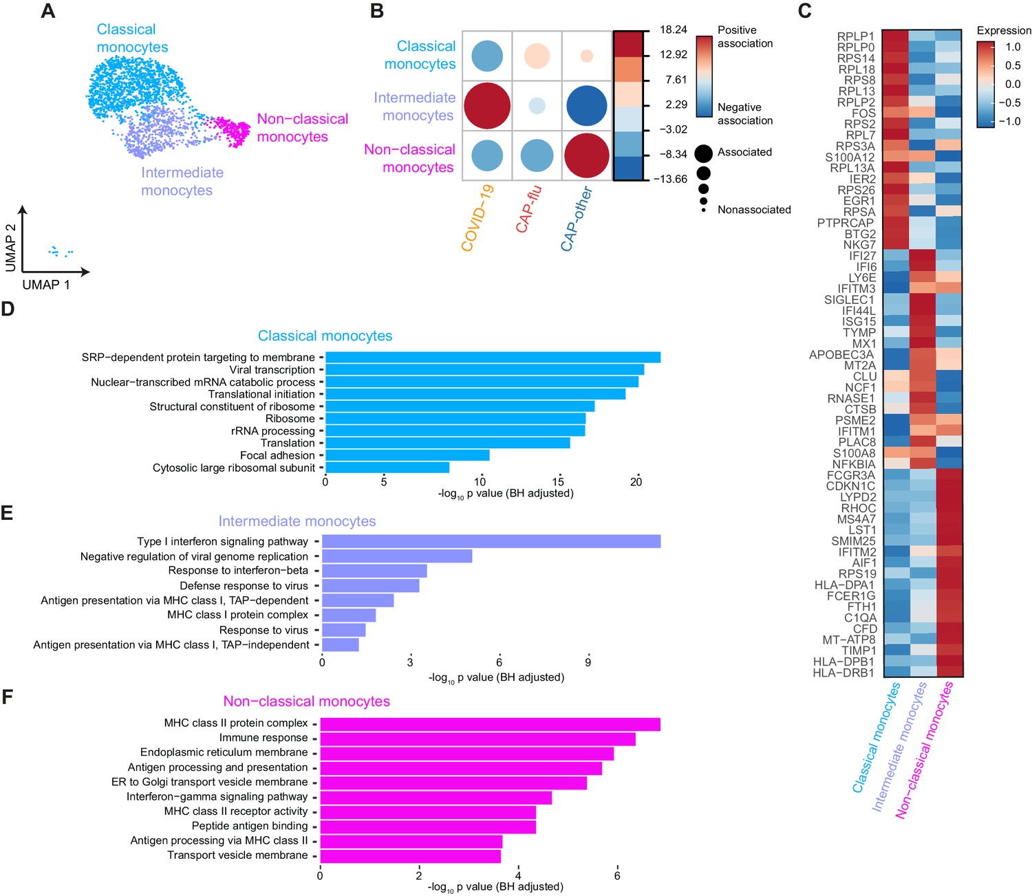
Distinctive subset compositions and transcriptional profiles in monocytes from patients with COVID-19, CAP-flu, and CAP-other.
(a) UMAP depicting the monocyte cell clusters identified by the single-cell transcriptomic analysis of PBMCs from COVID-19, CAP-flu, and CAP-other patients, where each dot represents a single cell with each color corresponding to a specific cell type cluster. The full UMAP of all identified clusters and the distribution per individual patient is depicted in Figure 3—figure supplement 1a,b. (b) Correlation plot depicting cluster enrichment in COVID-19, CAP, and CAP-flu patients. Dot size proportional to Pearson’s residual of the chi-squared test (i.e., reflecting the difference between the observed and expected proportion), while the color represents the degree of association from Pearson’s chi-squared residuals (red means a positive association, blue means a negative association). (c) Heatmap showing the expression of the top DEGs (adjusted p<0.05) between all three monocyte clusters. (d) Gene Ontology pathway analysis of the upregulated DEGs in classical monocytes, (e) intermediate monocytes, and (f) non-classical monocytes. The X-axis shows the Benjamini-Hochberg adjusted −log10 p-value from the enrichment score analysis. CAP, community-acquired pneumonia; DEG, differentially expressed gene; UMAP, Uniform Manifold Approximation and Projection.
Tables
Table 1
Clinical characteristics and disease course.
ACE = angiotensin-converting enzyme; AT-II = angiotensin II; CAP = community-acquired pneumonia; CURB-65 = confusion, blood urea nitrogen, respiratory rate, blood pressure, age 65 or older; COPD = chronic obstructive pulmonary disease; qSOFA = quick sequential organ failure assessment score.
| COVID-19 (n=8) | CAP* (n=8) | Controls (n=4) | |
|---|---|---|---|
| Demographics | |||
| Age (years) | 66.9 (9.4) | 70.9 (14.3) | 72.2 (1.7) |
| Sex (male) | 5 | 5 | 2 |
| Body mass index | 32.8 (6.5) | 23.8 (7.6) | 25.7 (4.9) |
| Race (white/black) | 4/4 | 7/1 | 4/0 |
| Chronic comorbidities | |||
| COPD | 0 | 3 | 0 |
| Asthma | 0 | 2 | 0 |
| Hypertension | 4 | 3 | 1 |
| History of myocardial infarction | 0 | 2 | 0 |
| History of stroke | 1 | 0 | 1 |
| Diabetes mellitus, type 2 | 3 | 1 | 1 |
| Chronic kidney disease | 0 | 1 | 1 |
| Chronic medications | |||
| Inhaled corticosteroids | 0 | 2 | 0 |
| Low-dose oral corticosteroids† | 0 | 1 | 0 |
| ACE-inhibitor/AT-II antagonist | 4 | 3 | 1 |
| Statins | 3 | 1 | 3 |
| Platelet aggregation inhibitors | 2 | 1 | 2 |
| Laboratory tests | |||
| Platelets (×109/L) | 284 (112) | 294 (85) | |
| Leukocytes (×109/L) | 5.7 [2.6, 7.2] | 13.9 [6.0, 19.5] | |
| Neutrophils (×109/L) | 4.4 [1.5, 5.8] | 11.7 [5.3, 17.9] | |
| Lymphocytes (×109/L) | 0.8 [0.4, 1.5] | 1.1 [0.5, 3.1] | |
| Severity scores‡ | |||
| Modified Early Warning Score | 3.5 [1.0, 5.0] | 3.5 [2.0, 6.0] | |
| Pneumonia Severity Index | 3.0 [2.0, 4.0] | 3.5 [1.0, 5.0] | |
| CURB-65 | 1.0 [0.0, 2.0] | 1.0 [0.0, 3.0] | |
| qSOFA | 1.0 [0.0, 1.0] | 1.0 [0.0, 1.0] | |
| Disease course | |||
| Symptoms to admission (days) | 10.0 [2.0, 14.0] | 3.5 [2.0, 9.0] | |
| Hospital length of stay (days) | 3.5 [1.0, 6.0] | 3.0 [2.0, 8.0] | |
| 28 day mortality | 1 | 0 |
-
Continuous data are presented as mean (standard deviation) or median (range). Categorical data are presented as counts.
* Caused by either Influenza A, bacterial, or unknown pathogens.
-
† Corticosteroids<7.5mg prednisolone/day.
‡ Measured upon presentation to the emergency department.
Table 2
Overview of proportionally increased cell clusters and transcriptional characteristics in the direct comparison between COVID-19, CAP-flu, and CAP-other.
| COVID-19 | CAP-flu | CAP-other | |
|---|---|---|---|
| NK cells | Granulysin+ NK cells ↑ higher type I interferon response than CAP-flu NK cells high IFITM3 expression | Granulysin+ NK cells ↑↑ higher AREG expression than COVID-19 | Low numbers of NK cells |
| T cells | CD8 EMRA-like 2 ↑ cytotoxicity, activation and inflammation | CD8 EMRA-like 2 ↑↑ cytotoxicity, activation and inflammation | Naive CD4/CD8 not activated CD8 EM less activated than EMRA-like 1 and 2 clusters |
| Monocytes | Intermediate monocytes high type I interferon response, increased antiviral potential | Classical monocytes ribosomal and viral transcription genes | Non-classical monocytes heterogenous gene expression |
Additional files
-
Supplementary file 1
Overview of clinical data per individual subject.
- https://cdn.elifesciences.org/articles/69661/elife-69661-supp1-v1.xlsx
-
Supplementary file 2
Overview of all antibodies that were used in this study.
- https://cdn.elifesciences.org/articles/69661/elife-69661-supp2-v1.xlsx
-
Supplementary file 3
Overview of technical information per sample.
- https://cdn.elifesciences.org/articles/69661/elife-69661-supp3-v1.csv
-
Transparent reporting form
- https://cdn.elifesciences.org/articles/69661/elife-69661-transrepform-v1.pdf
-
Reporting standard 1
Strobe checklist.
- https://cdn.elifesciences.org/articles/69661/elife-69661-repstand1-v1.pdf
Download links
A two-part list of links to download the article, or parts of the article, in various formats.
Downloads (link to download the article as PDF)
Open citations (links to open the citations from this article in various online reference manager services)
Cite this article (links to download the citations from this article in formats compatible with various reference manager tools)
Integrated single-cell analysis unveils diverging immune features of COVID-19, influenza, and other community-acquired pneumonia
eLife 10:e69661.
https://doi.org/10.7554/eLife.69661


