Multi-tract multi-symptom relationships in pediatric concussion
- Department of Neurology and Neurosurgery, Faculty of Medicine, McGill University, Canada
- Department of Physiology, Faculty of Medicine, University of Toronto, Canada
- Neuroscience and Mental Health, The Hospital for Sick Children, Canada
- McConnell Brain Imaging Centre (BIC), Montreal Neurological Institute (MNI), Faculty of Medicine, McGill University, Canada
- Department of Biomedical Engineering, Faculty of Medicine, School of Computer Science, McGill University, Canada
- Mila - Quebec Artificial Intelligence Institute, Canada
- Department of Computer Science, Université de Sherbrooke, Canada
- Imeka Solutions Inc, Canada
Figures
Figure 1
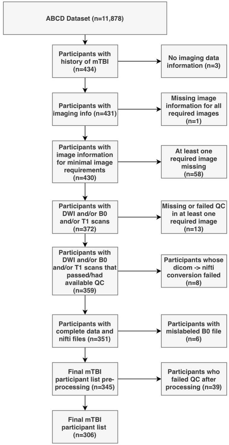
Flowchart describing the participant selection procedure.
Figure 2
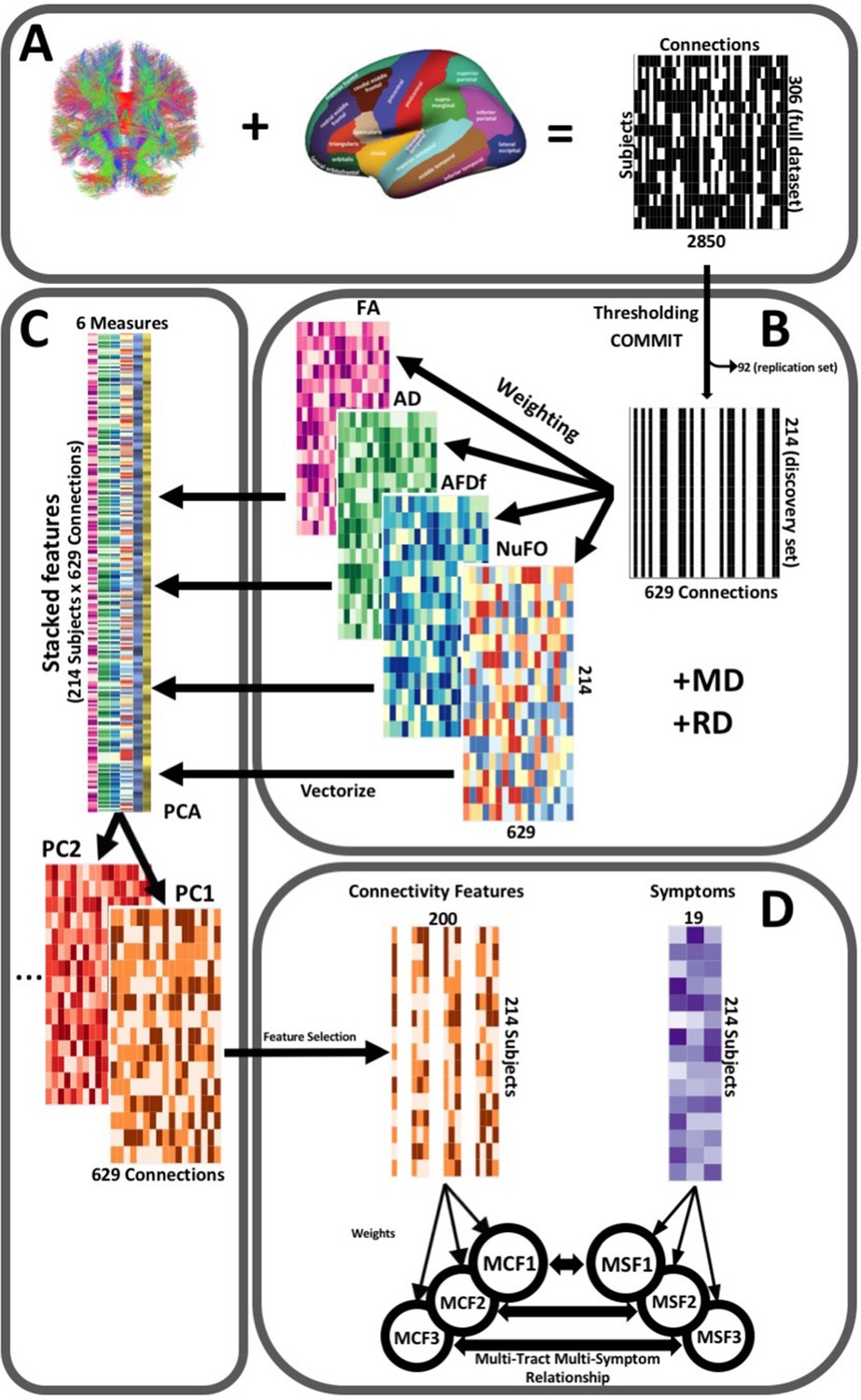
Illustration of the study’s post-processing pipeline.
(A). We applied the DKT parcellation onto each tractogram, thus building a binary connectivity matrix that displayed for all 306 subjects in the full dataset (rows), whether (black) or not (white) a streamline existed between each pair of labels (columns). (B). We thresholded connectomes using the full dataset, only keeping connections that existed across 90% of participants (a threshold of 100% is illustrated here for simplicity). On these connections, we also filtered streamlines by computing COMMIT weights. This technique assigns weights to streamlines depending on how well they explain the diffusion signal. We identified connections as spurious if all their streamlines had a COMMIT weight of 0. We only retained connections that were found to be non-spurious across 90% of participants in the full dataset. We then split the dataset into a discovery set (n = 214) and a replication set (n = 92). Using the discovery set, we then constructed connectomes of 6 scalar diffusion measures (Fractional Anisotropy (FA), Axial Diffusivity (AD), Mean Diffusivity (MD), Radial Diffusivity (RD), Apparent Fiber Density along fixels (AFDf), and Number of Fiber Orientations (NuFO)), by computing the average measure across each connection. (C). We stacked all columns from each connectivity matrix, creating vectors of every pair of subject and connection, and then joined together these vectors. We then performed principal component analysis (PCA) on these matrices. Principal component (PC) scores were calculated for each subject/connection combination, thus reconstructing connectomes weighted by PC scores. (D). From each these new connectomes, we selected 200 connections based on Pearson correlations with symptom-oriented measures. We then performed partial least squares correlation on each of these PC-weighted features and symptom measures, which allowed us to obtain pairs of multi-tract connectivity features (‘MCF’) and multi-symptom features (‘MSF’). Each multivariate feature is composed of linear combinations (weighted sums, illustrated by the black arrows called ‘weights’) of variables from its corresponding feature set.
Figure 3
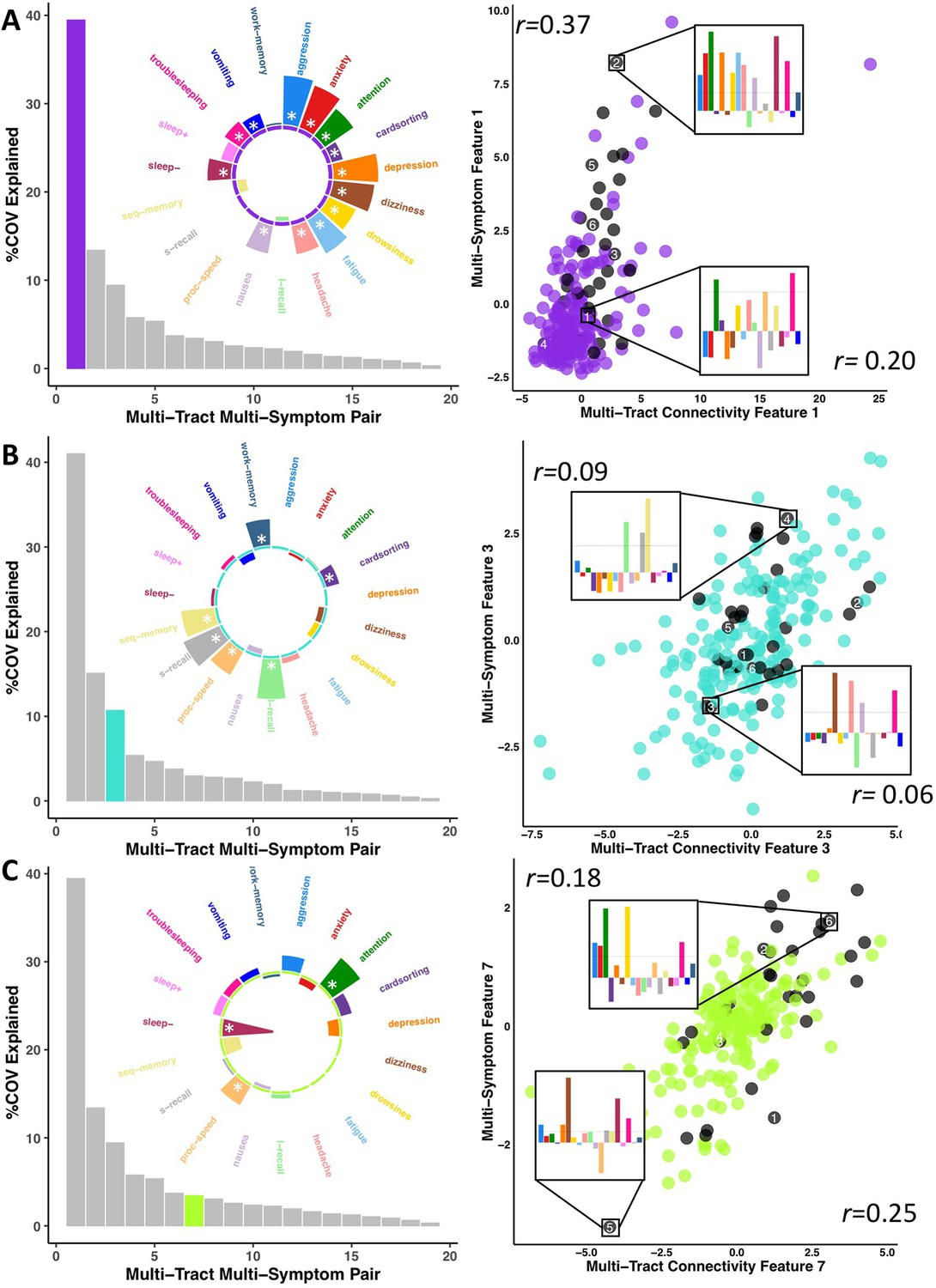
Illustration of multi-tract multi-symptom pairs 1 and 7 obtained from the microstructural complexity PLSc (A and C respectively), and pair 3 from the axonal density PLSc (B).
Left: Polar plots displaying the weights of all 19 symptom measures for each multi-symptom feature. Bars pointing away from the center illustrate positive weights, bars pointing towards the center represent negative weights. White stars illustrate symptoms that significantly contributed to the pair. Bar graphs underneath the polar plots illustrate the % covariance explained by each pair, with the currently-shown pair highlighted. Right: Scatter plots showing the expression of multi-tract features (x-axis) and multi-symptom features (y-axis). In each scatter plot, the same 6 participants are labeled (1 through 6). Small bar graphs illustrate the scaled symptom measures (i.e.: not the expression of multi-symptom features) for two participants, one expressing low levels of a pair, the other expressing high levels. For each illustrated participant, positive bars illustrate symptoms that are higher than the sample average, negative bars represent symptoms that are lower. The black dashed line illustrates 1 standard deviation above the group mean. Participants with ADHD diagnoses are illustrated in black. Correlation coefficients inset in each scatter plot represent Pearson correlations between expression of multi-tract features (near x-axis), or multi-symptom features (near y-axis) and a binary variable indexing whether or not a participant had a diagnosis of ADHD.
Figure 4
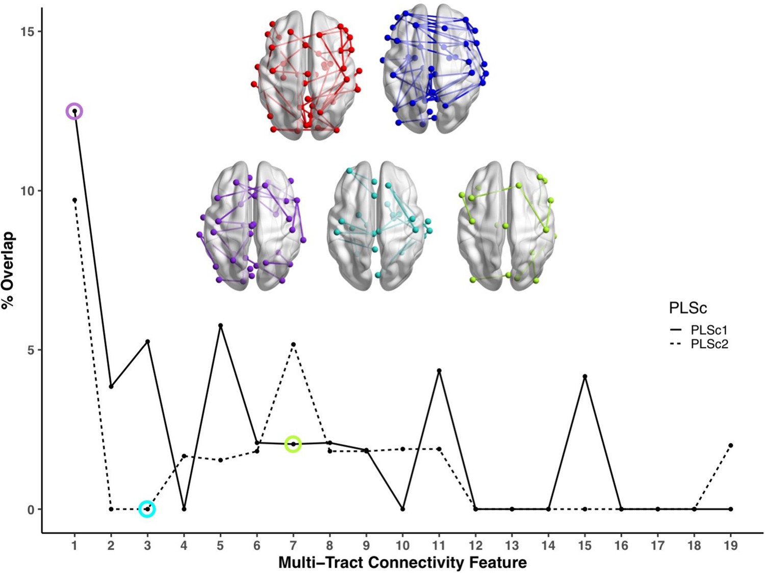
Line plot showing the percent overlap between univariate analyses and each multi-tract connectivity feature.
Highest overlap occurred for the first multi-tract connectivity feature from both PLSc analyses. Brain renderings shown above graph illustrate which connections were found to be significant for univariate comparisons of microstructural complexity (red), univariate comparisons of axonal density (blue), multi-tract connectivity feature 1 from the microstructural complexity PLSc (violet), multi-tract connectivity feature 3 from the axonal density PLSc (turquoise), and multi-tract connectivity feature 7 from the microstructural complexity PLSc (green). The percent overlap score for each of the three illustrated multi-tract connectivity features are identified in the line plot with a circle of the corresponding color. Univariate brain graphs show connections significant at p < 0.01 for illustrative purposes. Multivariate brain graphs show connections significant at p < 0.05. Brain renderings were visualized with the BrainNet Viewer (Xia et al., 2013).
Figure 5
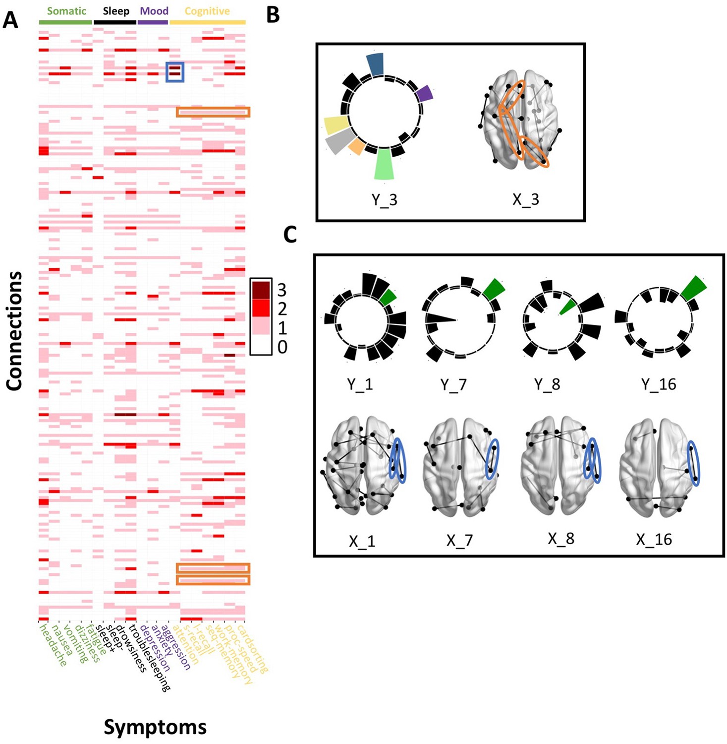
Patterns of connection/symptom correspondences across multi-tract multi-symptom pairs.
(A). Adjacency matrix, illustrating the number of multi-tract multi-symptom pairs from the microstructural complexity PLSc where a given significant connection corresponded to a given significant symptom (based on bootstrap analyses). Darker colors illustrate more consistent correspondences. Symptom categories are illustrated in colors (green: somatic, black: sleep problems, purple: mood problems, yellow: cognitive problems). Orange rectangles highlight three connections (right lateral occipital – right precuneus; left putamen – left rostral anterior cingulate; left putamen – left lingual) that were only present in one multi-tract multi-symptom pair (pair 3), which also represented broadly all cognitive problems. This pair is illustrated in B, where cognitive problems are illustrated in color and all other symptoms are illustrated in black, and the highlighted connections are circled in orange. Although only three connections are highlighted, several such ‘broad cognitive problems’ connections can be observed. The blue rectangle highlights two connections (right pars opercularis – right post-central; right pars opercularis – right supramarginal) that were present in 4 multi-tract multi-symptom pairs, all of which also implicated attention problems. These pairs are illustrated in panel C, where attention problems are illustrated in color, all other symptoms are illustrated in black, and the highlighted connections are circled in blue.
Appendix 1—figure 1
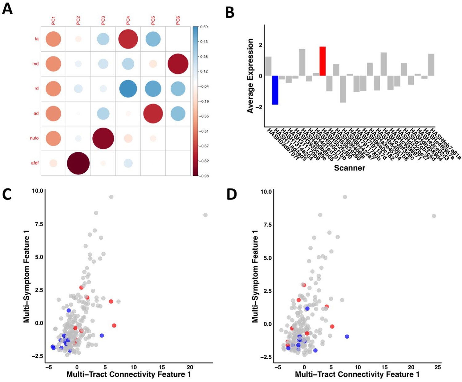
Illustration of the effects of regressing out scanner.
(A) Weights of each diffusion measure for each principal component obtained after running a principal component analysis on data that was processed without regressing out scanner. (B) Barplot illustrating the expression of multi-tract connectivity feature 1 averaged across all participants for each scanner. The blue bar illustrates the scanner with the lowest multi-tract connectivity feature 1 expression, and the red bar illustrates the scanner with the second highest multi-tract connectivity feature 1 expression (the scanner with the highest expression only had one participant, so it was not chosen for illustrative purposes). (C) Scatter plot illustrating expression of multi-tract multi-symptom pair 1 from the microstructural complexity PLSc using data that was processed without regressing out scanner. The blue dots illustrate participants from the scanner with the lowest average multi-tract connectivity feature 1 expression, the red dots illustrate participants from the scanner with the second-highest feature 1 expression. These two groups are distinguishable in their multi-tract connectivity feature 1 expression. (D) Scatter plot illustrating expression of multi-tract multi-symptom pair 1 from the microstructural complexity PLSc using data where scanner had been regressed out. The same participants identified in scatter plot C are illustrated in scatter plot D. After regressing out scanner, these two groups are not distinguishable in their multi-tract connectivity feature 1 expression.
Appendix 1—figure 2

Scatter plots illustrating the expression of three multi-tract multi-symptom pairs (first column: pair 1 from the microstructural complexity PLSc, second column: pair 3 from the axonal density PLSc, third column: pair 7 from the microstructural complexity PLSc), color-coded by total family income (first row), race/ethnicity (second row), and sex (third row).
The upper and bottom rows illustrate the correlation coefficient for the expression of multi-tract features (over x-axis) and multi-symptom features (over y-axis) and variables representing family income (top), and sex (bottom). For race/ethnicity, correlations were performed between multivariate feature expression and dummy-coded variables representing each specific race/ethnicity. The correlation coefficients are presented in the bar graphs following the same order as listed in the color code.
Appendix 1—figure 3
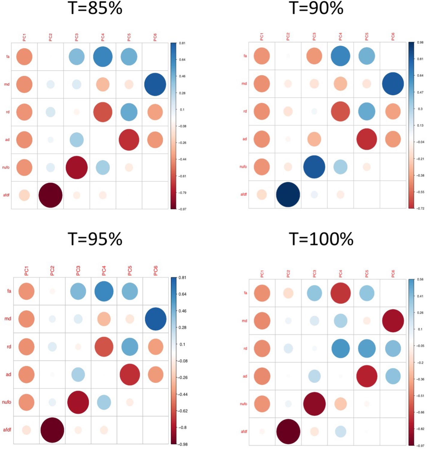
Plots illustrating the weights of each diffusion measure for each principal component for different connectome thresholds (85%, 90%, 95%, 100%).
The interpretation of the first two principal components are consistent across thresholds.
Appendix 1—figure 4

Polar plots illustrating the weights of each symptom measure for every retained multi-symptom feature obtained from the microstructural complexity PLSc performed using all 19 symptom measures as well as connectivity features selected from connectomes thresholded at T = 90%.
Black stars indicate symptoms that significantly contributed to the multi-tract multi-symptom pair based on bootstrapping analyses.
Appendix 1—figure 5
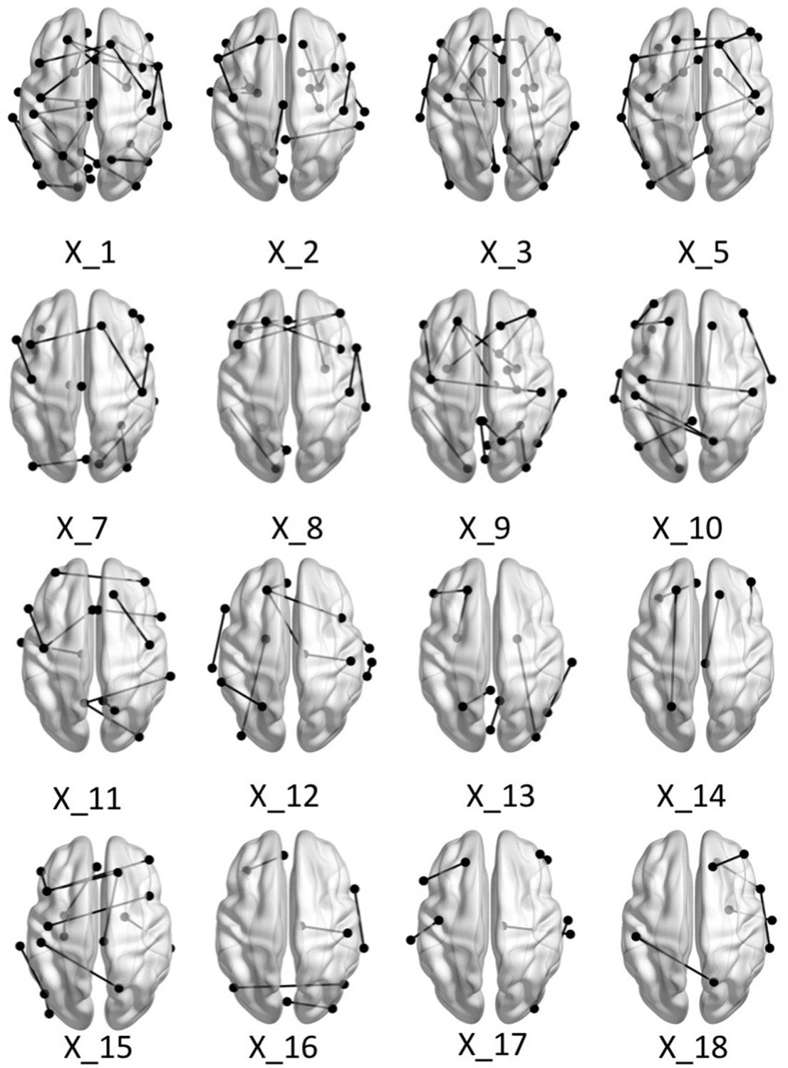
Brain graphs illustrating the connections that were found to be significant (P < 0.05 based on bootstrap analysis) for each of the retained multi-tract features from the microstructural complexity PLSc.
Brain renderings were visualized with the BrainNet Viewer (Xia et al., 2013).
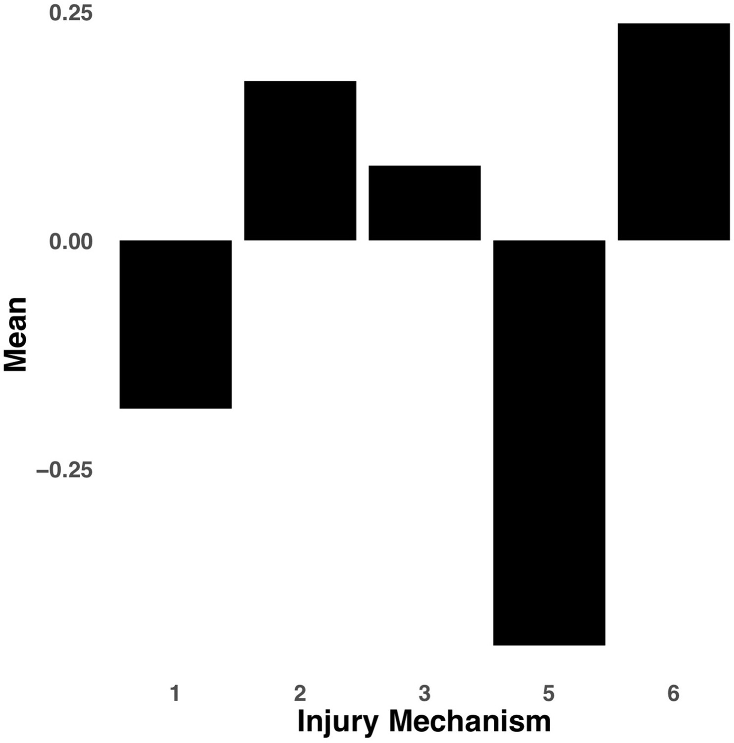
Appendix 1—figure 6
Bar graph illustrating the expression of multi-tract connectivity feature 2 from the microstructural complexity PLSc, averaged according to subgroups of participants defined by Injury Mechanism.
1: Fall/hit by object; 2: Fight/shaken; 3: Motor vehicle collision; 4: Multiple; 5: Unknown.
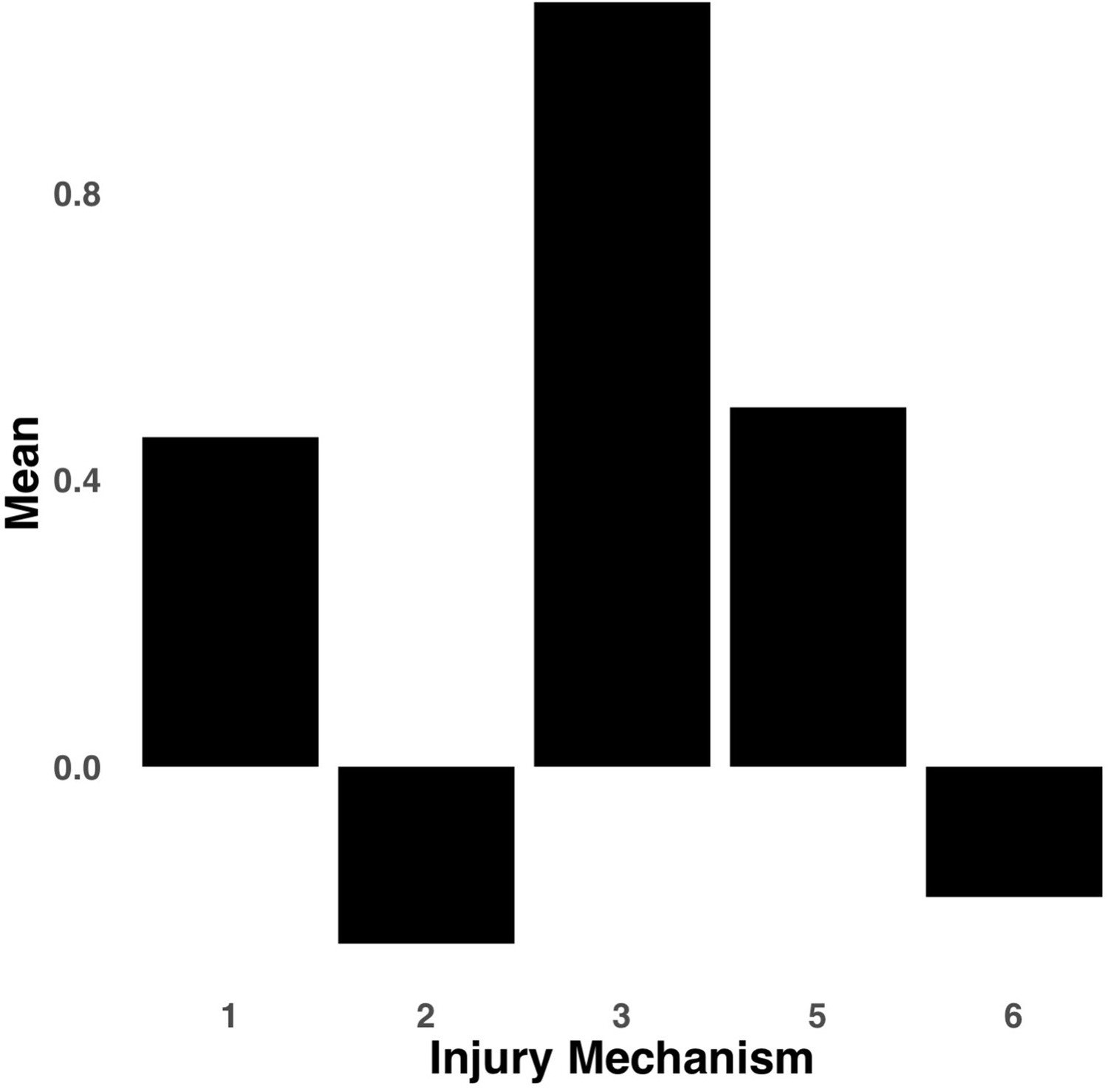
Appendix 1—figure 7
Bar graph illustrating the expression of multi-tract connectivity feature 15 from the microstructural complexity PLSc, averaged according to subgroups of participants defined by Injury Mechanism.
1: Fall/hit by object; 2: Fight/shaken; 3: Motor vehicle collision; 4: Multiple; 5: Unknown.
Appendix 1—figure 8
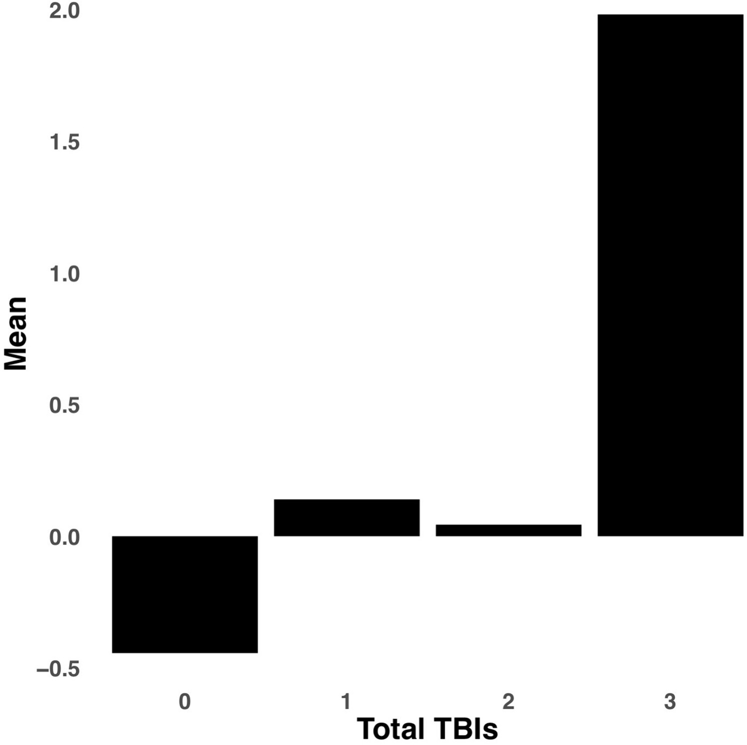
Bar graph illustrating the expression of multi-tract connectivity feature 15 from the microstructural complexity PLSc, averaged according to subgroups of participants defined by Total TBIs.
0: Unknown. Other numbers represent the total number of TBIs.
Appendix 1—figure 9

Plot illustrating the weights of each diffusion measure for each principal component for the PCA performed on the replication set data using a threshold of 90% during processing.
Appendix 1—figure 10
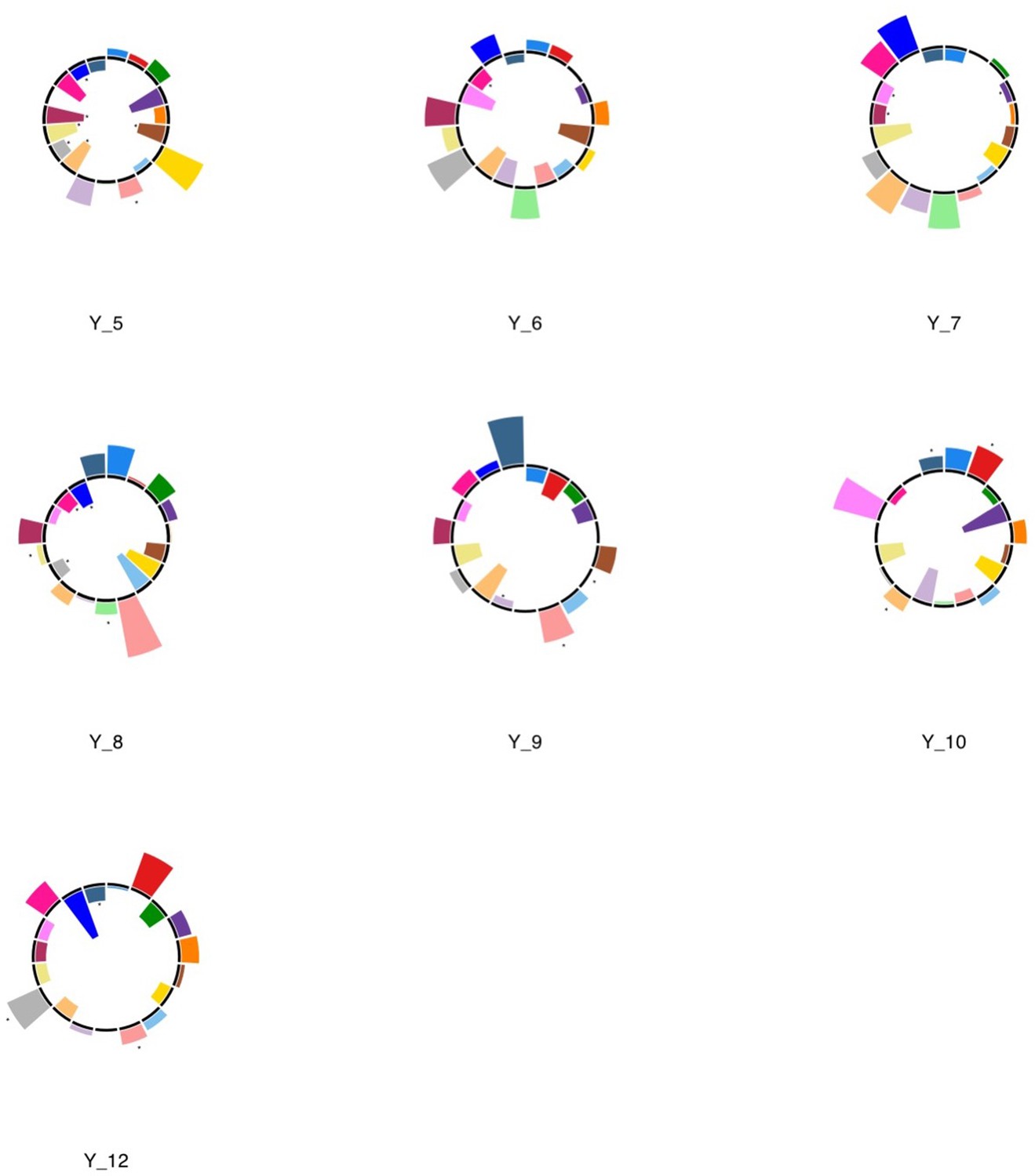
Polar plots illustrating the weights of each symptom measure for every retained multi-symptom feature obtained from the microstructural complexity PLSc performed using all 19 symptom measures as well as connectivity features selected from connectomes thresholded at T = 90% using the replication dataset.
Black stars indicate symptoms that significantly contributed to the multi-tract multi-symptom pair based on bootstrapping analyses.
Appendix 1—figure 11
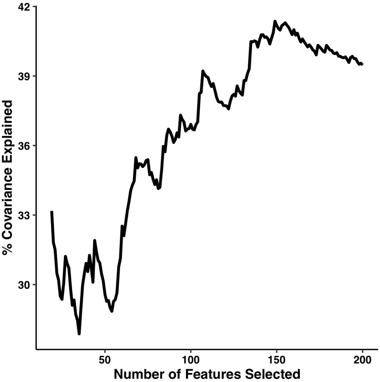
Percentage of covariance explained by the first multi-tract multi-symptom pair from the microstructural complexity PLSc as a function of the number of features selected from the univariate feature selection step.
The connectivity features are selected based on decreasing strength of correlation with any symptom. The number of features tested ranged from 19 to 214.
Appendix 1—figure 12

Polar plots illustrating the weights of each symptom measure for multi-symptom features that were obtained from the microstructural complexity PLSc performed using all 19 symptom measures as well as connectivity features selected from connectomes thresholded at T = 100%.
Only the multi-symptom features that were found to be significant in the corresponding PLSc performed at a threshold of T = 90% are shown here, for comparison with those multi-symptom features (Appendix 1—figure 4). All Black stars indicate symptoms that significantly contributed to the multi-tract multi-symptom pair based on bootstrapping analyses.
Appendix 1—figure 13
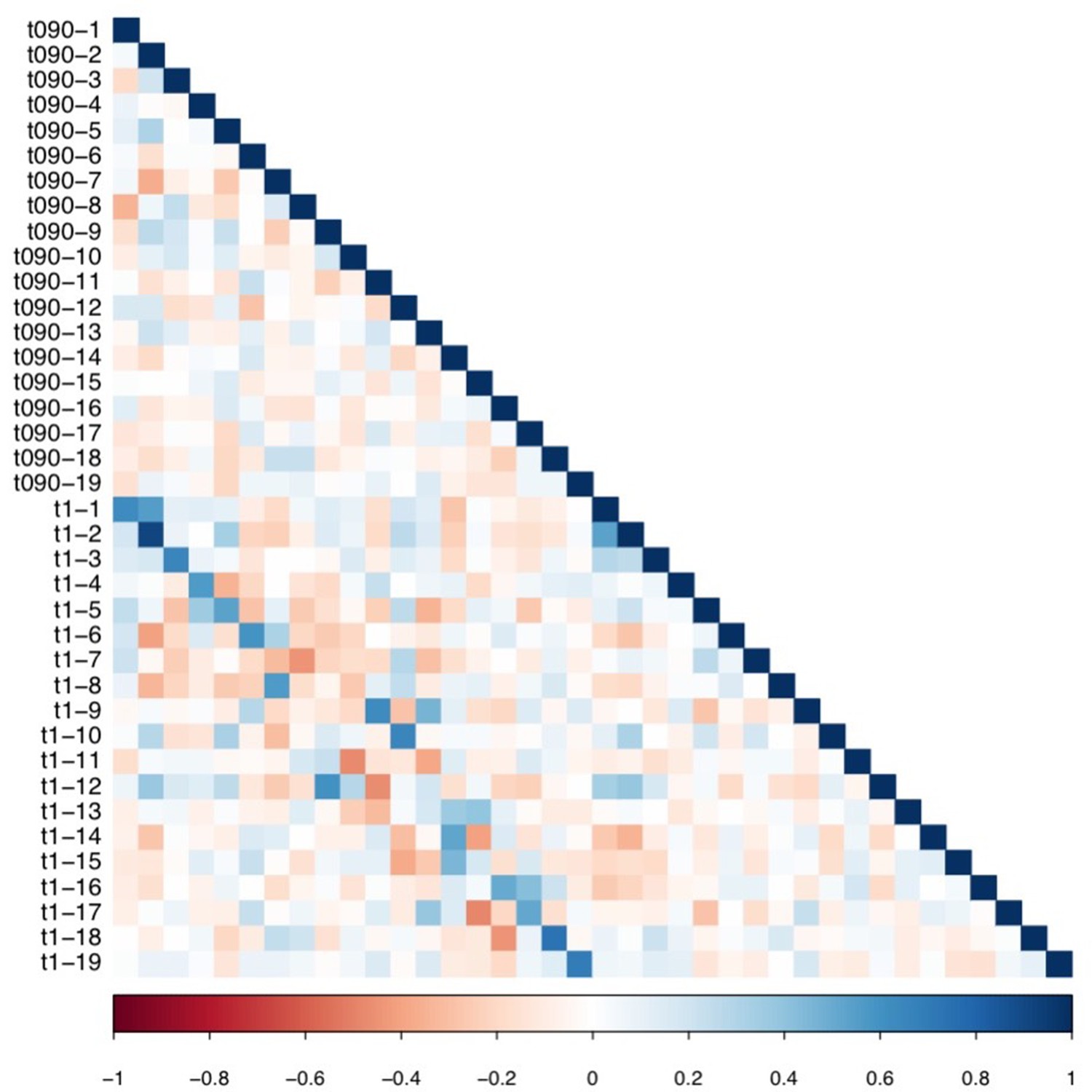
Matrix illustrating correlation coefficients between the expression of every pair of multi-tract connectivity features obtained from the microstructural complexity PLSc.
The matrix illustrates the correlation between features obtained from the PLSc analysis performed on connectivity features obtained from the 90% and 100% thresholds. Given that this matrix is symmetrical, only the bottom triangular is shown. The main diagonals illustrate autocorrelations. These matrices illustrate how corresponding multi-tract connectivity features between thresholds (e.g.: multi-tract connectivity feature 1 from T = 90%, multi-tract connectivity feature 1 from T = 100%) are highly correlated.
Author response image 1

Tables
Table 1
Table outlining all behavioral measures used in analyses, along with the corresponding symptom they reflect.
| Questionnaire - Description | Symptom Measured | Respondent |
|---|---|---|
| CBCL – Headaches | Headaches | Parent |
| CBCL – Nausea, feels sick | Nausea | Parent |
| CBCL – Vomiting, throwing up | Vomiting | Parent |
| CBCL – Feels dizzy or lightheaded | Dizziness | Parent |
| CBCL – Overtired without good reason | Fatigue | Parent |
| SDS – The child experiences daytime sleepiness | Drowsiness | Parent |
| SDS – The child has difficulty getting to sleep at night | Trouble falling asleep | Parent |
| CBCL – Sleep more than most kids during day and/or night | Sleep more than usual | Parent |
| CBCL – Sleeps less than most kids | Sleep less than usual | Parent |
| CBCL – Depression (DSM) T score | Sadness | Parent |
| CBCL – Anxiety Disorder (DSM) T score | Nervousness | Parent |
| CBCL – Attention Problems T score | Difficulty concentrating | Parent |
| CBCL Aggression T score | Irritability | Child |
| NIH Toolbox Picture Sequence Memory Test – Fully-Corrected T-score | Sequence Memory (difficulty remembering) | Child |
| NIH Toolbox List Sorting Working Memory Test – Fully-Corrected T-score | Working memory (difficulty remembering) | Child |
| RAVLT Short Delay Trial VI – Total Correct | Short recall (difficulty remembering) | Child |
| RAVLT Long Delay Trial VII – Total Correct | Long recall (difficulty remembering) | Child |
| NIH Toolbox Dimensional Change Card Sort Test – Fully-Corrected T-score | Executive function (feeling “foggy”) | Child |
| NIH Toolbox Pattern Comparison Processing Speed Test – Fully-Corrected T-score | Processing speed (feeling “slow”) | Child |
-
CBCL: Child Behavior Checklist. SDS: Sleep Disturbance Scale. NIH: National Institutes of Health. DSM: Diagnostics and Statistics Manual. RAVLT: Ray Auditory Verbal Learning Test.
Table 2
Table of sample characteristics.
| Demographic and injury data | Discovery set(n = 214) | Replication set(n = 92) |
|---|---|---|
| Interview Age | ||
| Mean (SD) | 9.57 (0.496) | 9.54 (0.501) |
| Median [Min, Max] | 10.0 [9.00, 10.00] | 10.0 [9.00, 10.0] |
| Sex | ||
| F | 88 (41.1%) | 39 (42.4%) |
| M | 126 (58.9%) | 53 (57.6%) |
| Pubertal Stage | ||
| Early | 41 (19.2%) | 18 (19.6%) |
| Mid | 58 (27.1%) | 19 (20.7%) |
| Prepubertal | 115 (53.7%) | 52 (56.5%) |
| Late | 0 (0%) | 3 (3.3%) |
| Race/Ethnicity | ||
| Asian | 2 (0.9%) | 2 (2.2%) |
| Hispanic | 27 (12.6%) | 18 (19.6%) |
| Multiple | 18 (8.4%) | 8 (8.7%) |
| Non-Hispanic Black | 14 (6.5%) | 11 (12.0%) |
| Non-Hispanic White | 151 (70.6%) | 52 (56.5%) |
| Other | 2 (0.9%) | 1 (1.1%) |
| Combined Family Income | ||
| < 5 K | 5 (2.3%) | 5 (5.4%) |
| $5,000 - $11,999 | 5 (2.3%) | 1 (1.1%) |
| $12,000-$15,999 | 3 (1.4%) | 2 (2.2%) |
| $16,000-$24,999 | 5 (2.3%) | 3 (3.3%) |
| $25,000-$34,999 | 12 (5.6%) | 4 (4.3%) |
| $35,000-$49,999 | 12 (5.6%) | 5 (5.4%) |
| $50,000-$74,999 | 34 (15.9%) | 16 (17.4%) |
| $75,000-$99,999 | 31 (14.5%) | 13 (14.1%) |
| $100,000-$199,000 | 76 (35.5%) | 27 (29.3%) |
| >$200,000 | 31 (14.5%) | 16 (17.4%) |
| Handedness | ||
| LH | 10 (4.7%) | 10 (10.9%) |
| RH | 175 (81.8%) | 69 (75%) |
| Mixed | 29 (13.6%) | 13 (14.1%) |
| Injury Mechanism | ||
| Fall/hit by object | 135 (63.1%) | 48 (52.2%) |
| Fight/shaken | 2 (0.9%) | 3 (3.3%) |
| Motor vehicle collision | 14 (6.5%) | 3 (3.3%) |
| Multiple | 10 (4.7%) | 5 (5.4%) |
| Unknown | 53 (24.8%) | 33 (35.9%) |
| Time Since Injury (years) | ||
| Mean (SD) | 3.22 (2.79) | 3.23 (2.60) |
| Median [Min, Max] | 2.00 [0.00, 11.0] | 2.50 [0.00, 9.00] |
| Total TBIs | ||
| Unknown | 53 (24.8%) | 33 (35.9%) |
| 1 | 151 (70.6%) | 54 (58.7%) |
| 2 | 9 (4.2%) | 5 (5.4%) |
| 3 | 1 (0.5%) | 0 (0%) |
-
Note: Participants with “Unknown” Injury Mechanism and Total TBIs reported sustaining a TBI but no mechanism of injury was endorsed.
Additional files
-
Transparent reporting form
- https://cdn.elifesciences.org/articles/70450/elife-70450-transrepform1-v2.docx
-
Supplementary file 1
Table listing labels retained in the DKT + aseg parcellation.
- https://cdn.elifesciences.org/articles/70450/elife-70450-supp1-v2.docx
-
Supplementary file 2
Table listing p-values of correlations between the expression of all retained multi-tract connectivity features and the time since the latest injury.
Note: PLSc1: Microstructural complexity PLSc; PLSc2: Axonal Density PLSc.
- https://cdn.elifesciences.org/articles/70450/elife-70450-supp2-v2.docx
-
Supplementary file 3
Table listing p values of correlations between the expression of all retained multi-tract connectivity features and a variable indexing ADHD.
Note: PLSc1: Microstructural complexity PLSc; PLSc2: Axonal Density PLSc.
- https://cdn.elifesciences.org/articles/70450/elife-70450-supp3-v2.docx
Download links
A two-part list of links to download the article, or parts of the article, in various formats.
Downloads (link to download the article as PDF)
Open citations (links to open the citations from this article in various online reference manager services)
Cite this article (links to download the citations from this article in formats compatible with various reference manager tools)
Multi-tract multi-symptom relationships in pediatric concussion
eLife 11:e70450.
https://doi.org/10.7554/eLife.70450


