Dynamics and variability in the pleiotropic effects of adaptation in laboratory budding yeast populations
- Department of Molecular and Cellular Biology, Harvard University, United States
- Department of Organismic and Evolutionary Biology, Harvard University, United States
- Department of Cell and Systems Biology, University of Toronto, Canada
- Department of Physics, Harvard University, Cambridge, United States
- NSF-Simons Center for Mathematical and Statistical Analysis of Biology, Harvard University, United States
- Quantitative Biology Initiative, Harvard University, Cambridge, United States
Figures
Figure 1 with 2 supplements
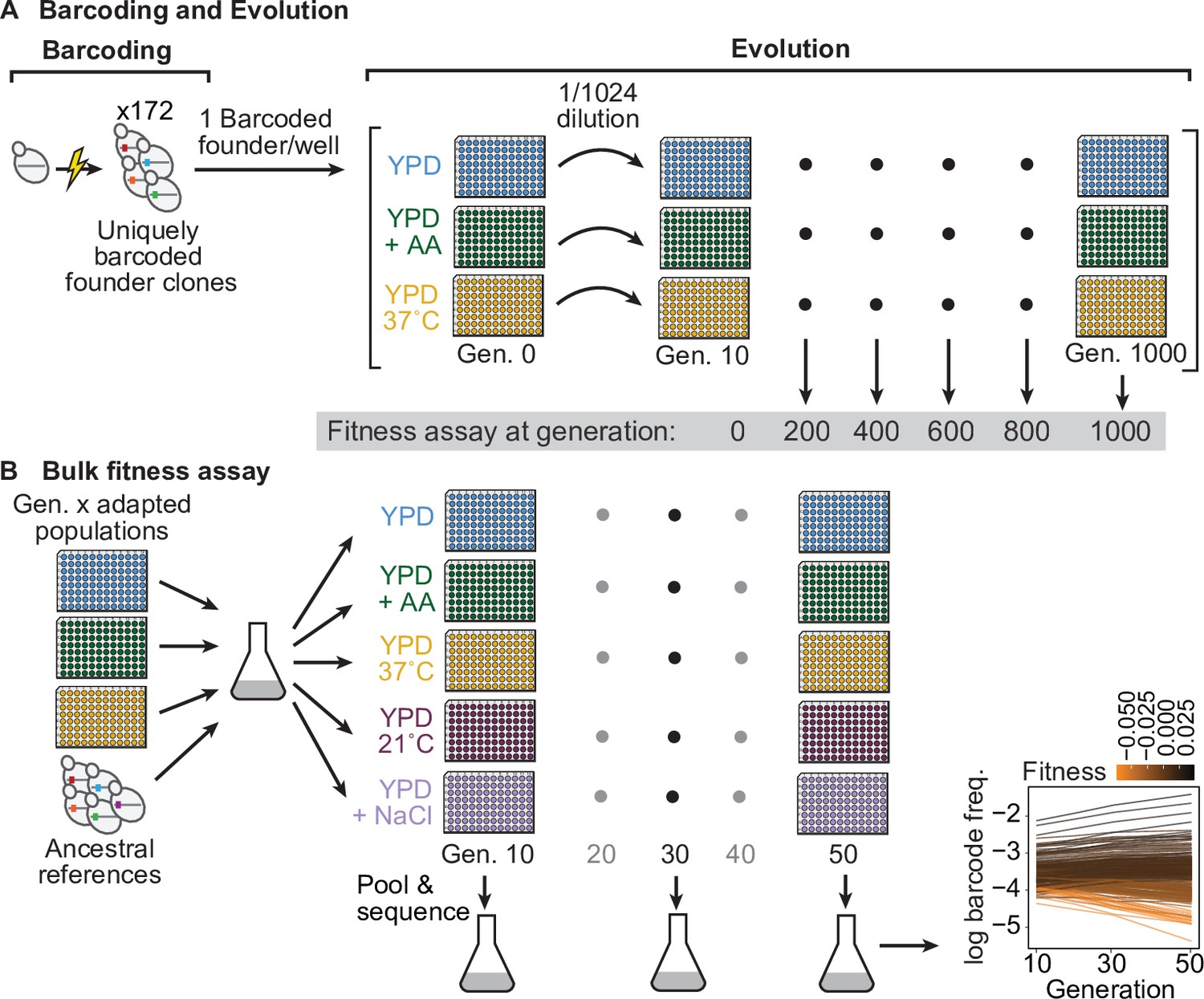
Evolution experiment and bulk fitness assay.
(A) Yeast cells were uniquely barcoded to generate founder clones. Uniquely barcoded founder clones were used to seed individual populations in 96-well plates. Populations were evolved for 1000 generations in three distinct environments: rich media (YPD), rich media at elevated temperature (YPD, 37 °C), and rich media with 0.2 % acetic acid (YPD+ AA), and frozen at 50-generation intervals. Fitness assays were performed at 200-generation intervals. (B) Bulk fitness assay of barcoded adapted populations by competitive growth in each evolution environment and two additional environments (YPD, 21 °C and YPD +0.4 M NaCl). Relative fitness of each population was evaluated from the log frequency of the respective barcode sequence over time compared to that of ancestral references, based on assay generations 10, 30, and 50.
-
Figure 1—source data 1
Growth curve OD600 and endpoint spot titer measurements; bottleneck sizes for each assay environment.
- https://cdn.elifesciences.org/articles/70918/elife-70918-fig1-data1-v2.xlsx
Figure 1—figure supplement 1
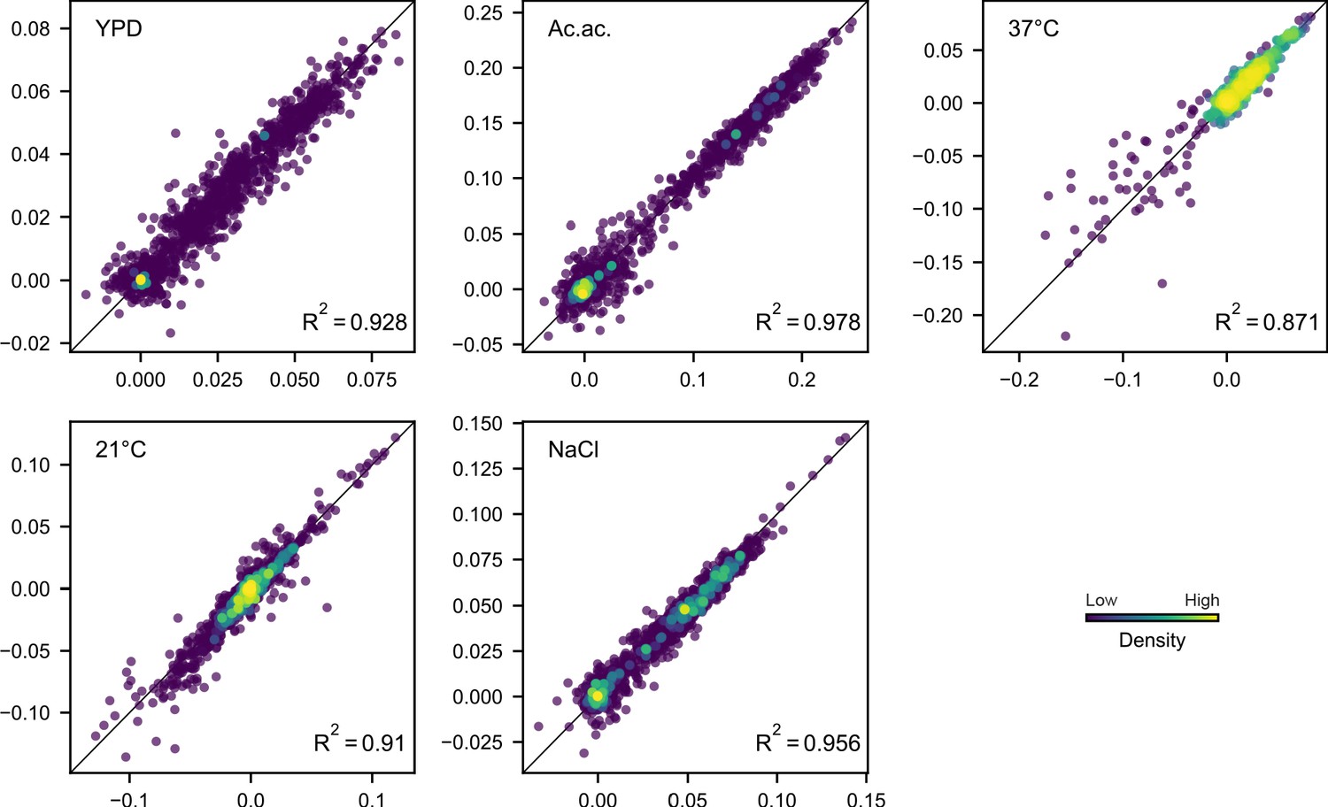
Comparison of technical replicate fitness measurements.
Each point corresponds to the fitness of a population at a given evolution timepoint in the environment indicated. Point color corresponds to the relative density of points, as determined by distance to five nearest points. The black line in each plot indicates x = y.
Figure 1—figure supplement 2
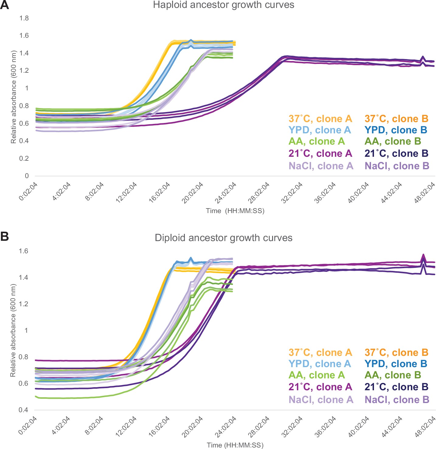
Growth curves for ancestors in each assay environment.
(A) Growth curves for two haploid ancestral clones. (B) Growth curves for two diploid ancestral clones. For both haploids and diploids, two technical replicate measurements were made per clone.
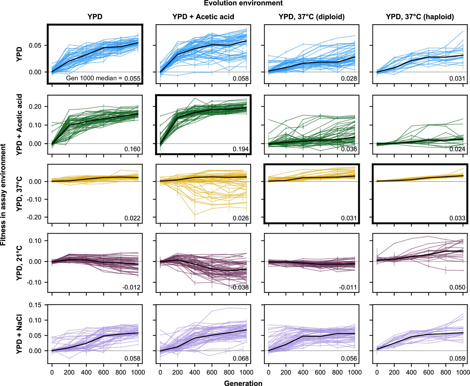
Figure 2 with 6 supplements
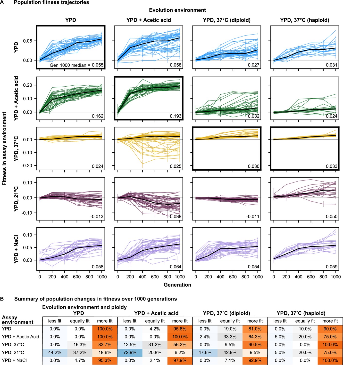
Fitness changes over 1000 generations of evolution.
(A) Population fitness trajectories. Replicate populations for each evolution condition are shown in each column. Environments in which the fitnesses of these populations were assayed are shown in the rows. Plots for which evolution and assay environment are the same are indicated by a bold outer border. The black line in each plot indicates the median fitness. Error bars indicate standard error of the mean. (B) Summary of population changes in fitness: generations 0–1000. Populations are categorized according to whether their fitness at generation 1000 is equal to, less than, or greater than their fitness at generation zero. Significance of fitness differences evaluated using one-sided Welch’s unequal variances t-tests, the number of observations for both fitness values is 2.
-
Figure 2—source data 1
Bulk fitness assay read counts and measured fitnesses.
- https://cdn.elifesciences.org/articles/70918/elife-70918-fig2-data1-v2.csv
-
Figure 2—source data 2
Statistical significance of fitness changes over time.
- https://cdn.elifesciences.org/articles/70918/elife-70918-fig2-data2-v2.csv
Figure 2—figure supplement 1
Fitness changes over 1000 generations of evolution for unfiltered data (outliers included).
Replicate populations for each evolution condition are shown in each column. Environments in which these populations’ fitnesses were assayed are shown in the rows. Plots for which evolution and assay environment are the same are indicated by a bold outer border. The black line in each plot indicates the median fitness. Error bars indicate standard error of the mean.
Figure 2—figure supplement 2
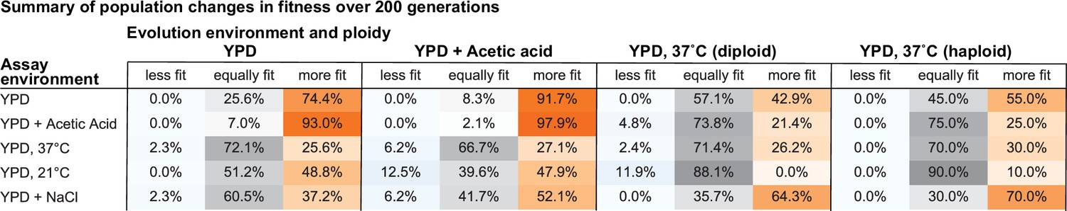
Summary of population changes in fitness: generations 0–200.
Percentage of populations that improve, decline, and maintain similar relative fitness from generations 0–200 for each combination of evolution and assay environments. Summary statistics provided in Figure 2—source data 2.
Figure 2—figure supplement 3
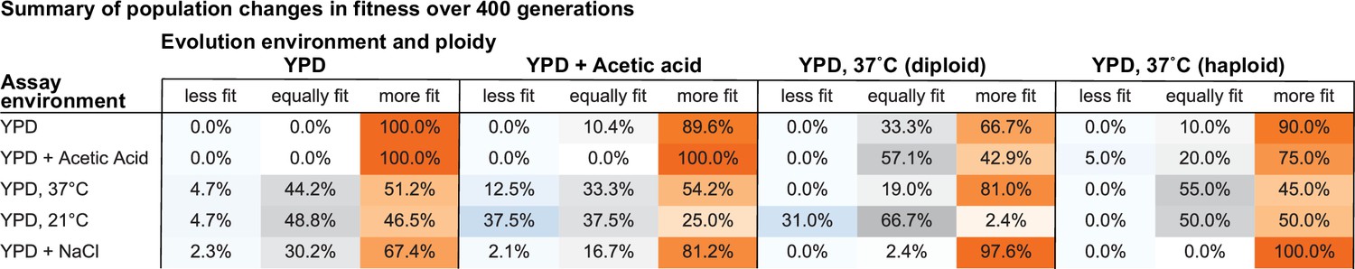
Summary of population changes in fitness: generations 0–400.
Percentage of populations that improve, decline, and maintain similar relative fitness from generations 0–400 for each combination of evolution and assay environments. Summary statistics provided in Figure 2—source data 2.
Figure 2—figure supplement 4

Summary of population changes in fitness: generations 0–600.
Percentage of populations that improve, decline, and maintain similar relative fitness from generations 0–600 for each combination of evolution and assay environments. Summary statistics provided in Figure 2—source data 2.
Figure 2—figure supplement 5
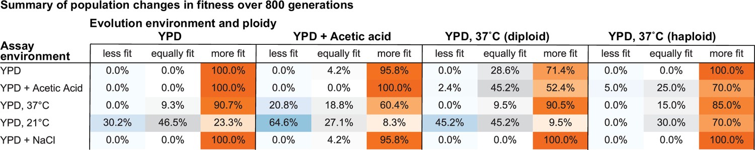
Summary of population changes in fitness: generations 0–800.
Percentage of populations that improve, decline, and maintain similar relative fitness from generations 0–800 for each combination of evolution and assay environments. Summary statistics provided in Figure 2—source data 2.
Figure 2—figure supplement 6
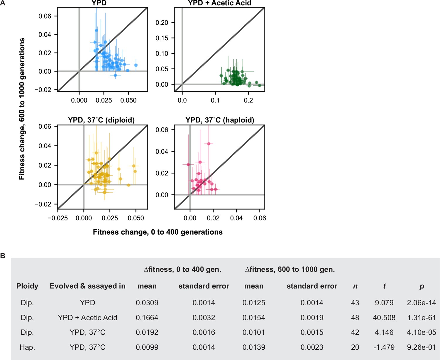
Changes in fitness early and late in evolution.
(A) Changes in fitness over the first (0–400) and last (600–1000) 400 generations of the evolution experiment are plotted for each population. Points are colored by evolution condition (environment and ploidy). (B) Summary statistics for t-test comparing the mean change in fitness over the first and last 400 generations for all populations evolved in each condition. n refers to the number of populations in that evolution condition.
Figure 3 with 2 supplements
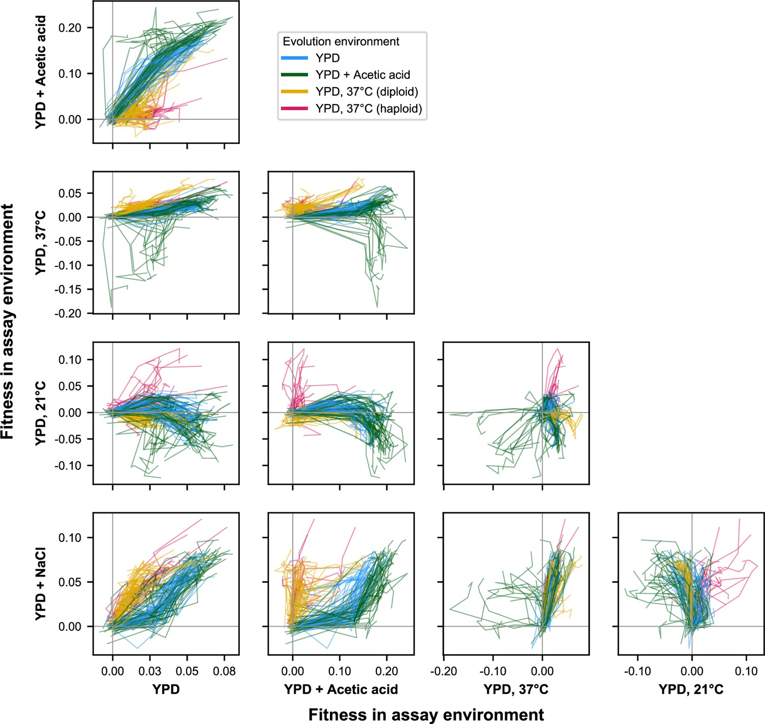
E × E evolutionary trajectories over 1000 generations of evolution in a constant environment.
Axes correspond to fitness in the indicated assay environments. Colors correspond to evolution condition. Gray vertical and horizontal lines indicate zero fitness relative to an ancestral reference in each environment.
Figure 3—figure supplement 1
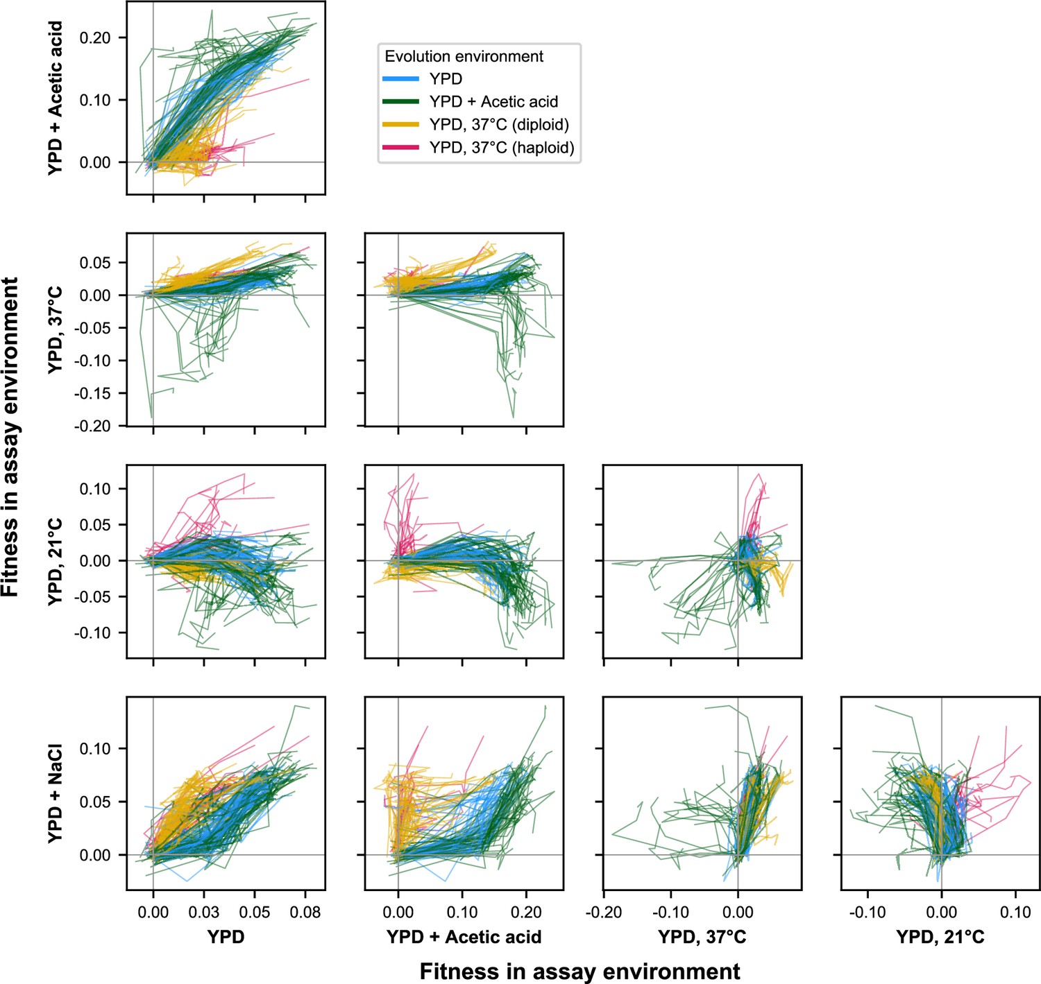
E × E evolutionary trajectories over 1000 generations of evolution in a constant environment for unfiltered data (outliers included).
Axes correspond to fitness in the indicated assay environments. Colors correspond to evolution condition. Gray vertical and horizontal lines indicate zero fitness relative to an ancestral reference in each environment.
Figure 3—animation 1
Animation of Figure 3.
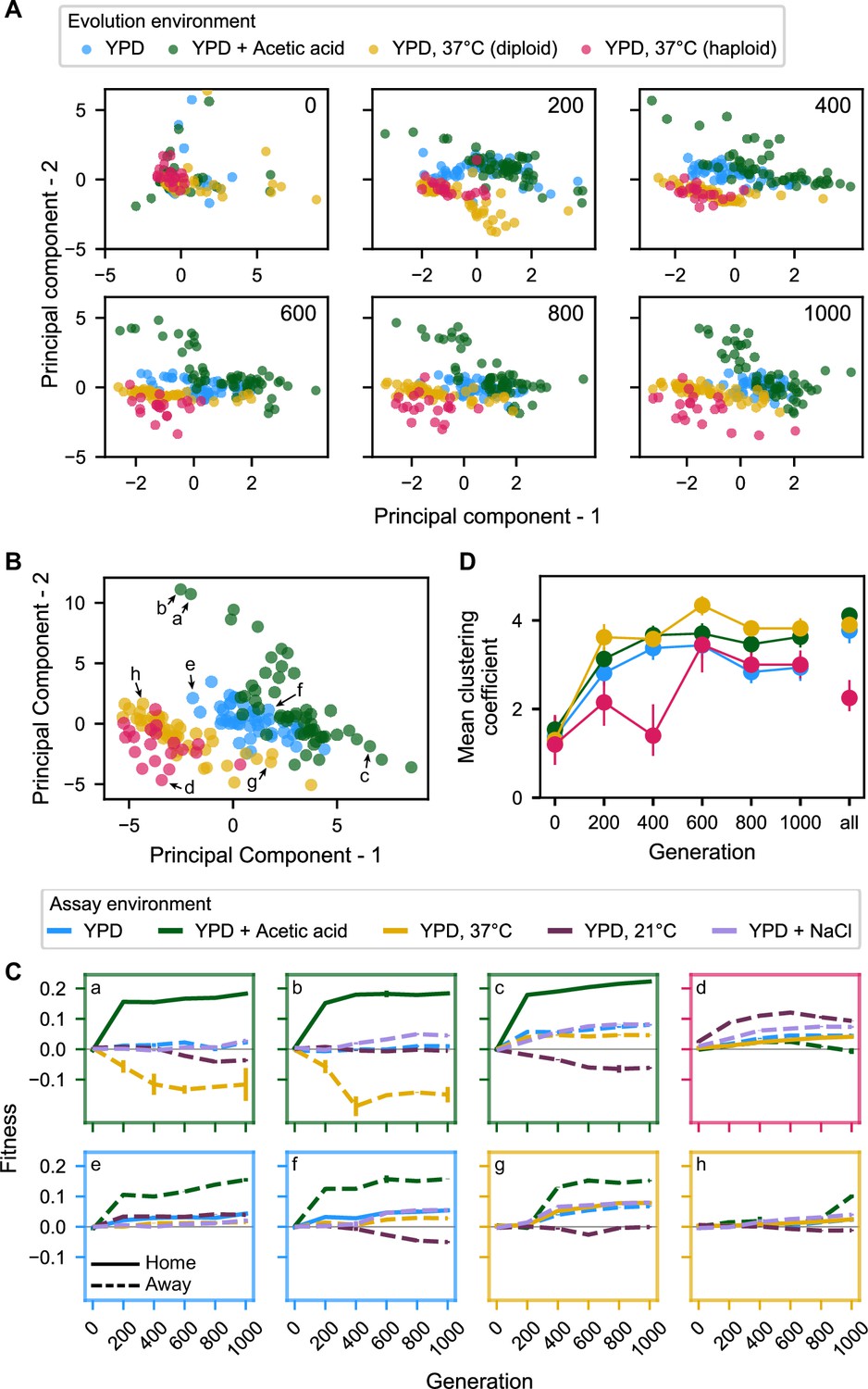
Figure 4 with 5 supplements
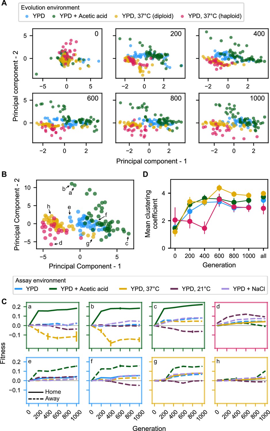
Principal component analysis of pleiotropy.
(A) Principal component analysis of evolving populations, performed independently each 200 generations. The first two PCs are plotted. Populations are colored according to evolution condition. (B) Principal component analysis of all populations using all fitness data from across the 1000 generations. The first two PCs are plotted and explain 30% and 22% of the variance, respectively. (C) Plots of fitness trajectories in all five assay environments for eight example populations (a–h, identified as points in (B)). (D) Population clustering in PCA by evolution condition over time. Clustering of each population was quantified as the number of five nearest neighbors that share the same evolution condition, for each 200-generation interval, and across all intervals. Clustering metrics were averaged for each evolution condition to calculate point estimates; error bars represent 95 % confidence intervals of the mean clustering metric, estimated by performing PCA on bootstrapped replicate fitness measurements.
-
Figure 4—source data 1
Principal component analyses presented in Figure 4A.
- https://cdn.elifesciences.org/articles/70918/elife-70918-fig4-data1-v2.zip
-
Figure 4—source data 2
Principal component analysis presented in Figure 4B.
- https://cdn.elifesciences.org/articles/70918/elife-70918-fig4-data2-v2.zip
Figure 4—figure supplement 1
Principal component analysis of pleiotropy for unfiltered data (outliers included).
-
Figure 4—figure supplement 1—source data 1
Principal component analyses presented in Figure 4—figure supplement 1A.
- https://cdn.elifesciences.org/articles/70918/elife-70918-fig4-figsupp1-data1-v2.zip
-
Figure 4—figure supplement 1—source data 2
Principal component analysis presented in Figure 4—figure supplement 1B.
- https://cdn.elifesciences.org/articles/70918/elife-70918-fig4-figsupp1-data2-v2.zip
Figure 4—figure supplement 2
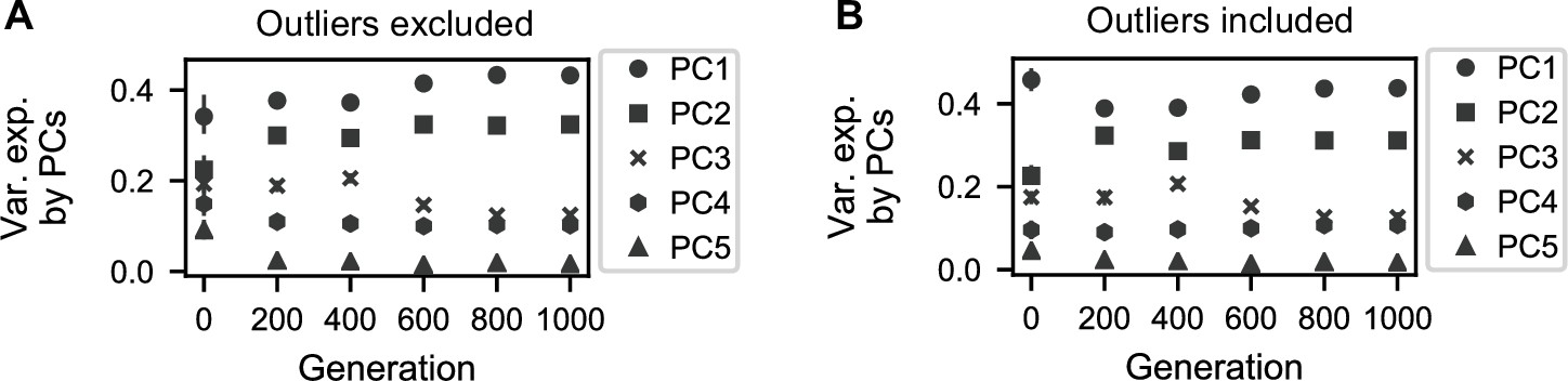
Variation explained by principal components.
(A) Variance explained by five principal components corresponding to the PCAs conducted for each generation interval in Figure 4A. (B) Variance explained by five principal components corresponding to the PCAs conducted for each generation interval in Figure 4—figure supplement 1A.
Figure 4—figure supplement 3
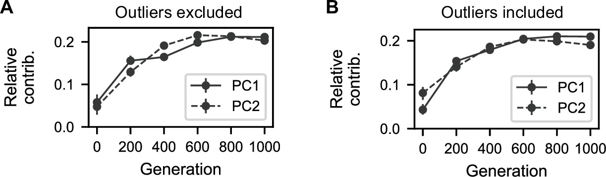
Contributions of generation intervals to principal components.
(A) Summed magnitudes of contributions of assay environments at each interval to the two principal components presented in Figure 4B. (B) Summed magnitudes of contributions of assay environments at each interval to the two principal components presented in Figure 4—figure supplement 1B.
Figure 4—figure supplement 4
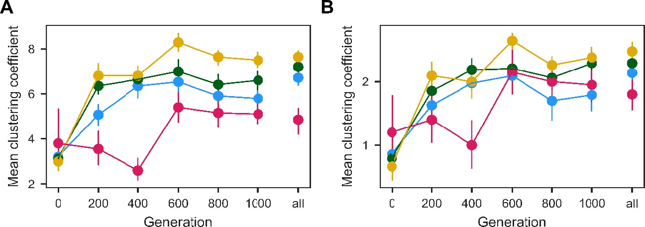
Population clustering in PCA as in Figure 4D quantified for (A) 10 and (B) 3 nearest neighbors.
Clustering metrics were averaged for each evolution condition to calculate point estimates; error bars represent 95 % confidence intervals of the mean clustering metric, estimated by performing PCA on bootstrapped replicate fitness measurements.
Figure 4—figure supplement 5
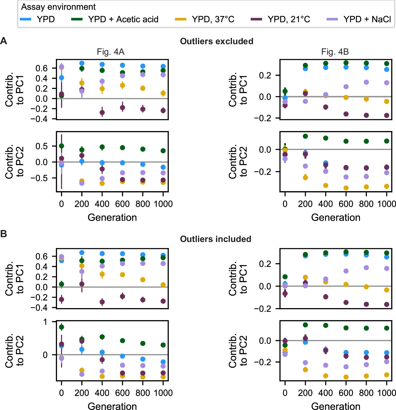
Contributions of assay environments to principal components.
(A) Contributions of each assay environment to each principal component for PCAs on individual 200-generation fitness measurements (left, corresponding to Figure 4A) and on all 200-generation fitness measurements (right, corresponding to Figure 4B) with outlier populations excluded. (B) Same as in A but with outlier populations included.
Figure 5 with 2 supplements
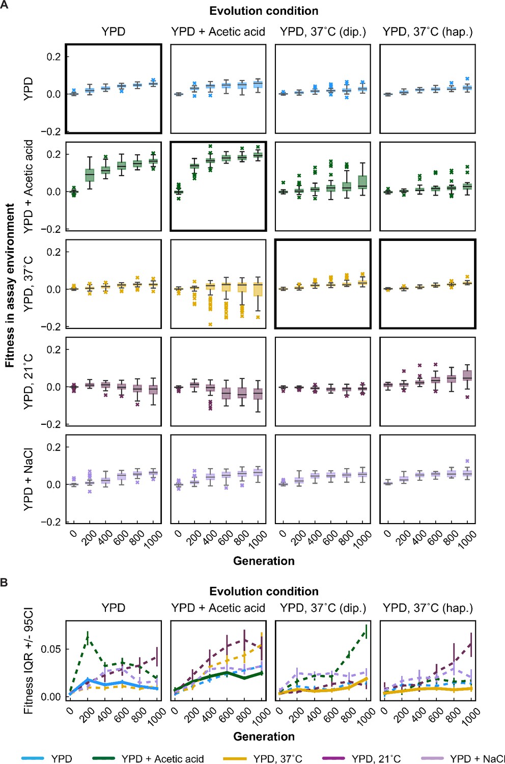
Variability in fitness over time.
(A) Box plots summarizing population mean fitness over time for each evolution condition (columns) in each assay environment (rows). Line, box, and whiskers represent the median, quartiles, and data within 1.5 × IQR (interquartile range), respectively; outlier populations beyond whiskers are shown as points. (B) IQR from box plots in (A) are plotted as a function of time for each evolution condition and assay environment. IQR for fitness measured in home and away environments are represented by solid and dashed lines, respectively. Error bars represent 95 % confidence intervals of IQR calculated from bootstrapped replicate fitness measurements.
-
Figure 5—source data 1
Brown–Forsythe test statistics.
- https://cdn.elifesciences.org/articles/70918/elife-70918-fig5-data1-v2.xlsx
Figure 5—figure supplement 1
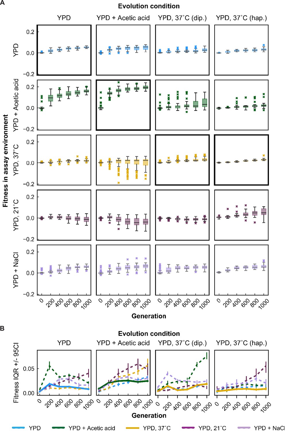
Variability in fitness over time for unfiltered data (outliers included).
(A) Box plots summarizing population mean fitness over time for each evolution condition (columns) in each assay environment (rows). Line, box, and whiskers represent the median, quartiles, and data within 1.5 × IQR, respectively; outlier populations beyond whiskers are shown as points. (B) IQR from box plots in (A) are plotted as a function of time for each evolution condition and assay environment. IQR for fitness measured in home and away environments are represented by solid and dashed lines, respectively. Error bars represent 95 % confidence intervals of IQR calculated from bootstrapped replicate fitness measurements.
Figure 5—figure supplement 2
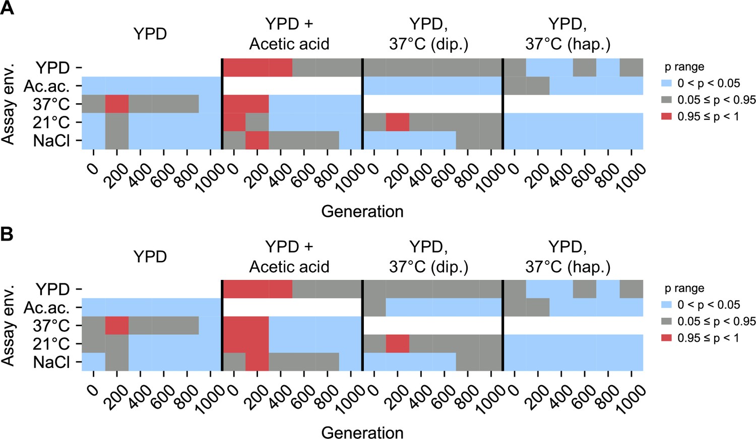
Statistical test of difference in variance between home, away environments.
Brown–Forsythe test p values for paired comparisons of fitness variance in home environment and away environment for populations evolved in each evolution condition (columns). White boxes correspond to invalid self-comparisons. p values represent a one-sided test in which the alternative hypothesis is that home variance is less than away variance. 0 < p < 0.05 (blue) indicates home variance significantly less than away variance. 0.95 ≤ p < 1 (red) indicates home variance significantly greater than away variance. (A) Excluding outliers. (B) Including outliers. Figure 5—source data 1 contains test statistics.
Figure 6 with 1 supplement
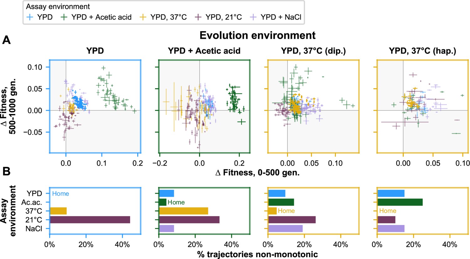
Nonmonotonicity in evolutionary trajectories.
(A) Each panel shows, for each of the five assay environments, the change in fitness over the first 500 (x-axis) and second 500 (y-axis) generations of evolution of each population in a given evolution environment. Error bars correspond to standard error. Populations that fall in shaded quadrants have trajectories that are nonmonotonic. Points corresponding to fitness in the home environment are colored more opaquely than points corresponding to fitness in away environments, and panel borders have been colored to match the home environment. Fitness at generation 500 has been interpolated. (B) Each panel corresponds to a given evolution environment and shows the proportion of populations evolved in that environment that exhibit clearly nonmonotonic fitness trajectories in (A). ‘Clearly nonmonotonic’ trajectories are those populations (points) in (A) that fall in the gray quadrants and whose error bars (one standard error in either direction) do not span either the x- or y-axis. As in (A), bars corresponding to the home environment are colored more opaquely than bars corresponding to away environments.
Figure 6—figure supplement 1
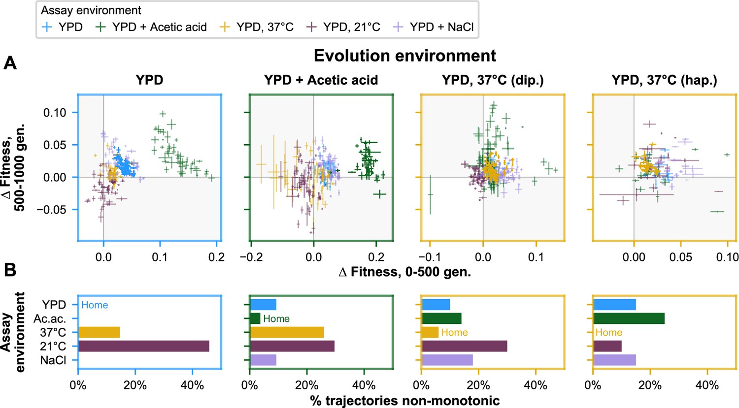
Nonmonotonicity in evolutionary trajectories for unfiltered data (outliers included).
(A) Each panel shows—for each of the five assay environments—the change in fitness over the first 500 (x-axis) and second 500 (y-axis) generations of evolution of each population in a given evolution environment. Populations that fall in shaded quadrants have trajectories that are nonmonotonic. Points corresponding to fitness in the home environment are colored more opaquely than points corresponding to fitness in away environments, and panel borders have been colored to match the home environment. Fitness at generation 500 has been interpolated. (B) Each panel corresponds to a given evolution environment and shows the proportion of populations evolved in that environment that exhibit clearly nonmonotonic fitness trajectories in (A). ‘Clearly nonmonotonic’ trajectories are those populations (points) in (A) that fall in the gray quadrants and whose error bars (one standard error in either direction) do not span either the x- or y-axis. As in (A), bars corresponding to the home environment are colored more opaquely than bars corresponding to away environments. As with the outliers-excluded data, populations exhibit clearly nonmonotonic trajectories in away environments much more commonly than in home environments (p < 0.0001), with most of these reflecting initially positive pleiotropic effects.
Tables
Key resources table
| Reagent type (species) or resource | Designation | Source or reference | Identifiers | Additional information |
|---|---|---|---|---|
| Strain, strain background (Saccharomyces cerevisiae) | YCB140B | This paper | MATa, his3Δ1, leu2Δ0, lys2Δ0, RME1pr::ins-308A, ycr043cΔ0::NatMX, can1::STE2pr_SpHIS5_STE3pr_LEU2, ybr209w::GAL10pr-CRE, trp1Δ, URA3::STE5pr_URA3, HO::CgTRP1 | |
| Strain, strain background (Saccharomyces cerevisiae) | YCB137A | This paper | MATα, his3Δ1, leu2Δ0, lys2Δ0, RME1pr::ins-308A, ycr043cΔ0::NatMX, can1::STE2pr_SpHIS5_STE3pr_LEU2, ybr209w::GAL10pr-CRE, trp1Δ, URA3::STE5pr_URA3, HO::CgTRP1 | |
| Recombinant DNA reagent | Barcoding plasmid landing pad 1 | This paper | Plasmid map in Supplementary file 2 | |
| Recombinant DNA reagent | Barcoding plasmid landing pad 2 | This paper | Plasmid map in Supplementary file 3 | |
| Sequence-based reagent | Illumina sequencing primers | IDT | Sequences listed in Supplementary file 4 | |
| Peptide, recombinant protein | Zymolyase 20T | Nacalai Tesque | Zymolyase 20T | |
| Software, algorithm | Custom code | This paper | https://github.com/amphilli/pleiotropy-dynamics |
Additional files
-
Supplementary file 1
Strain creation tables.
- https://cdn.elifesciences.org/articles/70918/elife-70918-supp1-v2.docx
-
Supplementary file 2
Plasmid for landing pad one barcode integration.
- https://cdn.elifesciences.org/articles/70918/elife-70918-supp2-v2.zip
-
Supplementary file 3
Plasmid for landing pad two barcode integration.
- https://cdn.elifesciences.org/articles/70918/elife-70918-supp3-v2.zip
-
Supplementary file 4
Primers used in this study.
- https://cdn.elifesciences.org/articles/70918/elife-70918-supp4-v2.xlsx
-
Transparent reporting form
- https://cdn.elifesciences.org/articles/70918/elife-70918-transrepform1-v2.pdf
Download links
A two-part list of links to download the article, or parts of the article, in various formats.
Downloads (link to download the article as PDF)
Open citations (links to open the citations from this article in various online reference manager services)
Cite this article (links to download the citations from this article in formats compatible with various reference manager tools)
Dynamics and variability in the pleiotropic effects of adaptation in laboratory budding yeast populations
eLife 10:e70918.
https://doi.org/10.7554/eLife.70918


