Barcoded bulk QTL mapping reveals highly polygenic and epistatic architecture of complex traits in yeast
- Department of Organismic and Evolutionary Biology, Harvard University, United States
- NSF-Simons Center for Mathematical and Statistical Analysis of Biology, Harvard University, United States
- Quantitative Biology Initiative, Harvard University, United States
- Department of Physics, Massachusetts Institute of Technology, United States
- Department of Molecular and Cellular Biology, Harvard University, United States
- Department of Data Science, Dana-Farber Cancer Institute, United States
- Department of Biostatistics, Harvard T.H. Chan School of Public Health, United States
- Department of Stem Cell and Regenerative Biology, Harvard University, United States
- Center for Cancer Evolution, Dana-Farber Cancer Institute, United States
- The Ludwig Center at Harvard, United States
- The Broad Institute of MIT and Harvard, United States
- Department of Physics, Harvard University, United States
Figures
Figure 1 with 4 supplements
Cross design, genotyping, phenotyping, and barcode association.
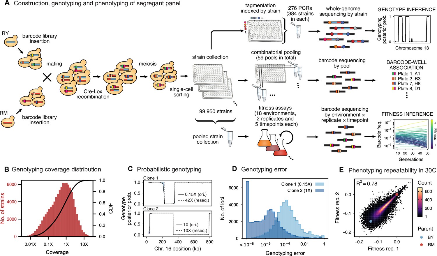
(A) Construction, genotyping, and phenotyping of segregant panel. Founding strains BY (blue) and RM (red) are transformed with diverse barcode libraries (colored rectangles) and mated in bulk. Cre recombination combines barcodes onto the same chromosome. After meiosis, sporulation, and selection for barcode retention, we sort single haploid cells into 96-well plates. Top: whole- genome sequencing of segregants via multiplexed tagmentation. Middle: barcode-well association by combinatorial pooling. Bottom: bulk phenotyping by pooled competition assays and barcode frequency tracking. See Figure 1—figure supplements 1–3, and Materials and methods for details. (B) Histogram and cumulative distribution function (CDF) of genotyping coverage of our panel (Figure 1—source data 1). (C) Inferred probabilistic genotypes for two representative individuals from low coverage (solid) and high coverage (dashed) sequencing, with the genotyping error (difference between low and high coverage probabilistic genotypes) indicated by shaded blue regions (Figure 1—source data 2). (D) Distribution of genotyping error by SNP for the two individuals shown in (C). (E) Reproducibility of phenotype measurements in 30 C environment (see Figure 1—figure supplement 4 for other environments). Here, fitness values are inferred on data from each individual replicate assay. For all other analyses, we use fitness values jointly inferred across both replicates (see Appendix 2, Figure 1—source data 3).
-
Figure 1—source data 1
Genotyping coverage of all strains in our panel.
- https://cdn.elifesciences.org/articles/73983/elife-73983-fig1-data1-v2.txt
-
Figure 1—source data 2
Inferred genotype for resequenced clones in Chr XVI.
- https://cdn.elifesciences.org/articles/73983/elife-73983-fig1-data2-v2.txt
-
Figure 1—source data 3
Replicate fitness measurements in 30C.
- https://cdn.elifesciences.org/articles/73983/elife-73983-fig1-data3-v2.txt
Figure 1—figure supplement 1
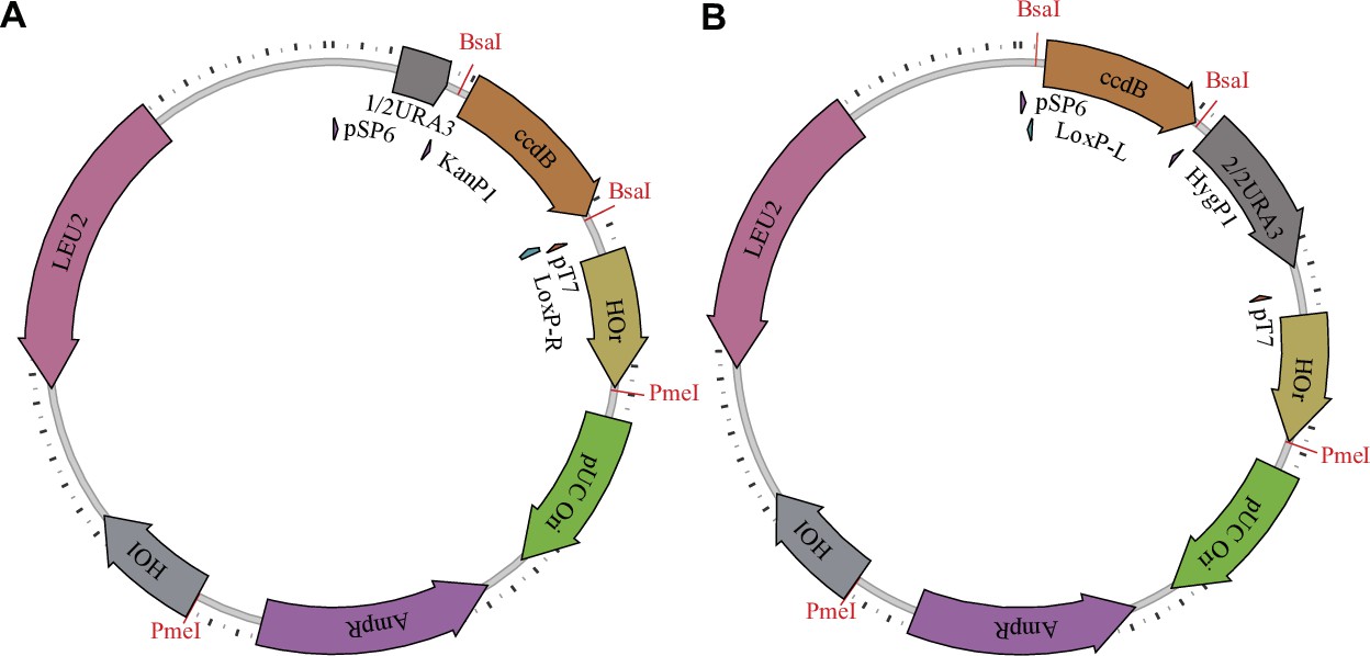
Barcoding plasmids.
The first type (A) has configuration pAN3H5a-1/2URA3-KanP1-ccdB-LoxPR, while the second type (B) has configuration pAN3H5a-LoxPL-HygP1-ccdB-2/2URA3. The ccdB gene is later replaced by diverse barcode libraries, as described in the Materials and methods and shown in Figure 1—figure supplement 2.
Figure 1—figure supplement 2
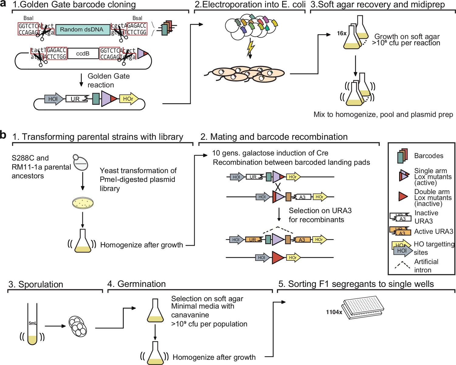
Detailed schematic of procedure to generate 100,000 F1 segregants.
(a) Generating the barcode plasmid library: (1) Oligonucleotides containing random nucleotides are flanked by BsaI restriction endonuclease sites, converted to dsDNA, and cloned into a recipient plasmid using a Golden Gate reaction. The recipient plasmid contains a ccdB gene, which is toxic to sensitive E. coli strains. (2) Plasmid libraries are transformed into E. coli by electroporation and (3) the cells are recovered in a thin layer of media containing soft agar. (b) Generating sorted F1 segregants: (1) Barcode libraries are transformed into parental strains. (2) Barcoded parental strains are mated and their barcodes recombined by Cre-Lox recombination. (3) Diploid cells are sporulated, and (4) MATa haploid spores are germinated and (5) sorted into single wells.
Figure 1—figure supplement 3
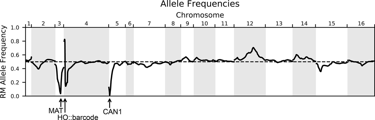
Allele frequencies of the RM parental allele for the genotyped pool of 99,950 segregants.
The dashed line indicates 50% frequency. Marker loci used in the cross are indicated with arrows: the mating locus MAT on chromosome III and CAN1::pSTE2-SpHIS5 on chromosome V are selected for the BY allele, and the barcode locus HO on chromosome IV is selected for the Cre-induced recombination of two barcodes (the first from the RM parent and the second from the BY parent).
Figure 1—figure supplement 4
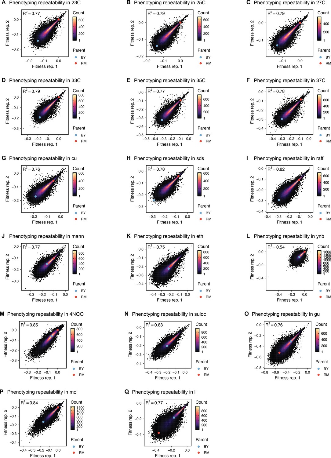
Phenotype measurement reproducibility, as in Figure 1D, for all other environments.
Figure 2 with 4 supplements
High-resolution QTL mapping.
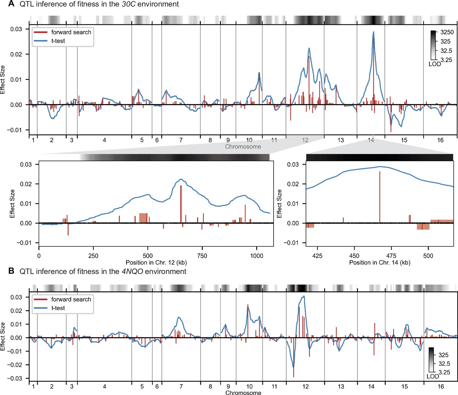
QTL mapping for (A) YPD at 30 °C and (B) SD with 4-nitroquinoline (4NQO). Inferred QTL are shown as red bars; bar height shows effect size and red shaded regions represent credible intervals. For contrast, effect sizes inferred by a Student’s t-test at each locus are shown in blue. Gray bars at top indicate loci with log-odds (LOD) scores surpassing genome-wide significance in this t-test, with shading level corresponding to log-LOD score. See Figure 2—figure supplements 1–4 for other environments. See Supplementary file 2 for all inferred additive QTL models.
Figure 2—figure supplement 1
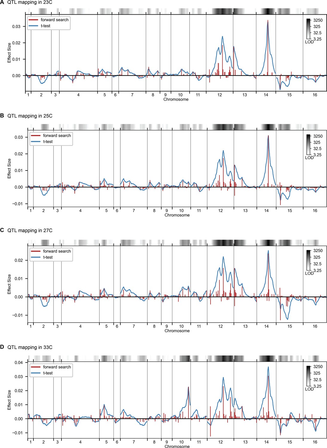
QTL mapping, as in Figure 2, for 23 C, 25 C, 27 C, and 33 C.
Figure 2—figure supplement 2
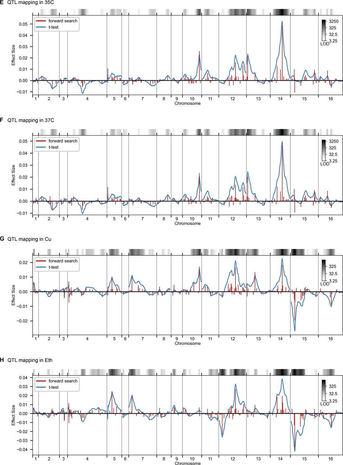
QTL mapping, as in Figure 2, for 35 C, 37 C, Cu, and Eth.
Figure 2—figure supplement 3
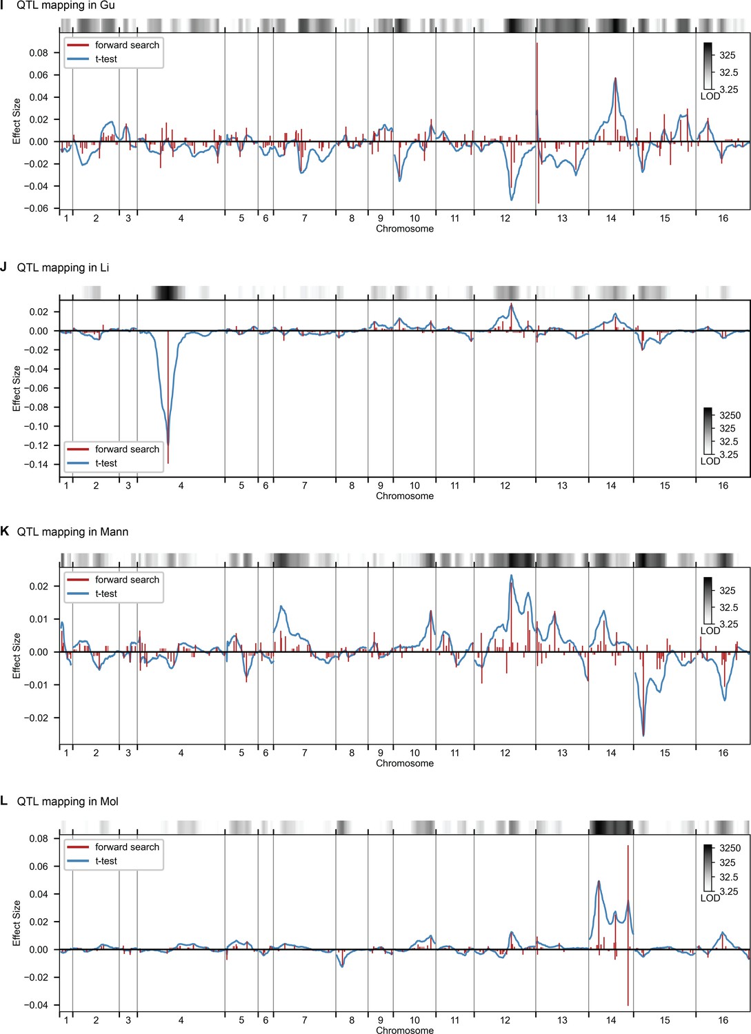
QTL mapping, as in Figure 2, for Gu, Li, Mann, and Mol.
Figure 2—figure supplement 4
QTL mapping, as in Figure 2, for Raff, SDS, Suloc, YNB.
Figure 3 with 3 supplements
Genetic architecture and pleiotropy.
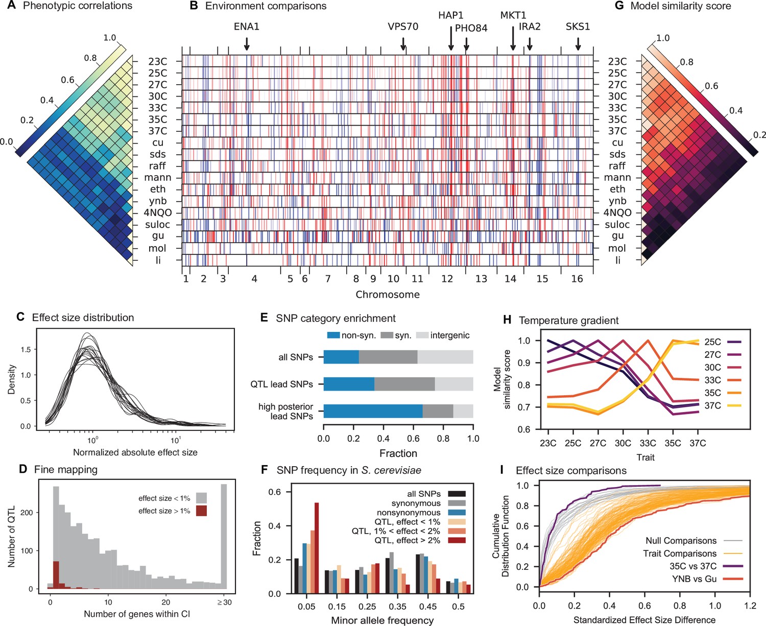
(A) Pairwise Pearson correlations between phenotype measurements, ordered by hierarchical clustering (Figure 3—source data 1). (B) Inferred genetic architecture for each trait. Each inferred QTL is denoted by a red or blue line for a positive or negative effect of the RM allele, respectively; color intensity denotes effect size on a log scale. Notable genes are indicated above. See Figure 3—figure supplement 1 for effect size comparison of the most pleiotropic genes. (C) Smoothed distribution of absolute effect sizes for each trait, normalized by the median effect for each trait. See Figure 3—figure supplement 2 for a breakdown of the distributions by QTL effect sign. (D) Distribution of the number of genes within the 95% credible interval for each QTL (Figure 3—source data 2). (E) Distribution of SNP types. “High posterior” lead SNPs are those with >50% posterior probability. (F) Fractions of synonymous SNPs, nonsynonymous SNPs, and QTL lead SNPs as a function of their frequency in the 1011 Yeast Genomes panel (Figure 3—source data 3). (G) Pairwise model similarity scores (which quantify differences in QTL positions and effect sizes between traits; see Appendix 3) across traits. (H) Pairwise model similarity scores for each temperature trait against all other temperature traits (Figure 3—source data 4). See Figure 3—figure supplement 3 for effect size comparisons between related environments. (I) Cumulative distribution functions (CDFs) of differences in effect size for each locus between each pair of traits (orange). Grey traces represent null expectations (differences between cross-validation sets for the same trait). The least and most similar trait pairs are highlighted in red and purple, respectively, and indicated in the legend.
-
Figure 3—source data 1
Phenotypic correlation across environments.
- https://cdn.elifesciences.org/articles/73983/elife-73983-fig3-data1-v2.txt
-
Figure 3—source data 2
Number of genes within confidence intervals of inferred QTL.
- https://cdn.elifesciences.org/articles/73983/elife-73983-fig3-data2-v2.txt
-
Figure 3—source data 3
Frequency of lead SNPs in 1011 Yeast Genomes panel.
- https://cdn.elifesciences.org/articles/73983/elife-73983-fig3-data3-v2.txt
-
Figure 3—source data 4
Pairwise model similarity scores across environments.
- https://cdn.elifesciences.org/articles/73983/elife-73983-fig3-data4-v2.txt
Figure 3—figure supplement 1
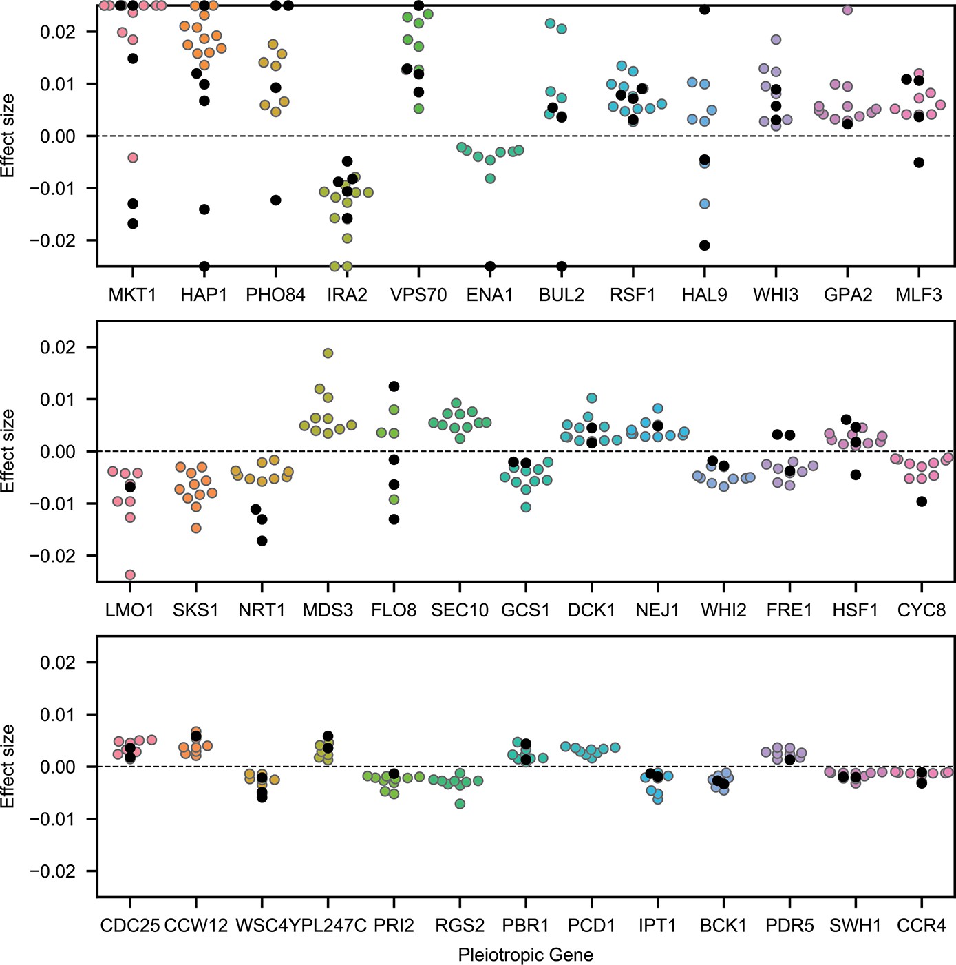
Highly pleiotropic genes.
For QTL that are observed in nine or more environments, we plot effect sizes for uncorrelated traits (4NQO, YNB, suloc, gu, li, mol; black dots) and for correlated traits (all others; colored dots). Effect sizes with magnitudes larger than 2.5% are shown on the boundaries.
Figure 3—figure supplement 2
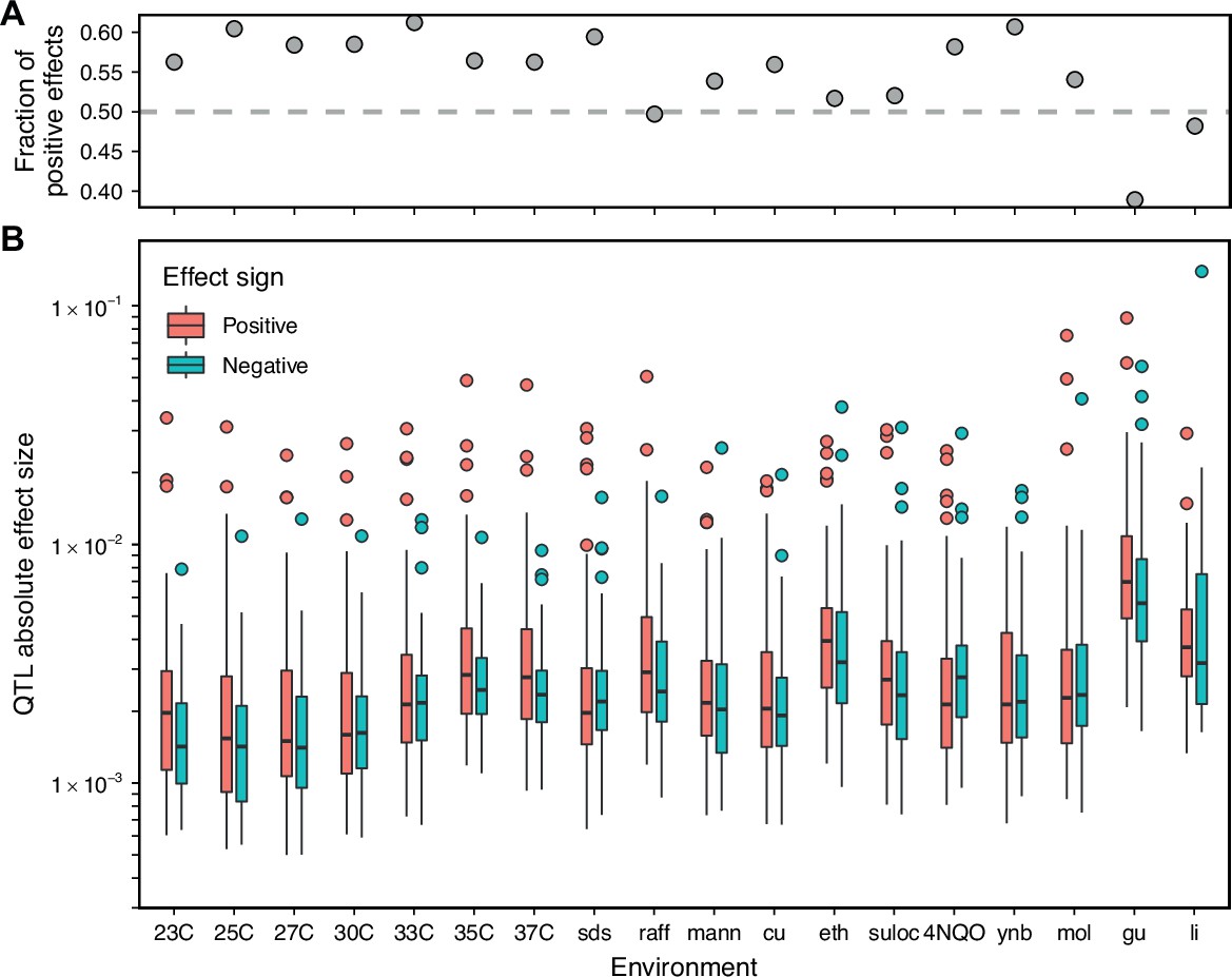
Comparison of positive and negative QTL effect signs.
(A) Fraction of inferred QTL with a positive effect sign. (B) Effect size magnitude of both positive and negative inferred QTL.
Figure 3—figure supplement 3
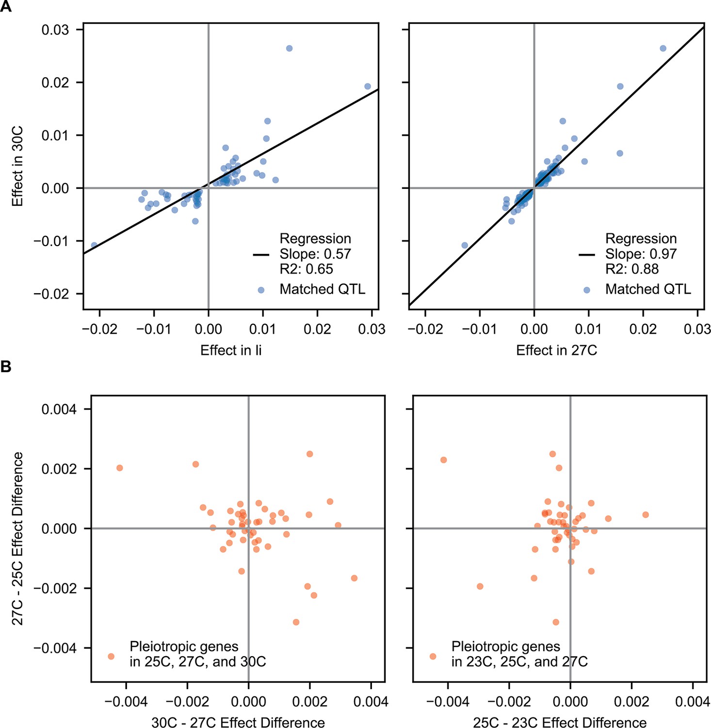
Correlations of pleiotropic effects across example traits.
(A) Scatterplots of QTL effects for QTL matched by pairwise model comparison. Left, 30 C vs Li; right, 30 C vs 27 C. Regression slopes and values are indicated. (B) Scatterplots of effect size changes for pleiotropic genes detected along a temperature gradient. Left, 30C–27C vs 27C–25C changes; right, 27C–25C vs 25C–23C changes.
Figure 4 with 6 supplements

Pairwise epistasis.
(A, B) Inferred pairwise epistatic interactions between QTL (with additive effects as shown in outer ring) for (A) the 4NQO environment and (B) the ynb environment. Interactions that are also observed for at least one other trait are highlighted in purple. See Figure 4—figure supplements 1–3 for other environments, Figure 4—figure supplement 4 for a simpler pairwise regression method, and Figure 4—figure supplement 5 for a breakdown of epistatic effects and comparison to additive effects. (C) Network statistics across environments (Figure 4—source data 1). The pooled degree distribution for the eighteen phenotype networks is compared with 50 network realizations generated by an Erdos-Renyi random model (white) or an effect-size-correlation-preserving null model (orange; see Appendix 3). Inset: average clustering coefficient for the eighteen phenotypes, compared to 50 realizations of the null and random models. (D) Consensus network of inferred epistatic interactions. Nodes represent genes (with size scaled by degree) and edges represent interactions that were detected in more than one environment (with color and weight scaled by the number of occurrences). Notable genes are labeled. See Figure 4—figure supplement 6 for the same consensus network restricted to either highly-correlated or uncorrelated traits.
-
Figure 4—source data 1
Network statistics of observed and simulated epistatic networks.
- https://cdn.elifesciences.org/articles/73983/elife-73983-fig4-data1-v2.txt
Figure 4—figure supplement 1
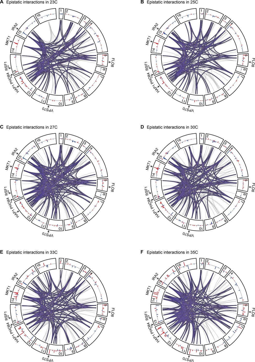
Epistatic interactions, as in Figure 4A and B, for 23 C, 25 C, 27 C, 30 C, 33 C, and 35 C.
Figure 4—figure supplement 2
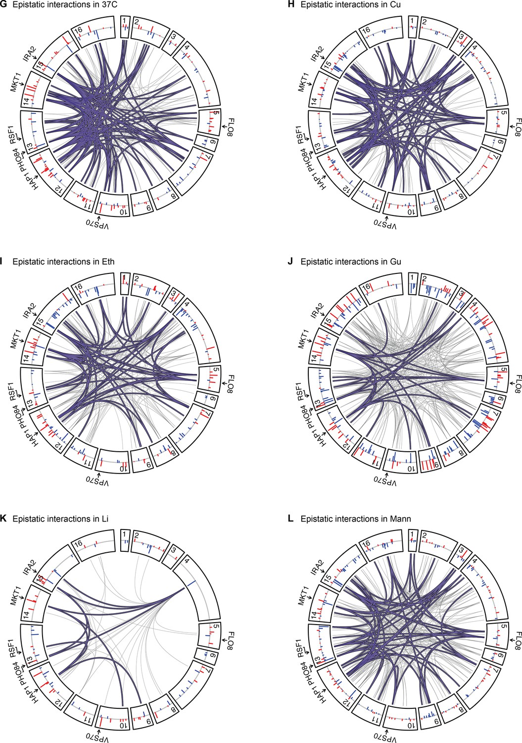
Epistatic interactions, as in Figure 4A and B, for 37 C, Cu, Eth, Gu, Li, and Mann.
Figure 4—figure supplement 3
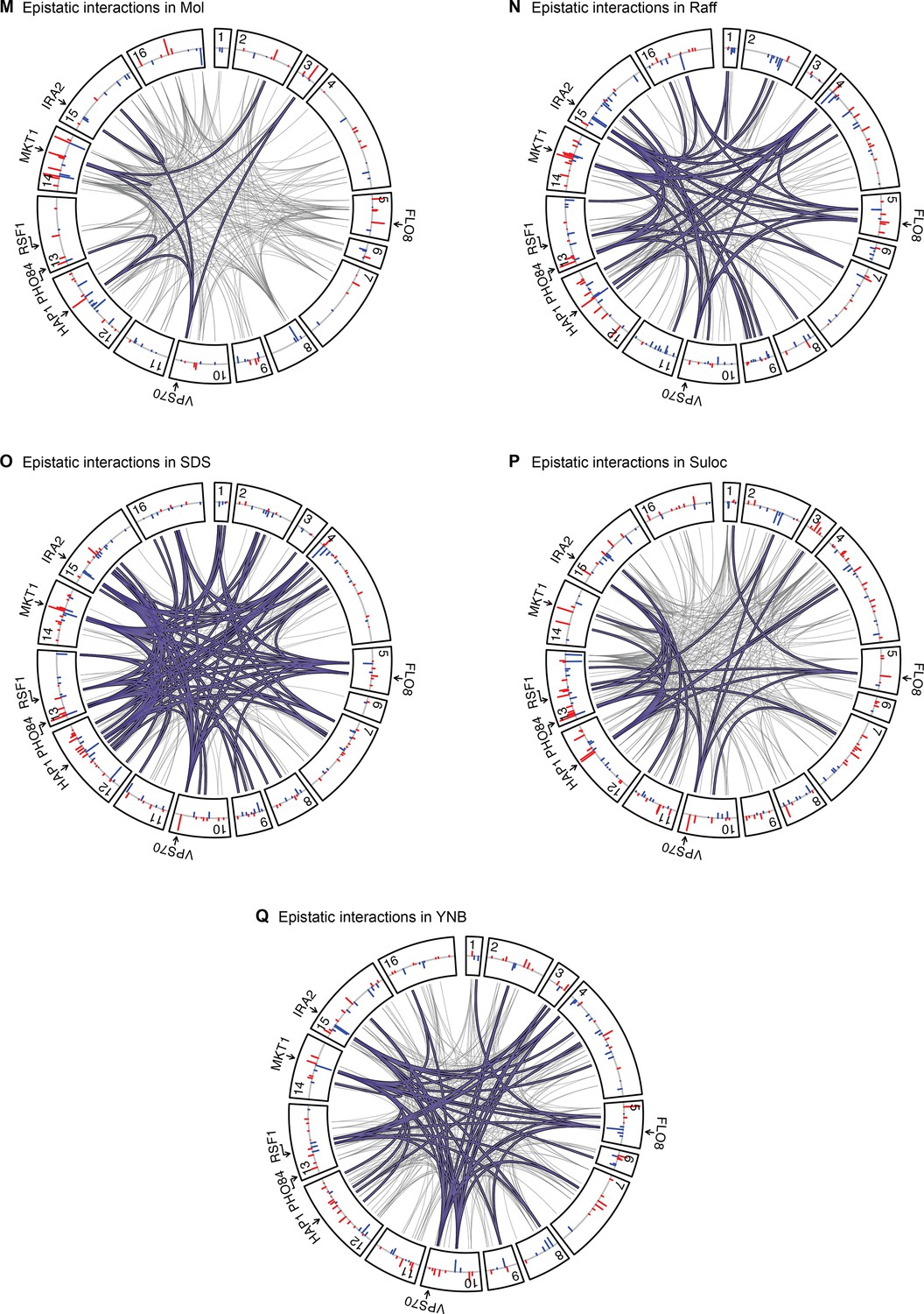
Epistatic interactions, as in Figure 4A and B, for Mol, Raff, SDS, Suloc, and YNB.
Figure 4—figure supplement 4
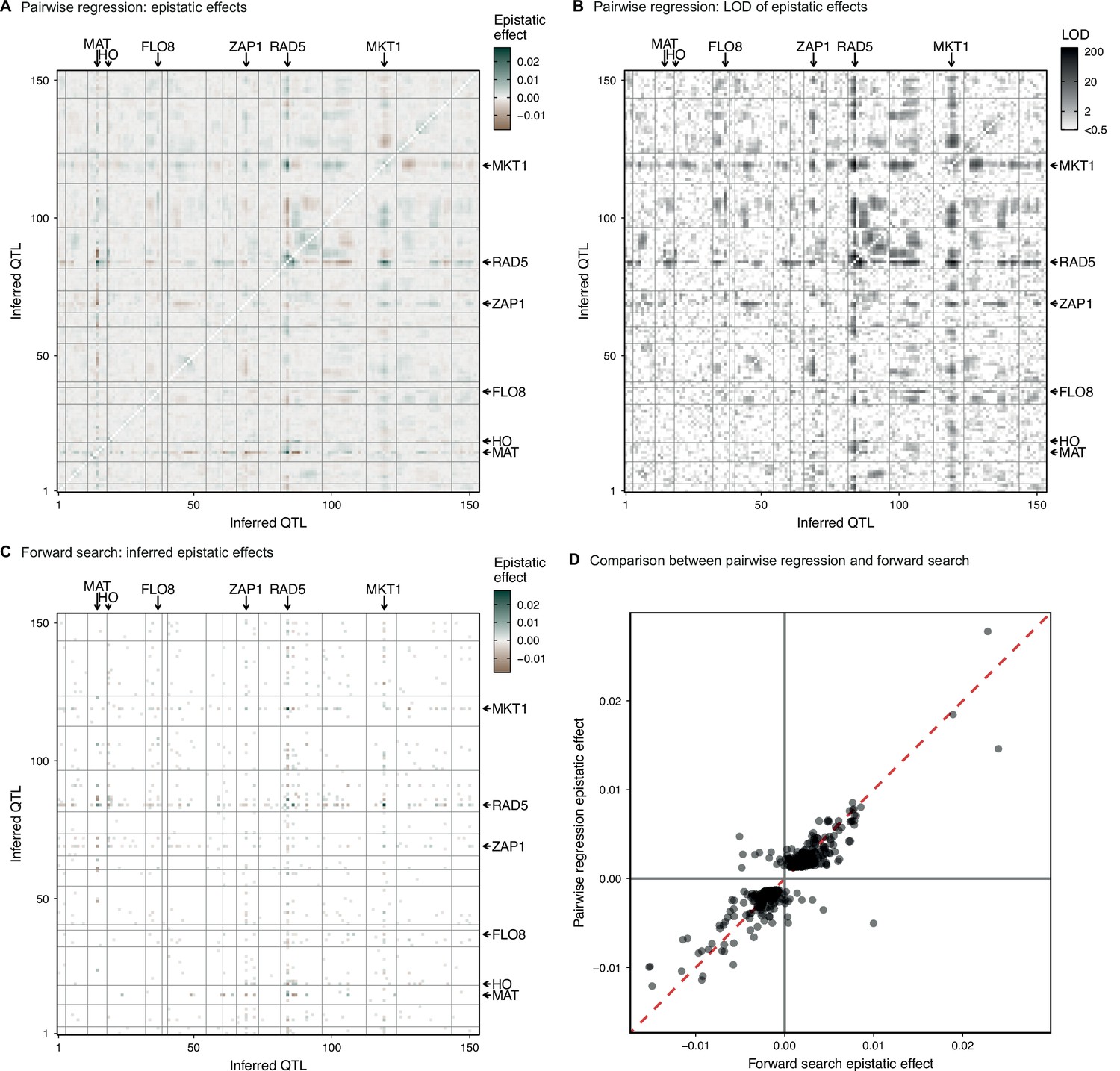
Parwise regression in 4NQO.
(A, B) Interaction coefficient and assoociated LOD for all pairs of QTL for which we previously infer an additive effect, estimated by linear regression of the measured 4NQO fitness on the genotype posterior probabilities at two sites at a time. (C) Epistatic interaction coefficients selected by the forward search procedure described in the text. (D) Comparison of forward search interaction coefficients and their respective pairwise regression estimates. In (A–C) QTL are organized in genomic order, with vertical and horizontal lines indicating chromosome limits. Among highlighted genes, MAT and HO are marker loci used in our cross. CAN1 is linked to the the highlighted FLO8 QTL. See Figure 1—figure supplement 3 for more info.
Figure 4—figure supplement 5
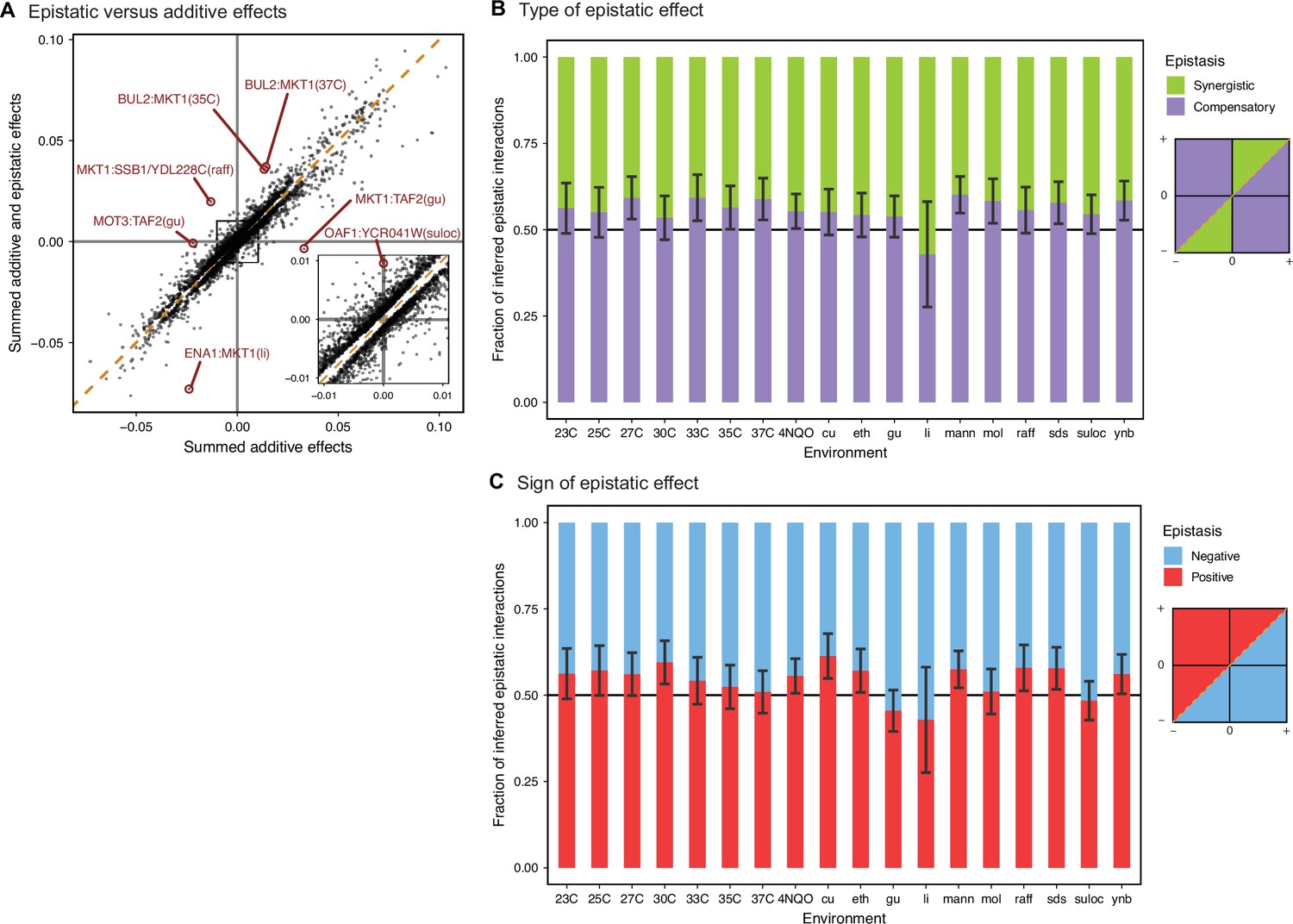
Comparison between additive and epistatic effects.
(A) Sum of additive and epistatic effects versus sum of additive effects only for all pairs of interacting QTL selected across all our epistatic models. Notable examples are highlighted and labeled with corresponding pair of genes and environment. Diagonal dashed line is the identity. Inset is zoomed in the indicated region. Breakdown of epistatic interactions between (B) synergistic or compensatory, and (C) positive or negative, classified in relation to panel A as indicated in the diagrams. Error bars are 95% confidence intervals of the binomial proportion estimate.
Figure 4—figure supplement 6
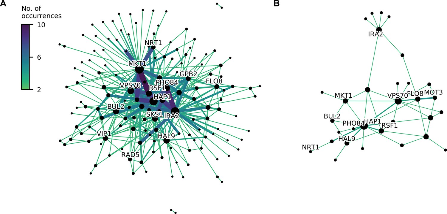
Consensus epistatic networks, as in Figure 4D.
(A) Consensus network for correlated traits (23 C, 25 C, 27 C, 30 C, 33 C, 35 C, 37 C, cu, eth, mann, raff, sds). (B) Consensus network for uncorrelated traits (4NQO, li, gu, mol, suloc, ynb).
Figure 5 with 2 supplements
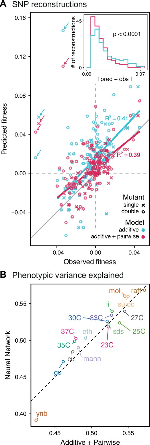
Evaluating model performance.
(A) Comparison between the measured fitness of reconstructions of 6 single (crosses) and nine double mutants (circles) in 11 environments, and their fitness in those environments as predicted by our inferred additive-only (cyan) or additive-plus-pairwise-epistasis models (magenta). The one-to-one line is shown in gray. values correspond to to shown fitted linear regressions for each type of model (colored lines), excluding MKT1 mutants measured in gu environment (outliers indicated by arrows). Inset shows the histogram of the absolute difference between observed and predicted reconstruction fitness under our two models, with the -value from the permutation test of the difference between these distributions indicated. See Figure 5—figure supplements 1 and 2 for a full breakdown of the data, and Figure 5—source data 1 for measured and predicted fitness values. (B) Comparison between estimated phenotypic variance explained by the additive-plus-pairwise-epistasis model and a trained dense neural network of optimized architecture.
-
Figure 5—source data 1
SNP reconstructions’ fitness measurements and predictions.
- https://cdn.elifesciences.org/articles/73983/elife-73983-fig5-data1-v2.txt
Figure 5—figure supplement 1
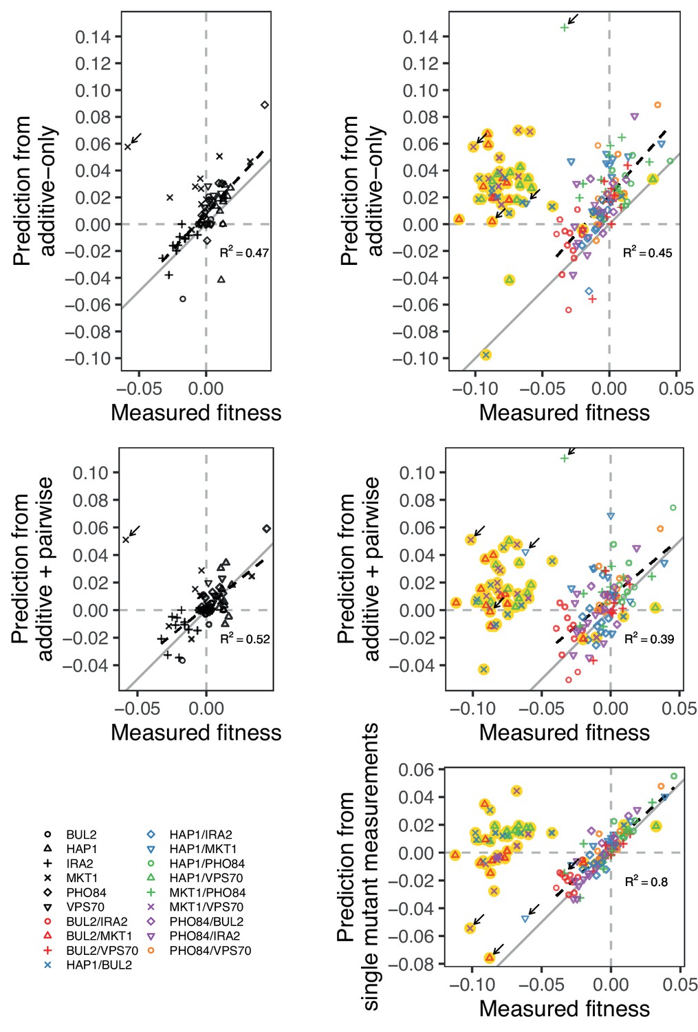
Comparison between measured and predicted fitness of reconstructions, as in Figure 5, broken down by mutation (single or double) and model type (additive-only or additive-plus-pairwise).
We also compare the measured fitness of double mutants, with the sum of the measured fitness of the respective single mutants. Highlighted in yellow are outlier strains removed from analyses and Figure 5, as explained in the Materials and Methods: BUL2-MKT1, HAP1-BUL2, HAP1-VPS70, and MKT1-VPS70. Arrow indicates the strains containing the MKT1 mutation in Gu, which were also removed from analyses. In gray is the 1:1 line. Dashed lines show a linear regression (excluding outliers), with their -values indicated.
Figure 5—figure supplement 2
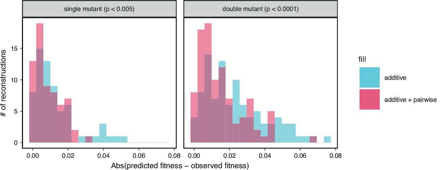
Comparison between observed and predicted reconstruction strain fitness, as in the inset of Figure 5A.
The histogram of the absolute difference between predicted and observed values is shown for both single and double mutation reconstructions with their respective permutation test -values indicated above each.
Appendix 1—figure 1
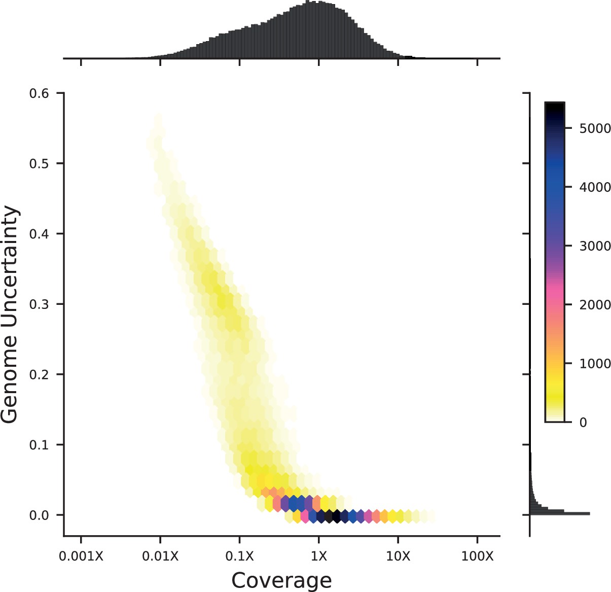
Density plot of genome uncertainty as a function of coverage (on a log-10 scale) for all 99,950 segregants.
Marginal distributions show the coverage (above) and uncertainty (left) histograms for all segregants.
Appendix 1—figure 2

Genome inference calibration.
For a segregant initially sequenced to 0.15 X coverage, loci were binned into 10 equal bins according to their genotype posterior probability. For each bin, we plot the average posterior probability for each bin against the fraction of those loci that were found to be RM in high-coverage sequencing data (i.e. showed a posterior probability of ≥0.99). The dashed grey line represents the expectation for perfectly calibrated posterior probabilities. Error bars are given by where is the fraction of RM loci and is the total number of loci in the bin.
Appendix 1—figure 3

Impact of low vs high coverage on both inference and performance of QTL models.
Left: numbers of QTL inferred for a selection of 6 traits, using either the highest-coverage decile (dark blue, coverage fraction >0.79, coverage >3X) or lowest-coverage decile (light blue, coverage fraction <0.03, coverage <0.05X) as the training set. Center: performance of the QTL models inferred with high-coverage (dark blue) or low-coverage (light blue) training sets on a high-coverage test set. Right: performance of the QTL models inferred with high-coverage (dark blue) or low-coverage (light blue) training sets on a low-coverage test set.
Appendix 1—figure 4

Credible interval sizes in basepairs (left) or number of contained genes (right), for models inferred from high-coverage training data (dark blue) or low-coverage training data (light blue).
Distributions represent QTL from all six traits.
Appendix 2—figure 1
Bulk Fitness Assay simulations.
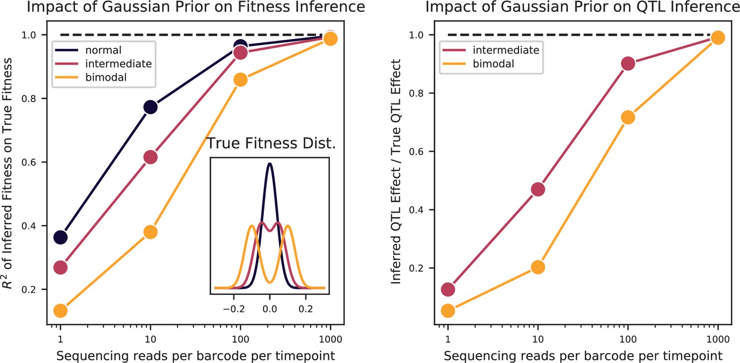
Simulated phenotypes are drawn from the distributions shown in the left plot inset, for normal, bimodal, and intermediate distributions. Left: accuracy of fitness inference ( of inferred fitnesses on true fitnesses) as a function of sequencing coverage, for the three distributions. Right: Inference of the strong QTL effect as a fraction of the true effect for the bimodal and intermediate distributions, as a function of sequencing coverage.
Appendix 3—figure 1
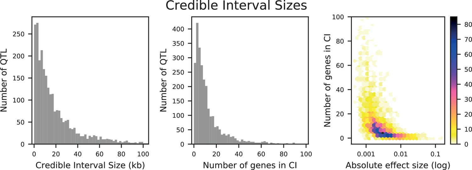
Distributions of credible interval (CI) sizes for inferred QTL across all traits.
Left: physical size in kilobases, with 2 kb bins. Center: number of genes that overlap each CI, with 2-gene bins. Right: density plot of number of genes that overlap each CI versus absolute effect size (on a log-10 scale). The count in each bin is indicated by the colorbar.
Appendix 3—figure 2

Performance of LASSO inference on simulated QTL architectures with 15, 50, or 150 true QTL at varying heritabilities.
Left: number of inferred QTL. Center: number of inferred QTL divided by number of true QTL. The dotted line indicates a value of 1 (the correct number of QTL). Right: Proportion of variance explained () of the model, estimated from cross-validation, as a fraction of the simulated broad-sense heritability. The dotted line indicates a value of 1 (all broad-sense heritability is explained by the model).
Appendix 3—figure 3
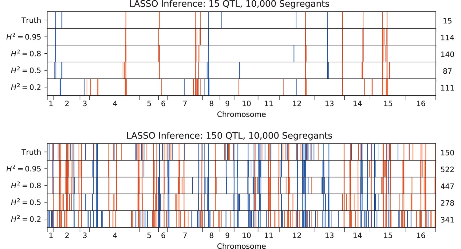
QTL inferred by LASSO plotted along the genome, for different heritabilities.
Models were inferred with a sample of 10,000 segregants, for simulated architectures with (top) 15 or (bottom) 150 true QTL. QTL are colored red (blue) if their effect is positive (negative) and opacity is given by effect size (on a log scale). The number of QTL in the true or inferred models is given to the right.
Appendix 3—figure 4
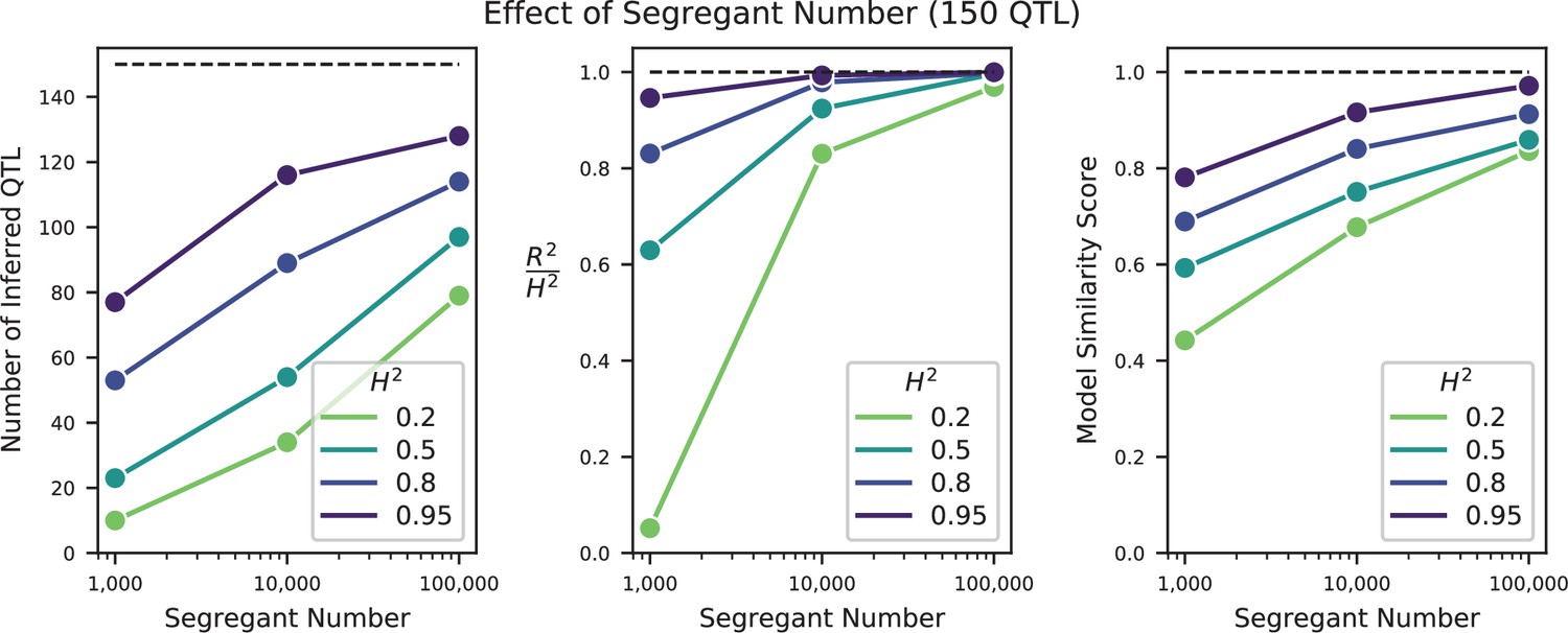
Effect of sample size on QTL inference.
Left: Number of inferred QTL. Dashed line represents the number of QTL in the true model (150). Center: Model performance ( on a test set of individuals) as a fraction of heritability . Dashed line represents , meaning all of the genetic variance is explained by the model. Right: Model similarity score (see Section A3-2.3) between the true and inferred models. Dashed line represents perfect recovery of the true model.
Appendix 3—figure 5
Effect of heritability on QTL inference (for 10,000 segregants).
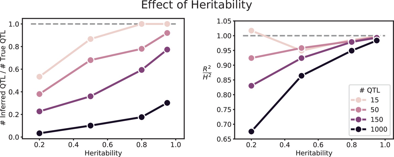
Left: Number of inferred QTL, as a fraction of the number of true QTL. Right: Model performance ( on a test set of individuals) as a fraction of heritability . Dashed line represents , meaning all of the genetic variance is explained by the model.
Appendix 3—figure 6
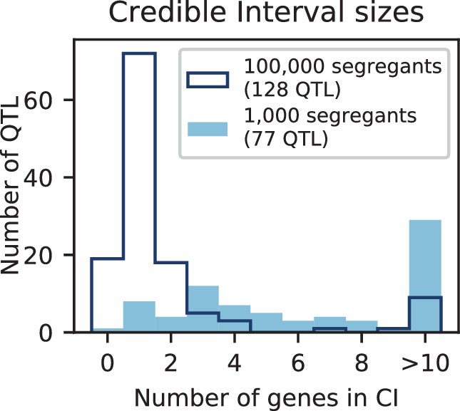
Number of genes contained in 95% credible intervals inferred on simulated data (at 150 QTL), for 1000 segregants (light blue shaded) and 100,000 segregants (dark blue outline).
Total numbers of inferred QTL are given in the legend.
Appendix 3—figure 7
Inferred QTL plotted along the genome, for different sample sizes.
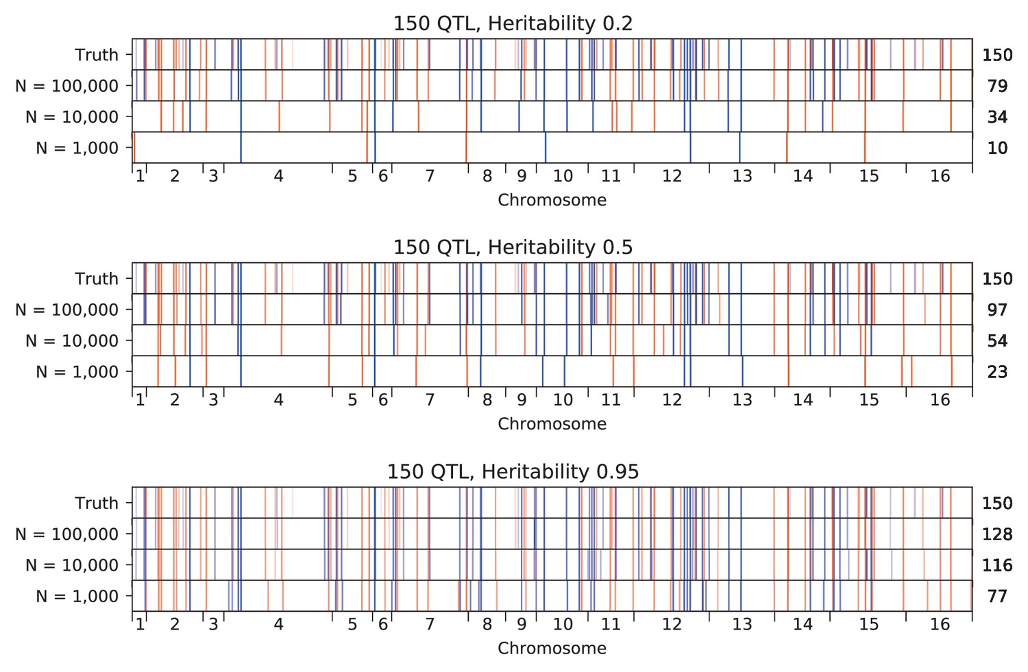
The true model (same for all subfigures) has 150 QTL and heritability given in the subfigure title. QTL are colored red (blue) if their effect is positive (negative) and opacity is given by effect size (on a log scale). Number of inferred QTL for each model is shown on the right.
Appendix 3—figure 8
Inferred QTL plotted along the genome, for different heritabilities.
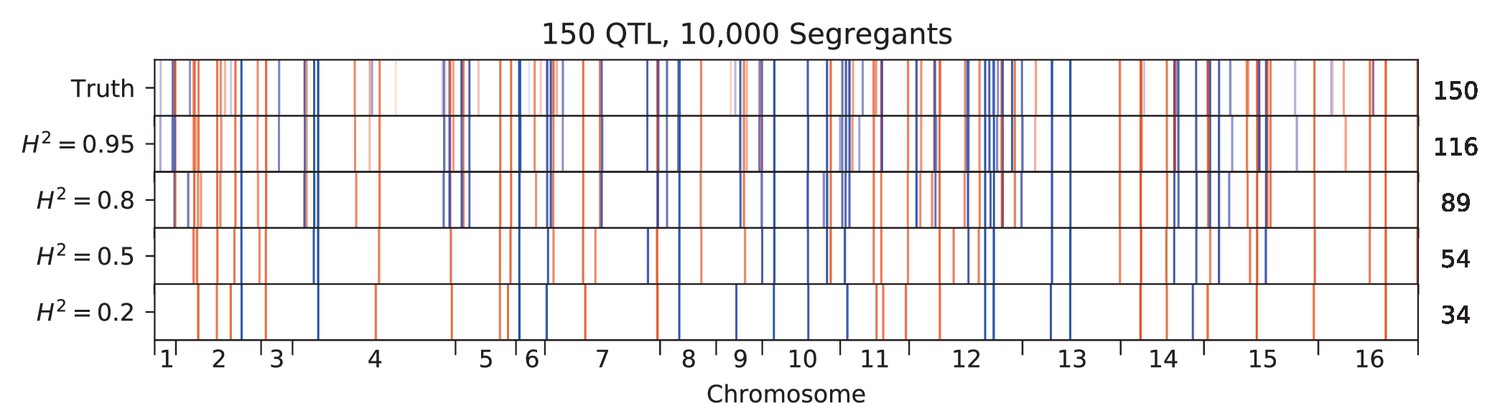
The true model has 150 QTL, and all inference is performed on a sample size of 10,000 segregants. QTL are colored red (blue) if their effect is positive (negative) and opacity is given by effect size (on a log scale). Number of inferred QTL for each model is shown on the right.
Appendix 3—figure 9
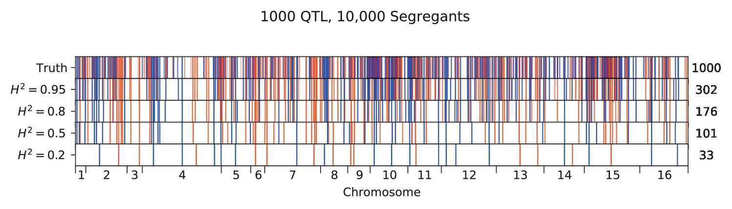
Inferred QTL plotted along the genome, for different heritabilities.
The true model has 1000 QTL, and all inference is performed on a sample size of 10,000 segregants. QTL are colored red (blue) if their effect is positive (negative) and opacity is given by effect size (on a log scale). Number of inferred QTL for each model is shown on the right.
Appendix 3—figure 10
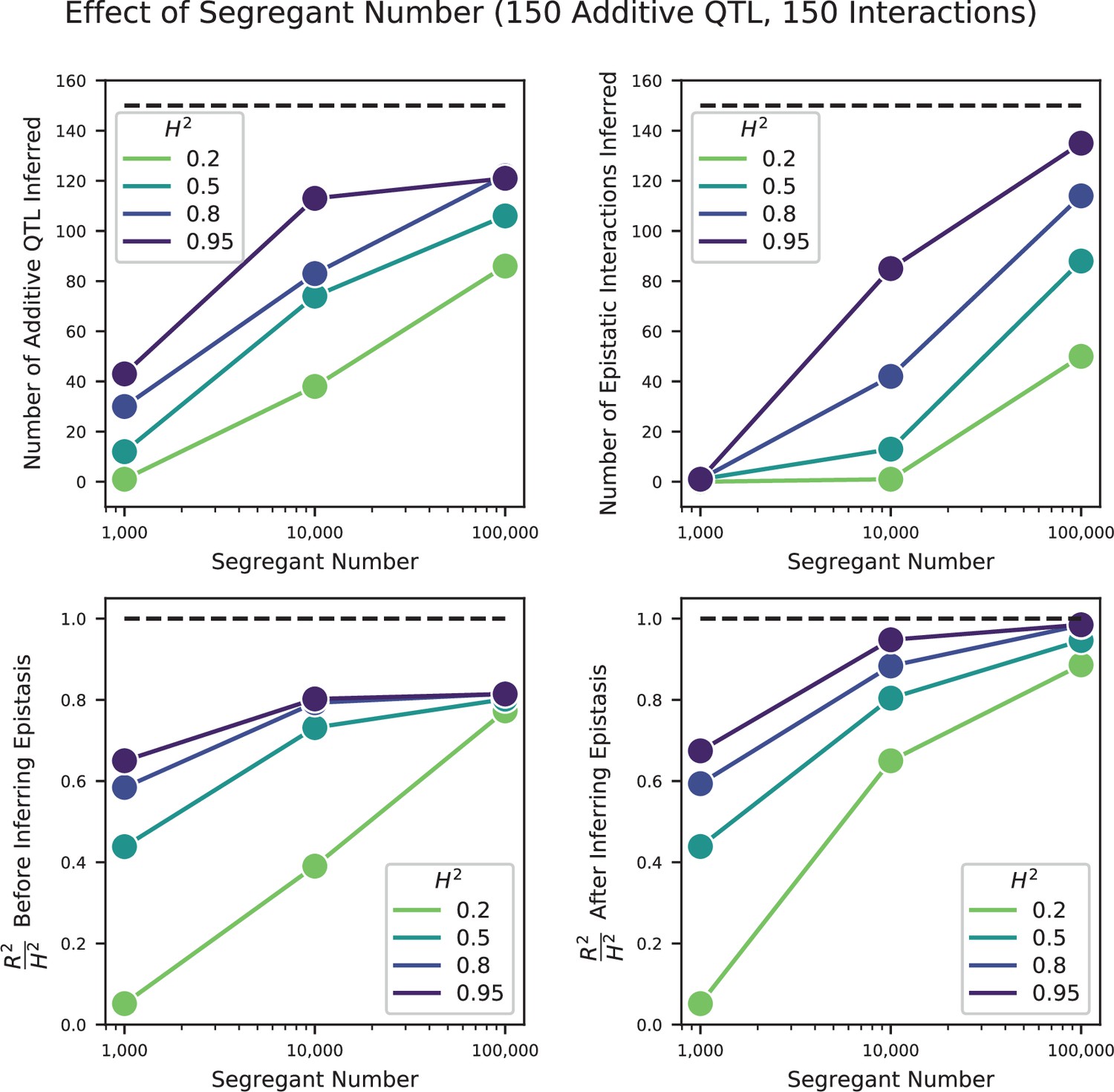
Effect of segregant number on QTL inference with epistasis.
Top left: Number of inferred additive QTL. Dashed line represents the number of QTL in the true model (150). Top right: Number of inferred epistatic interactions. Dashed line represents the number of epistatic interactions in the true model (150). Bottom left: Model performance ( on a test set of individuals) as a fraction of heritability , where performance is evaluated on the optimized model with only additive terms (before epistatic interactions are inferred). Dashed line represents , meaning all of the genetic variance is explained by the model. Bottom right: Model performance ( on a test set of individuals) as a fraction of heritability, where performance is evaluated on the fully optimized model with additive and epistatic terms. Dashed line represents , meaning all of the genetic variance is explained by the model.
Appendix 3—figure 11

Comparison of true and inferred epistatic effects for different segregant numbers.
Upper diagonal: True model versus inferred model with 100,000 segregants and heritability ; lower diagonal: true model versus inferred model with 10,000 segregants and heritability . In both plots, epistatic interactions are represented by dots with position given by the genome location of the two SNPs involved and size scaled by the magnitude of effect size of the interaction (on a log scale). Epistatic interactions in the true model are colored yellow and those in the inferred model are colored blue. Dots appear green where the true and inferred interactions overlap; thus yellow dots alone represent false negatives and blue dots alone represent false positives.
Appendix 3—figure 12

Comparison of true and inferred epistatic effects for different heritabilities.
Upper diagonal: True model versus inferred model with 100,000 segregants and heritability ; lower diagonal: true model versus inferred model with 100,000 segregants and heritability. Scaling and coloring as in Appendix 3—figure 11.
Appendix 3—figure 13
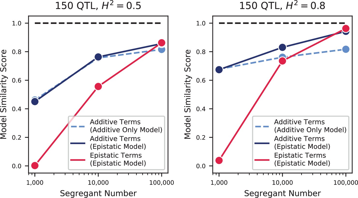
Model similarities for simulated epistatic architectures, as a function of segregant number.
In each panel, we show the model similarity scores between the true model and the additive-only model (dashed light blue), the additive terms in the additive-plus-epistatic model (dark blue), and the epistatic terms in the additive-plus-epistatic model (red). Left: heritability of 0.5; Right: heritability of 0.8. The true model (same in all cases) has 150 additive QTL and 150 epistatic interactions.
Appendix 3—figure 14
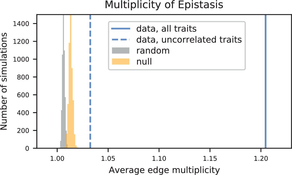
Empirical null distributions for average edge multiplicity (the expected number of traits in which an edge will be observed, given that it was observed in at least one trait).
Histograms, data from 5000 simulations of random (grey) and null (orange) networks. Values from data are shown as vertical lines (all 18 traits, solid line; group of 7 uncorrelated traits, dashed line).
Appendix 4—figure 1
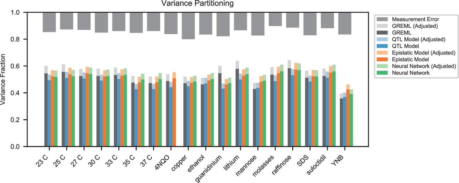
Variance partitioning for all traits.
Phenotyping measurement error is shown at top (grey). We show the variance explained by a random-effects model (black), our inferred additive QTL model (blue), our inferred additive-plus-pairwise-epistasis QTL model (orange), and a trained deep neural network (green). Light shades indicate correction for genotyping uncertainty.
Appendix 4—figure 2
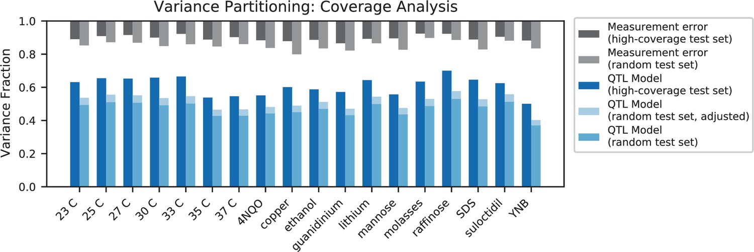
Variance partitioning for high-coverage individuals.
Measurement error for high-coverage individuals (black) and random individuals (grey) is shown at the top. For each trait, we show the variance explained by our additive QTL model on a high-coverage test set (left) or a random test set (right; correction for genotype uncertainty shown in light blue).
Tables
Table 1
Phenotyping growth conditions.
Summary of the eighteen competitive fitness phenotypes we analyze in this study. All assays were conducted at 30 °C, except when stated otherwise. YP: 1% yeast extract, 2% peptone. YPD: 1% yeast extract, 2% peptone, 2% glucose. SD: synthetic defined medium, 2% glucose. YNB: yeast nitrogen base, 2% glucose. Numbers of inferred additive QTL and epistatic interactions are also shown.
| Name | Description | Additive QTL | Epistatic QTL |
|---|---|---|---|
| 23 C | YPD, 23 °C | 112 | 185 |
| 25 C | YPD, 25 °C | 134 | 189 |
| 27 C | YPD, 27 °C | 149 | 255 |
| 30 C | YPD, 30 °C | 159 | 247 |
| 33 C | YPD, 33 °C | 147 | 216 |
| 35 C | YPD, 35 °C | 117 | 250 |
| 37 C | YPD, 37 °C | 128 | 265 |
| sds | YPD, 0.005% (w/v) SDS | 175 | 263 |
| raff | YP, 2% (w/v) raffinose | 167 | 221 |
| mann | YP, 2% (w/v) mannose | 169 | 341 |
| cu | YPD, 1 mM copper(II) sulfate | 143 | 225 |
| eth | YPD, 5% (v/v) ethanol | 149 | 247 |
| suloc | YPD, 50 µM suloctidil | 173 | 314 |
| 4NQO | SD, 0.05 µg/ml 4-nitroquinoline 1-oxide | 153 | 394 |
| ynb | YNB, w/o AAs, w/ ammonium sulfate | 145 | 303 |
| mol | molasses, diluted to 20% (w/v) sugars | 111 | 235 |
| gu | YPD, 6 mM guanidinium chloride | 185 | 277 |
| li | YPD, 20 mM lithium acetate | 83 | 42 |
Table 2
Summary of significant GO enrichment terms (Table 2—source data 1).
| Go id | Term | Corrected p-value | # Genes |
|---|---|---|---|
| GO:0000981 | RNA polymerase II transcription factor activity, sequence-specific DNA binding | 0.000026 | 30 |
| GO:0140110 | Transcription regulator activity | 0.000066 | 42 |
| GO:0000976 | Transcription regulatory region sequence-specific DNA binding | 0.000095 | 29 |
| GO:0044212 | Transcription regulatory region DNA binding | 0.000113 | 29 |
| GO:0003700 | DNA binding transcription factor activity | 0.000148 | 31 |
| GO:0001067 | Regulatory region nucleic acid binding | 0.000161 | 29 |
| GO:0043565 | Sequence-specific DNA binding | 0.000269 | 41 |
| GO:0001227 | Transcriptional repressor activity, RNA polymerase II transcription regulatory region sequence-specific DNA binding | 0.000417 | 9 |
| GO:0003677 | DNA binding | 0.000453 | 65 |
| GO:0043167 | Ion binding | 0.000999 | 143 |
| GO:1990837 | Sequence-specific double-stranded DNA binding | 0.001449 | 32 |
| GO:0000977 | RNA polymerase II regulatory region sequence-specific DNA binding | 0.007709 | 21 |
| GO:0001012 | RNA polymerase II regulatory region DNA binding | 0.007709 | 21 |
-
Table 2—source data 1
Full results of GO analysis on pleiotropic genes.
- https://cdn.elifesciences.org/articles/73983/elife-73983-table2-data1-v2.txt
Key resources table
| Reagent type (species) or resource | Designation | Source or reference | Identifiers | Additional information |
|---|---|---|---|---|
| Strain, strain background (S. cerevisiae) | BY4741 | Baker Brachmann et al., 1998 | – | BY parent background |
| Strain, strain background (S. cerevisiae) | RM11-1a | Brem et al., 2002 | – | RM parent background |
| Strain, strain background (S. cerevisiae) | YAN696 | This paper | – | BY parent |
| Strain, strain background (S. cerevisiae) | YAN695 | This paper | – | RM parent |
| Strain, strain background (S. cerevisiae) | BB-QTL F1 strain library | This paper | – | 100,000 strains of barcoded BYxRM F1 produced, genotyped and characterized in this paper |
| Strain, strain background (E. coli) | BL21(DE3) | NEB | NEB:C2527I | Zymolyase and barcoded Tn-5 expression system |
| Recombinant DNA reagent | pAN216a pGAL1-HO pSTE2-HIS3 pSTE3 LEU2 (plasmid) | This paper | – | For MAT-type switching |
| Recombinant DNA reagent | pAN3H5a 1/2URA3 KanP1 ccdB LoxPR (plasmid) | This paper | – | Type one barcoding plasmid, without barcode library |
| Recombinant DNA reagent | pAN3H5a LoxPL ccdB HygP1 2/2URA3 (plasmid) | This paper | – | Type two barcoding plasmid, without barcode library |
| Sequence-based reagent | Custom Tn5 adapter oligos | This paper | Tn5-L and -R | See Materials and methods |
| Sequence-based reagent | Custom sequencing adapter primers | This paper | P5mod and P7mod | See Materials and methods |
| Sequence-based reagent | Custom barcode amplification primers | This paper | P1 and P2 | See Materials and methods |
| Sequence-based reagent | Custom sequencing primers for Illumina | This paper | Custom_read_1 through 4 | See Materials and methods |
| Software, algorithm | Custom code for genotype inference | This paper | – | See code repository |
| Software, algorithm | Custom code for phenotype inference | This paper | – | See code repository |
| Software, algorithm | Custom code for compressed sensing | This paper | – | See code repository |
| Software, algorithm | Custom code for qtl inference | This paper | – | See code repository |
Appendix 3—table 1
Values for tests of directional selection.
| Condition | Sign test | Variance test | Constrained sign test |
|---|---|---|---|
| 23 C | 0.2191 | 0.0248 | 0.9035 |
| 25 C | 0.0193 | 0.0147 | 0.4001 |
| 27 C | 0.0489 | 0.0163 | 0.4786 |
| 30 C | 0.0389 | 0.011 | 0.5603 |
| 33 C | 0.0081 | 0.0053 | 0.2919 |
| 35 C | 0.19 | 0.01 | 0.953 |
| 37 C | 0.1846 | 0.0082 | 0.9536 |
| 4NQO | 0.052 | 0.2871 | 0.1275 |
| li | 0.8264 | 0.4085 | 0.6755 |
| mann | 0.356 | 0.2994 | 0.577 |
| mol | 0.4478 | 0.2428 | 0.4812 |
| sds | 0.0153 | 0.025 | 0.1887 |
| gu | 0.0032 | 0.2353 | 0.0119 |
| suloc | 0.6484 | 0.4292 | 0.6779 |
| ynb | 0.0125 | 0.1264 | 0.0798 |
| raff | 0.9999 | 0.1107 | 0.9865 |
| eth | 0.7433 | 0.4944 | 0.7562 |
| cu | 0.1807 | 0.0621 | 0.6308 |
Appendix 3—table 2
Results from -test of independence (with Yates’ continuity correction) between A (an epistatic interaction screened by our search is identified in our search) and B (an epistatic interaction screened by our search is identified by Costanzo et al., 2016) at three levels of stringency for B, as described in the text.
Overlap is the number of gene interactions identified by both studies.
| Stringency level | P(A|B’) | P(A|B) | Overlap | ||
|---|---|---|---|---|---|
| Lenient | 2.32% | 2.25% | 494 | 0.37 | 0.54 |
| Intermediate | 2.29% | 2.44% | 187 | 0.62 | 0.43 |
| Stringent | 2.29% | 2.86% | 96 | 4.46 | 0.03 |
Additional files
-
Supplementary file 1
SNP list.
Our final list of 41,594 SNPs. We provide the chromosome; the SNP index (note these are indexed from 1, while SNP indices in other files are indexed from 0); the chromosome position in basepairs; and the BY and RM alleles.
- https://cdn.elifesciences.org/articles/73983/elife-73983-supp1-v2.xlsx
-
Supplementary file 2
Inferred additive QTL.
For each trait, a list of all inferred additive QTL is ranked in order of decreasing effect size magnitude. For each QTL, we provide the effect size; SNP list index of the lead SNP, credible interval (CI) start, and CI end; chromosome; chromosome position (in basepairs) of the lead SNP, CI start, and CI end; and the list of genes with coding regions at least partially overlapping the CI (gene names are given when possible, otherwise ORF names are given).
- https://cdn.elifesciences.org/articles/73983/elife-73983-supp2-v2.xlsx
-
Supplementary file 3
Pleiotropic genes.
A list of genes containing a lead SNP in two or more traits (‘pleiotropic genes’), ranked by the number of traits. For each gene, we give the number of traits in which a lead SNP was detected; the chromosome; the gene name; the number of consensus genes (genes which overlap the intersection of credible intervals from all traits); the names of consensus genes; the lead SNP index identified in each of the traits (blank entries for traits in which the gene was not detected); the lead SNP chromosome position in basepairs in each of the traits; and the effect size in each of the traits. Following the list of pleiotropic genes, we provide a list of remaining QTL detected in only one environment, with associated data in the same format.
- https://cdn.elifesciences.org/articles/73983/elife-73983-supp3-v2.xlsx
-
Supplementary file 4
Inferred epistatic QTL.
For each trait, separate lists of the additive QTL and pairwise epistatic QTL inferred in additive-plus-pairwise models, ranked in order of decreasing effect size magnitude. For additive QTL, we provide the effect size; SNP list index of the lead SNP; chromosome; and gene in which the lead SNP is located (uppercase gene/ORF names indicate SNPs in coding regions, and lowercase gene/ORF names indicate that the SNP is intergenic but located closest to the gene given). For epistatic QTL, we provide the effect size; SNP list indices of both lead SNPs; chromosomes of both lead SNPs; chromosome positions in basepairs of both lead SNPs; and the gene name of both lead SNPs (formatted as for additive QTL). For both additive and epistatic QTL, we denote QTL located at selection markers (or immediately neighboring genes) in grey and place them at the bottom of the list; see Appendix 3.
- https://cdn.elifesciences.org/articles/73983/elife-73983-supp4-v2.xlsx
-
Supplementary file 5
Multiplicity of epistatic QTL across traits.
A list of gene pairs that are observed in epistatic interactions across all traits, ranked by the number of traits in which they occur (‘edge multiplicity’). For each gene pair, we provide the gene names, corresponding to those in Supplementary file 3; edge multiplicity (number of traits in which this pair of genes had a detected interaction); node pair multiplicity (number of traits in which this pair of genes were both detected as additive QTL, whether or not an interaction was detected); and the list of traits in which an interaction was detected. QTL located at selection markers (or immediately neighboring genes) are denoted in grey and placed at the bottom of the list; see Appendix 3.
- https://cdn.elifesciences.org/articles/73983/elife-73983-supp5-v2.xlsx
-
Supplementary file 6
Variance partitioning.
Variance partitioning, including error, additive genetic, epistatic genetic components, and neural-network on both raw and resampled phenotype data. See Appendix 4 for full definitions and discussion of all components.
- https://cdn.elifesciences.org/articles/73983/elife-73983-supp6-v2.xlsx
-
Transparent reporting form
- https://cdn.elifesciences.org/articles/73983/elife-73983-transrepform1-v2.pdf
Download links
A two-part list of links to download the article, or parts of the article, in various formats.
Downloads (link to download the article as PDF)
Open citations (links to open the citations from this article in various online reference manager services)
Cite this article (links to download the citations from this article in formats compatible with various reference manager tools)
Barcoded bulk QTL mapping reveals highly polygenic and epistatic architecture of complex traits in yeast
eLife 11:e73983.
https://doi.org/10.7554/eLife.73983


