Individualized discovery of rare cancer drivers in global network context
- Department of Microbiology, Tumor and Cell Biology, Karolinska Institutet, Sweden
- Science for Life Laboratory, Sweden
- Evi-networks, enskild konsultföretag, Sweden
Figures
Figure 1
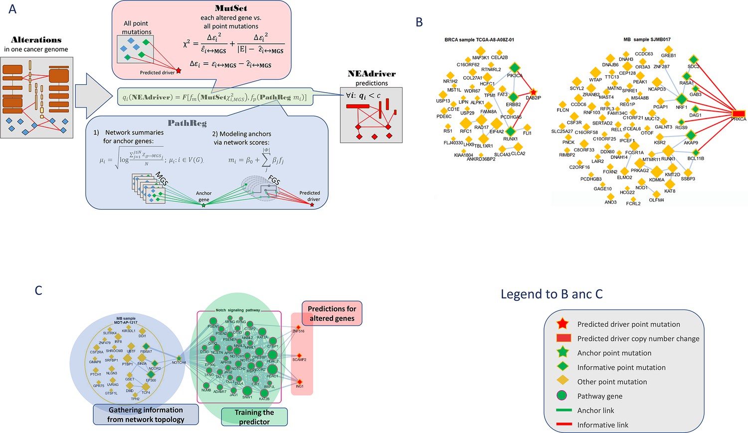
Visualization of NEAdriver analysis.
(A) Workflow according to the algorithm described in Methods. (B) Examples of MutSet analysis to mutation gene sets in two cohorts.(C) Example PathReg analysis in MB cohort. Legend to nodes and edges.
Figure 2 with 4 supplements
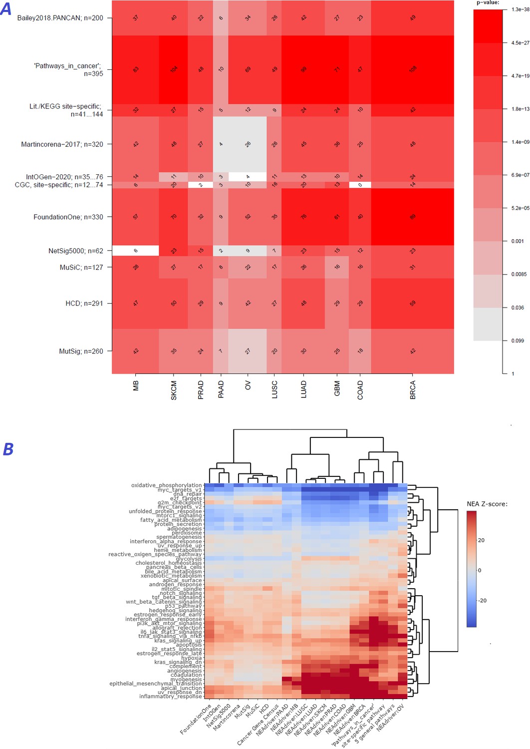
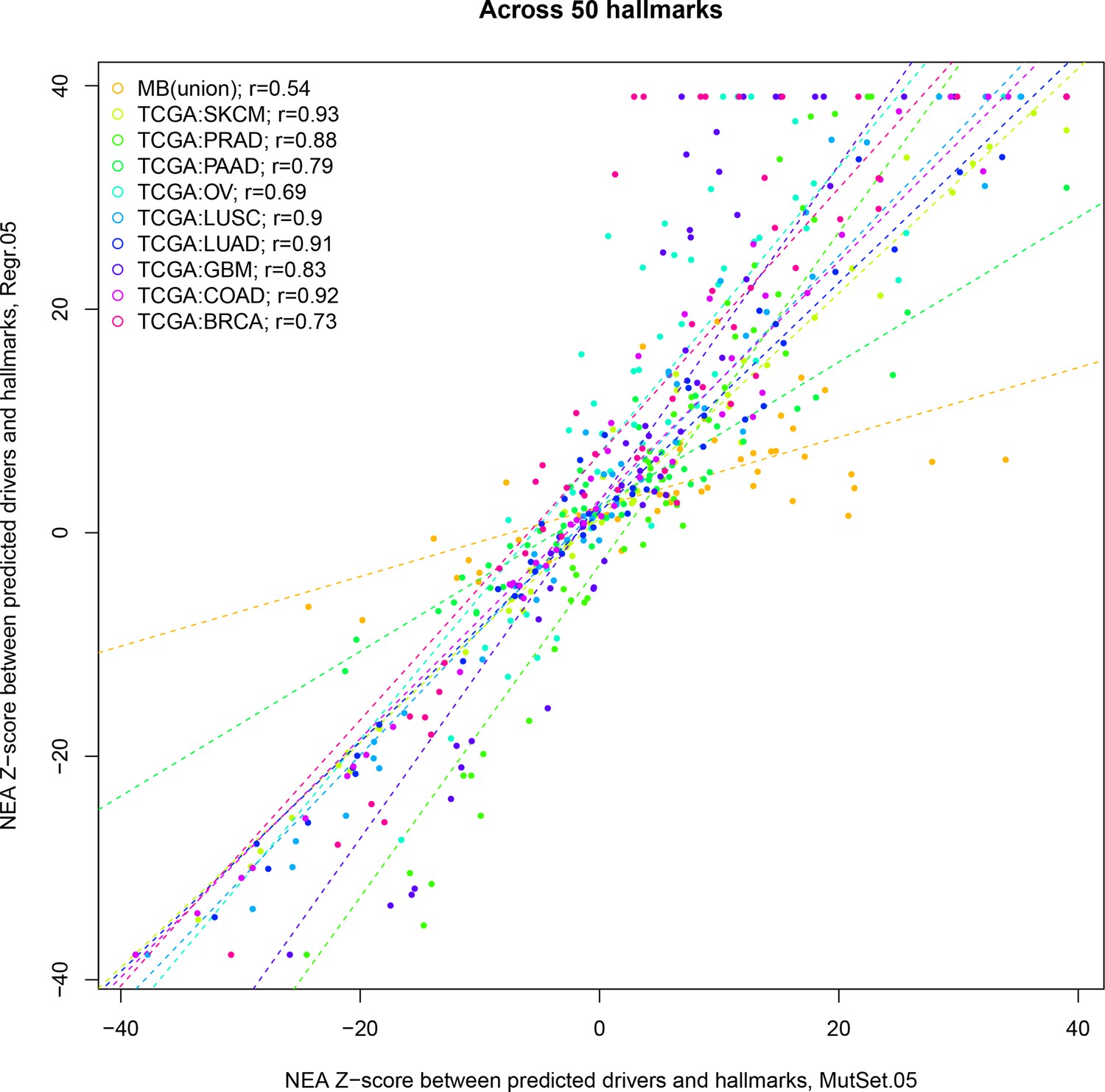
Agreement between NEAdriver and reference gene sets.
(A) The heatmap matrix elements represent overlap between the cohort-specific sets of predicted NEAdriver gene sets at q(MutSet&PathReg)<0.05 and gene sets from curated resources and alternative methods. Row and column widths are proportional to gene sets sizes. All the reference gene sets had fixed, ‘pan-cancer’ member sets independent of cancer site, except Cancer Gene Census, IntOGen, and literature/KEGG site-specific sets, for which size ranges are given. B. Network enrichment of the cancer gene sets with regard to 50 hallmarks (Liberzon et al., 2015). NEAdriver sets defined at q(MutSet&PathReg)<0.05 are represented by 165 genes for each cohort, most frequent across its samples(n=165 was chosen for being half of the size of FoundationOne set).
Figure 2—figure supplement 1

Network enrichment of the cancer gene sets with regard to 50 hallmarks.
Sets of genes which most frequently received confident (q<0.05) scores from MutSet and PathReg channels in each cohort were analyzed in terms of network connectivity against the 50 hallmarks (Liberzon et al., 2015). Point mutation gene sets (MGS), represented by 165 most frequent genes for each cohort.
Figure 2—figure supplement 2
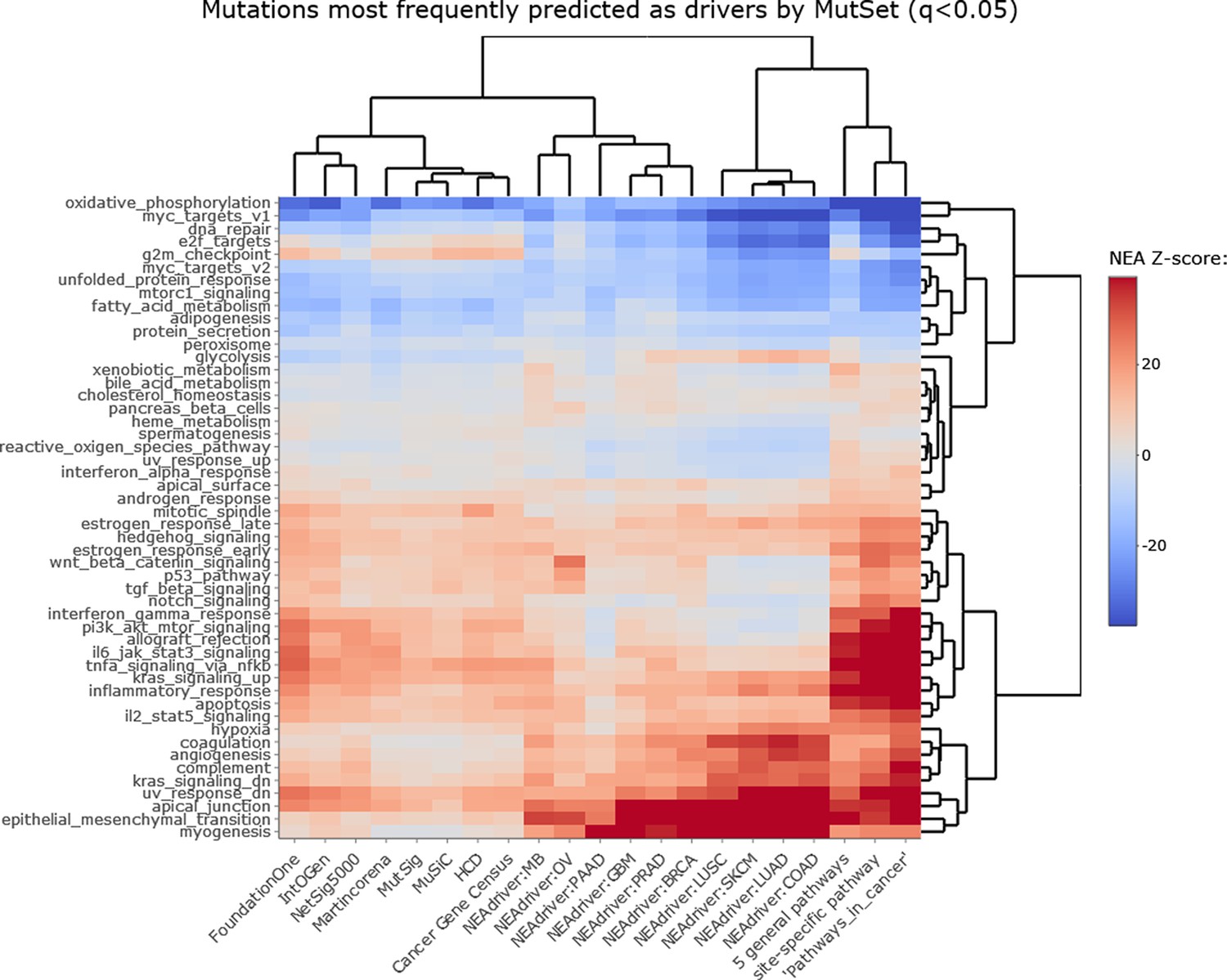
NEAdriver sets defined at q(MutSet)<0.05 and represented by 165 genes for each cohort.
Figure 2—figure supplement 3
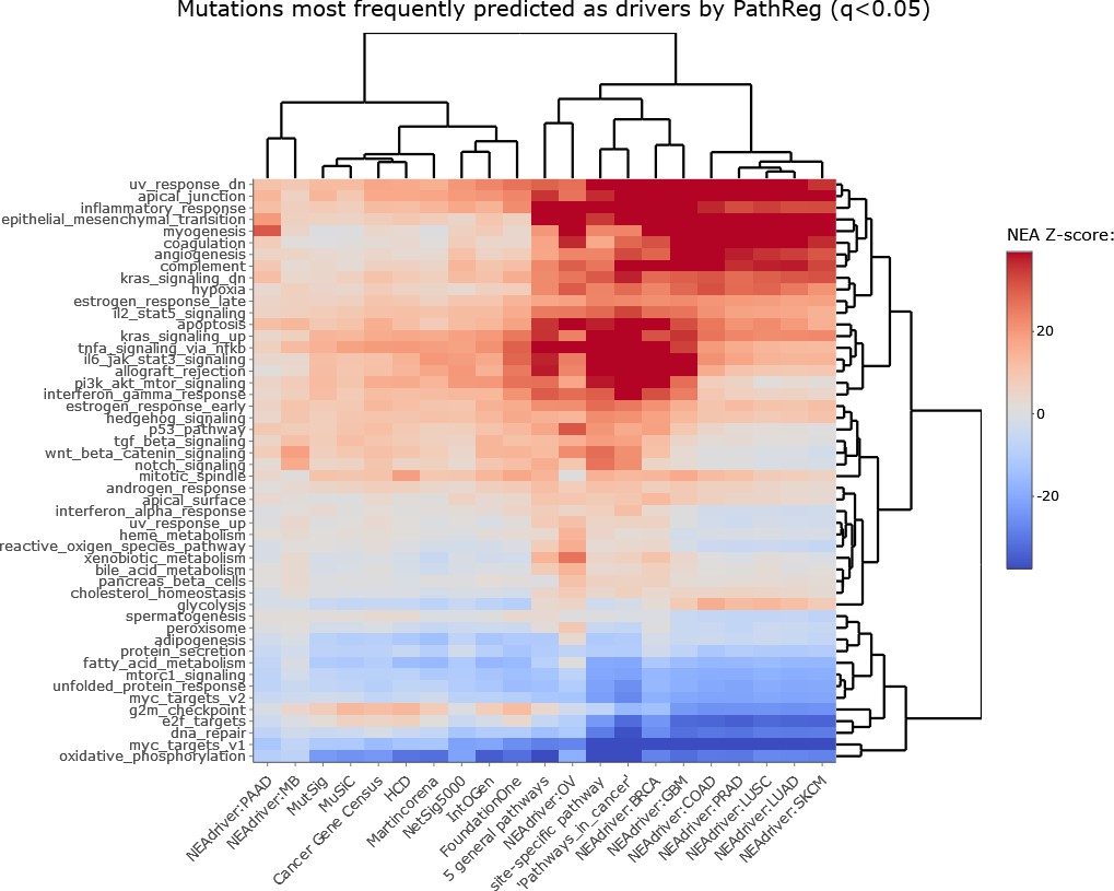
NEAdriver sets defined at q(PathReg)<0.05 and represented by 165 genes for each cohort.
Figure 2—figure supplement 4
Correlations between from PathReg and MutSet channels.
The points represent positions of individual hallmarks in each cohort.
Figure 3 with 10 supplements
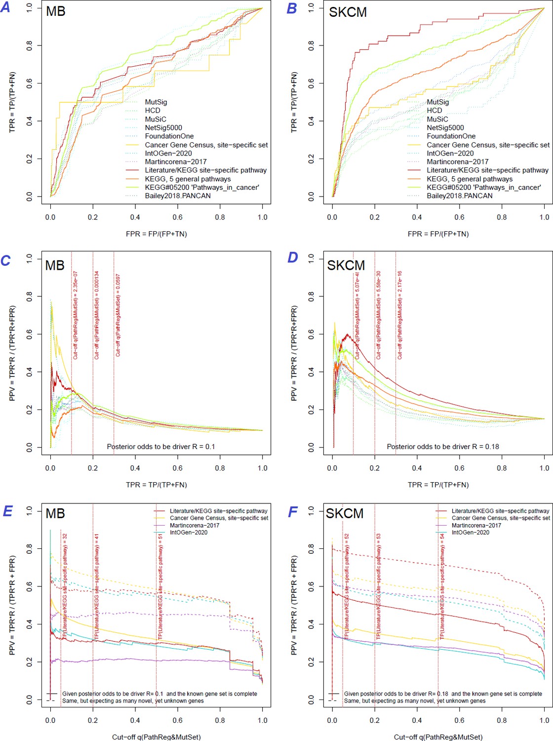
Performance of the new driver prediction evaluated on different benchmarks.
Two cohorts with very low versus high passenger mutation load, medulloblastoma (MB: A,C,E) and skin cutaneous melanoma (SKCM: B,D,F), represent contrast conditions for computational driver discovery. The NEAdriver predictions were quantified by the cumulative statistic q(MutSet&PathReg)<0.05 and matched to reference sets. (A) and (B): ROC curves in the space of true positive versus false positive rates in the classical definition of ‘precision’. (C) and (D): Precision-recall curves where precision was calculated via inclusion of odds ‘driver/non-driver’.(E and F) calibration of positive predictive value, PPV against false discovery rate (q~1 – PPV; solid lines) and modeling of PPV in presence of true, but yet unknown drivers (dot-dashed lines) using site-specific and pan-cancer benchmarks. The dotted vertical cutoff lines referto cancer site specific pathway sets, taken from either to the literature or respective KEGG pathway. Cutoffs in (C) and (D) display q(MutSet&PathReg) values, whereas TP counts in (E) and (F) are numbers of unique site-specific genes discovered under variable q(MutSet&PathReg) threshold shown at X-axis.
Figure 3—figure supplement 1
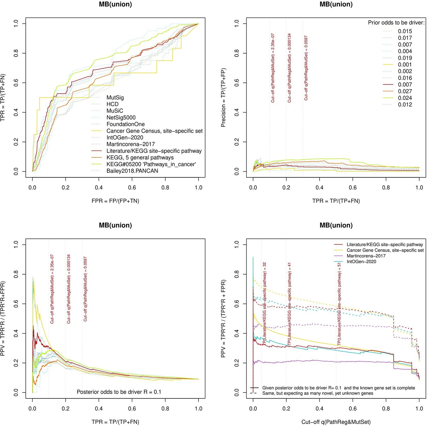
Performance of the new driver prediction evaluated on different benchmarks.
separate cohort files consisting of four panes each: Upper left: ROC curves in the space of true positive versus false positive rates in the classical definition of ‘precision’. Upper right: Precision-recall curves accounting for true and false positives as given by each gold standard set. Bottom left: Precision-recall curves where precision was calculated via inclusion of odds ‘driver/non-driver’. Bottom right: calibration of positive predictive value against false discovery rate (q~1 – PPV; solid lines) and modeling of PPV in presence of true yet unknown drivers (dot-dashed lines).
Figure 3—figure supplement 2

Performance of the new driver prediction evaluated on different benchmarks, all cohorts.
Figure 3—figure supplement 3
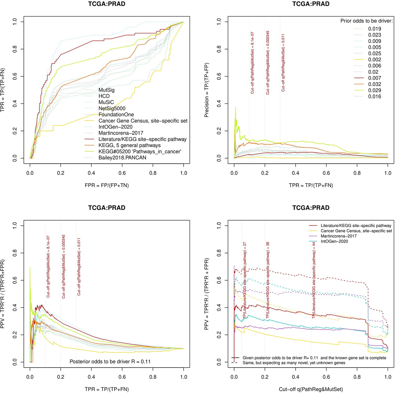
Performance of the new driver prediction evaluated on different benchmarks, PRAD.
Figure 3—figure supplement 4
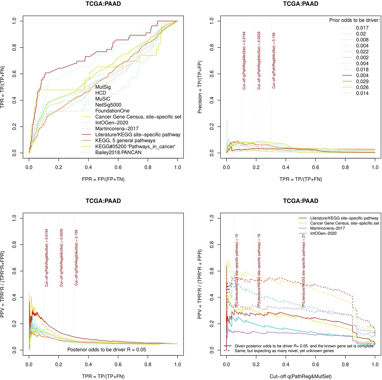
Performance of the new driver prediction evaluated on different benchmarks, PAAD.
Figure 3—figure supplement 5
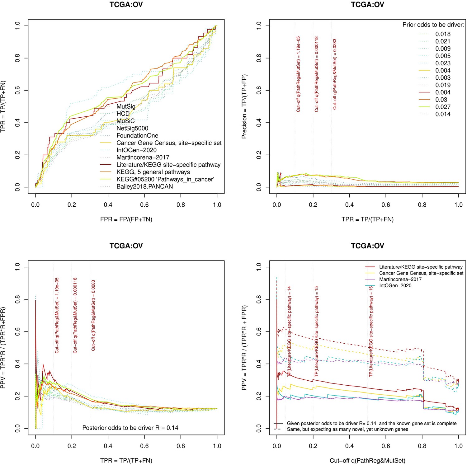
Performance of the new driver prediction evaluated on different benchmarks, OV.
Figure 3—figure supplement 6
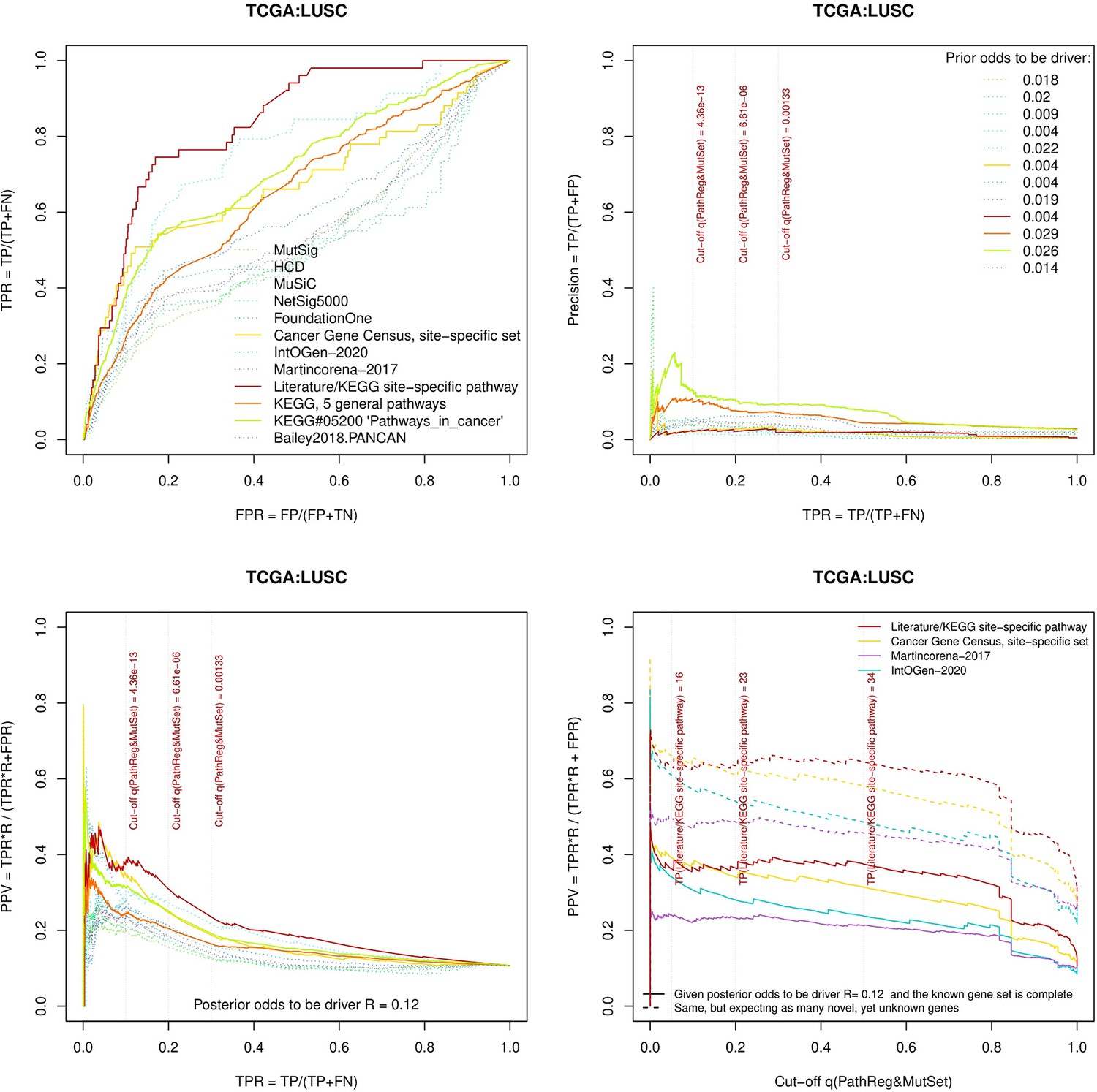
Performance of the new driver prediction evaluated on different benchmarks, LUSC.
Figure 3—figure supplement 7
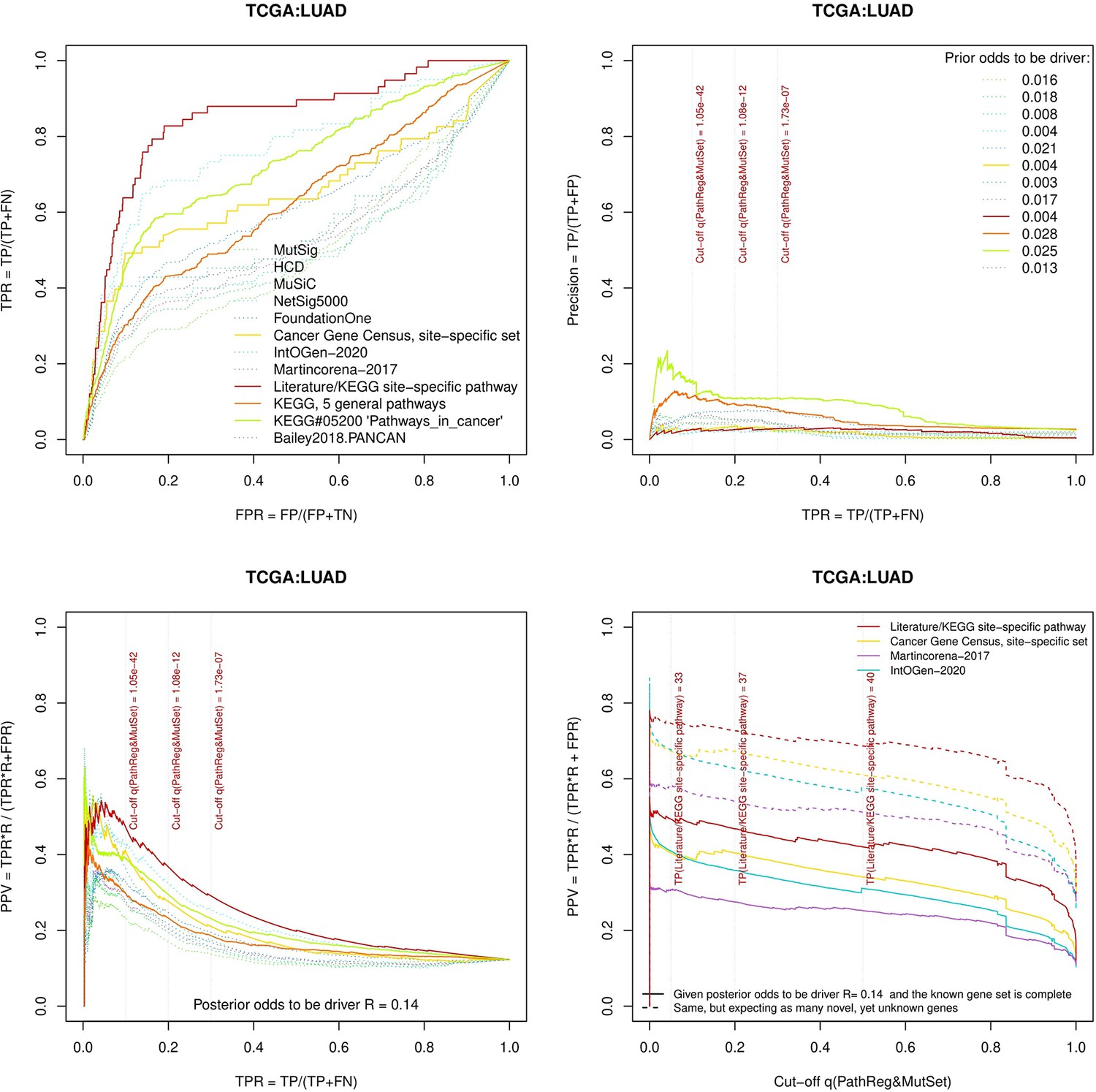
Performance of the new driver prediction evaluated on different benchmarks, LUAD.
Figure 3—figure supplement 8
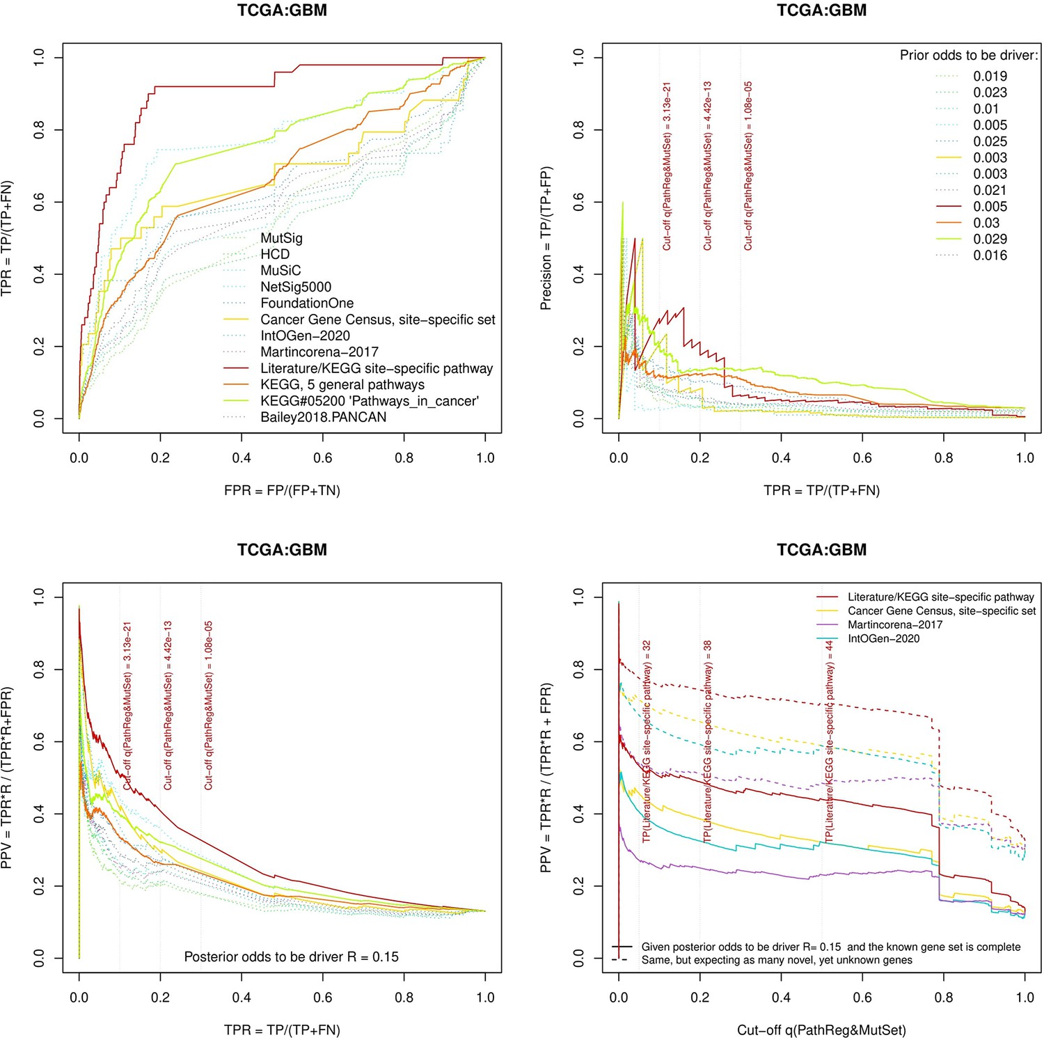
Performance of the new driver prediction evaluated on different benchmarks, GBM.
Figure 3—figure supplement 9
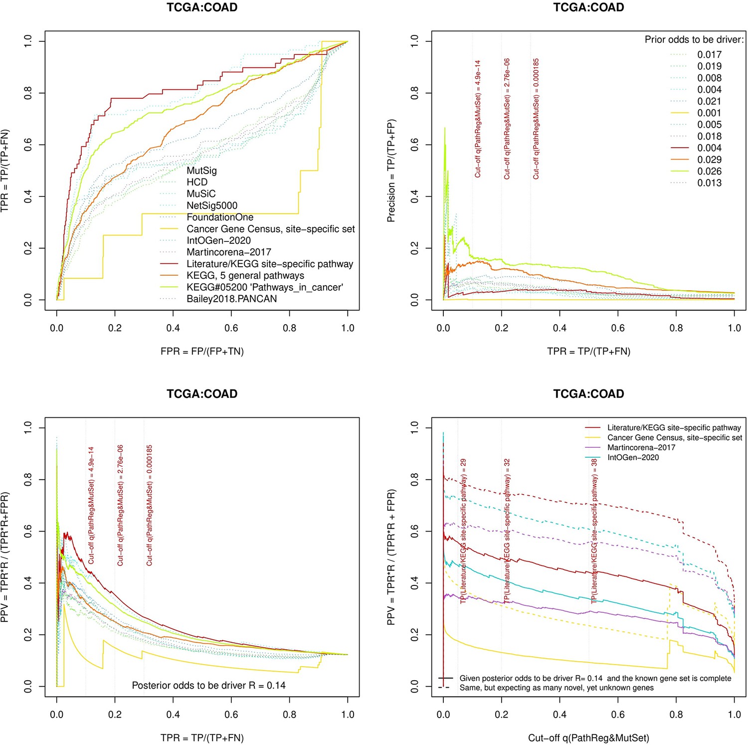
Performance of the new driver prediction evaluated on different benchmarks, COAD.
Figure 3—figure supplement 10
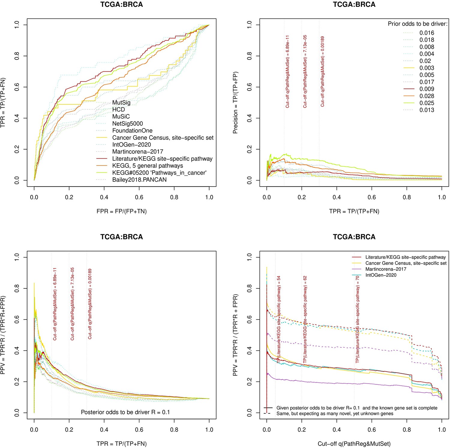
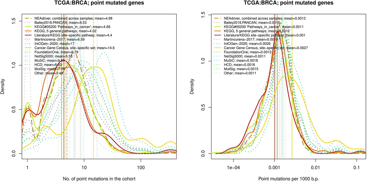
Performance of the new driver prediction evaluated on different benchmarks, BRCA.
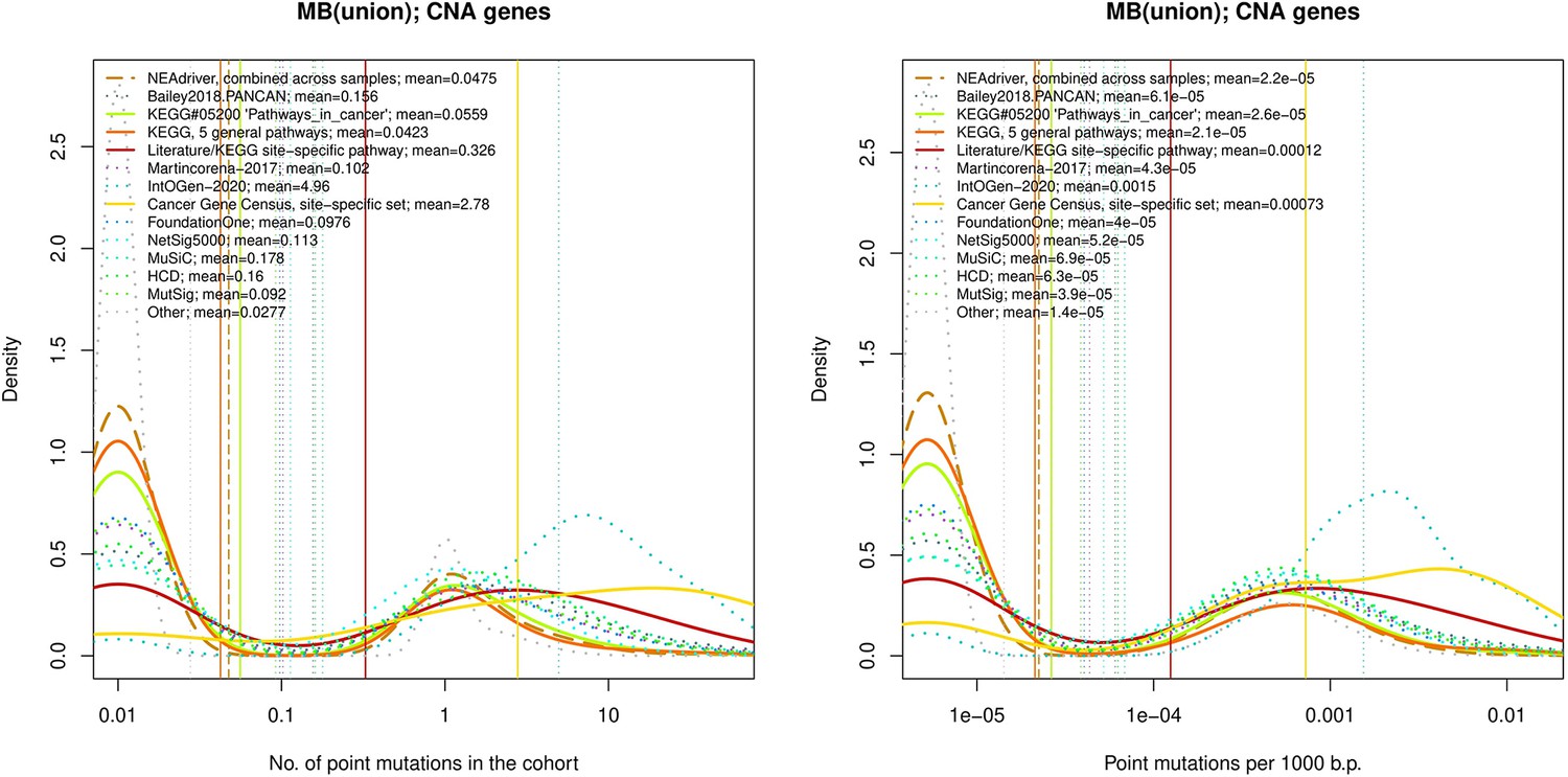
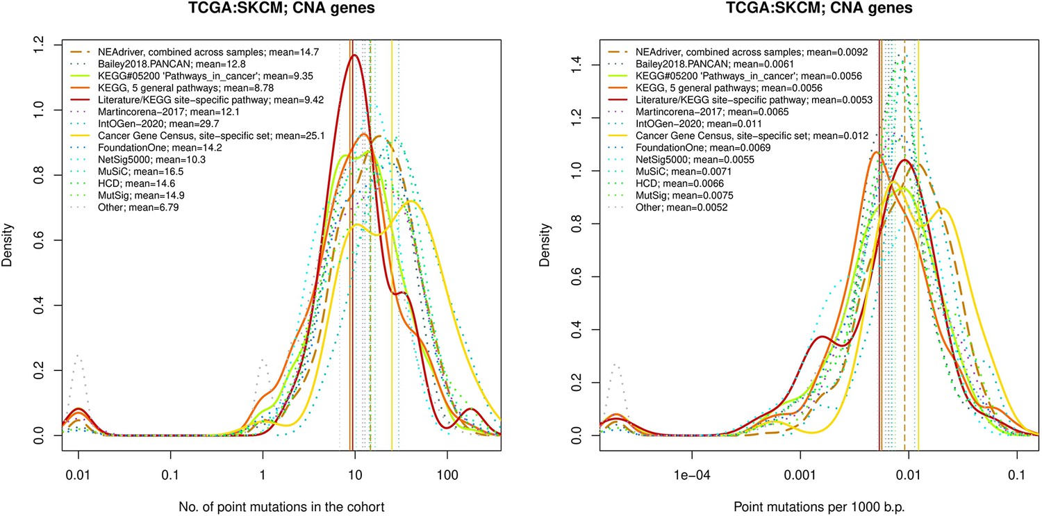
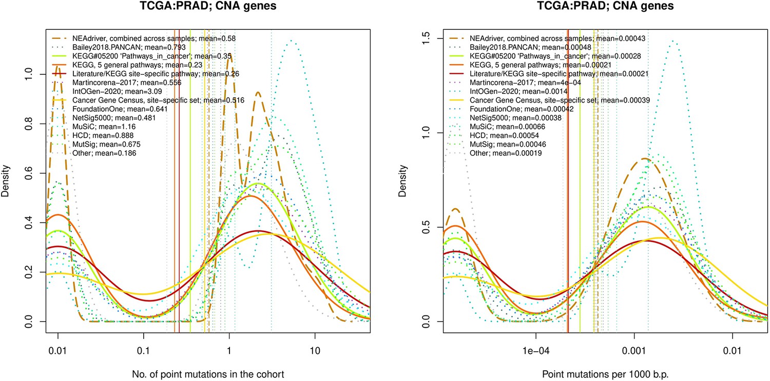
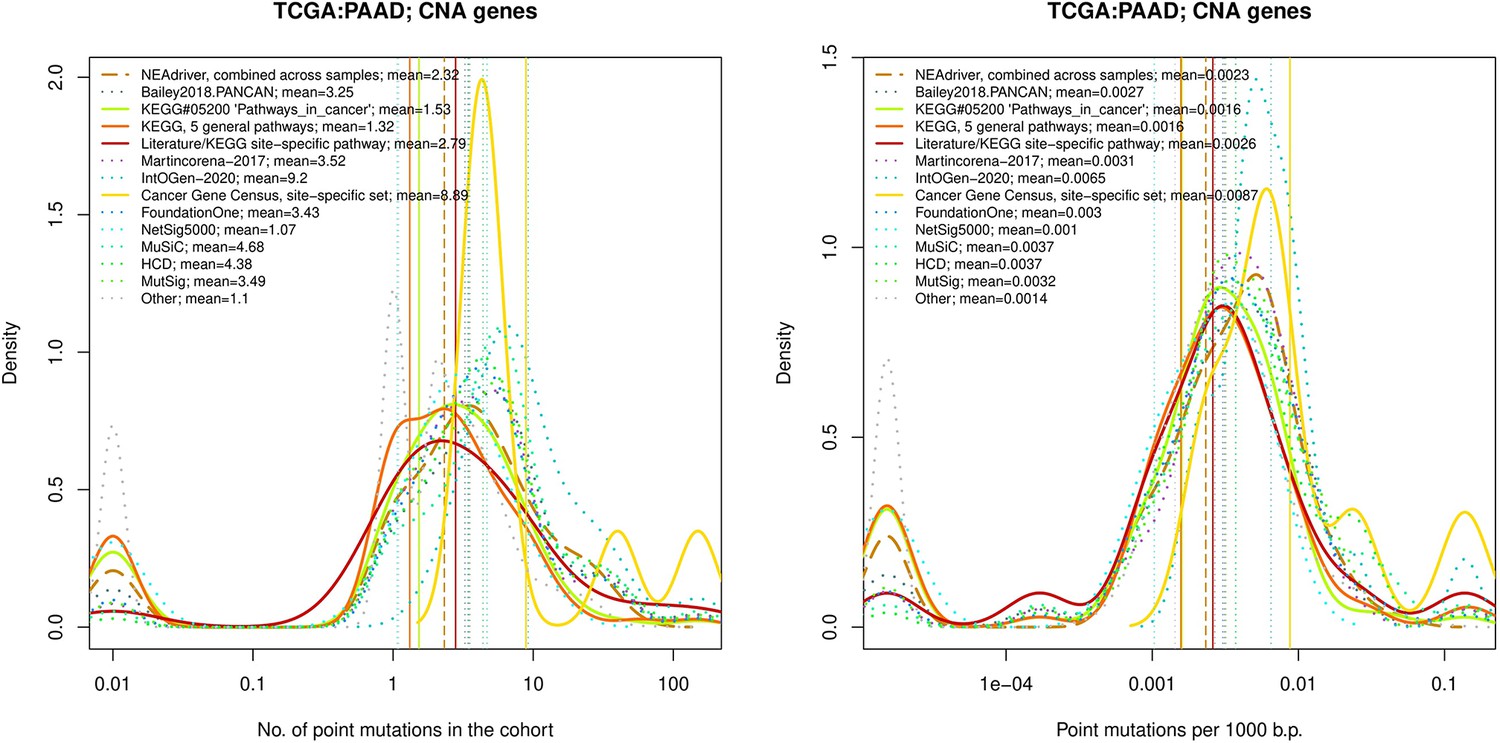
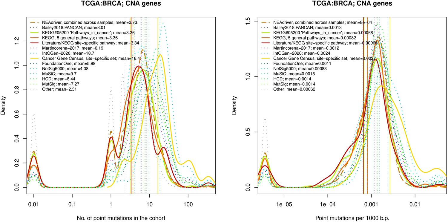
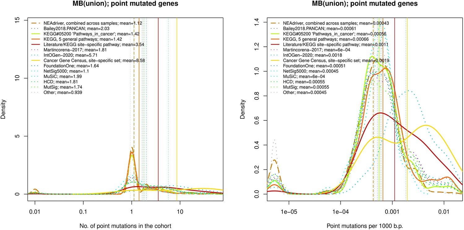
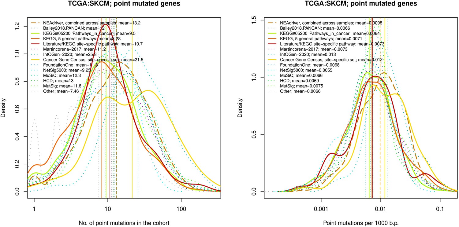
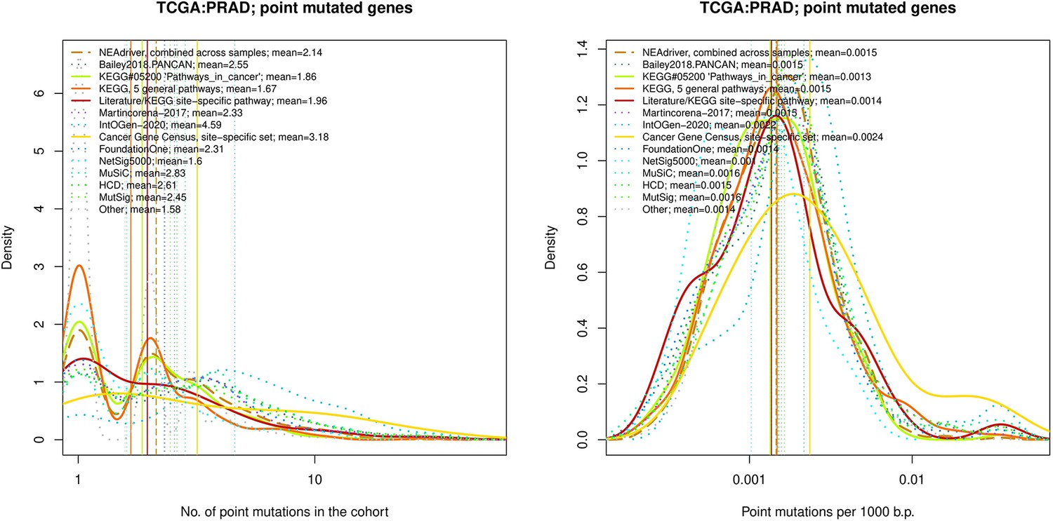
Figure 4 with 21 supplements
Comparative analysis of point mutation frequency among genes included in cancer gene sets.
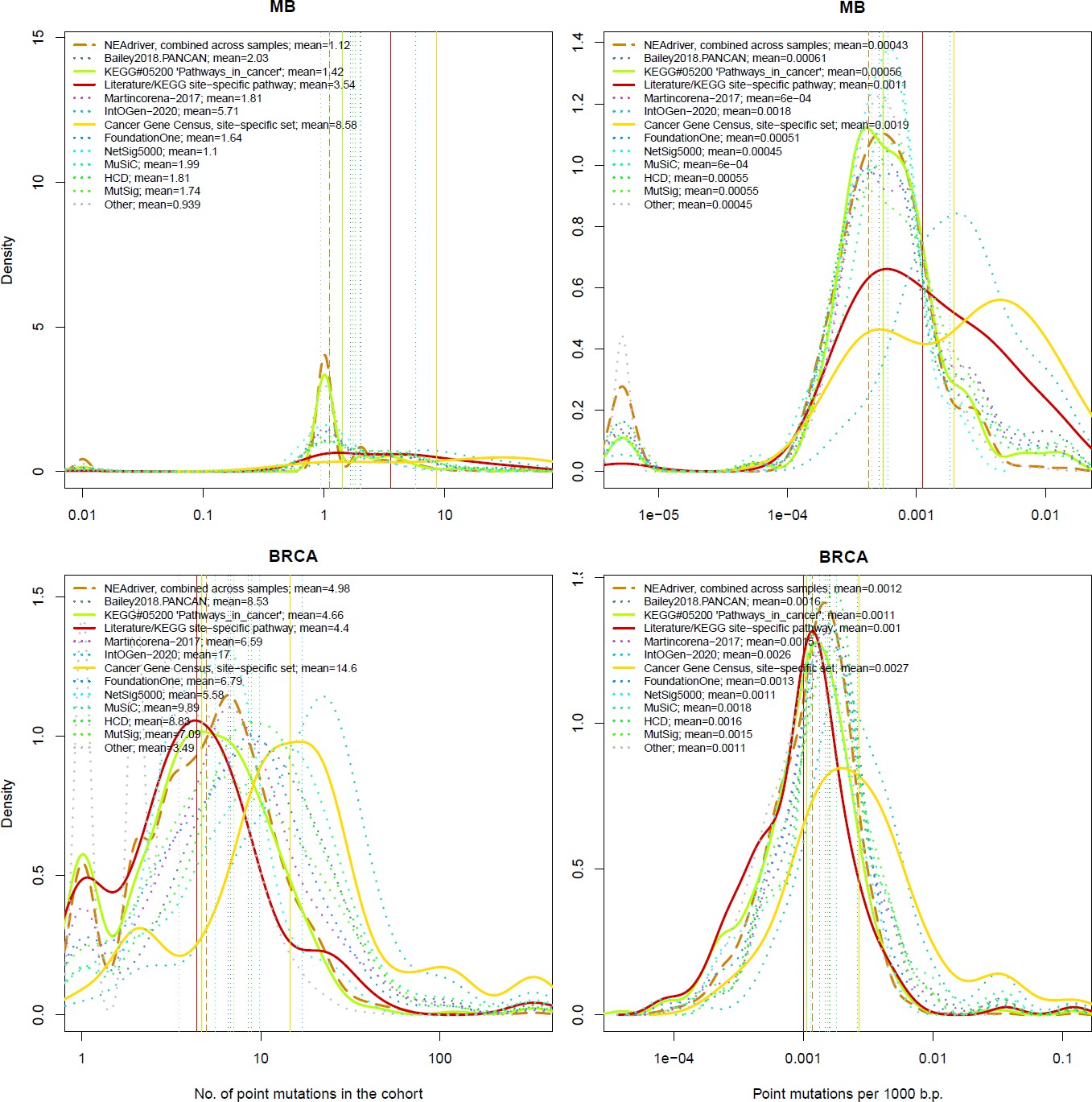
Density plots shape the distributions in each of the alternative sets, predictions by NEAdriver (q(MutSet&PathReg)<0.05; brown dashed line), and genes not included in any of the above (‘other’; gray dotted line). Vertical lines correspond to mean values provided in the legend.
Figure 4—figure supplement 1
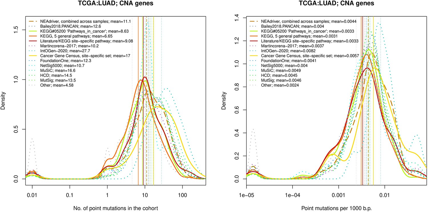
Comparative analysis of point mutation frequency among genes included in cancer gene sets.
tTen cohort files with density plots shaping mutation frequency distributions for genes in each of the alternative sets, predictions by NEAdriver (brown dashed line), and genes not included in any of the above (‘other’; gray dotted line). Vertical lines correspond to mean values, which are also provided in the legend.
Figure 4—figure supplement 2
Performance of the new driver prediction evaluated on different benchmarks, SKCM.
Figure 4—figure supplement 3
Comparative analysis of point mutation frequency among genes included in cancer gene sets, PRAD.
Figure 4—figure supplement 4
Comparative analysis of point mutation frequency among genes included in cancer gene sets, PAAD.
Figure 4—figure supplement 5
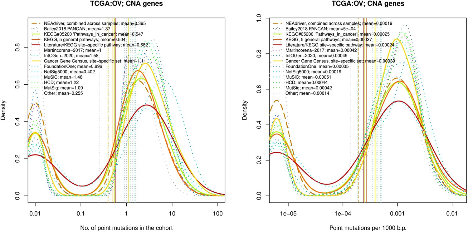
Comparative analysis of point mutation frequency among genes included in cancer gene sets, OV.
Figure 4—figure supplement 6
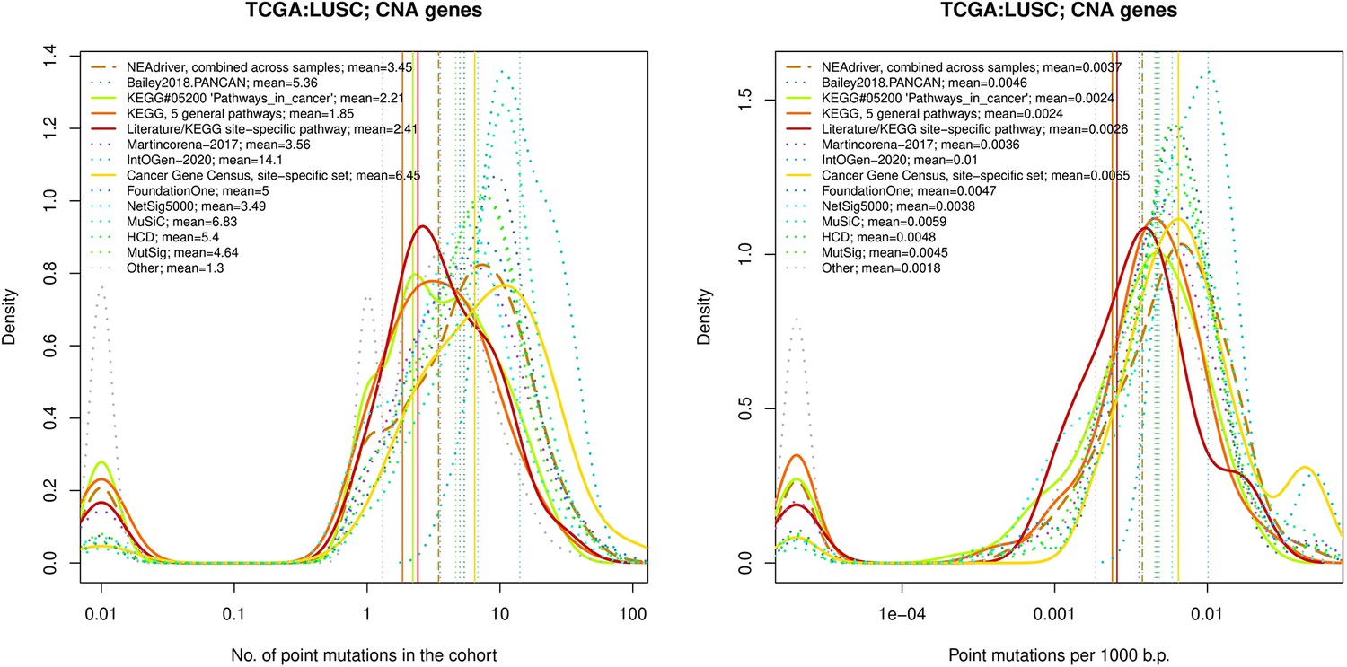
Comparative analysis of point mutation frequency among genes included in cancer gene sets, LUSC.
Figure 4—figure supplement 7
Comparative analysis of point mutation frequency among genes included in cancer gene sets, LUSC.
Figure 4—figure supplement 8

Comparative analysis of point mutation frequency among genes included in cancer gene sets, GBM.
Figure 4—figure supplement 9
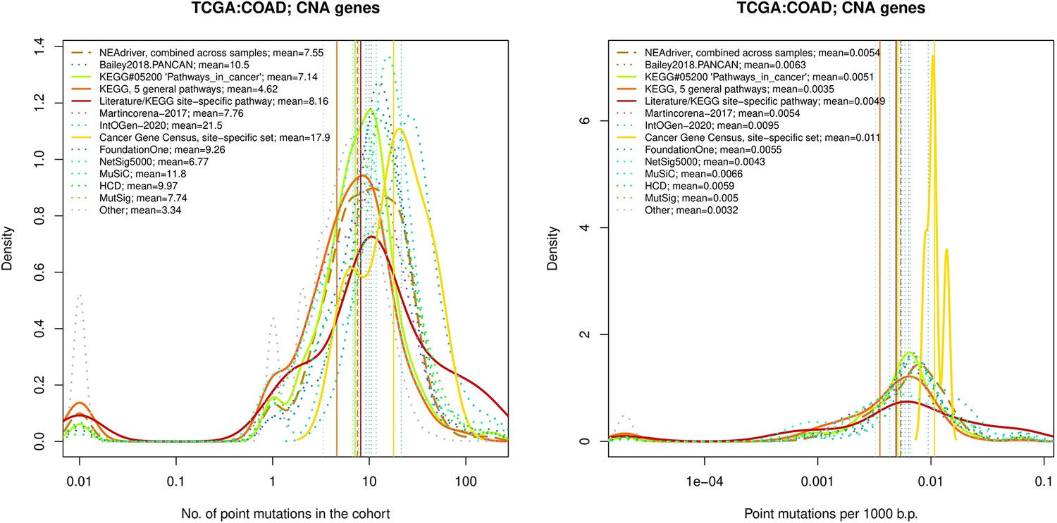
Comparative analysis of point mutation frequency among genes included in cancer gene sets, COAD.
Figure 4—figure supplement 10
Comparative analysis of point mutation frequency among genes included in cancer gene sets, BRCA.
Figure 4—figure supplement 11
Ten cohort files with density plots shaping mutation frequency distributions for genes in each of the alternative sets, predictions by NEAdriver (brown dashed line), and genes not included in any of the above (‘other’; gray dotted line).
Vertical lines correspond to mean values, which are also provided in the legend.
Figure 4—figure supplement 12
Comparative analysis of point mutation frequency among genes included in cancer gene sets, SKCM.
Figure 4—figure supplement 13
Comparative analysis of point mutation frequency among genes included in cancer gene sets, point mutations, PRAD.
Figure 4—figure supplement 14
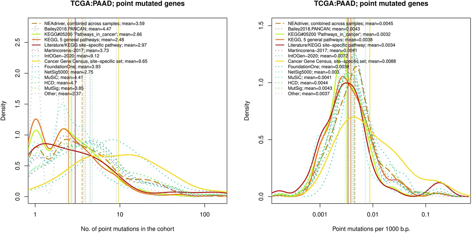
Comparative analysis of point mutation frequency among genes included in cancer gene sets, point mutations, PAAD.
Figure 4—figure supplement 15

Comparative analysis of point mutation frequency among genes included in cancer gene sets, point mutations, OV.
Figure 4—figure supplement 16
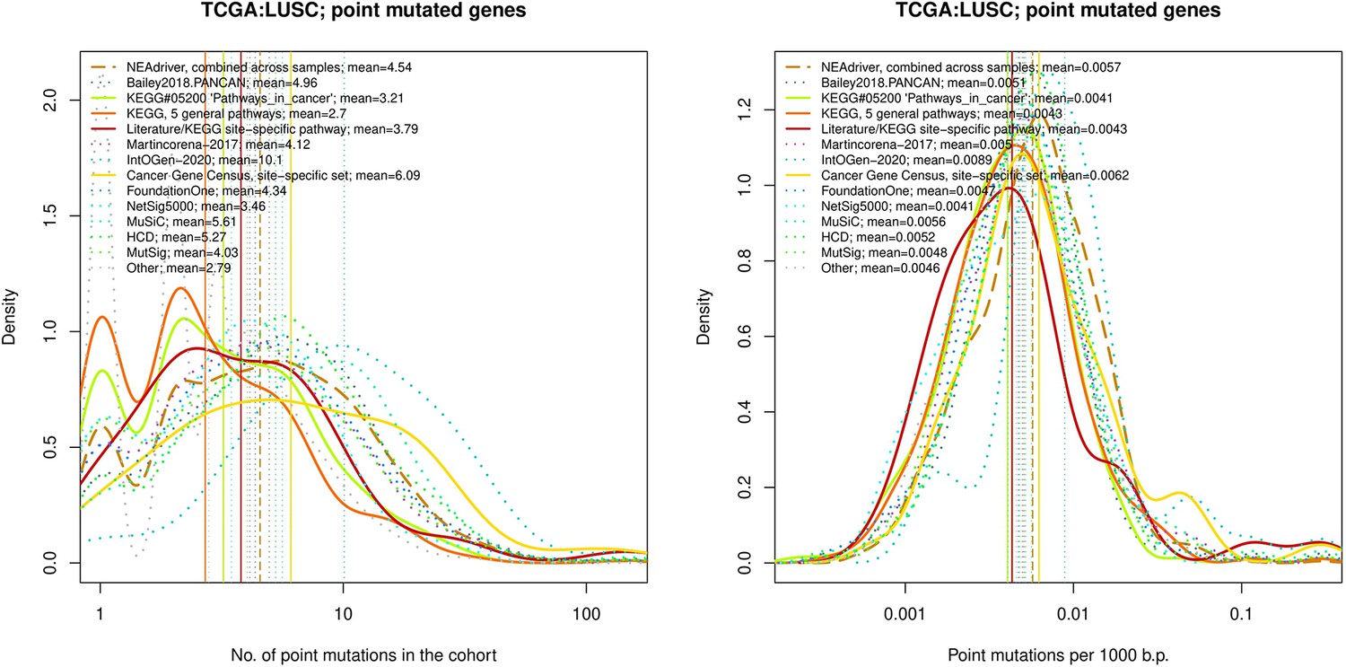
Comparative analysis of point mutation frequency among genes included in cancer gene sets, point mutations, LUSC.
Figure 4—figure supplement 17

Comparative analysis of point mutation frequency among genes included in cancer gene sets, point mutations, LUAD.
Figure 4—figure supplement 18
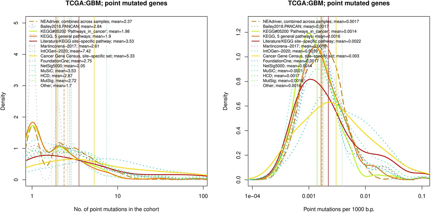
Comparative analysis of point mutation frequency among genes included in cancer gene sets, point mutations, GBM.
Figure 4—figure supplement 19
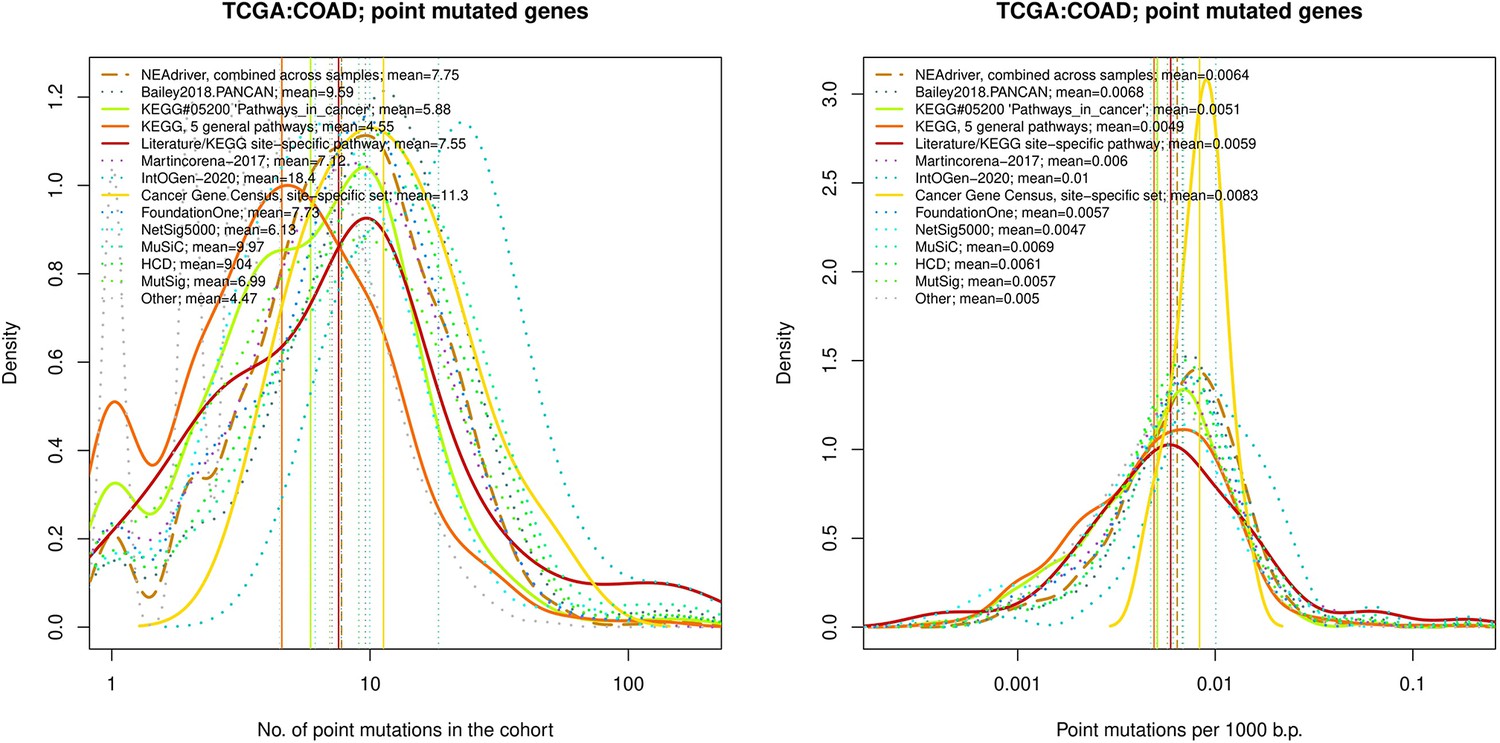
Comparative analysis of point mutation frequency among genes included in cancer gene sets, point mutations, COAD.
Figure 4—figure supplement 20
Comparative analysis of point mutation frequency among genes included in cancer gene sets, point mutations, BRCA.
Figure 4—figure supplement 21
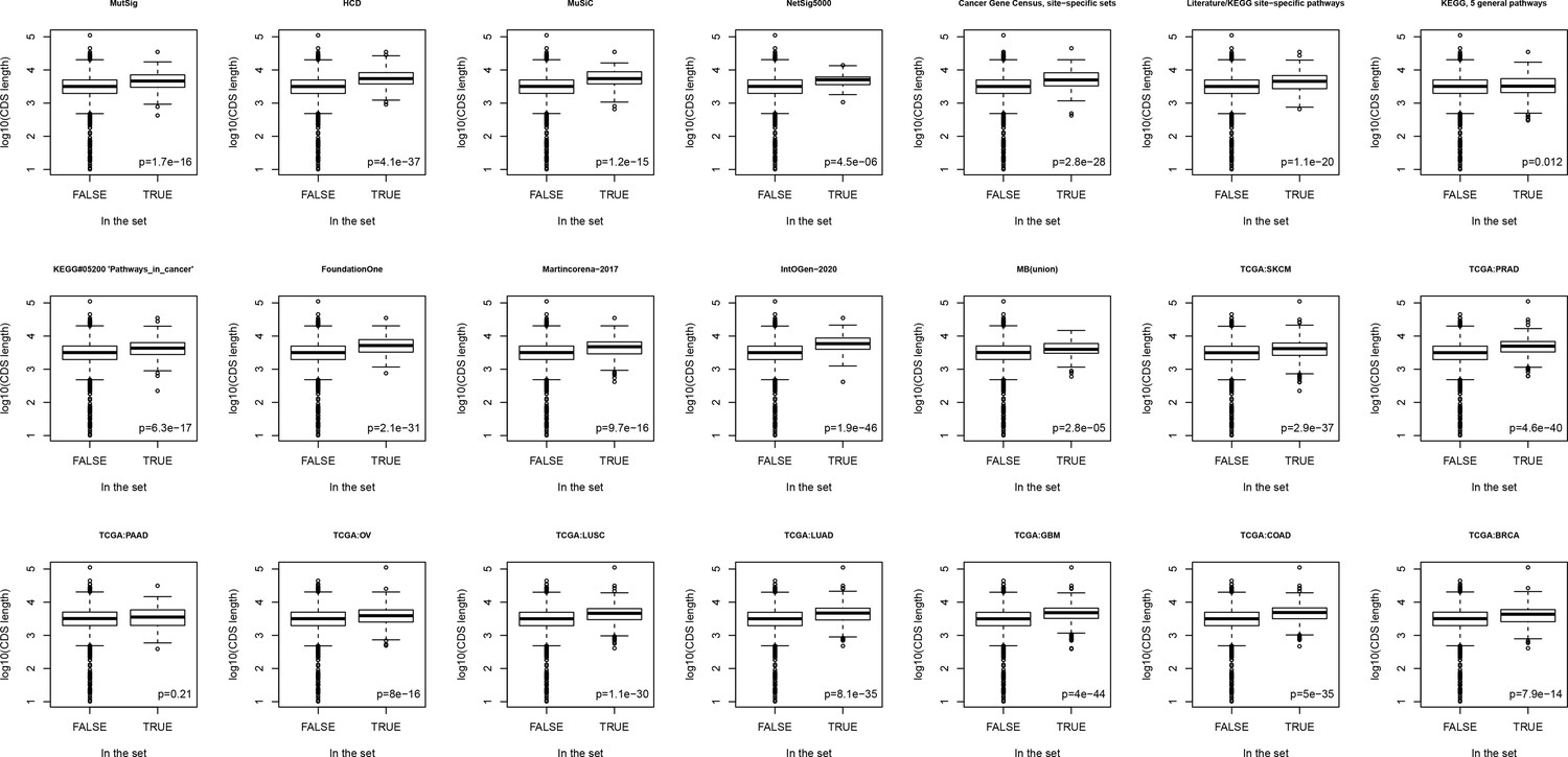
Boxplots comparing lengths of genes included in different sets versus rest of known genes.
Figure 5
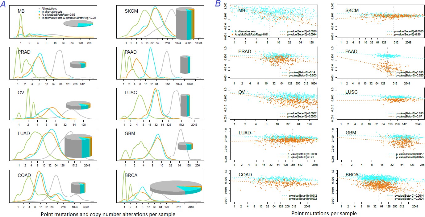
Distribution of somatic mutations versus drivers across genomic samples.
(A) Relative density plots of mutations and declared drivers. Pie charts summarize counts per genomic sample in each of the ten cohorts (height: average number of reported mutations per sample; width: number of samples in the cohort). (B) Overlap between the predictions by MutSet&PathReg and the merge of alternative gene sets (1434 genes in total) color by Jaccard index (sets’ intersection divided with sets’ union). The MGS sizes (regardless of driver status) are expressed as marker size. Gaussian noise was added to marker coordinates for better readability.
Figure 6 with 2 supplements
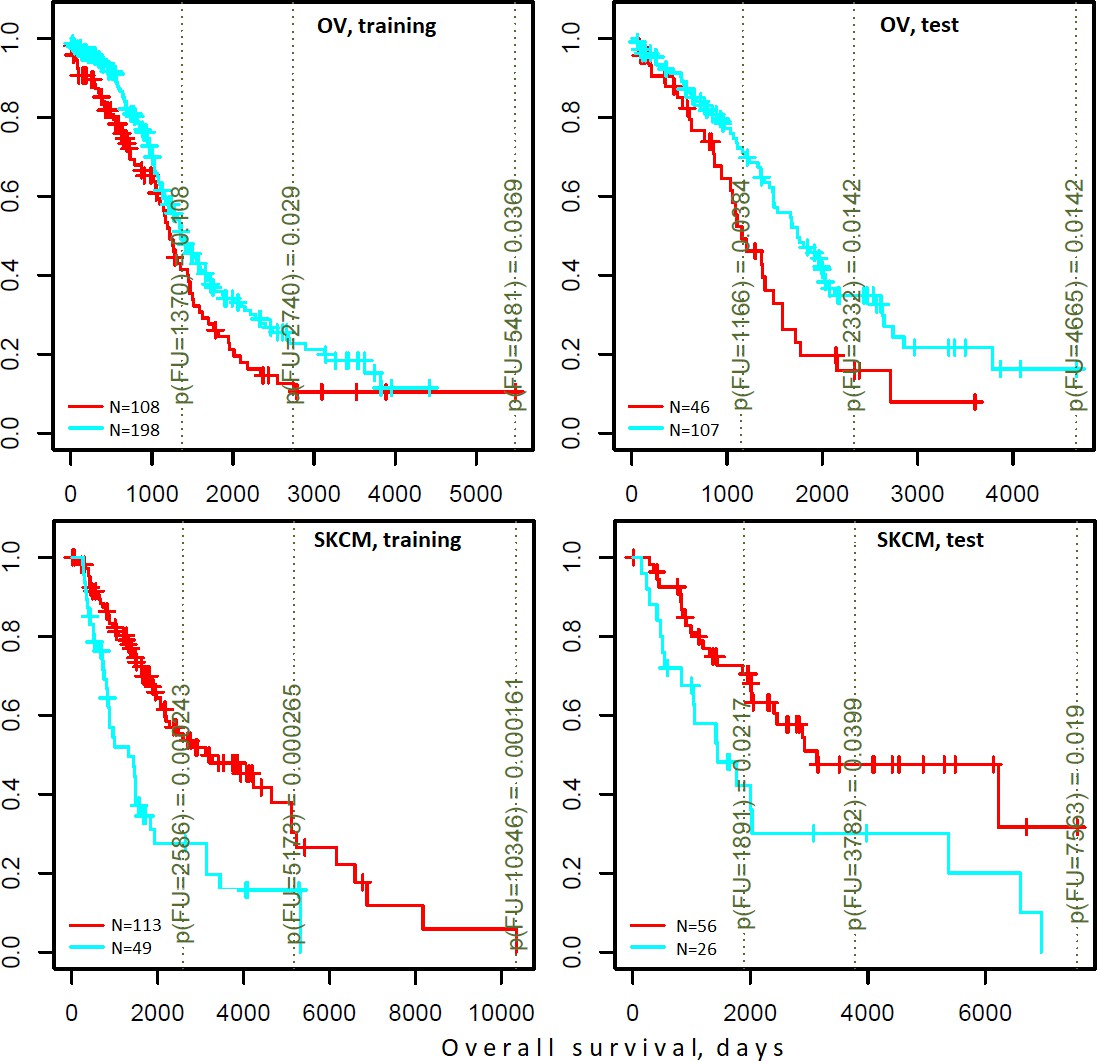
Differential survival of patients stratified in pathway space created by network enrichment analysis of driver gene sets.
Vertical captions (brown) convey Cox proportional hazard p-values for three follow-up intervals.
Figure 6—figure supplement 1
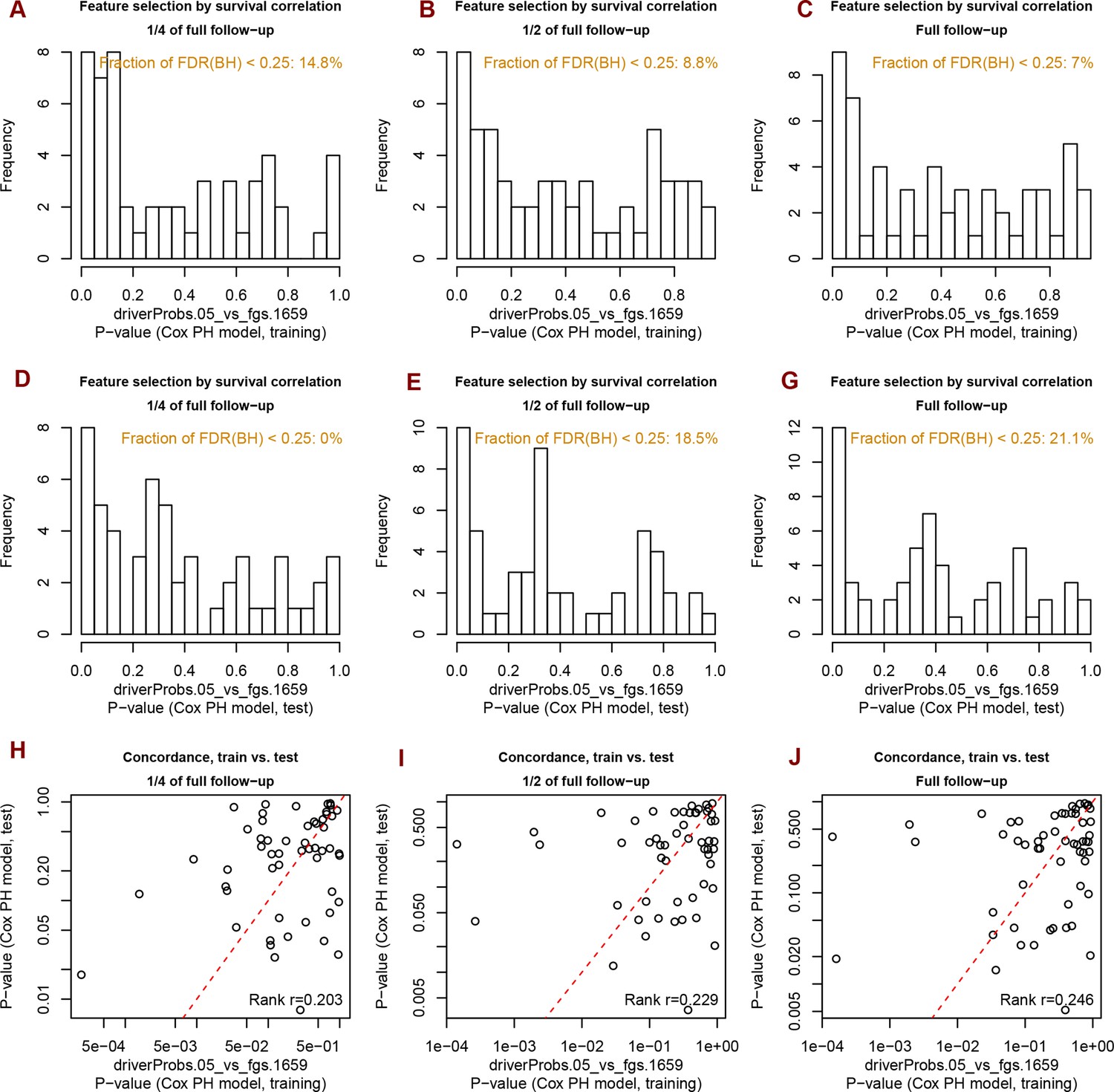
Analysis of significance across survival curves.
Distribution of Spearman rank correlation coefficients for 1659 FGS in the ten cohorts and for different clustering methods.
Figure 6—figure supplement 2
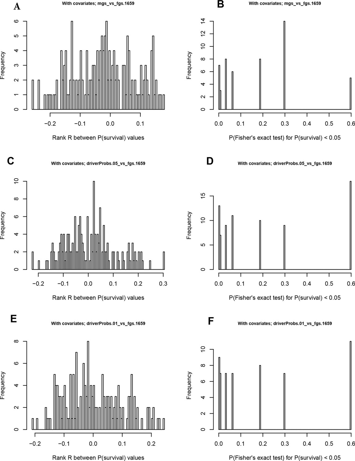
Distribution of p-values for survival correlations from different clustering methods and agreement of P-values on train versus test data sets.
Figure 7
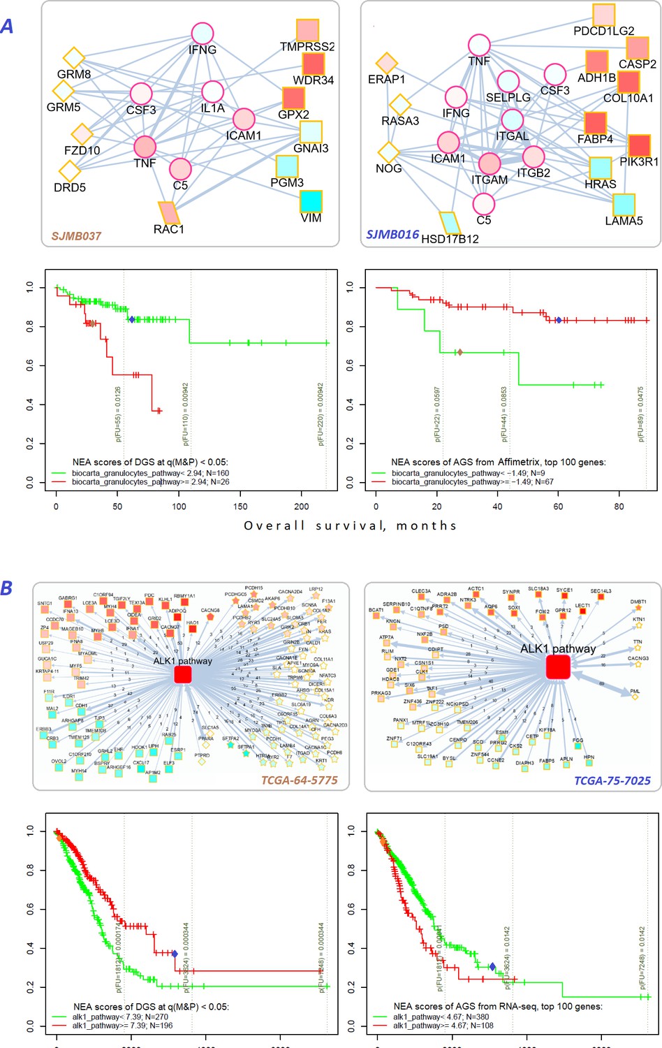
Network enrichment and survival analyses of patient specific lists of drivers and differentially expressed genes.
(A) Example from MB cohort. (B) Example from LUAD cohort. Yellow borders: patient-specific gene sets including (Torkamani et al., 2009) driver alterations (q(MutSet&PathReg)<0.05): either point mutations (stars) or copy number changes (diamonds) (Hanahan and Weinberg, 2011) genes with mRNA expression most deviating compared to the rest of the cohort (rectangles) (Lawrence et al., 2014) both categories 1 and 2 (rhomboids). Magenta borders: pathway genes (circles). Each gene is colored by expression in the given patient sample compared to the cohort mean. Note that pathway genes usually did not manifest genomic or strong expression changes. In figure (B) the edges combine individual network links between genes. Links within pathway not shown. Clinical and NEA data for the patients.
-
Figure 7—source data 1
Clinical survival data and NEA scores for the MB and LUAD patients.
- https://cdn.elifesciences.org/articles/74010/elife-74010-fig7-data1-v2.zip
Figure 8
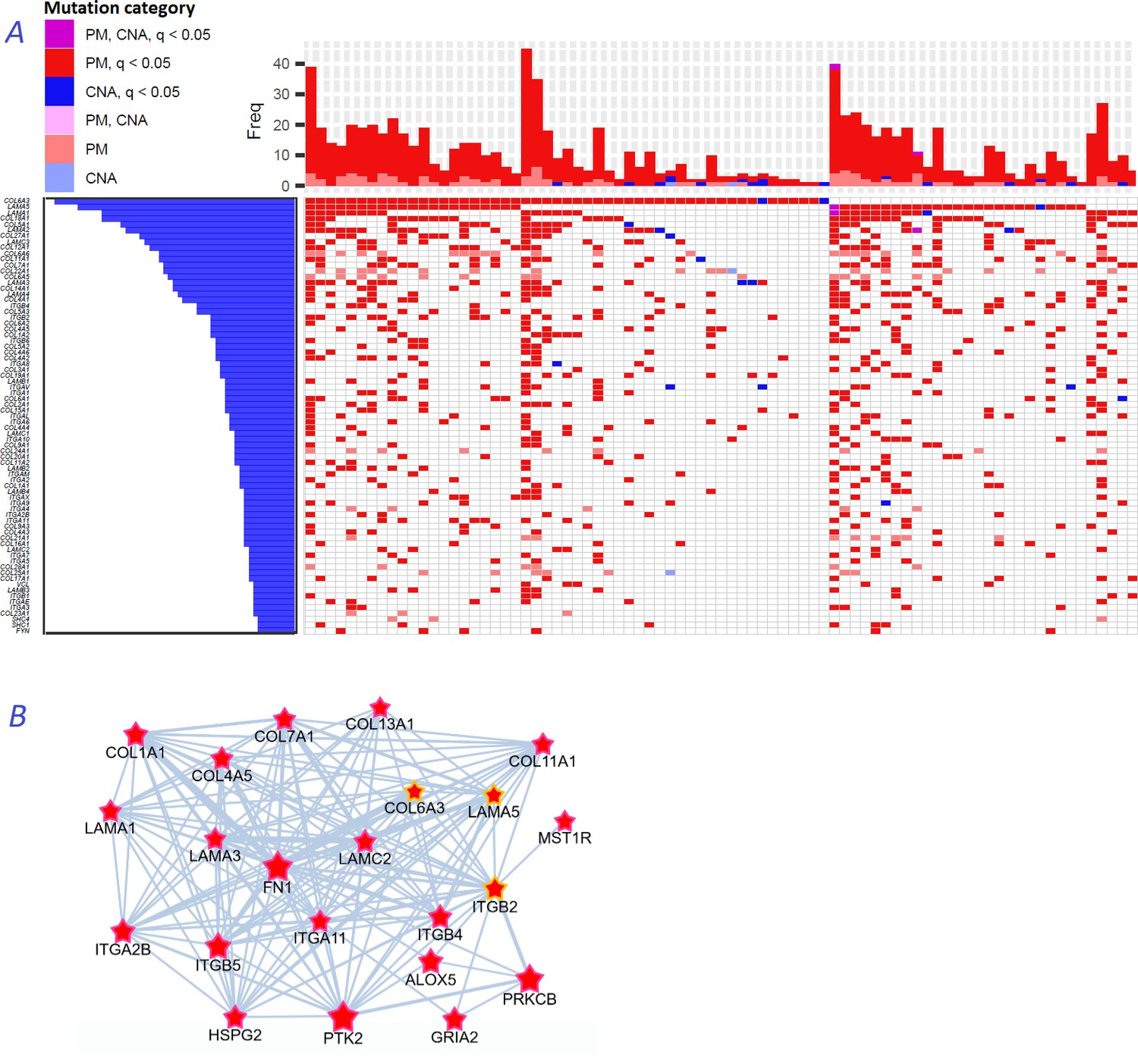
Novel gene families in cancer driver context.
(A) Upper left fragment of a waterfall plot containing top 75 genes for collagens, laminins, integrins, and a few signaling proteins most frequently mutated in COAD cohort (269 samples in total). Genes with point mutations (PM) and copy number alterations (CNA) are colored according to gaining significance as q(MutSet&PathReg)<0.05 or not. (B) Point mutations connected with each other in the global network and identified as potential drivers in one genomic sample TCGA-CM-6171–01 (COAD) at q(MutSet&PathReg)<0.05. In particular, point mutations in COL6A3, ITGB2, and LAMA5 were also detected as significantly co-occurring across COAD cohort in a general linear model accounting for total mutation burden as covariate (FDR <0.01).
Tables
Table 1
Fractions of individual alterations and unique genes predicted by NEAdriver.
| BRCA | COAD | GBM | LUAD | LUSC | OV | PAAD | PRAD | SKCM | MB | ||
|---|---|---|---|---|---|---|---|---|---|---|---|
| No. of | genes | 17,216 | 16,553 | 11,484 | 17,028 | 14,853 | 14,055 | 14,766 | 11,660 | 17,253 | 18,244 |
| samples | 989 | 269 | 284 | 519 | 178 | 461 | 185 | 300 | 346 | 564 | |
| alterations (PM&CNA) | 158,982 | 115,250 | 36,230 | 193,285 | 71,238 | 81,719 | 64,027 | 33,985 | 230,159 | 96,263 | |
| Fraction of cases when received q<0.05 | PathReg | 1.55% | 2.23% | 3.81% | 3.02% | 2.94% | 3.81% | 0.16% | 3.44% | 4.42% | 0.06% |
| MutSet | 2.95% | 3.52% | 3.75% | 4.88% | 3.68% | 3.53% | 1.21% | 2.62% | 9.24% | 4.48% | |
| PathReg & MutSet | 8.52% | 6.81% | 10.63% | 9.67% | 7.72% | 9.15% | 2.79% | 7.74% | 13.42% | 9.14% | |
| Fraction of cases when received q<0.01 | PathReg | 0.55% | 1.37% | 1.24% | 2.41% | 2.3% | 2.16% | 0.03% | 2.80% | 3.17% | 0.02% |
| MutSet | 2.17% | 2.77% | 2.65% | 4.01% | 2.57% | 2.68% | 0.70% | 1.80% | 8.00% | 3.65% | |
| PathReg & MutSet | 7.11% | 5.57% | 7.81% | 8.21% | 6.16% | 7.17% | 1.65% | 6% | 11.81% | 6.98% | |
| No. of genes which received q(PathReg&MutSet)<0.05 in>90% samples | 221 | 343 | 226 | 498 | 334 | 270 | 14 | 180 | 766 | 5 | |
Additional files
-
Supplementary file 1
Performance of PathReg multiple regression models.
Observed vs. predicted values of anchor.summary values represents performance of created models on continuous scale. In absence of a strict cut-off, performance was measured as a correlation between anchor.summary observed for each gene in the given cohort versus the a value predicted by the multiple regression model. In heatmaps, values next to gene names indicate number of samples with mutations in the given gene.
- https://cdn.elifesciences.org/articles/74010/elife-74010-supp1-v2.zip
-
Supplementary file 2
Size vs node degree of cancer genes included in NEAdriver driver predictions, compared against the union of all alternative sets.
X coordinates for the alternative sets represent their sizes. For NEAdriver (which in total, across all cohort samples typically predicted hundreds genes, most being very rare) the sets represent samples n=[50, 100, 200, 400] genes most frequently predicted in each cohort.
- https://cdn.elifesciences.org/articles/74010/elife-74010-supp2-v2.zip
-
Supplementary file 3
Comparison of NEAdriver results with OncoIMPACT (4 cohorts).
- https://cdn.elifesciences.org/articles/74010/elife-74010-supp3-v2.zip
-
Supplementary file 4
Comparison of NEAdriver results with other network-based methods (4 cohorts, 50 top genes from each method).
- https://cdn.elifesciences.org/articles/74010/elife-74010-supp4-v2.zip
-
Supplementary file 5
Dependence of NEAdriver q-values from covariates.
The five pages present relations between MutSet&PathReg q (Y axis) and no. of mutations per cohort, gene length, and normalized mutation frequency, replication rate, and gene expression rates, respectively (X axis). Top left legend: Spearman rank R and Kendall tau represent overall correlations between X and Y coordinates regardless of other factors. Bottom left legend: terms’ significance in 4-way linear models. Colored points: genes suggested as potential artifacts in literature; those receiving q<0.05 are text-labeled.
- https://cdn.elifesciences.org/articles/74010/elife-74010-supp5-v2.zip
-
Supplementary file 6
Kaplan-Meier plots for 10 cohorts: different survival metrics, dichotomized by NEA scores for either DGS or GE AGS.
- https://cdn.elifesciences.org/articles/74010/elife-74010-supp6-v2.zip
-
Supplementary file 7
No of mutations versus normalized mutation frequency: relative frequencies of silent and non-silent mutations per gene.
- https://cdn.elifesciences.org/articles/74010/elife-74010-supp7-v2.zip
-
Supplementary file 8
Summary tables over each of the ten cohorts.
PathReg, MutSet, and combined values per sample, per gene, in each cohort. MutSet q-values are accompanied with no. of network links observed between the given gene and point mutations in the sample, as well as respective NEA Z and NEA p-value. All the MutSet values are sample-specific. PathReg q-values are accompanied with respective anchor.summary, PathReg score, and PathReg p-values. All the PathReg values are cohort-specific and not sample-specific. NEAdriver q-value is product of MutSet q-value and PathReg q-value. The last 3 columns indicate genes listed as possible artifacts in literature.
- https://cdn.elifesciences.org/articles/74010/elife-74010-supp8-v2.zip
-
Transparent reporting form
- https://cdn.elifesciences.org/articles/74010/elife-74010-transrepform1-v2.pdf
Download links
A two-part list of links to download the article, or parts of the article, in various formats.
Downloads (link to download the article as PDF)
Open citations (links to open the citations from this article in various online reference manager services)
Cite this article (links to download the citations from this article in formats compatible with various reference manager tools)
Individualized discovery of rare cancer drivers in global network context
eLife 11:e74010.
https://doi.org/10.7554/eLife.74010


