Selection for infectivity profiles in slow and fast epidemics, and the rise of SARS-CoV-2 variants
- Centre for Interdisciplinary Research in Biology (CIRB), Collège de France, CNRS INSERM, PSL Research University, France
- Mathematical Modelling of Infectious Diseases Unit, Institut Pasteur, Université de Paris, UMR2000, CNRS, France
- WHO Collaborating Centre for Infectious Disease Epidemiology and Control, School of Public Health, Li Ka Shing Faculty of Medicine, The University of Hong Kong Pokfulam, Hong Kong Special Administrative Region, China
- Laboratory of Data Discovery for Health, Hong Kong Science and Technology Park New Territories, Hong Kong Special Administrative Region, China
- Institute of Ecology and Environmental Sciences of Paris (iEES-Paris, UMR 7618) CNRS, Sorbonne Université, UPEC, IRD, INRAE, France
Figures
Figure 1
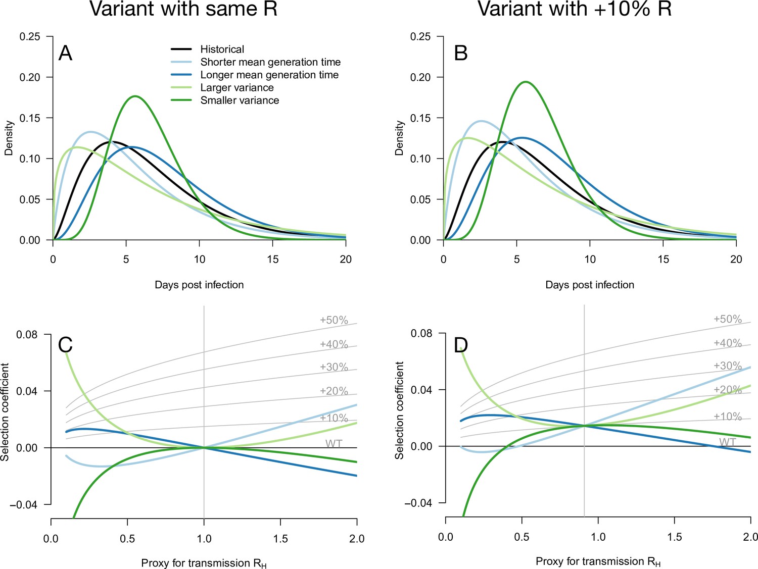
Variation of the selection coefficient as a function of transmission, for several infectivity profiles of emerging variants.
The Panels A and B show several variant infectivity profiles with the same effective reproduction number as historical strains (A) or an effective reproduction number increased by +10% (B). For variants with shorter or longer mean generation time, the relative mean generation time is –15 or +15% compared to historical strains. For variants with shorter or longer standard deviation (sd) in generation time, the relative sd in generation time is –40 or +40% compared to historical strains. The Panels C and D show the selection coefficient of these variants as a function of the proxy for transmission (effective reproduction number of the historical strains). The gray lines show the selection coefficient if the variant had the same infectivity profile as historical strains, with the infectivity profile increased uniformly by a constant as commonly assumed.
Figure 2 with 1 supplement
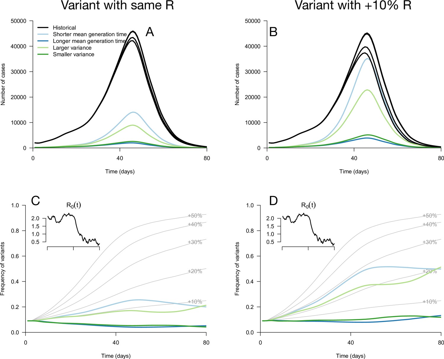
Epidemiological and evolutionary trajectories of several types of emerging variants competing with historical strains.
The Panels A and B show epidemiological dynamics (daily cases number of historical strains in black, of variants in colours). Historical strains display several slightly different curves when competing with each of the variants because of the weak competition brought about by the build-up of population immunity. The Panels C and D show evolutionary trajectories, with daily variant frequency as colored lines. The light gray curves show the frequency dynamics of variants with a +10 to +50%R advantage, with the same generation time as historical strains. The inset shows the transmission through time in these simulations, given by the basic reproduction number of historical strains (see details of simulation model in Methods).
Figure 2—figure supplement 1
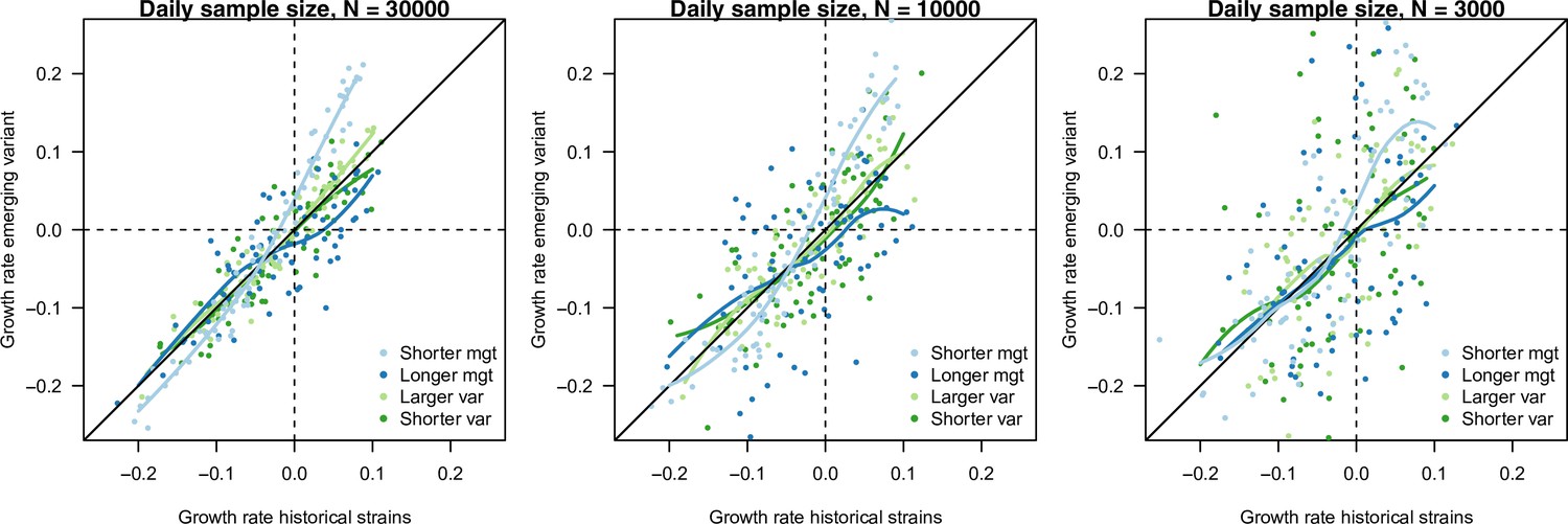
The relationship between estimated growth rate of the variant and historical strains across time in the simulation study, in the scenario of progressive decline of from 1.5 to 0.5.
The three panels are three daily sample sizes to assess variant frequency (30,000, 10,000, 3000). This is shown for variants with no R advantage , and four infectivity profiles: shorter mean generation time (, ), longer mean generation time (), larger standard deviation (sd) (, .4) and smaller sd (, ). Points are the estimated growth rates with error, the curves show local polynomial regression (loess). The selection coefficient is the vertical distance to the bisector. A variant with a shorter mean generation time presents a steeper relationship between the two growth rates (light blue curve), meaning that the selection coefficient is maximal when transmission is large (fast growing epidemic) (Figure 1C, D). On the contrary, a variant with a longer generation time presents a flatter relationship (dark blue curve), with selection coefficient being maximal when transmission is small. This distinction blurs when the number of cases sampled to assess variant frequency decreases. Variants changing the variance of the distribution (green curves) appear almost neutral, with curves close to the bisector.
Figure 3 with 3 supplements
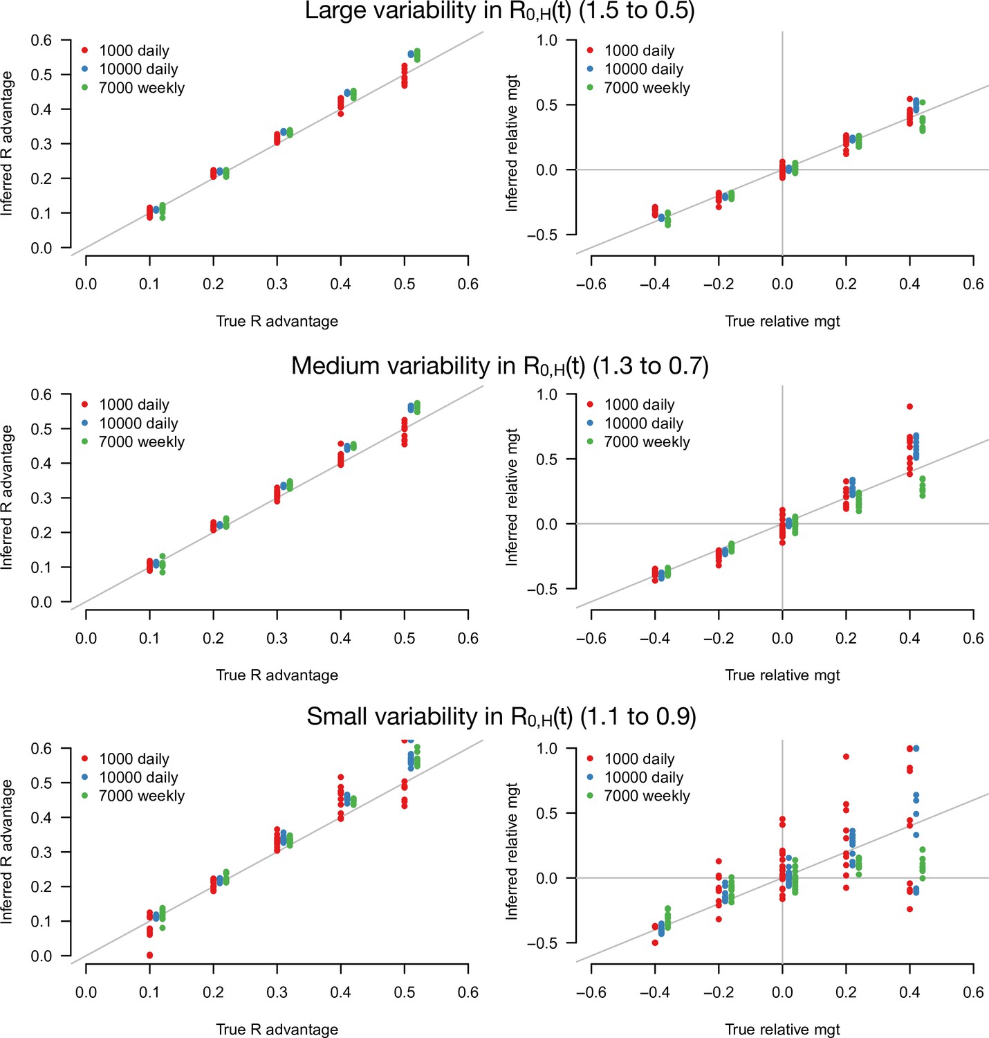
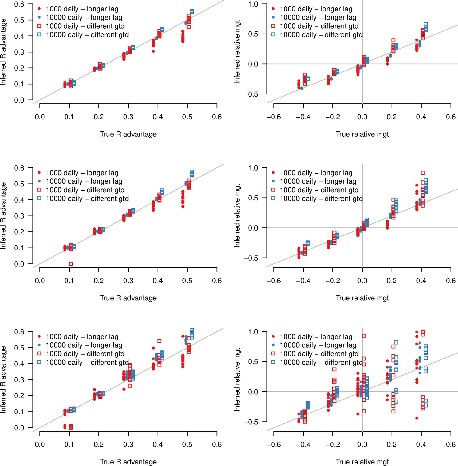
Inference of the R advantage and relative mean generation time in the simulation study.
The plots show the correlation between inferred and true quantities. The three colors show different sample sizes used to infer variant frequency: 1000 daily, 10,000 daily, and 1000 daily grouped by week (7000 weekly). The left panels show the R advantage, the right panels the mean generation time (mgt). Top, middle, and bottom panels show inference for large, medium, and small variability in R0,H(t). The simulations are initialized with and . For the inference of the R advantage, we used a variant relative mean generation time of (also inferred by the model), while for the inference of relative mean generation time we used the following combinations: ; ; ; We used a greater R advantage when the mean generation time is unchanged or longer to ensure the emerging variant reaches a significant frequency over the 80 days time period considered. For each parameter combination, 10 replicate simulations were drawn with the same parameters, hence the same deterministic epidemiological dynamics, but with different random error on data (Poisson error on cases number and binomial error on frequencies).
Figure 3—figure supplement 1
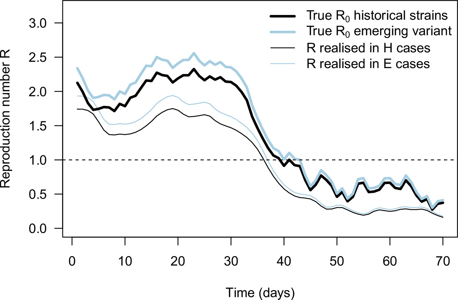
The daily basic reproduction number of the historical strains and variant ( and , identical thick lines), together with the effective reproduction number inferred from daily case and frequency data (thin lines), in the example simulation shown on Figure 2B for an emerging variant with +10% effective reproduction number and same distribution of generation time.
These realized effective reproduction number present a trend similar to the true basic reproduction number inputted to the simulation with three differences. First, the realized effective reproduction number are shifted in time compared to because of the time shift between infections and case detection. Second, the realized effective reproduction number is lower than the true because of population immunity and case detection and isolation. Third, error in cases numbers and in variant frequency cause error in the inferred effective reproduction number.
Figure 3—figure supplement 2
Inference of the R advantage and relative mean generation time in two additional simulation studies: (i) where the lag between symptom onset and case detection is longer (mean 6days instead of 2.2days) shown as points (“longer lag”), (ii) where the distribution of generation time is different from the assumptions of the model shown as open squares (“different gtd”).
In (ii), secondary infections are not possible in the first two days of infection, then the timing of infections follows a shifted gamma distribution. The plots show the correlation between inferred and true quantities. The two colors show different sample sizes used to infer variant frequency: 1000 daily, 10,000 daily. The left panels show the R advantage, the right panels the mean generation time (mgt). Top, middle and bottom panels show inference for large, medium, and small variability in R0,H(t). Other parameters as in Figure 3.
Figure 3—figure supplement 3

Inference of the R advantage and relative mean generation time (mgt) in the additional simulation study where the level of transmission is assumed to sharply decline from to .
Here, we varied the number of days for which number of cases and variant frequency data are available after the sharp decline from 10 (top panel) to 30days (bottom panel). The plots show the correlation between inferred and true quantities. The two colors show different sample sizes used to infer variant frequency: 1000 daily, 10,000 daily. The left panels show the R advantage, the right panels the mean generation time (mgt). Other parameters as in Figure 3.
Figure 4
Data used for inference.
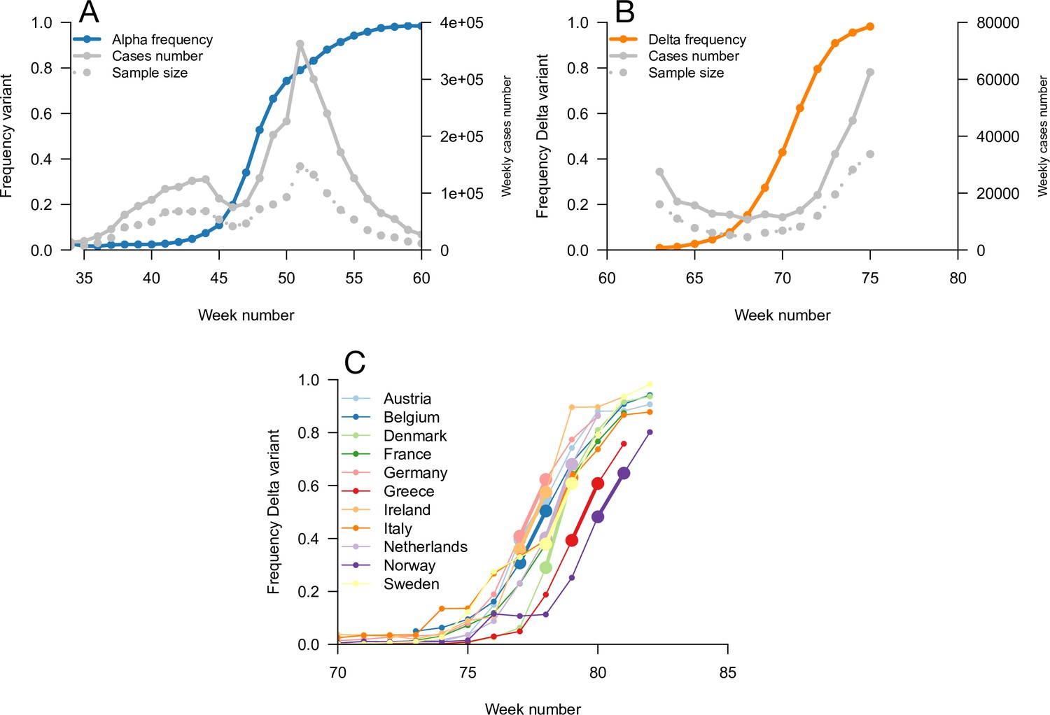
A and B: Dynamics of the Alpha variant frequency in England (A) and of the Delta variant frequency in England (B), estimated through SGTF. These frequencies are shown together with the dynamics of weekly cases numbers, over weeks 35 (week starting September 08, 2020)–60 (week starting March 02, 2021) for Alpha, and weeks 63 (starting March 23, 2021)–75 (starting June 15, 2021) for Delta. (C) the dynamics of the Delta variant frequency in 11 chosen European countries. For each country, we used the growth rate of historical strains and emerging Delta variant when the frequency passes 50%, highlighted with larger points and thicker line on the figure.
Figure 5 with 3 supplements
Inference of the infectivity profiles of the Alpha and Delta variants.
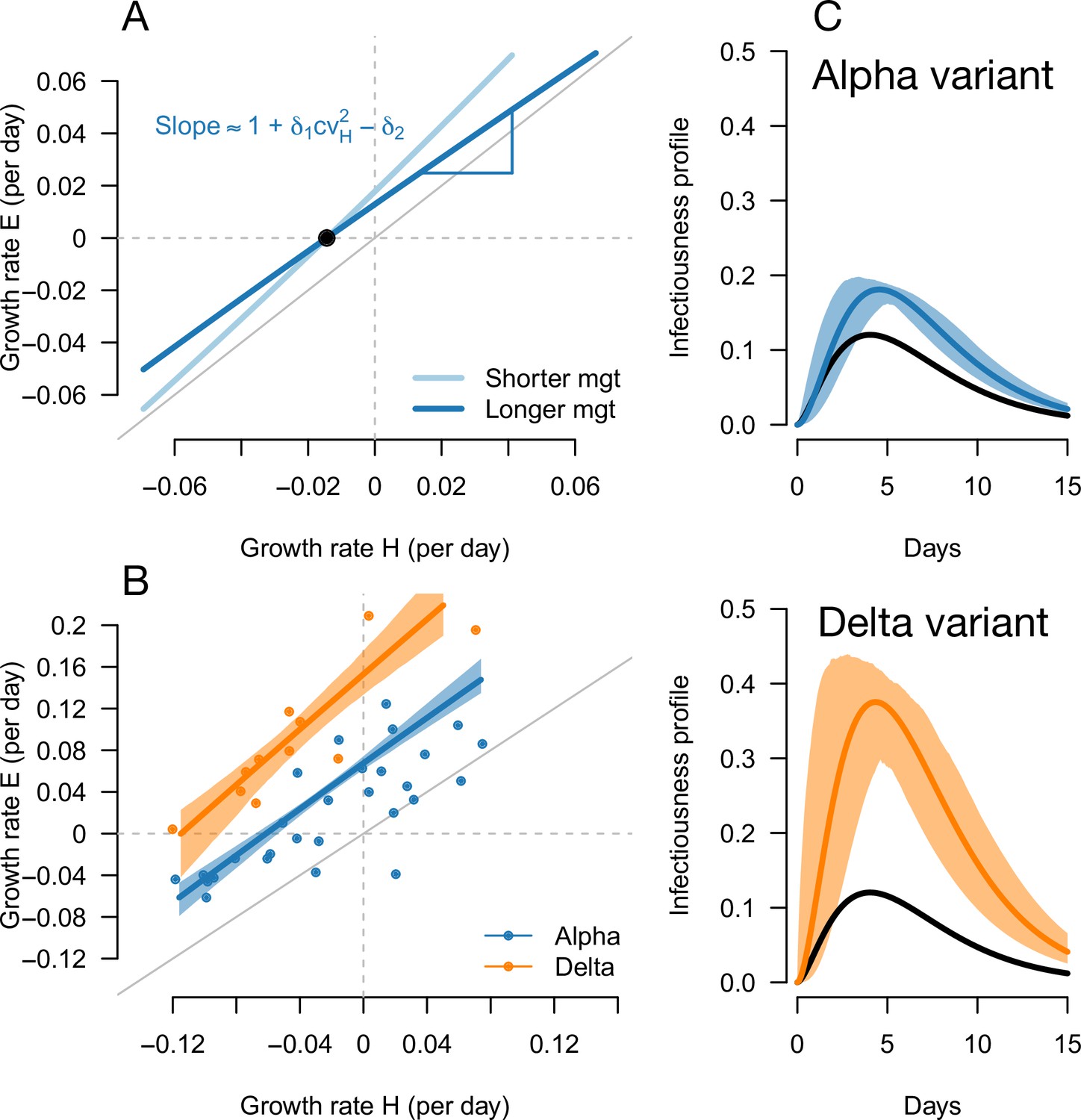
(A) Geometric intuition for how the relationship depends on the mean generation time for hypothetical variants with R advantage and relative mean generation time of and (as in Figures 1 and 2). The parameter cvH denotes the coefficient of variation of the historical strains distribution of generation time, equal to the standard deviation (sd) divided by the mean of the distribution. (B) The correlation between estimated growth rates of historical strains and variants in England. For Alpha (dataset 1) this is a temporal correlation in England over weeks starting September 08, 2020 to March 16, 2021. For Delta (dataset 3),this is a spatial correlation across European countries. The curves with confidence intervals are the model fits for each variant and show that the selection coefficient (the vertical distance to the bisector) is roughly constant across epidemiological conditions, indicative that the mean generation time is not altered in these variants. (C) The inferred infectivity profile of each variant with confidence intervals, together with the infectivity profile of historical strains circulating before the rise of the Alpha variant (black curve). This inference assumes a gamma-distributed generation time.
Figure 5—figure supplement 1
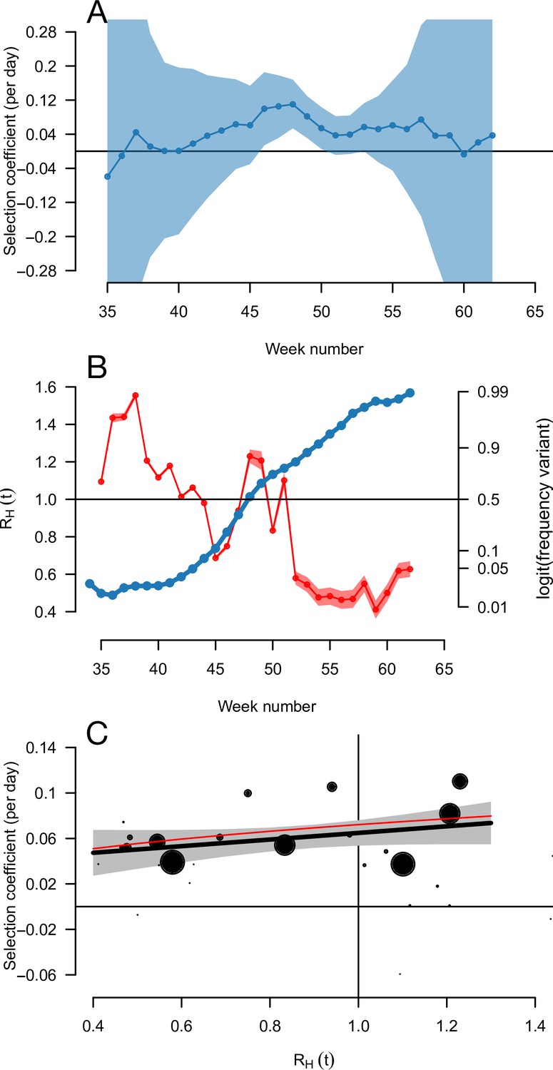
The relationship between the selection coefficient and level of transmission RH(t) for the Alpha variant spreading in England.
Panel A shows the estimated selection coefficient with 90% confidence intervals (these intervals can be very wide so 90% instead of 95% was chosen for readability). Panel B shows the estimated RH(t) (red) together with the frequency trajectory on a logit scale (blue), showing that the frequency grows more slowly when RH(t) passes below one. Panel C shows the correlation between selection coefficient and RH(t) across weeks. The size of the points reflects the inverse of the error variance on the selection coefficient at each point. The thick black line shows a linear regression with 95% confidence intervals, the thin red line shows the model prediction for the Alpha variant (R advantage of+54%, same mean generation time as historical strains).
Figure 5—figure supplement 2
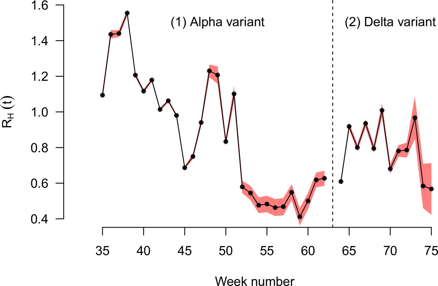
The effective reproduction number of historical strains RH(t) estimated on the English data, for the period when the Alpha variant emerged and replaced historical strains, then the period when the Delta variant emerged and replaced the Alpha variant and other strains.
The two periods are separated by the dashed vertical line. Black points show the maximum likelihood estimates, red shaded areas the 95% confidence interval.
Figure 5—figure supplement 3
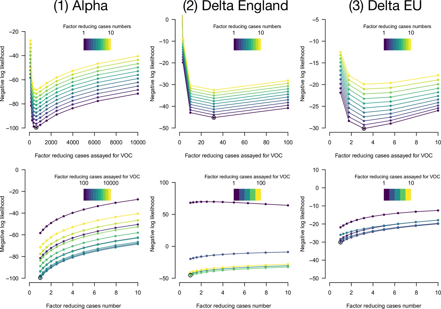
Negative log-likelihood of the fully optimized model as a function of overdispersion in number of cases and in emerging variant frequency.
Overdispersion is represented by two factors: a factor reducing the number of cases, thus increasing the variance of the error in cases number compared to a Poisson, and a factor reducing the sample size, thus increasing the variance in frequency compared to a binomial. We optimized likelihood for all combinations of the two factors. Top panels, negative likelihood of the optimized model as function of the factor reducing the number of cases. Bottom panels, as a function of the factor reducing the sample size. The best combination of factors is highlighted as an open point. This is shown for the three datasets (left, middle, right columns).
Additional files
Download links
A two-part list of links to download the article, or parts of the article, in various formats.
Downloads (link to download the article as PDF)
Open citations (links to open the citations from this article in various online reference manager services)
Cite this article (links to download the citations from this article in formats compatible with various reference manager tools)
Selection for infectivity profiles in slow and fast epidemics, and the rise of SARS-CoV-2 variants
eLife 11:e75791.
https://doi.org/10.7554/eLife.75791


