Speed variations of bacterial replisomes
- Biological Complexity Unit, Okinawa Institute of Science and Technology, Japan
- Department of Physics, School of Advanced Sciences, Vellore Institute of Technology, India
- Nucleic Acid Chemistry and Engineering Unit, Okinawa Institute of Science and Technology, Japan
- Genomics and Regulatory Systems Unit, Okinawa Institute of Science and Technology, Japan
Figures
Figure 1
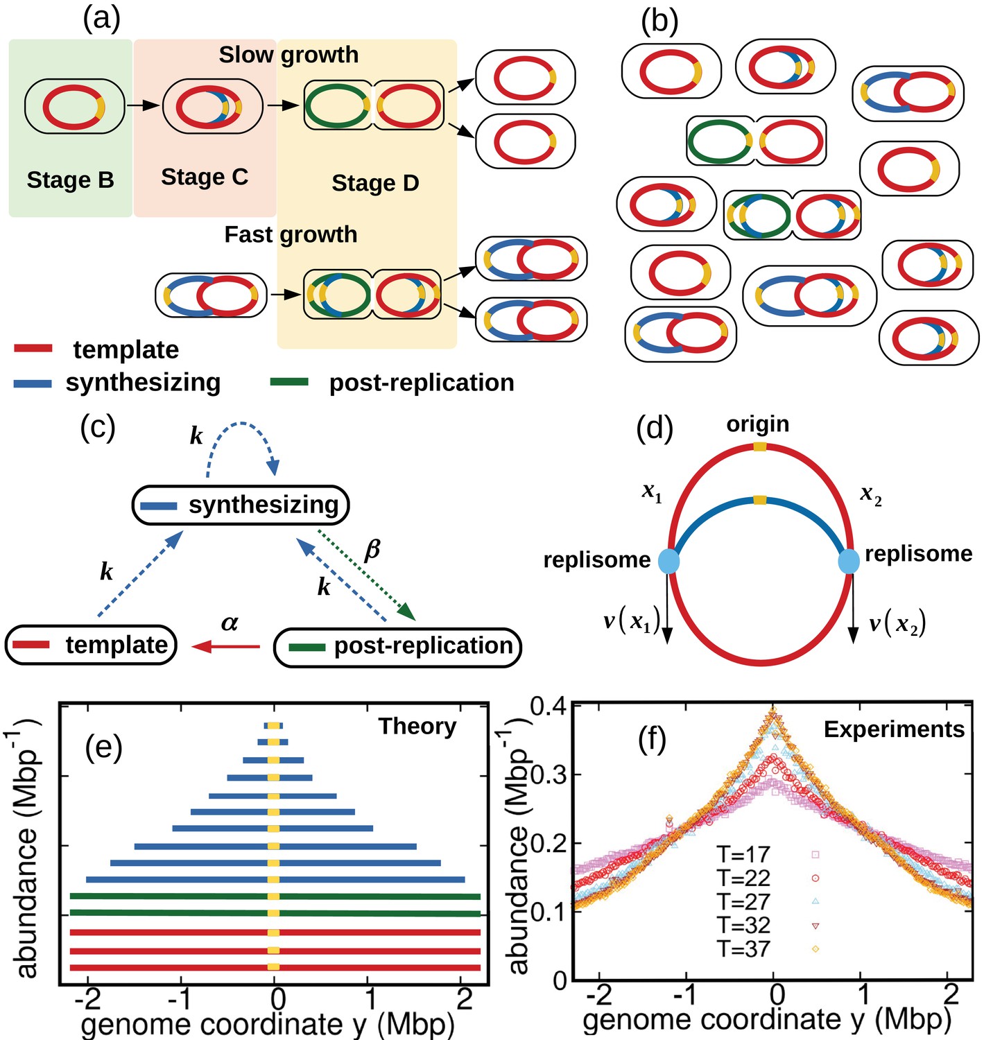
Dynamics of genome types and DNA abundance distribution in an exponentially growing bacterial population.
(a) Cell cycle. In slow growth conditions (top panel), newborn cells contain a template (stage B, red). As the cell cycle progresses, two replisomes synthesize a new genome (stage C, blue) starting from the origin on the template (yellow spot). When replication terminates, cells contain the original template and a post-replication genome (stage D, green). Upon subsequent cell division, the post replication genome becomes the template for the newborn cell. In fast growth conditions (bottom panel), newborn cells acquire a template which is already undergoing synthesis. In subsequent stages, multiple replicating genomes may exist in the same cell. (b) Composition of genomes in an exponentially growing population of cells. Each cell may contain a different number of genomes, depending on its stage in the cell cycle and growth conditions. (c) Dynamics of genome types. Dashed blue arrow represent initiation of replication. The dotted green arrow represents completion of replication. The solid red arrow represents cell division. (d) Replisome dynamics. Two replisomes begin replication at an origin and progress in opposite directions. Their speed may depend, in general, on their genome coordinate. (e) Sketch of the DNA abundance distribution as a function of the genome coordinate. All three types of genomes contribute to the DNA abundance distribution. Because of incomplete genomes, the DNA abundance is largest at the origin and smallest at the terminal region (i.e., towards the periphery). (f) Experimental DNA abundance distribution at different temperatures.
Figure 2 with 3 supplements

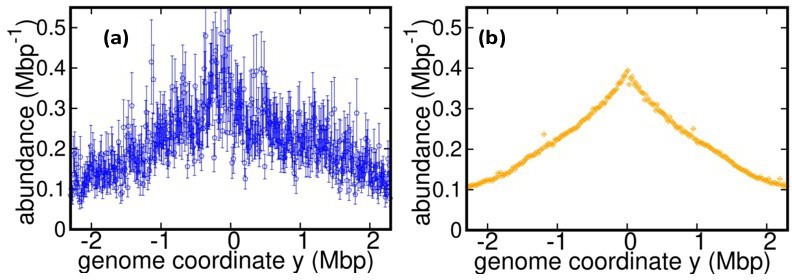
Results of the constant speed model.
(a) DNA abundance distribution for . Orange circles represent experimental data. The solid black line is the prediction of our model assuming constant speed and . Fits are performed using a maximum likelihood method, see Appendix 2 for details. The quality of fits for replicates and other temperatures is comparable, see Figure 2—figure supplement 1, Figure 2—figure supplement 2, and Figure 2—figure supplement 3. In particular, fits of replicates yield similar values of the speed . (b) Replisome speed as a function of temperature. Error bars represent sample-to-sample variations. (c) Comparison of the temperature-dependence of speed and growth rate (see Methods for details on the growth rate estimation). The solid curves are fits of Arrhenius laws to the data. The fitted parameters are , , and . We exclude the data point for in both fits. (d) Estimated number of replisomes per complete genome at different temperatures. The red triangles represents the estimate from Equation 19 in which we use the expression of β for the constant speed model, Equation 22. The black circles are the estimates from Equation 20.
Figure 2—figure supplement 1
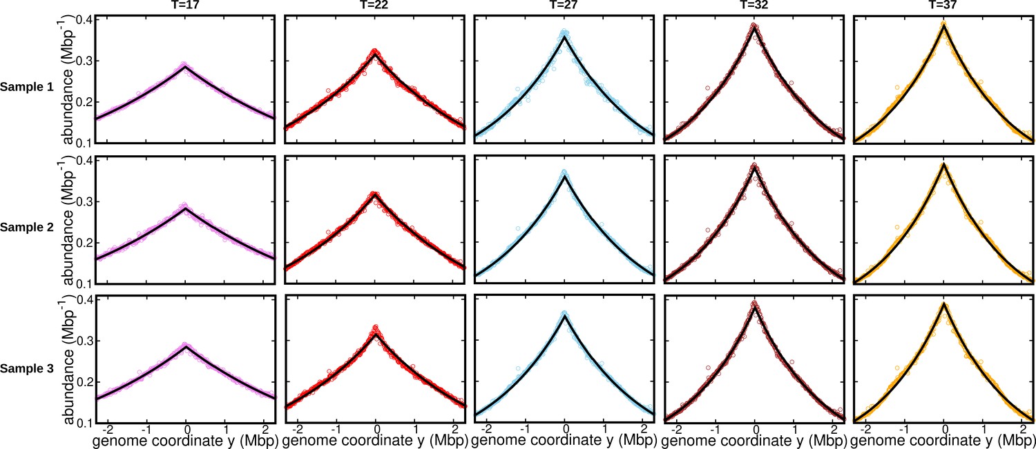
Fits for replicates and other temperatures (normalization 1).
DNA abundance distribution at different temperatures.Bias elimination is carried out using the DNA abundance of the stationary cells grown at temperature . Symbols are from experiments, and the solid black lines are predictions of the constant speed model. The DNA abundance distribution presented in Figure 1d, Figure 2a, and Figure 3 corresponds to Sample 1 (top panel).
Figure 2—figure supplement 2
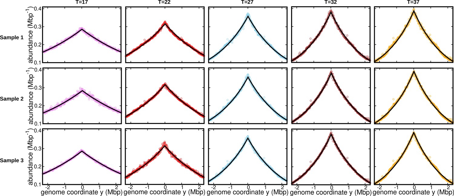
Fits for replicates and other temperatures (normalization 2).
DNA abundance distribution at different temperatures. Bias elimination is carried out using the DNA abundance of the stationary cells grown at temperature . Symbols are from experiments, and the solid black lines are predictions of the constant speed model.
Figure 2—figure supplement 3
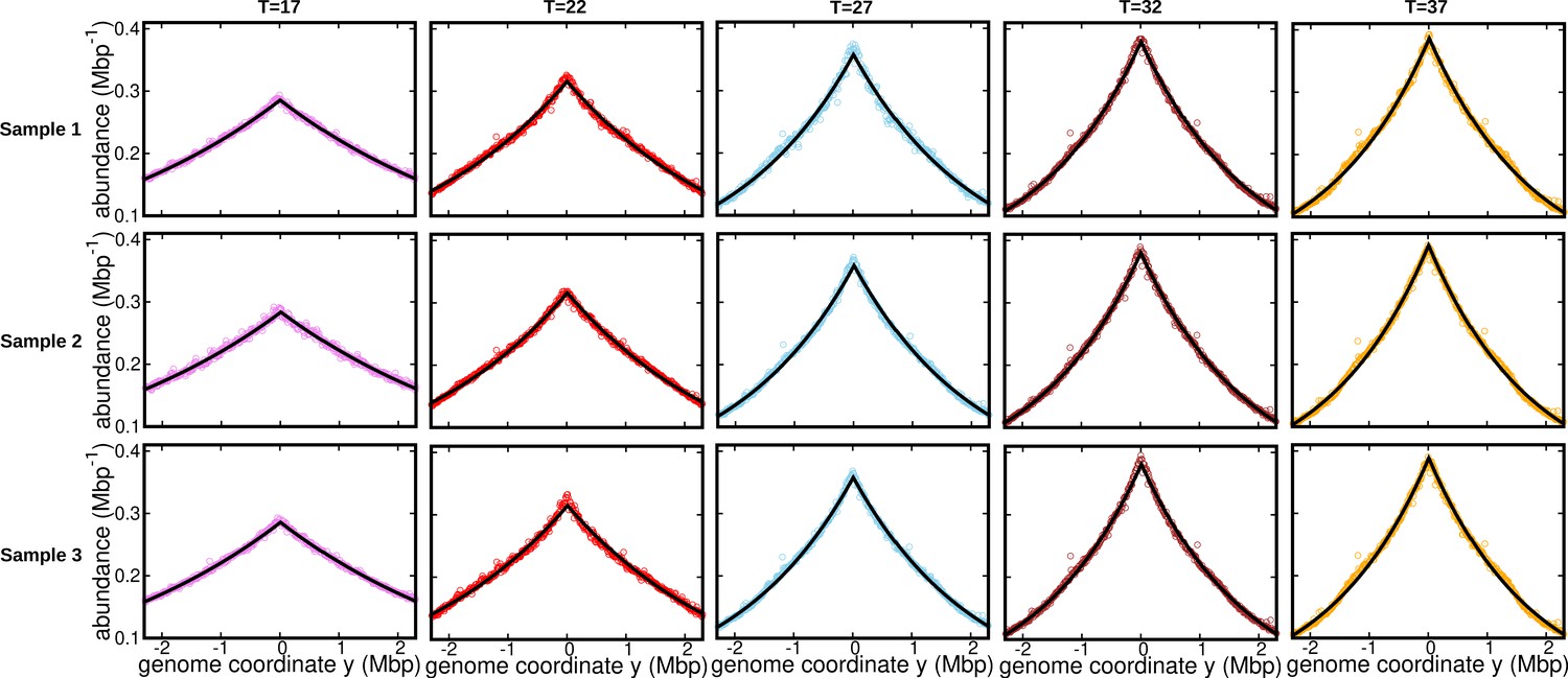
Fits for replicates and other temperatures (normalization 3).
DNA abundance distribution at different temperatures. Bias elimination is carried out using the DNA abundance of the stationary cells grown at temperature . Symbols represent experimental data. The solid black lines are the predictions of the constant speed model.
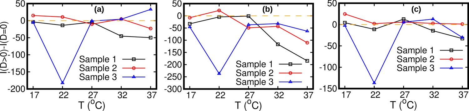
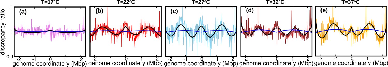
Figure 3 with 5 supplements
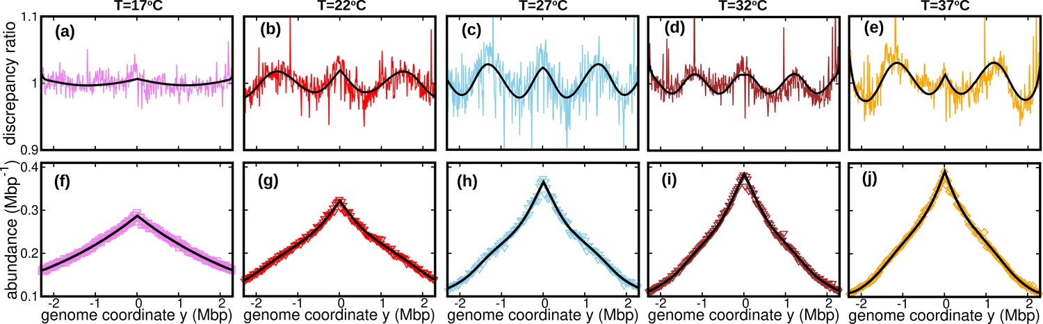
Wave-like deviations from the predictions of the constant speed model.
(a–e) Colored lines: ratios of the experimental DNA abundance over the corresponding prediction assuming constant speed and . The solid black lines represent the ratios of the predictions assuming oscillatory speed, Equation 13 and , over constant speed and . Corresponding plots for replicates and other temperatures are presented in Figure 3—figure supplement 1, Figure 3—figure supplement 2 and Figure 3—figure supplement 3. (f–j) Experimental DNA abundance distribution at different temperatures. The solid black lines are the fits of the oscillatory speed model. Tests based on the Akaike information criterion show that the oscillatory speed model should be chosen over the constant speed model for all the replicates and at all temperatures, see Figure 3—figure supplement 5. The fitted parameters are reported in Table 1.
Figure 3—figure supplement 1
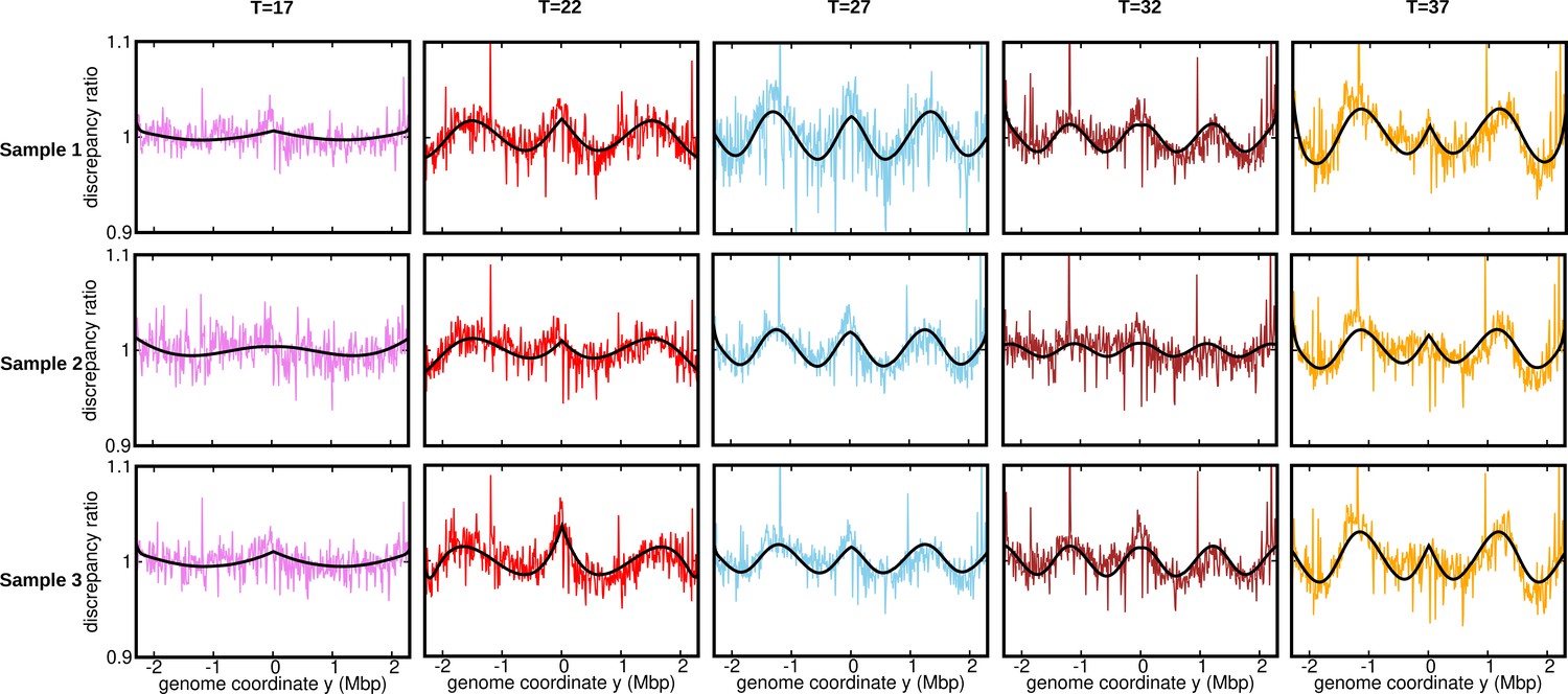
Discrepancy ratio for replicates (normalization 1).
Ratios of the experimental DNA abundance over the corresponding fit assuming constant speed and . The solid black lines represent the ratios of the predictions assuming oscillatory speed over constant speed. The data here is for the stationary temperature . The discrepancy ratios presented in Figure 3 are for Sample 1 (topmost panel).
Figure 3—figure supplement 2
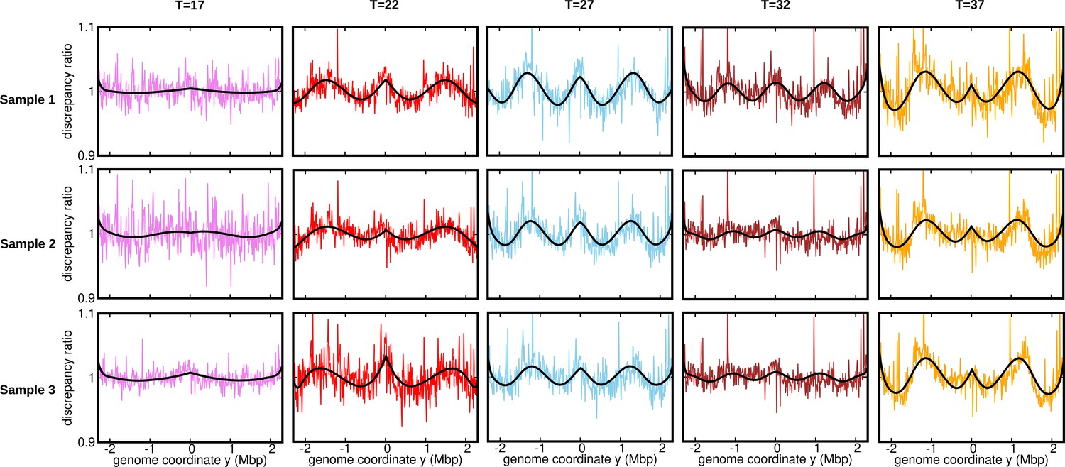
Discrepancy ratio for replicates (normalization 2).
Ratios of the experimental DNA abundance over the corresponding prediction assuming constant speed and . The solid black lines represent the ratios of the predictions assuming oscillatory speed over constant speed. The data here is for the stationary temperature .
Figure 3—figure supplement 3
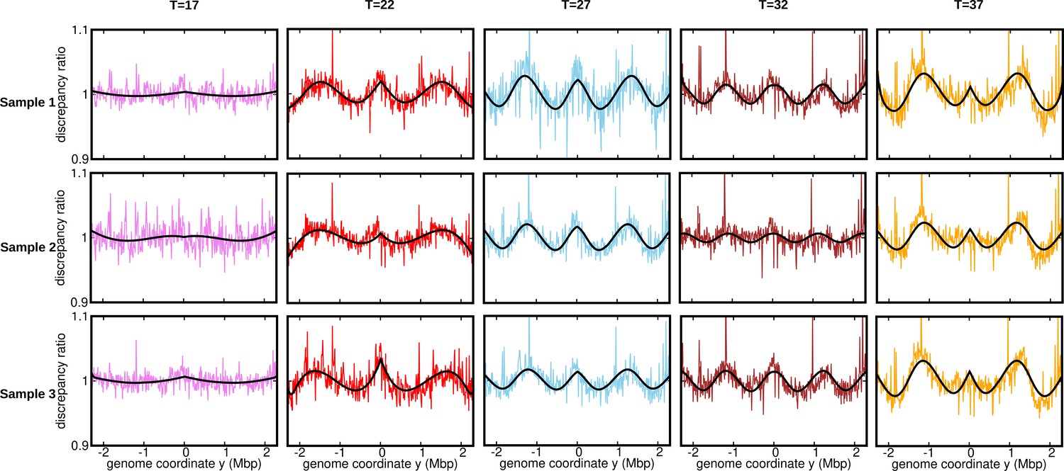
Discrepancy ratio for replicates (normalization 3).
Ratios of the experimental DNA abundance over the corresponding prediction assuming constant speed and . The solid black lines represent the ratios of the predictions assuming oscillatory speed over constant speed. The data here is for the stationary temperature .
Figure 3—figure supplement 4
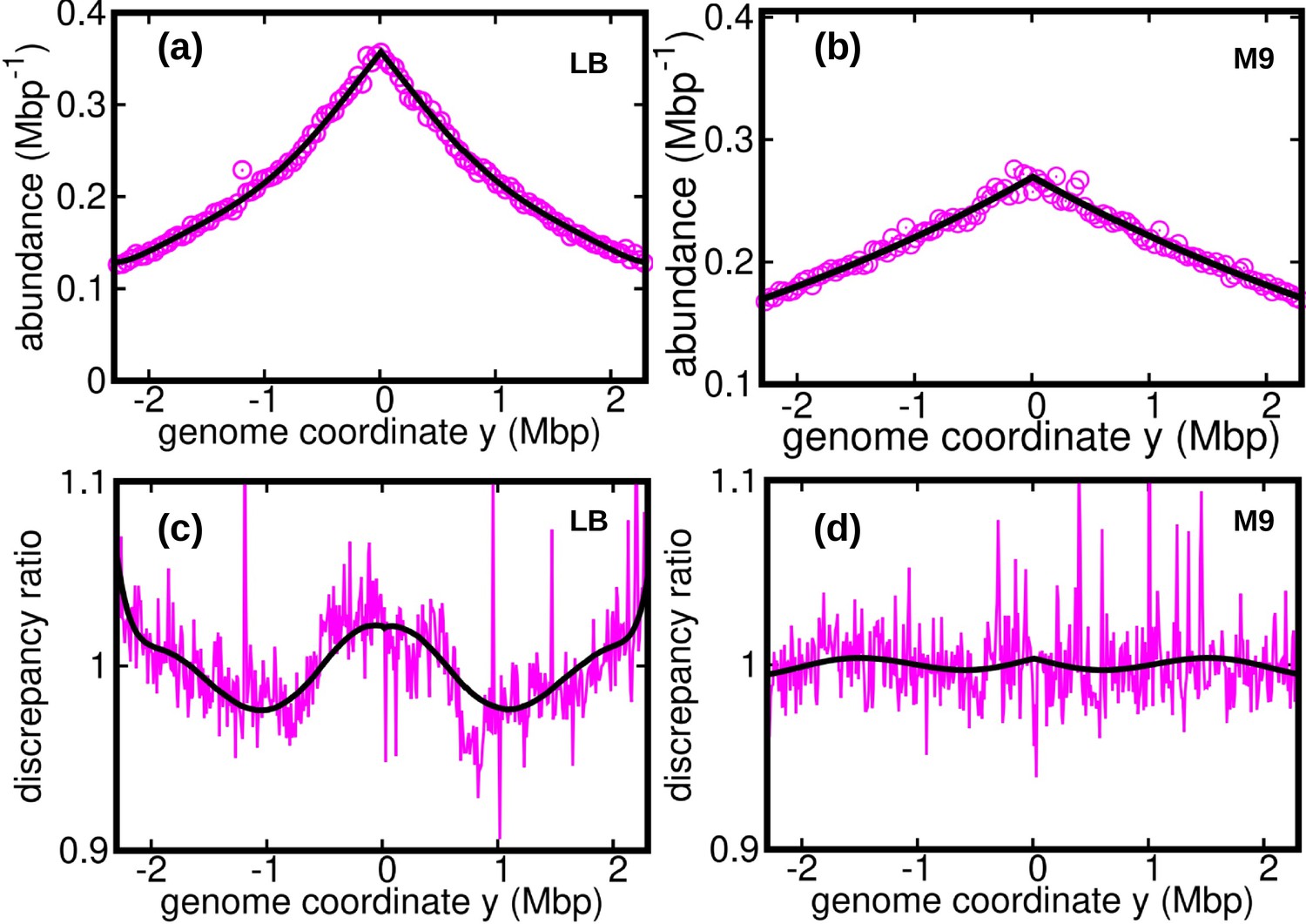
Discrepancy ratio computed from previous data (Midgley-Smith et al., 2018).
DNA abundance distribution from the data reported in Midgley-Smith et al., 2018 for E. coli growing in a Luria broth (LB) medium (a) and minimal (M9) medium (b). The solid black line is the prediction from the constant speed model. The reported growth rates are for LB and for M9 (Midgley-Smith et al., 2018). Substituting this value in our model we obtain the average speed for LB and for M9. Ratios of the experimental DNA abundance over the prediction of the constant speed model for LB in (c) and M9 in (d). The solid black lines in (c) and (d) represent the ratios of the predictions assuming oscillatory speed over constant speed. The estimated parameters of the oscillatory speed model for LB are, , , and . Similarly the parameters of the oscillatory speed model for M9 are,, , , and .
Figure 3—figure supplement 5
Comparison between the constant speed model and oscillatory model.
Statistical comparison between the constant speed model and oscillatory model by means of the Akaike information criterion. The Akaike information is defined as , where np is the number of fitted parameters in a model and is the maximum likelihood. The constant speed model includes a single free parameters versus five for the oscillatory speed model. The Akaike information criterion prescribes that, given a set of candidate models, one should prefer the one characterized by the minimum Akaike information. The Akaike information for the constant speed model, , is larger than that for the oscillatory speed model, , for all temperatures. The stationary data used for bias elimination correspond to temperatures (a) 17°C, (b) 27°C, and (c) 37°C.
Figure 4 with 2 supplements
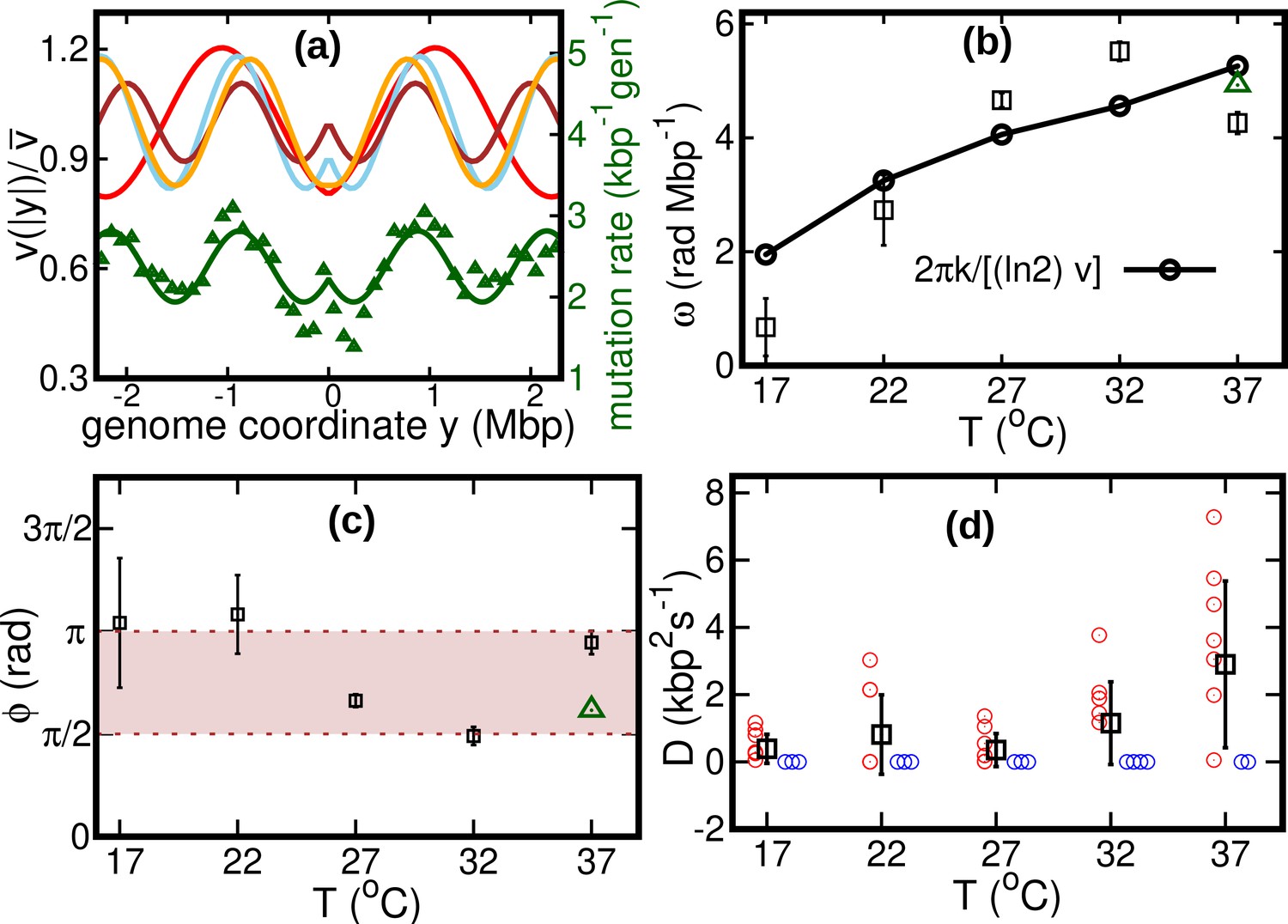
Results of the oscillatory speed model.
(a) Solid lines: relative speeds along the genome (Red: T = 22°C, sky blue: T = 27°C, brown: T = 32°C, and orange: T = 37°C). We omitted the curve for T = 17°C as the oscillations are less evident in this case (see Figure 4—figure supplement 1). The wave-like pattern of the speed is quantitatively similar to the variations of the mutation rate along the genome (green triangles, from Niccum et al., 2019; Pearson correlation coefficients between speed and mutation rate: ; and ). The mutation rate is defined as the number of base pair substitutions per generation per kilo base pairs. The solid green line is a fit to the mutation rate data with the same function as in Equation 13. The fit parameters are , , and . (b) Temperature dependence of angular frequency of oscillation ω (squares). (c) phase (squares). Green triangles in (b) and (c) represent the angular frequency and phase, respectively, from the fit to the mutation rate data with Equation 13. (d) Diffusion coefficient . Circles represent individual fitted values of diffusion coefficients. Blue circles represent cases in which the fitted value of is either zero or not significant (see SI). This occurs in two out of nine cases for 37°C and three out of nine cases for each of the other temperatures.
Figure 4—figure supplement 1
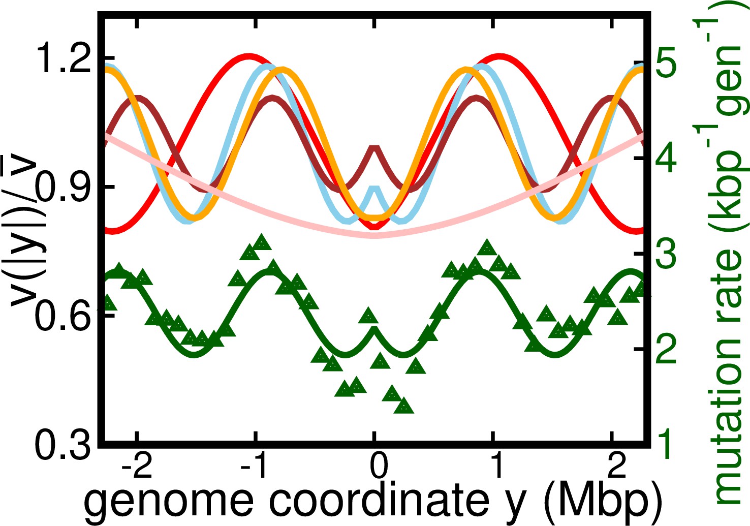
Alternative version of Figure 4a.
Results of the oscillatory speed model. This figure is same as Figure 4a, but with additional curve for C. Solid lines: relative speeds along the genome (Pink: C, Red: C, sky blue: C, brown: C, and orange: C).
Figure 4—figure supplement 2
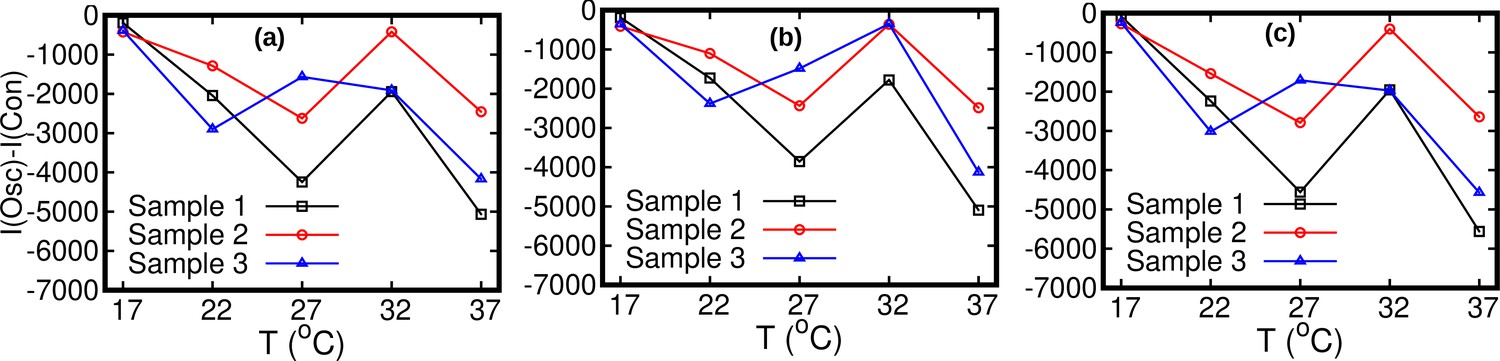
Oscillatory model with and without diffusion.
Statistical comparison between the oscillatory model with diffusion () and without diffusion () by means of the Akaike information criterion. The number of parameters is four for and five for . Difference between Akaike information for and . If this difference is negative, the model with should be preferred. The stationary data used for bias elimination correspond to temperatures 17°C in (a), 27°C in (b) and 37°C in (c).
Figure 5 with 1 supplement
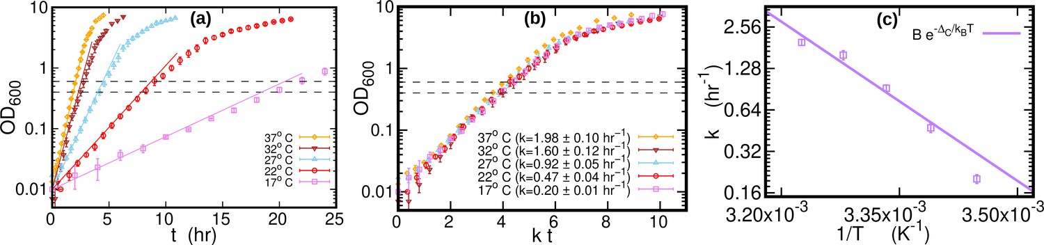
Growth curves at different temperatures.
(a) Optical density (OD) as a function of time at different temperatures. Each curve is averaged over three different replicates at the same temperature. Error bars represent standard deviations. Dashed lines mark the OD window in which the cells are harvested. Solid lines represents the exponential growth curve for each temperature. We computed the growth rate ki for each sample at a given temperature by fitting the optical density to a logistic function , where ai and bi are sample-specific constants (Zwietering et al., 1990). The growth rate for each temperature is the average of the kis. (b) Same data as in (a), but the time in the x-axis is scaled by the growth rate at each temperature. As a result of this rescaling, the growth curves collapse on each other. (c) Average growth rate as a function of temperature. The solid purple line is an Arrhenius fit to the data (see Figure 2), resulting in and . We exclude the data point for from the fit.
Figure 5—figure supplement 1
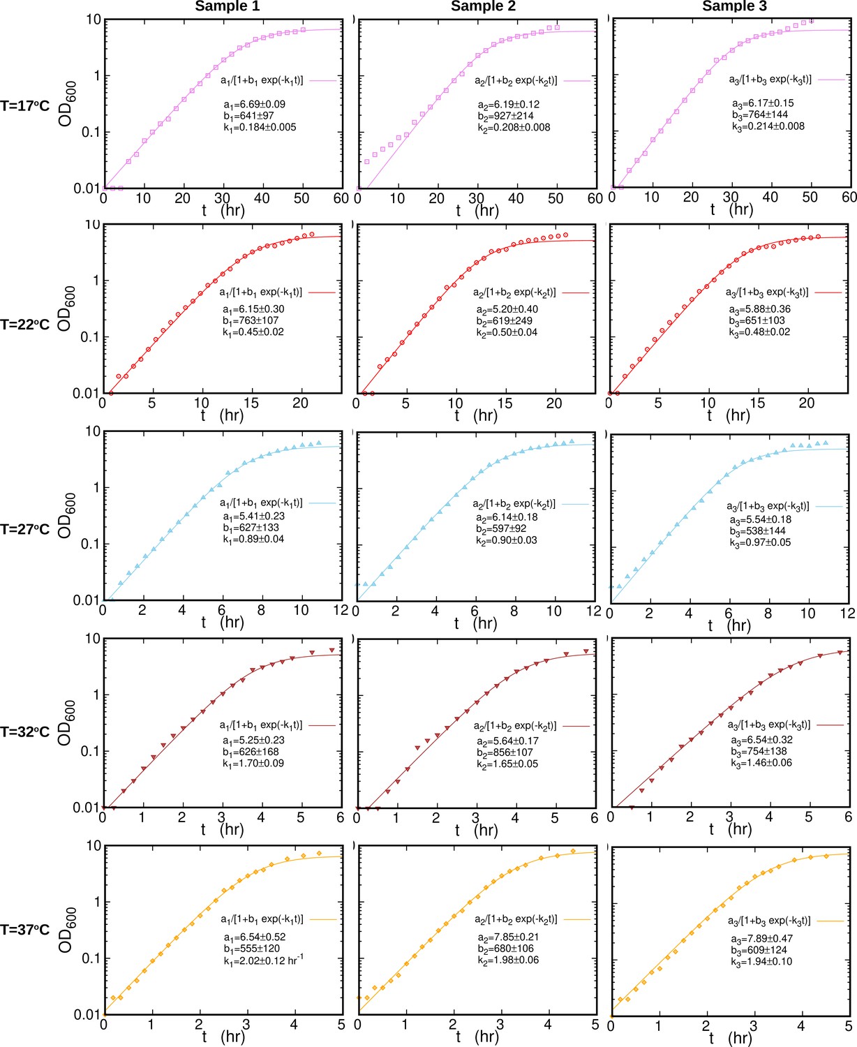
Individual growth curves at different temperatures.
Growth curves (symbols) for individual samples at each temperature are fitted (solid line) to logistic function, , where . The fitted parameters are reported in each plot separately. The sample collection time is almost 50 hr for and about 5 hr for .
Figure 6
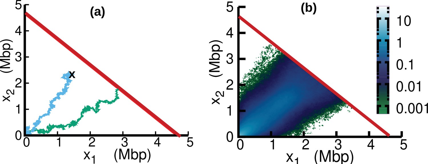
Replisome dynamics in the plane.
(a) Two different trajectories demonstrate two different types of resetting events in our simulations. Trajectories are reset to when the two replisomes complete replication (green trajectory) at the absorbing boundary (solid red line). Additionally, trajectories can be reset from any position to the origin at a rate (sky blue) to take care of the dilution term in Equation 15. (b) Replisome position distribution in the steady state. In both panels, parameters are , , , and . These parameters are on the order of those fitted from experiments (see Table 1), except for which is chosen to be larger for illustration purposes.
Appendix 3—figure 1

DNA content per cell as a function of the growth rate for the case of varying nutrients in (a) and of varying temperature in (b).
In (a), the experimental data (orange circles) are from Si et al., 2017. The solid red line is from Equation 45, in which we used min and min (Si et al., 2017). The curve in (b) is from Equation 44. In this case, we substituted the speed of replisomes and the growth rate of cells at each temperature in Equation 44. In addition, we assumed a linear temperature dependence for the post replication duration (), see (c). The parameters of the linear fit are determined from the data (red squares) reported in Stokke et al., 2012 for the LB medium. We used this linear fit to extrapolate the value of α for different temperatures in Equation 44.
Appendix 7—figure 1
Discrepancy ratio (blue line) between DNA abundance computed from the varying fork firing rate model and the constant speed model exhibits significantly smaller variations compared to the discrepancy ratio between experimental DNA abundance and the constant speed model (pink for 17°C , red for 22°C, skyblue for 27°C, brown for 32°C and orange for 37°C).
Black line is the prediction of the oscillatory speed model. All plots in this figure are from Sample 1. The effect of relaxing the steady-state assumption is similarly small for the other samples.
Author response image 1
Comparison between (a) DNA abundance (wild type E. coli) reported in Korem et al Science (2015) and (b) our experiments.
The data in (b) is for T = 37°C and stationary temperature corresponding to 17°C (used for bias elimination).
Tables
Table 1
Parameters of the oscillatory speed model.
Temperatures are expressed in , in , ω in , in , and in . Reported values are averages and standard deviations over experimental replicates. The oscillatory and constant speed models yield estimates of the parameter that are consistent with each other, see Appendix 4—table 1.
| T | δ | ω | |||
|---|---|---|---|---|---|
| 17 | 246±33 | 0.22±0.13 | 0.7±0.5 | 3.3±1.0 | 0.39±0.43 |
| 22 | 351±30 | 0.20±0.06 | 2.7±0.6 | 3.4±0.6 | 0.81±1.18 |
| 27 | 541±30 | 0.18±0.03 | 4.7±0.1 | 2.1±0.1 | 0.35±0.49 |
| 32 | 821±66 | 0.11±0.04 | 5.5±0.2 | 1.5±0.1 | 1.15±1.23 |
| 37 | 970±51 | 0.17±0.03 | 4.3±0.2 | 3.0±0.2 | 2.90±2.48 |
Appendix 4—table 1
Comparison between average (over the sample to sample variations) speed estimated in the constant and oscillatory speed models.
Temperature are expressed in Celsius and speeds in . The last column shows the average growth rate (expressed in ) at different temperatures.
| Temperature | (constant speed) | (oscillatory speed) | (growth rate) |
|---|---|---|---|
| 17 | 221±17 | 243±36 | 0.20±0.02 |
| 22 | 373±29 | 350±28 | 0.47±0.04 |
| 27 | 528±31 | 542±30 | 0.92±0.05 |
| 32 | 812±64 | 823±65 | 1.60±0.12 |
| 37 | 961±51 | 972±51 | 1.98±0.10 |
Appendix 7—table 1
The speed inputted to the time varying fork firing rate model to generate the DNA abundance distribution is comparable with the re-estimated speed by fitting the resulting DNA abundance distribution to the constant speed model.
Reported uncertainties in the re-estimated speed represent standard deviations over the replicates.
| Temperature (°C) | Speed inputted to the varyingfork firing rate model (bps-1) | Re-estimated speed(bps-1) |
|---|---|---|
| 17 | 221 | 233±8 |
| 22 | 373 | 393±23 |
| 27 | 528 | 558±25 |
| 32 | 812 | 846±37 |
| 37 | 961 | 1009±48 |
Additional files
Download links
A two-part list of links to download the article, or parts of the article, in various formats.
Downloads (link to download the article as PDF)
Open citations (links to open the citations from this article in various online reference manager services)
Cite this article (links to download the citations from this article in formats compatible with various reference manager tools)
Speed variations of bacterial replisomes
eLife 11:e75884.
https://doi.org/10.7554/eLife.75884


