Mutational robustness changes during long-term adaptation in laboratory budding yeast populations
- Department of Organismic and Evolutionary Biology, Harvard University, United States
- Quantitative Biology Initiative, Harvard University, United States
- NSF-Simons Center for Mathematical and Statistical Analysis of Biology, Harvard University, United States
- Department of Physics, Harvard University, United States
Figures
Figure 1 with 9 supplements
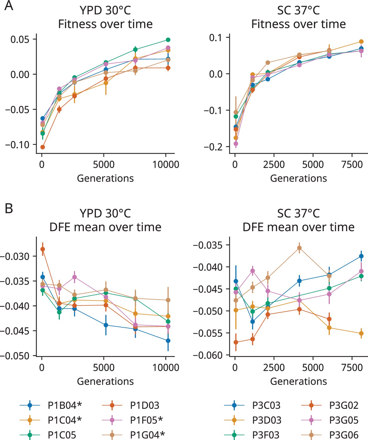
The distribution of fitness effects (DFE) mean declines in one of two environments during evolution.
(A) Changes in fitness during the evolution experiment, measured as the average fitness of two clones isolated from six timepoints in each population. In each graph, zero is the fitness of a fluorescent reference used in that environment. Error bars represent the standard deviation of the fitnesses measured for the two clones (points without error bars have errors smaller than the point size). (B) The mean fitness effect of the insertion mutations measured in the clones isolated from each timepoint. Asterisks represent a significant correlation (p<0.05, Wald test) between generation and DFE mean in that population alone. In both (A) and (B), the six populations are indicated by color. Error bars represent the standard error of the DFE mean, calculated from the standard errors of individual mutations (see ‘Materials and methods’). Additional DFE statistics are shown in Figure 1—figure supplement 4.
Figure 1—figure supplement 1
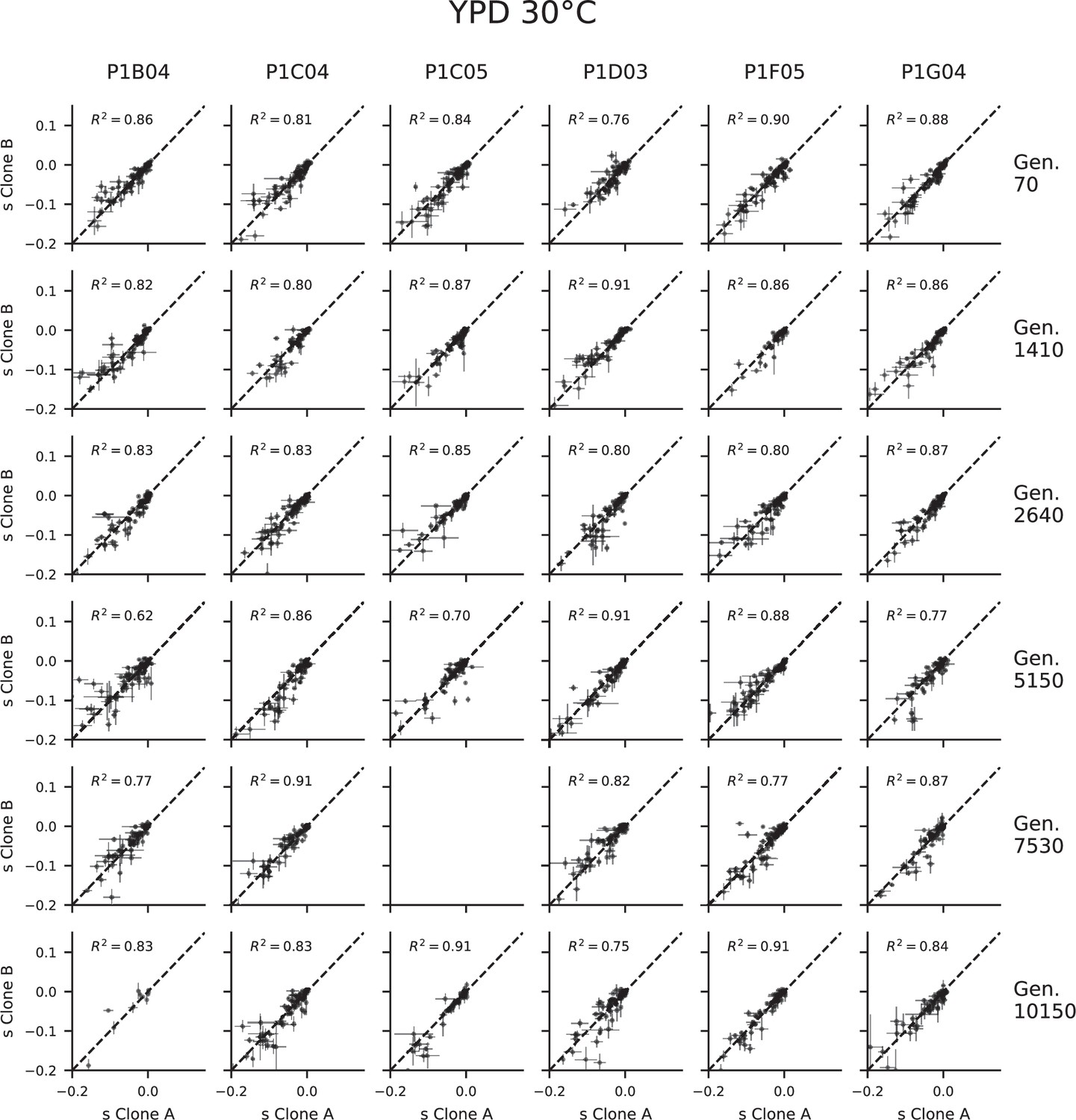
Fitness effect measurement correlations in YPD 30°C.
Only mutations with at least three barcodes with fitness effect measurements in each clone are included. Values are graphically pinned to the –0.2 and 0.15 if they fall outside that range. Blank graphs represent cases in which one or both replicates do not have fitness measurements due to low read counts or insufficient neutral barcodes for mean fitness estimation. Error bars represent standard errors (see ‘Material and methods’).
Figure 1—figure supplement 2
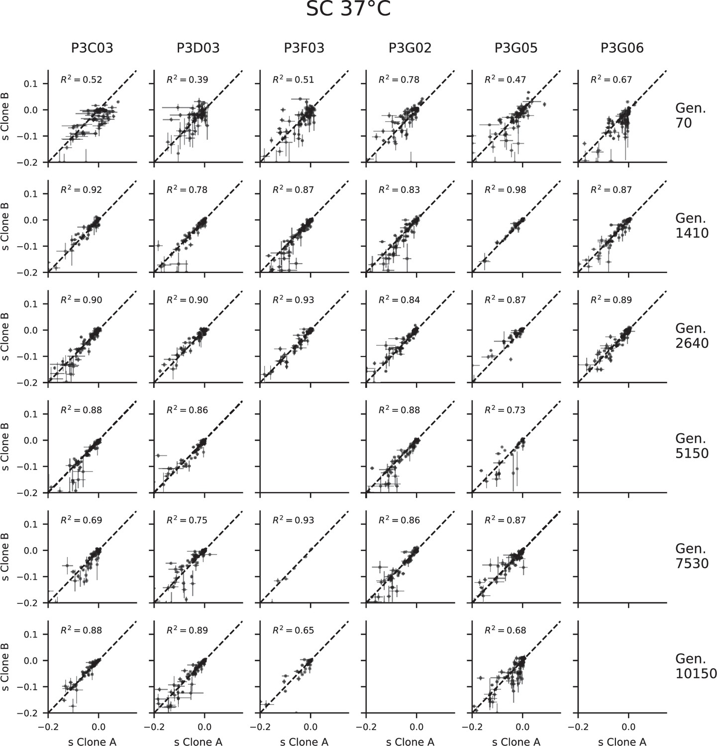
Fitness effect measurement correlations in SC 37°C.
Only mutations with at least three barcodes with fitness effect measurements in each clone are included. Values are graphically pinned to the –0.2 and 0.15 if they fall outside that range. Blank graphs represent cases in which one or both replicates do not have fitness measurements due to low read counts or insufficient neutral barcodes for mean fitness estimation. Error bars represent standard errors (see ‘Material and methods’).
Figure 1—figure supplement 3
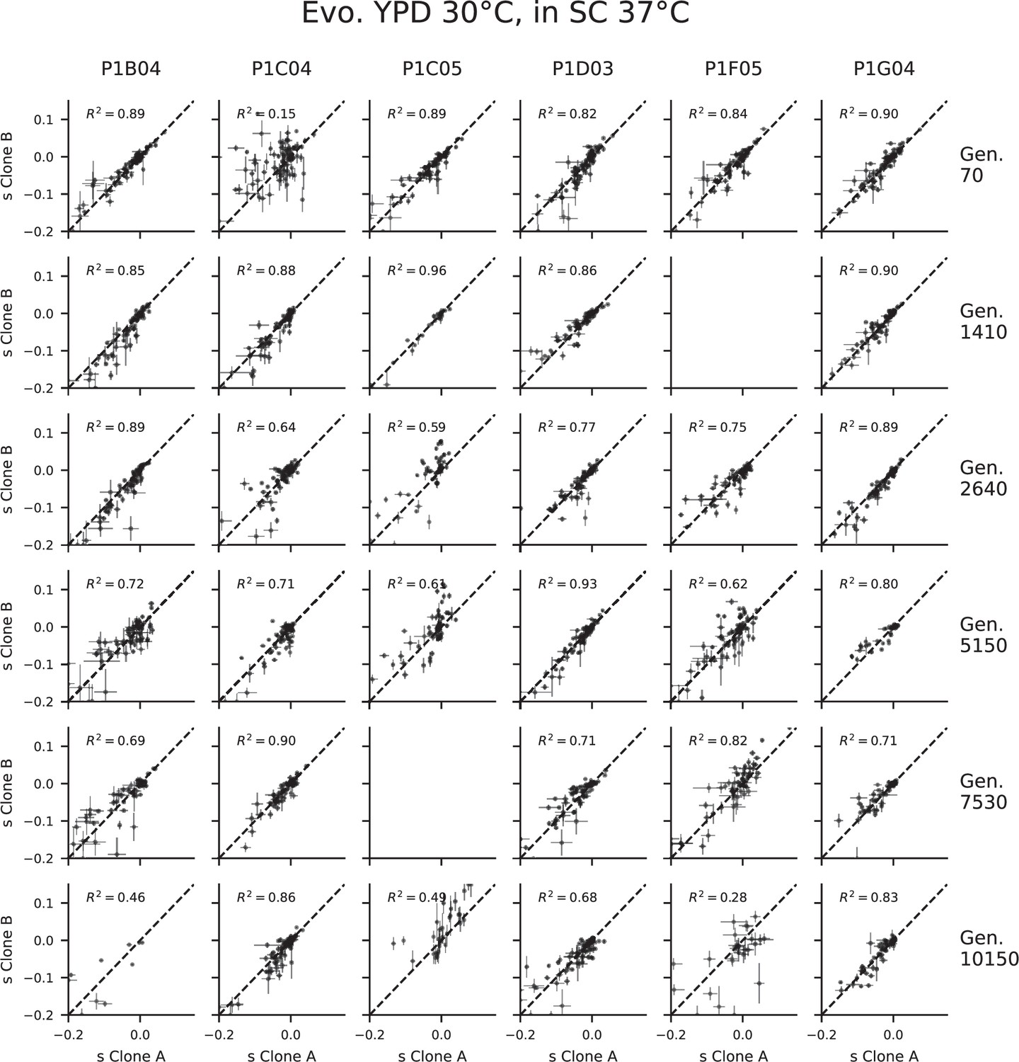
Fitness effect measurement correlations in clones evolved in YPD 30°C, assayed in SC 37°C.
Only mutations with at least three barcodes with fitness effect measurements in each clone are included. Values are graphically pinned to the –0.2 and 0.15 if they fall outside that range. Blank graphs represent cases in which one or both replicates do not have fitness measurements due to low read counts or insufficient neutral barcodes for mean fitness estimation. Error bars represent standard errors (see ‘Materials and methods’).
Figure 1—figure supplement 4
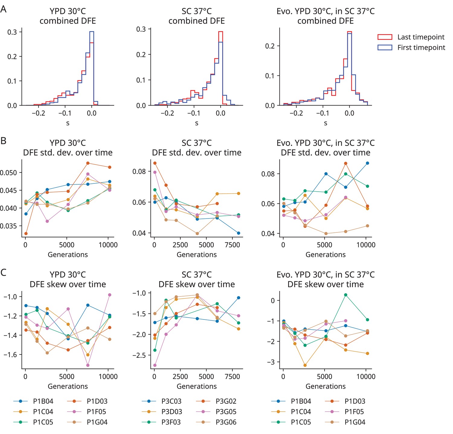
Additional distribution of fitness effects (DFE) statistics.
(A) The combined DFE of all populations at the first and last timepoint in each environment. (B) The standard deviation of the DFE over time in each population. (C) The skew of the DFE over time in each population.
Figure 1—figure supplement 5
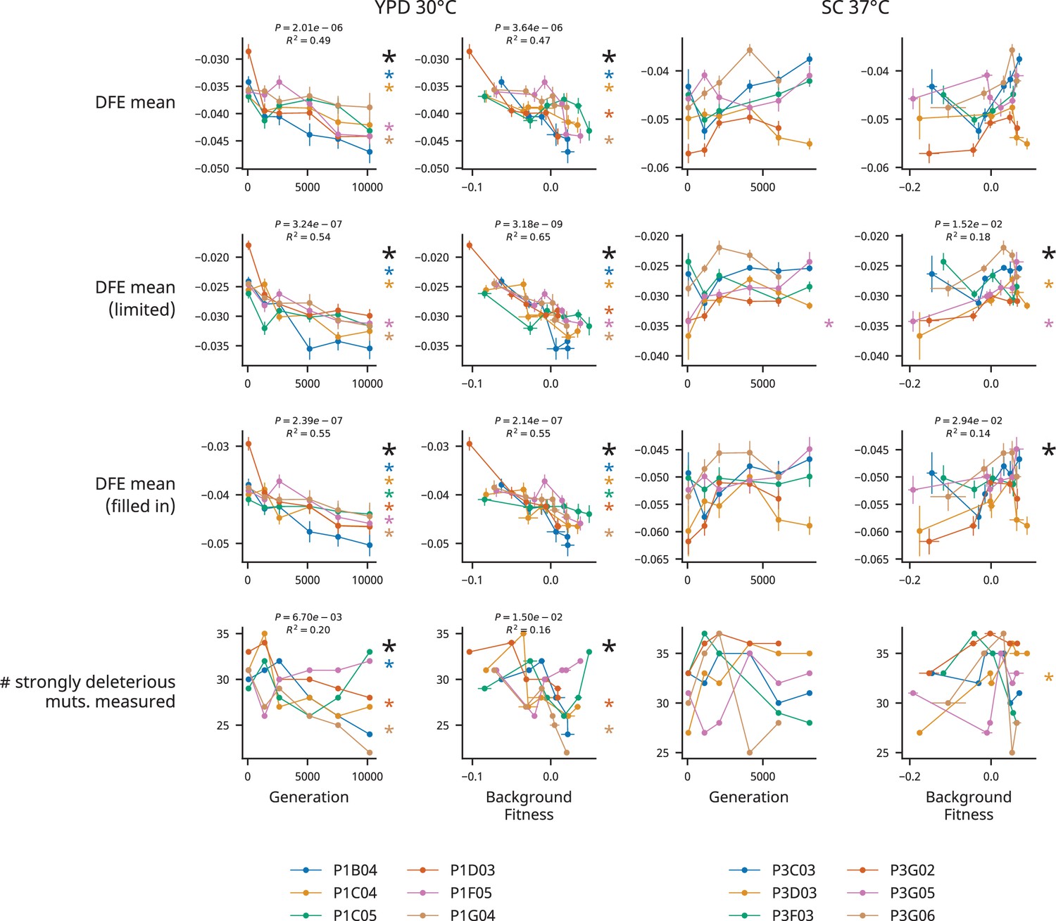
Accounting for missing fitness effect measurements.
Relationships between generations evolved and background fitness and various distribution of fitness effects (DFE) measurements in each environment. Colored asterisks next to each plot represent a significant correlation (p<0.05, Wald test) for the data corresponding to the associated population, and the larger black asterisk represents a significant correlation for the entire dataset (the associated p-value and R2 are shown above the graph when p<0.05). The first row shows the DFE mean. The second row shows the mean of a DFE of mutations in which every mutation is measured in every population-timepoint with usable data (68 mutations in all 36 population-timepoints successfully assayed in YPD 30°C, 57 mutations in 33 populations timepoints successfully assayed in SC 37°C). The third row shows the mean of a DFE in which missing fitness effect measurements are filled in with their average fitness effect across strains. The fourth row shows the number of strongly deleterious mutations (defined as having a mean fitness effect <–0.05 across all strains in a given condition) that had their fitness effects successfully measured in each population-timepoint. These methods for accounting for missing fitness measurements strengthen our conclusion that the mean of the DFE declines during evolution in YPD 30°C (p-values are lower and R2 values are higher in the limited and filled in DFE analyses, and strongly deleterious mutations are more likely to be missing measurements in high fitness strains).
Figure 1—figure supplement 6
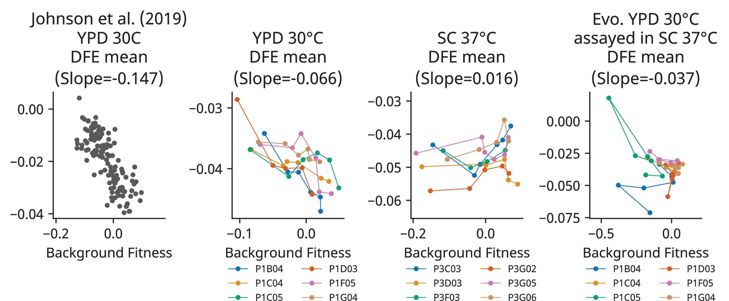
Comparison of our distribution of fitness effects (DFE) mean vs. background fitness data with the data from Johnson et al., 2019.
Each graph shows the relationship between the mean of the DFE and strain background. All graphs have the same aspect ratio, and the slope of a least-squares regression is shown in the title.
Figure 1—figure supplement 7
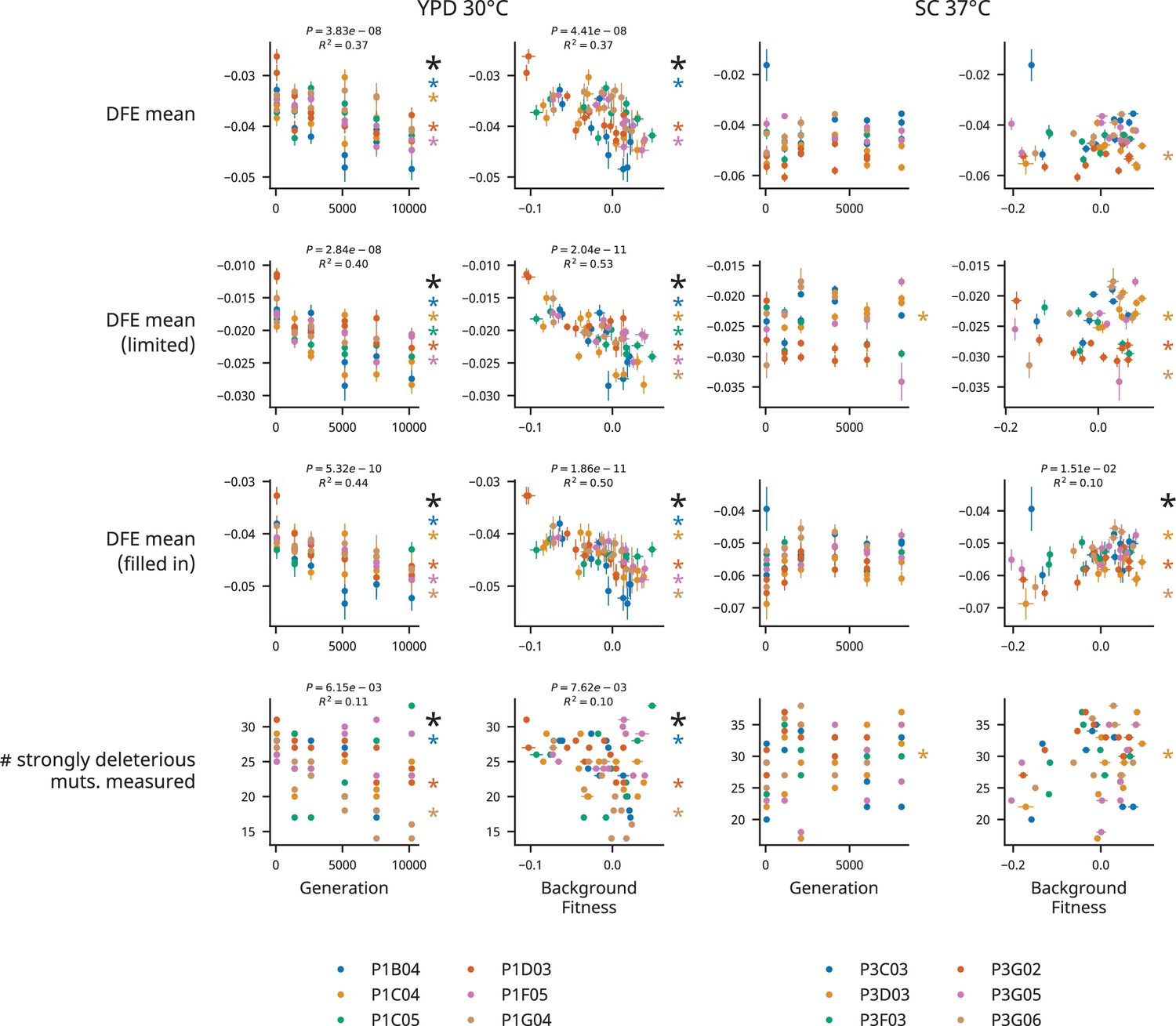
Distribution of fitness effects (DFE) statistics and missing fitness effect measurements for analysis considering clones separately.
Relationships between generations evolved and background fitness and various DFE measurements in each environment. Colored asterisks next to each plot represent a significant correlation (p<0.05, Wald test) for the data corresponding to the associated population, and the larger black asterisk represents a significant correlation for the entire dataset (the associated p-value and R2 are shown above the graph when p<0.05). The first row shows the DFE mean. The second row shows the mean of a DFE of mutations in which every mutation is measured in every population-timepoint with usable data (42 mutations in 62 clones successfully assayed in YPD 30°C, 40 mutations in 44 clones successfully assayed in SC 37°C). The third row shows the mean of a DFE in which missing fitness effect measurements are filled in with their average fitness effect across strains. The fourth row shows the number of strongly deleterious mutations (defined as having a mean fitness effect <–0.05 across all strains in a given condition) that had their fitness effects successfully measured in each population-timepoint.
Figure 1—figure supplement 8
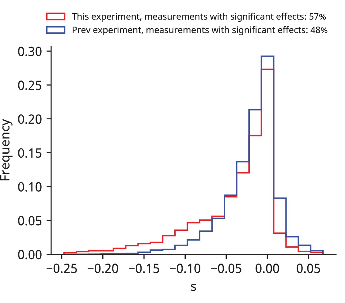
Distributions of all fitness effects measured in Johnson et al., 2019 and this experiment.
These distributions comprise all fitness effects measured using the set of 91 mutations derived from Johnson et al., 2019 in that experiment (blue) and this one (red). The number of fitness effects that were significantly different from zero after a Benjamini–Hochberg correction (see ‘Materials and methods’) is shown in the legend.
Figure 1—figure supplement 9
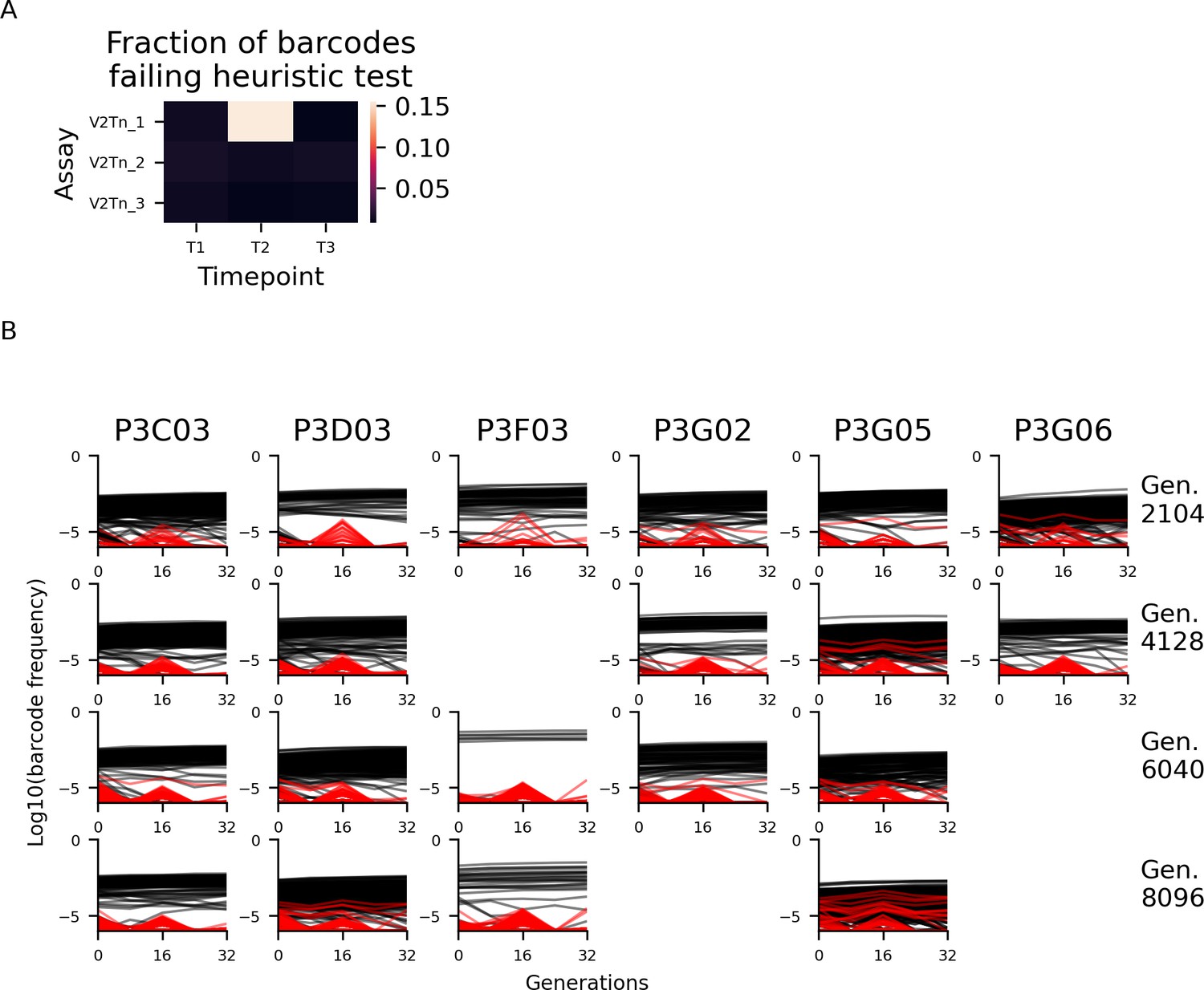
Excluding barcodes that experience sequencing cross-contamination.
(A) Heatmap showing the percentage of barcodes that failed our heuristic test for sequencing cross-contamination at each timepoint in each assay in our SC 37°C experiment. Based on this data, we excluded barcodes that failed this test at timepoint 2 in the V2Tn_2 assay. Frequency trajectories of reference mutation barcodes are plotted in (B), with excluded barcodes shown in red. This procedure excluded 0.4% of reads at timepoint 2 on average. Assays in which less than three timepoints have at least 5000 reads are not plotted. See ‘Materials and methods’ for more details.
Figure 2 with 5 supplements
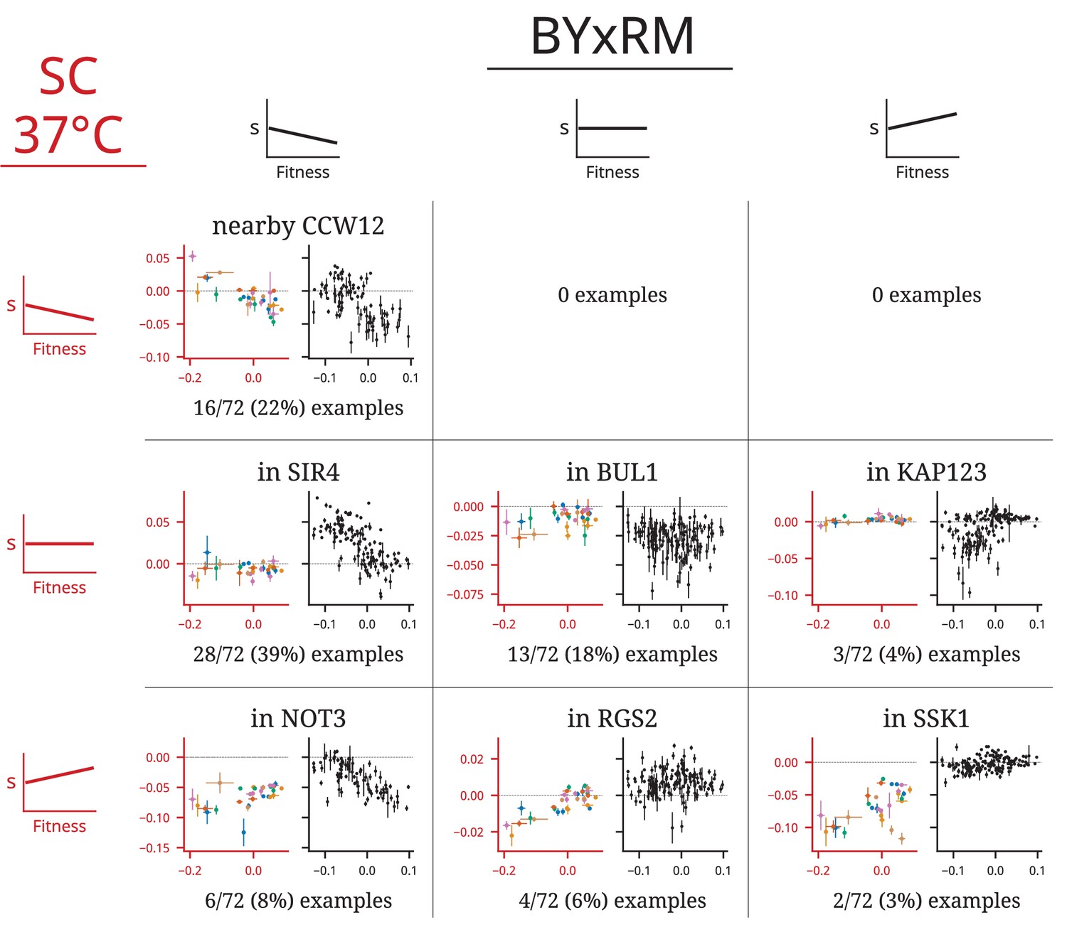
Patterns of fitness-correlated epistasis.
Each panel shows an example of a specific mutation with a particular combination of relationships (negative, positive, or nonsignificant correlation between fitness effect of the mutation, s, and background fitness) in the two environments; numbers indicate the total number of mutations displaying each pair of relationships. Each point depicts the fitness effect (y-axis) of one insertion mutation measured in one population-timepoint, with the measured fitness of that population-timepoint represented on the x-axis. Error bars show the standard error of both measurements (see ‘Materials and methods’). Axes are colored to identify the environment: in each panel, the blue axes on the left are data from YPD 30°C and the black axes on the right are data from SC 37°C. Points are colored by population, as in Figure 1. Each set of example plots is labeled by where the mutation is in the genome (i.e., which gene it disrupts). Additional comparisons of patterns of epistasis in these experiments and those from Johnson et al., 2019 are shown in Figure 2—figure supplements 1–4.
Figure 2—figure supplement 1
Comparison of patterns of fitness-correlated epistasis between YPD 30°C and a previous study.
Each panel shows an example of a specific mutation with a particular combination of relationships (negative, positive, or nonsignificant correlation between fitness effect of the mutation, s, and background fitness) in the two environments; numbers indicate the total number of mutations displaying each pair of relationships. Each point depicts the fitness effect (y-axis) of one insertion mutation measured in one population-timepoint, with the measured fitness of that population-timepoint represented on the x-axis. Error bars show the standard error of both measurements (see ‘Materials and methods’). The axes are colored to identify the environment: in each square, the blue axes on the left are data from YPD 30°C and the black axes on the right are data from Johnson et al., 2019, in which each point represents a segregant from a yeast cross. Points are colored by populations, as in Figure 1. Each set of example plots is labeled by where the mutation is in the genome (what gene it disrupts).
Figure 2—figure supplement 2
Comparison of patterns of fitness-correlated epistasis between SC 37°C and a previous study.
Each panel shows an example of a specific mutation with a particular combination of relationships (negative, positive, or nonsignificant correlation between fitness effect of the mutation, s, and background fitness) in the two environments; numbers indicate the total number of mutations displaying each pair of relationships. Each point depicts the fitness effect (y-axis) of one insertion mutation measured in one population-timepoint, with the measured fitness of that population-timepoint represented on the x-axis. Error bars show the standard error of both measurements (see ‘Materials and methods’). The axes are colored to identify the environment: in each square, the red axes on the left are data from SC 37°C and the black axes on the right are data from Johnson et al., 2019, in which each point represents a segregant from a yeast cross. Points are colored by populations, as in Figure 1. Each set of example plots is labeled by where the mutation is in the genome (what gene it disrupts).
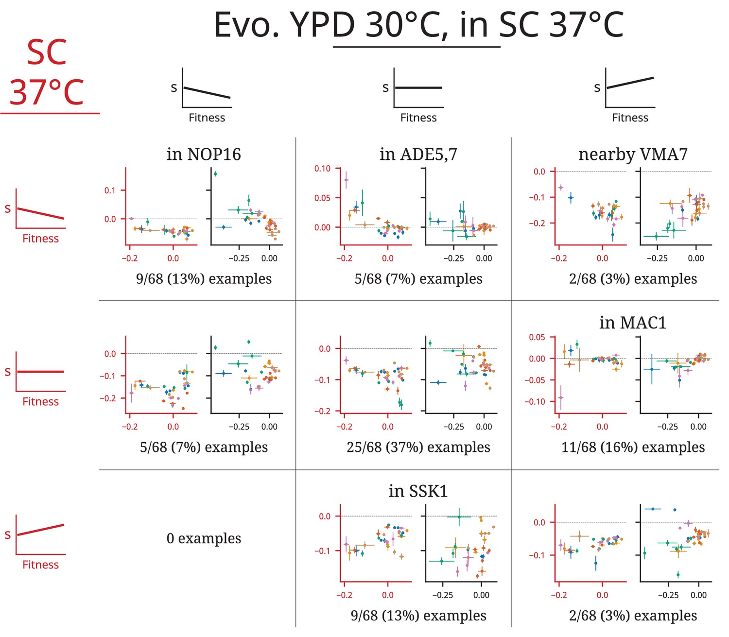
Figure 2—figure supplement 3
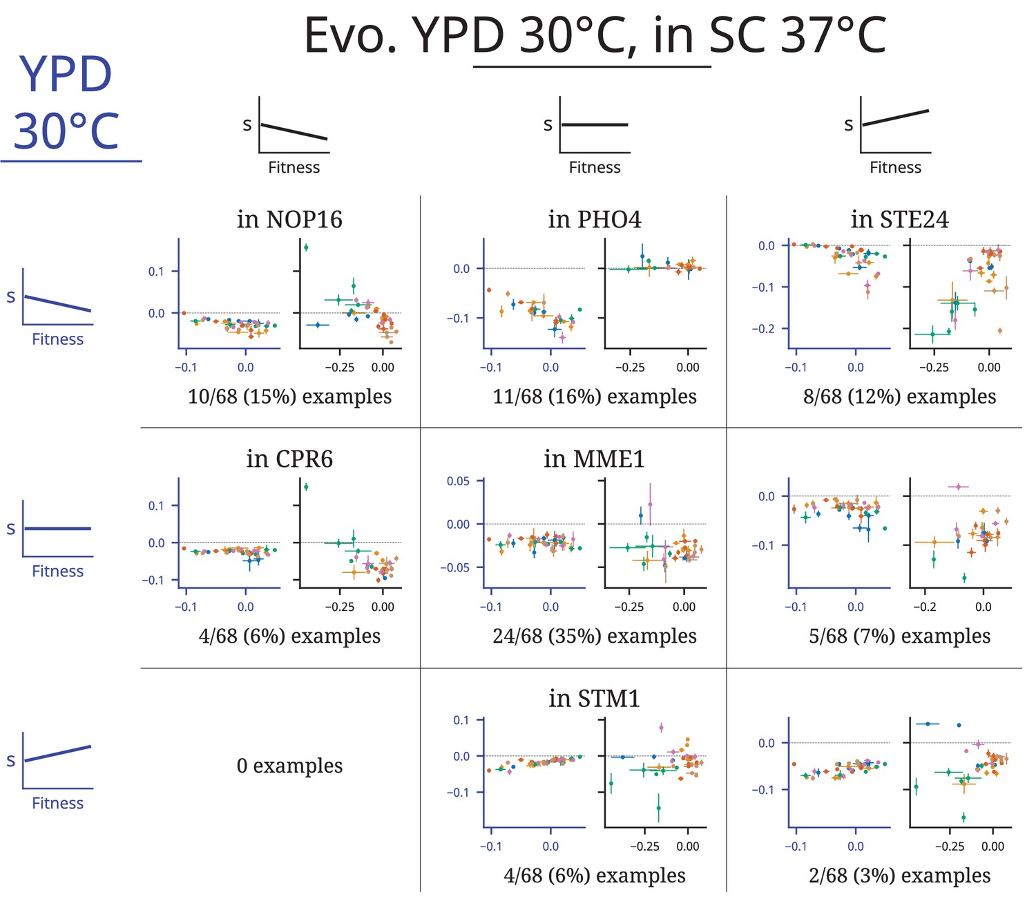
Comparison of patterns of fitness-correlated epistasis YPD 30°C and SC 37°C, in both cases using the set of clones isolated from evolution in YPD 30°C.
Each panel shows an example of a specific mutation with a particular combination of relationships (negative, positive, or nonsignificant correlation between fitness effect of the mutation, s, and background fitness) in the two environments; numbers indicate the total number of mutations displaying each pair of relationships. Each point depicts the fitness effect (y-axis) of one insertion mutation measured in one population-timepoint, with the measured fitness of that population-timepoint represented on the x-axis. Error bars show the standard error of both measurements (see ‘Materials and methods’). The axes are colored to identify the environment: in each square, the blue axes on the left are data from YPD 30°C and the black axes on the right are data from the same clones isolated from evolution in YPD°C, but assayed in the SC 37°C environment. Points are colored by populations, as in Figure 1. Each set of example plots is labeled by where the mutation is in the genome (what gene it disrupts).
Figure 2—figure supplement 4
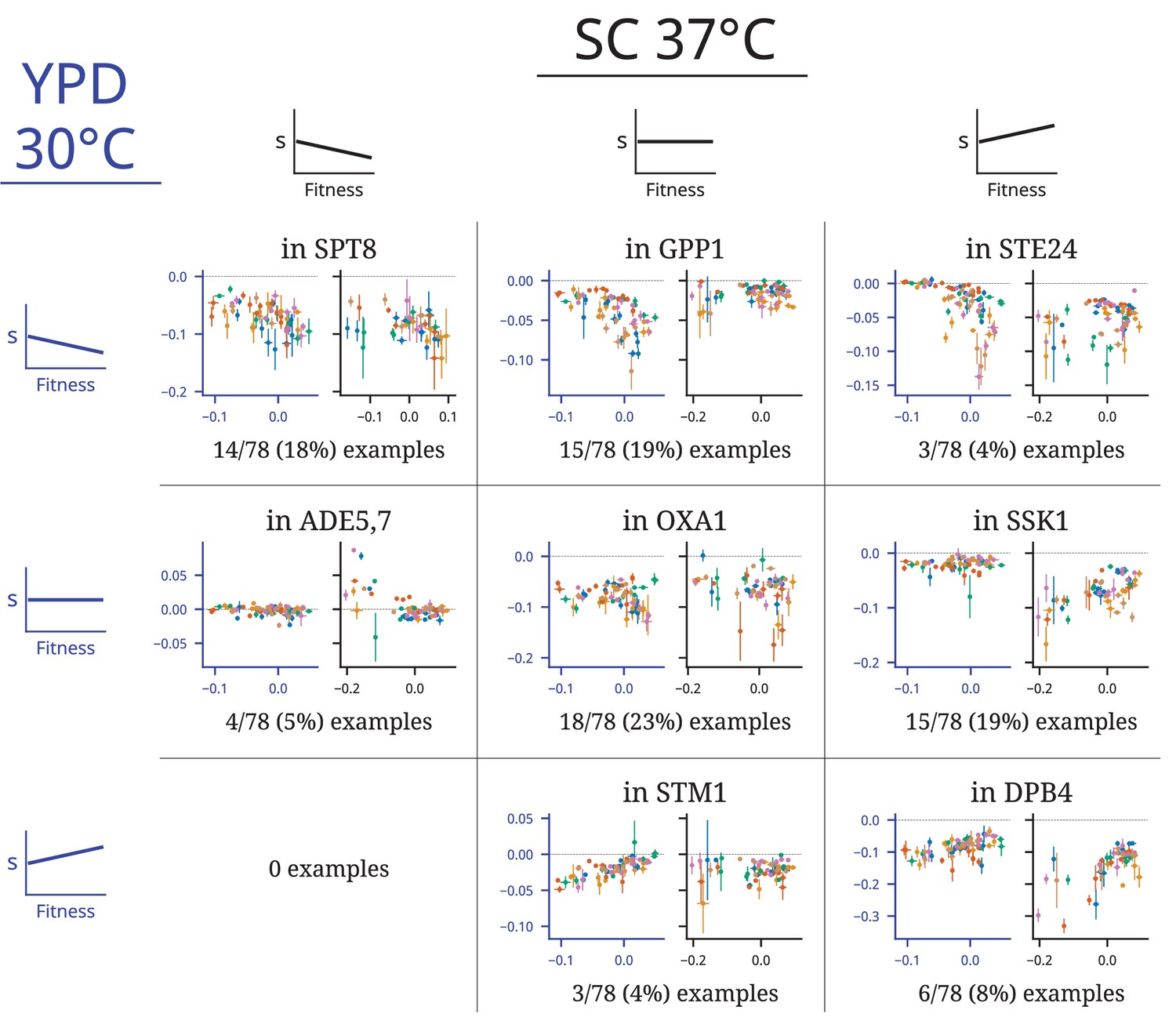
Comparison of patterns of fitness-correlated epistasis in the SC 37°C environment for clones isolated from evolution in either YPD 30°C or SC 37°C.
Each panel shows an example of a specific mutation with a particular combination of relationships (negative, positive, or nonsignificant correlation between fitness effect of the mutation, s, and background fitness) in the two environments; numbers indicate the total number of mutations displaying each pair of relationships. Each point depicts the fitness effect (y-axis) of one insertion mutation measured in one population-timepoint, with the measured fitness of that population-timepoint represented on the x-axis. Error bars show the standard error of both measurements (see ‘Materials and methods’). The axes are colored to identify the environment: in each square, the red axes on the left are data from clones isolated from evolution in SC 37C and the black axes on the right are data from clones isolated from evolution in YPD°C, both assayed in the SC 37°C environment. Points are colored by populations, as in Figure 1. Each set of example plots is labeled by where the mutation is in the genome (what gene it disrupts).
Figure 2—figure supplement 5
Patterns of fitness-correlated epistasis with clones treated separately.
Each panel shows an example of a specific mutation with a particular combination of relationships (negative, positive, or nonsignificant correlation between fitness effect of the mutation, s, and background fitness) in the two environments; numbers indicate the total number of mutations displaying each pair of relationships. Each point depicts the fitness effect (y-axis) of one insertion mutation measured in one clone with the measured fitness of that clone represented on the x-axis. Error bars show the standard error of both measurements (see ‘Materials and methods’). Axes are colored to identify the environment: in each panel, the blue axes on the left is data from YPD 30°C and the black axes on the right is data from SC 37°C. Points are colored by population, as in Figure 1. Each set of example plots is labeled by where the mutation is in the genome (i.e., which gene it disrupts).
Figure 3 with 37 supplements
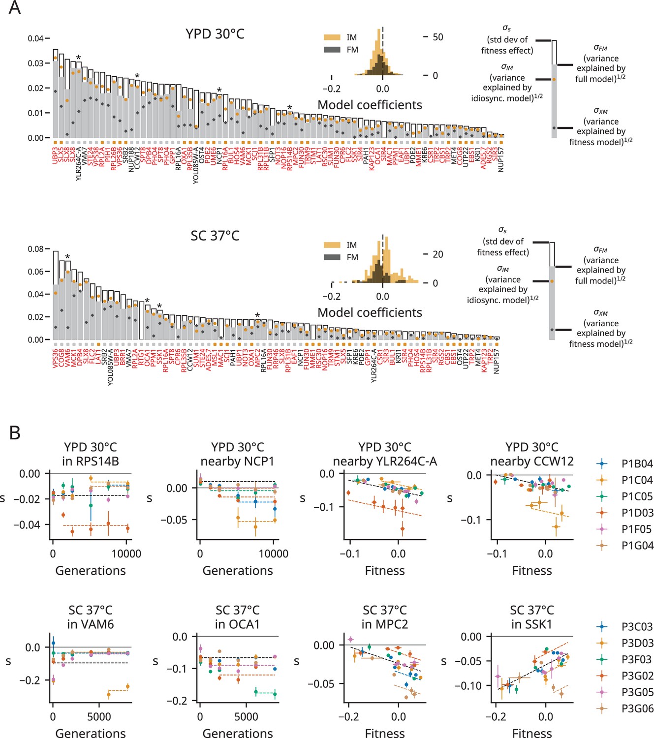
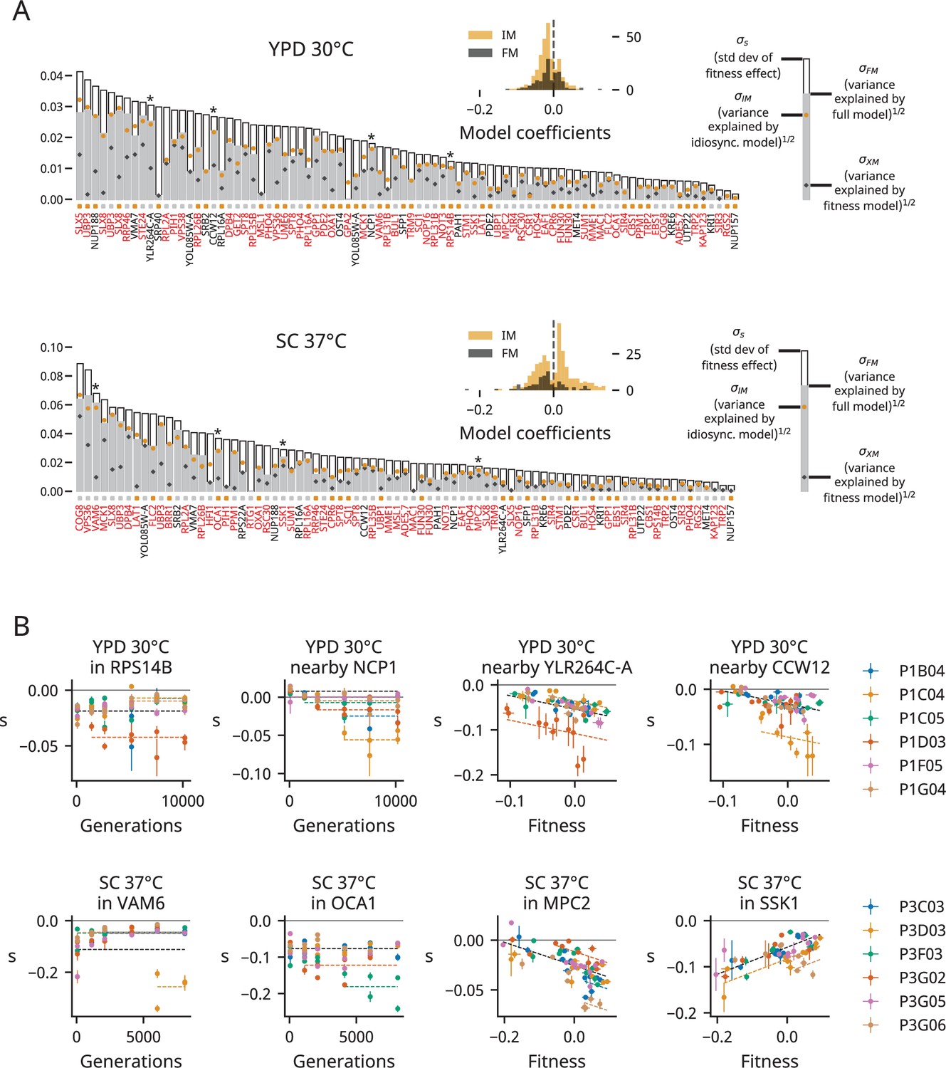
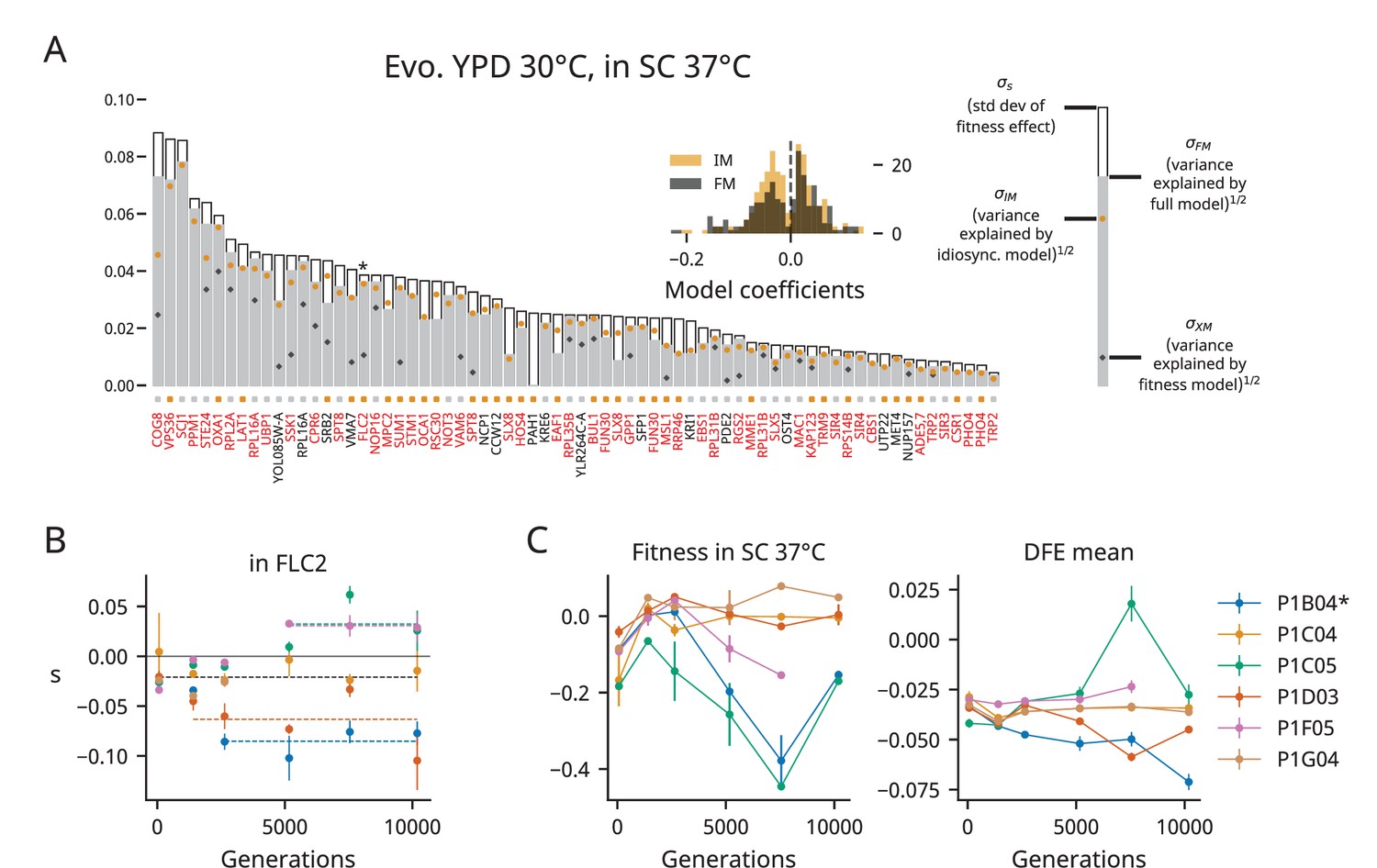
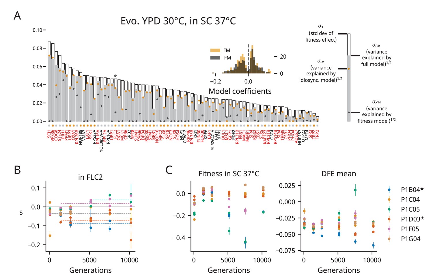
Determinants of fitness effects.
(A) For each environment, we plot the standard deviation of the fitness effect across all population-timepoints and the square root of the variance explained by each of our three models. The colored squares below each bar represent which model has the lowest Bayesian information criteria (BIC) for each mutation. Mutations shown in red or black are insertions in or near the corresponding gene, respectively; stars indicate the mutations shown in panel (B). Only mutations with fitness-effect measurements in at least 20 population-timepoints are shown. The insets show the distribution of all coefficients in the idiosyncratic model (IM) and full model (FM), pooled across all mutations. (B) Examples of idiosyncratic (left half) and full (right half) model fits. Model predictions are shown by dashed lines, and lines with contributions from indicator variables associated with a particular population are the same color as the points from that population (colors are the same as in Figure 1).
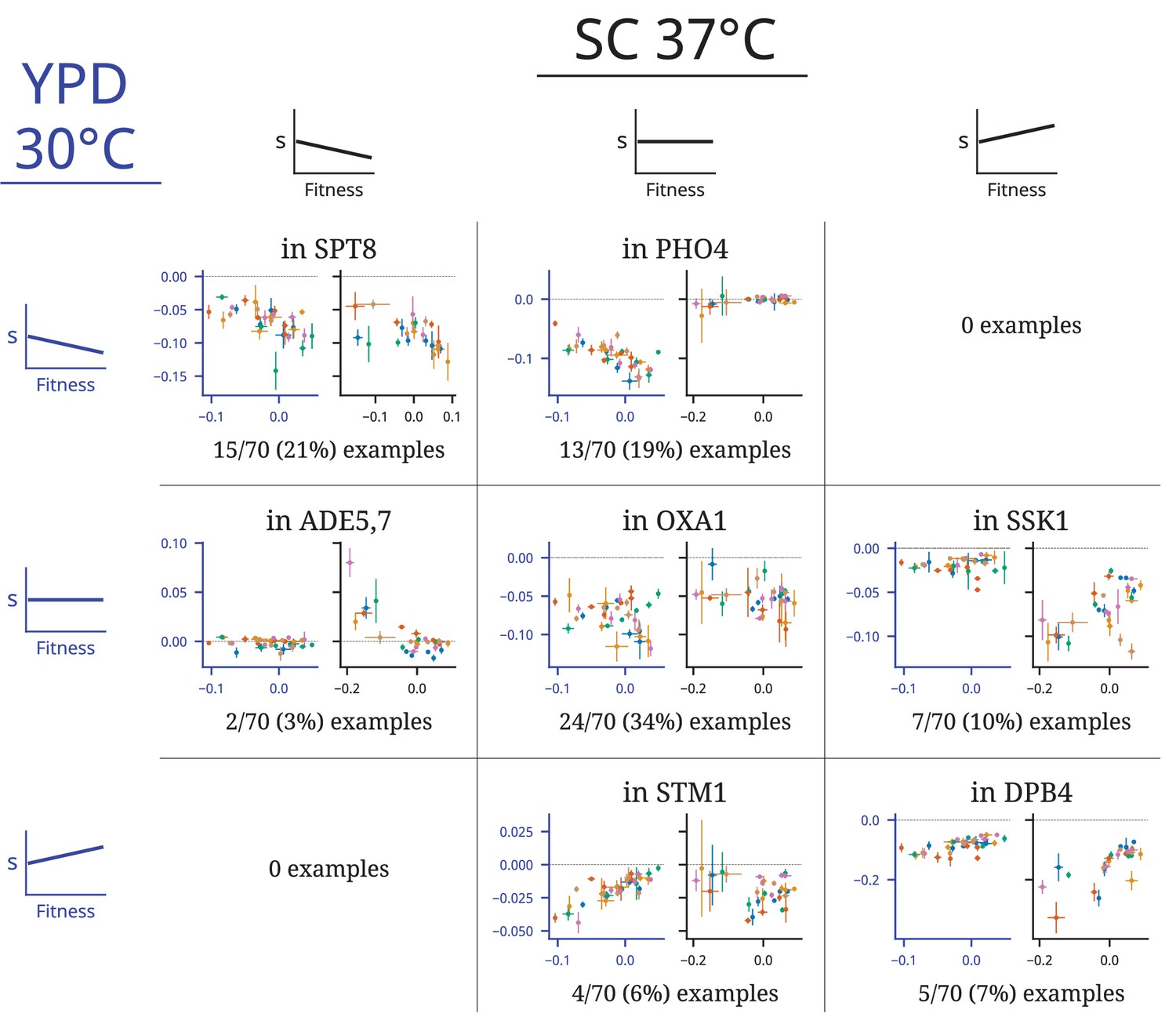
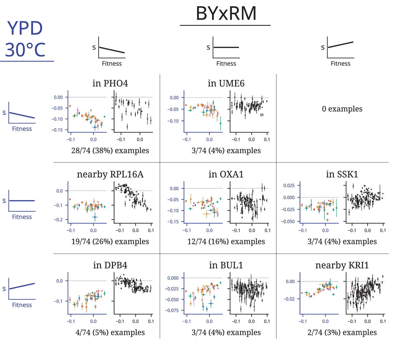
Figure 3—figure supplement 1
Epistasis in mutations that are beneficial on average at the first timepoint in at least one environment.
Each row represents an insertion mutation, labeled with the gene it disrupts or a gene nearby its insertion site if it is intergenic. Each column represents a condition from our experiment or data from Johnson et al., 2019 (right). Each plot shows the fitness effects of mutations over time in each population, with idiosyncratic model fits shown, as in Figure 3. The plots in the right column show the fitness effect of each mutation as a function of background fitness. Each of the mutations displayed here has a beneficial fitness effect on average in at least one environment that becomes neutral or deleterious in that environment during evolution.
Figure 3—figure supplement 2
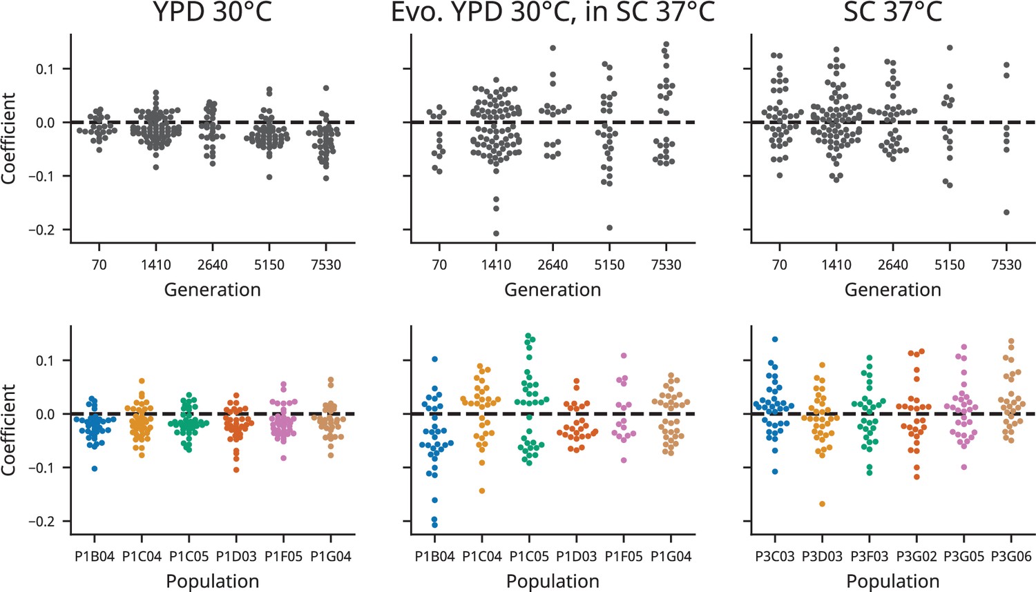
Idiosyncratic model coefficients, broken down by population and timepoint in each condition.
Figure 3—figure supplement 3
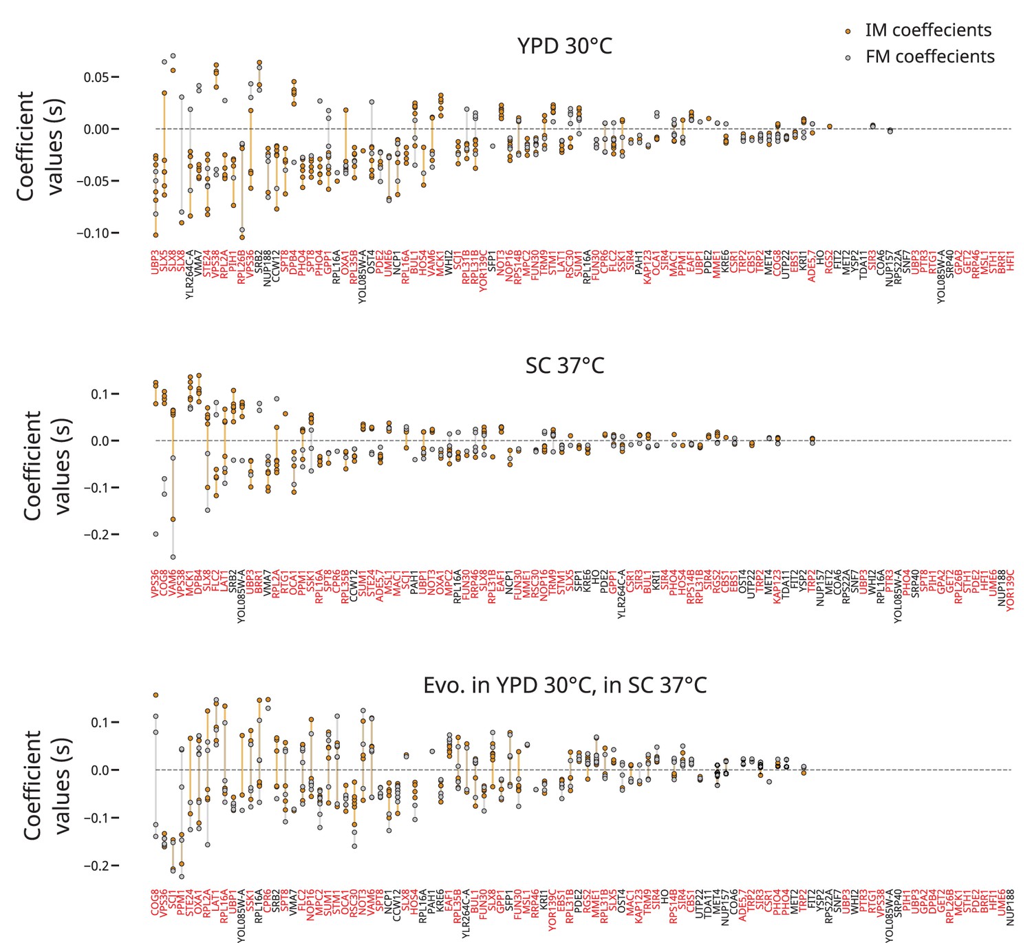
Model coefficients plotted by mutation.
For each mutation in each environment, we plot the values of all idiosyncratic model coefficients in yellow and all full model coefficients (excluding the background fitness coefficient) in gray. We connect all points for each mutation by a line of the same color for each model.
Figure 3—figure supplement 4
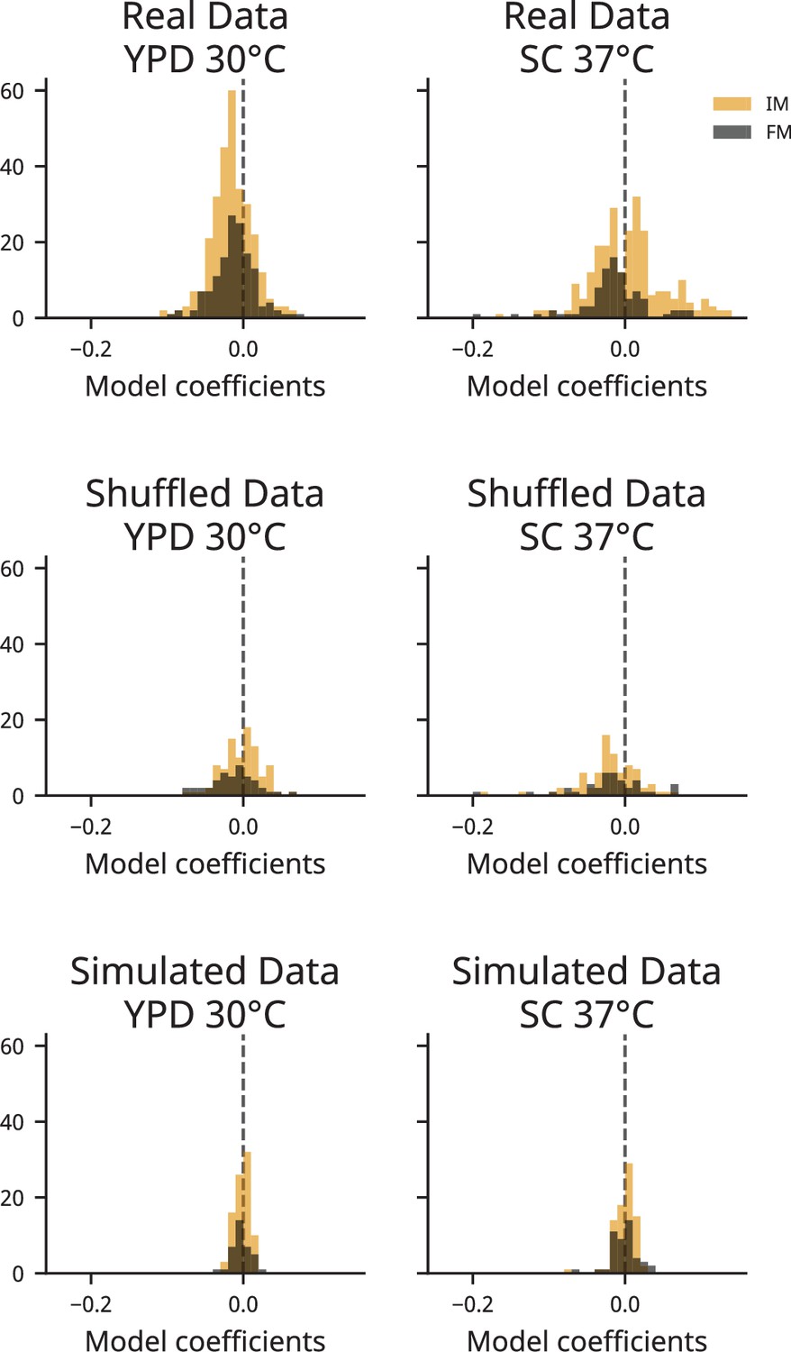
Model coefficient distributions for empirical, shuffled, and simulated datasets.
Distributions of model coefficients are plotted as in the insets of Figure 3, but with equal y-axes, for our empirical data (top), our randomly shuffled dataset (middle), and our simulated dataset (bottom). See ‘Materials and methods’ for more information on these datasets.
Figure 3—figure supplement 5
Analogous to Figure 3 but with clones treated separately.
(A) For each environment, we plot the standard deviation of the fitness effect across all clones and the square root of the variance explained by each of our three models. The colored squares below each bar represent which model has the lowest Bayesian information criteria (BIC) for each mutation. Mutations shown in red or black are insertions in or near the corresponding gene, respectively; stars indicate the mutations shown in panel (B). Only mutations with fitness-effect measurements in at least 20 clones are shown. The insets show the distribution of all coefficients in the idiosyncratic model (IM) and full model (FM), pooled across all mutations. (B) Examples of idiosyncratic (left half) and full (right half) model fits. Model predictions are shown by dashed lines, and lines with contributions from indicator variables associated with a particular population are the same color as the points from that population (colors are the same as in Figure 1).
Figure 3—figure supplement 6
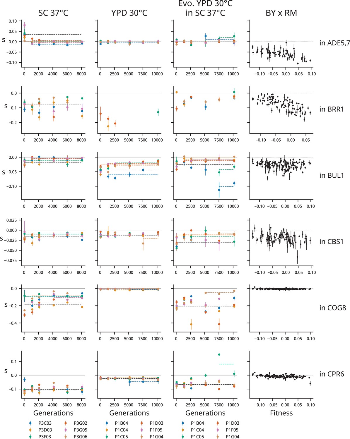
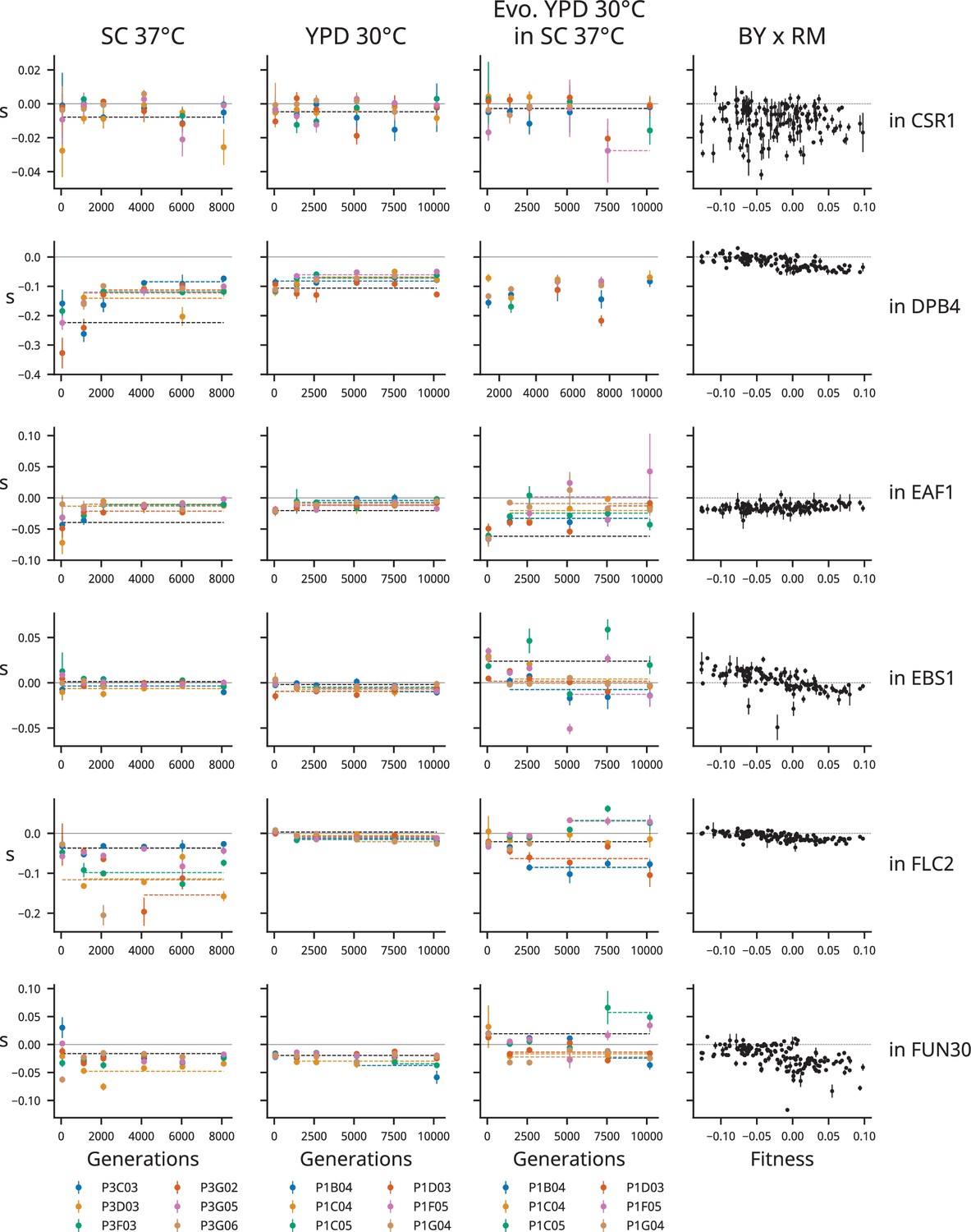
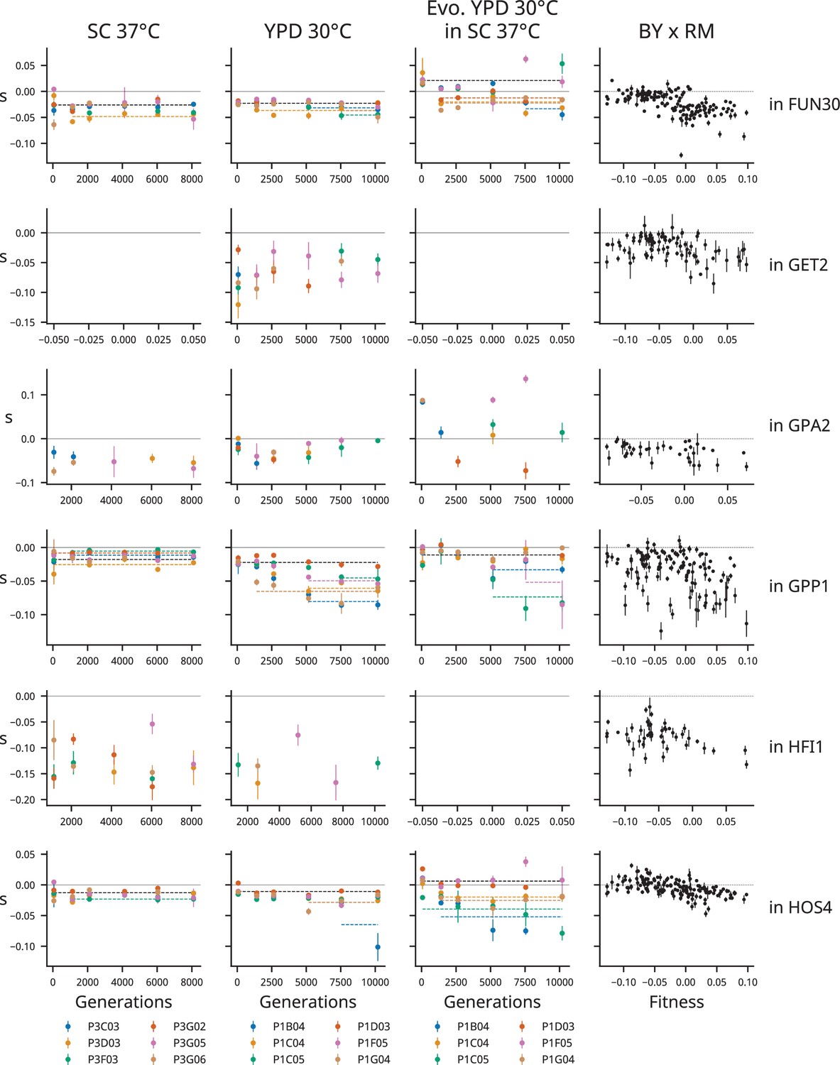
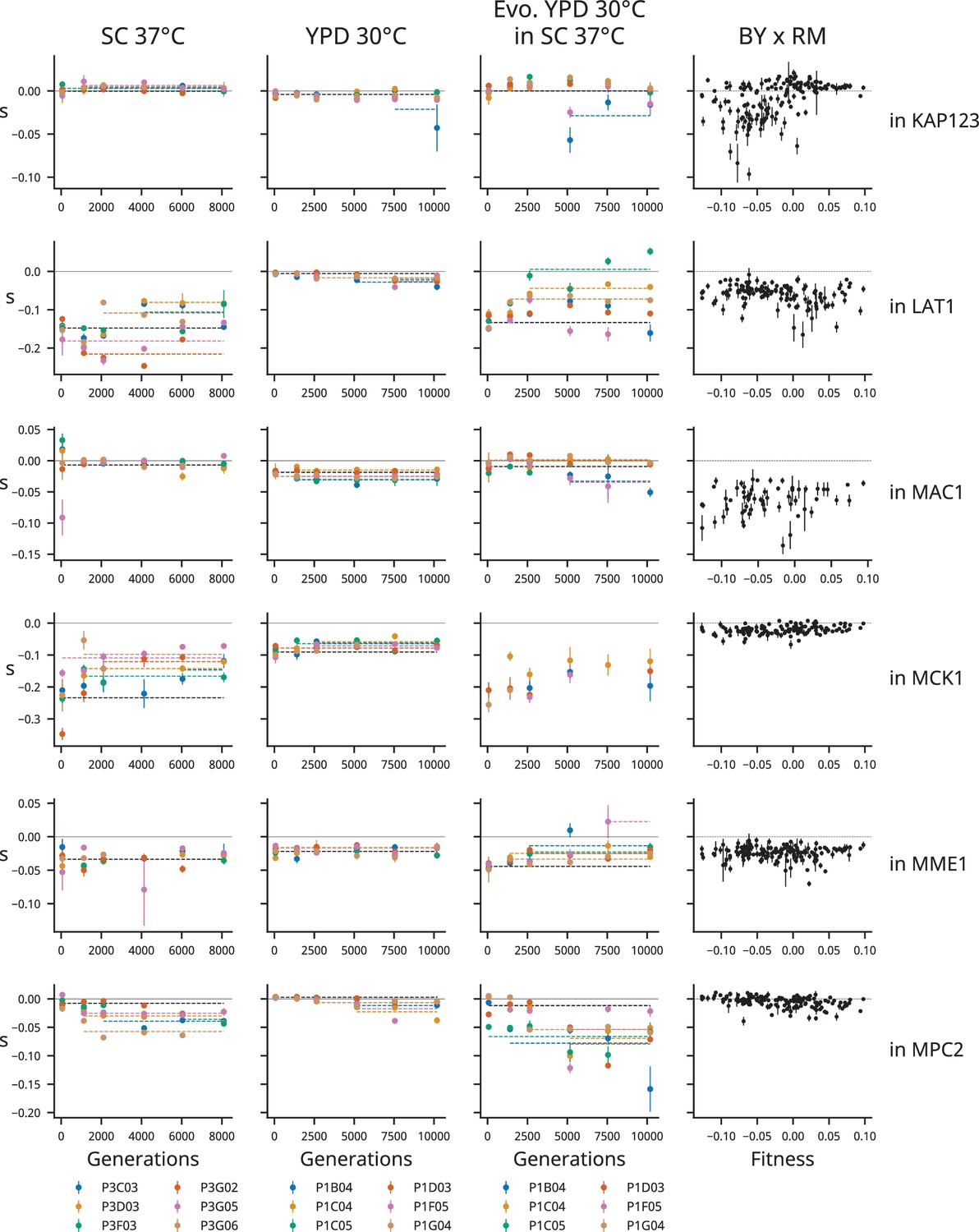
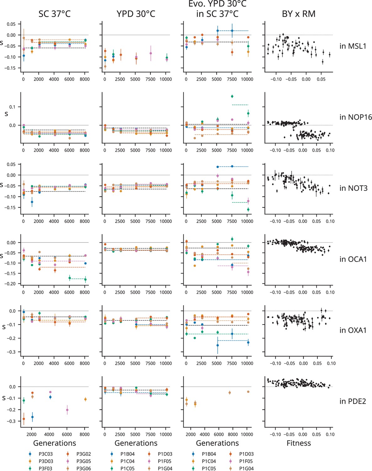
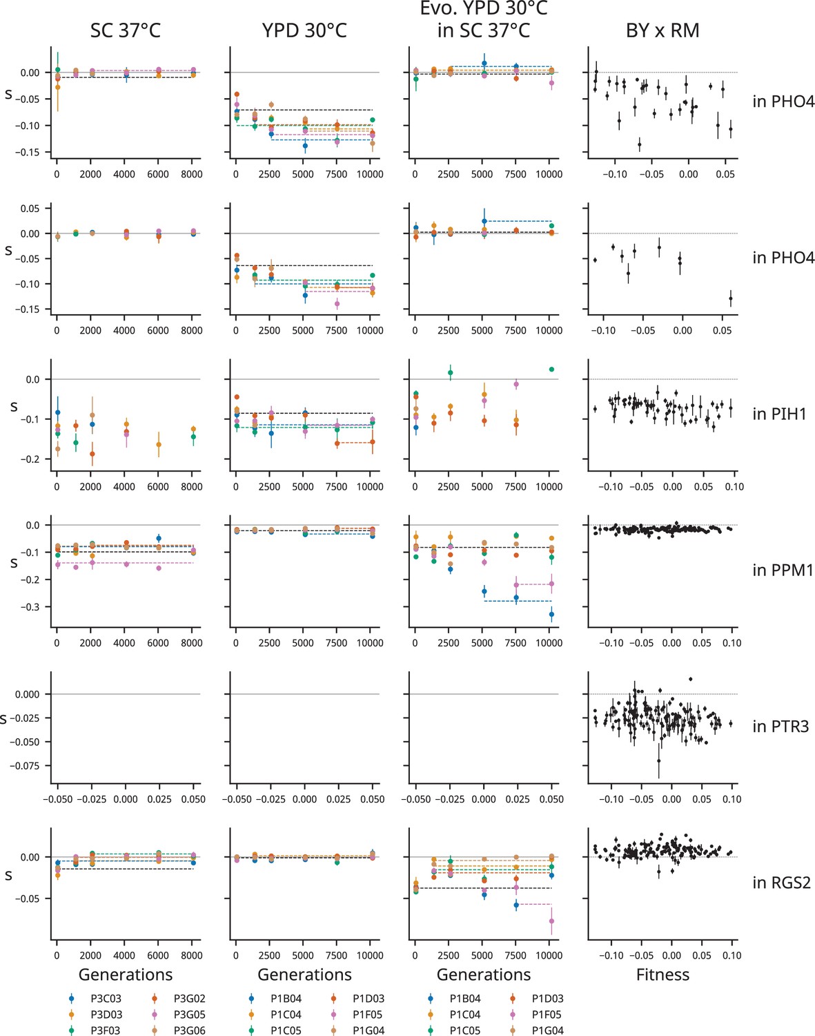
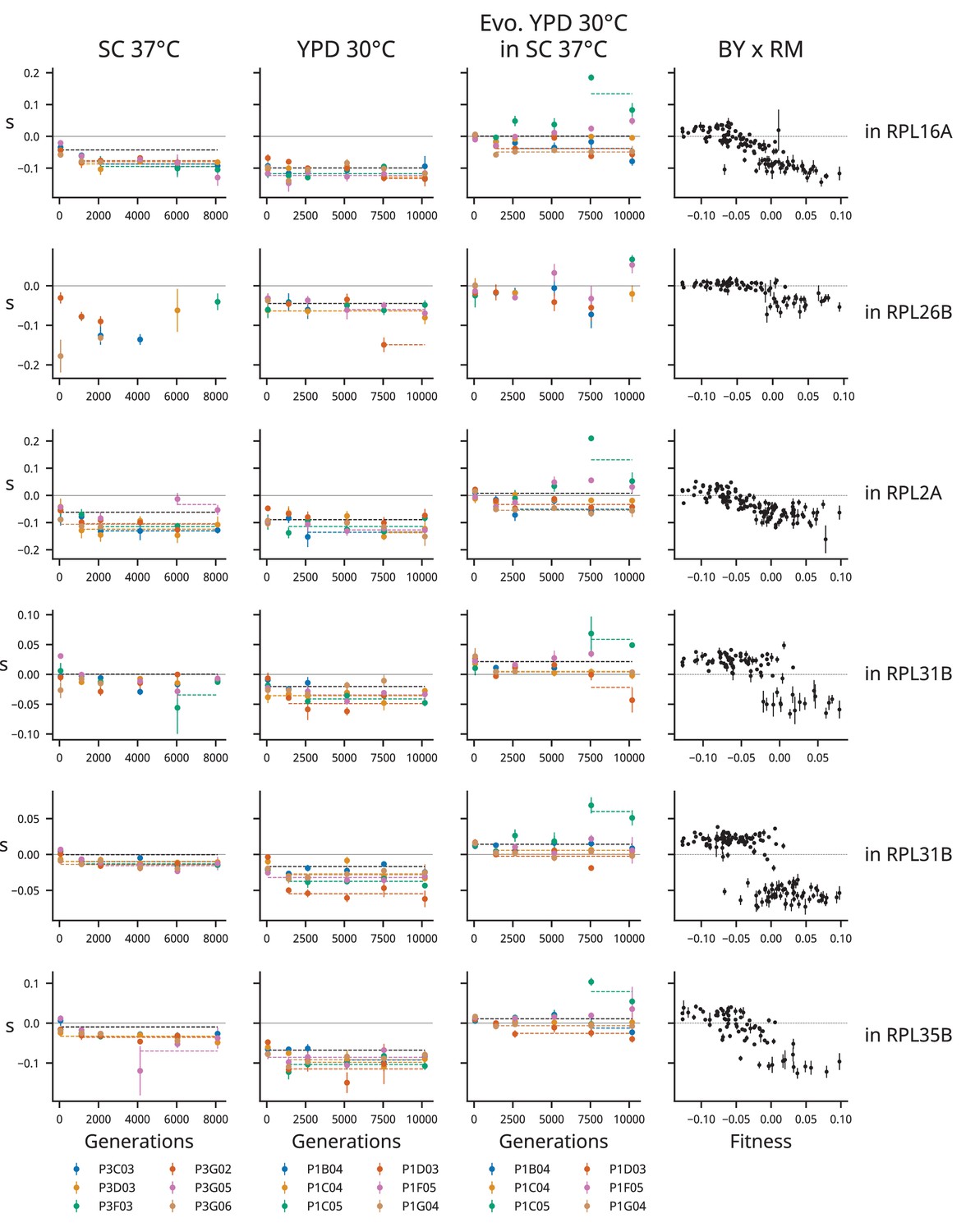
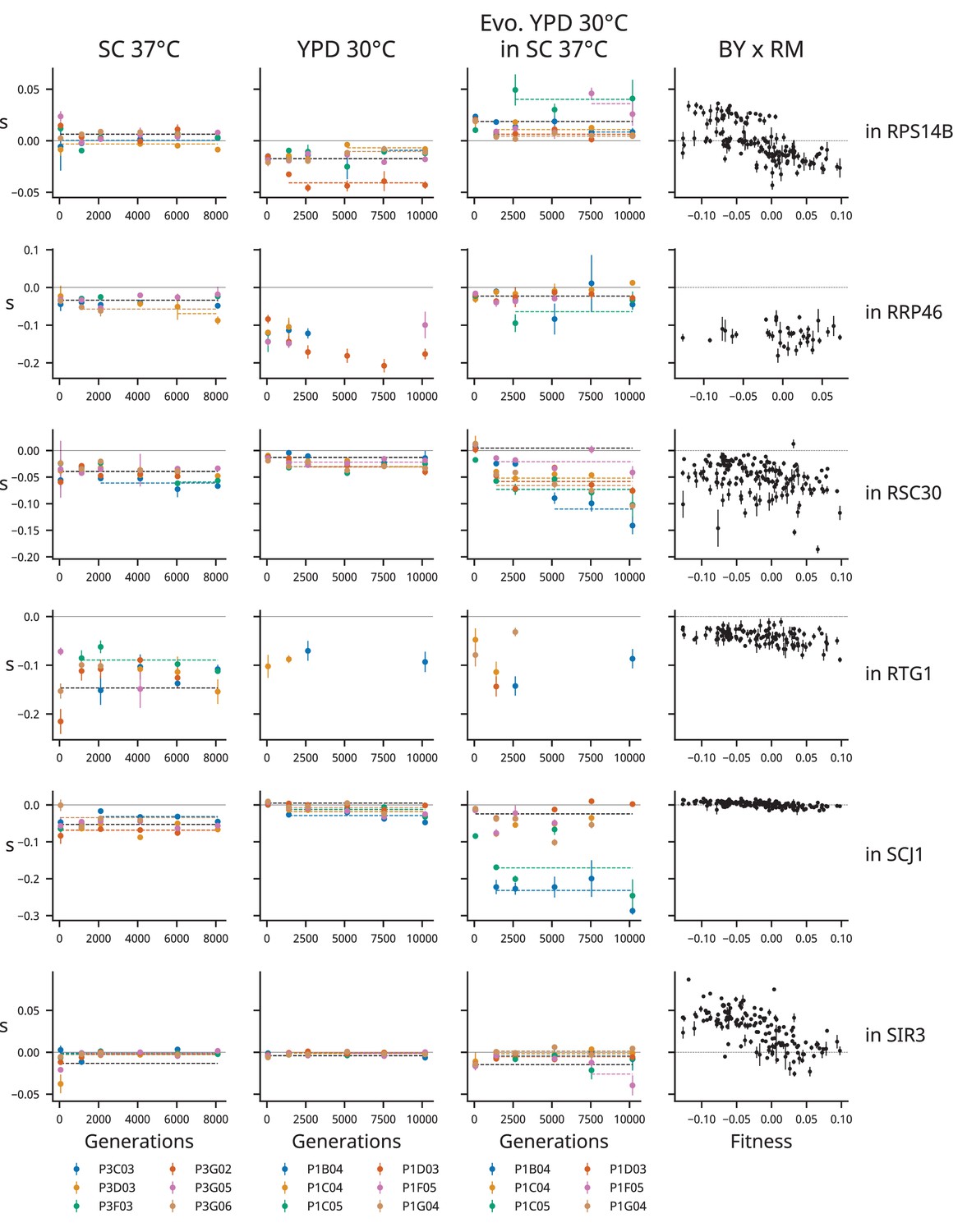
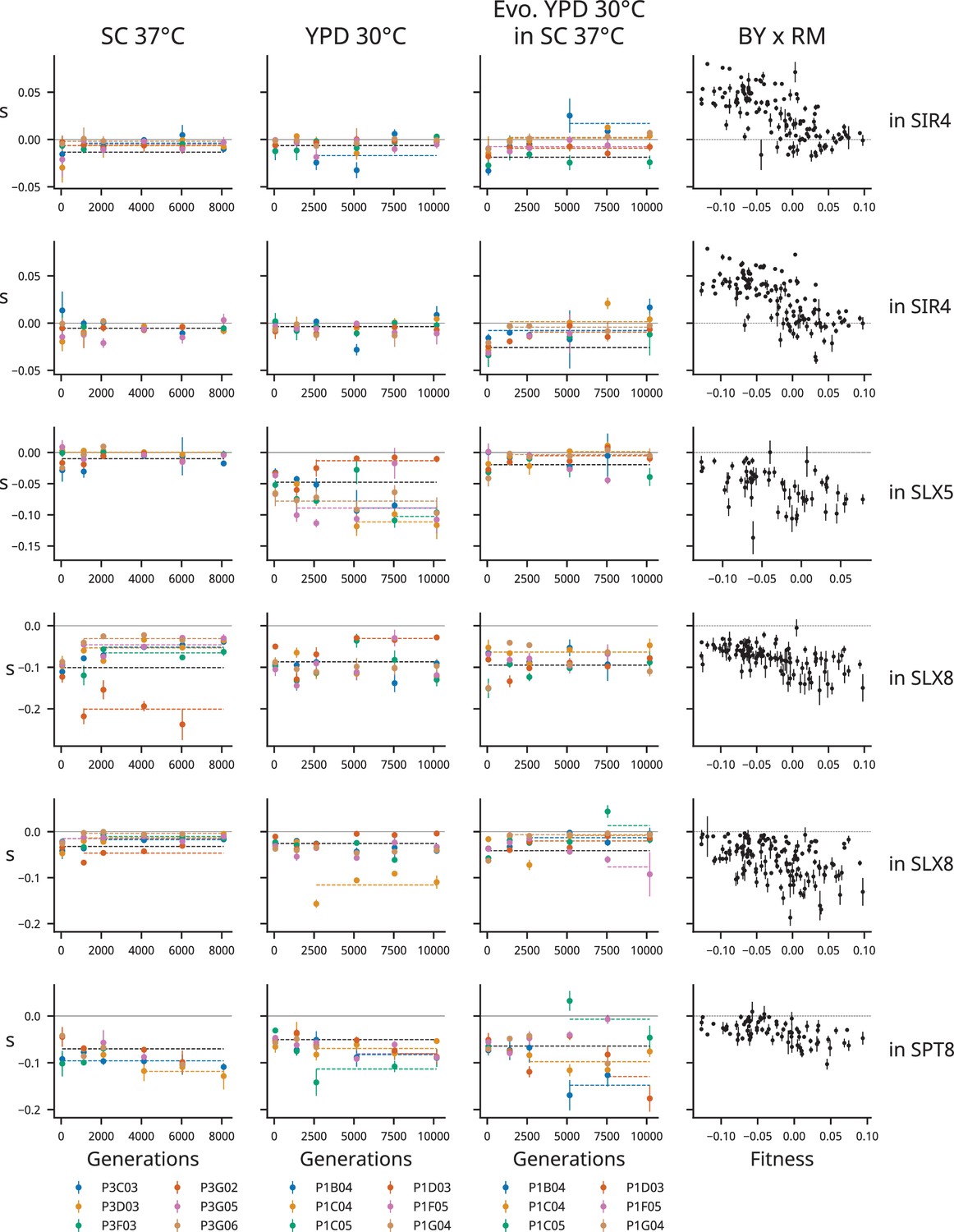
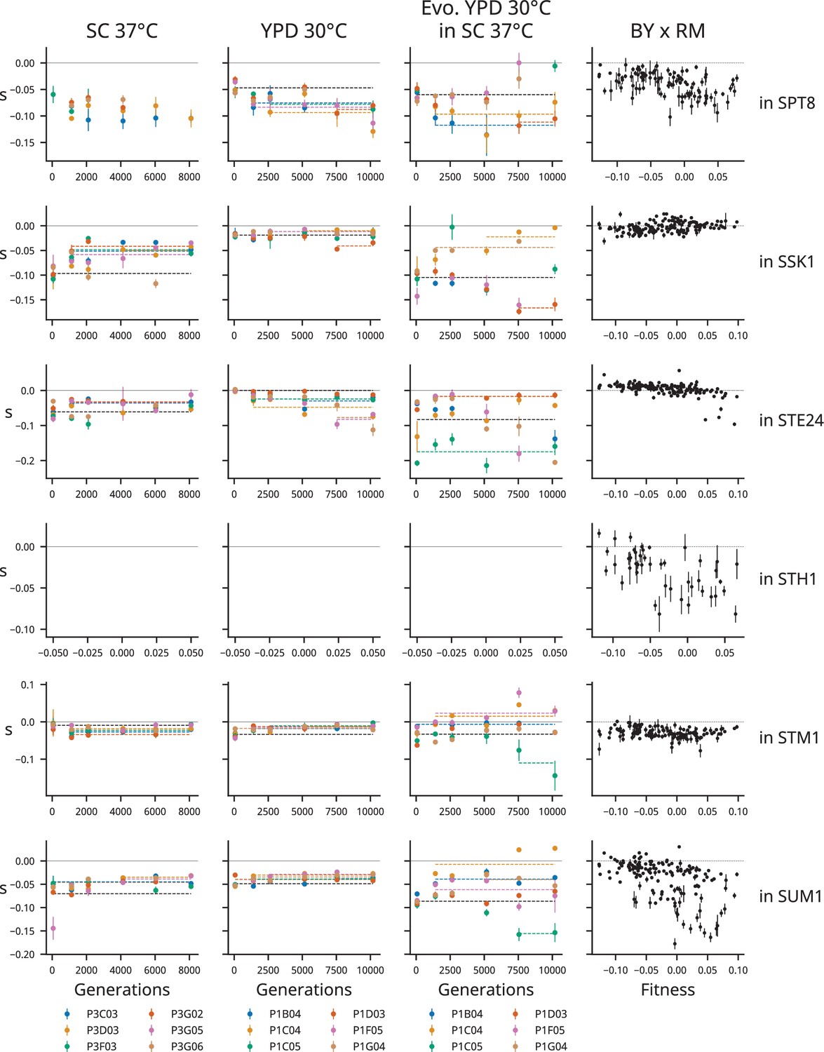
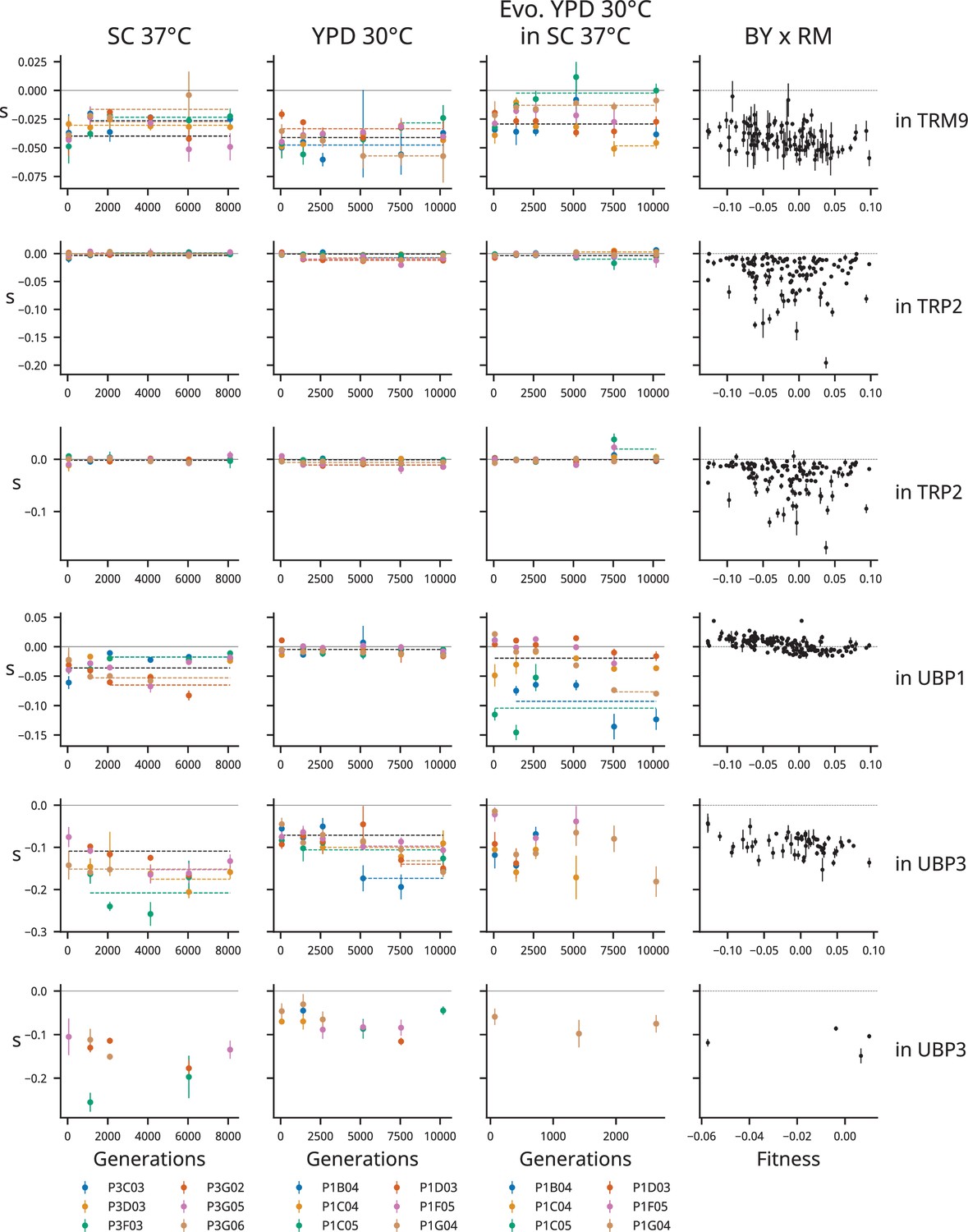
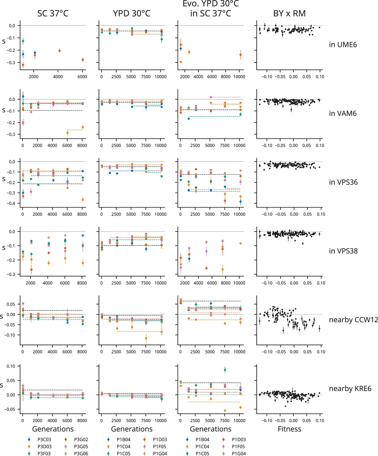
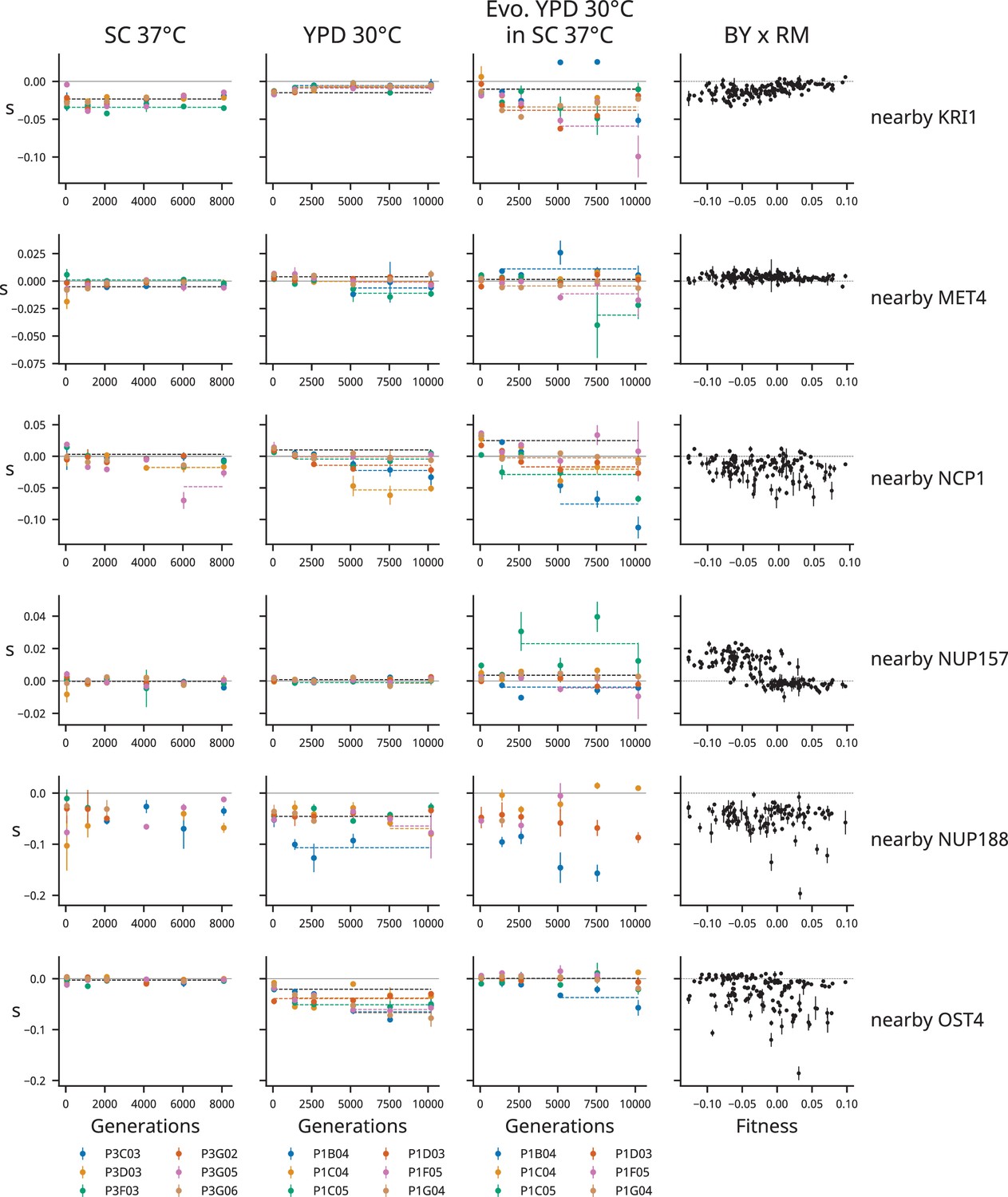
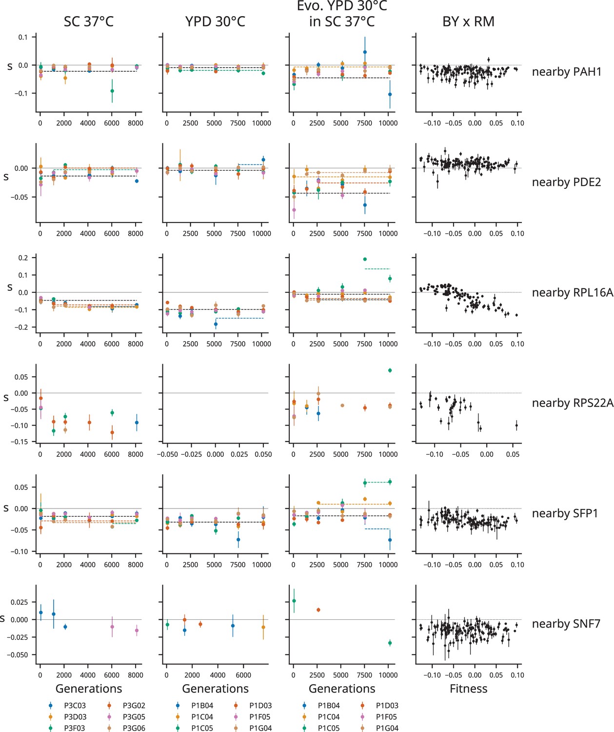
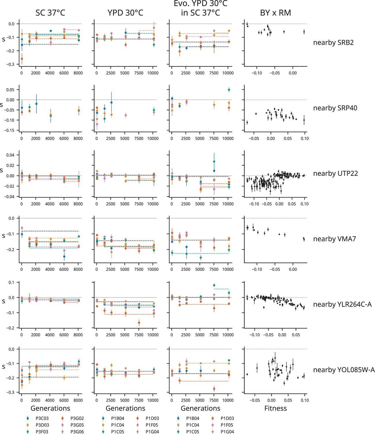
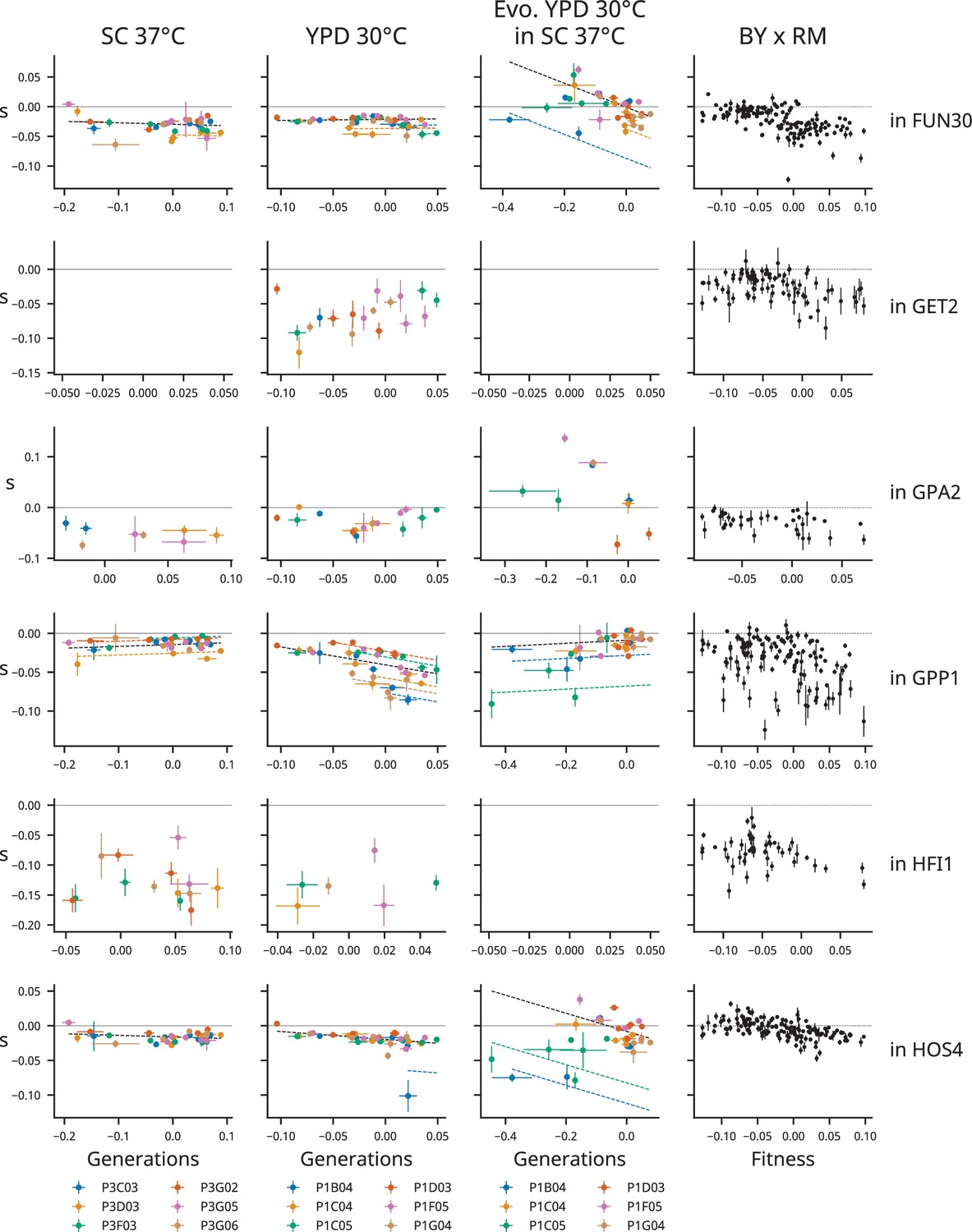
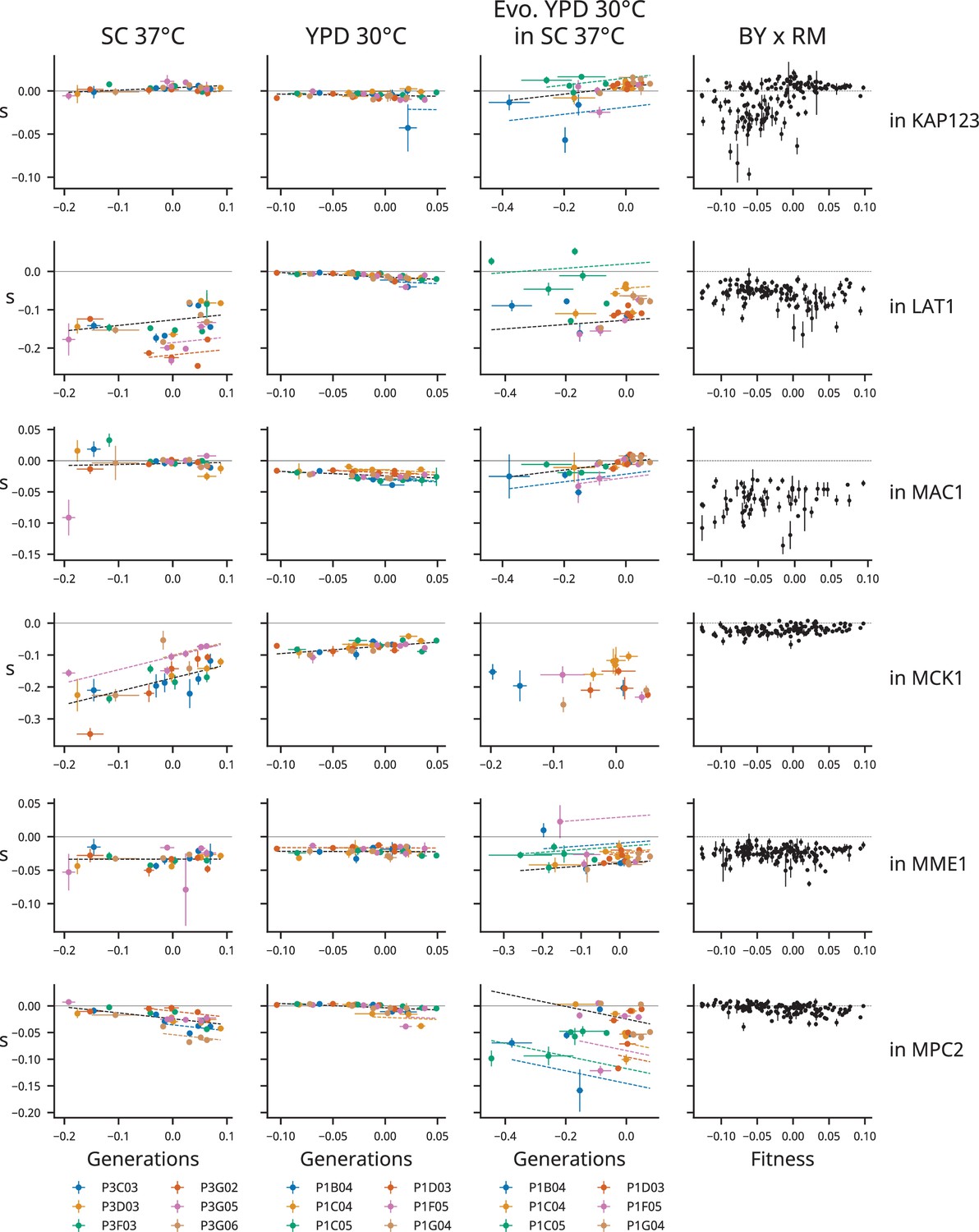
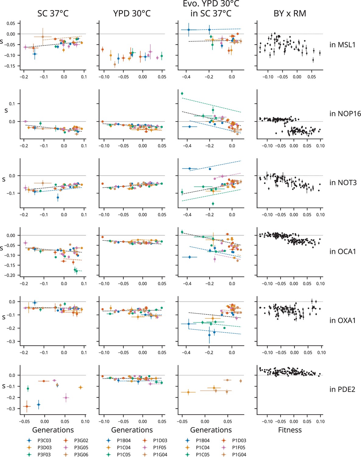
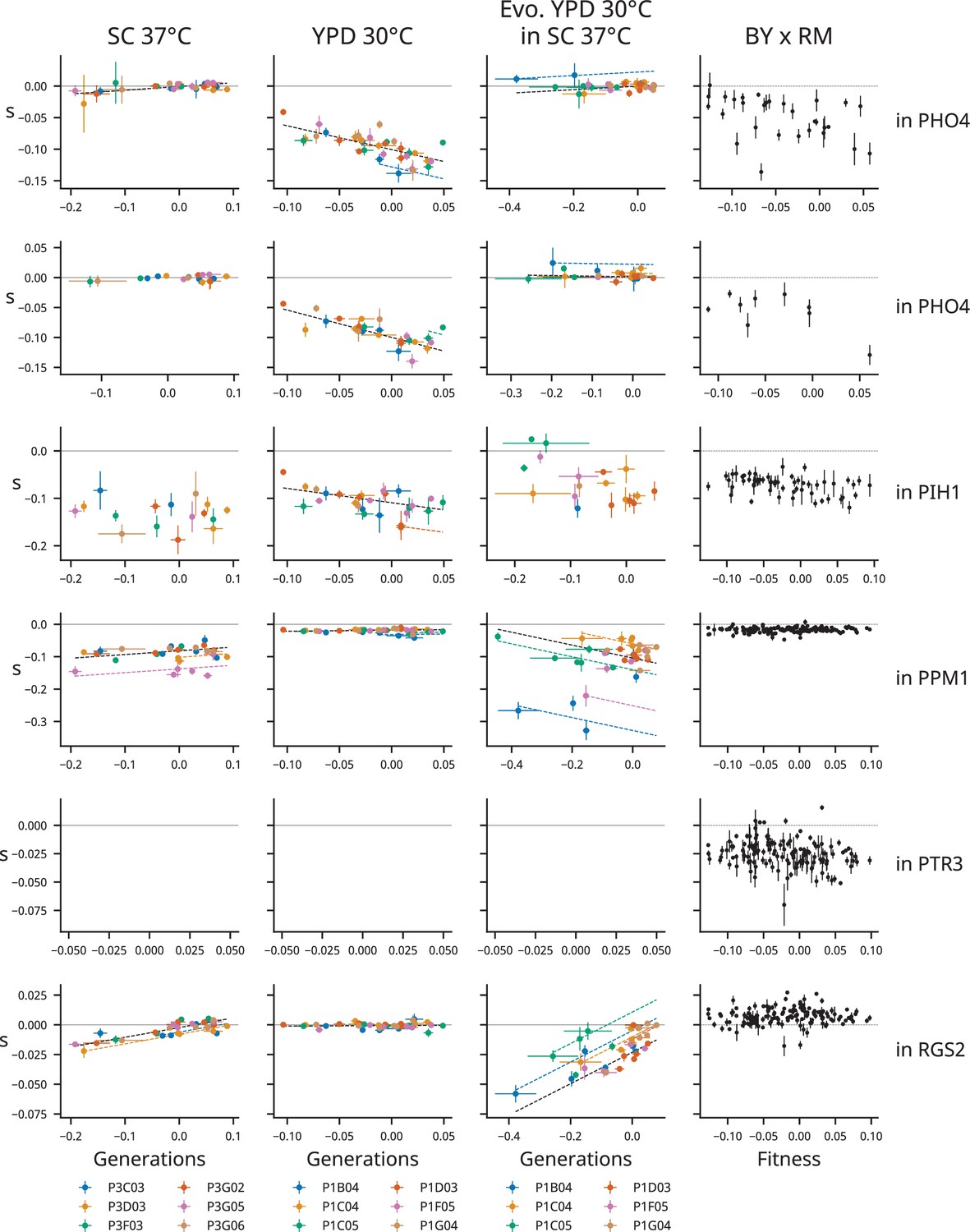
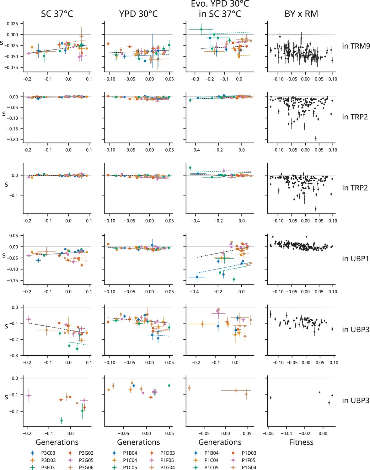
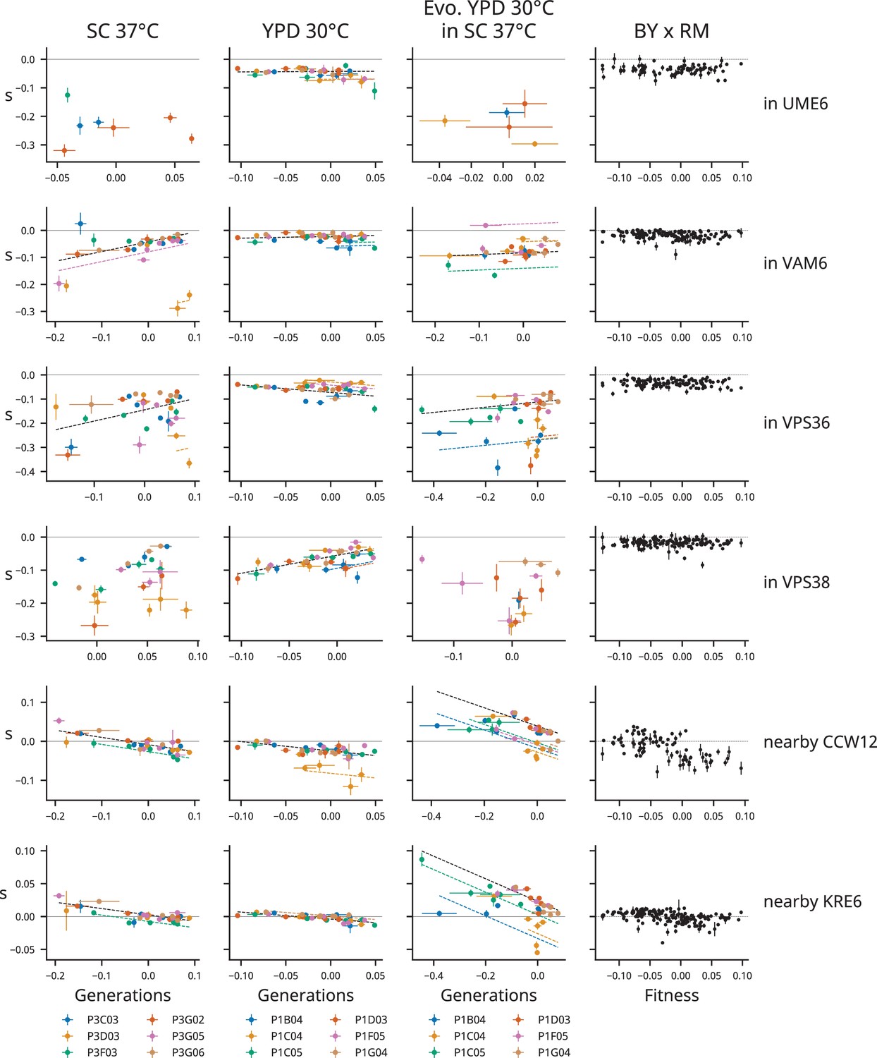
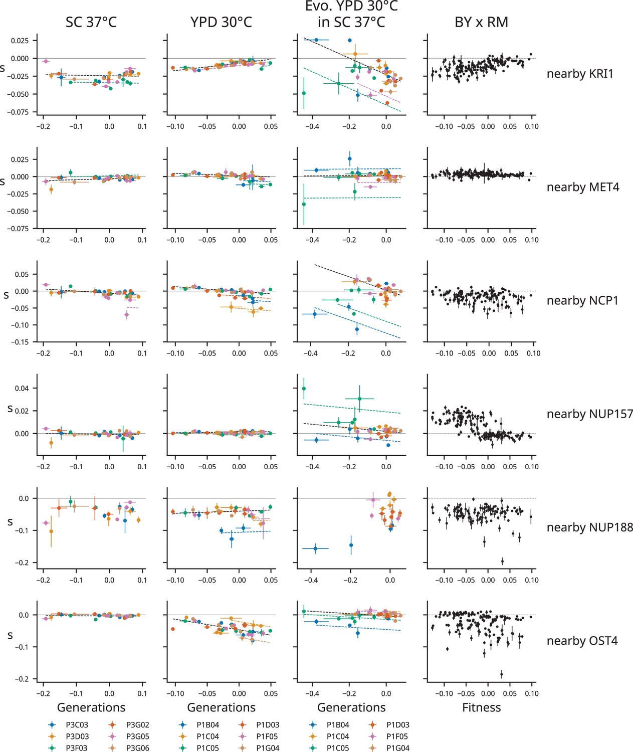
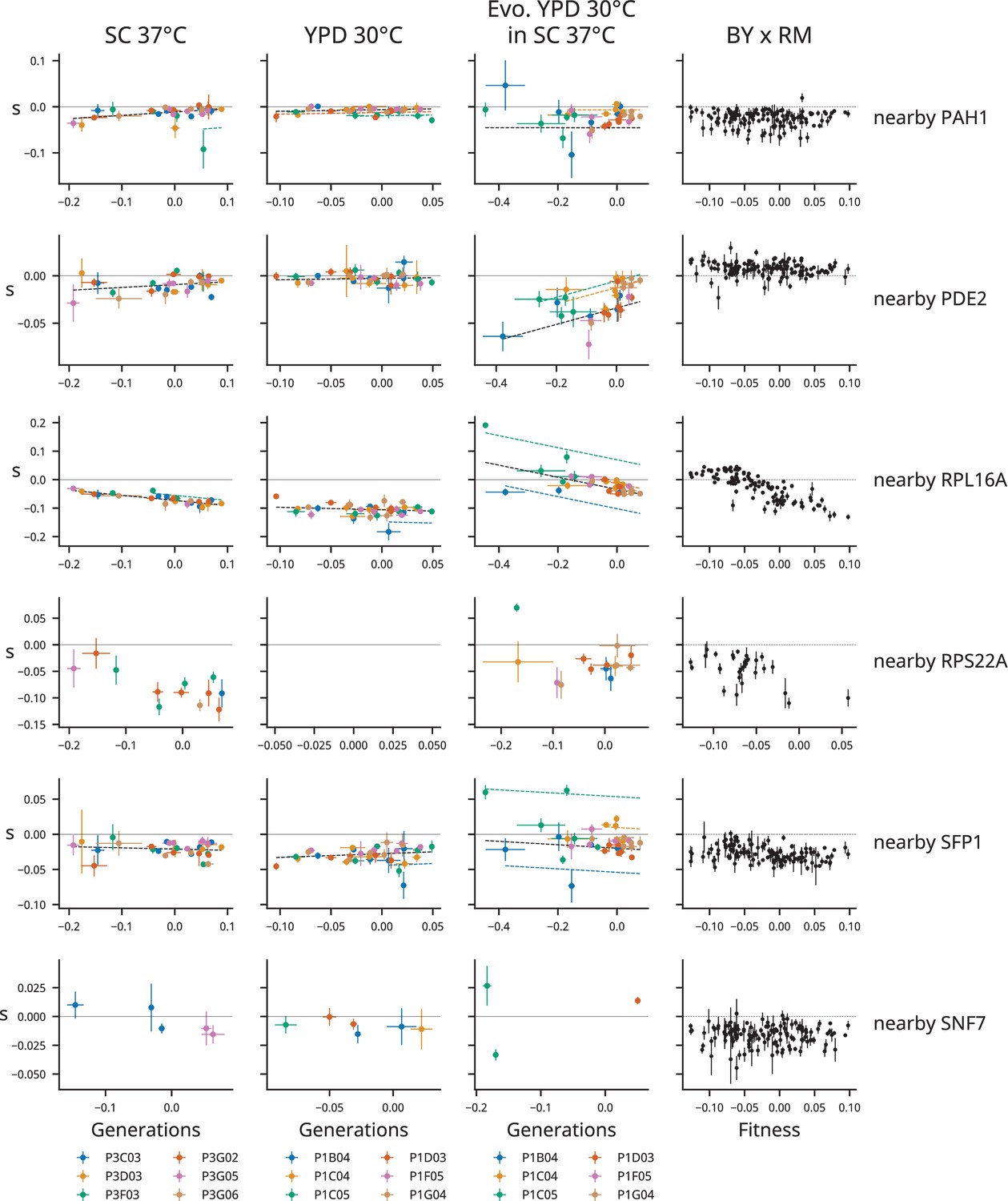
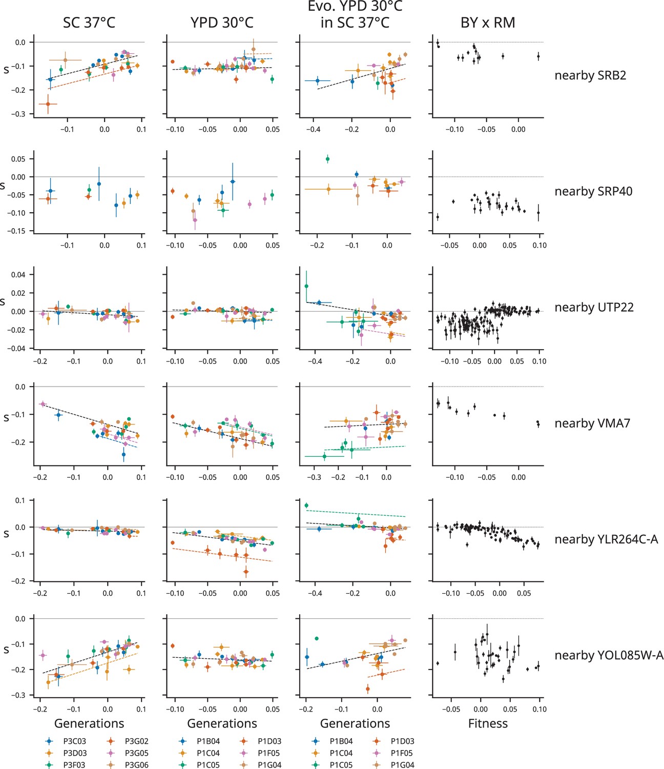
Determinants of fitness effects under the idiosyncratic model.
Each row represents one mutation, labeled at right with by the gene it disrupts or the nearest start of a gene if it is intergenic. Each column represents a condition. The left three columns show the fitness effects of mutations over the course of evolution, with points colored by population. The right column shows the relationship between fitness and the fitness effect of the mutation in the segregants from a yeast cross (data from Johnson et al., 2019). Model predictions are shown by dashed lines, and lines with contributions from indicator variables associated with a particular population are the same color as the points from that population.
Figure 3—figure supplement 7
Determinants of fitness effects under the idiosyncratic model.
Figure 3—figure supplement 8
Determinants of fitness effects under the idiosyncratic model.
Figure 3—figure supplement 9
Determinants of fitness effects under the idiosyncratic model.
Figure 3—figure supplement 10
Determinants of fitness effects under the idiosyncratic model.
Figure 3—figure supplement 11
Determinants of fitness effects under the idiosyncratic model.
Figure 3—figure supplement 12
Determinants of fitness effects under the idiosyncratic model.
Figure 3—figure supplement 13
Determinants of fitness effects under the idiosyncratic model.
Figure 3—figure supplement 14
Determinants of fitness effects under the idiosyncratic model.
Figure 3—figure supplement 15
Determinants of fitness effects under the idiosyncratic model.
Figure 3—figure supplement 16
Determinants of fitness effects under the idiosyncratic model.
Figure 3—figure supplement 17
Determinants of fitness effects under the idiosyncratic model.
Figure 3—figure supplement 18
Determinants of fitness effects under the idiosyncratic model.
Figure 3—figure supplement 19
Determinants of fitness effects under the idiosyncratic model.
Figure 3—figure supplement 20
Determinants of fitness effects under the idiosyncratic model.
Figure 3—figure supplement 21
Determinants of fitness effects under the idiosyncratic model.
Figure 3—figure supplement 22
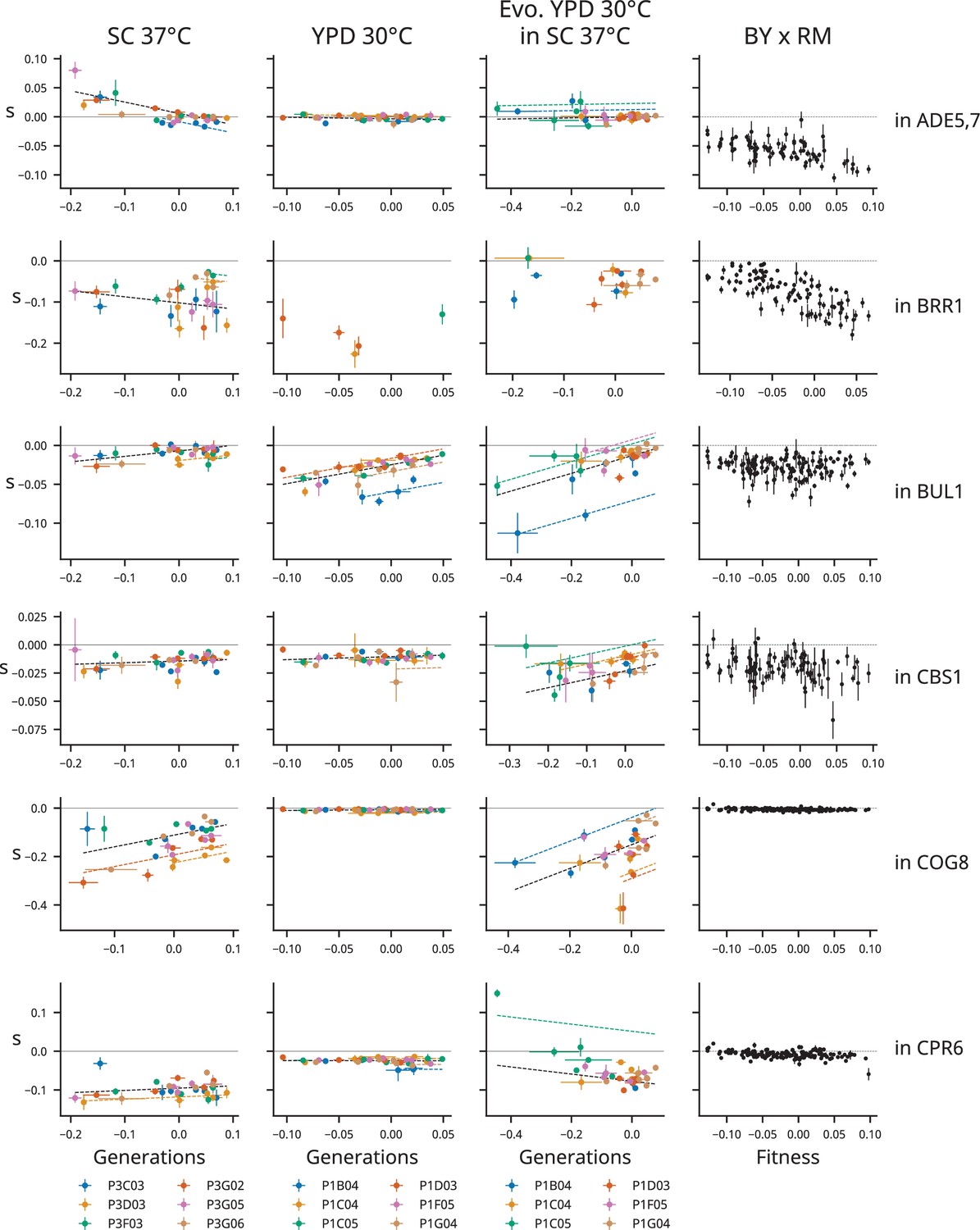
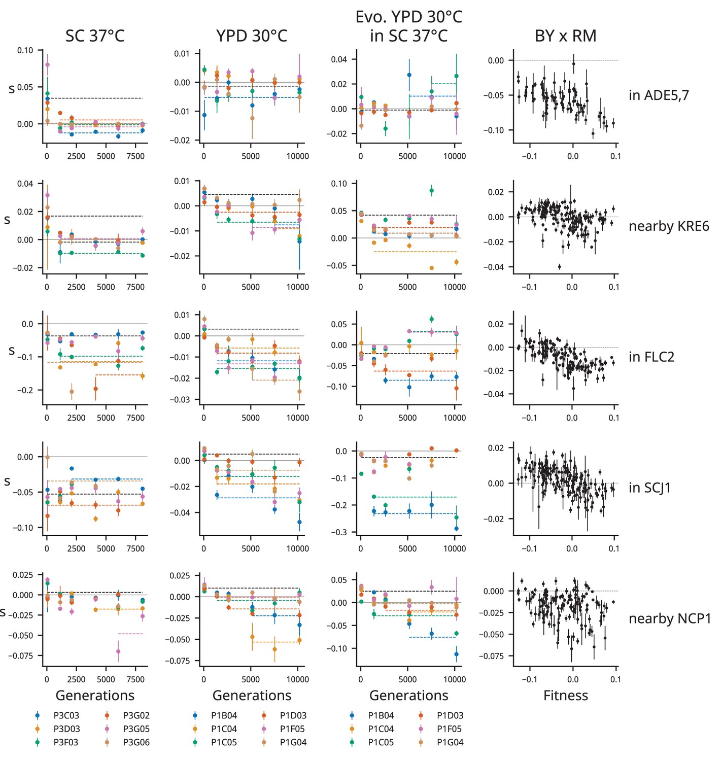
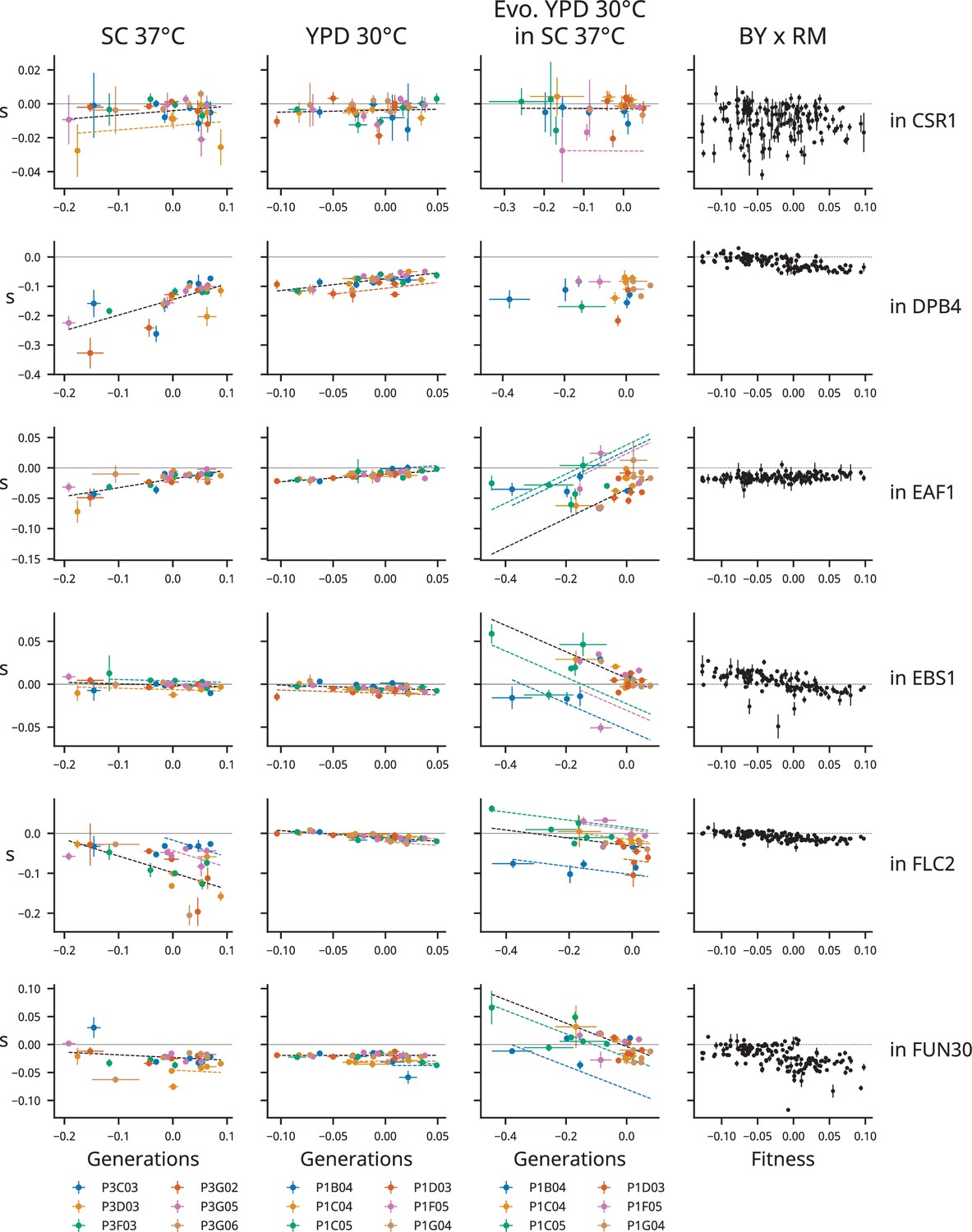
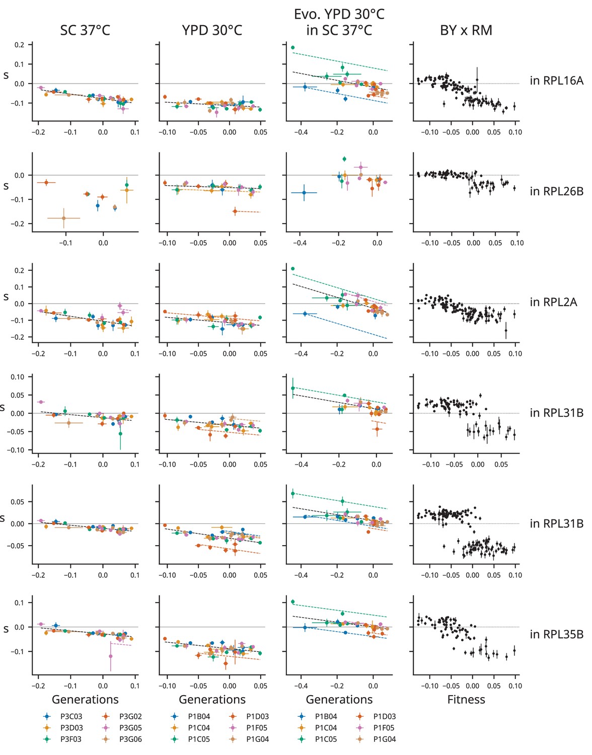
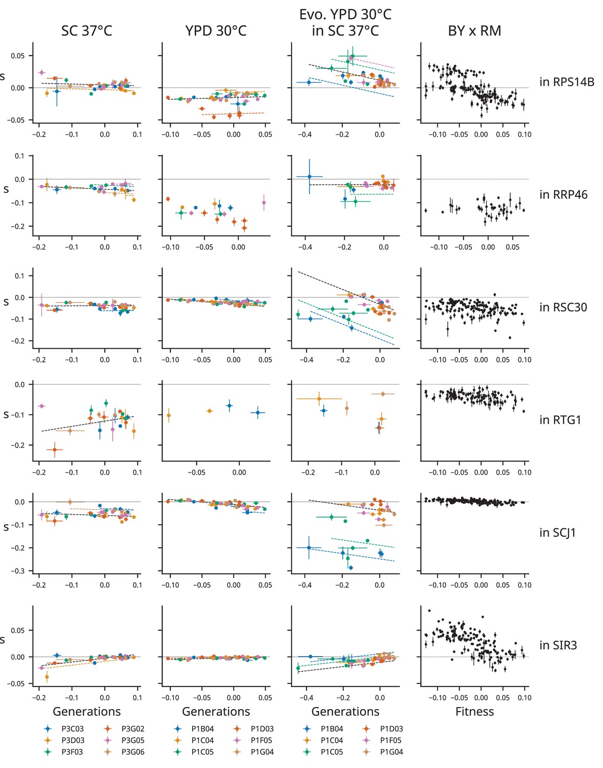
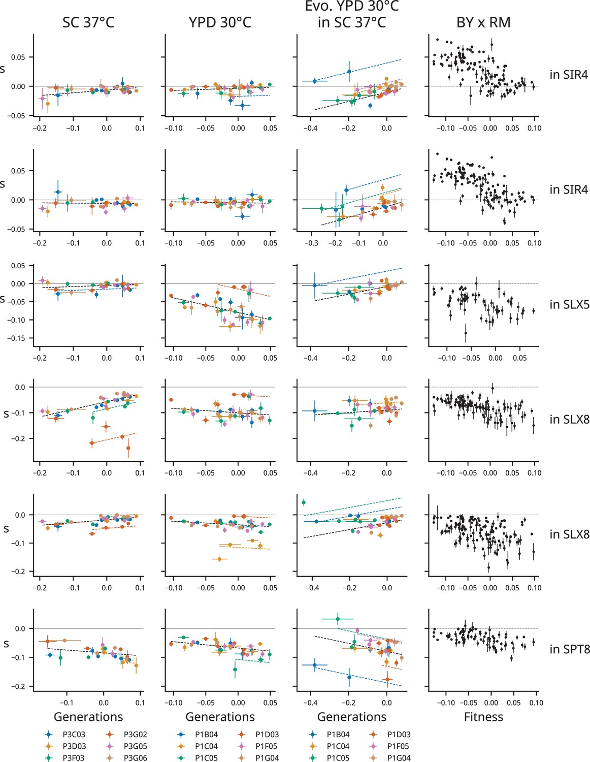
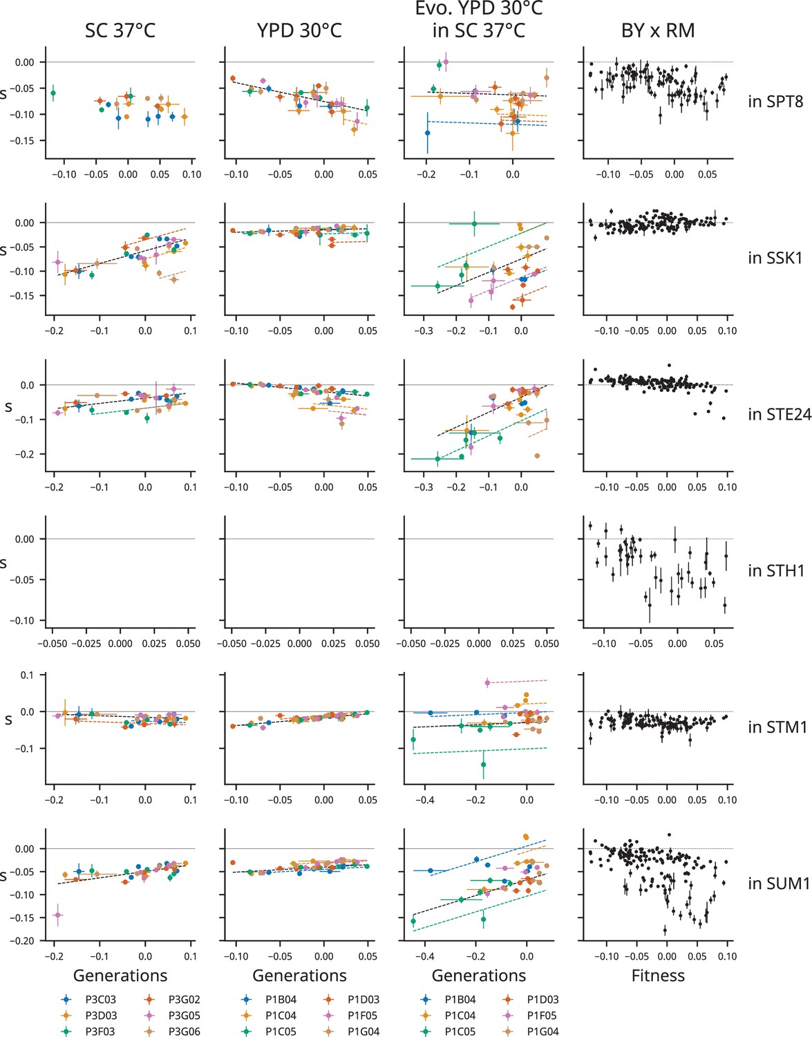
Determinants of fitness effects under the full model.
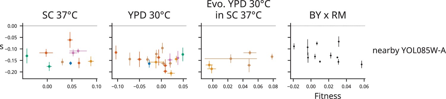
Each row represents one mutation, labeled at right with by the gene it disrupts or the nearest start of a gene if it is intergenic. Each column represents a condition. The left three columns show the fitness effects of mutations as a function of fitness, with points colored by population. The right column shows the relationship between fitness and the fitness effect of the mutation in the segregants from a yeast cross (data from Johnson et al., 2019). Model predictions are shown by dashed lines, and lines with contributions from indicator variables associated with a particular population are the same color as the points from that population.
Figure 3—figure supplement 23
Determinants of fitness effects under the full model.
Figure 3—figure supplement 24
Determinants of fitness effects under the full model.
Figure 3—figure supplement 25
Determinants of fitness effects under the full model.
Figure 3—figure supplement 26
Determinants of fitness effects under the full model.
Figure 3—figure supplement 27
Determinants of fitness effects under the full model.
Figure 3—figure supplement 28
Determinants of fitness effects under the full model.
Figure 3—figure supplement 29
Determinants of fitness effects under the full model.
Figure 3—figure supplement 30
Determinants of fitness effects under the full model.
Figure 3—figure supplement 31
Determinants of fitness effects under the full model.
Figure 3—figure supplement 32
Determinants of fitness effects under the full model.
Figure 3—figure supplement 33
Determinants of fitness effects under the full model.
Figure 3—figure supplement 34
Determinants of fitness effects under the full model.
Figure 3—figure supplement 35
Determinants of fitness effects under the full model.
Figure 3—figure supplement 36
Determinants of fitness effects under the full model.
Figure 3—figure supplement 37
Determinants of fitness effects under the full model.
Figure 4 with 1 supplement
Patterns of epistasis in a nonevolution environment.
(A) Same as Figure 3A, but for clones from YPD 30°C assayed in SC 37°C. We plot the standard deviation of the fitness effect across all population-timepoints and the square root of the variance explained by each of our three models. The colored squares below each bar represent which model has the lowest Bayesian information criteria (BIC) for each mutation. Mutations shown in red or black are insertions in or near the corresponding gene, respectively; stars indicate the mutations shown in panel (B). Only mutations with fitness-effect measurements in at least 20 population-timepoints are shown. The inset shows the distribution of all coefficients in the idiosyncratic model (IM) and full model (FM), pooled across all mutations. (B) Example IM model fit, as in Figure 3B. The model predictions are shown by bold dashed lines, and lines with contributions from indicator variables associated with a particular population are the same color as the points from that population (colors are the same as in Figure 1 and panel C). (C) The fitness and distribution of fitness effects (DFE) mean over time in YPD 30°C populations assayed in SC 37°C. The asterisk indicates a significant correlation (p<0.05). Error bars on fitness represent the standard deviation of the fitnesses measured for the two clones, but note that we were only able to measure the fitness of one clone at several population-timepoints due to low fitnesses relative to our reference; the corresponding points here have no error bars. Error bars on the DFE mean represent the standard error of the DFE mean, calculated from the standard errors of individual mutations (see ‘Materials and methods’).
Figure 4—figure supplement 1
Analogous to Figure 4 but with clones treated separately.
(A) Same as Figure 3—figure supplement 5A, but for clones from YPD 30°C assayed in SC 37°C. We plot the standard deviation of the fitness effect across all clones and the square root of the variance explained by each of our three models. The colored squares below each bar represent which model has the lowest Bayesian information criteria (BIC) for each mutation. Mutations shown in red or black are insertions in or near the corresponding gene, respectively; stars indicate the mutations shown in panel (B). Only mutations with fitness-effect measurements in at least 20 clones are shown. The inset shows the distribution of all coefficients in the idiosyncratic model (IM) and full model (FM), pooled across all mutations. (B) Example IM model fit, as in Figure 3B. The model predictions are shown by bold dashed lines, and lines with contributions from indicator variables associated with a particular population are the same color as the points from that population (colors are the same as in Figure 1 and panel C). (C) The fitness and distribution of fitness effects (DFE) mean over time in YPD 30°C populations assayed in SC 37°C. The asterisk indicates a significant correlation (p<0.05). Error bars on Fitness represent the standard error from replicate flow cytometry competition assays. Error bars on the DFE mean represent the standard error of the DFE mean, calculated from the standard errors of individual mutations (see ‘Materials and methods’).
Additional files
-
Supplementary file 1
Column-annotated underlying data for this project.
Includes background fitness, fitness effect, and modeling data from this experiment and Johnson et al., 2019.
- https://cdn.elifesciences.org/articles/76491/elife-76491-supp1-v2.xlsx
-
Supplementary file 2
Oligos used in this study.
- https://cdn.elifesciences.org/articles/76491/elife-76491-supp2-v2.xlsx
-
Transparent reporting form
- https://cdn.elifesciences.org/articles/76491/elife-76491-transrepform1-v2.pdf
Download links
A two-part list of links to download the article, or parts of the article, in various formats.
Downloads (link to download the article as PDF)
Open citations (links to open the citations from this article in various online reference manager services)
Cite this article (links to download the citations from this article in formats compatible with various reference manager tools)
Mutational robustness changes during long-term adaptation in laboratory budding yeast populations
eLife 11:e76491.
https://doi.org/10.7554/eLife.76491


