Reducing societal impacts of SARS-CoV-2 interventions through subnational implementation
- Department of Information and Computing Sciences, Utrecht University, Netherlands
- Centre for Complex Systems Studies, Utrecht University, Netherlands
- PBL Netherlands Environmental Assessment Agency, Netherlands
- Department of Public Health, Erasmus MC, University Medical Center Rotterdam, Netherlands
- Statistics Netherlands, Netherlands
- Korteweg-de Vries Institute for Mathematics, University of Amsterdam, Netherlands
Figures
Figure 1
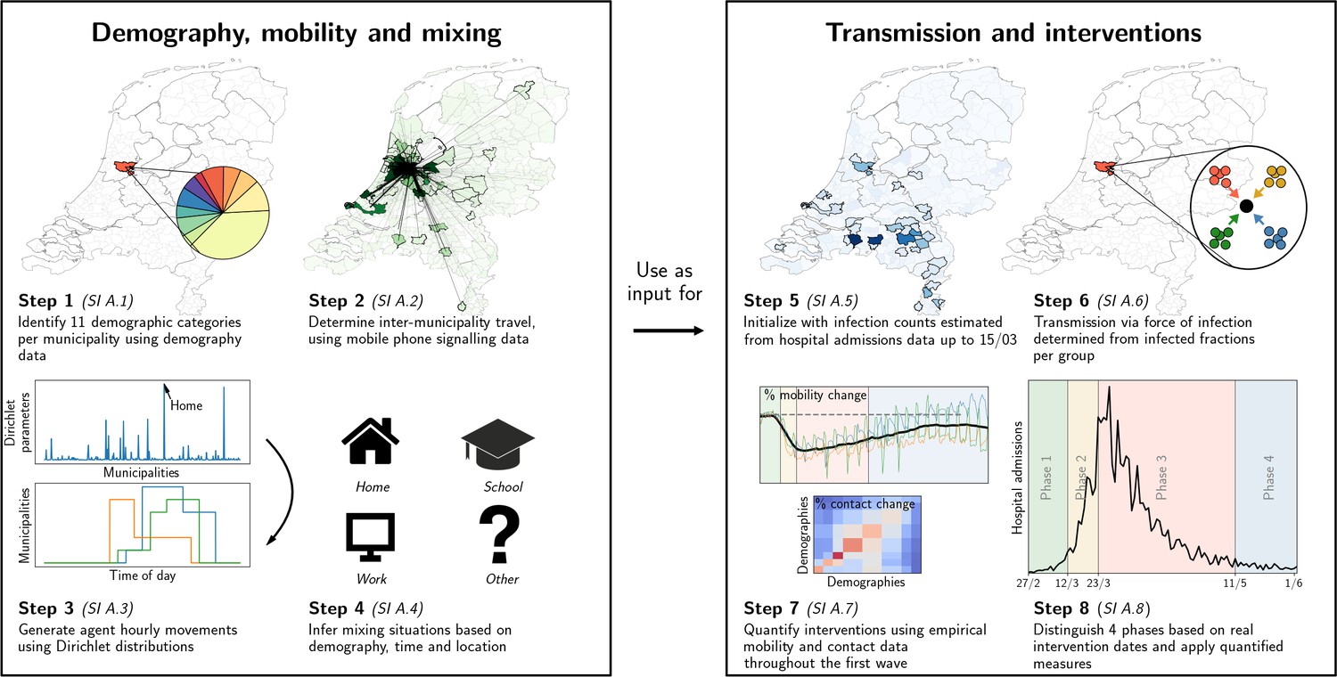
Our analysis framework consists of two parts: establishing proxy dynamic contact patterns from information on demography, mobility and mixing (left panel), and transmission and interventions (right panel); each part consists of four further steps.
See Appendix 2.1 for a description of the data used in steps 2 and 5. Processes in steps 2, 3, and 6 are stochastic in nature.
Figure 2
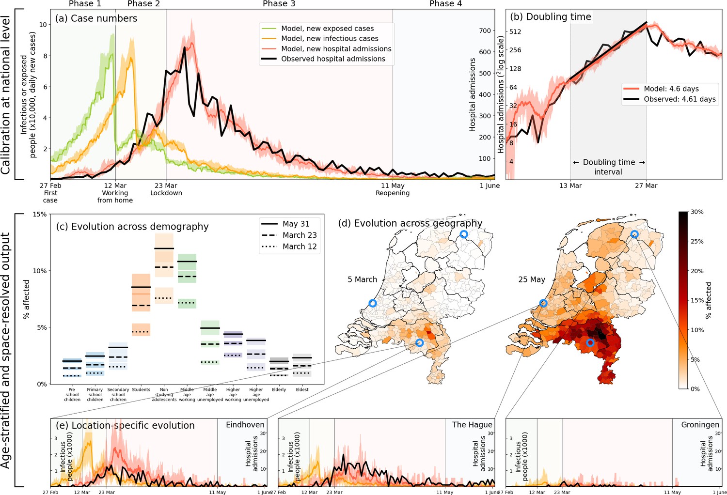
Calibration (a–b), and demography- and geography-resolved results from our analysis (c–e).
Panel (a), left axis: the daily number of new infections and exposures in yellow and green, respectively. Right axis: daily hospital admissions from analysis output (red) and observed data (black). Background colors and vertical black lines denote the four phases (arbitrary coloring). Uncertainty intervals mark the minima and the maxima in the ensemble of realizations used in the analysis; the same holds for panels (b), (c) and (e). Panel (b): Hospitalization doubling time over the period March 13 - March 27, 2020 (shaded gray shaded time domain) in analysis (red, 4.6 days) and observed data (black, 4.61 days). Panel (c): % affected agents (i.e., , or ) per demographic group for March 12 (dashed) and March 23 (solid). Panel (d): % affected agents per municipality on two days (March 5, May 25). Blue circles indicate the geographical locations of the three example municipalities shown in panel (e). Panel (e): Infectious agents (yellow) and hospital-admitted agents (analysis in red, and observed data in black) in three municipalities: Eindhoven, The Hague and Groningen. Analysis data correspond to an ensemble of 10 independent realizations.
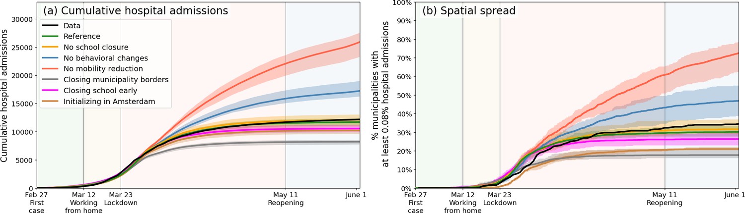
Figure 3
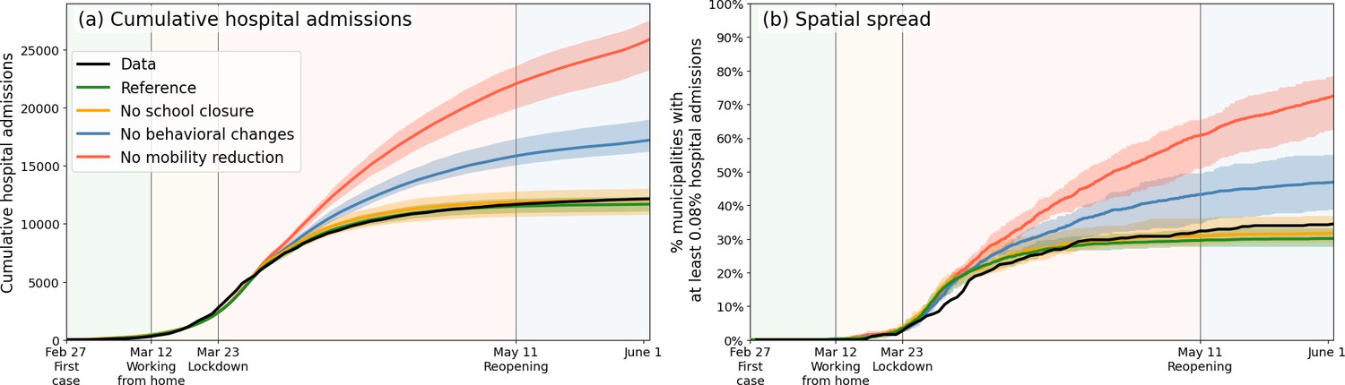
Comparing the impacts of nationally administered intervention measures.
In both panels, observed data are shown in black, the reference in green, and the impacts of (i) no behavioral changes like wearing masks, enhanced hygiene and social distancing in blue, (ii) no mobility reduction in red and (iii) no closing of schools in yellow. Bandwidths indicate the minima and maxima around the mean of a simulation ensemble of 40 realizations. Panel (a): Cumulative national hospital admissions. Panel (b): Geographical spread of hospital admissions, measured by the fraction of municipalities that have at least 0.08% of the population admitted to the hospital.
Figure 4

Quantification of the trade-off between costs (left) and benefits (right) of locally-adjusted interventions at four threshold values (0.1%, 0.33%, 1% and 3% of population simultaneously infectious).
Panel (a): Cumulative hospital admissions for different scenarios. Panel (b): Fraction of municipalities that do not have any interventions in place. Panel (c): Cumulative fraction of infection cases per municipality for the three local intervention thresholds. The additional number and percentage growth in hospital admissions as compared to the observed national interventions is indicated. Panel (d): Geographical indication of which municipalities have undergone interventions and which ones not. The number of municipalities that do not is shown in panel (b).
Appendix 1—figure 1
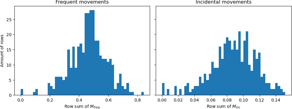
Histograms showing the row sums of (a) matrix and (b) matrix divided by the population sizes belonging to those rows.
Appendix 1—figure 2
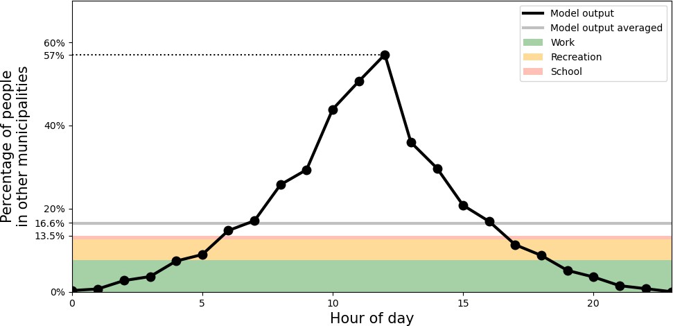
Percentage of people outside of their home municipality (black).
At the bottom, in colors, daily-averaged estimates of time spent outside the home municipality are displayed, due to the activities of work (green), recreation (yellow), and school (red).
Appendix 1—figure 3

Variability in the fraction of time spent in the home municipality.
Panel (a): across different demographic groups. Panel (b): across a selection of municipalities.
Appendix 1—figure 4
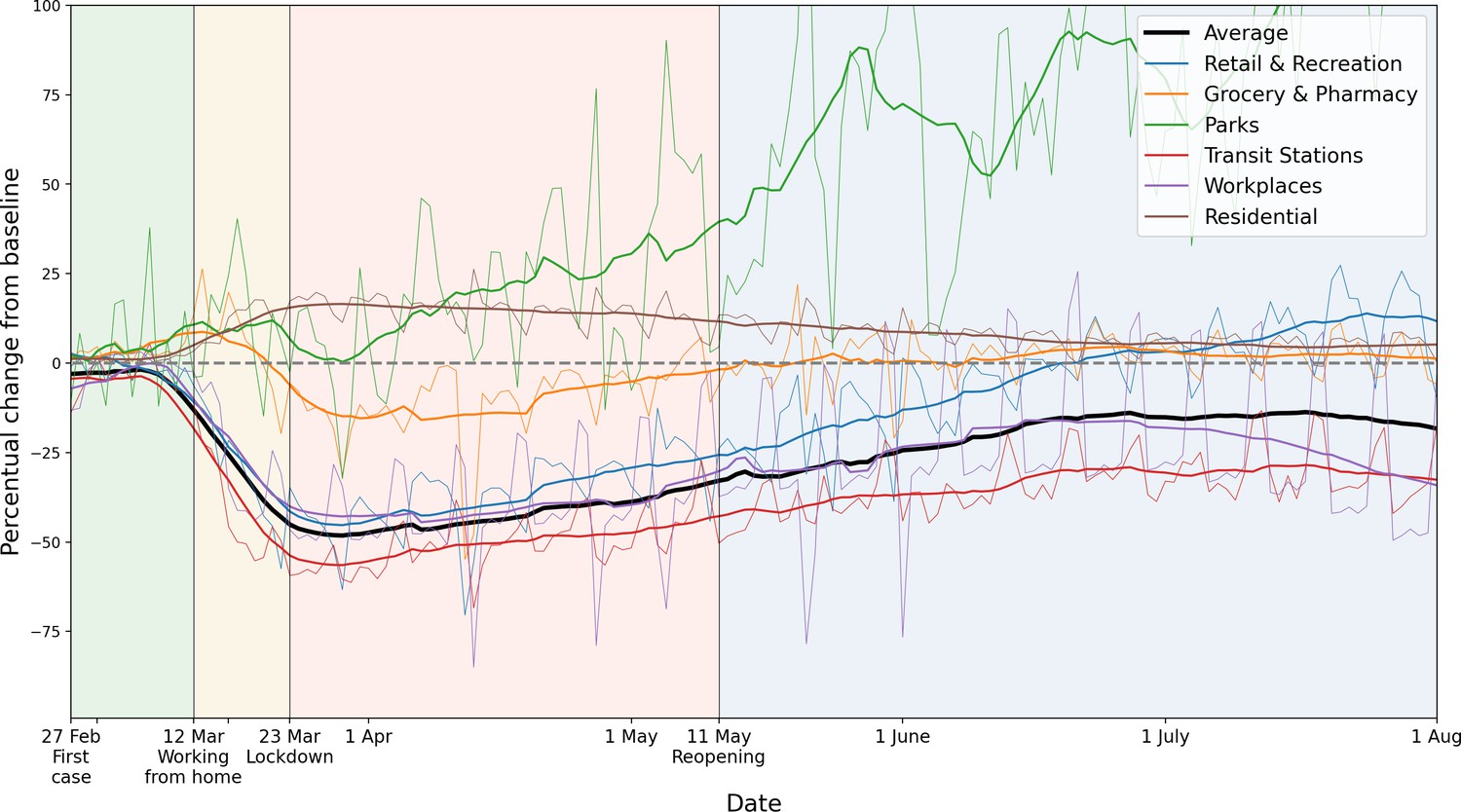
Percentage mobility changes with respect to the baseline, provided by Google Mobility data.
Six categories are distinguished, in different colors. For the purpose of measuring how inter-municipality travel reduced, we use the average of the categories ‘Transit Stations’, ‘Workplaces’ and ‘Retail and Recreation’. For each color, the raw data (thin lines) and 14-day running averaged data (thicker lines) are shown.
Appendix 1—figure 5
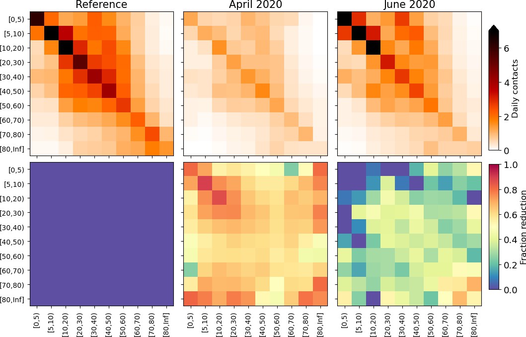
Changes applied to the model mixing matrices, calculated from survey mixing matrices in the PIENTER study (Vos et al., 2020).
Top panels: daily contacts in absolute numbers, stratified by age as depicted in the reference study (left), April 2020 surveys (middle) and June 2020 surveys (right). Bottom panels: element-wise reductions in contact numbers relative to the reference. These reduction percentages are converted to the demographic groups we use in this study and applied throughout the phases.
Appendix 2—figure 1
Comparison of disease prevalence across the eleven demographic groups (horizontal), expressed in % seropositivity (vertical) in different national administered intervention measures.
Observed data are shown in black, the reference in green, and the impacts of (i) no behavioral changes like wearing masks, enhanced hygiene and social distancing in blue, (ii) no mobility reduction in red and (iii) no closing of schools in yellow. Bandwidths indicate the minima and maxima around the mean of a simulation ensemble of 40 realizations.
Appendix 2—figure 2
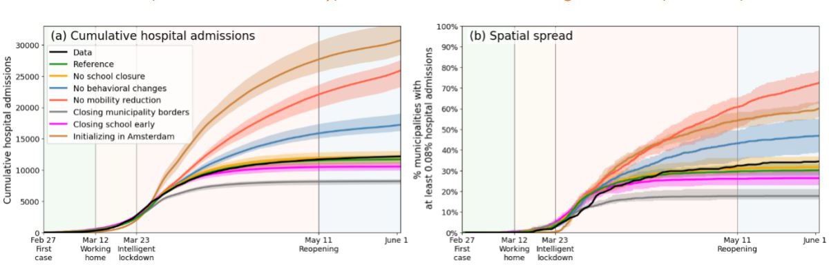
Comparing the impacts of nationally administered intervention measures.
Same as Figure 3 of the main text, but including three additional scenarios, in which municipality borders are fully closed upon initializing lockdown (gray), when schools are closed at the start of the simulation (purple), and when the outbreak starts in Amsterdam rather than as it was in reality (brown), respectively.
Appendix 2—figure 3
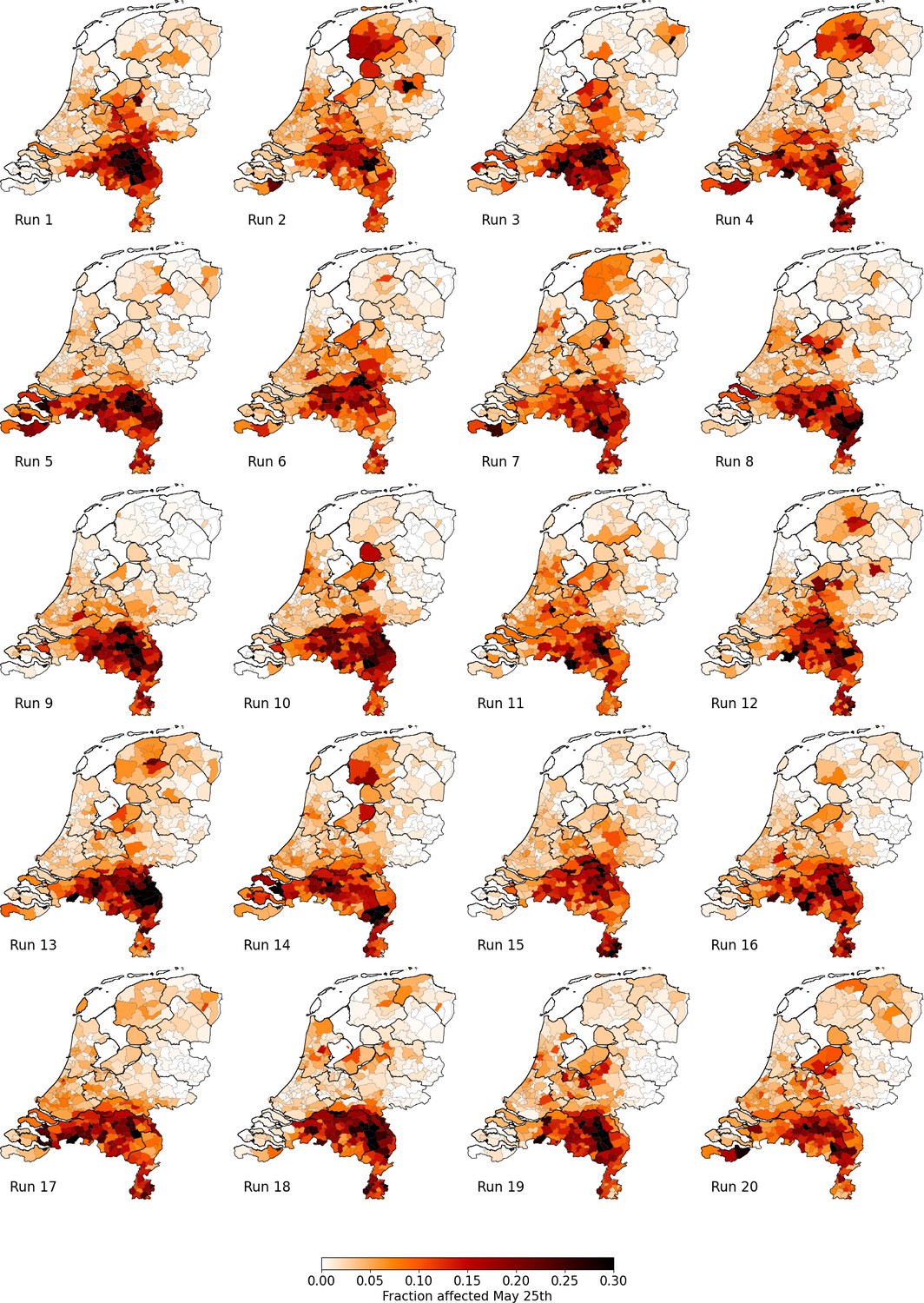
Percentage of affected municipality population (i.e. infectious or recovered) on May 25 using the Reference scenario, for 20 unique runs (out of an ensemble of 40).
Each column represents identical mobility seeds.
Appendix 3—figure 1

Same as Fig.
Figure 3 of the main text, but only including a comparison between the reference population resolution (1:100, green), an increased population resolution (1:75, red) and a reduced population resolution (1:500, orange).
Author response image 1
Tables
Table 1
Overview of how the four phases in the first wave of COVID-19 in the Netherlands are implemented in our analysis.
| Phase | Start | End | Travel | Mixing | Behavior | Schools |
|---|---|---|---|---|---|---|
| 1 | Feb 27 | Mar 11 | - | - | Open | |
| 2 | Mar 12 | Mar 22 | –31.7% | Reduced as per Apr 2020 | Closed halfway* | |
| 3 | Mar 23 | May 10 | –42.4% | Reduced as per Apr 2020 | Closed* | |
| 4 | May 11 | Jun 1 | –20.1% | Reduced as per Jun 2020 | Open |
-
*
Schools were closed in the period March 16 – May 10, which is also what we use in our analysis.
Appendix 1—table 1
The eleven demographic groups and attributes relevant to our analysis.
The mixing situations in the last two columns point towards the matrices chosen to simulate the mixing (see Appendix A.4): without brackets if the agent is in the home municipality, in brackets if the agent is in a different municipality.
| Group | Criteria | Attributes | |||||
|---|---|---|---|---|---|---|---|
| Age (y) | Work | School | National total (fraction) | Av. time not in home municipality | Daytime mixing | Nighttime mixing | |
| Pre-school children | 0–4 | - | - | 851880 (4.9%) | 6% | Home (Other) | Home (Other) |
| Primary school children | 5–11 | - | Yes | 1295380 (7.5%) | 6% | School | Home (Other) |
| Secondary school children | 12–16 | - | Yes | 991290 (5.7%) | 6% | School | Home (Other) |
| Students | 17–24 | - | Yes | 1,086,240 (6.2%) | 26% | School +Work | Home (Other) |
| Non-studying adolescents | 17–24 | - | - | 632,530 (3.6%) | 26% | Work | Home (Other) |
| Middle-age working | 25–54 | Yes | - | 5,530,360 (31.8%) | 26% | Work | Home (Other) |
| Middle-age unemployed | 25–54 | - | - | 1,231,780 (7.1%) | 6% | Home (Other) | Home (Other) |
| Higher-age working | 55–67 | Yes | - | 1,623,040 (9.3%) | 26% | Work | Home (Other) |
| Higher-age unemployed | 55–67 | - | - | 1,109,170 (6.4%) | 6% | Home (Other) | Home (Other) |
| Elderly | 68–80 | - | - | 2,102,530 (12.2%) | 6% | Home (Other) | Home (Other) |
| Eldest | 80+ | - | - | 802,670 (4.6%) | 6% | Home (Other) | Home (Other) |
Appendix 1—table 2
Probability of hospital admission and susceptibility parameter .
| Demographic group | ||
|---|---|---|
| Pre-school children | 0 | 1.0 |
| Primary school children | 0 | 2.0 |
| Secondary school children | 0.0018 | 3.051 |
| Students | 0.0006 | 5.751 |
| Non-studying adolescents | 0.0006 | 5.751 |
| Middle-age working | 0.0081 | 3.6 |
| Middle-age unemployed | 0.0081 | 3.6 |
| Higher-age working | 0.0276 | 5.0 |
| Higher-age unemployed | 0.0276 | 5.0 |
| Elderly | 0.0494 | 5.3 |
| Eldest | 0.0641 | 7.2 |
Appendix 1—table 3
Daily cycle parameter , from which we obtain .
| Hour of day () | 0 | 1 | 2 | 3 | 4 | 5 | 6 | 7 | 8 | 9 | 10 | 11 | 12 | 13 | 14 | 15 | 16 | 17 | 18 | 19 | 20 | 21 | 22 | 23 |
|---|---|---|---|---|---|---|---|---|---|---|---|---|---|---|---|---|---|---|---|---|---|---|---|---|
| 1 | 1 | 1 | 1 | 1 | 1 | 0.75 | 0.5 | 0.25 | 0 | 0 | 0 | 0 | 0 | 0 | 0 | 0 | 0 | 0 | 0.2 | 0.4 | 0.6 | 0.8 | 1 |
Additional files
Download links
A two-part list of links to download the article, or parts of the article, in various formats.
Downloads (link to download the article as PDF)
Open citations (links to open the citations from this article in various online reference manager services)
Cite this article (links to download the citations from this article in formats compatible with various reference manager tools)
Reducing societal impacts of SARS-CoV-2 interventions through subnational implementation
eLife 12:e80819.
https://doi.org/10.7554/eLife.80819


