Large-scale electrophysiology and deep learning reveal distorted neural signal dynamics after hearing loss
- Ear Institute, University College London, United Kingdom
- Perceptual Technologies, United Kingdom
Figures
Figure 1
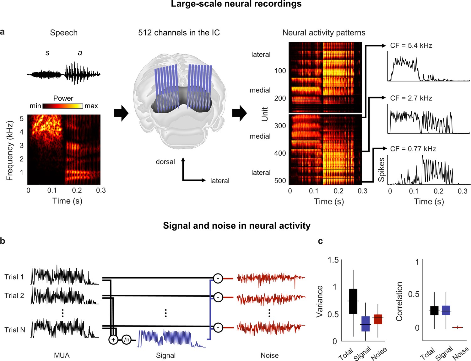
Neural signal and noise in the gerbil inferior colliculus (IC).
(a) Schematic diagram showing the geometry of custom-designed electrode arrays for large-scale recordings in relation to the gerbil IC (center), along with the speech syllable ‘sa’ (left) and the neural activity that it elicited during an example recording (right). Each image of the neural activity corresponds to one hemisphere, with each row showing the average multi-unit activity recorded on one electrode over repeated presentations of the syllable, with the units arranged according to their location within the IC. The activity for three units with different center frequencies (CF; frequency for which sensitivity to pure tones is maximal) are shown in detail. (b) Schematic diagram showing the method for separating signal and noise in neural activity. The signal is obtained by averaging responses across repeated presentations of identical sounds. The noise is the residual activity that remains after subtracting the signal from the response to each individual presentation. (c) Signal and noise in neural activity. Left: total, signal, and noise variance in neural activity for units recorded from normal hearing animals (horizontal line indicates median, thick vertical line indicates 25th through 75th percentile, thin vertical line indicates 5th through 95th percentile; n = 2556). Right: total, signal, and noise correlation in neural activity for pairs of units recorded from normal hearing animals (n = 544,362).
Figure 2 with 1 supplement
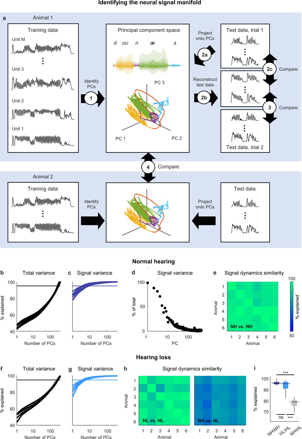
Neural signal dynamics identified via classical methods.
(a) Schematic diagram showing the method for identifying the neural signal manifold from recordings of neural activity. Step 1: principal component analysis (PCA) is performed on a subset of the recordings allocated for training. Step 2a: a subset of recordings allocated for testing are projected onto the principal components (PCs) from step 1. Step 2b: The projections from step 2a are used to reconstruct the test recordings. Step 2c: the reconstructions from step 2b are compared to the test recordings from step 2a to determine the total variance explained. Step 3: the reconstructions from step 2b are compared to another set of test recordings (made during a second presentation of the same sounds) to determine the signal variance explained. Step 4: the projections from step 2a for one animal are compared to the projections for another animal to determine the similarity of the signal dynamics between animals. (b) Total variance explained in step 2c as a function of the number of PCs used for the reconstruction. Each thick line shows the results for one normal hearing animal (n = 6). The thin line denotes 95% variance explained. (c) Signal variance explained in step 3 as a function of the number of PCs used for the reconstruction. (d) Percent of variance explained by each PC that corresponds to neural signal (rather than neural noise) for an example animal. (e) Variance explained in step 4 for each pair of normal hearing animals. (f, g) Total variance explained in step 2c and signal variance explained in step 3 for animals with hearing loss (n = 6). (h) Variance explained in step 4 for each pair of animals with hearing loss and each pair of animals with different hearing status. (i) Distributions of variance explained in step 4 for each pair of normal hearing animals (n = 15), each pair of animals with hearing loss (n = 15), and each pair of animals with different hearing status (n = 36). Median values were compared via Kruskal–Wallis one-way ANOVA and Tukey–Kramer post hoc tests, ***p<0.001, **p<0.01, *p<0.05, ns indicates not significant. For full details of statistical tests, see Table 1.
Figure 2—figure supplement 1
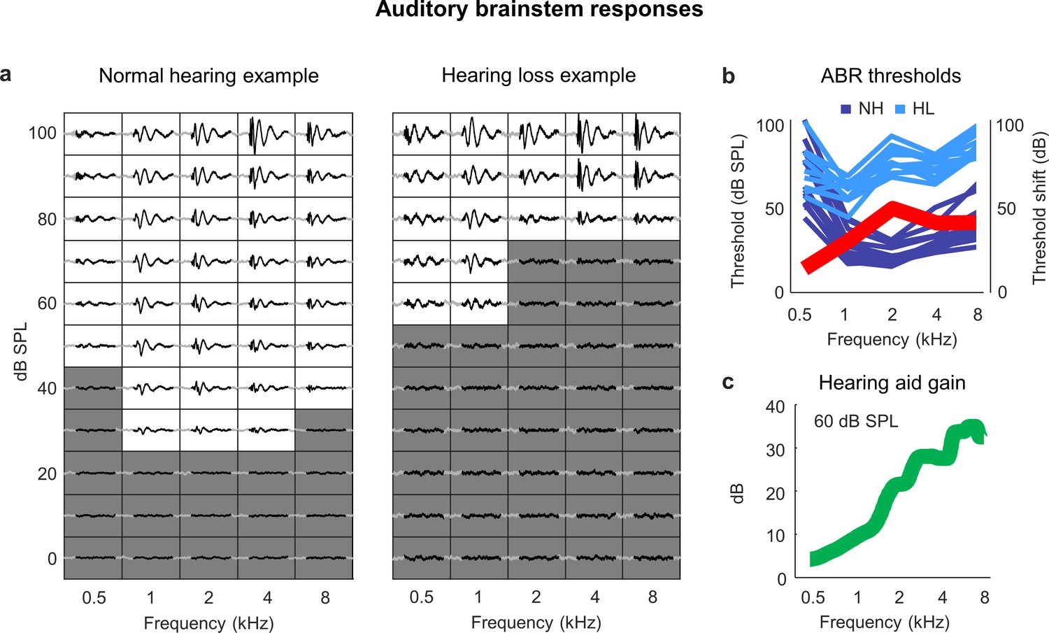
Sloping mild-to-moderate sensorineural hearing loss.
(a) ABR traces for two example ears. Each small box shows the average response to a tone at the specified frequency and intensity. The time points (30 ms) in each response that were used for threshold estimation are colored black. The boxes corresponding to intensities below the threshold for each frequency are colored gray. (b) ABR thresholds as a function of frequency in normal-hearing (dark blue) and noise-exposed (light blue) animals (each line shows one ear from one animal). The thick red line shows the average ABR threshold shift for noise-exposed animals relative to the mean of all animals with normal hearing. (c) Hearing aid gain as a function of frequency for speech at 60 dB SPL with gain and compression parameters fit to the average hearing loss after noise exposure. The values shown are the average across 5 min of continuous speech.
Figure 3
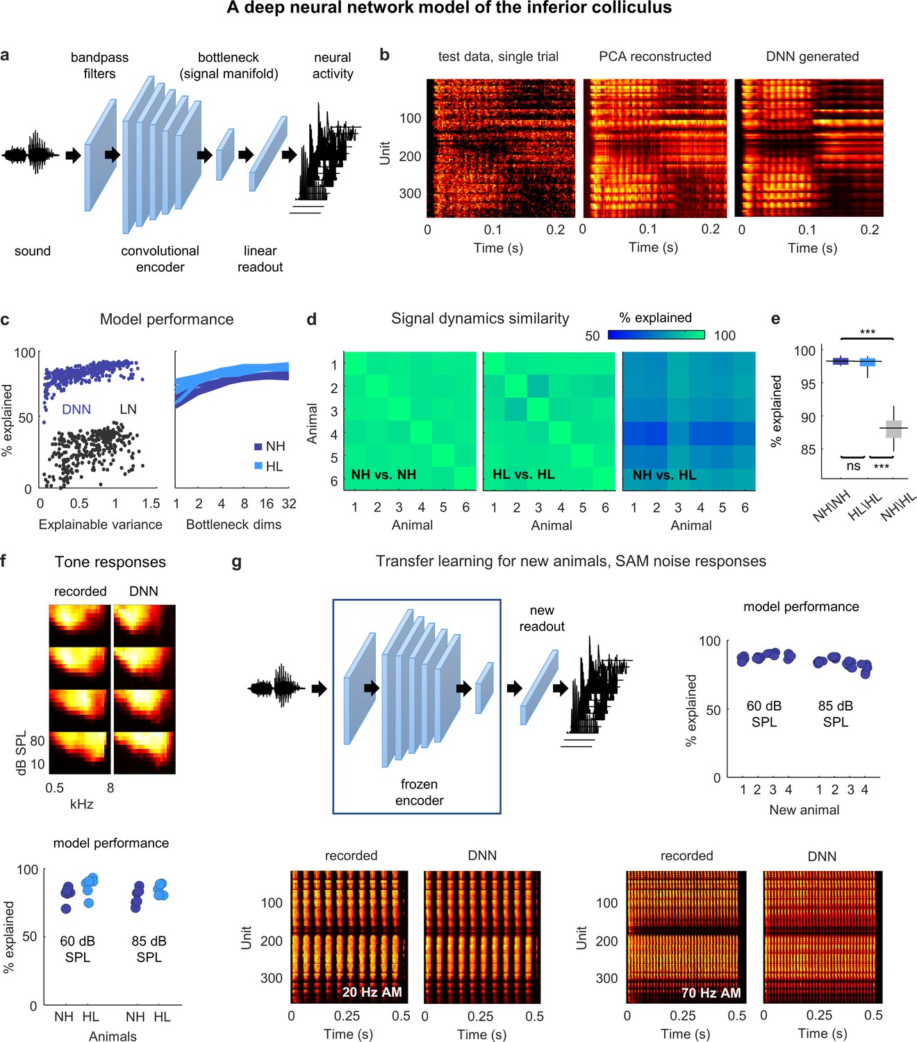
Neural signal dynamics identified via deep learning.
(a) Schematic diagram of the deep neural network (DNN) used to predict inferior colliculus (IC) activity. (b) Example images of neural activity elicited by a speech syllable from an example recording (left), reconstructed as in step 2b of Figure 2 (center), and predicted by the DNN (right). (c) Left: predictive power of the DNN for each unit from one animal. The value on the horizontal axis is the fraction of the variance in the neural activity that is explainable (i.e., that is consistent across trials of identical speech). The value on the vertical axis is the percent of this explainable variance that was captured by the DNN. Analogous values for linear–nonlinear (LN) models trained and tested on the same activity are shown for comparison. Right: average predictive power for all units as a function of the number of channels in the bottleneck layer. Each line shows the results for one animal. (d) Fraction of the variance in one set of bottleneck activations explained by another set for each pair of normal hearing animals (left), each pair of animals with hearing loss (center), and each pair of animals with different hearing status (right). (e) Distributions of variance in one set of bottleneck activations explained by another set for each pair of normal hearing animals (n = 15), each pair of animals with hearing loss (n = 15), and each pair of animals with different hearing status (n = 36). Median values were compared via Kruskal–Wallis one-way ANOVA and Tukey–Kramer post hoc tests, ***p<0.001, **p<0.01, *p<0.05, ns indicates not significant. For full details of statistical tests, see Table 1. (f) Top: example images of neural activity elicited by pure tones from an example recording (left) and predicted by the DNN (right). Each subplot shows the frequency response area for one unit (the average activity recorded during the presentation of tones with different frequencies and sound levels). The colormap for each plot is normalized to the minimum and maximum activity level across all frequencies and intensities. Bottom: predictive power of the DNN for tone responses across all frequencies at two different intensities. Each point indicates the average percent of the explainable variance that was captured by the DNN for all units from one animal (with horizontal jitter added for visibility). (g) Top left: schematic diagram of transfer learning for new animals. Bottom: example images of neural activity elicited by sinusoidally amplitude modulated (SAM) noise with two different modulation frequencies from an example recording (left; average over 128 repeated trials) and predicted by the DNN (right). Top right: predictive power of the DNN for SAM noise responses across all modulation frequencies and modulation depths at two different intensities. Each point indicates the average percent of the explainable variance that was captured by the DNN for all units from one of four new animals after transfer learning using a frozen encoder from one of six animals in the original training set.
Figure 4 with 1 supplement
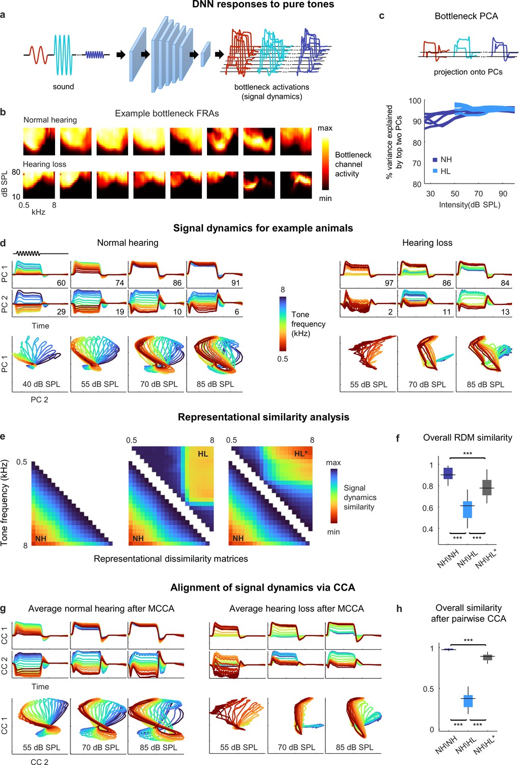
Neural signal dynamics for pure tones.
(a) Schematic diagram showing pure tone sounds with different frequencies and intensities and corresponding bottleneck activations. (b) Frequency response areas (FRAs) for the eight bottleneck channels from a normal hearing animal (top) and an animal with hearing loss (bottom). Each subplot shows the average activity for one channel in response to tones with different frequencies and intensities. The colormap for each plot is normalized to the minimum and maximum activity level across all frequencies and intensities. (c) Dimensionality reduction of bottleneck activations via principal component analysis (PCA). Each line shows the variance explained by the top two principal components (PCs) for one animal as a function of the intensity of the tones. (d) Signal dynamics for pure tones for a normal hearing animal (left) and an animal with hearing loss (right). The top two rows show the projection of the bottleneck activations onto each of the top two PCs as a function of time. The inset value indicates the percent of the variance in the bottleneck activations explained by each PC. The bottom row shows the projections from the top two rows plotted against one another. Each line shows the dynamics for a different tone frequency. Each column shows the dynamics for a different tone intensity. (e) Representational dissimilarity matrices (RDMs) computed from bottleneck activations. The left image shows the average RDM for normal hearing animals for tones at 55 dB SPL. The value of each pixel is proportional to the point-by-point correlation between the activations for a pair of tones with different frequencies. The center image shows the same lower half of the RDM for normal hearing animals along with the upper half of the RDM for animals with hearing loss at the same intensity. The right image shows the same lower half of the RDM for normal hearing animals along with the upper half of the RDM for animals with hearing loss at the best intensity (that which produced the highest point-by-point correlation between the normal hearing and hearing loss RDMs). (f) The point-by-point correlation between RDMs for each pair of normal hearing animals (n = 15), and each pair of animals with different hearing status compared at either the same intensity or the best intensity (n = 36). Median values were compared via Kruskal–Wallis one-way ANOVA and Tukey–Kramer post hoc tests, ***p<0.001, **p<0.01, * p<0.05, ns indicates not significant. For full details of statistical tests, see Table 1. (g) Average signal dynamics for pure tones for normal hearing animals (left) and animals with hearing loss (right) after alignment via multiway canonical correlation analysis (MCCA). (h) The similarity between dynamics after alignment via pairwise canonical correlation analysis (CCA) (see ‘Methods’) for each pair of normal hearing animals, and each pair of animals with different hearing status compared at either the same intensity or the best intensity (that which produced the highest similarity between the dynamics).
Figure 4—figure supplement 1
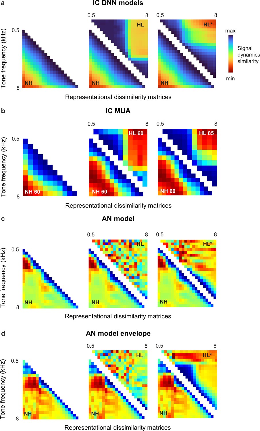
Distorted spectral processing in the inferior colliculus (IC) and auditory nerve (AN).
Representational dissimilarity matrices (RDMs) for simulated and recorded IC responses to tones display a simple block-like structure after hearing loss, indicating a clustering of response trajectories for different tones within the signal manifold. The effects of hearing loss on tone responses at the level of the AN appear to be much more complex and differ between full responses and response envelopes (i.e., with and without phase locking to tone fine structure). Methodological details are provided below. (a) RDMs computed from bottleneck activations. The left image shows the average RDM for normal hearing animals for tones at 55 dB SPL. The value of each pixel is proportional to the point-by-point correlation between the activations for a pair of tones with different frequencies. The center image shows the same lower half of the RDM for normal hearing animals along with the upper half of the RDM for animals with hearing loss at the same intensity. The right image shows the same lower half of the RDM for normal hearing animals along with the upper half of the RDM for animals with hearing loss at the best intensity (that which produced the highest point-by-point correlation between the normal hearing and hearing loss RDMs). Reproduced from Figure 4 for reference. (b) RDMs computed from original IC activity. The left image shows the average RDM for normal hearing animals for tones at 60 dB SPL. The center image shows the same lower half of the RDM for normal hearing animals along with the upper half of the RDM for animals with hearing loss at the same intensity. The right image shows the same lower half of the RDM for normal hearing animals along with the upper half of the RDM for animals with hearing loss at 85 dB SPL. The tones were 50 ms in duration with frequencies ranging from 500 Hz to 8000 Hz in 0.5 octave steps with 5 ms cosine on and off ramps. Tones were presented 128 times each in random order with 175 ms between presentations. IC multi-unit activity (MUA) was averaged across presentations of each tone. Principal component analysis (PCA) was performed and RDMs were computed using the top 3 principal components (PCs), which explained more than 90% of the variance in all cases. (c, d) RDMs computed from simulated AN activity. The left image shows the average RDM for normal hearing animals for tones at 60 dB SPL. The center image shows the same lower half of the RDM for normal hearing animals along with the upper half of the RDM for animals with hearing loss at the same intensity. The right image shows the same lower half of the RDM for normal hearing animals along with the upper half of the RDM for animals with hearing loss at the best intensity (that which produced the highest point-by-point correlation between the normal hearing and hearing loss RDMs). The tones were the same as those presented to the IC deep neural network (DNN) models: 100 ms in duration with frequencies ranging from 500 Hz to 8000 Hz in 0.2 octave steps; intensities ranging from 25 dB SPL to 100 dB SPL in 5 dB steps; 10 ms cosine on and off ramps; and a 100 ms pause between tones. AN responses were simulated using the model of Bruce et al. (2018) with default parameters at 48 CFs ranging from 200 Hz to 10 kHz. To simulate mild-to-moderate sloping sensorineural hearing loss, we modified the parameter controlling outer hair cell function () as needed to create a threshold shift ranging from 20 dB at 1 kHz to 40 dB at 8 kHz. Responses to low-, medium-, and high-threshold fibers were simulated and summed together to create MUA in each CF channel. PCA was performed and RDMs were computed using the top 8 PCs, which explained more than 90% of the variance in all cases. The envelope of the AN responses was extracted using a Hilbert transform (MATLAB envelope).
Figure 5
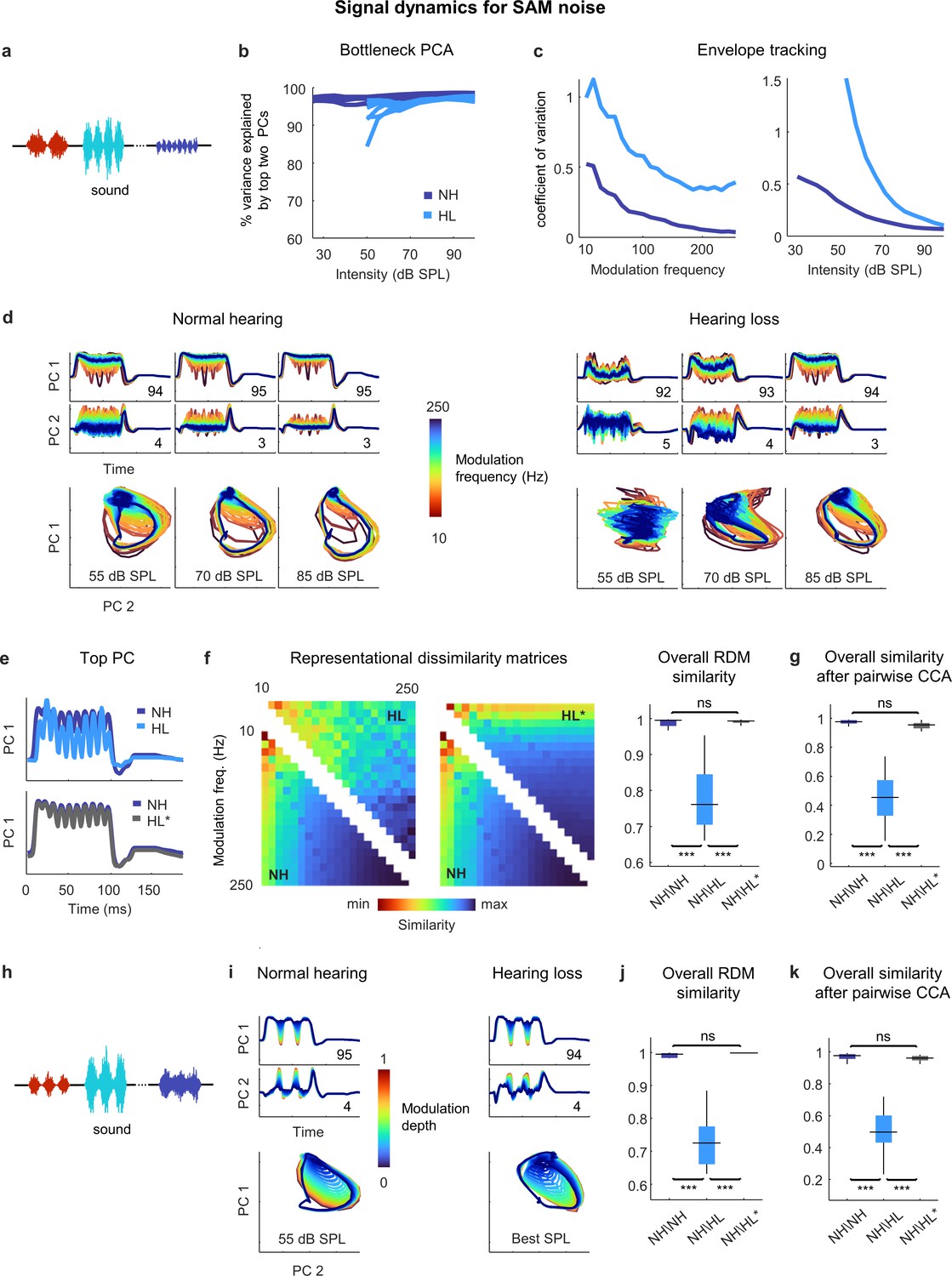
Neural signal dynamics for amplitude modulated noise.
(a) Schematic diagram showing amplitude-modulated noise sounds with different intensities and modulation frequencies. (b) Variance in bottleneck activations explained by top two principal components (PCs) for each animal as function of sound intensity. (c) Envelope tracking in signal dynamics measured as the coefficient of variation of the bottleneck activations for sounds with different modulation frequencies at an intensity of 55 dB SPL (left) and sounds at different intensities with a modulation frequency of 100 Hz (right). Values shown are the average across animals. (d) Signal dynamics for a normal hearing animal (left) and an animal with hearing loss (right). Each line shows the dynamics for a different modulation frequency. (e) Signal dynamics for a modulation frequency of 100 Hz after projection onto the top PC. The top panel shows the dynamics for a normal hearing animal and an animal with hearing loss at 55 dB SPL. The bottom panel shows the same dynamics for the normal hearing animal along with the dynamics for the animal with hearing loss at the best intensity. (f) Representational dissimilarity matrices (RDMs) computed from bottleneck activations and the point-by-point correlation between RDMs for different pairs of animals at 55 dB SPL or best intensity. Median values were compared via Kruskal–Wallis one-way ANOVA and Tukey–Kramer post hoc tests, ***p<0.001, **p<0.01, *p<0.05, ns indicates not significant. For full details of statistical tests, see Table 1. (g) The similarity between dynamics after alignment via pairwise canonical correlation analysis (CCA) for different pairs of animals at 55 dB SPL or best intensity. (h) Schematic diagram showing amplitude modulated noise sounds with different intensities and modulation depths. (i) Signal dynamics for a normal hearing animal at 55 dB SPL (left) and an animal with hearing loss at the best intensity (right). Each line shows the dynamics for a different modulation depth. (j) The point-by-point correlation between RDMs for different pairs of animals at 55 dB SPL or best intensity. (k) The similarity between dynamics after alignment via pairwise CCA for different pairs of animals at 55 dB SPL or best intensity.
Figure 6
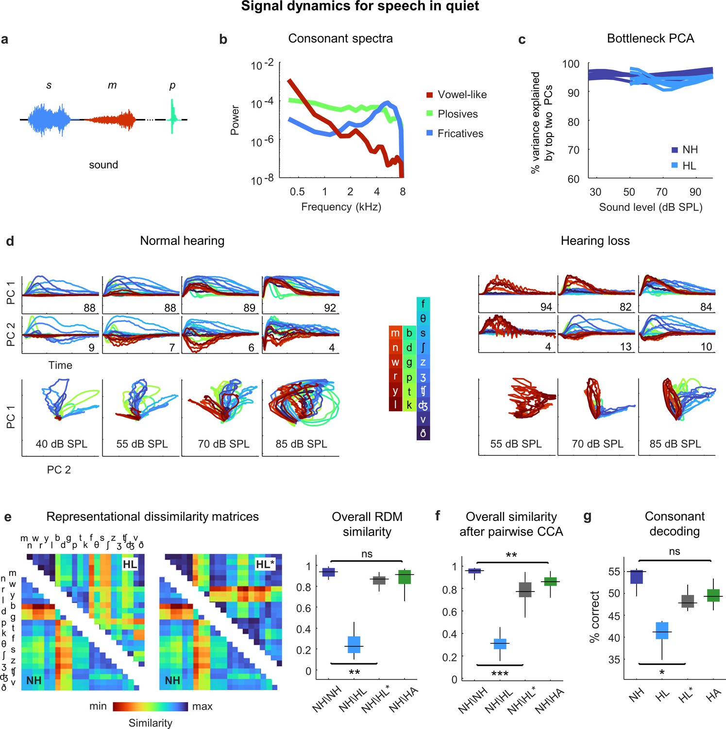
Neural signal dynamics for speech in quiet.
(a) Schematic diagram showing different consonants. (b) Average power spectra for three classes of consonants. The individual consonants are shown in the inset in panel (d). (c) Variance in bottleneck activations explained by top two principal components (PCs) for each animal as a function of sound intensity. (d) Signal dynamics for a normal hearing animal (left) and an animal with hearing loss (right). Each line shows the dynamics for a different consonant, averaged over all instances. (e) Representational dissimilarity matrices (RDMs) computed from bottleneck activations and the point-by-point correlation between RDMs for different pairs of animals at 60 dB SPL, best intensity, or with a hearing aid. Median values were compared via Kruskal–Wallis one-way ANOVA and Tukey–Kramer post hoc tests, ***p<0.001, **p<0.01, *p<0.05, ns indicates not significant. For full details of statistical tests, see Table 1. (f) The similarity between dynamics after alignment via pairwise canonical correlation analysis (CCA) for different pairs of animals at 60 dB SPL, best intensity, or with a hearing aid. (g) Performance of a support vector machine classifier trained to identify consonants based on bottleneck activations for each normal hearing animal (n = 6) at 60 dB SPL and each animal with hearing loss (n = 6) at either 60 dB SPL, best intensity, or with a hearing aid.
Figure 7
Neural signal dynamics for speech in noise.
(a) Schematic diagram showing different consonants in speech babble. (b) Average power spectra for three classes of consonants and speech babble. (c) Variance in bottleneck activations explained by top two (left) or three (right) principal components (PCs) for each animal as a function of sound intensity. (d) Signal dynamics for a normal hearing animal (top) and an animal with hearing loss (bottom). Each line shows the dynamics for a different consonant, averaged over all instances. Dynamics for speech in quiet are shown alongside those for speech in noise for comparison. (e) Point-by-point correlation between representational dissimilarity matrices (RDMs) for different pairs of animals at 70 dB SPL, best intensity, or with a hearing aid. Median values were compared via Kruskal–Wallis one-way ANOVA and Tukey–Kramer post hoc tests, ***p<0.001, ** p<0.01, *p<0.05, ns indicates not significant. For full details of statistical tests, see Table 1. (f) The similarity between dynamics after alignment via pairwise canonical correlation analysis (CCA) for different pairs of animals at 70 dB SPL, best intensity, or with a hearing aid. (g) Performance of a support vector machine classifier trained to identify consonants based on bottleneck activations for each normal hearing animal at 70 dB SPL, and each animal with hearing loss at 70 dB SPL, best intensity, or with a hearing aid.
Figure 8
Hypersensitivity to background noise after hearing loss.
(a) Average signal dynamics for speech in quiet at 60 dB SPL for normal hearing animals (left) and at best intensity for animals with hearing loss (right) after joint alignment via multiway canonical correlation analysis (MCCA). The inset value within each panel indicates the average percent of the variance in the bottleneck activations explained by each canonical component (CC). The inset value between columns indicates the average correlation between the dynamics after projection onto each pair of CCs. (b) Average signal dynamics for speech in quiet at 60 dB SPL for normal hearing animals (left) and with a hearing aid for animals with hearing loss (right) after joint alignment via MCCA. (c) Average signal dynamics for speech in noise at 70 dB SPL for normal hearing animals (left) and at best intensity for animals with hearing loss (right) after joint alignment via MCCA. (d) Average signal dynamics for speech in noise at 70 dB SPL for normal hearing animals (left) and with a hearing aid for animals with hearing loss (right) after joint alignment via MCCA. (e) Schematic diagram showing amplitude modulated narrowband noise target and masker sounds. (f) Correlation between bottleneck activations for target noise with and without masker noise at 70 dB SPL. Each line shows the correlation for a different target center frequency as a function of the masker center frequency, averaged across individual animals. (g) Change in correlation between bottleneck activations for target noise with and without masker noise at 70 dB SPL for animals with hearing loss relative to animals with normal hearing. (h) Change in correlation for animals with hearing loss at best intensity relative to animals with normal hearing at 70 dB SPL. (i) Change in correlation for animals with hearing loss with a hearing aid relative to animals with normal hearing at 70 dB SPL.
Tables
Table 1
Details of statistical analyses.
This table provides the details for the statistical analyses in this study, including sampling unit, sample sizes, and p-values. All comparisons were made using Kruskal–Wallis one-way ANOVA with post hoc Tukey–Kramer tests to compute pairwise p-values.
| Figure 2 | Figure 6 | ||||||
|---|---|---|---|---|---|---|---|
| Figure 2i | Sampling unit: pairs of animals | Figure 6e | Sampling unit: pairs of animals | ||||
| Groups: | Comparisons: | Groups: | Comparisons: | ||||
| 1. NH\NH (n = 15) | 1 vs. 2 | p=0.08 | 1. NH\NH (n = 15) | 1 vs. 2 | p<1e-7 | ||
| 2. HL\HL (n = 15) | 1 vs. 3 | p<1e-7 | 2. NH\HL (n = 36) | 1 vs. 3 | p=0.007 | ||
| 3. NH\HL (n = 36) | 2 vs. 3 | p<1e-7 | 3. NH\HL* (n = 36) | 1 vs. 4 | p=0.23 | ||
| 4. NH\HA (n = 36) | 2 vs. 3 | p<1e-7 | |||||
| Figure 3 | 2 vs. 4 | p<1e-7 | |||||
| 3 vs. 4 | p=0.29 | ||||||
| Figure 3e | Sampling unit: pairs of animals | ||||||
| Figure 6f | Sampling unit: pairs of animals | ||||||
| Groups: | Comparisons: | ||||||
| 1. NH\NH (n = 15) | 1 vs. 2 | p=0.71 | Groups: | Comparisons: | |||
| 2. HL\HL (n = 15) | 1 vs. 3 | p<1e-10 | 1. NH\NH (n = 15) | 1 vs. 2 | p<1e-7 | ||
| 3. NH\HL (n = 36) | 2 vs. 3 | p<1e-10 | 2. NH\HL (n = 36) | 1 vs. 3 | p<1e-7 | ||
| 3. NH\HL* (n = 36) | 1 vs. 4 | p=0.002 | |||||
| Figure 4 | 4. NH\HA (n = 36) | 2 vs. 3 | p<1e-7 | ||||
| 2 vs. 4 | p<1e-7 | ||||||
| Figure 4f | Sampling unit: pairs of animals | 3 vs. 4 | p<1e-4 | ||||
| Groups: | Comparisons: | Figure 6g | Sampling unit: animals | ||||
| 1. NH\NH (n = 15) | 1 vs. 2 | p<1e-7 | |||||
| 2. NH\HL (n = 36) | 1 vs. 3 | p<1e-3 | Groups: | Comparisons: | |||
| 3. NH\HL* (n = 36) | 2 vs. 3 | p<1e-7 | 1. NH (n = 6) | 1 vs. 2 | p<1e-6 | ||
| 2. HL (n = 6) | 1 vs. 3 | p=0.011 | |||||
| Figure 4f | Sampling unit: pairs of animals | 3. HL* (n = 6) | 1 vs. 4 | p=0.057 | |||
| 4. HA (n = 6) | 2 vs. 3 | p<1e-3 | |||||
| Groups: | Comparisons: | 2 vs. 4 | p<1e-4 | ||||
| 1. NH\NH (n = 15) | 1 vs. 2 | p<1e-7 | 3 vs. 4 | p=0.86 | |||
| 2. NH\HL (n = 36) | 1 vs. 3 | p<1e-4 | |||||
| 3. NH\HL* (n = 36) | 2 vs. 3 | p<1e-7 | Figure 7 | ||||
| Figure 5 | Figure 7e | Sampling unit: pairs of animals | |||||
| Figure 5f | Sampling unit: pairs of animals | Groups: | Comparisons: | ||||
| 1. NH\NH (n = 15) | 1 vs. 2 | p<1e-7 | |||||
| Groups: | Comparisons: | 2. NH\HL (n = 36) | 1 vs. 3 | p<1e-4 | |||
| 1. NH\NH (n = 15) | 1 vs. 2 | p<1e-7 | 3. NH\HL* (n = 36) | 1 vs. 4 | p<1e-7 | ||
| 2. NH\HL (n = 36) | 1 vs. 3 | p=0.99 | 4. NH\HA (n = 36) | 2 vs. 3 | p<1e-7 | ||
| 3. NH\HL* (n = 36) | 2 vs. 3 | p<1e-7 | 2 vs. 4 | p<1e-7 | |||
| 3 vs. 4 | p=0.056 | ||||||
| Figure 5g | Sampling unit: pairs of animals | ||||||
| Figure 7f | Sampling unit: pairs of animals | ||||||
| Groups: | Comparisons: | ||||||
| 1. NH\NH (n = 15) | 1 vs. 2 | p<1e-7 | Groups: | Comparisons: | |||
| 2. NH\HL (n = 36) | 1 vs. 3 | p=0.64 | 1. NH\NH (n = 15) | 1 vs. 2 | p<1e-7 | ||
| 3. NH\HL* (n = 36) | 2 vs. 3 | p<1e-7 | 2. NH\HL (n = 36) | 1 vs. 3 | p<1e-7 | ||
| 3. NH\HL* (n = 36) | 1 vs. 4 | p<1e-7 | |||||
| Figure 5j | Sampling unit: pairs of animals | 4. NH\HA (n = 36) | 2 vs. 3 | p<1e-7 | |||
| 2 vs. 4 | p<1e-7 | ||||||
| Groups: | Comparisons: | 3 vs. 4 | p=0.99 | ||||
| 1. NH\NH (n = 15) | 1 vs. 2 | p<1e-7 | |||||
| 2. NH\HL (n = 36) | 1 vs. 3 | p=0.89 | Figure 7g | Sampling unit: animals | |||
| 3. NH\HL* (n = 36) | 2 vs. 3 | p<1e-7 | |||||
| Groups: | Comparisons: | ||||||
| Figure 5k | Sampling unit: pairs of animals | 1. NH (n = 6) | 1 vs. 2 | p<1e-9 | |||
| 2. HL (n = 6) | 1 vs. 3 | p<1e-5 | |||||
| Groups: | Comparisons: | 3. HL* (n = 6) | 1 vs. 4 | p<1e-6 | |||
| 1. NH\NH (n = 15) | 1 vs. 2 | p<1e-7 | 4. HA (n = 6) | 2 vs. 3 | p<1e-4 | ||
| 2. NH\HL (n = 36) | 1 vs. 3 | p=0.97 | 2 vs. 4 | p<1e-3 | |||
| 3. NH\HL* (n = 36) | 2 vs. 3 | p<1e-7 | 3 vs. 4 | p=0.59 | |||
-
NH: normal hearing; HL: hearing loss; HL*: hearing loss at best intensity; HA: hearing aid.
Additional files
Download links
A two-part list of links to download the article, or parts of the article, in various formats.
Downloads (link to download the article as PDF)
Open citations (links to open the citations from this article in various online reference manager services)
Cite this article (links to download the citations from this article in formats compatible with various reference manager tools)
Large-scale electrophysiology and deep learning reveal distorted neural signal dynamics after hearing loss
eLife 12:e85108.
https://doi.org/10.7554/eLife.85108


