Local generation and efficient evaluation of numerous drug combinations in a single sample
- Department of Medicine, Brigham and Women's Hospital, United States
- Harvard Medical School, United States
Figures
Box 1—figure 1
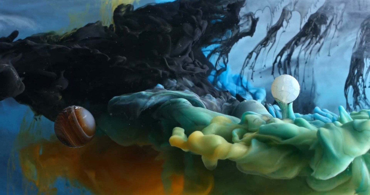
The aesthetic visualization of the stochastic mixing method implemented on a muchlarger scale.
Ink In Motion by Macro Room, https://www.youtube.com/embed/ICxC5ekWnUc. We use the fluorescent intensity of each uniquely labeled drug within a cell as a proxy tocorresponding total drug exposure (area under the curve). This allows us to barcode each cellwith information about the drug regimen to which it was exposed.
Figure 1

The workflow of the temporal local gradient method: Random drug mixing is achieved by creation of the local temporal gradients across a cell culture sample.
Cells exposed to different drug combinations are fluorescently barcoded. The drug combination and corresponding outcome (phenotype) are analysed using coarse graining approach to reduce biological and technical noise.
Figure 2
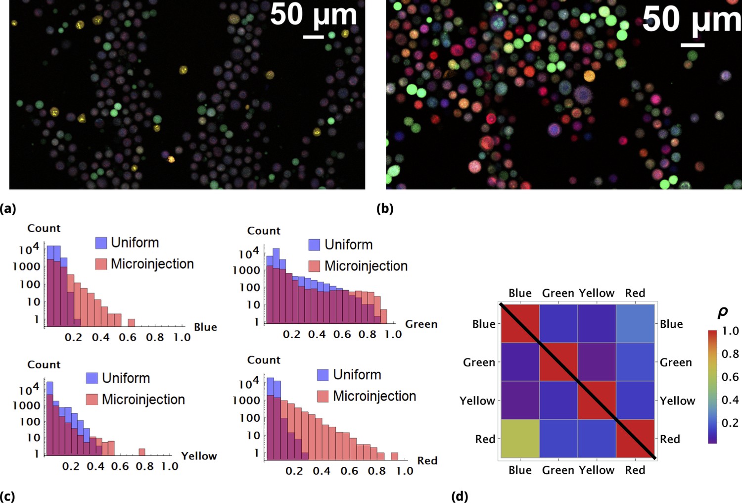
Enhancement of random drug mixing in suspension culture.
(a) and (b), Results of random dye mixing in suspension culture; raw image data are shown for homogeneous and point injection delivery methods, respectively. Here, we used four different CellTrace dyes (Violet, CFSE, Yellow, and Far Red), labeling independently and sequentially as for dyes and in Section 6. (c) The uptake distribution of individual CellTrace dyes incubated with HeLa cells in suspension is shown for each of the conditions on the same plot. Here, each histogram displays cell count as a function of fluorescence intensity, measured in arbitrary units for each dye. (d) Correlation coefficients, , for all pairwise dye combinations are shown graphically for homogeneous and point injection deliveries on lower and upper triangular matrix plots, respectively. (For example, the CV values of and correspond to intensity correlation of Violet and CFSE dyes for homogeneous and point injection delivery methods, respectively.) The absolute value of the correlation coefficient is represented by colors varying from violet to red for values 0 and 1, respectively.
Figure 3

A pair of Green and Red CellTrace dyes was co-delivered in one point location and another pair of Blue and QD655 dyes was co-delivered in another point location simultaneously of adherent cell culture sample.
(a) and (b), Statistical properties of homogeneous and point drug injections (microinjection) are compared in the same fashion in Sections 6 and 6. (c) Scatter density plots for drug uptakes are shown for each pair of dyes tested. First two columns, independent delivery of each dye pair; last column, co-delivery of each pair.
Figure 4
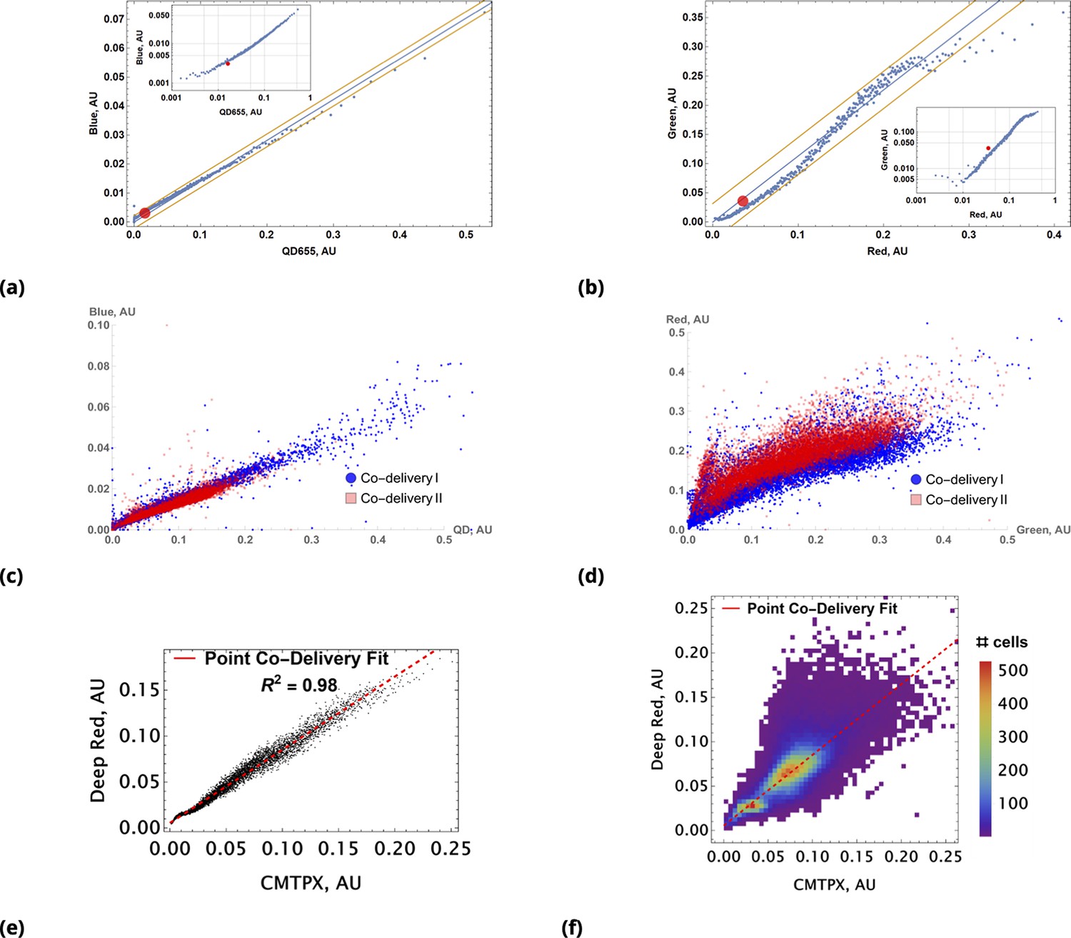
Coarse grained scatter plots for pairs of point co-delivered drugs are shown for (a) {Blue, QD655} and (b) {Green, Red} dyes.
Log-log scale of dye intensities are shown in insets. Here, the large, red-filled circle on each of the plots corresponds to average values of dye intensities for the homogeneous delivery method. The data from two different point injection experiments are compared for pairs {Blue, QD655} and {Green, Red} in (c) and (d). In these two experiments, the locations of point injections were altered to demonstrate the independence of co-delivered dyes parameterized from the geometric setting. The linear model fits of coarse-grain data are 0.99 and 0.97 for these pairs. (e, f) Point co-delivery of CellTracker dye pairs (CMTPX and Deep Red) in fixed cells: (e) coarse-grained intensity data and its linear regression fit (f) the combined scatter plot of single-cell intensity data for two separate experiments in which dyes were delivered at homogeneous concentrations. Here, we used the same molar ratio of dyes as in the point injection delivery, but delivered dye combinations homogeneously at concentrations of either or . The bi-modality is due to the separation of individual distributions of single-cell intensity data for each of these experiments.
Figure 5
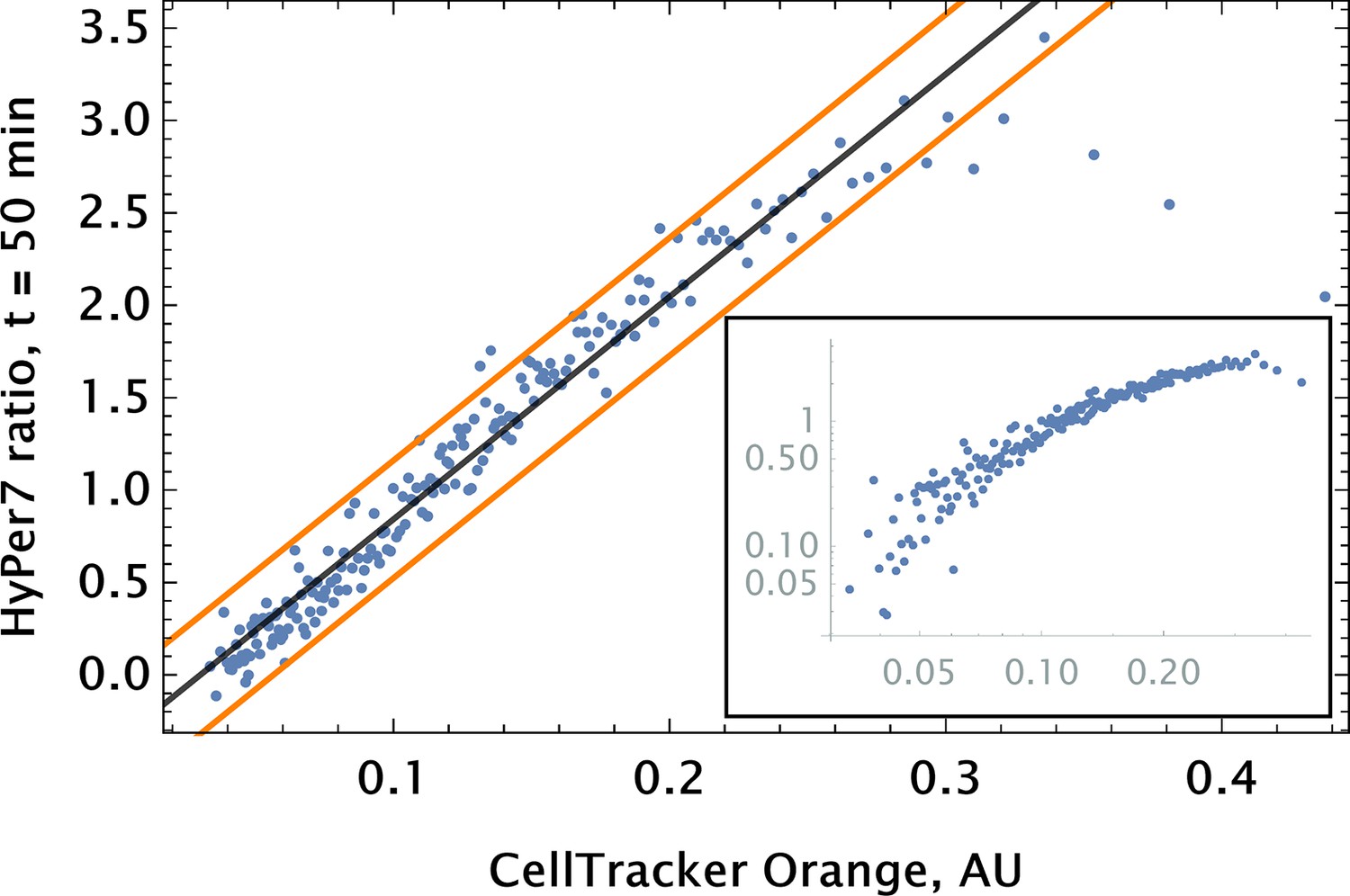
Auranofin conjugation-free barcoding in HPAEC: fluorescence signal of barcode (CellTracker Orange) and drug action proxy HyPer7 sensor ( fluorescent detector) were imaged by confocal microscopy.
Auranofin was pre-mixed with CellTracker Orange dye ( concentration each) and co-delivered locally using point injection. Quantification of the relationship between drug and dye uptake was performed using coarse grained analysis. The linear model fit for the coarse-grained HyPer ratio and 95% confidence intervals are shown by black and orange lines, respectively (adjusted ). The same scatter data are shown on log-log scale in the inset to demonstrate the broad log-linear range ( fold) of tag and drug correlation.
Figure 6

siRNA design: Different GFP messenger sites in open frame are targeted by either (a) fully complementary siRNA or (b) partially complementary msiRNA small interfering RNA molecules of length 21 nucleotides.
The distance in nucleotide units is measured between the 3’ ends of targeting sites. The siRNA are non-overlapping if and overlapping otherwise. Note that pairs {siRNAi, msiRNAi} completely overlap, . Each siRNA is conjugated to biotin molecules via a cleavable (disulfide) linker (CL). (c, d) The siRNA are delivered into cells by Quantum Dot nanoparticles (QD). The QD are functionalized with streptavidin molecules (5–10 per QD nanoparticle) which are used to load siRNA and biotinylated cell penetrating peptides (CPP) guiding and anchoring the fluorescent nanoparticles into the cells. The siRNA sense strand was designed with a cleavable linker (CL) at 5’ end. The linker region contains a disulfide bond, which releases the siRNA within the reducing cytosolic environment.
Figure 7
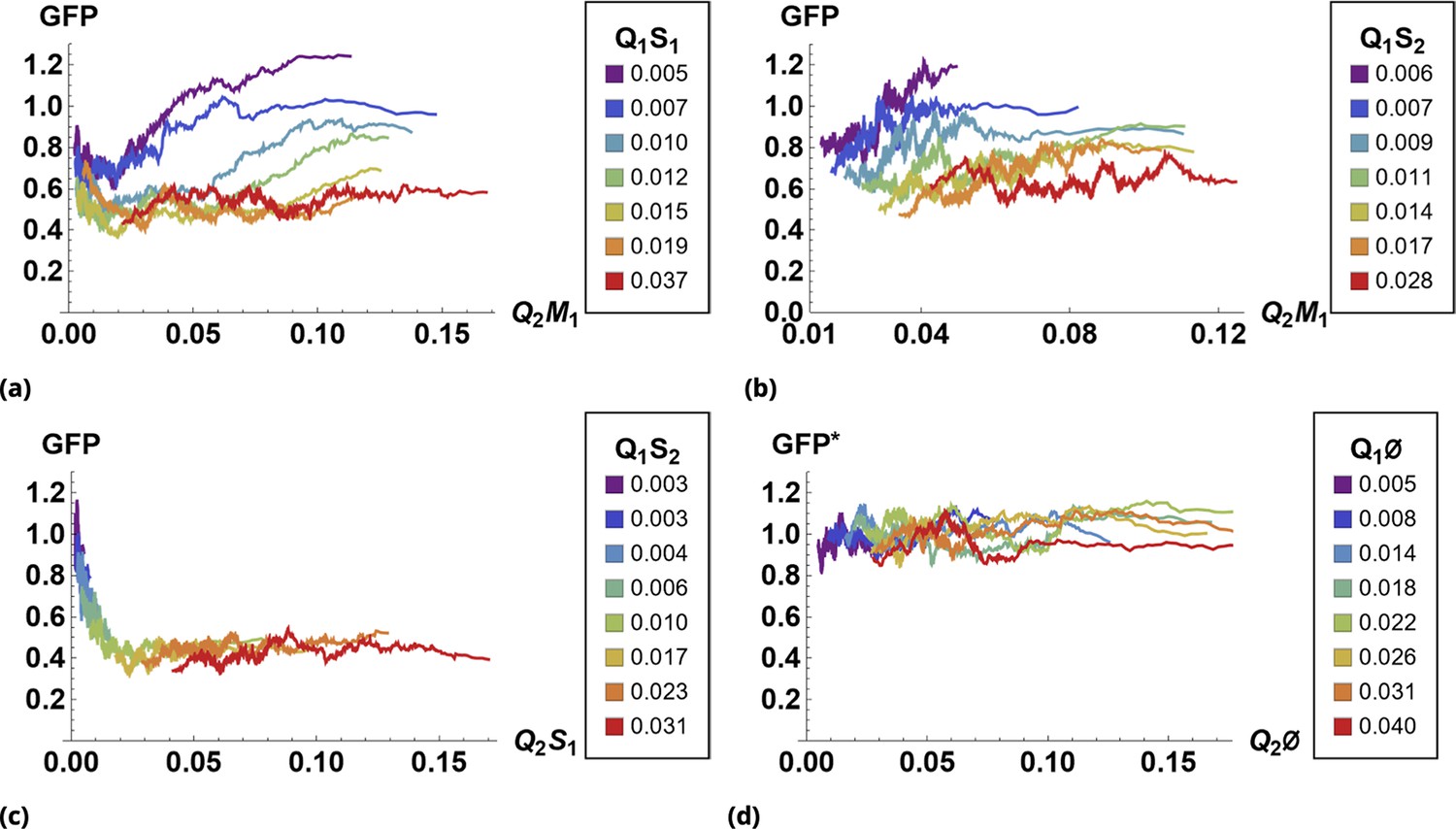
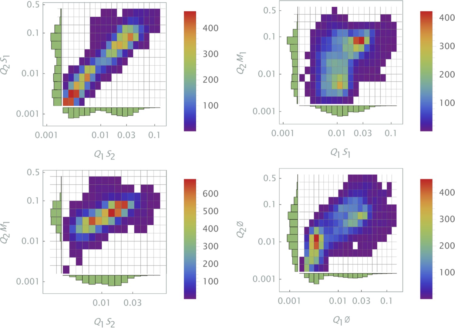
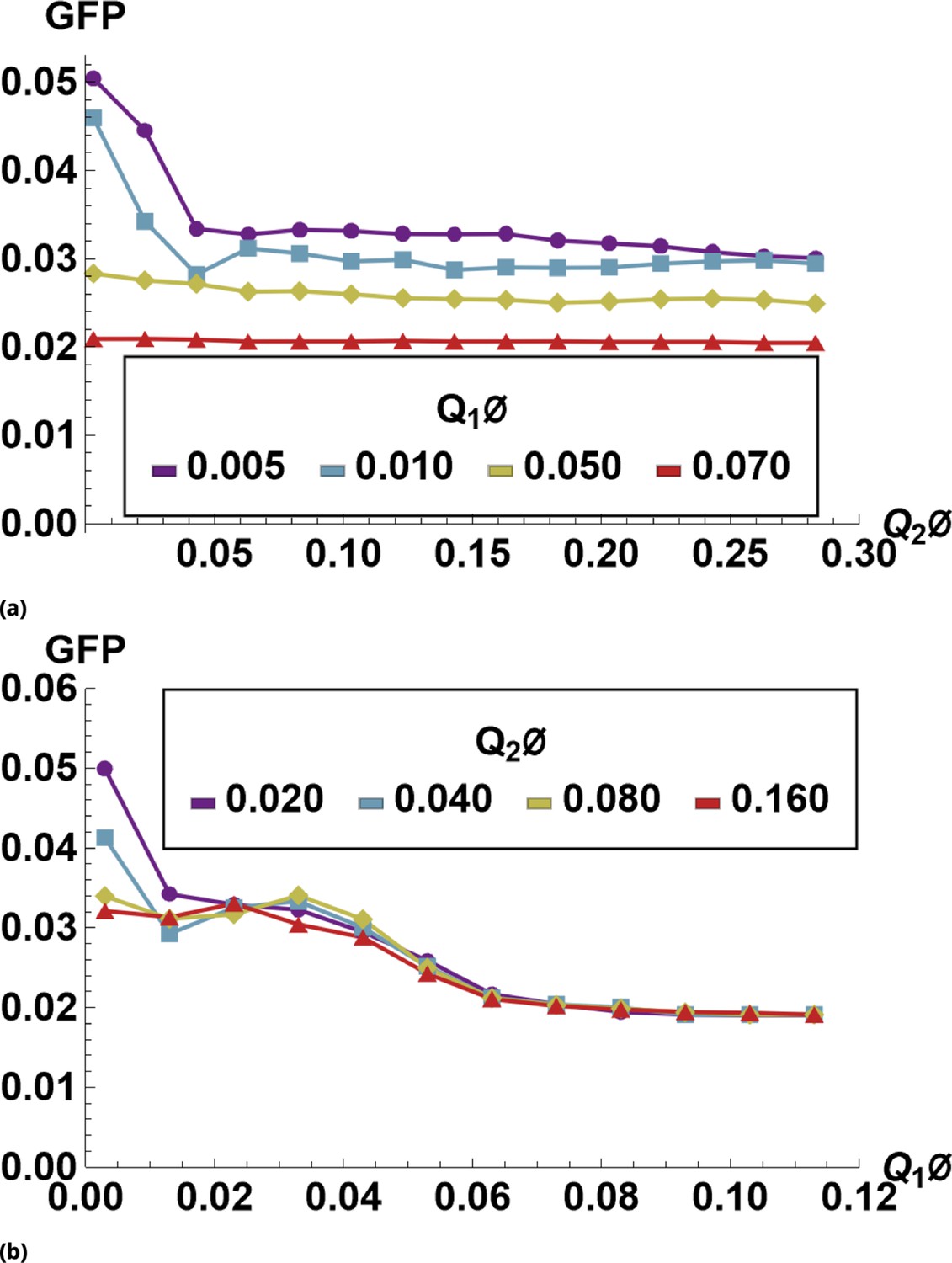
The effect of siRNA combinations on target gene (GFP) expression.
Three different siRNAs were delivered to cells by optically distinguishable QD nanocarriers (Q1 and Q2) in pair-wise fashion. Two siRNAs, siRNA1 (S1) and siRNA2 (S2), were designed to bind non-overlapping sequences of the mRNA target in completely complementary fashion. The third siRNA, msiRNA1 (M1), has almost identical primary structure as siRNA1 with a single nucleotide mutation close to the seed region. The GFP expression was normalized with respect to control samples. (a, b) Relief of GFP repression mediated by msiRNA1 is shown for different concentrations of the repressors siRNA1 and siRNA2, respectively. (c) Combination of non-overlapping repressors siRNA1 and siRNA2 results in additive/synergistic repression of target GFP expression. (d) Control sample of siRNA free QD combinations was used to account for QD toxicity for both carriers using a machine learning algorithm, and its predicative accuracy is shown here for different concentrations of Q1 and Q2.
Figure 8
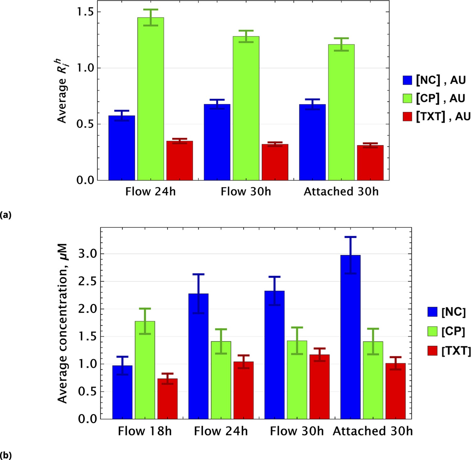
Population average of drug concentrations in either detached ("dead") or attached ("live") cells at different time points.
(a) Population average of drug concentrations in homogeneous delivery (thoroughly mixed) experiments, shown in blue, green, and red, respectively. Drugs’ concentrations are measured with respect to an auxiliary or marker dye. The first two samples correspond to detached cells harvested from the sample media at different time points and the last sample corresponds to surviving attached cells harvested at the final time point. The error bars represent standard deviations calculated by random partitioning of cell population into bins of 100 cells each. (b) The same analysis as in (a) applied to non-homogeneous (i.e., gradient or point-delivery methods) drug delivery experiments. Drugs’ absolute concentrations were determined using a linear normalization method based on intensities from homogeneously delivered samples. The first three samples correspond to detached cells harvested from the sample media at different time points, and the last sample corresponds to surviving attached cells harvested at the final time point. The error bars represent standard deviations calculated by random partitioning of cell population into 3 bins (average drug concentrations in each bin were considered independent sample measurement).
Figure 9

Pairwise drug distributions in intact cells in either detached or attached cells at different time points.
(a) Histogram of pairwise drug distribution in intact cells. Different colors correspond to detached cells harvested from the sample media at different time points (shown in blue, yellow, and red), and surviving attached cells harvested at the final time point (shown in green). (b) Time resolved changes in drug content of dead (first three samples) and live (last sample) cells collected. The density plots represent cell count as a function of drug concentrations (log scale) at different time points.
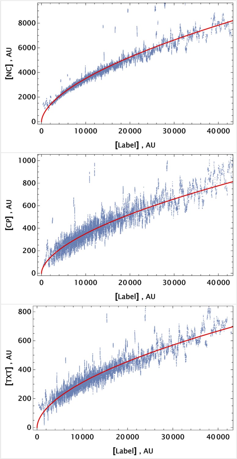
Figure 10

Time resolved measurement of attached cell density.
(a) Initial spatial distribution of drug concentrations of NC, CP, TXT, and 5-FU is shown in blue, green, red, and dark red, respectively. (b) Rows 1, 2, and 3: calculated cell local cell density at time points 18, 24, and 30 hours, respectively. Local cell density is determined by the fraction of cell-covered area within a square of . High and low cell confluency corresponds to a fractional range from 1 (blue) and 0 (red), respectively. (c) The pairwise initial drug distributions.
Figure 11
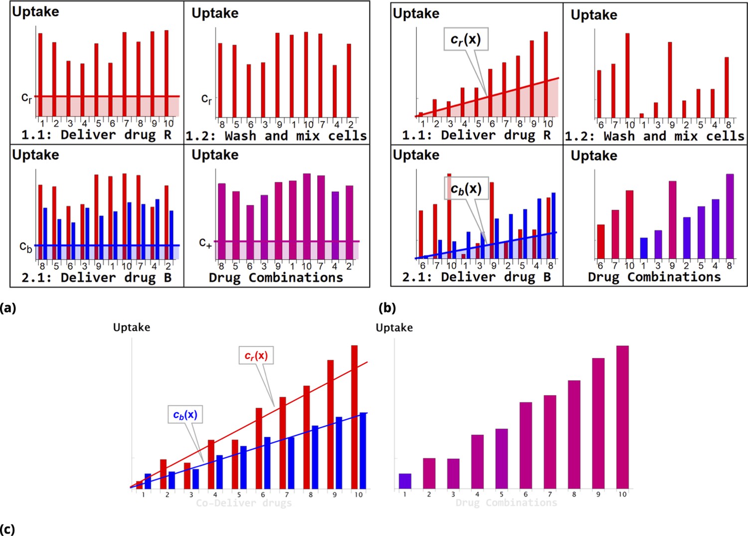
Schematic of dye/drug delivery steps for homogeneous and point injection methods (suspension cell culture).
(a) and (b), Graphic idealized illustrations of dye/drug delivery are shown for homogeneous and point injection methods, respectively. Here, x-axis values correspond to the initial position index of individual HeLa cells. Media dye concentration profiles are depicted by shaded regions on the left panel for both delivery methods. The y-axis values represent cellular dye uptake for each stage of staining (panels 1.1, 1.2, and 2.1). The final dye combinations are shown in the bottom right panels for both delivery methods (the bar color and the amplitude reflect the molar ratio and total uptake of dyes, respectively). Each wash step is mimicked by reshuffling the cell position index (cf., panels 1.1 and 1.2). Variation in dye uptake due to intrinsic cellular heterogeneity is illustrated for each of the delivery methods by imposing multiplicative noise. For simplicity, the noise in uptake is assumed to be independent for each dye. (c) Graphic illustration of the point co-delivery method.
Figure 12
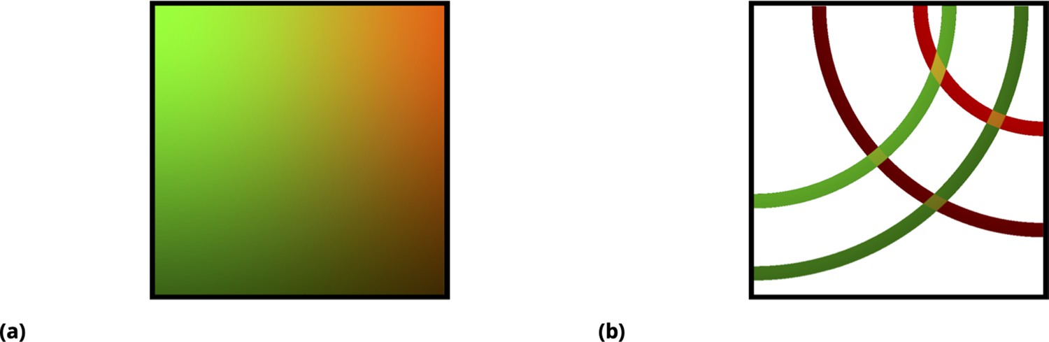
Graphic illustration of the point injection method for adherent cells in culture.
(a) Graphic illustration of the point injection method for adherent cells in culture. The idealized spatial distribution of two drugs (dyes) is shown, assuming they were delivered in the left and right upper corners (green and red color intensities correspond to drug uptake by cells). The fluctuations due to environmental factors and cell heterogeneity are ignored for simplicity, as well as the ripple effect due to finite well size. (b) Discretization (binning) of uptake for each drug corresponds to spatial partitioning by concentric annuli of finite width around the point injection origin. The intersection of the annuli for two different drugs corresponds to unique drug combinations (four different conditions, or annulus intersections, are shown).
Appendix 1—figure 1
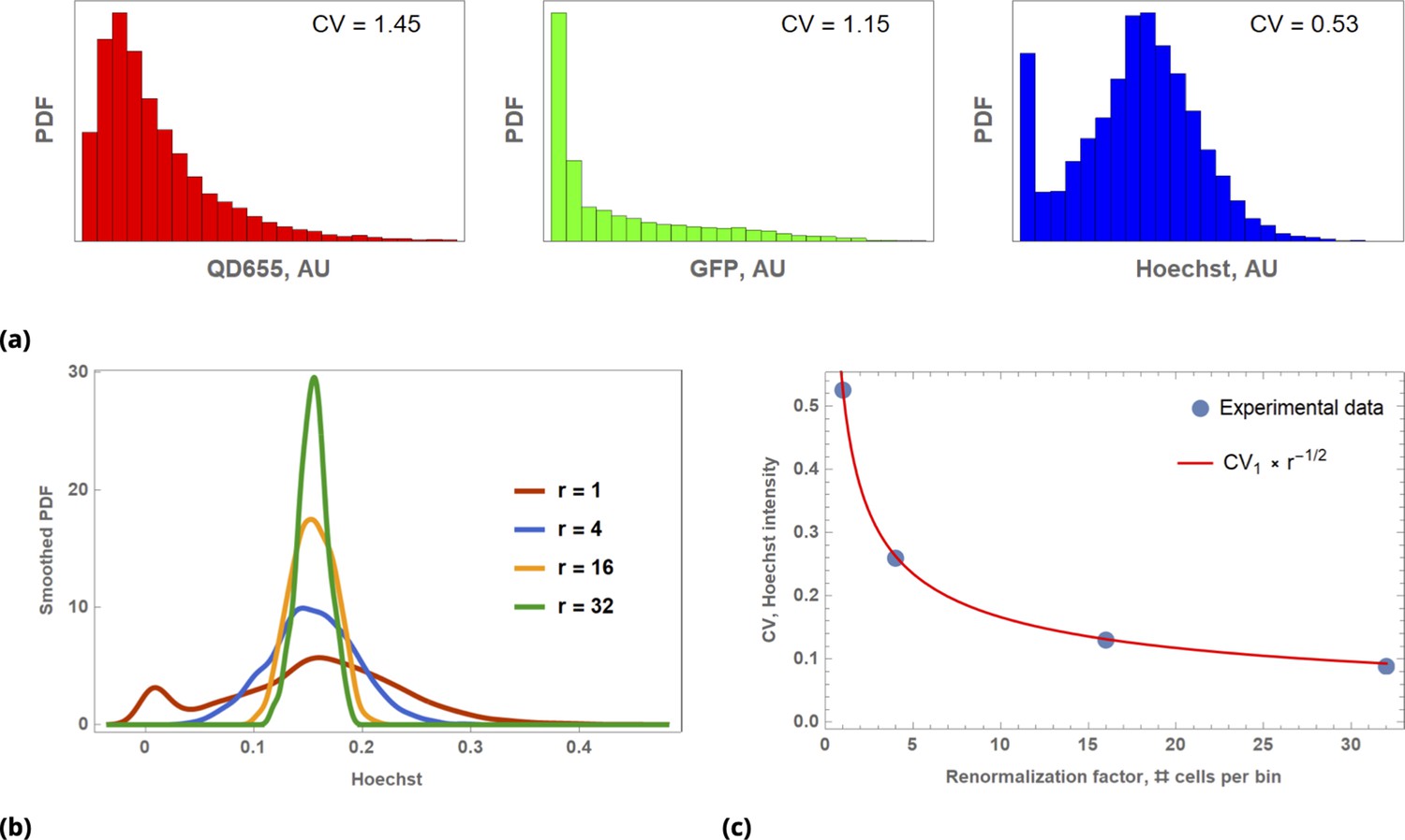
Illustration of Law of Large Numbers applied to single-cell marker fluorescence intensities: (a) Large degree of variability for different cellular phenotypes is shown for QD, GFP, and Hoechst dye single-cell fluorescence intensity data.
Each histogram represents a PDF distribution of mean pixel intensity for an ensemble of individual cells. (b) Smoothed distribution of Hoechst fluorescence intensity for different levels of renormalization. The red curve corresponds to single cell measurement statistics, , of raw data. (c) Coefficient of variation, , of a statistical ensemble is plotted as a function of scaling factor. Here, we defined as a coefficient of variation in Hoechst fluorescence intensity for raw single cell data ().
Appendix 1—figure 2
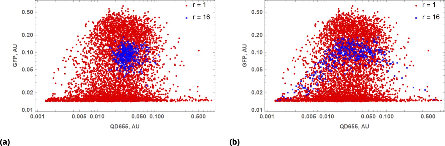
Results of multivariable data coarse-graining depend on pre-processing step(s).
(a) Scatter plot of QD655 and GFP cellular fluorescence intensities for raw () data and uniformly renormalized () data shown in red and blue, respectively. (b) The same as in (a), but renormalization was performed after sorting cells in ascending order by QD cellular fluorescence intensity.
Appendix 1—figure 3
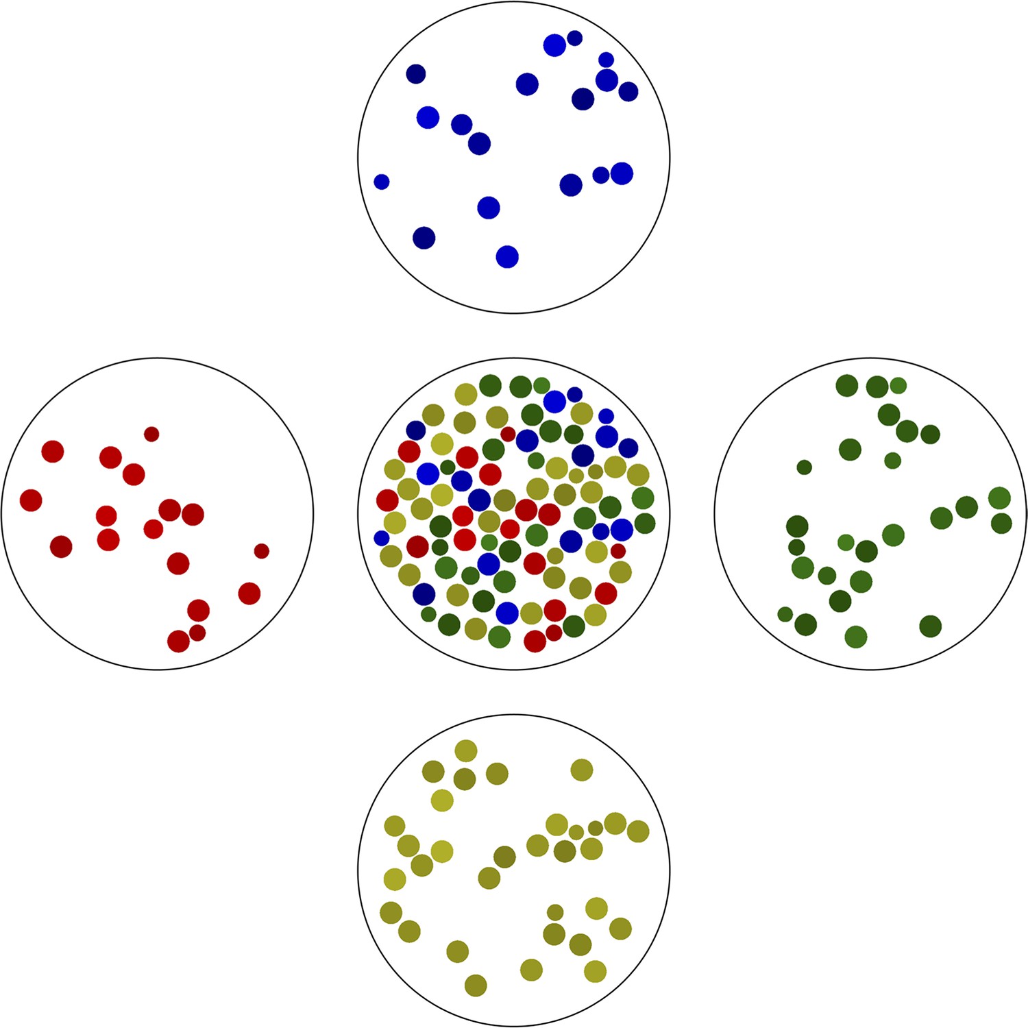
The simplest example of gated partitioning is based on the color of the objects.
Here, we partitioned all objects shown in the center into a one-dimensional grid with 4 bins spanning the color spectrum. Note the variation in ‘cell size’ in each bin.
Appendix 1—figure 4

Predictive accuracy in drug uptake using the point co-delivery method.
(a) and (b), Predictive accuracy in drug uptake using the point co-delivery method; the coefficient of variation in ‘drug’ uptake for each bin of co-delivered dyes is shown for pairs {Blue, QD655} and {Green, Red}, respectively. Here, the CV of ‘drug’ uptake is plotted against the average dye uptake for each bin comprised of 100 cells characterized by similar dye intensities. Variability in the uniform ‘drug’-dye co-delivery experiment across the entire cell population is shown as the large, filled, red circles for each condition above.
Appendix 1—figure 5
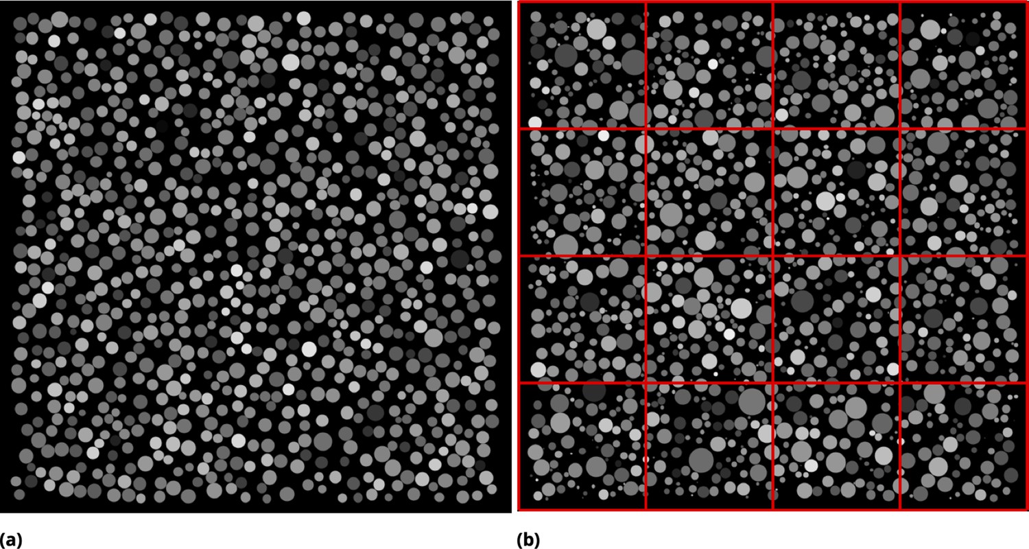
Synthetic images used to infer the optimal partition strategy for coarse-graining.
(a) Synthetic image generated by seeding identical circles at random locations in pixels square and assigning random pixel intensity uniformly across each circle. Dense culture conditions are emulated by allowing circles to touch. (b) Circles of varying radius were generated [radii are drawn from a normal distribution ( pixels)]. Pixel intensities were assigned as in (a). The concept of tile partitioning is illustrated by red mesh lines.
Appendix 1—figure 6
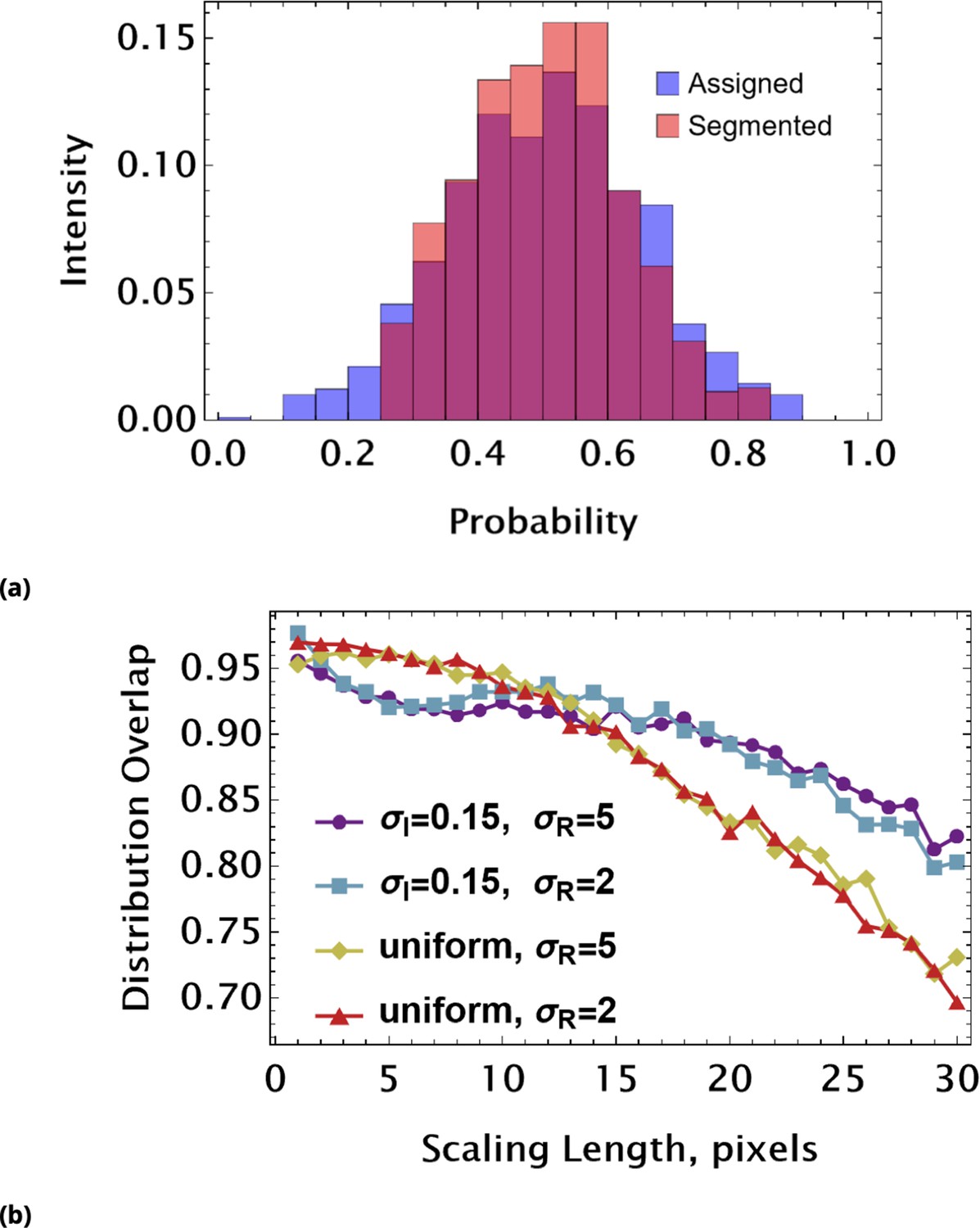
Assessing coarse-graining algorithm performance using synthetic image data (uniform pixel intensity in each cell).
(a) Graphic illustration of distribution overlap assessment. We compare the assigned (exact) distribution of mean object intensities (blue) with a ‘measured’ (orange) intensity histogram. The area under the curve is 1 for any probability distribution. Hence, the area of overlap (purple) can be used as a dimensionless parameter reflecting a match between exact and measured distributions. ‘Measured’ data here are derived using Otsu’s global thresholding (image segmentation) method. (b) The distribution overlap values as a function of scaling length used to partition synthetic images. The different curves correspond to different statistics of pixel intensities and circle radius. In all conditions, the mean values of pixel intensity and radius are and pixels, respectively. The pixel intensities were drawn from either a uniform or a normal distribution characterized by. The radii of circles were drawn from a normal distribution with or pixels.
Appendix 1—figure 7
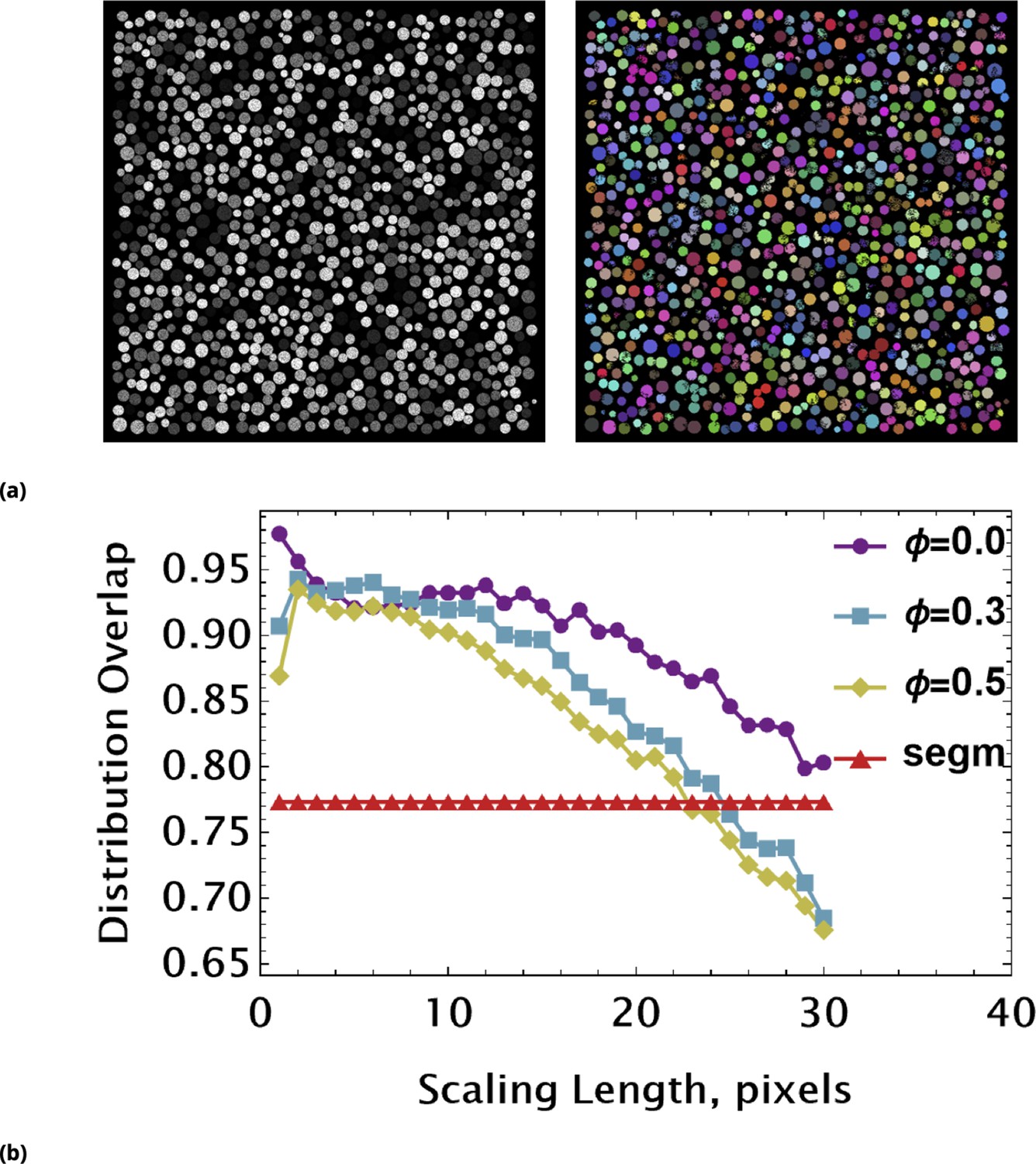
Assessing coarse-graining algorithm performance using synthetic image data (non-uniform pixel intensity in each cell).
(a) Non-uniform, noisy pixel intensities across each circle were simulated by introduction of multiplicative noise. The synthetic image (left) was segmented using a local, adaptive binarization approach. Imperfections of segmentation due to noise and touching objects are shown in the colorized binary image (right). (b) The overlap between exact and measured (using tiling renormalization) distributions are shown as a function of scaling length. Different curves are characterized by the strength of noise controlled by parameter Φ. The flat red line is an overlap value between exact and data-derived distributions using a standard segmentation approach (a).
Appendix 1—figure 8
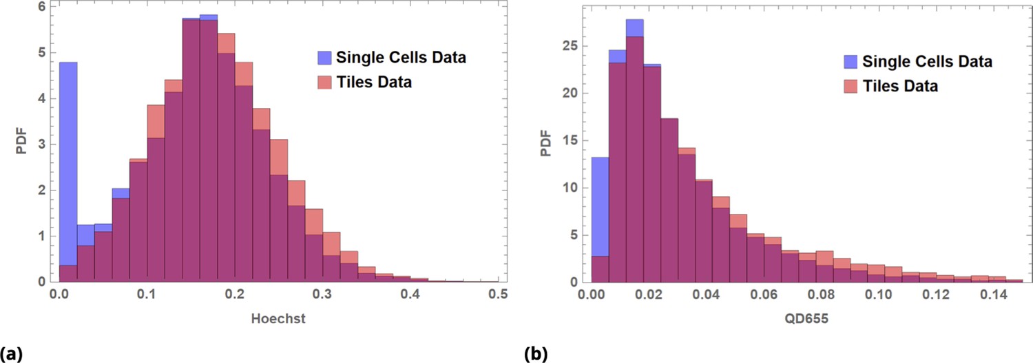
Image data renormalized by tiling for (a) Hoechst dye and (b) QD655 fluorescence intensity data.
Blue, single cell data; orange, tile data; red, overlap.
Appendix 1—figure 9
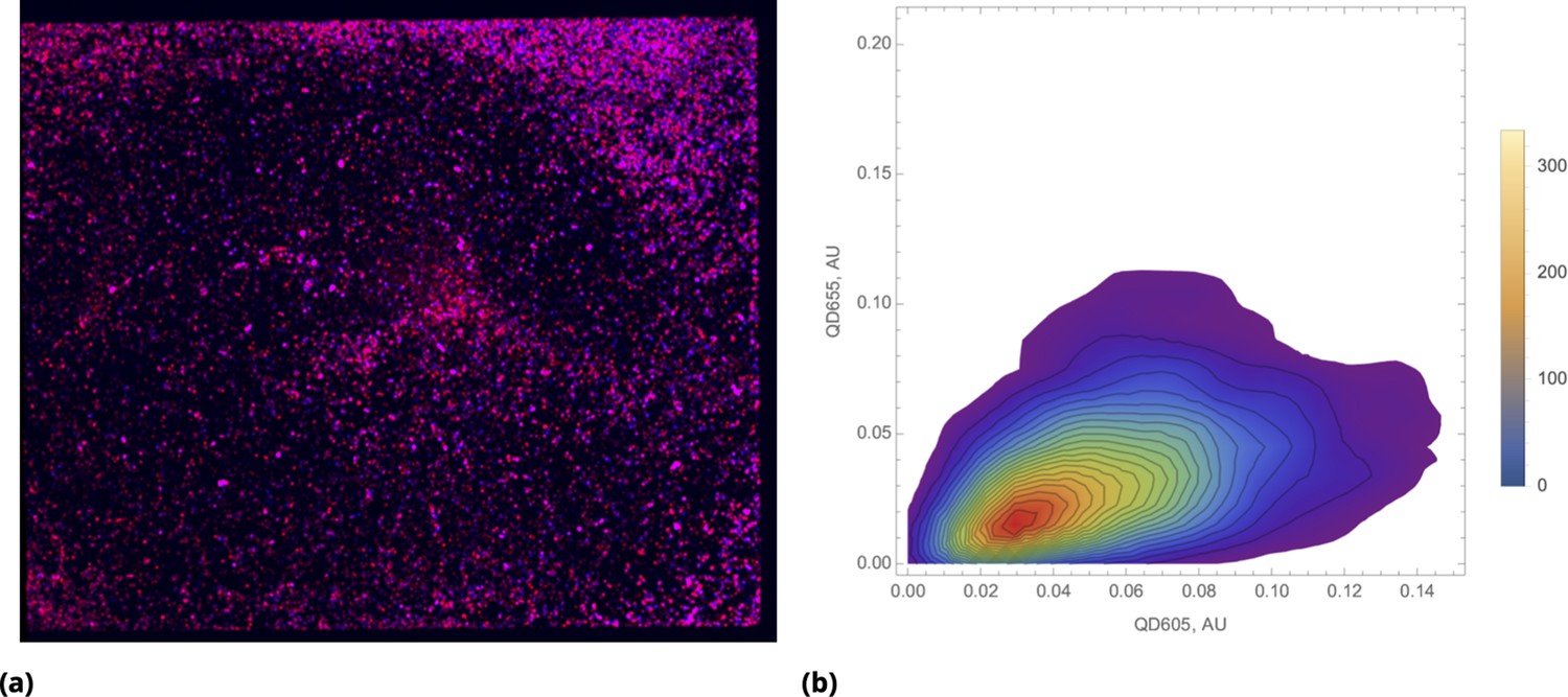
Bias towards proportional drug uptake in distribution of pre-mixed drugs.
(a) Color combined image data of the entire cell culture plate (chamber slide) after incubation with pre-mixed QD605 and QD655 nanoparticles delivered uniformly (shown in blue and red, respectively). (b) Density plot of renormalized QDs’ intensities for uniform delivery.
Appendix 1—figure 10
Density plot (log scale) of renormalized QDs’ intensities for point delivery of several representative samples.
Different siRNA combinations were delivered pair-wise by means of functionalized quantum dots, and .
Appendix 1—figure 11
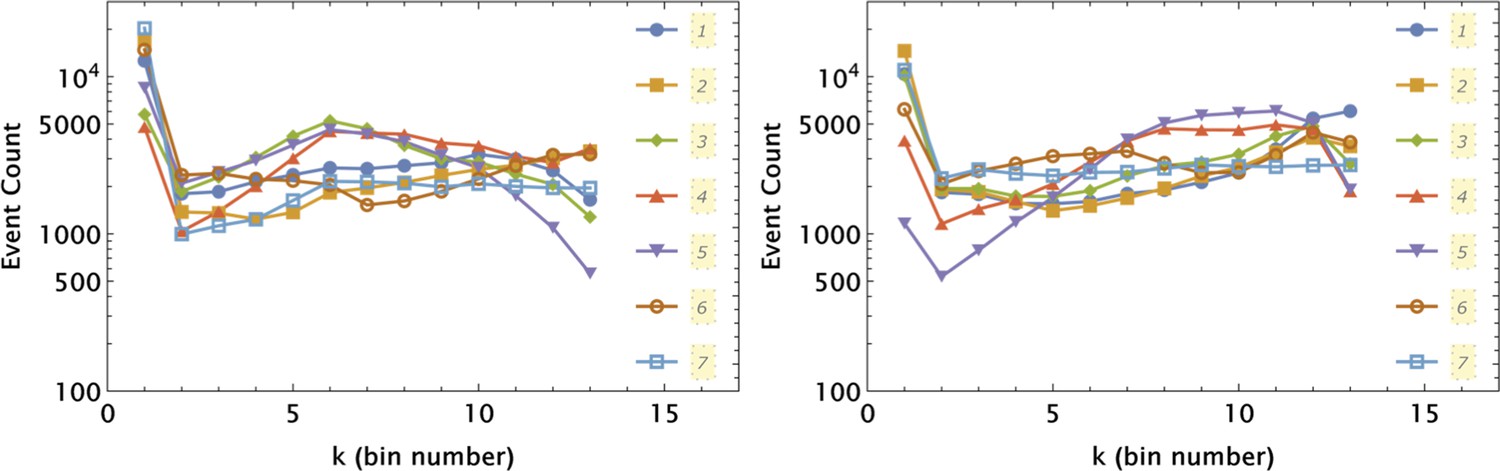
Independent application of the 1d partition mesh to and intensity data collected in 7 different samples shown by different symbols and line styles, as indicated in the left and right panels, respectively.
The partitioning was optimized for a control sample (7) and applied uniformly to all seven samples.
Appendix 1—figure 12
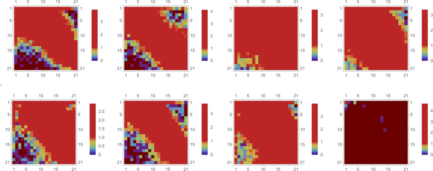
Logarithm of event number,, for a 2d partition mesh of intensity data is shown by color (brown color corresponds to no events).
Each attribute (both QD intensities) is partitioned independently into 13 bins, creating a mesh of 21x21 bins in 2d space. Here, we applied the same partitioning mesh to eight different samples. The partitioning was optimized for a control sample (7) and applied uniformly to all eight samples [the last (8th) sample corresponds to a QD- untreated specimen].
Appendix 1—figure 13
The effect of siRNA combinations on target gene (GFP) expression.
Three different siRNAs were delivered to cells by optically distinguishable QD nanocarriers (Q1, Q2) in pair-wise fashion. Two siRNAs, siRNA1 (S1) and siRNA2 (S2), were designed to bind non-overlapping sequences of the mRNA target in completely complementary fashion. The third siRNA, miRNA1 (M1), has almost identical primary structure as siRNA1 with a single nucleotide mutation close to the seed region. (a) Non-overlapping siRNAs, siRNA1 and siRNA2, were delivered to cells by either QD605 or QD655 nanocarriers respectively. (b) The same experimental setup, but QD carriers are switched for siRNAs.
Appendix 1—figure 14
Supervised machine learning prediction for GFP inhibition by QDs.
We used tiled renormalization applied to siRNA-free control sample images to derive the function that predict GFP expression numerically. Predicted values of GFP expression as a function of either QD655 or QD605 are shown in (a) and (b), respectively.
Appendix 1—figure 15
Pre-processed data from a control sample (cells labeled with CellTracker Deep Red dye only).
Data were sorted using the APC channel signal, and a moving average filter (of depth 50 events) was applied to reduce signal noise. Each channel output was fitted using a simple power law function of the APC (far-red channel) signal. Pre-processed data and the corresponding fit are shown as scattered plots and solid curves, respectively, for each channel.
Appendix 1—figure 16
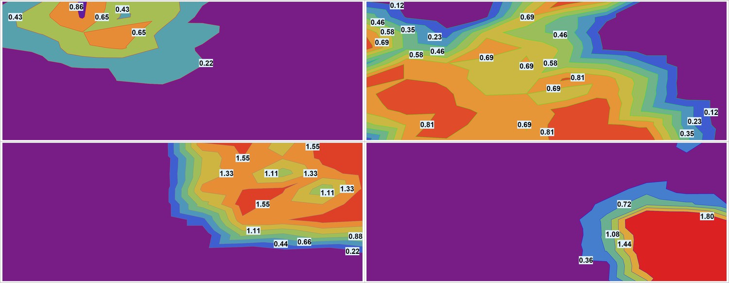
Smooth contour (elevation) plots of estimated drug densities for each of the drugs.
The images were downsampled by factor using piecewise linear interpolation for each fluorescent channel. (Each pixel in downsampled image is roughly equivalent to a single ‘cell’ in terms of the area.) The images were smoothed using Mean filter with linear window size 10 pixels to average the signal over roughly 100 ‘cells’.
Additional files
Download links
A two-part list of links to download the article, or parts of the article, in various formats.
Downloads (link to download the article as PDF)
Open citations (links to open the citations from this article in various online reference manager services)
Cite this article (links to download the citations from this article in formats compatible with various reference manager tools)
Local generation and efficient evaluation of numerous drug combinations in a single sample
eLife 12:e85439.
https://doi.org/10.7554/eLife.85439


