On the limits of fitting complex models of population history to f-statistics
- Department of Human Evolutionary Biology, Harvard University, United States
- Department of Biology and Ecology, Faculty of Science, University of Ostrava, Czech Republic
- Broad Institute of Harvard and MIT, United States
- Howard Hughes Medical Institute, Harvard Medical School, United States
- Department of Genetics, Harvard Medical School, United States
Figures
Figure 1
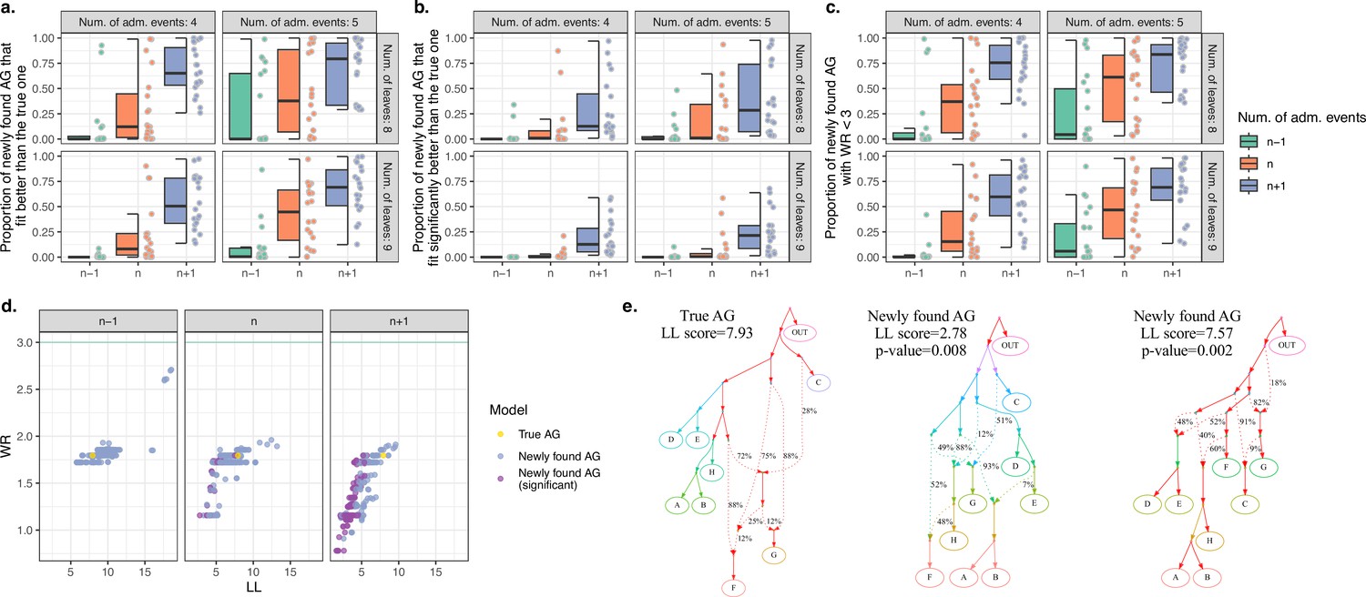
Computer simulations show that when the true admixture graph (AG) topology is complex, findGraphs frequently finds AGs fitting the data better than the true AG.
(a) Fractions of distinct AGs found with findGraphs that fit the data nominally better than the true AG (according to log-likelihood [LL] scores). The simulated datasets are grouped by complexity class (eight or nine leaves, four or five admixture events) and by the number of admixture events allowed at the topology search stage (n − 1 on the left, n in the middle, and n + 1 on the right, where n is the true number of simulated admixture events). Each dot represents a simulated random history, and 20 such histories were simulated for each complexity class. (b) Fractions of distinct AGs found with findGraphs that fit the data significantly better than the true AG (two-tailed empirical p-value of the bootstrap model comparison method <0.05). (c) Fractions of distinct AGs found with findGraphs that fit the data well in absolute terms (WR < 3 SE). (d) Distinct AGs found for a particular simulated history (eight groups and four admixture events) in the LL and WR coordinates. Only best-fitting graphs with WR < 3 SE are shown. The fit of the true topology is shown in yellow, and topologies that fit the data significantly better than the true one are in purple. The true topology was not recovered by our findGraphs searches. (e) The true model from panel (d) and two alternative models found with findGraphs, both fitting significantly better than the true one (based on the bootstrap p-value) and very different topologically. This is presented as an example of very high topological diversity seen among well-fitting models. Model parameters (graph edges) that were inferred to be unidentifiable (see Appendix 1, Section 2.F) are plotted in red.
Figure 2
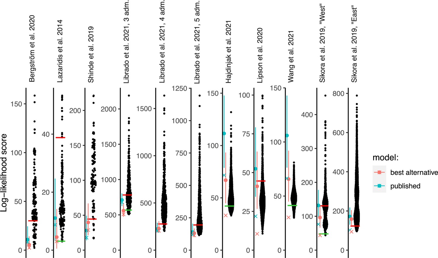
Log-likelihood (LL) scores of published graphs (those shown in Table 1) and automatically inferred graphs.
Each dot represents the LL score of a best-fitting graph from one findGraphs iteration (low values of the score indicate a better fit); only topologically distinct graphs are shown. LL scores for the published models and best-fitting alternative models found are shown by blue and pink x’s, respectively. Bootstrap distributions of LL scores for these models (vertical lines, 90% CI) and their medians (solid dots) are also shown. Lower scores of the fits obtained using all single-nucleotide polymorphisms (SNPs), relative to the bootstrap distribution, indicate overfitting. Green and red horizontal lines show the approximate locations where newly found models consistently have fits significantly better or worse, respectively, than those of the published model. In the case of the Bergström et al., Lazaridis et al., and Hajdinjak et al. studies, one or more worst-fitting models were removed for improving the visualization. The setups shown here (population composition, number of groups and admixture events, topology search constraints) match those shown in Table 1.
Figure 3
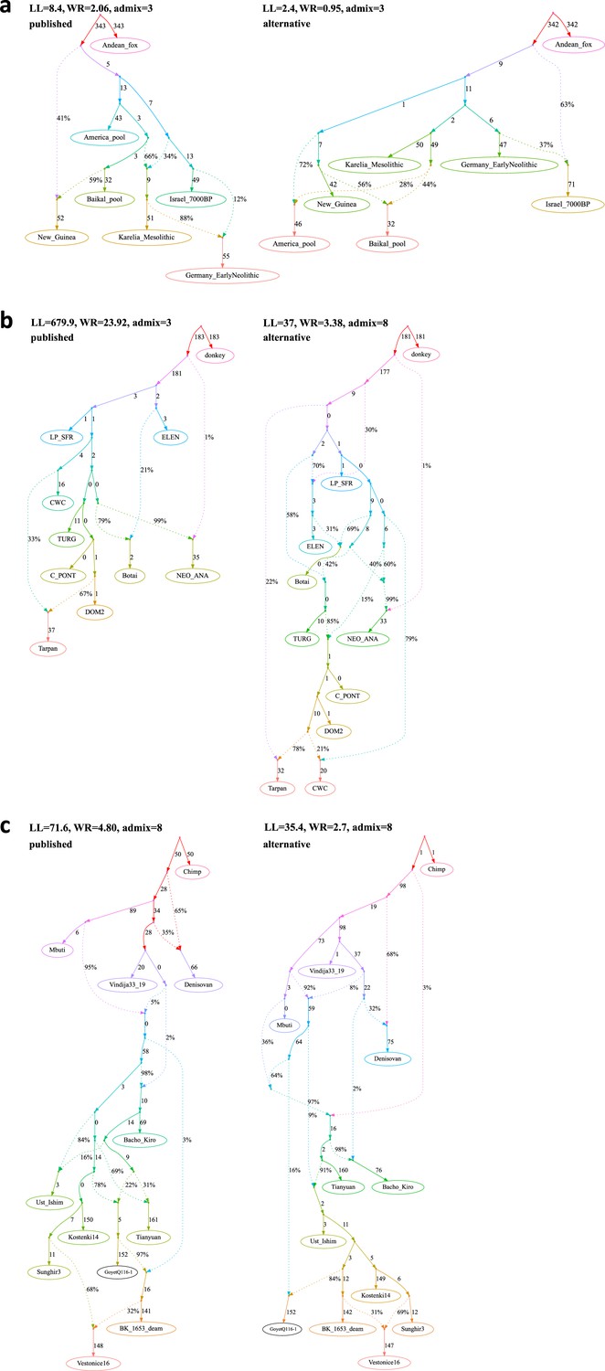
Published graphs and selected alternative models from three studies for which we explored alternative admixture graph (AG) fits.
In all cases, we selected a temporally plausible alternative model that fits nominally or significantly better than the published model and has important qualitative differences compared to the published model with respect to the interpretation about population relationships. In all but one case, the model has the same complexity as the published model shown on the left with respect to the number of admixture events; the exception is the re-analysis of the Librado et al., 2021 horse dataset since the published model with three admixture events is a poor fit (worst Z-score comparing the observed and expected f-statistics has an absolute value of 23.9 even when changing the composition of the population groups to increase their homogeneity and improve the fit relative to the composition used in the published study). For this case, we show an alternative model with 8 admixture events that fits well and has important qualitative differences from the point of view of population history interpretation. The existence of well-fitting AG models does not mean that the alternative models are the correct models; however, their identification is important because they prove that alternative reasonable scenarios exist that are qualitatively different from published models. Model parameters (graph edges) that were inferred to be unidentifiable (see Appendix 1, Section 2.F) are plotted in red. (a) The graph published by Bergström et al., 2020 (on the left) and a nominally better fitting graph for dogs that is more congruent to human history (on the right). For both species, Baikal and Native American groups are mixed between European- and East Asian-related lineages, and a ‘Basal Eurasian’ lineage contributes to West Asian groups; these features are all characteristic of human history but absent in the published dog graph. (b) The graph published by Librado et al., 2021 (modified population composition, on the left) and a significantly better fitting AG that is temporally and geographically plausible (on the right). In contrast to the published graph, in this graph with eight mixture events (the minimum necessary to obtain an acceptable statistical fit to the data), a lineage maximized in horses associated with Yamnaya steppe pastoralists or their Sintashta descendants (C-PONT, TURG, or DOM2) contributes a substantial proportion of ancestry to the horses from the Corded Ware Complex (CWC). Thus, in this model both CWC humans and horses are mixtures of Yamnaya and European farmer-associated lineages. This is qualitatively different from the suggestion that there was no Yamnaya-associated contribution to CWC horses which was a possibility raised in the paper. The AG with eight admixture events is also different from the published model in that it shows a fitting model where the Tarpan horse does not have the history claimed in the study (as an admixture of the CWC and DOM2 horses). (c) The graph published by Hajdinjak et al., 2021 (on the left) and a significantly better fitting AG, but without a specific lineage shared between the Bacho Kiro Initial Upper Paleolithic group and East Asians (on the right). In this model, all the lineages shared between Bacho Kiro IUP and East Asians contributed a large fraction of the ancestry of later European hunter–gatherers as well, and thus this graph does not imply distinctive shared ancestry between the earliest modern humans in Europe and later people in East Asia, and instead could be explained by a quite different and also archaeologically plausible scenario of a primary modern human expansion out of West Asia contributing serially to the major lineages leading to Bacho Kiro, then later East Asians, then Ust’-Ishim, then the primary ancestry in later European hunter–gatherers.
-
Figure 3—source data 1
The published (Bergström et al., 2020) and alternative admixture graphs for dogs found with findGraphs.
Model parameters (graph edges) that were inferred to be unidentifiable are plotted in red. (a) The published model, (b) alternative models fitting nominally better than the published one, sorted by the fit score, and (c) alternative models fitting nominally or significantly (the graph framed in blue) better than the published one, sorted by the fit score.
- https://cdn.elifesciences.org/articles/85492/elife-85492-fig3-data1-v2.pdf
-
Figure 3—source data 2
Alternative admixture graphs for humans found with findGraphs for the dataset from Bergström et al., 2020.
Model parameters (graph edges) that were inferred to be unidentifiable are plotted in red. (a, b) Best-fitting models for humans sorted by the fit score.
- https://cdn.elifesciences.org/articles/85492/elife-85492-fig3-data2-v2.pdf
-
Figure 3—source data 3
The published admixture graph from Lazaridis et al., 2014 and alternative graphs found with findGraphs (seven populations, four admixture events).
Model parameters (graph edges) that were inferred to be unidentifiable are plotted in red. (a) The re-fitted published graph and (b) 10 examples of graphs inferred by findGraphs (arranged according to LL score) and fitting significantly (the graph framed in blue) or nominally better than the published model.
- https://cdn.elifesciences.org/articles/85492/elife-85492-fig3-data3-v2.pdf
-
Figure 3—source data 4
The published admixture graph from Shinde et al., 2019 and alternative graphs found with findGraphs (8 pops., 3 adm. events) relying on the original set of SNPs and group composition, and original (incorrect) algorithm for calculating f-statistics.
Model parameters (graph edges) that were inferred to be unidentifiable are plotted in red. (a) The published model; the original set of SNPs and individuals, and the original algorithm for calculating f3-statistics was used (470,389 variable sites with no missing data at the group level available). The following claim in Shinde et al., 2019 relies on the admixture graph: Primary ancestry in the Indus Periphery group forms the deepest branch in the Iranian Neolithic clade composed of the Indus Periphery, Ganj Dareh Neolithic, Hajji Firuz Neolithic, and Tepe Hissar Chalcolithic groups. (b-f) Selected alternative models fitting significantly better (graphs framed in blue), nominally better (graphs without frames), or not significantly worse (graphs framed in red) than the published one.
- https://cdn.elifesciences.org/articles/85492/elife-85492-fig3-data4-v2.pdf
-
Figure 3—source data 5
The published admixture graph from Shinde et al., 2019 and alternative graphs found with findGraphs (eight populations, three admixture events) for the modified group composition and using the updated algorithm for calculating f-statistics.
The graphs were also re-fitted on the original set of single-nucleotide polymorphisms (SNPs)/individuals and using the original algorithm for calculating f-statistics. Model parameters (graph edges) that were inferred to be unidentifiable are plotted in red. (a) The published model with three admixture events. The following claim in Shinde et al., 2019 relies on the admixture graph: Primary ancestry in the Indus Periphery group forms the deepest branch in the Iranian Neolithic clade composed of the Indus Periphery, Ganj Dareh Neolithic, Hajji Firuz Neolithic, and Tepe Hissar Chalcolithic groups. (b) Alternative models fitting nominally better than the published one and confirming all of its important topological details and (c) alternative models fitting not significantly worse than the published one and differing from it in important ways.
- https://cdn.elifesciences.org/articles/85492/elife-85492-fig3-data5-v2.pdf
-
Figure 3—source data 6
Alternative graphs allowing for an additional admixture event found with findGraphs for the dataset from Shinde et al., 2019: 8 populations, 4 admixture events, the modified group composition, and the updated algorithm for calculating f-statistics.
The graphs were also re-fitted on the original set of single-nucleotide polymorphisms (SNPs)/individuals and using the original algorithm for calculating f-statistics. Model parameters (graph edges) that were inferred to be unidentifiable are plotted in red. (a) The highest-ranking model with four admixture events that confirms all important features of the published model with three admixture events. The following claim in Shinde et al., 2019 relies on the admixture graph: Primary ancestry in the Indus Periphery group forms the deepest branch in the Iranian Neolithic clade composed of the Indus Periphery, Ganj Dareh Neolithic, Hajji Firuz Neolithic, and Tepe Hissar Chalcolithic groups. (b) Alternative models fitting not significantly worse than the highest-ranking one and contradicting the historical interpretation of the admixture graph results by Shinde et al., 2019.
- https://cdn.elifesciences.org/articles/85492/elife-85492-fig3-data6-v2.pdf
-
Figure 3—source data 7
The published admixture graphs from Librado et al., 2021 and alternative graphs found with findGraphs (10 populations, 3–5 admixture events) for the modified group composition and using the updated algorithm for calculating f-statistics.
The graphs were also re-fitted on the original set of single-nucleotide polymorphisms (SNPs)/individuals and using the original algorithm for calculating f-statistics. Selected alternative graphs found with findGraphs when more admixture events were allowed (from 6 to 9) are also shown. Model parameters (graph edges) that were inferred to be unidentifiable are plotted in red. (a) The published model, three admixture events. The following claims in Librado et al., 2021 rely on the admixture graph: (1) NEO-ANA-related admixture is absent in DOM2; (2) DOM2 and C-PONT are sister groups; (3) there is no gene flow connecting the CWC group and the cluster associated with Yamnaya horses and horses of the later Sintashta culture whose ancestry is maximized in the Western Steppe (DOM2, C-PONT, and TURG); (4) there was a gene flow from a deep-branching ghost group to NEO-ANA; (5) Tarpan is a mixture of a CWC-related and a DOM2-related lineage. (b) An alternative model with three admixture events fitting significantly better than the published one, (c) the published model, four admixture events, (d) an alternative model with four admixture events fitting not significantly worse than the published one, (e) the published model, five admixture events, (f) an alternative model with five admixture events fitting not significantly worse than the published one, (g) selected models with six admixture events, (h,i) selected models with seven admixture events (all plausible models with WR < 5 SE), (j-l) selected models with eight admixture events (all plausible models with WR < 4 SE), (m-r) selected models with nine admixture events (all plausible models with WR < 4 SE).
- https://cdn.elifesciences.org/articles/85492/elife-85492-fig3-data7-v2.pdf
-
Figure 3—source data 8
Published admixture graph from Hajdinjak et al., 2021 and alternative graphs found with findGraphs (12 populations, 8 admixture events).
Model parameters (graph edges) that were inferred to be unidentifiable are plotted in red. (a, b) The published model and its simplified representation. The following claims in Hajdinjak et al., 2021 rely on the admixture graph: (1) gene flow from the Bacho Kiro lineage to Ust’-Ishim, Tianyuan, and GoyetQ116-1; (2) the BK1653 individual belonged to a population that was related, but not identical, to that of the GoyetQ116-1 individual; (3) Vestonice is a mixture of a Sunghir-related and a BK1653-related lineage. (c-e) Selected alternative models fitting significantly better than the published one.
- https://cdn.elifesciences.org/articles/85492/elife-85492-fig3-data8-v2.pdf
Figure 4
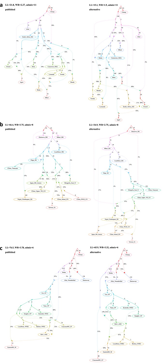
Published graphs and selected alternative models from three further studies for which we explored alternative admixture graph (AG) fits.
(a) The graph published by Lipson et al., 2020b (on the left) and a nominally better fitting AG (on the right). In contrast to the published graph, there is no single lineage specific to modern rainforest hunter–gatherers (Biaka and Mbuti) and Shum Laka (Cameroon_SMA). Rather, the primary ancestries in each group are separate deep-branching lineages (the deeper lineage they all share is also the source of the majority of ancestry in all anatomically modern humans modeled here). In contrast to the graph in the published paper, there is no West African-maximized ancestry present in mixed form in Biaka, Mbuti, and Shum Laka; archaic admixture is not limited to a subset of Africans but is present in all anatomically modern humans in various proportions; and there is no ghost modern human ancestry in Agaw, Biaka, Lemande, Mbuti, Mende, Mota, Shum Laka, and Yoruba. (b) The admixture graph published by Wang et al., 2021 (on the left) and a significantly better fitting AG meeting the constraints used to inform model building in the published paper (on the right). The finding of Onge-related admixture that is widespread in East Asia suggesting an early peopling via a coastal route is not a feature of this model. (c) The admixture graph published by Sikora et al., 2019 (simplified "Western" graph, on the left) and a nominally better fitting AG (on the right). The striking feature of the AG suggested in the paper whereby Mal’ta (MA1_ANE) derives some ancestry from a CHG-associated lineage is not a feature of this alternative model.
-
Figure 4—source data 1
The published admixture graph from Lipson et al., 2020b and alternative graphs found with findGraphs (12 populations, 11 admixture events) using the updated algorithm for calculating f-statistics.
The graphs were also re-fitted using the original algorithm for calculating f-statistics. Model parameters (graph edges) that were inferred to be unidentifiable are plotted in red. (a, b) The published model and its simplified representation. Below we list selected claims by Lipson et al., 2020b relying on the admixture graph: (1) A lineage maximized in present-day West African groups (Lemande, Mende, and Yoruba) also contributed some ancestry to the ancient Shum Laka individual, and present-day Biaka and Mbuti; (2) another ancestry component in Shum Laka is a deep-branching lineage maximized in rainforest hunter–gatherers Biaka and Mbuti; (3) ‘super-archaic’ ancestry (i.e., diverging at the modern human/Neanderthal split point or deeper) contributed to Biaka, Shum Laka, Mbuti, Lemande, Mende, and Yoruba; (4) a ghost modern human lineage (or lineages) contributed to Agaw, Mota, Biaka, Shum Laka, Mbuti, Lemande, Mende, and Yoruba. (c-q) Selected alternative models fitting nominally better than the published one.
- https://cdn.elifesciences.org/articles/85492/elife-85492-fig4-data1-v2.pdf
-
Figure 4—source data 2
The published admixture graph from Wang et al., 2021 and alternative graphs found with findGraphs (12 populations, 8 admixture events) using the updated algorithm for calculating f-statistics.
The graphs were also re-fitted using the original algorithm for calculating f-statistics. Model parameters (graph edges) that were inferred to be unidentifiable are plotted in red. (a, b) The published model and its simplified representation. The following claim in Wang et al., 2021 relies on the admixture graph: There is Onge-related admixture in the Jomon (Japan_HG_Jomon), Tibetan (Nepal_Chokhopani_SG), Upper Yellow River Late Neolithic (China_Upper_YR_LN), West Liao River Late Neolithic (China_WLR_LN), Taiwan Iron Age (Taiwan_IA), and China Island Early Neolithic (Liangdao, China_Island_EN) lineages. (c-l) Alternative models fitting significantly better than the published one.
- https://cdn.elifesciences.org/articles/85492/elife-85492-fig4-data2-v2.pdf
-
Figure 4—source data 3
The simplified published admixture graph for West Eurasian groups from Sikora et al., 2019 and alternative graphs found with findGraphs (13 populations, 6 admixture events).
Model parameters (graph edges) that were inferred to be unidentifiable are plotted in red. (a) The published model, with chimpanzee added as an outgroup and four low-level gene flows from the Neanderthal lineage dropped. The following claim in Sikora et al., 2019 relies on the admixture graph: The Mal'ta (MA1_ANE) lineage receives a gene flow from the Caucasus hunter-gatherer (CaucasusHG_LP) lineage. (b-h) Models fitting nominally better than the published one and not supporting the claim, (i) models fitting nominally better than the published one and supporting the claim.
- https://cdn.elifesciences.org/articles/85492/elife-85492-fig4-data3-v2.pdf
-
Figure 4—source data 4
The simplified published admixture graph for East Eurasian groups from Sikora et al., 2019 and alternative graphs found with findGraphs (14 populations, 6 admixture events).
Model parameters (graph edges) that were inferred to be unidentifiable are plotted in red. (a) The published model, with chimpanzee added as an outgroup and four low-level gene flows from the Neanderthal lineage dropped. (b) The published model simplified by dropping unidentifiable edges. The following claims in Sikora et al., 2019 rely on the admixture graph: (1) The Mal’ta (MA1_ANE) and Yana (Yana_UP) lineages receive a gene flow from an Asian source diverging before the Devil’s Cave (DevilsCave_N), Kolyma (Kolyma_M), USR1 (Alaska_LP), and Clovis (Clovis_LP) lineages; (2) European ancestry in the Kolyma, USR1, and Clovis lineages is closer to Mal’ta than to Yana; (3) The Devil’s Cave lineage receives no European-related gene flows, and Kolyma has less European-related ancestry than ancient Americans (USR1 and Clovis). (c) An alternative model fitting nominally better than the published one and supporting all three claims, (d-g) alternative models fitting not significantly worse than the published model.
- https://cdn.elifesciences.org/articles/85492/elife-85492-fig4-data4-v2.pdf
Appendix 1—figure 1
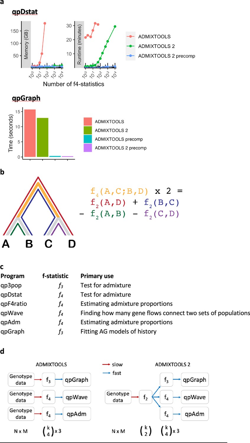
Performance comparison of f-statistic computation and AG fitting in Classic ADMIXTOOLS and ADMIXTOOLS 2 and an overview of the major ADMIXTOOLS programs.
(a) Performance comparison of f-statistic computation and AG fitting. Top: Memory usage and runtime for computing f-statistics using (1) the qpDstat program in ADMIXTOOLS v7.0.2 released in 06/2021, (2) the f4 function in ADMIXTOOLS 2 without precomputing f2-statistics, and (3) the f4 function in ADMIXTOOLS 2 with precomputed f2-statistics. (1) and (2) give identical results, whereas (3) only gives identical results in the absence of missing data, which limits its usefulness beyond a moderate number of populations. Bottom: Runtime comparison of qpGraph with and without precomputed f-statistics. (b) Illustration of f2- and f4-statistics. f2 measures the amount of drift separating any two populations, while f4 measures the amount of drift shared between two population pairs. Every f4-statistic is a linear combination of four f2-statistics. (c) Overview of the major ADMIXTOOLS programs, their primary use cases, and their associated f-statistics. (d) Schematic representation of the computations behind the ADMIXTOOLS programs qpGraph, qpWave, and qpAdm. ADMIXTOOLS 2 separates the computation of f2-statistics from the later steps in the pipeline. Shown below are the number of data points for N individuals, M SNPs, and k populations. The exact number of all possible non-redundant f2-, f3-, and f4-statistics for k populations are , , and . A small number of f2-statistics can be used to obtain a much larger number of f3- and f4-statistics and require much less storage space than the raw genotype data.
Appendix 1—figure 2
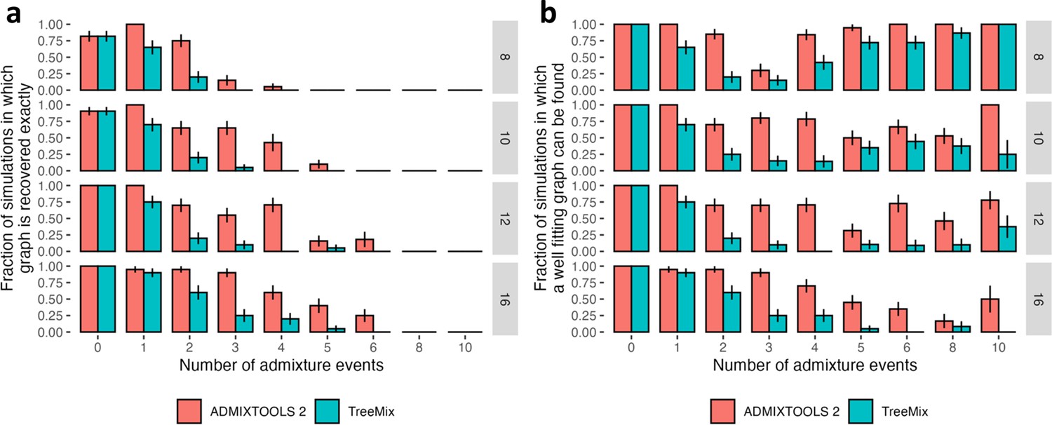
Comparison of accuracy of automated search for optimal topology in the findGraphs function of ADMIXTOOLS 2 and in TreeMix using simulated graphs with 8, 10, 12, and 16 populations, and 0–10 admixture events.
Error bars show standard errors calculated as SE2 = p (1 – p) / n, where p is the fraction on the y-axis and n is the number of simulations in each group (typically 20). In the case of ADMIXTOOLS 2, we applied findGraphs three times on each simulated dataset and picked a result with the best fit score. More details are provided in Methods. (a) Fraction of simulations where the simulated graph is recovered exactly. (b) Fraction of simulations where the simulated graph is either recovered exactly, or the score is at least as good as the score of the simulated graph, when both graphs are evaluated by ADMIXTOOLS 2. More admixture edges greatly increase the search space and make it more difficult to recover the simulated graph, but they do make it easier to find alternative graphs with good fits.
Appendix 1—figure 3 with 1 supplement
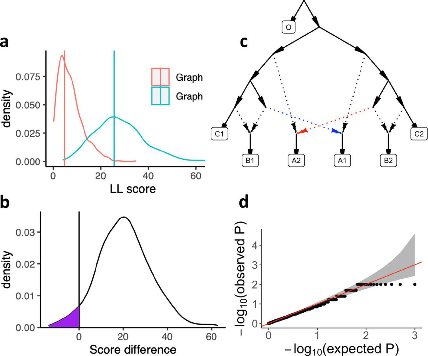
Calibrating the bootstrap model comparison approach.
(a) Bootstrap sampling distributions of the log-likelihood scores for two AGs (shown in Appendix 1—figure 3—Figure supplement 1) for the same populations fitted using real data. Vertical lines show the log-likelihood scores computed on all SNP blocks. (b) Distribution of differences of the bootstrap log-likelihood scores for both graphs (same data as in a). The purple area shows the proportion of resamplings in which the first graph has a higher score than the second graph. The two-sided p-value for the hypothesis of no difference is equivalent to twice that area (or one over the number of bootstrap iterations if all values fall on one side of zero). In this case it is 0.078. (c) The AG which was used to evaluate our method for testing the significance of the difference of two graph fits on simulated data. We simulated under the full graph and fitted two graphs that result from deleting either the red admixture edge or the blue admixture edge. These two graphs have the same expected fit score but can have different scores in any one simulation iteration. (d) QQ plot of p-values testing for a score difference between the two graphs (on simulated data) under the hypothesis of no difference, confirming that the method is well calibrated.
Appendix 1—figure 3—figure supplement 1
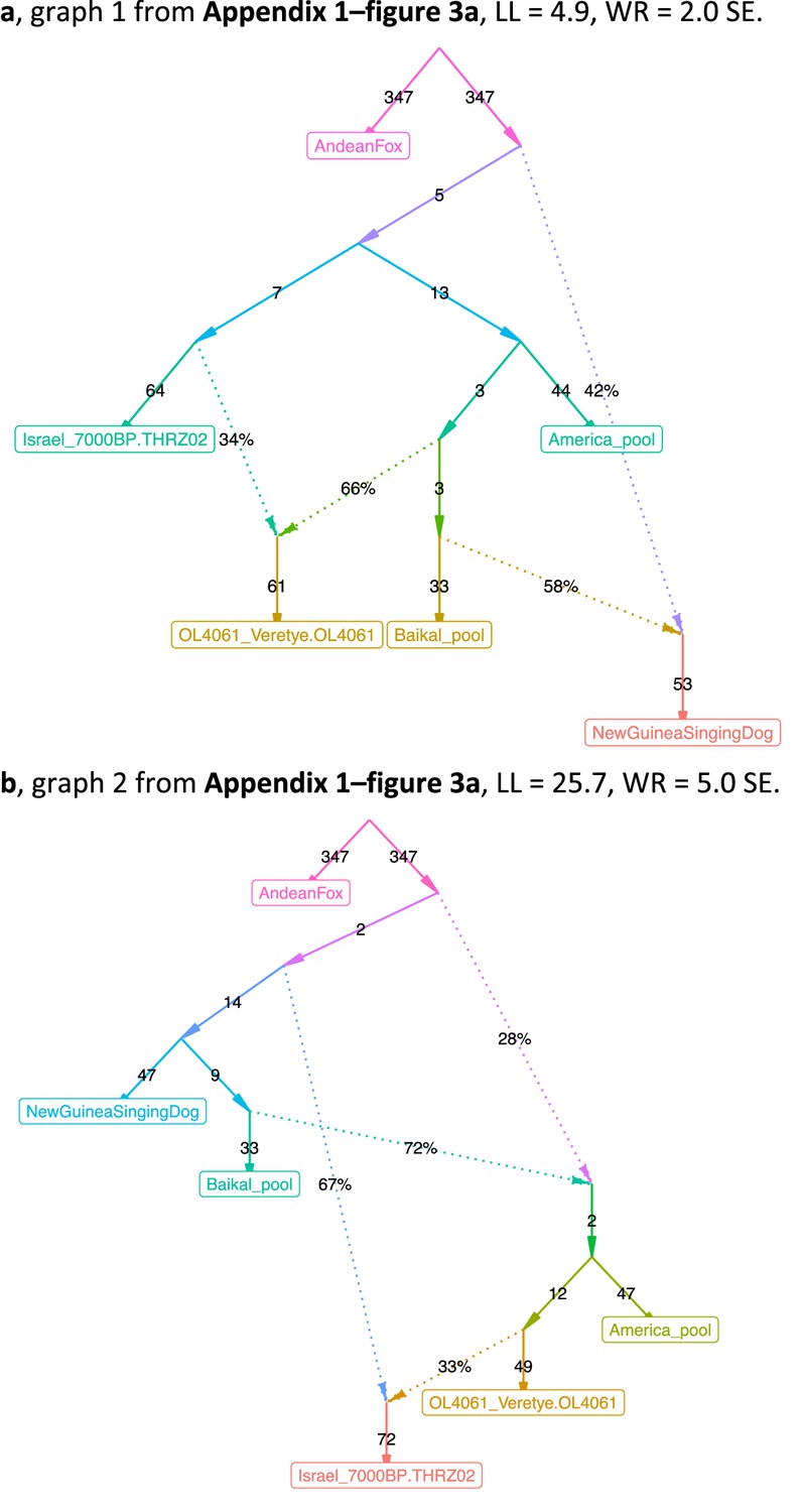
The admixture graphs compared in (Appendix 1—figure 3).
(a) Graph 1, LL = 4.9, WR = 2.0 SE. (b) Graph 2, LL = 25.7, WR = 5.0 SE.
Tables
Table 1
Published graphs in the context of automatically found graphs.
We compared graphs from eight publications to alternative graphs inferred on the same or very similar data (see Supplementary file 1 for details).
| Publication | Figure in the original publication | Groups (populations) | Admixture events | SNPs used | Publ. model: worst residual, SE | Distinct alternative topologies found | Significantly better fitting topologies, % | Non-significantly better fitting topologies, % | Non-significantly worse fitting topologies, % | Significantly worse fitting topologies, % | |
|---|---|---|---|---|---|---|---|---|---|---|---|
| Bergström et al., 2020 | 1e | 7 | 3 | 312,282 | 2.1 | 221 | 0.5 | 2.3 | 16.7 | 80.5 | |
| Lazaridis et al., 2014 | 3 | 7 | 4 | 642,247 | 2.2 | 306 | 1.0 | 12.1 | 80.7 | 6.2 | |
| Shinde et al., 2019 | 3 | 8* | 3 | 2,49,009 | 2.6 | 143 | 0.0 | 2.8 | 3.5 | 93.7 | |
| Librado et al., 2021 | 3b | 10* | 3 | 1,767,419 | 23.9 | 324 | 6.8 | 15.7 | 24.1 | 53.4 | |
| Ext 5d | 4 | 14.1 | 535 | 0.0 | 0.0 | 4.5 | 95.5 | ||||
| Ext 5e | 5 | 6.9 | 784 | 0.0 | 0.3 | 28.4 | 71.3 | ||||
| Hajdinjak et al., 2021 | 2d | 12 | 8 | 263,698 | 4.8 | 1988 | 15.7 | 55.7 | 6.6 | 22.0 | |
| Lipson et al., 2020b | Ext 4 | 12 | 11† | 211,738 | 2.3 | 2000 | 0.0 | 11.9 | 77.1 | 10.4 | |
| Wang et al., 2021 | Ext 6 | 12 | 8 | 203,753 | 3.8 | 1778 | 12.6 | 84.3 | 3.1 | 0.0 | |
| Sikora et al., 2019 | 3f (left) | 13 | 6† | 344,903 | 3.8 | 894 | 0.3 | 17.1 | 34.6 | 48.0 | |
| 3f (right) | 14 | 6† | 613,509 | 4.2 | 2785 | 0.1 | 0.9 | 9.8 | 89.2 |
-
Publication: Last name of the first author and year of the relevant publication.
-
Figure in the original publication: Figure number in the original paper where the AG is presented.
-
Groups (populations): The number of populations in each graph.
-
Admixture events: The number of admixture events in each graph.
-
SNPs used: The number of single-nucleotide polymorphisms (SNPs; with no missing data at the group level) used for fitting the AGs. For all case studies, we tested the original data (SNPs, population composition, and the published graph topology) and obtained model fits very similar to the published ones. However, for the purpose of efficient topology search, we in some cases adjusted settings for f3-statistic calculation, population composition, or graph complexity as noted in the footnotes, in Supplementary file 1, and discussed in the text.
-
Publ. model: Worst residual, SE: The worst f-statistic residual of the published graph fitted to the SNP set shown in the ‘SNPs used’ column, measured in standard errors (SE).
-
Distinct alternative topologies found: The number of distinct newly found topologies differing from the published one.
-
Significantly better fitting topologies, %: The percentage of distinct alternative topologies that fit significantly better than the published graph according to the bootstrap model comparison test (two-tailed empirical p-value <0.05). If the number of distinct topologies was very large, a representative sample of models (1/20 to 1/3 of models evenly distributed along the log-likelihood spectrum) was compared to the published one instead, and the percentages in this and following columns were calculated on this sample.
-
Non-significantly better fitting topologies, %: The percentage of distinct topologies that fit non-significantly (nominally) better than the published graph according to the bootstrap model comparison test (two-tailed empirical p-value ≥0.05).
-
Non-significantly worse fitting topologies, %: The percentage of distinct topologies that fit non-significantly (nominally) worse than the published graph according to the bootstrap model comparison test (two-tailed empirical p-value ≥0.05).
-
Significantly worse fitting topologies, %: The percentage of distinct topologies that fit significantly worse than the published graph according to the bootstrap model comparison test (two-tailed empirical p-value <0.05).
-
*
The population composition was modified, see Supplementary file 1 and the text.
-
†
Certain gene flows were removed from the published model for simplicity, see Supplementary file 1 and the text.
Table 2
Features of the published admixture graphs (AGs) that support inferences in the original studies and the level of their support in our re-analysis.
The table lists key features whose support we assessed in sets of alternative well-fitting and temporally plausible models generated by findGraphs. Since this assessment had to be performed manually, only in two cases (marked by asterisks) all models fitting better and non-significantly worse than the published one were scrutinized; in other cases only a subset of best-fitting models was examined (see the respective sections in Appendix 2 for details).
| Study | Groups/admixture events | Features of the published model supported by all temporally plausible alternative models generated by findGraphs that we scrutinized | Features of the published model lacking universal support among temporally plausible alternative models generated by findGraphs |
|---|---|---|---|
| Bergström et al., 2020 | 7/3* | Early divergence of domesticated dog lineages (prior to the date of the Karelian dog, 10,900 ya). | Siberian (Baikal), American, and East Mediterranean dog lineages are unadmixed, and the West European (Germany Early Neolithic), East European (Karelia), and dogs of Southeast Asian origin (New Guinea singing dog) are admixed. |
| Lazaridis et al., 2014 | 7/4 | Present-day Europeans represent a mixture of three ancestral sources related to the following groups: Mal’ta (MA1), West European hunter–gatherers, and early European farmers. | N/A |
| Shinde et al., 2019 | 8/3* | (1) Iranian farmer-related ancestry in the Indus Periphery group is not derived from the Hajji Firuz Neolithic or Tepe Hissar Chalcolithic groups. (2)There is Asian-related ancestry in the Indus Periphery group. | N/A |
| 8/4 | (2) There is Asian ancestry in the Indus Periphery group. | (1) Iranian farmer-related ancestry in the Indus Periphery group is not derived from the Hajji Firuz Neolithic or Tepe Hissar Chalcolithic groups. | |
| Librado et al., 2021 | 10/8 or 9 | (2) DOM2 and C-PONT are sister groups (they form a clade). (4) There is gene flow from a deep-branching ghost group to the NEO-ANA group. | (1) NEO-ANA-related admixture is absent in the DOM2 group. (3) There is no gene flow connecting the CWC group and the cluster associated with Yamnaya horses and horses of the later Sintashta culture whose ancestry is maximized in the Western Steppe (DOM2, C-PONT, TURG). (5) Tarpan is a mixture of a CWC-related and a DOM2-related lineage. |
| Hajdinjak et al., 2021 | 12/8 | (3) The Vestonice16 lineage is a mixture of a Sunghir-related and a BK1653-related lineage. | (1) There are gene flows from the lineage found in the ~45,000- to 43,000-year-old Bacho Kiro Initial Upper Paleolithic (IUP)-associated lineage to the Ust’-Ishim, Tianyuan, and GoyetQ116-1 lineages. (2) The ~35,000-year-old Bacho Kiro Cave individual BK1653 belonged to a population that was related, but not identical, to that of the GoyetQ116-1 individual. |
| Lipson et al., 2020b | 12/11 | N/A | (1) A lineage maximized in present-day West African groups (Lemande, Mende, and Yoruba) also contributed some ancestry to the ancient Shum Laka individual and to present-day Biaka and Mbuti. (2) Another ancestry component in Shum Laka is a deep-branching lineage maximized in the rainforest hunter–gatherers Biaka and Mbuti. (3) ‘Super-archaic’ ancestry (i.e., diverging at the modern human/Neanderthal split point or deeper) contributed to Biaka, Mbuti, Shum Laka, Lemande, Mende, and Yoruba. (4) A ghost modern human lineage (or lineages) contributed to Agaw, Mota, Biaka, Mbuti, Shum Laka, Lemande, Mende, and Yoruba. |
| Wang et al., 2021 | 12/8 | N/A | Admixture from a source related to Andamanese hunter–gatherers is almost universal in East Asians, occurring in the Jomon, Tibetan, Upper Yellow River Late Neolithic, West Liao River Late Neolithic, Taiwan Iron Age, and China Island Early Neolithic (Liangdao) groups. |
| Sikora et al., 2019 ‘West’ | 13/6 | N/A | The Mal’ta (MA1_ANE) lineage received gene flow from the Caucasus hunter–gatherer (CaucasusHG_LP or CHG) lineage. |
| Sikora et al., 2019 ‘East’ | 14/6 | (2) European-related ancestry in the Kolyma, USR1, and Clovis lineages is closer to Mal’ta than to Yana. | (1)The Mal’ta (MA1_ANE) and Yana (Yana_UP) lineages received gene flow from a common East Asian-associated source diverging before the ones contributing to the Devil’s Cave (DevilsCave_N), Kolyma (Kolyma_M), USR1 (Alaska_LP), and Clovis (Clovis_LP) lineages. (3)The Devil’s Cave lineage received no European-related gene flows, and Kolyma has less European-related ancestry than ancient Americans (USR1 and Clovis). |
Additional files
-
Supplementary file 1
Published graphs in the context of automatically found graphs.
We compared 22 different graphs from 8 publications to alternative graphs inferred on the same or very similar data; these findGraphs runs are highlighted in blue in the ‘Iterations’ column. In total, 51 findGraphs runs are summarized here since in some cases models more complex or less complex than the published one were explored and/or different population compositions were tested (see the ‘Topology search constraints and population modifications’ column and the footnotes for details). The columns with names in blue show various information on the published graphs or their modified versions and some properties of the published population sets. The columns with names in magenta show settings used for calculating f-statistics and for exploring the AG space, and the number of SNPs used that depends on them. The columns with names in black summarize the outcomes of findGraphs runs, that is, the properties of alternative model sets found.
Publication: Last name of the first author and year of the relevant publication.
Figure in the original publication: Figure number in the original paper where the AG is presented.
Groups (populations): The number of populations in each graph.
Singleton pseudo-haploid populations: The number of populations in the graph composed of a single pseudo-haploid individual. Calculation of negative ‘admixture’ f3-statistics is impossible for such populations since their heterozygosity cannot be estimated (see the text for details).
No. of negative f3-stats (allsnps: YES): The number of negative f3-statistics among all possible f3-statistics for a given set of populations when all available sites are used for each statistic. If no negative f3-statistics exist for a set of populations, AG fits are not affected by the ‘minac2=2’ setting intended for accurate calculation of f-statistics for non-singleton pseudo-haploid groups.
Admixture events: The number of admixture events in each graph.
Publ. model: log-likelihood (LL): Log-likelihood score of the published graph fitted to the SNP set shown in the ‘SNPs used’ column.
Publ. model: LL, median of bootstrap distr.: Median of the log-likelihood scores of 100 or 500 fits of the published graph using bootstrap resampled SNPs.
Publ. model: worst residual (WR), SE: The worst f-statistic residual of the published graph fitted to the SNP set shown in the ‘SNPs used’ column, measured in standard errors (SE).
SNPs used: The number of SNPs (with no missing data at the group level) used for fitting the AG. For all case studies, we tested the original data (SNPs, population composition, and the published graph topology) and obtained model fits very similar to the published ones. However, for the purpose of efficient topology search we adjusted settings for f3-statistic calculation, population composition, or graph complexity as shown here and discussed in the text.
Settings for calculating f2-statistics: Arguments of the extract_f2 function used for calculating all possible f2-statistics for a set of groups, which were then used by findGraphs for calculating f3-statistics needed for fitting AG models. See Appendix 1, Section 2.A for descriptions of each argument.
Topology search constraints and population modifications: Constraints applied when generating random starting graphs and/or when searching the topology space. Modifications of the original population composition are also described in this column, where applicable.
Iterations: The number of findGraphs iterations (runs), each started from a random graph of a certain complexity. For each case study, findGraphs setups that were considered optimal are highlighted in blue in this column.
Iterations confirming published graph: The number of iterations (runs) in which the resulting graph was topologically identical to the published graph. In the cases, when the published model was irrelevant since more complex graphs were explored, ‘N/A’ appears in this and subsequent columns. If less complex models were explored, the published model was still relevant since its version without selected admixture edges was tested.
Distinct alternative topologies found: The number of distinct newly found topologies. If graph complexity was equal to (or less than) that of the published graph, the published topology (or its simplified version) is not counted here. If graph complexity exceeded that of the published graph, all newly found topologies are counted. If the published topology was recovered by findGraphs, the numbers in this column are shown in bold.
Significantly better fitting topologies: The number of distinct topologies that fit significantly better than the published graph according to the bootstrap model comparison test (two-tailed empirical p-value <0.05). If the number of distinct topologies was very large, a representative sample of models (1/20 to 1/3 of models evenly distributed along the log-likelihood spectrum) was compared to the published one instead. These cases are marked as ‘a fraction of models tested’ in this column. If model complexity was higher than that of the published model, model comparison was irrelevant and was not performed.
Non-significantly better fitting topologies: The number of distinct topologies that fit non-significantly (nominally) better than the published graph according to the bootstrap model comparison test (two-tailed empirical p-value ≥0.05).
Non-significantly worse fitting topologies: The number of distinct topologies that fit non-significantly (nominally) worse than the published graph according to the bootstrap model comparison test (two-tailed empirical p-value ≥0.05).
Significantly worse fitting topologies: The number of distinct topologies that fit significantly worse than the published graph according to the bootstrap model comparison test (two-tailed empirical p-value <0.05).
Significantly better fitting topologies, %: The percentage of distinct topologies that fit significantly better than the published graph according to the bootstrap model comparison test (two-tailed empirical p-value <0.05). If the number of distinct topologies was very large, a representative sample of models (1/20 to 1/3 of models evenly distributed along the log-likelihood spectrum) was compared to the published one instead, and the percentages in this and following columns were calculated on this sample.
Non-significantly better fitting topologies, %: The percentage of distinct topologies that fit non-significantly (nominally) better than the published graph according to the bootstrap model comparison test (two-tailed empirical p-value ≥0.05).
Non-significantly worse fitting topologies, %: The percentage of distinct topologies that fit non-significantly (nominally) worse than the published graph according to the bootstrap model comparison test (two-tailed empirical p-value ≥0.05).
Significantly worse fitting topologies, %: The percentage of distinct topologies that fit significantly worse than the published graph according to the bootstrap model comparison test (two-tailed empirical p-value <0.05).
p-value best alternative vs. publ.: An empirical two-tailed p-value of a test comparing log-likelihood distributions across bootstrap replicates for two topologies, the highest-ranking newly found topology and the published topology. In some cases, the highest-ranking newly found topology (according to LL) has a fit that is not significantly better than that of the published model, but other newly found models fit significantly better despite having higher LL. P-values below 0.05 are highlighted in green.
Used in Table 1: Here the findGraphs runs featured in Table 1 are marked.
- https://cdn.elifesciences.org/articles/85492/elife-85492-supp1-v2.xlsx
-
Supplementary file 2
Statistics for shotgun sequencing of individual I8726.
- https://cdn.elifesciences.org/articles/85492/elife-85492-supp2-v2.xlsx
-
Supplementary file 3
Group labels, archaeological and geographic meta-data, and sequencing statistics for the individuals used for admixture graph fitting in Shinde et al., 2019.
See the ‘Comment’ column for a list of updates to the dataset composition we performed prior to admixture graph fitting in our study.
- https://cdn.elifesciences.org/articles/85492/elife-85492-supp3-v2.xlsx
-
Supplementary file 4
Group labels, archaeological and geographic meta-data, and sequencing statistics for the individuals used for qpAdm modelling that revisits qpAdm results by Narasimhan et al., 2019.
- https://cdn.elifesciences.org/articles/85492/elife-85492-supp4-v2.xlsx
-
Supplementary file 5
A summary of selected qpAdm results.
This is a re-analysis of the data from Narasimhan et al., 2019, with a modified group composition that is described in Appendix 2.
- https://cdn.elifesciences.org/articles/85492/elife-85492-supp5-v2.xlsx
-
Supplementary file 6
qpAdm results for separate individuals from selected target groups (Indus Periphery and others).
qpAdm p-values are shown for each individual for models of varying complexity, from one- to four-way models.
- https://cdn.elifesciences.org/articles/85492/elife-85492-supp6-v2.xlsx
-
Supplementary file 7
Comparison of the original group composition used for admixture graph fitting in Librado et al., 2021 and the modified groups used in our study.
- https://cdn.elifesciences.org/articles/85492/elife-85492-supp7-v2.xlsx
-
MDAR checklist
- https://cdn.elifesciences.org/articles/85492/elife-85492-mdarchecklist1-v2.docx
Download links
A two-part list of links to download the article, or parts of the article, in various formats.
Downloads (link to download the article as PDF)
Open citations (links to open the citations from this article in various online reference manager services)
Cite this article (links to download the citations from this article in formats compatible with various reference manager tools)
On the limits of fitting complex models of population history to f-statistics
eLife 12:e85492.
https://doi.org/10.7554/eLife.85492


