Humans parsimoniously represent auditory sequences by pruning and completing the underlying network structure
- Cognitive Neuroimaging Unit, CNRS ERL 9003, INSERM U992, Université Paris-Saclay, NeuroSpin center, France
Figures
Figure 1
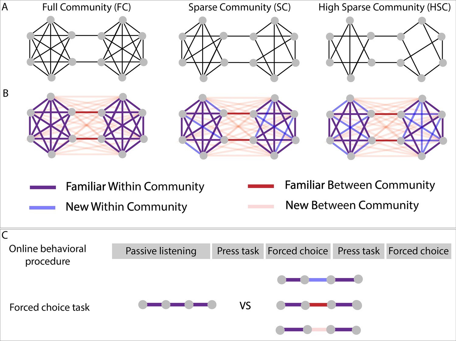
Experimental design.
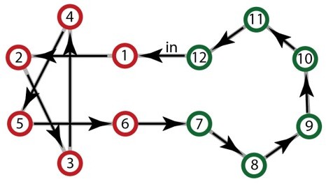
(A) Graph structure to which adult subjects were exposed in three different paradigms. (B) Graph design with color-coded conditions. Blue and pink lines represent transitions that have never been presented during the stream presentation but only during the forced-choice task. (C) Test procedure used for behavioral testing. In the press task phase, participants had to press a key when they felt there was a natural break in the sequence. In the forced-choice task, they had to choose between two quadruplets, the most congruent with the sequence they had heard. In the proposed pair, one was always a familiar within condition transition (purple transitions), and the other, one of the three other conditions.
Figure 2
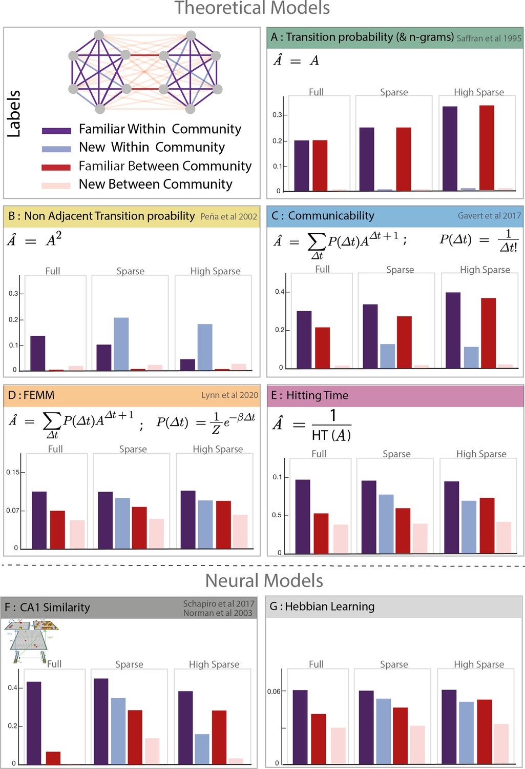
Model predictions.
Model description and predictions for the three paradigms tested. For each model, we computed the estimated familiarity (a.u.) predicted for each condition in the full, sparse, and high sparse paradigms. Although the models are partially correlated, they differ in their prediction about the familiarity of new within community transitions (light blue) which allows to separate the different models. Models D and E (free energy minimization model [FEMM] and hitting time) are two variations of the same sequence property from a statistical modeling or sequential point of view. Their predictions are thus almost identical. Models A, B, C, D, and E are theoretical metrics over the graph structure that predict more or less familiarity with the different types of transitions. Models F and G are biologically plausible neural encoding of those metrics. The box colors correspond to the conditions labeled in the top-left panel.
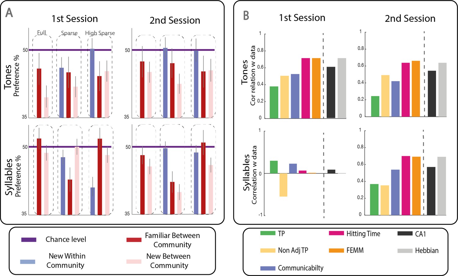
Figure 3
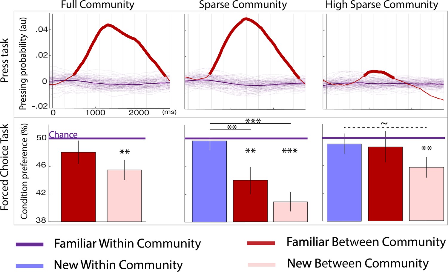
Behavioral results.
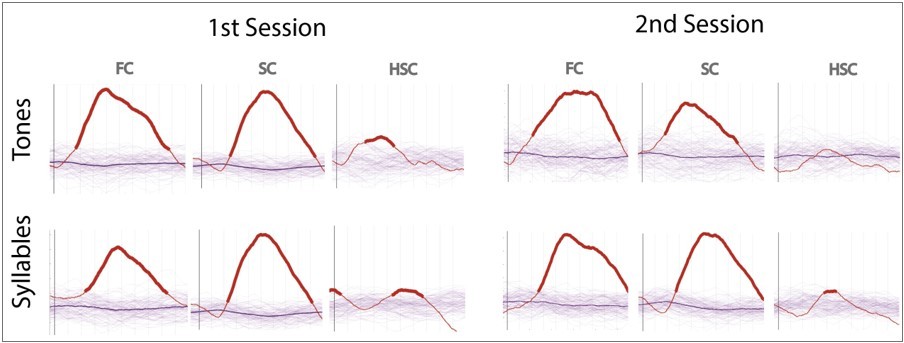
Top panel: parsing probability during the active listening phase (distribution of key presses after the offset of a given transition) purple lines: familiar within community transitions, red line: familiar between community transitions. Thin purple lines each represent a bootstrap occurrence of the parsing probability for the familiar within community transition. The bold red line indicates the time points where there was a significant increase of parsing probability after a familiar between community transition compared to a familiar within community transition. Bottom panel: familiarity measure in each paradigm: percentage of responses for each condition during the forced-choice task. By design, the chance level (50%) represents the familiar within community estimated familiarity (reference). The stars indicate significance against the reference and between conditions (pval <0.05 FDRcorr) the dotted line marginal significance (pval = 0.046 uncorr). The error bars represent the standard error for each condition. N=728 participants were tested to the Full Community (N = 250), the Sparse Community (N = 249), or the High Sparse Community (N = 228) paradigms.
Figure 4 with 2 supplements
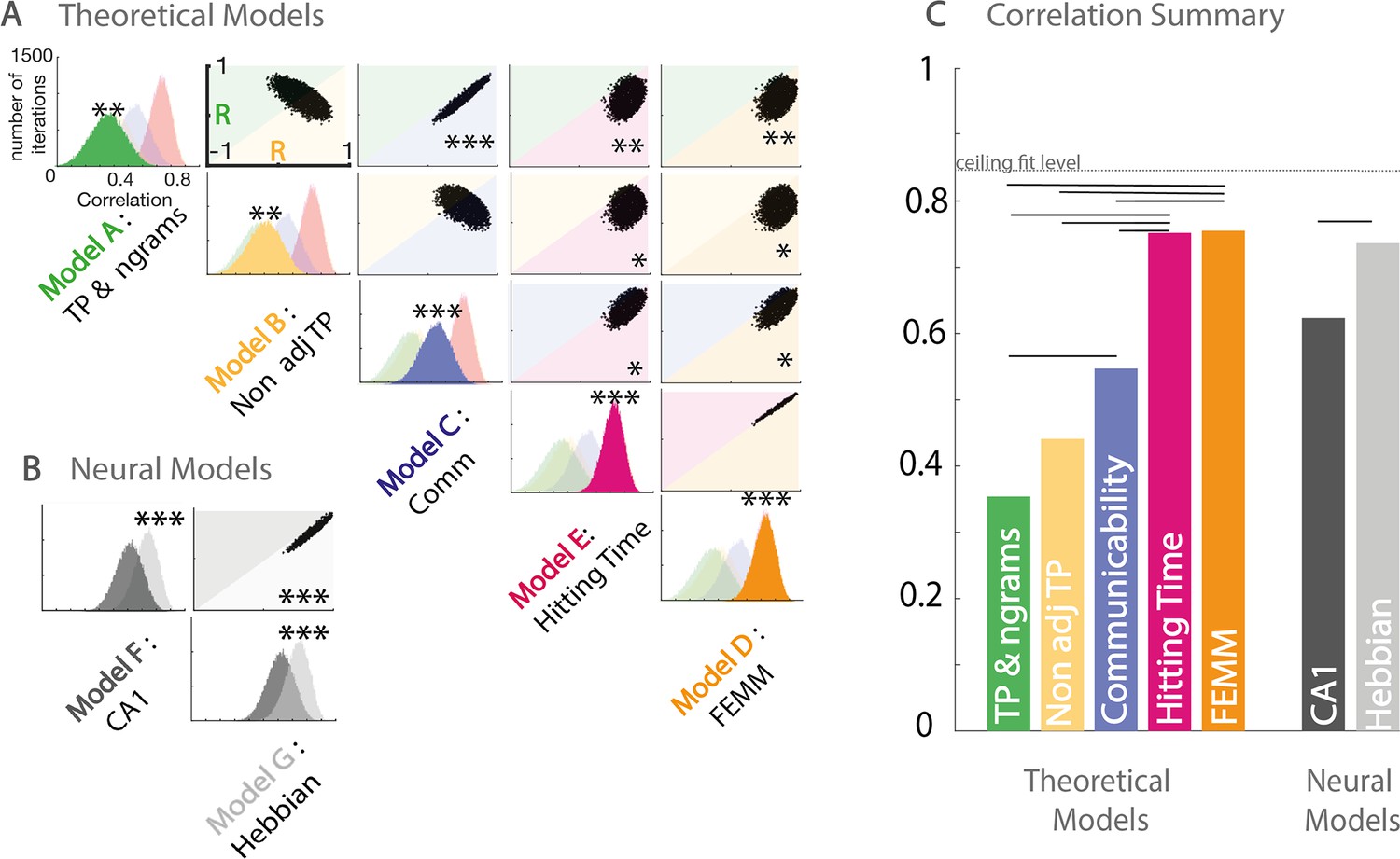
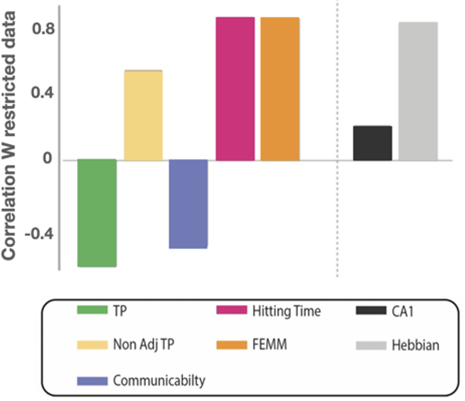
Model and data comparisons.
(A) Estimation of the correlation of the participants’ familiarity score pattern with each theoretical model (A to E) using bootstrap re-sampling. The diagonal of the matrix displays the distribution of correlations between the participants' familiarity pattern across conditions and the predictions generated by each model (A), theoretical models (A to E), and (B) neural models (F&G). Each panel of the diagonal presents the same result, the color of the relevant model being highlighted to facilitate the comparison between models. For each pair, the significance between models (indicated by stars) is estimated by counting the number of bootstrap occurrences for which one model was more correlated with the data than the other. We plotted this bootstrap as a cloud of dots in the Correlation with Model1 × Correlation with Model2 subspace. Significance is then represented by the percentage of dots above the diagonal. Models with similar predictions display a line style cloud of dots aligned along the diagonal. (B) We did the same comparison with the two neural models (F&G). (C) Summary of the correlations between each model and the behavioral data. Plain lines above the boxes indicate the significant differences between models. FEMM and hitting time (D&E) are equivalent and equally good and significantly better than all other theoretical models. For neural models, the Hebbian model (G) shows a slight, but highly significant, better fit with the participants’ scores. The dotted line indicates the ceiling fit level estimated for this dataset.
Figure 4—figure supplement 1
Group by group analysis.
In Figures 3 and 4, we presented the results of the two-forced-choice task and the correlation between human familiarity scores and the different models when mixing tone and syllables streams together. We only used data from the second two-forced-choice task session, corresponding to the maximal training. Here, we show the same analysis with tone and syllables groups separated for the first and second two-forced-choice sessions. The first session in the syllable stream did not show any sensitive pattern congruent with any of the learning model. Moreover, the data from the three different paradigms (full, sparse, high sparse) were not always in accordance. This observation might be related to participants' priors on syllable transition in sequences. Thus, a random walk among syllables strongly contradicts the usual organization of speech. Such a prior would conflict with correct learning of the structure. For tones, the range we used did not belong to any musical scale, limiting priors and making them more appropriate for such task. Nonetheless, after sufficient exposure (second block), the data from the syllable and tone groups no longer differed (none of the conditions were significantly different between the two groups), revealing that participants were able to overcome their priors about the organization of syllable sequences and learned the graph structure in the same way as in the tone experiment.
Figure 4—figure supplement 2
Correlation analysis on contradictory predictions.
We also compared the different models restricted to conditions for which the four correlated models and communicability make qualitatively different predictions (new within vs familiar between transitions in the sparse and high sparse designs). By doing so, we reduced most of the correlation between models and only tested for specific contradictory predictions. We again find that hitting time, FEMM, and Hebbian models are equivalent and better than the other models.
Figure 5
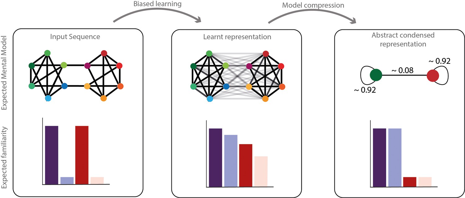
Network compression hypothesis.
Compressibility hypothesis. In the left panel, the real underlying structure of the input presented. In the middle the learned representation by humans. As described above, this representation does not completely reflect the real input structure but a biased parsimonious version of it, including pruning and generalization of transitions. In the right panel, we hypothesized a condensed representation that might be formed subsequently to simplify and compress the information. In this representation, the identity of the elements would be ignored in favor of their community label. The familiarity of each transition is represented with transparency of the edge in the network representation and each condition familiarity pattern is represented with barplots below.
Author response image 1
Author response image 2
Example of the only Hamiltonian walk compatible with a high sparse community design.
Given the first item, the full sequence becomes completely deterministic and repeats with loops of 12 elements.
Author response image 3
Author response image 4
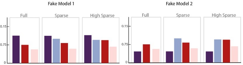
Two fake models are presented here that only differ in their predictions of the Familiarity score for the within community transitions (dark purple bar) compared to other conditions, that is, whether or not, its score is higher than the other conditions.
If we consider only the three conditions on the right without their relationship to the purple bar, both models would be considered similar and equally correlated to our data but only Fake Model 1 is consistent with our observations (All conditions < at chance level). Fake Model 2 does not represent our data because all tested conditions are preferred to within-community transitions, thus would have be chosen in our forced-choice task. Therefore, the threshold value of Familiar within community transitions = chance level = 50% is essential to disentangle the models.
Author response image 5
Author response image 6
Author response image 7
Additional files
Download links
A two-part list of links to download the article, or parts of the article, in various formats.
Downloads (link to download the article as PDF)
Open citations (links to open the citations from this article in various online reference manager services)
Cite this article (links to download the citations from this article in formats compatible with various reference manager tools)
Humans parsimoniously represent auditory sequences by pruning and completing the underlying network structure
eLife 12:e86430.
https://doi.org/10.7554/eLife.86430


