Spotless, a reproducible pipeline for benchmarking cell type deconvolution in spatial transcriptomics
- Data Mining and Modelling for Biomedicine, VIB Center for Inflammation Research, Belgium
- Department of Applied Mathematics, Computer Science and Statistics, Ghent University, Belgium
Figures
Figure 1 with 4 supplements
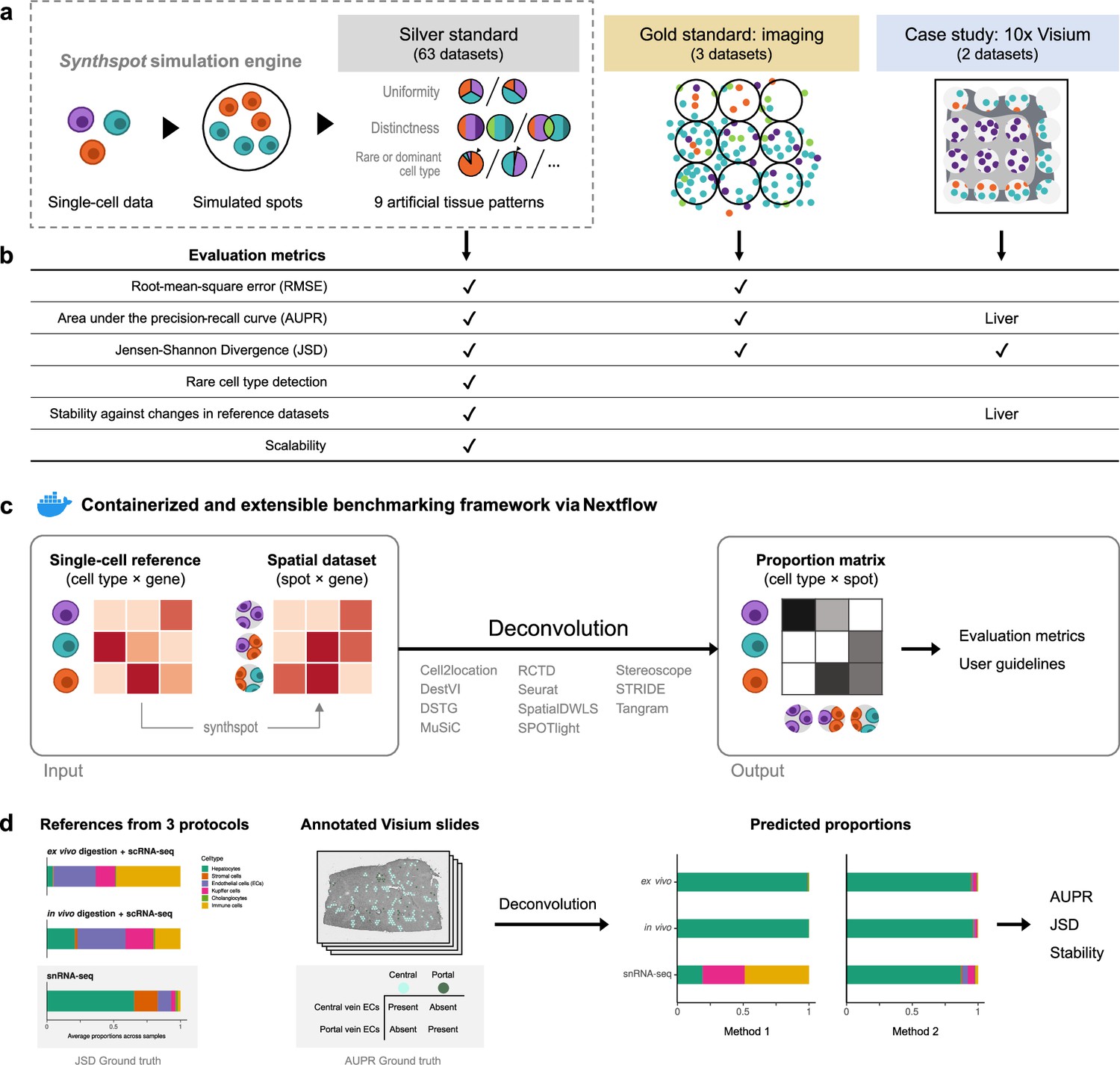
Overview of the benchmark.
(a) The datasets used consist of silver standards generated from single-cell RNA-seq data, gold standards from imaging-based data, and two case studies on liver and melanoma. Our simulation engine synthspot enables the creation of artificial tissue patterns. (b) We evaluated deconvolution methods on three overall performance metrics (RMSE, AUPR, and JSD), and further checked specific aspects of performance, that is how well methods detect rare cell types and handle reference datasets from different sequencing technologies. For the case studies, the AUPR and stability are only evaluated on the liver dataset. (c) Our benchmarking pipeline is entirely accessible and reproducible through the use of Docker containers and Nextflow. (d) To evaluate performance on the liver case study, we leveraged prior knowledge of the localization and composition of cell types to calculate the AUPR and JSD. We also investigated method performance on three different sequencing protocols.
Figure 1—figure supplement 1
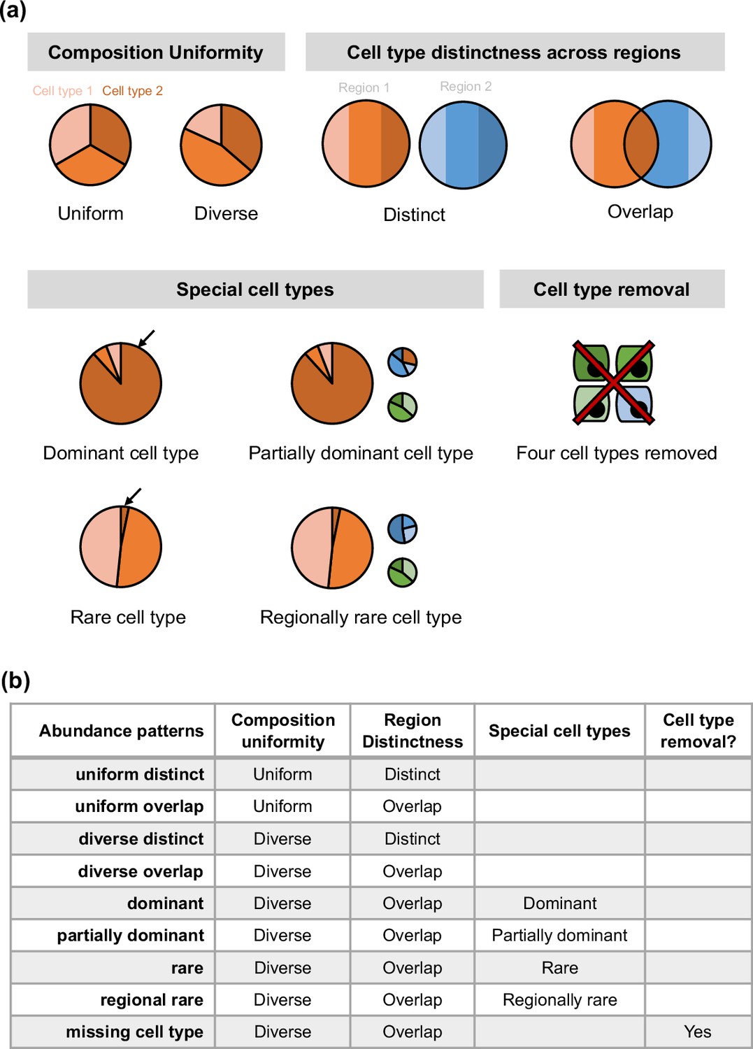
Overview of synthspot abundance patterns used in the study.
(a) Characteristics considered in synthspot include composition uniformity, cell type distinctness across regions, the presence of special cell types, or the removal of certain cell types. The pie charts represent frequency priors per region. Cell type composition in each region can be either uniform or diverse, depending on whether each cell type has the same or different number of cells per spot. Distinct and overlap refers to whether each region has a distinct set of cell types per region, or whether cell types can be found in multiple regions. Dominant cell type means that there is one dominant cell type that is 5–15 times more abundant than other cell types in all regions. In partially dominant cell type, this dominant cell type is dominant in all regions except for a region where it is equally abundant with other cell types and another region where it is absent. Rare cell type is the opposite of the dominant cell type, where one cell type is instead much less abundant than other cell types in all regions. In the regional rare cell type dataset, the rare cell type is only present in one region instead of all regions. (b) Each abundance pattern is a combination of multiple characteristics.
Figure 1—figure supplement 2

Data generation scheme of silver standards.
Silver standards are generated using half of the cells from a reference scRNA-seq dataset (generation). The other half (test) is used as the reference profile in deconvolution methods. This split is stratified by cell type. One scRNA-seq dataset gives rise to 90 synthetic datasets, as we generate nine synthspot abundance patterns with 10 replicates for each abundance pattern.
Figure 1—figure supplement 3
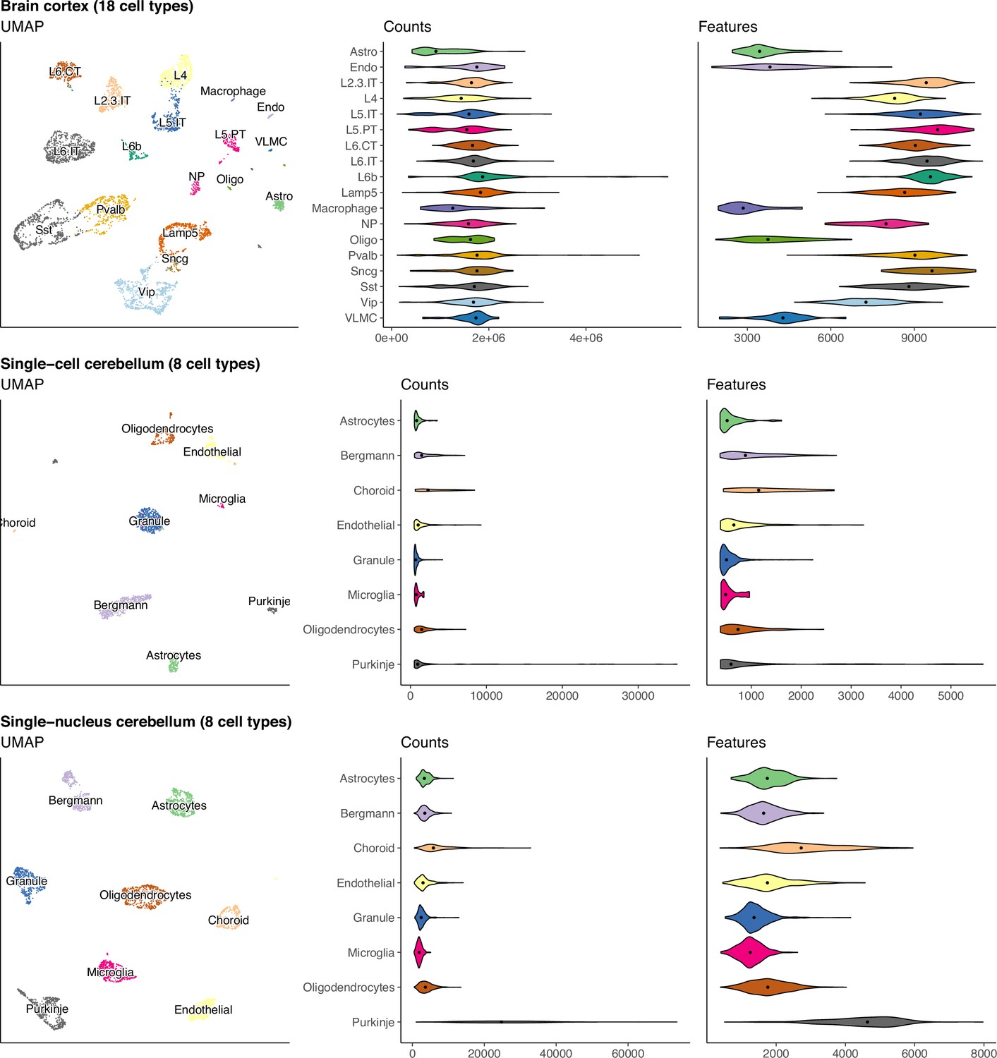
UMAP and violin plots of three of the seven scRNA-seq datasets used to generate silver standards.
Each point on the UMAP represents a single cell and the distance between two points corresponds to how similar their gene expression profiles are. The violin plots show the distribution of total number of counts and features (genes) across all cells in a cell type. The brain cortex dataset has much higher counts than the others because it was sequenced with a plate-based method (SMART-Seq), while the others were sequenced with droplet-based methods (10 x Chromium and Drop-seq).
Figure 1—figure supplement 4
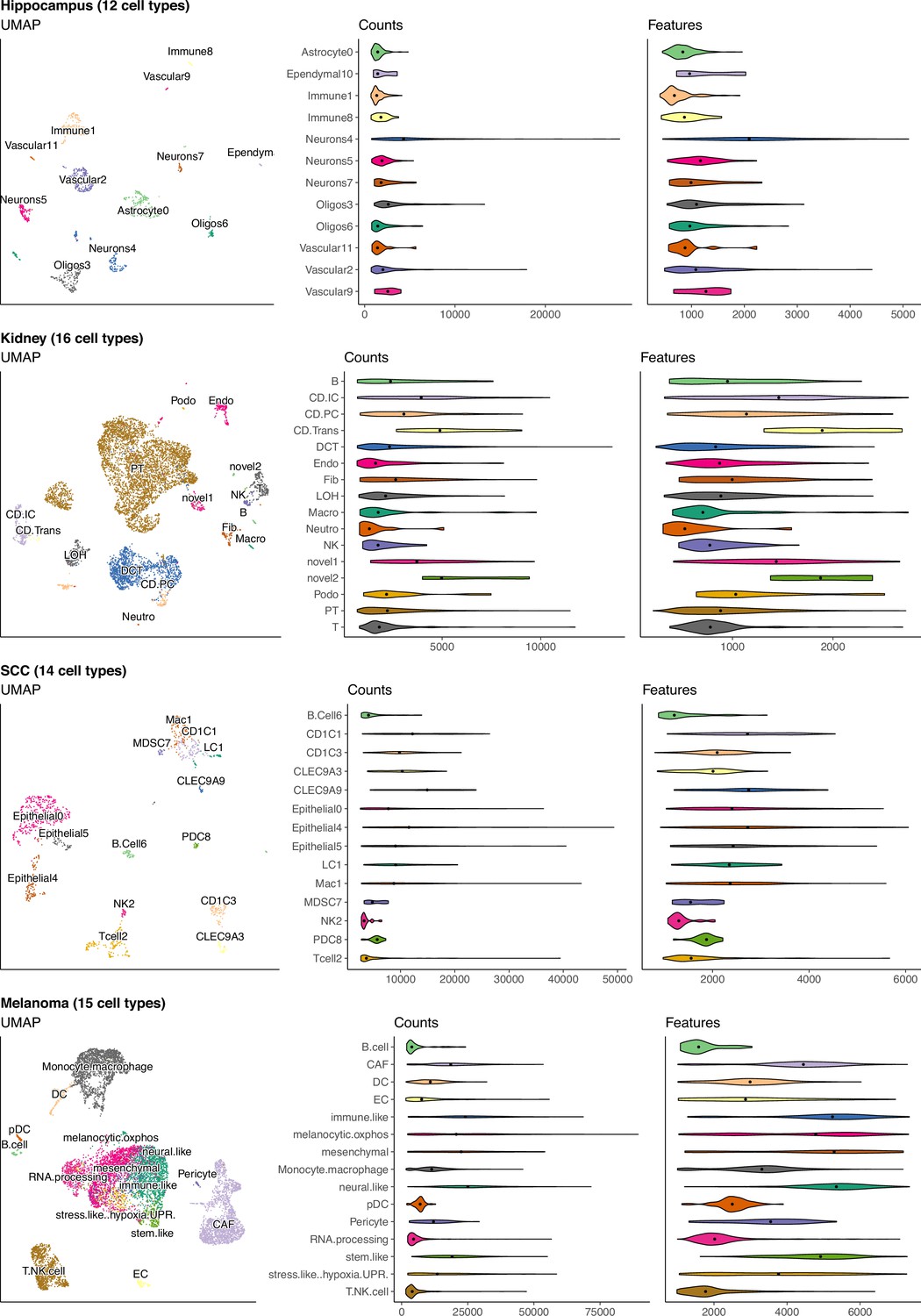
(Continuation of the previous figure supplement) UMAP and violin plots of four of the seven scRNA-seq datasets used to generate silver standards.
Each point on the UMAP represents a single cell and the distance between two points corresponds to how similar their gene expression profiles are. The violin plots show the distribution of total number of counts and features (genes) across all cells in a cell type.
Figure 2
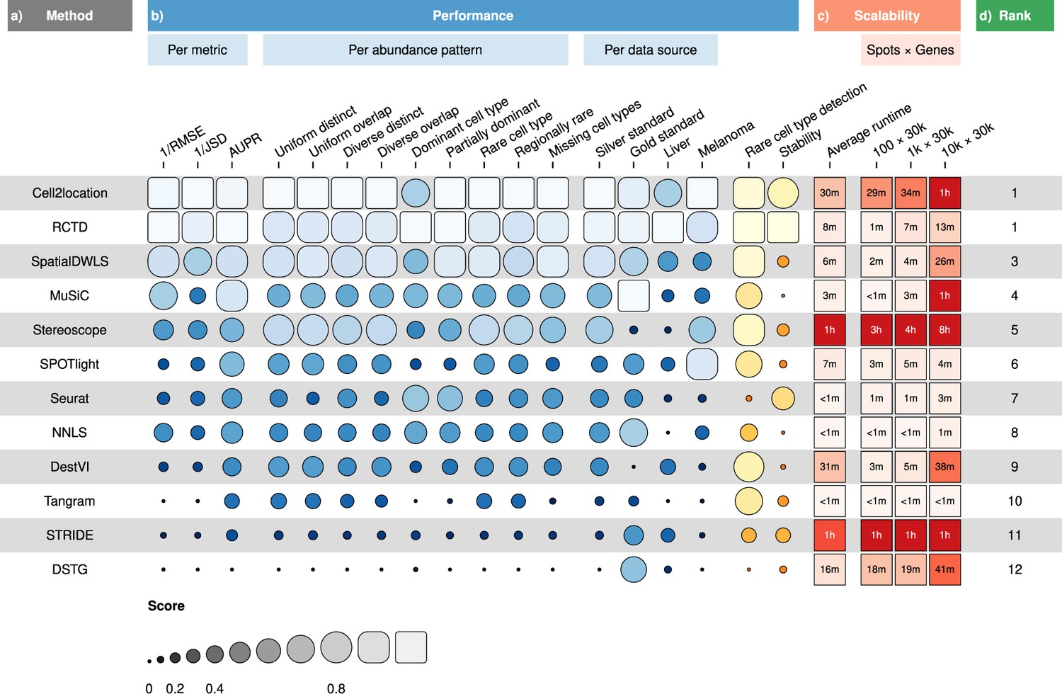
Overall results of the benchmark.
(a) Methods ordered according to their overall rankings (d), determined by the aggregated rankings of performance and scalability. (b) Performance of each method across metrics, artificial abundance patterns in the silver standard, and data sources. The ability to detect rare cell types and stability against different reference datasets are also included. (c) Average runtime across silver standards and scalability on increasing dimensions of the spatial dataset.
-
Figure 2—source data 1
Raw data table of Figure 2.
- https://cdn.elifesciences.org/articles/88431/elife-88431-fig2-data1-v1.xlsx
Figure 3 with 6 supplements
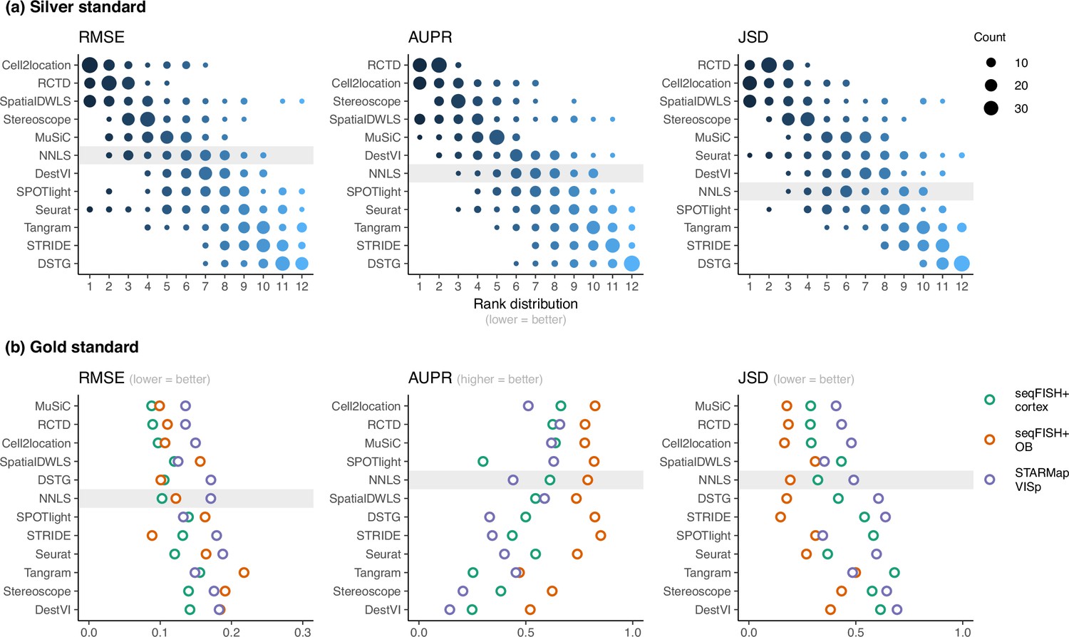
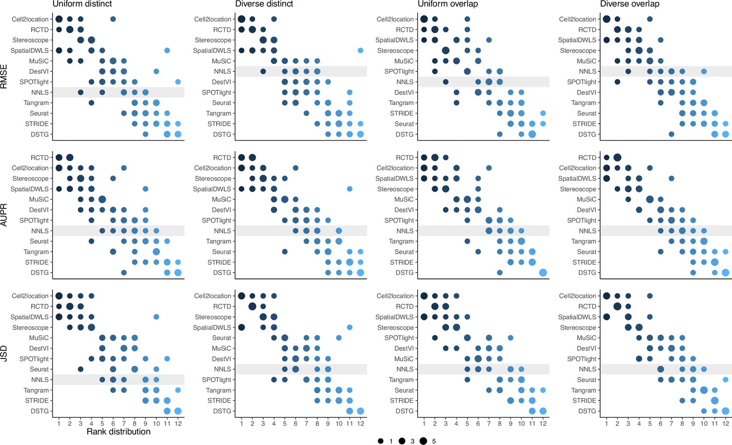
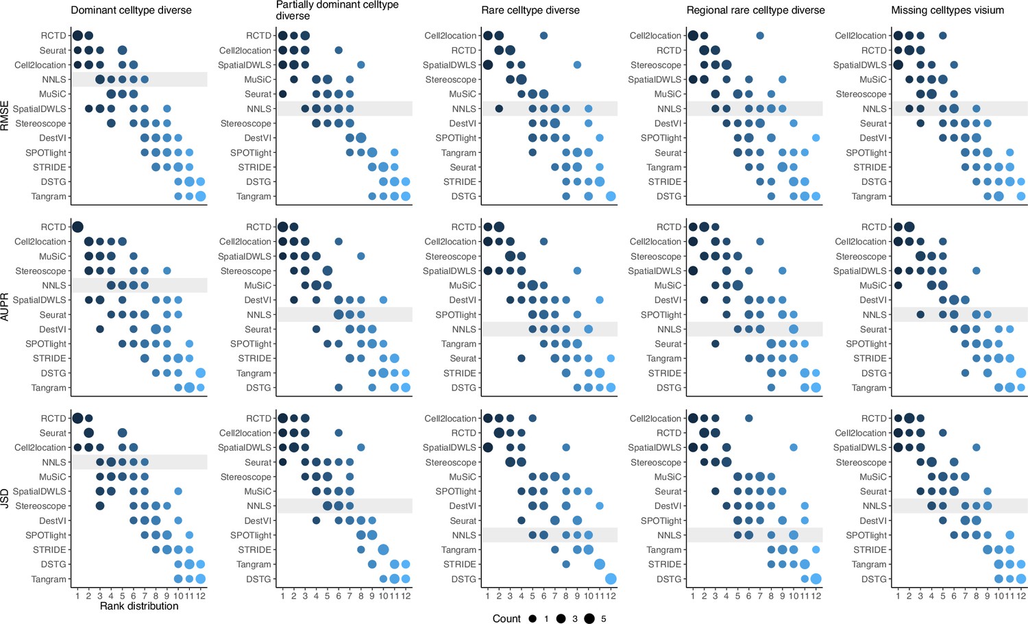
Method performance on synthetic datasets, evaluated using root-mean-squared error (RMSE), area under the precision-recall curve (AUPR), and Jensen-Shannon divergence (JSD).
Non-negative least squares (NNLS) is shaded as a baseline algorithm. Methods are ordered based on the summed ranks across all 63 and three datasets, respectively. (a) The rank distribution of each method across all 63 silver standards, based on the best median value across ten replicates for that standard. (b) Gold standards of two seqFISH+ datasets and one STARMap dataset. We took the average over seven field of views for the seqFISH+ dataset.
-
Figure 3—source data 1
Raw data table of Figure 3.
- https://cdn.elifesciences.org/articles/88431/elife-88431-fig3-data1-v1.xlsx
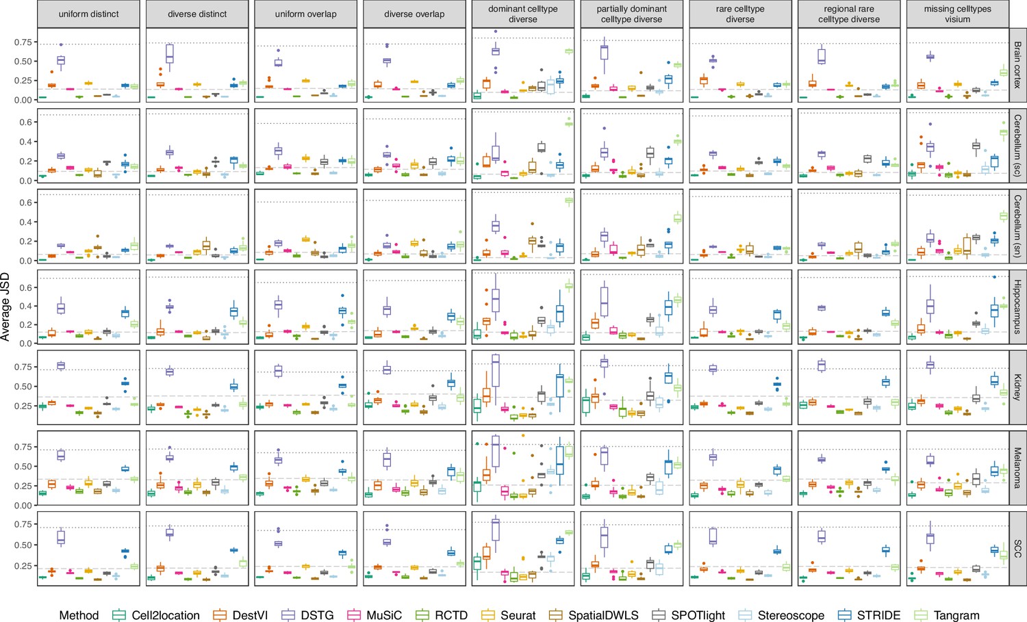
Figure 3—figure supplement 1
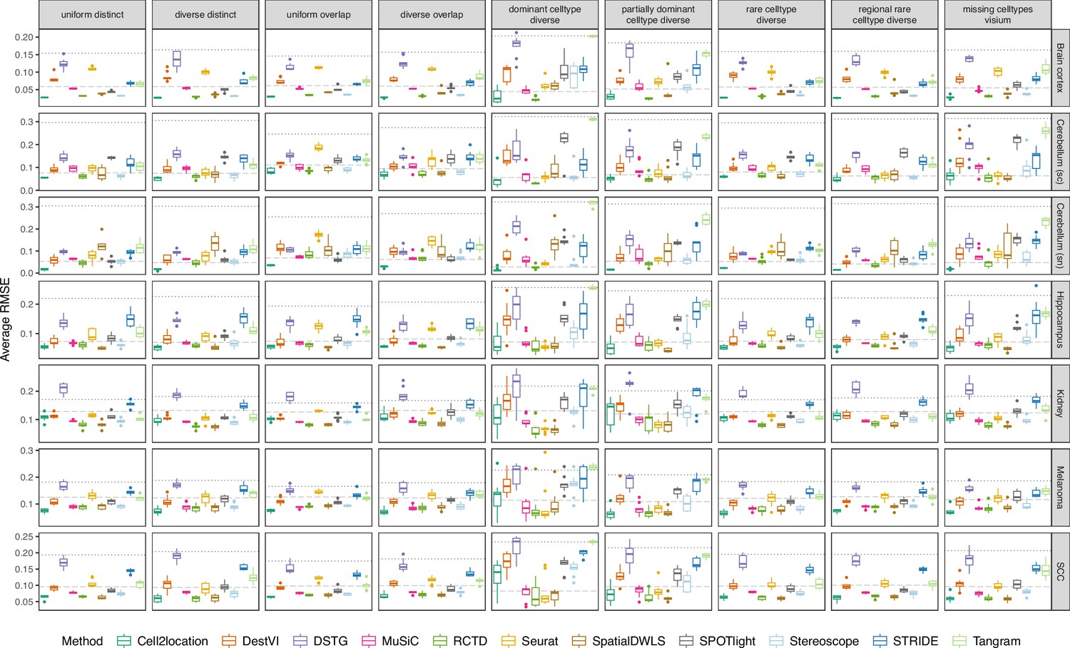
Boxplots of root-mean-squared error (RMSE) across ten replicates for each silver standard dataset (row) and abundance pattern (column).
Long dashed gray line: baseline algorithm (non-negative least squares); dotted gray line: null distribution (random proportions from a Dirichlet distribution). Number of cell types: brain cortex, 18; single-cell cerebellum, 8; single-nucleus cerebellum, 8; hippocampus, 12; kidney, 16; melanoma, 15; SCC, 14.
Figure 3—figure supplement 2
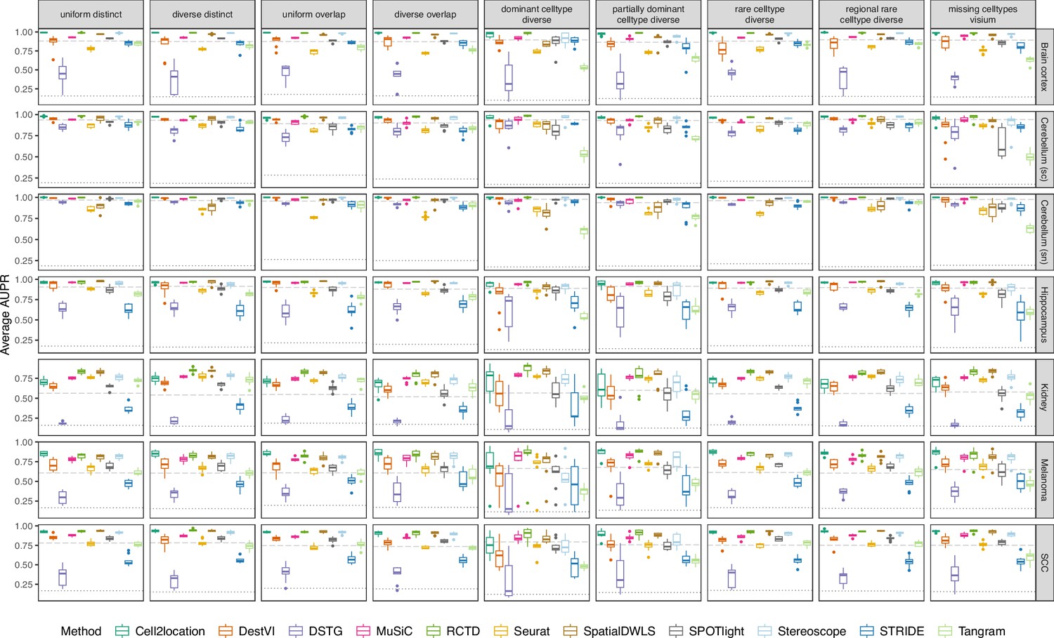
Boxplots of the area under the precision-recall curve (AUPR) across ten replicates for each silver standard dataset (row) and abundance pattern (column).
Long dashed gray line: baseline algorithm (non-negative least squares); dotted gray line: null distribution (random proportions from a Dirichlet distribution). Number of cell types: brain cortex, 18; single-cell cerebellum, 8; single-nucleus cerebellum, 8; hippocampus, 12; kidney, 16; melanoma, 15; SCC, 14.
Figure 3—figure supplement 3
Boxplots of Jensen-Shannon divergence across ten replicates for each silver standard dataset (row) and abundance pattern (column).
Long dashed gray line: baseline algorithm (non-negative least squares); dotted gray line: null distribution (random proportions from a Dirichlet distribution). Number of cell types: brain cortex, 18; single-cell cerebellum, 8; single-nucleus cerebellum, 8; hippocampus, 12; kidney, 16; melanoma, 15; SCC, 14.
Figure 3—figure supplement 4
Summed rank plots across all silver standard datasets for each abundance pattern (column) and metric (row).
Methods are ordered from best to worst performance. The baseline method (non-negative least squares) is shaded in gray.
Figure 3—figure supplement 5
(Continuation of the previous figure supplement) Summed rank plots across all silver standard datasets for each abundance pattern (column) and metric (row).
Methods are ordered from best to worst performance. The baseline method (non-negative least squares) is shaded in gray.
Figure 3—figure supplement 6
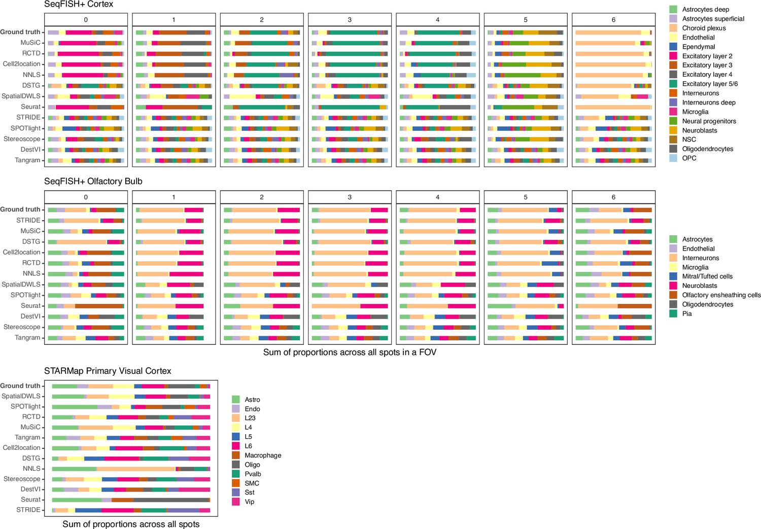
Summed abundances across all spots for each gold standard dataset.
FOV1 of the olfactory bulb dataset has shorter bars as it only contains 8 spots. Methods are ordered according to their ranking for each dataset, based on the lowest median RMSE.
Figure 4 with 1 supplement
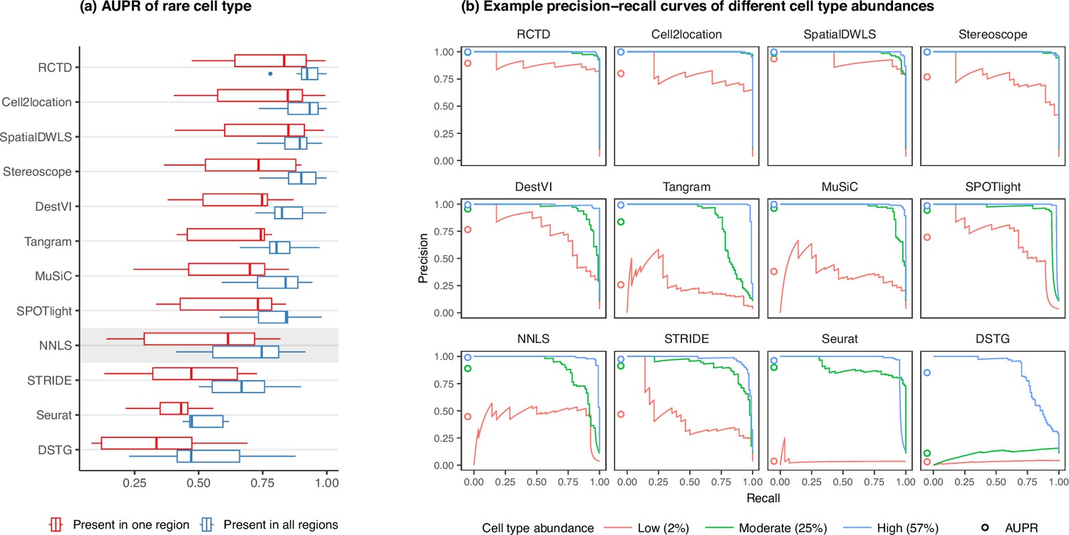
Detection of the rare cell type in the two rare cell type abundance patterns.
(a) Area under the precision-recall curve (AUPR) across the seven scRNA-seq datasets, averaged over 10 replicates. Methods generally have better AUPR if the rare cell type is present in all regions compared to just one region. (b) An example on one silver standard replicate demonstrates that most methods can detect moderately and highly abundant cells, but their performance drops for lowly abundant cells.
-
Figure 4—source data 1
Raw data table of Figure 4.
- https://cdn.elifesciences.org/articles/88431/elife-88431-fig4-data1-v1.xlsx
Figure 4—figure supplement 1
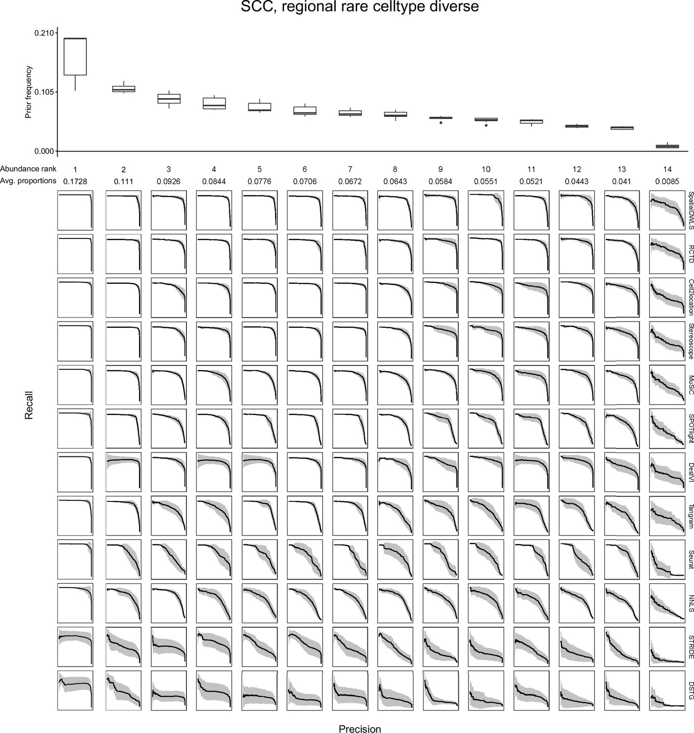
Evaluating the AUPR as a function of cell type abundance.
Across the ten replicates of a silver standard dataset (here, the SCC dataset with the regionally rare abundance pattern is shown), we ordered cell types according to their abundance and computed the average precision-recall curve for each abundance rank. For instance, the leftmost column depicts the average precision-recall curve for the most abundant cell type in all 10 replicates. The boxplots (top) depict cell type frequency priors in each abundance rank, that is the likelihood in which a cell type will be sampled in a spot. The observed average abundance is also indicated underneath the abundance rank number. As cells become less abundant, they become harder to detect by all methods, as indicated by less confident PR curves with smaller areas. Plots of all silver standard datasets can be found in our GitHub repository.
Figure 5 with 1 supplement
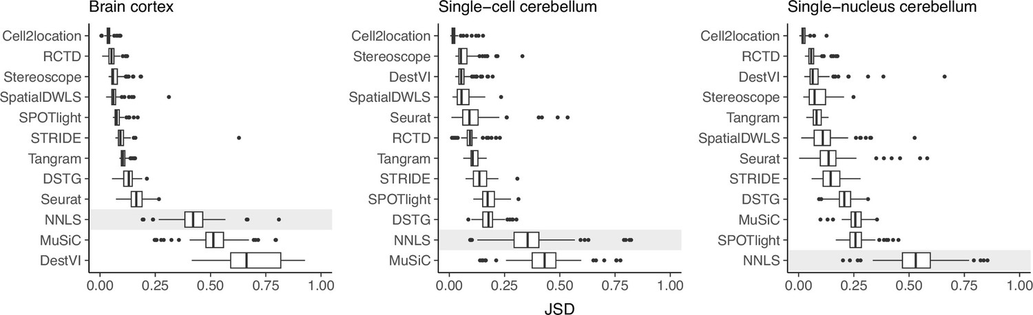
Prediction stability when using different reference datasets.
For each synthetic dataset (total n=90, from nine abundance patterns with ten replicates each), we computed the Jensen-Shannon divergence between cell type proportions obtained from two different reference datasets.
-
Figure 5—source data 1
Raw data table of Figure 5.
- https://cdn.elifesciences.org/articles/88431/elife-88431-fig5-data1-v1.xlsx
Figure 5—figure supplement 1
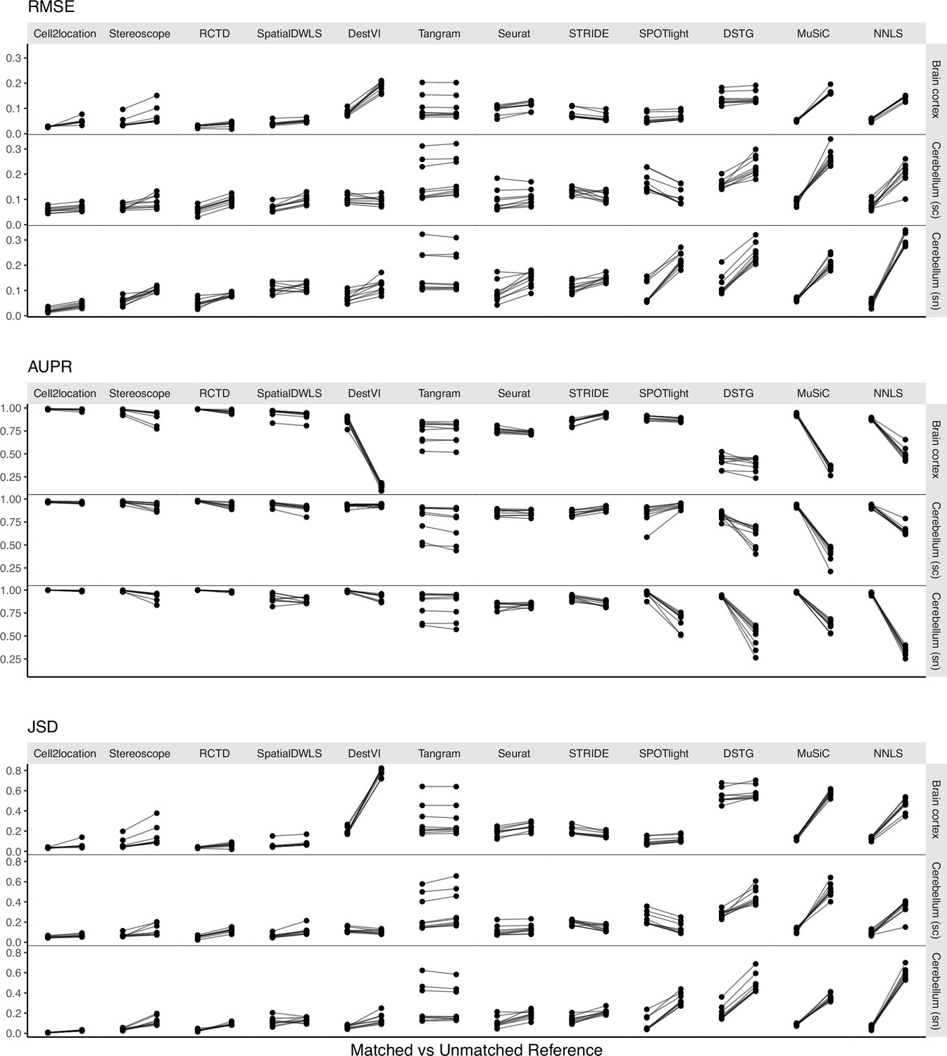
Changes in performance metrics when using a different reference dataset, from a matched to an unmatched reference (i.e., intra-dataset vs inter-dataset scenario).
A matched reference means that the simulated spots and reference were generated from the same scRNA-seq data but on different halves of cells (Figure 1—figure supplement 2). Methods are ordered based on JSD between predicted proportions and not on the metrics themselves (Figure 5).
Figure 6 with 6 supplements
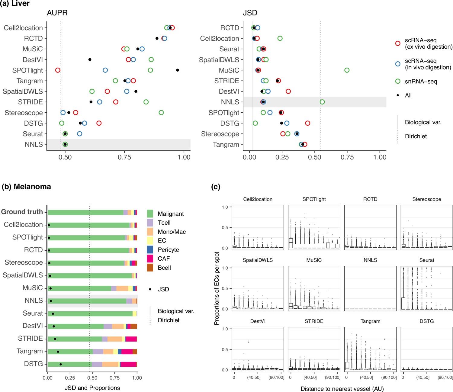
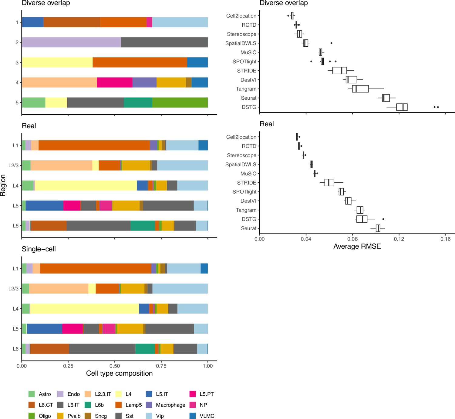
Method performance on two Visium case studies.
(a) In the liver case study, the AUPR was calculated using the presence of portal/central vein endothelial cells in portal and central veins, and the JSD was calculated by comparing predicted cell type proportions with those from snRNA-seq. All reference datasets contain nine cell types. Biological variation refers to the average pairwise JSD between four snRNA-seq samples. Methods are ordered based on the summed rank of all data points. (b) For melanoma, the JSD was calculated between the predicted cell type proportions and those from Molecular Cartography (bold). Biological variation refers to the JSD between the two Molecular Cartography samples. (c) Relationship between the proportions of endothelial cells predicted per spot and their distance to the nearest blood vessel (in arbitrary units, AU), where zero denotes a spot annotated as a vessel. An inverse correlation can be observed more clearly in better-performing methods.
-
Figure 6—source data 1
Raw data table of Figure 6.
- https://cdn.elifesciences.org/articles/88431/elife-88431-fig6-data1-v1.xlsx
Figure 6—figure supplement 1
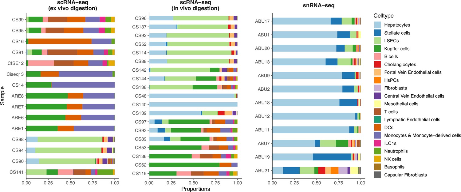
Comparison of cell type compositions between three sequencing protocols in the mouse liver atlas from Guilliams et al., 2022.
In the original paper, samples profiled by snRNA-seq were shown to best resemble in vivo cell compositions.
Figure 6—figure supplement 2
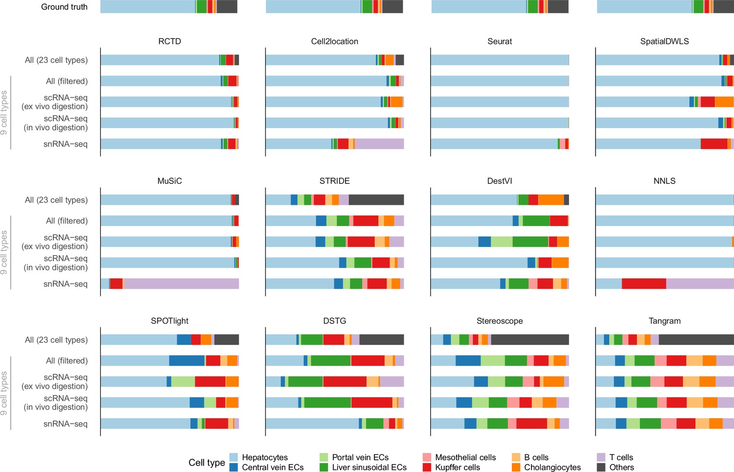
Predicted cell type abundances averaged across all four Visium slides from the liver atlas.
Using different reference datasets for deconvolution often led to drastically different predictions (most notably with snRNA-seq). Each reference dataset except ‘All’ was filtered to only contain nine common cell types. ‘All (filtered)’ comprises all three protocols but only nine cell types; ‘All’ contains 14 more cell types which were grouped under ‘Others’. The ground truth is the average of four snRNA-seq samples (ABU11, ABU13, ABU17 ABU20). Methods are ordered according to their JSD rankings (Figure 6a).
Figure 6—figure supplement 3
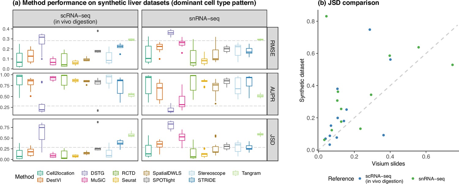
Concordance of method performance between the synthetic dataset (generated using synthspot’s dominant cell type abundance pattern) and the Visium dataset.
(a) Method performance on synthetic liver datasets generated from the ex vivo scRNA-seq protocol, using either the in vivo scRNA-seq or snRNA-seq protocols as the reference for deconvolution. (b) Comparison of the average JSD of each method between the synthetic and Visium datasets.
Figure 6—figure supplement 4

The predicted abundance of central vein and portal vein endothelial cells (ECs) for each spot in one liver Visium slide.
Here, the single-cell atlas containing all three protocols and filtered to nine cell types was used as reference for deconvolution. According to prior knowledge, central vein ECs should only be present in the central vein, and portal vein ECs in the portal vein. Methods are ordered based on their overall AUPR rankings (Figure 6a).
Figure 6—figure supplement 5

Stability of predicted proportions when using three different protocols from the liver atlas as reference for deconvolution.
For each Visium slide, pairwise JSD values between each reference were calculated. Methods are ordered based on stability, with a lower JSD indicating higher stability.
Figure 6—figure supplement 6
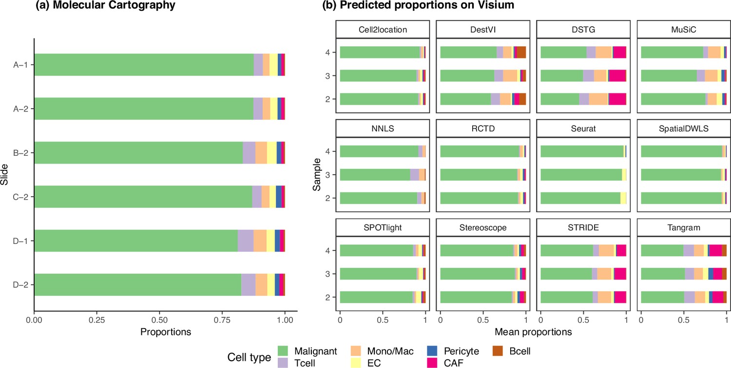
The ground truth and predicted cell type proportions of the melanoma dataset.
(a) Melanoma sections profiled by Molecular Cartography, a targeted, imaging-based technology, are considered as ground truth. The six different sections have consistent cell type proportions, with an average inter- and intra-sample JSD of around 0.003. Sections with the same number belong to the same sample, that is A-1 and D-1. (b) The average cell type abundances predicted by each deconvolution method are also consistent on the three melanoma Visium slides.
Figure 7
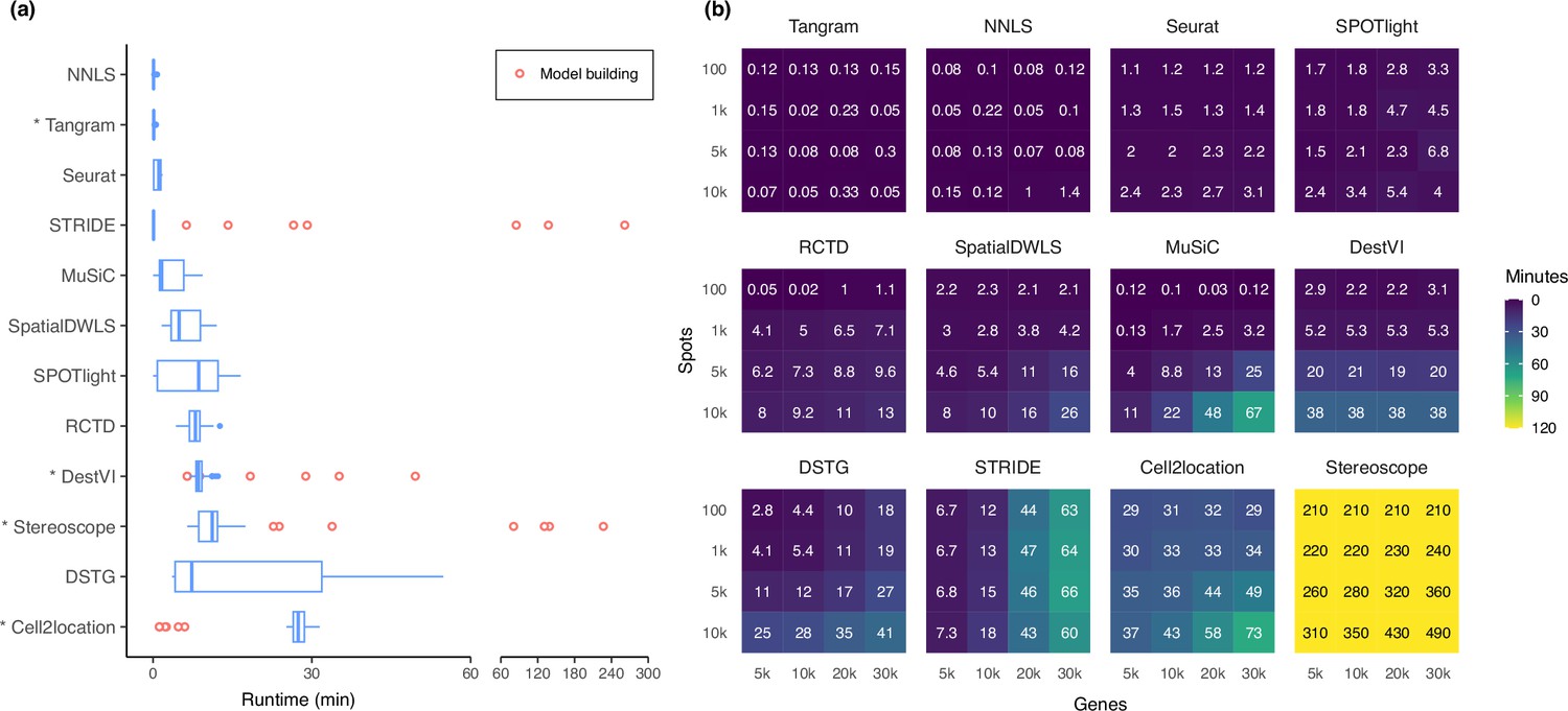
Runtime and scalability of each method.
(a) Runtime over the 63 silver standards (three replicates each). Methods are ordered by total runtime. Asterisks indicate when GPU acceleration has been used. Cell2location, stereoscope, DestVI, and STRIDE first build a model for each single-cell reference (red points), which can be reused for all synthetic datasets derived from that reference. (b) Method scalability on increasing dimensions of the spatial dataset. For model-based methods, the model building and fitting time were summed. Methods are ordered based on total runtime.
-
Figure 7—source data 1
Raw data table of Figure 7.
- https://cdn.elifesciences.org/articles/88431/elife-88431-fig7-data1-v1.xlsx
Appendix 1—figure 1
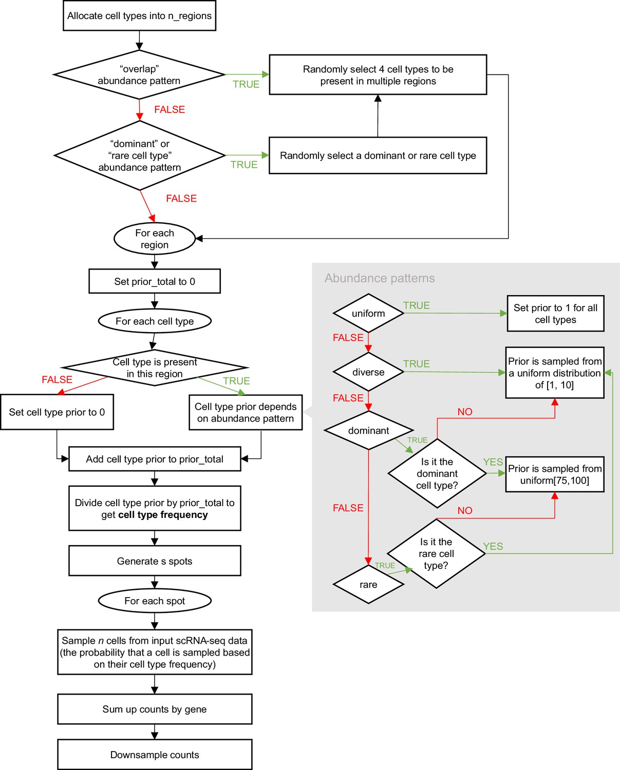
Schematic of the synthspot simulation algorithm.
Appendix 1—figure 2
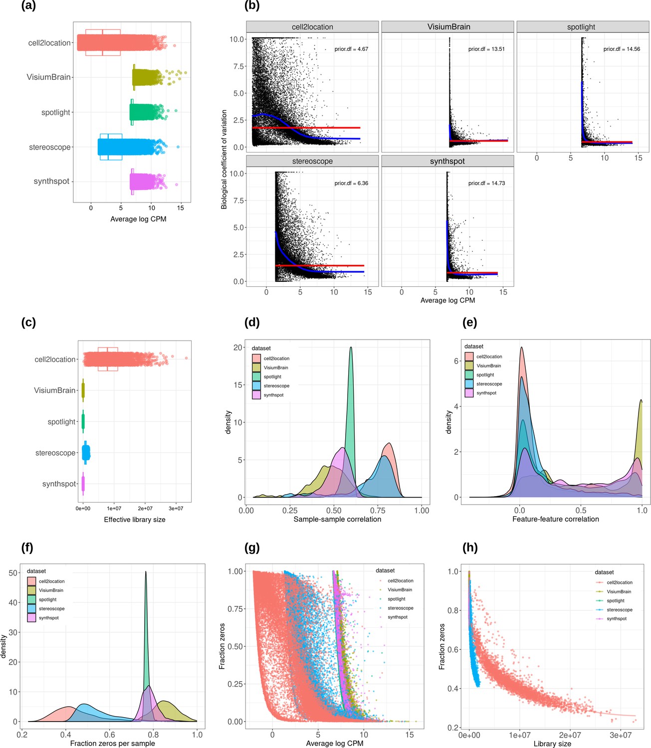
Plots comparing the characteristics of real Visium data from mouse brain and synthetic datasets generated from brain scRNA-seq data using different algorithms.
(a) Average abundance values (log counts per million) per gene. (b) Association between average abundance and the dispersion. (c) Distribution of effective library sizes, or the total count per sample multiplied by the corresponding TMM normalization factor calculated by edgeR. (d–e) Distribution of pairwise Spearman correlation coefficients for 500 randomly selected spots (d) and genes (e), calculated from log CPM values. Only non-constant genes are considered. (f) Distribution of the fraction of zeros observed per spot. (g–h) The association between fraction zeros and average gene abundance (g) and total counts per spot (h).
Appendix 1—figure 3
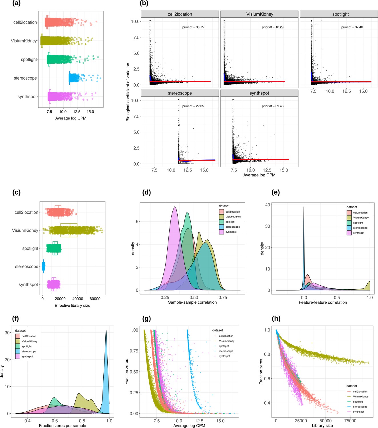
Plots comparing the characteristics of real Visium data from mouse kidney and synthetic datasets generated from kidney scRNA-seq data using different algorithms.
(a) Average abundance values (log counts per million) per gene. (b) Association between average abundance and the dispersion. (c) Distribution of effective library sizes, or the total count per sample multiplied by the corresponding TMM normalization factor calculated by edgeR. (d–e) Distribution of pairwise Spearman correlation coefficients for 500 randomly selected spots (d) and genes (e), calculated from log CPM values. Only non-constant genes are considered. (f) Distribution of the fraction of zeros observed per spot. (g–h) The association between fraction zeros and average gene abundance (g) and total counts per spot (h).
Appendix 1—figure 4
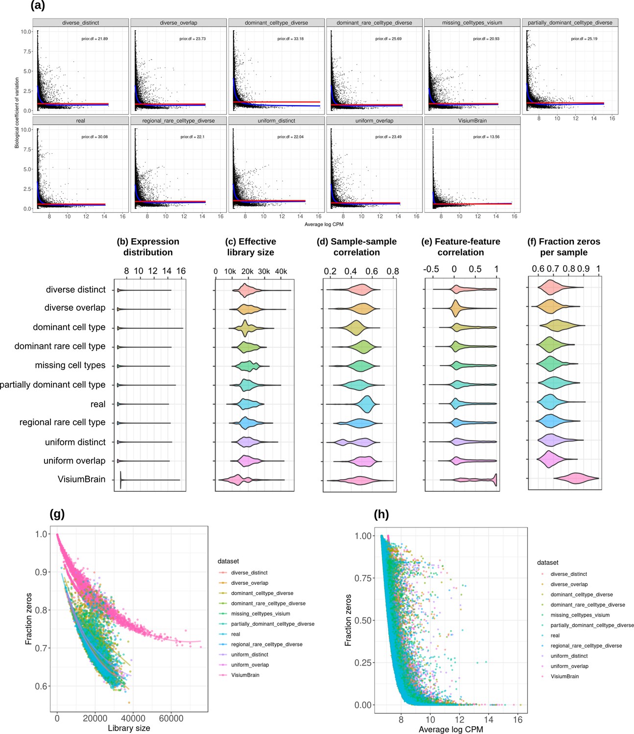
Plots comparing the characteristics of real Visium data from mouse brain and the eight synthetic abundance patterns from synthspot generated from brain scRNA-seq data.
(a) Association between average abundance and the dispersion. (b) Average abundance values (log counts per million) per gene. (c) Distribution of effective library sizes, or the total count per sample multiplied by the corresponding TMM normalization factor calculated by edgeR. (d–e) Distribution of pairwise Spearman correlation coefficients for 500 randomly selected spots (d) and genes (e), calculated from log CPM values. Only non-constant genes are considered. (f) Distribution of the fraction of zeros observed per spot. (g–h) The association between fraction zeros and average gene abundance (g) and total counts per spot (h).
Appendix 1—figure 5
Method performance on synthetic data generated from completely synthetic or annotated brain regions.
When using an artificial abundance pattern (diverse overlap) to create synthetic spatial data, method rankings remain almost identical as when using a real abundance pattern. The real pattern uses regional annotations from the scRNA-seq input to create regions with the same cell type frequencies.
Appendix 2—figure 1
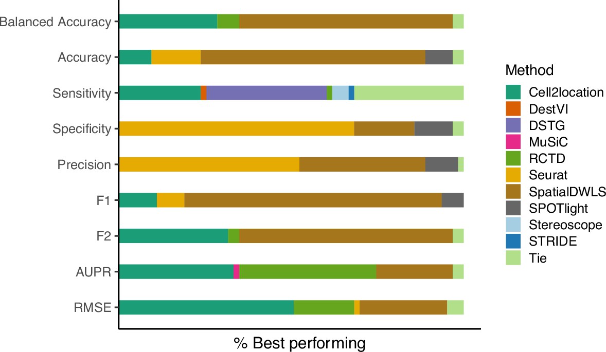
The relative frequency in which a method performs best in the silver standard, based on the best median value across ten replicates for that combination.
‘Tie’ means that two or more methods score the same up to the third decimal point. RMSE: root-mean-square error; AUPR: area under the precision-recall curve.
Appendix 3—figure 1
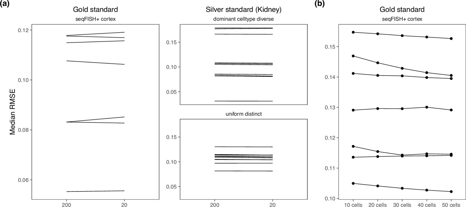
Changing hyperparameters in the cell2location model.
There is almost no performance difference when changing the (a) detection alpha and (b) number of cells per spot.
Appendix 3—figure 2
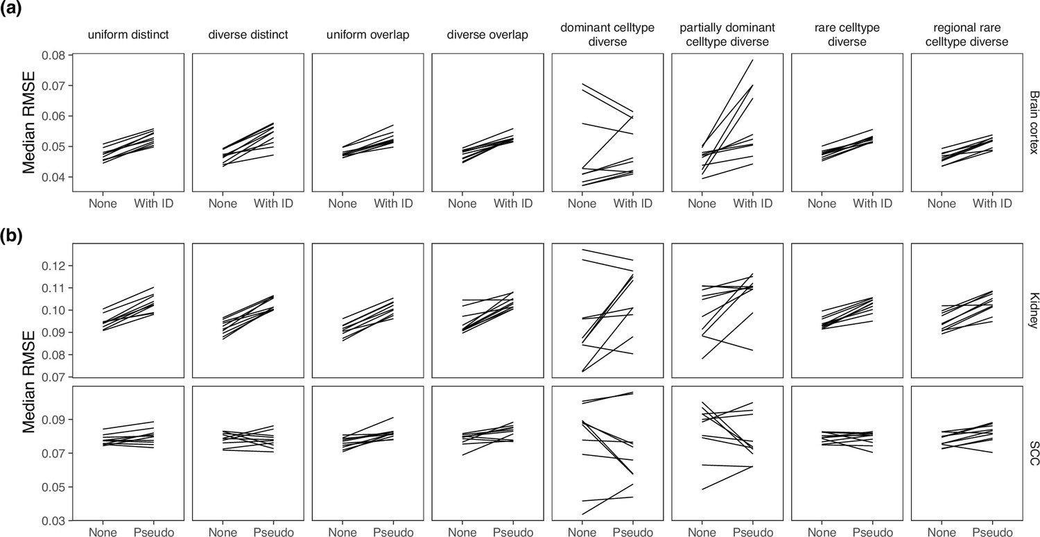
Comparing MuSiC performance when the model was given sample information.
MuSiC seems to perform best when single cells were used as samples (‘None’), as compared to (a) when the real sample information was given and (b) when pseudosamples were created.
Appendix 3—figure 3
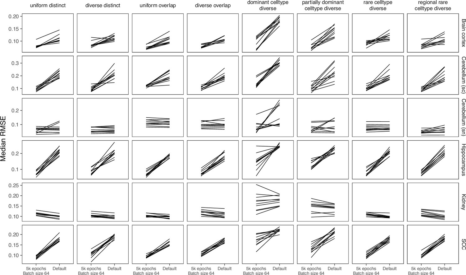
Comparing parameters of DestVI.
Compared to the default parameters (2500 epochs), DestVI has better performance with 5000 training epochs and batch size of 64.
Appendix 3—figure 4
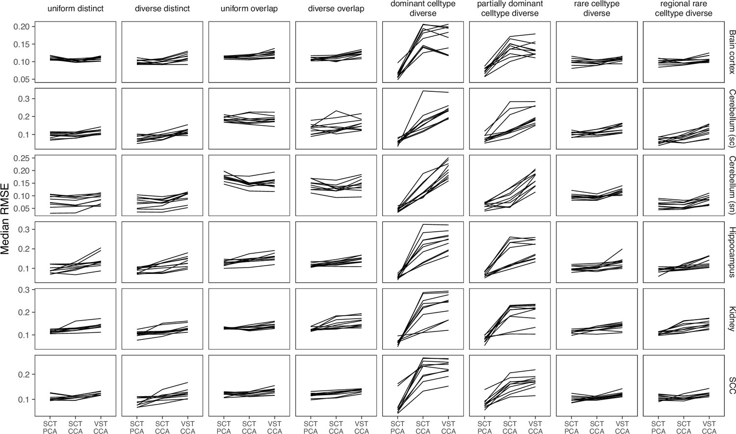
Comparing different data transformation and dimensionality reduction methods in Seurat.
Seurat has the best performance when the data was transformed using SCTransform and the dimensionality reduction method is PCA. CCA = canonical correlation analysis; PCA = principal component analysis; VST = variance stabilizing transformation.
Appendix 3—figure 5
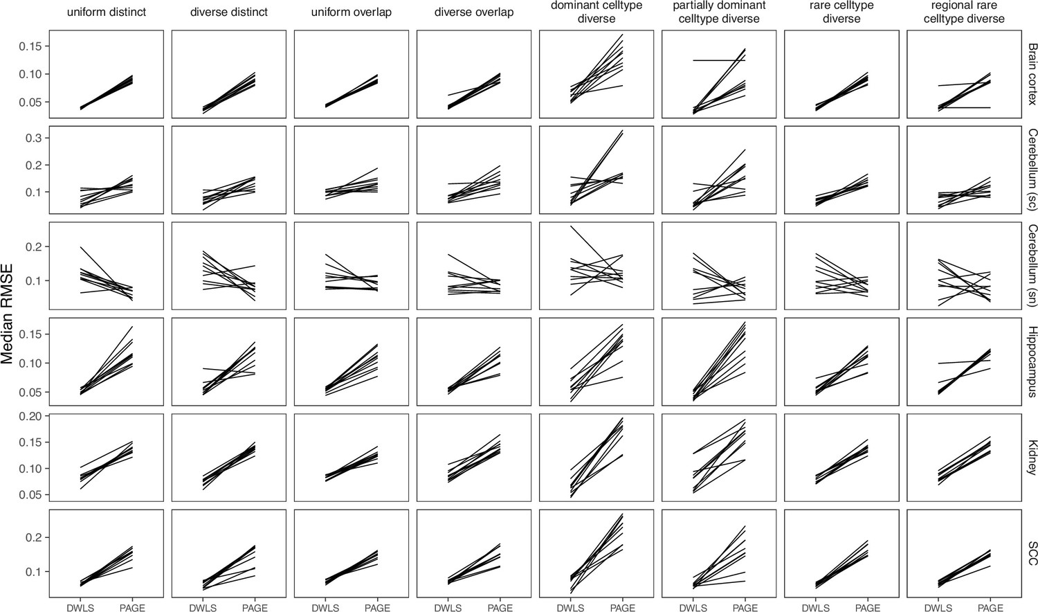
Comparing SpatialDWLS between two signature matrix creation functions.
SpatialDWLS has better performance when the makeSignMatrixDWLS was used to create the signature matrix (as described in the Current Protocols paper), instead of the makeSignMatrixPAGE function (described in the online vignette).
Appendix 3—figure 6
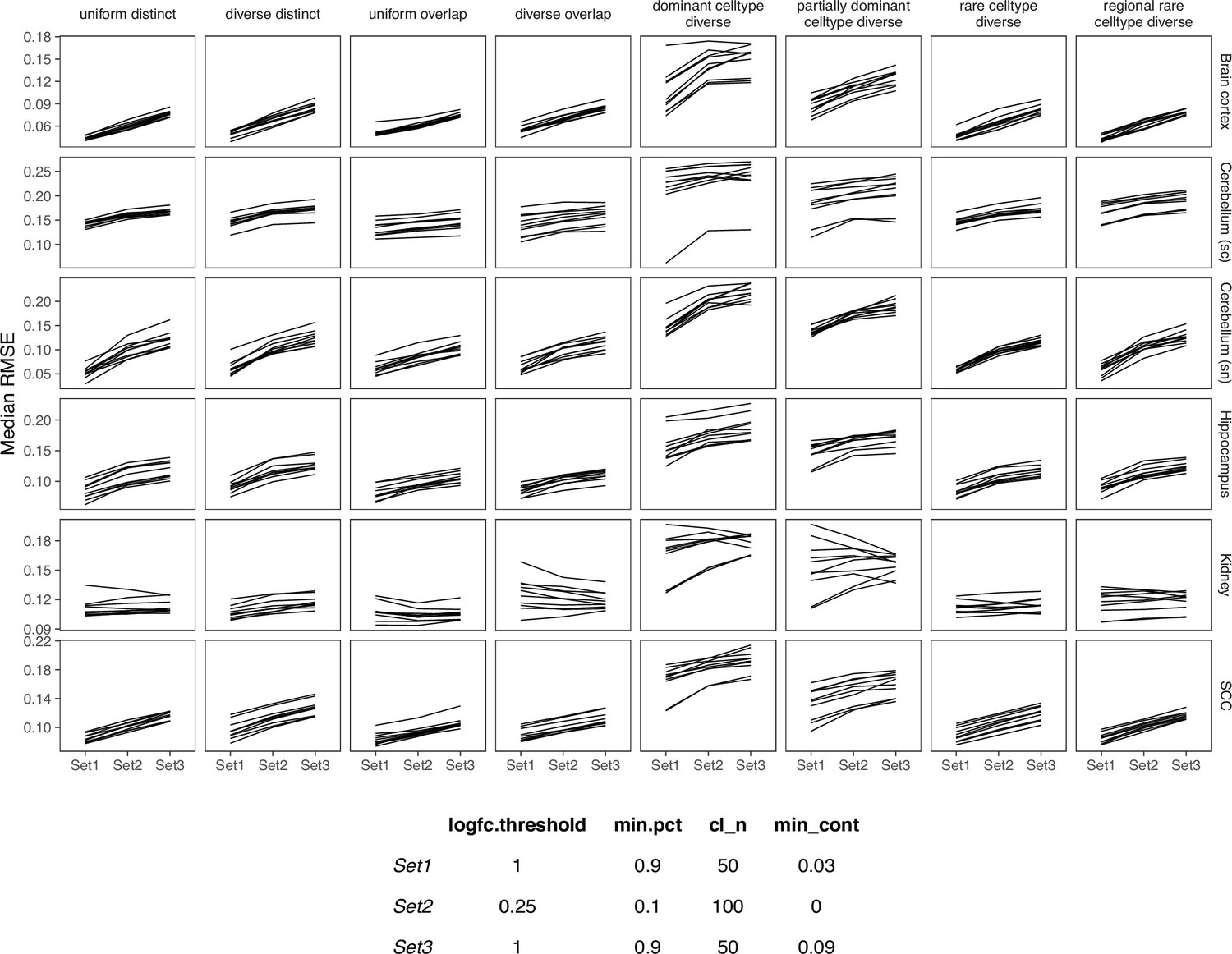
Comparing SPOTlight performance on three sets of parameters.
We used Set1 parameters in our benchmark.
Appendix 3—figure 7
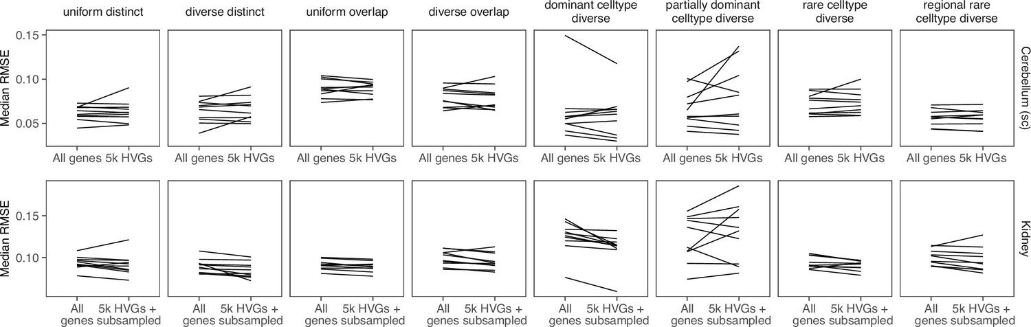
Comparing stereoscope performance to using only highly variable genes (HVGs).
There is no consistent performance difference between using all genes of stereoscope and using the 5000 HVGs (with or without subsampling the scRNA-seq reference).
Appendix 3—figure 8
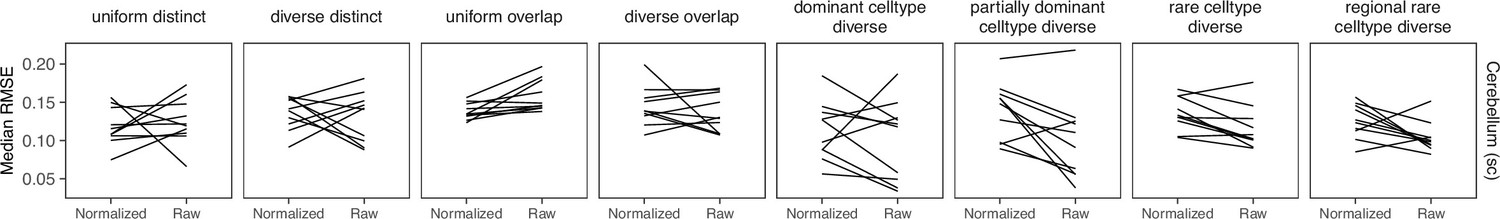
Comparing STRIDE performance on normalized and raw counts.
For STRIDE, there is no consistent performance difference between normalizing or using the raw counts.
Appendix 3—figure 9
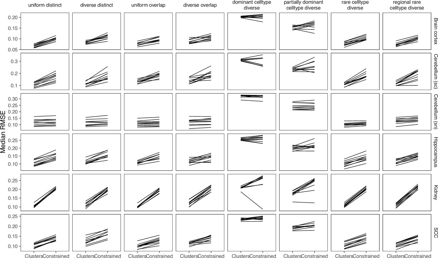
Comparing the mapping modes in Tangram.
Although the constrained mapping mode was recommended in the Tangram vignette, we found that the clusters mode achieve better performance.
Additional files
-
Supplementary file 1
An overview of all datasets used in this study, including the gold standards, silver standards, liver case study, and melanoma case study.
- https://cdn.elifesciences.org/articles/88431/elife-88431-supp1-v1.xlsx
-
Supplementary file 2
An overview of the deconvolution tools benchmarked in this study, including the algorithm and usage information.
- https://cdn.elifesciences.org/articles/88431/elife-88431-supp2-v1.xlsx
-
MDAR checklist
- https://cdn.elifesciences.org/articles/88431/elife-88431-mdarchecklist1-v1.pdf
Download links
A two-part list of links to download the article, or parts of the article, in various formats.
Downloads (link to download the article as PDF)
Open citations (links to open the citations from this article in various online reference manager services)
Cite this article (links to download the citations from this article in formats compatible with various reference manager tools)
Spotless, a reproducible pipeline for benchmarking cell type deconvolution in spatial transcriptomics
eLife 12:RP88431.
https://doi.org/10.7554/eLife.88431.3


