voyAGEr, a free web interface for the analysis of age-related gene expression alterations in human tissues
Figures
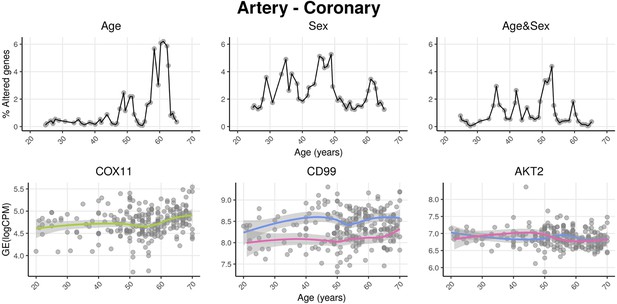
voyAGEr profiles tissue-specific age-associated changes in gene expression and their differences between sexes.
For each of the 49 human tissues in genotype-tissue expression (GTEx), gene expression was linearly modelled in windows spanning 16 years centered in consecutive years of age, to estimate the effects thereon of Age, Sex, and the interaction between them, i.e., how the Sex effect changes with age, equivalent to how the Age effect differs between sexes (v. Methods). In each age window, the percentage of genes with expression significantly altered by each of those effects gives their respective transcriptomic impact (upper panels). voyAGEr thereby identifies the age periods at which major gene expression changes occur in each tissue. For example, in coronary artery: major age-related transcriptional alterations are found at around 60 years of age (upper left panel), illustrated by the behaviour of COX11 (bottom left panel); major gene expression differences between males and females happen across the considered age range (upper centre panel), as illustrated by CD99 (bottom centre panel); major differences between sexes in age-related gene expression alterations happen across the considered age range (upper right panel), as illustrated by AKT2 (bottom right panel). Solid loess lines in the bottom panels (green for all donors, pink for females, blue for males). Gene expression (GE) in log2 of counts per million (logCPM).
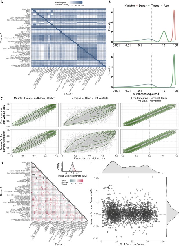
Impact of donor overlap between tissues in age-associated trends.
(A) Heatmap depicting the percentage of common donors between pairs of tissues. A given square illustrates the percentage of all samples of tissue in the x-axis (Tissue 1) that is in common with the tissue in the y-axis (Tissue 2). (B) Assessment of the relative contributions of different sources to the dataset’s variance. (Left panel) Tissue accounts for approximately 90% of the total variance, while donor contributes around 10%; age has a minimal impact (1%), likely due to the relative subtlety of its effects on gene expression and to the tissue specificity of ageing dynamics. (Right panel) Removal of the donor variable does not transfer variance to age, suggesting limited confounding between the two variables. (C) Impact of the relative proportion of common donors on gene expression correlation between tissue pairs. Panels A, B, and C showcase the tissue pairs with the highest (Muscle Skeletal/Kidney Cortex), median (Pancreas/Heart Left Ventricle), and lowest (Small Intestine/Brain Amygdala) percentages of common donors, respectively. The left panels illustrate gene-by-gene Pearson’s correlations of gene expression between the two tissues, comparing the scenarios with (x-axis) and without (y-axis) the removal of common donors. The right panels depict the same comparisons, but with random downsampling (y-axis) in both tissues based on the proportions defined for common donor removal. The depicted examples show that the outcomes are comparable when removing common donors or employing random downsampling. (D) Comparison of the impacts of removing common donor samples and random downsampling across tissue pairs. The process of removing common donors involved the identification and removal of samples from shared donors while maintaining the original sample size imbalance between tissues. As this process inherently involves downsampling, which may impact results, we performed additional downsampling by randomly removing samples from both tissues according to the proportions defined for the removal of common donors. The heatmap is coloured based on whether the removal of common donors has a greater (red) or lesser impact (blue) than random downsampling. The values depicted in the heatmap, denoted as the Impact of Common Donors (ICD), are computed for each tissue pair. This calculation involves several steps: first, by determining the absolute difference in Pearson’s correlation for each gene’s mean expression within each age window from the ShARP-LM pipeline, between the original data and the subset of data without common donors (DiffWoCD) or with random downsampling (DiffRD). Subsequently, the medians of DiffWoCD and DiffRD are computed, and the difference between these median values provides the ICD for each tissue pair. Due to the unidirectional nature of correlation (i.e. the results for tissue 1 vs tissue 2 mirror those for tissue 2 vs tissue 1), the resulting matrix is triangular in form. Gray tiles denote NA values, i.e., where the tissue-tissue comparison does not have a meaning, namely self-self and between sex-specific tissues. Top right insert: density line (‘smoothed’ histogram) of all ICD values. (E) - Scatter plot relating the Impact of Common Donors (ICD, values in heatmap D) with the respective percentage of common donors (values in heatmap A).
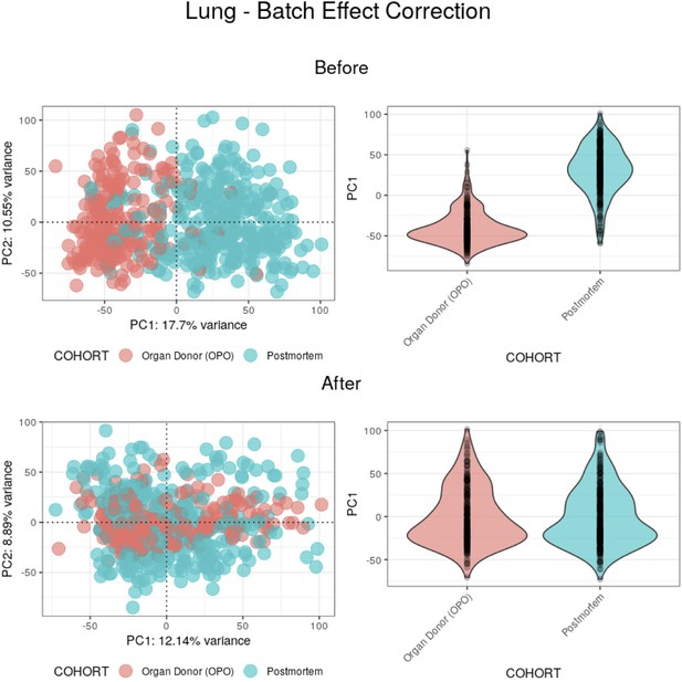
Batch effect correction applied to lung samples.
(Top) Before batch effect correction, 17.7% of the variance between samples appears to be mainly explained by the COHORT variable. (Bottom) After batch effect correction, PC1 no longer appears to be explained by the COHORT variable, with its weights having a similar distribution between batches.
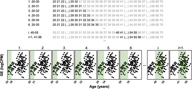
Principle of the Shifting Age Range Pipeline for Linear Modelling (ShARP-LM) method.
ShARP-LM involves fitting linear models to gene expression data for each tissue, with samples from donors grouped into age windows of 16 years each, shifted consecutively through individual years of age using a sliding window approach. As samples at the ends of the dataset’s age range would thereby be involved in fewer linear models, we made the window size gradually increase from 11 to 16 years when starting from the ‘youngest’ samples and decrease from 16 to 11 years when reaching the ‘oldest.’ The example shows the expression of an arbitrary gene over age, with 8 age windows shown. Coloured rectangles represent the age windows and coloured lines the linear modelling of the gene expression over age in each of them.
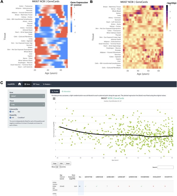
Gene-centric analyses of expression alterations across age.
(A) Heatmap of MKI67 expression across tissues over age. (B) Heatmap of the significance of Age-associated MKI67 expression alterations over age. p-values are for the moderated t-statistics of differential gene expression associated with the Age effect (v. the ShARP-LM approach in Methods). Notably, transcriptional changes are observed in the lung (mid 20’s, early 30’s, and after 55). (C) - voyAGEr’s Gene tab interface. MKI67 expression in the lung is inspected. Donors’ information is shown in a table and the scatter plot can be interactively adjusted according to the donors’ condition of interest (Figure 2—figure supplement 1B ).
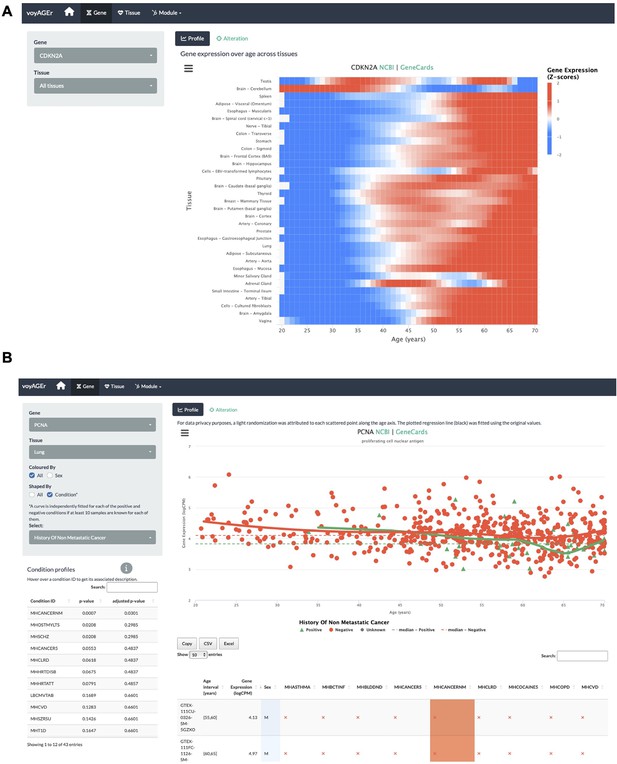
voyAGEr’s Gene tab interface.
(A) Heatmap of CDKN2A expression across tissues over age. (B) PCNA expression in lung over age and its association with the donor’s history of non-metastatic cancer.
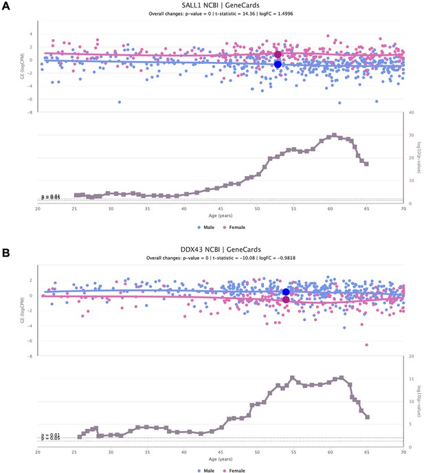
Sex-specific SALL1 and DDX43 expression alterations over age.
Scatter plots of SALL1 (A) and DDX43 (B) expression over age (above), in adipose tissue and lung, respectively, coloured based on the donor’s biological sex (male in blue and female in pink). The scatter plots of gene expression are shown together with line plots of the significance of their difference between sexes (below).
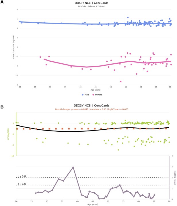
Impact of sex-specific genes in the interpretation of voyAGEr results.
Representation of the expression of Y-chromosome-specific gene DDX3Y, stratified by sex (A), along with the corresponding significance indicating age-related alterations (B). Despite the non-zero expression values for female samples, they fall within a range deemed of background noise (−2 to –8 logCPM). Notably, when assessing the significance of age-related changes in the gene, a distinct peak emerges around the age of 40. This peak is spurious, as it primarily mirrors changes in gene expression in females.
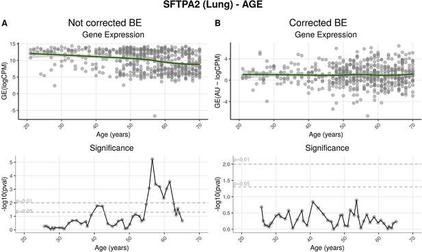
Effects of batch effect correction on gene-centric (SFTPA2) analysis.
(A) Before batch effect correction, SFTPA2 expression diminishes throughout ageing. This change is particularly significant after around 55 years of age. (B) After correction, expression of this gene shows no significant alterations across age ranges.
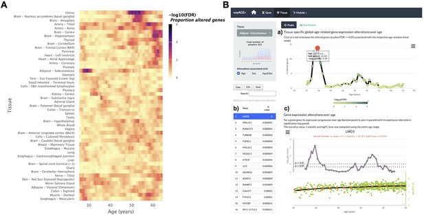
Tissue-specific assessment of gene expression changes across age.
(A) Heatmap of significance (false discovery rate, FDR, based on random permutations of age, v. Methods) over the age of the proportion of genes with expression significantly altered with Age in the 49 analysed tissues. (B) Exploration of gene expression changes across age in Subcutaneous Adipose tissue: (a) Percentage of genes with significantly altered expression with Age over age. Two main peaks of transcriptional changes are noteworthy, a major one in the late 20s and a minor one after 45; (b) Clicking on the dot of a specific age (29.57 years old in plot a) gives access to the list of the most altered genes at that age, ordered by statistical significance of expression changes (p-value of moderated t-statistic). (c) Plot of expression of the chosen top gene in the table in b across age (bottom) in parallel with the significance of its expression alterations with Age. The expression of LMO3 significantly increases at around 30 years old, concomitantly with the first peak of transcriptomic changes with Age.
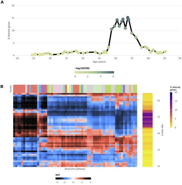
Transcriptomic alterations in the uterus coincident with the onset of menopause.
voyAGEr enables the identification of a prominent age period of transcriptional alterations in the uterus, which coincides with the onset of menopause (Kaczmarek, 2014). The genes exhibiting significant changes (A) reflect the transformations observed in biological processes (B), marked by a distinct switch in enrichment scores. Positively enriched pathways become negative, and vice-versa during this age frame.
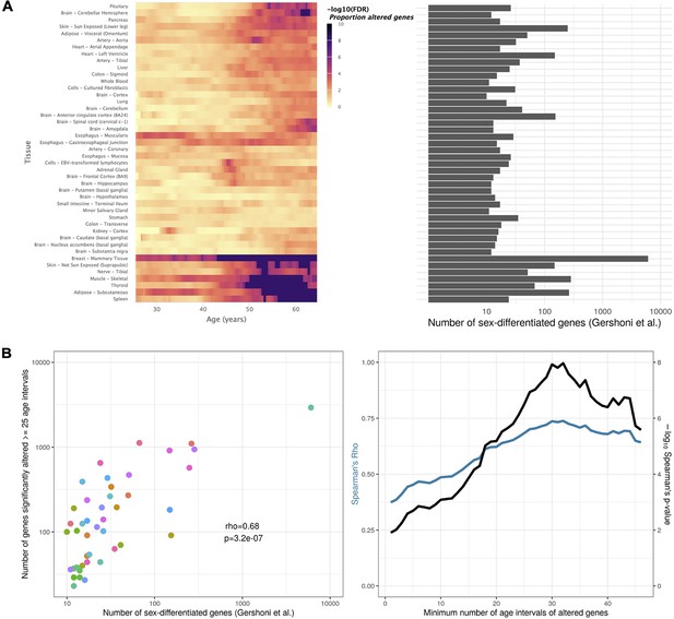
Tissue-specific sex-differentiated expression.
(A) Heatmap of significance over age, for each tissue, of the proportion of altered genes between sexes (left), in parallel with the number of sex-differentiated genes highlighted by Gershoni et al. (v. Figure 1 in Gershoni and Pietrokovski, 2017) (right). Mammary is corroborated as the tissue with the most sex-differentiated gene expression. For tissues like Adipose - Subcutaneous, Skin - Not Sun Exposed, Thyroid, Nerve - Tibial, Muscle - Skeletal, and Spleen, sex-related biases in expression mainly arise in late life. (B) Scatter plot relating, for each tissue (each dot), the number of sex-differentiated genes found by Gershoni et al. with the number of genes found by voyAGEr to be altered (p-value ≤0.05) between sexes in at least 25 age intervals (left). This correlation is significant (p-value ≤0.05) regardless of the considered minimum number of age intervals a gene must be altered in (right).
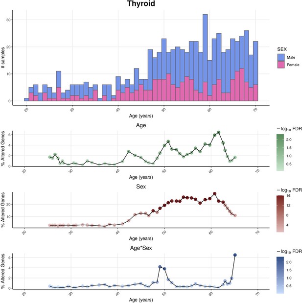
Distributions of genotype-tissue expression (GTEx) donors’ ages and its impact on the statistical power of detection of differential gene expression.
For thyroid as an example tissue, the sex-differentiated distribution of GTEx samples’ ages (v8) (above) are shown together with the percentage of altered genes over age (below) for the three variables (Age, Sex, and Age&Sex), as well as their statistical significance, given by the Shifting Age Range Pipeline for Linear Modelling (ShARP-LM) approach. The statistical power for detecting transcriptional changes is influenced by the age distribution of donors, leading to a higher likelihood of identifying significant alterations (FDR ≤ 0.05) in age ranges that are more prevalent in the sample population, typically associated with older individuals.
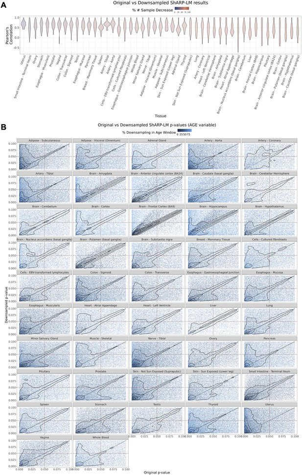
Effect of downsampling in Shifting Age Range Pipeline for Linear Modelling (ShARP-LM) results.
Downsampling was performed by reducing the number of samples in a given window to the minimum available sample size within all age windows for a given tissue. (A) Per tissue violin plots of gene-wide distributions of Pearson’s correlation coefficients b jetween original and downsampled logFC values for the Age variable across age windows, with tissues coloured by and ordered by increasing percentage of downsampling-associated reduction in the number of samples. (B) Density scatter plots of comparison of associated original and downsampled p-values for each tissue, coloured by the downsampling percentage in each age window, highlighting the low range of p-values (from 0 to 0.1). Despite changes in logFC with downsampling, a considerable correlation in significance is maintained, although downsampling naturally results in a loss of statistical power, evident by the shift of points towards the first quadrant (dashed lines: p-value = 0.05).
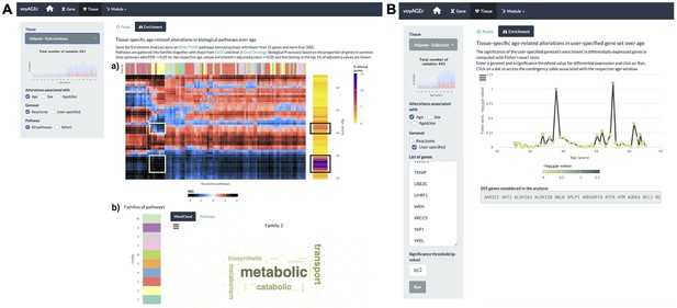
Tissue-specific assessment of pathway expression changes across age in the human Subcutaneous Adipose tissue.
(A) Heatmap depicting the normalised enrichment scores (NES) of Reactome pathways associated with specific tissues and effects. Pathways are classified into 10 families (a), which can be characterised by their frequently occurring terms (b), providing insights into their biological functions. Only pathways significantly linked to gene expression changes in at least one age window (FDR ≤ 0.01) are displayed. Black squares indicate the two age periods with prominent transcriptional changes, while yellow squares denote pathways common to both peaks, primarily belonging to family 2. Word cloud analysis (b) reveals that family 2 pathways are mainly related to metabolism. (B) Enrichment of a user-provided gene set, given by the significance of Fisher’s tests, in genes altered with Age throughout ageing (based on a user-defined p-value threshold). Here, the given gene set is composed of genes from Senequest Gorgoulis et al., 2019 whose link with senescence is supported by at least four sources. In this case, there are no significant peaks.
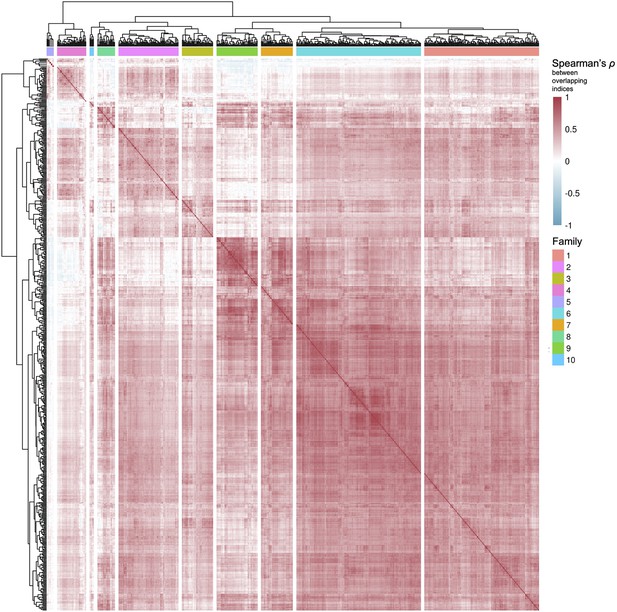
Clustering of pathways from Reactome and Kyoto Encyclopedia of Genes and Genomes (KEGG), and level 3 Gene Ontology Biological Processes.
Based on their common genes (v. Methods), pathways from curated databases were clustered in 10 families.
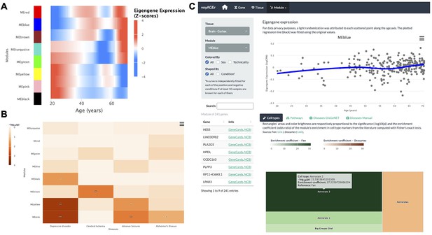
Tissue-specific assessment of age-associated progression of modules of co-expressed genes.
(A) Heatmap of eigengene expression for all the modules of co-expressed genes in the brain cortex over age. (B) Heatmap of association of the modules with four selected diseases, computed with the disgenet2r package (Piñero et al., 2019). (C) Scatter plot (above) of eigengene expression over age, in all brain cortex samples, for a selected module of 241 genes (MEblue). The eigengene expression is derived from the first component of the single value decomposition of its genes’ expression. This module was analysed, with Fisher’s tests, for enrichment in cell types, based on markers from the literature (Fan et al., 2018 and Descartes Cao et al., 2020) and found to be associated with astrocytes, as can be observed by the TreeMap below (where each rectangle’s area and darkness are proportional to the significance of its association with a cell type and its colour linked to the markers’ source study).
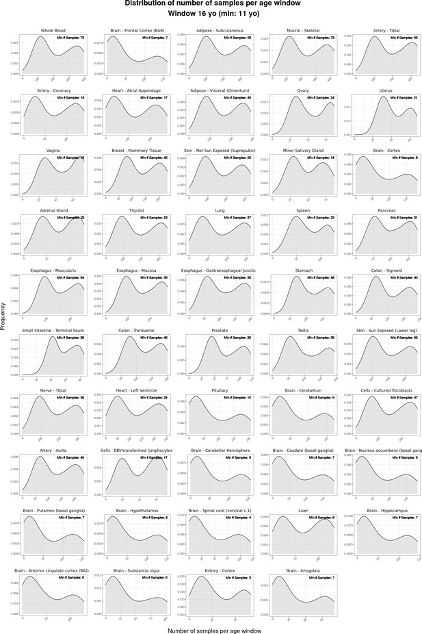
Density plots (“smoothed” histograms) of the distribution of numbers of samples per moving age window for the ShARP-LM pipeline, categorised by tissue.
The numerical value within each rectangle represents the minimum number of samples observed across all age windows for that particular tissue.
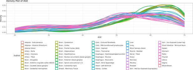
Density lines (“smoothed” histograms) of the distribution of the age of donors per tissue.
As depicted in the chart, there are more samples for older ages, particularly of brain tissues.
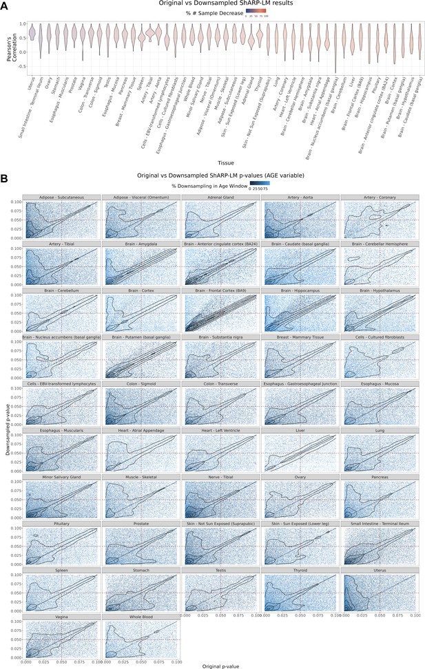
Effect of downsampling in ShARP-LM results.
(A) Per tissue violin plots of gene-wide distributions of Pearson’s correlation coefficients between original and downsampled logFC values for the Age variable across age windows, with tissues coloured by and ordered by increasing percentage of downsampling-associated reduction in the number of samples. (B) – Density scatter plots of comparison of associated original and downsampled p-values for each tissue, coloured by the downsampling percentage in each age window, highlighting the low range of p-values (from 0 to 0.1). Despite changes in logFC with downsampling, a considerable correlation in significance is maintained, although downsampling naturally results in a loss of statistical power, evident by the shift of points towards the first quadrant (dashed lines: p-value = 0.05).
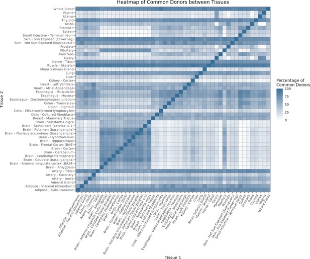
Heatmap depicting the percentage of common donors between pairs of tissues.
A given square illustrates the percentage of all samples of tissue in the x axis (Tissue 1) that is in common with the tissue in the y axis (Tissue 2)

Assessment of the relative contributions of different sources to the dataset’s variance.
(A) - tissue accounts for approximately 90% of the total variance, while donor contributes around 10%; age has a minimal impact (1%), likely due to the relative subtlety of its effects on gene expression and to the tissue specificity of ageing dynamics. (B) - Removal of the donor variable does not transfer variance to age, suggesting limited confounding between the two variables.
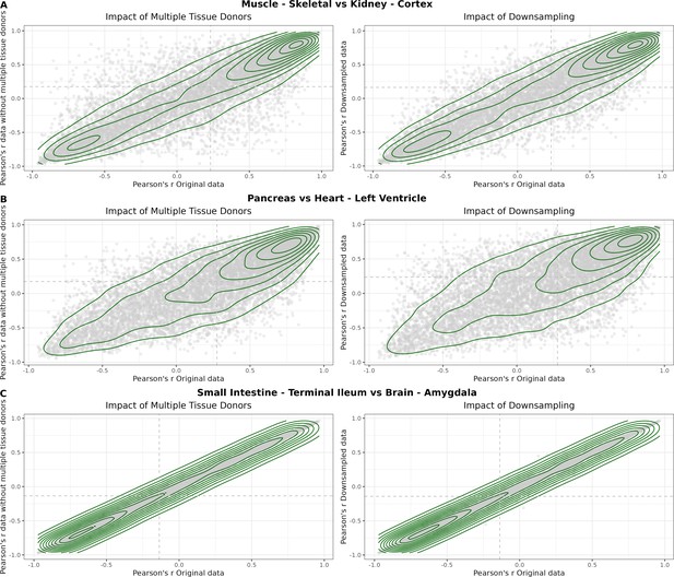
Impact of the relative proportion of common donors on gene expression correlation between tissue pairs.
Panels A, B, and C showcase the tissue pairs with the highest (Muscle Skeletal / Kidney Cortex), median (Pancreas / Heart Left Ventricle), and lowest (Small Intestine / Brain Amygdala) percentages of common donors, respectively. The left panels illustrate gene-bygene Pearson’s correlations of gene expression between the two tissues, comparing the scenarios with (x-axis) and without (yaxis) the removal of common donors. The ri ght panels depict the same comparisons, but with random downsampling (y-axis) in both tissues based on the proportions defined for common donor removal. The depicted examples show that the outcomes are comparable when removing common donors or employing random downsampling.
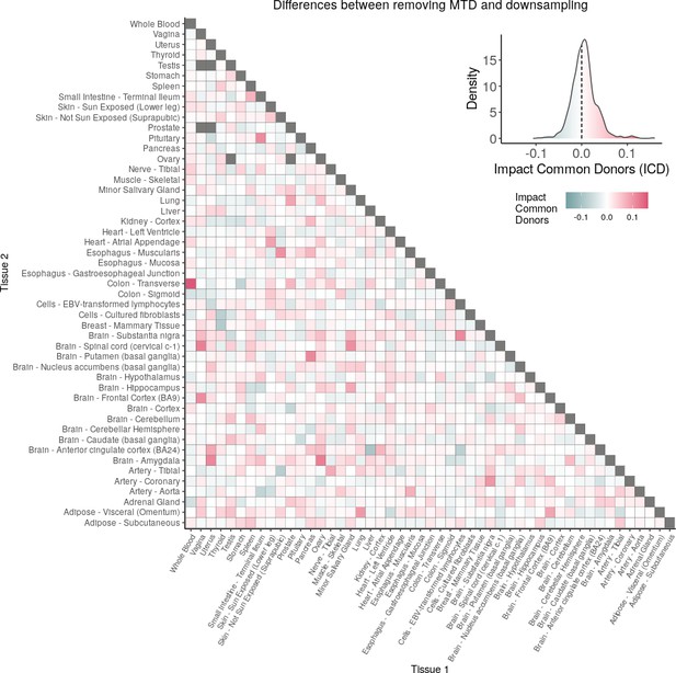
Comparison of the impacts of removing common donor samples and random downsampling across tissue pairs.
The heatmap is coloured based on whether the removal of common donors has a greater (red) or lesser impact (blue) than random downsampling. The values depicted in the heatmap, denoted as the Impact of Common Donors (ICD), are computed for each tissue pair. This calculation involves several steps: first, by determining the absolute difference in Pearson’s correlation for each gene’s mean expression within each age window from the ShARP-LM pipeline, between the original data and the subset of data without common donors (DiffWoCD) or with random downsampling (DiffRD). Subsequently, the medians of DiffWoCD and DiffRD are computed, and the difference between these median values provides the ICD for each tissue pair. Due to the unidirectional nature of correlation (i.e. the results for tissue 1 vs tissue 2 mirror those for tissue 2 vs tissue 1), the resulting matrix is triangular in form. Gray tiles denote NA values, i.e., where the tissue-tissue comparison does not have a meaning, namely self-self and between sex-specific tissues. Top right insert: density line (“smoothed” histogram) of all ICD values.
Additional files
-
Supplementary file 1
Number of studied genes per tissue.
For each tissue, we kept the genes with at least one CPM of expression in at least 40% of the samples.
- https://cdn.elifesciences.org/articles/88623/elife-88623-supp1-v1.csv
-
MDAR checklist
- https://cdn.elifesciences.org/articles/88623/elife-88623-mdarchecklist1-v1.pdf


