Eco-evolutionary dynamics of adapting pathogens and host immunity
- Biozentrum, Universität Basel, Switzerland
- Swiss Institute of Bioinformatics, Switzerland
- DISAT, Politecnico di Torino, Italy
Figures
Figure 1
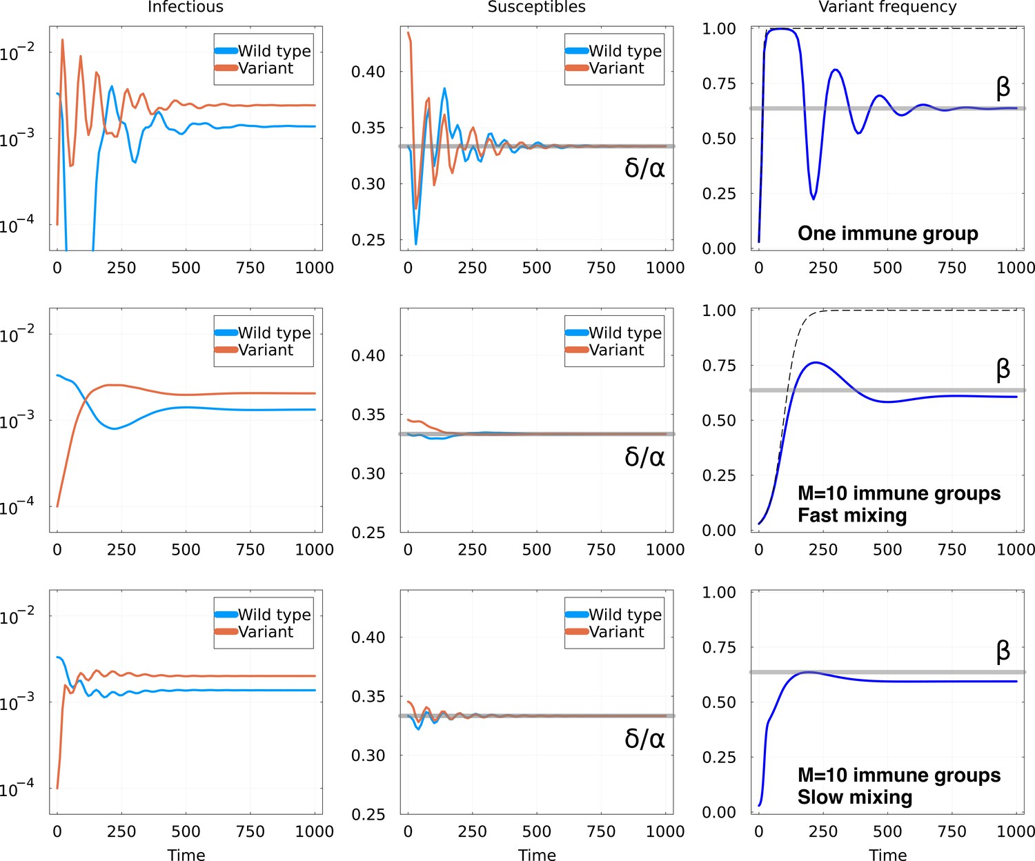
Invasion of animmune escape mutant.
Top row: one immune group, Middle row: immune groups and fast mixing and Bottom row immune groups and slow mixing . Other parameters are the same for all rows: in units of , we set and , and , , . For both rows, graphs represent: Left: number of hosts infectious with the wild-type and the variant; Middle: number of hosts susceptible to the wild-type and the variant, with the equilibrium value as a gray line; Right: fraction of the infections due to the variant. The thick gray line shows the expected equilibrium frequency in the case with one immune group, given in Equation 6. The dashed line shows the trajectory of a constant fitness logistic growth with the same initial growth rate.
Figure 2
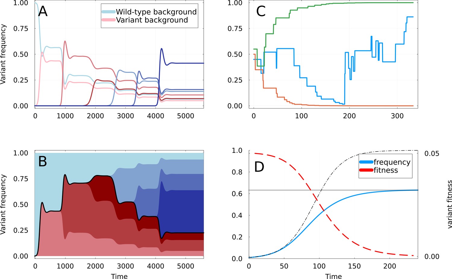
Dynamics of partial sweeps and subsequentfixation.
(A) Simulation of Susceptible-Infected-Recovered (SIR) Equation 1 & Equation 2 with additional strains appearing at regular time intervals. The fraction of infections (frequency) caused by each strain is shown as a function of time. The first strain to appear at is the variant of interest, and curves are shown in shades of red if they appear on the background of this variant, and of blue if they appear on the background of the wild-type. (B) Same as A but with frequencies stacked vertically. The black line delimiting the red and blue areas represents the frequency at which the mutations defining the original variant are found. (C) Three realizations of the random walk of Equation 9, all starting at . Two instances converge rapidly to frequencies 0 and 1, corresponding to apparent selective sweeps, while the remaining one oscillates for a longer time. (D) Representation of a partial sweep using the expiring fitness parametrization of Equation 11. The frequency of the variant is shown as a blue line saturating at value (gray line). The thin dashed line shows a selective sweep with constant fitness advantage . The fitness is a red dashed line, using the right-axis.
Figure 3 with 1 supplement

Retrospective analysis of predictability of viral evolution: frequency trajectories of all amino acid substitutions that are observed to rise from frequency 0 to for Top: influenza virus A/H3N2 from 2000 to 2023, and Bottom: SARS-CoV-2 from 2020 to 2023.
Left: all trajectories for , with blue ones ultimately vanishing and red ones ultimately fixing. The average of all trajectories is shown as a thick black line. Right: showing only the average trajectories for different values of (gray lines).
Figure 3—figure supplement 1
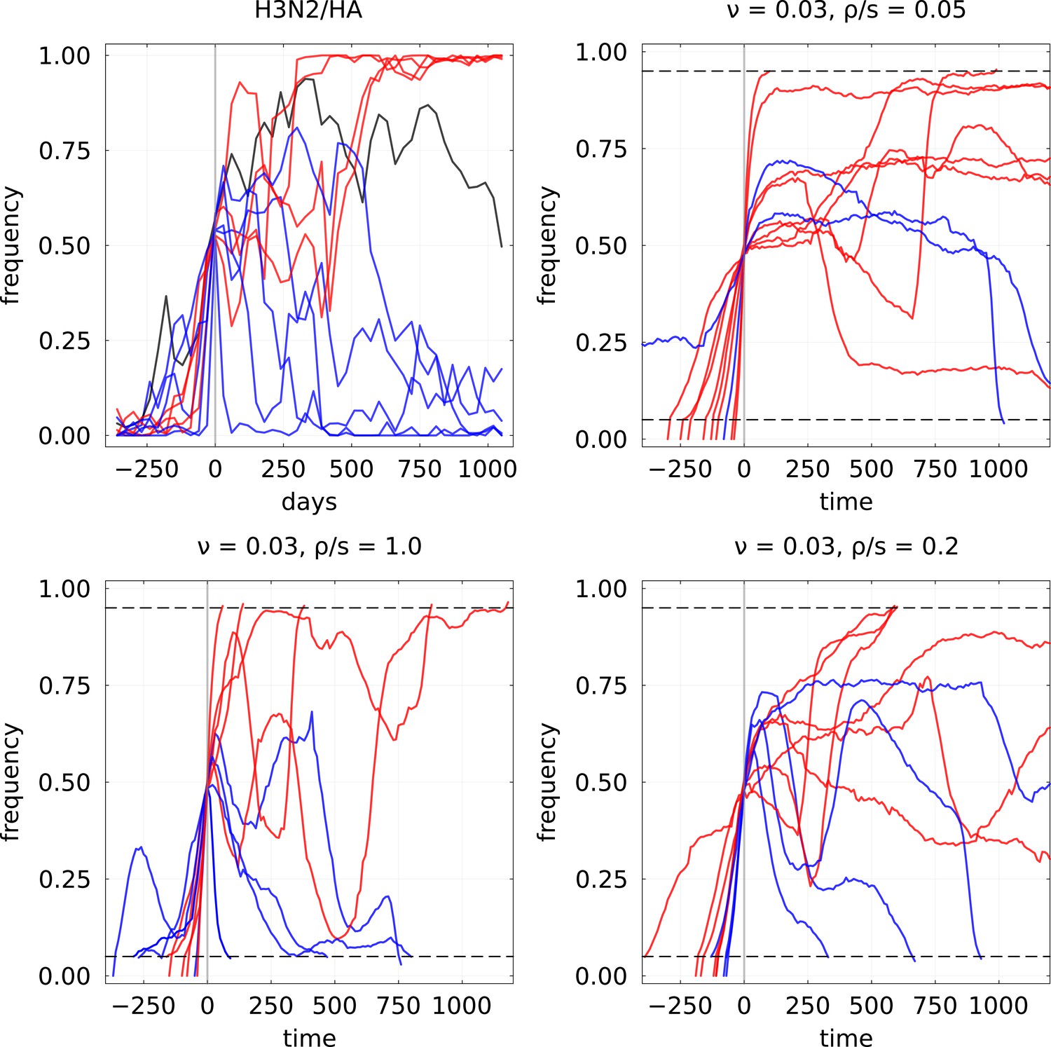
Example of mutation frequency trajectories that are increasing up to a frequency of 0.5 for H3N2/HA influenza and the expiring fitness model.
For the latter, parameters used are and three values of to illustrate different clonal interference regimes. In each case, 10 randomly selected trajectories are plotted, with blue color indicating final loss and red final fixation.
Figure 4 with 1 supplement

Simulations under the Wright-Fisher model with expiring fitness.
(A) Average frequency dynamics of immune escape mutations that are found to cross the frequency threshold , for four different rates of fitness decay. If the growth advantage is lost rapidly (high ), the trajectories crossing have little inertia, while stable growth advantage (small ) leads to steadily increasing frequencies. (B, C, D) Ultimate probability of of trajectories found crossing frequency threshold . Each panel corresponds to a different rate of emergence of immune escape variants, with four rates of fitness decay per panel. Increased clonal interference and fitness decay both result in a gradual loss of predictability. We use . (E) Time to most recent common ancestor for the simulated population, as a function of the prediction obtained using the random walk . Points correspond to different choices of parameters and , and a darker color indicates a higher probability of overlap as computed in Appendix 2.2.
Figure 4—figure supplement 1
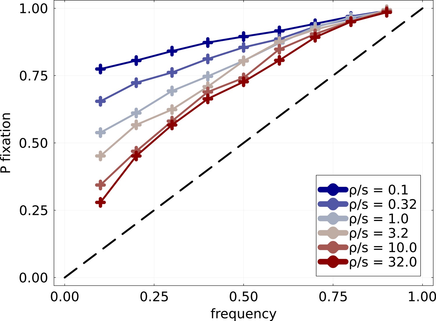
Probability of fixation of mutation Probability of fixation of mutations of mutation frequency trajectories found crossing the frequency threshold .
Fitness effects are exponentially distributed with fixed scale . The blue to red gradient in colors corresponds to the increasing rate at which mutations are introduced. Strong clonal interference regime is obtained when , in which case good mutations are introduced in close succession and compete for fixation. At low , trajectories are very predictable and an increasing trajectory almost certainly fixes. Even for the highest , remains significantly larger than and dynamics are visibly not neutral.
Appendix 1—figure 1
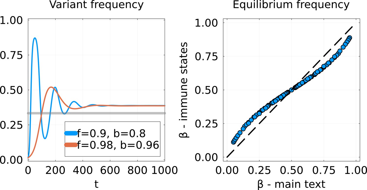
Comparison of SIR model implementations.
Left: Dynamics of the frequency of the variant for the Susceptible-Infected-Recovered (SIR) model from Equations 25; 26 using the invasion scenario from the main text. Two cross-immunity matrices are used, with off-diagonal parameters and chosen to give the same equilibrium. The gray line represents the equilibrium that would be obtained using the model of the main text. Right: Equilibrium frequency for this new SIR model (-axis) versus the from the main text (-axis). Each point corresponds to a given pair .
Appendix 1—figure 2
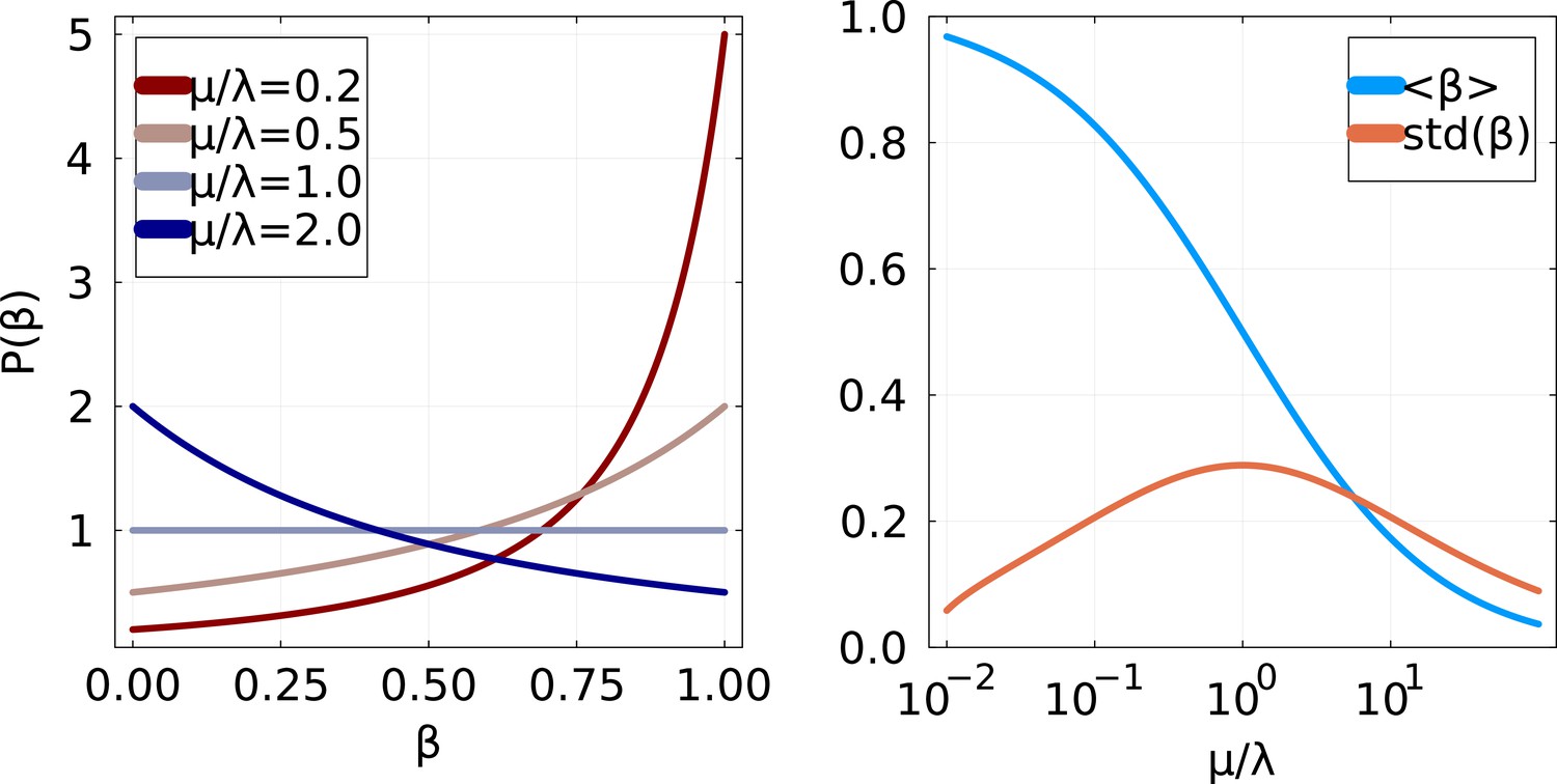
Distribution of partial sweep size if and are exponentially distributed with respective scales μ and .
Left: Probability distribution function for various values of . Right: Mean and standard deviation of as a function of .
Appendix 2—figure 1
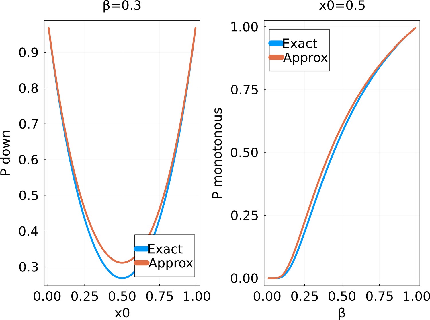
Probability of a strictly monotonous trajectory in the random walk of the main text, as a function of (fixed) and the initial value .
The ‘exact’ solution is obtained by numerically computing the product in Equation 41 up to .
Appendix 2—figure 2
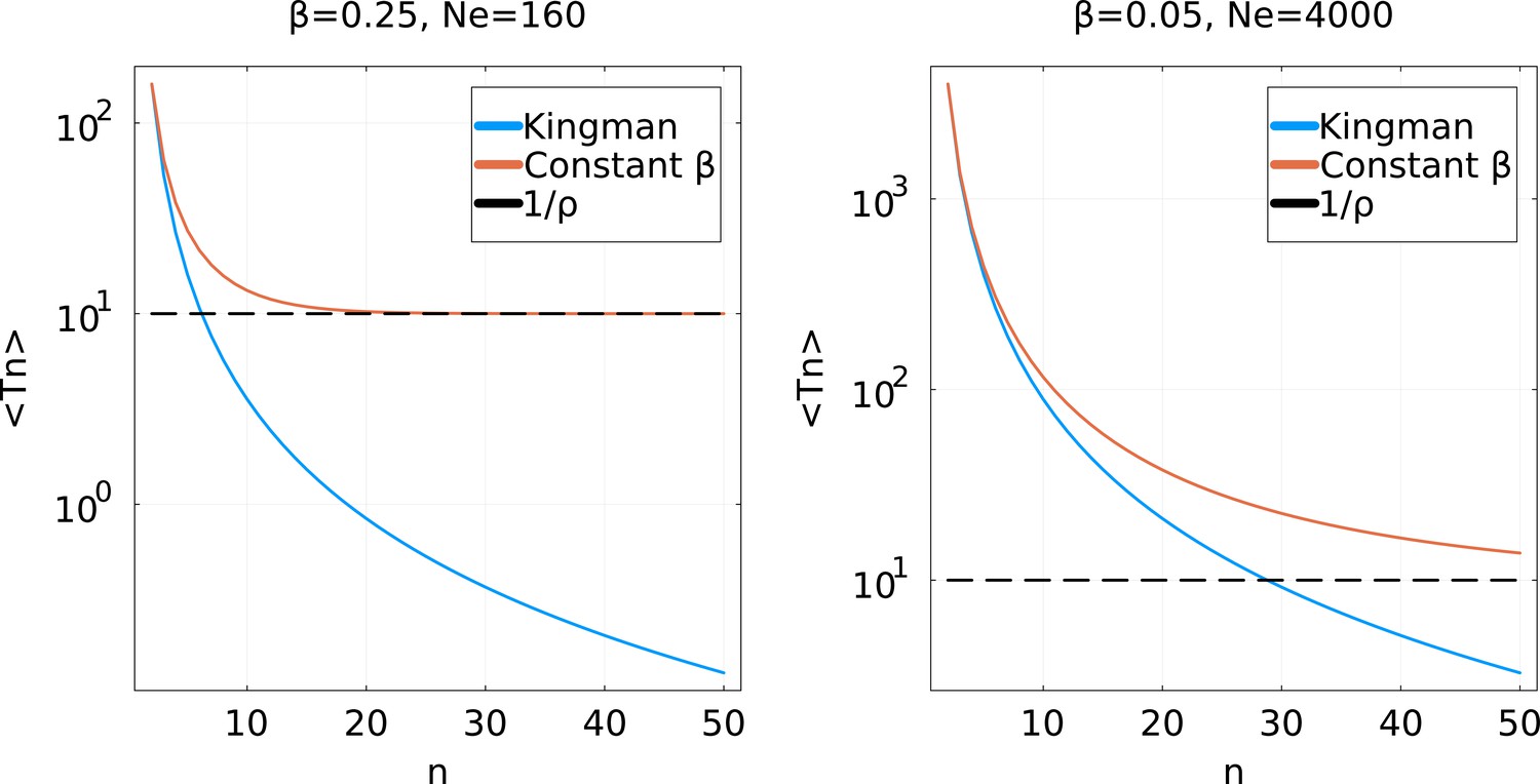
Average coalescence times for a partial sweep coalescent with effective population size and a Kingman coalescent with population size .
For simplicity, a constant is used: Left: a high value ; Right: a low value . For low , the two coalescent processes are very similar until a high . They considerably differ if is larger. Note that for the partial sweep process, never goes below .
Appendix 2—figure 3
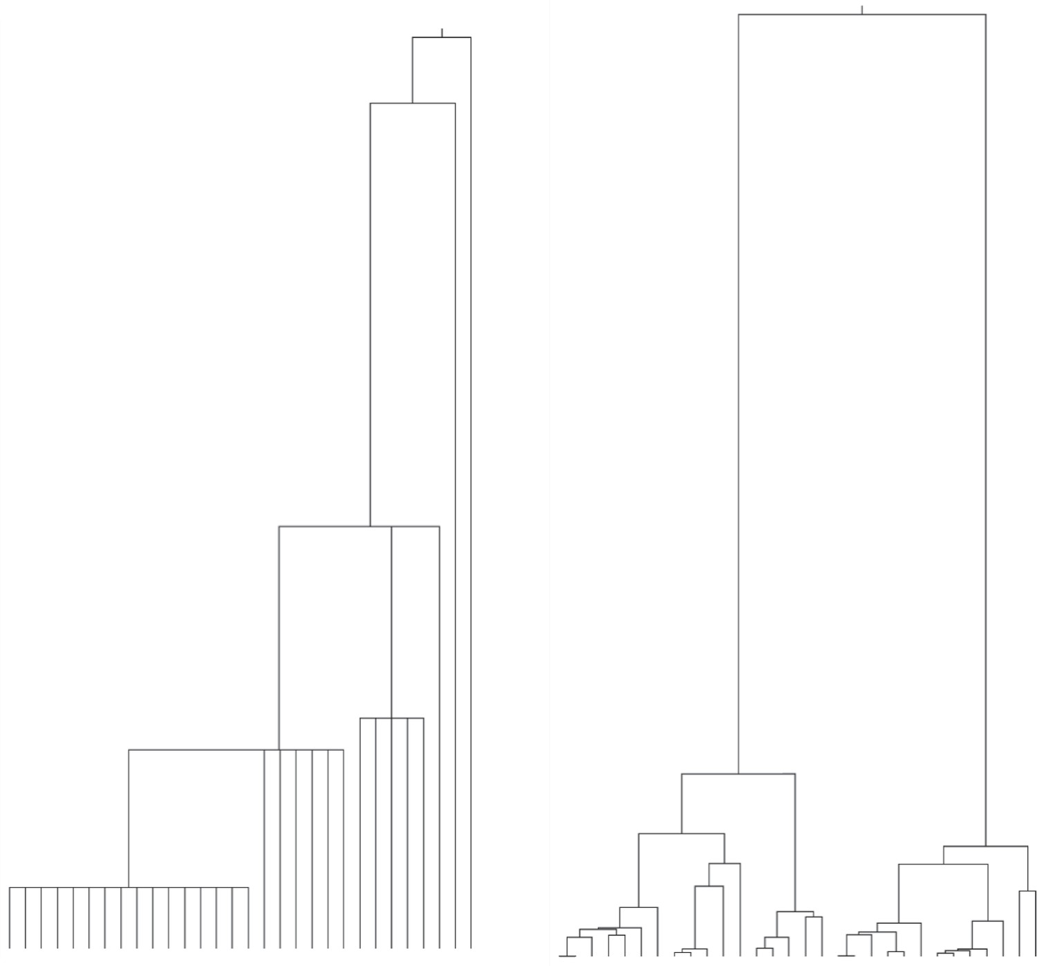
Realizations of different coalescence processes for 30 lineages (leaves).
Left: Partial sweep coalescent, with constant and such that . Right: Kingman coalescent with population size .
Additional files
-
Supplementary file 1
GISAID acknowledgements table listing submitting and originating laboratories for the all sequences used in this study.
- https://cdn.elifesciences.org/articles/97350/elife-97350-supp1-v1.zip
-
MDAR checklist
- https://cdn.elifesciences.org/articles/97350/elife-97350-mdarchecklist1-v1.pdf
Download links
A two-part list of links to download the article, or parts of the article, in various formats.
Downloads (link to download the article as PDF)
Open citations (links to open the citations from this article in various online reference manager services)
Cite this article (links to download the citations from this article in formats compatible with various reference manager tools)
Eco-evolutionary dynamics of adapting pathogens and host immunity
eLife 13:RP97350.
https://doi.org/10.7554/eLife.97350.3


