The emergence and evolution of gene expression in genome regions replete with regulatory motifs
Figures
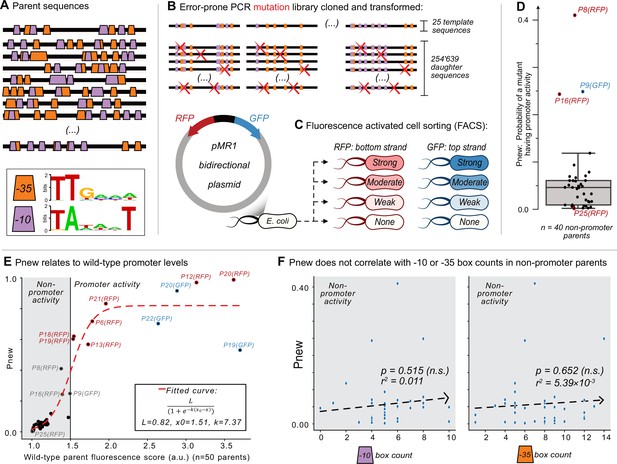
Mutagenesis reveals vastly different probabilities of promoter emergence.
(A) The location of –10 and –35 boxes in a subset of the parent sequences. See Figure 1—figure supplement 1 for the complete set (n=50). Orange trapezoids correspond to –35 boxes, and magenta trapezoids to –10 boxes, each identified using position-weight matrices (see sequence logos below and Figure 1—figure supplement 1). (B–C) The Sort-Seq protocol. (B) Top: we amplified 25 150 bp template sequences from 25 promoter islands in the E. coli genome with an error-prone polymerase chain reaction, generating a mutagenesis library of 245,639 unique daughter sequences. Bottom: we cloned the library into the pMR1 reporter plasmid between a green fluorescent protein (GFP) coding sequence on the top strand (blue arrow) and a red fluorescent protein (RFP) coding sequence on the bottom strand (red arrow). We transformed the plasmid library into E. coli. (C) Using fluorescence-activated cell sorting (FACS), we sorted the transformed E. coli cells into 8 fluorescence bins: none, weak, moderate, and strong, for both RFP and GFP expression (see Figure 1—figure supplement 2 for bins). We sequenced the plasmid inserts of cells from each bin, assigning a fluorescence score from 1.0 to 4.0 arbitrary units (a.u.), ranging from no fluorescence (1.0 a.u.) to strong fluorescence (4.0 a.u.) (see Figure 1—figure supplement 4 for score distributions). (D) Pnew is the ratio of daughter sequences with a fluorescence score greater than 1.5 a.u. to the total number of daughter sequences for each parent. Circles show the Pnew values for each of 40 non-promoter parents (i.e. 50 parents – 3 top strand promoters – 7 bottom strand promoters = 40 non-promoter parents.) The height of the box represents the interquartile range (IQR) and the center line the median. Whiskers correspond to 1.5×IQR. (E) A scatterplot between the calculated fluorescence score (Methods) for all of the parent sequences (n=50, both with and without promoter activity) and Pnew. The solid horizontal line at 1.5 a.u. marks our cutoff for whether a parent does not (gray shaded region) or does have promoter activity (no shading). The dashed line corresponds to a fitted sigmoidal curve, where L is equal to the upper asymptote, x0 is the inflection point, and k is the slope. See Methods for fitting details. (F) Scatterplots comparing the number of –10 or –35 box counts per parent sequence and their respective Pnew values. The dashed line is the line of best fit calculated using the method of least squares. We test the null hypothesis that the slope of the correlation equals zero with the Wald Test. The r2 value is the Pearson correlation coefficient. Calculation carried out using scipy.stats.linregress (version 1.8.1). Left: the number of –10 box counts (p=0.515, r2=0.011). Right: the number of –35 box counts (p=0.652, r2=5.39 × 10⁻³).
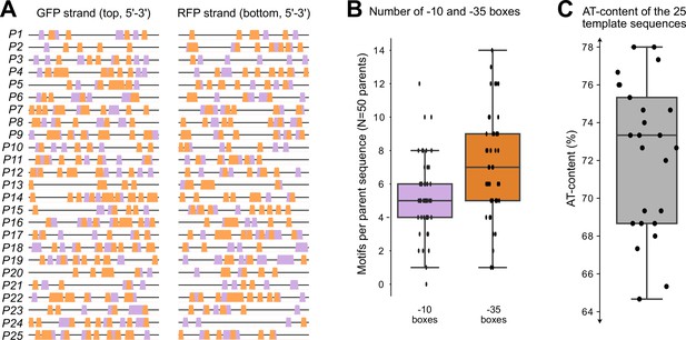
Promoter island sequences.
(A) The locations and arrangements of –10 and –35 boxes located across both the top and bottom strands of the 150 base pair DNA template sequences (P1–P25). Orange trapezoids: –35 boxes. Magenta trapezoids: –10 boxes. Left: top (GFP) strand. Right: bottom (RFP) strand. Note: the plot is shown from 5’–3’ for both strands. We refer to each strand on each template as an individual ‘parent sequence (N=50)’. (B) Distributions of the number of motifs found in the 50 parent sequences. We identified motifs with position-weight matrices (PWMs, Methods). Magenta: number of –10 boxes in each parent sequence (n=50). Orange: number of –35 boxes in each parent sequence (n=50). (C) Distribution of AT-content for the 25 template sequences. Boxes in (B) and (C) represent the interquartile range (IQR) and the center line the median. Whiskers correspond to 1.5×IQR.
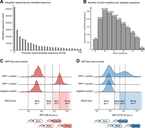
Mutagenesis library and sort-seq bins.
(A) A histogram with the number of unique daughter sequences per template sequence (N=245,639 daughters and N=25 template sequences). (B) The number of point mutations per daughter sequence (N=245,639 daughter sequences). The number above each bin is the number of daughters in each bin. (C) We defined four red fluorescence bins (1, 2, 3, 4, corresponding to none, weak, moderate, and strong fluorescence, respectively) using three controls: GFP+, RFP+, and a negative control (see Methods). Plots show histograms of the fluorescent readouts from 10,000 cells for each control. For bin 1 (none), we defined a minimum boundary as the larger of two PE-H values. These values are the minimum PE-H of the negative control (empty pMR1 plasmid) and the minimum PE-H of the opposite fluorophore positive control (GFP in this case). The upper boundary of bin 1 is the highest PE-H value detected for these same controls. For bin 4 (strong), we defined the lower boundary as the mean fluorescence level of the positive RFP control. This bin does not have an upper bound, because it encompasses the highest levels of fluorescence. For RFP bins 2 (weak) and 3 (moderate), the lower bound of bin 2 is identical to the upper bound of bin 1. The upper bound of bin 3 is identical to the lower bound of bin 4. The upper bound of bin 2, which is identical to the lower bound of bin 3, equals the average of the lower boundary of bin 4 and the upper bound of bin 1. (D) Analogous to (C) except with GFP and RFP controls swapped, with the following exception: Because the GFP-positive control produces a bimodal FITC-H distribution, we defined the lower bound of bin 4 for green fluorescence as the peak of the higher mode of this distribution.
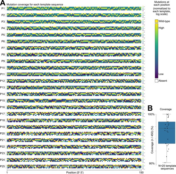
Mutational coverage for the template sequences.
(A) Heatmaps depicting the frequency of each nucleotide (A,T,C,G, y-axis) at each position (5’–3’, x-axis) for all of the daughter sequences of each template sequence (P1-P25, N=25 templates). Daughter sequences contain 1–10 point mutations (see Figure 1—figure supplement 2B). The color of each square in the heatmap corresponds to the frequency of each nucleotide occurring in the library at its respective position, where less frequent nucleotides are shown in dark blue. Highly frequent nucleotides are in yellow (log-scale). These include the nucleotides of the parent sequence, due to our modest mutation rate (~2.0 point mutations per daughter sequence). White squares indicate mutations absent from the library. (B) We calculate coverage as the percentage of all possible mutations of the template sequences (A,T,C,G and positions 1 through 150, 3×150 = 450 total neighboring mutations). In the boxplot, the box represents the interquartile range (IQR) and the center line the median. Whiskers correspond to 1.5×IQR.
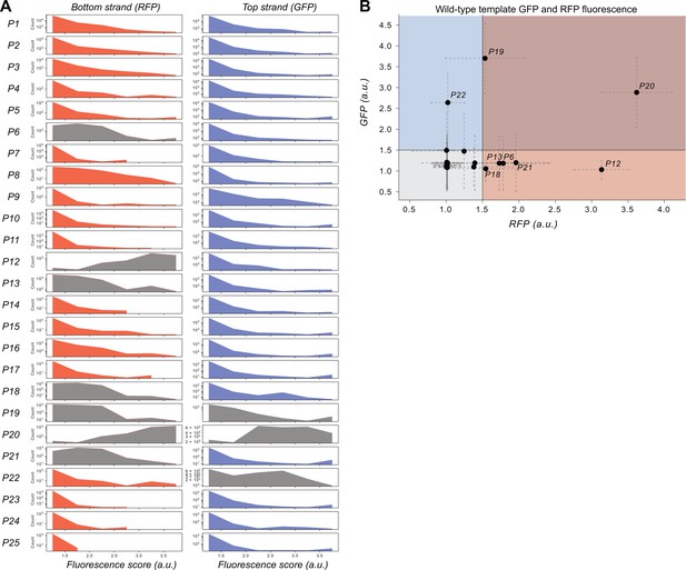
Histogram of the fluorescence score distributions for each parent and its respective daughter sequences.
(A) Rows: template sequences (P1–P25). Left column: bottom strand (RFP fluorescence scores); Right column: top strand (GFP fluorescence scores). Each panel is a histogram of the frequency of fluorescence scores (arbitrary units, a.u.) from the sort-seq experiment. Gray histograms indicate those parent sequences that already encode promoter activity. Note: daughter sequence counts vary among parents, and y-axis is unique to each panel. (B) A scatterplot comparing of RFP fluorescence scores (horizontal axis) and GFP fluorescence scores (vertical axis, a.u.: arbitrary units). Each point represents the fluorescence score of one the 25 template sequences (P1–P25). Length of dashed lines correspond to the standard deviation of the fluorescence values (see methods). Points that are labeled have a fluorescence score for GFP or RFP greater than 1.5 a.u. Points in the gray quadrant are non-promoters for both GFP and RFP. Points in the blue quadrant are promoters driving GFP expression only. Points in the red quadrant are promoters driving RFP expression only. Points in the purple quadrant drive expression of both GFP and RFP.
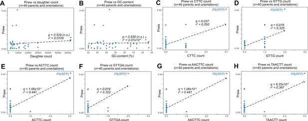
Correlation of Pnew with sequence composition.
(A) Scatterplots of Pnew (see Figure 1) and the number of daughter sequences per parent. Pnew is the ratio of daughter sequences with a fluorescence score greater than 1.5 a.u. to the total number of daughter sequences for each parent. Each point represents a parent without promoter activity (n=40). The dashed line is the line of best fit calculated using the method of least squares. We test the null hypothesis that the slope of the correlation equals zero with the Wald Test. The r2 value is the Pearson correlation coefficient. Calculation carried out using scipy.stats.linregress (version 1.8.1; p=0.529, r2=0.0105, not significant [n.s.]). (B) Analogous to (A) but comparing the GC-content of each parent sequence with Pnew (p=0.930, r2=2.07 × 10⁻⁴, n.s.). (C–H) We searched for k-mers that correlate with Pnew and identified six such k-mers with significant correlations. These k-mers are shown on the horizontal axes of the panels. Q-values correspond to p-values corrected with a Benjamini-Hochberg correction for multiple testing. The outlier at P8-RFP is labeled in each panel. Without P8-RFP, none of these correlations would be significant. (C) Analogous to (A) but for the k-mer CTTC (q=0.037, r2=293). (D) Analogous to (A) but for the k-mer GTTG (q=0.019, r2=0.325). (E) Analogous to (A) but for the k-mer ACTTC (q=1.06 × 10⁻³, r2=0.441). (F) Analogous to (A) but for the k-mer GTTGA (q=0.019, r2=0.322). (G) Analogous to (A) but for the k-mer AACTTC (q=1.06 × 10⁻³, r2=0.441). (H) Analogous to (A) but for the k-mer TAACTT (q=8.25 × 10⁻³, r2=0.367).
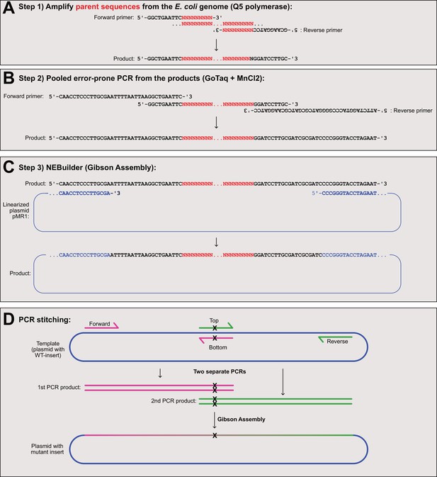
Molecular cloning of parent sequences.
(A) We first amplify the parent sequences from the E. coli genome using Q5 polymerase. Top: the forward and reverse primers contain constant overhang regions, and unique sequences (red N’s) unique to the parent sequence. Bottom: the product is a unique parent sequence with the sequences 5’-GGCTGAATTC…insert…GGATCCTTGC-3’ concatenated to the flanks. (B) We pooled the parent sequences amplified in (A) together for the error-prone polymerase chain reaction using GoTaq and MnCl2. Top: the forward and reverse primers contain constant overhang regions homologous to the pMR1 region for Gibson Assembly. Bottom: the product is the parent sequence flanked by sequences homologous to the pMR1 plasmid. (C) We carry out a Gibson Assembly reaction using NEBuilder. Top: we combine the products from (B) with a linear copy of the pMR1 plasmid. Bottom: the final assembly product is the pMR1 plasmid with a mutant library of daughter sequences. (D) We use PCR stitching to introduce mutations into promoter island inserts of plasmid pMR1. Top: We carry out two PCRs (magenta primers and green primers). The primers ‘Top’ and ‘Bottom’ are complementary and have the same point mutation(s) not present in the template. Middle: the PCR products are double-stranded DNA sequences which share a homologous region harboring the mutation(s). We carry out a Gibson Assembly reaction using NEBuilder with the pMR1 plasmid and the two products. Bottom: the assembly reaction combines the two PCR products together with the desired mutation(s) into the pMR1 plasmid.
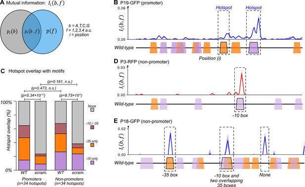
The majority of promoters emerge and evolve within a subset of preexisting promoter motifs.
(A) We calculated the mutual information between nucleotide identity (b=A,T,C,G) and fluorescence scores rounded to the nearest whole number (f=1,2,3,4 a.u.) for each position in a parent sequence. In essence, the calculation compares the probability of a base occurring at position , and the probability that a sequence has a fluorescence score . The joint probability is the probability that a sequence with base at position has fluorescence score . The greater the joint probability is compared to the individual probabilities, the more important the base at this position is for promoter activity. See methods. (B) An example of how to interpret mutual information using position-weight matrix (PWM) scores of predicted –10 and –35 boxes. Top: we plot the mutual information for P19-GFP. P19-GFP is an active promoter. Solid line: mean mutual information. Shaded region:±1 standard deviation when the dataset is randomly split into three equally sized subsets (Methods). Bottom: position-weight matrix (PWM) predictions for the –10 boxes (magenta trapezoids) and –35 boxes (orange trapezoids) along the wild-type parent sequence. We define hotspots as mutual information peaks greater than or equal to the 90th percentile of total mutual information (Methods), and highlight them with dashed rectangles. (C) Stacked bar plots depicting the percentage of hotspots overlapping with –10 boxes only (magenta), –35 boxes (orange), both –10 and –35 boxes (red), or with neither (gray). We plot this information for the wild-type (WT) promoters and non-promoter parents, as well as scrambled (scram.) versions of the parents. Horizontal lines correspond to χ (chi)-squared tests between the counts in each group (3 degrees of freedom). (D) Analogous to (B) but for parent P3-RFP. P3-RFP is an inactive parent sequence. Hotspot overlaps with a –10 box. (E) Analogous to (B) but for parent P18-GFP. P18-GFP is an inactive parent sequence. Hotspots overlap with (from left to right) a –35 box, both a –10 and a –35 box, and neither (None). Figure 2—figure supplement 1 shows analogous mutual information plots for daughters derived from each parent sequence.
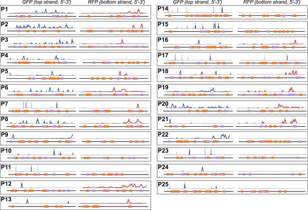
Mutual information and promoter motifs in the parent sequences.
Each panel corresponds to a unique parent sequence, with its numerical identifier in bold. Within each panel there are two plots, corresponding to the top strand (left), and the bottom strand (right), both shown from 5’ (left) to 3’ (right). Within each panel, we show on top the mutual information between nucleotide identity and fluorescence levels at every position (Solid line: mean mutual information, shaded region:±1 standard deviation when the dataset is randomly split into three equally sized subsets [Methods]). The bottom of each panel shows position-weight matrix (PWM) predictions for the occurrence of –10 box motifs (magenta trapezoids) and –35 box motifs (orange trapezoids) along the wild-type parent sequence. See Methods.
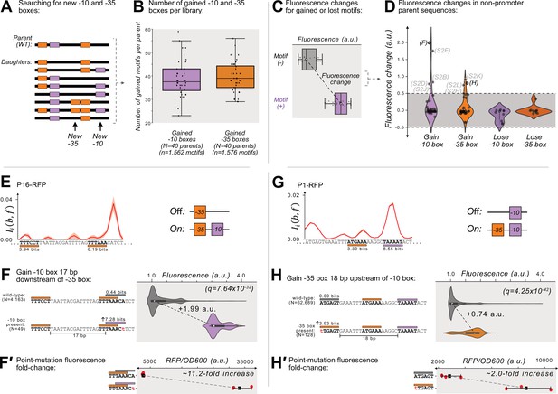
Gaining –10 and –35 boxes rarely creates de novo promoters.
(A) A cartoon for how we identify new –35 and –10 boxes (orange and magenta boxes, respectively) within each DNA sequence (thick, black, horizontal bars). Top: we first identify the –10 and –35 boxes in the wild-type parent sequence. Bottom: within all of the daughter sequences, we identify all locations where new –10 and –35 boxes appear, as shown with the arrows below the daughter sequences. We then count the new motifs gained for each parent, and plot the results in a box plot (B) for both new –10 and –35 boxes. Boxes represent the interquartile range (IQR) and the center line the median. Whiskers correspond to 1.5×IQR. (C) We define fluorescence change as the median difference between the fluorescence scores of sequences with vs without a –10 or –35 box. The fluorescence change is only considered valid if there is a significant difference between the central tendency of each distribution based on a two-sided Mann-Whitney U (MWU) test. See methods. (D) The change in fluorescence (arbitrary units, a.u.) when gaining or losing –10 and –35 boxes in mutual information hotspots of inactive parent sequences (see Figure 3—figure supplement 1 for calculation overview). Dashed lines indicate an effect size threshold of ±0.5 a.u. Each circle corresponds to a gain or loss of a box in a mutual information hotspot (see Figure 2 for hotspots). Circles with letters in parentheses refer to the corresponding Figure panels in Figure 3—figure supplement 2. The volume of each violin plot corresponds to a kernel density estimate of each distribution. Data available in Source data 4. (E) Parent P16-RFP. Top: Mutual information between nucleotide identity and fluorescence at each position. Solid red line: mean mutual information, shaded region:±1 standard deviation when the dataset is randomly split into three equally sized subsets (methods). Bottom: position-weight matrix (PWM) predictions for the –10 boxes (magenta rectangles) and –35 boxes (orange rectangles) along the wild-type parent sequence. (F) Top: Parent P16-RFP and its PWM predictions from (E). We plot the fluorescence scores of all daughters without a –10 box in the region of interest (left, gray rectangle). Bottom: the most frequent genotype in the dataset where a –10 box is in the region of interest. We plot the fluorescence scores of all daughters with a –10 box in the region of interest. We tested the null hypothesis that the gain of the –10 box significantly increases fluorescence (two-tailed Mann-Whitney U [MWU] test). The q-values correspond to Benjamini-Hochberg-corrected p-values (methods) (two-tailed MWU test, q=7.64 × 10⁻³²). Within the violin plot is a box plot, where the box represents the interquartile range (IQR) and the white circle the median. Whiskers correspond to 1.5×IQR. (F′) Top: the fluorescence readouts of three colonies harboring the wild-type P16-RFP reporter measured using a plate reader. The horizontal axis shows the RFP readout normalized to the optical density of the culture (OD600) during the reading (see methods). Each point corresponds to the fluorescence of an individual colony. Whiskers correspond to the minimum and maximum values and the dark square the mean fluorescence level. Bottom: analogous to top, but for three colonies harboring a single point mutation identified to change fluorescence in panel F. (G) Analogous to (E) but for the parent P1-RFP. (H) Analogous to (F) except for gaining a –35 box in the region of interest (two-tailed MWU test, q=4.25 × 10–42 (H′) Analogous to F′ but for the point mutation identified to change fluorescence in panel H). See Figure 3—figure supplement 2 for additional examples.
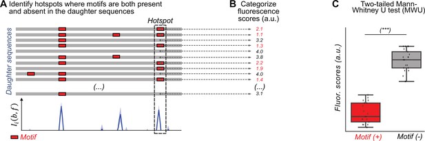
Identifying where motifs are gained and lost in hotspots that are associated with changes in fluorescence.
These panels do not show data from any parent sequence or hotspot, but show hypothetical data to illustrate how we identified the associations of base identity and fluorescence in our analysis. (A) Top: a cartoon illustration of all daughter sequences from a single parent. Red boxes correspond to position-weight matrix (PWM) predicted motifs. Bottom: Mutual information between fluorescence levels and nucleotide identity at each position calculated from the respective daughter sequences of a given parent sequence. We examine for each mutual information hotspot if –35 or –10 box motifs are present or absent in each daughter sequence. The dashed rectangle highlights a hotspot at the 3’-end of the daughter sequences discussed in (B) and (C). (B) We categorize the fluorescence scores for the daughter sequences based on whether they have a motif (red) or not (black) in the hotspot. (C) We test the null hypothesis that the fluorescence scores in each group have the same central tendency using a two-sided Mann-Whitney U (MWU) test. See Methods.
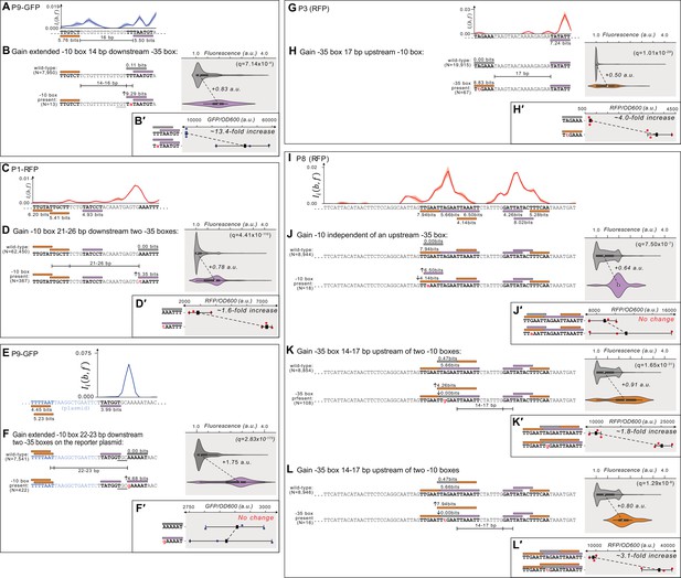
Additional examples of which gaining –10 and –35 boxes creates de-novo promoters.
(A) Parent P9-GFP. Top: Mutual information between nucleotide identity and fluorescence at each position. Solid line: mean mutual information, shaded region:±1 standard deviation when the dataset is randomly split into three equally sized subsets (methods). Bottom: position-weight matrix (PWM) predictions for the –10 boxes (magenta rectangles) and –35 boxes (orange rectangles) along the wild-type parent sequence. (B) Top: Parent P9-GFP and its PWM predictions from (A). We plot the fluorescence scores of all daughters without a –10 box in the region of interest (left, gray rectangle). Bottom: the most frequent genotype in the dataset where a –10 box is in the region of interest. We plot the fluorescence scores of all daughters with a –10 box in the region of interest. We tested the null hypothesis that the gain of the motif significantly increases fluorescence (two-tailed Mann-Whitney U [MWU] test). The q-values correspond to Benjamini-Hochberg-corrected p-values (methods) (two-tailed MWU test, q=7.14 × 10⁻⁴). Within the violin plot is a box plot, where the box represents the interquartile range (IQR) and the white circle the median. Whiskers correspond to 1.5×IQR. (B′) Top: the fluorescence readouts of three colonies harboring the wild-type P9-GFP reporter construct measured using a plate reader. The y-axis corresponds to the fluorescence readout normalized to the optical density of the culture (OD600) during the reading (see methods). Each point corresponds to the fluorescence of an individual colony. Whiskers correspond to the minimum and maximum values and the dark square the mean fluorescence level. Bottom: analogous to top, but for three colonies harboring the degenerate consensus sequence identified to change fluorescence in panel B. (C) Analogous to (A) but for parent P1-RFP. (D) Analogous to (B) but for gaining a –10 box in the gray region of interest on P1-RFP (two-tailed MWU test, q=4.41 × 10–110). (D′) Analogous to (B′) but the fluorescence levels from three colonies with and without the degenerate consensus sequence identified in (D). (E) Analogous to (A) but for parent P9-GFP. (F) Analogous to (B) but for gaining a –10 box in the gray region of interest on P9-GFP (two-tailed MWU test, q=2.83 × 10–173). (F′) Analogous to (B′) but the fluorescence levels from three colonies with and without the degenerate consensus sequence identified in (E). (G) Analogous to (A) but for parent P3-RFP. (H) Analogous to (B) but for gaining a –35 box in the gray region of interest on P3-RFP (two-tailed MWU test, q=1.01 × 10⁻²⁹). (H′) Analogous to (B′) but the fluorescence levels from three colonies with and without the degenerate consensus sequence identified in (H). (I) Analogous to (A) but for parent P8-RFP. (J) Analogous to (B) but for gaining a –10 box in the gray region of interest on P8-RFP (two-tailed MWU test, q=7.50 × 10⁻⁷). (J′) Analogous to (B′) but the fluorescence levels from three colonies with and without the degenerate consensus sequence identified in (J). (K) Analogous to (B) but for gaining a –35 box in the gray region of interest on P8-RFP (two-tailed MWU test, q=1.65 × 10⁻³¹). (K′) Analogous to (B′) but the fluorescence levels from three colonies with and without the degenerate consensus sequence identified in (K). (L) Analogous to (B) but for gaining a –35 box in the gray region of interest on P8-RFP (two-tailed MWU test, q=1.29 × 10⁻⁸). (L′) Analogous to (B′) but the fluorescence levels from three colonies with and without the degenerate consensus sequence identified in (L).
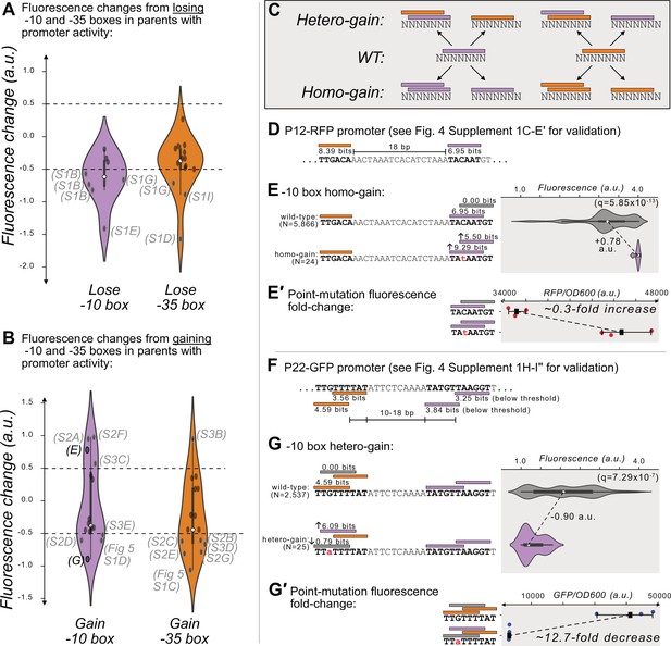
Gaining –10 and –35 boxes modulates promoter activity.
(A) The change in fluorescence (arbitrary units, a.u.) when losing –10 and –35 boxes in hotspots in the active parent sequences. Dashed lines indicate an effect size threshold of ±0.5 a.u. Each black point corresponds to a loss of a –10 or –35 box in a mutual information hotspot. Outlined points with letters in parenthesis highlight the corresponding Figure panels in Figure 4—figure supplement 1 (S1). The areas of the violin plots are the kernel density estimates (KDE) of each distribution. Within each violin plot is a box plot, where the box represents the interquartile range (IQR) and the white circle the median. Whiskers correspond to 1.5×IQR. Data available in Source data 4. (B) Analogous to (A) but for gaining –10 and –35 boxes instead of losing them. Parenthesis highlight the corresponding Figure panels in Figure 4—figure supplement 2 (S2), Figure 4- figure supplement 3 (S3), and Figure 5—figure supplement 1. (C) In parents with promoter activity, mutations frequently create new –10 (magenta rectangles) and –35 (orange rectangles) boxes over preexisting ones. (D) A model of the promoter located in parent P12-RFP. Position-weight matrix (PWM) predictions for the –10 boxes (magenta rectangles) and –35 boxes (orange rectangles) along with the wild-type parent sequence. See Figure 4—figure supplement 1C–E′ for the experiments validating this promoter. (E) Top: Parent P12-RFP and its PWM predictions from (D). We plot the fluorescence scores of all daughters without a –10 box in the region of interest (left, gray rectangle). Bottom: the most frequent genotype in the dataset where a –10 box is in the region of interest. We plot the fluorescence scores of all daughters with a –10 box in the region of interest. We tested the null hypothesis that the gain of the –10 box significantly increases fluorescence (two-tailed Mann-Whitney U [MWU] test). The q-values correspond to Benjamini-Hochberg-corrected p-values (Methods; two-tailed MWU test, q=5.85 × 10⁻¹³). Within the violin plot is a box plot, where the box represents the interquartile range (IQR) and the white circle the median. Whiskers correspond to 1.5×IQR. (E′) Top: the fluorescence readouts of three colonies harboring the wild-type P12-RFP reporter, whose activity was measured using a plate reader. The horizontal axis shows red fluorescence normalized to the optical density of the culture (OD600) during the reading (see Methods). Each point corresponds to the fluorescence of an individual colony. Whiskers correspond to the minimum and maximum values and the dark square indicates the mean fluorescence level. Bottom: analogous to the top, but for three colonies harboring a point mutation identified to change fluorescence in the preceding panel. (F) Analogous to (D) but for P22-GFP. Note that the two –10 boxes have PWM scores below the 3.98 bits threshold, but destroying these boxes decreases expression (see Figure 4—figure supplement 1H–I’’′ for the experiments validating this promoter). (G) Analogous to (E) but for gaining a –10 box in the gray highlighted region of interest on the top strand of P22. (G′) Analogous to (E′) but for the wild-type and consensus mutant in panel (G).
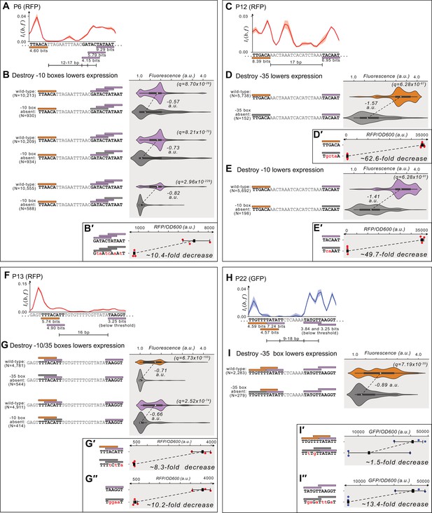
Mapping promoters in active parents.
(A) Parent P6-RFP. Top: Mutual information between nucleotide identity and fluorescence at each position. Solid line: mean mutual information, shaded region:±1 standard deviation when the dataset is randomly split into three equally sized subsets (Methods). Bottom: position-weight matrix (PWM) predictions for the –10 boxes (magenta rectangles) and –35 boxes (orange rectangles) along the wild-type parent sequence. (B) Top: Parent P6-RFP and its PWM predictions from (A). We plot the fluorescence scores of all daughters with a –10 box. Bottom: the most frequent genotype in the dataset where a –10 box is missing in the gray region of interest. We plot the fluorescence scores of all daughters without a –10 box in the region of interest. We tested the null hypothesis that the loss of the motif significantly decreases fluorescence (two-tailed Mann-Whitney U [MWU] test). The q-values correspond to Benjamini-Hochberg-corrected p-values (methods) (two-tailed MWU test, from top to bottom: q=8.70 × 10⁻²⁶, q=8.21 × 10–70, q=2.96 × 10–229). Within the violin plot is a box plot, where the box represents the interquartile range (IQR) and the white circle the median. Whiskers correspond to 1.5×IQR. (B′) Top: the fluorescence readouts of three colonies harboring the wild-type P6-RFP reporter construct measured using a plate reader. The y-axis corresponds to the fluorescence readout normalized to the optical density of the culture (OD600) during the reading (see Methods). Each point corresponds to the fluorescence of an individual colony. Whiskers correspond to the minimum and maximum values and the dark square the mean fluorescence level. Bottom: analogous to top, but for three colonies harboring a scrambled sequence where the three regions of interest were tested (See methods for scrambling procedure). (C) Analogous to (A) but for parent P12-RFP. (D) Analogous to (B) but for losing a –35 box in the orange region of interest on P12-RFP (two-tailed MWU test, q=6.28 × 10–67). (D′) Analogous to (B′) but the fluorescence levels from three colonies with and without the scrambled –35 box sequence. (E) Analogous to (B) but for losing a –10 box in the magenta region of interest on P12-RFP. (E′) Analogous to (B′) but for the fluorescence levels from three colonies with and without the scrambled –10 box sequence. (F) Analogous to (A) but for parent P13-RFP. (G) Analogous to (B) but for losing an overlapping –10/35 box in the orange and magenta region of interest on P13-RFP. (G′) Analogous to (B′) but for the fluorescence levels from three colonies with and without the scrambled –10/35 box sequence. (G′′) Analogous to (B′) but for the fluorescence levels from three colonies with and without a scrambled low-affinity –10 box sequence. (H) Analogous to (A) but for parent P22-GFP. (I) Analogous to (B) but for losing a –35 box in the orange region of interest on P22-GFP. (I′) Analogous to (B′) but for the fluorescence levels from three colonies with and without two scrambled –35 box sequences. (I′′) Analogous to (B′) but for the fluorescence levels from three colonies with and without two scrambled low-affinity –10 box sequences.
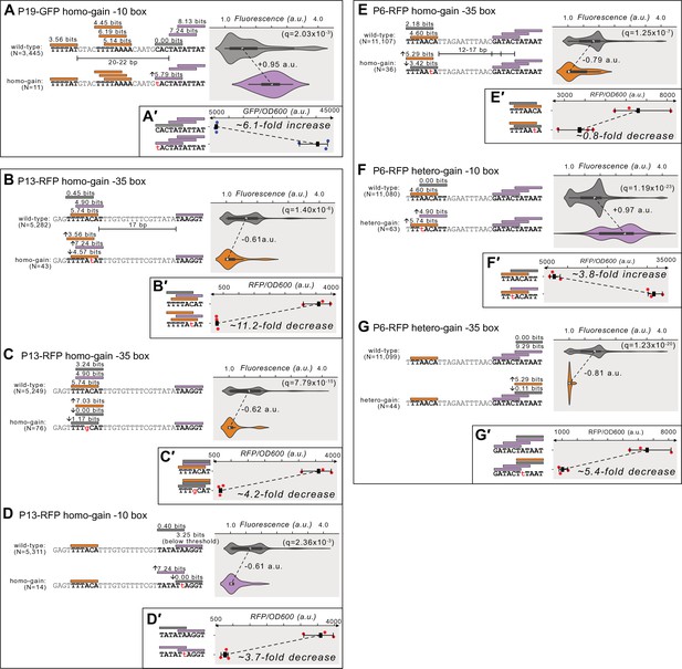
Additional examples of mutations modulating promoter activity.
(A) Top: Parent P19-GFP and its PWM predictions (orange rectangle = –35 box, magenta rectangle = –10 box, gray rectangle = region of interest). We plot the fluorescence scores of all daughters without a –10 box in the region of interest. Bottom: the most frequent genotype in the dataset where a –10 box is in the region of interest. We plot the fluorescence scores of all daughters with a –10 box in the region of interest. We tested the null hypothesis that the gain of the motif significantly increases fluorescence (two-tailed Mann-Whitney U [MWU] test). The q-values correspond to Benjamini-Hochberg-corrected p-values (Methods; two-tailed MWU test, q=2.03 × 10⁻³). Within the violin plot is a box plot, where the box represents the interquartile range (IQR) and the white circle the median. Whiskers correspond to 1.5×IQR. (A′) Top: the fluorescence readouts of three colonies harboring the wild-type P19-GFP reporter construct measured using a plate reader. The y-axis corresponds to the fluorescence readout normalized to the optical density of the culture (OD600) during the reading (see Methods). Each point corresponds to the fluorescence of an individual colony. Whiskers correspond to the minimum and maximum values and the dark square the mean fluorescence level. Bottom: analogous to top, but for three colonies harboring the degenerate consensus sequence identified to change fluorescence in panel A. (B) Analogous to (A) but for gaining a –35 box in the gray region of interest on P13-RFP (two-tailed MWU test, q=1.40 × 10⁻⁶). (B′) Analogous to (A′) but the fluorescence levels from three colonies with and without the degenerate consensus sequence identified in (B). (C) Analogous to (A) but for gaining a –35 box in the gray region of interest on P13-RFP (two-tailed MWU test, q=7.79 × 10⁻¹⁵). (C′) Analogous to (A′) but the fluorescence levels from three colonies with and without the degenerate consensus sequence identified in (C). (D) Analogous to (A) but for gaining a –10 box in the gray region of interest on P13-RFP (two-tailed MWU test, q=2.36 × 10⁻³). (D′) Analogous to (A′) but the fluorescence levels from three colonies with and without the degenerate consensus sequence identified in (D). (E) Analogous to (A) but for gaining a –35 box in the gray region of interest on P6-RFP (two-tailed MWU test, q=1.25 × 10⁻⁷). (E′) Analogous to (A′) but the fluorescence levels from three colonies with and without the degenerate consensus sequence identified in (E). (F) Analogous to (A) but for gaining a –10 box in the gray region of interest on P6-RFP (two-tailed MWU test, q=1.19 × 10⁻²³). (F′) Analogous to (A′) but the fluorescence levels from three colonies with and without the degenerate consensus sequence identified in (F). (G) Analogous to (A) but for gaining a –35 box in the gray region of interest on P6-RFP (two-tailed MWU test, q=1.23 × 10⁻²⁰). (G′) Analogous to (A′) but the fluorescence levels from three colonies with and without the degenerate consensus sequence identified in (G).
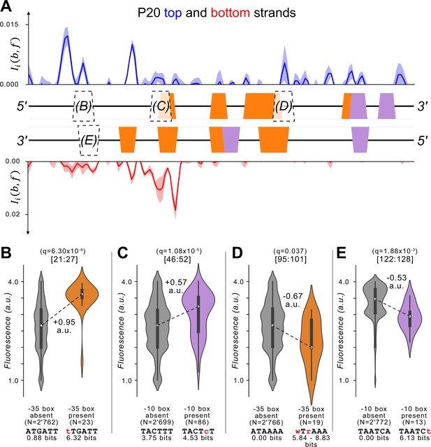
Template P20.
(A) We plot the mutual information for the top (blue) and bottom (red) strands of template P20. Top: P20-GFP. We plot the mutual information between nucleotide identity and fluorescence at each position. Solid line: mean mutual information, shaded region:± 1 standard deviation when the dataset is randomly split into three equally sized subsets (Methods). Middle: position-weight matrix (PWM) predictions for the –10 boxes (magenta trapezoids) and –35 boxes (orange trapezoids) along the wild-type parent sequence. Outlined trapezoids with letters in parenthesis indicate regions of interest for the subsequent Figure panel. Bottom: the mutual information for parent P20-RFP as described for P20-GFP. (B) We test the null hypothesis that the fluorescence scores have the same central tendency for daughter sequences with vs without –35 boxes at position 21:27 using a two-sided Mann-Whitney U (MWU) test (q=6.30 × 10⁻⁸). The areas of the violin plots are the kernel density estimates (KDE) of each distribution. Within each violin plot is a box plot, where the box represents the interquartile range (IQR) and the white circle the median. Whiskers correspond to 1.5×IQR. The DNA sequences are degenerate consensus sequences in each respective category. Values underneath them correspond to position weight matrix (PWM) bit scores of the degenerate consensus sequence. (C) Analogous to (B) but for gaining a –10 box at position 46:52 (two-tailed MWU test, q=1.08 × 10⁻⁵). (D) Analogous to (B) but for gaining a –35 box at position 95:101 (two-tailed MWU test, q=0.037). (E) Analogous to (B) but for gaining a –10 box at position 122:128 (two-tailed MWU test, q=1.88 × 10⁻³).
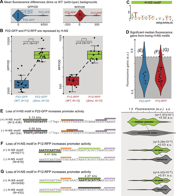
Histone-like nucleoid-structuring protein (H–NS) represses P12-RFP and P22-GFP.
(A) The difference in average fluorescence levels for each parent sequence in a mutant background for the Histone-like nucleoid-structuring protein (H–NS) Δhns vs the wild-type background. Positive and negative values correspond to increases and decreases, respectively in fluorescence in the Δhns background. Fluorescence values measured using a plate reader (see Methods). Within the violin plot is a box plot, where the box represents the interquartile range (IQR) and the white circle the median. Whiskers correspond to 1.5×IQR. We classified parents outside of the whiskers as H-NS targets, which are outlined in blue or red, and labeled. Left: GFP fluorescence changes (N=25 parents). Right: RFP fluorescence changes (N=25 parents). (B) The fluorescence levels of bacterial colonies (N=12 each) harboring a parent sequence in the wild-type (left) vs the Δhns background. Box and whisker plots described in (A). We test the null hypothesis that the means in each background are the same using a two-tailed t-test. Left: P22-GFP levels in the wild-type vs the Δhns backgrounds (two-tailed t-test, p=1.16 × 10⁻⁸). Right: P12-RFP levels (two-tailed t-test, p=4.33 × 10⁻¹⁰). (C) A sequence logo derived from a position weight matrix for the transcription factor H-NS (Tierrafría et al., 2022). (D) The increase in fluorescence (arbitrary units, a.u.) when losing a H-NS motif in mutual information hotspots of P22-GFP and P12-RFP (see Figure 3—figure supplement 1 for calculation overview and Source data 7). Dashed lines indicate an effect size threshold of +0.5 a.u. Each circle corresponds to a loss of a H-NS motif in a mutual information hotspot (see Figure 2 for hotspots). Outlined points with letters in parenthesis highlight the corresponding Figure panels. See Figure 5—figure supplement 1B for additional parents. (E) Top: Parent P22-GFP and its PWM predictions (orange = –35 box, magenta = –10 box, green = H NS motif of interest). We plot the fluorescence scores of all daughters with the H-NS motif. Bottom: the most frequent genotype in the dataset where the H-NS motif is absent. We plot the fluorescence scores of all daughters without the H-NS motif of interest. We tested the null hypothesis that losing the motif significantly increases fluorescence (two-tailed Mann-Whitney U [MWU] test). The q-values are Benjamini-Hochberg-corrected p-values (methods) (two-tailed MWU test, q=1.07 × 10⁻³). Within the violin plot is a box plot, where the box represents the interquartile range (IQR) and the white circle the median. Whiskers correspond to 1.5×IQR. (F,G) Analogous to (E) but for the highlighted H-NS motif in P12-RFP.
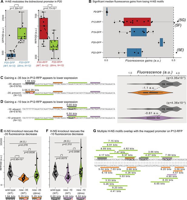
Additional H-NS sites.
(A) The fluorescence levels of bacteria colonies (N=12 each) harboring a parent sequence in the wild-type (left) vs the Δhns background. Boxes represent the interquartile range (IQR) and the center line the median. Whiskers correspond to 1.5×IQR. We test the null hypothesis that the means in each background are the same using a two-tailed t-test. Left: P20-GFP levels in the wild-type vs the Δhns backgrounds (p=1.59 × 10⁻⁶). Right: P20-RFP levels (p=4.77 × 10⁻⁴). (B) The increase in fluorescence (arbitrary units, a.u.) when losing a H-NS motif in mutual information hotspots (see Figure 3—figure supplement 1 for calculation overview). The dashed line indicates an effect size threshold of +0.5 a.u. Each circle corresponds to a loss of a H-NS motif in a mutual information hotspot (see Figure 2 for hotspots). Outlined points with letters in parentheses highlight the corresponding Figure panels. (C) The unmutated sequence of P12-RFP. Orange rectangles = –35 boxes, magenta rectangles = –10 boxes, green rectangles = H-NS motifs. Boxes above the DNA sequence correspond to the same strand as the displayed DNA sequence. Boxes below are on the opposite strand. The gray region corresponds to the region of interest and its current PWM score for the –35 box. Top: Parent P12-RFP and its PWM predictions. We plot the fluorescence scores of all daughters without a –35 box in the gray region of interest. Bottom: the most frequent genotype in the dataset where a –35 box is gained in the region of interest. We plot the fluorescence scores of all daughters with a –35 box in the region of interest. We tested the null hypothesis that gaining a –35 box significantly decreases fluorescence (two-tailed Mann-Whitney U [MWU] test). The q-values correspond to Benjamini-Hochberg-corrected p-values (methods) (two-tailed MWU test, q=3.35 × 10⁻⁵). Within the violin plot is a box plot, in which the box represents the interquartile range (IQR) and the white circle represents the median. Whiskers correspond to 1.5×IQR. (D) Analogous to (C) but for the region of interest highlighted in gray, corresponding to a new –10 box (two-tailed MWU test, q=4.36 × 10⁻⁴). (E) Analogous to (A) but for constructs from the parent P12-RFP with or without the –35 box shown in (C), in either the wild-type background or the Δhns background. N=16 colonies each. (F) Analogous to (E) but for constructs with or without the –10 box shown in (D). (G) PWM motif predictions and their respective fluorescence scores in bits for P12-RFP. Orange boxes = –35 boxes, magenta boxes = –10 boxes, green boxes = H-NS motifs.
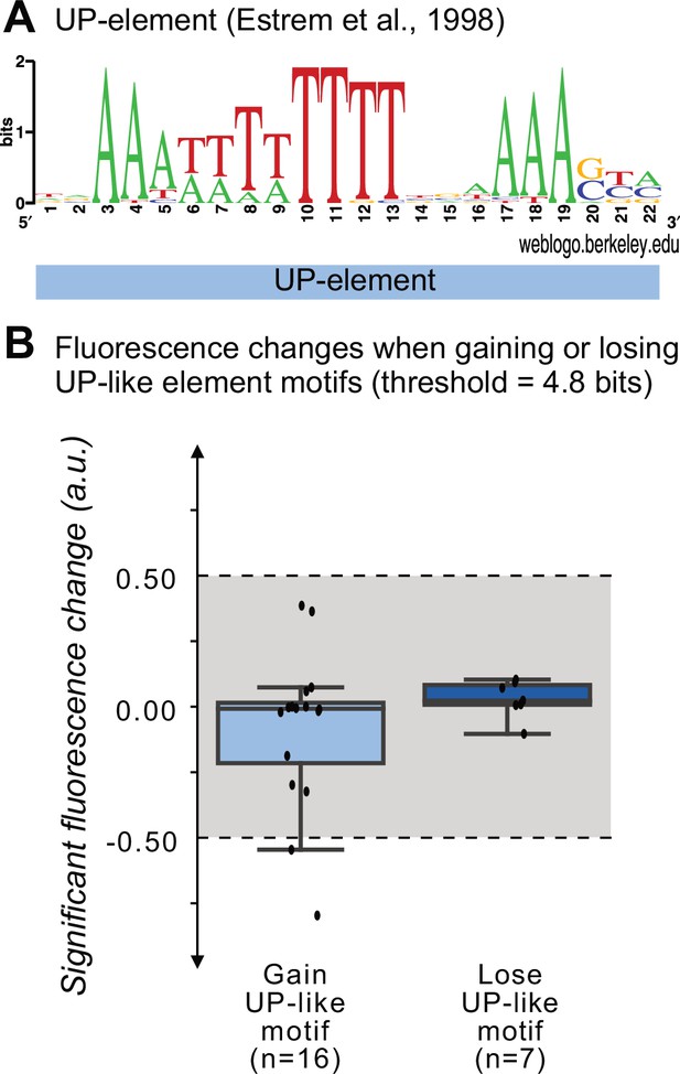
The change in fluorescence when gaining and losing UP-like motifs.
(A) A sequence logo for the UP-element derived from a position weight matrix for this element (Estrem et al., 1998). (B) Change in fluorescence (arbitrary units, a.u.) when losing or gaining UP element motifs (threshold = 4.8 bits) in mutational information hotspots of the parent sequences. Each point corresponds to a gain or loss of an UP-element motif in a mutual information hotspot. The boxes in the box plots represent the interquartile range (IQR), the white circle the median, and the whiskers to 1.5×IQR.
Additional files
-
MDAR checklist
- https://cdn.elifesciences.org/articles/98654/elife-98654-mdarchecklist1-v1.pdf
-
Source data 1
Is a table of the DNA sequences for the primers and template sequences in this study.
Data is stored as an Excel spreadsheet.
- https://cdn.elifesciences.org/articles/98654/elife-98654-data1-v1.xlsx
-
Source data 2
Is a dataframe with all daughter sequences and their respective fluorescence scores after quality filtering the data as described in the Methods subsection: Processing sequencing reads.
Data is stored as a csv file.
- https://cdn.elifesciences.org/articles/98654/elife-98654-data2-v1.csv
-
Source data 3
Is a dataframe containing the location of each mutational information hotspot, and information on whether the hotspot overlaps with a –10 or –35 box.
Data is stored as a csv file.
- https://cdn.elifesciences.org/articles/98654/elife-98654-data3-v1.csv
-
Source data 4
Is a dataframe with the results from our computational search for hotspots where –10 and –35 boxes are gained or lost, and the extent to which they associate with significant fluorescence changes.
Data stored as a csv file.
- https://cdn.elifesciences.org/articles/98654/elife-98654-data4-v1.csv
-
Source data 5
Is an Excel spreadsheet that can help to rapidly reproduce the main Figures (to the best of Excel’s capabilities).
- https://cdn.elifesciences.org/articles/98654/elife-98654-data5-v1.xlsx
-
Source data 6
Is a dataframe with fluorescence readouts from our plate-reader experiments.
Data is stored as a csv file.
- https://cdn.elifesciences.org/articles/98654/elife-98654-data6-v1.csv
-
Source data 7
Is a dataframe with the results from our computational search for hotspots where H-NS motifs are gained or lost, and the extent to which they associate with significant fluorescence changes.
Data stored as a csv file.
- https://cdn.elifesciences.org/articles/98654/elife-98654-data7-v1.csv
-
Source data 8
Is a dataframe with the results from our computational search for hotspots where UP-element motifs are gained or lost, and the extent to which they associate with significant fluorescence changes.
Data stored as a csv file.
- https://cdn.elifesciences.org/articles/98654/elife-98654-data8-v1.csv


