NK cell exhaustion in Wilson’s disease revealed by single-cell RNA sequencing predicts the prognosis of cholecystitis
- Cancer Research Center, The First Affiliated Hospital of USTC, Division of Life Sciences and Medicine, University of Science and Technology of China, China
- Department of Cadre Cardiology, The First Affiliated Hospital of Anhui University of Chinese Medicine, China
- Department of General Surgery, The First Affiliated Hospital of Anhui University of Chinese Medicine, China
- Institute of Chinese Medicine Surgery, Anhui Academy of Chinese Medicine, China
- International Co-operation Laboratory on Signal Transduction, Eastern Hepatobiliary Surgery Hospital, Second Military Medical University, China
- National Center for Liver Cancer, Second Military Medical University, China
Figures
Figure 1 with 1 supplement
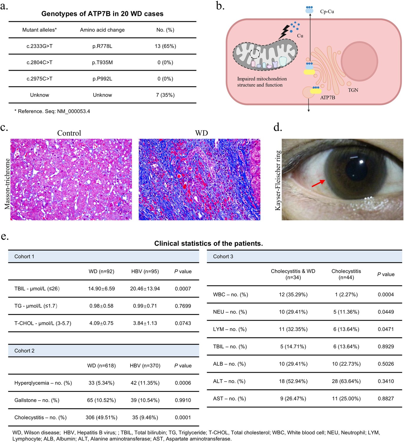
Clinical manifestation of Wilson’s disease (WD) patients and WD causes poor prognosis of cholecystitis.
(a) DNA sequencing result of 20 WD patients was summarized in the graph. (b) The schematic diagram illustrates copper transport disturbances caused by ATP7B mutations, along with structural and functional impairments in mitochondria. Created with BioRender.com. (c) Masson-trichrome staining of liver tissues of patients with WD and control. (d) The picture of Kayser-Fleischer (KF) ring in the cornea of a patient with WD, captured during clinical examination. (e) The table of clinical statistics of patients in three cohorts. Data are mean ± SD. Unpaired two-tailed t-test and chi-square test.
Figure 1—figure supplement 1
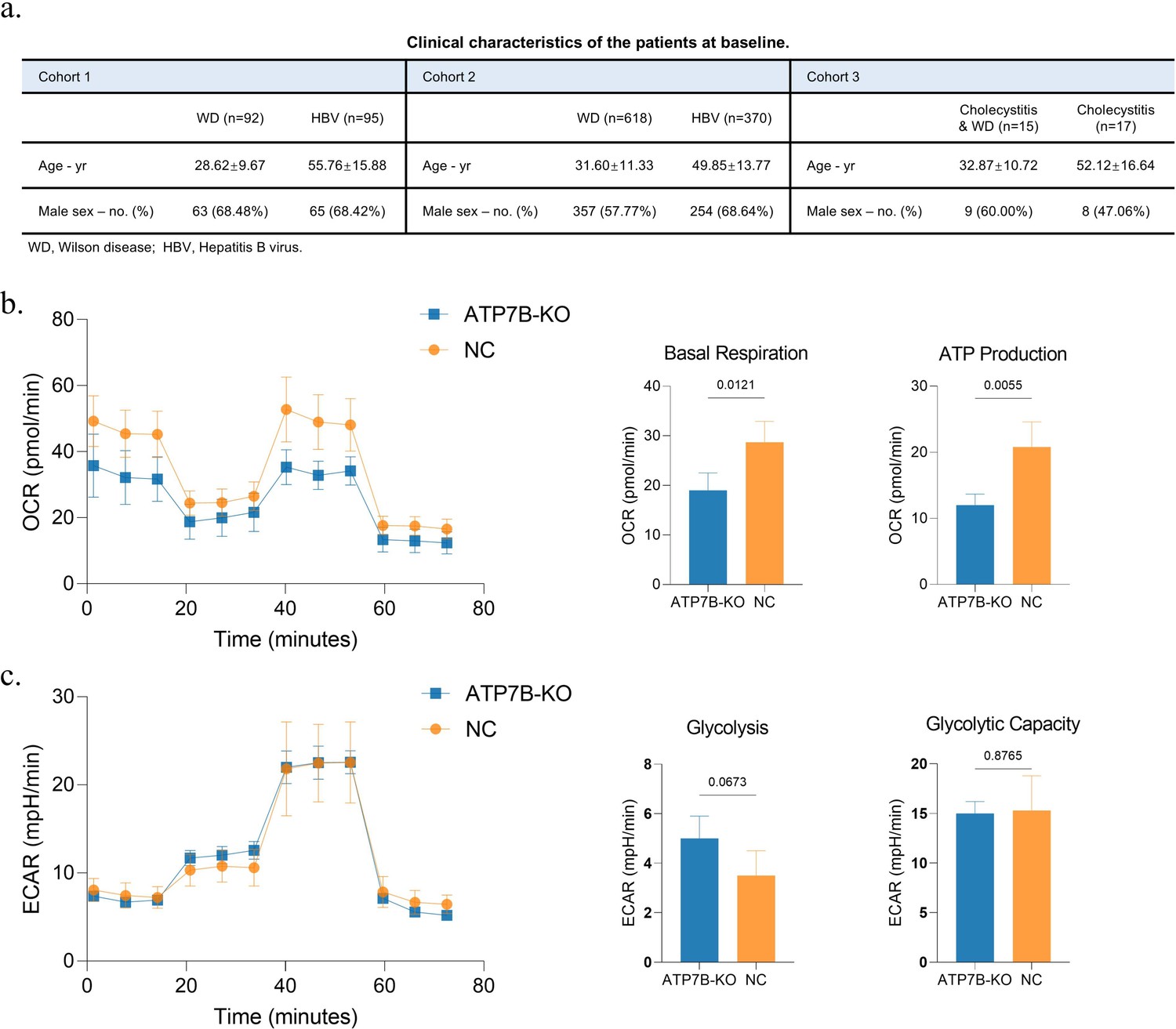
ATP7B mutation causes metabolic abnormalities.
(a) The table of clinical characteristics of patients in three cohorts at baseline. Data are mean ± SD. (b) Mitochondrial stress (oxygen consumption rate [OCR]) measured in ATP7B-KO (n=3) and NC (n=3) WRL 68 cell lines. Bar charts showing the statistical results of basal respiration and ATP production. Unpaired two-tailed t-test. (c) Glycolysis stress (extracellular acidification rate [ECAR]) measured in ATP7B-KO (n=3) and NC (n=3) WRL 68 cell lines. Bar charts showing the statistical results of glycolysis, and glycolysis capacity. Unpaired two-tailed t-test.
Figure 2 with 1 supplement
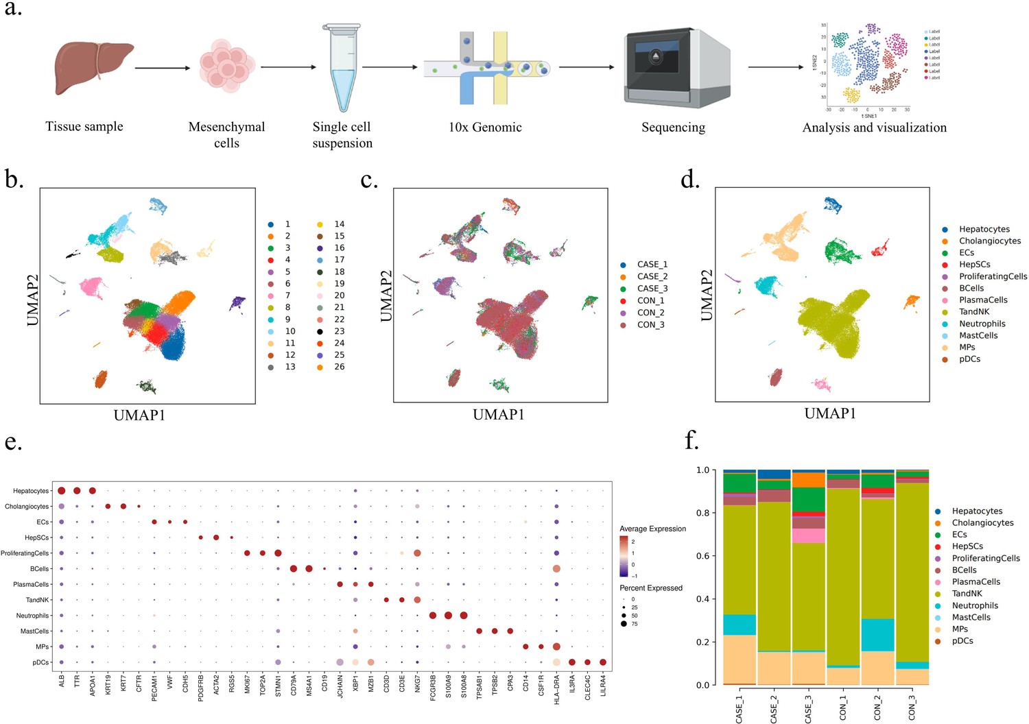
Single-cell profiling of non-parenchymal cells in the liver of Wilson’s disease (WD) patients.
(a) The workflow of single-cell RNA sequencing (scRNA-seq). Created with BioRender.com. (b) UMAP visualization of 26 principal components of all the single cells. (c) UMAP visualization of 26 principal components by samples. (d) UMAP visualization of 12 main cell types. (e) The dot plot showing the expression of top 3 marker genes in 12 main cell types. (f) The bar chart showing the proportion of 12 main cell types in each sample.
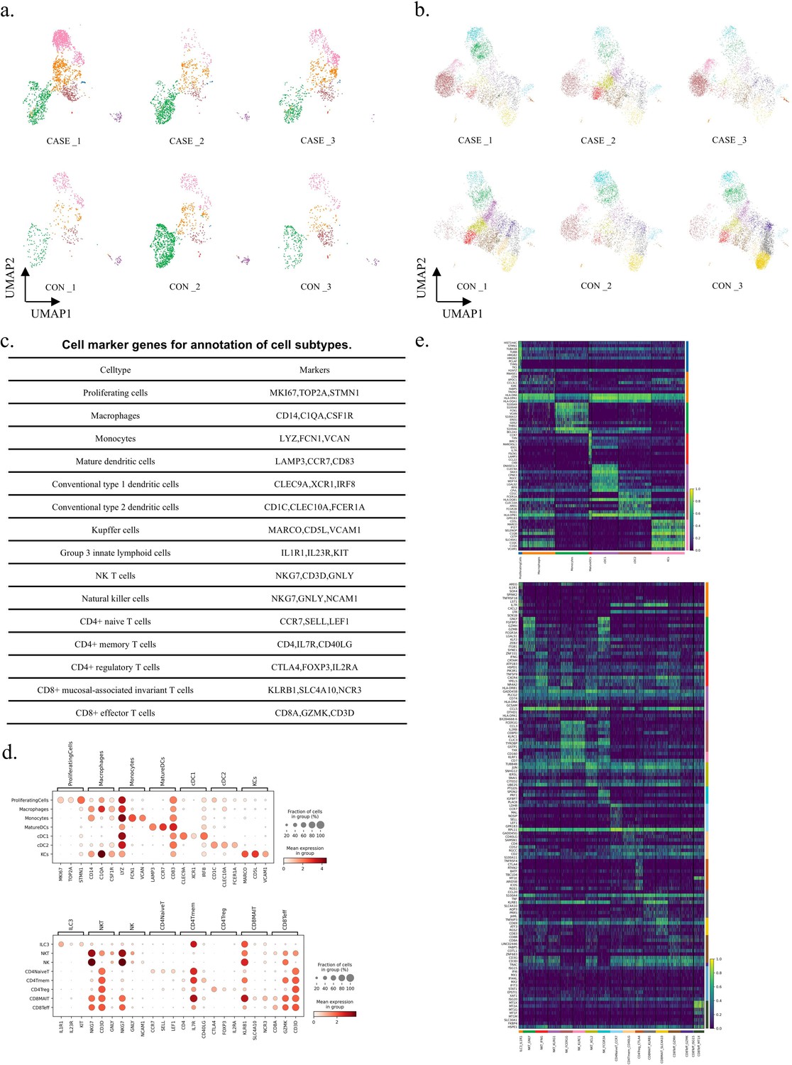
Figure 2—figure supplement 1
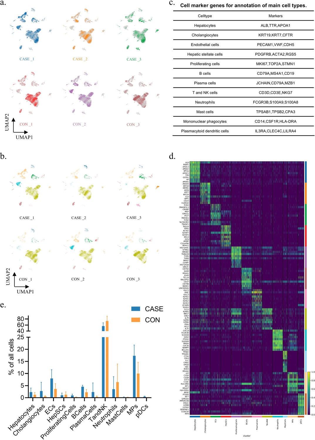
The proportion and differently expressed genes (DEGs) of each main cell type.
(a) UMAP visualization of principal components by six samples. (b) UMAP visualization of 12 main cell types by six samples, corresponding to Figure 2d. (c) The table displaying cell marker genes for annotation of main cell types. (d) The heatmap showing the top 10 DEGs for each cell type. (e) The bar chart showing the average percentage of different cell types in CASE (n=3) and CON (n=3). Data are mean ± SD.
Figure 3 with 1 supplement
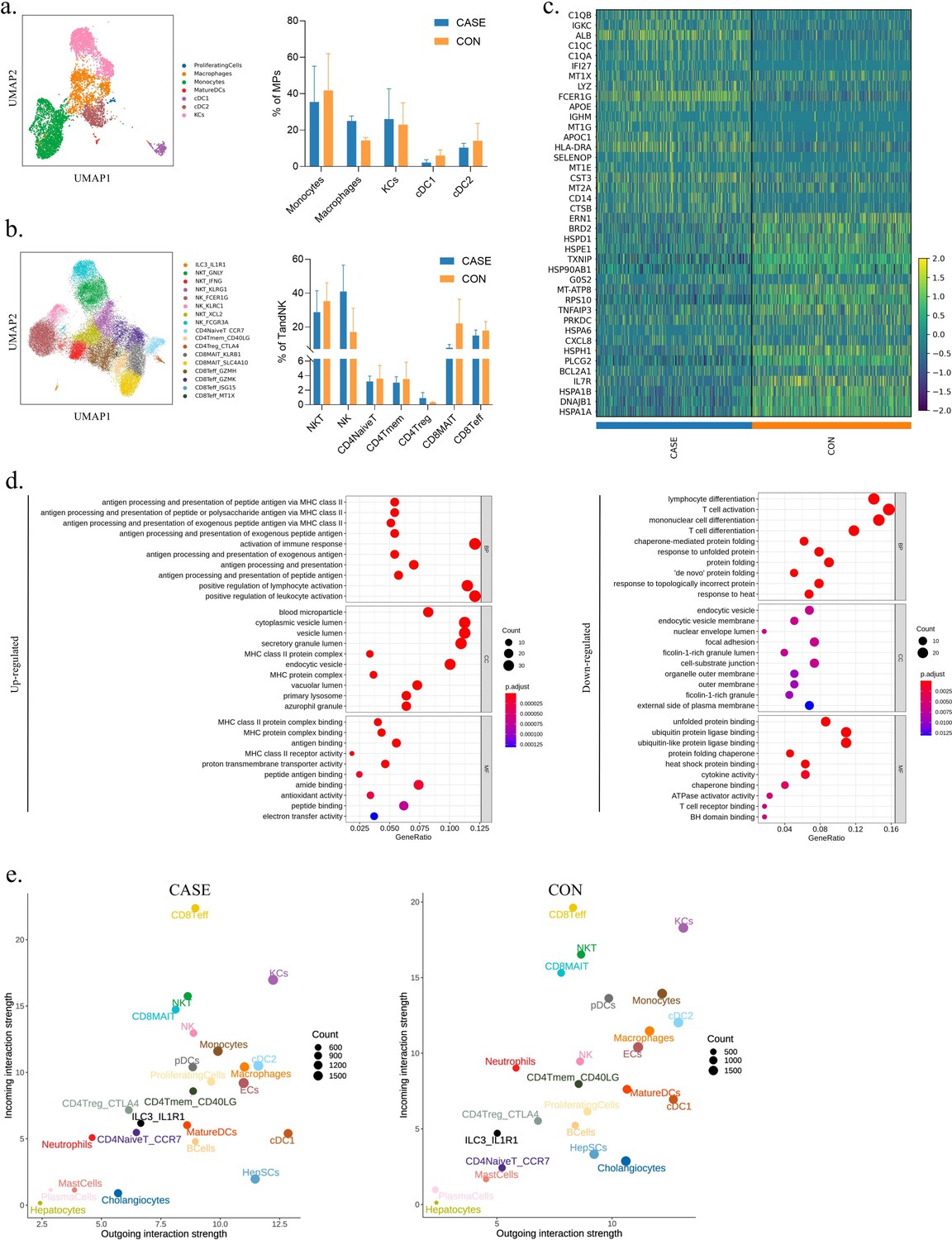
An overview of the immune microenvironment in Wilson’s disease (WD) patients.
(a) UMAP visualization of mononuclear phagocytes (MPs) colored and labeled by cell subtypes (left). The bar chart showing the average percentage of different subtypes in CASE (n=3) and CON (n=3) (right). Data are mean ± SD. (b) UMAP visualization of T and NK cells colored and labeled by cell subtypes (left). The bar chart showing the average percentage of different subtypes in CASE (n=3) and CON (n=3) (right). Data are mean ± SD. (c) The heatmap showing the top 20 differently expressed genes (DEGs) for all immune cells. (d) The dot plot showing Gene Ontology (GO) enrichment on DEGs of all immune cells between CASE and CON. BP, biological processes; CC, cellular components; MF, molecular function. (e) The scatter showing the incoming and outgoing interaction strength of all cell subtypes in CASE and CON.
Figure 3—figure supplement 1
The gene expression characteristics of each cell subtype.
(a) UMAP visualization of cell subtypes in mononuclear phagocytes (MPs) by six samples, corresponding to Figure 3a. (b) UMAP visualization of cell subtypes in T and natural killer (NK) cells by six samples, corresponding to Figure 3b. (c) The table displaying cell marker genes for annotation of cell subtypes. (d) The dot plot showing the expression of top 3 marker genes in each cell subtypes. (e) The heatmap showing the top 10 differently expressed genes (DEGs) for each cell subtypes.
Figure 4 with 1 supplement
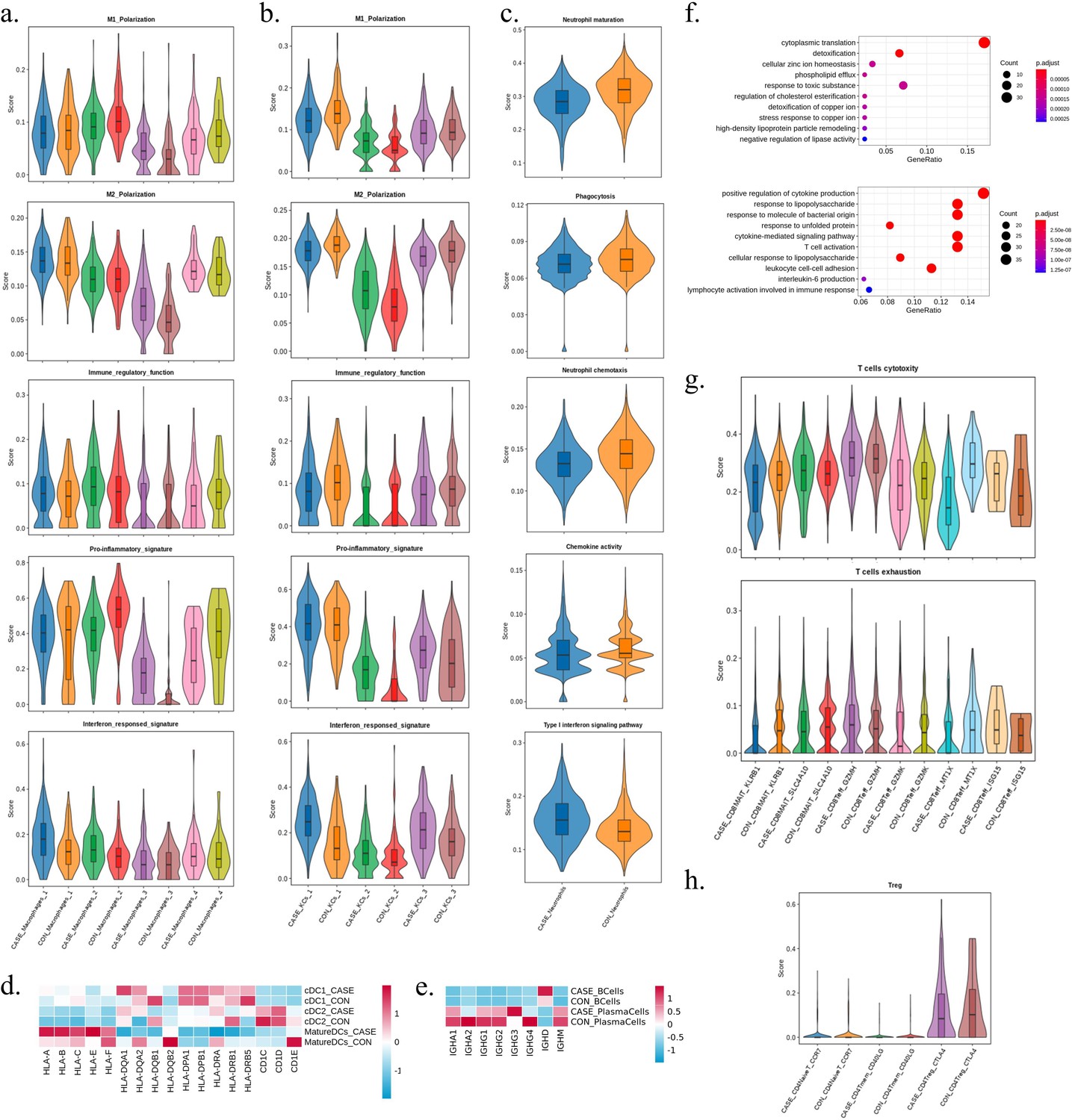
The dysfunction of main immune cells in Wilson’s disease (WD) patients.
(a) The violin plots displaying M1 polarization, M2 polarization, pro-inflammatory signature, and interferon responsed signature of the four subtypes of macrophages between the two groups by gene scoring. (b) The violin plots displaying M1 polarization, M2 polarization, pro-inflammatory signature, and interferon responsed signature of the three subtypes of Kupffer cells between the two groups by gene scoring. (c) The violin plots displaying maturation, phagocytosis, chemotaxis, chemokine activity, and Type I interferon signaling pathway scores of neutrophils between the two groups by gene scoring. (d) The heatmap showing the relative expression level of genes of the three subtypes of DC cells between the two groups. The color represents the relative expression level. (e) The heatmap showing the relative expression level of genes of B cells and plasma cells between the two group. The color represents the relative expression level. (f) The dot plot showing biological process of Gene Ontology (GO) enrichment on differentially expressed genes (DEGs) in monocytes between the two group. Upper, upregulation; down, downregulation. (g) The violin plots displaying cytotoxicity and exhaustion scores of the six cell subtypes of CD8 T cells between the two groups by gene scoring. (h) The violin plots displaying Treg scores of the three cell subtypes of CD4 T cells between the two groups by gene scoring.
Figure 4—figure supplement 1
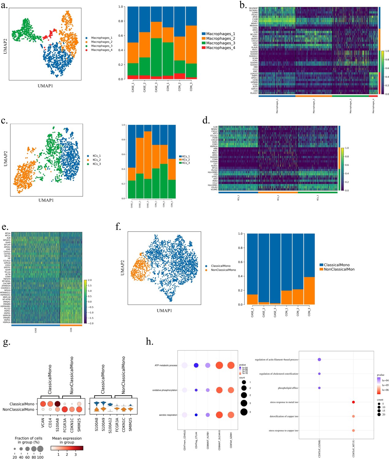
The difference in percentage and gene expression of each cell subtype between CASE and CON.
(a) UMAP visualization of the four further clustered subtypes of macrophages (left). The bar chart showing the percentage of each subtype across different samples (right). (b) The heatmap showing the top 10 differently expressed genes (DEGs) for each cell subtype of macrophages. (c) UMAP visualization of the three further clustered subtypes of Kupffer cells (KCs) (left). The bar chart showing the percentage of each subtype across different samples (right). (d) The heatmap showing the top 10 DEGs for each cell subtype of KCs. (e) The heatmap showing the top 20 DEGs for B cells. (f) UMAP visualization of the two further clustered subtypes of monocytes (left). The bar chart showing the percentage of each subtype across different samples (right). (g) The dot plot showing the expression of top 3 marker genes in each cell subtypes (left). The violin plot showing the expression of top 3 DEGs for two cell subtypes (right). (h) The dot plot showing the upregulated biological process of Gene Ontology (GO) enrichment on DEGs in each cell subtype between CASE and CON.
Figure 5 with 1 supplement
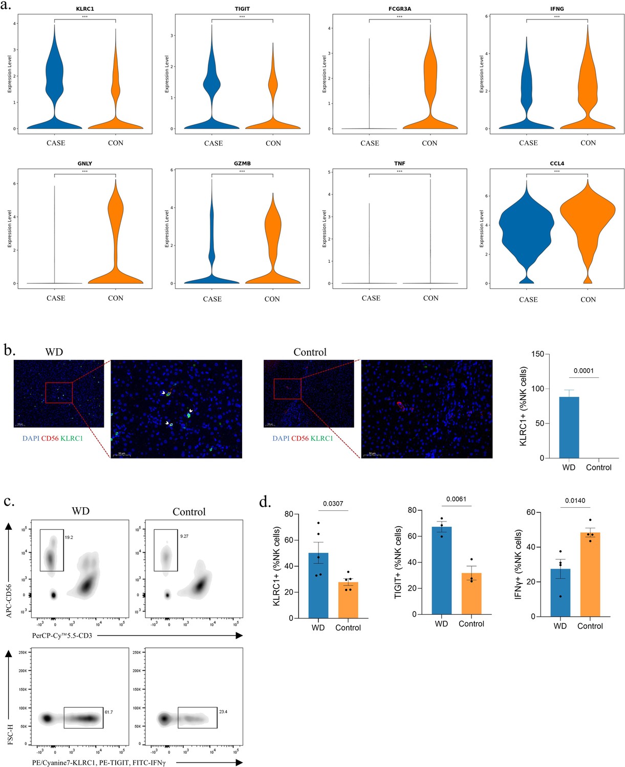
Identification of natural killer (NK) cell exhaustion in Wilson’s disease (WD) patients.
(a) The violin plots showing the relative expression level of genes in NK cells between the two group. ***, p<0.001; Wilcox test. (b) Representative immunofluorescence staining for NK cells marked by CD56 and expression of KLRC1 in liver tissues of WD and control. The nucleus is stained by DAPI. Scale bars, 100 μm for 40× and 50 μm for 100×. KLRC1+ NK cells are highlighted by arrows. The bar chart showing the proportion of KLRC1+ NK cells. Quantifications were performed by assessing three random fields per slide. Data are mean ± SD. Unpaired two-tailed t-test. (c) Gating strategy applied in flow cytometry. Upper: NK cells were determined by CD3-CD56+. Down: NK cells with positive indicators (KLRC1, TIGIT, and IFNγ) were recorded. (d) The bar charts showing the percentage of KLRC1+ (WD, n=5; Control, n=5), TIGIT+ (WD, n=3; Control, n=3), and IFNγ+ (WD, n=4; Control, n=4) NK cells. Data are mean ± SD. Unpaired two-tailed t-test.
Figure 5—figure supplement 1

Identification of natural killer (NK) cell exhaustion in Wilson’s disease (WD) patients.
(a) The dot plot showing Kyoto Encyclopedia of Genes and Genomes (KEGG) enrichment on differentially expressed genes (DEGs) in NK cells between CASE and CON. (b) The dot plot showing Gene Ontology (GO) enrichment on DEGs in NK cells between CASE and CON. BP, biological processes; CC, cellular components; MF, molecular function. (c) The heatmap showing the relative expression level of genes in three NK subtypes. The color represents the relative expression level. ns, not significant; *, p<0.05; **, p<0.01; ***, p<0.001; ****, p<0.0001; Wilcox test. (d) The bar chart showing the proportion of three subtypes of NK cells in the two group. (e) The heatmap showing the top 20 DEGs for three subtypes of NK cells. (f) The plot showing trajectories of NK cells in CASE and CON. Upper: respective trajectory. Down: merged trajectory. (g) The heatmap showing the expression of genes in three clusters in pseudotime. The cell fate is divided into two directions, and left represents fate 1 and right represents fate 2. The expression level of genes in three clusters was represented by colors. See full gene list in Supplementary file 1b. (h) The heatmap showing the average expression of top 10 regulons in NK cells in CASE and CON. (i) The bar charts showing the percentage of NK cells (WD, n=6; Control, n=7) and CD56Bright NK cells (WD, n=7; Control, n=7). Data are mean ± SD. Unpaired two-tailed t-test.
Figure 6 with 1 supplement
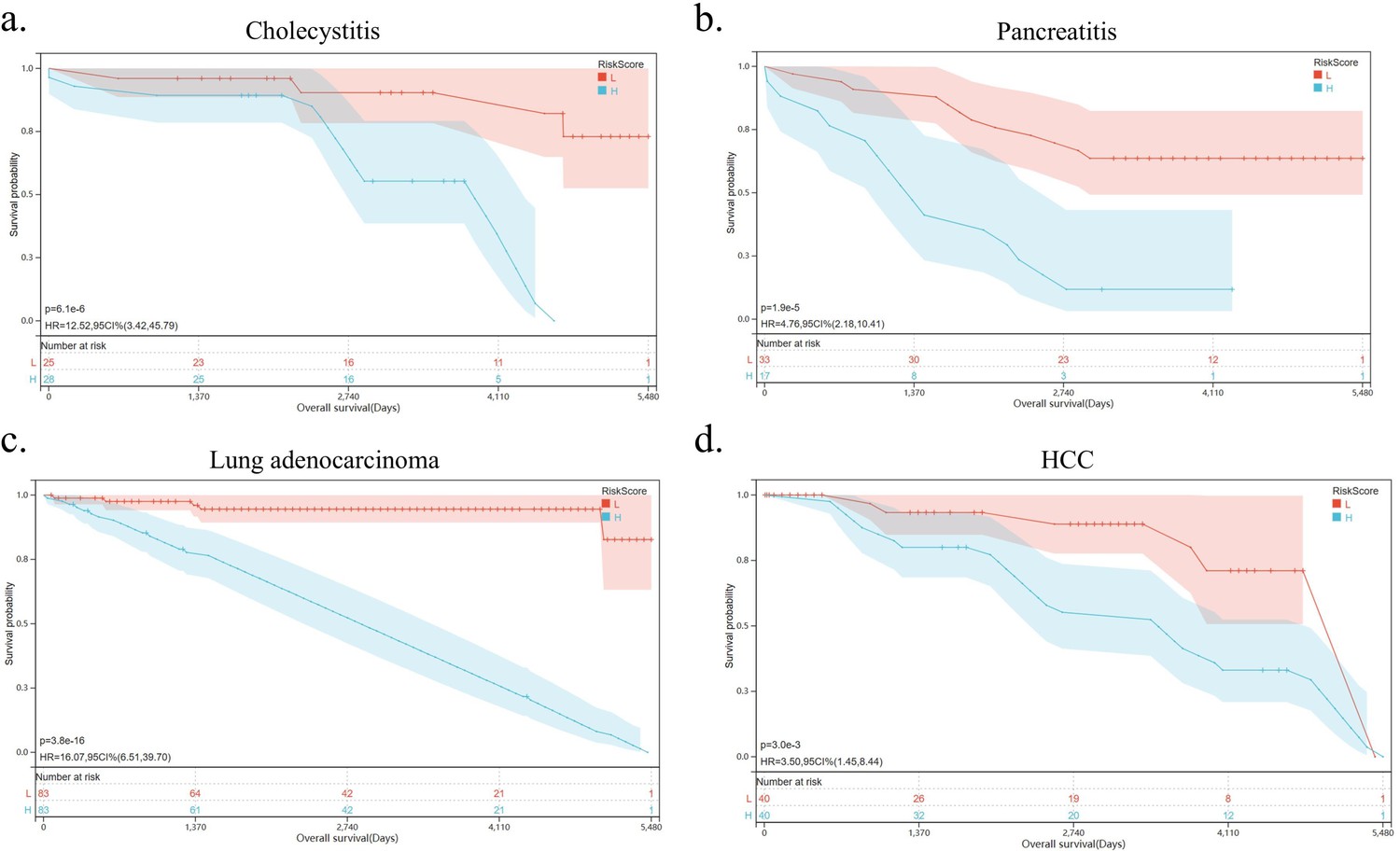
Natural killer (NK) cell exhaustion predicts poor prognosis of inflammatory diseases.
(a–d) Kaplan-Meier survival curves for cholecystitis, pancreatitis, lung adenocarcinoma, and hepatocellular carcinoma according to the markers of NK cell exhaustion in the GSE166915, GSE91035, GSE75037, and GSE41804 datasets.
Figure 6—figure supplement 1
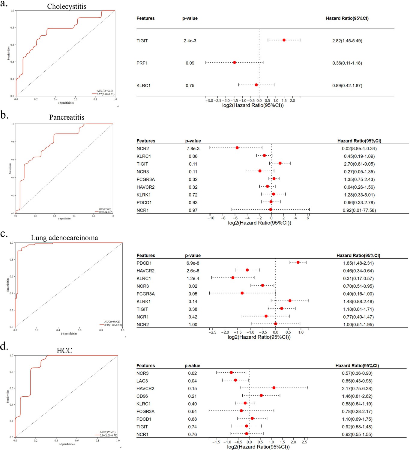
Predictive model construction for natural killer (NK) cell exhaustion.
(a–d) Receiver operating characteristic (ROC) curve analysis of prognostic-related markers of NK cell exhaustion and corresponding AUC values for the expression cohorts (left). Forest plot of prognostic-related markers of NK cell exhaustion based on univariate Cox regression analysis (right).
Additional files
-
Supplementary file 1
Supplementary informations for data analysis.
(a) The number and proportion of each cell type. This table shows the number and proportion of each cell type and each subtype in all samples. (b) The list of genes in each cluster. This table shows the gene ID included in three clusters, and the genes mentioned in the article are marked in yellow. (c) The list of genes used for signature scoring. This table shows the gene ID used for signature scoring. (d) The list of marker genes used for cell type annotation. This table shows the marker genes used for cell type and subtype annotation and the respective references.
- https://cdn.elifesciences.org/articles/98867/elife-98867-supp1-v1.pdf
-
MDAR checklist
- https://cdn.elifesciences.org/articles/98867/elife-98867-mdarchecklist1-v1.docx
Download links
A two-part list of links to download the article, or parts of the article, in various formats.
Downloads (link to download the article as PDF)
Open citations (links to open the citations from this article in various online reference manager services)
Cite this article (links to download the citations from this article in formats compatible with various reference manager tools)
NK cell exhaustion in Wilson’s disease revealed by single-cell RNA sequencing predicts the prognosis of cholecystitis
eLife 13:RP98867.
https://doi.org/10.7554/eLife.98867.3


