Expression noise facilitates the evolution of gene regulation
- University of Basel, Switzerland
- Swiss Institute of Bioinformatics, Switzerland
Figures
Figure 1 with 7 supplements
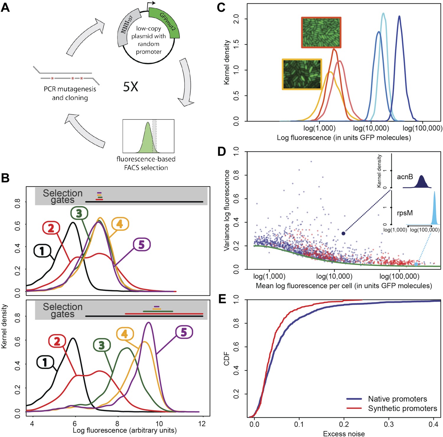
Experimental evolution of functional promoters de novo.
(A) We created an initial library of approximately 106 unique synthetic promoters by cloning random nucleotide sequences, of approximately 100–150 base pairs (bp) in length, upstream of a strong ribosomal binding site followed by an open reading frame for GFP, as used to quantify the expression of native E. coli promoters (Zaslaver et al., 2006), and transformed this library into a population of cells (‘Materials and methods’). We evolved populations of synthetic promoters by performing five rounds of selection and mutation on this library. In each round we used fluorescence activated cell sorting (FACS) to select 2 × 10⁵ cells that lie within a gate comprising the 5% of the population closest in fluorescence to a given target level. Next, plasmids were isolated from the selected cells and PCR mutagenesis was used to introduce new genetic variation into the promoters. We then re-cloned the mutated promoters into fresh plasmids and transformed them into a fresh population of cells. We performed this evolutionary scheme on three replicate populations in which we selected for a target expression level equal to the median expression level (50th percentile) of all native E. coli promoters and three replicate populations in which we selected for a target expression level at the 97.5th percentile of all native promoters (referred to here as medium and high expression levels, respectively). (B) Changes in the fluorescence distribution for one evolutionary run selecting for medium target expression (top) and one evolutionary run selecting for high target expression (bottom). The curves show the population's expression distributions before selection, with the numbers above each curve indicating the selection round. The colored bars at the top indicate the FACS gates that were used to select cells from the populations at each corresponding round. (C) Examples of fluorescence distributions for individual clones obtained after five rounds of evolution. Microscopy pictures of two individual clonal promoter populations are shown as insets. (D) For each native E. coli promoter (blue) and synthetic promoter (red), the mean (x-axis) and variance (y-axis) of log-fluorescence intensities across cells were measured using flow cytometry. Fluorescence values are expressed in units of number of GFP molecules. The green curve shows the theoretically predicted minimal variance as a function of mean expression (Appendix 1). The insets show the log-fluorescence distributions for two example promoters (corresponding to the larger dark blue and light blue dots). (E) Cumulative distributions of excess noise levels of native (blue) and synthetic (red) promoters.
Figure 1—figure supplement 1
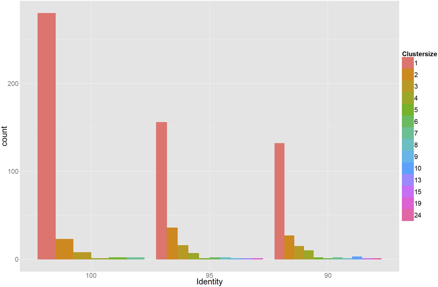
Genetic diversity of 378 sequenced promoters, which were extracted from randomly selected clones from the populations that were obtained after three and five rounds of selection.
Sequences were clustered using single-linkage based on 100%, 95%, or 90% sequence identity (left, middle, and right panels) and the bar plots show the corresponding histograms of cluster sizes. The results indicate that the promoters in the populations at the third and fifth rounds are highly diverse, deriving from many different initial random sequences in the initial library.
Figure 1—figure supplement 2
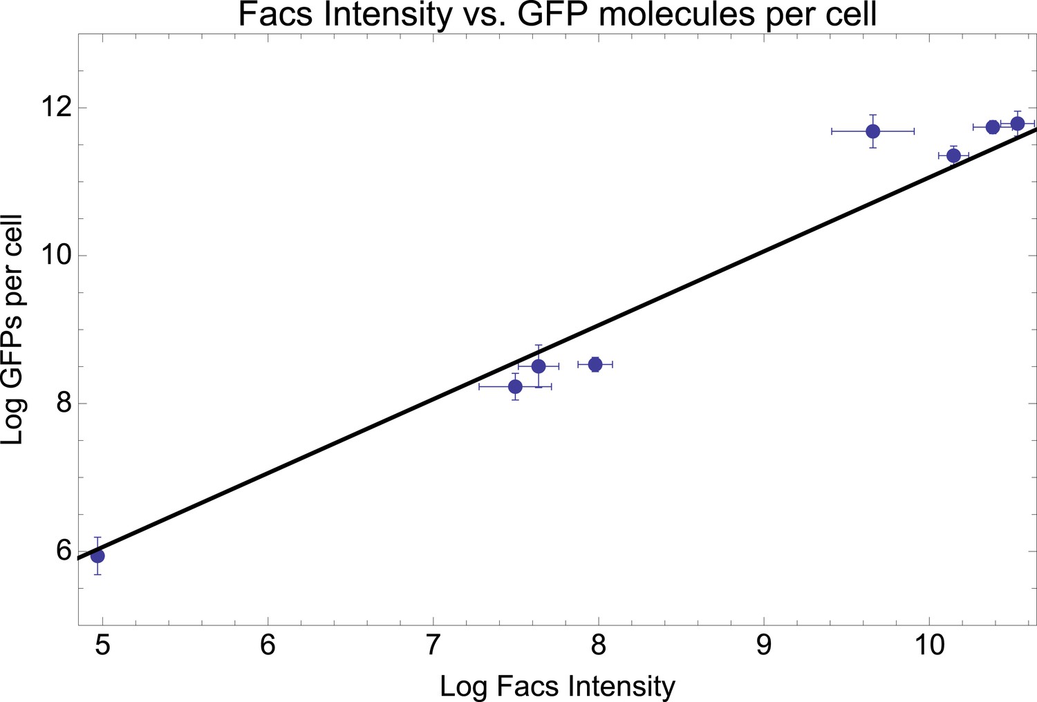
Mean log-fluorescence intensities as measured by FACS (horizontal axis) against estimated log GFP molecules per cell (vertical axis) as estimated from quantitative Westerns (see Appendix 1) for eight selected promoters.
Error bars were estimated from three replicates for the FACS measurements and six replicates for the GFP levels. The straight line shows the fit y = x + 1.06, which is equivalent to: GFP molecules per cell = 2.88* mean FACS intensity.
Figure 1—figure supplement 3
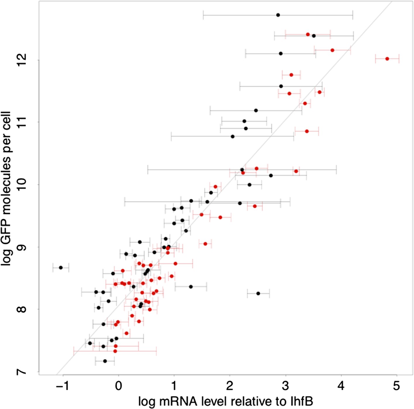
Relationship between log-protein levels as measured by GFP intensity in FACS (vertical axis) and log-mRNA levels (horizontal axis).
The mRNA levels are estimated relative to the mRNA level of reference gene IhfB. Error bars show ±1 standard deviation of the posterior probability distribution on mRNA levels (Appendix 1). Black data points correspond to native promoters and red data points to synthetic promoter. The straight line shows a linear fit with slope 1, that is, the best fit to a model where the protein level p is directly proportional to the mRNA level m, log(p) = c + log(m), with c = 7.06 (Appendix 1).
Figure 1—figure supplement 4

Comparison of three biological replicate FACS measurements of means and excess noise of log-fluorescence for evolved E. coli promoters.
The top three panels compare mean log-fluorescences across three replicates and the bottom three panels compare excess noise in log-fluorescences across three replicates. The Pearson squared correlation coefficients between pairs of replicate measurements are indicated at the top of each panel.
Figure 1—figure supplement 5
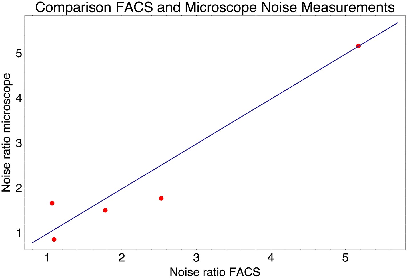
Relative noise levels (variance of the log-expression distribution) of five pairs of native promoters that have very similar mean expression levels.
Each dot corresponds to one of the pairs of promoters and shows the ratio of the noise level of the highest noise promoter to that of the lower noise promoter as measured by FACS (horizontal axis) and by microscope (vertical axis). The blue line shows the line y = x.
Figure 1—figure supplement 6
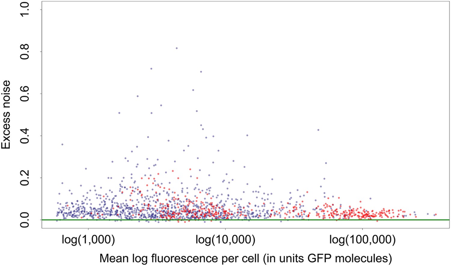
Mean log-fluorescence (horizontal axis) and excess noise levels (vertical axis), that is, the difference between variance of log-fluorescence levels and the minimal variance at the corresponding mean, for all native (blue dots) and synthetic (red dots) promoters.
Both axes are in units of number of GFP molecules. Note that, in contrast to raw variances in log-fluorescence that show a clear dependence on mean log-fluorescence, the excess noise levels show no dependence on mean.
Figure 1—figure supplement 7
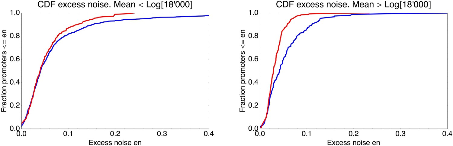
Cumulative distributions of excess noise levels for the native (blue) and synthetic promoters (red).
The left panel shows the cumulative distribution of excess noise for promoters whose mean log-expression was less than log(18,000) (corresponding to the medium expressing synthetic promoters), and the right panel for promoters with mean log-expression more than log(18,000) (corresponding to the high expressing synthetic promoters). High noise promoters are clearly enriched among native promoters for both medium and high expressing promoters.
Figure 2
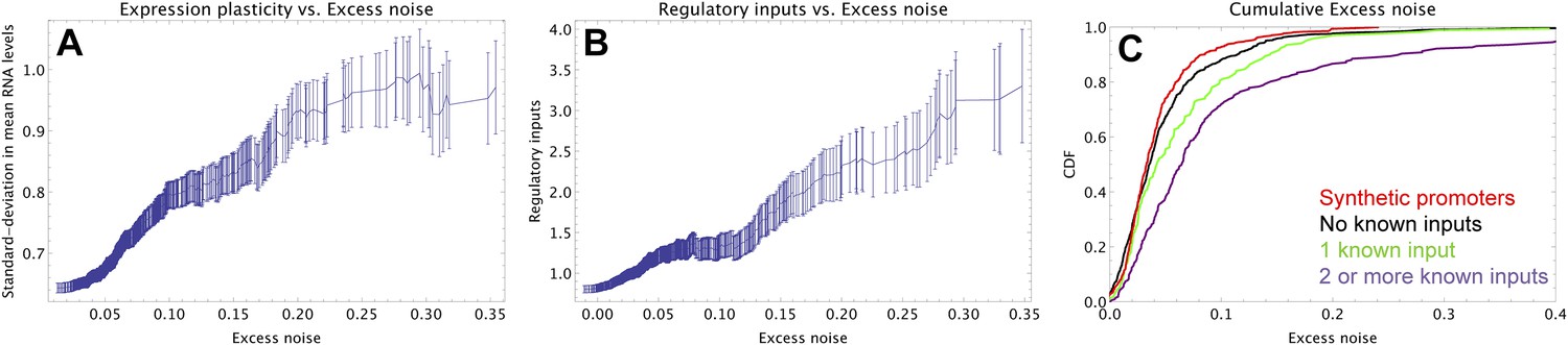
Promoters with elevated noise exhibit high expression plasticity and large numbers of regulatory inputs.
(A) Native promoters were sorted by their excess noise x and, as a function of a cut-off on x (horizontal axis), we calculated the mean and standard error (vertical axis) of the variation in mRNA levels across different experimental conditions (data from http://genexpdb.ou.edu/) of all promoters with excess noise larger than x. (B) Promoters were sorted by excess noise x as in panel A, and mean and standard error of the number of known regulatory inputs (vertical axis, data from RegulonDB [Salgado et al., 2013]) for promoters with excess noise larger than x is shown. (C) Cumulative distributions of excess noise levels of synthetic promoters (red) and native promoters without known regulatory inputs (black), with one known regulatory input (green), and with two or more known regulatory inputs (purple).
Figure 3 with 2 supplements
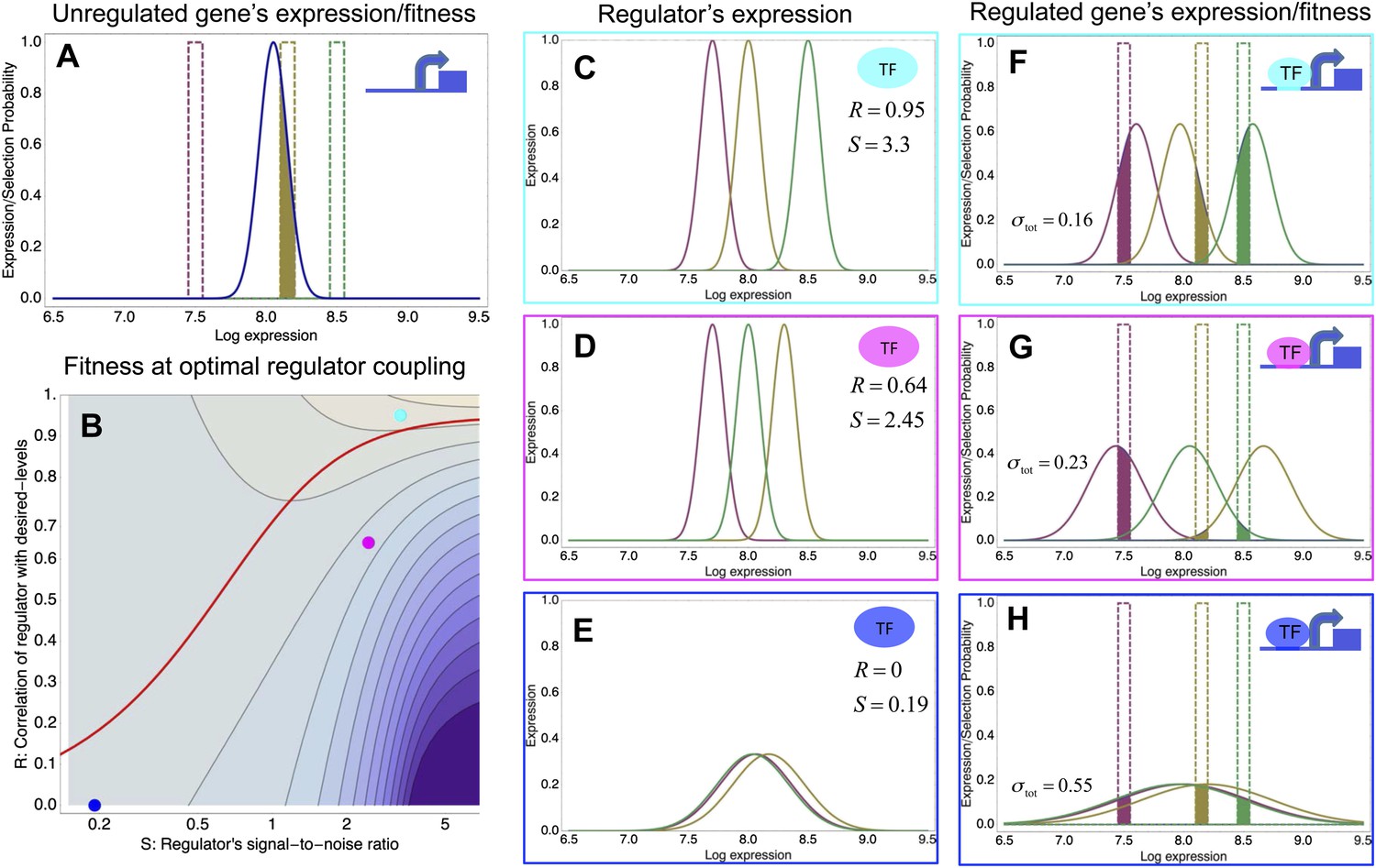
A model of the evolution of gene expression regulation in a variable environment.
(A) Expression distribution of an unregulated promoter (blue curve) and selected expression ranges in three different environments, that is, the red, gold, and green dashed curves show fitness as a function of expression level in these environments. Although our model applies more generally, for simplicity we here visualize selection as truncation selection (i.e., a rectangular fitness function). The fitness of the promoter in the gold environment is proportional to the shaded area. (B) Contour plot of the log-fitness change resulting from optimally coupling the promoter to a transcription factor (TF) with signal-to-noise ratio S and correlation R. Contours run from 7.5 at the top right to 0.5 at the bottom right. The three colored dots correspond to the TFs illustrated in panels C–H. The red curve shows optimal S as a function of R. (C–E) Each panel shows the expression distributions of an example TF across the three environments (red, gold, and green curves). The corresponding values of correlation R and signal-to-noise S are indicated in each panel. (F–H) Each panel shows the expression distributions across the three environments for a promoter that is optimally coupled to the TF indicated in the inset. The shaded areas correspond to the fitness in each environment. The total noise levels of the regulated promoters are also indicated in each panel. The unregulated promoter has total noise σtot = 0.1.
Figure 3—figure supplement 1
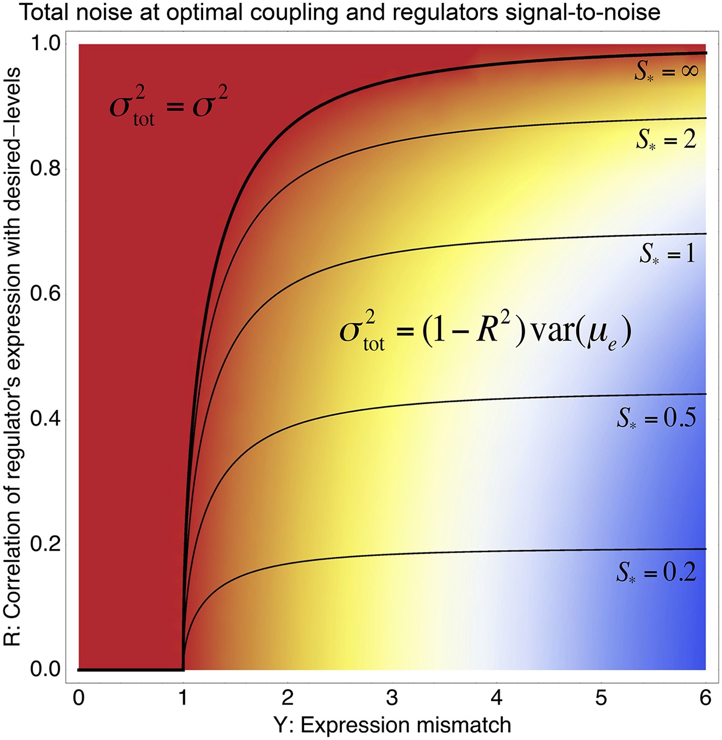
Phase diagram of the total noise σtot of a promoter with expression mismatch Y (horizontal axis) that is coupled (at optimal coupling strength) to a regulator whose regulatory activities have correlation R with the desired expression levels (vertical axis) and whose signal-to-noise ratio S has also been optimized.
The colors indicate the value of σtot, running from σtot equal to the noise σ of the unregulated promoter (red) to σtot = 6σ (blue). A phase boundary (thick black curve) separates solutions in a ‘basal noise regime’ at the top left, where the total noise equals the minimal noise σ2, and solutions in an ‘environment-driven noise regime’ at the bottom right, where the total noise matches the variance in desired levels that is not tracked by the regulation, that is, . The contours show optimal signal-to-noise ratios S* as a function of Y and R. Note that S* diverges at the phase boundary.
Figure 3—figure supplement 2
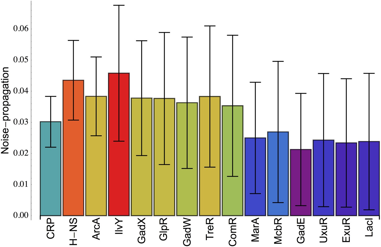
Inferred noise-propagation strengths of individual E. coli transcription factors (TFs).
For all promoters p, the excess noise level Ep was modeled as a linear function , where Rpr = 1 when the regulator r is known to target promoter p and Rpr = 0 otherwise (data from RegulonDB [Salgado et al., 2013]), and Vr is the noise-propagation strength of regulator r. The noise-propagation strengths Vr are inferred by minimizing the squared deviation between the predicted and observed excess noise levels using a Gaussian prior and cross-validation to avoid over-fitting (Balwierz et al., 2014). Each bar shows the inferred value of Vr for the TF indicated at the bottom of the bar, together with its error bar σ(Vr). All TFs are shown for which Vr > σ(Vr) and are sorted from left to right by their significance Vr/σ(Vr).
Appendix 1—figure 1

Measured intensities of the GFP reference bands as a function of the amount of GFP (in grams) loaded on each band.
Each curve corresponds to one replicate (shown in a separate color), and each curve has five data points.
Appendix 1—figure 2

For the first replicate, we inferred a saturation value Imax = 15,631.
Plotting w as a function of I/(Imax − I) we obtain an approximately linear relationship that also approximately goes through the origin (0, 0) (as it should).
Appendix 1—figure 3
Inferred GFP amounts (in grams, vertical axis) for the eight strains (strain numbers shown along the horizontal axis) using the reference data from each replicate.
Each color corresponds to a replicate. The vertical axis is shown on a logarithmic scale.
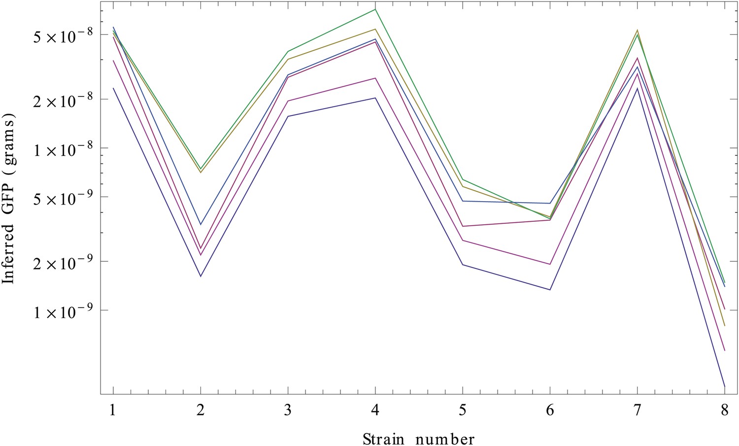
Appendix 1—figure 4

Normalized inferred GFP amounts (molecules per cell, vertical axis) for the eight strains (strain numbers shown along the horizontal axis) using the reference data from each replicate.
Each color corresponds to a replicate. The vertical axis is shown on a logarithmic scale.
Appendix 1—figure 5
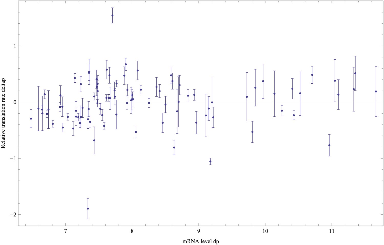
Estimated relative log-translation rates δp and their error bars σ(δp) (vertical axis) as a function of the log-mRNA level relative to ihfB, dP, for each promoter p.
https://doi.org/10.7554/eLife.05856.020
Appendix 1—figure 6
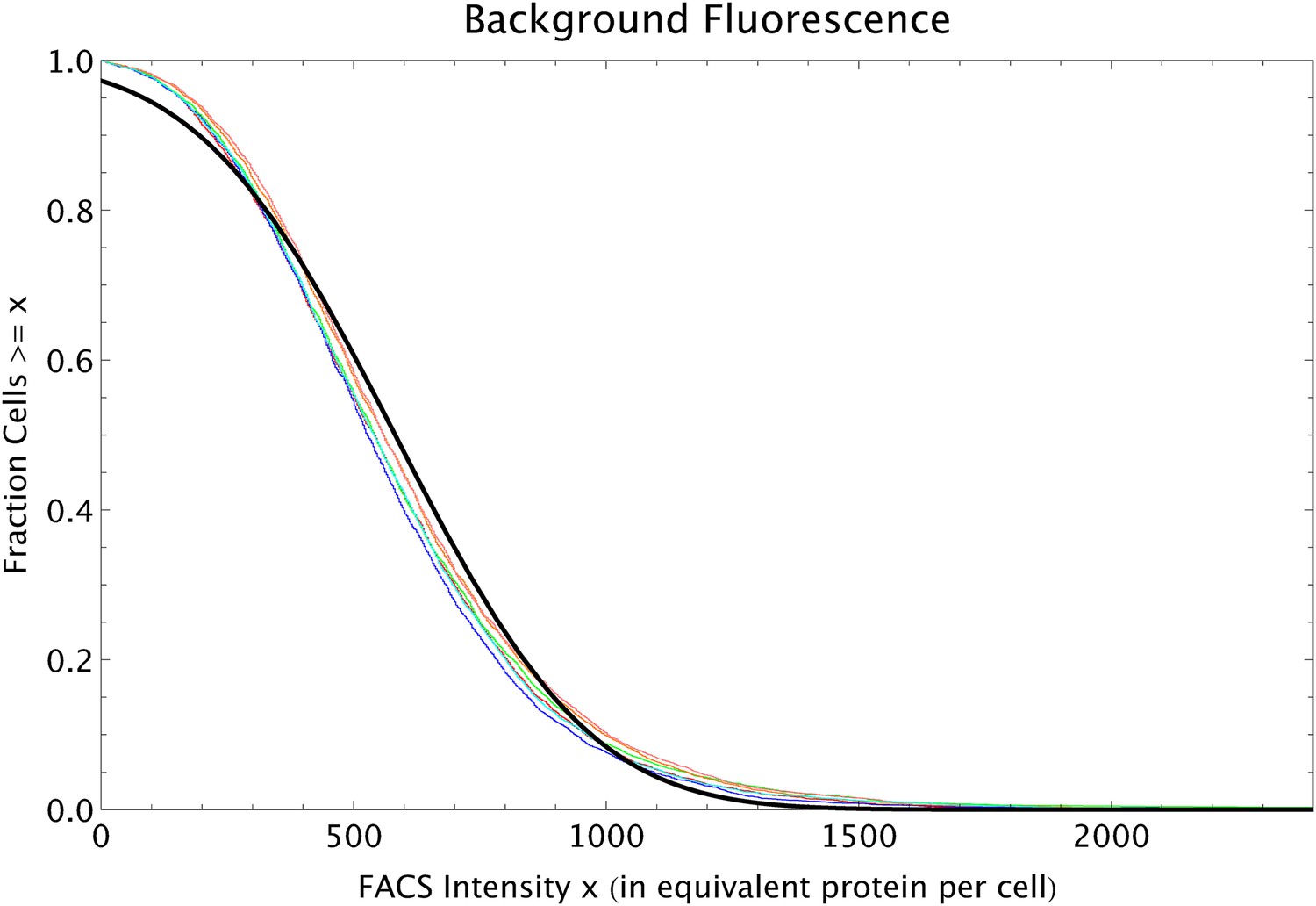
Reverse cumulative distributions of the FACS intensities per cell (multiplied by 2.88 so as to correspond to the equivalent of GFP proteins per cell) for MG1655 cells without a plasmid (red, blue and green curves) and MG1655 cells with an empty plasmid (orange, pink and cyan curves).
The black line shows a Gaussian distribution with matching mean and variance.
Appendix 1—figure 7
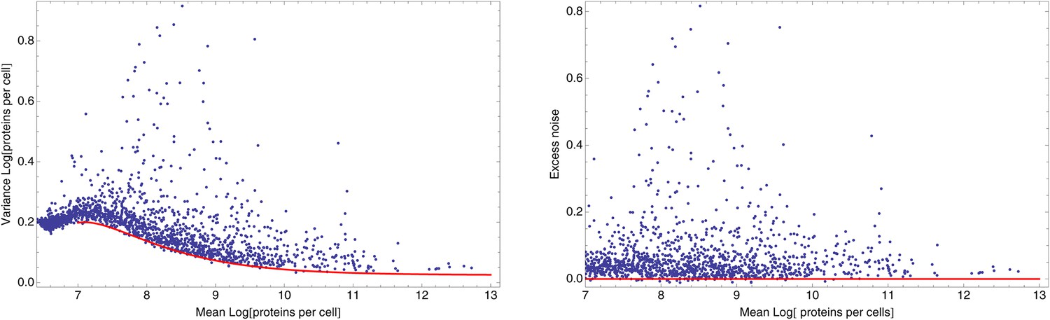
Dependence between mean and variance of log FACS intensities.
Left panel: Means and variances of log-FACS intensities of all native promoters (blue dots) together with a fitted lower bound on the variance as given by Equation 67 using and β = 450 (red curve). Right panel: Excess noise (obtained by subtracting the fitted lower bound from the variance) as a function of mean log-FACS intensity for all native promoters (blue dots). The red line shows the x-axis.
Appendix 2—figure 1
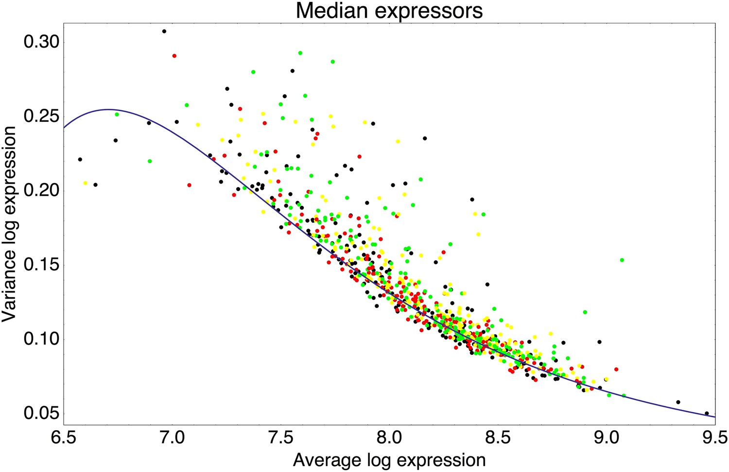
Means and variances of the log-fluorescence levels of clones from the third and fifth rounds of the evolutionary runs in which we selected for medium expression (black dots), and clones obtained after performing another round of selection on these populations, selecting either 1% (red), 5% (yellow), or 25% (green) of the population closest to the desired log-fluorescence μ*.
The blue curve shows a fit of the typical variance σ2 as a function of the mean μ: σ2(μ) = 0.02 + 384e−μ − 156,915e−2μ.
Appendix 2—figure 2
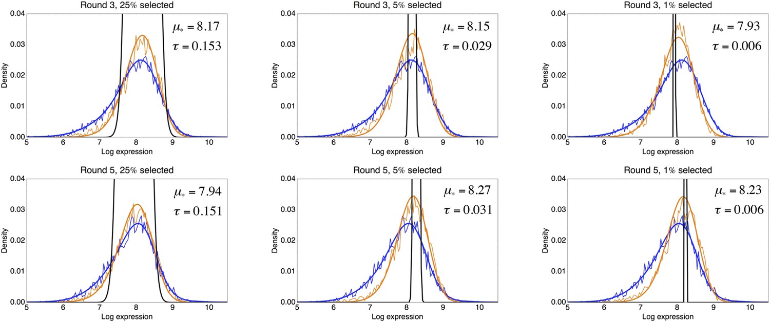
Inference of the fitness function from the observed log-fluorescence distribution before and after a round of selection.
Each panel corresponds to one selection experiment with the title indicating on which population an extra round of selection was performed, that is, a population either from the third or fifth round of the evolutionary run for medium expression, and what fraction of the population was selected. The thin blue line indicates the observed log-fluorescence distribution p(x) before selection, and the thin orange line the observed distribution p′(x) after selection. The thick lines show the corresponding fitted distributions. The inferred selection window , that is, Equation 69, is indicated in black, and its parameters μ* and τ are indicated in each panel as well.
Appendix 2—figure 3
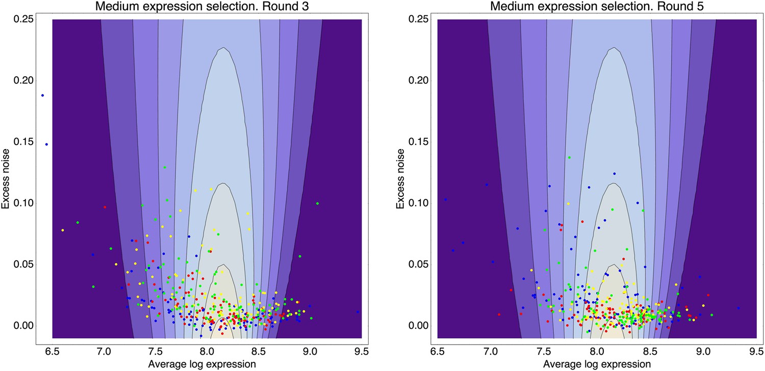
Contour plot of the inferred fitness function (76) as a function of mean expression μ (horizontal axis) and excess noise (vertical axis), that acts on the population from rounds 3 through 5 of the evolutionary runs for medium expression.
The contours correspond to fitness values (fraction of cells selected) of 0.01, 0.02, 0.03, through 0.08. Left panel: In addition to the fitness function (contours), the panel shows the means and excess noise levels of a selection of clones from the third round of the evolutionary run (blue dots) and clones that resulted from subjecting this population to another round of selection, selecting either for the 1% (red dots), 5% (yellow dots), or 25% (green dots) of cells with expression closest to the desired expression level. Right panel: As in the left panel, but with the dots corresponding to clones from the fifth round of the evolutionary run and clones resulting from additional rounds of selection on this population (colors as in the left panel).
Appendix 2—figure 4
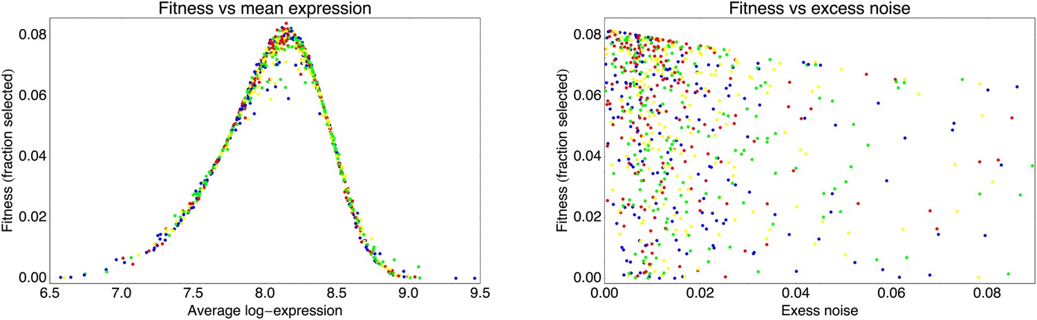
Fitness of the observed clones, as given by Equation 76, as a function of their mean expression μ (left panel) and their excess noise η (right panel).
As in Appendix 2—figure 3, the blue dots correspond to clones from the third and fifth round of the evolutionary run, the red dots result from another round of stringent selection (top 1%), the yellow dots from another round of standard selection (top 5%), and the green dots from a round of weaker selection (top 25%).
Appendix 2—figure 5
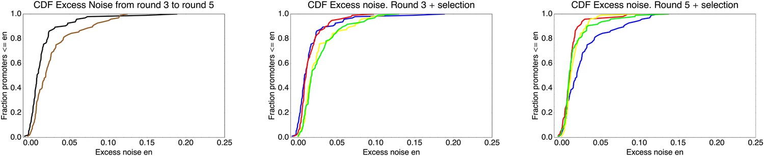
Cumulative distribution functions of excess noise levels for the promoters extracted from different populations.
Left panel: Excess noise levels of promoters from the third (black) and fifth (brown) round of the evolutionary run. Middle panel: Excess noise levels of promoters from the third round of the evolutionary run (blue), and from clones that resulted from another round of either stringent (red), normal (yellow), or weak (green) selection. Right panel: As in the middle panel but now for clones from the fifth round and clones resulting from another round of selection on this population.
Appendix 3—figure 1
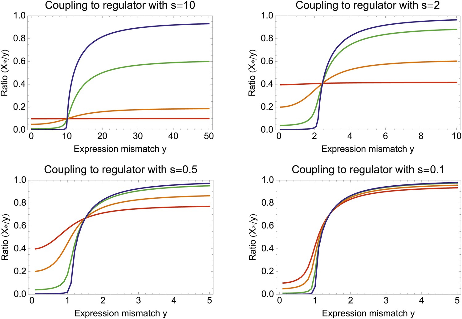
The ratio X*/Y between optimal coupling X* and expression mismatch Y as a function of Y, for different values of the regulator's signal-to-noise ratio S and the correlation between regulator and environment R.
Each panel corresponds to a different signal-to-noise ratio S, from a high signal regulator in the top left to a noisy regulator at the bottom right. In each panel, the different colored lines correspond to different correlations R, that is, R = 0.01 (blue), R = 0.1 (green), R = 0.5 (orange), and R = 0.99 (red).
Appendix 3—figure 2
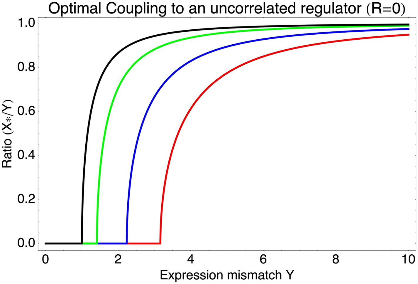
Optimal coupling X* to an uncorrelated regulator (R = 0) as a function of the expression mismatch Y for different values of the signal-to-noise ratio S, that is, S = 0 (black), S = 1 (green), S = 2 (blue), and S = 3 (red).
https://doi.org/10.7554/eLife.05856.029
Appendix 3—figure 3
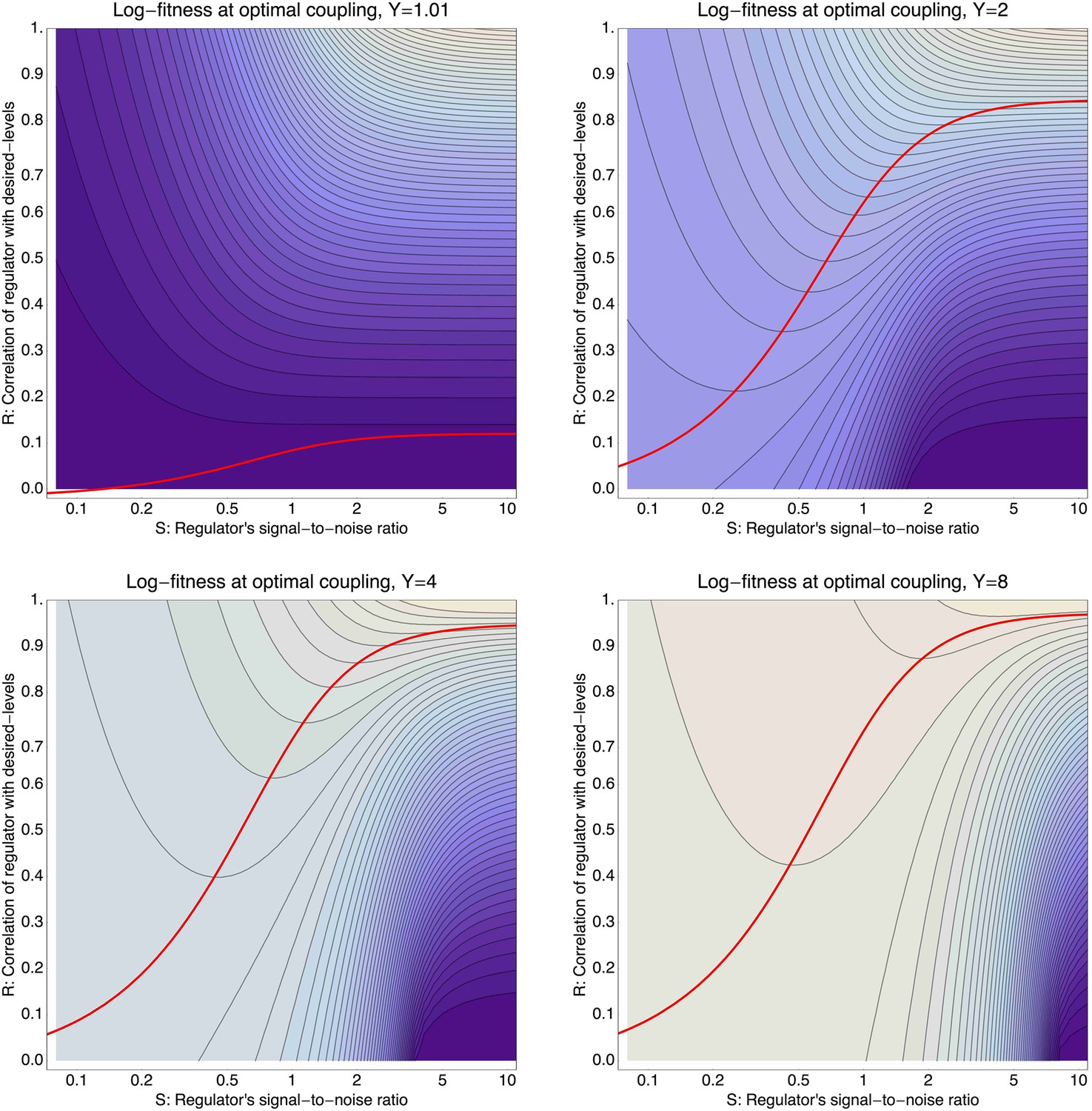
Log-fitness as a function of the signal-to-noise ratio S (horizontal axis) and correlation R of the regulator (vertical axis) for a promoter that is optimally coupled (X = X*) to the regulator.
The different panels correspond to log-fitnesses that are obtained for different values of the expression mismatch Y (indicated in the title of each panel). The contours run from −0.04 to −0.5 in the top left panel, from −0.3 to −1.9 in the top right panel, from −1 to −12 in the bottom left panel, and from −2 to −30 in the bottom right panel. The red curves show optimal signal-to-noise S as a function of the correlation R.
Tables
Appendix 1—Table 1
Fitted variances and fractions of meaningful measurements for the genes of interest (σ2, ρ) as well as for the reference gene measurements (, ) for each of the three biological replicates
| Replicate | σ2 | ρ | ||
|---|---|---|---|---|
| 1 | 0.0252 | 1.0 | 0.0116 | 0.934 |
| 2 | 0.0113 | 0.981 | 0.0118 | 0.988 |
| 3 | 0.0329 | 0.956 | 0.0072 | 0.955 |
Download links
A two-part list of links to download the article, or parts of the article, in various formats.
Downloads (link to download the article as PDF)
Open citations (links to open the citations from this article in various online reference manager services)
Cite this article (links to download the citations from this article in formats compatible with various reference manager tools)
Expression noise facilitates the evolution of gene regulation
eLife 4:e05856.
https://doi.org/10.7554/eLife.05856


