A continuum model of transcriptional bursting
- University College London, United Kingdom
Figures
Figure 1 with 2 supplements
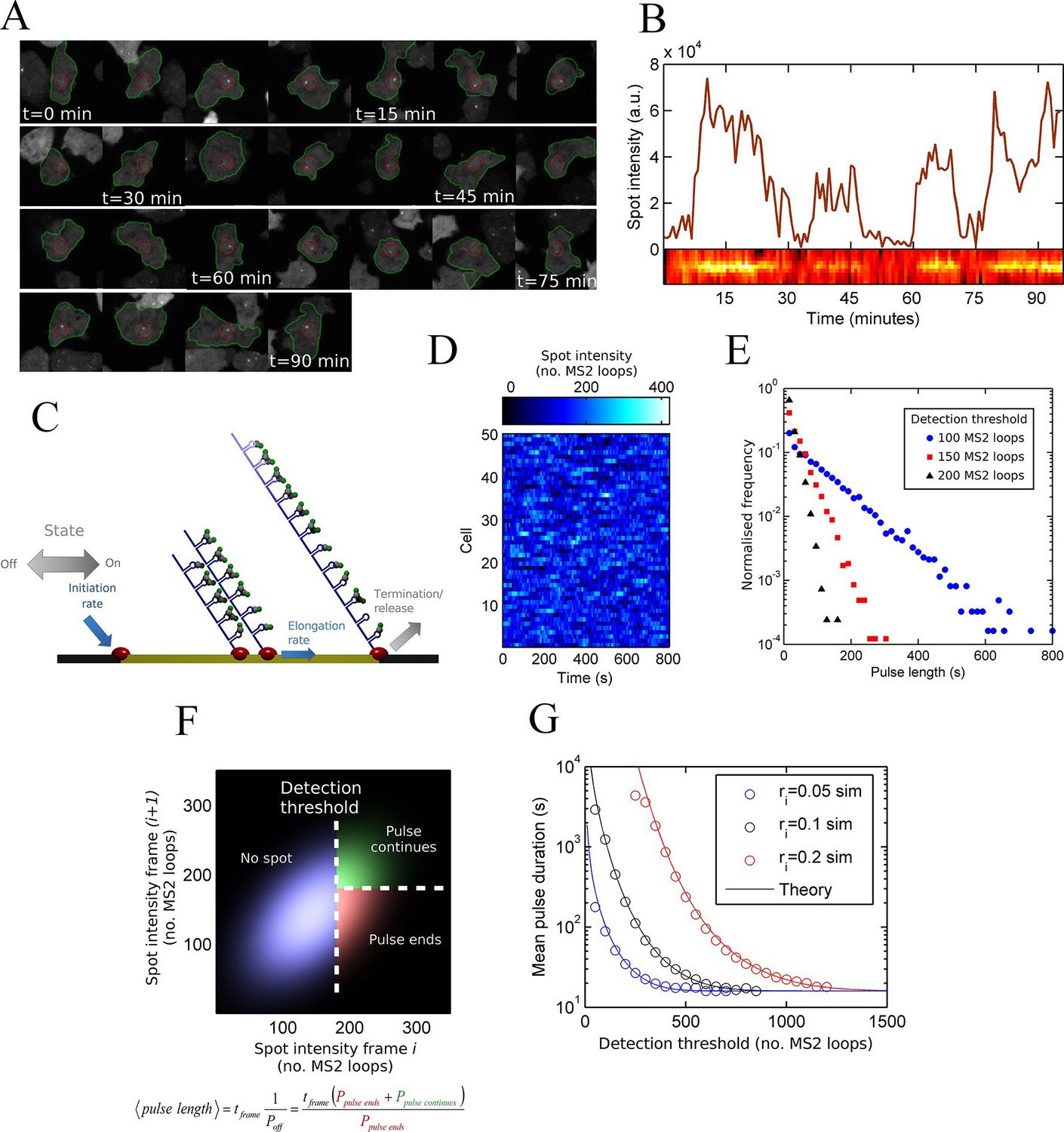
Measurement and theory of transcriptional fluctuations See also Figure 1—figure supplements 1 and 2.
(A) Montage of a cell identified and tracked throughout a time lapse movie showing the transcription spot fluctuating over time. Detected cell (green) and nuclear (red) boundaries are shown. (B) (Upper) Spot intensity trace for the cell shown in A. (Lower) Kymograph extracted from image, aligned with time axis of upper graph, showing the fluctuations in intensity of the region around the spot. (C) Monte Carlo simulation of MS2 system. Binding of polymerases at the start of the gene (initiation) and single nucleotide elongation steps are modelled as processes with one rate-limiting step. Additional steps could be added, such as termination/release from the gene. To simulate systems with switches in initiation rate, single rate-limiting steps are used to transition between different initiation states. (D) Simulated transcription site intensity fluctuations (total number of stem loops) for a promoter with a constant Poisson initiation rate. (E) Histogram of pulse durations for different detection thresholds. A pulse is defined as successive frames where the transcription site intensity is above a threshold number of loops. Experimentally, the threshold of detection is the intensity at which a spot is identifiable over background noise, and depends on the imaging conditions. (F) Two-dimensional histogram calculated from the bivariate Gaussian theory, showing the probability distribution of the transcription site intensity in two successive frames. Blue region - spot intensity below threshold in current frame; green region - intensity above threshold in both current and next frames; red region - spot intensity above threshold in current frame but below threshold in next frame. The average pulse duration is determined from the probability of the transcription spot disappearing between one frame and the next: P(off) = P(red)/(P(green) + P(red)). (G) The bivariate Gaussian theory accurately predicts the pulse durations of simulated data. Comparison of theory and simulation are shown for three different initiation rates (ri). Therefore, the duration of a visible transcription pulse depends on properties such as the exposure time, detection sensitivity and frame interval, and does not provide a simple readout of gene activity fluctuations.
Figure 1—figure supplement 1
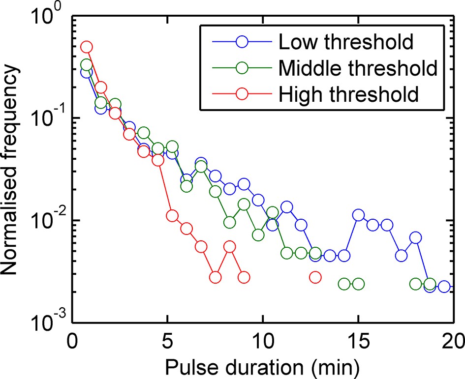
Experimental pulse durations obtained by applying various thresholds of detection: low - 4000 arbitrary intensity units (a.u.), middle - 8000 a.u. and high 16,000 a.u.
https://doi.org/10.7554/eLife.13051.004
Figure 1—figure supplement 2
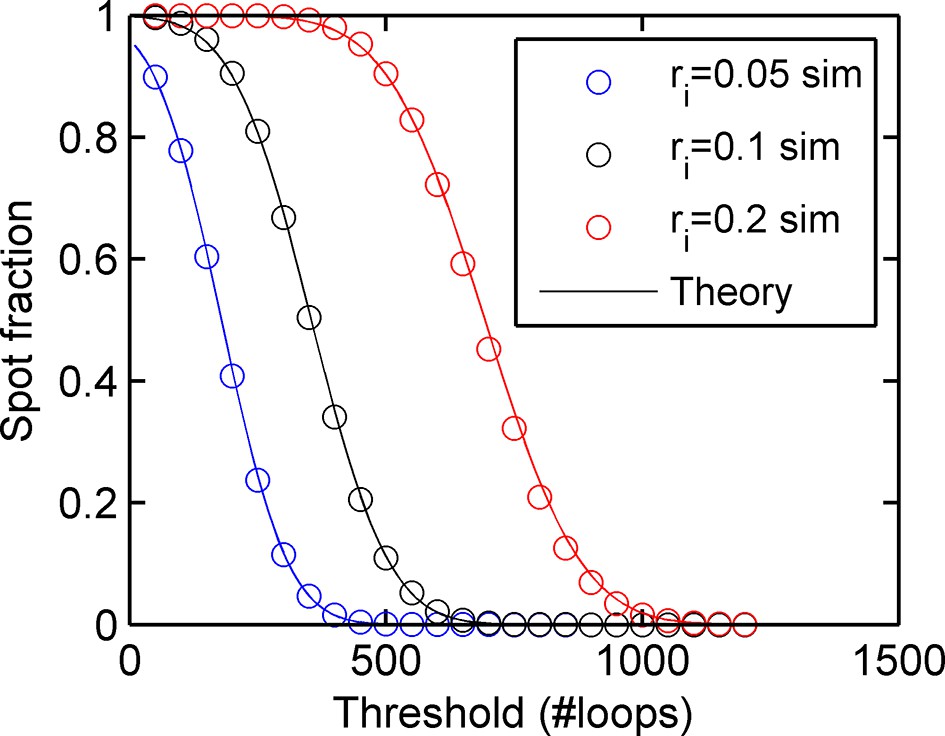
Agreement between simulations and bivariate Gaussian theory of spot frequency (fraction) (right) as a function of detection threshold.
Circles correspond to different initiation rates and solid lines indicate predictions of the theory, with no free parameters.
Figure 2 with 2 supplements
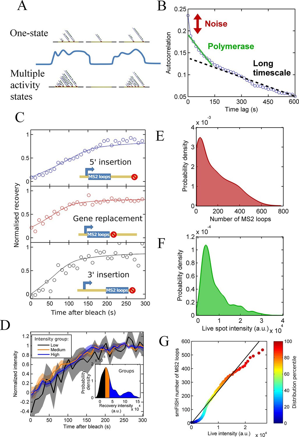
Calibration of MS2 system provides quantitative detail of polymerases at the transcription site.
See also Figure 2—figure supplements 1 and 2. (A) The correspondence between spot intensity and number of MS2 loops at the transcription site strongly influences the type of model which accurately describes the experimental data. Depending on the actual detection threshold, the blue intensity trace could be generates by either the one state (top) or multiple activity state scenarios (bottom). (B) Autocorrelation of transcription spot traces. The autocorrelation can be decomposed into three parts: measurement error (noise), polymerase contribution, and longer timescale fluctuations. Classification and distinction between the three parts is discussed in detail in the text. (C) FRAP curves showing recovery of TS intensity after photobleaching for different configurations of MS2 loop position. The inset cartoons illustrate the arrangement of loops after the actin5 promoter. Solid line shows best fit to model described in the text. For the 5’ MS2 loop insertion, n=30 cells, for the 3’ loop insertion, n=32 and for the gene replacement loop insertion, n=25, with each insertion line analysed on 4+ experimental days. (D) Grouping of FRAP curves based on the recovery intensity, showing no clear variability in dwell time as a function of intensity. The 5’ MS2 insertion cell line was used here, with data from 56 cells (captured on 5+ experimental days) divided into 3 groups for high, medium and low spot intensity (inset). The experimental variability is shown as standard error. (E) Intensity distribution of transcription spots measured by smFISH using a probe hybridising to the inter loop region of the MS2 loop array. Plot shows the probability density function. The intensity of one MS2 RNA is calculated from cytoplasmic spots, and used to calibrate the nascent FISH transcription spot intensity in terms of the number of complete MS2 RNA molecules each consisting of 24 loops. For calibration, an average of 53,150 cytoplasmic RNA spots were used to measure single molecule fluorescence. 594 transcription spots were measured using smFISH. (F) Intensity distribution of transcription spots measured in live cells using MCP-GFP fluorescence. 1449 transcription spots were measured. (G) Calibration of MS2 live TS intensity using smFISH measurements. Comparing percentiles of the smFISH (E) and live distributions (F), allows the live TS intensity to be interpreted in terms of the number of stem loops present. The colour of the points indicates the percentile of the distribution.
Figure 2—figure supplement 1
Experimental spot data is not consistent with a model of constant activity.
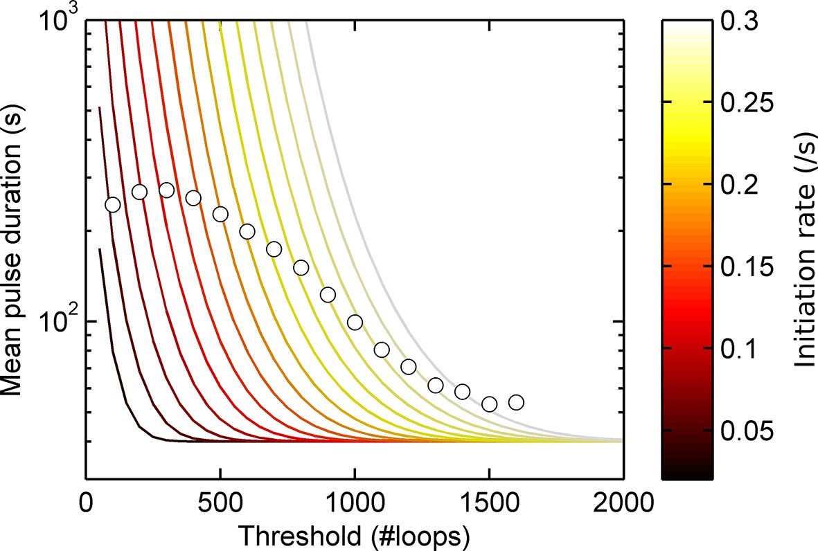
Lines show theoretical contours of different initiation rate for a one-state (Poisson) model, circles indicate experimental results as a function of threshold for the act5-MS2 wild type (WT) cell line. A single contour of initiation rate does not capture the range of spot intensities observed.
Figure 2—figure supplement 2

Experimental spot data is not consistent with a binary on/off model (two-state) of transcription initiation.
Lines show theoretical contours of different initiation rate, for a two-state model. Circles indicate experimental results for pulse duration (left) and spot frequency (right) as a function of threshold for the act5-MS2 wild type (WT) cell line. In the two state model, the switching rates have been optimized to give best agreement at low thresholds. In all cases, a single contour of initiation rate does not capture the range of spot intensities observed.
Figure 3 with 2 supplements
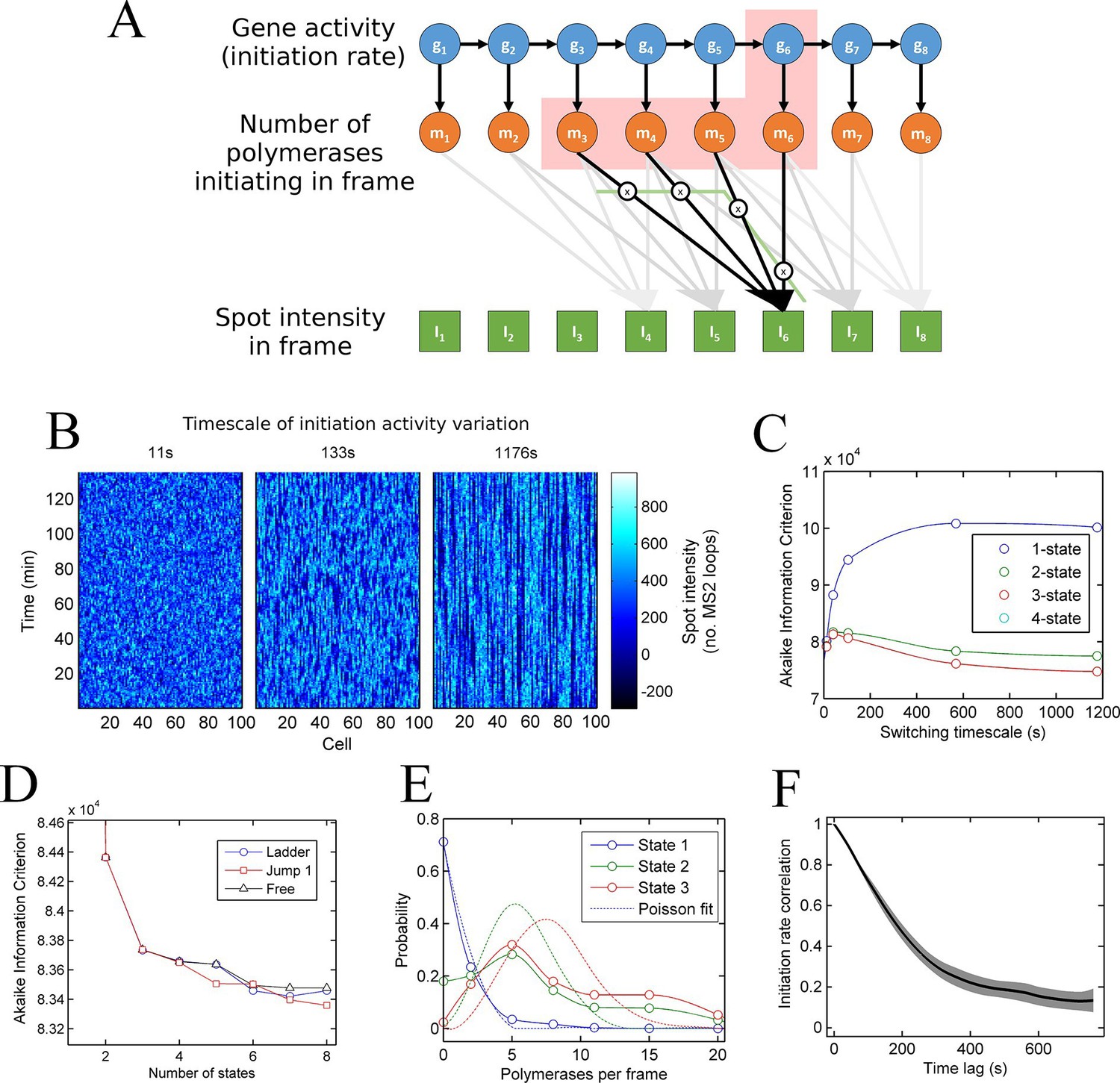
A continuum of transcriptional states.
See also Figure 3—figure supplements 1 and 2. (A) Architecture of a hidden Markov model (HMM) to describe transcription spot intensity in the case where polymerases remain at the transcription site for up to 4 frames. The hidden state at a given point in time consists of the gene-state at the current time (gt) and the number of polymerases (m) which have been initiated in the previous 4 frames [g,mi,mii,miii,miv], highlighted by the red background. With approximately processive polymerase behaviour, polymerases initiated in the current frame will be near the start of the gene and thus have transcribed few MS2 loops; polymerases initiated in previous frames have transcribed more MS2 loops by the current frame. The polymerase states, weighted by the expected number of loops per polymerase (x), combine with the measurement error to give the observed state It (green). (B) Simulated transcriptional fluctuations based on a 3-state model, with three panels corresponding to different timescales of switching between transcriptional states. The right panel (timescale of variation 1176 s) has longer pulses- reflecting the slower switching between initiation rate states. (C) Testing the HMM framework on the 3 state simulation from B. As described in the text, the AIC (Akaike’s Information Criterion) is reduced for optimal models, while penalizing overly complex models via the number of free parameters. The one state fit has the highest value of AIC, regardless of the switching timescale. The 2-state fit does much better and the 3-state fit better still, with a reduced AIC. A 4-state fit gives no additional improvement over the 3-state fit and is hidden by the 3-state curve. (D) Increasing the number of possible initiation rate states improves the likelihood that the model reflects the experimental transcription data. AIC for models of increasing numbers of initiation states. While 1- and 2-state models do not adequately describe the data, the quality of the fit continues to significantly increase as the number of states increases from 3 upwards. The three curves indicate different rules for allowed transitions between states- 'ladder' means the gene can move up or down one state per time, 'jump 1' allows a change of up to 2 states and 'free' is unconstrained switching of the gene between states. These data represent a typical experiment, with data from 145 different cell tracks comprising 6350 individual time points. Three further 3 independent biological replicates gave similar conclusions. A decrease in AIC of 10 (note: the vertical axis units are scaled by 104) is significant at the 1% level (p=0.007). A more extensive treatment of the statistics is included in the Supplementary Material. (E) Probability distribution of the number of polymerases initiated per frame for each state of a three-state model, calculated using a modified forward-backward algorithm. Attempted Poisson fits for each state are shown by the dotted lines. The distributions were strikingly non-Poissonian, with χ2 = 5059 (p=0) and 3152 (p=0) for states 2 and 3. For state 1, χ2 =10.24, but we cannot reject Ho because of no degrees of freedom. Data from a representative biological replicate are shown. (F) The timescale of initiation rate fluctuations revealed by autocorrelation analysis. The curve shows the decay in the correlation as a function of time, with the initiation rate largely uncorrelated with the rate 5–6 min before.
Figure 3—figure supplement 1
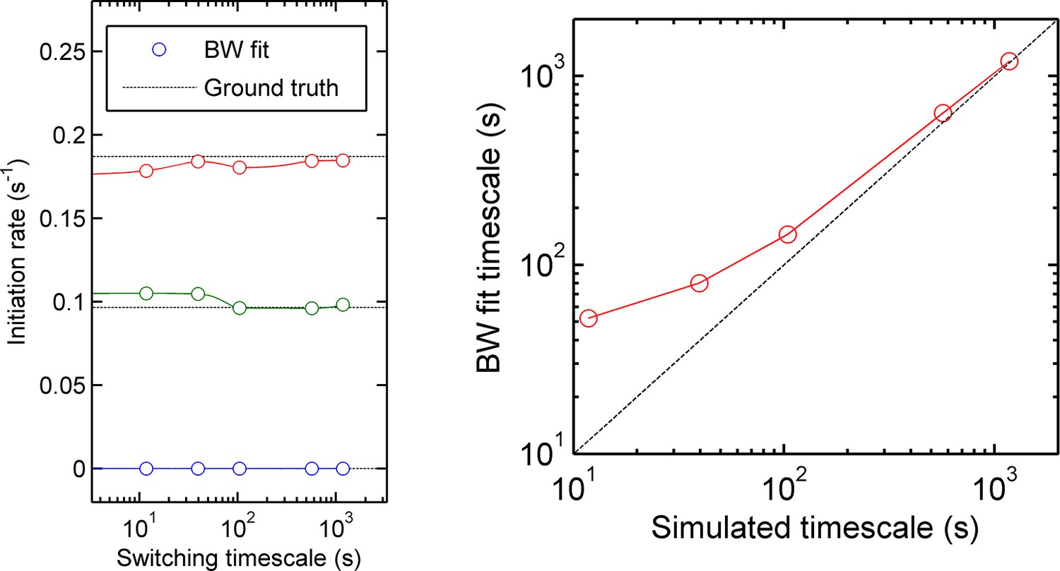
Accuracy of measurement of state initiation rates and state switching rate using hidden Markov model methods (Baum-Welch algorithm).
Three-initiation-state models were simulated with a range of timescales of state switching, to test the accuracy of Baum-Welch training in measuring the initiation rate for each state and the rate of switching between each state. Left - for all timescales, the fitted initiation rate (circles, different colours indicate the three states) estimated using the modified Baum-Welch algorithm is in good agreement with the values inputted into the simulation (dotted lines). The estimated values begin to deviate by small amounts when the timescale of state switching is very short. Right - the calculated state switching timescale shows good agreement with the ground truth (simulation input) for slow switching rates (long timescales). When the rate of switching becomes very fast (left hand side of figures) the maximum likelihood approach of Baum-Welch fitting misses some fast transitions, and consequently the timescale of state-switching is over-estimated.
Figure 3—figure supplement 2
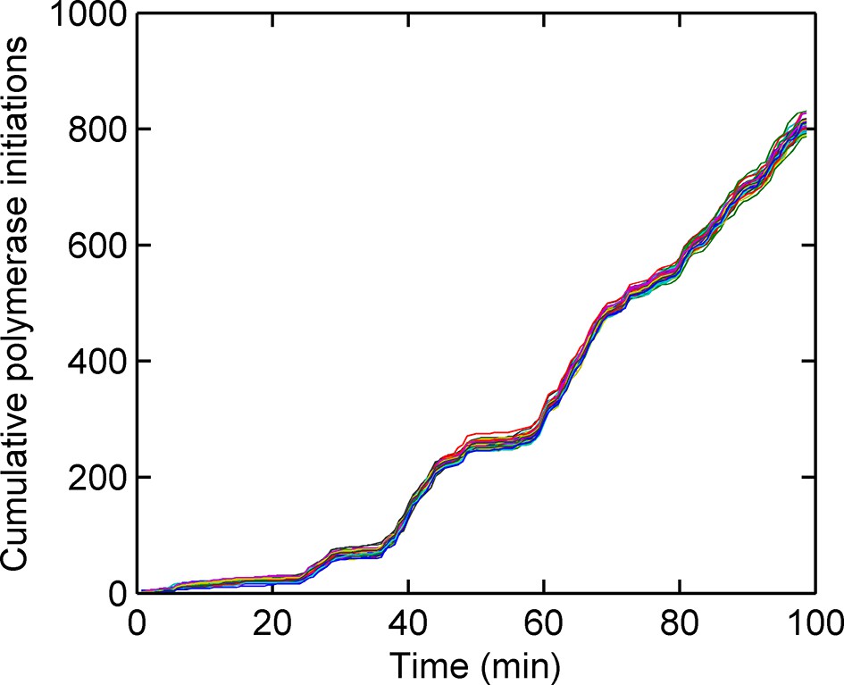
Cumulative number of polymerases initiated as a function of time, calculated using a custom Gibbs sampling method.
Different colours indicate models with different numbers of initiation rate states, with multiple runs per model. The number of polymerases is approximately independent of the number of states used in the model. The initiation rate is given by the gradient of the plot; as such straight lines indicate periods of time for which the initation rate is roughly constant.
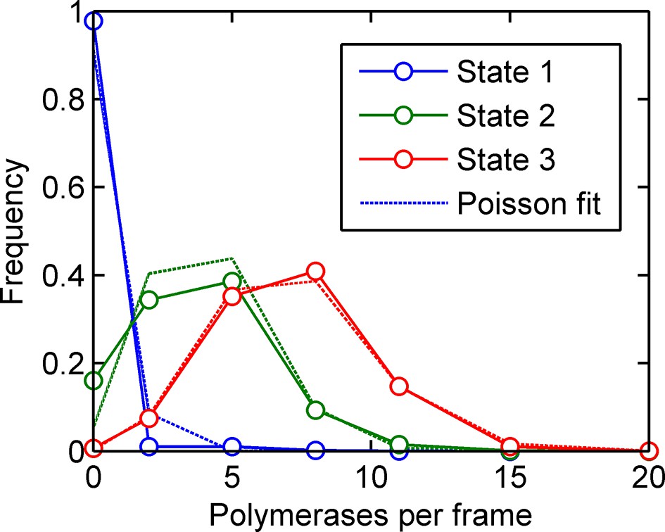
Figure 4 with 1 supplement
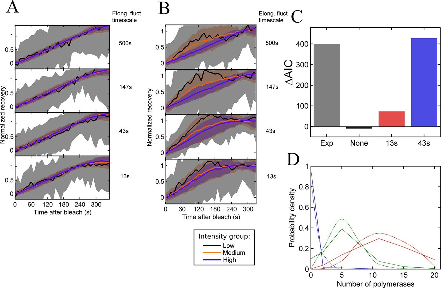
Testing the contribution of elongation rate switching to intensity fluctuations See also Figure 4—figure supplement 1.
A and B Simulated FRAP measurements for a system with three states of initiation rate and two elongation rate states. Initiation rate dynamics are chosen to match those observed experimentally, while the timescale of elongation rate fluctuations is varied from 500 s (top panel) to 13 s (bottom panel) between 10 bases/s and 30 bases/s. In A, the elongation rate for each polymerase fluctuates independently from other polymerases, whereas in B, all polymerases move with a global fluctuating elongation rate. The simulated data are subdivided equally between three bins of low (black), medium (orange) and high (blue) spot intensity, as with the experimental data in Figure 2D. Differences between bins are only apparent with global fluctuations. Variability is shown with standard deviations. (C) Effects of elongation rate fluctuations on the 3-state simulation. The y-axis shows the increase in complexity produced by adding elongation fluctuations to a three-state simulation, compared with experimental results. Simulated data is slowly varying three-state initiations with fast-varying two-state elongations. Simulations with fast fluctuations (13 s) show a small improvement in fit above three states (red bar). Simulations with 43 s timescale elongation fluctuations (blue) show an improvement in fit comparable to experimental data (grey). (D) Polymerase distributions in three-state model fit for 3-state simulation with 43 s elongation fluctuations (solid, straight lines), compared with Poisson best fit (dotted, curved lines).
Figure 4—figure supplement 1
Training a three-initiation-state model on simulated data with three initiation states and no elongation rate fluctuations (see main text).
The calculated number of polymerases initiated in each of the three states (solid blue, green and red lines respectively) are very close to Poisson distributions, accurately reproducing the states inputted in the simulation. The fitted states are slightly broader than Poisson, as expected due to the probability of making a switch within the last frame interval.
Figure 5 with 4 supplements

The TATA box influences access to the high activity states.
See also Figure 5—figure supplements 1–4. (A) TATA box mutations studied for the act5 gene. (B) Probability density function of transcription site intensity for TATA mutations T1A and A2C compared to WT. One of four biological replicates is shown. The reduction in intensity in the TATA mutations is slight, but significant (KS test: p=10–58 for wt vs. T1A and p=10–158 for wt vs. A2C). (C) Lifetime of constant initiation rate pulses in the active state, as a function of initiation rate for TATA mutants compared to control. The TATA mutants spend longer in lower initiation states and shorter durations at high initiation rates. The curves display mean and S.E.M. from 4 independent experiments (with 1686–6350 individual frames from 44–145 individual cell tracks, from each cell line, from each of the 4 replicates). We used grouped ratio t-tests to compare distributions, pooling the data based upon initiation rate. For low initiation rates (<0.2 s-1) gave p=0.0083 and 0.0015 for T1A and A2C respectively. For high rates (>0.25 s-1) gave p=3.5 x 10⁻⁵ and 0.0011. A breakdown of the data is contained in the Supplementary Material. (D) Timescale of initiation rate persistence, as measured by the decay of the autocorrelation of instantaneous initiation rate, is similar for TATA mutants and WT. (E) Estimated rates of transition from closed to open state (k(on)) and from open to closed state (k(off)). Values are average of 4 experiments. Error bars are S.E.M. Differences are all non-significant (p all >0.45).
Figure 5—figure supplement 1
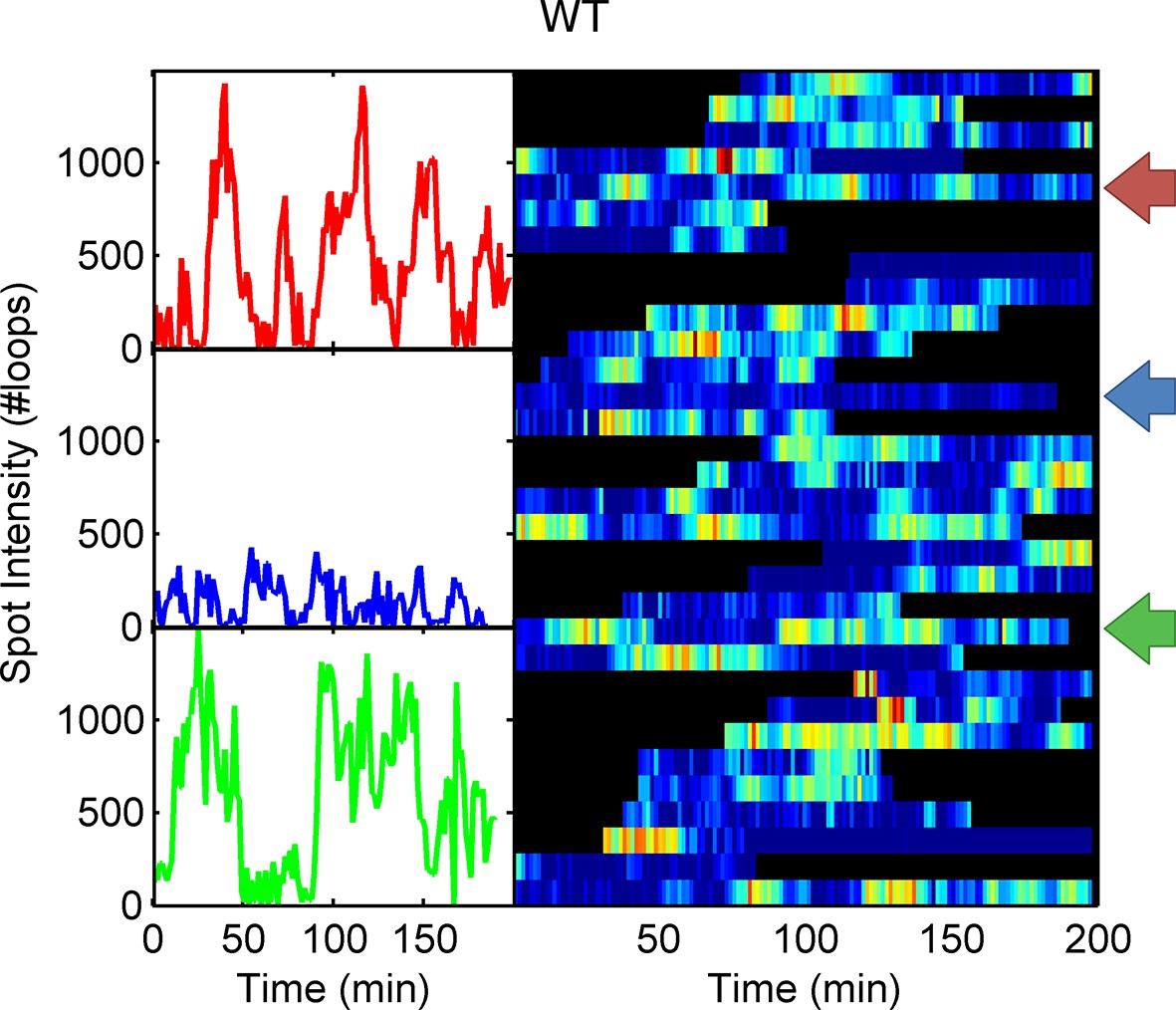
Example WT spot intensity traces.
The colour-coded arrows denote the traces shown individually in the left panels.
Figure 5—figure supplement 2
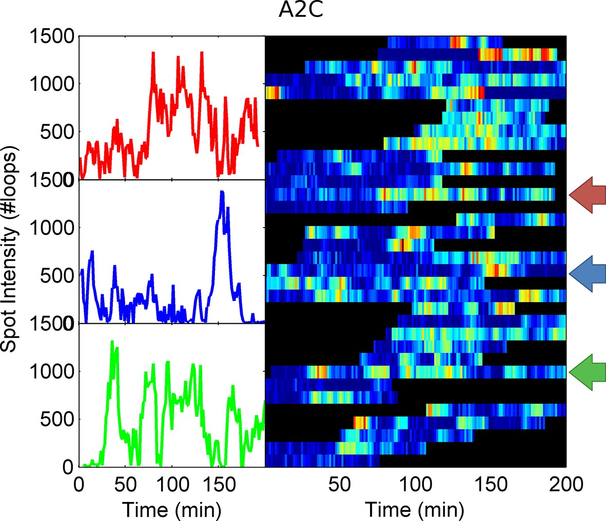
Example spot intensity traces for the A2C TATA box mutation cell line.
The colour-coded arrows denote the traces shown individually in the left panels.
Figure 5—figure supplement 3
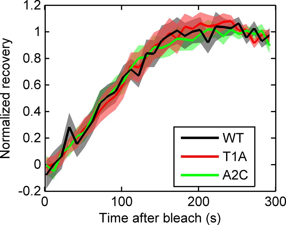
Fluorescence recovery after photobleaching (FRAP) curves show no evidence for different RNA dwell times in the TATA mutants (T1A, A2C) compared to wild type (WT).
https://doi.org/10.7554/eLife.13051.017
Figure 5—figure supplement 4
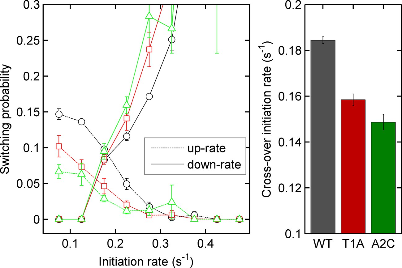
Left - probability of increasing (dotted lines) or decreasing initiation rate (solid lines) as a function of initiation rate for the act5-MS2 wild type (WT) and TATA mutant cell lines.
Right - the crossover of the two curves, as an estimate of the equilibrium initiation rate for the three lines. Black - WT, red - T1A, green - A2C.
Figure 6 with 2 supplements
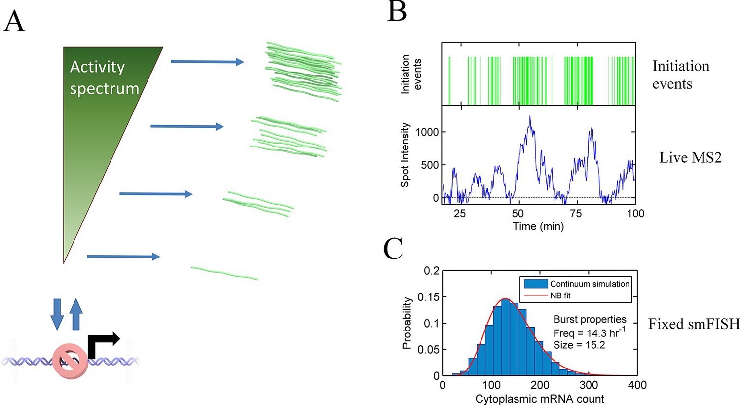
Continuum model.
See also Figure 6—figure supplements 1 and 2. (A) Proposed continuum model. In addition to switches to and from a closed state on the timescale of around ten minutes, the initiation rate in the active state fluctuates on a shorter timescale. (B) Simulation of the continuum model, resulting in temporal variation in the initiation rate (upper, green spikes). The short integration time of MS2 measurements (the time for which RNA is retained at the transcription site) means fluctuations in the active state of the gene can be visualized (lower). (C) In simulated smFISH data (right), using the RNA production events from the continuum model (B) and a cytoplasmic RNA decay time of 40 min, the distribution is well described by a standard two state bursting (negative binomial, NB) model. The long lifetime of cytoplasmic RNA averages out the temporal fluctuations in the initiation rate.
Figure 6—figure supplement 1
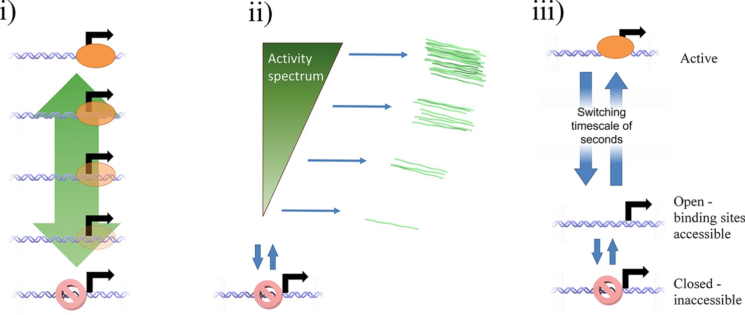
Potential mechanisms by which a continuum of activity (ii) may arise: (i) a ladder containing a large number of discrete states, each with a distinct initiation rate, caused by specific binding of transcription factors or epigenetic marks.
The states are too closely spaced to distinguish and count individual states. Alternatively, a model of fast switching between a primed state and an active state (iii) on a timescale of seconds or tens of seconds (shorter than the observation timescale of the MS2 system) produces a continuum of transcriptional activity. The fraction of time spent in the active state is modulated by the rates of switching into and out of the state, which depend on the local and time-varying concentration of polymerase and transcription factors.
Figure 6—figure supplement 2
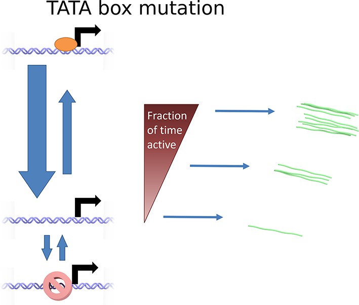
Cartoon illustrating the continuum model and the predicted changes caused by TATA sequence modification.
Mutation of the TATA box may cause reduced rate of binding or increased rate of unbinding of activator. This results in a lower fraction of time spent in the active state, reducing the upper limit of initiation rates which can be realized. The rate of switching to and from the closed and inaccessible state is unaffected.
Appendix 3—figure 1
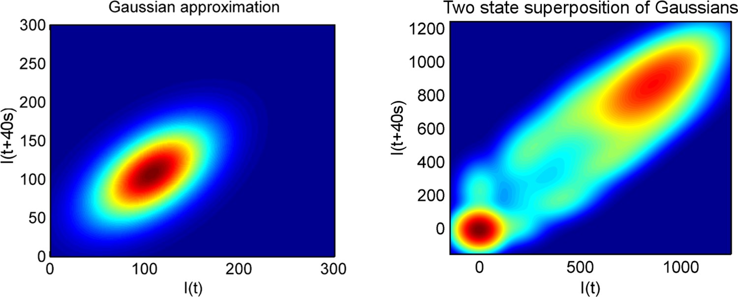
Using a joint intensity distribution to calculate pulse duration.
The heatmaps show the probability of the spot intensity in one frame (x-axis) and the spot intensity in the next frame (y-axis), for a one-state (Poisson) model of constant initiation rate (left), and a two-state model (right), which switches randomly to and from an inactive state.
Download links
A two-part list of links to download the article, or parts of the article, in various formats.
Downloads (link to download the article as PDF)
Open citations (links to open the citations from this article in various online reference manager services)
Cite this article (links to download the citations from this article in formats compatible with various reference manager tools)
A continuum model of transcriptional bursting
eLife 5:e13051.
https://doi.org/10.7554/eLife.13051


