Multiple inputs ensure yeast cell size homeostasis during cell cycle progression
Figures
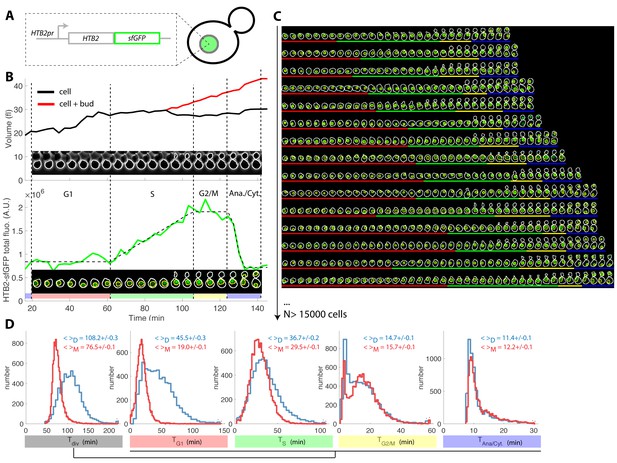
Tracking of cell cycle phases in individual cells.
(A) Principle of the H2B-GFP fluorescence marker used track cell cycle progression (B) Sequence of phase contrast (upper) and fluorescence (lower) images of a sample wild-type daughter cell carrying a histone marker (HTB2-sfGFP), displayed with a 6 min interval. Segmented cell and nuclear contours are indicated in white and yellow, respectively. The upper and bottom panels show the quantification of cell (and bud) volume and total fluorescence signal (green curve) over time, respectively. The dashed line shows the best fit of a piecewise linear model to the fluorescence signal, which is used to segment the cell cycle into distinct phases (see text for details), as indicated using a specific color code. Vertical dashed lines highlight cell cycle phase boundaries. (C) Sample dynamics of 15 individual daughter cells during one cell cycle. The green signal represents nuclear fluorescence of the HTB2-sfGFP marker. White and yellow lines indicate cellular and nuclear contours, respectively. Colored segments (G1, red; S, green; G2/M, yellow; anaphase/cytokinesis, blue) indicate cell cycle intervals, as determined using the procedure described in (B); (D) Histogram of durations of cell cycle intervals and overall cell cycle for WT daughter (D; N = 6079) and mother (M; N = 10775) cells. The legend indicates the mean ±standard error on mean.
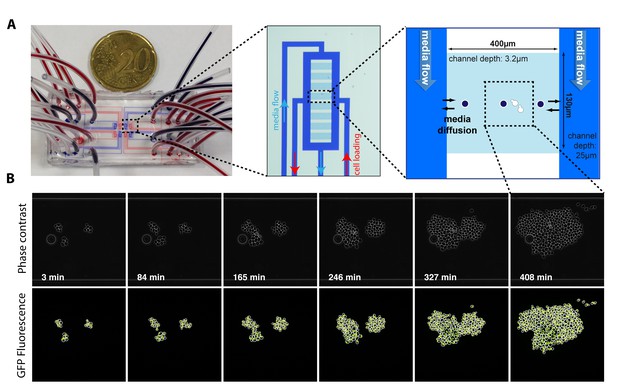
Principle of the microfluidic device and time lapse experiment.
(A) Photograph and schematics of the microfluidic device used in this study, showing the dimensions of the cavities designed to trap cell microcolonies. (B) Sequence of phase contrast and fluorescence image showing the growth of isolated microcolonies within the microfluidic device. White and yellow contour represent the cellular and nuclear contours, respectively. Cell and nuclear segmentation are described in detail in the supplements.
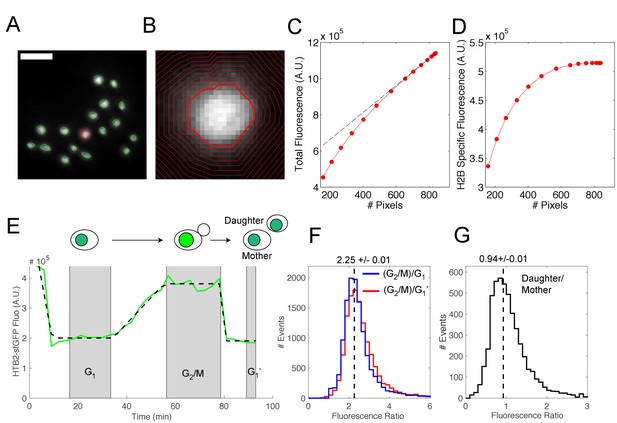
Quantification of H2B-sfGFP fluorescence signal in individual cells.
(A) Typical fluorescence image of a microcolony of cells expressing HTB2-sfGFP. Nuclear contours were generated using a custom segmentation procedure. Scale bar, 5 μm. (B) Higher magnification of the nucleus highlighted in red in (A). Contours of increasing size are used to determine the total HTB2-sfGFP fluorescence and to discard the background signal. (C) Procedure used to remove fluorescence background. Total fluorescence as a function of the nuclear contour size (in pixels). The dashed line is a linear fit to the last six points, which represents an asymptotic limit corresponding to background pixels. (D) Total HTB2-specific fluorescence signal obtained after background subtraction. (E) Typical evolution of HTB2-sfGFP fluorescence signal (green line) during a complete cell division cycle. The black dashed line represents a piecewise linear fit to the experimental data. The gray shaded areas represent the interval of G1, G2/M, and subsequent G1 (G1′) phases of the cycle, as defined by the plateaus obtained during the fitting procedure. (F) Distribution of the fluorescence level ratio during G2/M and G1 or G1′. The median ratio is 2.25 ± 0.01. (G) Distribution of the fluorescence level ratio between mother and daughter cell upon nuclear division. The median ratio is 0.94 ± 0.01 (see Materials and methods and Supplemental Information for further details).
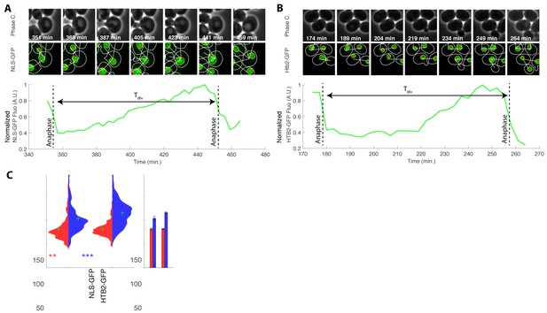
Influence of the HTB2-sfGFP marker on cell cycle duration.
(A) Top: sequence of phase contrast and fluorescence of cells carrying an NLS-GFP marker at indicated time points. White and yellow line indicate cellular and nuclear contours, respectively. White segment indicates bud/mother parentage. Bottom: quantification of normalized total nuclear NLS-GFP fluorescence during one cell cycle. The dashed lines correspond to automatic detection of anaphase events measured as a sudden drop in total nuclear signal in the mother cell nuclei. Tdiv is the cell cycle duration, as measured from anaphase to anaphase. (B) Same as (A), but with a HTB2-GFP strain. (C) Violin plots showing the distribution of cell cycle duration for mother (red) and daughter (blue) cells with an NLS-GFP or HTB2-GFP marker. Green crosses indicate the distribution median. Star symbols indicate results of a Kolmogorov–Smirnov test: *p<0.05, **p<0.01, ***p<0.001, using the HTB2-GFP strain as a reference. Right: Means of the distributions shown on the left. Error bars display standard error on mean.
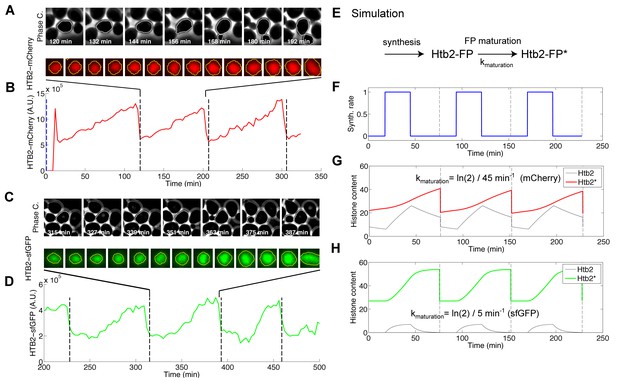
Effect of fluorophore maturation on the apparent dynamics of histone synthesis.
(A) Typical sequence of phase and fluorescence images of a strain carrying a HTB2-mCherry marker. The time stamps are relative to the beginning of the assay. (B) Quantification of the HTB2-mCherry fluorescence signal measured in (A) over multiple cell cycles. The dashed lines correspond to automatic detection of anaphase events measured as a sudden drop in total nuclear signal in the mother cell nuclei. (C and D) Same as in (A and B), but with a strain expressing HTB2-sfGFP. (E–H) Numerical simulation recapitulating the effect of the time delay induced by fluorophore maturation on the measured fluorescence signal following pulsatile synthesis of histones. (E) Schematic of the reaction scheme used to model the expression of a histone–fluorescent protein fusion protein (Htb2-FP, immature; Htb2-FP*, mature). The maturation half-time varies from 5 min for sfGFP to 45 min for mCherry. (F) Pulsatile synthesis rate used to mimic histone synthesis during the cell cycle. (G) Simulation of immature (black line) and mature (red) fluorescent fusion protein according to the model described in (E) following pulses of protein expression as in (F) and assuming periodic cell division events (indicated by dashed lines). In this case, kmaturation = ln(2)/45 min−1 (corresponding to the mCherry maturation rate). (H) Same as (G), but with kmaturation = ln(2)/5 min−1 (corresponding to the sfGFP maturation rate).
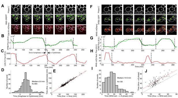
Comparison of HTB2-sfGFP fluorescence dynamics with other known cell cycle markers.
(A) Phase contrast and fluorescence images of cells expressing both HTB2-sfGFP and Cdc10-mCherry markers. The white and yellow lines represent the cellular and nuclear contours, respectively. The blue line indicates the contour of the budneck. (B and C) Quantification of total nuclear fluorescence (B) and mean budneck fluorescence (C) as a function of time over multiple cell cycles. The dashed lines indicate the end of anaphase (B) or the end of cytokinesis (C), which are computationally detected as a sudden drop in the fluorescence signal. (D) Histogram of the distribution of the duration between the end of anaphase and the end of cytokinesis, based on automated detection of a sudden drop in the signal (see (C)). (E) Scatter plot showing the time from the end of anaphase to the end of the next cytokinesis as a function of the time from the end of anaphase to the end of the next anaphase (black points). The black dashed line represents the diagonal. The red line is a fit to a line of slope 1, which represents the systematic delay between anaphase and cytokinesis. (F–J) Same analysis as in (A–E), but using Whi5-mCherry as a complementary marker. In this case, both the end of anaphase and entry into S phase are detected (G), as well as the Whi5 nuclear exit (H). In (I), the histogram displays the distribution of time between Whi5 nuclear exit and the onset of histone synthesis. In (J), the time from the end of anaphase to the next phase of histone synthesis is plotted against the time from the end of anaphase to the next Whi5 exit (see Materials and methods and Supplemental Information for further details).
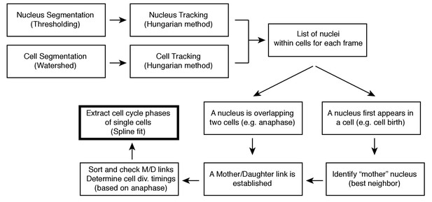
Cell segmentation and tracking pipeline.
Procedure for extraction of the duration of cell cycle phases in individual cells. See Supplemental Information for details.
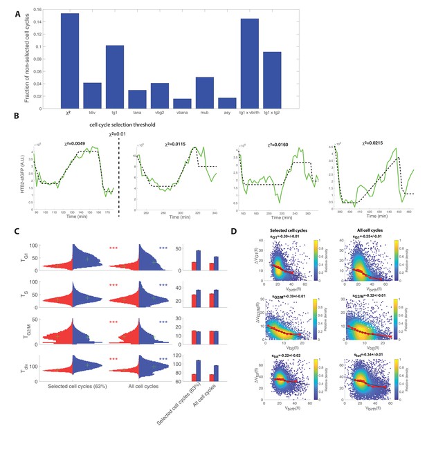
Cell cycle selection procedure and its impact on cell cycle timings and measurements of compensatory growth.
(A) Histogram showing the fraction of rejected cell cycle for each variable/parameter used to filter the dataset (see supplemental information). The sum of all bars is larger than one, since a given cell cycle may be rejected due to a failure to fulfill one or more selection criteria. (B) Examples of histone level curves (green line) and their fit to the cell cycle model (dashed black line). The value of χ2 is indicated on each plot, and a vertical dashed line indicates the cell cycle selection threshold used (χ2=0.01) for this parameter throughout the manuscript. (C) Left: Violin plots of the distribution of duration of G1, S, and G2/M phases and total division time (Tdiv) for mother (red) and daughter (blue) cell cycles that passed the quality control criteria (‘selected cell cycles’) versus all cell cycles. Green crosses indicate the distribution median. Star symbols indicate results of a Kolmogorov–Smirnov test: *p<0.05, **p<0.01, ***p<0.001 vs. the selected cell cycle. Right: Means of the distributions shown on the left. Error bars display standard error on mean. (D) Scatter plots showing variations in mother/bud volumes at the indicated cell cycle stages for selected (left panels) versus all cells (right panels). Color indicates point density. Red line shows binning of the scatter plot along the x-axis. Dashed black line is a robust linear regression through the cloud of points, and the indicated slope (s) represents the strength of the size-compensation mechanism. Error bars represent the 95% confidence interval.
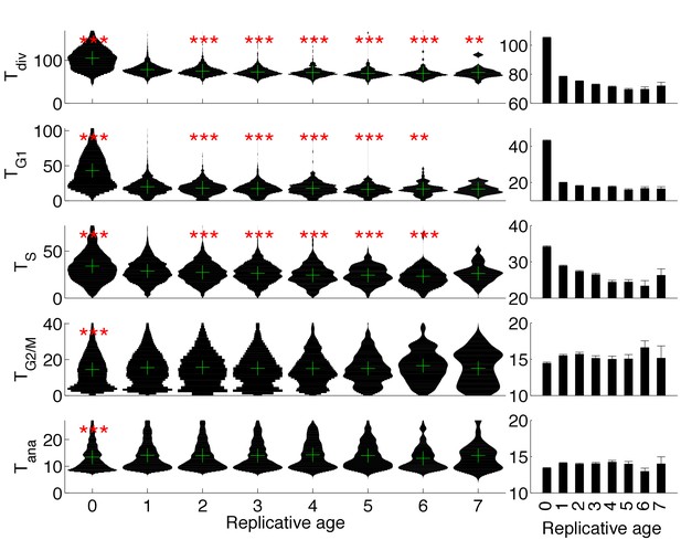
Evolution of cell cycle duration as a function of replicative age.
(C) Violin plots showing the distribution of duration of the indicated cell cycle phase as a function of the replicative age of the cells (Age = 0 and Age > 0 correspond to daughter and mother cells, respectively). *p<0.05, **p<0.01, ***p<0.001 vs. replicative age of 1 using a Kolmogorov–Smirnov test. The green cross indicates the median of the distributions. Right: Mean of the distributions represented on the left. Error bars indicate standard error on mean.
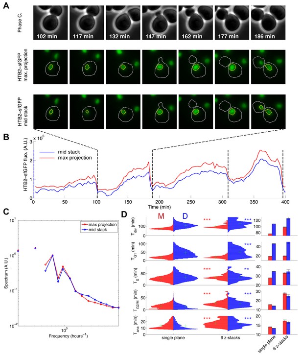
Effect of multi-plane acquisition on cell cycle phase quantification.
(A) Sequence of phase contrast and fluorescence images of cells carrying an HTB2-sfGFP marker, based on a 6-image z-stack acquisition (spacing 300 μm). The sequence in the middle and bottom represent the max projection and the image in the middle of the stack, respectively. (B) Quantification of total HTB2-sfGFP fluorescence obtained using max projection (red line) or the image in the middle of the stack (blue line). The dashed line indicates the end of anaphase, detected computationally. (C) Fourier spectrum of the datasets displayed in (B), averaged over more than 400 cell cycles. (D) Left: Violin plots showing the distribution of duration of the indicated cell cycle phase or the entire cell cycle (Tdiv) in a wild-type strain expressing HTB2-sfGFP, acquired using a single plane or a 6-image z-stack. The red and blue plots correspond to mother and daughter cells, respectively. *p<0.05, **p<0.01, ***p<0.001 vs. control (single plane) using a Kolmogorov–Smirnov test. The green cross indicates the median of the distribution. Right: Mean of the distributions represented on the left.
Cell cycle progression of wild-type cells.
Movie showing the overlay of phase contrast and HTB2-sfGFP fluorescence of 16 individual cells during one cell cycle with 3-inute interval. Neighboring cells have been masked for clarity, and images of individual cells were rotated so that the budding axis is identical for all cells. The red line highlights cell and bud contours. The white progress bar on the right indicates the total HTB2-sfGFP signal within the nucleus, which is used as a proxy for S-phase progression. The progress bar on the left shows the sequence of cell cycle phases as indicated on the legend.
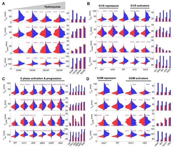
Duration of cell cycle phases in hydroxyurea-treated wild-type cells and in cell cycle mutant strains.
(A) Left: Violin plots of the distribution of duration of G1, S, and G2/M phases and total division time (Tdiv) for mother (red) and daughter (blue) wild-type (WT) cells at the indicated hydroxyurea concentration. Green crosses indicate the distribution median. Star symbols indicate results of a Kolmogorov–Smirnov test: *p<0.05, **p<0.01, ***p<0.001 vs. 0 mM control. Right: Means of the distributions shown on the left. Error bars display standard error on mean (B–D) Same representation as in (A) analyzing various cell cycle mutants (untreated), using the WT strain as a reference for statistical tests.
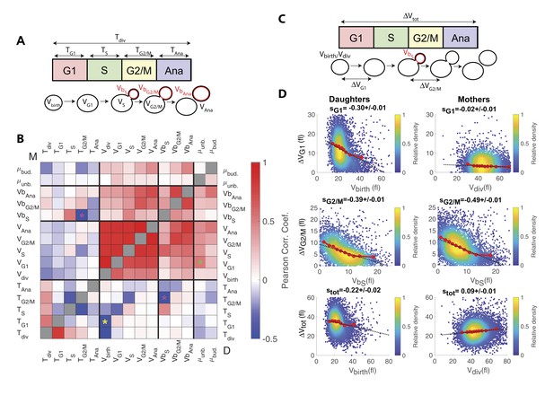
Identification and measurement of size compensation mechanisms in WT.
(A) Top: Schematic of cell cycle phases and definitions of variables used in the correlogram in panel (B). (B) Correlogram that represents Pearson’s correlation coefficient obtained from the scatter plot associated with the two variables. As indicated on the color scale, blue indicates a negative correlation and therefore highlights the presence of a potential compensatory mechanism, whereas red indicates a positive correlation. T indicates the duration (min) of each cell cycle phase; V and Vb indicate the mother and bud volumes at each cell cycle phase, respectively. μunb and μbud are the linear growth rate during the unbudded and budded period of the cell cycle, respectively. Ana indicates anaphase to cytokinesis interval. M (top left triangle) and D (bottom right triangle) represent the analyses performed in mother and daughter cells, respectively. Colored asterisks indicate squares of specific interest (see Main text). (C) Schematic of cell cycle phases and definitions of variables used in the scatter plots below. (D) Scatter plots showing variations in mother/bud volumes at the indicated cell cycle stages. Color indicates point density, according to the indicated color code. Red line shows binning of the scatter plot along the x-axis. Dashed black line is a robust linear regression through the cloud of points, and the indicated slope (s) represents the strength of the size-compensation mechanism. Error bars represent a 95% confidence interval.
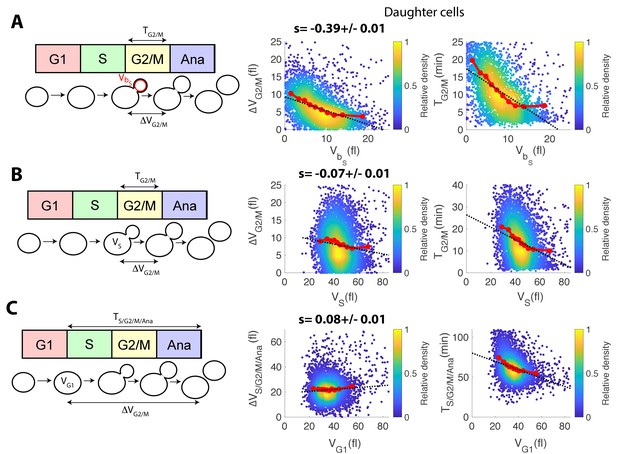
Comparison of size compensation effects in the budded part of the cell cycle.
(A) Left: schematic showing the definition of variables used to assess the magnitude of size compensation effects during the cell cycle. Right: scatter plots showing variations in cell/bud volumes during G2/M, as a function of bud volume by the end of S phase. Color indicates point density. Red line shows binning of the scatter plot along the x-axis. Dashed black line is a robust linear regression through the cloud of points, and the indicated slope (s) represents the strength of the size-compensation mechanism. Error bars (SE) were obtained by bootstrap analysis. Right: same as the scatter plot in the middle, but with G2/M duration. (B) Same as (A), but plotting total variations in cell/bud volumes during G2/M as a function of total cell volume (i.e. cell and bud) at the end of S phase. (C) Same as (A), but plotting total variations in cell/bud volumes during S/G2/M/Anaphase as a function of total cell volume (i.e. cell and bud) at the end of S phase.
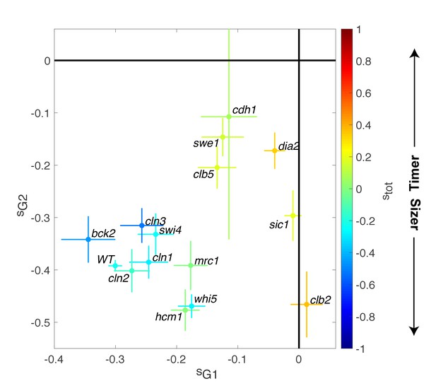
Magnitude of size compensation effects in cell cycle mutants.
Strength of size compensation during G1, G2/M, and the entire cell cycle in the indicated mutant backgrounds, calculated as described in Figure 3D. The cross color indicates the overall compensation size during the entire cell cycle, as indicated by the color scale. Values of −1 and +1 correspond to an ideal Sizer and Timer, respectively. Error bars represent a 95% confidence interval obtained from robust linear regression.
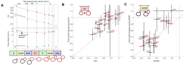
Evolution of cell size variability during cell cycle progression.
(A) Measurements of cell and/or bud size variability as a function of the mean cell and/or bud volume (in logarithmic scale) during cell cycle progression. Each data point (red symbols) corresponds to a measurement at specific cell cycle phases, as indicated in the bottom schematic. Top panel represents the coefficient of variation (CV, red symbols) in logarithmic scale. Error bars represent the statistical error, which was estimated by bootstrap analysis. The red dashed line shows the best fit to a power law CV=F1/2/V1/2, where F is the Fano factor (see main text). The grey symbols represent an estimate of experimental error on cell volume measurement, as a function of cell size (see Materials and methods for detail). Error bars represent the standard error on mean measurement error (grey symbol, see Material and methods). Bottom panel shows the Fano factor (in logarithmic scale), as defined above (red symbols, see main text for detail). Error bars represent the statistical error, which was estimated by bootstrap analysis. The red horizontal dashed line represents the mean Fano factor during cell cycle progression. The grey symbols represent an estimate of noise associated with cell volume measurement, as a function of cell size (see Materials and methods for detail). Error bars represent the standard error on noise measurement (grey symbol). (B) Ratio of the Fano factors at the end and the beginning of the G1 phase for the indicated mutants as a function of the magnitude (slope) of the size-compensation mechanism, as defined in (B). Error on the mean Fano was calculated using a bootstrap test, whereas the error on slope was calculated using a robust linear regression procedure (95% confidence interval). The dashed line has a slope one and coincides with the point (0;1). (C) Same as in (B), except applied to bud growth during the G2/M phase.
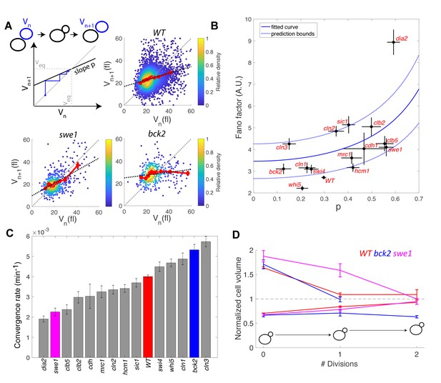
Return map analysis linking cell size noise to the magnitude of the size-compensation mechanism.
(A) Top left: Illustration of the return map model, showing the successive iterations of daughter cell size at birth Vn. The size-compensation mechanism can be described by three parameters: steady-state volume Veq, size-compensation strength p, and noise η. The three return maps of experimental data were obtained with wild-type (WT), swe1, and bck2 daughter cells. Color indicates point density. Red line shows binning of the scatter plot along the x-axis. Dashed black line is a linear regression through the cloud of points. The gray dashed line is the diagonal. (B) Average Fano factor during the entire cell cycle as a function of the experimentally measured size-compensation strength p. The black points and bars are the mean ± SEM of the WT cells and indicated mutants. The blue line shows the single parameter fit to the model (see text), yielding the intrinsic noise of the growth process 0.5, with 99% confidence intervals indicated by the dashed blue lines. (C) Rate of convergence to an equilibrium size for each strain listed in order, based on Equation 3 in the main text. Mean ± SEM. (D) Normalized size of successive daughter cells for WT cells and swe1 and bck2 mutants, starting from cells that deviate by more than 50% or less than 30% of the equilibrium cell size (indicated by the black dashed line).
Additional files
-
Supplementary file 1
List of strains used in the study.
- https://doi.org/10.7554/eLife.34025.019
-
Supplementary file 2
Mean duration of cell phases in specific mutant backgrounds.
- https://doi.org/10.7554/eLife.34025.020
-
Transparent reporting form
- https://doi.org/10.7554/eLife.34025.021


