Identifying gene expression programs of cell-type identity and cellular activity with single-cell RNA-Seq
- Harvard Medical School, United States
- Broad Institute of MIT and Harvard, United States
- Massachusetts Institute of Technology, United States
- Harvard University, United States
- Howard Hughes Medical Institute, United States
Figures
Figure 1

Schematics of matrix factorization for single-cell RNA-Seq analysis and the consensus matrix factorization pipeline.
(a) Schematic representation of how cellular gene expression can be modeled with matrix factorization. The gene expression profiles of individual cells (left bar charts) are weighted mixtures of a set of global gene expression programs (right bar charts) with distinct weights reflecting the usage of each program (middle pie chart). Variable usage of the activity programs is represented by the number of blue circles and orange squares in each cell. (b) Schematic of the consensus matrix factorization pipeline.
Figure 2 with 8 supplements

cNMF infers identity and activity expression programs in simulated data.
(a) t-distributed stochastic neighbor embedding (tSNE) plot of an example simulation showing different cell types with marker colors, doublets as gray Xs, and cells expressing the activity gene expression program (GEP) with a black edge. (b) Pearson correlation between the true GEPs and the GEPs inferred by cNMF for the simulation in (a). (c) Same tSNE plot as (a) but colored by the simulated or the cNMF inferred usage of an example identity program (left) or the activity program (right). (d) Percentage of 20 simulation replicates where an inferred GEP had Pearson correlation greater than 0.80 with the true activity program for each signal to noise ratio (parameterized by the mean log2 fold-change for a differentially expressed gene). (e) Receiver Operator Characteristic (except with false discovery rate rather than false positive rate) showing prediction accuracy of genes associated with the activity GEP. (f) Scatter plot comparing the simulated activity GEP usage and the usage inferred by cNMF for the simulation in (a). For cells with a simulated usage of 0, the inferred usage is shown as a box and whisker plot with the box corresponding to interquartile range and the whiskers corresponding to 5th and 95th percentiles. (g) Contour plot of the true GEP usage on the Y-axis and the second true GEP usage for doublets or the second highest GEP usage inferred by cNMF for singletons for the simulation in (a). 1000 randomly selected cells are overlayed as a scatter plot for each group.
-
Figure 2—source data 1
Benchmarking of matrix factorizations on simulated data.
- https://doi.org/10.7554/eLife.43803.012
Figure 2—figure supplement 1
Robustness of matrix factorization methods.
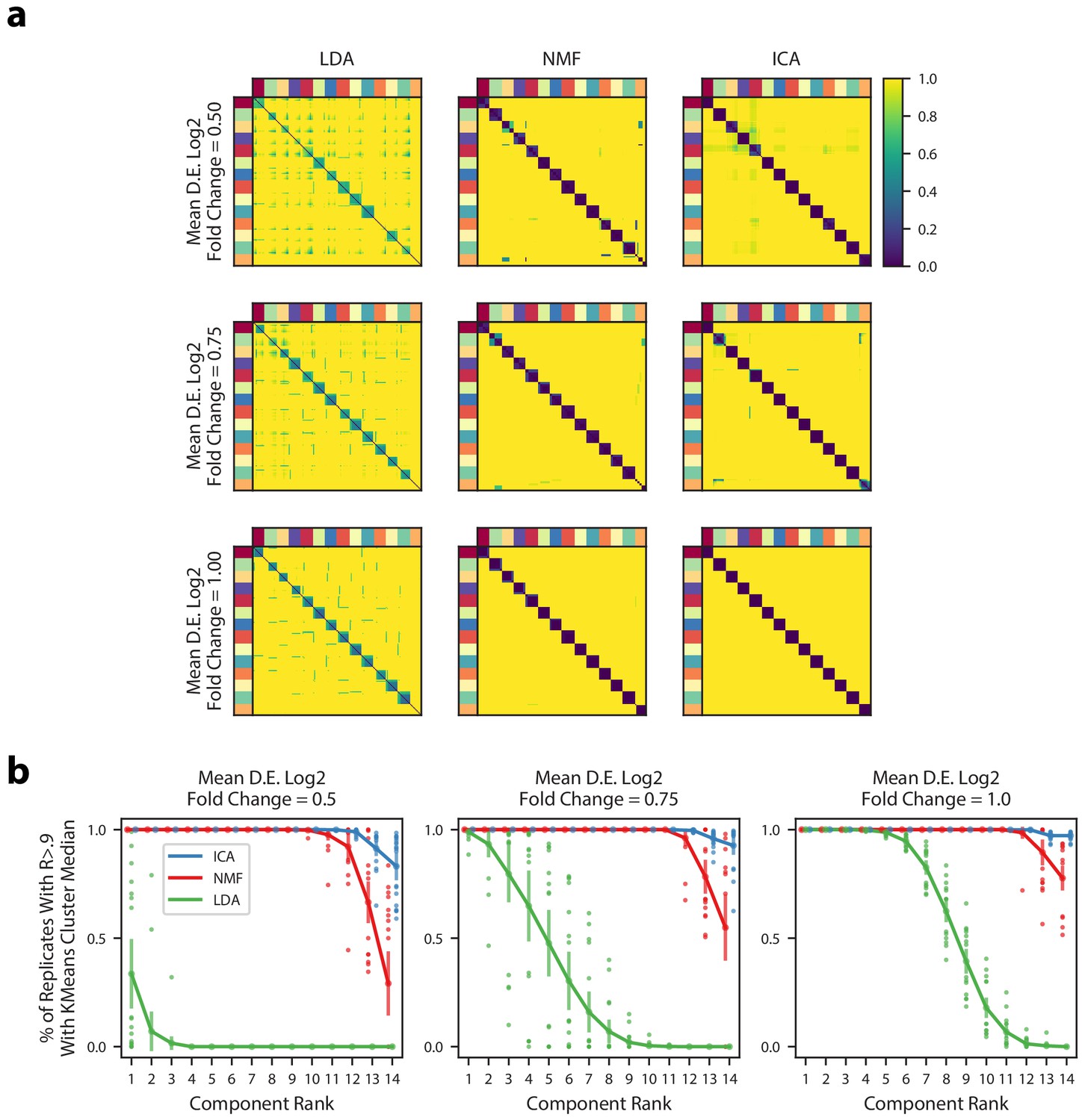
(a) Pairwise correlation coefficients for all components combined across 200 replicates for multiple simulations (rows) and multiple matrix factorization algorithms (columns). All 14 components for each replicate were assigned in a one-to-one fashion to a ground truth GEP in order from most correlated to least correlated. Components are ordered in each heatmap by the assigned ground truth GEP which is denoted by the outer color bars. The three simulations had different average signal strengths as parameterized by the mean log2 fold-change for differentially expressed genes in a GEP (Online Methods) and are ordered from least signal (top row) to most signal (bottom row). (b) Components from the 200 replicates were assigned to a ground truth GEP, as in (a), and were correlated with the median of their assigned group. Then, for each factorization replicate, the 14 components were ranked in order from most to least correlated. The plots shows the % of replicates where the kth most correlated component had a Pearson correlation >0.9 with the median of the components assigned to the same ground truth GEP. We plot the mean and standard deviation of this percentage across the 20 replicates as bars around the mean, and plot individual dots for simulation replicates that exceeded one standard deviation of the mean.
Figure 2—figure supplement 2
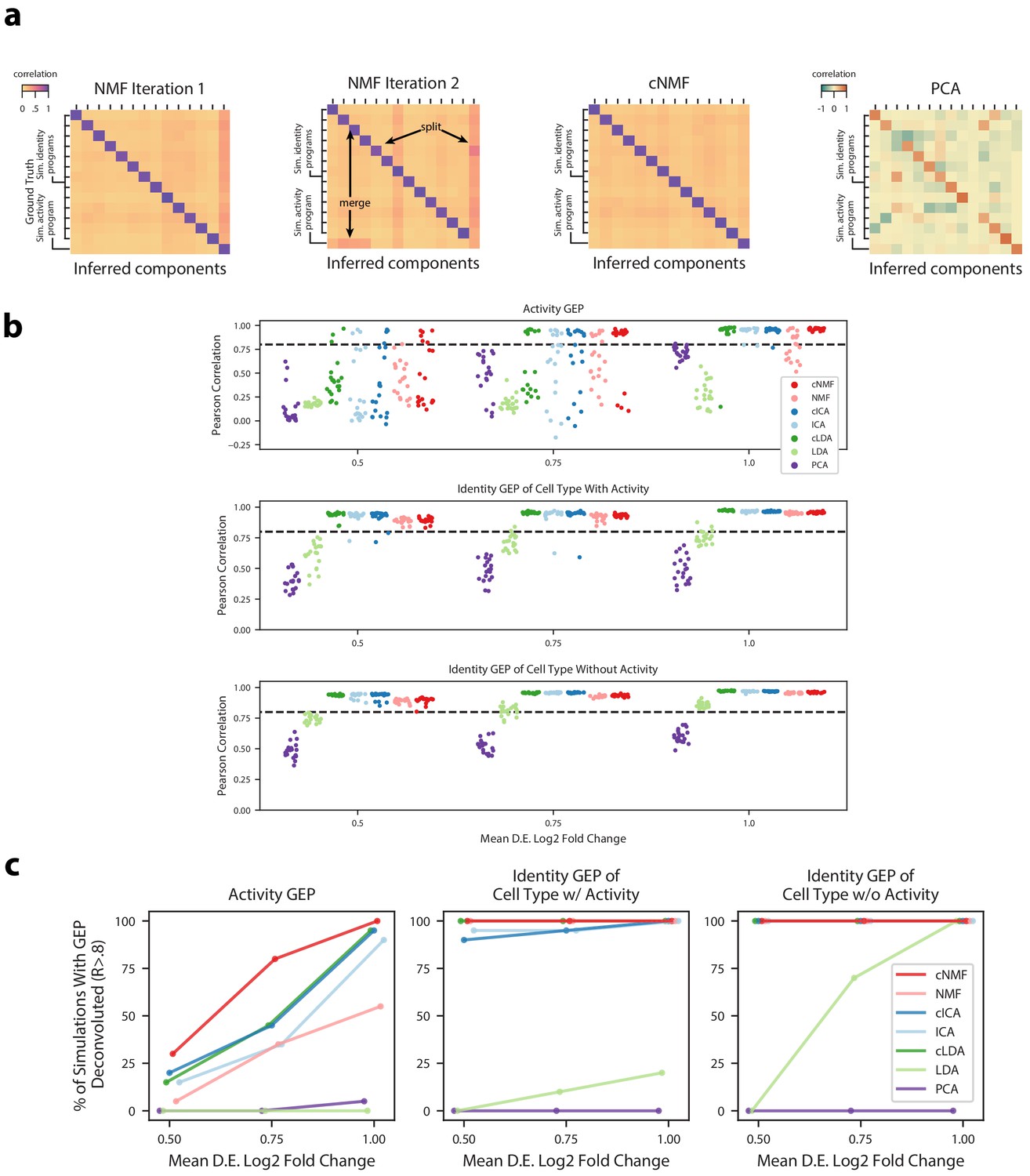
Deconvolution accuracy of matrix factorization methods.
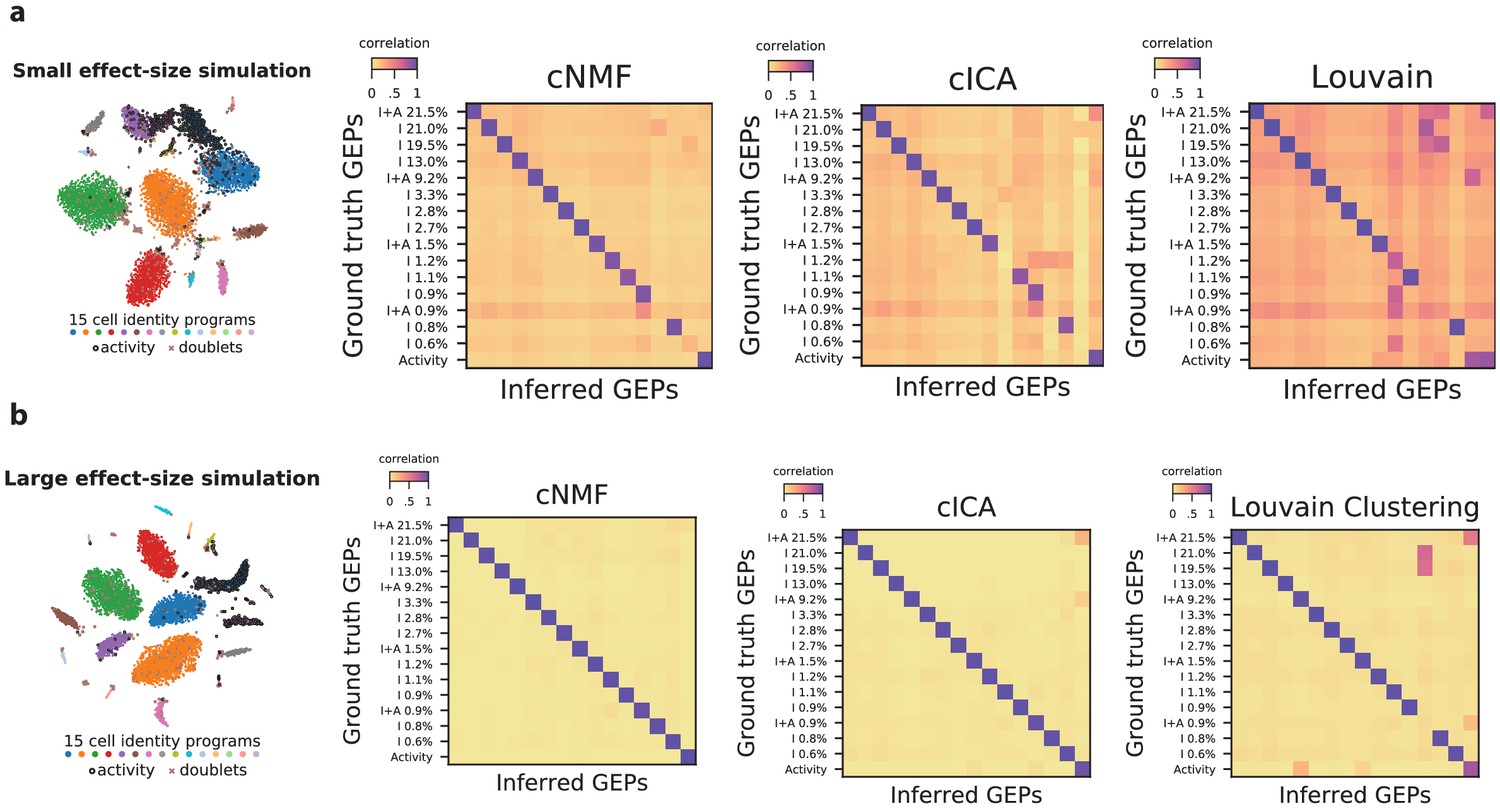
(a) Pearson correlation between ground truth GEP means (rows) and GEPs inferred by different iterations of NMF (left), cNMF, or PCA (right) for an example simulation. All correlations are computed considering only the 2000 most over-dispersed genes and on vectors normalized by the computed sample standard deviation of each gene. Arrows annotate cases where GEPs were merged into a single component or a GEP was split into two components. (b) Pearson correlation between inferred GEPs and true simulated GEPs for several matrix factorization methods across all 20 simulation replicates for each average signal level. (c) Percentage of simulation replicates for which GEPs of each type had a pearson correlation of R > 0.8 with the true simulated GEP, as a function of the average signal level.
Figure 2—figure supplement 3

Diagnostic plot for cNMF on an example simulated dataset.
(a) Number of cNMF components (K) against solution stability (blue, left axis) measured by the euclidean distance silhouette score of the clustering, and Frobenius error of the consensus solution (red, right axis), with the K selection used in the manuscript indicated with a line. (b) Plot of the Log10 proportion of variance explained per principal component, with the K selection used in the manuscript indicated with a dotted line. (c) Clustergram showing the clustered NMF components for K = 14, combined across 200 replicates, before (left) and after filtering (right). In between is a histogram of the average distance of each component to its 60 nearest neighbors with a dashed line where we set the threshold for filtering outliers.
Figure 2—figure supplement 4
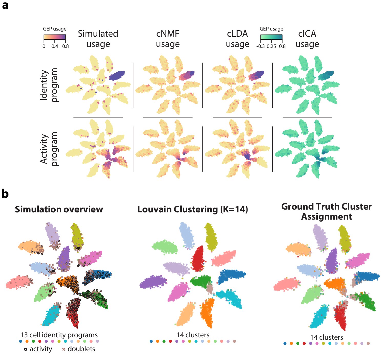
GEP usage inference.
(a) Comparison of GEP usage inference by cNMF, cLDA, and cICA for an example identity GEP (top row) and the activity GEP (bottom row). Each cell is represented as a point and its usage is represented by the marker color. (b) Comparison of the results of ground truth cluster assignment and Louvain clustering represented on a t-SNE plot. (Left) Reproduction of Figure 1b which shows cells colored based on their true identity program, doublets marked with an X, and cells that express the activity program with a black border. (Middle) Cells are colored based on Louvain clustering. (Right) Cells with activity GEP usage of greater than 40% are assigned to an activity cluster, and all other cells were assigned to their identity cluster. This shows how an optimal hard clustering might behave in the context of mixed membership.
Figure 2—figure supplement 5
Accuracy of identifying genes in each GEP.
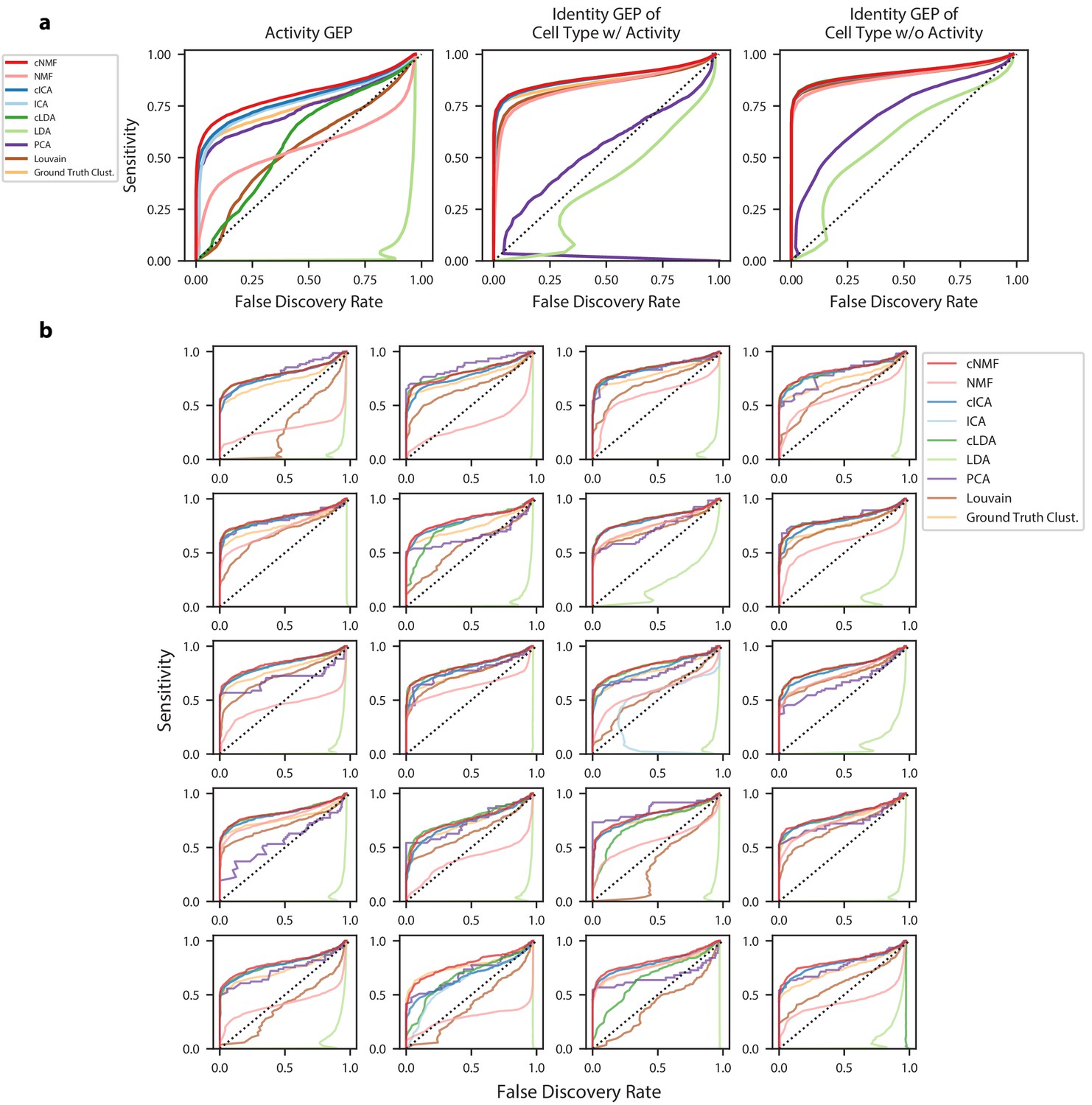
(a) Receiver operating characteristics (ROCs) but showing false discovery rate (FDR) on the X-axis against sensitivity on the Y-axis for detection of genes in GEPs. Separate curves are shown for cNMF, cICA, cLDA, NMF, ICA, LDA, ground truth cluster assignment, Louvain clustering, or PCA. These show combined results for all 20 simulations with mean log2 fold-change = 1.00. Sensitivity is calculated considering genes with a differential expression fold-change of >= 2 and FDR is calculated considering genes with no differential expression (fold change = 1) (b) Same as (a) but only showing the results for the activity GEP and plotted separately for each of the 20 simulations at the mean differential expression log2 fold-change of 1.00.
Figure 2—figure supplement 6
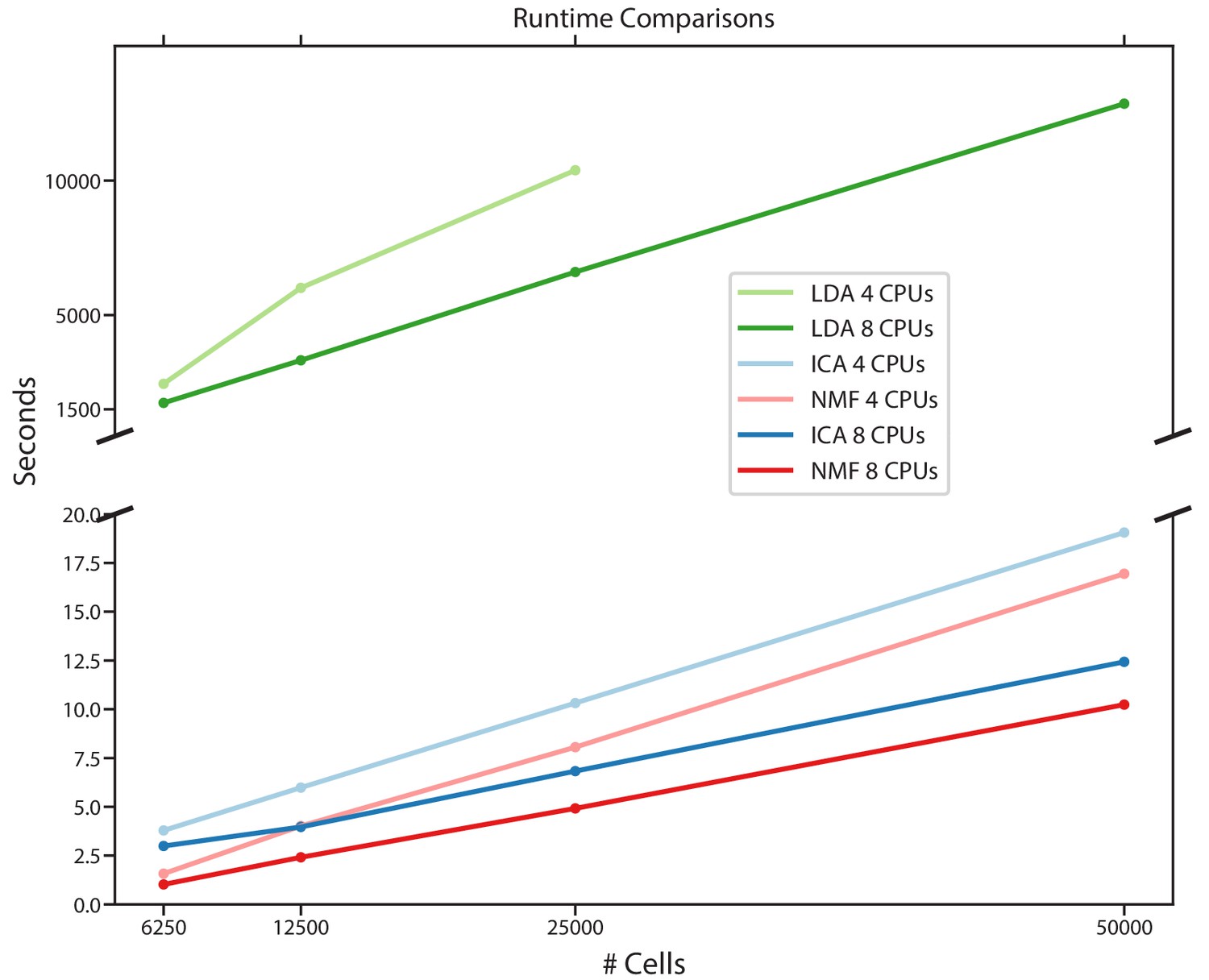
Comparison of run-times for different matrix factorization algorithms.
Run-time in seconds for NMF, ICA, and LDA for a simulated scRNA-Seq dataset down-sampled to 6250, 12,500, 25,000, or 50,000 cells, run either using eight CPUs or four CPUs. Estimates are the average of three independent replicates with different seeds.
Figure 2—figure supplement 7
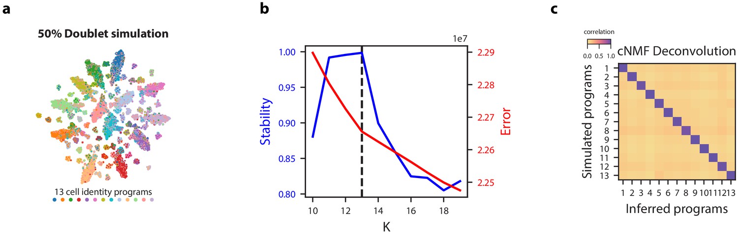
cNMF demonstration on simulated datasets with 50% doublets.
(a) tSNE plot for a simulated dataset with 50% doublets with marker color and edge color representing the simulated cell types. (b) K selection diagnostic plot showing solution stability (measured by the silhouette distance) in blue and Frobenius error of the consensus solution in red. (c) Pairwise Pearson correlation between ground truth GEP means (rows) and GEPs inferred by cNMF (columns) for the 50% doublet simulation dataset.
Figure 2—figure supplement 8
Impact of variable cell-type proportions on GEP inference.
(a) Visualization and inference of simulated scRNA-Seq data with the same parameters presented in Figure 2a but with 15 cell-types at variable frequencies corresponding to the proportions of cell-type clusters in the Hrvatin Et. Al visual cortex dataset. (b) The same as (a) but using a differential expression location parameter of 2.0 instead of 1.0, corresponding to GEPs that are more divergent from each other. The leftmost panels show the t-distributed stochastic neighbor embedding (tSNE) plot for the simulations, representing cell types with distinct marker colors, doublets as gray Xs, and cells expressing the activity gene expression program (GEP) with a black edge. In the heatmaps to the right, we display the Pearson correlation of the ground truth GEPs with the programs inferred by cNMF, cICA, and Louvain clustering. All correlations are computed considering only the 2000 most over-dispersed genes and on vectors normalized by the computed sample standard deviation of each gene. The GEPs are labeled by the type of GEP (activity, I for identity only, and I + A for cell-types that express the activity GEP) and with the frequency of the cell-type in the data.
Figure 3 with 4 supplements
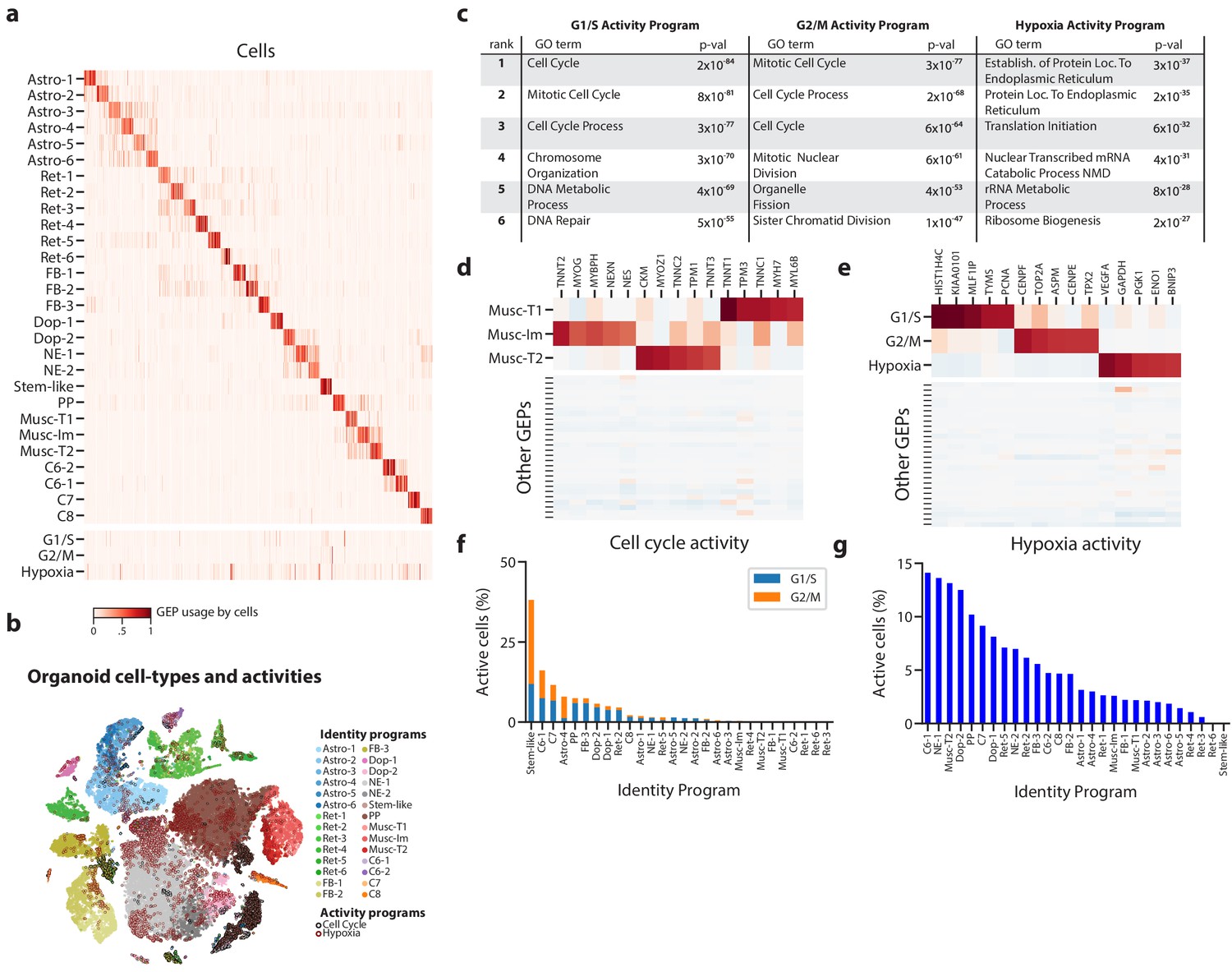
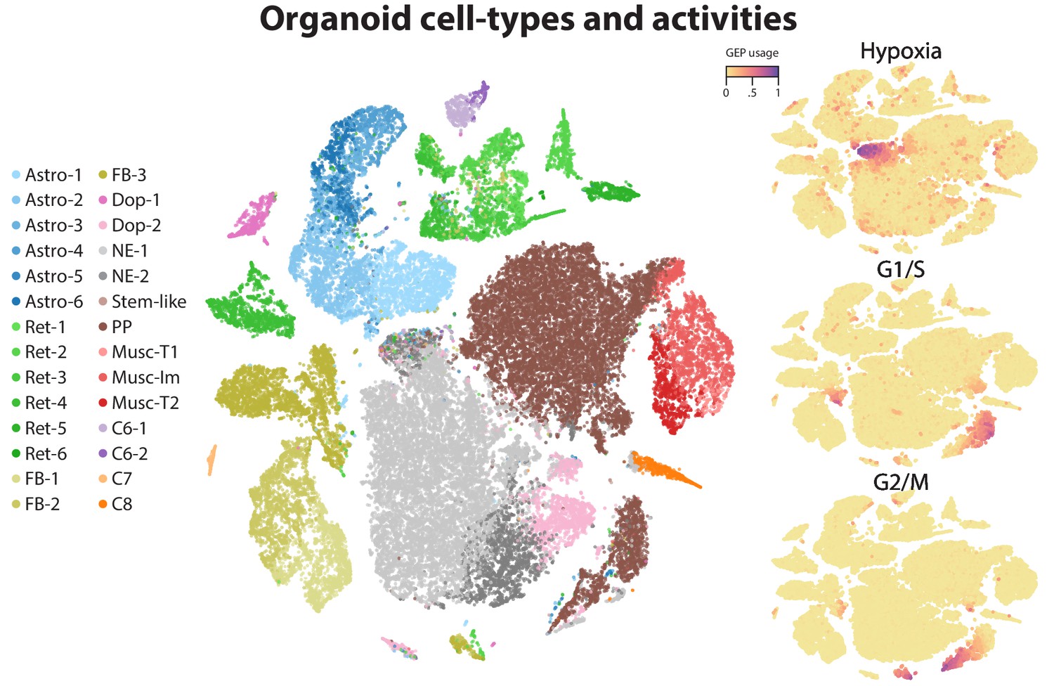
Deconvolution of activity programs from cell identity in brain organoid data.
(a) Heatmap showing percent usage of all GEPs (rows) in all cells (columns). Identity GEPs are shown on top and activity GEPs are shown below. Cells are grouped by their maximum identity GEP and fit into columns of a fixed width for each identity GEP. (b) tSNE plot of the brain organoid dataset with cells colored by their maximally used identity GEP, and with a black edge for cells with >10% usage of the G1/S or G2/M activity GEP or a maroon edge for cells with >10% usage of the hypoxia GEP. (c) Table of P-values for the top six Gene Ontology geneset enrichments for the three activity GEPs. (d) Heatmap of z-scores of top genes associated with three mesodermal programs, in those programs (top), and in all other programs (bottom). (e) Heatmap of z-scores of top genes associated with three activity GEPs, in those programs (top), and in all other programs (bottom). (f) Proportion of cells assigned to each identity GEP that express the G1/S or G2/M program with a percent usage greater than 10%. (g) Proportion of cells assigned to each identity GEP that express the hypoxia program with a percent usage greater than 10%.
-
Figure 3—source data 1
Application of cNMF to brain organoid data.
- https://doi.org/10.7554/eLife.43803.018
Figure 3—figure supplement 1
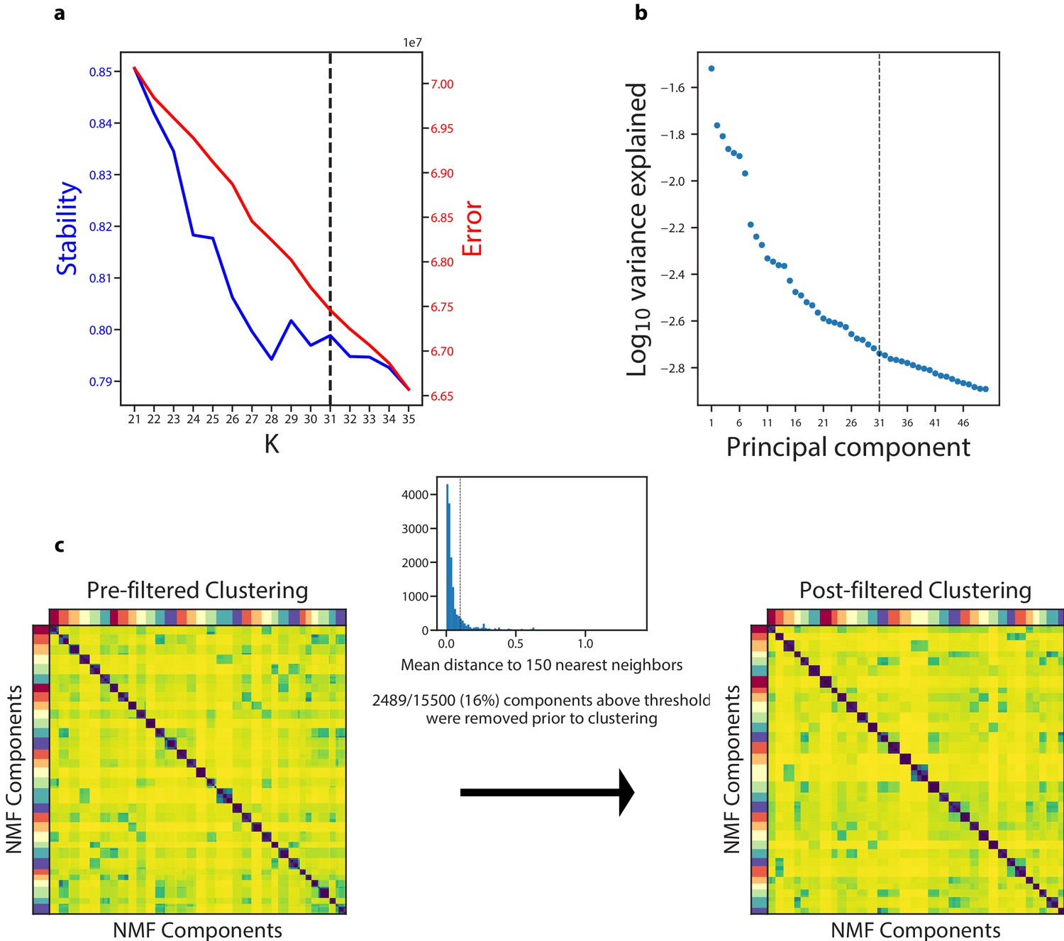
Diagnostic plot for cNMF on the Quadrato et al. (2017) brain organoid dataset.
(a) Number of cNMF components (K) against solution stability (blue, left axis) measured by the silhouette score of the clustering, and Frobenius error of consensus solution (red, right axis). (b) Plot of the Log10 proportion of variance explained per principal component, with the K selection used in the manuscript indicated with a dotted line. (c) Clustergram showing the clustered NMF components for K = 31, combined across 500 replicates, before (left) and after filtering (right). In between is a histogram ofthe average distance of each component to its 150 nearest neighbors with a dashed line where we set the threshold for filtering outliers.
Figure 3—figure supplement 2

Correlation between GEP spectra pairs and fraction of cells that use both programs.
Scatter plot of the pearson correlation between pairs of GEPs (X axis) and the fraction of cells that co-use the GEP pair (Y axis). Co-usage is defined as the number of cells with usage >0.1 for both programs divided by the number of cells that use the less common of the programs with usage >0.1. Dots are colored by whether or not the GEP pair is made up of identity or any of the three activity programs.
Figure 3—figure supplement 3
t-SNE plots of identity and activity GEPs in the Quadrato et al. (2017) brain organoid dataset.
t-SNE plots of cells colored by maximum identity GEP usage (left) or by absolute usage of each activity GEP (right).
Figure 3—figure supplement 4
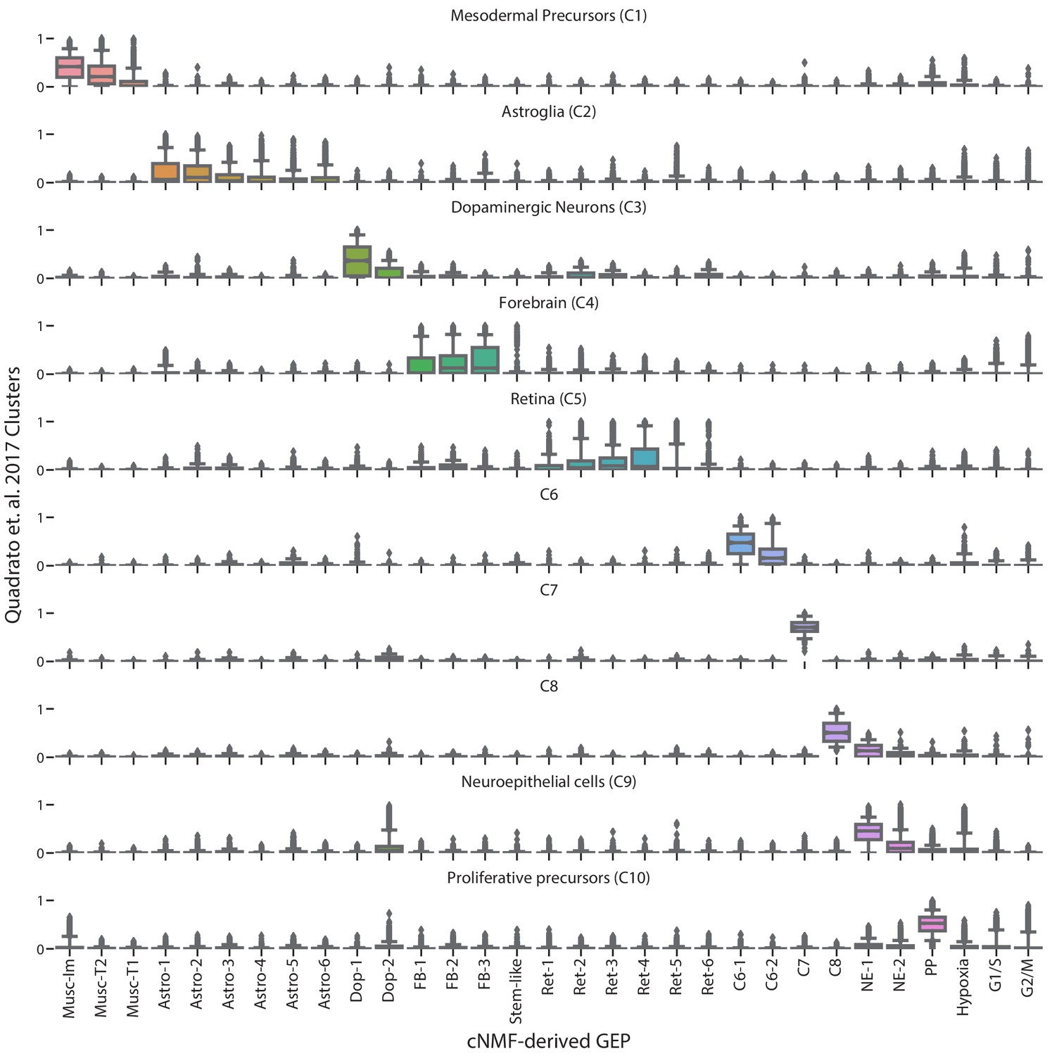
Comparison of cNMF usages with the cell-type clusters from Quadrato et al. (2017).
Box and whisker plot of the usage of each GEP (column) in cells of the clusters from Quadrato et al. (2017) (rows). Boxes represent interquartile range, whiskers represent 5th and 95th percentiles.
Figure 4 with 3 supplements
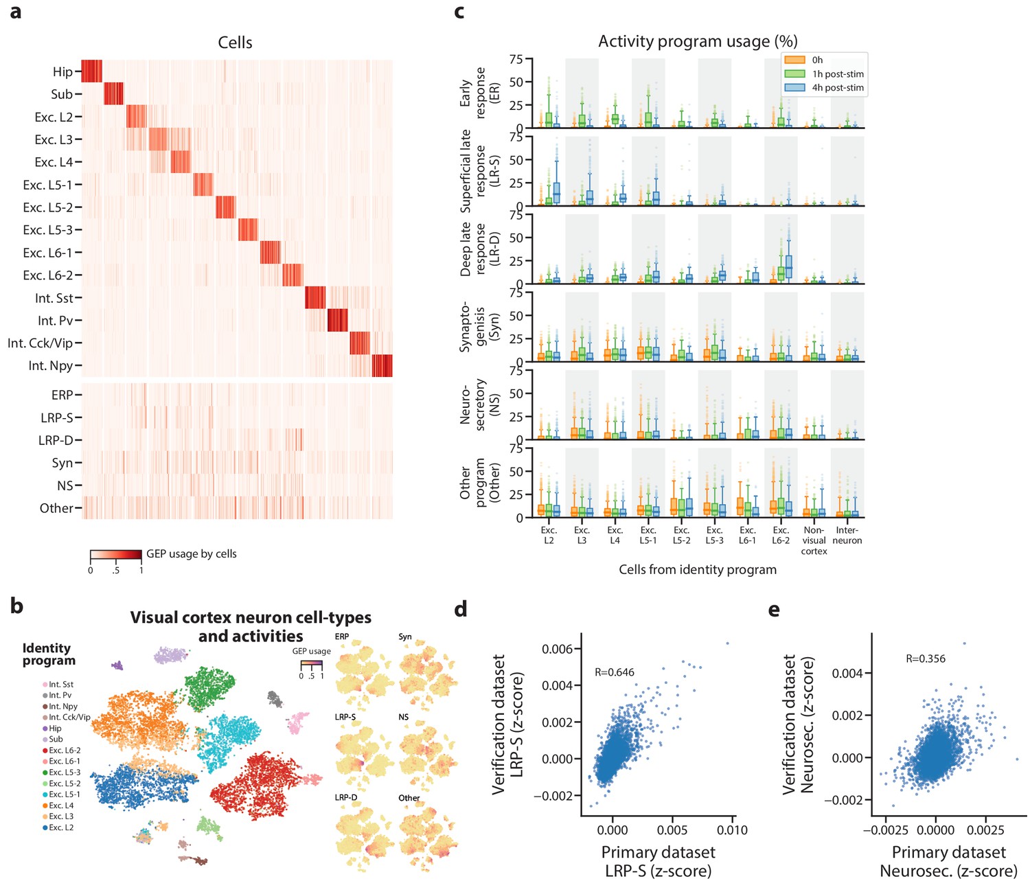
Identification of activity programs in neurons of the visual cortex.
(a) Heatmap showing percent usage of all GEPs (rows) in all cells (columns). Identity GEPs are shown on top and activity GEPs are shown below. Cells are grouped by their maximum identity GEP and fit into columns of a fixed width for each identity GEP. (b) t-SNE plots of cells colored by maximum identity GEP usage (left) or by absolute usage of each activity GEP (right). (c) Box and whisker plot showing the percent usage of activity programs (rows) in cells classified according to their maximum identity GEP (columns) and stratified by the stimulus condition of the cells (hue). The central line represents the median, boxes represent the interquartile range, and whiskers represent the 5th and 95th quantile. (d) Scatter plot of z-scores of the superficial late response GEP in the primary dataset against the corresponding GEP in the Tasic et al. (2016) dataset. (e) Same as (d) but for the neurosecretory activity program.
-
Figure 4—source data 1
Application of cNMF to mouse visual cortex data.
- https://doi.org/10.7554/eLife.43803.023
Figure 4—figure supplement 1

Diagnostic plot for cNMF on the Hrvatin et al. (2018) visual cortex dataset.
(a) Number of cNMF components (K) against solution stability (blue, left axis) measured by the silhouette score and Frobenius error of consensus solution (red, right axis). (b) Plot of the Log10 proportion of variance explained per principal component, with the K selection used in the manuscript indicated with a dotted line. (c) Clustergram showing the clustered NMF components for K = 20, combined across 500 replicates, before (left) and after filtering (right). In between is a histogram of the average distance of each component to its 150 nearest neighbors with a dashed line showing the threshold for filtering outliers.
Figure 4—figure supplement 2
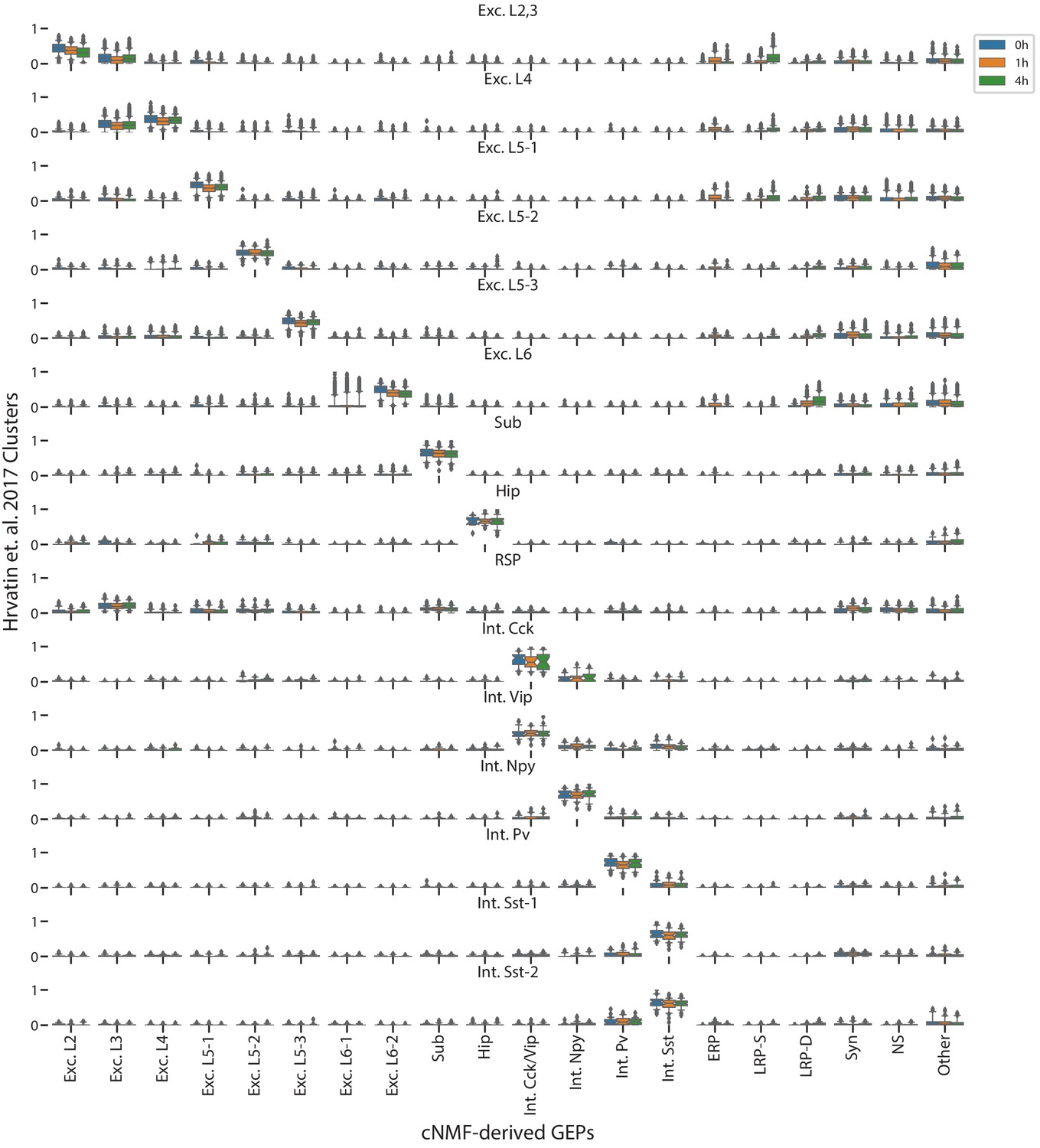
Comparison of cNMF usages with the visual cortex cell-type clusters from Hrvatin et al. (2018).
Box and whisker plot of the usage of each GEP (column) in cells of each cluster from Hrvatin et al. (2018) (rows) stratified by the stimulus condition of those cells (hue). Boxes represent interquartile range, whiskers represent 5th and 95th percentiles.
Figure 4—figure supplement 3
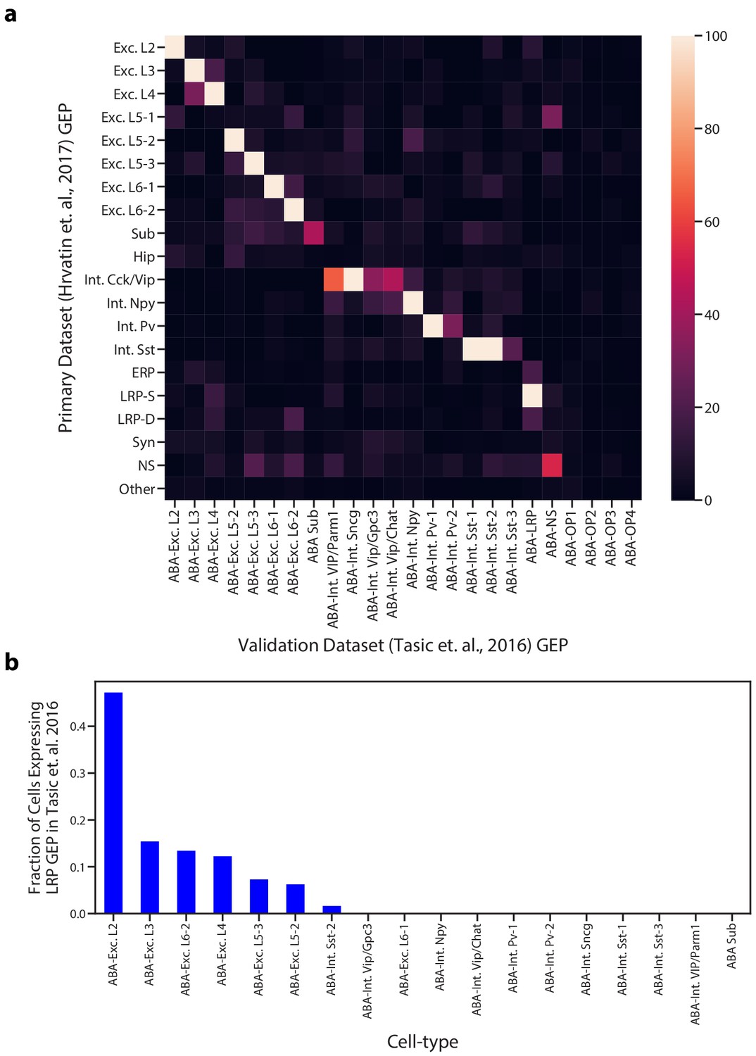
Comparison of GEPs identified in the Hrvatin et al. (2018) and Tasic et al. (2016) visual cortex datasets.
(a) Heatmap showing the odds ratio for the intersection of top associated genes in each inferred GEP in the Hrvatin et al. (2018) and Tasic et al. (2016) datasets. Top associated genes were defined as those with an association score >= 0.0015. Odds ratios above 100 were set to 100 for better visualization of pairs in the lower range. GEPs from the Tasic et al. dataset are labeled as ABA for Allen Brain Atlas. (b) Proportion of cells of each cell type that express the superficial LRP with greater than 10% usage in the Tasic et al. dataset. Cells were assigned to a cell type based on their most used identity GEP.
Figure 5 with 2 supplements
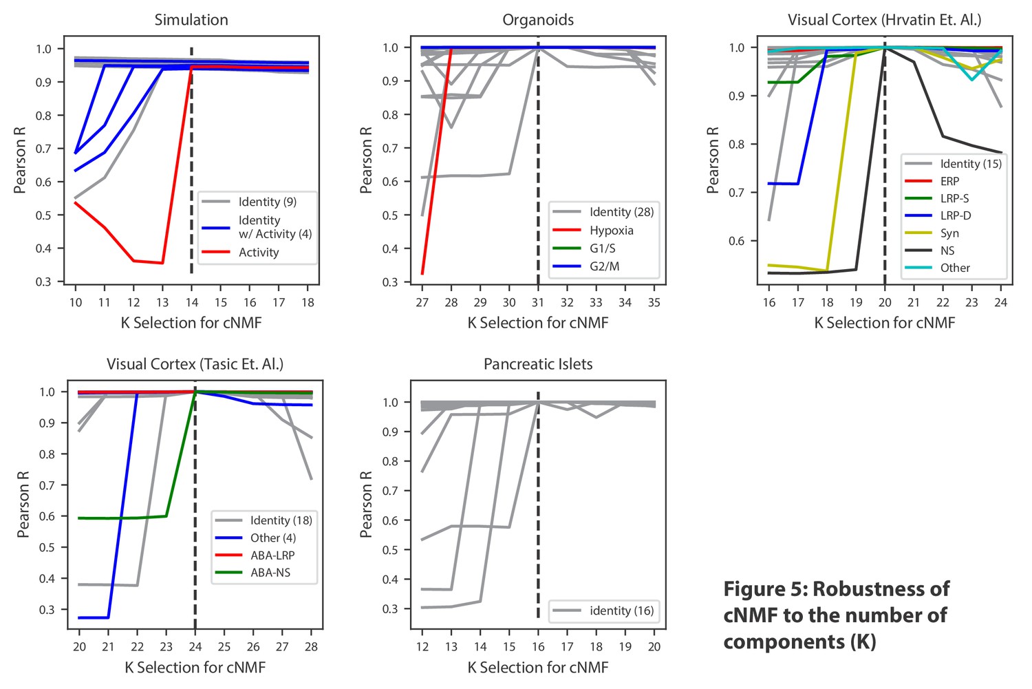
Robustness of cNMF to the number of components (K).
Line plots of the maximum Pearson correlation between each of the cNMF components presented in the main analysis, and the cNMF components that result from multiple choices of K. For the simulated data, for which we have access to ground truth, we plot the correlation between the inferred components for each choice of K and the ground truth 14 components. We highlight components corresponding to activity GEPs with distinct colors and denote the number of identity GEPs contained on the same plot in parenthesis in the legend. A dashed line indicates the K choice that was presented in the main analysis. Pearson correlations are computed considering only the 2000 most over-dispersed genes and on vectors normalized by the computed sample standard deviation of each gene.
-
Figure 5—source data 1
Application of cNMF to pancreas data and analysis of robusness to the choice of K.
- https://doi.org/10.7554/eLife.43803.027
Figure 5—figure supplement 1
Characterization of GEP usage across biological replicates.
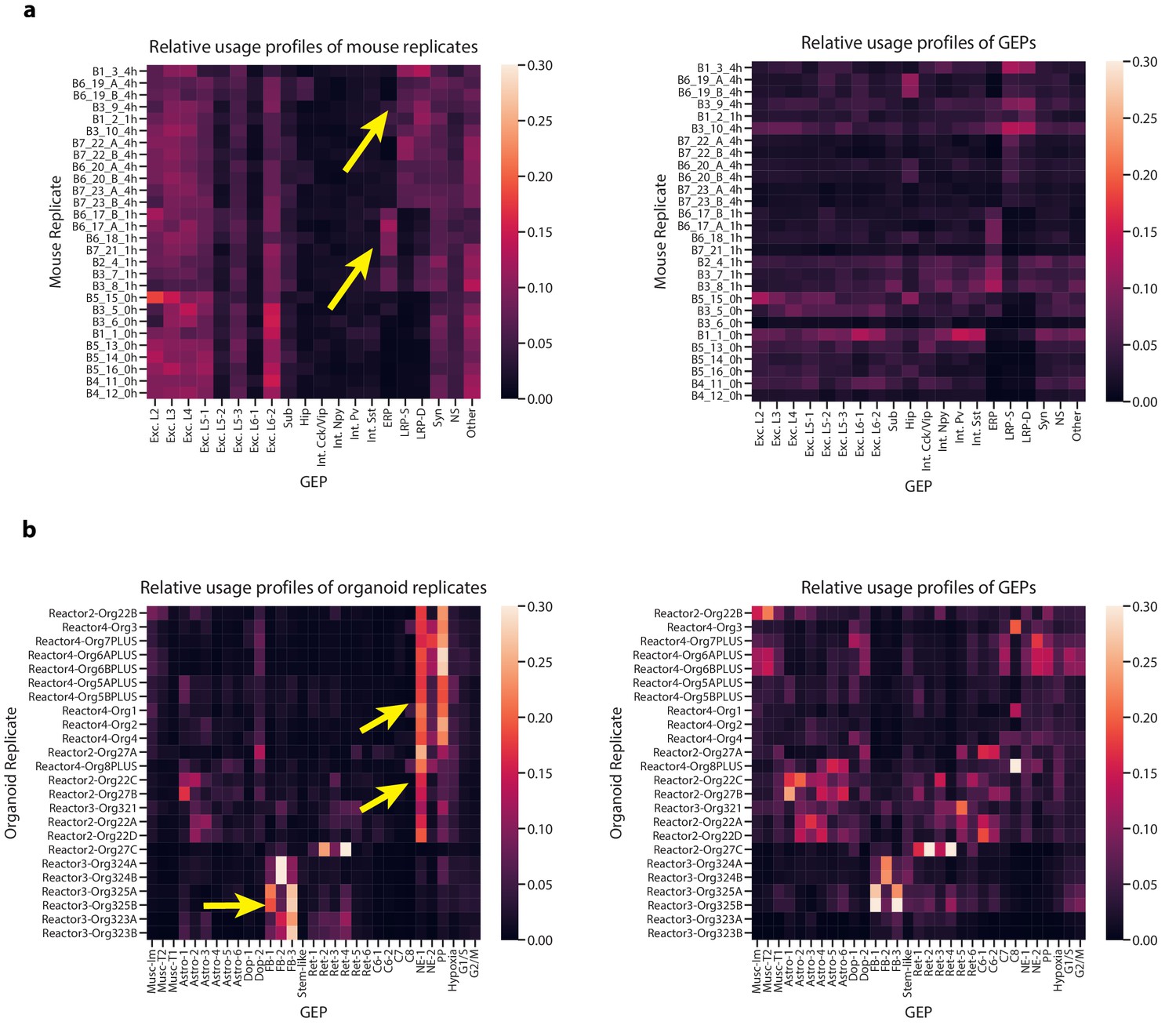
(a) Heatmaps of aggregated GEP profiles for each biological replicate of the Hrvatin et al. (2018) data, derived by summing the GEP usage vectors for all cells from a replicate. We plot the GEP profiles normalized to sum to one for each replicate (row) in the left panel or to sum to one for each GEP (column) in the right panel. The left panel contrasts the composition of the replicates while the right panels visualizes which replicates contributed most to each GEP. We use yellow arrows to highlight the usage of the depolarization-induced GEPs (ERP, LRP-S, and LRP-D) in replicates of mice treated with the stimulus condition (replicate names ending in _1 hr or _4 hr denoting the 1 hr or 4 hr treatments, respectively). For all heatmaps, rows are ordered by hierarchical clustering of the row-normalized matrix using the cosine metric and average linkage method. (b) The same as (a) but for the Quadrato et al. (2017) organoid data. We use yellow arrows to highlight the variability corresponding to the bioreactor from which the organoids derived (indicated in the beginning of the name).
Figure 5—figure supplement 2
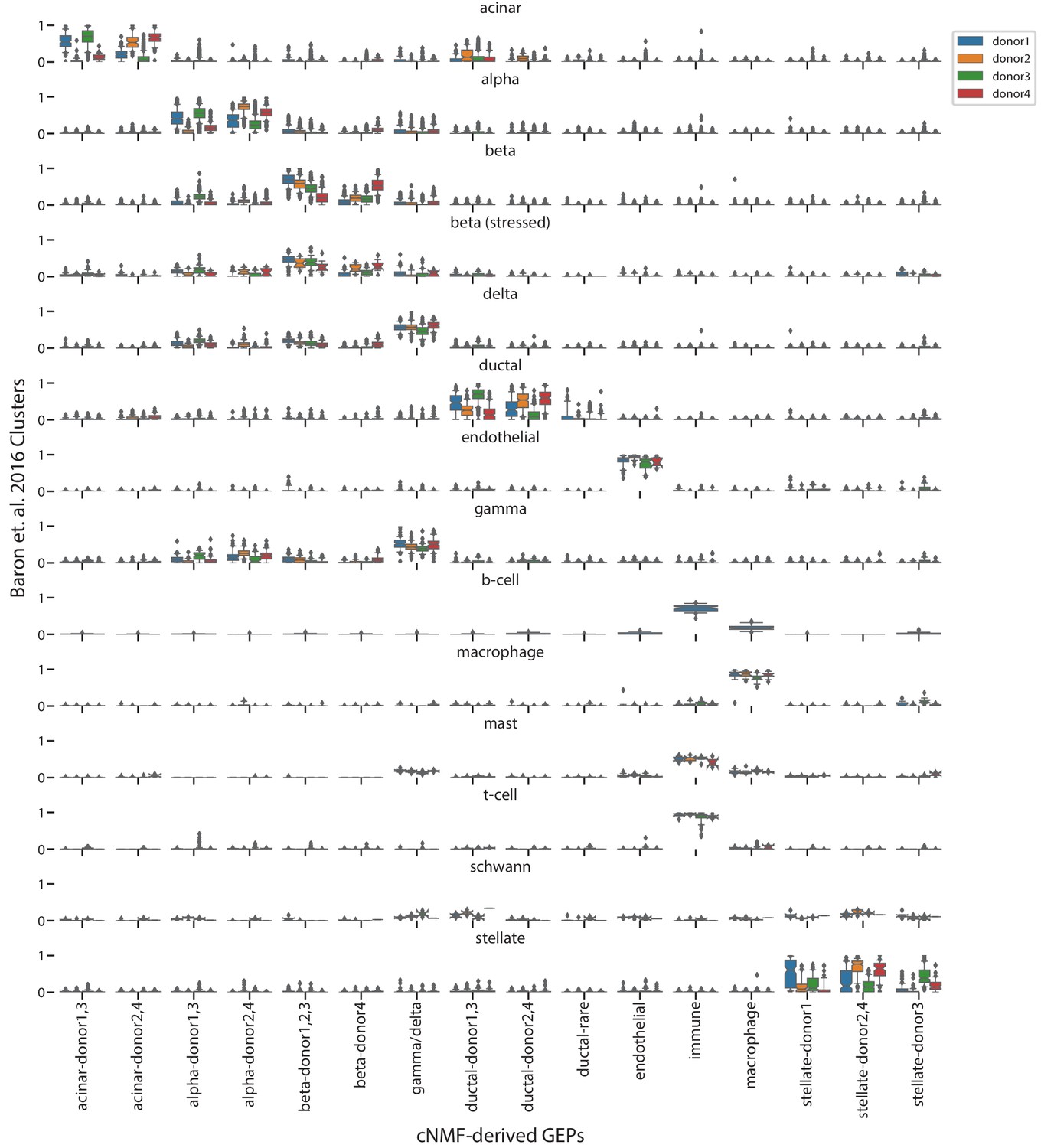
Comparison of cNMF usages with the published cell-type clusters from Baron et al. (2016).
Box and whisker plot of the usage of each GEP (column) in cells of each cluster from Baron et al. (2016) (rows) stratified by the donor of origin of each cell (hue). Boxes represent interquartile range, whiskers represent 5th and 95th percentiles.
Author response image 1
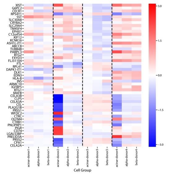
Genes that are differentially expressed between donors in Baron et al., 2016.
We performed differential expression analysis comparing gene expression between cells derived from each donor using ordinary least squares regression of donor dummy variables on log10 TPM expression values. We did this separately for cells assigned to the acinar, α, and β cells clusters from Baron et al., 2016. Shown above are the regression coefficients for the 20 genes with the most significant batch-effect for each cell-type, as ranked by the F-test P-value. While some signals are common across cell-types, others show marked variation between cell-types.
Author response image 2
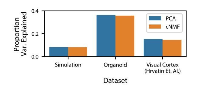
Variance explained by cNMF and PCA.
Variance explained by the cNMF solutions presented in the manuscript and Principal Components with the same K as was used for cNMF. Explained variance is calculated for the input matrix used for cNMF (2000 most over-dispersed genes, variance normalized).
Additional files
-
Supplementary file 1
Brain organoid GEP genescores.
- https://doi.org/10.7554/eLife.43803.028
-
Supplementary file 2
Visual cortex GEP genescores.
- https://doi.org/10.7554/eLife.43803.029
-
Supplementary file 3
Novel activity GEP enrichments.
- https://doi.org/10.7554/eLife.43803.030
-
Transparent reporting form
- https://doi.org/10.7554/eLife.43803.031
Download links
A two-part list of links to download the article, or parts of the article, in various formats.
Downloads (link to download the article as PDF)
Open citations (links to open the citations from this article in various online reference manager services)
Cite this article (links to download the citations from this article in formats compatible with various reference manager tools)
Identifying gene expression programs of cell-type identity and cellular activity with single-cell RNA-Seq
eLife 8:e43803.
https://doi.org/10.7554/eLife.43803


