Initiation of chromosome replication controls both division and replication cycles in E. coli through a double-adder mechanism
- University of Basel, Switzerland
- University of Bern, Switzerland
Figures
Figure 1 with 1 supplement
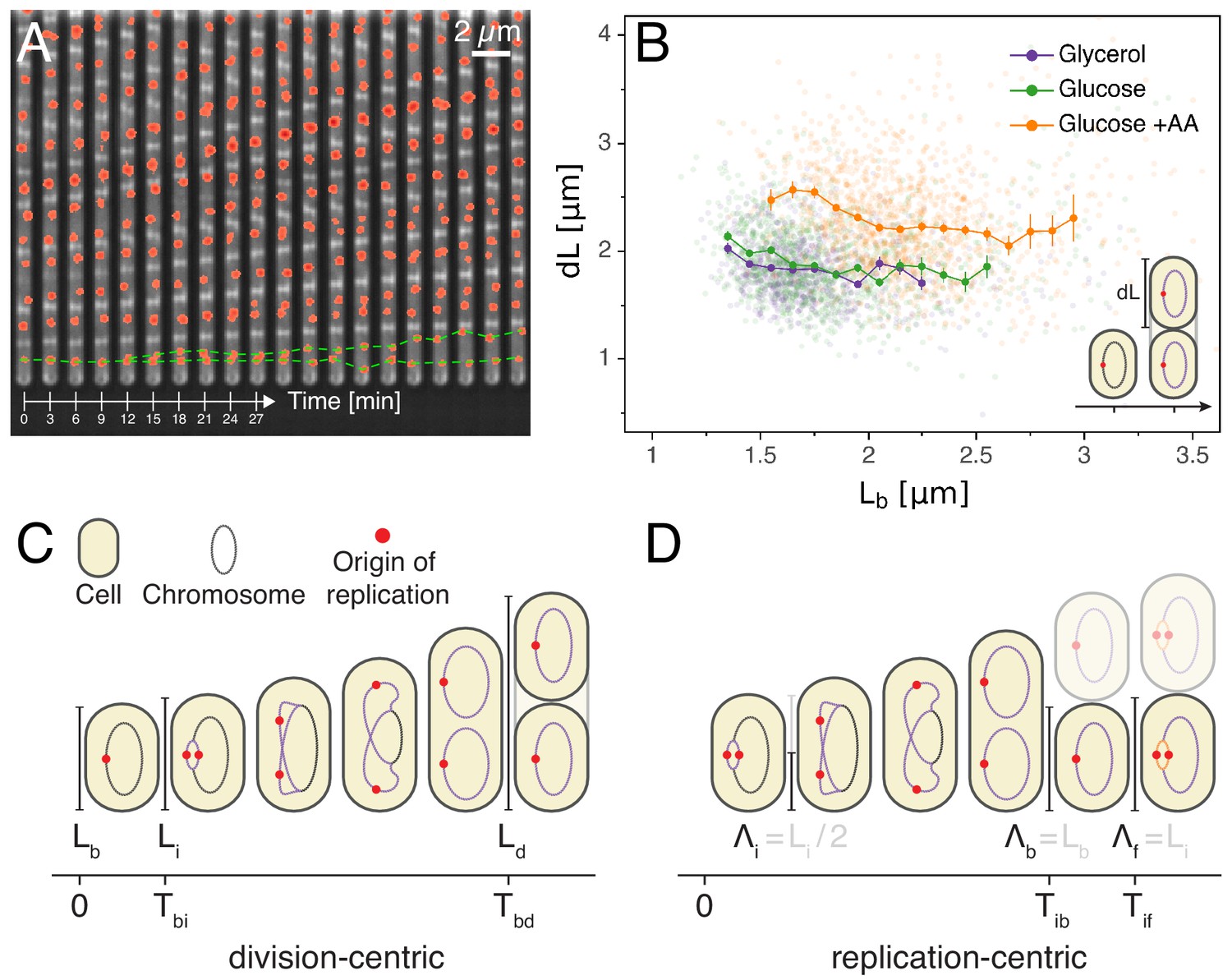
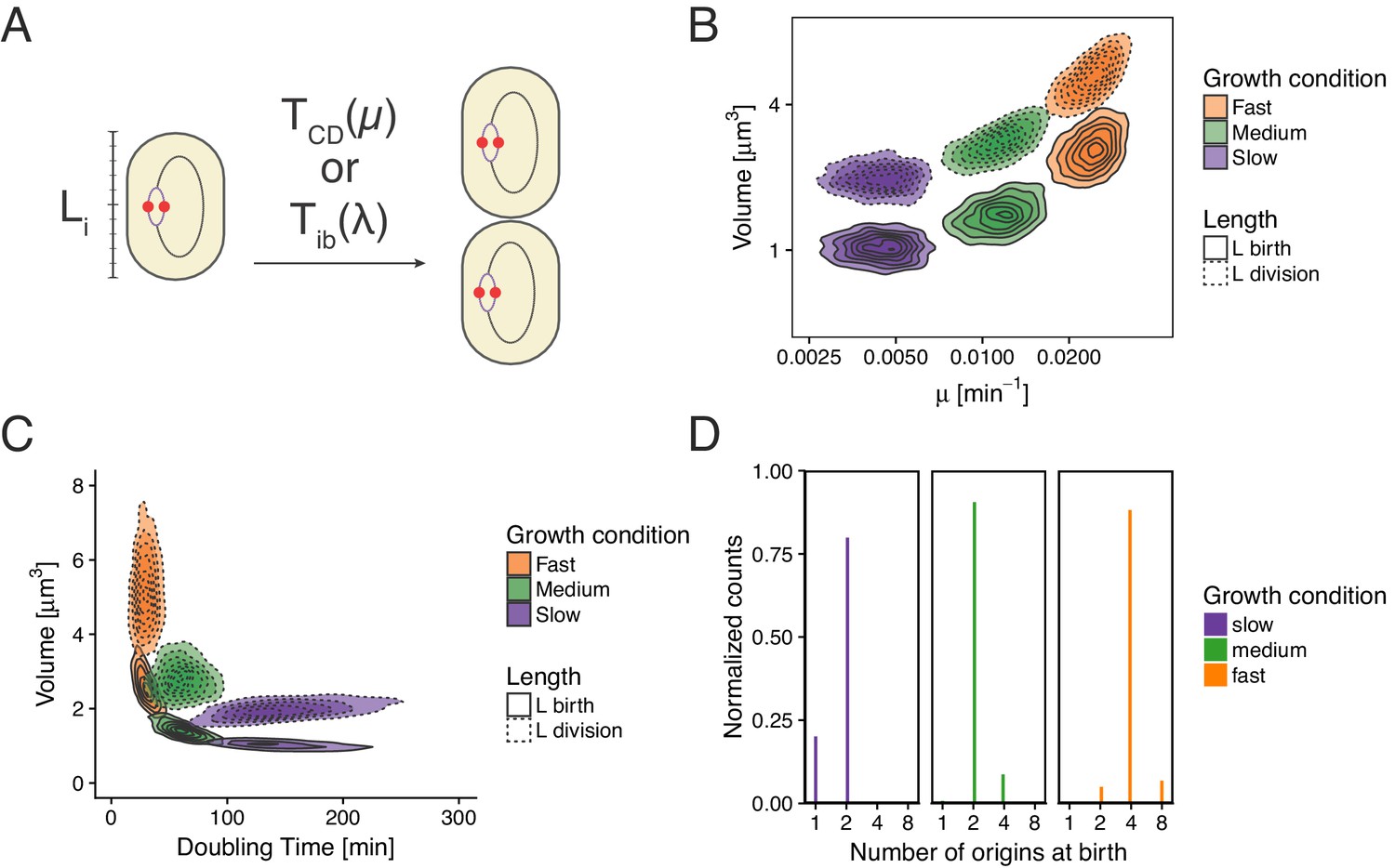
Experimental approach and analysis framework.
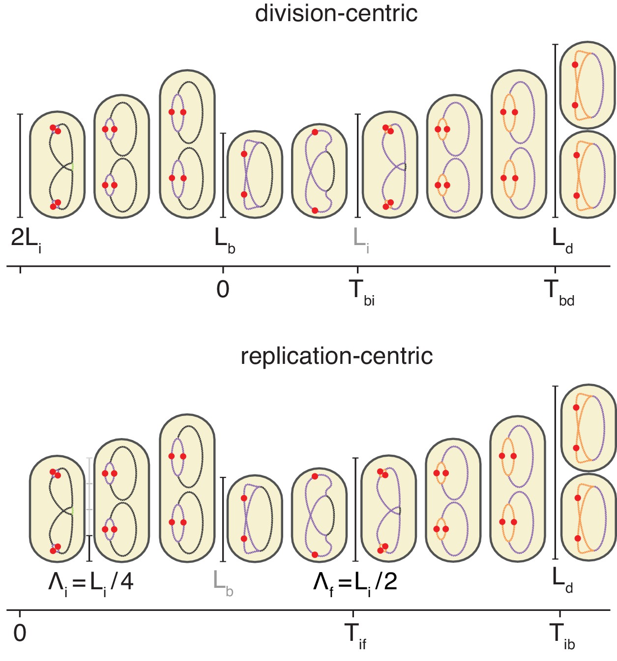
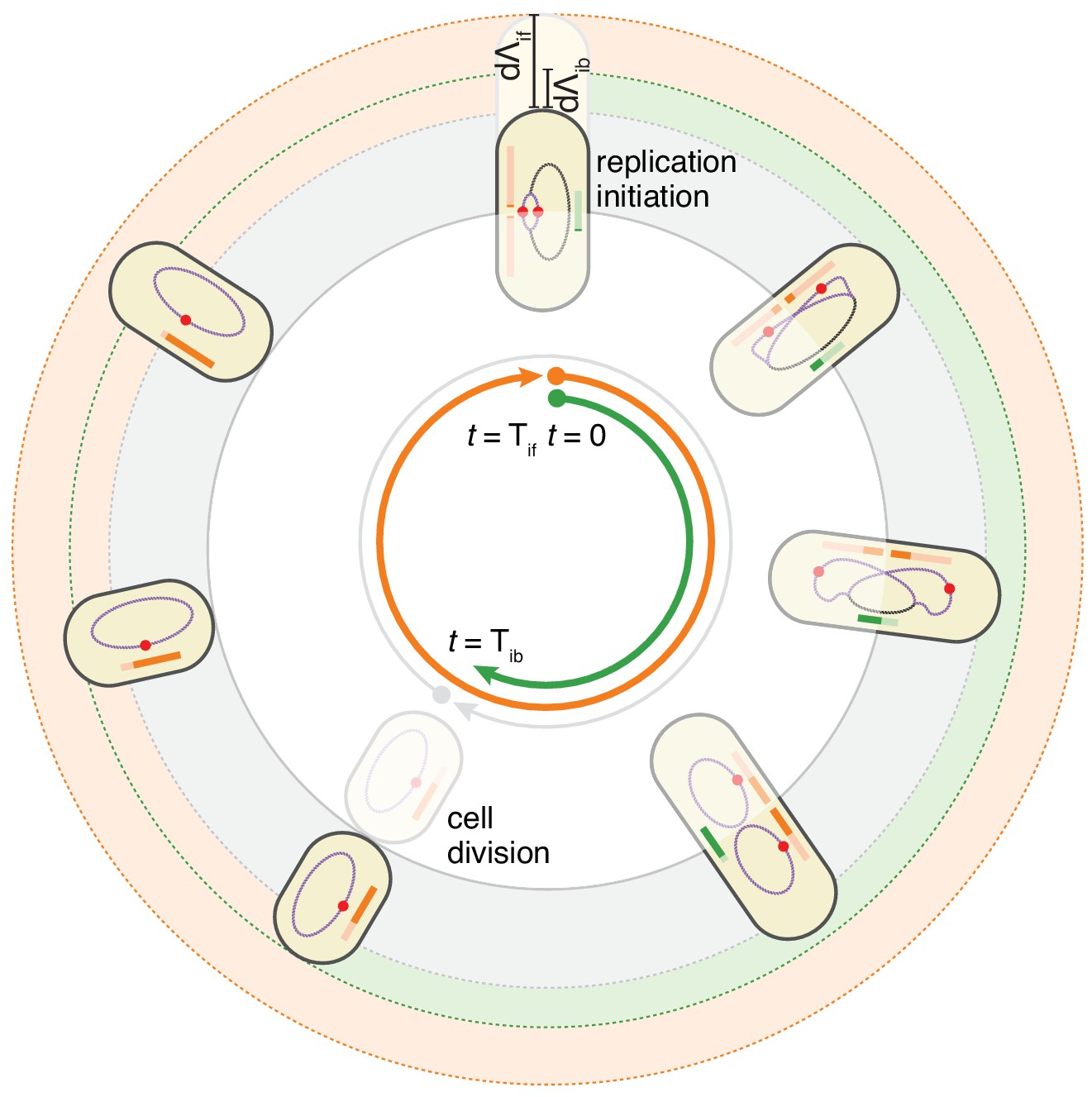
(A) Time-lapse of E. coli cells growing in a single microfluidic channel. The fluorescence signal from FROS labeling is visible as red spots in each cell. The green dotted line is an aid to the eye, illustrating the replication of a single origin. (B) Consistent with an adder model, the added length between birth and division is uncorrelated with length at birth (here and in all other scatter plots, the darker lines show the mean of the binned data and the error bars represent the standard error per bin). (C) The classical cell cycle is defined between consecutive division events, shown here with replication and division for slow growth conditions (i.e. without overlapping rounds of replication). (D) We introduce an alternative description framework where the cell cycle is defined between consecutive replication initiation events. The observables that are relevant to characterize the cell cycle in these two frameworks are indicated (see also Table 1).
-
Figure 1—source data 1
Table with source data for Figure 1B.
- https://cdn.elifesciences.org/articles/48063/elife-48063-fig1-data1-v2.csv
Figure 1—figure supplement 1
Schema of the cell cycle and variable definitions for the case of fast growth with overlapping replication cycles.
Figure 2
Models for initiation control.
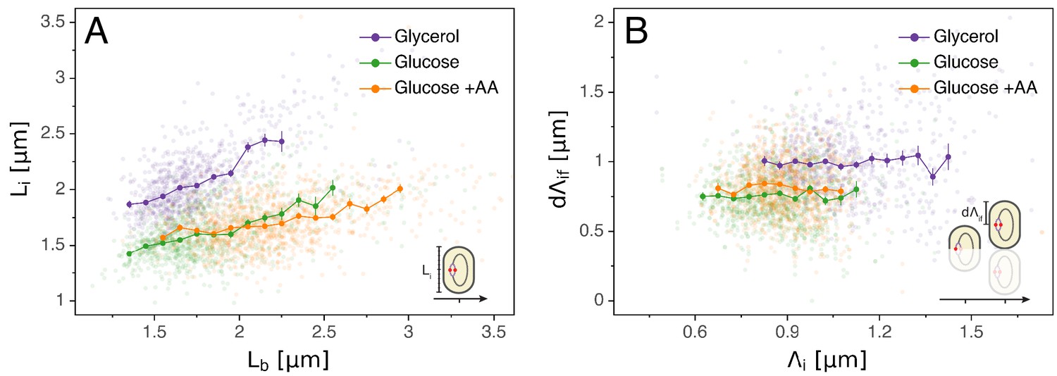
(A) The initiation mass model predicts that the length at initiation should be independent of the length at birth . However, we observe clear positive correlations between and in all growth conditions. (B) In contrast, the length accumulated between two rounds of replication is independent of the initiation size , suggesting that replication initiation may be controlled by an adder mechanism.
-
Figure 2—source data 1
Table with source data for Figure 2.
- https://cdn.elifesciences.org/articles/48063/elife-48063-fig2-data1-v2.csv
Figure 3
Initiation to division period.
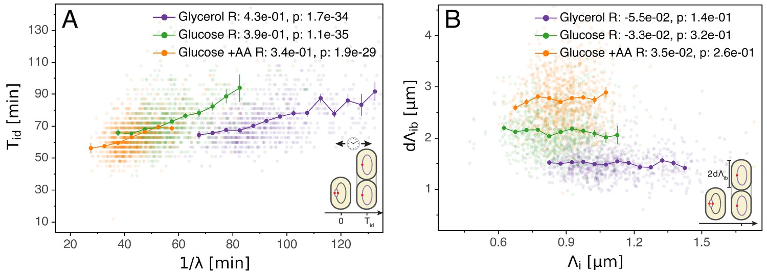
(A) Several models assume that a constant time passes from an initiation event to it corresponding division event. However, within each growth condition, that period is clearly dependent on fluctuations in growth rate. (B) The length accumulated from initiation to division is constant for each growth condition, suggesting an adder behavior for that period. In A and B, the Pearson correlation coefficient R and p values are indicated for each condition.
-
Figure 3—source data 1
Table with source data for Figure 3.
- https://cdn.elifesciences.org/articles/48063/elife-48063-fig3-data1-v2.csv
Figure 4 with 1 supplement
The double-adder model postulates that E. coli cell cycle is orchestrated by two independent adders, one for replication and one for division, reset at replication initiation.
Both adders (shown as coloured bars) start one copy per origin at replication initiation and accumulate in parallel for some time. After the division adder (green) has reached its threshold, the cell divides, and the initiation adder (orange) splits between the daughters. It keeps accumulating until it reaches its own threshold and initiates a new round of division and replication adders. Note that the double-adder model is illustrated here for the simpler case of slow growth.
Figure 4—figure supplement 1
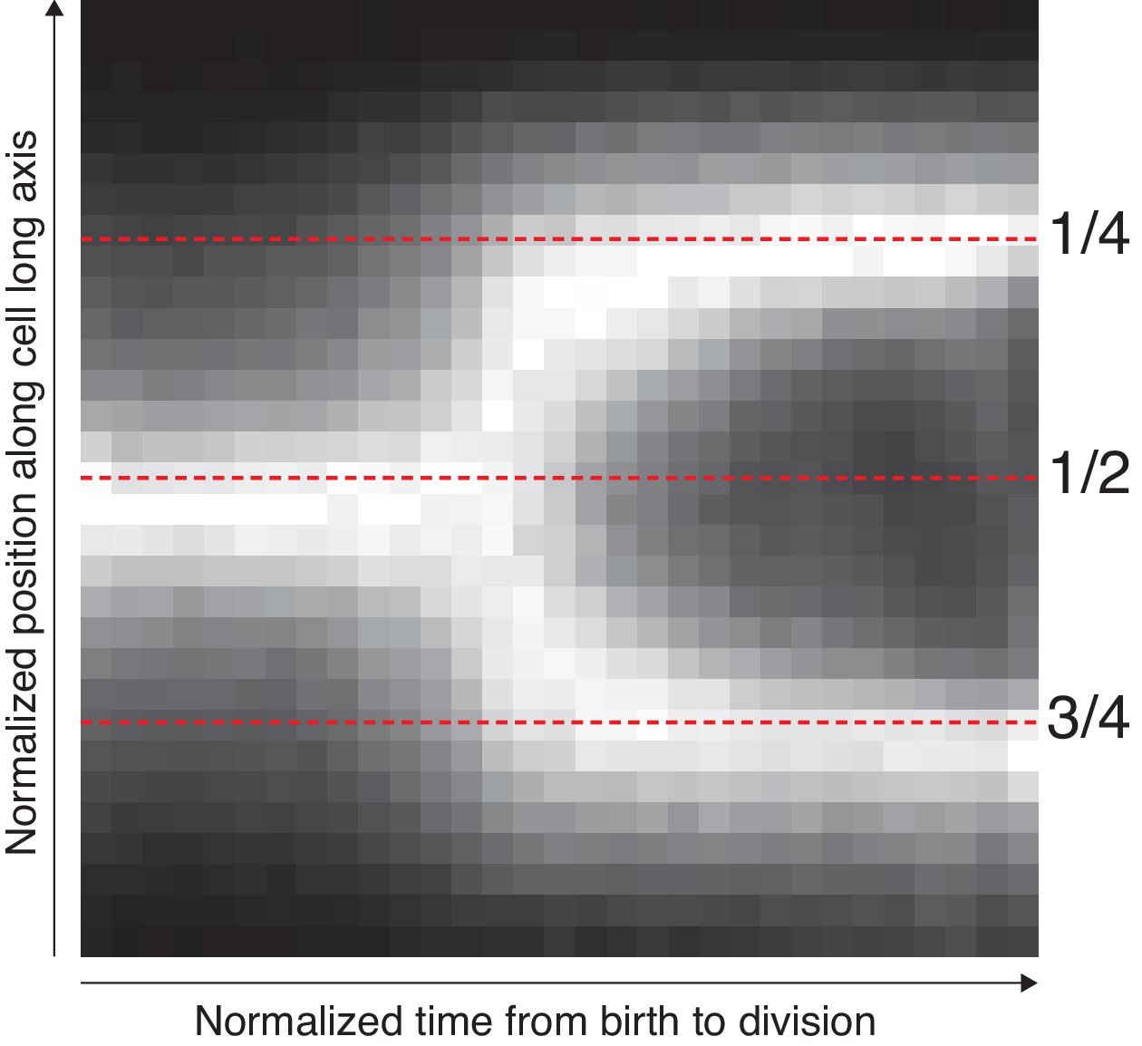
Average localization of the origin in cells growing in M9 glycerol.
The position along the cell axis and the cell-cycle time of all detected spots were collected. The longitudinal position was scaled with cell length to indicate the relative position in the cell. The cell cycle time was normalized between 0 and 1. The figure shows these space-time data as a 2D histogram, where additionally each time point (column) has been normalized to have a maximum bin value of 1. The mid-cell and quarter-cell (mid-cell of daughter cell) positions are indicated with dotted lines.
Figure 5 with 4 supplements
Comparison of predictions of the double-adder model with experimental observations.
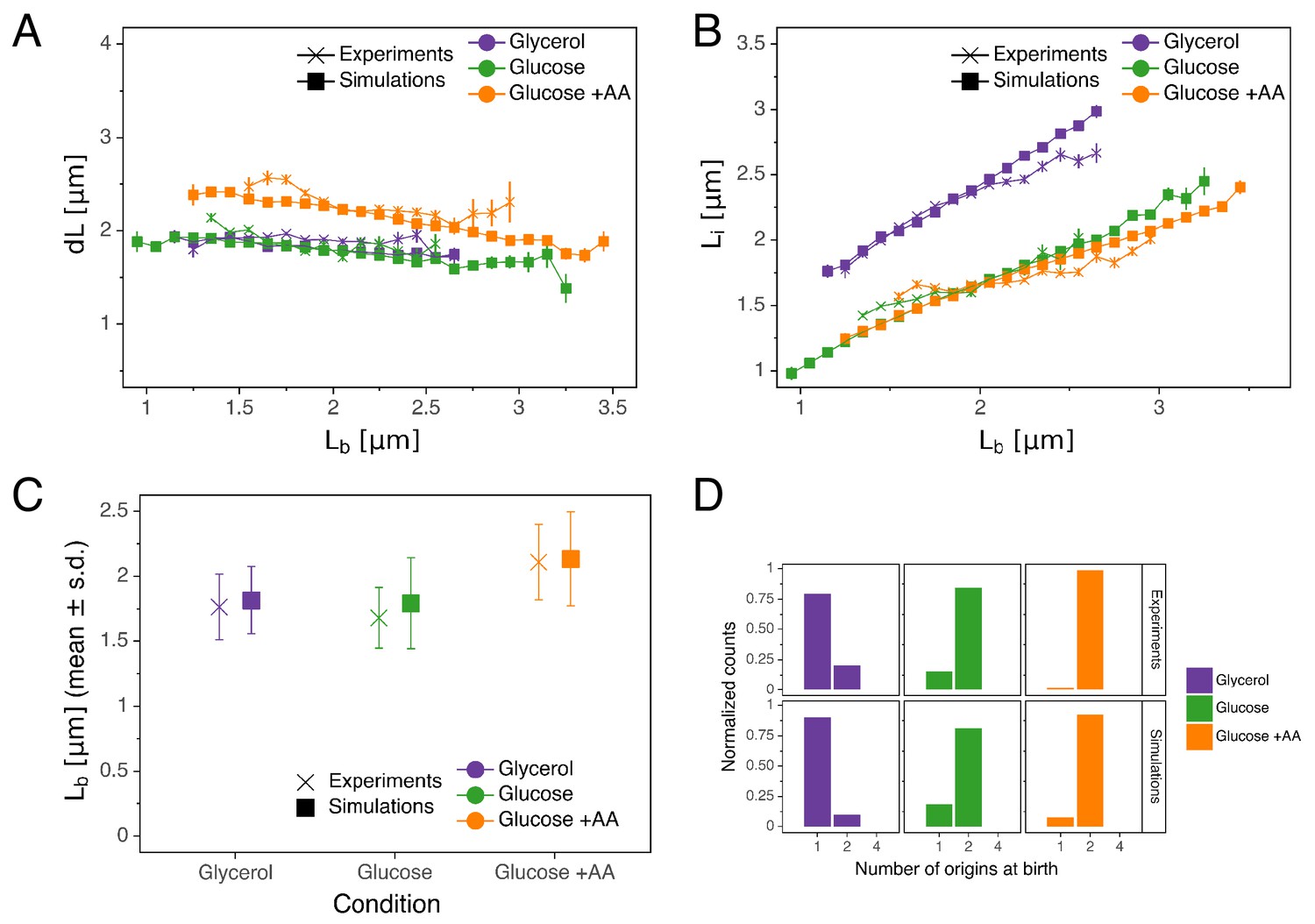
(A) Binned scatter plot of the added length between birth and division versus length at birth shows no correlations in both the data and the simulations, demonstrating that the double-adder model reproduces the adder behavior at the level of cell size. (B) Binned scatter plot of the length at initiation versus length at birth shows almost identical correlations in data and simulation. (C) Average (± s.d) cell length at birth . Both the mean and standard deviation are recovered in the model simulation. (D) The distribution of the number of origins at birth is also highly similar between experiments and data for all growth conditions.
-
Figure 5—source data 1
Table with source data for Figure 5AB.
- https://cdn.elifesciences.org/articles/48063/elife-48063-fig5-data1-v2.csv
-
Figure 5—source data 2
Table with source data for Figure 5C.
- https://cdn.elifesciences.org/articles/48063/elife-48063-fig5-data2-v2.csv
-
Figure 5—source data 3
Table with source data for Figure 5D.
- https://cdn.elifesciences.org/articles/48063/elife-48063-fig5-data3-v2.csv
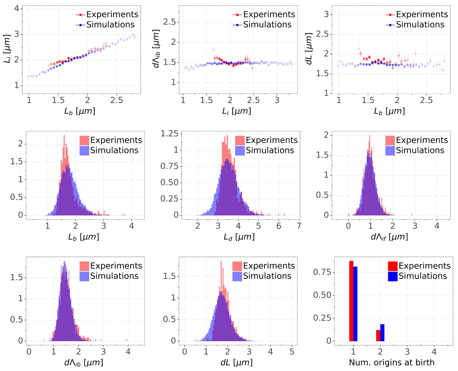
Figure 5—figure supplement 1
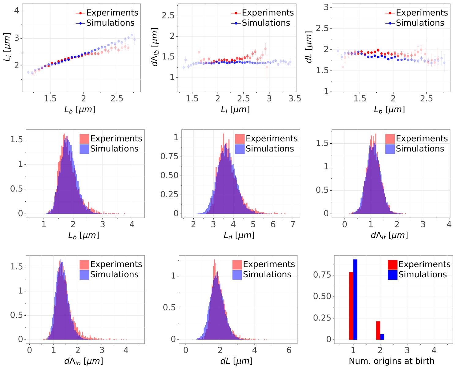
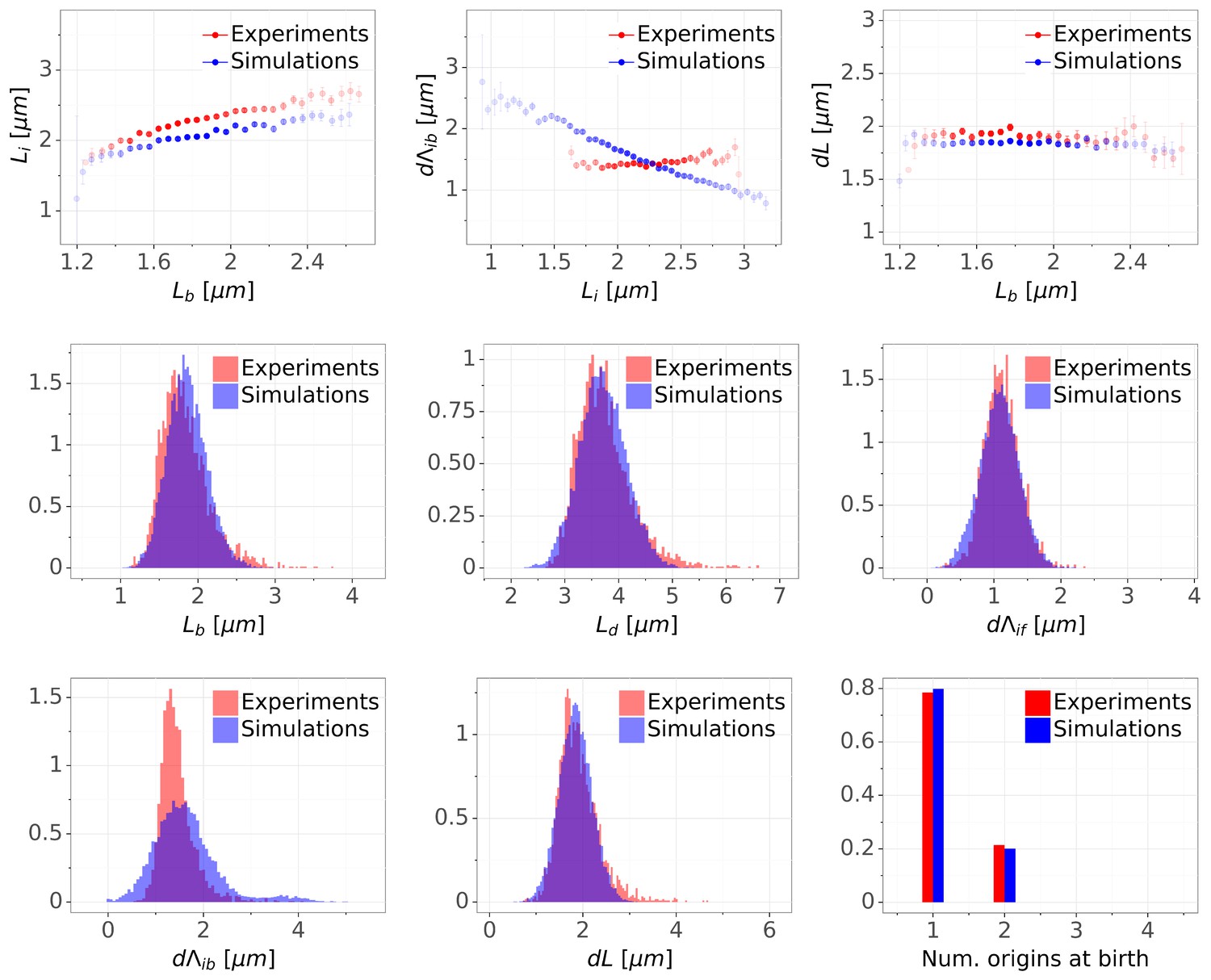
Detailed comparisons of cell cycle variables distributions and correlations between experiments and simulations for M9+glycerol condition (with automated origin tracking).
The top row shows binned scatter plots of pairs of variables. The transparency degree reflects the density of data on the horizontal axis. Note that the slight slope of the adder plot () can be corrected when reducing the variances of the division adder distribution (data not shown). As the initiation measurement is made imprecise for experimental (e.g. acquisition rate) and biological (e.g. variable cohesion of origins), it is reasonable to assume that we overestimate the variance of that parameter.
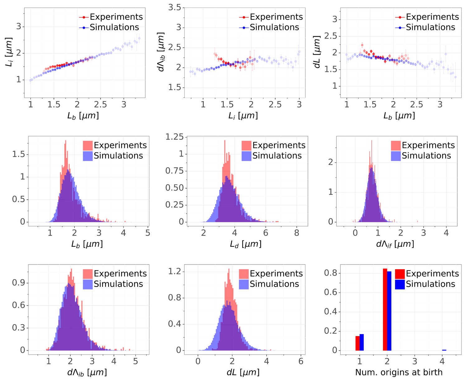
Figure 5—figure supplement 2
Detailed comparisons of cell cycle variables distributions and correlations between experiments and simulations for M9+glycerol condition (with manual origin tracking).
The top row shows binned scatter plots of pairs of variables. The transparency degree reflects the density of data on the horizontal axis.
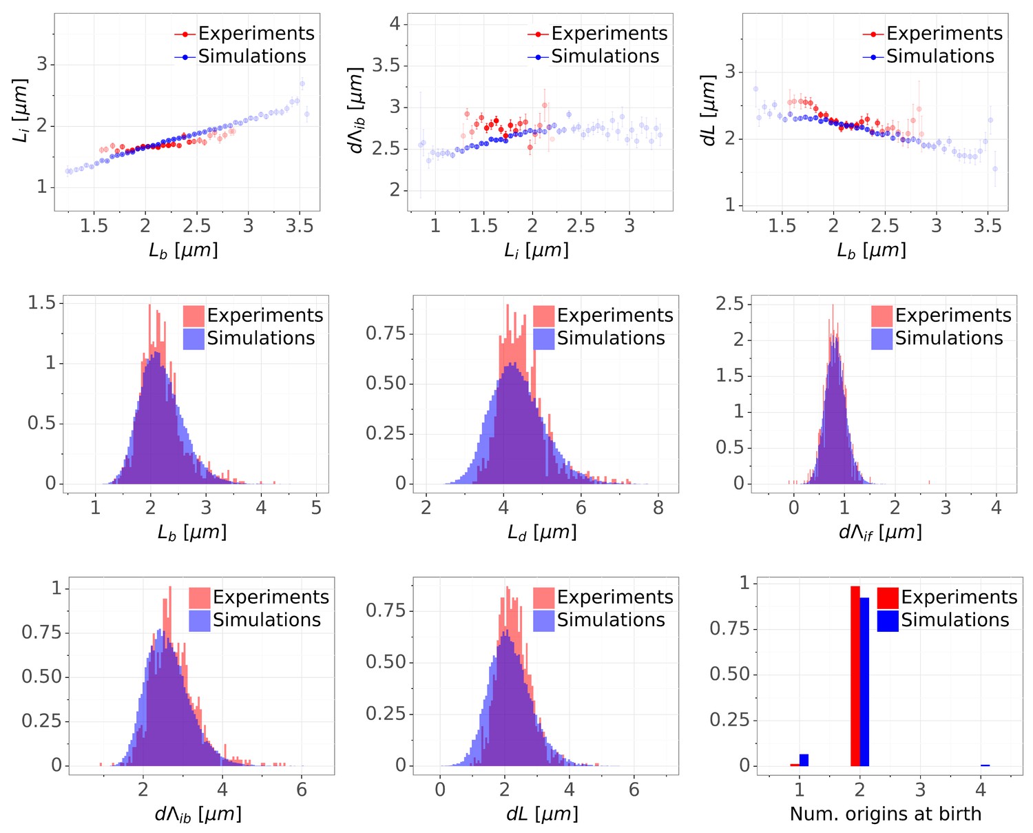
Figure 5—figure supplement 3
Detailed comparisons of cell cycle variables distributions and correlations between experiments and simulations for M9+glucose condition (with manual origin tracking).
The top row shows binned scatter plots of pairs of variables. The transparency degree reflects the density of data on the horizontal axis.
Figure 5—figure supplement 4
Detailed comparisons of cell cycle variables distributions and correlations between experiments and simulations for M9+glucose+8a.a. condition (with manual origin tracking).
The top row shows binned scatter plots of pairs of variables. The transparency degree reflects the density of data on the horizontal axis.
Figure 6 with 1 supplement
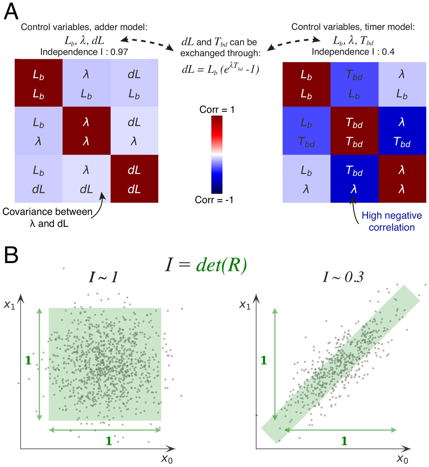
Decomposition method.
(A) The cell division cycle of a single cell can be described by different combinations of three variables which we refer to as decompositions. For example, the set corresponds to an adder decomposition, while corresponds to a timer decomposition. For each possible decomposition, we can calculate the matrix of observed correlations between each pair of variables in the decomposition from the data. Shown are the correlation matrices for the adder decomposition (left) and the timer decomposition (right), with positive correlations shown in red and negative correlations in blue. The independence of each decomposition is defined as the determined of the correlation matrix and is indicated on top of each matrix. While the independence for the adder decomposition is close to the possible maximum of 1, the independence of the timer correlation is much lower due to a strong negative correlation between growth rate and the cell cycle duration . (B) Conceptual illustration of the independence measure . For each decomposition, the data can be thought of as a scatter of points in the space of the decomposition’s variables, normalized such that the variance of points along each dimension is 1. In this conceptual example, we show two scatters of points for the two variables and . The independence corresponds to the square of the volume covered by the scatter of points. On the left, there is virtually no correlation between the two variables, that is , such that the independence . In contrast, on the right there is a strong correlation, leading to a much lower independence . In this way, the independence measure quantifies to what extent the variables in the decomposition fluctuate independently, and this measure applies to scatters of any number of dimensions.
-
Figure 6—source data 1
Table with source data for Figure 6.
- https://cdn.elifesciences.org/articles/48063/elife-48063-fig6-data1-v2.csv
Figure 6—figure supplement 1
Correlation matrices for all decompositions of the division cycle.
In the main Figure 6, we showed the correlation matrices and independence measure for two possible decompositions of the division cycle. Here we show the correlation matrices for all eight possible decompositions, sorted by their independence . Each matrix represents one decomposition, and each element of the matrix shows the correlation of the two variables indicated within it. The level and sign of correlation is given by the color bar.
Figure 7 with 5 supplements

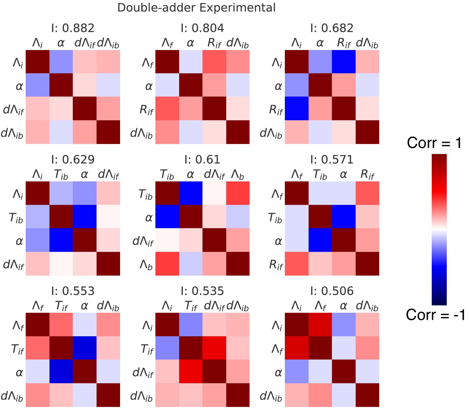
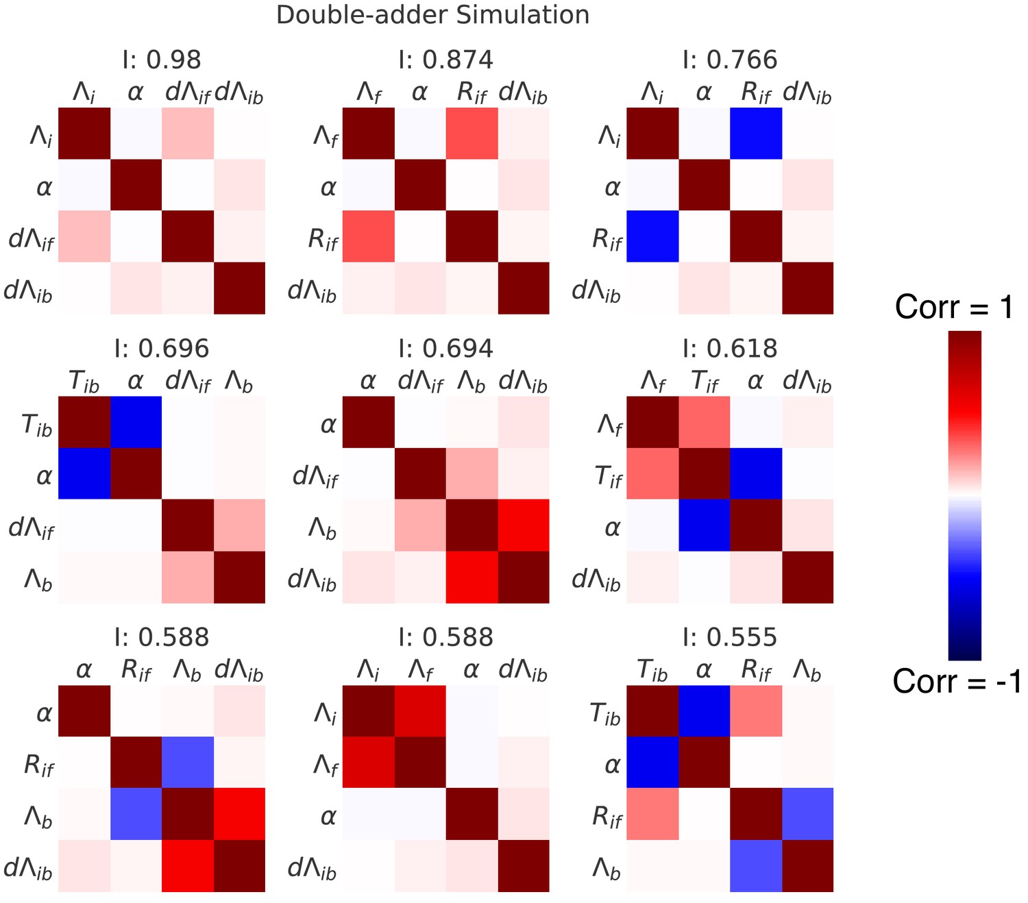
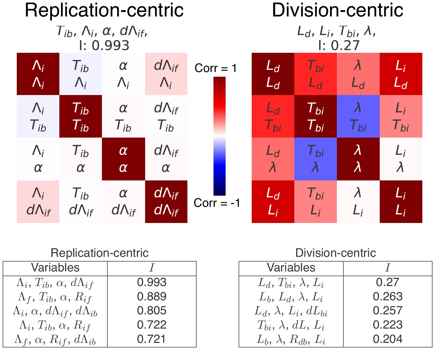
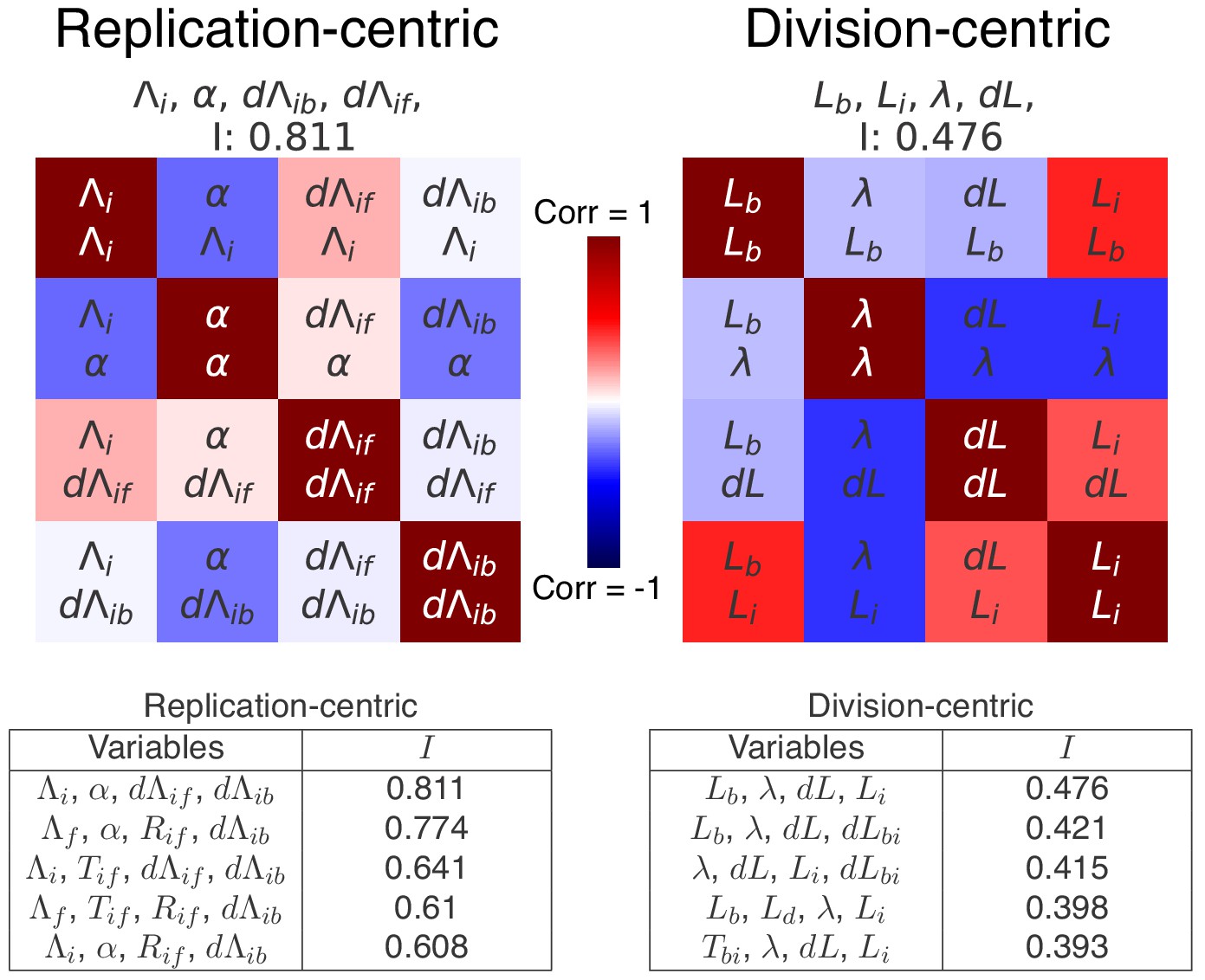
Decomposition analysis applied to the division and replication cycles.
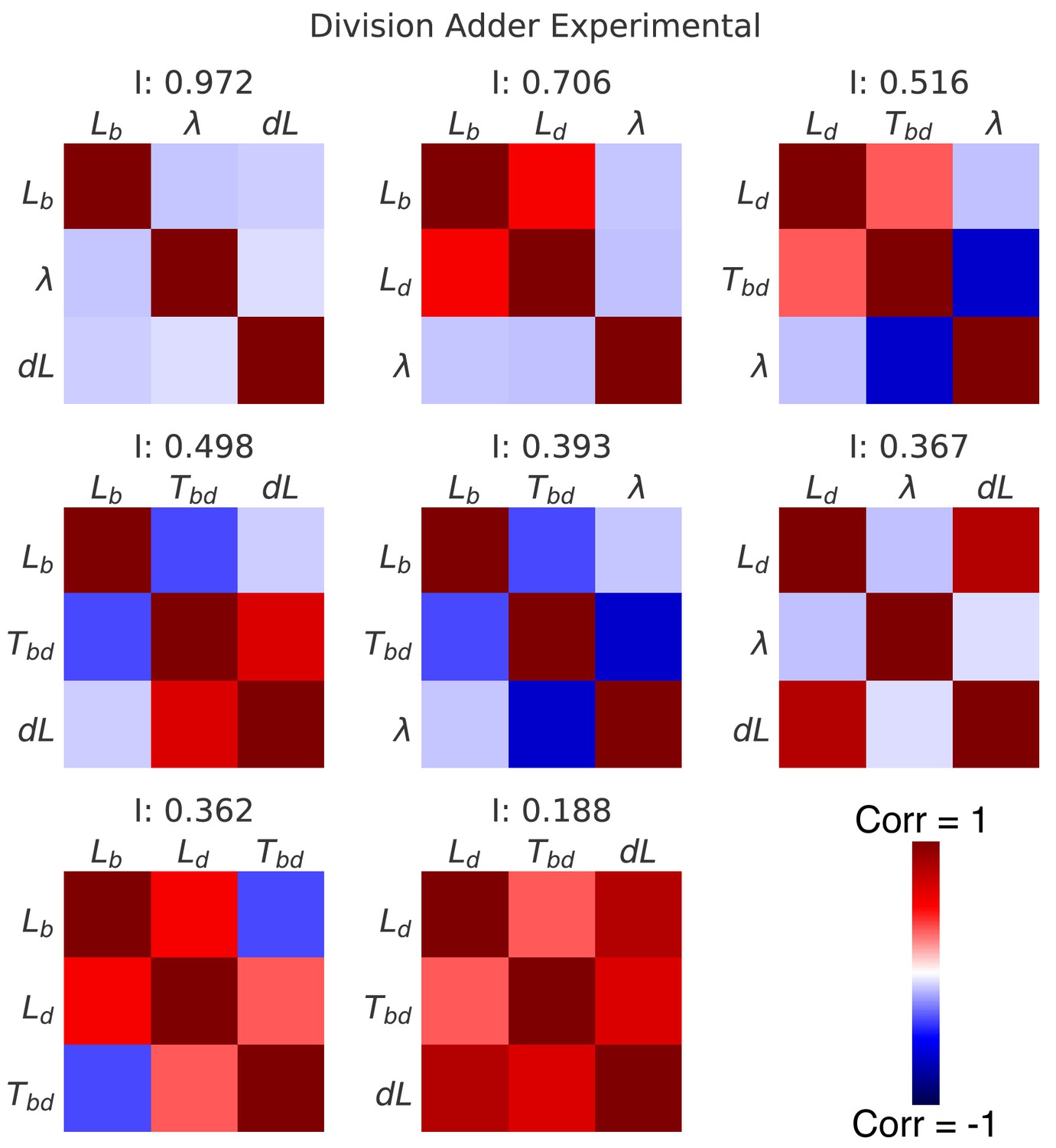
(A) The tables show the independence measures for the top scoring decompositions of the division and replication cycles. In these tables, each line represents a possible decomposition and its independence . As there are two ways to see the cell cycle (replication- and division-centric), we present decompositions for both replication- (left) and division-centric decompositions (right). In addition, we show the top decompositions both for the correlation matrices of the experimental data of the growth conditions M9+glycerol (automated analysis) and for the data from the simulations of the double-adder model (top and bottom rows, respectively). Results for the full list of decompositions can be found in Figure 7—figure supplement 3. Note that the decomposition analysis clearly identifies the replication-centric double-adder characterized by , , and as the best decomposition. The fact that the double-adder decomposition is also top scoring (with ) for data from the simulation of the double-adder confirms that the decomposition analysis works as expected. (B) Correlation matrices for the best decompositions for replication-centric (left) and division-centric models (right). As in Figure 6A, each matrix represents one decomposition, and each element of the matrix shows the correlation of the two variables indicated within it. The level and sign of correlation is given by the color bar. As the lower left and upper right triangles of the matrices are redundant, we use them to show correlations from both experimental and simulation data in a single matrix. The lower-left corners bounded by a dotted line contain correlations from experimental data and the upper-right ones, bounded by a continuous line, from simulation data. The diagonal summarizes the set of variables. The best replication-centric model (left) has only weak correlations between its variables as reflected in high independence, while the best division-centric model has a few highly correlated variables leading to low independence.
-
Figure 7—source data 1
Table with source data for replication-centric decompositions of both experimental and simulation data of Figure 7 and Figure 7—figure supplement 1, Figure 7—figure supplement 2 and Figure 7—figure supplement 3.
- https://cdn.elifesciences.org/articles/48063/elife-48063-fig7-data1-v2.csv
-
Figure 7—source data 2
Table with source data for division-centric decompositions of both experimental and simulation data of Figure 7 and Figure 7—figure supplement 1, Figure 7—figure supplement 2 and Figure 7—figure supplement 3.
- https://cdn.elifesciences.org/articles/48063/elife-48063-fig7-data2-v2.csv
Figure 7—figure supplement 1
Correlation matrices for the top nine decompositions of the experimental data.
In complement to the best decomposition shown in Figure 7, we show here correlation matrices for the first nine best decompositions for the experimental data (M9+glycerol). Each matrix represents one decomposition, and each element of the matrix shows the correlation of the two variables indicated within it. The level and sign of the correlation is given by the color bar. The independence is shown at the top of each correlation matrix.
Figure 7—figure supplement 2
Correlation matrices for the top nine decompositions of the data from simulations of the double-adder model.
In complement to the best decomposition shown in Figure 7, we show here correlation matrices for the first nine best decompositions for the data from the simulation of the double-adder model (with parameters from growth in M9+glycerol). Each matrix represents one decomposition, and each element of the matrix shows the correlation of the two variables indicated within it. The level and sign of the correlation is given by the color bar. The independence is shown at the top of each correlation matrix.
Figure 7—figure supplement 3
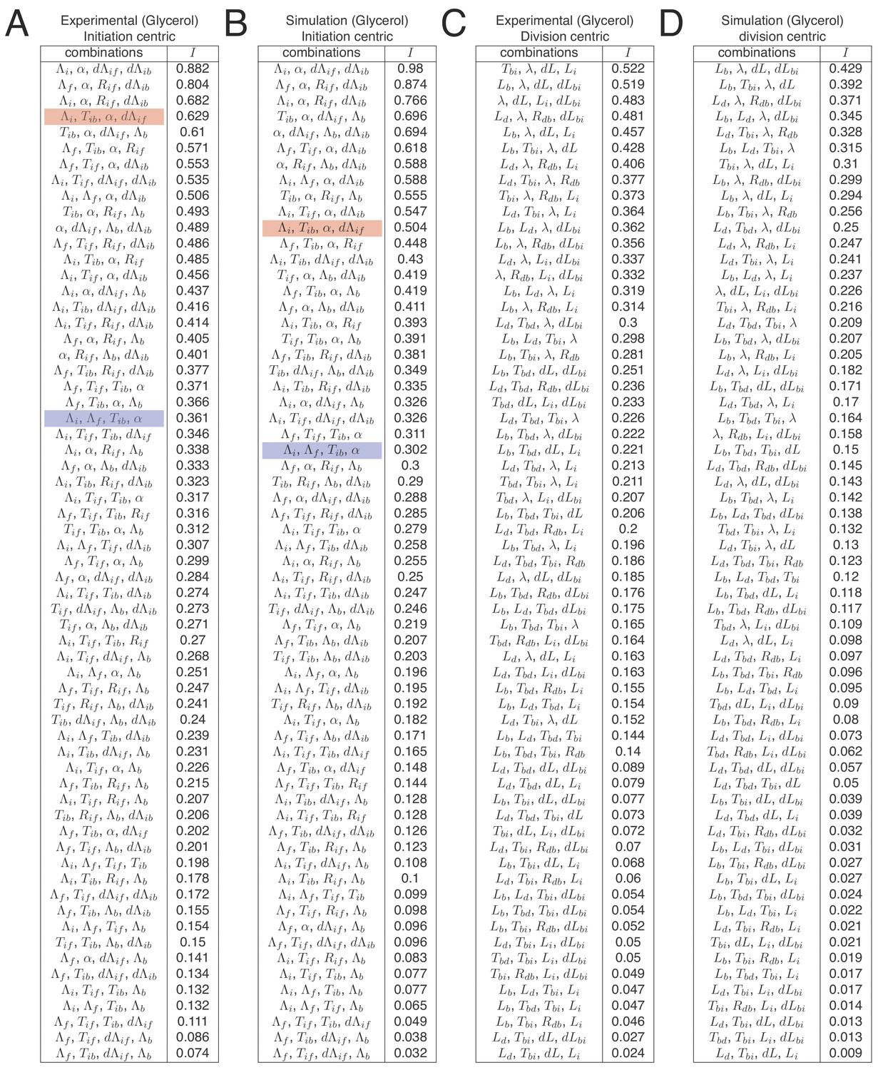
Full list of independences for all replication-centric and division-centric models.
In Figure 7A we show tables indicating independence for the five best decompositions of the M9+glycerol growth condition. Here, we show independences for all possible decompositions for both experimental and simulation data and both replication- and division-centric views of the cell cycle. Each line in the table shows one possible decomposition and its associated independence , and decompositions are ranked by decreasing . The double-adder model (decomposition , , , ) presented in this article has the best level of independence (top row in tables A and B). Some decompositions correspond to other previously proposed models. As an example, the Ho and Amir (2015) model based on an inter-initiation adder and a division timer is highlighted in red (decomposition , , , ), and the Wallden model based on a per origin initiation mass and a timer from initiation to division is highlighted in blue (decomposition , , , ).
Figure 7—figure supplement 4
Top scoring decompositions for data from simulations of an alternative model.
We simulated a model regulated by a inter-initiation adder and a initiation to division timer , that is as proposed by Ho and Amir (2015), and applied our decomposition analysis to data from these simulations. We here show the correlation matrices of the best replication- and division-centric decompositions on this data. Each matrix represents one decomposition, and each element of the matrix shows the correlation of the two variables indicated within it. The level and sign of correlation is given by the color bar. The independence of each decomposition is shown at the top of each matrix. In the tables, we also show the scores of the five best decompositions. Reassuringly, the decomposition corresponding to the variables used for the simulation (left) indeed comes out as top scoring, with an independence of , confirming the validity of our decomposition approach.
-
Figure 7—figure supplement 4—source data 1
Table with source data for replication-centric decompositions of Figure 7—figure supplement 4.
- https://cdn.elifesciences.org/articles/48063/elife-48063-fig7-figsupp4-data1-v2.csv
-
Figure 7—figure supplement 4—source data 2
Table with source data for division-centric decompositions of Figure 7—figure supplement 4.
- https://cdn.elifesciences.org/articles/48063/elife-48063-fig7-figsupp4-data2-v2.csv
Figure 7—figure supplement 5
Top scoring decompositions for data from Si et al. (2019).
We performed the same decomposition analysis as the one used for our data in the main Figure 7 on a published dataset found in Si et al. (2019) for slow growth in a different strain and different growth medium (MG1655 in M9+acetate). We show here correlation matrices for the two best replication- and division-centric decompositions on this data. Each matrix represents one decomposition, and each element of the matrix shows the correlation of the two variables indicated within it. The level and sign of correlation is given by the color bar. The independence of each decomposition is shown at the top of each matrix. In the tables, we also show the scores of the five best decompositions. Notably, in agreement with the results on our own data, the double-adder model (, , , ) shows the best independence on this dataset as well.
-
Figure 7—figure supplement 5—source data 1
Table with source data for replication-centric decompositions of Figure 7—figure supplement 5.
- https://cdn.elifesciences.org/articles/48063/elife-48063-fig7-figsupp5-data1-v2.csv
-
Figure 7—figure supplement 5—source data 2
Table with source data for division-centric decompositions of Figure 7—figure supplement 5.
- https://cdn.elifesciences.org/articles/48063/elife-48063-fig7-figsupp5-data2-v2.csv
Appendix 2—figure 1
Re-implementation of the model proposed in Wallden et al. (2016) for three growth conditions.
(A) Cells initiation at length and grow for a time before dividing. (B) Cell volume at birth and division as a function of growth rate. (C) Cell volume at birth and division as a function of generation time. (D) Distributions of the number of origins at birth.
Appendix 2—figure 2
Comparison of distributions and correlations for slow growth case between experimental (M9+glycerol auto) and simulation data from a model combining an inter-initiation adder and a classic adder .
Tables
Table 1
Variables definitions.
| Division-centric | Replication-centric | ||
|---|---|---|---|
| Measured variables | |||
| Size at birth* | Size per origin at initial replication initiation* | ||
| Size at division* | Size per origin at final replication initiation* | ||
| Duration between birth and division | Duration between consecutive replication initiations | ||
| Size at replication initiation* | Size per origin at birth* | ||
| Duration between birth and replication initiation | Duration between replication initiation and birth | ||
| Derived variables | |||
| Cell growth rate* (between birth and division) | Cell growth rate* (between consecutive replication initiations) | ||
| Division 'adder' | Replication 'adder' | ||
| Birth-to-initiation 'adder' | Initiation-to-birth 'adder' | ||
| Growth ratio between birth and division | Growth ratio between con- secutive initiations | ||
| Growth ratio between birth and initiation | Growth ratio between initia- tion and birth | ||
-
* variables indicated by a star are measured from a linear fit of exponential elongation.
Appendix 1—table 1
Statistics for all experiments.
Glycerol auto is the dataset analyzed automatically, while Glycerol is the one analyzed manually. Each growth condition represent one experiment during which multiple positions on the chip where recorded and for which multiple growth channels were analyzed. The discarded fraction represents cell cycles not following exponential growth. In the automated analysis (Glycerol auto) an additional 14% of cycles are discarded because of a failed origin tracking. stands for Pearson correlation, and the superscript indicates a mother-daughter correlation. The doubling time (1/) is obtained by fitting the distribution of growth rates with a log-normal distribution.
| Experiment | Discarded % | # cell cycles | Adder r | |||
|---|---|---|---|---|---|---|
| Glycerol auto | 3.3 | 3070 | 86.0 | −0.10 | 0.33 | 0.45 |
| Glycerol | 2.1 | 810 | 89.0 | −0.07 | 0.42 | 0.58 |
| Glucose | 2.1 | 1035 | 53.0 | −0.04 | 0.47 | 0.66 |
| Glucose +AA | 2.4 | 1159 | 41.0 | −0.12 | 0.36 | 0.48 |
Additional files
Download links
A two-part list of links to download the article, or parts of the article, in various formats.
Downloads (link to download the article as PDF)
Open citations (links to open the citations from this article in various online reference manager services)
Cite this article (links to download the citations from this article in formats compatible with various reference manager tools)
Initiation of chromosome replication controls both division and replication cycles in E. coli through a double-adder mechanism
eLife 8:e48063.
https://doi.org/10.7554/eLife.48063


