Predicting geographic location from genetic variation with deep neural networks
- University of Oregon, Institute of Ecology and Evolution, United States
Figures
Figure 1
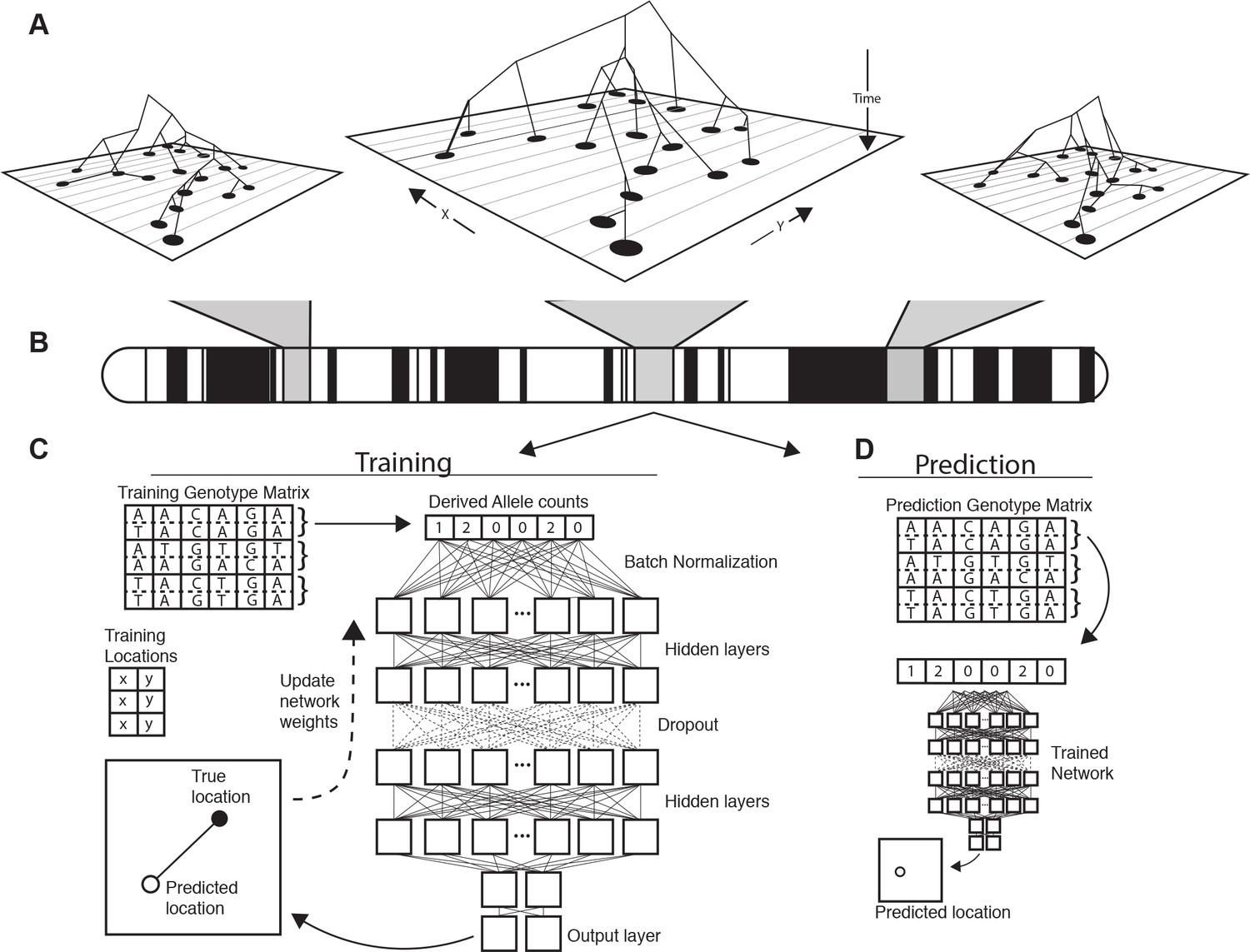
Conceptual schematic of our approach.
Regions of the genome reflect correlated sets of genealogical relationships (A), each of which represents a set of ancestors with varying spatial positions back in time. We extract genotypes from windows across the genome (B), and train a deep neural network to approximate the relationship between genotypes and locations using Euclidean distance as the loss function (C). We can then use the trained network to predict the location of new genotypes held out from the training routine (D).
Figure 2 with 2 supplements
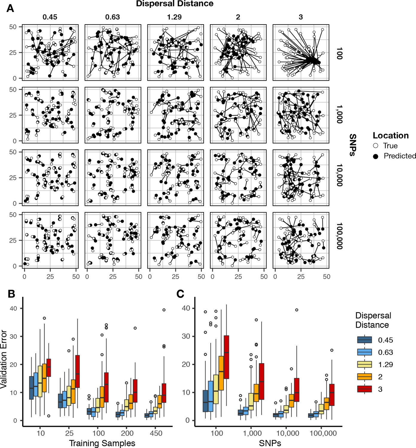
Validation error for Locator runs on simulations with varying dispersal rates.
Simulations were on a 50 × 50 landscape and error is expressed in map units. (A) True and predicted locations by population mean dispersal rate and number of SNPs. 450 randomly-sampled individuals were used for training. (B) Error for runs with 100,000 SNPs and varying numbers of training samples. (C) Error for runs with 450 training samples and varying number of SNPs. Plots with error in terms of generations of expected dispersal are shown in Figure 2—figure supplement 1.
Figure 2—figure supplement 1

Validation error for Locator runs on simulations with varying dispersal distance, expressed in generations of mean dispersal (test error divided by mean dispersal distance per generation).
(A) Error for runs with 100,000 SNPs and varying numbers of training samples. (B) Error for runs with 450 training samples and varying number of SNPs.
Figure 2—figure supplement 2
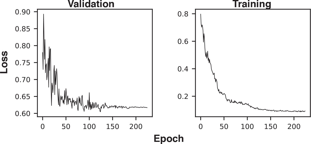
Example training and validation loss histories.
The first three epochs (with very high loss) were excluded from the plot to improve axis scaling.
Figure 3 with 1 supplement
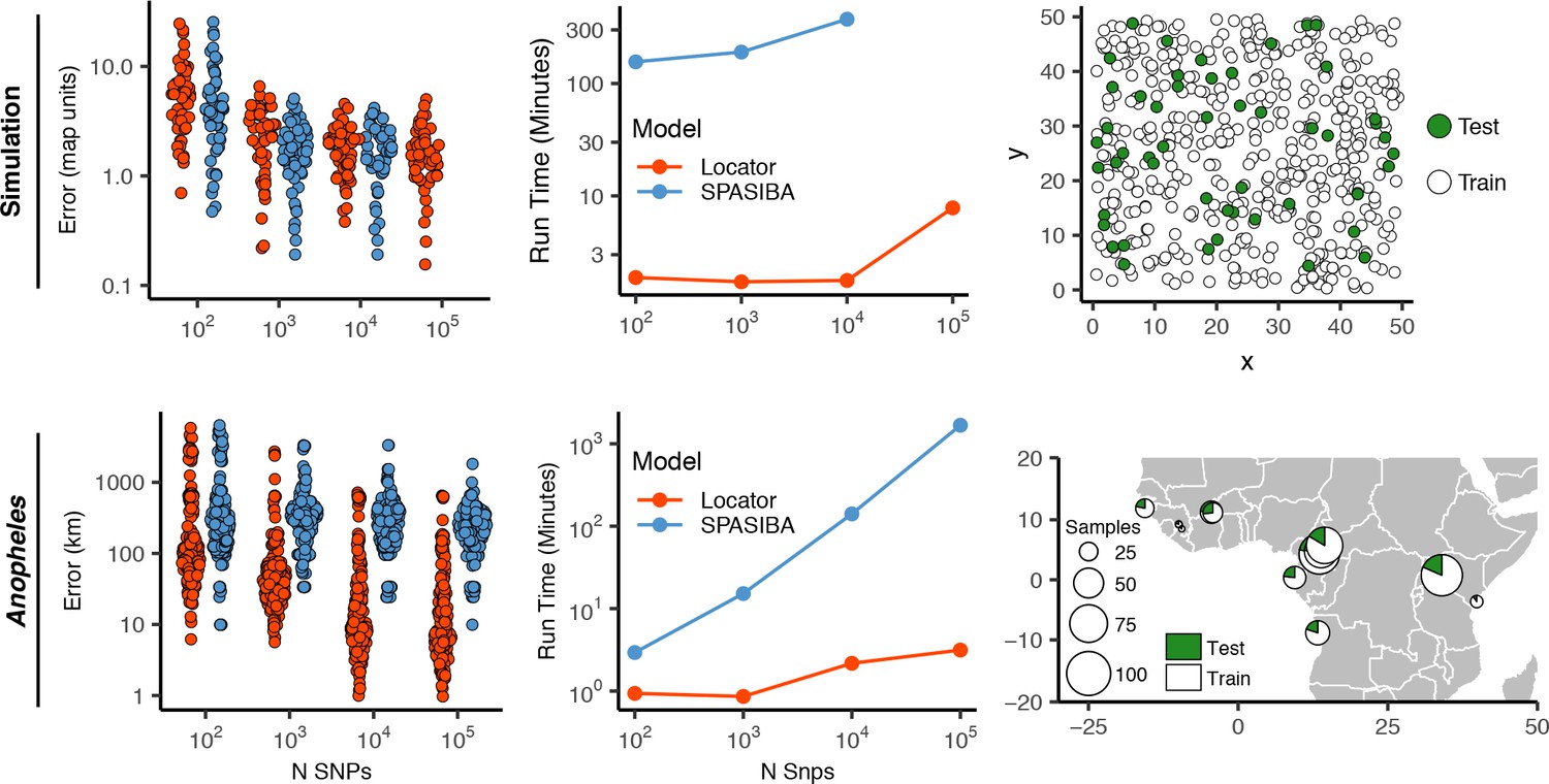
Test error and run times for Locator and SPASIBA on simulated data with dispersal distance equal to 0.45 map units/generation (top; 450 randomly sampled training samples) and empirical data from the ag1000g phase one dataset (bottom; 612 training samples from 14 sampling localities).
Figure 3—figure supplement 1
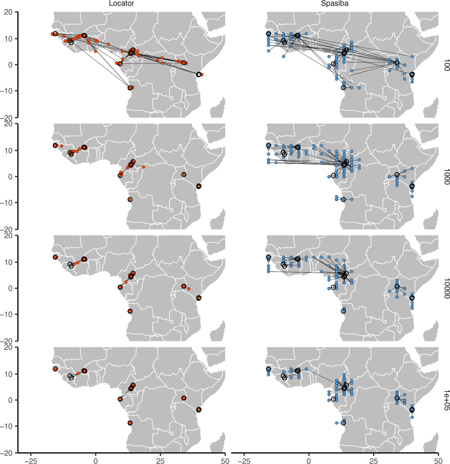
Predicted (colored points) and true (black circles) locations for Locator and SPASIBA on the ag1000g dataset.
Number of SNPs per run is shown on the right. Both methods were run on randomly selected SNPs with minor allele count >2 from the first five million base pairs of chromosome 2L.
Figure 4 with 1 supplement
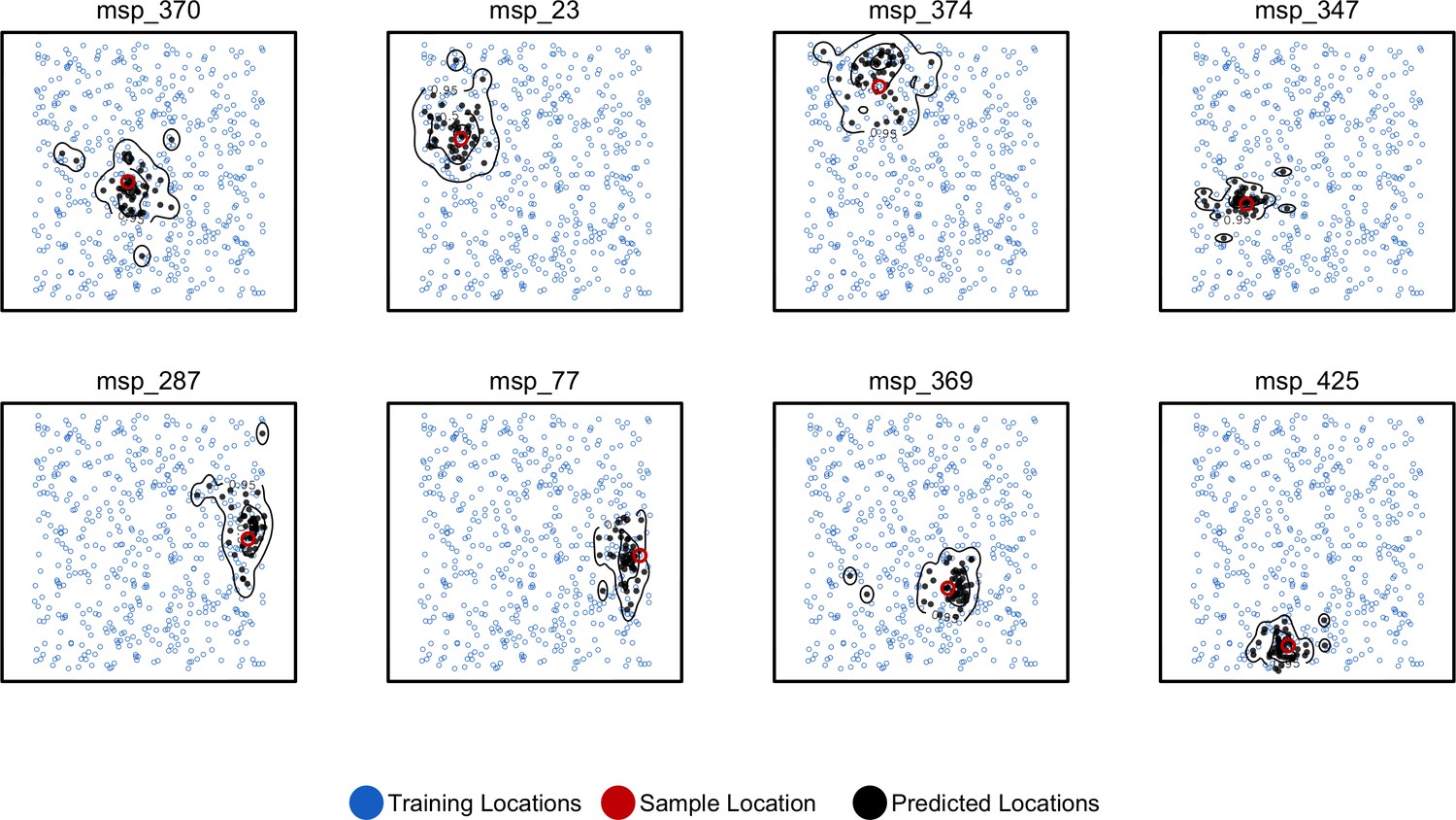
Predicted and true locations for eight individuals simulated in a population with mean per-generation dispersal 0.45 (roughly 1% of the landscape width).
Black points are predictions from 2Mbp windows, blue points are training sample locations, and the red point is the true location for each individual. Contours show the 95%, 50%, and 10% quantiles of a two-dimensional kernel density across all windows.
Figure 4—figure supplement 1
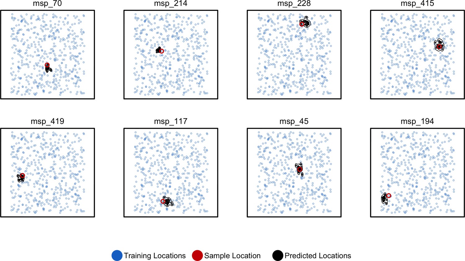
Predicted and true locations for eight individuals simulated in a population with an expected dispersal rate of 0.63 map units/generation, using a set of 10,000 randomly sampled SNPs.
Here, we generate predictions (black points) from bootstrap samples of the complete genotype matrix (in contrast to using separate sets of SNPs extracted from windows as used for figures in the main text). This could be useful for low-density genotyping data from approaches like ddRADseq, or when users lack a reference genome for windowing. In this setting, we see that the distribution of predictions is much smaller than fitting individual windows.
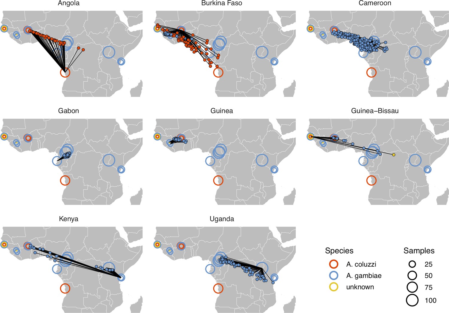
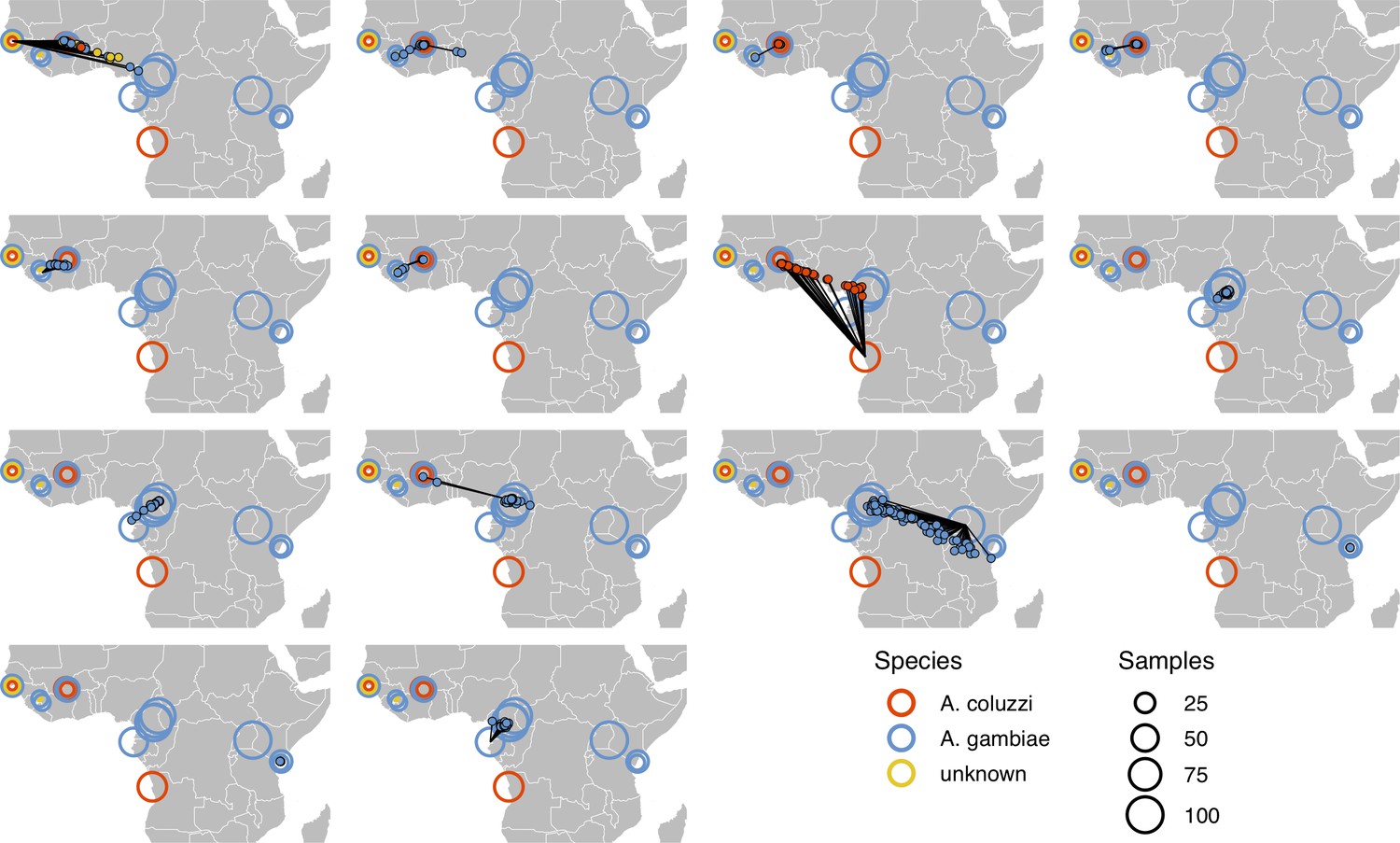
Figure 5 with 3 supplements
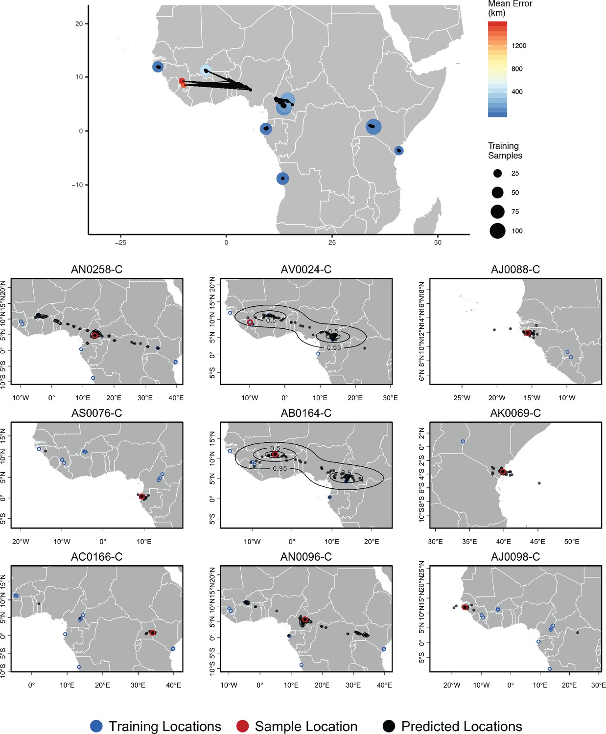
Top – Predicted locations for 153 Anopheles gambiae/coluzzii genomes from the AG1000G panel, using 612 training samples and a 2Mbp window size.
The geographic centroid of per-window predictions for each individual is shown in black points, and lines connect predicted to true locations. Sample localities are colored by the mean test error with size scaled to the number of training samples. Bottom – Uncertainty from predictions in 2Mbp windows. Contours show the 95%, 50%, and 10% quantiles of a two-dimensional kernel density across windows.
Figure 5—figure supplement 1

Comparison of cross-validation performance on the ag1000g dataset using SNPs from chromosome 3R, under varying network architectures and numbers of SNPs.
Boxplots show the distribution of Euclidean distance between the true and predicted locations of validation samples across 10 replicate training runs. Network shapes are described on the horizontal axis as 'layers × width’. Although two-layer networks are typically the least accurate, no single architecture provides consistently better performance across datasets of different sizes. Missing networks required over 12 GB GPU RAM.
Figure 5—figure supplement 2
Performance on 10,000 SNPs from chromosome 2L in the ag1000g phase one dataset when all samples from localities in the true country are dropped from the training set.
Figure 5—figure supplement 3
Performance on 10,000 SNPs from chromosome 2L in the ag1000g phase one dataset when all samples from the true locality are dropped from the training set.
Figure 6 with 1 supplement
Top – Predicted locations for 881 Plasmodium falciparum from the Plasmodium falciparum Community Project (Pearson et al., 2019) (5% of samples for each collecting locality), using 5084 training samples and a 500Kbp window size.
The geographic centroid of per-window predictions for each individual is shown in black points, and lines connect predicted to true locations. Sample localities are colored by the mean test error with size scaled to the number of training samples. Bottom – Uncertainty from predictions in 500Kbp windows. Contours show the 95%, 50%, and 10% quantiles of a two-dimensional kernel density across windows.
Figure 6—figure supplement 1
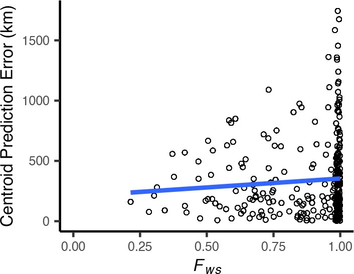
Centroid prediction error as a function of within-host diversity () for the Plasmodium falciparum dataset.
scales from 0 (maximum complexity) to 1 (minimum complexity). The blue line shows a linear regression (). High within-host diversity does not appear to explain outliers in Locator’s prediction error.
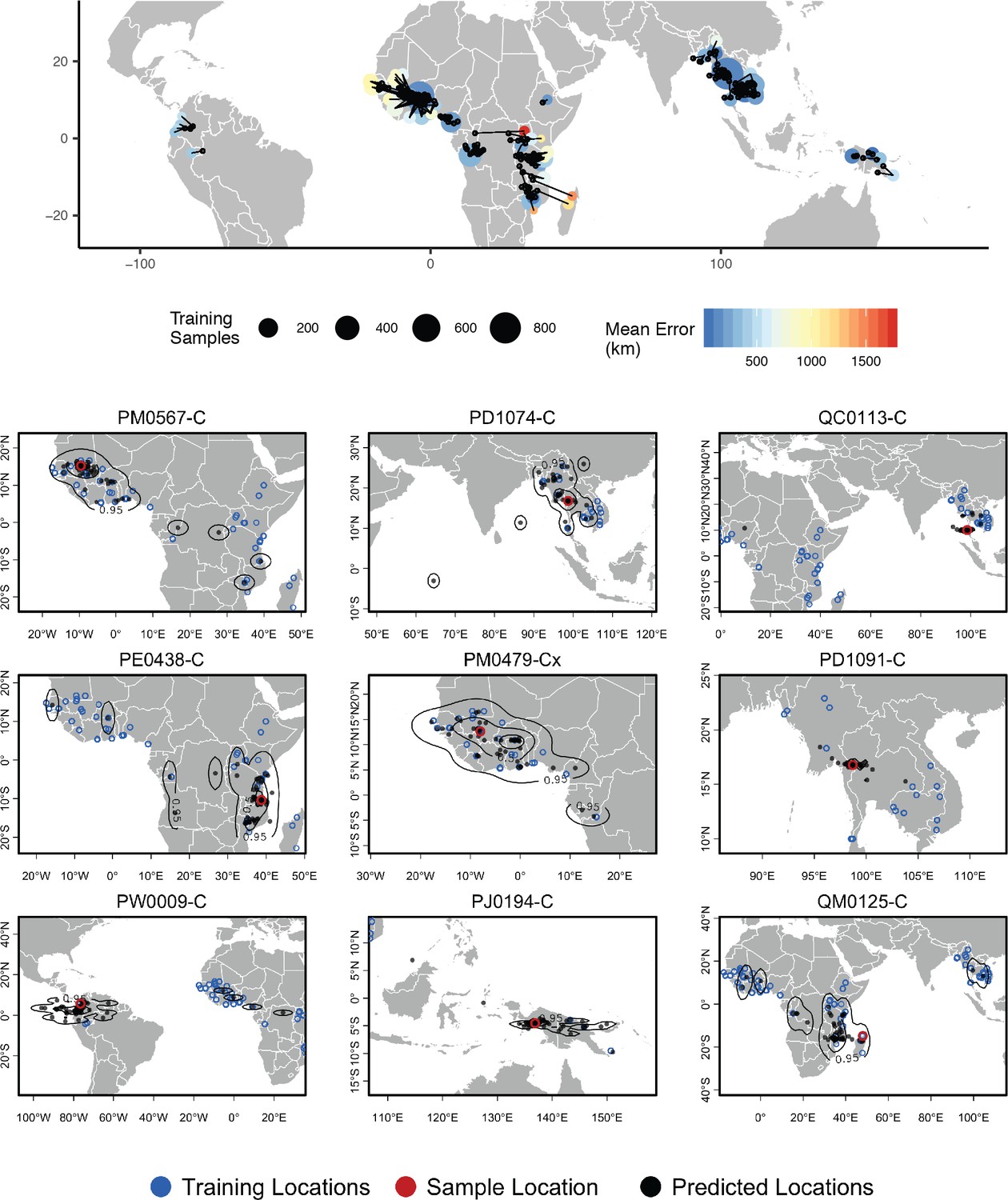
Figure 7 with 1 supplement
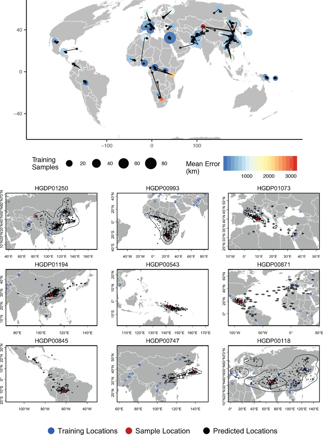
Top – Predicted locations for 162 individuals from the HGDP panel, using 773 training samples and a 10Mbp window size.
The geographic centroid of per-window predictions for each individual is shown in black points, and lines connect predicted to true locations. Sample localities are colored by the mean test error with size scaled to the number of training samples. Bottom – Uncertainty from predictions in 10Mbp windows. Contours show the 95%, 50%, and 10% quantiles of a two-dimensional kernel density across windows.
Figure 7—figure supplement 1
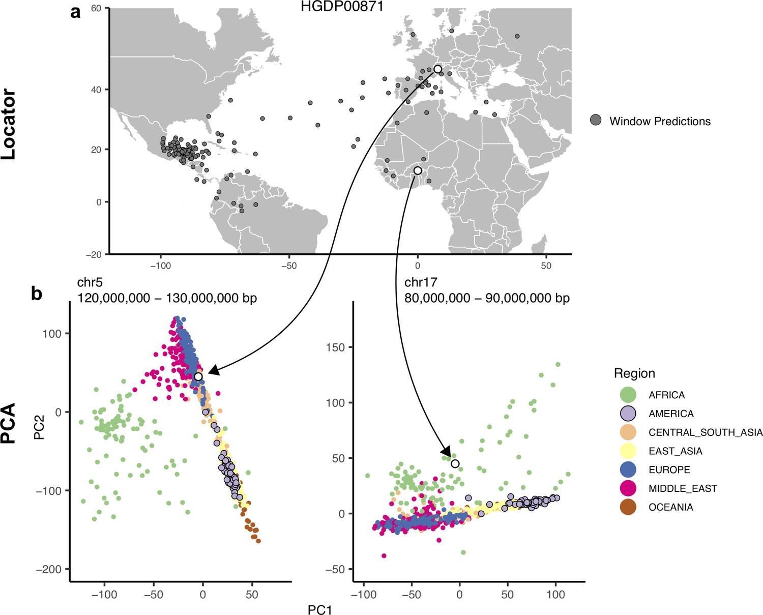
Outliers in windowed Locator analyses identify genomic regions enriched for admixed ancestry.
(A) Windowed Locator predictions for Maya sample HGDP00871. (B) PCAs of all HGDP samples run on SNPs extracted from windows with predicted locations in western Europe (left) and west Africa (right). In these windows sample HGDP00871 (open points) clusters with individuals from region predicted by Locator in PC space, rather than with other genomes from the Americas.
Figure 8 with 4 supplements
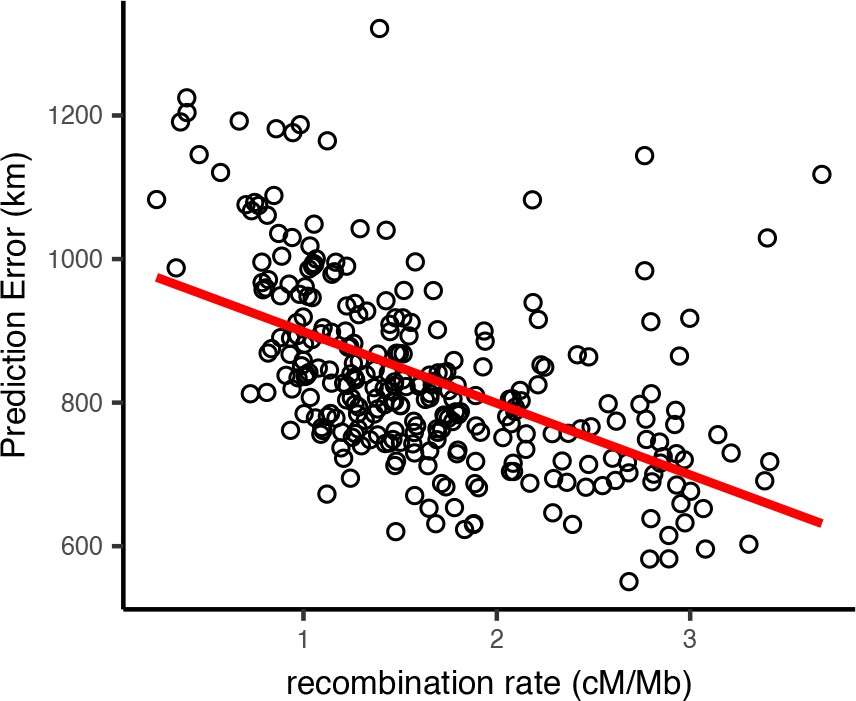
Per-window test error and mean recombination rate for human populations in the HGDP dataset.
The top 2% of windows by test error were excluded from this analysis. The slope of the least-squares linear fit is −99.9723 km/(cM/Mbp) and has adjusted .
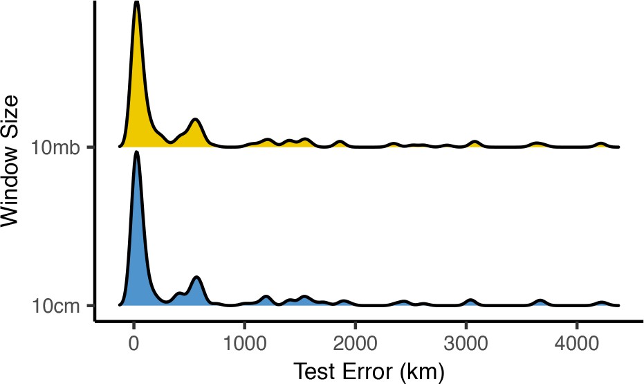
Figure 8—figure supplement 1

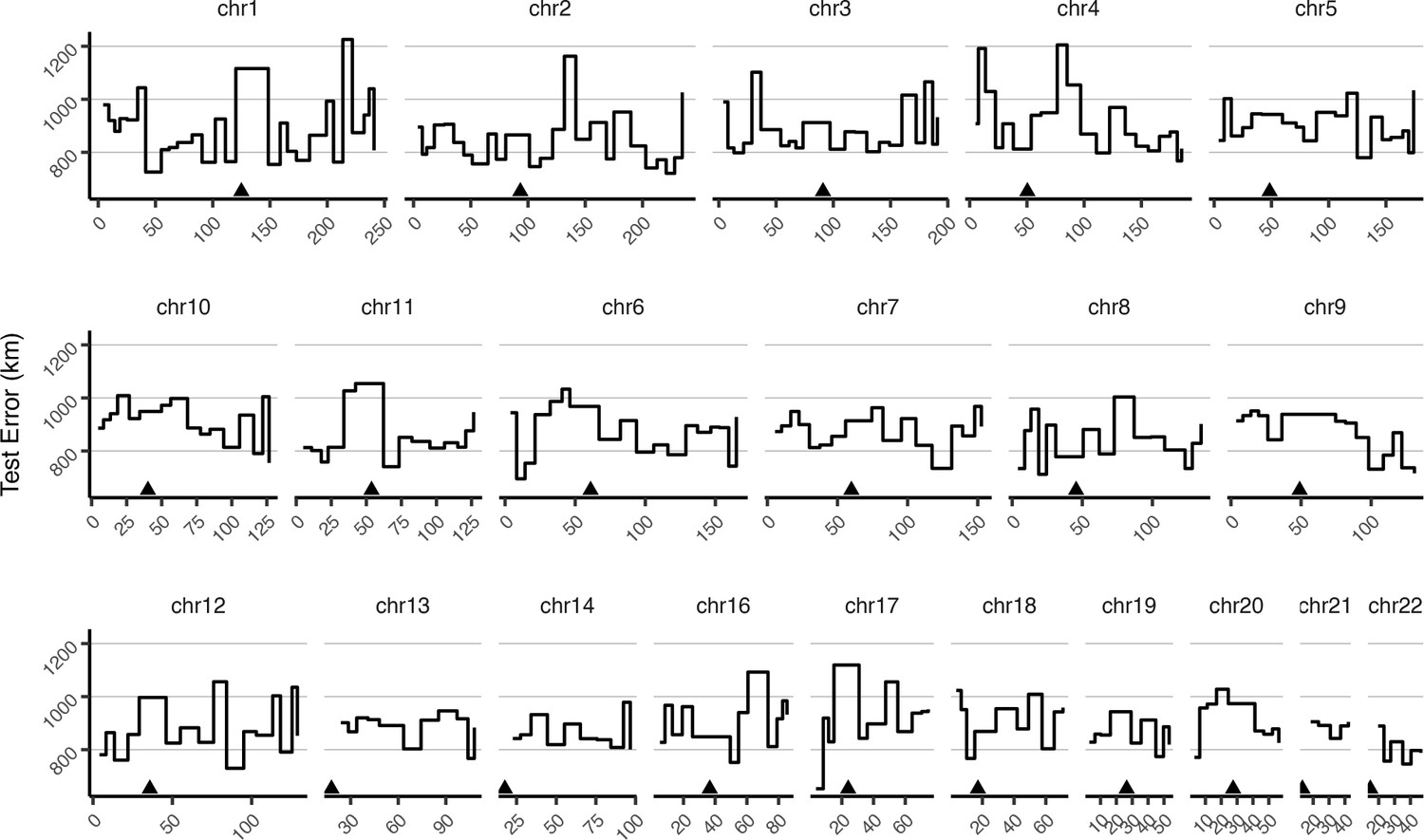
Mean test error for HGDP samples in 10-megabase windows.
Triangles show approximate centromere locations.
Figure 8—figure supplement 2
Mean test error for HGDP samples in 10-centimorgan windows.
Triangles show approximate centromere locations.
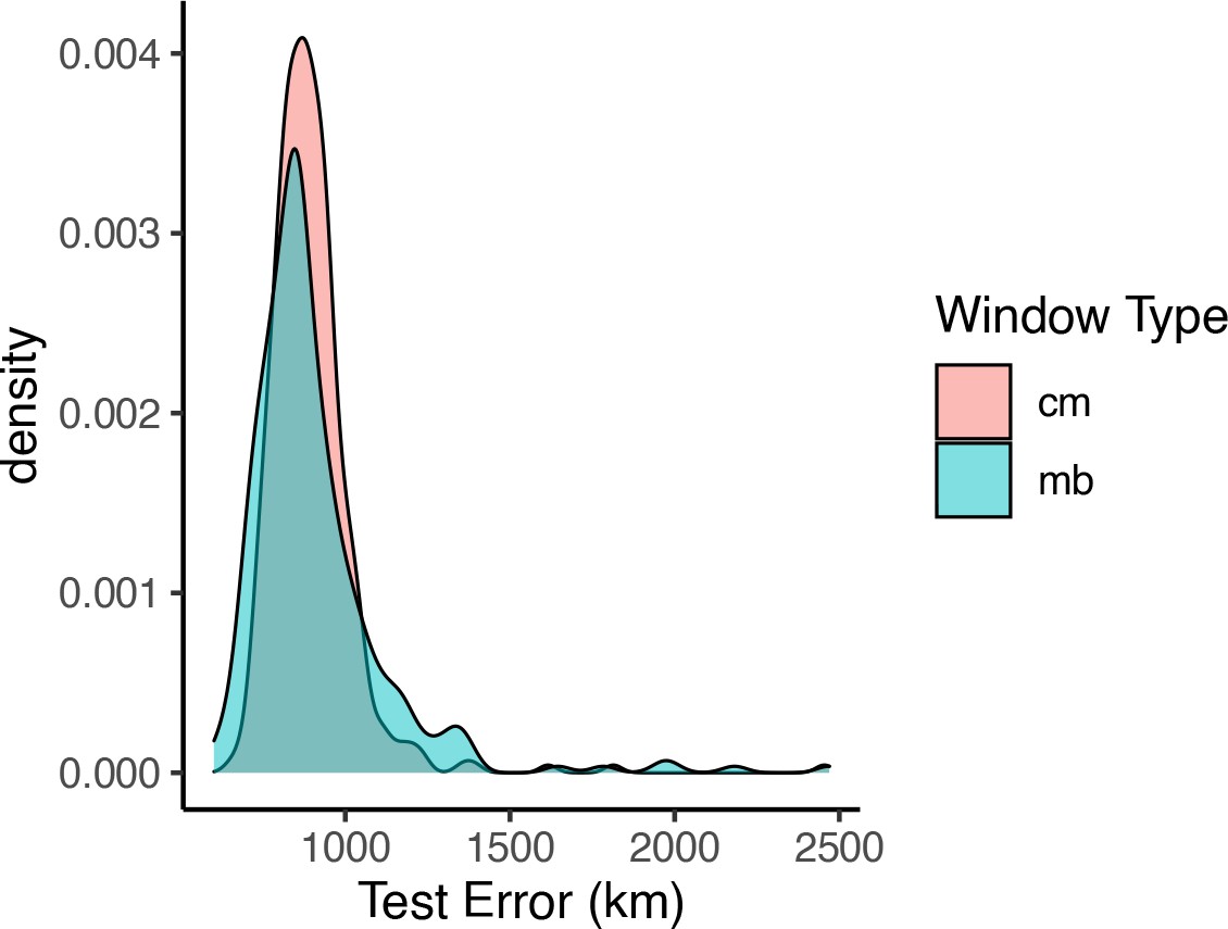
Figure 8—figure supplement 3
Distributions of centroid prediction error across samples.
Despite differences in error among genomic windows (Figure 8—figure supplements 1 and 2), error in the mean genome-wide predicted location is very similar when using megabase (top) or centimorgan (bottom) windows.
Figure 8—figure supplement 4
Distributions of prediction error across windows when using megabase- versus centimorgan-based windows.
Figure 9
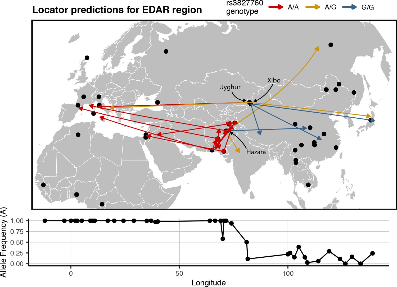
Predicted locations for HGDP samples from central Asia using a model trained on SNPs within 100 kb of EDAR.
Black points show sampling locations. Arrows are colored by genotype at variant rs3827760 and point towards the predicted location. Frequency of the A allele by longitude is shown below the map.
Additional files
-
Supplementary file 1
Validation error in terms of map units and generations of mean population dispersal for Locator runs in simulations with 450 training samples and 100,000 SNPs.
Note that while absolute error increases along with dispersal rate, it is roughly constant when expressed in terms of generations of mean dispersal.
- https://cdn.elifesciences.org/articles/54507/elife-54507-supp1-v2.csv
-
Supplementary file 2
Mean and median prediction error for Locator and SPASIBA run on simulations and Anopheles data as shown in Figure 3.
Error is in terms of map units for simulated data (total landscape width = 50).
- https://cdn.elifesciences.org/articles/54507/elife-54507-supp2-v2.csv
-
Supplementary file 3
Test error for windowed analyses of empirical datasets using the location with highest kernel density and the centroid of per-window predictions, as median (90% interval).
- https://cdn.elifesciences.org/articles/54507/elife-54507-supp3-v2.csv
-
Transparent reporting form
- https://cdn.elifesciences.org/articles/54507/elife-54507-transrepform-v2.docx
Download links
A two-part list of links to download the article, or parts of the article, in various formats.
Downloads (link to download the article as PDF)
Open citations (links to open the citations from this article in various online reference manager services)
Cite this article (links to download the citations from this article in formats compatible with various reference manager tools)
Predicting geographic location from genetic variation with deep neural networks
eLife 9:e54507.
https://doi.org/10.7554/eLife.54507


